Today we have two readers kitchens to show. But as is usually the case, their houses are also pretty, so I thought you would enjoy seeing the other rooms and not just the kitchen. One house is in Austin, Texas and the other is here in Houston. And for those who say I only show white slipcovers – both houses are much more colorful! Enjoy!!!
AUSTIN, TEXAS:
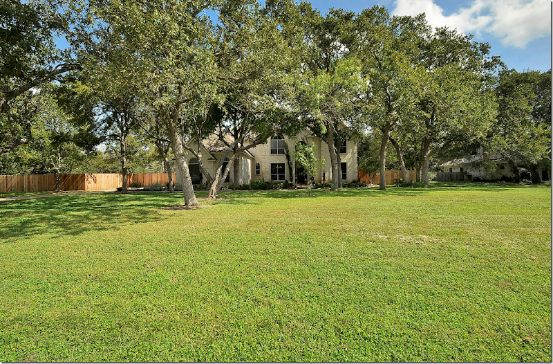
The first house is located on a huge residential lot that measures just over 1 acre. Look at the size of that front lawn! And the backyard is just as large. Can’t imagine how nice it must be to spread yourself out on all that land! This house was built in 1994 and the owners gutted the kitchen when they moved in. There was laminate flooring and carpet and brass hardware throughout, which the owners also replaced. The house is 4 bedrooms and 3 baths and is just under 4,000 sq. ft. It was placed on the market and they got a contract on the first day it was listed! Amazing.
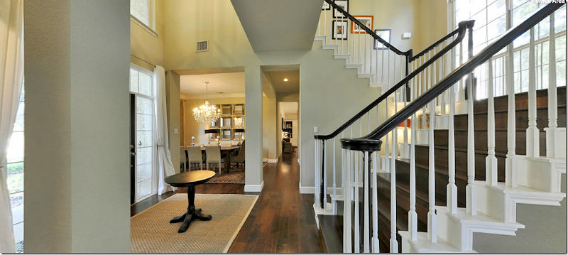
Walking through the painted black front door, you enter a two story foyer with a staircase that connects to a landing which spans the area above the entry. On the left is the dining room and on the right is the office and living room. Aren’t those stairs pretty?!
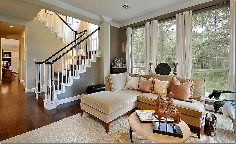
Looking towards the right at the office and the living room. The stairs have wood treads which makes it look so rich. And I like the black bannisters. I’m thinking of painting my stained brown ones black too. I keep seeing that look and really like it.
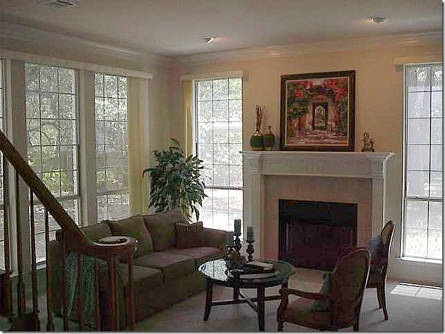
Here is the before picture of the living room. You can see the bannisters used to be brown before they were painted the rich black.
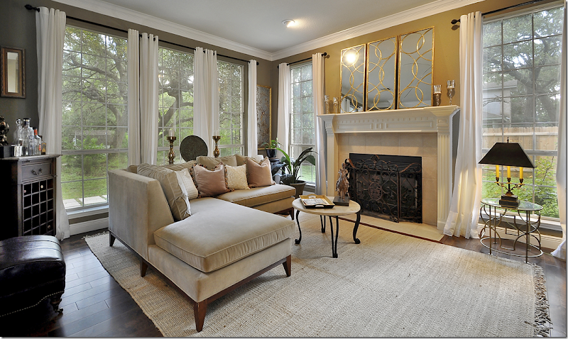
And after. The owners put down hardwoods throughout the downstairs and much of the upstairs. They painted the walls a deep green-gray shade and added a new fireplace screen.
Another view towards the staircase which is the focal point of the first floor.
And looking from the living room to the foyer.
The office, right off the front door, also now has hardwoods. Love those blue lamps with the red leather sofa.
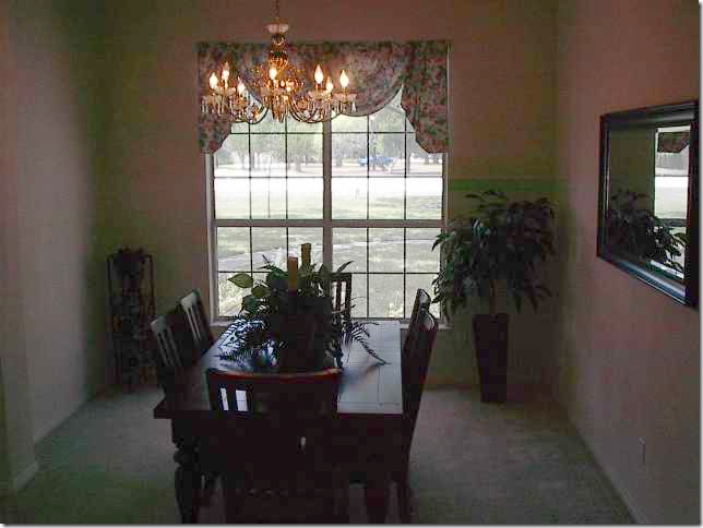
Before: The dining room was carpeted.
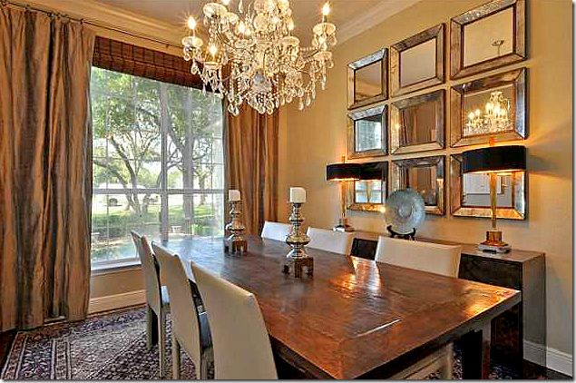
And after, hardwoods and moldings were added to the room, along with curtains and a crystal chandelier. Notice the grouping of small mirrors – that’s a good idea - use mirrors instead of the more usual series of framed prints.
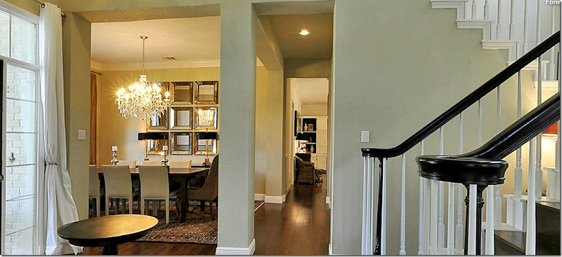
View of dining room off the main hall.
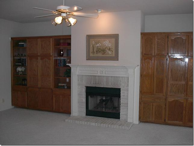
Before: the family room was carpeted and had brown stained cabinets, along with a ceiling fan.
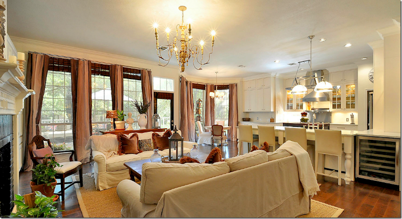
And after, hardwoods were placed throughout this area, including the kitchen and breakfast room. An Italian style chandelier replaced the ceiling fan.
And looking into the kitchen.
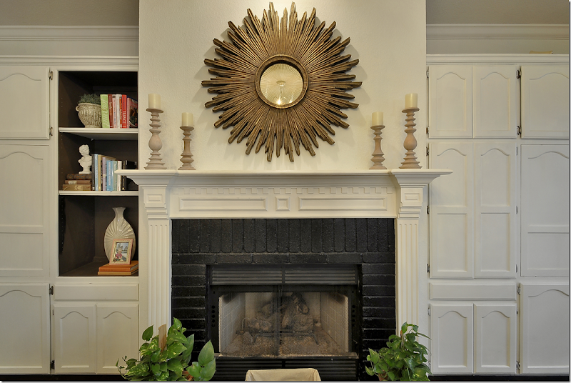
And after, the cabinets were painted white and the backs of the shelves were painted a dark brown for contrast. The white brick was also painted – black.
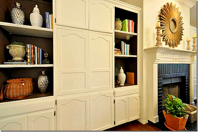
Notice the painted shelves – even the sides are painted, not just the backs.
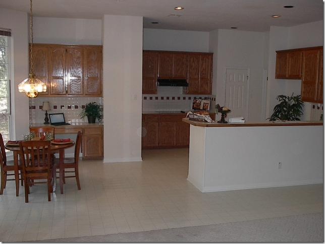
BEFORE: The kitchen was gutted, but the footprint stayed basically the same. The main difference is a breakfast bar was added and they removed the sheetrock wall between the kitchen and the breakfast room.
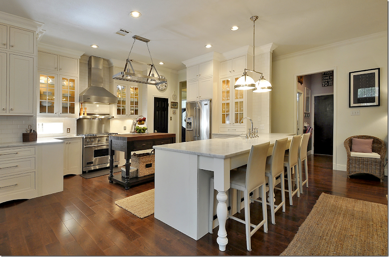
And After: The all white and stainless kitchen is now totally different looking! And so pretty, too! The large sheetrock divider between the breakfast room and the kitchen was removed to make a seamless connection. Restoration Hardware lighting fixtures, Rohl hardware and Shaw’s farmhouse sink. Love the breakfast bar.
Looking over the bar into the family room. Marble counters and white subway tile backsplash, along with Viking appliances.
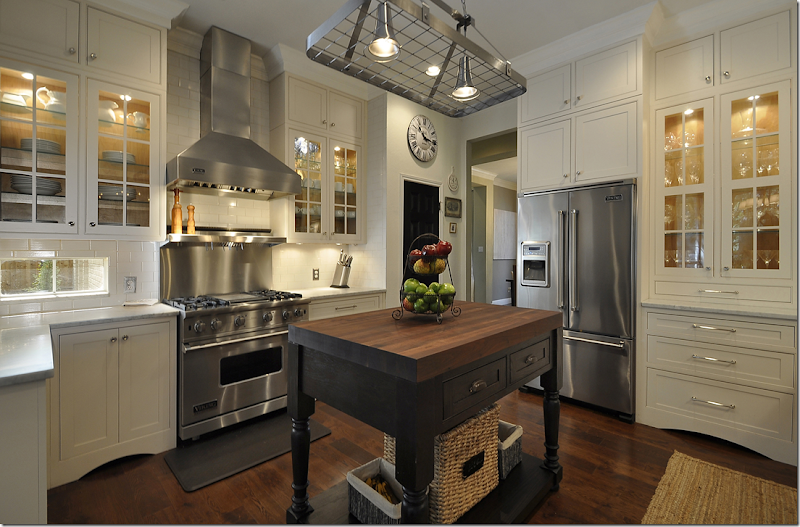
Notice the dark painted island with the wood top. The upper cabinets have glass doors. Cute station clock over the black painted pantry door. Notice the bottom of the cabinets – with the attractive arch. The owner painted her doors black, a touch which is nice and gives more importance to builders grade doors.
Overlooking the breakfast area.
Here you can see how the dining room is across the main hall from the kitchen.
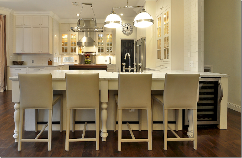
Notice the chunky carved “legs” at the bar.
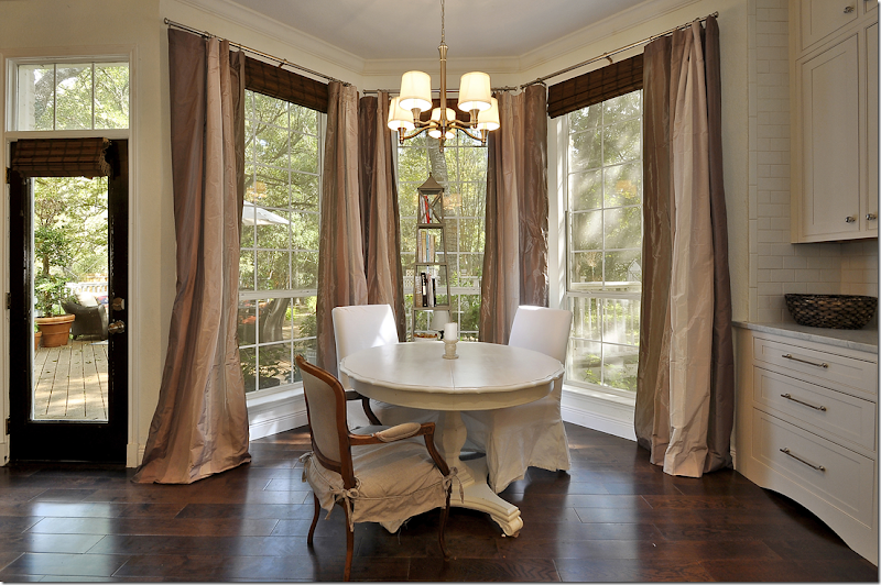
The breakfast room overlooks the back yard. I love the hardware on the cabinets and love the look of their hardwoods. Oops- just noticed the white slips on these two chairs!!! Sorry!!!
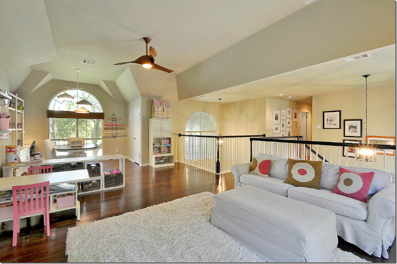
Upstairs is large family room for the couple’s daughter.
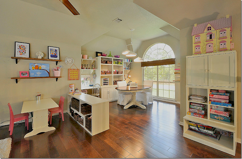
And a craft area for mom. This would make a great home school space. I think these hardwoods are really pretty. I really like the wide planks.
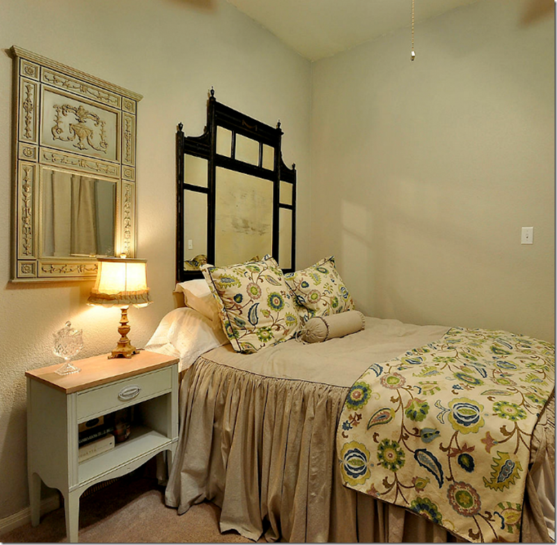
A guest room.
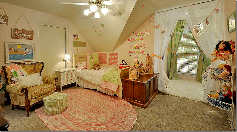
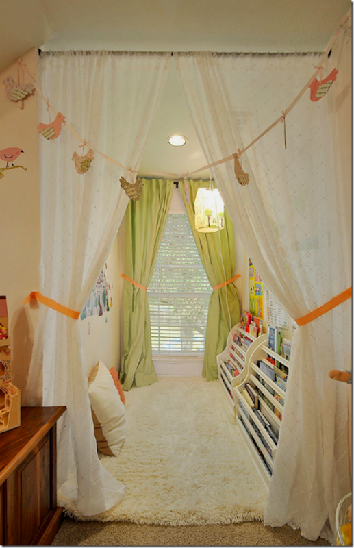
And the daughter’s room. Plus, look at the cute play area behind the curtains.
It’s a library for the daughter with a soft rug to lie down on the floor and read. What a great idea! I’ll bet the daughter develops a love of reading having her own library. No pictures of the master bedroom.
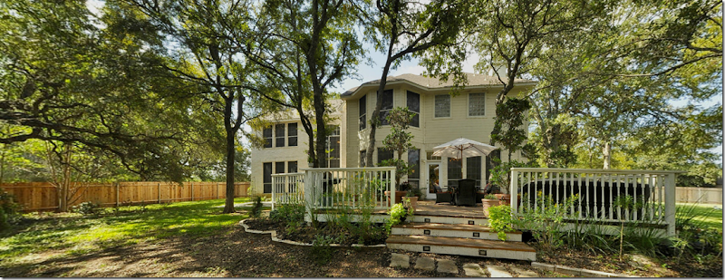
The back yard is something else. There’s a large deck off the house.
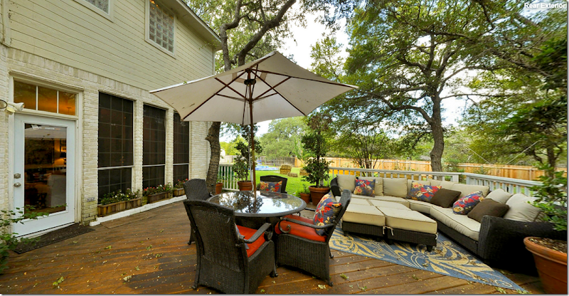
The deck is furnished with an outdoor couch and dining table.
Way back there is a dining terrace, a fire pit area, and a playground. Must be amazing. Hope they had dogs! No wonder they had a contract pending on the first day.
HOUSTON, TEXAS:
The second home is located in Houston, right behind the popular shopping area – Highland Village – near the upper crust River Oaks neighborhood. The area where this house is located is small and filled with empty nesters and young families who are tearing down the older, smaller one story houses and building new, larger two story ones. The reader who sent in these pictures did just that. She says they built their house and she designed the interiors, though she claims she isn’t an interior decorator. Could have fooled me!
The house was on the market when she sent in the picture and she said all her decorative items were stored away according to the realtor’s wishes. Plus the stylist insisted she leave out her toaster, something she doesn’t usually do. Funny!! She told me that she thought the readers would enjoy seeing her kitchen since people always comment on how much they like it. And I agree – it’s beautiful.
BUT, I know this house – I’ve driven by it a zillion times and it has masses of curb appeal. I’ve always wondered what it looked like inside, so I was thrilled to get these pictures. Why can’t that happen all the time?? Drive by a house you love and then you just happen to get the pictures of it in your email? That would be heaven! Yes, I do love the kitchen, but I also like the entire house – so I thought you would probably too. The house, built in 2008, has 4 bedrooms, 4 bathrooms and is just under 4,000 sq. ft.
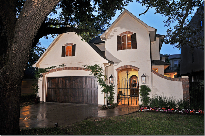
The house has tons of curb appeal with its white stucco walls accented by old Chicago brick. There is a front courtyard behind a charming gate flanked by gas lit lanterns. I just love the façade of this house – can’t you see why I have noticed it before!!
Notice how cute the front door is – with its arch and glass panes. The walls have a subtle stucco paint treatment which gives them texture and depth. I think that wall treatments like this add so much to a house.
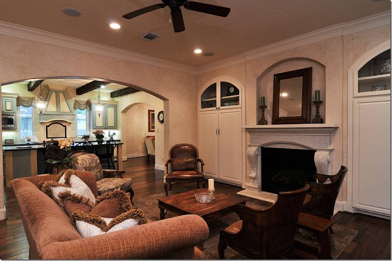
The stairs wind along the wall in the front hall. Towards the end of the hall is the family room. Notice the beautiful hardwoods. And notice the treads on the stairs – they were painted to look like stone.
According to the homeowner, the house was designed to be comfortable and family friendly. The large kitchen opens off this space, as does the dining room.
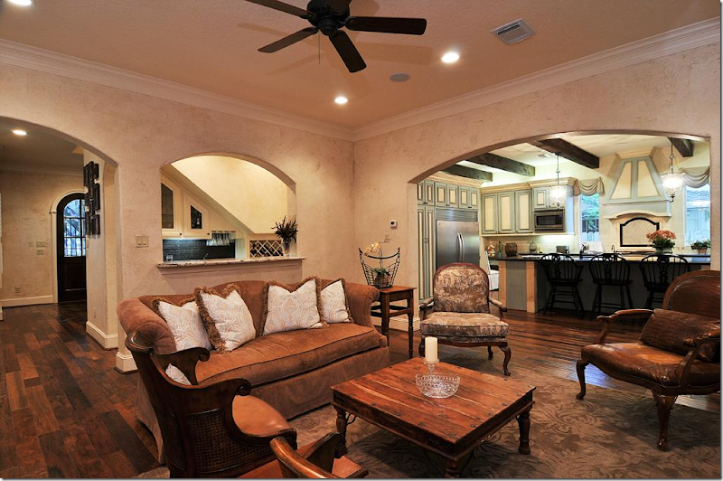
Looking back towards the front door. The wet bar is under the stairs and is open through a wide arch to the family room. I love all the arches.
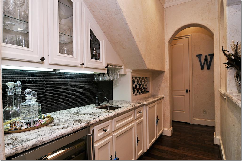
The wet bar – love those small tiles on the backsplash.
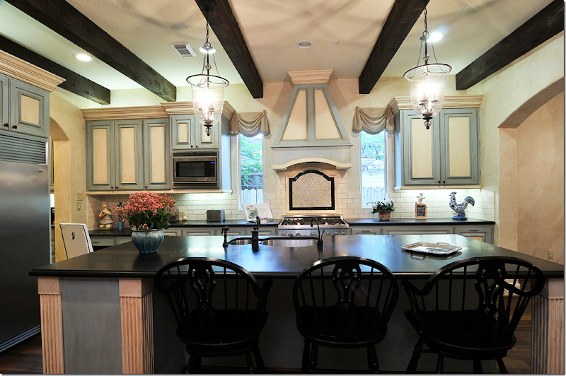
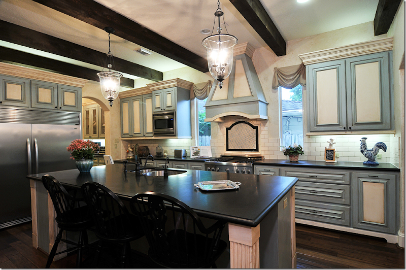
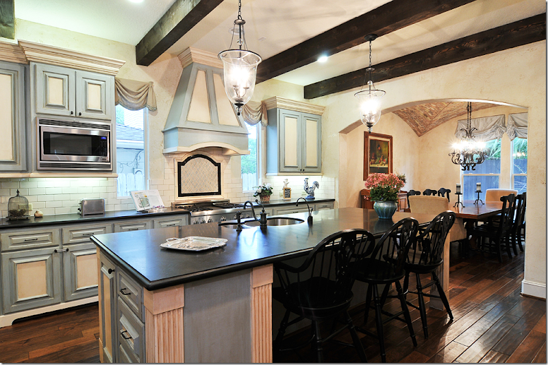
Off the family room is the kitchen and I think it is soooo pretty!! I love the colors – the blues and creams with the black honed granite countertops.
The creamy subway tile backsplash plays off the cream colored cabinets. I just love the way the cabinets are painted – blue and cream. And the stove hood and tiny window swags give it a touch of folly. I can’t tell if those are fabric shades or painted boards. Either way, I love the way they look.
And notice how the dark ceiling beams play up the black countertops and the small touch of black accent behind the stove. Just beautiful. To the right through another wide arch is the dining room.
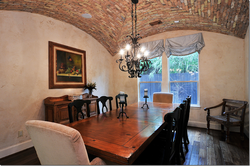
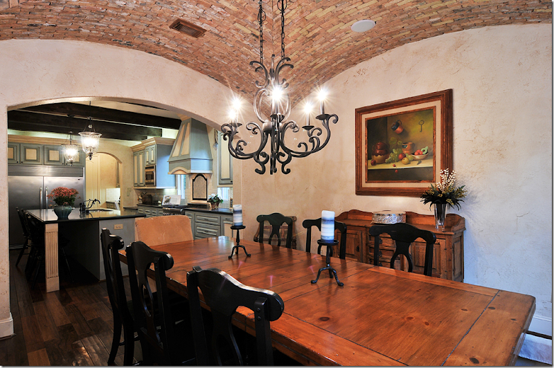
Off the kitchen is the dining room. The layout of the house is interesting – the rooms all open off each other which is great for entertaining. The owner told me she designed the house for having guests feel comfortable and I can see how that’s true. Instead of having a formal dining room away off in a part of the house that no one uses but for holidays, I can see how the family probably uses their dining room for everyday evening meals since it is located so near the kitchen and family room.
And that groined ceiling! Wow!!! It is made out of old Chicago bricks – and it’s a stunner. What an amazing detail – it adds so much texture and warmth to the room. The furnishings are perfect with the style of the house. It almost seems as if the house was in San Miguel de Allende instead of Houston.
And looking back at kitchen.
The powder room has a chest that is now repurposed as the vanity with a cloisonné sink. The walls have a handpainted damask pattern that is very subtle. Not sure who painted all the walls, but I love the different treatments. It makes the rooms all just a bit more special. Even the hand towel is so pretty!
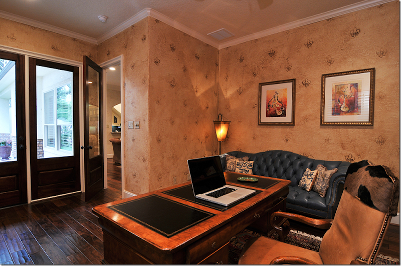
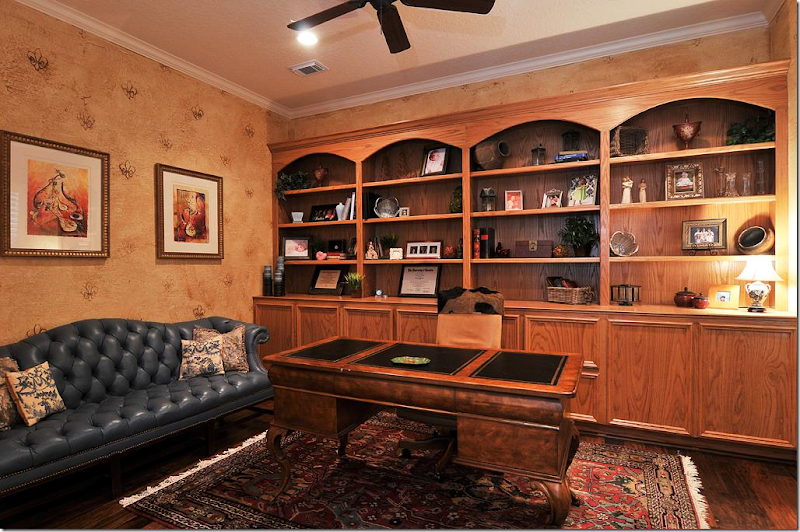
Off the family room is the office/library. The walls are hand painted with a raised fleur de lis pattern.
That’s a really pretty sofa, the soft blue tufted leather. There are touches of blue that are carried from the kitchen, to the study and up to the master bedroom.
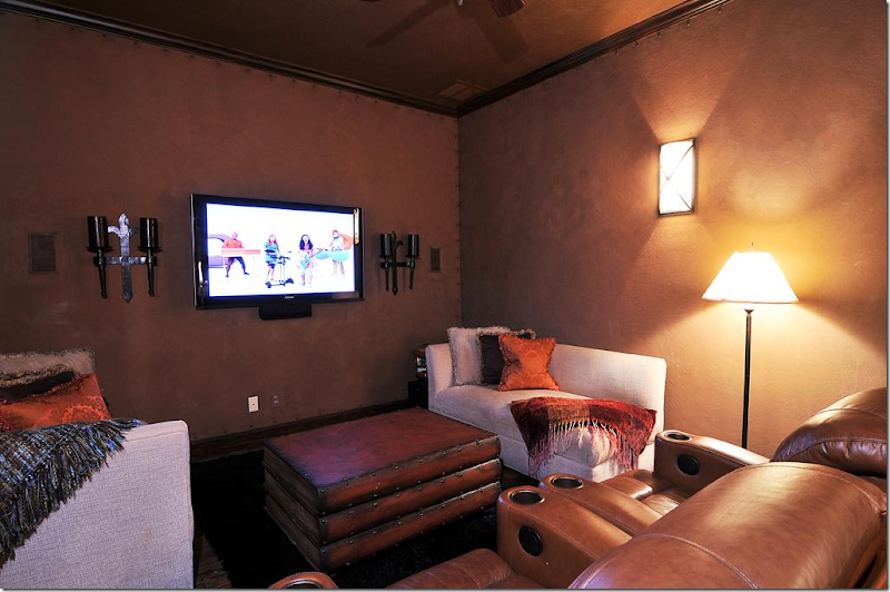
The media room has another interesting wall treatment with nailheads that give the appearance that the walls are leather! Another great idea. And instead of lots of stadium seating, they added two comfy chaises, along with a coffee table made of faux leather books. Love the way she designed this room. It looks like a great place to watch a movie.
Upstairs, the master bedroom highlights the golds from throughout the house and the blue color found downstairs.
And the master bath combines the browns and light blues together – such a pretty combination. The marble is especially pretty!
I hope you enjoyed seeing both readers’ kitchens! Even though they actually submitted their kitchens – and both are so pretty - I thought you would enjoy seeing more of their houses. And I know you enjoy seeing a pretty house from Houston that isn’t white and doesn’t have slipcovers and seagrass!!
NOTE:
The finalists for the Aidan Gray contest have been submitted to owner Randal Weeks. Hopefully, we will know the winners soon. I can’t wait to find out who won myself! AND, I can’t wait to start showing you all the entrants.
AND, FINALLY:
If you are in Houston, CdT sponsor Memorial Antiques & Interiors (MAI) is having an anniversary open house this Wednesday:
At the open house, Bryan Batt, star of “Mad Men” and interior designer, will be on hand to sign his new book, “Big Easy Style.” Besides his successful acting career, Batt and his partner own a décor store, Hazelnut, in New Orleans, where they offer their interior design services. The just recently published book is filled with photographs from houses in New Orleans. It features Batt’s colorful designs and others – including the popular blogger The Visual Vamp.
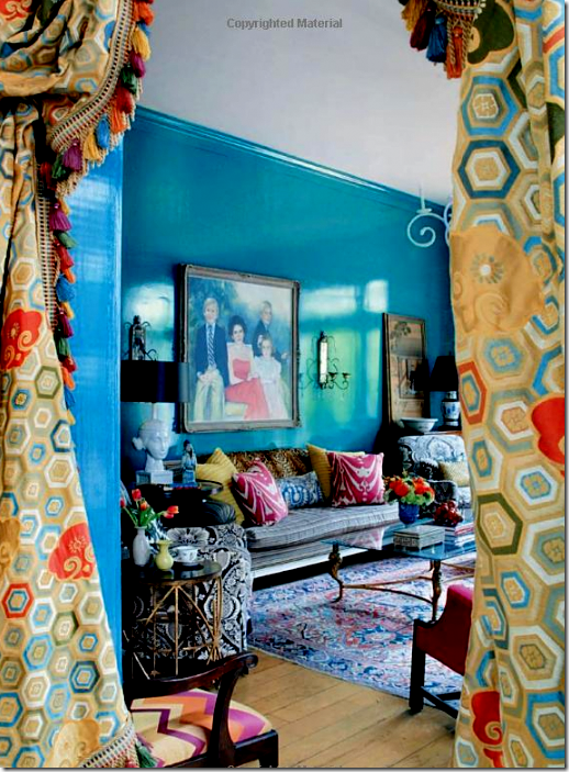
Big Easy Style is filled with pages of colorful interiors in New Orleans, such as this house with its vivid blue lacquered walls.
While at MAI, be sure to visit Pruitt and Littleton’s space which showcases their beautiful artistry. Their work is also seen in Batts’ “Big Easy Style” and they were instrumental in bringing Batt to Houston for the signing.
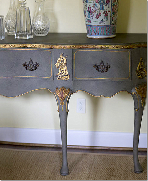
A console, formerly stained brown, becomes a beautiful painted chinoiserie piece under the talented hands of Pruitt Littleton.
And also while at MAI, visit CdT sponsor’s 2 Lucy’s booth.
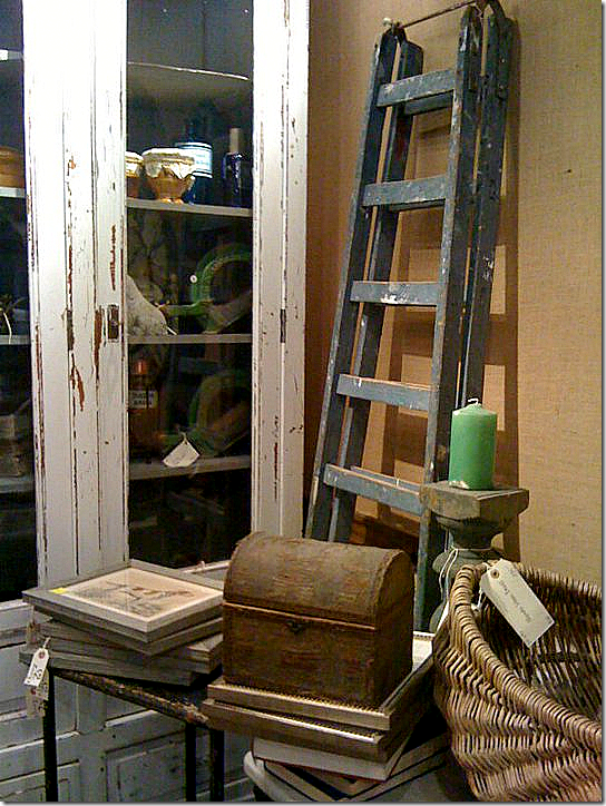
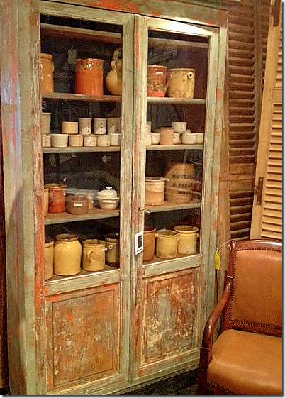
They have a HUGE assortment of French and English antiques hand picked in Europe. Their booth is jammed packed with wonderful items – too many to choose just one, which is always an antique lover’s problem. Last time I was there, they had good selection of oversized station clocks, if you are in the market for one.
And more. They have tons of confit pots if you are looking for those!!
Can’t make it to the signing? Click on the picture to purchase Big Easy Style from Amazon.


















I think we are all in love with the first home's wood floor. Per chance since it was done recently, does the owner remember the floor color?
ReplyDeleteHi, thanks for the compliment! It's called prestige chicory oak by earthwerks.
Deletewas looking for a interior design related blog from where I can see some update about new idea for me. & finally I think your blog is perfect for me to give information according to my requirements!
ReplyDeleteI love this house
ReplyDeletesaludos from Chile
Both of these homes are so beautiful the owners should be very proud of themselves for the design work they've done. We have the same colored floors as the first home, dark walnut, and they look wonderful thoughout the house. I see so many things I would like to try in our home, something large above our fireplace and the small grouping of mirrors, love that idea rather then one large mirror. Thank you to both homeowners for sharing their stunning homes!
ReplyDeleteXXX
Debra~
Two lovely homes. Congratulations to both owners and thanks for sharing them with us.
ReplyDeleteXO, Victoria
Who lives in these houses ? Ghosts ?? Why are they so sterile and clean ??
ReplyDeleteIt's called being "styled" for a photo shoot. No one wants to see someone's old sneakers and socks lying about.
DeleteDid you really say "styled"? That is just too rich.
DeleteMy house is not styled and I don't have sneakers and socks lying about...that's being messy!
DeleteNice homes. Cozy and warm. I would love to have that craft room, I don't think I would ever leave!
ReplyDeletei know. my favorite is the little girl's library. i fell in love with that!!!!!!!
DeleteThese homes are just beautiful! I got many new design inspirations from them. Thank you for sharing them!
ReplyDeleteSome of these pictures confirm my observation about faux finishes. They look dated and dirty. I am not sure what the purpose of this post was other than perhaps these two owners may have entered the Aidan Gray contest. The white kitchen of the first house was nicely done.
ReplyDeleteDining room view, 2nd house???????
ReplyDeleteAt the least a pair of closed shutters, sconces, bench, stain. Instant. With time, evergreen vine, pair large pots with evergreen cone shape + trailing plant, gravel, stone edging.
AT THE LEAST.
On what planet, mental state would I EVER do a fabulous dining room with THAT view?
I know, most people could care less about their garden views. With me it's primary.
Garden & Be Well, XO Tara
The cream de la fence Houston style. Every house that is shown on this site from Houston has those same cheap, Home Depot wooden slat fences. I cannot imagine entertaining in this dining room either. These are probably the two least noteworthy houses ever posted here. By the way, the view of dead trees about to fall over in the back of the first house is nothing to look at either.
DeleteThat's certainly nasty. Are you sure you told us how you really felt? By the way, the expression is I COULDN'T care less not could. Getting expressions correct is primary with me.
Delete777
hey anony 9:08 -here is a suggestion: go start your own forum -- at your own expense in time and money. Take all the photos yourself. Let us know when you have it set up -- and we'll
Deletecome and critique it. ...and we'll tell you what's "nothing to look at" or not. ha ah ahahah--
bite it, shell - lol
Deletewell, let me say this y'all - in texian. we DO have issues in Houston with lot sizes. unless you have tons of money OR you live far out from downtown, you are going to have small lots, esp, in trendy neighborhoods where young families want to live. and young families usually can't spend a fortune on landscaping. or they don't realize the importance of it. ok? when we built this house - our backyard is really only a courtyard and my father had a heart attack when he saw it. a few days later, he gifted us with a large check so that we could have a landscape architect design a courtyard for us. we would have been able to do that ourselves without his help. and i we didn't realize how important it would be living here to make it a courtyard instead of a backyard. so it was money well spent, but money we didn't have and i think that is a big issue with people here. we just have tiny lots in this area and unless you fork it over to a landscape designer, you are going to have bad views. it IS an issue, i know that.
DeleteHad to laugh when I saw the floral arrangement in the niche near the stairway in house #2. Like you, I love the outside. Loved house #1. Thanks for sharing.
ReplyDeleteMaureen
Guess the owner didn't read the latest post on niches. Dried flowers - ugh!!
DeleteObservation about House No. 1 - why are the treads on the stairway two-toned? The picture looks like the center of the tread is painted black like the rail and the outside of the tread past the railing is white. This looks like a gingerbread staircase.
ReplyDeleteHouse No. 2 has a nice curb appeal, but it ends at the front door. This house is dreary, dark and lifeless.
No, the center of the tread is not painted black, it's actually the hardwood, that's the only way they were able replace the carpet with wood, and I didn't want to paint.
DeleteThe correct way to have done the stairs is to have taken the railing down and replaced all of the treads. I have never seen a hardwood inner tread with the outside painted white. I suppose there is a first time for all things. It would have looked more seamless to have had the stain run the length of the tread. It's hard to believe that the homeowner got advice about this.
DeleteThanks, but that was out of our budget :). It's called money, honey! Amber
DeleteOut of your budget???? You bought a very large home on an acre lot and replacing treads are out of your budget?
DeletePerhaps you would have been wiser to have bought within your budget and renovated more wisely.
GOD please!!!!!!!!!!!!!!!!!!!!!!!!!!!!!!!!!!!!!!!!!!!!!!!!!!!!!!!!!!!!!!!!!! STOP THIS!!!!!!!!!!!!!!!!!!!! I really have it tonight. YOu have NO idea what they paid for their house. NONE. I think the stairs look beautiful. So what - it wasn't done the way it always is done. That's how they did it. Please people, think about what you say here. please. otherwise I swear, I'm not going to show any houses except those from magazines. i swear. I can't take it.
DeleteJoni, how can you defend the treads and risers of the steps in house No. 1 with a straight face. Risers are painted, treads are stained. This is one of the most basic build/design concepts no matter what kind of home one buys. You are right about one thing, however, a homeowner is allowed to screw things up if he/she so chooses, but that should not then prevent someone who knows better from noticing.
DeleteInteresting comments. I didn't know that about risers and treads (i.e. painted vs. stained). Is there a particular reason for differentiating -- perhaps safety? Or is it just tradition?
Deletewow... this person has way too much time on their hands!
Deleteabout the stairs - i think they are pretty. kill me. ok?
Deletei know what probably happened. they were carpeted. and it's a huge mess and a huge expense in dealing with putting hardwaoods on stairs that were carpeted. they probably didnt want to spend the money that it would have cost to do it the "right" way. i think they look good as is. the person who buys the house could probably paint the risers white, right?
Unlike many homes where the treads are hardwood, the builder cut corners and put in plywood and covered the treads with carpet. It clearly shows that the risers are still plywood by the way the stain has grabbed onto the wood. Sanding and painting them would have made the steps look fresher and less rustic. In addition, it would have taken very little effort to have put in a full hardwood tread rather than piecemeal as it is now. Glad you like it, but doubt you would do it in your home. Compared to the other changes made in the house, this appears to be a case of penny wise, pound foolish.
DeleteJoni,
DeletePlease, moderate comments. I enjoy your blog, I enjoy the insights (both positive and critical) that I read in the comments. What is increasingly unpleasant are the couple of people who delight in ripping into you, the blog, and the homeowners who take a risk and let total strangers into their homes via the internet.
I'm all for freedom of speech, but this is your personal blog. I don't feel you owe everyone the right to say anything and everything here. It's your space. If I can draw a comparison, you have a front lawn and you may allow political candidates, even conflicting ones, to stake posters on your lawn. But I believe that if someone showed up and threw crap on it and then set it on fire, you would drawn the line and remove it. The two or three vilely unpleasant and increasingly insane Anonymous posters are doing exactly that to your blog's comment area/lawn.
Cris
Absolutely! How disrespectful to the homeowners who sent you photos. She is just as bad as the people who post nasty comments, allowing it to go on, and even responding. Very ugly! I am sure she uses it to cause a stir, and boost her traffic. Won't be back here, get some class, Joni!
Deletei don't know............
ReplyDeletethe first house i see some hints of joni.
the kitchens a are fabulous.
-and the bones of the 1st house are my fave.
xox
Grand idea of painting existing builders doors black. If I learn one thing each day that is new...it is a good day, Thanks, Joni xxpeggybraswelldesign.com
ReplyDeleteJoni,
ReplyDeleteI loved viewing each of these houses. I too live in Houston- moved from Clear Lake to Cinco Ranch where no one I know decorates with white slips and seagrass. I love the look though. I would love to see you feature more houses outside like these for those of us who need a little more color in our lives. BTW. the kitchens were fabulous as you said. I disagree with anonymous- wish she would have kept her feelings to herself! Have a happy day!!! Margaret
I am intrigued by the first homeowner's choice to replace their living room ceiling fan with a chandelier and the second's to keep the fan. I would have thought the second home, being ~10 years newer, would have better air conditioning control. Have been debating endlessly whether to replace my own LR fan with a chandelier - but it's a two story ceiling and the cost of electrician + scaffold will not be neglible. Really worried that if I do away with the fan, I'll suddenly realize it does make a significant difference in maintaining a comfortable feel. Thoughts?
ReplyDeleteI know that ceiling fans are out of favor, but they serve a purpose. I just moved from a house with two of them...one in the master BR....and I miss them. The AC in our new place is adequate for cooling temps but there are times when you need a little air moving to keep it from being stuffy. AC does not accomplish that. How I would love to have one in our BR. There are times when practical matters take precedence.
DeleteI say do away with the ceiling fan and keep a small well designed (chrome?) fan for pulling out when the need arises. That's what we've done and it's been great! (And no, it's not as powerful or far reaching as a ceiling fan, but I'm okay with that. Chandeliers are so much prettier than ceiling fans. A trade-off I am good with.)
DeleteYou know...we finally got a couple of powerful, retro-looking table fans that really do the trick. They can easily be tucked out of sight, but are great additions when you want some air moving around or over you. And...can have our beautiful chandeliers. Just a thought!
Deletewe did the same - i have a cute little fan in the corner that ben turns on in the den. but in the bedroom, i kept the ceiling fan. he would have divorced me over that one - and i would love to put a fixture there, but you know, it's his room too.
DeleteJoni, I'm STILL trying to convince my husband to let me replace the ceiling fan in our bedroom. :) Like you, the fan stays.
DeleteOne thing I noticed was the color of the first house's entry. In the first picture it appeared a muted green and in the second picture it was a shade of tan. Would the (previous)owner care to share what color it was? mdaniel@consolidated.net
ReplyDeleteMany thanks!!!
And may I add that I'm embarrassed by the unkind comments? Those tell me more about the people who post them than they do about the houses. Rude. Why are they necessary? Keep them to yourselves.
ReplyDeletethank you!!! i agree! both houses are beautiful = and both kitchens are to die for. i really love them both.
DeleteToots-I agree. Apparently, we read Joni's blog b/c we LOVE design, etc. I just can't imagine saying mean things that will hurt the women who are probably excited to be featured on Joni's blog. I know I would be excited. But, now I'm concerned that my house will be picked apart by people who have different opinions/design aesthetics??? But, Joni please keep doing what you do b/c your blog continues to inspire! It would be a shame for it to be ruined by a few bad apples :)
DeleteLove both of them, but I always have to give a little bit of credit to a transformation like the first house. I wonder if they might share with us their paint colors...have been looking for just the right gray-greens and LOVE the hues they used downstairs.
ReplyDeleteWe used Bone by Farrow and Ball in the entry area, it's the beige color. The formal living and dining are Mouses Back by Farrow and Ball. Thanks for the compliment! :)
Deletewow! mouses back!!!! i was going to call it a moss green, but then in some pics it looked gray - but now i can see that it is that color. that's one of my favorites of theirs. thanks for answering all the questions!!! i appreciate it.
DeleteThis comment has been removed by the author.
ReplyDeleteThe houses are both nice, but I do like the first one a lot better, it is basically my dream house! Does anyone know where I can get a bedspread like the one in the guest room of the first house? I love bedspreads instead of a duvet with dust ruffle, but I only ever find really dated/cheap ones.
ReplyDeleteJoni, I so enjoyed seeing these lovely homes. We have family along with our godson's family in Austin, so I really loved seeing that home. Now I'm wondering if they live nearby.
ReplyDeleteIn addition to that great kitchen, I marveled at what she did to the dining room. It didn't even look like the same space! And that was very clever with the grouping of smaller mirrors to open it up and reflect he light. Loved the chairs, too, and the lamps on the sideboard.
I wonder how far your other reader lives from Aunt Margaret (in RH). Aunt M. told us that a lot of people are doing knockdowns with the smaller homes, and I like what they did here a lot. And in additoin to loving their kitchen and other rooms, I am also fascinated with their dining room. That ceiling is amazing. I don't recall seeing anything like that before (done in brick), and it's a neat touch. We had a cove ceiling in one home, but the brick just sends this one to al all new level. Loved seeing it!
Many thanks to you for sharing and to your friends for inviting us to tour their homes. They are both beautiful. And I enjoyed myself thoroughly!
XO,
Sheila
Sheila, that ceiling is seen a lot in Mexico. And its gorgeous. Just gorgeous. All the details in house #2 are wonderful. she did a great job and she is not a professional.
DeleteJoni, that ceiling is seen frequently in Austin as well, especially homes built in the decade long "Texas Tuscan" style (which I got so tired of!). They are beautiful in person, I agree.
DeleteP.S. Lest we forget, those shops all look fabulous, too! They make me want to plan a trip to Texas!!!
ReplyDeleteJoni, They are both beautiful homes. I especially love the kitchen in the first house and the brick ceiling in the 2nd one.
ReplyDeleteGreat post! It so so nice to see before and after photos. I think sometimes it is so easy to think that renovating a home will be a breeze but it can be hard and costly. The changes made were wonderful and inspiring. Thanks for sharing. Love all the ideas.
ReplyDeleteDo you think people could remember how when you have nothing nice to say then don't say it. Do you not remember that the owners will read these comments? They are so hateful and hurtful...what is gained?
ReplyDeleteI think they are lovely homes and I am not going to sit here and pick apart the view, where the sofa is, if a mirror is hanging too high, its THEIR home and I respect it enough to know that people who live there love it. I would like to see you post YOUR homes and let people have their field day...don't think you would like it very much.
Thanks for posting and to the homeowners for sharing their lovely homes.
Thank you so much. I feel the same way. I just think people think they can say anything that comes to their minds. I don't mind constructive criticism, but telling someone how they should have budgeted is going way too far. seriously, i am thinking about just showing houses from magazines so see if that is better. but how boring would that be? ???? is that the readers want who are always so critical of everyone's houses? I look at other blogs and see houses that are nearly as nice as these and no one says a nasty word about it, but here, they just let it rip. so tired of it. really. do you WANT me to moderate comments? Because I will if it doesn't stop. This ruthless criticism. and then, how fun would that be? Can't we just ask homeowners questions and comment on things we like? If we don't like something, say it in a nice way. Like - i"m curious why you chose not to landscape? Instead of going berserk over a fence.
DeleteOr simply ask, why did you not try to cover up that eye sore outside your dining room window. Would that have been better? I agree with Tara on this and no, she did not go "berserk". She is a landscape designer and naturally she would notice what the visual is from the interior to the exterior. You post pictures and criticize when someone notices the details.
DeleteJoni: The first home is beautiful, beautiful!! House #2 has great curb appeal and looks really stunning on the outside.
ReplyDeleteI really like the first house. Thanks for sharing. Greetings from Hungary
ReplyDeleteI have to add that I am CRAZY for that playroom/craft room. Joni -it would be the PERFECT space for homeschooling!!! It's amazing. Great job!!!
ReplyDeleteI love the first house - the daughter;s bedroom is totally darling. However, the paint effects in the 2nd house are sort of grubby looking. It is a very dark & dated looking house - not your usual style Joni.
ReplyDeleteJust wondering... Are you sure those bricks are securely attached to the dining room ceiling? I'd feel a little uneasy having dinner there.
ReplyDeleteSuch pretty houses, thanks to the home owners for sharing. Love the exterior of the second home and the open flow of the first. The crewel duvet in the first home's guest room and that mirror are to die for:) I really connected with the homeowners' style. I think we have to remember the second home owner said all her decorative items were put away, I would love to see pictures of the house before it was listed. That is so funny about her toaster!!! You didn't mention the square footage of the second house, perhaps the interior seem overwhelming with the finishes and brick work because the pictures do not do justice to the actual scale??? As for the view from the dining room, since the home is for sale it is probably better to let the buyers landscape.Have a great week.
ReplyDeleteoops sorry realized I missed the size of the 2nd home, to me thats a good sized home and I imagine the rooms are much larger than they appear in the photographs. I would love to be able to see that dining ceiing in person, the whole house has a very European vibe to me with the architectural details and finishes. Joni can you get the paint colors used in the kitchen, thats my favorite combination: blue and cream and with the black accents! My floors are definitely going darker and the carpet is coming up after seeing these homes! Thanks again to both of them for opening their homes to us and to you, Joni, for posting.
DeleteDid I read correctly that the homeowners no long own the homes submitted? You mention that they were for sale and had received a contract on the first one. How long ago did the owners do the renovations?
ReplyDeleteI agree about critical remarks being unproductive and hurtful. It's especially easy and cowardly to sit under the Annonymous moniker and dish out the critiques! Let's go take a look at your homes!?
ReplyDeleteThis is such a TREAT! -and a surprise! I never would have anticipated the floor plans your homeowners have shared from looking at the outside of their homes.Texas has some unique builders! I have to comment on the first homes creative changes-painting brick, painting family room cabinets, enlarging breakfast bar, etc.. all so tastefully done! Standing at the sink in the kitchen offer a fab view! Love the charming character and scale of the rooms of the second home-every turn something unexpected! Thank you - thank you for sharing!
ReplyDeleteJoni-I painted our two story all wood railing of our previous home black-and posts white. so happy I finally took the leap. I went gloss black when I painted.Our current home has black railings which I immediately fell in love with upon entering the home. New home's railings are a satin finish but the stairway isn't as grand - not a two story so I think satin suits it overall-plus it shows less mars and fingerprint. I believe you will be VERY happy with the results if you do so in your home. Thank again sharing.
Wow I really got some great ideas from the Houston home the powder room and the kitchen! Keep em coming Joni! They are both hits!
ReplyDelete
ReplyDeleteDear Joni What colors are used on the kichen cabs in the second house? I could use this to 'live with' black granite-it really softens the look very pretty! thanks so much Kris in Seattle
I don't know, but I love the colors together like that. I haven't seen that done too often and I think it's really beautiful - the blue and cream. I don't know why - but i just love the second house. She sent me the pictures a long time ago and everytime I would see them they would make me smile. Not sure if it was the dining room ceiling, the facade or the kitchen, but those three elements really speak to me.
DeleteAs for the first house, i love what she did to it. She turned a spec home into a custom home - a very special home at that. and the kitchen. I love the breakfast bar and those legs!!!!! They are almost sexy looking!!!
The combination of blues with cream is one that I've always loved; my mother made sure it was central to my parents' bedroom when I was a boy, and Jacqueline Kennedy's bedroom in the White House included the same colors, and now I'm noticing it not only in my bedroom today, but also in the living room. It's a great duo.
DeleteI will not be "piling on" to the negative comments, but would like to offer a ---hopefully---helpful tip, as a certified paint specialist. When you paint brick, such as over a dated fireplace, make sure your painter uses a FLAT finish. This is very important so that the brick doesn't take on any type of sheen. Brick is not supposed to be shiny, whether in its natural state or painted. I am noticing really shiny bricks in some of the images. I hope this is considered constructive feedback to your readers who are considering updating their dated brick. I have learned so much from you, Joni, on other issues. Hopefully, I can pay it forward in some small way. Best regards, Ellen
ReplyDeletethis is exactly the kind of constructive criticism that is welcomed. polite and helpful. not snarky. thank you very much.
Delete*** Hi, Joni... Heavens, it's been aaaaages, hasn't it?!?! Just wanted you to know I was saddened by the rudeness showed by some... constructive criticism is great, IF the homeowner WANTS IT, and CAN "accept" the advice offered. After it's all DONE, tho, I suspect most folks aren't going to change anything (unless they WANTED to already)! I'm ALWAYS reminded "If you can't say something nice...". STILL pretty good advice to follow...
ReplyDeleteI really liked the charming & clean feeling evoked by the first house, and I think the exterior of the second was also lovely.
So nice to say "hello" again!
Warmest,
Linda in AZ *
bellesmom1234@comcast.net
hi! i know - where have you been???? so glad to hear from you!!
DeleteWow!! Awesome i like all your new stuffs.You people shared here a wonderful things.I really enjoyed it each and every post.Thanks Buddy!!Keep on posting.:)
ReplyDeleteJeep Auto Glass
Re the second house: plantation shutters, sponged painted walls, swags in the kitchen and dining room, oh come on Joni, you have taught us too well....
ReplyDeletePart of the fun is reading some of the comments (not when they are mean spirited) and I have to say it is truly sad that some feel so at liberty to judge the homes and therefore the homeowners. Do you realize that when you make these judgemental comments it is safe to say that the homewowner will be reading them? How do you think YOU would feel if someone spoke of your home (you know your home is your haven and is totally subjective) that way? I think it would hurt. Hurt a lot.
ReplyDeleteInstead of saying how generous these people are to open up their homes and share them with all of us who never get enough......if you don't have something nice to say, then its simple just refrain from saying it. Try to find the beauty in everything....instead of trying to tear something down. Especially when its an attack on someones home, it doesn't get more personal than that.
Joni, thank you for sharing these lovely homes. They each have their own distinct personality and I am sure they are both homes that are filled with lots of happy memories and good times. The craft room is incredible...I need that! Appreciate the thorough job you do and thanks to the homeowners for sharing!
My grandmother always uses the Mark Twain quote that "kindness is the langauge the deaf can hear and the blind can see". So true:)
Joni, I have question regarding the kitchen in house #1: What is the counter top material? Is it marble or a precast material? It is wonderful!
ReplyDeleteI'm rather desperately hoping it is a precast because I have a kitchen redo in my near future and the people who live with me (and whom I love!) would ruin marble in months. One is absent-minded and the other has dementia. I'm not always home to supervise, and there is no point in setting us up for frustration-- he would be upset and want to know who ruined the counter top, and I'd have to either divert, lie, or tell him he was the man.... repeat on at least daily basis? I know marble has greater resale value, but there are some things that are worth more than money to me at this point. Any suggestions for precast that don't look muddy, anyone?
I do love the master bath in the second house; I'm not sure I would ever leave the tub!
it is marble. BUT, there is a beautiful white faux stone called Caesarstone. Maria, the color expert, put it in her kitchen and it is so pretty and a great alternative to white marble, imo. here's how it looks in her kitchen: http://www.mariakillam.com/2012/08/spectrum-stone-and-marias-new-countertops.html I trust Maria - you should go see it.
DeleteI think the most recent anony postings are by someone who is either 12 years old and in middle school OR
ReplyDeletethey are made by an older, lonely person who never learned any manners as a child and lacks the intelligence to learn from peers about
what to say and not say. And thus now has no friends. Imagine if you went to someone's home and said out loud some of these disgustingly rude remarks.
Would you ever be invited back? NO! I think you should not post on a blog anything you would not say to someone's face.
I read above that the [ or some] anony poster told me to "bite it". Now does that sound like something you'd say to another person if you
are a mature, intelligent adult? That sounds like something a 12 year old moron says-!
I agree with enchanted home-she wrote:
"Instead of saying how generous these people are to open up their homes and share them with all of us who never get enough......if you don't have something nice to say, then its simple just refrain from saying it. Try to find the beauty in everything....instead of trying to tear something down.".....
thank you. i appreciate your patience.
DeleteLovely homes! Thank you for sharing. The kitchen in the first home is to die for!
ReplyDeletePast experience with reader responses, though, should have indicated that you have some nasty posters. Out of respect for the readers who chose to show their homes, why not delete the rude comments? We all know the difference between comments that are meant to tear people down, and comments that are simply questioning choices or making suggestions. Puzzled, Joni, as to why you would choose not to moderate in this situation? I feel really badly for the ladies that agreed to have their homes shown, seeing that the trolls that could have been predicted from past situations have returned and are (in some cases) being very cruel!
Amy
Have to agree with Amy. A lot of mean, nasty posters out there. Especially on your blog. Everyone seems to moderate, no point on keeping trolls comments around who are intentionally trying to hurt those who generously let you into their homes.
DeleteI have asked Joni several times to prohibit anony posting because if you have to call yourself SOMETHING, you'll be less inclined to be rude and nasty. She refuses to do it and yet I see today she was asking someone to stop it- that she "can't take it anymore". Joni--it's YOUR blog - if you can't take it--delete it! None of us sincere and well-intentioned people will miss reading anything nasty at all.
Deleteuggh. this is such a touchy subject with me. i don't want to make it seem like i'm not honest and moderating is just htat. picking and chosing comments that are acceptable. ugh. and so boring. plus i wouldn't have a life, there would be no comments at all until i hada chance to read through all of them and accept t hem. it's easy when a blog gets 5 or 10 comments, but otherwise, it becomes really cumbersome. it had really gotten better for awhile. i just wish those two or three guys would move on. i told them to go to slim's blog or habitually chic's blog where the stakes are so much higher and the decor is so much richer and better. but no, they like to make fun of me and my blog. one really lives for it. can't get on fast enough when he gets home. i just wish he would tone it down a bit. jsut a little y'all. just a little. i'm not asking for miracles. just civility.
Deletesorry joni i'm just not buying it that it's all that difficult to remove nasty immature remarks.
Deleteyou do read all the comments--right--?- so what is so hard about hitting a delete key here and there? and the thing is, you
would not have be doing this "forevermore". i'm guessing the nasty jerks who post revolting & ugly
crap will get tired of having their drivel deleted...and move on to another blog where they can view their ignorant cheap shots.
gives them a sense of importance...since their small lives are so meaningless.
maybe you'd only have to bother deleting stuff for
1-2 months. NOT FOREVER! i bet after 1-2 months these jerks would be gone. more could come take
their place of course but you make it sound like it would be such a CHORE and i bet it would not be.
might give us all a much needed BREAK if we could have a breather from these moronic jr high
garbage minds.
You sound like some kind of control freak. Is this your blog? Didn't think so but given the amount of lip you invest here, one would not know. Start your own blog if you are so unhappy. You can delete to your heart's content, but it's not likely that you will have to considering no one would want to read what you have to say in the first place.
DeleteI agree with Shell. What's the point in responding to such vile posts, or keeping them on your site? Makes people think twice about sending photos in.
DeleteThanks anyony 11:05!
DeleteSee Joni--I I won't share picture of my new home for this very reason. People don't feel safe on here and you can do something about it and make it better and you are not doing it. I am disappointed in you because it does not have to be this way.
It will be greatly missed.
Delete"People won't feel safe on here" What is this a halfway house for you shell? By all means please share your pictures so that our tired and weary eyes may cast themselves upon the incomparable beauty you are threatening to deprive us of. Seriously??? So you now need a hand holder in order to submit pictures - how pathetic.
DeleteKitchen #1 is an absolute dream. The first house really was more my style so I really loved it. The second house was very nice, just not my style. I did think the brick ceiling was a major wow factor as well as the curb appeal of the home. I also loved the beautiful wood beams in the kitchen #2. I was really hesitant to comment after reading some posts. I hope this came across okay. I don't want to hurt anyone's feelings.
ReplyDeleteBreathtaking before/afters and, I must say, outstanding photography of the spaces! The lighting is gorgeous, the surfaces are perfection...I'm in love.
ReplyDeleteHorrible that negative comments keep popping up, because what inspires me most is that these homes are REAL. They aren't staged. They aren't prepped. They are true homes, decorated with love, and fully reflective of the homeowner's personalities.
Thank you for sharing, Joni!
As an afterthought: I think too many people are used to seeing "staged" spaces and can no longer appreciate a real space.
ReplyDeleteKeep in mind, all who are critical, that many photos bouncing around the blogosphere are highly prepped and edited to look perfect.
These homes, however, are genuine. Every object has a story and was placed with a purpose, whether it meets your taste or not. I hope we all learn to see the beauty in life's REAL luxuries and not just those found in a glossy magazine.
www.lifeloveandluxury.com
Hi,
ReplyDeleteI have a quick question about your blog, do you think you could e-mail me?
Brian
Sadly, the anons who post the ridiculously harsh remarks seem to be unaware that these homes aren't created for a magazine photoshoot, where everything is perfected. In real life, we have budgets and priorities, and sometimes landscaping becomes a priority for later. Probably the dining room is used at night anyway, when you won't even see out the window. And yes, grayed fences are the norm in Texas, so it doesn't look odd at all, when everyone has the same fence. In the real world, these homes are well-decorated to the owner's preferences, including staining stair treads even when the textbooks say not to do that. I think they are both grand to look at, and both contain inspirational ideas. I have a personal preference for one over the other, but so what. It doesn't diminish the other one in any way.
ReplyDeleteIMO both are beautiful homes and find it refreshing that they have their own signature in personality. Speaking of which from reading some of the unnecessary nasty comments indicates to me; those who make them lack civility and in most part probably have a very tiny mentality which is incapable of expressing constructive criticism.
ReplyDeleteWith that said, thank you to the homeowners who opened their doors to let me take a tour of their home. Sincerely -Brenda-
Joni, these homes are so amazing. And the kitchens are beautiful. Lovely post. Love the staircases and floors in both.
ReplyDeleteLisa
Leeshideaway.blogspot.com
We would like to know the color of the hardwood in the house from the stained stair treads. Pin
ReplyDeleteバイアグラオーラルゼリーは男性機能改善を目的としたED治療薬(勃起不全治療薬)です。バイアグラオーラルゼリーの個人輸入 バイアグラオーラルゼリー販売 バイアグラオーラルゼリー購入 バイアグラオーラルゼリー通販の夜ともガイドはバイアグラを確実にお届けしております。http://www.yorutomo-gaido.com/viagra_oral_jelly
ReplyDelete^ ^ ^ ^ ^ ^ ^ ^ S P A M M E R ^ ^ ^ ^ ^ ^ ^ ^
DeleteSpeaking as a homeowner who was featured in the past and who received some of these nasty comments from "anonymous", yes, they did hurt. But, way more powerful were the supportive and encouraging comments from Joni's readers! To the two homeowner's who were featured this time, in the end who cares what these "anonymous" cowards say? Your homes are lovely and a reflection of your personalities and I am delighted to have had a chance to view them.
ReplyDeleteObviously, in the real world these nasty commentators are friendless losers who get their jollies from ripping other people. Most likely their homes are cold, sterile environments that never know laughter or warmth as who would want to befriend such freaks? And really, the only comments they are interested in is their own. Who else who listen to such drivel?
Well put, Mimi! I agree.
DeleteMimi, why did you have your home posted in the first place. If you can't take someone's honest opinion or an expression of a difference in taste you should have kept your pictures off the blog. Obviously, you thought your home had more merit than perhaps it ultimately was judged by others. Some people call it like they see it. Just put your house on the market and have a real estate agent give you potential buyers' feedback. You will come to understand that while a lot of comments are positive, many will not be. You don't roll over and get your feelings hurt - you're trying to sell your home. Get a spine for heaven's sake.
Deleteok anony 2:09-I'm calling it like i see it and your comment is rude and obnoxious. "Get a spine for heaven's sake". What a thing to say!
DeleteYes, "get a spine". Stop being some kind of wuss that needs constant adoration and affirmation about how wonderful you are and how extraordinary your home decorating skills are. Only women without confidence need this kind of a prop.
Deletegosh, i wonder who was mimi? I don't recognize the name - maybe it was a home on har?
Deletei am so torn about this - shell, it's not a simple matter of hitting delete - yes, i do read the comments = but not all day. i come at night or on the morning. and sometimes in the afternoon. it's hard enough to be constantly looking for things to write about , researching it, looking for pictures, editing it, rereading it, rewriting, more pictures, more research - i can't tell you how much time i spend on the stories alone. and then to have to constantly monitor the comments, i just can't even imagine the work and time. i could try it. and it might be a good idea for a few months like you said.
what do you ALL think? even the nasty anons, because you do know i have a hate/love affair with a few of you. i just wish you could come here with the viscious snark. sometimes you make me laugh and spit my coke out. you can be really funny. other times, though, i want to pull my hair out and scream and yes, you have made me cry too - not for me, but for a few people along the way.
so....what should i do????? i wont ever monitor the comments on my work, my house, my blog - but maybe for the personal houses, i could do that.
oh god, then you wlil be on the next story - screamingn about how i wouldn't let your comment through.
can't we just ignore them??? it would be so much better to just ignore.
uggh. this is just ridiculous. it's a freaking blog. can't y'all just be nice????????? to the personal home owners, that is all i ask. or not?
Joni,
DeleteWith the anon troll it is not just about the homeowners. I understand you don’t want people to be scared away from submitting photos of their homes. Most of these homes are fabulous and I think the owners live very blessed lives and wouldn’t take the vile comments seriously. I don’t think many of your readers take the comments seriously either. That is not the point. The anon troll viciously attacks and bullies everyone he can on here. You say that “i wont ever monitor the comments on my work, my house, my blog” That is your choice, I disagree. You should know by now the comments don’t just get ignored. Leaving the comments turns things into a off-putting hate fest.
And who might all the "attackees" be, anon? Name them, please?????
DeleteLovely homes.. Regarding the last two give-aways, the pumpkins and the table.... ? was there a winner? Did I miss it? Thanks for a great bog! Rie'
ReplyDeletepumpkins - yes, a winner already. and there will be another giveaway from that company next week.!!!
Deletethe table - no, i'm going to draw the name tonight. i think. i hope to.
the aidan gray contest. randal has all the finalists and he and his wife and looking them over. i think there are about 20 houses that made the finals - probably we got around 50 houses. it was really hard to judge them, i mean REALLY hard! mostly i went by areas. if there were 3 or 4 houses in one area, i would lump those together. and houses in texas got extra consideration because he is located in texas. i can't wait!!!!
Both gorgeous and creative homes. Kitchen number one is perfect, and looks very, very user friendly. All, ALL the "modcons" and I also love how that funny little space in the bedroom that could have been awkward was turned into such a cozy little library for the daughter, it is really charming and an asset to the room now. I LOVE the kitchen and the dining room ceiling in house number two, those are two really special and beautiful elements. The two things I would do different (and keep in mind home owners if you are reading, I have vertical blinds and a blue carpet, we rent, it is a money thing, I don't have any right or place to judge, but I STILL LOVE houses and decor and still have an opinion, and hope I am not judging, but just sharing my opinion here) is in house 1 I would remove some cabinet doors and paint the interior black on the other side of the fireplace also (I love how the items on the black shelves really pop) and house number two I would have a few less faux finished walls, although I do love how cozy and warm the home feels and we don't see cozy and warm so much anymore. If those "valances" in the kitchen and dining room are painted boards I really like the creativity and quaintness of doing that instead of using fabric, and if they are painted they are painted super well.
ReplyDeleteLouise
Less faux finished walls - no kidding. The house would look so much more up to date with a limit on the faux painting.
Deletelouise - great construction criticism excellent. SEE? It CAN be done!!!
DeleteI thought the same thing. I love the way the open shelves look - and maybe if they weren't moving, she would open up some on the other side too. again, i'm sure it was just a budget item, easier to paint than redo cabinets which can get really expensive.
about the faux walls in two - i think that is the charm of the house. i don't know why people are comoplaining about her walls. i think they are really pretty!!!
Both homes are lovely. The first homeowner did an amazing job with the remodel, which is really harder to do than designing a new house. The second house is full of architectural details and has wonderful curb appeal.
ReplyDeleteBy the way, my kitchen and dining room windows don't look out on luscious landscapig neither. The lots here are small and there is not enough room between neighbors to plant trees or tall bushes. That's just a reality when you live close to a mayor city.
Shell,
ReplyDeleteYou have left seven comments here so far. Why not ignore the comments that are rude and respect Joni's wish to allow everyone to join in the conversation here? Some of the anonymous comments are quite clever, some funny, some critical, some add great points and positive critiques. Just pass over the ones that are so disturbing to you. Somehow, it seems that you continually engage this person, making things worse. Just let it go. Honestly, I wouldn't take it personally.
Anon troll 10:46,
DeleteYou are not as clever or funny as you think you are. You do not add great points and "positive critique." And your comments are not just disturbing to Shell they disturb the entire tone of the blog.
Wow. I was just attacked for observing the frequency of the commenter who seems most upset about this. I honestly was trying to be positive and tell her to ignore the garbage. Now I have been called a troll! Oh, my. I was just labeled Anon troll 10:46. Can't believe it. Sad. Not all anonymous posters are trolls.
Deletei saw that. i actually thought you made some good points. i wish people would just sign a name, any name, at the end of the post so we could know who wrote what, you know? just ignore it and move on to the next story. i don't think there will be any negative posts for the next few stories at least.
DeleteAnon. if there is one person who comments here that you need to ignore it's "shell". It takes very little to light what few candles who has.
DeleteThank you to Joni and the homeowners for sharing both homes. I always enjoy seeing how other people live. In particular, I enjoyed the Austin house because the owners took a typical builder's house and upgraded it beautifully. I would love to see more examples of this kind of renovation. Limestone houses like this are popular in Austin..in fact, I live in one probably close to House #1! Thank you so much for sharing the paint colors and the floor information.
ReplyDeleteI share the same "ceiling fan or not" debate - the heat in Texas does require the air to move for comfort. I am planning to remove a few fans and add portable vintage fans as suggested.
Rude commentors aren't worth the energy to recognize them. Joni I hope you start blocking some IP addresses or deleting rude comments on sight. Anyone who has enjoyed your blog already knows that you are a fair writer and there is no need to think twice about this issue. It won't be as time consuming as you might think.
THANK YOU!
i cant block ip addresses. it doesn't work that way. i wish i could. i would. i can't even figure out who is leaving the comments either. if i could, i would.
DeleteJoni,I have been enjoying your blog for many years now. First, I want to thank you. I have learned so much from you. I also learn from your readers and find myself scrolling back to look at a photo after someone points out something I missed. Unfortunately, an anonymous bully changes what would be a positive experience into a negative one. Do you have any respect for your readers? It really makes you look bad letting this go on and on. I am disappointed with you letting an anon bully and taunt your readers. It changes the whole dynamic of your blog. It seems to me that you get some sort of sick pleasure out of it just like the anon. You might say how awful this person is, but let’s face it you allow this behavior to take place under your watch and on your blog.
ReplyDeletethanks for your kind words, but really i have to disagree. you think i get some sort of "sick pleasure" out of it are you serious? nothing could be further from the truth. at all. I have been fighting this for 3 or 4 years now and to think i enjoy it, is really ludicrous. i have explained why i don't moderate until i am blue in the face and no one either believes me or gives a damn.
Deletein order to moderate - i would become a slave to the comment section. i barely have time to answer my emails, much less moderate the coments as they come 1 after another. i haven't read my emals for 4 days now. they number 3500. yet, you think i just have all the time in the world to sit and read each comment in real time and decide if i should let it come one here - where most stories get over 50 comments?
again, if there were 5 or 10 comments, ok, that would be easier. but sorry, i dont have the time.
that's one aspect of it.
the other is i don't really want to be the judge of what is acceptable or not. i enjoy that people can come here and say what they feel. what i DON"T enjoy is when people are rude to personal home owners. the others times, i don't mind - when it's about me or a story they don't care for, or whatever.
now, i don't like the bullying of other commenters - that's kind of new. it started with charlotte and now it's shell. shell does answer them back which only fuels it.
but for you to ask if i have any respect for my readers??????? what blog have you been reading all these years????
I seek out nice, expensive giveaways for you. i try to write interesting stories, not just show pictures. most blogs just show pictures these days and i try VERY hard to find interesting stories that we can all learn from or laugh about or cry about - whatever. i do that FOR you. not for me. if i wrote this for me, what would be the point? it's all in my head.
I just don't get why you are ganging up on me. I really am at my wits ends. maybe i should just close all the comments. i could do that. would that appease everyone? no comments?
because i do not think i can moderate the comments. i really don't i could try. but it won't be the same. the comments won't load in real time. it may be a day with no comments until i can read t hem all and approve them.
i guess i could always just go around and delete the ones that are rude. but i couldn't catch them in time before no one could read them. some would be here for a few hours until i could get to it.
i mean, honestly i do have a life outside the blog. i work. i have a family. i am not just reading the comments 24/7. believe it or not.
ok, right. i have no respect for the readers and i get a sick pleasure of this. i confess. you're right. i'm a terrible person. really. no redeeming qualities. you caught me. the other person that you say have enjoyed all these years is a phony. the person who writes the blog isnt really me. i'm the bad person.
i just am clueless how to respond to this.
"
Deletethe other is i don't really want to be the judge of what is acceptable or not. i enjoy that people can come here and say what they feel. what i DON"T enjoy is when people are rude to personal home owners. the others times, i don't mind - when it's about me or a story they don't care for, or whatever."
You don't force personal homeowners to come here and feature their homes. You don't force them to send in pictures of their renovations. Therefore, isn't it logical to say that when homeowners decide to feature their homes that they understand that while many will find them attractive or beautiful, there will be others who do not. These homeowners have to have some serious blind spots if they believe that 100 percent of all readers will have positive comments. The one thing I have come to understand in reading this blog and seeing some of the pictures, is that people clearly do some unusual things in their homes in the name of design. Some are victims of poor advice and even more poor execution. Some deem themselves design mavens and find it hard to swallow that someone noticed that there is evidence to the contrary. Is that the fault of your readers or the fault of the featured homeowner?
The blogs that moderate comments are basically picture books. As a result when you look at the number of responses you are correct that few people bother. This is also the reason their readership is much lower than yours.
You do have some bossy readers not the least of which is shell. She reminds me of a little yappy puppy whose bark is bigger than her bite. For some reason, she takes your blog quite seriously as thought it were her own. I'm sure she is quite popular in all of the clubs and organizations she belongs to, particularly when she can't control the outcomes.
While many believe you should moderate comments, it should not be to prove that you do not respect your readers. You don't owe your readers anything, including the vast amount of time you put into your post and the time prior to writing same in doing the necessary research. Readers come here of their own free will just like your featured homeowners.
yes, you are so right - BUT, don't you think when people are really hurtful to the homeowners that it's just rude and uncalled for. we had several people who questioned design elements - this time - but did so respectfully,not meanly. I wish it could be like that,instead of saying - your faux walls look dirty. that's just rude and mean and so ridiculous. and not true, imo. but you know what i mean.
Deleteand yes, moderated comment sections are snooze fests and i do think that the comments for the most part here - are interesting, sometimes much more interesting than the story. even without the mean trolls, the comment section is lively - alive - fun, interesting, informative. i know that many people enjoy reading the comments and the logistics of moderating would take some of the away.
and - i have to say, i don't have that many readers compared to other big blogs, probably less. and i certainly don't not moderate to get more readers. i am not ambitious at all, and i never, ever read my stats, ever, so i am not driven by that. i just want people to enjoy reading it, learn something, teach me something, and just communicate with each other. that's why i do like the comment section, for the most part, unless it's a personal homeowner. then i get very nervous about it.
oh and part II - i don't think most homeowners think about the comments when they present their house. i do try to warm some of them but sometimes i forget or i'm not in touch with the owner. house 2 sent in her pictures last year. but sometimes i do warn them to just ignore the nasty comments, that there will be some for sure. and i always seem to to know when it might get bad before hand.
Deleteno one's house is perfect. no one. there are always negative comments you can make about any house. i just wish we could remember that when we leave comments.
I think the problems with the homeowners is that they really are looking for accolades. In their own minds, they have something unique when in reality, they don't. For what other reason would anyone want to publish pictures of their home? Now if you show a remodel of a kitchen and you only show the before and after of the kitchen, then there is definitely a lot to be learned in how an owner used the space, the materials, the appliances, lighting, etc., but every little wrinkled bedspread - no. This post was suppose to be about kitchens, but it really looked like a virtual tour for a real estate sale. You aren't protecting the owners' feelings nearly so much as their egos. The owners should have cast their egos aside when they hit the send button.
DeleteThank you to the homeowners for being so generous to share their pictures with us. It's sad to think that some people would be so tacky in their comments.
ReplyDeleteThe first home is gorgeous. I love the black details and the paint colors. I personally like the stairs the way they are painted. I can't believe how stuck some people are on how things are "supposed" to be. What happened to being individually creative in our homes?
I think the homeowner was very creative in putting the big display of ironstone in the living room and the artwork in the family room. Traditionally, those would have been reversed with the dishes displayed in the kitchen/dining area of the house. Also they put the red sofa behind the desk in the office. Visually it's beautiful to look through the glass doors and see it but traditionally you don't sit at a desk with your back to the sofa.
I love how the homeowner added the small windows in the backsplash when they took out the sheetrock wall in the kitchen. It adds great natural light to the kitchen.
I wonder what it would look like to add a short curtain above the back door so visually the family room & dining room curtain line would be unbroken.
I'd love to have the large upstairs family room/craft/office that's so open. What a creative space!
The guest & daughter's bedrooms are fantastic so I can only imagine how wonderful their master bedroom must be.
The second home is gorgeous. The facade is charming and I would love to have the kitchen & dining rooms; the honed black granite, the cabinets, the ceiling. I have a courtyard (in my mind because the $$$ hasn't been found yet) and I have no doubt the owners have something special planned for the view. I wonder how the window would look with a pair of antique shutters framing it and the valance above.
The powder room is wonderful. I've been painting all of the doors in my home black (what a project!) and the master bedroom and bath would look amazing with black doors. I knew the doors would look good because of your blog but I wasn't prepared for how much better everything else looks. These two rooms would be stunning.
To the future homeowners who will so graciously and proudly share their homes with us, please know that for the few tacky people who don't have manners there are literally thousands of us who admire what you've done, are inspired by your ideas and sincerely appreciate your generosity.
" I personally like the stairs the way they are painted. I can't believe how stuck some people are on how things are "supposed" to be. What happened to being individually creative in our homes?"
DeleteDawn, you probably liked Alice in Wonderland's Yellow Brick Road as well. The stairway is laughable. There is nothing creative there. Do you find one black newall post on each side, a black railing, two toned treads and stained risers attractive? Anyone who can renovate a house this size should have known better. The steps are the first thing you see upon entering the house, that is after you fall over the center table which is too small that sits on seagrass. This is the first impression you get. Show the picture to any designer/architect and you will get the same answer. Unfortunately, the owner put all her eggs in her kitchen and none in the stairway except for some poorly done stain job.
snark aside, the issue is there was carpet on the stairs. so to replace the carpet, you put down the wood, but the sides are already wood - painted white. what should she have done? removed all the spindles? replacing carpet on stairs is a HUGE expensve and i'm sure they would rather put their money in the ktichen and floors and paint than ripping out almost the entire staircase.
Deleteunder the circumstances, i think they look good. i would have painted the risers white i guess, but how would you stain the sides??? im really curious here. would it have looked funny to paint the risers but have the treads brown and white? are you suggesting they would have looked better with just carpet on them?
Carpet would have at least covered the two toned treads. What she should have done if she did not want carpet on the steps is install hardwood treads or at least strip the white paint and blend the stain of the partial treads she did install. Definitely paint the risers and definitely do not have one black newell post on each side of the steps standing alone with two or three white posts.
DeleteI love the stairs the way they are. What's the big deal? Why the push for conformity? Be original people! Or go get a life and spend less time 'correcting' people about their stair treads....
DeleteJoni, this is my first time here and not sure I will come back with all the nastiness in the comments. It would be easy to disallow anonymous posting at the least. But it is your blog so whatevs.
I certainly wouldn't submit any photos here that's for sure. I don't need accolades for my home design but I don't need anonymous bullying either.
What a difference between the before and afters in the first house. A lovely home, and the kitchen is fantastic. I love the curb appeal of the second house. The blue and cream in the kitchen is beautiful -- the colors make it look a bit more french country to me, which is a style I like. I'm not a big fan of faux painted walls, but that's just my opinion. I do love the ceiling in the dining room -- glad it wasn't faux ;-). I appreciate that the homeowner designed the house the way she wanted it and applaud her for the hard work she put into it. Well done to both homeowners and thank you for sharing your home pics with us.
ReplyDeleteThe first home would be my dream home!!! Wow, would I be happy to live there. I think from the before and afters the homeowner made some great choices to turn cookie-cutter finishes into something quite beautiful...not crazy about the second home but the most important thing is that your home reflects your tastes and I am sure the second homeowner is very happy with his/her choices..so kudos to both.
ReplyDeleteJoni, please let your posters help out. Add a button to flag abusive posts and spam, or allow a couple hand-selected posters the ability to zap rude comments.
ReplyDeleteis that an option? let me go look. i don't think so, but if so, let me go see.
DeleteMore info here: Disqus, Intense Debate And Livefyre - Use The Top Comment Systems On Blogger http://createtheblogger.blogspot.com/2012/08/disqus-intense-debate-and-livefyre-use.html
DeleteThank you for all your caring work!
Oh, so now the blog belongs to Joni's readers and they decide what is and what is not abusive posts and spam. Sounds like the thought police has infiltrated the design world. Quote: Add a button to flag abusive posts and spam". Are you really serious. Is this your damn blog, dude?
ReplyDeleteJoni worries about anons. She should worry about the design nazis that seem to show up occasionally to help decide what the commentary will and will not be. I refuse to click my heels.
ReplyDeleteso the flag button is a bad idea? i guess if people get really offended then don't read the comment. just skip over it. that might be an easy solution, but it won't work for sensitive home owners who will force themselves to read every comment. i know i do when it's my own house on here, or my work, and there are so many nasty comments. like, right now, i have a large redo job i did and i don''t want to show it because it's white slipcovers!! haha. ive been holding it back. and it's really pretty too. exactly what the homeowoner asked for when she called me. maybe i'll go take pictures and show it and give y'all something to laugh at.
DeleteFlag button??? Seriously, is this a design blog or kindergarten? Joni, Joni, Joni, she hurt my feelings. Whatever shall I do but hit my flag button? lol
DeleteDo you really want more of this?
DeleteAnonymousOctober 17, 2012 12:35 AM
Hi Joni, I love the first kitchen! Is it possible for Amber to give me the kitchen faucet, knobs and pulls information? They are fabulous! Thanks, Regina
ReplyDeleteLooking at it is already a beauty.
ReplyDeleteI really enjoyed this blog until I started reading the comments. I typically enjoy that part as much as the pics because there are usually good suggestions to be found. This comment section felt like I was reading a teenager's Facebook page full of drama....it's a real shame because the beginning of the blog really impressed me, but the comments have tainted it. On a side note, house #1 has my dream kitchen.
ReplyDelete