I had a little excitement at my house a few weeks ago: a photography crew came and took pictures to put in a national magazine next October. The editor picked two rooms for their publication: my family room and the guest room. Actually, the choice of rooms was strange to me. While I do love my family room, it's not really "decorated." I think my living and dining room would have been better picks. And my guest room????? That choice is really beyond me - I like my master bedroom much better!!
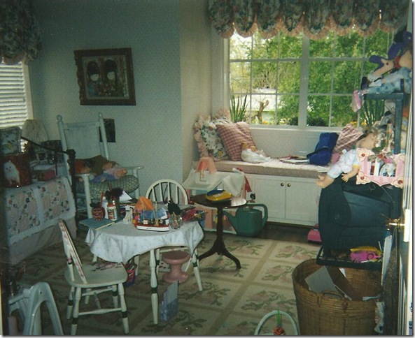
The history of our guest room is a long one, starting when it was used as my daughter's nursery. At that time, it was wallpapered in an English paper of pink and white dots and it was decorated with a Waverly (remember Waverly?) pink and green chintz and a cotton pink and white ticking. There was an iron daybed and a dhurrie rug that I liked to pretend was really a high end needlepoint.
The guest room as it once was, a nursery.
What a dump! Well, if I could go back 14 years, I would certainly style this mess!!!! This is definitely the room of a very active little girl who liked to play with dolls and toys, instead of with boys like today. Oy! I even spy a play telephone sitting ready on the side table - a hint of things to come!! The iron daybed is on the left with its pink and white ticking bedspread. Covering it was a quilt my mother in law made for my baby. The window seat's cushion was also in the pink and white ticking and all the pillows and curtains were in the Waverly chintz. The dhurri, or, faux needlepoint rug, is shown. Trust me, this room used to be really cute before "the Princess" starting growing up and making a mess of everything. As it turned out, my daughter grew bored with this room (more hints of things to come) and moved into another bedroom, leaving this room to slowly languish, unused. In order to get the redecoration of the nursery rolling, I knew that first, the wallpaper had to go. So one day, I had my painter remove it and paint the walls a color very similar to Restoration Hardware's Silver Sage. The iron day bed was given away, as were all the pillows, the ticking, the chintz and the faux needlepoint rug. My daughter moved on too - to Ikea and West Elm. A few years ago she redecorated her new room, by herself and with very little help from Mom. Yes, it was hard for me to relinquish that control, but Elisabeth is willful and very independent. Here's what her room looks like today:
The Princess' room today.
The bed, bookcase, and tables are from West Elm. The mirror and desk are from Ikea. I had the softgoods made for her from what she picked out: silk purple for the windows and a crushed silk velvet for the duvet. The walls are a silvery lilac and the ceiling is a deeper purple - both from Pratt and Lambert's faux paint line. The light fixture is made from trendy capiz shells. She's been hinting lately that she wants to move back into her old room, which is now the redone guest room. I am hinting back too, "I don't think so."
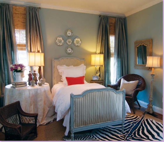
The guest room as it was photographed last year for Houston House and Home magazine (read the article here.)
Last year, you may remember, my home was photographed for a Houston magazine: Houston House and Home. Above is how the guest room looked then. I was given a very short time to get the empty and mostly junked out room into shape last year. The bed, an antique french day bed I bought on sale from Maison Maison, was luckily already upholstered in a green silk stripe. I bought some white linens, curtains and lamps from Restoration Hardware. The skirted table is Bennison - a nice left over from a client who rejected it. The zebra was new, bought at Round Top and layered over seagrass. The day before that shoot last year, I ran out and bought two orange pillows for a color pop from Area. I thought it looked ok. Apparently, the national magazine thought so too - they wanted to put it in their own magazine. After last year's physically tiring and mentally exhausting photo shoot, I swore I would never do it again. But, somehow, here I was, less than a year later, again welcoming strange photographers into my house. Of course, nothing is ever easy.
Exactly one week before the big photoshoot, I received news from the local scout. She had a list of things the editor wanted changed for the shoot. Oh? Really? The editor and art director wanted a new window seat cushion (made out of the Bennison fabric, no less!) The zebra rug HAD to go - apparently their readers object to zebra rugs, the suzani on the chair also had to go (suzanis are too bright) and the neon orange pillows must also go to be replaced by other pillows (like what other pillows, I wondered?) Now understand, I had known this shoot was going to happen for about three months - three months that I could have gotten all these changes done with no problem. Instead, the editor gave me one week to get the new cushions and pillows made. Luckily I had a little fabric in the garage left over from a few jobs, so I didn't have to order the Bennison fabric which never would have arrived in time, never mind how expensive it is. I called my trusty assistant Monica, from Custom Creations by Monica, and she ran over that night to measure. In the end, she got the workroom to rush the new window seat cushion, 7 new pillows, a new seat cushion for the wicker chair, and two new cushions for the two child's chairs. I ran out and bought a new Blanc d'ivoire desk and lamps to take the place of the hideous TV stand in the room. Monica showed up exactly 6 days later with her bounty, thank God.
When they all arrived. the scout and the photography crew seemed happy with the new changes. It was a much different shoot than the one done last year. This time, each photograph took over an hour to complete - the attention to detail was that time consuming. The crew was uber professional and fun at the same time. They overtook my small house like an army at headquarters. It was an interesting learning experience and I am anxious to see the finished product. I've been told that my family room will be shown in October and the guest room will be in another month's issue. I'll be sure to share the details as soon as I know them. As for the changes the editor asked for - I'm happy with most of them and plan to keep them. In the end, the editor and art director, the scout and the photographer all knew better that me, I guess.
And one last note: apparently the magazine scouts are always on the look out for homes to nominate for publication. If you think your house is "photo ready" or could be with a little help, please email me. I'd love to pass on prospective homes to them! Don't be shy!
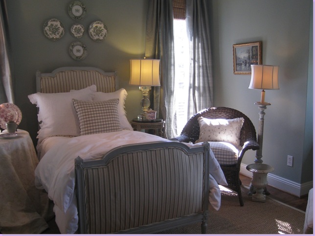
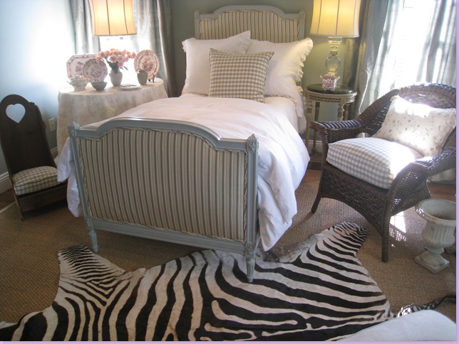
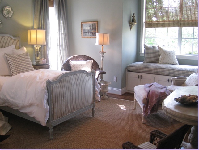
Here's how the guest room looked for the new photoshoot. Chelsea Editions check and vine pillows replaced Area's orange ones. I added the cushion and pillow in the wicker chair. Zebra rug was pulled out. Everything is softer, the colors muted - no bright colors or contrasts.
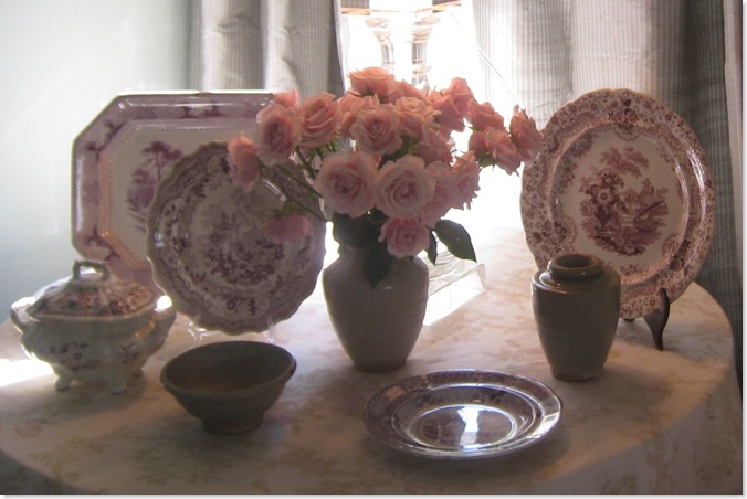
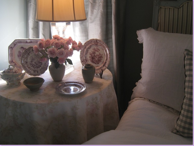
The mulberry transferware used to be on my entry hall table but now is permanently in the guest room where it looks much better on the Bennison skirted table.
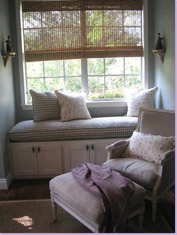
The new check window seat cushion with new pillows. The chair and ottoman are from Blanc d' ivoire. A softer lilac pashmina replaces the bold suzani that the editor asked me to remove. I like this much better and plan to keep this change.
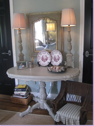
I took out the hideous tv stand and added this table from Blanc d' ivoire along with their lamps. The mirror is from Joyce Horn. Cushion was made for child sized chair.
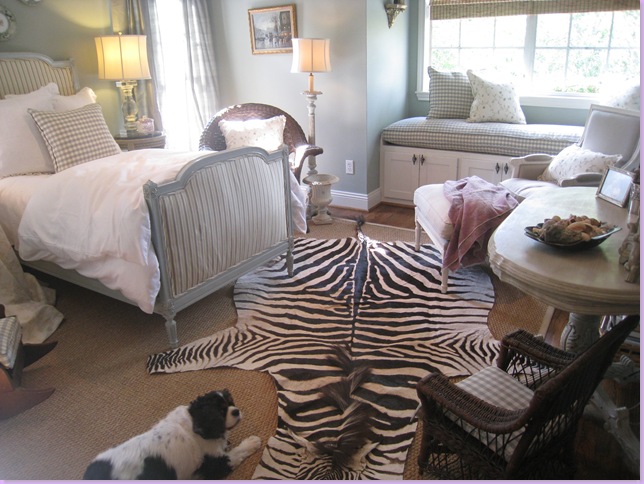
Now, the big question is - should the zebra rug go back in? I can't decide - so please leave me a comment with your opinion - yes or no! I'm just not sure I like it in there anymore. What do you think? Here are some pictures to help you decide:
The zebra rug back in the room - yes or no?
With or Without?
Sammie Jo loves it, but I'm not so sure - what do you think? Too much?
There were lots of changes in the family room too - I'll show you those in a few days. Remember - email me if you think you have a house worthy of a magazine shoot. Seriously!


How exciting - the room looks wonderful! I'm amazed that they asked you to redecorate!
ReplyDeleteAs for the zebra, I think I'm liking it without - it seems more serene.
Can't wait to see it published!
-Lana
I love the zebra rug; an animal print adds drama and texture. It's a shot of glamour and the contrast makes everything else stand out more.
ReplyDeleteSuzieQ
You have more goings on in your "neck of the woods". I love the new room for the shoot. I love the old room too. My take is....without the pop of color(pillow etc.) you loose the pop of zebra. It now becomes just a different "wonderful"...serene and lovely.
ReplyDeleteI might be ready for a shoot of my 1924 cottage in Pasadena, but I'm in SoCal. Thank you Joni for being like a dessert a day. Ginny
very funny Ginny!!!! haha
ReplyDeleteNo - all zebras back to the veldt. We've just seen too many of them. Lovely, inviting room without the horse rug.
ReplyDeleteNo - all zebras back to the veldt. We've just seen too many of them. Lovely, inviting room without the horse rug.
ReplyDeleteNo zebras, please. A zebra rug is a sad thing. The roomc looks so lovely just as it is.
ReplyDeleteCluny
No zebras, please. A zebra rug is a sad thing. The roomc looks so lovely just as it is.
ReplyDeleteCluny
I LOVE THE ZEBRA!! I think its fun.
ReplyDeleteHey Joni,
ReplyDeleteI really didn't think I could love the room more; but I do AND without the zebra please. Oh, so soothing and lovely. Can't wait to see you in that nat'l publication.
Those are 2 really different looks. I agree with Ginny.... the first room with the pops or orange go so well with the zebra. This new room is really calm and country chic and doesn't suit the zebra.
ReplyDeleteCongratulations! Love your blog!
I loved the zebra in the room when it also popped with the orange pillow, but now the room is so calm and soothing! I would leave it out. I always thought the room was beautiful the way it was, but now it is fabulous. I will save a copy of the article when it comes just like the last time!
ReplyDeleteI love zebra stripes but I like this room without the zebra rug, maybe a brown and white zebra accent would be nice, less contrast.
ReplyDeleteYour home is beautiful and I adore the zebra rug! However I like the room without it. My master bedroom is an "Out of Africa-ish, Ralph Lauren, on the conservative side(I did not want a safari look so I have no animal prints yet) Where can one find a rug like that? I was pleased to see you use the bamboo shades with yummy silky curtains as I have done the same thing in my bedroom and have raised a couple of eyebrows, I felt confident in my decision but now even more so. Thank you for sharing, Paula
ReplyDeletePut the orange pillows back! :)
ReplyDeleteJoni,
ReplyDeleteCan I come and stay in your guest room? Sigh! It's so beautiful! I like it without the zebra rug. I know the bed is an antique - is there any company that makes new beds in this style? Also, what color are the walls? Love it all. Thank you.
This room is beautiful! How do I get reservations?
ReplyDeleteAlthough I do love the Zebra rug, I think the room looks better without it. Doesn't work with the check for me.
Can't wait to see your home in the article!
Have to agree that the zebra needs the orange. Loved that pop of color in the original room but the new version is so serene. You just want to plop down into one of those chairs or onto the bed. If you want that dash of contrast that the zebra rug gave, how about leopard (needlepoint, maybe)? Ah, so much fun to spend someone else's money. And yes, please, what is that wonderful paint color on the walls?
ReplyDeleteMy absolute fave is the guest room with the zebra and the red pillow - but don't get me wrong, the rest is GORGEOUS!!!!
ReplyDeleteIt pains me to say this, as I ALWAYS welcome a pop of color and contrast, but I actually like the new room without the rug. Now, the old room - loved it with the rug.
ReplyDeleteHow exciting for you, Joni! I swear, you always have something happening around you - I love it.
too crowded with stuff; no zebra rug and a more refined, not-as-wide chair in place of the wicker one on the right side of the photo.
ReplyDeleteFirst of all, you are such a talent. I think that you are just pretty darn cool :)
ReplyDeleteSecond, I love your guest room! I personally prefer it without the zebra rug, but I like everything in harmony and at "peace" and the rug just changes that for me. However, I can see also how it lends a whole new look to the room and some style as well.
Thirdly, how awesome that you will be featured in another magazine!
Hi Joni
ReplyDeleteCongratulations on the publication!!! It is well deserved. I think your room is beautiful whatever way you choose. It is fun to be able to change your look.
Not keen on the rug at all - too much for the "strong delicacy" of the rest of the room. If you want a skin rug, I'd say a sheepskin would be more neutral.
ReplyDeleteVery English manor house - which is my forte. Love the pink and white transferware china. We lived in London for almost 10 years and I am an Edwardian girl myself. Surely do miss the antique fayres and auctions I used to attend on a regular basis. Back in Katy now (just west of you I guess!) and have brought England to the western suburbs! :)
Congratulations, Joni! How exciting! I'm dying to know which publication you'll be featured in. Now I have your house and Andy's to look forward to.
ReplyDeleteI think the zebra rug looked fabulous in the room before you made the most recent changes, but think the updated version looks better without it.
So stimulating....all this analyzing. Interesting how just a couple of changes can create such different effect. A good lesson for us all! Cote de Texas, you are like a favorite teacher....fun and informative. Ginny
ReplyDeletewow - that room is gorgeous! What color did you use on the walls? I would love to use that for my master bedroom - it looks so calming and serene.
ReplyDeleteI vote no on the zebra :)
Hi Joni, I love that room and didn't think it could get better but it did!!!!! I love the calmness of it now. Leave the Zebra out. If you want to sell it...we can talk. LOL I'd love it in my den! Congrats on the photo shoot. You deserve this and more!
ReplyDeleteWow love your taste...have to agree with Ms Wis. the orange and the zebra did it in the old room however i would still like to see something over the neutral rug, i.e.needlepoint, or another animal with more subtle hues. Would you ever consider making that long drive up to Dallas? Would love a consult!!!! TEXAS FRANCOPHILE
ReplyDeleteNo to the zebra. What a beautiful room.
ReplyDeleteI really think the zebra scatters your eye too much. However, if you could find a rug with the antique, faded look of an Aubusson that also incorporates the wonderful color of the walls at bit, that would, I think, be perfect. I also rather think zebra rugs are too 80's for the serenity of this room.
ReplyDeleteAlso a no to the Z rug. The room is very tranquil and serene...and can I guess on the national mag?? I'm thinking House Beautiful...yes? no?
ReplyDeleteThe room is absolutely perfect! Congrats to you, they are lucky to profile this room on their publication.
ReplyDeleteAs for my choice with the rug. Well if your looking for more of a traditional look then I'd go without the zebra. But if you want more Hollywood glamour, which im suspecting is the whole point of the rug to begin with...then go for it! It still looks great in the room.
Oh...and your princess's room is wonderful!
Joni - A big congratulations on your magazine shoot! Can't wait to see it. I vote no on the rug. It's too strong for the serenity of the room and overpowers all the other more delicate features.
ReplyDeleteActually I think your zebra rug would help my home become more "photo shoot ready."
ReplyDeleteLoved the post and love the guest room.
Your guest room is so charming and tasteful, Joni. I think I like it better without the zebra rug, although I do like zebra rugs. Your home is perfect for a magazine and I can't wait to see it! I wish they'd feature your entire house(with no changes! LOL)
ReplyDeleteXO
Joni, loved that zebra rug when you posted that room last year, such a great pop in there. I think I'll have to agree that with the changes, it might not be needed now. I bet there is another spot in your house you could use it. I really love that zebra & would love to have a rug somewhere in my house too.
ReplyDeleteYou have such excellent taste in pulling a room together. I'm trying to take lots of notes from you.
Rhoda
No zebra... a nice faded oriental rug would look great.
ReplyDeleteThe room is lovely. The zebra rug gives it a "busier" look. I love your blog --I check it every morning!
ReplyDeleteWonderful lesson -- and brillant posting! I do love the changes and must agree that the zebra rug might do well in another area of your home. The room looks like "summer" -- cool, fresh and calm. Perhaps a faded oriental for the winter months? Something to bring out the mulberry in the china? Perhaps a mulberry accent cushion?
ReplyDeleteJan at Rosemary Cottage who always takes notes when I read your postings!
Congratulations on yet another photo shoot!!!! I can't wait to see it in print :o) I can totally understand why they picked your family room and guest room for the photo shoot!!! Both are fabulous rooms....why they needed the changes to the guest room though I have no idea!?!?!?! Gosh, I loved the zebra rug in the room before you made all the changes but now.... not so much. I'm sure you will find the perfect spot for it somewhere though! I never tire of seeing pics of your beautiful home...it is always such a treat!!!!!!!
ReplyDelete~Des
I love the new look with the serene colors and NO zebra rug. Congrats!
ReplyDeleteI love your blog!
Congratulations! This is so exciting. I can hardly wait to see it in the mag.
ReplyDeleteI can understand why they went for this room--it's beautiful! I have to vote for "sans zebra," since I don't think it needs it. But either way, I'm loving it.
Boy, do I remember Waverly! I was working as a designer's assistant in the early '90s and we Waverly'd everything to death. I have a soft spot for those old patterns, though, so I loved seeing your daughter's old room with it. Brought back some memories! -Julia
Definitely NO zebra. Why? Just visualize for a moment the terrified animal caught in full flight and then its bloody carcass left behind so you can walk on its skin. . .
ReplyDeleteJoni, really liked the room before the re-styling for the magazine shoot; really LOVE the fresh new look you gave the room with the changes. No to the zebra, I am afraid; I am curious as to how a nice needlepoint rug or a faded Aubusson would look in the right colors. Glad you are getting national ink! You and your blog are definitely star quality to all of us!!
ReplyDeleteeveryone hates the zebra! ok!!! I get it! My husband loves it. ha!
ReplyDeletethanks for the overwhelming support - I'm humbled. everyone is just tooooo nice!
(well almost everyone - except one; not bad!)
And not one person thinks their house is photo ready! Come on people!!! Someone out there has a pretty house!!! Dont be shy!
I think the room is so pretty and lovely , I personally liked the orange pillows , a little jolt of fun, for the zebra , no, I like it much better without, it looks like too much .
ReplyDeletewow what a great room.
Chris
It is Ikea , I wish they would come out with more designs .
ReplyDeleteChris
NO zebra! the room is so soft and delicious w/o it. NO zebra!
ReplyDeleteBeautiful both ways...Can't wait to see your room in a national magazine- what a highlight!!! Way to go C de T!!!
ReplyDeleteJoni...i left an email regarding my home but from your comment above regarding a shoot ready home, I am not sure that you received it. Ginny
ReplyDeleteGinny - send it again !!! I must have not seen it.
ReplyDeleteoh wait - Ginny - do you mean Pasadena Texas or Pasadena CA - I think I thought you were kidding me. ok = send me another email asap, ok?
ReplyDeleteOh what a beautiful room. I'm salivating over the transferware, and that bed makes my heart skip a beat! Congratulations on the magazine exposure -- that's so exciting, and I'm sure it will be great for business, too. :)
ReplyDeleteAs for the rug, I'm thinking it looks a little too busy, especially in that last photo. But it is a totally wonderful rug...
Can't wait to see the family room!
xoxo,
Mary
Love the zebra with the pops of bright color, but in the more muted room, it seems like it fights with the serenity. So, one vote for no. :)
ReplyDeleteJoni...sent you info by email, Ginny
ReplyDeleteI vote no also. The room is beautiful and peaceful w/o it. I, too, read "you" every morning. Thanks for all your hard work on this blog. Christy:-)<><
ReplyDeleteCongrats on your photo shoot! That is a testament to your great decorating skills, I'm sure. Can't wait to see more photos from the shoot. Regarding the zebra rug, I prefer it NOT in the room now that the colors have been made more subdued. I think it's too busy with the rug and no longer suits the room. Your guestroom has a swedish look to it and the zebra rug would be better suited for a contemporary or eclectic room, I think. I love the seagrass rug by itself.
ReplyDeleteKelly
I sent a comment, but guess it did not send! I voted NO on the Zebra the 1st time and I vote NO again! The room is too perfect without...less is more sometimes! Love the skirted table...glad I could get in the act...tee hee! Can't wait to see 2nd shoot.
ReplyDeleteMy house may be camera ready soon, just ask my designer!
hb
I loved this room the other way, Joni. The new way is gorgeous, too! I'm thinking without the zebra, with the new look, though.
ReplyDeleteI'll think about the photoshoot worthy possibilities. Not sure we're ready.
I'm just now seeing this post. Visiting 3 year old. We're having fun!
Pat
Thank you for your quite valid question on my blog.
ReplyDeleteAdmittedly, I feel differently about domesticated animals partly because they are not facing extinction, partly because in the case of the chicken death is sudden with no panicked fleeing beforehand, and partly because I see a great difference between using the animal for decoration or using it for subsistence. This said, I realize that vegetarians and vegan would find my arguments specious. . .
I was always taught that when I visited someone's home, I should use my manners and be nice. I should appreciate the trouble the hostess has gone to making me feel welcome and I should try to engage in pleasant conversation. I do want to be invited back.
ReplyDeletePerhaps Francoise does not realize we stop by for plesantries, not debates!
Hi Joni......I love the zebra but not with the changes you made. I like the soft serene look & don't think it is needed. It looked wonderful the other way too & the zebra was great in the other look. Congratulations!
ReplyDeletebonnie
Congrats on the publication! I think I have to lean toward no zebra in the room. It seems so serene without it.
ReplyDeleteJoni, congratulations! Yah for you!
ReplyDeleteI'm a scarily passionate animal lover (and vegetarian) and the zebra just makes me sad and nauseous. You don't need it.
Joni, you are an absolute talent! I love looking at your rooms and you compile simply THE BEST posts with lots of details (which I love...gotta know where everything came from and track all the changes!).
ReplyDeleteI love all the changes you made to your guest room - it is now very soft and pretty. I do think the zebra adds and awesome punch, so whatever you do will work. It seems boring without, but then again, it seems like such a contrast in the room, which seems too elegant and not edgy enough for the zebra.
If Sammie Jo loves it....
;)
Your daughter sounds lovely, and I love that she is confident and so talented! like a little chip off the block!
Congrats on your publications!! I am so impressed! Wish you were closer and I'd get you to come help me whip this place into shape!!
Love to you and yours and I am so happy for your success!! P.S. I also love the Blanc d'Ivoire chair and ottoman. I would love a combination like this for my living room. Was it expensive? Can I get it here? I will go investigate!
If not, I may need to hire you to ship for me. Calgary shopping sucks! hehe. Just teasing, but thanks for the ideas! And I love the check pillows!
xo Terri
I have to vote no to the zebra rug for I find it more than jolting to such an otherwise serene, beautiful environment. It actually makes me sad to look at it, reminds me of all the innocent creatures who have lost their lives for the sake of decorating trends. I hope the day will come when that is not the case, as it happened with mink coats.
ReplyDeleteWAY too much w/ zebra rug. Gorgeous without!
ReplyDeleteI like the zebra rug when you use the bright colored pillow. But otherwise, without. What a gorgeous room. I want to come be a guest at your house! What color is that on the walls? It's really pretty! And it looks like your daughter has inherited the decorating gene!
ReplyDeleteLove the changes to the room and can't wait to see it published! Like the others, I prefer the room without the zebra. Also, I couldn't help noticing your woven shades. Are they Hunter Douglas or Conrad? Or are they the ones you found at Target? I am trying to find some bamboo/tortoise shells shades that you see in the mags all the time, but the manufacturer is never listed in the resource guides! Congrats on getting published again.
ReplyDeleteDitto to what LaLa Lovely said. I LOVE,LOVE,LOVE the room with the pops of contrast from before, but if you are not going to bring back that hot orange pillow, then nix it and IMMEDIATELY ship it to my address. You do have my address, riiiiggght?I mean, I do have a birthday coming up ;) Teeheehhee!
ReplyDeleteThanks for the peek into your home! What a gorgeous room. I love your paint color in there...I think I like without the rug now- just makes it so peaceful and calm in there....ahhh I would just sit in there all day long and read a book!
ReplyDeleteI'm here from Hooked on Houses. I am a transplanted Houstonian. I miss browsing Area.
ReplyDeleteSuch a serene guest room.
It would be a dream come true to have my house photographed!
Joni, I LOVED reading this story. My favourite posts are of when you talk about your home or the homes you've worked on. I LOVE seeing the before and after pics, they're so inspirational. I ADORE your newly decorated guest room. The colours used are my absolute favourites. I'm sure anyone would feel honoured to sleep amongst such beauty. I agree the room looks more serene without the zebra rug but I hope you're able to use it somewhere else in your home cause I think it's fabulous.
ReplyDeleteAnna :)
Anon: my shades are not HUnter Douglas, nor are the Conrad (ha!) they are Target - yes, my dear, Target!!!
ReplyDeleteJoni
Thank you everyone!!! I am overwhelmed by the response!!! Zebra - NO!
anon: I don't know the color! It's Pratt and Lambert. But it is very similar to Restoration Hardware's Silver Sage - that would be pretty much the same one. I matched it to that color. I just dont remember the name! sorrry.
ReplyDeleteI vote -No Zebra.
ReplyDeleteMegan
Joni - this is so exciting - can't believe no one asked which magazine. All better mannered than I. Congratulations, it's well deserved.
ReplyDeleteLast week, I would have said "take it out". But this past weekend, we stayed at a B&B and our room was done in an African theme. That was way outside of our box, including the zebra bed spread, but it still was a fun room for a weekend and something we probably would never experience again. I think that if Sammie Jo likes it, it sould stay. It won't be hard to pull it if she outgrows the look.
ReplyDeleteWhoa, I missed all the excitement while I was away! How exciting!!!!
ReplyDeleteI loved the room before, and I love it now. I like the zebra rug before but now it commands too much attention in such a soothing room.
Love it, so exciting Joni!!!
Thanks for sharing all the photos and your experience! I am SO not ready for photographers. And I will likely move before that day ever comes.
Happy day,
melissa
What a cute room -but I liked it better before the changes really -but I could do without the zebra rug. Looks like a charming place for guests! I loved seeing the evolution of the room over the past 14 years!
ReplyDeleteJoni,
ReplyDeleteI loved the room both ways. I happen to love zebra and/or cowhide rugs. But, I agree with the majority, the new incarnation of the room looks better without the rug. It looks good with it, just better without it. I just think the direction you went is very restful for the photo shoot, zebra makes it less so.
Ok, by the way, these photos have convinced me, Target here I come! I will give up my obsession with the Conrad shades in the Aichler house. This will greatly relieve my husband!!!
Congrats Joni!!! I'm so excited for you! (I'm with Patricia- we want to know which magazine!!!). I love both versions, but I'm with the others- the new version should be zebra-less. But I really love the first version too!
ReplyDeleteJust came here by way of Stylecourt.What a fun blog! I will definitely add this to my daily routine. Love your work!
ReplyDeleteSuch a lovely serene room, I vote no for the zebra, if you think it needs a punch do it with pillows.
ReplyDeleteKathy ;)
Okay, here's what irks me . . .
ReplyDeleteThe magazine likes your work and want to show your rooms. Your fans agree! It shows they recognize a true talent. Why, then did they tell you to radically change the rooms?
As much as we (your fans) feel like we know your style since we are devoted to your blog, I hope I'm not being too presumptuous to say that both versions of the guest room look like you. One version is the exuberant you--bold and confident--and the new version is the more contemplative, serene you. So, I'm not complaining that the magazine made you redesign the guest room to reflect someone you're not, I'm just irritated that they didn't like you just the way you were to begin with! Perhaps my skin is a bit too thin.
For what it's worth, I like the zebra skin in the first room, but prefer it left out of the new room. And, congrats on the recognition! You certainly have earned it.
Angela P.
No zebra rug. It is not really unexpected in a good way. It sort of distracts from the beauty of the room. If there were other more contemporary pieces in the room, maybe, but not on its own.
ReplyDeleteSo that's how you get published. Buy the stuff the editor orders you to buy...
ReplyDeleteAngela: here's how it went - the orange pillows were too much of a color pop - distracting in the scout shoots. their readership doesn't like zebras by survey - so they asked that those things be taken out of the photos and they wanted a windowseat cushion - which I used to have. But they did want it to basically look the same - I ordered all the cushions and pillows and things because I wanted it to look the best it could. it still looks like me - just a little change which I do like and probalby would have done on my own anyway one day (new cushions and pillows - more decorated - I just never cared that much before!)
ReplyDeleteANON: why are you such an asshole? always? they didn't order me to buy anything - they asked, I agreed. I could have said no.
I feel like I am the guest and I enjoy my stay at your home ! This room looks gorgeous ! Now , I'm waiting for the family room !
ReplyDeleteI feel like I am the guest and I enjoy my stay at your home ! This room looks gorgeous ! Now , I'm waiting for the family room !
ReplyDeleteOkay! I can follow that progression without getting defensive on your behalf! I'll just think of it the way I treat my house before guests or a party: I like to put my best face forward, so I "freshen things up" and get around to doing the little list of things I perhaps should have already done. I do agree that it looks like you (to the extent I presume to know).
ReplyDeleteIt does look lovely, Joni.
Angela P.
Just found your blog-I am addicted!!
ReplyDeleteI really love the seagrass rugs. Do you mind sharing where you get them-and do you use a pad underneath? How do you care for them, do they stain? Are they comfortable to walk on?
Thanks for the fun blog-
Meg
Meg - email me - I'll be glad to explain it all!
ReplyDeleteJoni
You go girl! Hmmm. I wonder which magazine. I am guessing in my head right now. Congrats! You deserve it!
ReplyDeleteHi Joni
ReplyDeletecongratulations! Again great post-can't wait to see which magazine. Oh the zebra rug- I love it without!
Joni,
ReplyDeleteI could not agree more w/ your statement to Anon.
Anon, go find another blog to post your pitiful comments. Obviously, you have no life!
Joni, congratulations! It's so nice of you to share the behind-the-scenes info too. Love what your daughter did to her room! It was nice of you to let her have her say. That duvet looks so soft!
ReplyDeleteJoni, congrats! I'm so happy for you. This is great news!
ReplyDeleteMuch prefer it without the zebra. Looks great!
ReplyDeleteI love your blog! Someone else asked about seagrass rugs and I wanted to ask you a question:
ReplyDeleteI have a sisal rug in my living room (pretty easy to clean), but want to get the more textured seagrass for the dining room. I'm wondering, though, if it's difficult to clean and would not be a good choice for there? I would just love that rougher, natural texture mixed with the fussier dining chairs I have, but I do have two small children, so food does end up on the floor.
Thanks for all the work you put into this blog-- I love the pictures and your writing!
Hi Joni,
ReplyDeleteCongratulations on well deserved attention and a shoot in a magazine no less. I never realized how grueling a shoot could be and that some would ask you to change cushions and etc. As usual, I always learn something new from your wonderful blog. I actually do Love zebra rugs in general, but just not in this particular room as the rug looks like it's sort of sticking out like a sore thumb to the rest of the room. Perhaps there is another room or place for it?
Your house looks absolutely amazing and I would love to see more photos of your home that the magazine chose not to show!! I'm ready to jump into that bed in your guest bedroom it looks so inviting! Thanks for sharing your experience and amazing home!
Hugs,
Karen
Wow! Even after 103 comments I feel compelled to say that I loved the room as it was before, and agree with commenter #3: the zebra rug and the orange pillow "popped." But one without the other...doesn't make visual sense somehow. The room is lovely either way; just go with what makes you happy! :)
ReplyDeleteJeez - so many comments - i had no idea! thanks y'all so much and I think 3 people liked the zebra! too funny! thanks a lot, y'all - let's move on. :)
ReplyDeleteLove the zebra rug for the photo shoot, but for every day it looks a little much. I love the room! Those shades are Target? Love Target
ReplyDeleteJoni, your daughter's room brought back many good memories of my daughter's room...an iron bed and Waverly. Your rooms are beautiful. I would love to see pics of the rooms you thought looked better. Its hard to believe you have even better rooms!!!
ReplyDeleteLoved both rooms, but I ended up loving the one fo the shoot, sot serene, elegant. I hope you will go with that. The zebra rug will look better in anoter room
ReplyDeleteSusan
Love this site!
I had to laugh at ANON Joni. I get them too...always those who leave nast comments are ANON! Cowards!
ReplyDeleteNow, CONGRATULATIONS! Your home is glorious from top to bottom. It deserves to be recognized!
I would give anything to be in a photo shoot...it was always a dream of mine, to showcase what it is like to be a military family on the move and how to showcase all those trinkets we fill up in while on that journey. I doubt my home would be worthy but i would love it.
I know thjis is great fun for you...I envy you the grand home and all the wonderful details such as the mouldings and window seats.
Your room's colors are so lovely. I do really like the use of the neutral rug..sisal is it?...and see what others mean by how it fits in woth the tranquil mood.
Of course, I love adding something that pops or that is s great surprsie and that rug is it!
I guess I am on the fence huh?
No help at all am I? But I doubt you need MY help! *laugh*
Grace will be shown your daughter's room and I have a feeling she will fall head over heels for it. We have found a wall unit at IKEA that she desperately wants. In the Fall we will paint her room and begin to de-little girl her space. Not fully yet but she is all about closets and mirrors and clothes and modern.
Thank you for another wonderful post and again, congratulations on another photo shoot experience!
Love,
Sue
I say, keep Sammie Jo, but store the zebra rug for another spot later..............
ReplyDeleteThe feeling of peacefulness you created is perfect for the room now. In the photos the rug is distracting my eye from everything else I love in the room.
When can I sleep in this room?
Fabulous revamp-!!
Denise S.
congrats on being published! that's so exciting!
ReplyDeleteand if your guest room is one of the "undone" rooms of your house, well, then i certainly hope we get to see the rest published elsewhere soon!
as for the rug, i think the room doesn't really need it, but if you aren't going to use it, i can think of a room that certainly DOES need it- my living room! ;-)
Oh Joni,
ReplyDeleteThis is absolutely stunning, and I can't wait to see it published! I love the Zebra rug - and as you posted this back in June I'm sure you've already made a decision - but I think I like the room better without it. I've been looking for a zebra rug though - so that might be why I'm telling you no, so that I can tempt you to roll it up and mail it to me! Now about that whole house worthy of a magazine comment - I certainly don't have the same decor style in my home as you, but it could certainly grace the pages of cottage living or American Bungalow. Have you see pictures of it yet?
hlbvpfgihtmecjuqvnhb, http://nailfunguscurecuretreatment.com nail fungus cure, aqEAZZQ!
ReplyDelete