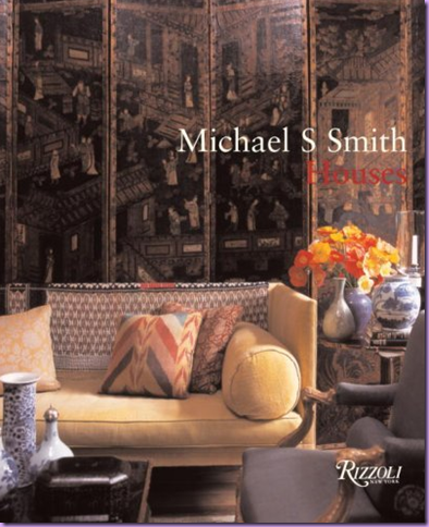
Michael S. Smith, interior designer from California, has been profiled here a few times before: as the designer of the fabulous hotel Shutters and more recently, The Canary, and as Cote de Texas’ Top Ten Designers - #9 (obviously he is a HUGE favorite of mine!!!) Smith’s aesthetic is one that has broad appeal – his interiors are both accessible and sophisticated at the same time. He prefers to use the finest of surfaces, the rarest of antiques, the most exclusive of fabrics, yet his rooms are always friendly and warm. Nothing about a Michael Smith interior says – don’t touch - nothing is ever off limits. How he manages to combine the two – priceless and comfortable - is the mark of his genius. It’s not easy to make the most rarefied seem so cozy, yet he does, perfectly. Smith’s first book, Elements of Style, was a runaway hit and his second, Houses, has been eagerly awaited. It does not disappoint. With the dizzying array of design books published these days, it is difficult for an author to have his book noticed. Even though the competition this holiday season is intense, Smith’s Houses is clearly the standout – a must buy for anyone who is serious about interior design. With the economy on everyone’s minds, many people have become discriminating while choosing a pricey design book, but Smith’s newest should definitely make the cut. A well known secret about many design books is they truly are not an interesting read. The pictures drive the book, not the words. There are, of course, exceptions. Rose Tarlow’s The Private House comes to mind immediately. Tarlow’s pictures are secondary to her fascinating story, though the images are certainly worthwhile. Another design book great, John Saladino’s Style by Saladino, is a bible. So educational and enlightening, Saladino’s book should be taught in design schools – “Saladino 101.” Villa, Saladino’s newest is due out this spring. Smith’s newest book competes with Tarlow’s and Saladino’s on every level. He explains his thought processes on design, breaks it down, and justifies his choices. Written in simple prose, one is able to take away concrete ideas to utilize in one’s own home or a client’s. Interesting to note that Smith cites Saladino as a major influence of his, along with Niall Smith, Gep Durenberger, Michael Trapp, and a host of other notables, most of whom he either has worked for or with.
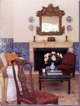
This house, inspired by Portugal with walls made of gorgeous tiles, is featured in the new book. Smith reveals in Houses that these clients actually wanted a Tuscan inspired house. Smith, characteristically bored with the plethora of Tuscany houses in Southern California, suggested the clients look to Portugal for inspiration. The result is one of the prettiest Portuguese styled homes in the United States. Not that there are that many of those!
In his new book, Smith confirms his first love and the inspiration for his own house is the English Country Manor style, with its look of faded beauty. He especially adores Georgian style architecture and furniture. No aspect of an English country home is off limits to his critical eye: he earnestly studies the massive servant kitchens for ideas. It is no surprise that Smith’s interiors are typically filled with English, not French, furniture. In Houses, Smith presents several interior projects recently undertaken. He has many rules for himself which are listed and are intriguing to study: wood floors should be stained and waxed, always leave off the polyurethane sealant. Of course it is much more work to rewax your floors once a year or so, but the effect is worth it. I must agree with Smith on this point . I have clients with wood floors that are waxed and they are far superior looking to the sealed hardwoods that turn dull and lifeless looking within a few short years. Another gem: his hardware was all replated in silver. How gorgeous! He describes the plated finish as being “alive.” Of course, again, the upkeep of the silver plated finish is something that most people would rather not want, yet this exquisite finish should be considered when choosing hardware. If the upkeep scares one off, try limiting the silver plate to the powder room and master bath, where it can be enjoyed with daily use. Most fascinating, Smith’s house was not not painted, instead he used venetian plasters in each room, along with lime washed ceilings. One can only imagine the cost, and the beauty, of his walls. The doors are especially refined: are all paneled of solid mahogany – a luxury few of us will ever experience. Page after page is filled with these musings on design choices and, for that alone, the book is a must have.
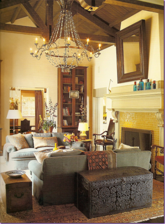
This beautiful house is featured in the new Michael Smith book. A new home, built in the Italianate style, Smith and the architect worked hard to have the house appear to have a patina that is acquired only after a century or two. I find this room stunningly beautiful!
It is fair to note that many of the projects in the book have been published before. There are some new houses to be sure, but there are many that have already been seen in magazines. Yet, this does not detract from the value of the book as it is worth having these beautiful images in one place for further research and enjoyment. And, of course, Smith’s running commentary that accompanies the houses shown is priceless. For each house, Smith takes the reader through the process of his initial inspiration up through the purchasing of the furniture, art, and accessories. Smith is “obsessed” with design and uses that word frequently: “Right now I am obsessed with……..”” he says over and over again. His enthusiasm for interior design and great furniture is infectious. He also confesses a tendency to get bored with certain fabrics or styles. He is constantly on the lookout for the next thing that excites him. Trends have little value to Smith and as soon as something does become mainstream, he leaves it in a cloud of dust – off seeking out a new inspiration. This passion comes through the book loud and clear. He feels great furniture is vastly undervalued when compared to works of art on canvas. To Smith, a beautiful dining room table IS a work of art. Lovers of interior design will certainly relate with this sentiment. While it is true his clients are among the wealthiest, and he is certainly making a nice living, he still retains a air of humbleness. He seems like one of us when he describes his favorite past time - perusing real estate listings, dreaming of a different life to be lived in a new place. One never gets the feeling that his work is a business for Smith. That seems secondary to him. It is impossible to imagine Smith being willing or even able to be anything other than an interior designer. He is that passionate about his art.
In anticipation of the book’s release, there has been a rash of published works by Smith. Below, are the two projects just published that are from the new book.
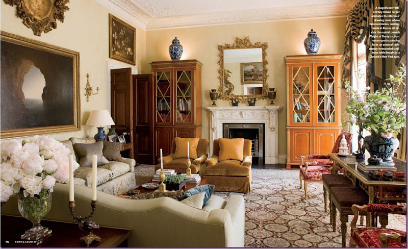
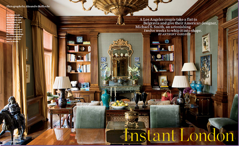
From Town and Country Magazine: This opulent home located in London was created out of three apartments put together all one floor. The owners are American, long term clients, who requested Smith furnish the apartment in a few months time. Looking at this space, it is hard to believe it was put together so quickly, yet this is the claim. The space is spectacular. In this room, notice the glorious rug and the matching bookcases that flank the marble fireplace. Blue and white porcelain, a favorite of Smith’s, finds a home in almost every Smith interior. The curtain fabric is a blue and cream stripe. For expediency, Smith had all the curtains made in New York and shipped over.
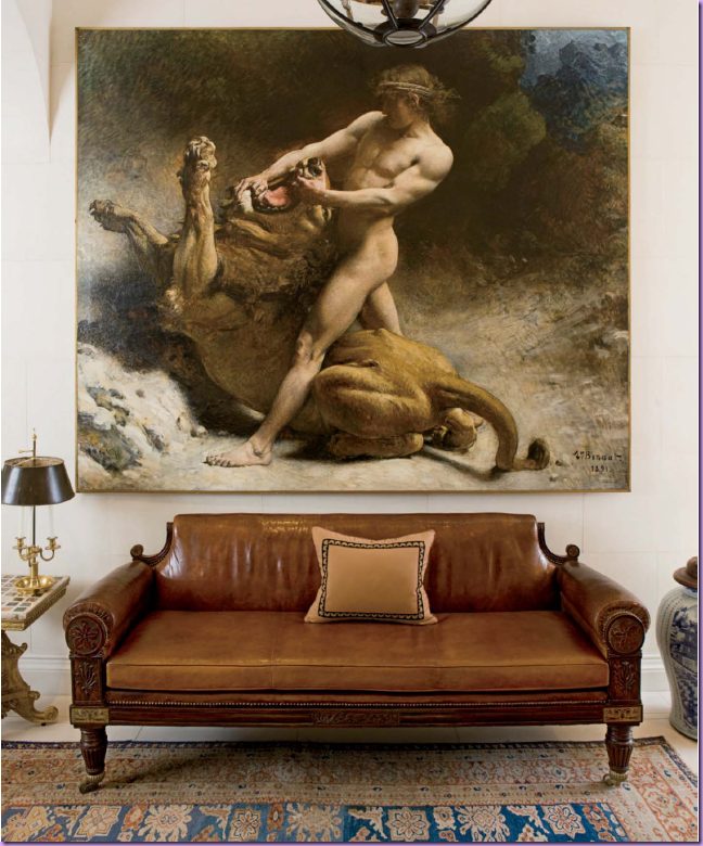
The entry hall. Smith loves the large entrance halls of country houses in England. In his own home, he put a fireplace in his entry room. Here, an oversized painting becomes the focal point in a room without much architectural interest. The leather sofa is quite stunning itself.
The beautiful library shares space with the dining room. The peacock blue colored velvet of these dining room chairs is a particular favorite of Smith’s – he used this same fabric in his own dining room.
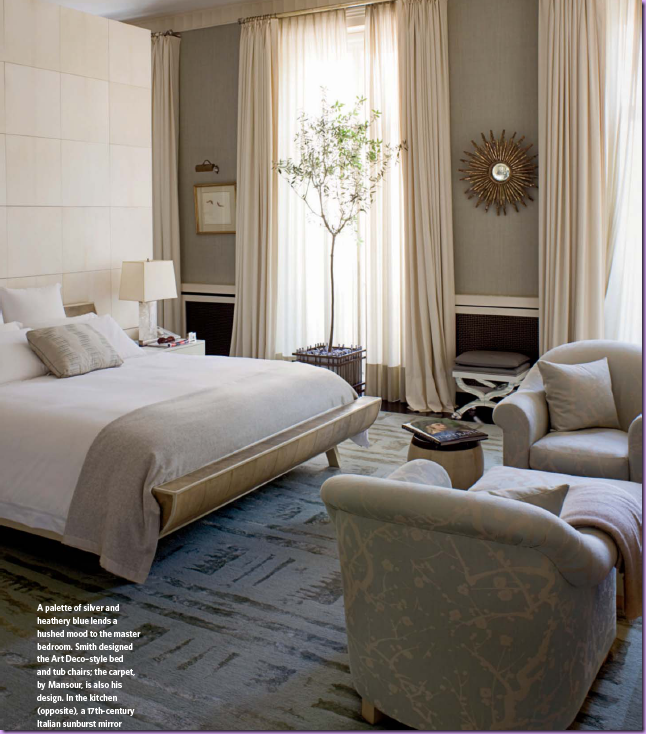
A surprise, the master bedroom has a Hollywood glamour feel to it. Smith designed the rug and the Art Deco styled bed and chairs.
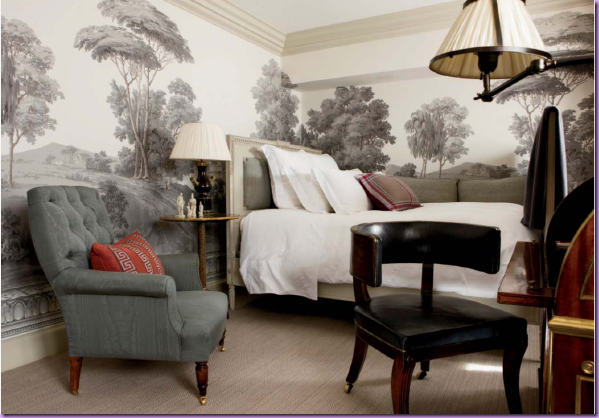
The guest room – where Smith stays when he visits his clients who have become close personal friends. The walls are covered in a Zuber grisaille paper. Smith uses de Gournay and Zuber hand painted wall coverings repeatedly. A miniscule room, the paper elevates it tremendously.
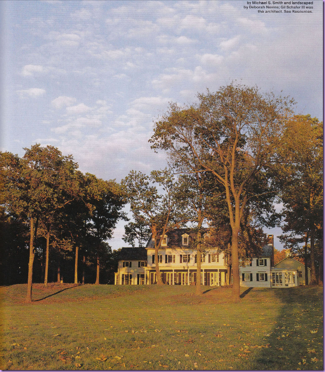
Elle Decor: This weekend and summer horse farm was built in Millbrook, New York for a Hollywood major player. Gil Schaefer III was the architect in charge of the three year project. The house appears old due to the use of original parts taken from an nearby older house that was bought and dismantled for the project: the beams, floors, moldings, and hardware hinges were all taken from the older house. Looking at the design of the facade, it truly does look like an older house added on to over the generations. There is a realism to the architecture that is usually lacking when a lesser architect tries to “age” a new house.
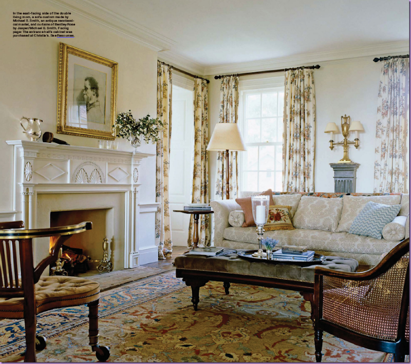
Michael Smith at his best – cozy, warm and inviting. J’adore the curtains – made of his own fabric Bentley Rose by Jaspar. Smith’s fabric line is a favorite of mine – the color ways available are never bold, but instead are muted and “off.” The prints are reminiscent of Robert Kime’s line and his Tree of Life fabric is particularly satisfying.
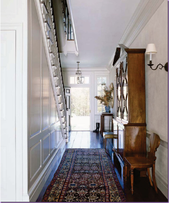
The entry hall with authentic paneling and aged floorboards taken from the other house.
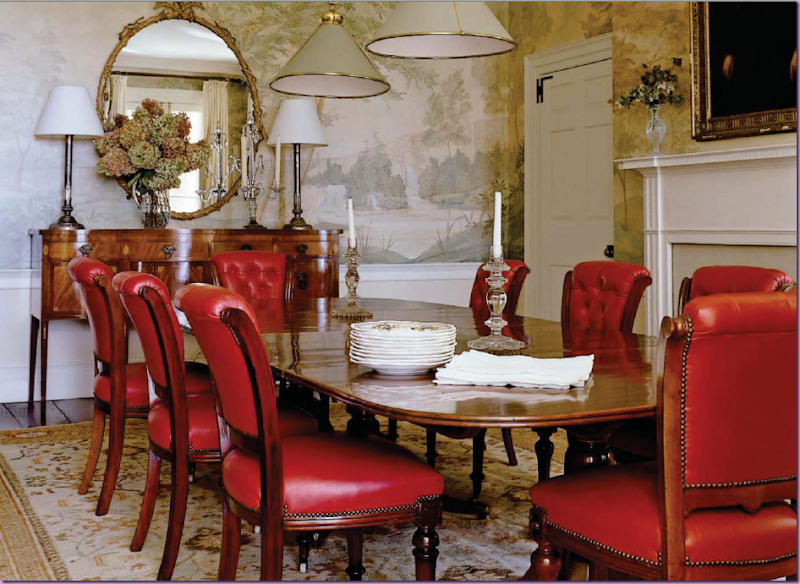
The dining room has a spectacular mural painted to resemble an old paper. Tufted red leather chairs further the English feel of the room. The table is an antique with a patina that Smith says is impossible to duplicate from scratch.
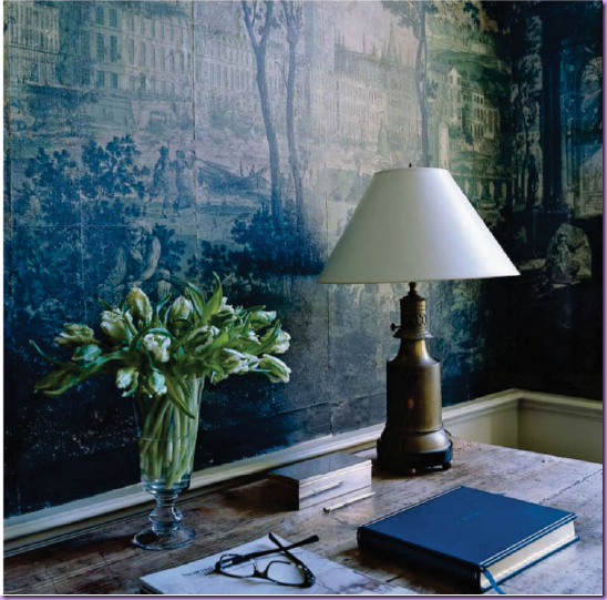
This is actually the mudroom! The paper, bought at auction, is a crumbling antique from the early part of the 19th century.
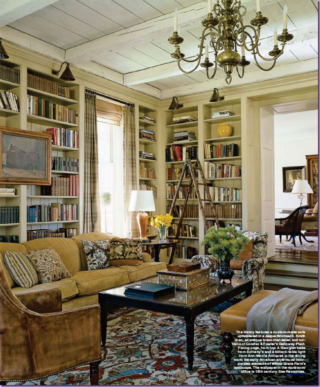
In the library – notice the wonderful wood ceiling and beams, taken from the old house. The sofa is covered in Smith’s cotton linen fabric. The shelves are lighted by charming brass fixtures. My favorite piece in this room - the wonderful library ladder!
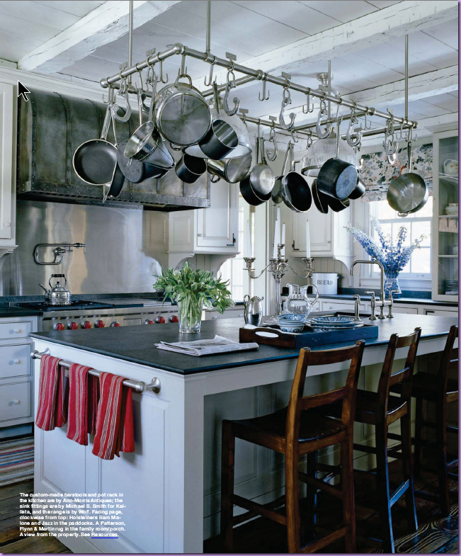
In the kitchen, the countertops are a flamed granite – giving them a matte and dulled, rather than shiny, finish. The chairs and pot rack were custom made for the house.
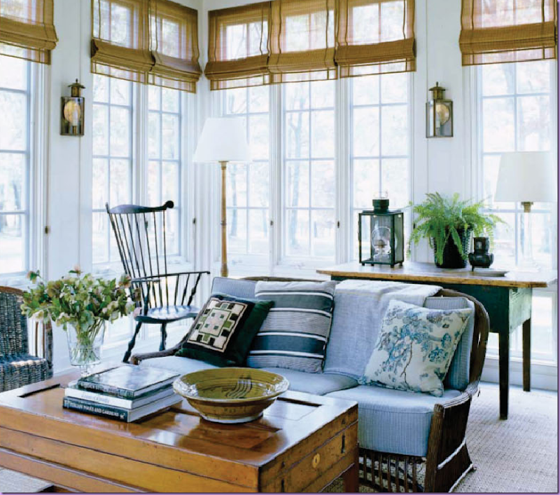
The sunroom features an elegant Windsor chair and rustic rattan sofa. The coffee table is actually an antique French game box. Fabrics by Smith for Jaspar. I love the lanterns used as sconces. The picture in the book of this room is larger and in it you can see the ceiling fan – not just any ceiling fan, but an antique, original ceiling fan!
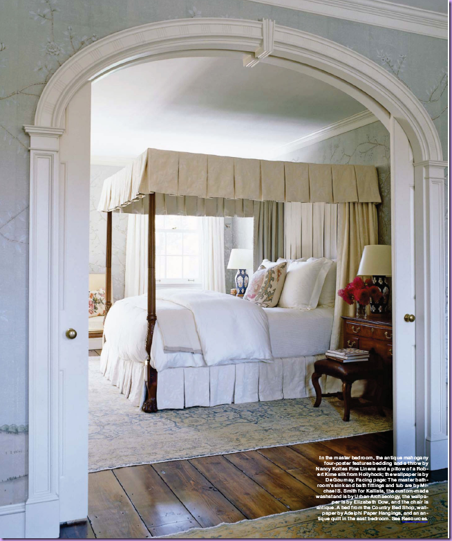
In the master bedroom – you can really see the beauty of the aged floor boards taken from the old house – they are so gorgeous! And the arch – separating the bed and sitting rooms - was also taken from the other house. The wallpaper is hand painted de Gournay.
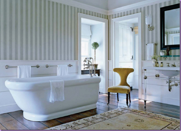
The bathroom features the hardwood floors again – making it just so cozy. In the book, Smith states he likes to add a table with a lamp in bathrooms which immediately warms up the room. What a great idea to use in your own home! All fittings are from Kallista by Michael Smith.
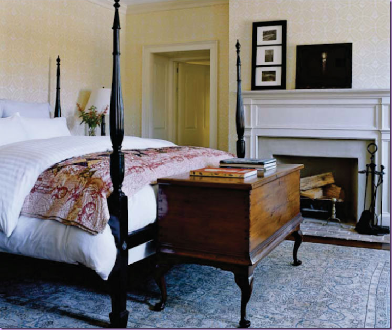
The guest room features an ebony four poster bed. The chest at the end of the bed is the standout piece here. Smith states it is a very rare piece from the Bahamas.
To read Cote de Texas Top Ten Designers #9 - Michael Smith, go here. To order Houses by Michael Smith, go here.

Love this post Joni, especially the mudroom - I understand why he is on your top ten at number 9 xv
ReplyDeleteThanks for yet another great post on Michael Smith and his style. He has a knack for layering and juxtaposing old with new, classic with ethnic and earthy. I especially like those nubby, airy roman blinds in that one living space.
ReplyDeleteThis is absolutely great post about my favorite designer. I am ordering his new book right now.
ReplyDeleteI would like to pinch one of your photos -stairs- for my stairs post , hope you will not mind??
Thank you
V
I don't have any of his books, but I do think I will get this one.
ReplyDeleteI have been a huge Michael Smith fan for quite a while. His designs appear so effortless. None of his rooms look "designed" .Intead, they look like they have been collected over the years.
ReplyDeleteHe truly has a amazing gift.
Thank you for the images.
Yes, I too will be buying his book asap!
xo
Brooke
This is truly magnificent,Just loved it.I just love looking at homes and their interriors.Michael Smith is just so Fab.Marie Antionette
ReplyDeleteThose floors are just lovely! I love his simpler rooms...the sunroom, the kitchen. That mudroom paper is amazing!
ReplyDeleteThanks for a great post! I love your writing style, Joni!
Joni, you always put so much thought, effort, and heart into your posts, and it makes them a joy to read! I'm in love with that library! Wowza! That gorgeous library ladder, the books, those shelves are perfectly accessorized, the furniture looks perfect for coziness, curled up with a book. Oh to have a real library, instead of that bookcase in the guest room. I need about 2 times the space so I can fit in all the books, and accessorize the shelves too! Anyway, fantastic post, as always. I'm definitely going to look for this book! Love his style!
ReplyDeleteJoni, love Michael S. Smith. He is my favorite designer and was my first blog subject. Thank you for your always wonderful review of his book. My favorite is that living room with the mustard colored fireplace tiles. I think it's beautiful and I want to live there!
ReplyDeleteHe is in my top ten as well. I ADORE that london apartment -especially that guest room! Can I move in? I need to get my hands on that article!
ReplyDeleteThis post and the wonderful interiors are cozying ( i know not a word ) up the morning here! It is snowing and super windy! Wish I could be near one of those fireplaces right about now! Michael Smith is a MASTER! I love how he can make a new home look centuries old..and all the beautiful finishes,and fabric and artwork..his homes must be like comfortable museums!
ReplyDeleteThanks for such a wonderful post!
Oh, Joni. . . what am I going to do? This book is one of several on my Christmas wish list (so I don't have to fork over the cash myself for at least a couple of the too-many design books I have around here!), but now that I've had a peek, how am I supposed to wait? Michael S Smith may be my all-time favorite designer, if only because I could see myself moving right in to his rooms. (Except for that entry hall with the naked guy fighting the lion! Not nearly enough testosterone here to handle that!) Thanks for the tease. . . and another great post. I'll try to stay strong. . . Christmas is so close! (Oh jeez, is that good? or bad? Gotta go get busy!!)
ReplyDeleteThanks Joni!
I just received my copy last week and read it cover to cover in a day. Just as you say, the copy enhances the pictures. I also adore that he said things go wrong. Mistakes are made, then you go back and adjust. Indeed.
ReplyDeleteMy heart is beating faster. How I love those Zuber rooms. I wasn't sure I was going to add this book to my list of wants, but I'm afraid it may be topping the list after this delicious preview.
ReplyDeleteHi Joni
ReplyDeleteI just got this book and I totally agree with you that it is a good "read" as well as having beautiful pictures. You have picked some of the best pictures from the book to highlight. Well done!!
Ohhhh!! What a wonderful book. Can't wait to check it out.
ReplyDeleteYou have done it again Joni!!!! This post is as delightful a read as Smith's book. I really think it's time for you to do a book!!!
ReplyDeleteI scrolled down and saw the azulejos and got really excited! Aren't they beautiful? I've loved them since I was a kid in the Azores. Absolutely beautiful post...and I love his idea of looking to Portugal for design inspiration (for my own selfish reasons, haha!)
ReplyDeleteJoni - who needs a Michael Smith book? We just need a book by YOU. Please.......
ReplyDeleteJoni, You give us so much to view! I am not getting the book at this time (later) I have enjoyed so many gorgeous images of Michael' s homes!
ReplyDeleteWow. I am in complete awe of those houses and rooms. Thanks for sharing. I think I need the book!
ReplyDeleteYou certainly sold me on the book. What gorgeous rooms! laurie
ReplyDeleteI love grisaille! I'd stay in that guest room all the time, or in that deliciously painted dining room. Something about his attention to detail reminds me of Moss and Banks-Pye, but his look is so soft and comfortable. I'd love to be up in that four poster with a fire going!
ReplyDeleteGlad to know it's worth getting. You've also sold me on the Saladino book. Limewash, by the way, should be very cheap. There are companies making it in colors(see Bauwerk Color in Australia), or you can order pigment and add it to a restoration plaster product(see Master of Plaster website) and make your own. Surprisingly easy, although a bit messy. It's good for masonry houses because it breathes, and it's healthy for you too, no ammonia, or VOC's. Silver plate though, hmmm... I would take the whole bathroom if I could.
ReplyDeleteTough to go wrong with Zuber and de Gournay wallpaper. And the wood floors are beyond.
ReplyDeleteNow the naked guy fighting the tiger? Hmmmmmmm.
Its a very nice book. But its heavy. The dining room chairs..one of those things you go back and fix. Just me.Cheers, Homer.
ReplyDeleteI saw that on Amazon the other day and thought it looked like a new release, but wasn't sure. The art-deco styled room is so unlike his usual style, but he still pulls it off with his usual finesse.
ReplyDeleteJust opened this book for my birthday last night. It is truly a gem, a designers textbook too! Every home he does is exactly that- a home... that is what I love most about his style and what I strive for whith my clients. Thanks Joni!!!
ReplyDeleteGorgeous !!!!J'adore his style ! The zuber's grisaille is to die for ....
ReplyDeletelove those sheer flat romans.
ReplyDeleteelegant for a roman.....
AH! A fellow Anglo-phile!! Thanks for this one - this is truly a "kindred spirit" decorator.
ReplyDeleteOne of the best compliments I receive about our home is how inviting it is. My kids grew up with antiques and "nice things" as these things are the scrapbook of our lives - where we've been, where our families have been, where we've come from - all constant reminders of who we are and where we've come from. For someone who's moved 17 times in 32 years of marriage, having "roots" that are transportable was very important. This guy gets that.
In the least words possible 'such eye-candy'. -RMS mrsben-
ReplyDeletethe exterior reminds me of the house I grew up in. Love it!
ReplyDeleteThank you for the in-depth review and sneak peek -- the book looks gorgeous! Just added to my next book order.
ReplyDeleteil love this music and if you interest you can visit my blog
ReplyDeletehttp://recoveryformat.blogspot.com
At the coach outlet online you have the largest selection of the day. If you touch the item and like it, keep it in your possession until you make your final decision.The coach factory outlet has been in business for many years. You can log in to find more information about its products and services.You know, Coach items are so perfect and fascinating. Now I grow up, and find coach outlet on the Internet offering affordable products with reliable quality.
ReplyDeleteThere certainly are a amount of methods to acquire affordable coach products at coach factory outlet,it could possibly the most effective options.the most vital cause may be the reality that you simply can purchase genuine coach products at there.All people give the good comments for the coach factory online, and now the Coach outlet store provides many discount goods online.Coach bags enjoy high popularity throughout the world. I would like to share the coach factory outlet online with you. What are you waiting for? Just come to visit.
ReplyDeleteThere certainly are a amount of methods to acquire affordable coach products at coach factory outlet,it could possibly the most effective options.the most vital cause may be the reality that you simply can purchase genuine coach products at there.It is believed that you will like the products on the coach factory online. There are spacious sizes and different colors, styles and so on.in the market you definitely can find various colorways that are designed in as well as the high quality that applied in. For most of you would like to come. So just come to our coach factory outlet online store to choose one.
ReplyDeletecoach outlet has always been simple,durable style features to win consumers.The products are more flexible,with easy bleaching,wear characteristics,and simply use a damp cloth.Where there are women, there are bags. Where there are bags, there are coach outlet store online. Coach products are the direction indicator of the latest fashion and trend.At the coach outlet online you have the largest selection of the day. If you touch the item and like it, keep it in your possession until you make your final decision.
ReplyDelete