As most of you know – searching real estate listings can either be great fun or a terrible bore – depending on the zip code and what’s available on the market. Hours can be wasted in the hopes of finding just one house that is decent – manicured and decorated. The majority of houses for sale are neither. Finding one appealing house is like finding a needle in the proverbial haystack. You’re extremely lucky if you do. I got lucky this time! This town house in Houston is located in an area close to great shopping and within the inner loop. The 1950’s era houses in this neighborhood are being torn down and replaced with town houses, sometimes 3 and 4 per lot. Still, it’s a lovely area with towering trees and mature landscaping – and it’s highly sought after by empty-nesters and young married couples alike.
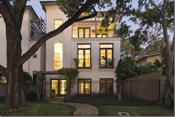
I thought I would show you this particular house because the owner got so many details “right” – and there’s a lot to be learned here. The owner is a single woman, I believe, and she is either an interior designer or hired one – not sure which. But certainly, this wasn’t put together by an amateur. It’s three story – a piano nobile design, which is typical of high density lot town houses in Houston. The square footage is around 4,000 and it lists for about $900,000. Oh, and don’t fall in love – it’s a Sale Pending!
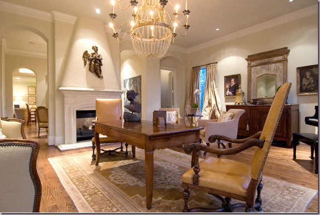
The public rooms are located on the second floor. The living room is arranged with entertaining in mind. There is no coffee table, instead a small dining table is set in the middle of the room – centered in front of the fireplace - with two large antique chairs surrounding it. A beautiful antique chandelier is centered over the table. This arrangement is a brilliant idea for a living room which probably doesn’t get much daily use. When having a large family dinner – this extra table will come in handy. It’s an unusual arrangement, but I think it is very practical.
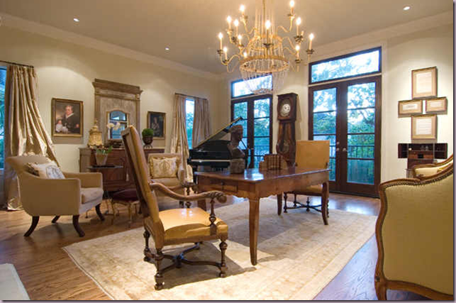
Looking at the room from the other angle, you can see how large it actually is. There is a baby grand piano in the corner – another great idea for entertaining. The front windows are left undraped while the side windows have silk curtains, probably for privacy from neighbors. If this was my client, I would have draped all the windows – and taken the curtains up to the ceiling molding – but that’s me. It looks perfectly lovely as is. What is notable here is the different furniture heights. LESSON: try to vary the height of furniture in a room, otherwise it gets rather boring. Here, the two tall French chairs, the clock, the large mirror, and piano all lend different heights to the large room, thereby creating interest.
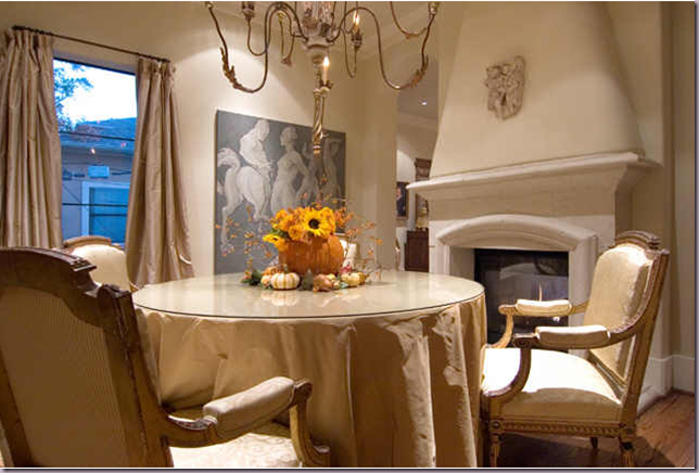
The dining room is through the double arches and shares the fireplace with the living room. Notice how both mantles are clean – just a small hanging sculpture was placed on each fireplace. I love this room with its gilded wooded chandelier and silk skirted table. The chairs are gorgeous. It’s simple, yet very elegant.
Past the dining room is the kitchen with it’s granite countertops and trendy stainless appliances. The bar stools are too low to be functional. LESSON: be sure when ordering bar stools that you buy the correct height – they come in two standard heights. I like the touches of texture – the window shade, the large wicker basket, the rattan seats.
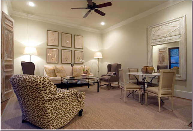
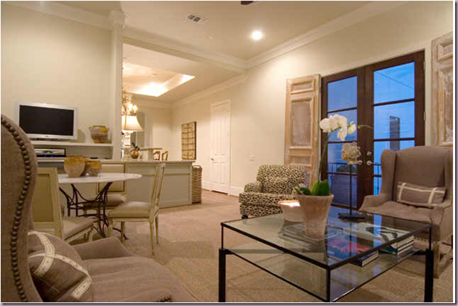
Past the kitchen is the sitting room. Here, the owner made perfect choices. First – she ordered a custom cut seagrass matting rug. Notice how closely the rug is cut to the walls. A store bought seagrass rug or an ill fitting one can ruin a room – it would be better to do without. LESSON: A properly sized seagrass rug should cover the room almost as if it was wall to wall carpeting. I love this room – to me, this is a wonderful family room. The sofa is high backed and is fashioned after an antique style. The two wing chairs with their French mouton legs are again, copies, of antiques – but they seem almost contemporary here. The classic club chair with its English saddle arms adds just enough pattern to this quiet interior. The French side chairs surround an iron based table which adds a needed texture. A large French antique mirror reflects the daylight. LESSON: Always place your mirrors where they can reflect something beautiful – an important rule to remember. The set of large botanicals are perfectly placed and hung. LESSON: place art just a few inches above the sofa. This is a good rule to follow. This helps to connect the art to the large sofa – otherwise, if pictures are hung too high above the sofa, or the buffet or the console, it looks like they are flying off into space. Remember – just a few inches above the grounding piece! Notice too the size of the prints – together the six look like one large element – the scale of the six prints to the sofa and room is perfect. Absolutely perfect! And lastly – instead of curtains, the owner has used antique doors or shutters – again, to add texture and interest.
A view from the opposite direction. Here you can see the contemporary glass coffee table – which plays off all the antique styled furniture. Notice, here the wing back chair with its beautiful nail heads, a nice way to update a classic.
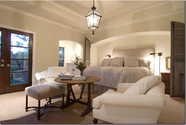
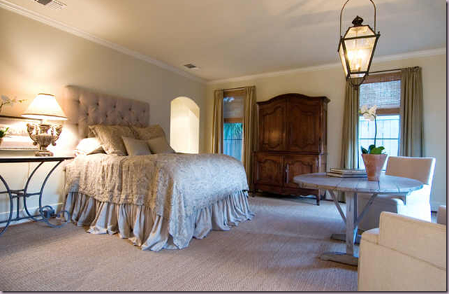
The master bedroom is divine! The architecture is wonderful – notice the low, wide arch that creates an alcove for the bed. LESSON: notice how high the bed is – it was probably placed on risers purchased from Bed, Bath and Beyond or somewhere similar. This is an excellent way to update a bedroom. Notice the two stacked baskets that double as a night table. The bedding is simple, a plain linen coverlet and pillows – no fancy trims to spoil the look. The sconces are just the right touch of “industrial” to add another texture – iron. Again, antique shutters are used to bring texture and architectural detail to the room. I love the low hanging trendy lantern over the sitting area. And notice the placement of the furniture, floating in front of the bed. I love the antique wine table, simply decorated with a few books. The chairs should probably be slipcovered in a tight cover to keep them fresh – but then you would lose the lovely nailhead detailing. LESSON: Visual Vamp came up with the perfect solution for white upholstered furniture: she purchased yards and yards of white pleather and recovered everything in it! The white pleather is a wonderful alternative to slipcovers and allows the use of trendy nailheads. In the seating area, I love how the ottoman doesn’t match the chairs, interest and texture comes from its wood frame. LESSON: notice the great wall to wall seagrass matting. It adds a wonderful, live texture and color to the room. I think this room is perfection!
To the left of the bed, is a small “breakfast” bar. LESSON: the wood has been fauxed to look like an aged piece of furniture. The iron hardware continues the deception. Wonderful, simple accessories add just enough to maintain the spare look of the room.
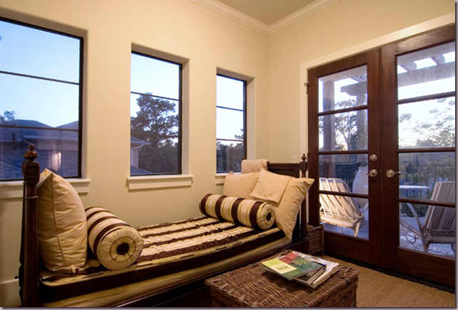
Across the bed and furniture grouping is this French antique day bed. What a luxury to have a one bed for the day and one for the night! Again, simple linen pillows are mixed with striped bolsters – this fabric is the only pattern in the room. LESSON: use a large wicker basket instead of a coffee table, side table or night table. If this was my house – I would have added curtains and shades to the windows – but again – it looks perfectly fine without. LESSON: I’m just one who believes that curtains add so much warmth and romance to a room, they should always be used!
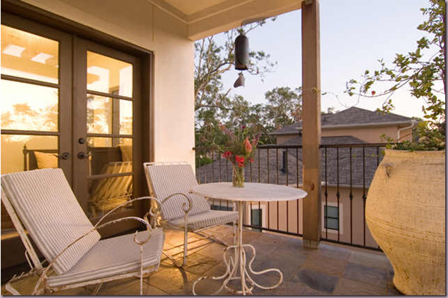
Off the master bedroom – there is a balcony – and notice how the owner chose to furnish it: using antique iron furniture instead of modern pieces. They add just the right touch of romance to this French inspired home. And I love the single, oversized French vessel! Wonderful!
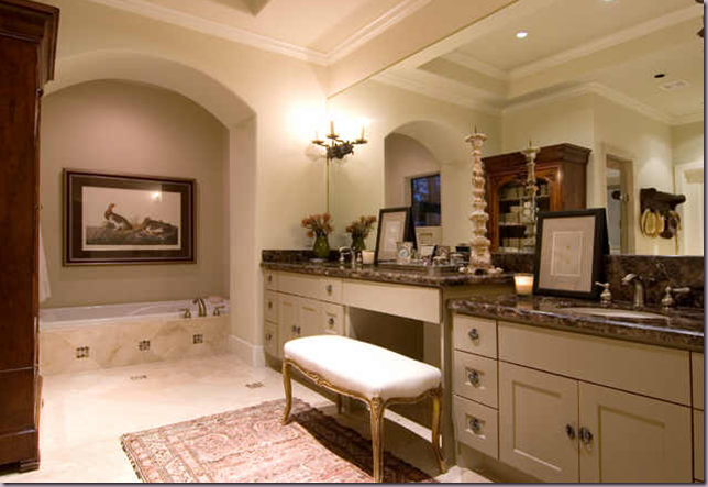
The owner brought furniture into the master bathroom to warm it up – I love the large antique bookcase used here. LESSON: bring furniture, lamps, and paintings into the bathroom to make it a more warm and livable space.
The guestroom – again, the bed is raised. Notice the wonderful dust ruffle with its hem slightly puddled. Another wine tasting table with two chairs float in the room – with another lantern over the setting. LESSON: if a look is great – why not repeat it? I think this is a great looking bedroom! Simple, quiet and elegant. The buffet a deux is gorgeous. The iron table adds just the right amount of metal in the room. The curtains are paired with woven shades – again I would have brought both the shades and the drapes up to the ceiling molding. I think this is an important point to emphasize. LESSON: if the curtains are brought up to the ceiling it creates a clean line, it adds height to the room, and it increases the size of the window by camouflaging the sheetrock above the window and below the ceiling. Personally I think curtains should always be hung that way, if possible. Again, the owner used wall to wall seagrass and I think these rooms are a wonderful example of why I stress using a textured, natural fiber for floor covering. LESSON: natural fiber carpet adds much texture and color and warmth to a room – as opposed to plain carpet! If seagrass is not an option, opt for using a flat weave, patterned carpet instead. All in all – I love this room and think the owner got it just right!
The third bedroom – it’s nice enough – we can’t all totally decorate every room! Actually – the four poster bed works great with the unusual, small windows. I think this room might double as an office.
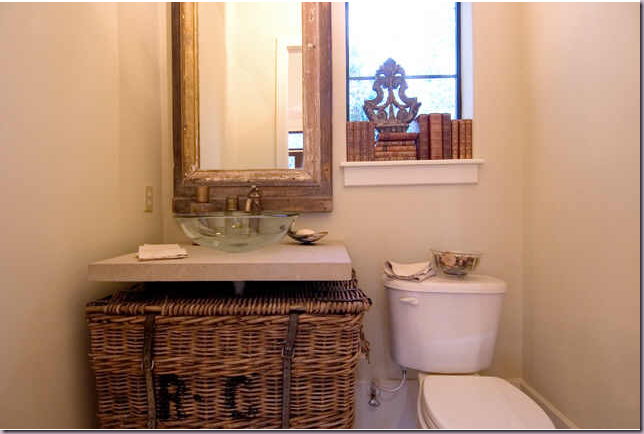
The powder room continues with the French theme found throughout. LESSON: the owner came up with a brilliant idea to hide the space under the sink counter by using the large wicker basket. I love how casual this room is. The books stacked in the window is a charming touch – as is the wonderful mirror and glass sink.
I hope you’ve enjoyed looking at this town house and getting ideas from the owner on how to achieve a French inspired home! It’s always great when you can learn from someone who understands design and knows what looks good in a home!




I saw this home on HAR a while back and it totally reminded me of you. My favorite room is the master bedroom. It looks so inviting! Great lessons, Joni!
ReplyDeleteGreat post yet again. I can't get over the lighting...the lighting (and not so much the fixtures as the placement) is incredible, inside and out, with the exception of the sitting room. Wow.
ReplyDeleteI almost fell of my chair when I saw the master bedroom. I just love it. I just built a laundry room and am trying to find something interesting for the sink, I might have to borrow that basket idea. Thanks again for the lovely post. xo, MB
ReplyDeleteA rare find, indeed .. and your notes are especially astute as to why elements do or don't work. Methinks the owner must be a Shabby Slips fan. Those double puddled skirts on the high beds are a dead give away. Given all that she got SO right .... it's simply inconceivable that those bar stools were such a major miss. Any designer who misses on the correct height should be shot!
ReplyDeleteMerci, Miss Joni -- for a lovely and thoughtful post .... Judith de Santa Fe
The basket under the sink is brilliant. Not sure I'm a fan of the library/game tables in most of the living spaces.
ReplyDeleteThis house reminds me of a London town house - the size and the layout of the rooms. The French basket under the sink is genius, xv.
ReplyDeleteSo beautiful, so right!!!! Thanks for all the details in your lesson Joni.
ReplyDeleteI just got back from showing one of my clients 9 homes ... none of which had ANYTHING right! Especially the vacant ones with the heat turned down to below 50 degrees making for a chilly welcome! Refreshing to turn on the lap top and see this LOVELY town home with everything SO RIGHT!!! No wonder it is in Pending!
ReplyDeleteGreat post!! and thanks for all the lessons here!
loved this post, thanks for the lessons! vickydarnell
ReplyDeleteYou know what, Joni, I have a feeling you would win over FAUDREE for the car!......I would love to see it though! Haha!!
ReplyDeleteYou are toooooo funny!
I so LOVE learning from the best. Thanks, Joni! GREAT lessons...
ReplyDeletewow, this is HUGE for a townhouse! Only in Texas...
ReplyDeleteI love this house EXCEPT: why is there so little artwork? I think that lends itsself to the peaceful vibe though.
I just love those mahagony windows too, great upgrade - so beautiful.
what a beautiful home...looks just like your style!
ReplyDeleteMid Lane. I live right around the corner. These are gorgeous. Built by a friend of mine.
ReplyDeleteThe windows are sooo awesome!!! I love how casual but elegant it is and it does feel like a family home.
ReplyDeleteShe had great ideas!!!
Beautiful Townhouse! Thank you for the "lessons"...I now know why my living room "doesnt work". Its the height thing!..gotta get some different heights to the furniture!...why dont the people who sell you that stuff tell you that?....Thanks for the great post. Cindy
ReplyDeleteJoni, you always post the nicest things, and point out the most interesting details and lessons to be learned!
ReplyDeleteI do agree, those barstools definitely are the one really jarring element of this whole beautifully-designed house.
I don't think the barstools themselves are the problem in this case, though; the actual height of the bar counter is, so I don't think this is fixable with different stools. The ledge itself is just extraordinarily high, although it looks like a bit of an optical illusion at first glance because the camera angle may be a bit on the low side to get the chandelier in. Standard kitchen counter height is 36", so we can assume that's about what the main counters are - and the seats of the stools are just a few inches shy of the height of the main counter, which makes them about 30" or so, which is already bar-height - as tall as they get.
The ledge *towers* over the main counter by at least 10", so there's no reasonable way to make a useable eating bar out of it. Faced with a situation like this, if the client didn't want to cut that section down and lower it , I'd install a custom bookshelf/display case under there to disguise the awkward height of the ledge and forego the stools altogether.
Just gorgeous. So many beautiful touches. Neutral colour scheme. Timeless design!
ReplyDeleteLove it all
XXX
V
Beautiful, just beautiful. I also (naturally) would like to see more art in this fabulous townhome. Joni, thanks for the tips and lessons!
ReplyDeleteYour posts are phenomenal! I always learn so much from them.. you point out details that slip by my untrained eye(hanging frames inches above sofa, etc.)..but these are the details that make the difference between an okay space and an exceptional one. My tuition check is in the mail!
ReplyDeleteThis comment has been removed by the author.
ReplyDeleteI love coming to class every day, Mrs. Webb. You're my favorite! Seriously, your posts are out of this world.
ReplyDeleteJoni, Your posts are so refreshing! I love love love so many of the details in this townhouse. I agree with you on curtains- they are a must and so dramatic and beautiful.. and so much more glam when they are brought to the ceiling! Maybe the new owner will see your post and take the advice. Hoechstetter Interiors had a great point too- a bookcase on the back of the kitchen island would look spectacular. Despite these two nitpicking details the house is a gem.. I can only imagine what the owner is moving to now????Merci for the lessons and the eye candy!
ReplyDeleteThat MBR is amazing!
ReplyDeleteI am so with you on the curtains. I wonder why they didn't take them up higher. The ceiling height could have appeared much taller. Oh, well. They didn't ask me! (Warmth of the master bath was great--bring in the wood!)
ReplyDeleteyou are right on regarding the lessons.
ReplyDeleteall my fav rules as well.
..........so when are we opening up our design shop in paris again ?
xx
Quick Question!??! Where in Houston could I purchase custom cut seagrass? Also any particular kind. I bought a natural rug at World Market and my husband hates it. He said its too hard. Any natural rug that less abrasive under foot?
ReplyDeleteChazzy
Chazzy - try Creative Flooring.
ReplyDeleteSeagrass is VERY easy on the feet. It shouldn't bother anyone!
Fabulous house. Makes me want to be in Houston.
ReplyDeleteLoving you from Dallas.
xmb
ps. shabby slips has been a favorite of mine for more than a decade.
Sorry, I was morphing two of your postings, I think.
ReplyDeleteYour visit to Austin and your fabulous last posting of the Houston townhome.
mb
So many great tips, Joni. One I could use for sure is the books in the powder room window. I always love how you turn each blurb into a lesson. :-)
ReplyDeleteFabulous! What a beautifully designed and decorated home. I love all the detailing, the colors, I'm ready to move in. And the square footage you get in Texas for the price is amazing compared to here in Southern California.:)
ReplyDeleteLidy
Nice architecture to the home. Great furniture in all rooms. i still would paint a color on the walls or a wall. Something Warm. Nice place though. mishelle
ReplyDeletefab post on prettiest town home. love how you broke it down into lessons like a class... cool, interesting and nice to collectively reflect on what works and doesn't instead of just looking at more beautiful interiors. nice touch!
ReplyDeleteA beautiful home, Joni. I love how you included lessons!
ReplyDeleteI love your 'Lessons' about decorating. Can sea grass rugs be vacuumed? Would you layer rugs over sea grass - say, under a table? How do you feel about zebra or cow hide rugs?
ReplyDeleteThanks Joni for the great information.
ReplyDeleteChazzy
Loved this post. Thank you Joni for so many great insightful tips. I feel like I just took "Cote de Texas 101"! You know you really should write a book with all of your wonderful tips in it.
ReplyDeleteShe really did a lovely job with the interiors. Nice and neutral with a lot of interesting pieces. Aren't those old shutters on the windows beautiful?
xo
Brooke
I love the whole idea of creating a room-like feel in the bathroom. Bathrooms are so 'clincal' looking these days. Fantastic post!
ReplyDelete'Clinical' (correct spelling)
ReplyDeleteOh, how I wish I could hire you to decorate my house (or at least give me some tips/suggestions)!
ReplyDeleteLove the house!
ReplyDeleteAnd the wall colour! Yum...
Question: What Farrow and Ball colour do you think would match the living room?
Nadine
Thanks for the wonderful post. Here is a question about seagrass - how do you clean it? Do you vacuum? And if you have pets, should you steer away from it? (My cats have an occasional upchuck.)
ReplyDeleteJoni,
ReplyDeleteI have been reading your blog for a couple of months and I am shamed to say that I have never written to thank you. I enjoy it so much and appreciate your consistency and all the work you put into your thorough postings. Thank you.
Melanie
So, pretty, I only wish my Townhouse looked so good.
ReplyDeleteThe kitchen is great.
CIao
I like how your blog roll now has pictures - very eye catching!
ReplyDeleteI loooove house tours. This condo is very beautiful and seems roomy, too. I made the same mistake with my last set of bar stools. Mine were too tall, though, not too short. I learned my lesson the hard way - measure, measure, measure! Great post!
ReplyDeleteWonderful and fascinating to read all your commentary, Joni, and I agree with everything you've said, especially about curtain height, and lack thereof in bedrooms.
ReplyDeleteI adore the chandelier in the living room. Wouldn't you love to know a bit more about who lives here, why they are selling, and which decorator they used?
ReplyDeleteFabulous! Thanks for today's lesson. And wow--a 4,000 sq ft townhome. I've been living in England too long.
ReplyDeleteYou've been TAGGED damn it. xo
ReplyDeleteI just love coming and looking at the beautiful pix you post, but as I've said before, I particularly love the "lessons" you give. That basket under the sink idea is brilliant! So many good ideas in this townhouse. Thank you for posting these pix and for the lessons. laurie
ReplyDeleteI just love coming and looking at the beautiful pix you post, but as I've said before, I particularly love the "lessons" you give. That basket under the sink idea is brilliant! So many good ideas in this townhouse. Thank you for posting these pix and for the lessons. laurie
ReplyDeleteThere is an uncomfortable disconnect between the sleek modernity of the townhouse exterior and the somewhat bogus Olde Worlde French mood going on inside. Lessons? Respect the architecture and do not impose this fake European taste upon innocent American houses.
ReplyDeleteSo gorgeous- great post!
ReplyDeleteGorgeous townhouse! What a charming, elegant and serene home! I had the same problem with my kitchen barstools -- then I added a cushion and soft felt pads to the feet -- and problem was solved! LOL! BUT as wisely mentioned above -- perhaps THAT bar is simply too high for the space? As for the table in the center of the living room -- hmmmmmm -- not sure about THAT! I think that I would have re-arranged the area so that the table was used as a sofa table behind the pretty sofa -- which I would turn to face the fireplace. Just a thought! Really!
ReplyDeleteJan at Rosemary Cottage
Once again, very nice, Joni! I particuarly love that wicker basket under the sink and the antique leater books in the window. I also like the textures which I think add warmth to the space. They're perfect for a neutral palette like that. Wonderful as usual!
ReplyDeleteXO,
Sheila
It's houses like this that make me want to light a match and toss it into the giant pile of unwashed laundry sprawled across the kitchen floor. Gorgeous.
ReplyDeleteGretchen - email me about the seagrass at mrballbox329@aol.com
ReplyDeleteI'll be happy to talk with you about it!
Joni
Nadine - email me!
ReplyDeleteJoni.
Oh.... this townhouse is huge!
ReplyDeleteI love the big basket in the powder room!!
Nicely done I think! LOVE the seagrass! I wish it were easier to convince clients it is SUCH a great thing! My husband hated the idea, but now admits it holds up much better than any carpet, and keeps looking great. I am on team seagrass! Thanks for another inspiring post Joni!
ReplyDeleteWhat a find! I love the mixture of the door & shutter finishes juxtaposed with the clean lines of the architecture. And your comments about the details are great.
ReplyDeleteTeacats: what a brilliant idea!! I think she should do that, if she wasn't moving!!
ReplyDeleteToo DIE for! I love it! They did "get" so much right!......Must go back a look some more!
ReplyDeleteWhat a beautiful townhome... thanks for sharing your thoughts.. I especially appreciate the comment about differing heights in the livingroom. When you are not a decorator or designer, you know there is some little something about a room... but what is it? In the livingroom, for me, it was the varying heights, which I'd never have figured out in my little psuedo-decorating mind.
ReplyDeleteAs for the Jeep in your previous post... as a fellow 50-something Texas girl.. I totally get it!
What a beautiful house this is! Loved reading your Lessons too on the entries, great tips. Wish I could have taken pics of one of the old homes I toured in a Christmas tour. You would have loved it. All neutral, large pieces, and wall to wall seagrass on the stairs and part of the floors. It was gorgeous!
ReplyDeleteCan't wait to try Windows Live, thanks to YOU!
Hello!
ReplyDeleteI just found your blog via Weasel's Journal.
Your blog is just beautiful. I must be back again to visit soon.
Happy Holidays!
Melissa
Sunbonnet Cottage
This Irishman needs a bit more color but its a very beautiful home. And Cote....your pretty cute yourself. Dinner??
ReplyDeleteGreat post - your commentary on the photographs is very informative and picks up some of the details and tricks in the design.
ReplyDeleteHowever, I really dislike the design of the house.
The exterior isn't bad, although the massive iron fence in front is jarring. A townhouse needs to be approachable and really ought to front right onto the street. This imposing fence makes it look like the house is in a bad area and the fence is needed for security.
The interior is way too pretentious, with real delusions of grandeur. In the living room, the fireplace and chimney tries to look like something from a castle. The chandelier also looks totally out of place (note the halogen downlights behind it, that probably came with the house when it was built).
The sitting room isn't to my taste, but it's ok -- but marred by a hideous ceiling fan. Again, no doubt it was put in by the original builders.
The master bedroom is by far the most successful room. It's comfortable looking and relatively casual. There's a mix of modern pieces and antiques, all of which are simple designs and are in scale to the room. The owner should have applied the same principles to the rest of the house (but with a bit more colour).
ok, i have viewed this to death, and now i know what bothers me.
ReplyDeleteit is where the beautiful taupe silk side panels are mounted.
they are too low, they should be close to the ceiling. no ?
ps.
i fixed my link a week ago.
it works.
Love this post Joni and dining table set in the middle of the living room is fab!!
ReplyDeleteHi Joni~ Yes you found a GEM! Such a lovely home, not much to change, maybe add just a bit of color. Perhaps fresh flowers.
ReplyDeleteOh, how I love coming to your blog for some inspiration ~ Thank you!!!
Hello! I found your blog through a google search for the SGG kitchen. My husband and I are in the middle of building a farmhouse in Kansas. This is the kitchen I have been trying to create but I just didn't know it. To me a farmhouse kitchen is suppose to have dark wood floors, white cabinets and a dark countertop. I wanted to ask you a question about the countertop. Everyone is trying to convince me that using honed black granite would be a mistake because of maintenance. The lady I'm getting my cabinets throught uses Cambria and I'm struggling with selecting a color. Cambria's black is shiny and I'm not sure I'm sold on that. They have a nice gray/brown color called sussex but I'm not sure that is going to give the look I want. I really want honed black!! We lived in Aledo, TX from 2005-2007. I really enjoyed living there. The shopping was fabulous. I got to go to the Dallas market and loved every minute of that. You need to check out Chattel in old Aledo. That was my absolute favorite place to shop. I really enjoyed your townhouse tour.
ReplyDeletePosh and perfect!
ReplyDeleteAs I was learning the lessons, I saw the shout out!
Thanks so much!
xo xo xo
I learn so much from your posts! You help me notice things that I would never see on my own.
ReplyDeleteThis is a beautiful townhouse. I agree with you about those barstools. I wonder why they even left them there. They are clearly not functional for the current owners and are a distraction for potential buyers in my very humble and uninformed opinion.
Everything else, though, is spot on!
I just love this home and the way it was designed, especially the drapes! I know you disagree but I believe the drapes were hung low so the arches in the doorways would stand taller and look more grand. When a home does not have as much architectual details as this one of course hang the drapes to the ceiling, but not in this one.
ReplyDeleteThe drapes are luxurious but played down wich is a look I love. I have done the same look in my master bedroom and at first was hesitant because everyone has always said hang to the ceiling, but I guess im the black sheep in this case.
I really love the outside. I would just look at it all day long.
ReplyDeleteI loved this house...but that last photo, the powder room, was wonderful. The use of the basket, the books in the window...just lovely.
ReplyDeleteWow...I think I need to go re-arrange some bathroomn windows!
Love,
Sue
The owner has such a good taste , and wonderful ideas
ReplyDeleteStunning! What a treat.
ReplyDeleteDonna
There are so many beautiful elements to this home, and I am completely in love with the doors, windows, and porch! And the master bedroom looks so serene.
ReplyDelete