
This is story of a redo. It is the story of Ron van Empel, lamp maker extraordinaire, and the creation of his new retail space. Ron and I met through emails after The Peak of Chic featured his company, Empel Collections – based in the Netherlands. We became fast friends and I featured his lamps on my blog, HERE. Then something remarkable happened that we shared – the process of his building a new showroom. It started like this: Ron bought the retail space that housed a run-down flower shop underneath his apartment. He took me along for the ride, through hundreds and hundreds of pictures and emails; a ride that lasted almost a year. The story of his redo became my story too. There was a time, when this all started – one whole week of time – that I pored over pictures of his territory, his apartments (he owns two in the same building), his swimming pool, his pool house, the upstairs terrace, the old flower shop he just bought, the new annex he was building – until I understood it all so well, I could probably walk around the vast complex blindfolded and still find my way – halfway across the globe. I don’t know why this kind of thing intrigues me, but it does. It is at the core of who I am, aesthetically. I find pleasure in floor plans, in seeing old spaces turned into new ones. I’ve always been this way – becoming aware of it at 8, when my parents built our family home – and the process of it, the architectural drawings, the space planning, the interior design all became a way of life for me from which I have never wavered. I suspect many readers of Cote de Texas are exactly the same. But, if you aren’t interested in renovations, or architecture, or interior design, or floor plans – you probably won’t be all that interested in this story. In truth, I found it all so fascinating on a number of levels that I hope you will too. To help you understand the layout – full floorplans follow the story.

The most important thing to consider in this story is the country. In Holland’s cities, where space is at a premium, you don’t just tear down property – you redo it, you add onto to it, you squeeze as much living space as you can into your four walls. You may choose to gut the interiors to your liking, yet all the while - you preserve the exterior to blend in the neighborhood. And this is exactly what Ron did. It all starts with a building: after college, the young Ron bought an apartment over a flower shop thinking he would stay there just a few years (fate has a sense of humor!) In this building, besides the flower shop, there were two other apartments in addition to Ron’s. Today, Ron owns 3/4 of the building – hopefully, the final upstairs apartment will one day be his after the owner decides to sell. Ron’s city is called Leiden and it is a quick 30 minutes away from the metropolis of Amsterdam with an international airport nearby for the convenience of his clients who fly in from all over the world. Ron’s neighborhood is called a garden area, and it was developed in the 30’s, just as Ron’s building was. The area is now middle class, but many university students are moving in. Besides there being even newer areas of town, Leiden boasts buildings still standing from the 16th century!
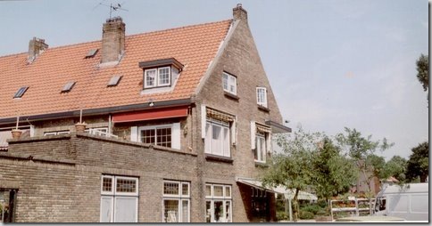
BEFORE: Ron’s building with this two apartments and the florist shop on the bottom left, just waiting to be rebuilt.
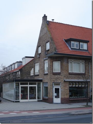
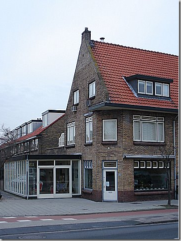
BEFORE: Ron’s building as it was: on the ground floor is the old run-down flower shop with – on the left - the white, modern annex the florist added to his shop. The two red doors on the right are to Ron’s two apartments. The red door on the left leads to his upstairs apartment over the flower shop with its bright white door. That apartment takes up the second floor and its two bedrooms are on the third floor (seen in the left attic dormer, above.) The red door on the right leads to his second apartment – another two story unit. The door in the middle leads to the last apartment – which one day Ron hopes to own. This picture was taken in spring of 1996 – notice the gorgeous bed of daffodils – where are the tulips, Ron????? As the young Ron lived in his upstairs apartment, he began toiling with lamps, designing them and then making them himself. As his business starting growing, so did his need for space. He needed room to spread out and he needed storage space. He began eyeing the next door apartment.
BEFORE: Here is a rare picture of the back of the building before the florist built the white annex. You can see Ron’s first apartment here on the second and third floor. The large window on the second floor opens up to a terrace. Let’s go look at Ron’s first apartment, above the original flower shop, that is now the home to Empel Collections.
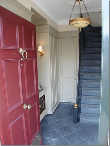
RON’S FIRST APARTMENT: You enter through the red door at the front of the building to this first floor vestibule with slate floors. Ron loves classical design and symmetry. He has chosen the X as a motif and it pops up throughout his spaces. He completely gutted this area and rebuilt it to his specifications. All the light fixtures are his, of course, hand made by Ron. Ron’s career as a lighting designer happened by accident. Now 47, he was an interior designer until 8 years ago – when he finally decided to put all his attentions into what was at first a hobby – designing lamps. Today, he still does some interior design and by chance is very involved with the total remodel and renovation of a house in Houston – of all places!
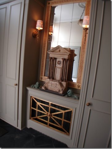
In the vestibule, Ron created the two closets flanking a niche with a mirror and sconces.
A close up of his niche: all Ron’s design – the mirror, the miniature, the sconces, the hanging light! Isn’t this just beautiful!!!!
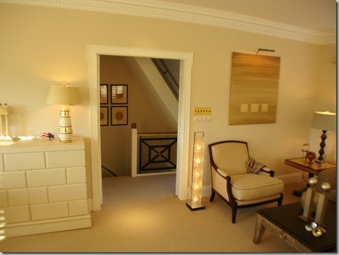
The staircase leads to the second and third floor living spaces. Notice the X motif on the stair railing. This X shows up time and time again.
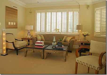
Here’s the living area today – it overlooks the front of the building. Ron has renovated and upgraded this apartment twice in all the years he has lived here.
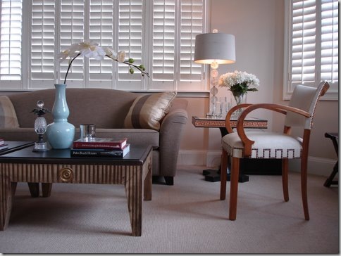
Close up - I love those coffee tables, so interesting! The crystal lamp is from his contemporary collection – isn’t it beautiful with the drum shade?
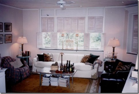
THEN: Here is how Ron lived as a young man, right out of university, all those years ago! I actually quite like this – bleached shutters, tufted leather sofa, Burberry throws, and leopard pillows.
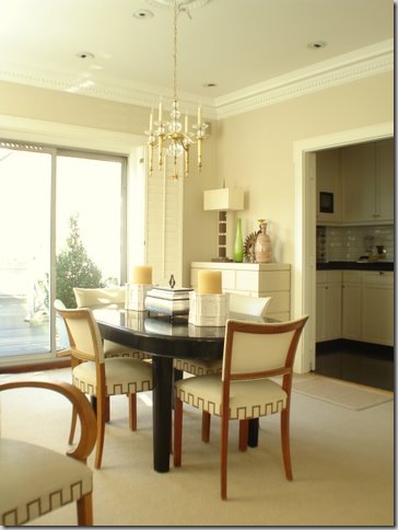
The dining area overlooking the back terrace.
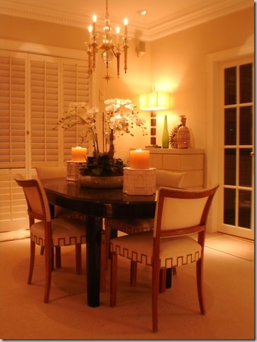
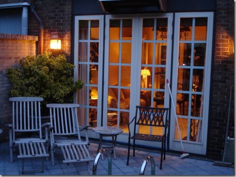
The same room at night. The kitchen is through the French doors.
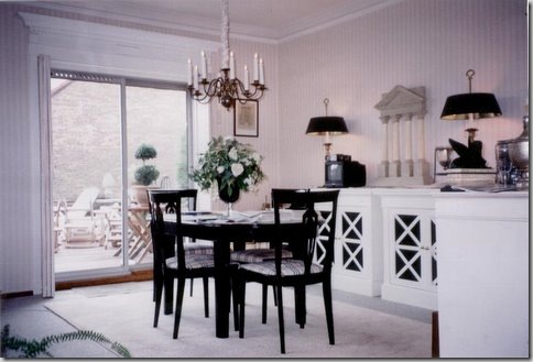
THEN: The dining room then, before the renovations many years ago. The entrance to the kitchen was in the stair hall. Ron, this looks quite nice for a young man just starting out! The table is the same one Ron uses today.
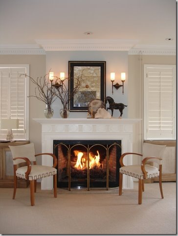
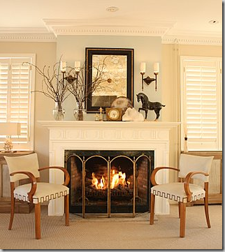
In between the living area and dining area is the fireplace – Ron recently painted the wall behind the mantel a Farrow and Ball light blue.
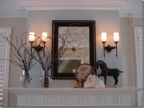
Close-up of his mantel-scape. Just beautiful. Notice the dentil crown molding and the carved mantel. These architectural details, along with the sconces and mirror are all Ron’s designs.
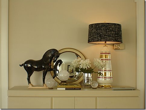
The door to the kitchen is flanked by two cabinets – providing surfaces to showcase more accessories. Ron makes lamps out of many different things – his horses will probably end up as lamps one day!
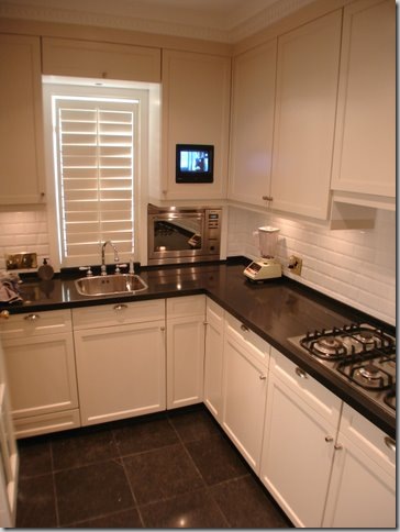
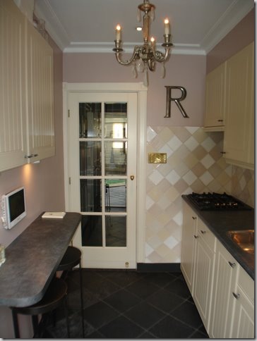
And the small kitchen – perfect for a bachelor: black granite and white subway tiles and plantation shutters. Notice how he built in his TV! And remember what I said about eeking out every inch of space – notice the built in microwave to the right of the sink.
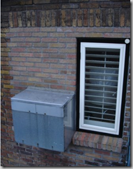
In order to conserve much needed counter space, Ron had this box built to house the microwave outside! The washing machine and dryer got a similar treatment. Ingenious!
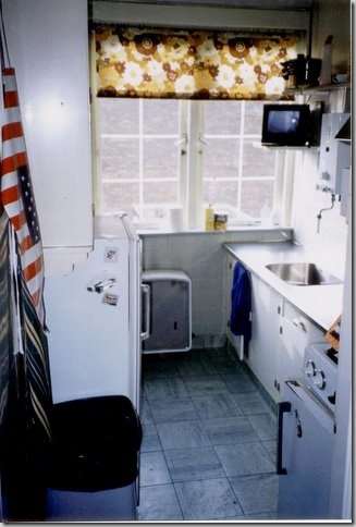
THEN: The kitchen as it was – wow! Ron – you’ve really changed this room for the better!!!!
The outside terrace, off the dining room. To the right, through the faux windows – this overlooks the pool area of Ron’s second apartment!
BEFORE: The side of the building with the white annex – Right above the annex you can see Ron’s terrace with the row of faux windows, the dining and living room windows, and on the third floor, the bedroom and bathroom windows. On the left side of the back of building is Ron’s second apartment. Today – this looks completely different!! Ron refers to the white annex as a trailer – stuck onto the building with no regard to it’s architecture or age.
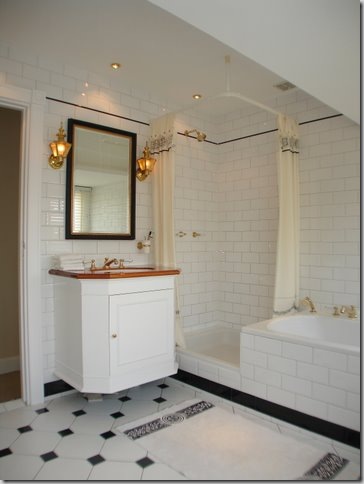
Ron’s upstairs bathroom, classic black and white tiles.
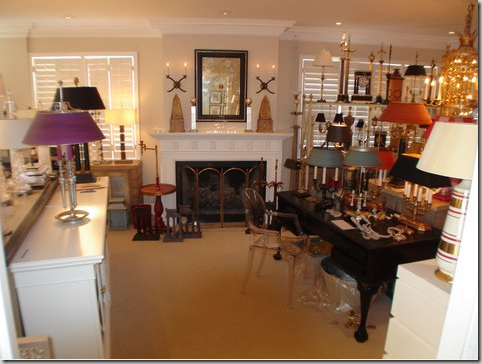
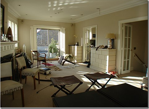
As Ron’s business grew, so did his need for space. He needed room to make his lamps, store his lamps, and sell his lamps. And so, for a few years, he turned his first apartment’s living room into the factory and the warehouse. This is how his first apartment was the last few years– see the fireplace in the middle of all this?
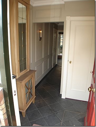
RON’S SECOND APARTMENT: Through the second red door is Ron’s newer apartment – bought to help with space problems and to have a place to entertain friends and clients. The second apartment is two stories. On the second floor, Ron connected his two apartments through a door.
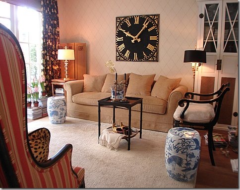
The second apartment garden room: this is where Ron greets his clients and serves them tea. First, they sit and talk and relax so that there is no heavy sales pressure and he can gauge what the client will need. After the tea and delicious (I’m sure!) pastries, Ron leads his clients to his new showroom either through the back pool area or out the front door to the new showroom entrance. I love the way Ron has decorated this room – the gorgeous clock, the antiques, the blue and white garden seats!
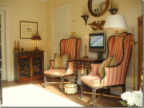
The other side of the garden room shows the classic symmetry that Ron loves so!
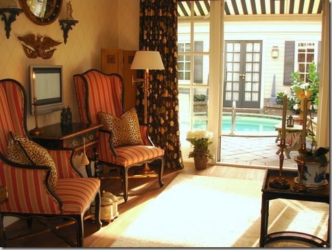
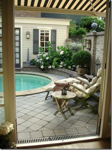
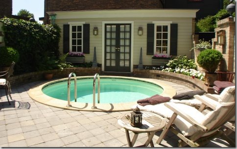
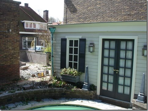
At the back of the second apartment is the pool and pool house which Ron built – quite a extravagance for a Leiden apartment. Ron installed a retractable black and white canopy for protection from the sun.
The back pool and pool house.
Today – this area has changed somewhat. On the left side where the ivy wall is, Ron built an atelier for the showroom.
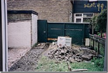
BEFORE: Whoa! This is what the back yard of the second apartment looked like. What to do? How to hide the brick shed on the left? Ron came up with the idea of a pool house. The left window on the pool house is actually a facade! Quite a difference today with a charming Pool house vs. this disaster! Scroll up – this is exactly the same view before Ron built the pool and pool house.
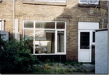
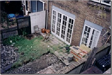
BEFORE: Before there were no French doors – just a window and a door to the kitchen.
DURING: Ron installed two sets of French doors – one to the Garden Room and one to the kitchen. This picture was taken from his first apartment’s outside terrace. Scroll up to see the exact same view before the French doors and after.
TODAY: The same view. Looking back into the garden room at dusk. These French doors replaced the plate glass window.
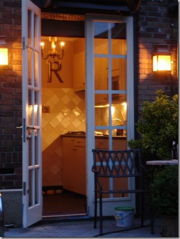
TODAY: And looking into the second apartment’s kitchen – these French doors replaced the kitchen door.
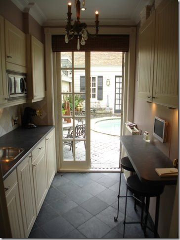
The kitchen in the second apartment – looking out at the Pool House.
And looking in, the other way. I love how he used French doors for the interior and exterior. Just charming!
And now, Ron starts his waiting game with the owner of the flower shop. He approaches him about selling and offers are made. It took over three years to finally get an agreement drawn up. All this time, Ron has been planning and drawing – thinking how he can turn the decrepit flower shop into a beautiful showroom worthy of his high end light fixtures. Finally the day comes – the florist moves out and Ron begins his renovations.
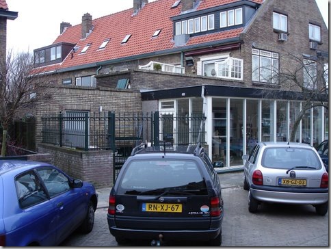
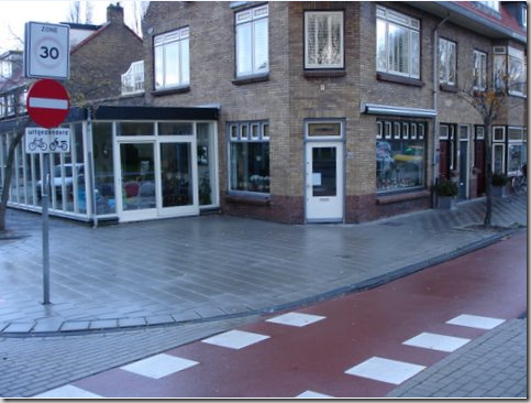
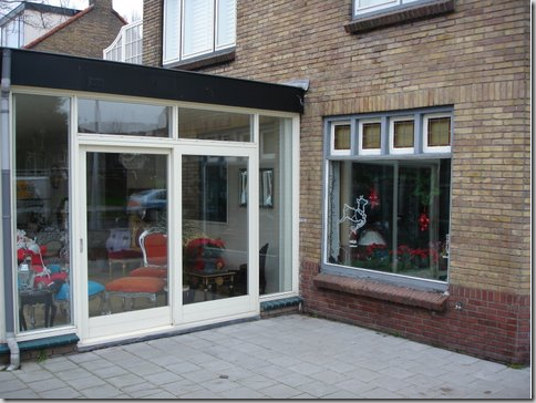
THEN: The flower shop with it’s white annex. The front door to the shop is the single white door. Ron’s first apartment is directly above the flower shop. Ron’s plan is to change out all the windows, lining them up with those above it on the second floor, raise the roof of the annex, gut it, and make the annex the front door to Empel Collections.
The demo works begins in the back. The wall covered in ivy that divides the pool from the flower shop comes down. The alley space between Ron’s apartment and the flower shop will be built out, connecting the space.
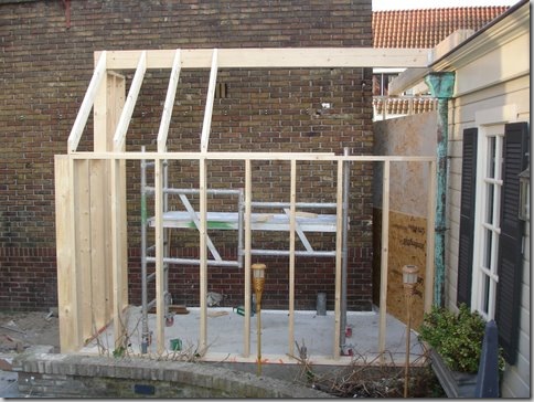
The building begins. This room is being built in the alley way between the apartment and the flower shop. It will connect through the brick wall into the flower shop – and will be used as a workroom.
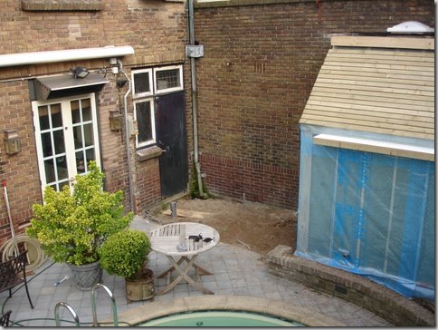
Ron’s entrance to his kitchen is through the French Door on the left. With the boundary wall torn down, Ron makes plans to break through to the flower shop - thus creating a back door entrance into his new showroom through his pool area. The black door leads directly into the flower shop.
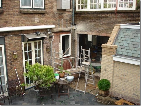
A few weeks later, the adjoining building – the new workroom - is finally shaping up. Romantic slate tiles go on the roof. And finally – you can see here - Ron breaks through to the flower shop. This will become his backdoor to work. Above the hole in the wall – you can see the wall of faux windows which line Ron’s terrace in his first apartment. And notice – the black door to the flower shop is now a window!! Just above the window, is the metal box which houses his microwave.
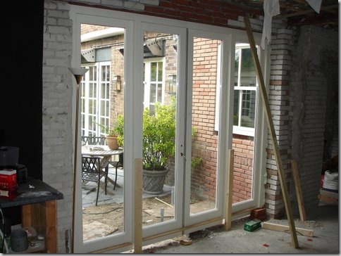
The doors go in! Looking from the flower shop out to the pool area of Ron’s second apartment. Progress is really being made.
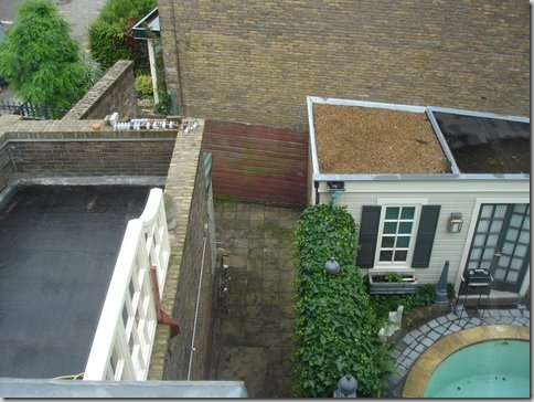
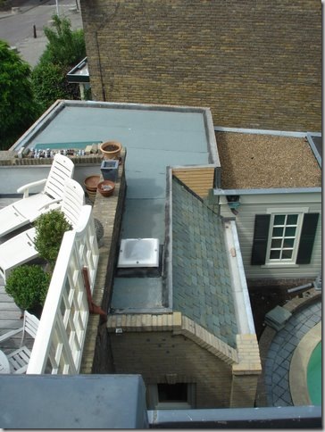
BEFORE: To help you better understand the layout – this is a before view, looking down at the pool. The ivy fence is shown here. Ron’s outside terrace with the faux window wall is on the far left. The space between his ivy wall and the building is the alleyway of the flower shop. Also from this picture, you can see the pool house roof. The left side of the roof was the original shed that Ron disguised by erecting the pool house around it. Confused yet?
DURING: From the exact same vantage point, showing the new back storage room leading into the showroom. Scroll up to see the difference.
BEFORE: The white annex to the left and the flower shop’s front door in white. Above the shop is the living room to Ron’s first apartment.
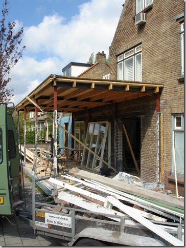
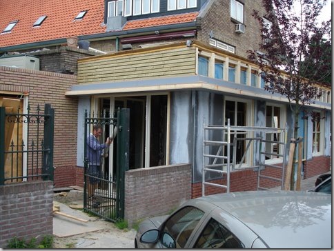
DURING: While all the work on the back is going on, the front on the building is being worked on too – here the roof of the white annex or “trailer” is raised a few feet, before the space is totally gutted.
Mission accomplished. The white annex’s roof is raised and it is totally gutted.
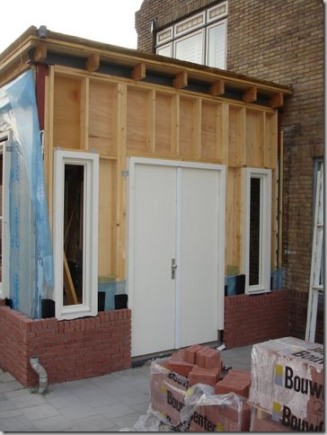
The gutted white annex, with it’s roof raised, will now be built out. This will become the entrance to the showroom.
The side view of the former white annex being built.
And showing the back of the white annex.
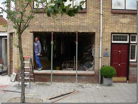
While all the work on the back side and the annex is being done, Ron prepares to work on the front facade. All the windows and the former front door of the flower shop will be completely changed. On the right is the red door to Ron’s first apartment, above the flower shop.
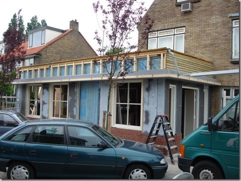
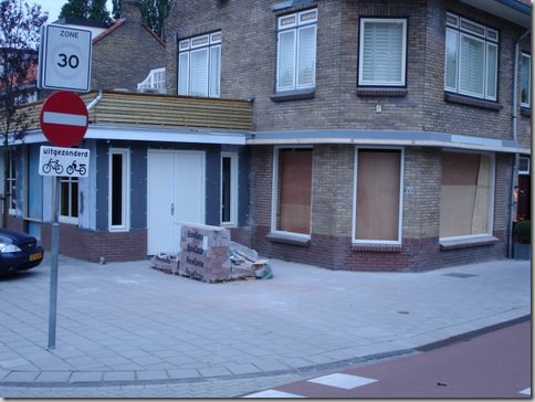
In progress: The white annex is long gone, replaced with a much more substantial building – you can now see the front entrance to the new showroom. The flower shop's windows have all been changed out to match the placement of the windows above it. The old door to the flower shop is long gone – replaced by a window instead. Ron designed an overhang to visually connect the main building to the front door annex.
The windows get paned.
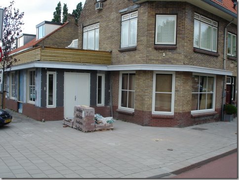
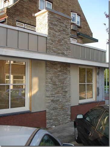
As time goes on, the former white annex is no longer recognizable as the old “trailer” as Ron called it, instead it is a beautiful building with a lovely stacked stone fireplace. Ron has put in the paned windows. The roof gets a siding of zinc, the bottom gets a skirting of brick. The fireplace will soon be getting a custom designed cap.
With the outside facade almost complete, work begins inside the former flower shop. Here looking out towards Ron’s pool area – what a mess!!!! This is where Ron broke through the brick wall. He will be taking his clients from his second apartment garden room, after tea and pastries, through the spruced up pool area into this back door – OR they will enter through the front door!
And looking from the back towards the front windows. Through this door on the left – you can see the replaced windows from the front facade. On the right, through the openings is the new annex or the former “trailer” building.
And inside the former white annex, looking towards the new front doors.
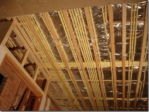
And all the state of the art wiring goes in. Don’t forget – this is a lighting showroom, there has to be good electricity!
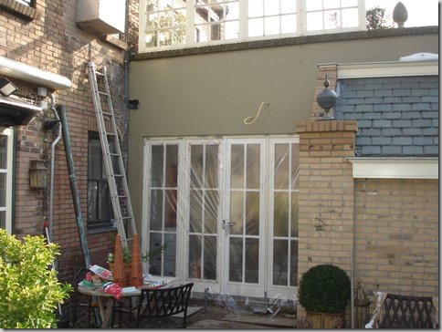
In the backyard pool area, the brick is plastered over and painted. Ron puts decorative finials on the post. Look above to see Ron’s terrace with the faux window wall outside his first apartment.
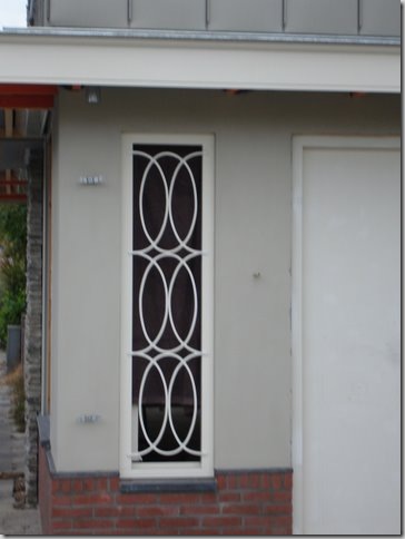
The side window grill of the backyard pool building gets installed – in his beloved X motif.
More details: the front door windows get their own grills.
And the beautiful stone chimney gets its zinc cap. Everything is finally coming together. Ready for the final reveal?
A wintry scene with icy flower beds.
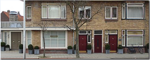
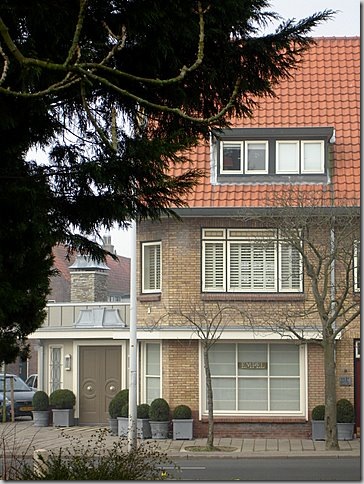
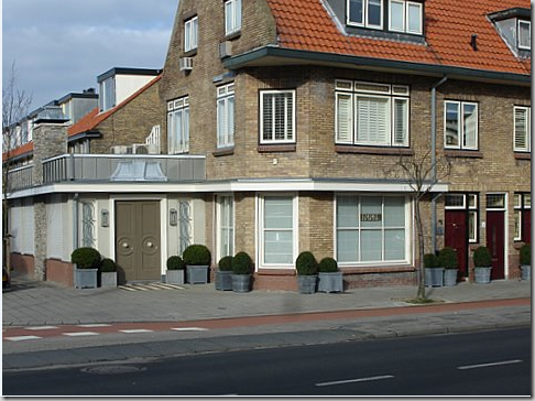
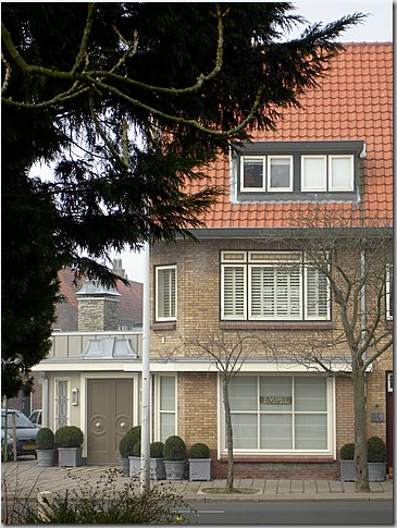
The front – with all three apartment’s doors. Ron’s apartments are the left and right red doors. One day he hopes to own all three apartments in the building.
And a close up. Notice how nicely the windows are lined up now. The overhang visually connects the front door annex to the main building, as does the darker red brick skirting. Let’s go inside!
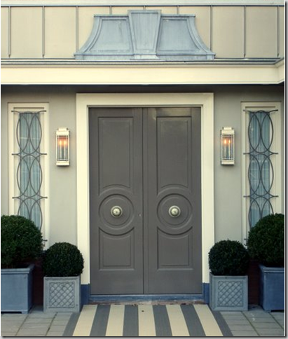
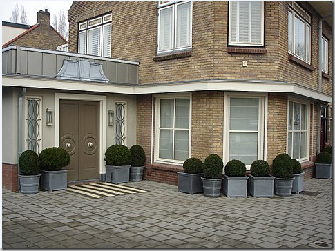
The front door – hard to believe this was once the white annex, what Ron called a trailer. Inspired by Dorothy Draper, Ron designs a double door with center knobs, flanked by hanging lanterns, and topped with a zinc pediment. The rug gives it a nice extra touch. I adore this door! What a fabulous logo to put on stationary – not that anyone asked moi!
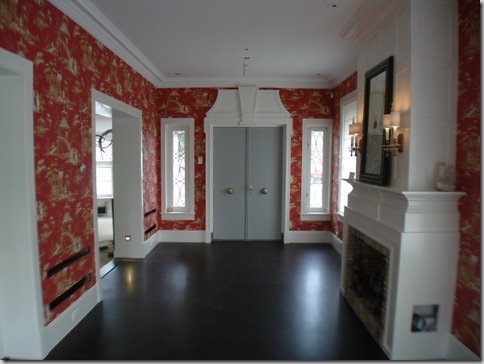
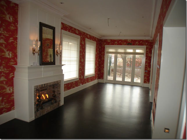
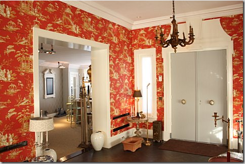
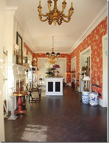
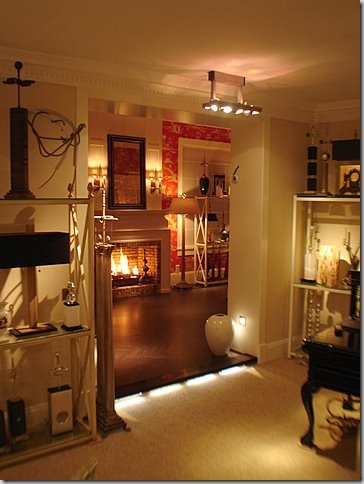
Before moving in: Inside the former white annex, Ron creates a fancy showroom, with red chinoiserie wallpaper, dark hardwood floors, and a beautiful fireplace. The front door is painted gray, and notice how the pediment matches the zinc one outside.
Looking towards the back of the former white annex. The windows at the rear lead to a back courtyard off the parking area. Ron has not finished the landscaping there yet.
And the same view at night – showing all the dramatic lighting.
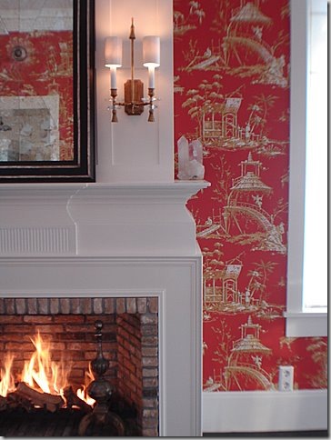
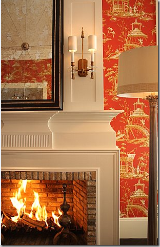
Looking at the brick fireplace with its antique andirons and Ron’s own designed sconces and mirror.
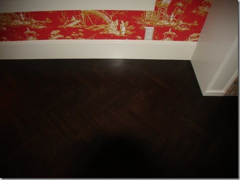
The floor in the annex is a beautiful dark herringbone pattern.
A close up of the fireplace details.
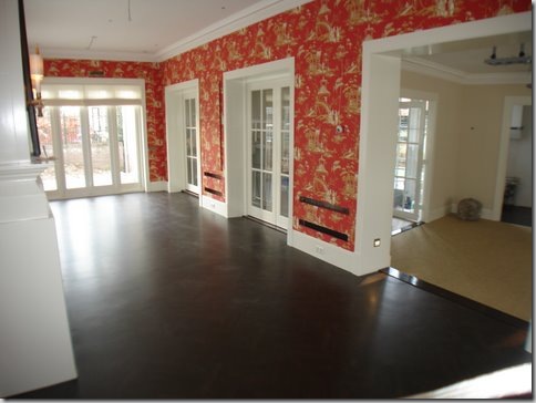
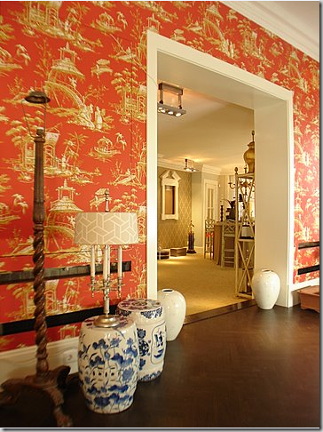
Looking from the Chinoiserie room to the main showroom on the right. Time to move everything in the shop!!
Everything from Ron’s first apartment, which has been his temporary showroom all these years, has to first be packed up before it can all be brought downstairs to the new showroom. OY!!!
Leaving it looking like this! But don’t worry – remember how beautiful he fixed it up:
Much better! Now that this is no longer his workroom, Ron has moved back into his first apartment, leaving the poolside second apartment for friends and guests.
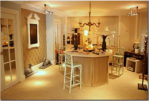
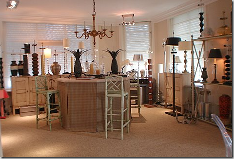
All moved in!!!! Finally – four years after negotiations to buy the old flower shop began, Empel Collections has a proper showroom. From the front door in the Chinoiserie Showroom, you can enter the main showroom, in what was formerly the flower shop.

Facing the back of the Chinoiserie Showroom, with the main showroom on the right.
The view from the front door looking into the Chinoiserie Showroom.
Looking from the Chinoiserie Showroom into the main showroom – the former decrepit flower shop! Beautiful photo.
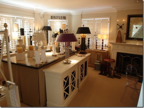
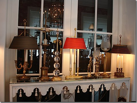
Close up of Empel Collections product displayed on a console table.
Another shot of the lit fireplace with Ron’s designs. I love that fire! So romantic. Honestly, when was the last time you were in a lighting shop with a roaring fire and chinoiserie wallpaper? Never? I didn’t think so!
Leaving the Chinoiserie Showroom, and entering the main showroom. The wood floor is replaced with a natural fiber wall to wall carpeting.
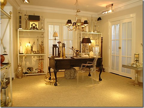
Facing the street. Notice the large pediment on the left wall. Inside it is a TV monitor. When Ron and his clients sit at the skirted table and Ron shows product from his computer – the image is displayed on the large wall monitor. No more peering at a small computer screen for Ron’s clients. He has thought of every detail – he should have! He had four years to plan his showroom!!!! Through the French doors on the left is a powder room and a storage closet. The niche where the computer monitor is hanging is accented with wallpaper while the rest of the walls are painted.
The same view – looking to the right. The windows face the street. The old flower shop door used to be at the curved corner. No longer. The front door is now in the Chinoiserie Showroom.
Looking from the skirted table to the rear of the main showroom. To the right is the powder room.
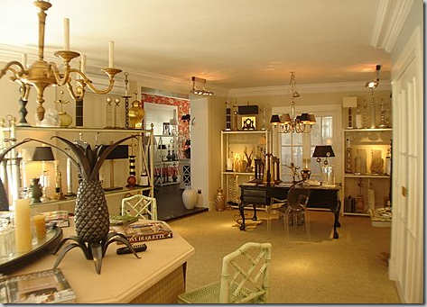
The main showroom – looking towards the back.
The French door behind the desk leads to the workroom which connects to Ron’s pool yard. The door to the right of the desk leads to the kitchen, which is not yet completed.
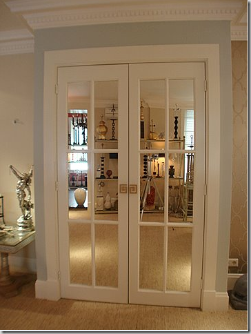
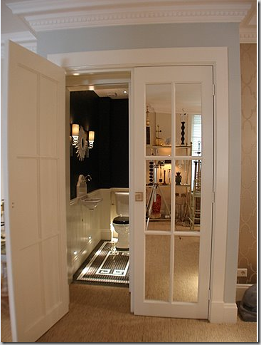
I love how Ron chose to use mirrored French doors throughout the interior of his shop. They just add so much sparkle and atmosphere. The powder room is behind these doors. Look at the Greek Key door handles he designed. Always the classical choice for Ron.
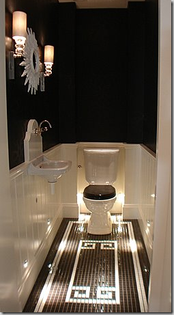
The powder room is stunning in black and white. What a surprise!
Notice how the floor repeats the motif of the door handles. And I love the small spot lights pointing to the tiled floor. Just stunning!
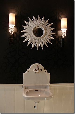
A close up of the black on black wallpaper and hanging sink! The mirror and light fixtures that Ron designed add just the right touch!
FROM THIS
TO THIS
FROM THIS
TO THIS
FROM THIS
TO THIS.
I hope you’ve enjoyed my story of Ron van Empel’s redo. I know it was long and if you stayed with it - thanks!!!! He is so proud of it and I am of him, too! Ron is one of the nicest guys I’ve met on the blogs and he’s got a quick wit to match. Ron, I wish you much success and good health and happiness in your beautiful new showroom!
For all the architects and designers out there – here are the hand drawn plans Ron emailed me one night last summer when I was trying to put it all together in my mind. After that, are his plans to one day turn the showroom into his house when he retires – yes, you heard that right. And following that are the proper architectural drawings!

This shows the floor plan of his second apartment, the pool area, and the new showroom with the Chinoiserie addition.

Ron’s plans to turn the showroom into his home after he retires!

He even has his furniture placed in his future home. Anal? You decide!
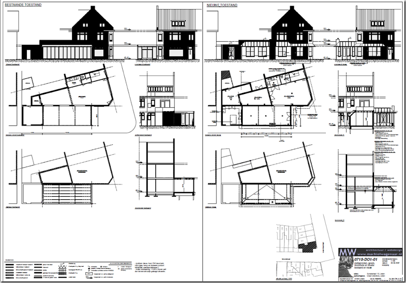
The architectural drawings for the showroom.















What a great story! And I very much identify with Ron's sense of the neoclassical and symmetry. I wonder where he found the miniature featured early on in the post, (in the niche). It's just great.
ReplyDeleteYou have struck a nerve with me dear Joni. I too have been a renovation freak since childhood and your tour of Ron's project with the addition of the floor plan projections has me hooked on this house. Gorgeous, and so suited to its history and use.
ReplyDeleteKudos to your reporting of the progression, and to Ron on a beautiful transformation.
What an amazing and gorgeous transformation!
ReplyDeleteSimply amazing!!!!!!
ReplyDeleteJoni, you are always so gracious. I bet this project did "feed your soul" ..... You are WONDERFUL at what you do.....Bravo to both you and Ron.
I am so hyperventilating right now. I feel the need to fan myself! So beautifully classic! The floors, the wallpaper, the color choices, those beautiful Greek key pulls, the LIGHTING!!!! Fabulous job Ron, and kudos to Joni on this post!
ReplyDeleteI am so fascinated with other countries sense of history and keeping the exterior of things the same. So much more pleasant to look at from an architectural standpoint. I really enjoy your tour and all that has been done inside and out. Hugs, Marty
ReplyDeleteSoooo beautiful!!!! That bathroom is absolutely GORGEOUS!!!!! I want one too, please! You guys did a lot of work and it paid off. Wow!
ReplyDeleteSally Wheat
That may be the best redo I've ever seen: the complexity of the project; the very long-term thinking and all within the constraints of a place where space is of the essence and you don't do it the American tear-down way. Lovely, inspiring and great fun to read; thanks, as always!
ReplyDeleteWhat a fun project for you ! I totally understand the passion for re-purposing old space (hence, my church project) and there is nothing I love more than floorplans....I live my life "in plan". I love it all BRAVO.
ReplyDeleteJoni....what a FABULOUS, FANTASTIC and EXTRAORDINARY post !!!!!!!!!!! You amaze me!(and so does Ron!)
ReplyDeletexoxo..........
What great comments already, so early in the morning! Thanks for compliments to y'all ( I love that word, how southern!). I am floating on a pink cloud.
ReplyDeleteTo Columnist; the architectural miniature I made myself.
And most important, thank you Joni for this extensive and indepth reporting of my reno. Nobody could have captured it in a nicer and more comprehensive way! You have such talent and interest to learn about other 'projects'. And you get it!
I can't thank you enough.
Hugs, Ron
Simply breathtaking! This man is such a talented space planner and interior designer! Whew! If this was a "little redo" I would hate to see a "big" one! Amazing work!
ReplyDeleteGreat work on your part, too, Joni, bringing it all to us! When do you sleep gal?
Love it all!
Vickie
I don't know how you do it, but you have the most spectacular eye candy in the world of blogging. Every picture can just suck me in for minutes--checking out all the details, trying to figure out the lighting, you name it! Thank you for another great post!
ReplyDeleteI loved the story of this remodel! The result is beyond words. Joni, I visit your blog every day - - thank you. Ron, Your homes and your shop are outstanding. Thank you for sharing! Ron, I did notice (with delight!) that I have a garden stool exactly like those in your home. My father, who was an auctioner at Samuel T. Freeman's in Philadelphia, gave it to me.
ReplyDeleteWhat a wonderful was to begin a new week!!
Jean
In addition to an architectural fetish I have a lamp fetish. My office: 10 lamps, 1 chandelier.
ReplyDeleteGlad Ron is out of the country.
Great post & thanks for adding the drawings.
Garden & Be Well, XO Tara
Impressive. Such a complicated tricky renovation with so many starting problems, and it works so well. I think that drawing the furniture arrangements is smart rather than anal. My first reaction to the whole thing is just "wow".
ReplyDeleteThis is a dream come true. He did a great job with this renovation. Everything is just gorgeous.
ReplyDeleteWow, Joni, I love that garden room with the fab clock, very unique. I can see a PVE illusration of the front door! Be sure to see my latest painting giveaway!
ReplyDelete*** What deep LOVE & entirely dedicated COMMITMENT Ron has felt & displayed, for his vision to become a reality~~~ It is REQUIRED if one is to maintain his/her patience til getting it "just right", isn't it? BUT, not many people can ACHIEVE that! What a terriffic, uplifting, inspiring, fun and beauuuutiful way to start the new week!!! Thank you to Ron for sharing w/ you, and thank YOU, JONI, for taking soooo much time to present his enchanting story the way you did! Wunderbar~~~ BOTH of you!!! Love, Linda/ RMS's "Mom of a German Shorthair"
ReplyDeleteThis is truly a labor of love! I am always awed by what people can do with apartment renovations. I hope he can one day own that middle apartment, imagine what he could do with it!
ReplyDeleteThank you, Joni, I really enjoyed reading this and seeing the renovation from beginning to end. You have such a gift for being able to communicate the design process!
Like all the rest of us design freaks I was reading every word and studying every picture. I have been like this since before I was six...I think you can be taught to solve problems ect. but you either have or you don't! I also wanted to thank you for the sweet comments that you left at my blog and yes the horse is still alive and well, retired from the show ring, but just as beautiful. His name is Da-veed.
ReplyDeleteI cannot wait to go back and study this frame by frame! Watching a project go from "before" to "after" must be in our blood! Thanks once again for making another everyday special!
ReplyDeleteHi Joni and Ron!
ReplyDeleteLove it! I have learned so much from "cote"! I love the zinc pediment and the design of the doors. I wonder if I could convince my husband to sell and build a new house....
I did take your advice and change out a couple of lamp shades! I'll send you a snapshot. Big difference.
Thanks,
Cara
What an amazing transformation!
ReplyDeleteWhat a fabulous re-do!!! I most appreciate that the aesthetics of the building and its surroundings are still in harmony with the neighborhood/community! And the interiors were breathtaking! Gorgeous!
ReplyDeleteThe details on the exterior of the old flower shop are just amazing. He nailed them just right! I love the chinoiserie wallpaper! But most of all---I LOVE that black bathroom! The floor lighting, the tile floor, the sink and mirror and lights---I think I could move into that bathroom!! ;)
ReplyDeleteEverything is just incredible!!! Both of you are such talented people.
ReplyDeleteI think you should write a book about your experience. A decorating version of the the book I think it was the 2000 mile gardeners or something: two people who shared a gardening passion across the miles and across time. Either that or how you have blogged your way into the world, encouraged others, grew more talented in your own right.
ReplyDeleteJoni, how do you keep pulling this stuff out of the hat? What a wonderful story. I was hypnotized by all the beautiful lighting. Never have I seen so many lovely fixtures in one place. Ron, Please bring Empel Collections to America if you're not already here!!!! And if you are, let us know where.
ReplyDeleteThis is an amazing recapture of an incredible journey. Thanks for sharing it. I too think a book is in order!
ReplyDeleteThe powder room...gasp! Thanks...this was so much fun, I guess I need to sign in as a reno-dreamer too...oh, and doesn't everyone place the furniture in their reno-dream-drawings?
ReplyDeletehehehe
Absolutely fabulous post. Loved every word and photo...as always.
what a fabulous renovation! I LOVE love LOVE his apt!! And i always love the mirrored french doors -that powder room is just amazing!
ReplyDeleteWhat fantastic coverage you provided. I stayed with the whole story and loved every detail. You two did a great job corresponding...that powder bath is stunning!
ReplyDeleteHow beautiful- I was admiring the mirrored french doors until I scrolled down and literally gasped at the powder room behind them. And I loved to see the ceiling fixture over the oval table next to the kitchen in apartment one. I've drooled over it on the Empel site since Peak of Chic's post and now to see it in a practical application...
ReplyDeleteLots of inspiration in this post. Thanks again Joni, and thank you also to Mr. Empel for opening his world up to design voyeurism!
Liz in Upstate NY
Exquisite taste & patience = Speechless!
ReplyDeleteTruly, it's genius! He must possess an architectural background to even envision these renovations!
You should see me writing this post. I'm just sitting here shaking my head in sheer wonderment! EVERYTHING is perfection! One phrase keeps popping up in my head: (this is) how to do it right!
incredible.
ReplyDeletethe entrance , the first bathroom, the kitch. the garden/pool ....it goes on forever,and so could i.
the concept is fabulous.
an absolute dream.
Joni, I loved this post! I have travelled to Holland twice and loved it! Great ideas.
ReplyDeleteI cannot even tell you how much this redo speaks to the classicist in me!!!! You know how much I'm ALL OVER precision, refinement and strong, clear lines. I'm salivating. Seriously. Now this more than anything in the last year has made me want to get off my big round rumpus and get started on remodeling this old house!!!!! Progress soon, I promise ;)
ReplyDeleteAnd how I wish,wish,wish that Ron would sell his products in the US of A. I would certainly spec them for my clients....two for you, two for me. four for you, 5 for me :)
Great job y'all!!!!!!!!!!! It is utterly spectacular!!
What a beautiful renovation! Thank you for sharing it all with us.
ReplyDeleteKim
Such a lovely result to the journey! It would have been soooo tempting for me to move into that red wallpapered room with the fireplace. I already have it done in my mind!
ReplyDeleteLove his lamps, too!
Great story and fantastic project, Joni. Everything is just so beautiful and perfect I can't even think where to begin with the comlpiments. I do love your friend's dedication and tenacity. . . he'll get that last apartment yet!
ReplyDeleteI immensely enjoyed Ron's journey.
ReplyDelete(Thank you Joni!)
Amazing the transformation. Chances are the previous owner of the Flower Shop could just drive right by without first glimpse recognition.
Thank you for sharing this post. Its amazing how much beauty and space he could fit into the same footprint. Very inspiring to any renovator.
ReplyDeleteWhen we lived in Norway, we frequently visited Leiden as friends of ours had moved to work in The Hague. Leiden was where the American school was so they lived there too. To be able to do this type of renovation is amazing knowing how difficult it is to procure the property let alone get council permissions to get the work done! I'm "gobsmacked" at how well it turned out and that such small spaces were "fooled" into BIG ones!
ReplyDeleteI appreciate you allowing us to be "privy" to this project as it unfolded.
Your "in depth" stories are so enjoyable and informative. This one is a great inspiration! It takes far more imagination and patience than our American tear down mentality. "Yeah, it's cute but it just has to go. Not worth putting money into it and/or could never get my money out of it. Low ceilings. Not enough sq.ft. Etc." Thanks, Joni and Ron!! PS: Joni you also showed what imagination can do in your Tanglewood redo. Beautiful.
ReplyDeleteOMG - this post beats out anything in the magazines this month. Also loved the Tanglewood redo. Thanks for the design fix.
ReplyDeleteWhat a beautiful redo, and such a fascinating story of the way a business grows and the space requirements involved. This story reminded me so much of my own developments, having recently moved into bigger space also! I know the time and energy involved and it's so nice to see the beautiful results of Ron's efforts, as encouraged by the wonderful Joni!
ReplyDeleteLucky Ron to have great taste and own the building where he has his showroom! I lived in Holland for four years a thousand years ago and I never remember seeing interiors like we are seeing today. Ron and I crossed paths through the internet awhile back - so I was so happy to see this wonderful post. Love the hidden powder room - the white mirror is very beautiful. Thanks Joni and I hope Ron is reading all these wonderful comments - and if so a big hello to him!
ReplyDeleteAs I read your post, I couldn't help but dream of enjoying an evening meal with you and Ron in his shop - the photos of his place reveal such an incredible inner life and your post bubbles over with joy in not only the subject matter but how you've assembled this blog and how it all came about. So many things I see in the photos I wish I could have in my home too and will do some searching to see what is possible by way of Ron's lights.
ReplyDeleteOf all the photos, it was the bathrooms that were so telling that they were in Europe - the use of brass in the bathrooms. I find it so much warmer than the polished nickel (which I like very much) and wish it would catch on again here in the States.
Thank you again for such lovely post. - KBN
This is such an amazing transformation!
ReplyDeleteWhat an absolutely stunning transformation!! Thanks for sharing the journey with us!
ReplyDeleteThere are no words..........what an amazing job and friendship. You are so gracious and talented and it sounds like Ron is equally so......thanks for such a detailed look at the whole process. Wow.
ReplyDeleteWhat a great story- such a beautiful re-do and so many inspirations in the process!
ReplyDeleteblessings,
kari & kijsa
Thanks for sharing Joni, how fun! I've exchanged emails a few times with Ron and he seems like a darling. How on earth you have time to put together such long posts on a regular basis is beyond me though!
ReplyDeleteGreat interior decoration, Nice furnishing furniture and best use of bi folding doors and windows.
ReplyDeleteI have no vision whatsoever for renovation, so I love to see a completed renovation in order to understand the possibilities!
ReplyDeleteThe little details are what draw me in here...the grill of the front door, the fireplace, the castellation pattern on the dining room chairs, the mantlescape, the lighting behind the toilet! I look forward to examining this in more detail.
Ron makes one of the most beautiful chandeliers - a custom empire style - the proportion is absolutely perfect. I first saw it on a post of yours a long time ago, and still remember it.
I love the x design used over and over -especially on the railings and on the radiator cover - also ador the greek key tack design on the dining chairs. Divine!
ReplyDeletexx-Gina
Love it, Joni... fascinating the transformation. I love all of his touches, and I am in lust with those high-backed, red-striped chairs among a dozen other things!
ReplyDeleteThanks for sharing...
XO,
Sheila who wants to know if you're wearing your green so you won't get pinched! As I said to someone earlier, I guess it depends on who's doing the pinching! ;-)
Fascinating transformation. Ron has really got style! Great narrative, Joni. I love his herringbone floors in the showroom, too.
ReplyDeleteWhat an amazing re-do. I am one who is smitten by the X motif...as you can tell by our farm. I love the semblence it has to the equestrian theme as well. Oh - I just get lost in your wonderful blog posts!! On day I hope to be able to build a real house on our farm.
ReplyDeleteWow! What an interesting story. I know I can always find something so well thought out and presented on your blog, Joni.
ReplyDeleteWhat an amazing, interesting story!! Thanks, Joni, I always find your blog to be a learning experience! Hugs, ~cindy s~
ReplyDeleteI love the redo & his timeless style. As always, you leave no stone unturned. I have also now tucked those mirrored french doors into my brain for future use!
ReplyDeletexoxo
This is an amazing before and after and an amazing story. I love the Red chinoiserie wallpaper and the black wallpaper in the bathroom. Really everything was great. He has incredible style. I am going to check out his lamp collection now. Great story.
ReplyDeleteA little Redo! Amazing...
ReplyDeleteI'm having a giveaway
everyone is welcome to enter!
xoxo,
Cathleen
Another fabulous post! Thanks for sharing it with us. So much to learn from you and your wonderful clients!
ReplyDeleteJoni, r someone who bought house plan books and decorating books since she was a girl, I was highly interested in watching the extraordinary transformation and hearing the story behind it. I didn't have a bit of a problem sticking with this one. Love the story of how you two connected as well.
ReplyDeleteThanks for sharing another exciting and interesting post.
~~ Victoria
My dear, this is one of the best blog entries, no make that one of the best renovation stories I have every read. Seriously. Ron has an amazing sense of style and a sharp eye. His attention to detail is superb. I love the little details like the Greek Key handles and the repetition of the "x." The writing was also great. Well explained and witty too. I am so inspired! Thank you!!!
ReplyDeleteThis was clearly a labor of love for both you and Ron. I am partial to the infusion of the neoclassic details and love the traditional yet fresh finished results.
ReplyDeleteI love detail and seeing what he has done is just beautiful. It is such a good reminder to me that great things take time and it is a process! I have the "I want it all together...right NOW" problem. :>)
ReplyDeleteHi Joni - another wonderful post!
ReplyDeleteI noticed you asked Ann about the Italian inspired headboard in the post with RED and Bella Notte Linens.. if you are interested, I can hook you up! My boss (a self proclaimed Italio-phile) designed the bed and we had a local craftsman make it for us. I say "us" it was for the Italian store my boss had in Fredericksburg, VILLA TEXAS. Unfortunately for the store, she decided to focus on her architectural/design work and so she downsized the shop. The bed is beautiful - it's exceptionally well made & sturdy. Let me know if you have any questions....
Stacey
Wow! What a transformation! I love the mirrored french doors and the powder room is amazing!
ReplyDeleteCurious... I know the blue paint is Farrow and Ball, but which blue? And the neutral?
Kerry
For Kerry; Thanks for compliment ( that goes of course for all others who have left many compliments!!)
ReplyDeleteThe bleu paint; F&B skylight 205.
The neutral, I had this color developed just for me. I needed a warm beige that would not go pink when the sun would enter a room. This custom paint has now been used in many projects in Europe and the US.
THANK YOU EVERYONE - I'M SO GLAD FOR RON THAT YOU ALL REALLY ENJOYED IT! I TRIED TO MAKE IT AS EASY TO FOLLOW AS I COULD - AND I HOPE YOU FOUND IT FUN!!!!
ReplyDeleteTHANKS EVERYONE - AS ALWAYS, SO VERY VERY MUCH!
brill!
ReplyDeleteHi Joni, I distinctly remember the first post about Ron's lamps and his home. Absolutely gorgeous. This post totally blew me away! I SERIOUSLY WANT his BLack Lighted Bathroom. It is SOO cool.
ReplyDeleteKaren O :)
This is truly an amazing transformation! Thanks for this and all of your meticulous posting. I look forward to each new one.
ReplyDeleteum, wow! this post has left me a bit speechless. wow.
ReplyDeletelove the the new wolfsonian front entry best, i think but it's hard to narrow it donw becaesu the whole thing is just, wow.
Joni, I just LOVE your posts. So many pictures, so much detail, you really help your readers feel a part of the transformations! So inspiring!
ReplyDeleteI am a fellow Houstonian, so I truly loved the West U posts. My hubby & I lived in Rice Village our first few years of marriage before we were off to Austin.
I wondered if you could help me... I just inherited some dining room furniture, a table, 6 cane backed chairs and a fabulous buffet. Only problem... it's maple wood, which I hate. I am thinking of having it painted one of your fabulous Gustavian grays you so often post about. Any tips of great colors of paint for dining room sets? Many thanks!
Oh, my email: ktmt925@sbcglobal.net
Great story.....
ReplyDeletecheck out my blog:
http://chezlamaisonblanche.blogspot.com/
You've got a mention...
Ron is truly talented! Thank you for sharing. Happy Friday, Happy Spring, Happy~Happy Everything!
ReplyDeleteBeautiful transformation. I admire how detail-oriented you are.
ReplyDeleteI'd love to see him do a guest post on selecting lighting. I think it's the hardest thing to do (he must, too, with all the custom designs!).
Specifically, why is hallway lighting so UGLY??!!
P.S. Hallway ceiling lighting.
ReplyDeleteRon, after having the pleasure of meeting you in Dec. of 2008 and hearing about this project.....words just did not do it justice....it is fabulous as are you and your lovely lamps!!! I think we will see quite a lot more of you in the USA!!
ReplyDeleteWOW! I absolutely love this post! The before and after and during the transformation pics are excellent. There are so many details that I like too. I will be looking at at this post again and again. It's spectacular! Thank you for sharing.
ReplyDeleteBeen traveling and I'm late to the game, but.... I'm absolutely blown away!!
ReplyDeleteGreat post. Stunning renovation! Cant wait to see it in real life Ron.
ReplyDeletecheers,
Eric
gosh...I stumbled here searching for tips on redoing an old brick fireplace, and next thing I know it's bedtime and I'm wondering where the night went!
ReplyDeleteIts rare to see such a complete set of before and afters...I really enjoyed this! Thanks
What a great story, Joni! Having lived in Holland for years, this is not only a great renovation story, but also one of perserverance on Ron's part, I am sure. {permits are hard to come by!}
ReplyDeleteWhat a transformation. Next time I am in Holland I will try to visit his wonderful shop.
Lidy
Great and fantastic article. Thank you for you very nice and interesting posting. Congrats!
ReplyDeleteAt the coach outlet online you have the largest selection of the day. If you touch the item and like it, keep it in your possession until you make your final decision.The coach factory outlet has been in business for many years. You can log in to find more information about its products and services.You know, Coach items are so perfect and fascinating. Now I grow up, and find coach outlet on the Internet offering affordable products with reliable quality.
ReplyDeleteThere certainly are a amount of methods to acquire affordable coach products at coach factory outlet,it could possibly the most effective options.the most vital cause may be the reality that you simply can purchase genuine coach products at there.It is believed that you will like the products on the coach factory online. There are spacious sizes and different colors, styles and so on.in the market you definitely can find various colorways that are designed in as well as the high quality that applied in. For most of you would like to come. So just come to our coach factory outlet online store to choose one.
ReplyDeleteJoni I had somehow missed this post the first time and am so very glad you linked to it. What an amazing transformation. Mr. van Empel has such lovely vision and to see it brought to fruition through hard work and patience is a true joy!
ReplyDeleteHi Joni!
ReplyDeleteYou keep outdoing yourself! what a wonderful blog post!
Before and afters are so instructive! Students should just forgo school and read your blogposts.....what they are teaching in many schools is tripe!!!
Honestly.....You are a gift to the design world.
Thank you! What a wonderful thing to see!
(I haven't seen "Boyhood"; but this looks to be the building version of "Boyhood"!!
XXOO
Joni, Thank you!!!
Penny