One of my all time favorite design magazine stories concerned a house that was decorated primarily in pinks. The young owner had a life long obsession with the color and was determined to live with it. She was very definite about her colors - it was not just any pink that she loved, instead it was a most specific shade, a blue-pink. Apparently her mother also shared a love of this same color and the owner had grown up around it – it was in her blood, you might say. Enter interior designer Suellen Gregory, from Richmond, Virginia, who fulfilled the owner’s pink fantasy by creating the house of her dreams. The Pink House first appeared as the cover story of Traditional Home, September, 2003. I remember it well. We were vacationing on the beach when the issue came out and my copy of the magazine went home sandy, stained, and dog-eared. I loved everything about the house and remember feeling a pang of envy that here was someone with enough self confidence to actually take such a ravishingly feminine color and use it throughout, without any regards to what people might think of a pink-filled house!
The story of the Pink House appealed to a lot of people, not just myself. For years afterwards the house showed up time and again in various sister publications. My well-read copy of the original article remained on my desk –hoping for that one client who would also want that perfect shade of pink. As it so happened, one day I decided to research the designer online and there, lo and behold, was the Pink House on Gregory’s web site, except it had been totally transformed! The house was now redecorated all in white, with just a few accents of a deeper, hotter pink. I found the comparison between the pink rooms versus the white rooms fascinating, and even wrote about the two different color schemes in the early days of my blog. I polled the readers as to which they liked better – the pink decor or the white version? It was all in great fun, and an associate of Ms. Gregory, Megan Lowden, emailed me, thanking me for the story. Megan and I have kept in touch through the years and she recently let me know that Ms. Gregory had just gone online with a brand new website. Would I like to feature it, she wondered? You bet I would! I adore Ms. Gregory’s style – a genteel southern brand of design that is heavy on the classics, the kind of decorating that stands the test of time. Gregory, eschewing trendiness, creates a decor that looks as good today as it did yesterday and will tomorrow. Her designs speak to me – I love her silk taffeta curtains, her use of French antiques, her ability to effectively mix the modern and the ancient, all the while creating a cozy and warm ambience. Of course it would be my pleasure to promote her new web site!
Well designed web sites are as important today to the interior design profession as is a well designed space, and Gregory’s new site does not disappoint. The images are large and bright, focused and professional – something that many others lack. The site is straightforward and not overburdened with lots of gimmicky flash intros. It’s easy to navigate and best of all – there are plenty of magazine layouts in PDFs. Perhaps the most surprising part of the website was who designed it – Coleen Rider, the owner of Coleen and Co., a hugely popular design store in Los Angeles. Coleen and Co. is one of the design blogosphere’s favorite retail spots, but did you know that Coleen designed web sites too? Neither did I!! To me, Coleen is famous enough for her ultra fabulous tent-lanterns, her one-of-a-kind tole lighting fixture that has been the rage on so many blog and magazines. Yet, wearing another hat, Coleen develops web sites and other business branding product, a hobby that has turned into a satisfying and lucrative business. Today, I am thrilled to show you Suellen Gregory’s new site, designed by Coleen Rider – I hope you enjoy it as much as I do!
The epitome of southern grace and charm, Ms. Suellen Gregory from Richmond, Virginia.
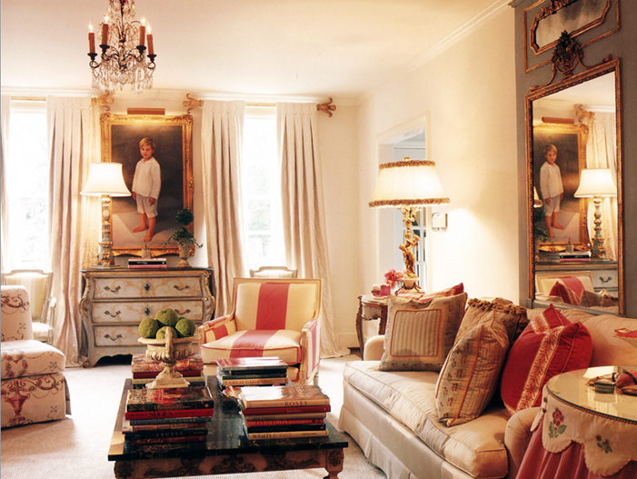
The original famous “Pink House” – lot of creams with accents of pink made up the formal living room. Throughout the house, Gregory used a cool gray as the secondary color. When first published in 2003, I thought this was one of the prettiest rooms I had ever seen – and I still feel that way today!
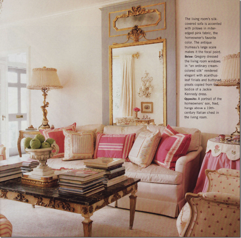
The living room – the blue-pink shows up in the silk pillows. The oversized antique French trumeau is the room’s focal point.
In the living room, the portrait of the owner’s son is flanked by lovely cream colored silk curtains. Notice how gorgeous the curtain rods are! Gregory said that the button pleats were modeled from the bodice of a Jacqueline Onassis dress!!
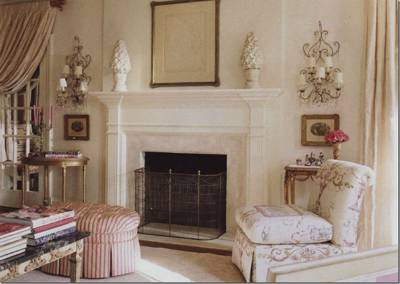
Across from the sofa is the fireplace with a pair of crystal sconces on each side. I adore the pink and cream striped ottoman and the ultra feminine fabric on the slipper chair.
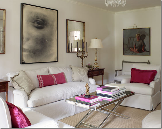
Today: the Pink House was redecorated by Suellen Gregory, as evidenced by these pictures on her web site. Gone are all the French pieces such as the trumeau, instead the room is now more cleaned lined with a heavy dose of glamour. The creams have been replaced with clear whites and the pinks are of a decidedly hotter variety. The French styled coffee table was replaced with a mirror-clad more contemporary piece and assorted bergeres were switched with club chairs. Notice how Gregory updated the sofa – there is a single bottom cushion and double back cushions that replaced the traditional three cushions of before. Notice too the dressmaker skirt that flows from the deck – a much updated look. Even the portrait of the son has become less traditional!
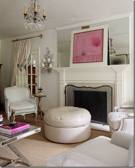
Painted wood frame chairs are now upholstered in white with chic nail head trim. The mantel has been mirrored, showcasing a contemporary piece of art done in pink – of course! Do you prefer the living room with the white decor or the pink decor? Hard to decide, I know!!!
The dining room, before, while the house was still all pink. The painted and gilded cane backed chairs are upholstered in silk and cream stripes and the floors are a wonderful, painted grey and white checked pattern. Just dreamy!!
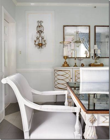
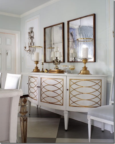
The dining room in the new white decor. The console is white with gilding. The chairs have been replaced. Mirrors replace art work. Just as in the living room, the dining room is more 40’s glam than the traditional French style before. The floors remain the same as does the table, although the top has been mirrored.
Another shot of the “white” dining room. Do you have a preference for the pink or the white decor? I really can’t say if I do myself. I love the pink decor, but the white is fabulous too.
The entry hall as it originally was – in this room, Gregory chose to highlight the blue-gray color, instead of the blue-pink. The entry hall is long and is divided into sections. Through the second area, you can see the blue silk portieres that were used at the doorway. The slipper chairs were upholstered in the same fabric. I love how Gregory painted the handrail to match the floor boards! But the piece de resistance is the antique wood fragment, used over the portal, creating an arch effect – magnificent!
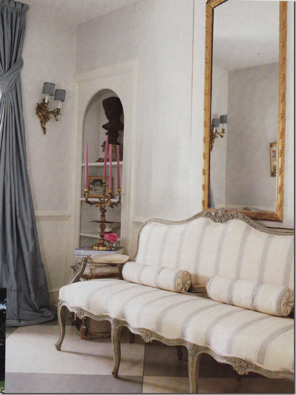
Across from the slipper chairs is this gorgeous antique French canape, in gray and white stripes. Notice the shelves are open here.
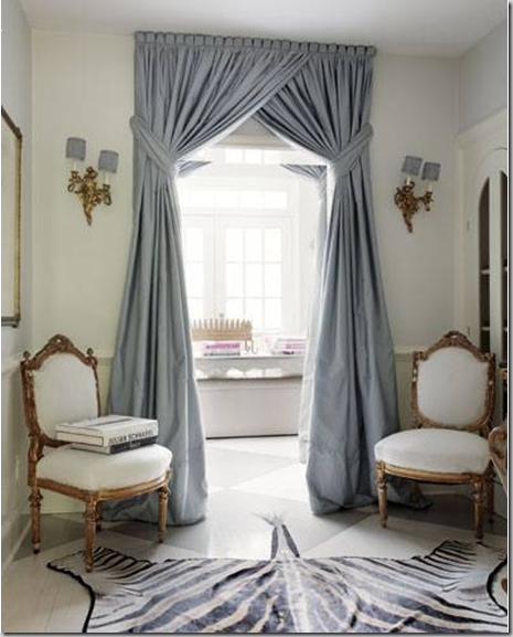
Today, the space has been updated – the slipper chairs are long gone, replaced with gilded chairs upholstered in white. A zebra rug finishes the updating. Note that the shelves now have arched doors closing them off. In this picture you can see the detailing of the portieres – Gregory does wonderful window treatments, as evidenced here. I love how they are tied back high up, rather than low, creating an excellent visual proportion and also notice the scalloping at the top of the curtains – all excellent ideas to file away and utilize on your own curtains one day.
For the Pink House’s family room, Gregory used a slipcovered sofa with pink trimmed pillows – pink gimp was used on the bergeres. The curtains are a softly colored pink and white ticking, held with beautiful antiqued mirrored tie backs. Above the sofa is another trumeau. Notice in the trumeau – the reflection of the luscious shades!!!
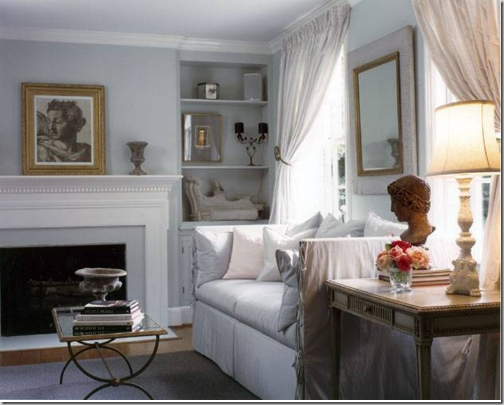
Today – as the “White House,” the pink pillows are replaced with white, as are the curtains. The walls are now the light blue-gray shade.
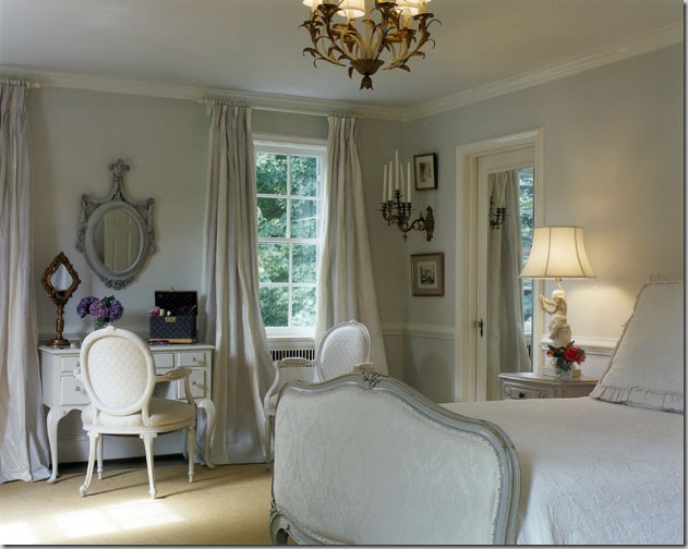
In the original Pink House design, he master bedroom was not done in pinks – instead it was all French and creams and whites and grays.
In the redecorating, the master bedroom was streamlined – the chair at the desk was changed as was the mirror. The bed linens are simplified without the duvet. I love the subtle gray and white striped fabric used for the curtains.
So, that is all the pictures of the Pink House, now the White House on Suellen Gregory’s web site, or is it????
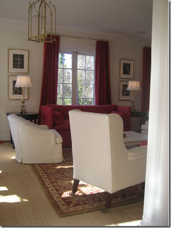
While perusing the pictures, I found this one of a gorgeous paneled library filled with a beautiful pink silk damask fabric. But the painting over the fireplace looks familiar. Wait – it’s the same as the one in the “White House” living room! Could the house have been updated yet again? The touches of pink seen in the adjoining room give off even more tantalizing clues.
Might this room, with the deep pinks be the adjoining room to the library? The sofa does seem the same shape as the white slipcovered one…..
No, it can’t be the same house – this adjoining room isn’t the original Pink/White House’s living room. But it was fun for awhile to try to read the clues! As you all well know, I love to study houses and their decor and see the evolution of their rooms throughout the years. I become engrossed trying to figure out floor plans from pictures – how the rooms relate to each other. And so, after studying these three rooms above, I had to say, that no - it wasn’t the same Pink/White House at all, despite the same art work found in the paneled library. I must say, though, that this room designed by Gregory is one of my favorites on her web site. I love the lines of the twin sofas, the absence of the back cushions is so fresh looking and the long lumbar pillow is just the perfect accent. The two pieces of art or tapestry canvases flanking the doorway, are just gorgeous!!!! I love the gold mixed with the white – and notice the mirror-less frame over the mantel. Beautiful!!!!!!!! But wait…….the gilded chair in the gold damask, isn’t that the same chair upholstered in white in the entry hall of the Pink/White house????? The mystery continues……..
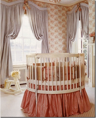
One of the prettiest nurseries in the world – this apricot and gray vision, with a toile wallpaper, patterned rug, and taffeta bedskirt was designed by Suellen Gregory. Notice the wonderfully shaped valance and how subtle the draperies are held back. Just beautiful!! Who wouldn’t want to be a baby in this room???
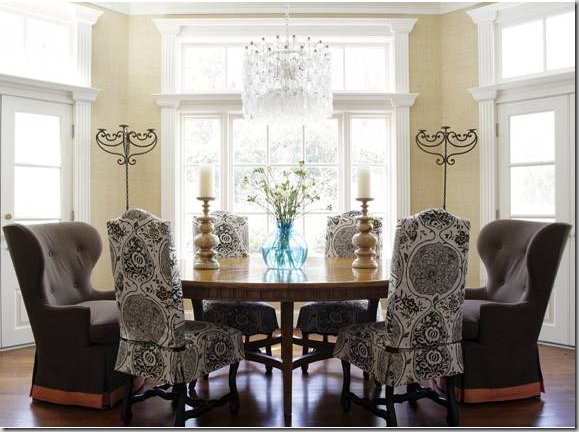
And finally, this dining room by Suellen Gregory features chocolate linen chairs from Coleen and Co. Coleen Rider, proprietress of Coleen and Co., also designed Gregory’s new web site.
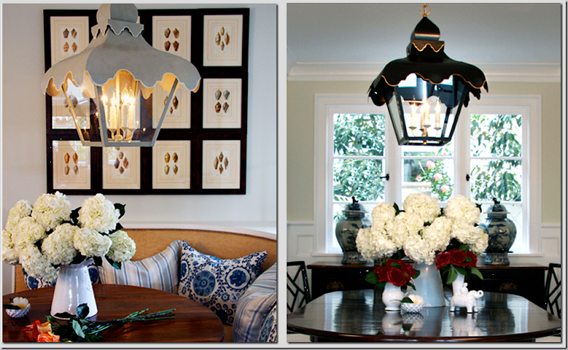 Coleen Rider’s fabulous tole tent lanterns, in gray and in black. They also come in wall sconces.
The pictures I’ve shown today are just a small taste of Suellen Gregory’s portfolio found on her newly designed web site. Be sure to visit it today to see all of her beautifully designed rooms, here. And also, be sure to visit Coleen Rider at Coleen and Co. To contact her web site development company, Creative and Company, please visit, here.










I must say that I do prefer the white rooms with the hits of that glorious pink. Funny you should post about pink - yesterday HGTV had a pink marathon - every program all day was about pink rooms - so incredible. Gorgeous design, excellent post. Once again..a home run Joni. LP
ReplyDeleteThink pink>>
ReplyDeleteAfter watching "Funny Face" last weekend ( for the umpteeneth time) the song has been swirling through my grey matter non stop. I wonder if thats why I prefer the Pink House. For me, it evokes more warmth.
It's a hard one, I think I prefer the updated version. It's a shame they didn't leave touches of pink in the dinning room. The pink flowers & candles would have added a lovely punch of colour.
ReplyDeleteI remember the pink vs white post, and I still prefer the softness of the pink decor, although I like how streamlined the white decor became...just not some of the furniture choices.
ReplyDeleteMy theory on the new house is that Suellen has a thriving consignment store on the side based on how frequently her 'pink' client likes to redecorate!
This has to be one of my favorite posts! I'll have to use a lot of these rooms as inspiration for my new OLD home! Thanks!
ReplyDeletePink and grey are a perfect combination, but I enjoy the updated, predominantly grey version. But either one is gorgeous, and strangely you may think, pink is actually quite a masculine colour to use, certainly the way she has used it, (sparingly).
ReplyDeleteI have followed Suellen Gregory for years. Her work appears in my inpiration files often. I love the original house the best, but I love the way her work has evolved as well. Love that room with the white sofas with touches of gold.
ReplyDeleteI've not read this post yet and will have to come back. Some of the photos are in my files that I have torn out of magazines,can't wait to read it...but no time this morning. I wanted to thank you for sending lauren my post and do tell her that I could not breathe the first time I saw her home. Linda/mom is wanting to contact her about something too. Pass that on to her if she in interested ...thanks
ReplyDeleteJoni, a lovely post, once again. I love both versions, but I think I like the white mixed with pink, best.
ReplyDeleteWhat a wonderful post! I wonder what happened to that lovely portrait, which I assume is her son. I would prefer it over the sofa instead of the picture of the eye. All of the rooms are so beautiful!
ReplyDeleteOh I remember the pink house from that issue of Traditional home! It was so romantic! Like it better than the all white, though that is lovely too.
ReplyDeleteI loved this pink theme when first published and agree, it stands the test of time. Do you remember knowing that Angelica Huston as a very young girl lived in a pink cottage and everything in it was pink - well, Jack Nicholson found the whole package pretty darn captivating. When I was young, I did not care for pink; thought it was sappy - now I love it to pieces! Dorothy Rodgers, wife of the Richard Rodgers, the composer said a woman has several evolutions as she decorates her home; her taste change and grow as she becomes versed in pattern, antiques, scale, etc. Surely this is some of what we are seeing with Sue Ellen.
ReplyDeleteI still have my copy of Traditional Home magazine which featured Suellen's lovely pink version of her home. The original with all that glorious pink will always be my favorite. I hail from Richmond too, however Ms. Gregory lives on one of the most famed avenues there and the homes are quite lovely.
ReplyDeletePink has always been my signature color so of course I loved the femininity of her previous decor.
Thank you Joni, for this lovely post.
I, too, remember the pink house and the discussion of the very perfect shade of pink. I prefer the first version. It seems warmer, more personal, more gracious. The white version has more glam, but to me less soul. While you are wondering about the rooms, I wonder why the home owner wanted such a different, whole-scale redo.
ReplyDeleteThis is beautiful. I love Suellen Gregory. Such talent. The nursery is so lovely and graceful.
ReplyDeleteMy favorites have to be the rooms accented with pink. I like a little color with my white.
As always...a beautiful post.
Have a wonderful day.
Cathy
I like the pink as well, and appreciate the post. Thanks. Some time ago, I had a pink house, and had brainwashed my boys that pink was the best color. I didn't want to take any flack from the men folk about pink, or poodles, so I started early, telling them that pink was the best color, and they believed it. They were toddlers twins. I guess I went overboard, because when we went to Sandy's Shoe Store, I had to sneak out of the house and call ahead, and say " you know those really nice pink cowboy boots you always keep in the window?" yes, the lady said, " well get 'em out of there, because I don't want them asking for those pink cowboy boots." I still love pink but I have it on my upstairs now.
ReplyDeleteInteresting to see how the pink rooms were transformed into more modern white rooms, but still with traditional elements.
ReplyDeleteBoth the pink and white versions of the rooms are exquisite -- too hard to choose the favourite between the two!!
Kelly @ DesignTies
I couldn't see more than 1/2 the pictures on this post. Strange--reading the comments it doesn't seem like anyone else had this problem!
ReplyDeleteI love the way you do these comparisons and you are so good at describing what is happening in the photos! Great post, as always.
Both versions are beautiful, but I think I prefer the pink. :)
ReplyDeleteThe pink definitely, but I love the gray striped sofa. I think I like the pink so much because, although certainly feminine, the rooms are actually very subtle. Its not often done so well.Many pink rooms look like children's fantasies. I think the reason pink doesn't happen more as a room color is that its not a neutral gender color. Not many husbands would allow an all pink house, would they?
ReplyDeletea wonderful post
ReplyDeleteI Love the pink, and then some elements from the white. The blue/ gray is gorgeous as in the draperies.
ReplyDeleteI love this post!!! Pink has always been my signature color so I instantly fell in love with the interiors of this house. The magazine came out a few years ago when I was on a trip to NY and I stared at the pictures for 3 hours on the plane! Suellen Gregory is so talented. Both versions are absolutely beautiful but I prefer the pink. The pink version with its beautiful antiques is timeless. Thanks for sharing! Lauren
ReplyDeleteI don't really like pink...but I really like the pink version better lol. (maybe I secretly like pink?) LOL The painting of her son though is so beautiful!! She should have used it in her re decorating..I just love that painting. ...when I was a teenager we actually lived in an apt that had pink carpet and at first I hated it! Now that I look back on it though that apt always felt cozy and it was bc that pink carpet made the light in the rooms nice and rosy. Great post Joni!
ReplyDeleteJoni, you are a master design detective! While I appreciate the pink rooms immensely, I could move right into those white rooms and be in seventh heaven. They are gorgeous. However, I would probably have to live alone to live in those white rooms. Hmmm...that's a thought. But no, I love my family, so I'll keep the white in the kitchen where it's easier to keep clean and keep on dreaming of gorgeous white rooms.
ReplyDelete~ Victoria
I love this post. Suellen Gregory is the epitome of a great Southern Designer--so rich. Coleen Rider (a friend) seems to have captured the essence of Ms. Gregory's aesthetics in the design of her website. It is truly perfect.
ReplyDeleteThanks,
I prefer the white although the first photo is beautiful.
ReplyDeleteI love the last photo and the chairs in the neighboring room. I need to see if that's also Suellen's design.
The gray and white with hits of pink is probably easier for most to live with, myself included... though I am a little envious of someone who can jump so completely into a bold or colorful interior!
ReplyDeleteLoved this post!
Looking through the pictures again, I had to comment on the colorful candles used... I notice they have changed from hot pink to dark gray...
ReplyDeleteThe way the whole house is so pretty and detailed reminds me of Jackie O, in addition to the buttoned curtains!
I prefer the pink version --it's gorgeous!
ReplyDeleteThe paneled library, the big eye on the sofa, the light blue gray shade small room are my favourites. I would go with the white version, even though I love pink in any shade. Waiting for your great next post, Joni!
ReplyDeleteLove, love the pink house--everything but those ghastly lamps!
ReplyDeleteI'm back and loved this post. I can't decide which I like best for I love both, great design is great design. I think I would have kept a bit more of the pink house in the new update and the mix would have been perfect. Thanks and p.s. Lauren commented on my blog...how much did I love that! Thanks
ReplyDeletePink + ZEBRA = Fantabulous!!!
ReplyDeleteWhat is not to like in either one? Pink....white....they are both lovely rooms. The difference for me is oxygen. The white rooms have more oxygen, the pink rooms are a little warmer and busier visually.
ReplyDeleteFabulous, fun post, Joni! Thank you!
Such great post. Thank you again.I know how it feels to have had a favorite house or rooms dear to one's heart and to see changes. I have a large collection of my favorite picturesfrom various places. How rarely does it happens to wittness new development. I love the old color scheme, I love the new stream lined look. All feels more modern, I would ideally merge the two...
ReplyDeleteAs for a choice, well probably #2!
I just love going through all of this with you! I truly feel like you are my tour guide to design AND history. Thank you for taking so much time to share your love of design with us! My husband and I are on the brink of buying our first home, and I frequent your blog to soak in lots of inspiration for my future nest! Also, I love that you are just down the road (I live in Austin) - it makes you seem even more accessible. Thank you, thank you!
ReplyDeleteHi Joni!
ReplyDeleteThanks for the fabulous tour! I love the updated look, with white and pops of that haute pink and of course zebra! My favorite!
Always fun to visit you!
Take Care!
Zuniga Interiors
The pink is lovely, but I can say definitively that I prefer the White house!
ReplyDeleteI prefer the pink house--much warmer than the white house. I agree with your comment about having a pang of envy for someone who is not afraid to go full tilt with pink! That silk covered sofa with all the pink patterned pillows is so gorgeous. I may have to add a little more pink to my life after this. Deborah
ReplyDeleteSaw Sueellen's house during Historic Garden Week a few years ago (it's held late April each year) and it was so beautifully designed yet felt like a real home.
ReplyDeletehttp://www.vagardenweek.org/. You should come up for it some time.
Oh, I know that pink house!! Yes, I loved it too, even though it's not what I would choose. That is where I discovered how truly, truly out of my league all this stuff featured in Traditional Home is for someone like me. I fell in love with the tole planter in the dining room, looked it up through Niermann Weeks, thinking, I will splurge on a couple hundred for something like this just this one time... HA! It was over $800! Can't do that for a tabletop planter. I still pore over Traditional Home, but realize it can only be inspirational in my life. LOOOOVE your site!!
ReplyDeleteI love that dining room with the pink and beige striped fabric chairs. Just gorgeous.
ReplyDeleteI honestly like the pink better but I think it's because I'm getting so tired of seeing rooms just like the updated one. Everywhere you look these days rooms are all pale, light, white, gray. It's all overdone now. What's next in the design world?
ReplyDeleteI do like the pink and I am a bit surprised at myself.
ReplyDeleteWhile I like to wear pink I don't think of it in decorating terms, but I have to say this is stunning!
The creamy white and gray is lovely as well, and I'm with you...those floors are gorgeous.
Joni- first of all let me say that I am a huge fan of your blog- I am an interior decorator that is just starting out and take great inspriation with all that you have given. I too have admired Sueellen's work for some time and have seen this particular house featured in many publications. It is so great to see you highlight her! I think her work is timeless and classic- just like yours! I look forward to your blog and can't wait to see what comes next.
ReplyDeleteA very faithful fan from Canada.
Megan
P.S Do you know the pink that Sueellen used?-I know that it is a bluish pink but any help would be greatly appreciated.
Oh, Joni, I absolutely love that dining room with the wing chairs!!
ReplyDeleteI'm off to check out her website.
Love the boldness of hot pink splashes. Me too, I'm off to check out her website. Thanks Joni!
ReplyDeleteHi Joni, Great post as usual! I love the library with the bright bright touches and the zebra rug! Very bold, but it works!
ReplyDeleteJoni, I really enjoyed this post because I remember that room and I drooled over those pictures again and again. I love the before, I think the only room I like better now is the master bedroom. SueEllen is a wonderful designer but the original is my favorite. Mary
ReplyDeleteBoth are very beautiful however even though I am not a 'pink' person :) I find the abundant fabric patterns and their trims, a delight for the eyes.
ReplyDeleteThis is a really hard choice. I love the contrast of the white with that beautiful pink. There are elements in all the rooms that are just wonderful, though. Love the soft pink stripes used, the french pieces, but, also, love some of the more contempory pieces and cleaner look. The painted floors are great and the greys!! It's just too hard to pick a favorite! Thanks for the very informative tour, though.
ReplyDeletemarcie
Joni, I love love love your blog. I appreciate the research and thought you put into each post. Your sense of style is devine. -B
ReplyDeleteAside from the fact that you bootleg other people's work and call it a blog, you do not use regard correctly. As with most modern people who don't know better you write, "...in regards to..." If you are saying, "Give my regards to Mary Jones" then this would be correct, but for all other usage it is "...in regard to" (singular).
ReplyDeleteHey Anonymous! You leave her alone! She can say "regards" all the day long. And she's not trying to present this as orginal work. Jiminy Christmas!
ReplyDeleteanonymous - I'm curious as to how I bootleg other people's work - what does that mean? fyi - I was asked by the designer and web master to profile this on my blog - how is that bootlegging?
ReplyDeleteand - thanks for the tip on regards. I never claimed to be an English major.
so - from now on, just read someone else's blog, ok? you'll be much happier!!!!
The nasty anon is from
ReplyDeleteWest Des Moines Iowa ????
he uses Global Crossing
MS- Firefox browser
If anyone knows him - tell him to email me to have a real discussion about bootlegging blogs, whatever that means!!!
Thanks!!
What stunning rooms - half of them won't load on my computer (a new iMac, is it me or you?). I always have this problem on your blog! Oh well, the half I can see are GORGEOUS.
ReplyDeletexo
For those individuals who are concerned about what a blog is and what it isn't, here is the definition offered by Columbia Encyclopedia of a blog.
ReplyDeleteShort for web log, an online, regularly updated journal or newsletter that is readily accessible to the general public by virtue of being posted on a website. Blogs typically report and comment on topics of interest to the author, and are usually written and posted using software specifically designed to facilitate blogging; they include hyperlinks to other website and, often, photos, video clips, and the like. The most recent entry by the blogger is posted at the beginning of the blog, with earlier entries following in reverse chronological order; comments and other responses to the blog by readers are often posted after each entry.
In regard to the anonymous blogger’s comments from Iowa, we send our regards to you and hope that your day hasn’t been unduly traumatized by the improper usage of the word, regard.
ReplyDeleteDefinitely, I’m an individual who doesn’t mind being instructed but it is the how, when and where of the instruction that may conflict me somewhat. To say the least, this isn’t a behavior that wins friends and influences people (even thou you are correct in the English anatomy and usage of the word regard.) Perhaps this should have been a one-on-one between you and Joni and not the entire blogosphere community.
I can’t help but visualize mentally who you might be, what your career field might have been and the real motive behind the email that you forwarded to Joni. Perhaps it was just to get attention or to stir things up a bit. Perhaps the blogger responses are boring to you and you need to add some excitement to us readers (not a bad thing on occasion).
It is a tough call-- pink or white... I prefer many of the rooms as they are updated with the white, but there are some that I prefer as they were in the Pink House! The rooms you featured are lovely, and I can't wait to check out her website to see more of her work.
ReplyDeleteI loved the first rooms with the touches of light pink and blue gray. The button drapes and the pleated slipper chairs are so elegant. Can you descripe the buttons?
ReplyDeleteI imagine that you were all over the zebra rug.
I am in-love with the pink pillow with the stripes at cross directions. Read this post the other night and I'm still thinking about that pillow & where some pink might work in my house!
ReplyDeleteJoni, I am not a lover of pink, but I still have that Traditional H magazine, and I still love to look at those rooms! I, like you, vividly recall my first sight of those rooms. I loved them then, and I love them now. For someone who isn't so into pink, it surprises me that I like the pink rooms the best! Thank you for another great post. Now, in "regards" to the English language, I don't know about anyone else, but I'm sure not coming over to your blog for English lessons! laurie
ReplyDeleteOoops! I forgot something I wanted to say. If someone is reading this post closely enough to correct grammer, how could they not understand the very plain English, at the beginning of the post, when you explained that you were invited to post these photos? laurie
ReplyDeleteI love Sue Ellen's home! So elegant and warm. Great style. thanks for posting, Miss Joni.
ReplyDeleteOwning a living such as the ones shown in this post is truly a dream come true. One can really feel relaxed and comfortable while entertaining guests or just sitting with a good book at hand. The given photos here are truly inspiring. Thanks for sharing!
ReplyDeleteI love the cabinets used in all of the rooms. They are just too elegant to pass up. The white cabinets with a hint of gold looks like it were made for royalty. It just goes so well with the whole design of the house. An overall beautiful house! Thank you!
ReplyDeleteIt is the same artwork and some of the same furnishings. The family moved to another house since the pink and white photos were published.
ReplyDeleteI am giggling at this great find! Gearing up to have custom drapes made for my dining room and instantly thought of the pink house and how many years ago I had carefully taken the pages out of my 2003 September Traditional Home and placed them in sheet protectors. It had become my dream home: an inspiration for every room in my house. When I googled and saw Cote de Texas I couldn't stop smiling because I found you once before while searching for that gorgeous Parisian home in Buckhead that belonged to Ginny Magher. Before I came to your website I had told myself the pink house had probably been redecorated 10 times or more since 2003. More giggles as I saw updated versions. Which was my favorite? Well, let's put it this way, the only photos I saved were of the original pink house: )
ReplyDelete