Two years ago House Beautiful declared “Belgian is the new Swedish” – how prescient that statement was. Today Belgian design IS the hottest thing with no signs of overkill or boredom setting in just yet. Why Belgium? Why Belgian design? Such a small country that few of us could immediately point to on a map, and even less of us have actually visited. The reason for Belgian design was explained to me by a designer from the Netherlands who said, that while the Netherlands is mostly a country of the middle class, Belgium has a very large poor population and a smaller, very extremely wealthy class of people. People who can afford to and who do restore the many country manors that dot their flat landscape. They fill up their newly renovated houses with beautiful antiques and art and they are courted by the eager designers waiting to guide them. Yet, guided by this small handful of extremely talented designers, they chose not to exactly fill up their houses but instead sparsely and deftly decorated them, letting each precious piece speak for itself instead of becoming lost in a sea of fauteuils and bergeres. This decade has indeed become the Belgian decade – the overscaled upholstery, the worm eaten, unstained woods, the linen textures, the large lanterns, the industrialized repurposed pieces - have all become a part of our lives without most even realizing that Belgian designers were behind it all. The look is perfect for the younger generation, couples who don’t want their parents furniture have hungrily sought out the spare designs. Weary antique lovers tired of frilly French and heavy English pieces are now flocking to Belgium to visit the warehouses and shops filled with things they have only seen before in pictures. Whether you like this design, whether you loathe it, it is here and it’s not going anywhere soon. In fact, Restoration Hardware has taken on Belgian design in a big way, betting the company’s future on a look so new, so foreign to the masses. They are predicting that America is firmly on Belgium’s side, as if this was a soccer match instead of interior design. Will Restoration Hardware be successful? I’m not sure, their pieces are stunningly gorgeous, yet pricey. Let’s wait and see what Target does. The ball is their court now.
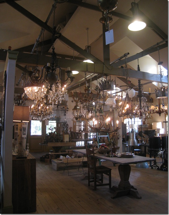 BROWN, Houston’s Belgian Design Mecca.
At one time, everything I knew about Belgium and its design and antiques, I learned from the woman who owns this shop, Jill Brown, a force to be reckoned with in Houston, 1st Dibs, and truly anywhere she goes. Jill, a charismatic trend-setter, had lived in Belgium and returned to Houston where she promptly opened an antique store stocked with wares she brought back from her adopted country. At that time – the legendary Axel Vervoordt had barely made a name for himself. So, for me and countless other Texans, BROWN was Belgian Design for years and years and still is and always will be. (See Jill’s wonderful house here.) Our exposure here in the south to Belgian Design was made of small steps that quickly added up.
In the beginning, there was just Axel Vervoordt, the famous Belgian antiquarian first seen in Architectural Digest in 2002. It’s truly amazing how far he has come in 7 short years. Today, Vervoordt is credited, rightly or wrongly, with starting Belgian design. What is indisputable is that Vervoordt did introduce the world to this type of design. He authored several best selling books that helped spread the word about what was going on his country. He lured people to Belgium to tour his private castle and shop while they were there. His vision became everyone’s vision. No one has yet knocked him off his throne yet, though there are several contenders in Belgium. Here Vervoordt stands among the hallmarks of Belgian design – unstained woods, furniture made from organic materials, white walls, and sparse, monochromatic interiors.
And then in Houston during the mid 2000s, large, beautiful, and very expensive coffee table books began showing up mostly at the landscaping company, Thompson and Hanson. Their pages were full mostly of houses from Belgium. The publisher, Beta-Plus, out of Belgium, has been in the book business since 1995, but their sales have really taken off these past few years since the world has gone Belgian. Though hard to find, they truly are the definitive word on Belgian Design and a must-read to learn more about the style. Available here.
 A small collection of the Beta-Plus books. I am trying to collect the entire group, I’m almost there!
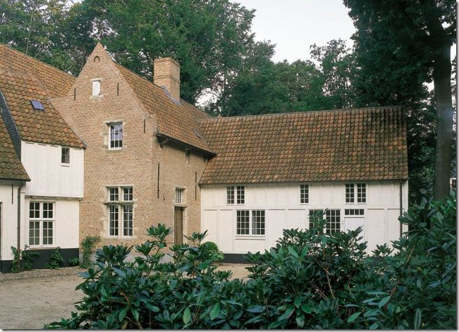
Sparse exteriors match Belgian interiors.
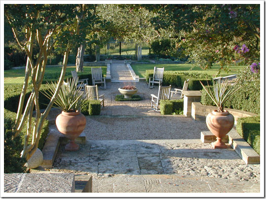
In Austin and in Houston, gardening went Euro, Zen, French, Belgian – call it whatever you like. But GARDENS in Austin and Thompson Hanson in Houston drastically changed the way many people thought about gardening. It certainly wasn’t all azaleas and magnolias anymore. Far, far from it. It was gardening with a light touch, a spare quality, where emphasis was on texture and shades of green, not colors and mounds of flowers. It was about gravel and boxwoods and biots filled with succulents.
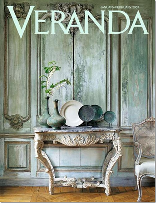
And, then there was THIS cover story – gee, was that really only two years ago? Seems so much longer! But look how gorgeous this is, the faux painted patina paneling, the ancient vessels. Was there a prettier cover ever?
It was enough to make us ALL get up and move to Belgium, wherever that was! When I was in college, my sister Melanie, my cousin Josette and I took a grand tour of Europe for a month – we went everywhere! Everywhere! But Belgium. Now, people see that country as a destination, with a layover in Paris.
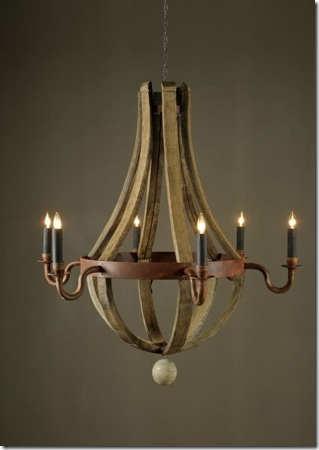
And then there was this light fixture – made from old wine barrels – it was copied everywhere.
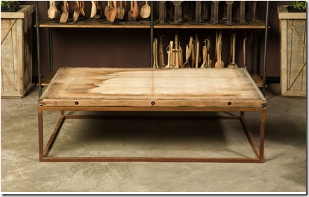
And there was this – the famous brick layer table. Thousands of these slabs bought at a quarry were turned into tables that today are still the hottest thing going. Until recently when Brooke from Velvet and Linen went to Atlanta and visited Bobo’s Intriguing Objects – I had no idea that the same person was behind both the wood barrel chandelier and the brick layer table. But BoBo and his Belgian partner designed both these objects which are the hallmark of Belgian design: organic and industrial at the same time.
Listen to Brooke’s most intriguing interview with the force behind Bobo’s Intriguing Objects here
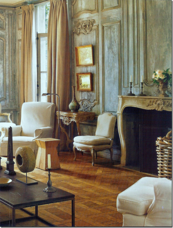
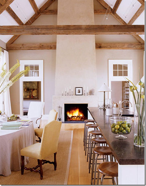
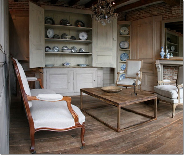
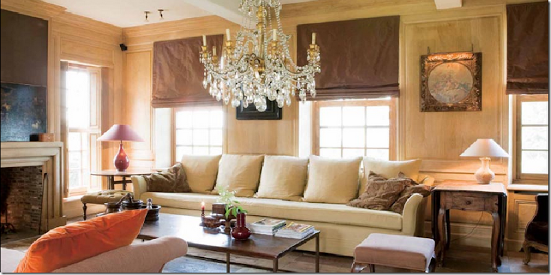
In late 2007, House Beautiful showed this Belgian styled house in America declaring Belgian is the new Swedish. Lanterns, overscaled slipcovered furniture, light unfinished woods, white walls. This room is a pretty faithful reproduction except for the tufted contemporary chair – which is not Belgian at all.
And Ina Garten’s new Hamptons barn was nothing by Belgian design for America. Everyone raved without even knowing it’s origins.
What exactly is true Belgian design?
It’s big rooms that are sometimes almost empty. It’s huge lanterns and oversized pieces of furniture and spare, but large accessories.
It’s long, lean sofas, sometimes with no cushions at all. It’s huge coffee tables with metal bases and simple wood tops.
Belgian Design is about a calm, quiet interior without much contrast. It’s sparse with one or two dressy pieces mixed in with wicker or something dragged inside from the outside.
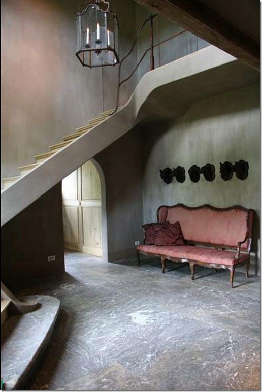
Belgian design can be somber and dark with urns and vases and fabulous art work, but only one canvas per room, please.
It’s floors that aren’t stained or varnished, just limed and it’s wood paneling is also not stained. It’s about texture and shapes, it’s matte, not shiny.
It’s about attic rooms with ancient rafters and a mixture of French and Swedish antiques here and there. It’s not just about Belgium antiques at all.
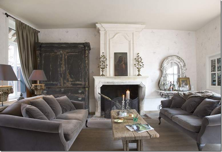
Belgian design is about monochromatic decorating in either grays or beiges or taupes. It’s about mirrors and worn terra cotta floors and kitchens filled with white dishes.
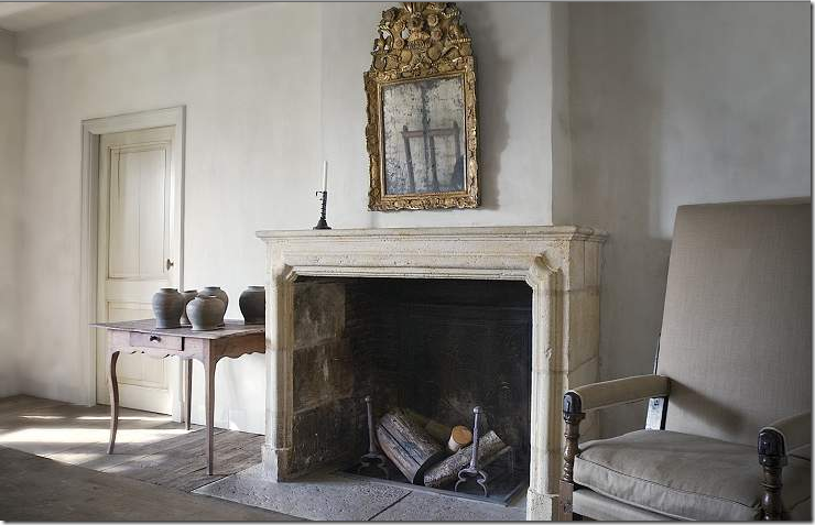
It’s about old houses in the country and in the city being restored for today with huge stone fireplaces and even older shutters.
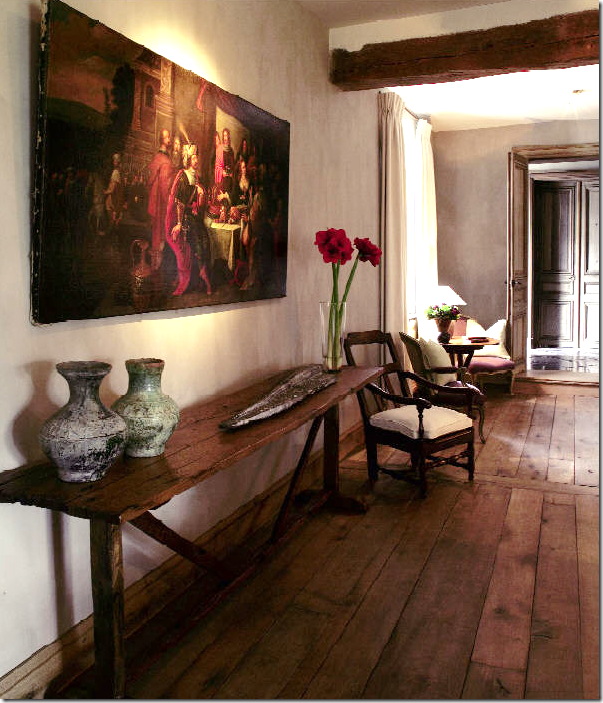 Belgian design is about wood – on the floors, the ceilings, the walls. It’s about worm eaten antique furniture. It’s about great art work and even greater architecture.
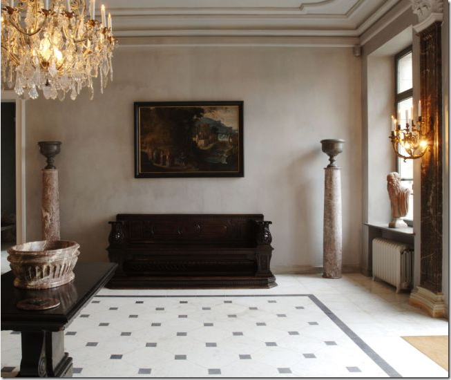
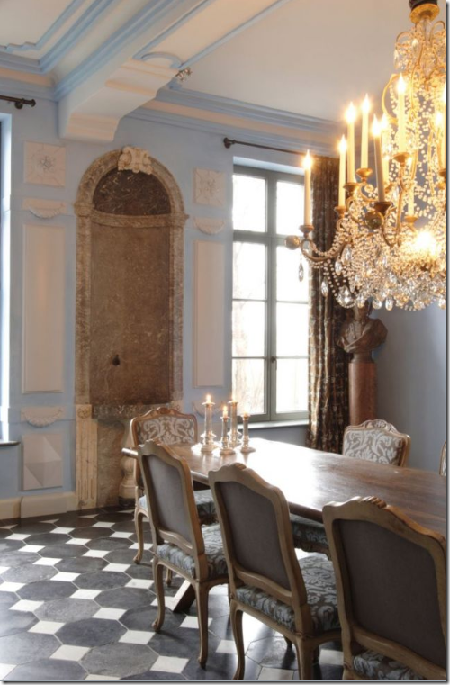
It’s about Belgian linen everywhere and light colored paneling. It’s about lamps made out of vases and fancy crystal chandeliers used in places you wouldn’t expect them.
It’s about reclaimed building materials being used on every surface – ancient marble floors and old flagstones from generations passed are sought out and prized.
It’s about mixing velvet with chipped, worm eaten wood and dressy mirrors mixed with lowly tables. It’s about a quiet, simple elegance that is accessible and down to earth – not fancy and untouchable.
Belgian design is about a mixture: of high and low, of dressy and casual, of organic and industrial, of unstained wood and white washed wood, it’s about overscaled slipcovered furniture and small dainty antiques. It’s about being quiet and subtle. It’s about being modest, not boastful.
Which brings to me today. Restoration Hardware, the store famous for reviving vintage games and old fashioned record players and deco fans has gone Belgian. An upscale hardware store that sells, well, hardware and paint along with slipcovered furniture and beautiful lamps has changed – in a huge way. Recently they partnered with the owners of Bobo and a few other select designers. This renowned group of artisans was given artistic license to create their products – some brought their own lines, some are exclusive for RH. The gamble is huge. The new RH is no longer inexpensive like the old days – this new inventory is pricey – but it has to be. It’s built to last a lifetime and it shows. These are gorgeous pieces, exquisitely executed, faithful and honest to their designers. RH started showing the next line slowly – a mirror here, a light fixture there. But now, their web site is full of all that is new and it’s breathtaking! It is the best in Belgian design for all of Americans to enjoy, along with the best of France and the other locales of inspiration. I was stunned at the beauty. I hope we are ready for this – to pay a little extra and get the best. It’s a huge business gamble especially in this climate of cutting back. RH is asking us to change our direction and turn down a new road. I’d hate for this company to go under now. It’s the best it’s ever been and their future is limitless, as long as people will be willing to pay the prices and buy the merchandise. I hope so. I’m dying to see what the next collection will bring!
Be sure to visit the web site and read about Bobo’s designs and all the other artisans who contributed to the new Restoration Hardware. Each person played an integral role in making this store the best there is right now.
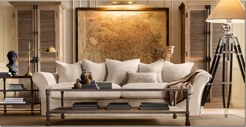
The Belgian camelback sofa is so beautiful! Slipcovered in linen, it’s a standout piece – the core of the collection. The industrial tables are Dutch. The oversized map of Paris is another stunner. And the lamp is gorgeous. I would buy every piece in this picture and be thrilled to have it! The wood cabinets are unstained just like you would find in Belgium. What styling, what advertising, how can one resist it?
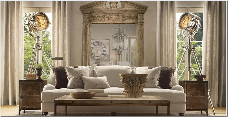
The English inspired sofa is slipcovered with hot-as-can-be feedbag pillows looking fabulous on it. Bobo’s brick layer table is here as are the two industrial side tables. The mirror was one of the first pieces they advertised – it’s beyond gorgeous. But the lamps are amazing – true works of art. RH is now carrying a line of breezy Belgian linen curtains that look perfect against all the woods and metals.
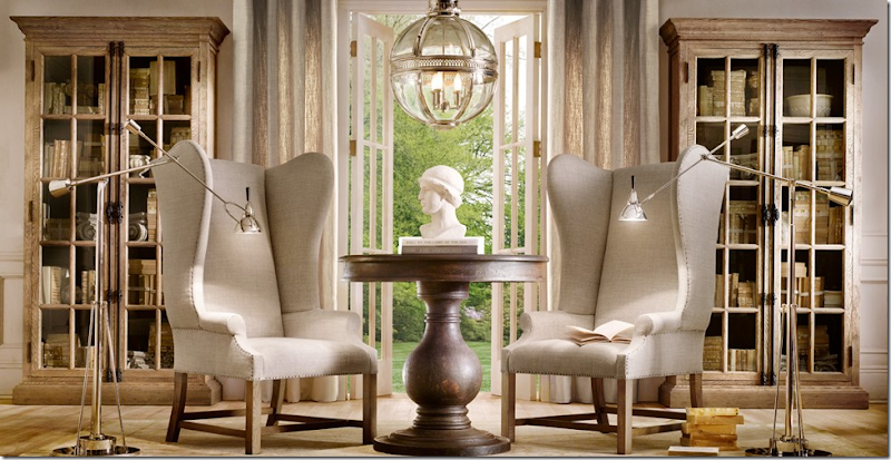
The photo styling for the catalogue is beautiful - the rooms look like they could be in a Belgian house in the country. The floors are light wood, unstained, the walls a light gray/taupe. And these 19th century styled French chairs are truly to die for! No cushions – which is so streamlined and hip. Just gorgeous. I would pair these with the Belgian sofa, stunning!! The chairs – a star in the line – were designed by Bobo. And notice the cabinets in the lightly stained wood.
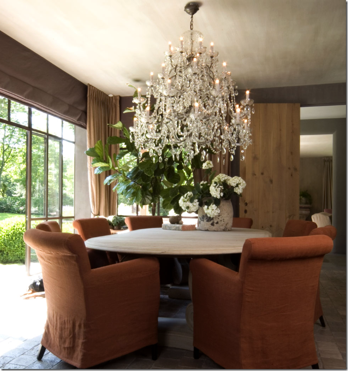
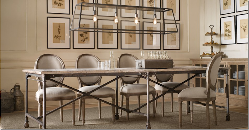
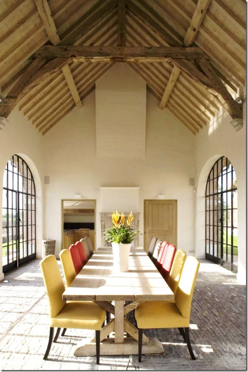
This dining room shows great chairs and a large unstained trestle table – made out of 100 year reclaimed wood from Britain. The gorgeous lanterns are repros made by Bobo. And in the back is a mirror clock. If you have the room for this huge table – wouldn’t it be wonderful? I would put it in a large galley kitchen or in a long breakfast room or a beach house.
Gorgeous repro French chairs (and these are so cheap too!) and I love this smaller version of the above table. BoBo’s famous wine barrel chandelier is shown, of course. The clock is a station replica but the mirror is the real focal point here. Belgian linen curtains.
The industrial styled Flatiron table – another wonderful casual table paired with medallion back Louis French chairs. The botanicals are great! But look at the light fixture !!!!!!!!!!!!!!!!!!! Gorgeous!!!!
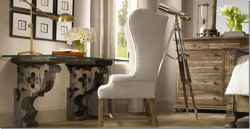
What a desk – from Restoration Hardware? It looks like something you would repurpose yourself! Again, this styling is superb.
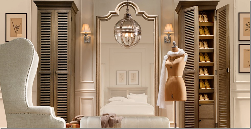
These unstained shoe cabinets double as towel cabinets. I think these chairs make anything wonderful! And the dressmaker form! So cute!!!
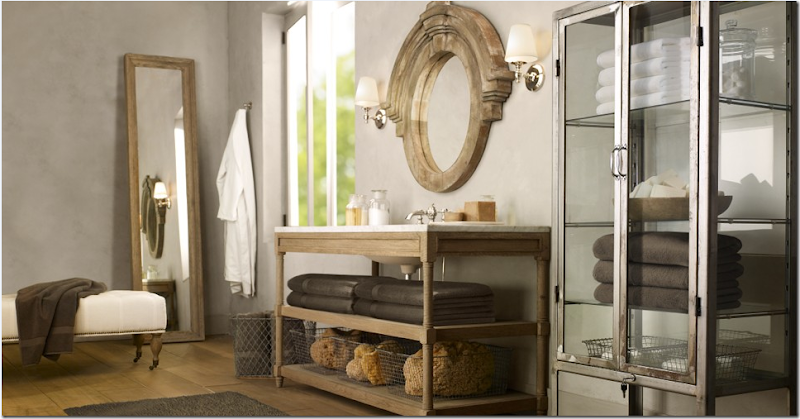
In large old Belgian houses (and all over Europe really,) bathrooms are carved out of whole rooms – so they are often quite spacious. Wouldn’t it be great to actually have all this space to really spread out? I love the medical cabinet and the Mansard mirror.
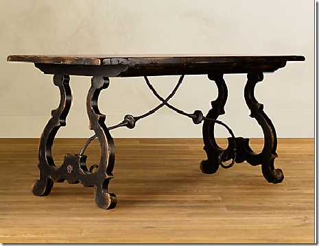
This Portuguese desk is one of my favorite new items. I would use it behind a sofa as a console table.
Restoration Hardware has brought Belgian Design to the masses. Will we accept it? Will we buy it? What stunning style it is – what looks better, where? I am just amazed by it all. Like I said, I hope Restoration Hardware makes it with this new direction. The items are not cheap and some are downright expensive compared to Pottery Barn and what we have come to expect from places like these. But, the quality, the style, the majesty of the furniture really sets it apart from the competition. Now, let’s see if Target jumps on the Belgian bandwagon and dilutes it of all it’s uniqueness. Probably the only way for Belgian design to be accepted by the masses is if Target does jump in the waters. Will it? Do we want that really? Does Restoration Hardware need the masses to accept Belgian Design?









Joni, I went into Restoration Hardware in Dallas just this morning. The new pieces are really really lovely. I think I want some of them.
ReplyDeleteI like the flatiron collecition. They don't have the wing chairs in the showroom yet---but are expecting more pieces to be delivered to the store every Wed. I'll be back looking.
Stunning. I called to order 4 pieces, including the shuttered cabinets in the Belgian camelback sofa photo, and they were already sold out!
ReplyDeleteGreat post, very interesting and original. Although I like aspects of Belgian design (I love those elaborate chandeliers in a stark room), in general it is not my style. However, I think there are some pieces in this collection that are absolutely stunning! I wish the desk had come out last year, I would have ordered it.
ReplyDeleteVery brave of RH. I love the store and I hope this new collection is a huge success. It's pricey but not stratospherically pricey for what you are getting.
ReplyDeleteI have been following your blog for about six moths or so- your posts are amazing- thorough, well planned, well edited and informative- thank you!
ReplyDeleteJoni- I missed you for the last couple of days. I'm very glad to have you back. Like always, I learn a lot on your blog and I just love Belgian design. I must take a trip to Restoration Hardware, I have a feeling one of my clients is going to love that desk.
ReplyDeleteI love this look and would love to have a client who'd let me "experiment" with it! (not enough color for me and my own home) Target did have some pretty "driftwood" inspired pieces a couple of seasons ago... baskets and trays and things in grey hues. They wouldn't have to change it up much to call it Belgian!
ReplyDeleteI'm really loving the direction Restoration hardware and Pottery Barn are both taking right now... not bothered at all by their "for the masses" approach.
Great, thorough post, Joni. You realize we've come to expect nothing less, right?
I got the email announcing the new collection last week and had the only reaction a true design blog nerd would have. I thought "Joni's going to have something to say about this!"
ReplyDeleteYou didn't let me down!
Beautiful, Joni! I have been aware of the growing influence of Belgian design, but this is fascinating to have the evolution of the trend laid out so clearly I am happy for the Bobo partners--they are so talented!
ReplyDeleteI will certainly be picking up some of these pieces. Please add a link to the Restoration Hardware site! We want RH to see that your readers are coming to them as a result of your excellent article!
I can sum this up in one phrase...Drop Dead Gorgeous!!!!
ReplyDeleteI do hope this new direction is a successful one for RH.
Reading your posts are like reading a good little novel, interesting and full of great stories...then on top of that I learn something.
ReplyDeleteCheers! Janell
It's because of your well-thought-out blog posts (like THIS ONE) that I have mostly stopped buying home decor magazines. You never disappoint Ms. Joni!
ReplyDeleteI too loved the new RH catalogue and didn't even consider the Belgian background.
My favourite is the dress form. Oh I would love to have one in my closet too.
Leave it to you, Joni to do a seriously thorough post on Belgian design. I posted about RH's new line a couple of days ago. But, of course, had no idea of the transition that takes place from high style to mass marketing. I LOVE RH's new line. I would really like to see the pieces in person before I consider buying. That will take awhile since there's not one around here. I'm especially taken with the coffee tables. BTW, look at my post here and tell me if I could recover these reproduction wing back chairs in a similar look. I've been kind of sick of them for awhile. They are SO similar, I think. Okay, never mind, I guess I haven't taken such great pictures of these blue chairs. Maybe because I don't care for them.
ReplyDeleteGreat job again,
Karen
http://elderberrystreet.blogspot.com/2009/08/restoration-hardware-revived.html
First...very smart of RH, very beautiful. If you have access to good Flea mkt...you can do better, but if you have more money than time it's yours in 6-8 weeks. A little sad that all those wonderful flea mkt finds are now mass marketed. The thundering hooves of mainstream design thundering after the latest style. I suppose it's always been this way. Love the style.
ReplyDeleteI thought the letter from the CEO on the inside cover about being part of The Establishment or The Movement set the right tone both for what could be both a design, but also financial risk in today's economic environment.
ReplyDeleteAdditionally, I think it's fascinating to see so many "design" companies partnering with well known, proven designers/brands as a way to validate their perspective: JCrew, Target, Ikea, and now Restoration Hardware.
All the best to them for bringing great design to the forefront and hopefully financial stability to the designers.
dear gawd I hope Target jumps on this train. I have been drooling over the RH piece since I got an e-mail from them. LOVES. :)
ReplyDeleteI love the style, for all of the reasons you mentioned. And the pieces at RH are wonderful. My concern is that the style will get saturated and it will lose it's appeal like many other trends. Hoepfully it will hold it's own!
ReplyDeleteReally on the mark Joni, I received the catalog and was impressed. Clean, simple and clutterless is where many are going today.
ReplyDeleteI will be refinishing my hardwood floors in about a month (3000 square feet) and I am thinking of a "naked" finish aka Belgian.
Excellent post~*~kelley
Amazing. I had no idea RH was offering these types of furnishings. Hopefully, it will be a success for RH---the catalog photos are beautiful.
ReplyDeleteI love the dining room table. I was looking for one just a little longer and if it was i would have bought it in a second. MB
ReplyDeleteThis is such a remarkable post! Belgian design is so beautiful and I love the way that you presented it here. You have a great voice, Joni.
ReplyDeleteI am FLOORED by the Restoration pictures! OMG! I will have to come back and ogle them again in a little while. Just gorgeous! If anyone would like to donate the entire collection to me, I will happily accept.
I like the look...it's very calming. I hope they have success..although I personally probably can't be buying anythg! LOL I also live with more color, but I do really like the calmness of it and all the woods :0)
ReplyDeleteMore grace, more wonder. Another chance to thank you for your ongoing contribution to life on earth via your blog. Thank you for this splendid bog entry on Belgian Design.
ReplyDeleteThe whole posting makes me sigh in its halcyon spendor.
You are a treasure. Thank you.
Of all the recent design trends, Belgian design is my favorite. I see it as living with fine things that show some age, some use, but are still very beautiful and yet comfortable.
ReplyDeleteThe colors are so soothing. Here's hoping that our new den will give this great feel when it's redone!
Every post you do Joni is a lesson in itself!!!! Love love love reading your posts- no need for a new design magazine- Joni is the way of the future in design!!!
ReplyDeleteHi Joni~
ReplyDeleteLovely! I love all the linen and the simplicity of these spaces. I would add...fresh soft pink flowers...any sort just to give a splash of colour. Would that work still in this style??? Ooooh and I Love Love Love the Paris map, tres belle!!!
oh my..oh my..oh my! the collection is perfection and so is your post!
ReplyDeleteyour the best! :)
Can't wait to buy some of this furniture! Great post!
ReplyDeleteOoooh...I LOVE this look, and believe the masses will too as it has been unfolding for several years. But I imagine (fair or not) once it hits mainstream, mass produced (which is Restoration Hardware...Pottery Barn...Target...Walmart) We will be firmly on to another style.
ReplyDeleteI happen to love Belgium. When I went to school in Paris we spent a week there...It is one of the most memorable places I have ever been. Brussels was A city that seemed enrobed in dark chocolate. Brugge was indescribably stunning!
Thanks Joni...I'm going back to look at all the images!
Was just talking to a friend and she'd just gotten back from Belgium, and we were comparing notes about what we liked most about the country.
ReplyDeleteI do like this look, but overall it's not for me. Excellent post, as always. And I do love that big Paris map, as you well know!
The post is amazing. I think RH new look is terrific - nice to see a big retailer trying something, anything, new (for mass market.) If you like this look you will love the new blog Belgian Pearls. I'll send you the link.
ReplyDeletei hope it's successful, and i love when a retailer lurches to a new direction- so many stick to the same tired formula.
ReplyDeleteLearned about your blog via aesthetes lament. I have to say that the new direction is stunning. I truly believe in craftsmanship and these pieces are amazing.
ReplyDeleteI'm looking at an upholstered bed that I want to purchase.
This is huge for this phenomenal quality retailer...just the right timing too. I think it will work very well!
ReplyDeleteThis topic is timely for me because my interior materials class started today and we have to specify a whole house and I immediatly new I wanted to go Belgian/Axel Vervoordt. Oh, it's all so exciting! I hope no other students make my choice for Belgian! I can't wait to get started. Thanks for your blog, as always it's simply the best.
ReplyDeleteHi Joni,
ReplyDeleteLike everyone else, great post. I wish I wasn't half a world away. What's not to love in all the pictures that you posted. You know me so well, I know, I know those wing-backed chairs!! I was wondering if it's possible to run into a shop and hyperventilate into a brown paper bag at the same time - that's what I'd be doing if I was in your part of the world!!! Can't wait for the next post - please don't leave it too long. Thanks for sharing.
Take Care
Love Janine
XXOO
Tasmania, Australia
Joni-
ReplyDeleteYour best post ever.
Your analysis...starting with 'first there was Axel'...is brilliant.
You add the Beta Plus books, the old, the new, the many interpretations.
It is all too fabulous.
Bravo to your for a truly illuminating post...superb.
all best, www.thestylesaloniste.com
I love it! I love the feel and the casual look of it, but also very formal.
ReplyDeleteAt the end of your fantastic post you asked the same questions that I had. When I spoke to Mark Sage, I asked him about this big shift in focus for Restoration. The prices seem a bit high compared to what they used to carry. Mark explained that Restoration really wants to set itself apart from the Pottery Barns and the Targets. They asked several artisan furniture designers to create pieces for Restoration's new line. These craftsmen maintained complete control over the quality of the pieces. I think that is what makes this new Restoration line different.
ReplyDeleteIt will be very interesting to see what happens. As you know, I am a bit obsessed with Belgian design lately. I agree with Mrs. Blandings. You are going to love Greet's Belgian Pearls.
Thank you for mentioning my interview!
xo
Brooke
Joni,
ReplyDeleteA great post you did about interior design in my country!
The image on the cover of the Veranda Magazine, is from the house of our Belgian Couturier Eduard Vermeulen. His houselabel"Natan".
In my blogpost of the 3th of August (http://belgianpearls.blogspot.com/2009/08/inspiring-belgian-homes-and-castles.html), I wrote about Eduard and his inspiring house.
So as you can see Joni, not only good interior designers, but even very good fashion designers, can be found in our little country, named Belgium.
Greet
I just received my Restoration Hardware catalog yesterday. I was impressed with the changes. Not as much dark leather! i am loving the Belgium look!
ReplyDeleteAmazing post! I love every speck of it. Thank you. I learned so much.
ReplyDeleteAnother comment about quality. The pieces I saw at Restoration Hardware yesterday were top notch in quality---completely the equal of boutique pieces from Dallas shops like Vintage Living. There is no comparison between the Restoration Hardware pieces and things I've seen at Wisteria. The Restoration Hardware pieces are true quality and I've seen them in person.
ReplyDeleteThe only line I didn't really like was the St. James Collection. It's quality too--but not in the same way. I'm not sure the St. James Collection will be as popular as the others.
The Flat Iron Collection is my favorite.
Hi Joni :)
ReplyDeleteI think the trend has already started to take over. I see it everywhere in Blogland and it's only a matter of time before the "she told two friends" scenario takes effect, if you know what I mean.
Personally I LOVE the way it looks, although I do think it's only a matter of time before it shows up at Target. After all it's slowly starting to make an appearance in PB.
Wonderful post!
rue
Fabulous post!
ReplyDeleteBelgian is my absolute favorite, I love everything about it. I received the RH catalog the other day and could have just died. I can't wait to see some of the pieces in the store.
Just a question for the masses..I am also in love with this look and think RH did a fabulous job but don't we need a caveat here about actually eating dinner on an unfinished (no protection whatsoever) oak or pine dining table.....it looks beautiful but in order to be functional you would need to put some sort of finish on it once it arrived..right? i see leaving the coffee and other table in there raw state but the dining table? also the floors..I LOVE the look and in our home we recently put in wide plank white oak floors in an attempt to recreate this exact look..unfinished and in there raw state they are simply devine..but leaving them in this state is something for the uber rich who can afford the maintenance..right? that is at least what our flooring guy is telling us!
ReplyDeleteMeg, You have a point. I saw the unfinished table tops on the flatiron RH collection yesterday. They are rough---in other words, you would not want to run your hand across them (splinters). I had not thought about what it would mean for every day dining. I don't know what sort of finish you could use.
ReplyDeleteGorgeous, I too have been a fan of the Belgian sensibility for years, I adore Axel Vervoordt's work and loved his collection at Holly Hunt!! Most definitely will be checking out Brown when in Houston. Funny enough, I just received an email from RH this morning and noted what a graceful wing chair it was, lol. We have a Belgian inspired collection at DOXA Home as well, check it out if you want, http://www.doxahome.com/category_s/960.htm. Thanks Joni, love this post!
ReplyDeleteLove the line- I saw it the other day at RH. but everything is HUGE- really, really huge. As much as I would like to purchase, the pieces are way overscaled for my home. RH needs to scale back slightly.
ReplyDeleteThat Veranda house, the home of fashion designer Edouard Vermeulen, has always been one of my favourites. But before Veranda sets its crew to record its glories, the house appeared in an international issue of Traditional Home and before that in British House & Garden.
ReplyDeleteIt's Mark Sage, owner and designer of BoBo Intriguing Objects.
ReplyDeleteThank you so much for your post and to the readers for their kind and inspiring comments. I do read your blog!
Expect more design collaboration between BoBo and RH... we are meeting in our warehouse in Belgium with the management of RH in two weeks to discuss some new products... expect garden and outdoor pieces to surface.
My business partner and I were antique dealers prior to creating BoBo and still are... we import almost 40 containers per year of antiques.
We will be in Texas for the Big Red Barn (Round Top) Antique Fair which starts on September 30. We will be dropping two containers of antiques directly from Europe... one from Belgium and one from Sweden.
For those who only shop the show until Marburger starts, stay the extra day and go to the Big Red Barn. We are in the new tent (20 spaces) and will sell our antiques at wholesale prices.
Again, thank you for your post and the comments have been an inspiration to me!
Wow, I had to go fish my RH catalog out of the recycling bin! These pieces look beautiful! I can't wait to see them in person.
ReplyDeleteSally W.
Better watch out, Ms. Webb, your confidence is glowing. This post is a delicious romp with information, history, backstory and shopping points. Well done!
ReplyDeleteI agree with Sally the minute I started reading I was wondering where I threw my catalogue. I knew it was coming via Brook at Velvet & Linen but had no idea it would be this wonderful! Thanks to you Joni for educating us all & I bet RH loves you for it!! Great post as always!
ReplyDeleteUNBELIEVABLE! Gorgeous, stunning, superb. I guess that sums it up!
ReplyDeleteGO TARGET!!!
ReplyDeleteAmazing post Joni!
ReplyDeleteJoni,
ReplyDeleteLoved today's post. I first fell in love with Belgian design a little over a year ago with the May 2008 House Beautiful cover story. In fact, I'm surprised you didn't include that living room in your post. I hope Restoration Hardware succeeds in this new venture. Keeping fingers crossed.
Jenny
Oh Joni, this is so Fabulous! If I could start all over, clean house, this is the style I would want.
ReplyDeleteWhen ever anyone brings up Belgium the first thing that comes to mind is Agatha Christie's Hercula Poirot. In her mysteries, this detective is always telling us he is not French, he is Belgian. This is the ponit; this style is influenced by French and Swedish design, but like proud Poirot reminds us, it's Belgian.
You being one of our best at detective work in design, hit it right on with saying it is the calm, quiet, sparse look that makes it Belgian
Over the years, as neighboring countries began restricting antique exports to preserve cultural heritage, Belgium became an avenue to get pieces out of Europe. It was only a matter of time before Belgian pieces began slipping into shipments and catching people’s eye in the US!
ReplyDeleteGreat post!
+Spencer
www.ArchitecturalAntiqueReview.com
For me, I do not want Target to go w/this trend at all. I want it to stay the way it is. I love that you have to hunt down for little things here and there thats what is appealing about it. I dont want the mass produced, mdf-laden Target furniture, I just can't imagine how Target could do it tastefully.
ReplyDeleteI just loved this post. It had me in Belgian heaven. Bravo to RH! Thank you so much for highlighting what IS and IS NOT Belgian design. As always, you're a huge source of knowledge and inspiration. I plan on linking to this post from my blog. :)
ReplyDelete-C
cprojectpretty.blogspot.com
Just one more comment--this is an amazing piece of journalism. I have loved Belgium design and Axel Vervoordt for years (Spanish design is quite similar)--the minimalism and the counterpoint. Joni, you laid out the delineating elements so perfectly. I do hope that RH has huge success with this line because it will inspire people to go back to using some traditional antiques and unique modern pieces to interact with the zen quality of this timeless design.
ReplyDeleteLove this post. So many inspiring finishes, textures and colors.
ReplyDeleteJonie- reading your blog is so educational, and so much fun. I love Belgian linen, and the minimalism is so soothing. I do find it interesting, that it's a hard look to incorporate into an eclectic home- to me, the beauty is in the refined choices. Wouldn't work in my cluttered home of two kids. Can't wait for the next skirted roundtable! I download you guys on itunes and it's a treat during my walks.
ReplyDeleteHmmm, it sounds like I'm going to be the only person with anything negative to say about RH's new venture. First of all, I'd like to say that I love the style. It's gorgeous. However, like many furniture companies today, RH seems to assume that we all have rooms the size of hotel ballrooms! This furniture is massive! If I put even one piece in any of my little rooms, there wouldn't be any room for me. I know that many designers say you should put at least one oversized piece in a small room, but there's oversized and then there's "I-couldn't-possibly-squeeze-another-piece-in-here-if-I-tried"! With any luck at all, RH will eventually come out with some pieces that will fit in normal-sized homes.
ReplyDeleteThank you, Joni, for another thorough, well-researched blog. I've been reading your posts for some time now, but this is the first time I've felt compelled to comment.
Belgian design at Target only means your posts will be about the new trend of teal green leather siding (or something crazy that nobody is selling right now).
ReplyDeleteFood grade mineral oil on your unfinised wood table to keep it from staining.
Not all the RH pieces are oversized. Take a look at the factory carriage coffee table--comes in two sizes. Also, the flatiron collection has petite side tables and console tables. Many of the dining chairs are not large at all--and the flatiron desk is just a smaller dining table. Some of the cupboards are narrow. I see lots of ways to use these lines in smaller spaces.
ReplyDeleteMost house have at least one larger room. And, one hallmark of the Belgian style is very few pieces in each room. I think it will work!
What a wonderful post Joni! My sister studied in Belgium and I went to visit her for two weeks. It really is a wonderful country and I left wanting to learn all I could about the design and history. Your pictures transport me back there!
ReplyDeleteGreet LeFevre (Belgian Pearls) is the
ReplyDeletemost comprehensive style source for the Belgian Look. Her family company is an architectural/design featured in the Beta Plus series. Why we can't truly incorporate the look here in the states? We simply don't have the bones to start with. Those "bones" are multi million dollar ancient structures that could NOT be reproduced today unless you had an 8 figure budget to work with. And poor Houston - the high end painting companies are not comfortable working with "lime" paints. So you would have to outsource all your labor - find a mill shop who could reproduce the exquisite woodwork that is left unfinished -Chateau Domingue for flooring (mid 5 figures for a single room of antique wide plank flooring)- Christian Liagre Belgian sofas at $7,000. a pop - an industrial true Belgian iron and bluestone table at $10,000 from Lucca in L.A. - a couple of ancient Chinese ceramic pots in muted matte grey turned into Lamps ($1,200 a piece) and you've only just begun.... that's real Belgian Design. Restoration Hardware is to Belgian Design as Target is to Haute Couture. Bringing a pseudo look to the masses.
Joni, once again, the amount of research and detail you put into your blog posts exhausts me. I don't know how you do it. I have lamented in my blog about the loss of my favorite magazines but as I was reading this post on Belgian design I realized that you have taken over that role. I can stay current in design trends/news and see beautiful pics at the same time. Thank you!
ReplyDeleteI am not as cynical as Anon above, but I don't think this is a good thing.....RH has already started to dilute the uniqueness of Belgian design.
ReplyDeleteDoes anyone else remember what happened to Holly Hunt lighting when RH tried to replicate it with their cheap imitations? Horrible. And PB jumped on that bandwagon, as did Home Depot. We are heading in the same direction here. Expect to see those wine barrel chandaliers in some form or another at Lowes or Home Depot in the next 18 months. Just my 2 cents. And I am not a design professional, so what do I know.
Joni, I would love to know what you think could replace Belgian design as the next "go to look" in 2010/2011? What does the future hold?
I love the look, and think it is such a great classic. Yet I worry when RH or PB, or whomever gets ahold of a great look they then: use, bruise, and abuse it and we all become sick of said 'classic.' Hope this doesn't happen in this case.
ReplyDeleteThis was a great post Joni! We used to see Mark when we'd go to the Scott show. Such a nice guy. Even ten years ago his eye was so different from everything else out there. So happy for his success!
Must ... have... those Morse code floor lamps! (dies) I saw the RH catalog yesterday and about passed out. I love the step they are taking - while flipping through the pages of Belguin beauty and trying to drive at the same time, there was also great news on the radio that the housing market was up 10% this month for buying as well as pricing -- so maybe we're digging out, and people can exhale and investing that money into furnishings - like that mirror (faints) that will last a lifetime will not seem so scary. I hope so. Any access to Bobo and that gorgeous (and favorite of mine!) blend of luxe, rustic, and industrial is a good thing indeed.
ReplyDeleteYUM!!!! Thanks for another look at all this heavenly stuff!
xo Isa
-- i have that bruxelles antiques photo on my sidebar, it's been one of my inspiration photos for a long time!
I'm glad to see shape come back into furniture. And interesting detail. I love strong color, so I would use the furniture in my own way. That grey is just too drab for me. It reminds me of the cold winters of Europe. Nooooooo. But I do think this is a very good thing, and I wish them success. I have used a lot of their bathromm hardware and lighting. I am all for them copying more expensive lines to make them affordable to my clients.
ReplyDeleteSo glad you did this, not only will Restoration be thankful but we are too as we carry some of the Beta Plus books from a supplier in Canada. We find them an inspiration for the shop, and for us out here in the country, a more sophisticated and luxurious representation of "living in the sticks!"(we affectionately call this the "sticks")
ReplyDeleteThose of us in the REAL antiques business would like to thank you for sending our potential customers to Rh and BOBO. They can thank you for recommending them to buy a product which will be worth nothing in one week, versus a beautiful, one of a kind, piece with the wonderful patina that only years can give which will maintain or increase its value in the same time period.
ReplyDeleteThe masses can afford the real thing, if they were directed in the right direction, and educated.
I love the look, but RH and BOBO are not the only ones who get it.
Be fair to those of us who are small businesses who have invested life saving, countless hours of study, and our hearts and souls into producing "the Look". These large companys are putting us out of business, just like Walmart put the great little hardware, the man down the block car repair, the mom and pop grocery.
They have a place in our industry, but it is not the end all be all that many persons describe them to be. They have a place, but not a face!!
I think the real point is--and when you see it in person--you may agree: RH is not doing cheap stuff here. In several cases they are using real antiques (factory carriages) and real old pallets for their tables. This is not fake furniture--and it is not cheap.
ReplyDeleteI have real compassion for small shops---but RH has a right to have a line of furniture they are proud of. They have real artisans desiging this stuff--and they haven't cut corners.
It is less expensive and not everyone can afford antiques. I look at Vintage Living in Dallas--and it is out of my price range--and my price range is not inexpensive. The things in the boutique are for the truly rich---who can afford $7,000 and more for antique pieces for their second homes. The people who can afford this are a rarefied group.
At the same time, Wisteria does not do it for me. I've seen those things in person--and they are copies of antiques--and not great quality. What I have seen at RH IS quality.
I think one of the anonymous posters is a bit cynical. While it is true that we don't live in Europeans chateaus, many of us do have large great rooms or open kitchens which CAN accomomdate these things--and their more petite versions. And, it is so much better than the big box furniture stores.
What I have found is that stores like RH provide good design. Their bathroom fixtures and hardware are classics. They make shopping for these things easy.
Up to know, I haven't cared for their furniture. Some of these new items are really nice. Sure, they are not fine antiques---but most people don't have fine antiques. The people who can afford fine antiques are not going to be buying RH items. People who have a budget in the price range of $1,000-3500 for a piece of furniture will buy them.
I have a design/lifestyle book that foresaw this trend quite a few years ago. It's called, I believe, "The Sensuous Home". It emphasized texture, soothing palettes, natural materials, authentic design, etc., just as Belgian does and other design has done.
ReplyDeleteIMO it's an escape from our frenetic technological culture that strikes a deep chord in people.
Thanks,
Jill
The Dutch designer agrees with you! And again a great great post!For the US, the Belgian look will be a new avenue. I understand everybodys' worry for it to turn into an abused look. I think the look is not for everybody, if done correct it is almost spartan, frugal....Not realy for the masses who still like to see a good deal of furniture in their homes. To create the look is not easy. I think a lot of the RH pieces will just be bought by the public to go into an already excisting 'different' interior. So for RH's sake I hope they will not loose.
ReplyDeleteMaybe RH came a bit too early with this look that is not even 'big' yet with interior designers. I hope that does not make the style less interesting too soon.....
Ron ( the Netherlands)Your biggest fan in the old World.
Check out this site everyone:
ReplyDeletehttp://www.lisalubyryan.com/home/tabid/705/Default.aspx
This is a lovely high end boutique in Dallas carrying antiques--and many in the Belgian style. Everything in the shop is wonderful---and extraordinarily expensive.
The new RH things could give someone this look--at a lower price. And, it is still quality furnishing.
I love the juxtaposition between the rustic pieces and the very elegant pieces. I think Beligian design is here to stay!
ReplyDeleteSo you just made me go click over there & order a new catalogue to oogle at home.
ReplyDeleteJoni,
ReplyDeleteOutstanding - yet again!! Wonderful, educational post!! Love it. Been drooling over the RH stuff for days.
Meg-Regarding unfinished tables. I have been living with Swedish and Belgian antiques for years. Wood is generally left raw. My kitchen and dining room tables were this way when I got them. The best way to preserve and protect them is 3 to 4 coats of clear Briwax applied with 000 Steel wool- then buffed with a soft cloth. They stay beautiful and protected. I re apply the wax every year or two. Never ever had a water ring, stain or any other issue. Works great!
Joni ,I almost wrote to you yesterday about this very post as I had just popped on the RH web page, and I wondered what your opinion would be. I agree with Ron in his opinion and also with an earlier poster who said something about not having Target delude the style and not represent the style properly. Im not a designer but after living in Holland for 10 years I dont think Target could pull it off.( I go back to the states one or twice a year) Ill be looking in Target now when I go. Julie in Holland (Netherlands)
ReplyDeleteOh dear. Your killing me here! I lvoe Belgian style and that Veranda cover a few years back about put me over the edge. I figured out how to do that worn aqua faux finish, I did a hutch like that but it's all I can do not to slap up some ply wood on my walls and do it all over the place!
ReplyDeleteI have so many photos I want to comment on...but there were so many wonderful ones...so little time!
I do adore this style of furniture....too bad I cannot just start over. I am so blessed to have many of my grandmother's pieces, some french, some mahogany, some plantation. BUT if I had a clean slate and lots of $$$.....oh the possiblities!
ReplyDeleteBlessings...
Joni,
ReplyDeleteI remember a great post you had done inquiring about why no one had brought Flamant (i.e. the Belgian look) to the U.S.? Well, I think RH and Bobo just did! I have also loved the Belgian look after "discovering" it while living in CH and visiting the Flamant store in Zurich almost weekly. My Belgian decor obsession led me to re-do my entire home upon our families return to the U.S.! We live in a small 1500 square foot cape cod in Minneapolis---and must emphasize---this look can work for any size or budget. I think the beauty of the Belgian look is one of the reasons our home was selected to be one of the winners of the "O at Home" design contest and better photo's were featured in Decorating magazine (Fall 08/article entitled Boho Belgian). Like all great decorating styles, Belgian style can be incorporated into any size or budget. Thanks again for another superb post!
Kirsten Hollister
www.bohobelgian.com
Okay, so I can't seem to just e-mail you. In my previous comment I realized that I hadn't posted a good photo of the chairs. I'm sorry you didn't realize that and had to search my whole blog! I just posted a blog that is specifically about the chairs. See what you think. THANKS!
ReplyDeleteKaren B.
www.elderberrystreet.blogspot.com
AH! As soon as I received the new catalog I was going to do a post on this as I couldn't believe the dramatic shift in style. However, I believe you provided much more history and insight that I would have- great post!
ReplyDeleteCote de Texas:
ReplyDelete"Now, let’s see if Target jumps on the Belgian bandwagon and dilutes it of all it’s uniqueness. Probably the only way for Belgian design to be accepted by the masses is if Target does jump in the waters. Will it? Do we want that really?"
Let's face it: it doesn't matter what we want. Target will do what it wants to do. Besides, people are sheep, and as soon as anything new--or, at least, new to them--comes along, some people will get in line to buy it. So yes, Target will definitely come out with their own version of this line, and theirs will be the pieces scaled for normal-sized rooms in normal-sized houses, after which WalMart will come out with similar pieces made of particleboard faced with a picture of gray-toned woodgrain. It's called the circle of life, and we're all in it together, so we might as well enjoy the ride, cause it isn't going to stop to let us off, anyway. BTW, the printing on those feedbag cusions? That's French: Apres nous, le deluge, which is French for "Coming soon to a cheesy crafts fair near you".
But really, should any of the monkey-see-monkey-do stuff matter to people who truly love this look--and it is beautiful, no question about it. Well, if they love Belgian decor mostly because it's fresh & 'new' then yes, because once the huddled masses get their grubby mitts all over the look, the thrill is gone, so it's on to something else for the trendy crowd. On my kitchen wall, I have a Venn diagram: in one circle, Music I Like, in the other, Music You Like. Where the two overlap; Music I Used to Like. It's kind of like that. People like that can't stand to be on the trailing edge of a once-hot trend. Cole Porter had some excellent advice about spur-of-the-moment redecorating in the new look of the moment.
If we'd thought a bit, of the end of it
When we started painting the town,
We'd have been aware that our love affair
was too hot not to cool down.
On the other hand, people who've always favored this sort of restrained, refined look, even though it might not have an official name before--and despite the rough-spun linen & raw wood and mousey colors, it's essentially a patrician, old-money--will go right on liking it no matter what K-mart shoppers do down the line. I don't remember the price of genuine Gustavian antiques going down the year that IKEA came out with affordable versions of the 18th century originals. And the American Museum of Folk Art didn't toss its collections a few years ago, when, after an episode of HGTV's Dream House, gigantic rusty tin stars popped up in every mail-order catalog. And back in the early 90s, collectors of Vitruvian engravings & early 19th century furniture didn't suddenly abandon the look just because Spiegel started selling Empire-influenced daybeds & engravings of columns & urns in marbleized mats. I happen to have one of those $39 Spiegel prints mixed in among a bunch of real antiques and its presence in no way compromises the valuable stuff.
So if, following the RH lead, Target wants to offer some chunky pedestal tables in a driftwood finish, I'm all for it. That way, when the people who buy real Belgian antiques at uppity prices get tired of them because Walmart starts selling cheap knockoffs, I can pick up the originals for next to nothing.
Sometimes I flinch when I hear talk about the masses and their grubby mitts. Who are we talking about exactly? And, don't they have a right to try to make their environments beautiful also? Just a thought.
ReplyDeleteThe bottom line for me is that RH, Target, Walmart---not that they are anything alike---all have a right to plan their own product lines. They obviously are trying to have things in their stores that will sell.
Help! We are building an eco-friendly, non-toxic home in a historic town, and it is time to make flooring decisions. I would LOVE to go with unfinished reclaimed wide plank floor, but I am told that I must protect the floors somehow. Can anyone out there tell me how? Flooring will run through kitchen, living, dining and office. Thank you!
ReplyDeleteDear Joni,
ReplyDeleteI enjoyed your post. I sure appreciate your mention of brown. Angela DeWree just reset the shop and we have loads of wonderful Belgian goods in the warehouse waiting to come over to the shop. I remember when I first started at Skelton-St.John after moving back to the U.S. from Belgium and nobody wanted my Belgian stuff. It had to be from France. I felt like a step-child! Belgium means so much to me and my boys. We spent a wonderful four years there. It was a great experience and my little family is so thankful that Solvay, a wonderful Belgian company, offered us the opportunity to live in Belgium. Sam and I were back in April and May. We were there at a time when Axel VerVoordt's home was open. It is wonderful to see.
Jill Brown
www.shopbybrown.com
"Bobo Intriguing Objects" is my most favorite company name EVER. Ever ever.
ReplyDeleteTwo weeks ago my husband and I saw a wonderful wooden handmade buffet table (similar to the RH one near the front of the new catalogue). I loved it. I sketched it. He priced it. About $48. I'm not joking. The wash/stain would double that price, so let's say $100. It was 8 ft long. Tabletop and shelf below. I couldn't believe my eyes when I got my RH catalogue last week and the price for the buffet table (made with antique reclaimed wood) is well over $2000.00 !!! I just can't justify that price. Anyone who has any handyman/woman around could duplicate this piece of furniture. Having said this, I did love the catalogue - would love to buy almost everything....fabulous post Joni - fabulous style.
ReplyDeleteSusan - NO! We don't want the masses with their grubby mitts to have nice homes!!!! God NO!!!!!!
ReplyDeleteThe point really is for RH to be successful with this line - it's going to need mass approval. And for mass approval, Target is going to need to push it. That's all. The question is asked - is that what designers want - to see it all at Target, a slim vision of what it really is. Is David as beautiful when it's some cheesy 5 inch statue or the Mona Lisa when its on velvet? As if we have a vote anyway. But to answer your question, no, nobody wants people to have pretty homes, lest of designers who do that for a job day in and day out. email me - I'd love to really talk to you about this. OK? I had a very similar discussion today that I would love to tell you about!!! email me!!!!!!!! ok????
My mother just brought me the catalog a few days ago and her words were "have you seen this, its all Belgian?" like she was bewildered.
ReplyDeleteI would love to see Pottery Barn, Target and anyone else so inclined create their own versions of Belgian style. That way, those who can afford genuine Belgian antiques can buy them, those who can afford Restoration Hardware’s version of Belgian style can buy it, those who can afford Pottery Barn’s version of Belgian style can buy it, etc. Like Susan said, don’t they (the huddled masses) have a right to make their environments beautiful, too? Damn right they do! I’m getting the distinct impression that well-off people want to keep Belgian style for themselves. But I say “So what if the style gets saturated and loses its appeal, so what if millions of people get to enjoy it instead of just hundreds”. Those people with large disposable incomes can simply move on to the next style that appeals to them. And the next one. And the next one.
ReplyDelete"Huddled masses and grubby mitts" - how was that arrived at? Sounds like a case of class envy. I don't see a post that articulated that thought at all.The other posts were merely pointing out the fact that those that live in homes that truly ARE Belgian style are like the women who wear true haute couture.In all honesty they truly DO NOT CARE what others do to emulate them. And we DO emulate them. We see those fabulous photos and we become "wanna-bees". And to be honest - the wanna-bees are FAR more critical and snobbish than the elite. Haven't you experienced that - be honest.
ReplyDeleteYes, I do the the wanna bees can be more critical.
ReplyDeleteI just don't like to anything disparaging to be said that even remotely criticizes those who can only afford Target, Walmart or another lower priced establishment.
And I agree---the truly wealthy will move on to another design idea. And isn't it great that there is always another design idea waiting around the corner!
I've been thinking about the Belgian style and RH's wonderful new pieces. ARE they going to be successful? Maybe it will hinge on how versatile the pieces are. Are they going to require an entire redo of a house or room? OR can they adapt to some things that are already there?
I know for me--it would be all or nothing. I would want the whole look. The spare look, the right color walls, etc.
Currently, we are restoring a mid 19th century log house on our farm . We are at the furnishing stage. I've looked at the RH pieces to see if they might work there. Of course I will consult with my interior designer and will probably use pieces from her shop and other boutiques instead. Still--the flat iron pieces are calling to me.
Thank you doesn't begin to express my thanks for the amount of work you put into your blog posts. I love this look, but then I am Dutch, and Belgium is the place I would probably move to if I had to leave the states. {don't tell anyone, it's not France I would move to1} Gorgeous.
ReplyDeleteCan't wait to see some of the pieces at Restoration, my friends have told me they are of great quality.
Joni,
ReplyDeleteAnother GREAT piece. I love it. I was at T&H this morning (and tiny boxwoods). I love when you mention things I know (like Jill Brown). I was actually having coffee with one of her best friends this am.
Thank you for posting some of your Houston sources. Bennet Fan Co. is coming next week to do some work for me (two chandeliers and some floor plugs). I told them you referred me. Now I need a custom sea grass rug and I am delighted you have listed your source.
Where can I get that candle? It looks great!
PLEASE keep your sources listed here. I love it!!!
Kim
Oh and I having been eyeing the linen curtains at Indulge for a few months but they did not have the length I wanted so I am going to look at Restoration Hardware:)
ReplyDeleteHey Joni! Love this post and the curtain 411. We are in the process of buying a little house, so I'm taking notes! I'm having trouble deciding on lighting to go over my kitchen island and was hoping you could give me your input. I am on a strict budget, so no authentic antique lanters for now. but i mananged to find a few lanterns over at csn. Would love your feedback! also, if you have any other requests, i'm all ears! totally understand if you don't have time btw. just thought it wouldn't hurt to ask:) hope you have a great weekend!
ReplyDeletegrace
www.nameisgrace.blogspot.com
Wow it's really amazing what they've done, and thanks for the study on Belgian design. That first camelback sofa with the pillows? That's the only type of sofa I would never buy again, they were big in the 80's but all you do is fuss with the pillows!
ReplyDeleteGreat post Joni!
Great post, as always! laurie
ReplyDeleteI love your blog, I've been reading it for a while and every time you publish exactly what I am into at the moment.
ReplyDeleteThank You from Mexico City
This just seems like a promotion for Restoration Hardware. If you want this look, simply invest the time in finding pieces sans the corporate mark-up and soulless, beige, blandness that these "quality" retailers crank out under the guise of "artisans.".
ReplyDeleteThe images prior to the catalog shots are great! The spaces are well-conceived, sophisticated and most importantly personal.
If you want your living room, great room or the whole McMansion to look like something out of a catalog, go right ahead. It all just ends up in the basement within a couple years anyway and the cycle begins yet again...
As for the comment regarding the masses go I'd love to know which class in the scheme of things do you supposedly belong?
Joni... great post. I got to your page via Velvet and Linen. I'm shocked that corporate is thinking outside of the box but also a little scared. We have a beautiful home furnishings and design store in California. What does this mean for retailers going to market to search for the unique and impressive? Of course, we'll have to be one step ahead of the game by going towards the next trend but I am very worried for small business.
ReplyDeleteThanks,
Sara
What class do I belong to? the masses, huddled and grubby. whatever that means. I can't afford much at RH myself - maybe the sheets and the curtains. but I don't care - I love this stuff. I think it's wonderful. for the masses too. but we can't afford it. I'm waiting for WalMart to jump on the trend.
ReplyDeleteTerrific post! I love the new RH line. It really is breathtaking. My only concern is the wood as others have mentioned. I have 2 young ones - oh, the splinters from one of those tables (I too ran my hands across all of the line at my local RH). Besides protecting the wood from water rings/damage, how would I prevent the knots in the reclaimed pine from reappearing after a few years? Uggh, I so love this furniture but so despise knotty pine. And with age those knots grow in size and increase in number!
ReplyDeleteAny suggestions??
Love this style thanks this will be so helpful on my future decorating expirements :)
ReplyDeleteWonderful post Joni! I do like the way you have presented it here. Looks very stylish and formal http://www.greenwichmetalfinishing.com/index.htm. Thanks !
ReplyDeleteWonderful post Joni! I do like the way you have presented it here. Looks very stylish and formal http://www.greenwichmetalfinishing.com/index.htm. Thanks !
ReplyDeleteDanke sehr an den Autor.
ReplyDeleteGruss Nadja
I seriously can't decide between the brickmaker's vs. the Dutch Industrial coffee table.
ReplyDeleteRH doesn't have the 36" depth brickmakers which I think is perfect so I'd have to order elsewhere. The Dutch ind is 32" deep for the small which is ok I guess. Just wondering with that one if the wood can be swapped out some day with other material as it sits in a 'frame'.
2 different styles - gah
awesome blog, do you have twitter or facebook? i will bookmark this page thanks. peace maria
ReplyDeleteI really like your blog and i really appreciate the excellent quality content you are posting here for free for your online readers. thanks peace klara.
ReplyDeleteGreat writing! I was googling about RH's refreshed children's line and stumbled upon your blog -- and it's bookmarked now. Years ago Bruxelles was my home -- and when RH took this new direction I had one word for it -- Flamant! RH is a little slice of Belgium here in the Bay Area. I'm glad. Thanks again!
ReplyDeleteSO beautiful...i love and like.
ReplyDeleteHotel furniture
nice
ReplyDeleteI found this blog after a long time which is really helpful to let understand different approaches. I am going to adopt these new point to my career and thankful for this help.
ReplyDeleteSuperServer 7039A I