Two Cuties in Houston, House #1 – Gorgeous interiors which made me wonder who the interior designer was.
I recently wrote about two houses for sale in Houston that I had lusted for on HAR. Both houses are located in the same neighborhood – and both are beautifully furnished. I called the story “Two Cuties in Houston” and asked readers to pick which house appealed to them the most and why. The final vote was pretty much evenly divided between the two. As for my own vote, I was especially impressed with House #1’s beautiful interiors - I felt that the decoration truly enhanced the house and made it even more appealing. I adored all the blues and aquas, the use of antiques, and I especially loved the dining room and the oversized clock. The story left me wondering who the interior designer was but I knew it wouldn’t take long before someone would leave a comment telling me the information. That afternoon at 4:42, an anonymous commenter revealed the designers name, which was later confirmed by the owners. It should probably have been an easy guess – the designer is the hottest name in Houston right now. She is everywhere these days – and I mean everywhere!
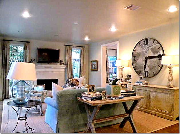
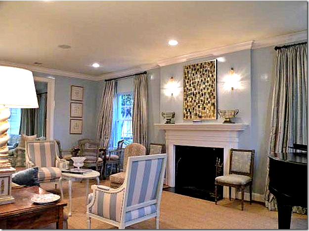 House #1 – The Living Room as seen on HAR.
The interior designer of House #1 is, of course, Eleanor Cummings, and it’s been amazing watching all the national press Cummings has most deservedly received these past few months. What’s even more interesting is comparing her decorating style between the four interiors: three in national magazines and this house in River Oaks. While all four houses are indeed beautiful, they are all very different. For sure, there are common design elements that Cummings uses over and over: antiques, for one. Judging by these four projects, it’s evident that Cummings loves antiques. She appears to enjoy using antique mirrors, sconces, seagrass rugs, slipcovers, linens, silks and velvets, chandeliers, lanterns, and antique Oushak rugs. (No wonder I love her work!) None of these projects are contemporary. It would interesting to know if she ever does design in the pure contemporary style. Honesty. There is a honesty to her designs. I can’t really explain that in words, but it’s more a feeling of the interiors matching the architecture: there is no pretense. Her designs rise to the architecture. If a house is imposing, her interiors are finer. If the house is cozy, her interiors match it. Cummings is without a doubt highly talented. Her ability to design extends to more than just arranging furniture and pulling fabric samples, two of these houses were conceptualized from the ground up. Zinc as a refrigerator surface? That’s a first for me – and it’s gorgeous. So, enjoy this peek into four projects of Eleanor Cummings!
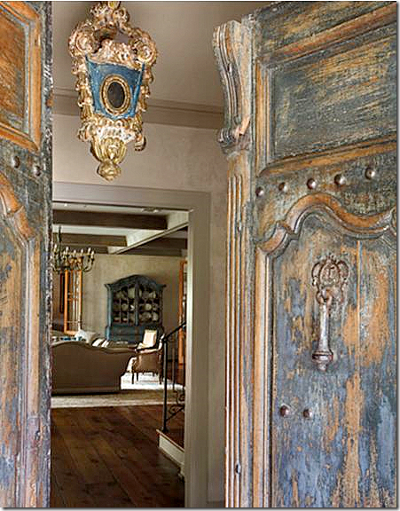
Magazine Story #1: House Beautiful – March issue. The house is a study in blues: the antique front door and Venetian lantern hint at the shade inside.
Eleanor Cumming’s media blitz started with the March issue of House Beautiful. For this house, Cummings shared design credit with Houston greats Babs Watkins and her daughter Julie Baker.
 The Family Room: love the mirror and curtains. The table is from Chateau Domingue.
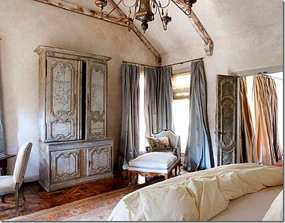 Gorgeous silk draperies and painted antiques found in the bedroom and throughout the house make it a knock out.
Magazine Story #2: House Beautiful – April issue. In very next House Beautiful issue, Cummings shows up again. This time, she is listed as the sole designer of this newly built house, filled with antique architectural elements that give it a Tuscany feel. Cummings says the husband was the driving force behind the design of the house as he was obsessed with Italy after first visiting there as a child. The living room features the wonderful antiques that Cummings likes to use. Notice the gorgeous fireplace mantel! Cummings seems to like to use mirrors and sconces a lot. I love that look too.
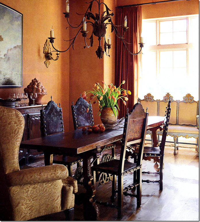
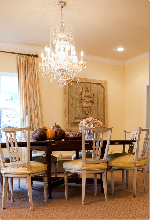
The Dining Room.
The dining room furthers the Tuscany feel of the house with an 18th century Italian table. Although Cummings is usually partial to painted antiques, this settee is the only painted piece in the house.
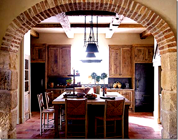 Eleanor designed the kitchen using zinc covered refrigerators – fabulous idea!!
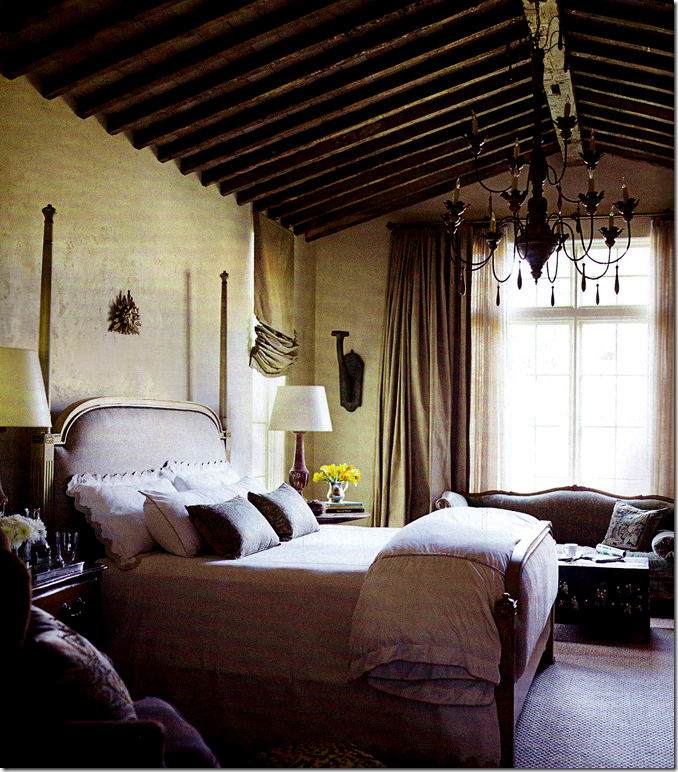 Beautiful ceiling and chandelier. I love how the bed is perfectly scaled for the room – something that many people don’t get right. Her curtains are always perfection too.
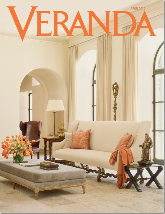
Magazine Story #3: Veranda - April issue. While most designers are lucky to get in one magazine in their entire career – Eleanor Cummings landed in the March AND April editions of House Beautiful. And then..she made the COVER of the April Veranda. Whew! I can’t remember the last time a Houston designer was so honored in the press in one year. Congratulations Eleanor! You must be so proud.
The Veranda house is my personal favorite of the three magazine stories. It’s stunning, gorgeous, beautiful – !!! Seriously – look at this living room, with its to die for couch, bench, chairs, art work! Each piece in this house was hand picked, labored over, sought after – and it shows. You don’t make the cover of Veranda without being worthy. I can’t quit staring at the mouton legs on that sofa!! Fabulous. The house itself is a masterpiece – designed by Kirby Mears of Murphy Mears Architects. The curtains are Rose Tarlow fabric. Notice the floor – limestone from Chateau Domingue, the thickness of the stucco arched doorways (by Segreto Finishes) and the metal windows.
The other side of the living room showing the antique French mantel from Chateau Dominque, of course! The chairs!!!! Notice the carved, curving wood on the wing chair – so pretty!! And notice the antiques books, without covers, tied with twine. Ever since Restoration Hardware started carrying these coverless books, the design blogosphere has gone crazy over this trend - “terrible” “horrible.” Myself, I love the look of true antique books sans covers. The faded, yellowed, frayed pages themselves become the artwork. The twine and rough edges add texture. So get over it everyone – if Eleanor Cummings loves coverless books, that’s good enough for moi.
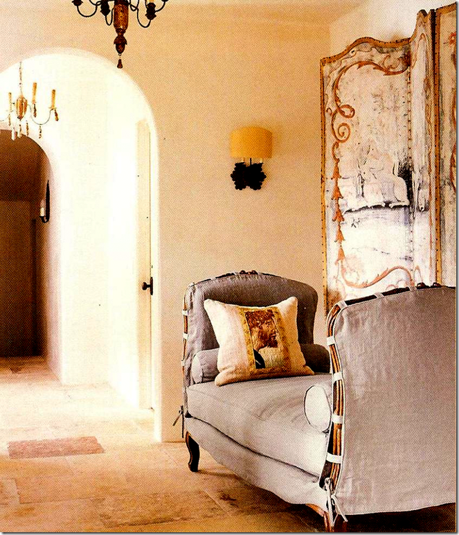
I love the way Eleanor has slipped this antique daybed – perfection!!!! Love the screen. You can really see the limestone floors in this picture. This is an upstairs hallway. Kill me now. This is all I need in life – a gorgeous French daybed, slipcover in linen, a fabulous screen, a sconce to read by, and a pillow with a scrap of antique tapestry. HEAVEN!
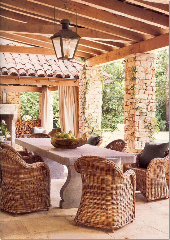 Now this is how you design a French styled porch: antique French street lantern, bluestone table, and wicker chairs. I am in love this chair, especially the gray-whitewashed ones. I think they look so fab outdoors and indoors, even at fancy dining tables. Noir and Artesia make great copies – wholesale only, please.
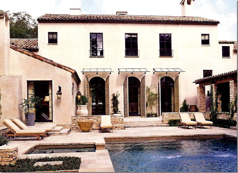
The back facade.
The back side of the house, built in Memorial by Alan Edwards Builders HERE who has built some of the finest houses in Houston. The architect is Kirby Mears of Murphy Mears Architects. Mears has worked with many of the top designers in Houston, and Cote de Texas readers will recognize him as the architect of Kay O’Toole’s enfilade house, also featured in Veranda this year. To read the story about Kirby Mears and Kay O’Toole’s enfilade, go HERE. Interestingly, through a series of emails, Kirby and I realized we both attended Hunters Creek Elementary school together – in the same grade. I COULD bribe Kirby with a cute photograph of him in younger years, but I’ll refrain….for now!
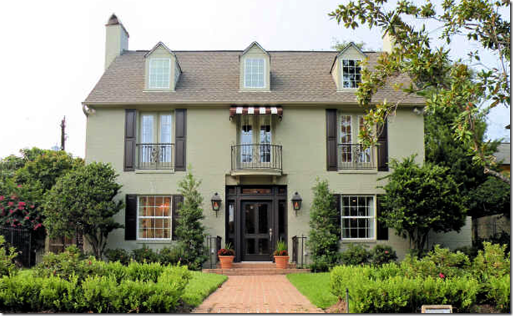 The River Oaks house that Eleanor Cummings designed. The team of decorative artists Pruitt Littleton helped with faux finishes.
It’s so interesting how writing about one thing, leads to another, leads to another. I never dreamed that when I wrote about this house in River Oaks that I’ve been drooling over for months now, that the designer would turn out to be Eleanor Cummings who has fascinated me these past two months with all her magazine articles. While a few nasty anonymous comments can ruin it for everyone – most comments are nice, polite, and even informative. I wouldn’t have known that Cummings was the interior designer, if not for the comments left. Another person left a comment wondering about the painted floors. Which lead to another comment informing readers that the decorative artist team of Pruitt Littleton had painted the floors in the entry hall.
The stained floor in the foyer.
After reading “Two Cuties in Houston” the married team of Merri Pruitt and Jimmy Littleton, who worked on the Cummings River Oaks house, emailed me pictures of their contribution to it. Since HAR pictures are so awful, I was thrilled to get these professional photos – what better way to stalk the interiors! Merri and Jimmy have over 25 years experience in the finishes business. They are originally from New Orleans where they did work for my personal favorite designer, Gerrie Bremermann, among others. Merri and Jimmy’s work has been seen in all the great design magazines such as Veranda and the late, much beloved Southern Accents. When Katrina struck Nola in 2005, the Littleton’s house and studio were destroyed – and they decided to make Houston their permanent home, after fleeing the storm, first by boat, then by hitchhiking. New Orleans’ loss was Houston’s gain, and interior designers quickly put them to work. The Cummings house in River Oaks is a perfect showcase of their abilities, starting with the entry hall floor.
The beautiful dining room, seen here in much greater detail. Look how gorgeous those chairs are!
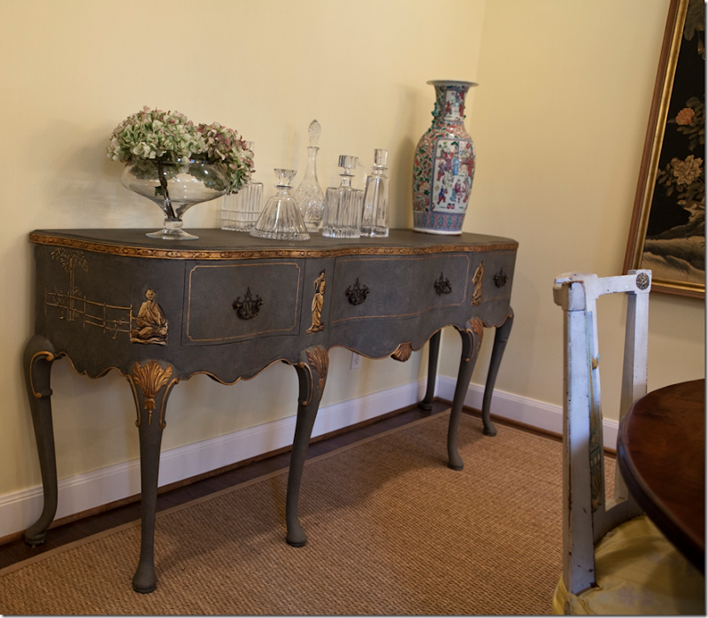 Pruitt-Littleton painted this console in the dining room in a chinoiserie style. Beautiful! I love the collection of crystal decanters.
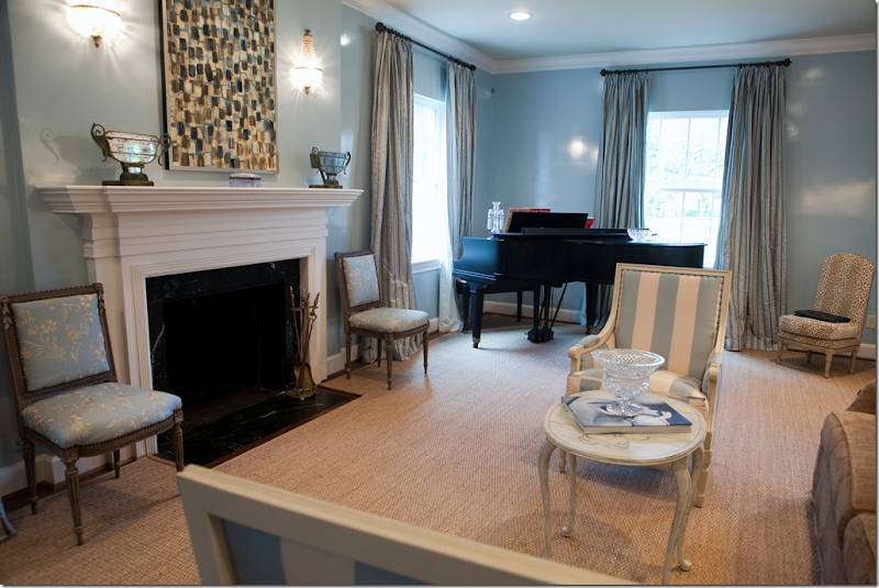 In this professional photograph of the living room, you can see the coffee table that Pruitt-Littleton painted for Cummings. Also, notice the gorgeous sheen on the walls! What a surprise! They look lacquered – softly glowing. Just beautiful.
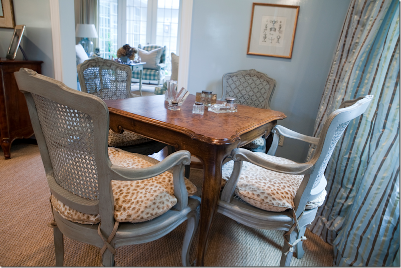 In this corner of the living room, you can see the French chairs that Pruitt-Littleton painted, including adding a design on their backs. Notice too, in this enlarged photograph, you can see the curtain fabric close up. Love the chair cushions with their ballet shoe ties. Through the doors is a peek into the family room with the aqua checked fabric.
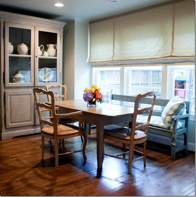 The River Oaks Breakfast Room.
In this picture of the breakfast room is more furniture painted by Pruitt Littleton. Notice how Cummings brought the check in from the family room and used it for pillows and cushions. The shade fabric looks like a smaller checked design. Love the collection of white ironstone in the gray painted cabinet.
I hope you’ve enjoyed seeing this small compilation of Eleanor Cummings’ portfolio. There are no pictures on her web site, unfortunately, as I would love to see more and more examples of her work. I adore her style, her aesthetic – and look forward to more magazine articles about her in the future. To contact Eleanor Cummings, go HERE.
And finally,a huge thank you to Merri and Jimmy for these new pictures of the River Oaks house!! To reach Pruitt-Littleton, go HERE. Professional photographs of the River Oaks house are by Tammy Price Photography HERE. .
NOTE: The new Skirted Roundtable is finally up! Antiquarian Lee Stanton from Los Angeles is our guest. If you love antiques and want to learn about them, tune in. He is fascinating AND gorgeous! Seriously, we were swooning from his voice and his face!!!!! There ought to be a law against such beauty! Go HERE to listen.






Joni, a beautiful post about an incredible designer. Thanks for all the research and amazing photos. Looking forward also to the new SR. I adore antiques and old world things...cannot wait! Was very lost these last couple of weeks with no SR to listen to!!
ReplyDeleteHope you are well and great post!
xo Terri
Joni,
ReplyDeleteI knew I liked house #1 for a reason! I am completely smitten with the work of Ms. Cummings. How great that you inadvertently uncovered even more of her fantastic work. I have to admit that I literally studied the articles you mentioned when they arrived. Thanks for giving us even more eye candy to drool over!!
Suzanne
Joni, really smitten with the Veranda cover home, I am just in awe!! Congratulations to Eleanor!
ReplyDeleteI am excited to listen to the latest SRT.
Karena
Art by Karena
Well, this just proves that you can sure pick em! I'm so glad to see more pix of the decor in this house. It was my fav the first time you posted it, and it just got better with the new pix. I've seen some of these magazine articles, and she is a wonder! laurie
ReplyDeleteWow! Beautiful post!
ReplyDeleteHave a nice day!
/Susanne Kings
Joni,
ReplyDeleteYour inspiration for beautiful posts seems endless! I am so glad to see the work of Eleonor Cummings!
I can't find the magazine Veranda anymore in Belgium!
Thanks to you I keep up to date!
xx
Greet
I didn't see a single nasty comment on that post, Joni. But my brain is muddled from looking at the back of the veranda house...oh my oh my!
ReplyDeleteI also poured through the house beautiful "tuscany" home when i recieved the mag...refreshing change. Some of the details were supreme!
Eleanor is most certainly talented in giving each home it's own voice!!
I just wrote a guest post for a magazine, and picked pictures that illustrated the theme. I was amazed at how many of the pictures were Eleanor Cummings! In fact, I was trying to track down the designer of one of the pictures, and was about to email you, when I found the magazine in my stack and sure enough - Eleanor Cummings. You should call her up and go out to lunch with her some time!
ReplyDeleteThere must have been a chair sale going on in Houston when House #1 was decorated by Cummings. Nine chairs in the living room is a bit much. I would not have guessed that Cummings designed this interior from looking at the cover of Veranda. I suppose House #1 is the dressed down version of her work.
ReplyDeleteI love that I always learn something from your posts, and while I remember studying the Veranda story, I hadn't connected her with House Beautiful...duh!...
ReplyDeleteSo thanks for connecting the dots for me. I'm a huge fan of painted furniture, and I loved seeing the professional pictues from Merri and Jimmy...great work!
Thanks for another wonderful post.
So many gorgeous things! Joni, you have an unerring eye. Speaking of comments and answers, does anyone know who sources the bed in the 9th picture from the top?
ReplyDeleteSue in RI
Eleanor Cummings is perfection,through and through.
ReplyDeleteI just love that house in Veranda! It would be heaven to live there! The art work in the living room is especially fabulous. Maybe someday I can afford to hire Eleanor Cummings.
ReplyDeleteWow! Love the slipped daybed...the screen behind it. The Chateau Dominique mantle with arched stone relief. The teal touched Venetian lantern and entry doors. The beauty goes on forever. So much gorgeous texture. Such subtle undulations of color. Thank you Joni. Trish
ReplyDeleteHi Joni,
ReplyDeleteYou know I always adore your thoroughly researched posts and this was no exception. House no.1 was my favourite too, so I agree with you. House Beautiful March issue, is this a usual thing, when a designer wil share design credit with another designer. So they worked/collabrated on this together??
Magazine story 2 April issue. Loved everything, so well executed and I couldn't agree with you more in regards to the scale of the bed to the size of the room. I don't know about you Joni, but I also notice that people overlook the scale of bedside lamps next to the scale of the bed. I love how the bed is dressed. I watch a couple of shows here where they go in and look around a persons home that they are wanting to share/or do up and the making of the bed is so overlooked. I need to be a control freak and give them some lessons!! Anyway, moving right along magazine 3 Veranda. You are so right everything has been carefully selected, and it shows. I think if you seen the scale and especially the thickness of the arch as you walk into the room it would nearly take your breath away, such a stunning feature. Just beautiful moulton legs - classic. Also drooled over the chairs in the same room. The curved, carved wood as well as what looks like piping - stunning! The upstairs hall with the daybed - will have to go back and stare at that one for a while. Loved the stained floor in the foyer. The dining room with the pumpkins on the table and all of the painted furniture. The corner of the living room, then you look into the family room with aqua checks - well I could sit there all day and look at that - perfection. Love everything about the breakfast room - ironstone, furniture and fabric choices. Thanks for sharing....I think that covers all the basics. Bit longwinded, sorry about that. Anyway, hope you and your family are well Joni, take care
Janine
XXOO
Tasmania, Australia
I was just looking at the April issue of Veranda a few minutes ago. What a beautiful home and a very talented designer. I love her style.
ReplyDeleteJoni,
ReplyDeleteI found your blog last year while researching seagrass rugs for my home and I just wanted to say what a great resource and design inspiration you are! For a non-designer design enthusiast living in Houston, your blog is a wealth of fun and information. Love these beautiful Houston homes you have showcased - magnificent!
The walls may have a sheen, but the photographer has done a poor job of staging the lighting in House #1. The last thing a good photographer would do is turn on recessed lights in a living room or dining room - normally two rooms where these types of lights are not generally found. I wonder if that's the reason the walls have a strong sheen. Joni, you normally have an aversion to this type of lighting. Did you not notice that the recessed lights were on in these rooms?
ReplyDeleteI'm speechless. I first fell in love with the house Eleanor Cummings did with Babs Watkins. If I could afford it, I would replicate that home here in CA in a heartbeat. Then, it was the second home profiled in House Beautiful (love the idea of zinc on a fridge and LOVED that living room). While I hadn't seen the Veranda home, the pictures here look amazing. To find out she did House #1 only confirms that Eleanor Cummings needs to become my new best friend. :-)
ReplyDeleteThank you for a wonderful post. I will be studying it for days.
Joni, I hear ya on the negative comments...I mean why bother! Why put that negative energy out there...what is the point?Constructive commentary, I'm all for it, provacative discussion, bring it on..but the snark is ridiculous! I swear its ruining our society.
ReplyDeleteJoni,
ReplyDeleteAbsolutely gorgeous! I have all three magazines on my bedside table since they arrived. Your blog is the "go to " for everything.
Blessings,
Fantastic reading, Joni! I love your blog and never tire of it. And what a fantastic designer- I would love to see the homes in person- I think I would surely die!
ReplyDeleteWhat lovely homes by a wonderful talent. I am particularly smitten with that backyard pool area with the open french doors ! *sigh*
ReplyDeleteLove your blog !
Lisa
What a talent! Those house are to die for!!!!!
ReplyDeleteThanks for taking the time to reveal the fabulous work of this designer!!!!! Oh to dream of living in one of those very special houses.....
ReplyDelete~Des
Joni, Joni, Joni
ReplyDeleteI am not sure if you should be working for the CIA or as a scout for one of the shelter magazines! You never cease to amaze...maybe one of your best posts ever & that says quite a lot! You have come a long way from your starbucks drive bys! What a sleuth you are! Thanks again for another fabulous post!
Amazing, so beautiful, both of them!
ReplyDeleteYou've nailed it, darling!
XX
Victoria
You did a fabulous job of tying together the work of Ms. Cummings! I bought Veranda based on the legs on the sofa. Now I know what they are called--mouton legs! You never cease to teach me something new. Thank you, Joni. p.s. I'm still trying to get readership for my new blog, so if you have a moment please go over to: http://graciousinteriors.blogspot.com. I keep working on it...
ReplyDeleteSuch incredibly beautiful rooms. This post is a perfect example of why your blog is a must see for me on a regular basis; you are such a generous designer. You are always highlighting the work of others. I'm also amazed that you always respond when I ask you a question via email as I know how busy you are. Luv you Joni!
ReplyDeleteYou should be a scout for a magazine! Actually, your blog is better than many magazines I subscribe to.
ReplyDeleteI'm wondering if anyone knows who sources the large-scale aqua gingham (or is "buffalo check" the correct term?) used in the family room and on the bench cushion. I'm smitten!
It's probably a Brunschwig check. But Chelsea editions makes gorgeous checks -large and medium ones. Hope this helps.
ReplyDeleteAmazing!! You and Eleanor!
ReplyDeleteThanks Joni! I always love you "backstories." You really could be a detective in your spare time too. You always know all the facts!!!! Eleanor Cummings work is fabulous!!!!
ReplyDeleteBeautiful post about a fabulous designer, and her very talented team of artisans! Gorgeous work coming out of Houston, thanks so much for enlightening me!
ReplyDeletexx
Kit
You never fail to bring GREAT stories re: homes and designers. Just a beautiful post. Thanks for the "mouton" leg reference - didn't know the name.
ReplyDeleteJoni, another amazing post by YOU!! Loved it and all the information you gave us. I am with you I loved House #3. There are so many pieces in each home that I think we would all love to have. Each interior looks as if it evolved over many years. That is good design, Kathysue
ReplyDeleteJoni, Wow, what an epic piece AGAIN! Love it, such knowledge, you are such a wonderful source, I hope that the designers etc are grateful to you for "advertising" them! I have to agree that I love house number three the Veranda issue the most, such simplicity, much is too much in my eye, the simpler the better, that way it's so much easier to appreciate everything in a slower more gentle manner. The design is stunning, I really love the slip covered daybed in the upstairs hallway, serene, calm, peaceful, how a home should be.
ReplyDeleteI have to admit, that I HAD to subscribe to Veranda magazine (not easy from Tokyo I can tell you), but had a big shock once I had pressed the subscribe button. On the advertisement it said 30 dollars for 24 issues and if you subscribed to Elle Decor at the same time, would receive that subscription for just 5 dollars for 10 issues. You can imagine my horror when I pressed subscribe to be told that the actual cost would be 102 dollars for the Veranda subscription and 46 dollars for the Elle subscription! A total of 113 dollars more than advertised. I know that I do not reside in the US, but come one, please 113 dollars more. I emailed Hearst Publishing to make them aware that they should not dupe people into subscribing before they are made aware of the ACTUAL cost! Sorry, just had to get that one off my chest. On the plus side, I just can't wait to receive Veranda and Elle Decor through my letter box every month here in Tokyo!
Another job well done Joni, thanks again!
Angela
I always enjoy your posts, the pictures you choose to show us and the way you have with words! Also, like in this post on Cummings, the way you kindly and loyally present the work from interior designer colleagues.
ReplyDeleteMade a little post with reference to your blog, hope you find it OK.
http://hellepirette.blogspot.com/2010/04/kill-me-now.html
Love Helle
I love her work and had noticed her from the first magazine. I would love to know more about covering the frig with the zinc! I think that could be the next big thing!
ReplyDeleteHoly moly...if you ever tire of designing you could be an investigative reporter/journalist! This was great...I love the Veranda one best too! And the exteriors and landscaping are all pretty awe inspiring as well!
ReplyDeleteI could live in the Veranda house and be head over heals happy! Love the muted color palette and of course all of the antiques. The back facade of that house is so gorgeous! Loved this post Joni (of course I love them all :-) ).
ReplyDeleteI'm off to download the SRT with Lee Stanton. His shop is one of my favorites. He has a fantastic eye.
xo xo
Brooke
Another AMAZING post! Honestly, if I had to pay to read your blog I would do so, happily!
ReplyDeletePerhaps Eleanor Cummings might be a future guest on SRT? I for one would love to hear a conversation with her!
Warmly,
Jennifer
I adore Cummings work. The homes look like homes and not houses. The layering of texture and color is amazing. I love how there is a "new build", but it appears to have been there forever. That is the true artistic vision of a designer.
ReplyDeleteCummings, from the two posts above, would appear to fall into the category of designer who evaluates the client's knowledge and sophistication before the beginning of a project. If a client is found lacking, they get look No. 1, if a client is perceptive, they get the look in the remainder of Joni's post. You can see this game played in almost every city in the country. The inattentive client gets the rejects of the client who is savy and recognizes junk when he/she sees it. How could the same designer put their name on these projects without having marginalized one of the clients? The first post is pure flea market. Did the client want that or did the client unwittingly get that look?
ReplyDeleteAnon, you are such a horse's ass. truly. what - not enough slipcovers for you bash????
ReplyDeleteflea market?? what - where - ?????
has it never occured to you that some clients have bigger budgets and can afford more period antiques, more expensive art work, than the other? it has nothing to do wiht being inattentive or not recognizing junk as you state. you are rude, truly rude.
To everyone else besides the anon thank you so much for your kind words! I al so glad you loved seeing her work all together here. It just amazed me how it all played out these two months and then - to happen upon that house on HAR!!!! small world.
ReplyDelete"Anonymous Horse's Ass" cracks me up, and your response is dead-on. As designers, we all get a range of clients with different tastes, and different budgets. It's relatively easy for a talented, well-trained designer to walk into a blank canvas type project with an unlimited budget and create something spectacular. The differences we're seeing from one project to the next showcase Cummings' range and ability to meet a variety of clients' needs and preferences, and the idea that "unsophisticated" clients are deliberately snubbed by their designers is ludicrous. On the contrary, most designers I know go out of their way to educate clients about why certain products are better than others, and we're always trying to get our clients the very best value for the investment they are making in furnishing their homes. Some clients are unwilling or unable to pay for high end furnishings and valuable antiques, others honestly prefer a more casual "flea market" aesthetic, but what matters is that the designer is listening to what the client wants, needs, and is able to afford. At the end of the day, the best residential interiors are as much about the client's personality as they are about the designer's personal aesthetics, and if everyone had the exact same taste it would be a very dull world indeed.
ReplyDeleteThank you, Joni, for sharing these inspirational photographs of a very talented designer's work.
Dear Joni,
ReplyDeleteThank you for your response to Horses Ass. As a designer it is very frustrating to read this comment. We are presented with many different budgets and as professionals try to be respectful of of each and every client and budget. Many of our new clients will present us with beautiful photos from magazines that are very expensive to achieve and they
have only shoestring budgets.
We are not miracle workers. Eleanor is a friend, she has a heart for design and cares for her clients. Her work reflects this.
Horses Ass do you realize just how many decorators and designers try and get their work published every day? Eleanor is a nationally published designer (more than once)
and not many accomplish this.
You might want to re-think your position and realize she was on a
tighter budget or maybe you are just a negative jerk.
I say how lucky a client is is to get a designer who will help them on a budget. I know alot of designers would kick them to the curb.
ReplyDeleteI would like to have an inside peek at that jack asses house......I bet it was designed on a really BIG BUDGET!
Thanks for the sweet note Joni. I will look into it. But for now, I am happy to take a little time off.
ReplyDeleteI could not believe your anon!!!! She makes me so mad. I always work on a budget for myself and the clients in this small town. She wants to act like she knows design and then makes a comment like that . It shows her for what she is and how much she really knows...
I LOVED seeing more of her work and was happy to put it all together as I've been drooling over that Veranda house since I received the issue (and I believe one of the captions was about French in Texas, so I immediately thought of you). Well done (again!).
ReplyDeleteRoom Service - Decorating 101 -
ReplyDeleteYour name is appropriate since you have no clue what I know about design. Yes, for starters I do know how many designers work according to perception of their client. I do know (and Joni would be lying if she says this does not happen) that they pass rejects from one client to another. Now you might say that one man's junk is another's treasure, but in some cases it is all junk. The sophistication of the client is often the difference between good and bad design - not the talent of the designer. Now since you have named yourself "Decorating 101", I am going to assume that you are a novice. Certainly from your post that would be obvious. Budgets do matter, both large and small. It IS POSSIBLE to get good design on a smaller budget but it doesn't have to be flea market acquisitions. One fantastic antique of value is far superior than a room full of rusty, worn, junk that came out of somebody's garage and taken to Roundtop to pass off as antiques. Flea market cast offs are ruining the image of real antiques, and designers are using them to give some of their less sophisticated clients a feeling of pedigree. I assume from your comment that this professional dishonesty is okay with you.
So what do you say about Albert Hadley dragging in chairs from the streets in NY and putting them in his own house??? I guess that is ok then...You are probably a really crummy designer passing as a real one
ReplyDeleteAnon. 7:32 AM, I have never claimed to be a designer. I am a sophisticated consumer, however and I have had over the years a number of "design projects" where I was privileged to work with true professionals. As to Albert Hadley - I am so glad you mentioned him. He lived at 63rd & Madison in an apartment building where very close friends of mine use to live before moving on Park Ave. If Sir Albert found chairs on the street in the upper east side, I can assure you they were in far better condition than anything I have seen in some of the posts here, particularly House No. 1. Now sweetie, think before you speak!
ReplyDeleteDear Anonymous,
ReplyDeleteWhere do you think some of those
fabulous antiques are originally purchased? Maybe the answer could be flea markets and fairs all over Europe.
Have you stopped to consider Eleanors client could have al so been a sophisticated and savvy consumer as you assume you are and
already owned many of these pieces.
Again I mention that Eleanor has been published in many National
publications or do you also believe
the editors of these magazines are not as sophisticaded as you assume you are. By the way just because someone lives in New York does not mean they have the best taste,
I have worked on projects on Park
Avenue as well as the upper East Side and am currently working on something in Soho. People are just people, no matter where you are from. Money does not buy taste,
nor manners. There all many different styles and consumers out there. Some have better taste than others. In my work I have jobs all over the country, the region in which they live does not dictate if they have taste.
Give it a rest Jack Ass.
Bravo to To Anon 9:15!!!!!!!!!
ReplyDeleteI used to have button that said" WE DON"T CARE HOW THEY DO IT IN NEW YORK"
Okay, I've been mulling Anonymous's comments, read his/her new follow-up comments, and went back and looked again at the photos from House #1 compared with the other projects.
ReplyDeleteAnonymous, now that I know your comments are coming from a client's perspective (and not just sour grapes from another designer who is jealous of Cummings' success), I see some merit in what you're saying. I definitely prefer Cummings' other featured projects over House #1, but I still wouldn't go so far as to say that the designer compromised herself on that first project. Residential design is such an intimate field, and the success or failure of these projects has to be evaluated based on the clients' individual circumstances and criteria. We have no way of knowing what Home #1 looked like when Cummings first laid eyes on it, we don't know what the client asked for, how much leeway the designer was given or how much she had to work with. I do think it's safe to assume that the client is thrilled and proud to see her home featured in print, and we should keep in mind that this is a real person's home that we're discussing and not a show home where the designer had free reign to do whatever he or she wanted with the space. I also think it's healthy for the shelter magazines to showcase projects across a broader spectrum of price points. It shows consumers that good design is not something only the extremely wealthy can attain, and that there are more interesting alternatives rather than buying a whole room full of matchy-matchy Pottery Barn furniture, for example.
BUT Anonymous is right -- at least pre-Recession, it was common for many designers to purchase without client approval. They'd say, "I know she'll love it, and if she doesn't, I'll sell it to someone else." I don't think those designers would consider that as "passing off rejects on less sophisticated clients," because I believe that in those instances the designer is purchasing something that they really love and feel confident about. If anything, this practice reflects a designer's inflated ego, and sometimes clients may reject items in these situations just to rein the designer in and remind him or her of the power of the purse, so to speak. However, I can appreciate how a client would be upset to discover that a piece they thought was hand-picked for their project had actually been previously rejected by one or more other clients -- especially if these clients are all friends. After all, clients are paying for a designer's services in order to obtain a custom interior created and personalized just for them, and there is a conflict of interest for the designer when they begin to amass an inventory of "rejects" that they need to sell. Of course you're going to think about that table sitting in the corner of your office that Client A, B, and C didn't want before you head out looking for a similar table for Client D. But getting back to Cummings, unless I missed something in the article or in an earlier post, there has been nothing to suggest that anything in House #1 was a "reject" from someone else's project.
Another good point Anonymous raises that I must agree with is that the most successful residential design projects are often the result of collaboration between a savvy, sophisticated client and a talented designer whose style is a good fit for the client's own personality. The designer gets most of the credit, but so often it's the client's exquisite art collection or family heirlooms or acquisitions from travel that inspire the designer and set the tone for a fabulous interior.
ReplyDeleteI am happy to hear that Anonymous has had positive experiences working with design professionals in the past, and I'll bet Anonymous has a beautiful home. From my own professional experience, I would much rather work with an educated client who has high standards and strong opinions about what he or she does and doesn't want than a client who doesn't know, doesn't care, and expects me to work miracles on a shoestring.
Still, "think before you speak" is a wise admonition on the internet. Even when you have valuable insight to contribute to a discussion, if you start out by attacking people everyone gets defensive and we all get so caught up in slinging mud at one another that no one notices any of the good points you raised. That's just my two cents' worth.
Rebecca Grace, I think you should run for Secretary of State.
ReplyDeleteartluvr: Hah! I was kind of hoping for a Supreme Court nomination -- I'd be the justice in the leopard print robes, sketching new drapery designs for the chambers while the lawyers were arguing their cases. :-)
ReplyDeleteTo Anon 9:15 and 9:25 - perhaps YOU should "give it a rest". I do not now nor have I ever lived in New York and frankly could care less how "they do it" in New York. Please try reading Rebecca Grace's comments as she seems to be the only intelligent poster here (including the Anon designer who claims to be working on NY projects) who gets it.As for the rest of you, keep on drooling over "stuff" that looks like it came out of grandpa's woodshed. This says a lot more about you than it does me.
ReplyDeleteTo Anon 9:15 AM - You suggest that perhaps Eleanor's client in House No. 1 may be a savvy and sophisticated consumer and therefore could have already owned the pieces shown in the pictures. So you now want to prove a negative? If she owned some of those pieces, she wasn't a savvy, sophisticated consumer as you suggest. Some of them look like they came out of a traveling antiques fair.
ReplyDeleteDear anonynous,
ReplyDeleteI am not suggesting these clients did not have taste. What I am suggesting is you might want to consider your written words and how they may affect others. Maybe this is a young couple wanted to finish their home on a tight budget rather than wait and purchase one really good piece at a time. This young couple did not ask for this exposure nor do they deserve your negative comments.
Do you remember as a child how one negative comment would wipe out all the positive compliments you were given. You do not know what these clients asked Eleanor to do.
Again maybe you want to re-think your position on all of this and consider not everyone cares about
the vetting of each piece.
As a designer we can all get caught up in the triviality of all of this. It is just stuff and it is fun to be creative and enjoy the pleasures of beauty. But all
of us have real issues, the economy,the health and well being of our children and families.many
are ill and read these blogs for comfort and pleasure, many use these blogs as escape and entertainment and some of this snarkiness is funny but when it
becomes unnecessarily cruel it is time to re-evaluate.
I suggest we are not the design police and beauty is indeed in the eye of the beholder.
These are thoughts from anon 9:15
9:15 anon, the House No. 1 is a lovely home on the outside and I am sure it has some quality features on the inside as well. It is doubtful that this is a starter home of a young couple. I agree that beauty is in the eye of the beholder. My point from the outset was that often unsuspecting clients put their trust in a designer only to be sold a bill of goods of very little lasting value. Many of the pieces in the pictures of this home I believe fall into that category. If people don't want their homes critiqued, they should keep them off of design blogs and the internet. Do you truly think those dining chairs and that hideous buffet trimmed in fake gold leaf a la chinoiserie is really decorating at its best or "real" antiques? No I am not the design police, but I find it shocking that so many woman who comment on some of these pictures
ReplyDeletedrool over such inferior "stuff" (I refuse to call them antiques).
If the owner told the decorator that he/she wanted a shabby chic vintage look to some of the selected pieces, then the client got what they desired.
Why is it that some people just don't get that taste is a personal thing?! :/
ReplyDeleteAlright, alright! People, come take a look at the Designer Challenge I kicked off this Wednesday (yesterday). In it I have bloggers who are also designers, re-doing my dining room with very little limitations. It showcases the designer's artistic point of view. This should please anonymous greatly. hahaha
ReplyDeleteNo compromises here, my dear.
http://theshinypebble.blogspot.com
Enough - this was a real estate web
ReplyDeletesite and used to sell their home.
This couple certainly did not expect to be on design blog and I doubt they would appreciate reading your coments.
But the real issue is you seem to have strong opinions about most designers and they seem to be of a negative nature. We could all
rally and try to make our point with you but it would make no difference. There are just negative people in this world.
Our industry owes you nothing. You are just one persons opinion.
A friend once told me her mothers sage advice - DON'T EXPLAIN AND
DON'T COMPLAIN.
Signed Anon 9:15.
9:15 Should a homeowner expect a blogger to download photos from a real estate website of their home for commentary by anyone? I would suggest that Joni had no right to reproduce or comment on the pictures offered by the seller any more than you believe I have the right to comment. "Our industry owes you nothing" - was I asking for anything or did I miss something in your sage advice. I don't have strong nor negative opinions of most designers. On the contrary, I haven't see that many on this site. My comment is not about the designer, but the furnishings (known by some who post here as 'antiques'). The couple would have been wise to never allow their home to be on a design blog if they are interested in selling only. There was a time when trophies were given just to the winner. Now they are given just for participating. That certainly seems to be the case here.
ReplyDeleteOne quick comment - I'm still reading through these. But when I said a tight budget - maybe I'm am saying one homeowner spent a million on furnishings as opposed to 3 million? we aren't talking flea market or ikea here. in any of the 4 houses. that commenter truly has no idea of the value of things if she thinks any house was "flea market." NONE of these houses was done on a budget that the normal person can understand or afford. These are all houses that are very refined, filled with antiques and expensive reproductions both. It doesn't come cheap. so, when I said "budget" - I was not talking Ikea budget this time.
ReplyDeleteanon- I NEVER pass off rejects from one client to another. NEVER. I have no idea what you are even talking about? I order things for a client, they use them. If there is a mistake, I eat it myself and it goes into my house or I give it to a family friend. But no designers that I know have warehouses filled with other client's rejects that they pawn off to another client. That's is just plain silliness. Now, some designers - myself included, will buy something at an antique sale thinknig that one day a client will want it. Those are NOT rejects. That is called prudent buying. I recently bought a pallets worth of antique books AND several cases of books from Tara Shaw that I use in client's shelves when needed. That's not a reject. And I defy you to name something in house #1 that was a reject from another one of Eleanor's clients. Pure silliness.
ReplyDeleteRebecca Grace - I think you need to reread what anon said initially:
ReplyDeleteANON:
If a client is found lacking, they get look No. 1, if a client is perceptive, they get the look in the remainder of Joni's post. You can see this game played in almost every city in the country. The inattentive client gets the rejects of the client who is savy and recognizes junk when he/she sees it. How could the same designer put their name on these projects without having marginalized one of the clients? The first post is pure flea market. Did the client want that or did the client unwittingly get that look?
She implied that House #1 owners were lacking and inattentive, therefore they got Cumming's rejects from another client. She said this in black and white and very insultingly. There is NOTHING flea market about House #1 - it is very fine decorating, very warm and cozy, very friendly and inviting. I have NO doubt that the owners got exactly the look they wanted and asked for. They live in a Georgian styled house - not an Italian Villa or French Maison like house 3 and 4. The Georgian house itself drove the decorataing, NOT the rejects of past clients. I'm surprised you sided with anon. I see nothing of value in her comments. Nothing.
Rebecca - further, she was rude to the homeowners, who are reading these comments. would you like to be that homeowner and read that you were taken advantage of and your house is flea market?
ReplyDeleteI ask you - do YOU think that house is flea market? i feel you must because you have defended anon who's main point is that.
I ask you - what exactly do you find flea market about it? please explain where you feel that Cummings cut corners and budgeted down the project. where she saved money on this project? what is cheap? the fabrics? the furntiure? the light fixtures? the accessories? the curtains?
Feel free to email me if you like, mrballbox329@aol.com
ok, people enough. I need to explain something to newbies. I have an anonymous commenter who hates me, hates slipcovers, hates seagrass, hates shabby chic, etc. this person has written horrible things about my family, my daughter, my mother in law (!) yes!, my house, my clients - she has left these comments about my family on my blog and on other blogs too. I have thought from the beginning that these nasty anon comments about Cummings that started last night were actually from this person. I am now convinced of it. So, I am going to stop the comments from her now. We tracked her to a corporate office. One day recently she logged onto this blog over 150 times, just waiting for comments about her so she could leave more. She is seeking attention through her negative comments. They add nothing to discussion except hurt people. she hurts innocent people each time she posts. She did this to another homeowner who ended up crying over her remarks. She hates linen - "it wrinkles" - she only likes chenille and velvet I suppose. She only likes fancy antiques. she doesn't like Belgian antiques or anything that is rough luxe. she doesn't realize that the word "antique" means any piece of furniture made before 1910. So, enough of her vileness for the day. I'm stopping it now. and i apologize to anyone she has hurt with her ugly words.
ReplyDeleteJoni, you go girl!
ReplyDeleteCorporate office? Bet he/she works for a real estate broker. That's why she's into houses and decor.
ReplyDeleteJoni:
ReplyDeleteSo glad you have stopped the negative commenter. He/She adds nothing to your wonderful website. This person who can be so rude to others obviously has no class so is incapable of recognizing good taste when he/she sees it. He/She is sad and is to be pitied.
Your posts are terrific and so are you and so is Eleanor Cummings.
Janice from Pemaquid
Janice from Permaquid -
ReplyDeleteWhat is your website about? Permaquid sounds like something you squirt out of a hot glue gun.
As Joni's longtime fan -- I can honestly say that I would take ANY item that she had left over from any project! LOL! And my poor-to-the-limit budget would be truly grateful! I am just teasing - really! And I do hope that Ms. Cummings might be featured on the The Skirted Roundtable -- I would be THRILLED to catch any crumb from that table!
ReplyDeleteJan at the poor-ordinary-and very-pedestrian Rosemary Cottage
Eek! Joni, I was having a Polyanna moment this morning and trying to find hidden (deep, deep DEEP down) good intentions in what your anonymous commenter was saying. For a brief, glorious moment while sipping my latte, I had this vision that somehow we could all get along, that maybe I could help this person to play nice with others and learn to voice differences of opinion without attacking people personally... I was thinking way more clearly last night when I originally commented that Anonymous was a jackass, while I was drinking a glass of wine. :-)
ReplyDeleteI agree that she/he was unnecessarily cruel and insulting in stating her/his opinions, and I was trying to say so in a diplomatic way: "think before you speak on the internet," "when you start out by attacking people, no one notices the good points you raise" and "remember that these are real homeowners" in hopes that Anonymous would self-correct. I was trying to give Anonymous the benefit of the doubt. I thought all that ranting about "rejects" might have come from a recent bad experience that Anonymous had working with her own designer, and coincidentally the showroom manager at French Heritage in High Point just mentioned designers doing that sort of thing when I had lunch with her during Market earlier this week. So I tried to acknowledge that this might sometimes happen, and agree that it SHOULDN'T happen, but I also pointed out that there was no evidence that any "rejects" had been used in the Cummings project we were all discussing.
And while I agreed with her that house #1 was my least favorite of Cummings' projects, I never agreed that it looked cheap or flea market. I specifically said that I did NOT think Cummings compromised herself at all on the project. I know that it takes a great deal of skill and talent to pull off the casually elegant simplicity of House #1 and have it look so fresh and uncontrived, even if I personally prefer Cummings' more dramatic projects. To me, this is like saying I like emeralds better than diamonds; it doesn't mean I think diamonds are crap! Also, the low-res photos of house #1 make it impossible to judge the quality of anything used in the project, and I did not at first realize that the high-res photos of the "River Oaks House" at the end of your post were actually the same house as House #1. No, this was definitely not a low-budget project, there's nothing flea-market or cheap about it, and the details are exquisite. I think Eleanor Cummings is fabulous, her clients are very lucky to have the honor of working with her, and each of these homes is magnificent in its own way.
In my defense, I had no idea that Anonymous was a hateful troll, or I would never have engaged him/her (it?). I apologize if I was responsible for encouraging more hurtful comments from this person as that was certainly not my intention. I am going to crawl back into my Lurking Box now and suck my thumb...
no - it wasn't a real estate office - it was a financial office. and on that day that we checked - she had logged onto this blog over 150 times!!!!!!! yes!!
ReplyDeleteshe is slightly crazed or obsessed or whatever. not sure. but we know where she works, lives, etc.
Rebecca - thanks! hehe. I thought I could get you back over to the "nice" side. those pictures at the end are the same house. it's beautiful. the anon had problem with the piece in the dining room - that was an old piece bought by the owner and repainted which I think is a great thing to do with wood pieces stained brown. Anyway, I would move into that house in a NY minute if only the furniture and accessories were included. i love the way it's designed and furnished. The dining room esp. is so beautiful. I adore the family room and the pink game room. And yes, this is a "starter" house of sorts, the couple has young children! My "ending" house is nowhere near the quality of this one. anyway - That ANON IS a troll. she has left viscious comments about my family, my daughter, my mother in law, my house, my clients, whatever she can think of. At first I was willing to give her the benefit of the doubt that it WASn't her this time becuase she didn't mention slipcovers, but she has a special M.O. and it always peeks out in the end.
ReplyDeleteThanks for being so sweet!!!!!
Joni
Yea, Cote de Texas we believe you. If you are so sure publish it. If you wrong, plan to get sued. Go for it hot shot! I have never stepped foot in a financial office for any reason other than to have consultations about my investment portfolio. But if you are so cock sure, I invite you to publish your findings or shut up!
ReplyDeleteJoni we all hope this person does
ReplyDeletenot know where you live. I have read in the back of town and country that you can lease guard dogs. Maybe you should consider this. call Steven Drucker and see if he will give you a break but be sure to warn Sami Jo of the impending visitor.
Wow, Joni, I absolutely love House #1. The blue in the living room is one of the prettiest colors I've ever seen. The fabrics on the chairs and curtains are just exquisite. Thank you so much for sharing Ms. Cummings' work with us. Count me in as a fan of hers and of the couple who did the lovely painted furniture and floors.
ReplyDeleteI shouldn't even respond to the tacky anonymous commenter other than to offer my whole-hearted support to you, but I must take issue with her saying there are too many chairs in the living room. I'm guessing that lady doesn't have any friends and thus could never picture a gathering where people would pull up chairs in order to have an extended visit. Every one of those chairs looks to me like one that someone could sit on (unlike the fine antiques she prefers that have to have a gilded cord over them lest they actually be used as originally intended). In fact, what appeals to me most about House #1 is its warm and inviting feel. It comes across as a place where people live, laugh and converse rather than merely walk through and admire as in a museum or historical house.
You have such a great eye, Joni, for design and for detail, and you have an uncanny way of feeling the pulse of your readers and knowing what they would enjoy reading about and seeing. My hat is ever off to you.
Eloise, eight chairs (16 legs showing) in one picture, another picture had 9 chairs. The only upholstered piece in the room was the sofa. The room needed more weight - not 16 legs showing. This isn't about pulling up a chair for guest. One can have all the chairs they need depending on the size of the room and layout. The issue is that all the chairs were the same.
ReplyDeleteCorrection: 16 legs showing not counting the four game chairs which would add another 16 legs for a total of 32. I would say this calls for a 911 call to the "slipcover" man.
ReplyDeleteHello! The front door and entry fixture alone in house #1 cost a pretty penny!! Please block this person forever!
ReplyDeleteJoni, thank you SO much for sharing these wonderful homes with us. Coming to your blog is not only educational, it's utterly enjoyable. I cannot thank you enough. I needed this time away from workmen more than I can ever begin to tell you, and now I'm ready to conquer the world... well, at least my little corner of it. ;-)
ReplyDeleteI thoroughly enjoyed this post, and I salute your knowledge and your kindness in sharing that with others. I love too many things to mention all here, but those painted finishes on furnishings (like that wonderful console) and on that spectacular pair of doors in the second house (I think) are just two reasons I enjoyed this so much. Thanks, friend!
Fondly,
Sheila
Eloise: thank you for your sweet comment. I feel exactly like you about this house. Your house has a very similar vibe to it too - a warm, inviting, and cozy family home. who would want anything more? as for the chairs = I agree! I don't think there are too many chairs in there at all!!! I've seen rooms with more chairs than that!
ReplyDeleteThanks again!!!
Joni
To the anon who threatened to sue me?!
ReplyDeleteYou think you can sue someone for knowing an IP address? they are public knowledge - all over the interet. I actually could download a program that would show every IP address that logs onto this blog in real time if I cared too. you think you can SUE me for that? too funny. I'm laughing all the way to your lawyer's office. My dear, IP addresses are not sacred. It's a shame your IP address has it's office name attached to it though. it gives you away. as for needing a guard dog, i doubt sammi jo would be up to the task, she is stone deaf. But georgie is another matter. she makes a fine guard dog. thanks for offering Drucker's services though, whatever that is about??
By all means publish my IP Address. I am eager to see whose IP address you have since my address is in no way attached to a corporate office because I don't work in a corporate office. Sorry, dearie! Get your information correct before you start bluffing your readers. You are beginning to look stupid.
ReplyDeleteEloise, take note - it's not the number of chairs in a room that is a problem provided a room has the space and proper layout. The issue raised above is about the number of chairs with exposed legs. 32 legs is a bit much, don't you think?
ReplyDeleteIt is apparent that none of the above people who left comments concerning the leg issue in the living room have been in a real French house in France..the rule is legs, legs and more legs.
ReplyDeleteI lived in Paris for five yrs and actually they would have had more chairs and of course more legs.
Do your homework people!
Did you ever consider the Foreign Service? You are such a design sleuth. To spread a little positivity- I am sending you a "framed pve chateau" for you to host a giveaway! You really are the Queen of blog land, and have inspired me as well as countless others! I thank you for the energy you share in each post.
ReplyDeleteI need a day to read over this post and get caught up!
pve
Anon. 7:44, perhaps in the Grand Salon of the Plaza Athenee but not in a 19x14 living room.
ReplyDeleteJoni:
ReplyDeleteBeautiful post, as usual.
Have you considered restricting anon comments? Does anyone here really need to hear what this person has to say.
I will say it again; something must be awfully wrong in this poor woman's life...
GE
Joni,
ReplyDeleteI just stumbled across the April 2010 issue of House Beautiful and Eleanor Cummings' beautifully designed italian home... and of course, wasn't surprised at all when your blog covered it. Bed shopping is boring as I have found over the last year, but was wondering if you might know where to find that bed in the master bedroom. I think I have finally found a bed... hopefully :)
hi all
ReplyDeletehttp://www.tor.com/community/users/ransgalifi1989
http://www.tor.com/community/users/inamemre1977
http://www.tor.com/community/users/lynetgasbsi1977
http://www.tor.com/community/users/emfixturngin1985
http://www.tor.com/community/users/healdepopac1981
hi,
ReplyDeletegood designing!! whats a great talent.....
and gorgeous silk draperies and antiques paint in bedroom........
lead answer
A gas conflict has not ended, and you are all on their third
ReplyDeleteRalph Lauren Outlet
ReplyDeleteKate Spade Outlet
MCM Backpack Outlet,
MCM Backpack
UGG Boot Clearance
Oakley Sunglasses Outlet
North Face Outlet Online
Marc by Marc Jacobs