House #1
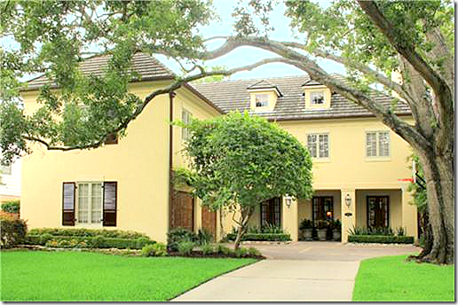
The first house from West University today – the “Large” home is one I’ve loved since it was being built. It’s on a great street with a large esplanade – rare for West U., plus it’s custom built, not your typical West U. home. Of course I should have known why I’ve loved it – Kurt Aichler designed it. It was built in 1997 with a stucco and Austin limestone facade. It’s 3 stories, 4 bedrooms, 4 1/2 bathrooms, with a pool and a screened in porch. It measures at 5,454 sq. ft. Listing Price is $2,050,00. Interiors are by Katie Galliano – see her web site, go HERE. To read its listing, go HERE.
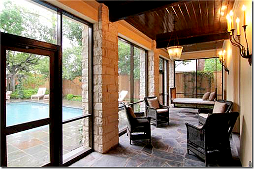 The stucco and limestone screened in porch is off the long living room/dining room. The ceiling is wood planks.
Close up of the beautiful screened in porch with the swinging bed and wicker chairs.
A pergola covers the back terrace. The large den is off to the right where the limestone fireplace is. The screened in porch is at the other end of the pool – the porch leads off the living room/dining room.
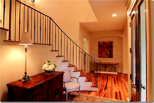 Beautiful entry with iron railing and limestone accent wall.

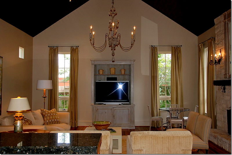
Close up of the living room, designed by Katie Galliano.
The dining room end – I love the chandelier and the fireplace. It’s so romantic to have a fireplace in your dining space.

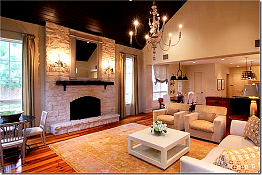 Looking the other way – into the kitchen and breakfast room. The pool is seen through the windows.
Interior Designer Katie Galliano worked on this house and kindly sent me some of her larger pictures. I wish I had more of this quality to show you!!! To see her web site, go HERE.
Another view from Katie of the family room.
I love this view of the beautiful curtains and rods. The Swedish chairs sit around an iron French table.
Looking from the kitchen into the family room.
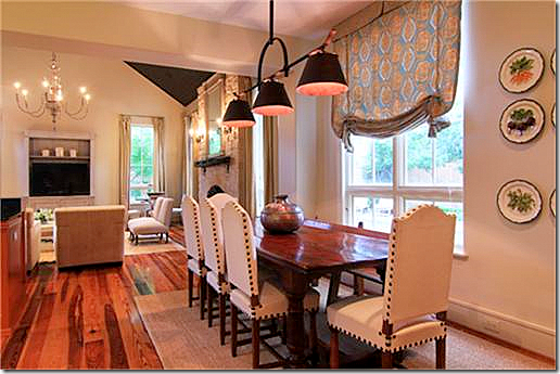 The breakfast area has a wonderful light fixture that really grabs attention. Love the nailhead chairs.
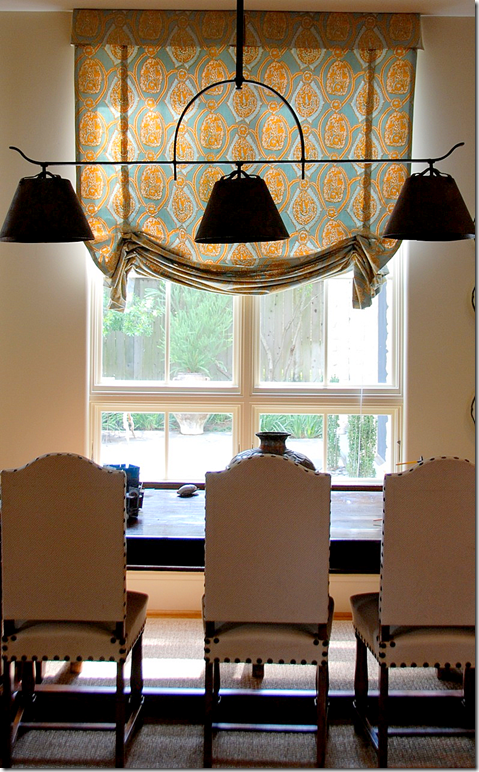 Another picture by Katie of the breakfast room with its fabulous light fixture.
The master bedroom has heated marble floors and a footed tub. Typical of the custom details found in an Aichler home.
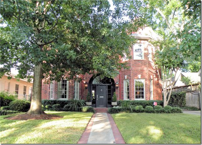
The second house shown today was built in 1988 and is a more typical West U home from the 80s and 90s. This house was updated in 2005 and is 5 bedrooms and 3 and 2 1/2 baths and has a large pool. This house is also three stories and is 3,885 sq. ft. Asking price is $1,125.00. The listing can be seen HERE.

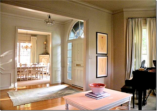
The front door opens to the living room on the left and the dining room on the right. The updating is seen right away with a new paint job in trendy light gray. This is the only picture of the dining room, unfortunately – it looks like there is a Swedish table and chairs in there.
The entry hall leads to the back family room and kitchen. Love the trumeau and the lantern!
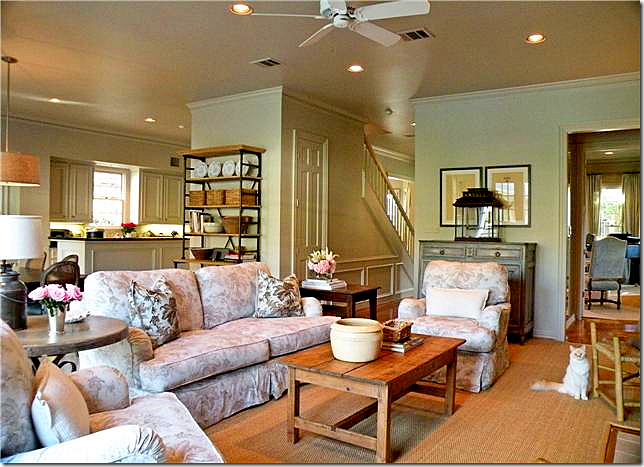
Custom cut seagrass is found in the public rooms and up the stairs. Notice the banister is also painted gray, as are all the moldings and the ceiling. This is a great way to update your house’s paint job: paint everything, including the moldings and ceilings one color. I wish there were more pictures of the living room!!! It looks so cute with the high Swedish coffee table and light blue silk drapes.
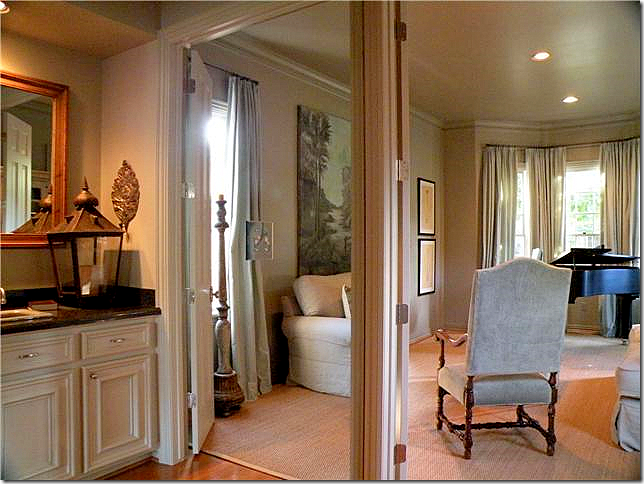 The bar connects to the living room. There is a wall to wall mirror along the back wall which makes the bar look twice its size. Here you can see in the living room that a piano sits in the bay window.
The family room connects to the kitchen. Cute linen slipcovers in a muted floral pattern.
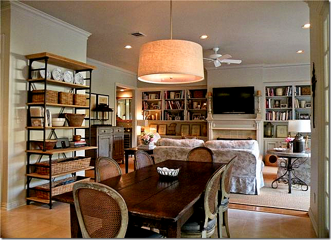 The breakfast room connects to the family room. Love the chairs and table and all the baskets.
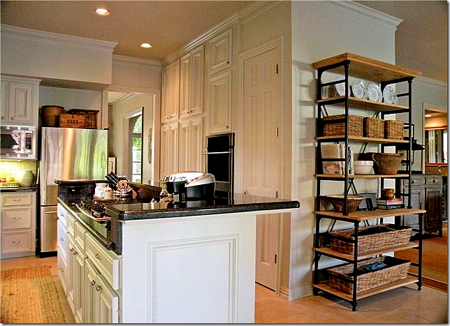 The kitchen was updated with new stainless appliances. I love that shelving unit in the breakfast room!
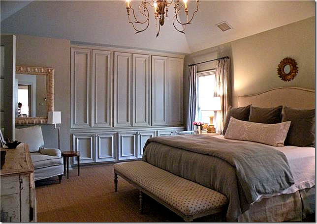
The master bedroom – seagrass and Italian light fixture. I love the linens on the bed and the long French or Swedish bench. I wish we could see the painted piece on the left side of the picture! Really nice bedroom.
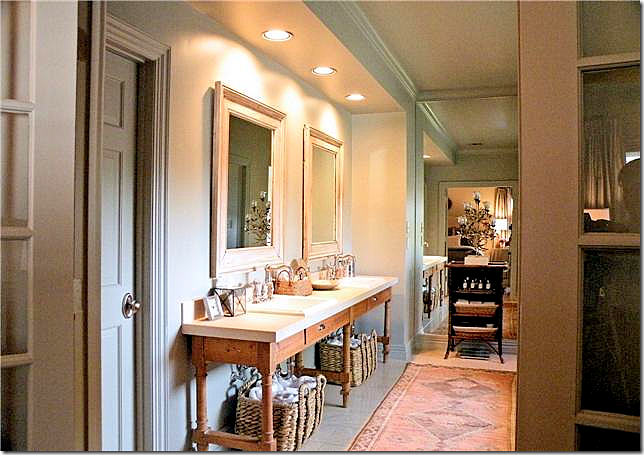 Updated bathroom – they removed the built in cabinet and placed this long console with two sinks in it. They then added bifold French doors leading to the bedroom. This is what I really want to do to my bathroom. By removing the built in counters, it really updates a typical bathroom. I have no idea, but I wonder if Ginger Barber decorated this house? It certainly has her “look” to it.
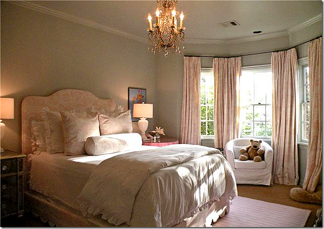 One daughter’s bedroom is adorable. Love the curtains, the scalloped bedding, the chandelier, the lamps, the mirrored chest. Really cute.

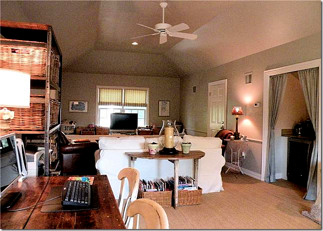 The third floor media room also has wall to wall seagrass and slipcovers. I love the way the kitchenette has portieres. To visit this house’s listing, go HERE.
House #3
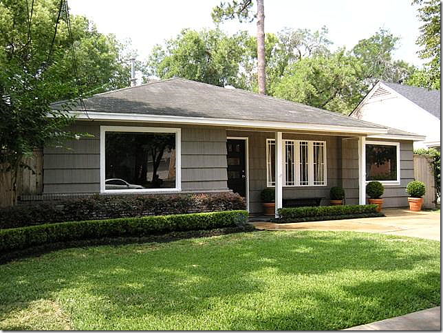
The third house today is located in an original bungalow from the 1940s. So many of these original houses have been torn down instead of remodeled, that they are becoming a rarity. This house was decorated by an interior designer and it really shows. The furnishing are top rate. It’s 3 bedrooms and 1 1/2 bath, with no garage. The sq. footage is only 1,420 and it is on a typical 50 x 100 lot. The asking price has been reduced to $539,000. To see this house’s listing, go HERE


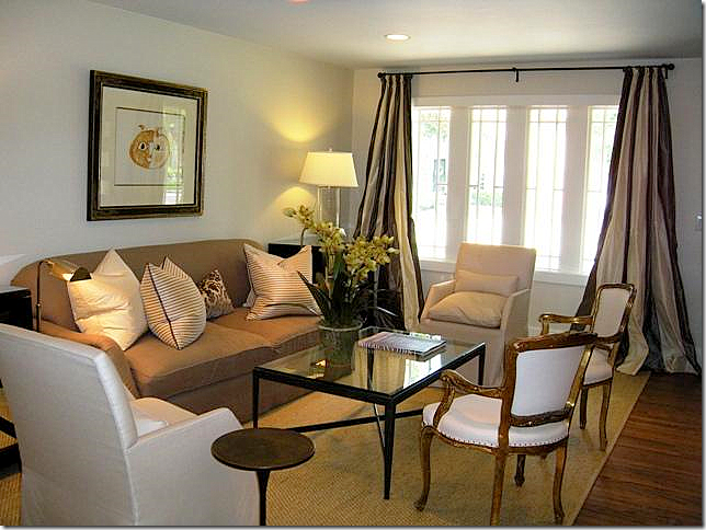
Just perfect! Great silk pillows and contemporary chairs and coffee table. Love the striped silk curtains.
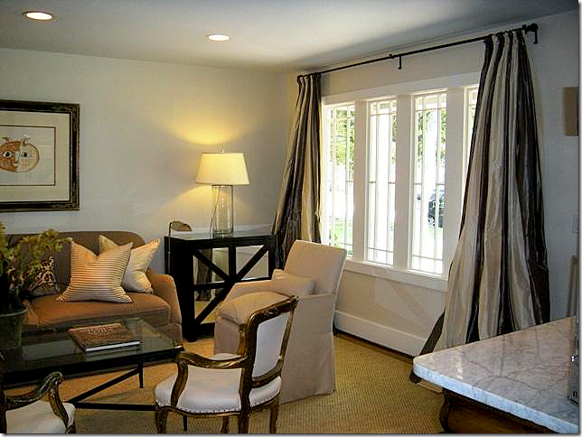 Close up of the curtains. I love the mix of the antiques with the contemporary. This decor is so fresh and youthful.
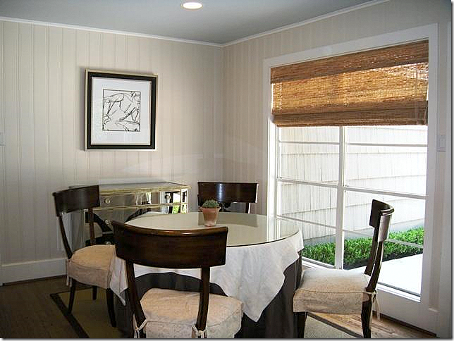
The dining room has wood beadboard and slipcovered chairs. A textured shade is used here instead of curtains. Again, a mirrored chest mixes the old with the new.
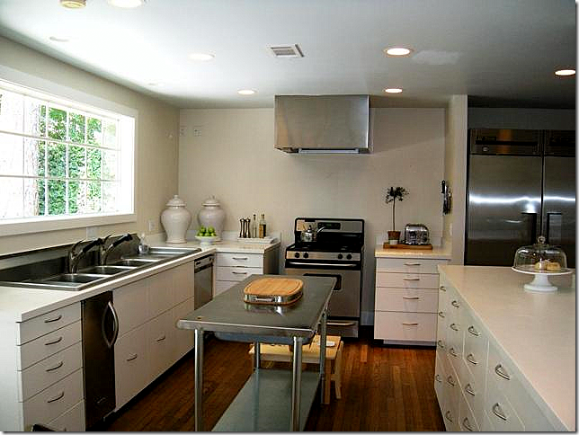
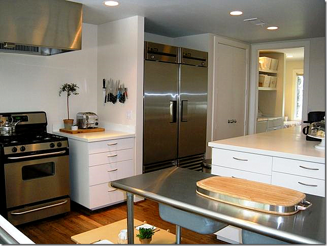
The kitchen is a fabulous space for this sized house. Notice the sink! I love how its styled with the simple white ginger jars and ironstone. No overhead cabinets make it look fresh and contemporary.
Another view of the kitchen with its refrigerator/freezer. The kitchen is really wonderful.
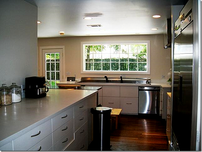
The large kitchen overlooks the backyard. Great window. And great wraparound counter.
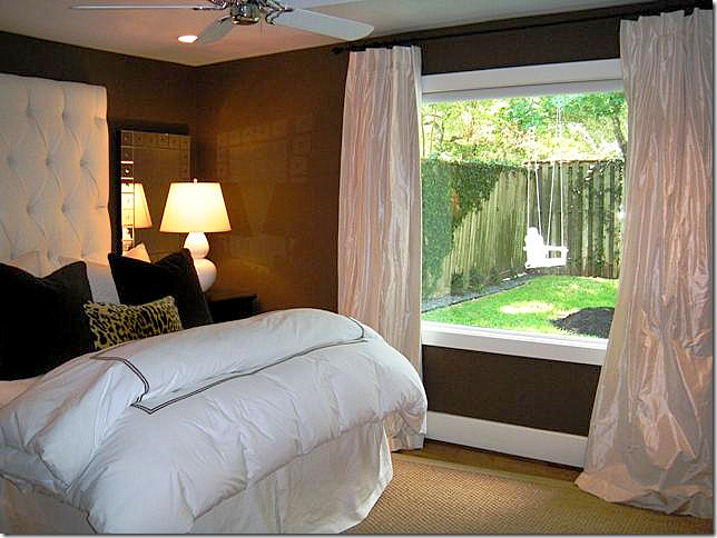
The master bedroom is painted deep brown and has ivory silk curtains. The headboard is oversized for drama. Love the lamps and the velvet pillows. This room overlooks the back yard.
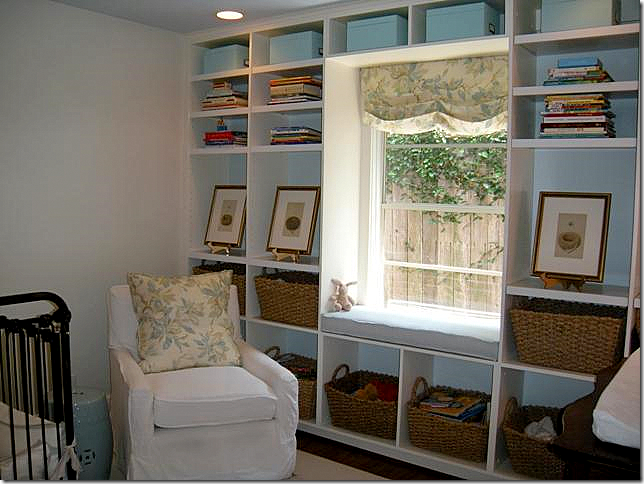 The nursery has a wall filled with baskets – great idea to keep it neat!!
The bathroom, like the rest of the house, has been completely updated – all in quiet whites.
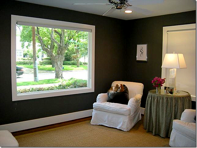 The front bedroom with its brown/black walls is used as a sitting room. Great lamp!
An amazing array of three houses available in the same exact neighborhood – one newer custom at almost 5,500 sq ft, a second spec house at 3,880 sq ft., and a third – an original bungalow at just 1,400 sq ft. Each professionally decorated and landscaped. Which would fit your lifestyle and pocketbook? Does the architecture matter the most to you? Or does the interior decoration matter more? I’m keeping my own choice a secret!!!! What’s your choice?








Now that is a tough one Joni!
ReplyDeleteLove the exterior pf the big one, and that lovely breakfast nook and there is nothing like a dining room fireplace, people never leave the table at a dinner party.
The medium speaks to my roots...lovely centre stair, gorgeous fan window over the front door, a very comfortable group of furnishings.
The small one is sooooo clever with the limited space and of course decorated with as much taste as the first two...
ummmm I'm still thinking.....
cheers Heather
No contest- #2. I'd put wood planks on that ceiling in the family room and kitchen (like the porch in house #1 but painted) and be done with remodeling. Haven't seen a house I liked so much in a long time...going back for a second look now...
ReplyDeleteJoni,
ReplyDeleteyou know how much I love homes and as a little girl I would tell my parents which house I would live in. My Dad loves to remind me of this now. I love illustrating them and all 3 of these are wonderful, just like children, it is hard to say which is best.
(I do love number 3 for it's humble lines and simplicity.)
But all 3 are really lovely. Thanks for sharing.
pve
Really like the 3 houses Joni. Of course you are going to ask us to choose? I think there are so many elements that I like from so many of the 3 seperate house's?
ReplyDeleteLove the first one, that fireplace!
The second space is so ala, G.B. (LOVE HER).
The third is so living large????
I guess we would have to toss the ol coin on this one!
Thanks for the peek into your little part of the world,
enjoyed as always!
L.
If I were ONLY looking at the bare bones... house #1, but if I were going to include the decor... house #2 would be for me! Neither fits my purse. lol
ReplyDeleteYou can always count on Kurt to give a home with an interesting floor plan. Somehow he just seems to
ReplyDeleteknow where to put a nook or a cranny.
But, NUMBER three I could walk in with a toothbrush
and my Mac and be very happy.
Nice job, Joni.
The middle home for me please. The other two are beautiful in their own right, but it doesn't look like people really live there, the middle one is perfect. Comfortable and pretty, lots of textures, really beautiful! I love these posts!!! so fun! have a great weekend!
ReplyDeleteEach home has its own charm...tough decision. But since all 3 are out of range, I will dream and go for the big one...after all this is Texas! I love the wide open spaces in 1 because it opens up so many options to create vignettes. 2 has a timeless, elegant feel and may be the better investment. 3 speaks to living simply and well. I really love them all...thanks for posting!
ReplyDeleteHouse 3...human scale, cozy, but still 1400 square feet (which, by the way, is not all that small for the average person!). The only odd thing is in the kitchen...it looks like the cabs were made for a professional range, but a small one was brought in instead.
ReplyDeleteSeems odd.
The little rancher - no stairs - is what we need at this stage of our life. I want to be in that kitchen.
ReplyDeleteI just love this post because I could look at homes all-day-long! What great picks. I love the 1st one b/c it reminds me of the 1st home we first built (on a much smaller scale though). The second home I can identify with b/c it is just about the same look, size and layout of our current homestead. I really love what they have done to the place and found much inspiration. The 3rd home is wonderful b/c it goes back to, we don't NEED larger homes, we just need less stuff and should really put thought and pour detail into the space we have. House Beautiful cover is for featuring just that for the month and I loved it very much. Our 1st place was a 700 sq ft condo and we were beyond happy. The giant window over the double faucet sink is fab!
ReplyDeleteOMG - These are beautiful houses ..
ReplyDeleteLiving near Sydney Australia - I was amazed at the relatively cheap price for what you get in all of them - $1.2m USD = $1.4m AUD, I kid you not when I say at that price you'd be lucky to get a house with both the kitchen and bathrooms fully renovated in some areas - and three storeys? More like $5m.
So interesting ...
Love your blog btw..
While I love the screened in porch of House #1, the traditional architecture of House #2 is most appealing to me. The decor is lovely, and it appears that the house has a nice flow, both in plan and in color and there is a lot of attention to detail in the millwork not seen in more transitional homes. There is a certain graciousness this home has that the other two lack. As to House #3, I think that the large plate glass windows could have been updated and I also thought it peculiar that the kitchen had such a large sink and yet such a small stove. Otherwise, it is great kitchen space for someone who loves to cook.
ReplyDeleteLove the second one best!
ReplyDeleteI think I swooned a bit at this post. I am going to paint the walls and woodwork light gray, as you suggest. Same finish on all? Flat on walls and semi-gloss on woodwork? Any ideas? TY for the post and TY for the paint advice, in advance. Being and empty nester, I vote for house #3.
ReplyDeleteWonderful homes all, but the first one has my heart. thanks for the tour.
ReplyDeleteWhat beautiful houses for us to dream about!
ReplyDeleteI will take the medium, please!
Great blog, by the way.
This is a hard one. I've spent some time and looked closely at all three. I love the bungalow, love the simple lines of the this period home. LOVE what they did with the kitchen. I've lived in two of them and have fond memories of both. My youngest daughter has just bought one and is in the process of renovating her home, she needs to see this house!
ReplyDeleteThe second house feels more like home to me, though. I think I could move into it with just my toothbrush, as one of the comment's above said.
And on the third home, I love the exterior, the master bath and the light fixtures above the island in the kitchen. For me it seems as if the wood ceiling in the family room is a little dark understanding, however, that that could be the photo and I am confused over the location of the dining room. It seems like a long way from the kitchen. I'm sure if I walked in this house it would present itself much differently.
I tried to focus on the architecture of the homes thinking that if I purchased any one of these houses the furniture and fabrics would not stay. Also, I don't mean to be critical in any way, We have recently finished building our home and there are things I would love to re-do. Hearing what other's have to say about it would be helpful, but a little nerve racking at the same time.
This is truly a great post, all three houses are beautiful and beautifully decorated. Inspirations all the way around.
Thank you.
No brainer for me...the last one...charming!
ReplyDeleteEach one of these homes is so beautiful in it's own way.
ReplyDeleteGreat eye candy! Thank you for sharing Joni and have a fantastic weekend!
xo
Edyta
http://edytaandco.blogspot.com/
Hi Joni, I always enjoy these real estate posts that you do.
ReplyDeleteI really like them all...but I think #2 has the most potential and maybe its on the best street too!
Is there a "best " street?
~kelley
Because the last thing you read or see leaves the greatest impression, I would have said the interior design of number 3 is my favorite. But, on going back and reviewing, I'd say you hid the jewel in the middle--the place you usually lose your least impressive example! This is a very livable home--not too big, nor too small...just right. I do love the silk drapes in both #2 and 3. They look like ball gowns--I bet they are lined and inner-lined with double flannel! And I was enamored with the light fixtures in home #2. Finally, I will borrow house #2's ideas for updating a master bathroom. Thanks for a wonderful post!
ReplyDeleteLet's see: In house #1 -- I would paint the kitchen cabinets to pale gray, bleach all of the orange-toned floors and the dark ceiling in the family room (feels too "heavy"). House #2 is wonderful -- and House #3 is the winner! Just right! Wonderful posting as usual -- thanks for sharing!
ReplyDeleteJan at Rosemary Cottage
I adore house #2. I have seen my share of West U houses (as many of my college friends live in West U), and the floor plan is so typical - but the decor is not. I am a big believer in painting out the trim to match the wall. I also am a big believer in the power of paint color!
ReplyDeleteLove those little intaglios at the base of the bookshelf in the family room.
Breathtaking rooms!
ReplyDeleteThose chocolate brown walls in that bedroom were absolutely yummy!
A lot of good ideas and inspiration in these photos.
Thank you,
Tamra
Oooh!!This is fun and hard. I love the architecture in the second house but I tend to love a bungalow. Since I am spending virtual monies I will buy the second and have it designed more like the interior of the 3rd!! I love spending virtual money, so easy and painless!! Happy weekend! Kathysue
ReplyDeletePS I am doing a Someday FAmily room series on my blog. Having fun planning it out and spending someday monies!!
You real estate sleuth you! They all have their own personalities and charm...no choosing here!
ReplyDeleteIn taking a second and closer look at the facades of these three homes I am struck by something that I notice when homes in this neighborhood are showcased here. It looks like a neighborhood in transition where over a period of time larger homes are being built where older, smaller ones have been torn down. Therefore, the lots appear too small for the structures that sit on them. I have glimpsed several privacy walls, either of chain link fencing or wooden slats. Does this neighborhood not have a restriction on the kind of privacy walls one can build and for the asking prices, would a buyer not expect a wall built in materials complimentary to the home, i.e., brick, stucco, stone, etc.? The homes are lovely, but the cheap privacy walls between the homes down grade their beauty and value.
ReplyDeleteI'm not too crazy about any of the exteriors but ALL of the interiors are DELICIOUS!!!!!!!!!!! I mean, I surely can't choose--they are all so gorgeous!
ReplyDeleteThank you for the luscious eye candy as usual ;)
Another great post from the master of blogging!!! Thanks Joni...nobody does it better. I think the smaller house would be my pick. i just love the freshness and the kitchen.
ReplyDeleteHouse number three for sure! Beautiful and the mortgage might let you sleep at night!
ReplyDeleteAs far as choosing which one Joni, that's a toughie as they all have their own personality. :)
ReplyDeleteTo decide on choosing one, I would definitely have to consider function which in return would vastley depend on layout/traffic pattern and architectural features.
Re 'knitaboulous's'comment from Down Under; the same applies to your Northern neighbours (in Canada) as I too find your real estate values far more reasonable in pricing compared to that what we are subjected to.
Thanks for the delightful tour. As all three homes are enchanting.
-Brenda-
I love house #2. It's perfect and livable. Anyone know where I can obtain a console like the one in the front hall? It looks very narrow, just what I need. Joni your blog has got to be the best!!
ReplyDeleteThe houses are all nice.
ReplyDeleteI think the second house is lovely!! But, think the exterior is too harsh for the pretty interiors- would want to paint it a soft gray.
Fun post Joni!
hope you're staying cool?!!
joan
I love when you post on houses in Houston! My fave is the teeny one....j'adore the decor!
ReplyDeleteI prefer the decor of #2 (although I liked #3 too) and the price of #3 is more to my budget.
ReplyDeleteI love these fly on the wall real estate stalking treats.
Hi, Joni. I've followed your blog for a long time but never thought my house would be featured!!! We own the bungalow and are touched by your kind comments. Thank you. Just wanted to give credit to my decorator, Ashley Goforth, a former apprentice for Renea Abbott. You can see more of her fresh, youthful work at www.ashleygoforthdesign.com - thanks again. Your fan, Kara Sanders
ReplyDeleteI would love home #3 as I'm more subdued and cottage-y. It's almost my price range :)
ReplyDeleteThank you Joni for giving us 3 interesting choices. I love West U!Here goes...
ReplyDelete#1 left me completely flat. No personality and out of place for West U. They probably tore down 2 darling bungalows to build it.
#2 a gracious home keeping in tradition of the area with a careful update bringing it up to speed for a young family.
However.....#3 is my favorite. Clean, classic, simple with good bones...the house, that is.
The interior decorating is top notch but out of place for the style of home. I think the guilt chairs and silk drapes are more fitting of home #1. The paneled diningroom is screaming for a country French pine table & hutch. Ok I better back off...sorry, I'm on my third cup of coffee. The interior designer is very talented, but you asked for my opinion.
I love that kitchen! Great use of space. Beautiful floors! That corner above the ginger jars is soooo empty and would be great with a rustic french wood corner cabinet of some sort to display more ironstone. Love the ss rolling rack in the bathroom together with the softer classic tilework. A nice mix of industrial & original elements. The nursery is soft and so easy on the eye. I would have kept going in that direction throughout the house.
All that being said, architectural style and good bones are what I look at and are far more important than interior decorating.
Have a lovely Sunday Joni!
xo lisa
I love this post, Joni. I have driven by the third house and wondered what it looked lke inside. I love it because I adore bungalows, so it is my favorite. I think the interior is a perfect match for the exterior. I could probably move right in!
ReplyDeleteI love the soothing paint color in the second house and the outdoor spaces and family room in the second house. But the bungalow has my heart!
Kelly@40isthenew30
so much fun to look at these houses!! I adore #2. It's the best, but #3 is fab, too.
ReplyDeleteI love the 3rd house. It is so sweet, someone did an amazing job decorating it.
ReplyDeleteThey're all three great, but house 2 is definitely more my own aesthetic. As far as architecture vs. interior design--I say the architecture needs to be right first, then the beautiful decoration will make it a home. If you're fighting bad architecture, the design can never reach it's full potential, IMHO. (If you don't believe me, just ask my poor husband--I've put up walls, taken down others, put in doorways, you name it, all in the quest to get the architecture just right in my own home. And it's still a work in progress....)
ReplyDeleteDid Katie Galliger buy five chandeliers and get the sixth one free? The one over the living room coffee table just makes me wonder if she should try out for HGTVs Design Star.
ReplyDeleteAll three are wonderful. I love it when you give us choices and comparisons. My favorite is the second one - love the colors and brightness and furniture and fabric choices. Beautiful. And the cat is perfect. Also, the brown and white puppy in #3 is perfect for that decor. Love it when the pets match, ;)! Thank you, Joni.
ReplyDeleteIt's amazing how the outside of these homes do not reflect the inside. House No. 1 looks so fresh and inviting from the outside, but the decor is disappointing inside. The lack of crown molding and the dark ceilings take away from some of the other nicer appointments such as the stone work. Perhaps it's only poor photography but the living room looks cramped and over furnished. House No. 2 has a lot of curb appeal but the inside was a nice surprise. It is tastefully executed. I only wish we could have seen the dining room. From the small peek into the space, it looks like a winner as well.
ReplyDeletewhoa! there are some serious window treatments happening, deep in the heart of texas!I love a good snoop, thanks~
ReplyDeletexoxo
M
Feels a little bit like Goldilocks - big bed, medium bed or little bitty bed. I'm afraid even the small house is beyond my means, alas! They are all truly beautiful and completely inspiring. The more I glimpse into the composition of architecure and interiors, the more equipped I feel to make decisions that work in my own house.
ReplyDeleteAnyway, I know this is totally self promoting (gulp) but I have wedding pictures! just a few. So please pop over if you'd care to look. The photographer actually did a good job of capturing pretty pictures of our home too.
http://poyndexter.blogspot.com/2010/07/scenes-from-wedding.html
:) Diane
Ginger did decorate most of house #2. Good call :)
ReplyDeleteI had a - let's move to Texas! moment when I read the price on the second house... then saw you missed a Zero. oh, well...
ReplyDeletethey all have their own charm and those silk curtins really add light to the rooms.
All lovely in their own ways, but for the interiors (the part you live in everyday), I like #2.
ReplyDeletewow...I take size large...one please!!
ReplyDeleteIt's the site, architecture and interior for me...the decoration can be changed, but I think it does help sell the house.
Hope you are having a great summer Joni!!
Best,
Michelle
I love going house touring with you, Joni! It's always such fun.
ReplyDeleteWhile I like a lot of the design elements in the first house, I really prefer the scale of the second. I have a friend who has a house with enormous rooms, and they tend to gravitate to the rooms that are cozier in size. Love that bathroom in the second house and would love to have something similar. I think you ought to go for it if you're considering doing something like that. I know it would be perfect off of your gorgeous bedroom.
Thanks for taking us touring with you!
XO,
Sheila :-)
Hi Joni, My favorite things about these homes are the shiny silk curtains in homes #1 & #3, the living room in #1, and the rustic bookshelf in #2.
ReplyDeleteAll three lovely, but No 2 and 3 are my favorites! I've said it before, but I'll say it again, you Texans really know how to decorate!
ReplyDeleteHouse 1 needed the skills of whoever was responsible for the interiors of House 3. Loved the porch and dark wood exterior beams of 1, but sadly did not carry into the interior, to lush, or satiny or whatever. House 3 nailed it in interior coolness. A lovely space.
ReplyDeleteOh, what was that, House 2. I'd forgotten already. Nondescript. At best.
House 1 for potential, House 3 for reality.
Love it when I receive an email from you in my in box!!!
ReplyDeleteNumber 3 house for me...the first 2 seemed cluttered and kind of disjointed to me...I am not a designer... but do know what I like.
Thank you for sharing
Victoria
I like the header on the ivory silk curtains What do you call that?
ReplyDeleteThese are beatiful homes with a lot of great furniture in them. I really like the black terrace outside by the pool on the first home it looks very serene. Thanks for sharing.
ReplyDeleteThanks everyone. Yes, the exteriors are an issue here with the small lots and the bigger new houses. I love the way kurt handled the exterior on #1 - i think it's genius. the garage becomes part of the house, not something to be hidden. real genius. he's the best. no doubt.
ReplyDeleteHouse #1 - black shutters?? on the garage only? The family room architecturally looks like what the inside of a Monopoly Hotel game piece would look like. Black ceiling, orangey lacquered flooring, a couple of stone walls thrown in (why?)the 80's golden oak cabinets in the kitchen, and the complete lack of any mill work make this house a candidate for worse designed home in Houston. Bungalow #3 takes the prize.
ReplyDeleteJoni, all of the three houses have something that appeal to me... but I have to say that number three kicked me in the gut. My father in law just had to go into assisted living, and sell their home of 55 years. It is this exact house in a town South of Dallas. Exactly. This tore at my heart strings. These old charmers are so easily updated (theirs was) and I wish they weren't being torn down. I can guarantee you that this house had the same "awning" windows (about 4 bays of small windows that pushed out with screens on the inside to let in air. Theirs was successfully and seamlessly added onto, and is the same gray ridged shingle siding. LOVED this post.
ReplyDeleteJoni,
ReplyDeleteI love all 3 houses. I used to live in West University with my grandmother when I was in kindergarten. We lived on Sunset Blvd in the first block off Buffalo Speedway. Several years ago we went by the house and luckily it was still there. I love that area of town and could imagine my self in any of the houses. If I had to pick one it would be hard, they each have great features. Thanks
Keep on writing, great job!
ReplyDeleteMy web-site : Help me make money online
Thanks for ones marvelous posting! I definitely enjoyed
ReplyDeletereading it, you might be a great author. I will make certain to bookmark your blog and definitely will come back someday.
I want to encourage you to definitely continue your great posts, have a nice afternoon!
Feel free to surf my web blog quick cash advance loan
I really like your blog.. very nice colors & theme.
ReplyDeleteDid you design this website yourself or did you hire someone to do it for you?
Plz answer back as I'm looking to create my own blog and would like to know where u got this from. thank you
Also visit my site ... top electronic cigarette
I know this website presents quality dependent posts and extra data, is there any other website which presents
ReplyDeletethese kinds of stuff in quality?
Also visit my website :: stop smoking
Hello! I just wanted to ask if you ever have any problems with hackers?
ReplyDeleteMy last blog (wordpress) was hacked and I ended up losing a few months of hard work due to no backup.
Do you have any solutions to protect against hackers?
Review my web page - guaranteed Cash Advance
Do you mind if I quote a couple of your posts as long as I provide credit and sources back to your webpage?
ReplyDeleteMy website is in the exact same area of interest as yours and my
users would truly benefit from a lot of the information you provide
here. Please let me know if this alright with you. Thanks!
My blog post Electronic cigarette
I think this is really a very nice post. http://www.windows4life.ca
ReplyDelete