A house recently went on sale in Houston. It is owned by an upcoming young, talented and beautiful (the triple threat!) interior decorator. The designer has not lived in this house very long and as luck would have it, I have the photographs of the house from its previous sale in 2008. Both times, the house was beautifully furnished in the Houston style – lots of seagrass and linen. I love seeing how the house changed from 2008 to today under the two different owners and decorators. This house must really have a special designer vibe – it was also owned by another interior designer in the late 1990s.
Enjoy!
VERSION #I:
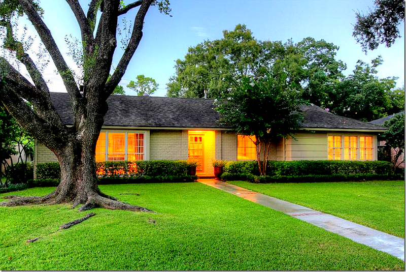 This one story house, built in the 1950s, has a fabulous location – right off Weslayan between San Felipe and Westheimer.
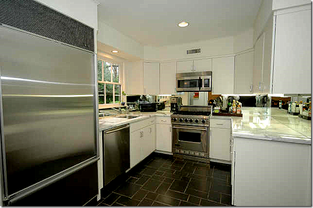
Located in Oak Estates, in the shadow of River Oaks, the one story, 1950s house is small – with only 1,986 sq. ft - which makes it perfect for a young family or empty nesters. It’s kitchen has been updated with Carrara marble countertops, slate floor, new stainless appliances, and there is an expanded master suite with an adjoining study. The house was previously a 3 bedroom, but one of the bedrooms was turned into a master closet, making it now a 2 bedroom 2.5 bathroom. Listed at $775,000, the HAR information is available HERE.
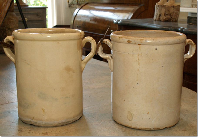
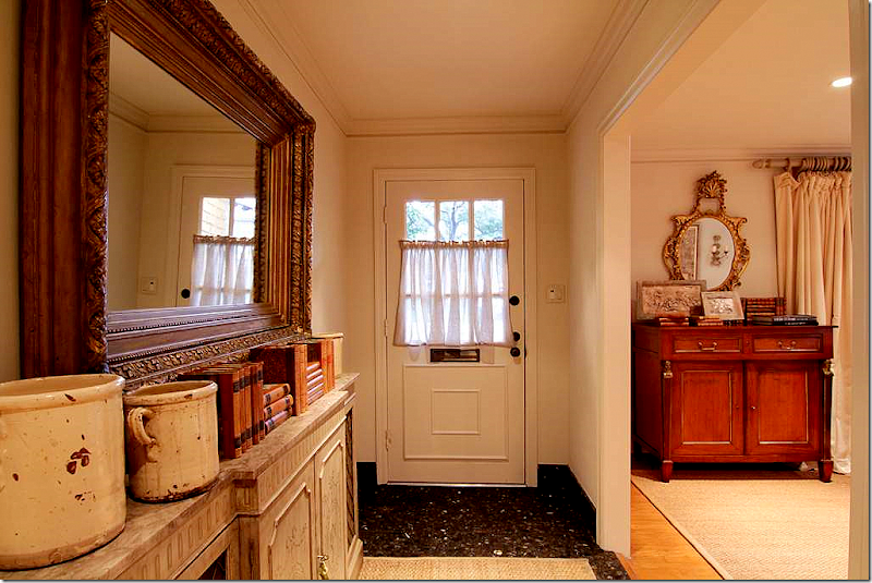
Walking into the foyer, it’s obvious someone with impeccable style lives here. A collection of antique French pots and books sit atop a painted console. A glimpse into the living room shows an antique buffet and mirror.
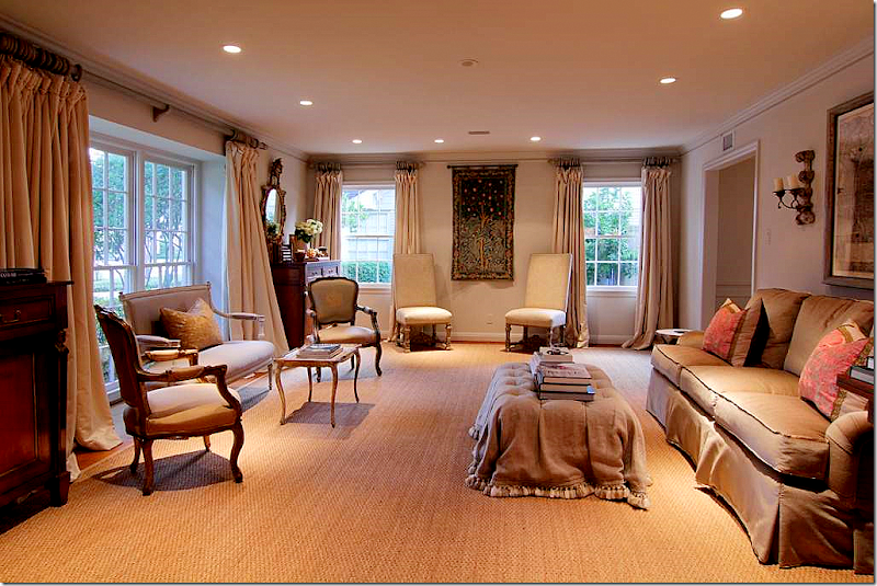 YUM! Custom cut seagrass in the living room, along with beautiful creamy silk curtains. The curtains are perfect – reaching to the top, they are full and luscious – exactly how they should be. Notice on the left, there are two antique buffets and mirrors flanking the front window. I love the tufted ottoman and the French settee. Two Fortuny pillows sit on the sofa and a mirror and pair of sconces are hanging above. Note: Be sure to set your monitor on maximum view to see the entire picture.
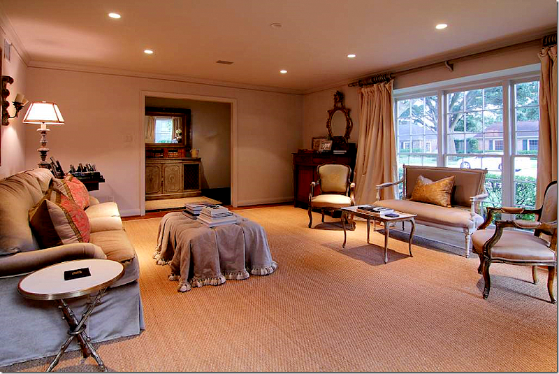 The living room, looking back towards the entry hall.
 The house has a nice, open flow to it. The dining room opens from the living room and the family room opens from the dining room. The kitchen is next to the dining room. The dining room has two benches instead of chairs. The linen slip, with its ruffled flange, is rough – perfectly matched to the table. There is also an antique trumeau and a painted buffet. The first time I saw benches used like this was in Pam Pierce’s house. See pictures at the end of this story.
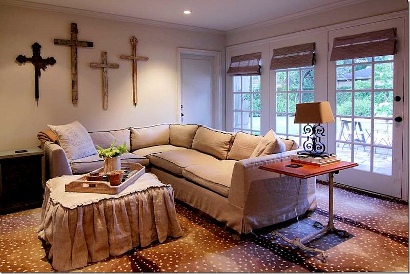 Connecting through the dining room is the family room – here the owners used Stark’s antelope carpet – a favorite in Houston. The designer homeowner cozied up a sectional sofa with a custom made slipcovered ottoman in linen. What a great idea – especially when blending his and hers – the ottoman really makes the typical sectional look atypical.
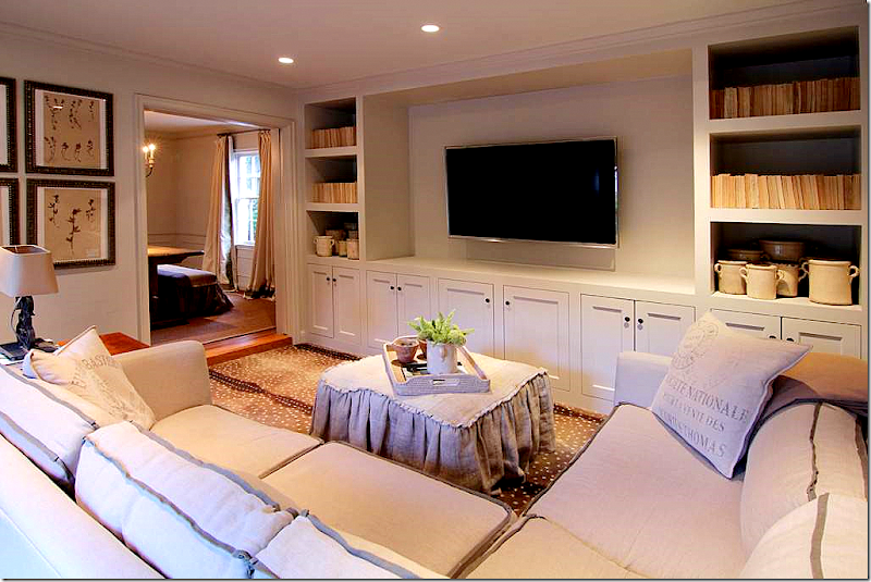 And looking the other direction – the bookshelves are filled with French pots and books, turned backwards to give a unified look. I know this is a controversial way to shelve books, but I love the way it looks, especially when the books are a collection of cheap paperbacks! I think it looks great. Notice how thick the shelves are – this is a great way to update a bookshelf. Notice here, you can see that the flange trim on the sofa is darker, giving a contrasting accent to the sectional. Pillows like this can be found all over the Ebay and Etsy or at Restoration Hardware.
Restoration Hardware’s pillows, similar to the homeowner’s.
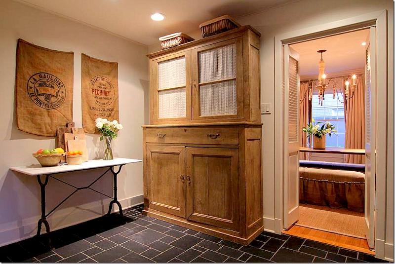 Off the dining room is the kitchen and breakfast room.
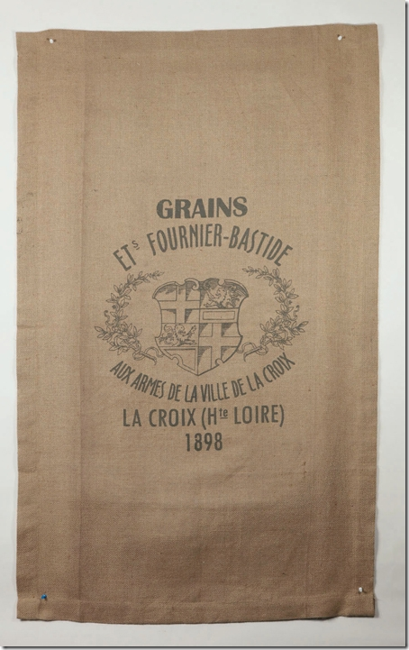
Vagabond Vintage sells burlap runners like those seen in the breakfast room. Order VV through Olivine HERE.
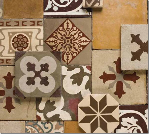
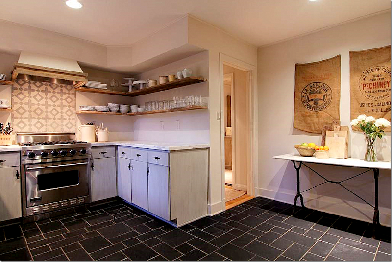 The kitchen has stainless appliances and a new range hood. There are Carrara marble countertops and new open shelving. The backsplash appears to have come from Chateau Domingue HERE.
This collection of tiles from Chateau Domingue are late 19th century. They are actually colored cement tiles, called encaustic tiles. Mostly the tiles are used on floors, but in Houston – many have been using them as backsplashes in powder rooms and kitchens.

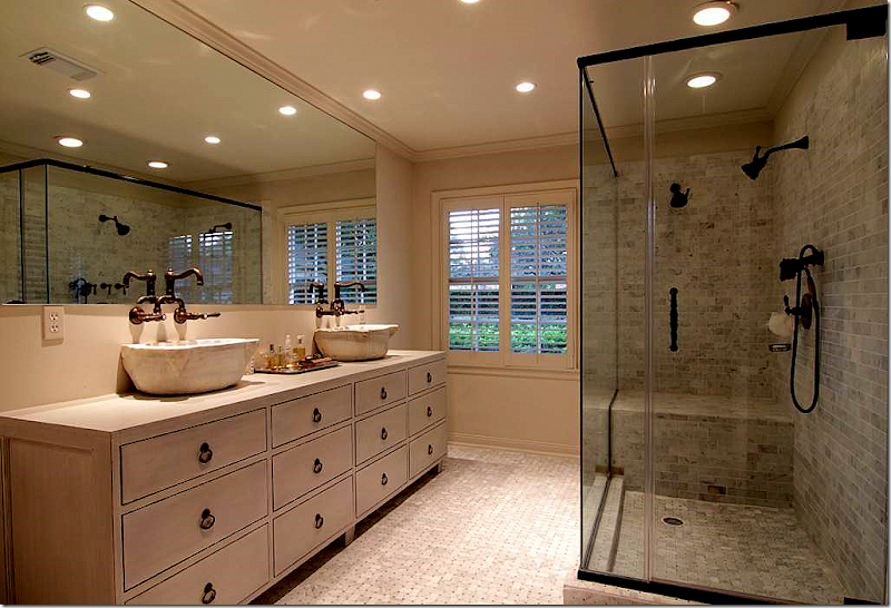 Beautiful new bathroom – love the cabinet and the antique marble vessel sinks. Great Rohl hardware. Really well done. Walker Zanger tile.
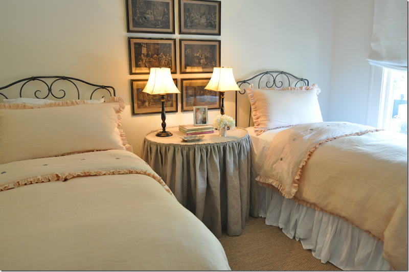
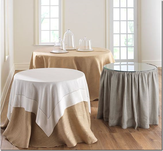
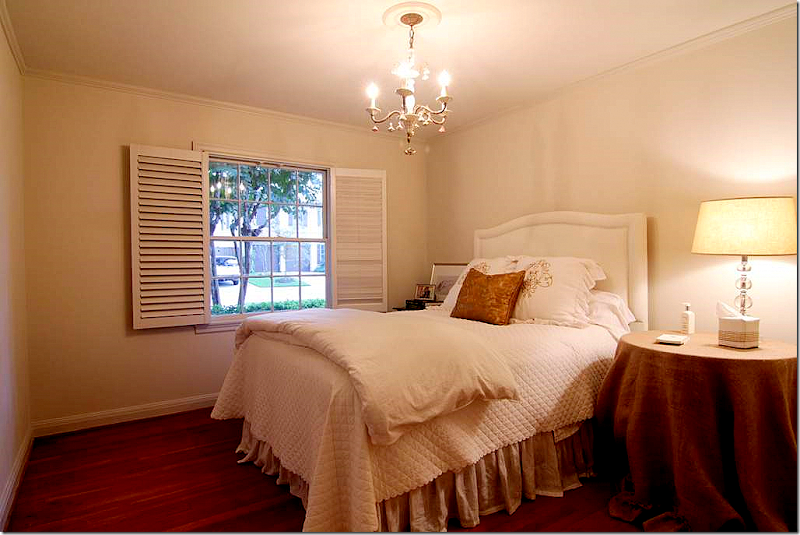 The guest room is simple and sweet. I like the shutters opened like that. The skirted table is a simple burlap - Wisteria and Ballard Designs sell similar ones.
Wisteria sells these, so does Ballard Designs. HERE.
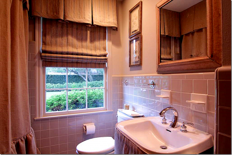
The second bathroom is softened with a custom made linen shower curtain and sink skirt. Another linen is used as a shade.
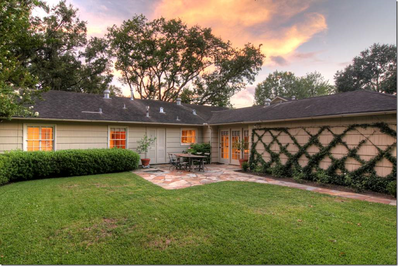
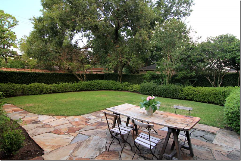 Nice landscaping and patio, along with vintage outdoor furniture.
Another view of the back yard – the trellis is a great way to soften the garage’s blank wall.
VERSION: II
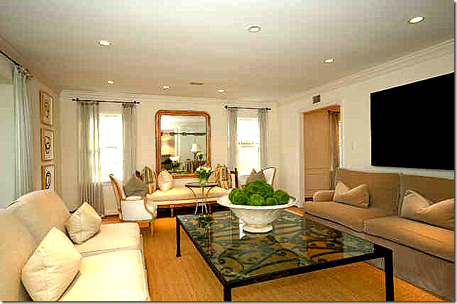 Here are the HAR pictures from the house when it was sold to the current owner in 2008. Which version do you like best, I or II or a combination of the two?
Version II: In this arrangement, there is a lot more furniture and the room looks totally different than Version I. I love the Louis Philippe mirror and the French day bed and chairs on the back wall. But, I am definitely missing the beautiful lush silk curtains from the first house.
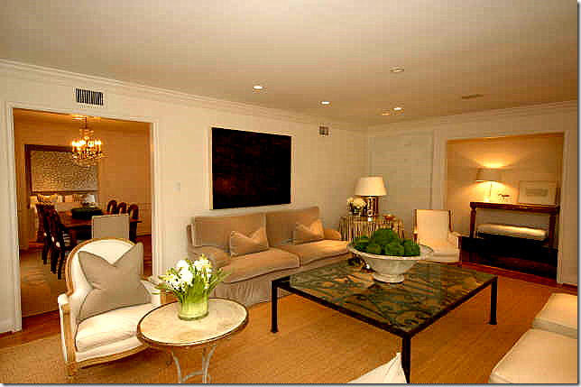 The living room from the other view. I love the French chairs and table.
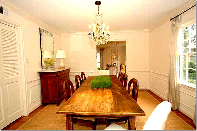 The dining room is set up like Version I with a long rustic styled table and a buffet in the corner with a mirror over it. The chandelier is crystal here, as opposed to the Italian styled one in the current house. The same curtains are used here as in the living room.
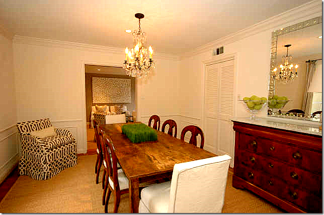 Here, you can see the host chairs are slipped in white linen with a gray trim. These owners have more contemporary pieces, like this mirror and the art work.
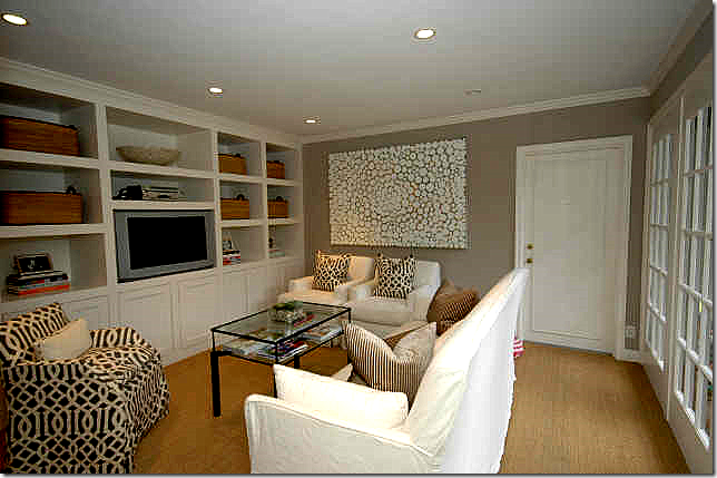
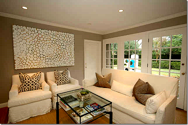 Another view – I really love this room! Very nicely done.
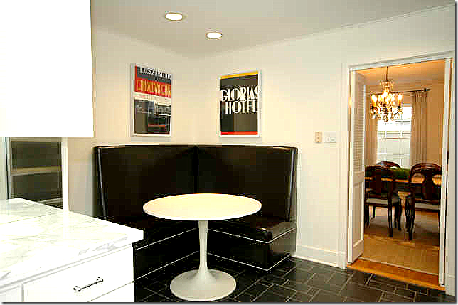 This owner chose to use a leather banquette and a Saarinen table. Different, but very functional.
The kitchen is so different now in Version I with the open shelving and new hardware. Version I is such an improvement over all these upper cabinets. I also like the new range hood in Version I than here.
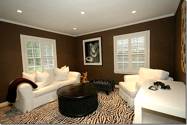
These owners chose to use the 3rd bedroom as an office. Great carpet, furniture, and I love the dark chocolate walls.
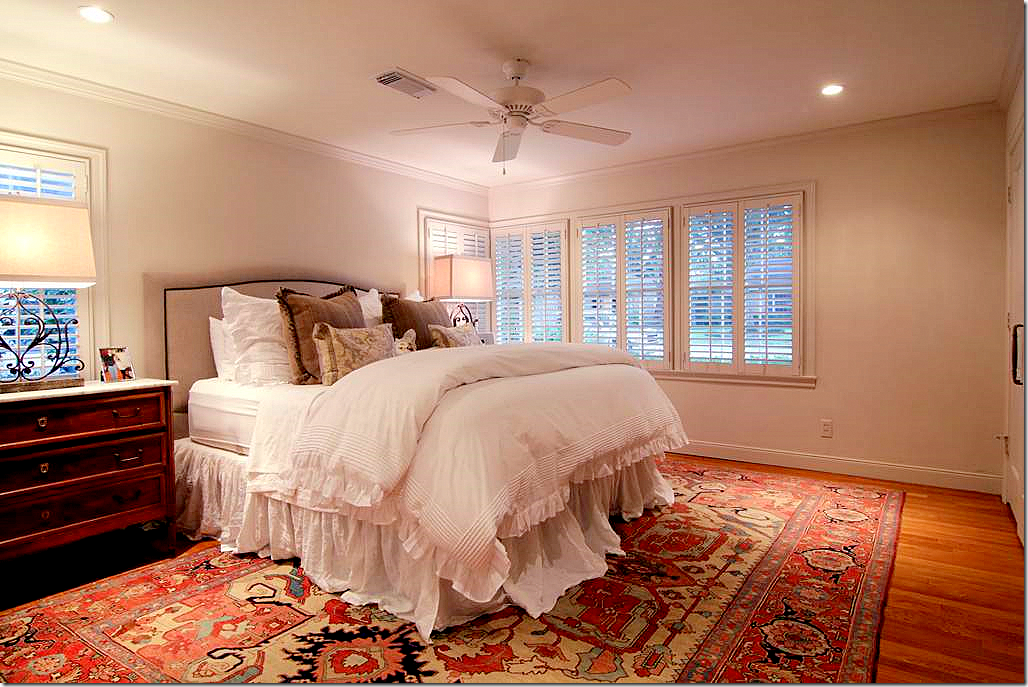
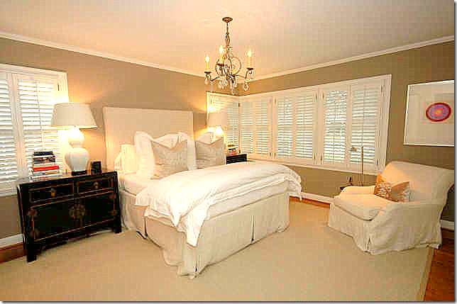 The master bedroom with dark taupe walls has linen slipped headboard and chair with two Oriental end tables and a crystal chandelier. Totally different decor from Version I.
One of the bathrooms – nice and simple in gray tile. But I do miss all the linen – the shades, the shower curtain; I think it warmed up this bathroom in Version I.
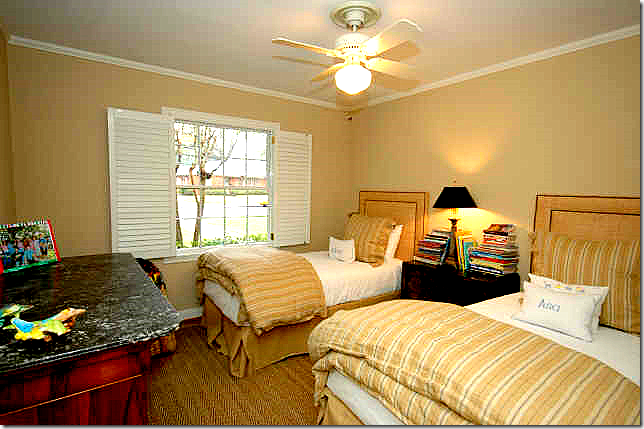 This bedroom is much more decorated than in Version I. Love the Rogers and Goffigon linen duvet and shams. Very cute!
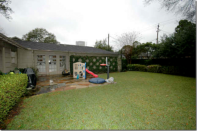 The backyard is set up for kids under this owner.
So, which is better, Version I or Version II. Actually there are elements of both houses that I like. I like the updated kitchen and bathrooms in Version I better. And I like the living room and dining room in Version I. But I prefer the family room and the bedrooms in Version II over I. Agree???
Pam Pierce Slipcover Details :
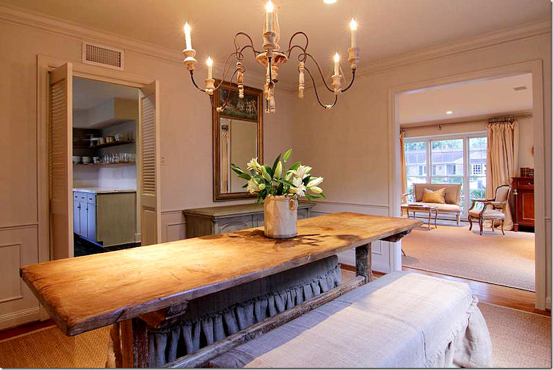 Remember the dining room in Version I – with the two linen covered benches? I love this look, and credit is due to Pam Pierce for making it popular.
In Pierce’s own house photographed for Veranda, her dining room featured two benches slipped in linen. This was the first time I had seen this look updated for the 2000s.
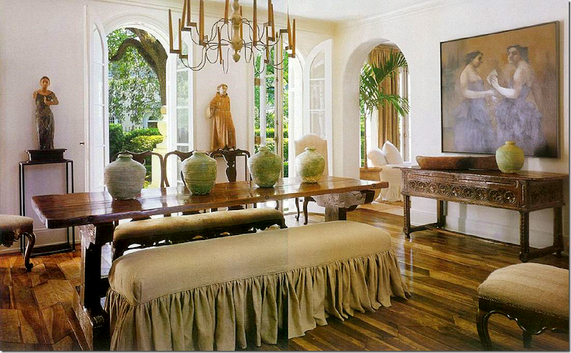
Chateau Domingue’s Ruth Gay has a similar look in her house. I love this dining room – notice the beautiful jars on the buffet. Gorgeous. And notice the tablescape. Just beautiful. AND, it was Pam Pierce, of course, who was the designer who helped Gay with her house.
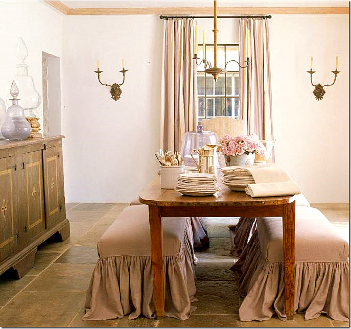
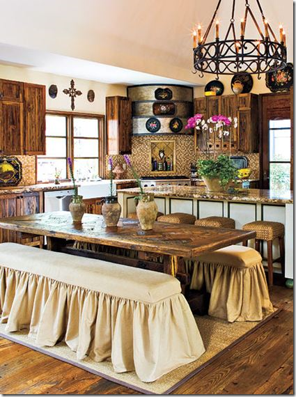 Recently, Southern Living published this picture – with two linen slipcovered benches. My first thought when seeing these was they were inspired no doubt by Pam Pierce.
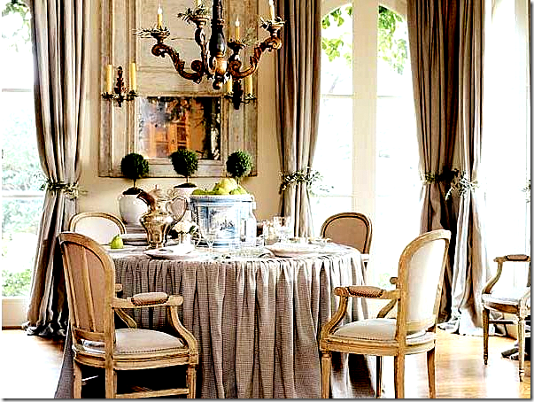
Another style that Pam Pierce first did and many others followed was her skirted tables. Instead of running the fabric with two seams up the side, Pierce gathered the linen on top of the table. It’s hard to see in this picture, but again, Pierce championed this look.
In The Stone House featured here, the homeowner’s skirted dining table is modeled after Pierce’s. The gathering is pulled onto the tabletop here.
 In The Bennison House, interior designer Jane Wood HERE used a similar type of skirted table, the seam is just at the edge of the table.
And in Sally Wheat’s living room, HERE, she used a skirted table with the seam running on top. FYI – Sally’s living room looks nothing like this today. Not one piece in this room is here today except for the curtains. Her new living room is contemporary!




I have to say I love the first version. Love the anteloupe carpet. The bathroom vessel sinks are gorgeous. Great idea for the hood in the kitchen. I have seen this done once before and thought it was a great idea however this version is much better than the first one I saw. Great combo with the rough wood shelves. Love it! Great post!
ReplyDeleteI like the second version (2008) better. I do like what the new owner did with the kitchen, and I'm really not a fan of the black booth in the nook off the kitchen, but everything else I prefer. I know the first look is very in, but it is a little blah for me. The second feels a lot more like a beautiful home and not just a staged space.
ReplyDeleteThe first version looks more like a home to me. I like the second version, but it gives off a "temporary" vibe. Two things: 1.) This post was the last straw. I'm done with skimpy bedskirts. So many of your posts show beautiful full bedskirts that make me want to run up and jump on the bed. Need one of those. 2.) I read somewhere years ago that it was an Irish custom to turn a book backward in the shelf once finished reading it. It could be complete hogwash, but who knows...it does work with old magazines when looking for inspiration and trying to remember how far down the stack you are.
ReplyDeleteThey are both beautiful versions but I prefer the 1st - especially the kitchen. Since the 2nd owner has children, perhaps the thought of sippy cups and Disney plates on open shelves drove them to upper cabinets. In a smallish kitchen the open shelves make a huge difference. Thanks Joni! Dene
ReplyDeleteLve Version 1 better, but second is stylish too...just not as much to my taste.
ReplyDeleteI would love a combination of both houses- there are elements I love in each. All that linen and seagrass and French antiques- Joni, you are so fortunate to live where design is done so beautifully- I am so bored with the mundane and total lack of creativity I see here.
ReplyDeleteI'm liking version two...more color, more eclectic. I need more color in my life than version 1 will allow. They are both so very well designed, and I'm going to shop for that kitchen tile today! Love it
ReplyDeleteI also like a combination, but Version I is just too stark and really does not look like someone lives there. Perhaps the photos were done from the staging of the property, specifically for marketing purposes. I like an edited look, but Version I is just a little under accessorized, I think. The richer mix of textures in Version II appeal to me. Also, it is my experience that photography reveals things like this that are not so apparent to simple observation. So not to seem too critical, Version I has some beautiful things in it and is lovely. Either way, the house is charming.
ReplyDeleteWOWWOWWOW on that first house!!!!!!!Just beautiful, AND I can see that-potentially-it is both child and animal friendly......Olivine's "bottom line"! The interiors look soft and sink-in comfortable,with alot of texture going on from the rustic antiques and nubby linens.Both houses are lovely, but I heart Number 1!
ReplyDeleteJoni, you have set a new standard...I hope, for other designer blogs...supplying sources and inspiration to accompany your wonderful photo shoots is truly design genius! Do you lie awake at night dreaming up these ideas?!? BRAVO! franki
ReplyDeleteI like parts of both. I think the first version has overdone the skirts...I have a feeling they're going to look very Grandmotherly in years to come.
ReplyDeleteSally Wheat seems to pull it off, but she's light with the hand. Done sparsely, it looks great, but in every room, I see dropcloths hiding ugly upholstery (in my mind).
The second dining room is blah
Love the first bathroom
Like the second kitchen better, but it looks worn out (I'm sorry!) and the first kitchen looks like one in a city apartment...neither seem to fit the house.
Love a lot of both, though.
Second version is so much better!! Love the skirted tables and the use of linen! It has something Belgian!
ReplyDeleteHave a nice weekend Joni!
xx
Greet
the new owner really hired me to do the design ... didn't she tell you?
ReplyDeletejoke
it's s.t.u.n.n.i.n.g.
I love so much in V#1, but somehow it leaves me feeling over done. I don't think I like sooo much linen and soooo much seagrass, but I absolutely love both. It leaves me feeling bored, but saving all the pictures at the same time. What's up with that?
ReplyDeleteThe Ottoman in the living room is WONDERFUL but how about an antique rug in the entrance area... I love the benches at the dining table...but I'd rather see a beautiful rug underneath as well. I love the family room...everything about it, but she's already done it. How about a cool found object coffee table? And I will be turning all the books around in my master bedroom bookcase cuz, yes, that's where all the cheap books are stashed! I've saved pictures of this before and I like a little less straight...more jumbled up but I get it when it looks like this one. Now, that kitchen. I absolutely love that she removed the cabinets and put up the old shelves, but I worry about resale, I hope the next homeowner can pull this off. I know I'd have to come in and add some closed cabinets.
There's a few things I like in V#2, the family room is nice but I think I need some window treatments...
Ok, now I've been bucking for a window seat in the kitchen, so I thank you for all of these bench pictures. I'll do this instead and somehow figure out how to make Jeff think it's his idea so I can do it right away :)
I'm off to Crush Party to reblog you a little bit (as usual) Thank you so much for always the best post of the day! When I pass out blog names to my customers at Rooney Robison, your's is always the first out of my mouth!
I like the second better, with the exception of the kitchen...but after looking at all those photos, of course the one thing that jumped out at me was that they used the same cabinet hardware in the kitchen and bath that I just put in my butler's pantry. I also like to see bathrooms where they leave the old tile....there are 5 bathrooms in this house with tile up the walls and seeing them remodeled without a complete gutting is very inspiring to me.
ReplyDeleteApart from the updated kitchen, which is a breath of fresh air, and what I assume must be an updated master bath, I think I'd have to go with the first version of the home.
ReplyDeleteAll of the seating arrangements are chic but look comfortable and inviting, and overall I feel the first version, while still elegant and chic, reads younger and a little more glam.
I too could tire of the abundance of hemp sacks and drop cloth in the second rendition after a time.
That said, both are lovely variations on the theme.
Goodness, that's a hard choice. I definately like parts of both of them. But, I probably would chose #1 if I could only take one.
ReplyDeleteThank you so much for showcasing a simple, one story ranch house. I live in such a house and it is so hard to find pictures of nicely designed ranch houses. Thank you, thank you, thank you.
Amazing how you cover all aspects of the story. Appreciate all the time and work you do for us, the humble homemaker with dreams of grandeur. The first house was stunning. Yet the soft. drab colors wouldn't suit me. Too enamored with red walls, flow blue china and quilts to settle for neutral colors. You do broaden our views. Thank you. Peggy
ReplyDeleteI like a combo of the two and although I love some of the details and items in Version 1 it left me feeling like no one really lives there....I also really didn't care for the living room arrangement..like all the furniture was hugging the walls with a big path in the middle..That was my biggest complaint. But I do like what was done in kitchen, big look in a typical 1950's kitchen for not a lot of money. Besides the living room I just wish it had a little more personal look to it and more artwork.....but as we all know that takes $$$$. Version 2 is a different look....a little more contemporary in feel but to be Version 1 feels more formulaic...trend of the moment which is great when used in touches but it kinda overdoes it for my taste....Both have wonderful pieces I just like a little more personality with art and accessories....It could be the way they were styled for the HAR photos...Either way, thanks for the post Joni...you do such a great job and we all love your blog....
ReplyDeleteWhat a lovely home! I like overall the second version a little more, but some changes in version 1 are very appealing to me. The kitchen for instance. I love the eclectic mix of old and contemporary. I find version 2 more current. Perhaps I would mix them up a bit!
ReplyDeleteJoni, as always, an enjoyable and so entertaining post!
Please come over and see my new blog lay out! Hope you like it!
Much love and have a sweet weekend!
XX
Victoria
Thanks, Joni. I love these compare and contrast posts. Both versions are lovely. I think I agree that the first version has a little too much gathered linen. Personally, I would like just a little pattern or texture somewhere. Both versions seem a little unfinished. And I would have to completely redo both kitchens, starting with the floor.
ReplyDeleteI have to agree with you. I love the version one kitchen, dining room and bathroom. Love all the linen!
ReplyDeleteI must say Joni, Version 1 appeals to me much more. This post could not have come a better time for me. We are planning a major renovation of my circa 1971 brick bi-level and it just proves what good interior sense and style can do without bombing the entire house! I notice that the moldings windows etc.which are dated, disappear against the beauty of the of the overall design scheme. This has been a superb lesson for me as to where I should put the money for this reno. Also, so you know, one more fan, from Canada. Never miss a post since, I followed.Nella
ReplyDeleteI have to go with Version 1. Although I like many of the individual pieces used in Version 2 (and the Family Room was terrific) I think the overall effect was much more pleasing in Version 1. Thanks for sharing! I'm no designer but your blog has helped me learn so much and chisel away a lot of fleeting trends to refine my own likes. Thank you!
ReplyDeleteI love both homes, but Version II was definitely my favorite. For one thing, I love animal prints and the linen, and there seemed to be more personality in the second home. I did like the seagrass rug over the wall to wall carpet. The kitchen in version II was updated and beautiful.
ReplyDeleteHave a nice day.
Teresa
I love the first version! do you know what the black floors in the kitchen are? I have seen Belgian bluestone that looks similar with the white/light gray grout.
ReplyDeleteAlso, antelope don't have spots, ya'll! those are axis deer skins that have those markings. I have two pelts and drape them over my chair or sofa.
I can't make up my mind which version I like better, both are beautiful. Are the kitchen floors soapstone that's been sealed? I don't think slate would hold up in a kitchen but the floor is gorgeous. You always find the best of both worlds don't you and we're so grateful you do!
ReplyDeleteI like both versions; however, I think a mix of the two would be great. I like it when rooms are more full than sparse. Hands down the kitchen is better in Version I. I am sad that they tore out the beautiful tile behind the stove.
ReplyDeleteI have to say that it is axis deer hide not antelope. In the design showroom I worked in, we sold axis deer hide chairs. They have the spots.
The ottoman in the first version is just what I've been looking for to explain as far as the style I want for a re-new for my ottoman! I like a mix of both 1 and two but have to sat that 1 had more likes for me. Jennifer
ReplyDeleteHands down I love the first version best...gorgeous! The ottoman in the first version in the living room literally made me gasp! I love,love,love that ottoman! The beautiful drapes really make such a huge difference in that room. Thanks for sharing the two versions of this house,it was a lot of fun to see the two and compare!!!! Have a great weekend :o)
ReplyDelete~Des
I prefer the first version. It felt warmer and cozier to me and just overall more welcoming. I also really loved the beautiful gold mirrors combined with the rustic wood tones.
ReplyDeleteHave a wonderful weekend!
Trina
of course, I like the second version better. It feels, I don't know, more 'creative'. It has more personality.
ReplyDeleteI like it's current state much better.
ReplyDeleteFunny, isn't it, how quickly a room can become a bit "dated".
Joni,
ReplyDeleteYou amaze and inspire me! Thank you for the hard work and dedication that you put into your blog.
You are wonderful!
Angie
Version #2 pleez! Although version #1 is beautiful, the interior does not "go" with the exterior and era of the year the home was built...I feel like the owner stuffed a different house inside the facade.. I see that kind of decor in a large tudor style home built in a much earlier time... Version #2 "feels" like the decor belongs there... Just my 2 cents!
ReplyDeleteJoni,
ReplyDeleteI love Version I! It is inviting and comfortable in appearance. Version II has done some great things with paint but overall V-I gets my vote.
What is under the seagrass in the foyer? Is it terrazzo?
ReplyDeleteI prefer Version I. Would love to know about Master Bedroom linens.
ReplyDeleteles deux versions sont trés américaines!!
ReplyDeleteBoth versions are nice, but I do like the older version the best. The first is just "too much" for my tastes. For some reason, my first thought was can't see a man living in this. It looks like the owners/designers were trying to pretend they are living in a French cottage. Touches of it are fine and I have some of the same looks in my own home. I do love the Stark antelope carpet and plan on adding one to my family room in the future. B
ReplyDeleteI like aspects of each. The master bath and kitchen in the updated version appeal to me...and I am always a fan of the antelope rug. But, I like the living and family rooms in the 2nd version. I think I need more color than version 1. Both lovely though and just personal opinion.
ReplyDeleteI much prefer (overall) the 2008 version of the house. However, I like the 2010 bathroom better thatn the 2008 bathroom. Both are nice but my preference is for the 2008 interior design style.
ReplyDeleteThe 2008 version is definitely more functional- what I find amazing is how blah the landscape is. We have a similar home in size and it really helps to integrate nice outdoor living rooms with a smaller house especially if you give up a bedroom for a closet! Too bad we didn't get to see this closet.
ReplyDeleteI like certain aspects of each verson, so it's difficult for me to choose between the two. They're both lovely and each owner put a lot of care and thought into decorating the home, which is nice to see.
ReplyDeleteDeborah
Joni - you do this to me everytime! Just when I think it's time to move on from the French look you pull me back in with such stunning pictures! Both versions are obviously fantastic but I'm drawn more to the 2nd version. I prefer the kitchen, bathrooms and breakfast room from the 1st version though. Thanks for the weekend inspiration.
ReplyDeleteSherry
It's hard to choose between both versions, each one has very unique characteristics that make them beautiful. I actually prefer the bedrooms of the second version, the furniture decoration is more elaborate. Overall a beautiful house, and both decorations are very tasteful. Thanks for sharing!
ReplyDeleteLike aspects of both versions. First is more to my personal taste, but I appreciate the look of the second. However, the the ending photos of the skirted benches and tables by Pam Pierce,Jane Wood, Sally Wheat and others are all eye candy with that wow factor. Inviting, homey, functional and elegant all at once. You created that look in your daughter's room. To me it's decorating at it's best.
ReplyDeleteGreat post as usual - do so love this blog.
Janice
Pemaquid
Like the bathroom sinks, the last version is better. The first one had a few things I did not like.
ReplyDeleteyvonne
Loving the difference a couple of years make. The first pics are really more to my liking, but both versions work for current homeowners so, it is interesting how really great views entice more and personal spaces. Thanks for giving us a peek.....
ReplyDeleteL.
Hi Joni!
ReplyDeleteThanks for showing two great homes that have not been mowed down to put up those other homes that are so prevalent in Houston....I think both are winners. I think the first is a precourser to the style of the later version....But I also feel you did another thing not realizing it.... Those old brick ranch homes are a wonderful canvas to be made into a beautiful home..... I know I live in one, and love it. Thanks very much for this post that really hit home for me... Maryanne xo
GREAT post. Well-researched. You have a good memory and tie things together nicely for your readers. Love your blog!
ReplyDeleteJoni,
ReplyDeleteAny idea if the crosses on the wall are old or new and where the owner got them? I love the concept.
As usual, I love your posts, but lately many of the pictures do not show up for me. It is probably a problem with my computer. I have to wait forever for the images. NOt a complaint because it is probably on my end, but frustating nontheless. Love Lizzy's dorm room!
ReplyDeleteDo people who have long benches around their dining room tables ever actually have guests who use them? They're terribly uncomfortable for any length of time and whenever one guest wants to get up, everyone else on it has to as well.
ReplyDeleteI can't think of anything less conducive to gracious entertaining than seating your guests on benches. It won't be a long, leisurely dinner.
You can visit our website to check our complete cement tiles collection.
ReplyDeletewww.originalmissiontile.com
ReplyDeleteI like elements of both. The first house looks a little stark to me, especially the family room. It needs a little oomph. Also, the master has no artwork and seems lonely to me. But I like the kitchen in no. 1 better, as well as the bathrooms. I am not sure I am sold on the dining room in no. 1. I think I like no. 2 better. I like it a bit more traditional with the chairs as opposed to the benches. I just don't think it would be comfortable to sit very long on benches when you are eating a nice meal.
ReplyDeleteI do like the lamps in the no. 1 bedroom. Any leads on those?
I like some from each design as it should be.
ReplyDeleteI don't care for benches in the home either. I can remember being a guest in such a dining room and leaning back and the rest is well...embarrassing.
Yet another great post.
E 'vero! Credo che questo sia un concetto molto diverso. Pienamente d'accordo con lei.
ReplyDeleteCondivido pienamente il suo punto di vista. In questo nulla in vi e credo che questa sia una buona idea. Pienamente d'accordo con lei.
Don't think I could pick a favorite -- both versions are so gorgeous! That linen, the seagrass, all that white = pure heaven.
ReplyDeleteBut do you know the one thing I would change? To me, the LR is screaming out for a fireplace mantle. Somehow it seems like there should be one in that particular room.
It's been a while since we've seen anything by Sally Wheat...I'm having withdrawals. Would love to see a post on her newly designed living room. Great post!!
ReplyDeleteI am so sorry to hear Sally Wheat went contemporary. How could she leave the French look behind?
ReplyDeletexo,
nancy
Okay, I know I will get pummeled for this, but you asked for opinions, right? I really don't like the first (newest) version, except for the master bedroom. It just screams "FAD"! The linen, the open shelving, the backwards books...these are all "new" styles, and all are ridiculous, in my opinion. Linen wrinkles and looks unkempt. It also doesn't hold its shape, so the slipcovers will fit badly very soon. The open shelving makes it impossible to keep your things clean (a must in a kitchen, in my opinion) and as an avid reader I hate the trend of covering books or shelving them backwards. You can't find books when you want to, and if you're visiting someone's home, you miss the pleasure of browsing their shelves and finding a treasure or learning more about their interests. I don't mind change, I like eclectic mixes, and I look forward to the time when these impractical fads fade away. They make me nuts. Don't people realize that when they make all their homes cream with linen and weird book arrangements and dirty open shelves...they just make themselves look like sheep?
ReplyDeleteI really don't like the first one at all. I mean, it's nice enough, but the spacing in the living room is just odd, and everything is trying to be very trendy and I think is already outdated.
ReplyDeleteThe second isn't my ideal, but it's very nice, and I actually think the kitchen looks less like it's trying to be out of the Restoration Hardware catalog (along with all the beige linen everywhere).
Fun post! While the 1st dining room is beautiful to look at, my back aches just thinking about sitting on a bench for any length of time. Not a table to linger at . . .
ReplyDeleteJennifer
Joni- I cant stop thinking about this house. Maybe because it is a rambler like mine so I feel a connection to it and it gives me inspiration for my own. I just love the real Houston designer homes that you show here. It makes me excited to come and visit my sister who is moving there. I could never in a million years find a house like that on our MLS in Salt Lake City. Oh, I agree - super full linen bed skirts are a MUST! And I prefer the first version that you featured. Thanks for the great post! Bethany
ReplyDeleteI like some of the 1st and some of the 2nd best. I hate the books turned backward! I love the vessel sink bathroom ... parts of each. I do think the 1st house looks like it is trying very hard to be something it is not. A bit too trendy, but still pretty, and I enjoyed both house tours very much. Please show us Sally's new LR. I am dying to see it. Thanks for another great Joni Post.
ReplyDeleteThis is fun to see two designers' takes on the same space. The first space seems very staged though so I'm not sure we're seeing the designer's complete vision. I love the addition of the modern elements in the second space like the Kelly Wearstler patterns and contemporary artwork. It makes the space much more interesting to me.
ReplyDeleteJoni...I love the oval mirrors...
ReplyDeletewhere did you find them?
Kudos to decorator in house version number one. Not only beautiful but warm and inviting.I love,love her choice of details. Great mix of beautiful antiques and other pieces. She must be a southern belle!! I would love to see her closet too!!
ReplyDeleteArchitects should see the big picture. In Houston, Texas there are lots of great resident architects that are very trust worthy.
ReplyDeleteI love version 1. The blend of new and old is amazing...truly an inviting space! Such a talent!!
ReplyDeletei like both versions.
ReplyDelete