Last June, I showed a house in Rosemary Beach, Florida that interior designer Jenny Johnston had totally remodeled. Jenny took the beach house from the 1990s to the 2010s by using cooler colors, white slipcovers, antiques and trendy fabrics and furniture. Most people who left comments loved the transformation, but a few did prefer the older décor more: the brighter colors, the pine furniture, and the bold printed upholstery fabrics. Recently, Jenny showed me pictures of a condominium in ski country – Crested Butte, Colorado - that she had remodeled. The redo took two years to complete and it was a total gut job – with a new kitchen, bathrooms, lighting, flooring, etc. – everything was redone. I think I can safely guarantee that no one will say they like the previous décor better! The condo is very small – 2 bedrooms and one loft bedroom with just one living area. The “Before” pictures show that the condo hadn’t been freshened up in over 20 years, while the “After” pictures show Jenny’s dramatic transformation. The décor is very Colorado ski country chic – rustic, yet sophisticated. Enjoy!!!
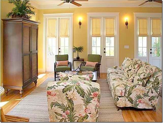
Rosemary Beach, Florida: the “BEFORE” living room. Some commenters preferred the 90s décor over the new look. Most though, liked Jenny’s updated décor more. Me too!
AFTER: A white slipcover sectional is much quieter than the loud island printed fabric of before. Jenny painted the yellow walls white and brought in an antique French buffet and a trendy Belgian styled coffee table. To read the entire post on the Rosemary Beach house, go HERE.
CRESTED BUTTE, COLORADO CONDOMINIUM:
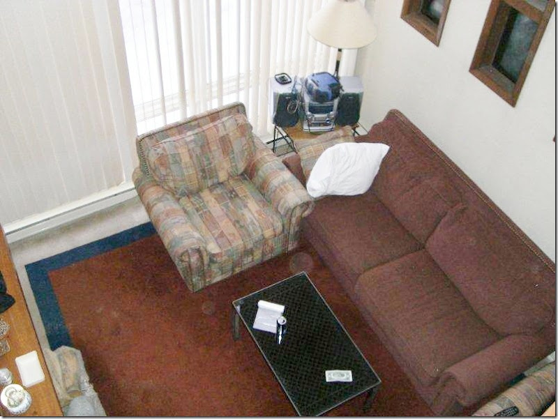
BEFORE: Typical Colorado ski country condo – rock and wood fireplace, vertical blinds, bulky furniture in maroons, blues, and greens.
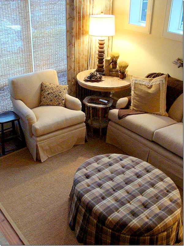
AFTER: Everything has been gutted and changed – soft, printed linen curtains and textured blinds replace the verticals. The furniture is in shades of cream and ivory, with a large tufted plaid ottoman. A textured rug covers the living area.
BEFORE: The wood and rock fireplace as it was before Jenny redid it.
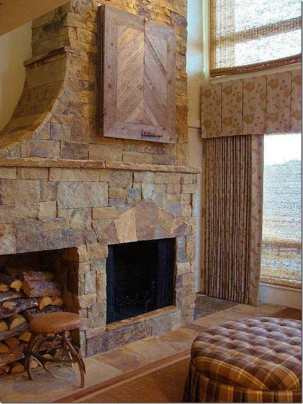
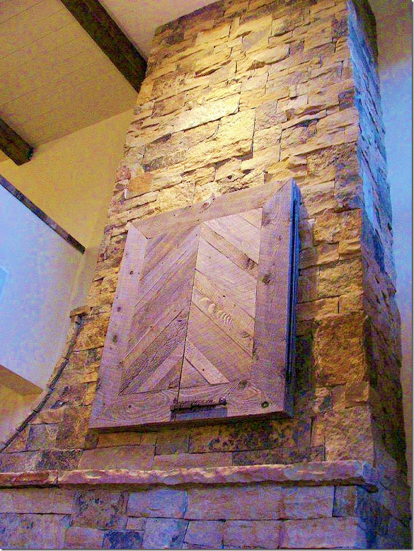
AFTER: The new slate fireplace has a wonderful curve on its left side, leading to the loft floor above it. A new cubby holds all the logs. Notice the way Jenny handled the flatscreen TV – a nice alternative.
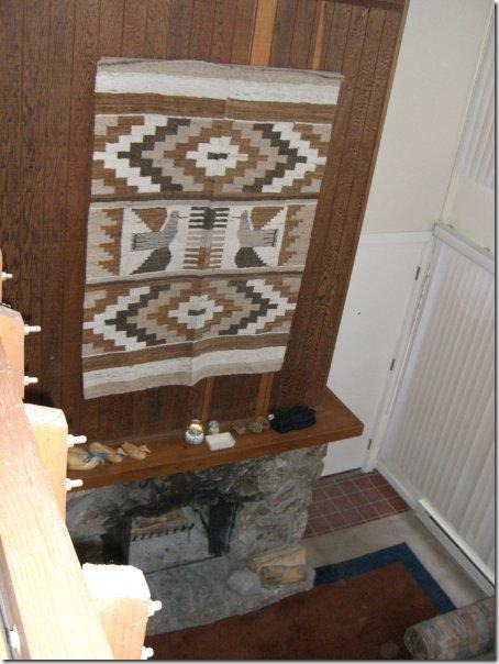
Before: Wood and stone fireplace. You can see the front door to the right of the fireplace.
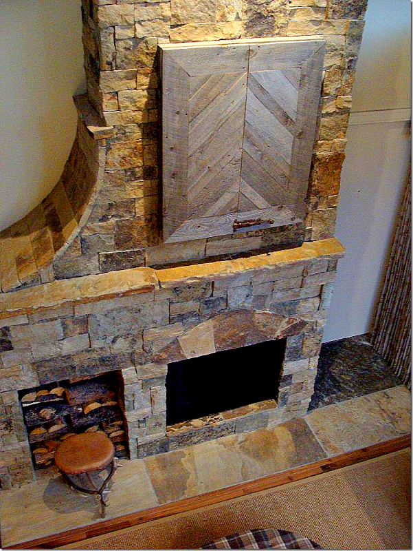
AFTER: Looking down from the loft at the fireplace – you can really see the curve on the left side and the large hearth on the right, which serves as a small entry hall. The front door to the condo is directly to the right of the fireplace.
The living area is very small, so furniture is kept to a minimum. The ottoman does double duty –it’s perfect for a coffee table AND extra seating.
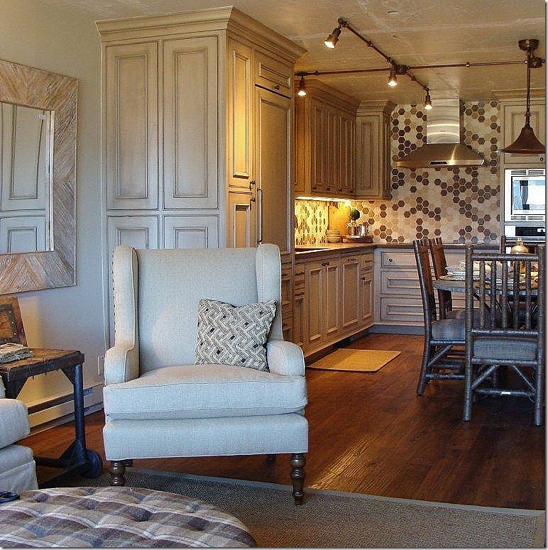
AFTER: Looking the other way towards the kitchen area. Notice the great woodwork in the kitchen – the refrigerator is almost invisible in the paneling.
BEFORE: Here you can see the kitchen and living/dining area – once two separate rooms. Jenny removed the wall between the two spaces, opening it up to create one larger, open room.
AFTER: Same View. The kitchen and dining area are now one big space, combining it with the living room. The floors were replaced with rustic looking hardwoods – keeping with the ski lodge atmosphere.
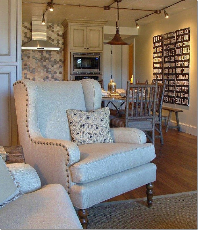
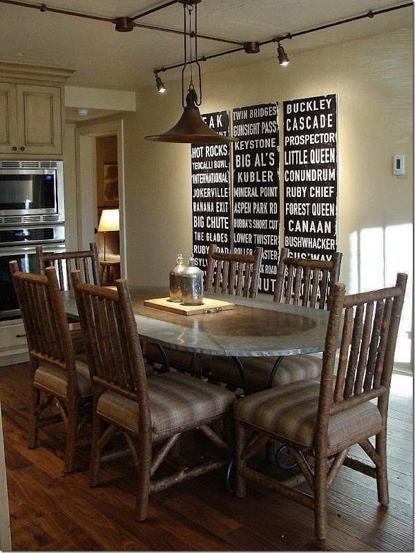
AFTER: Trendy nailhead armchair in the living room and an even trendier railway stops sign hangs in the kitchen area.
AFTER: The dining room chairs have a log appearance, again – keeping with the Colorado vibe. Great tin top table with curved iron base. Notice the overhead lights and fixture. Through the back hall, you can peek into the kids bunk room.
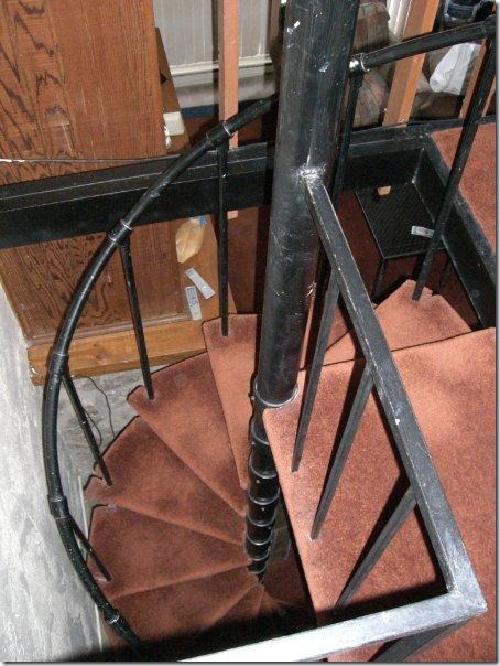
BEFORE: The spiral stairs with the brown carpeting that leads to the loft area overlooking the living room.
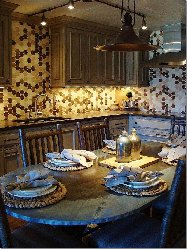
AFTER: On the spiral stairs, the carpet has been replaced with wood. Here, you can see into the guest bedroom. Notice how the table looks bronze in the center – which goes with the metals in the kitchen. And the chairs – really do resemble cut logs – perfect for ski country rustic!
AFTER: Looking at the other side, the range has a cute hood and hexagon tiles in shades of bronze, taupe, browns and ivory make a huge style statement.
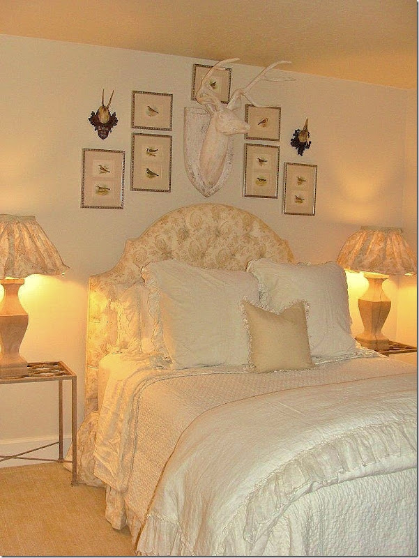
AFTER: The guest room, off the dining area, has textured wall to wall carpet.
I adore the lampshade treatment!!!
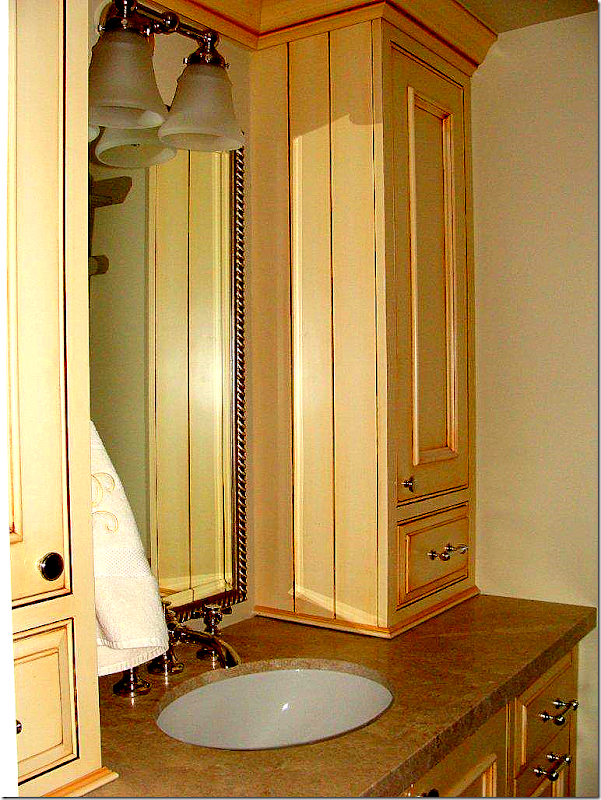
AFTERL: The guest room’s bath. Jenny used the same cabinetry here as in the kitchen, and throughout the condo. In such a small space, the repetition of the cabinetry and other design elements creates cohesion.
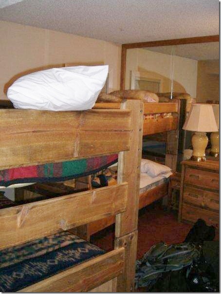
BEFORE: The jumbled and cramped kids bunk room.
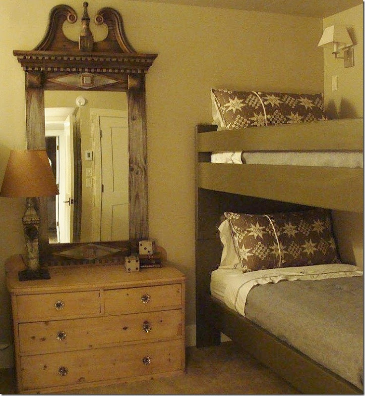
AFTER: The bunk room now has two sets of bunk beds in it. An antique pine dresser sits between the beds. The tall mirror is an unexpected touch of elegance – juxtaposed with the rustic dresser. Bunk beds remained – just with a new, deeper paint job.
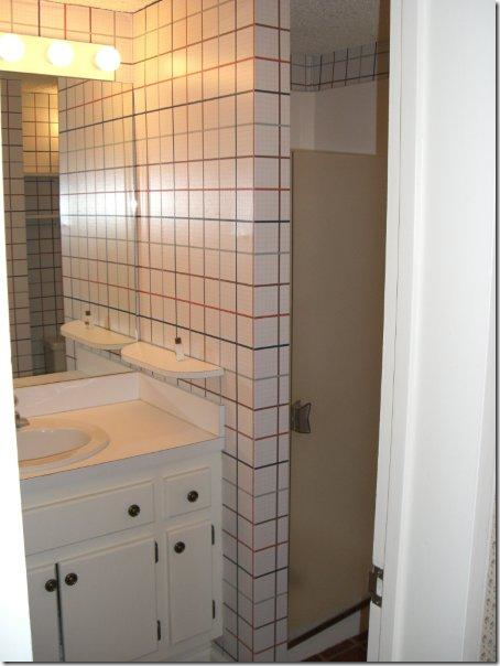
BEFORE: The bunk room’s bathroom is small, with room for just a shower stall. What could possibly be done to this space to make it interesting?
Ask Jenny!
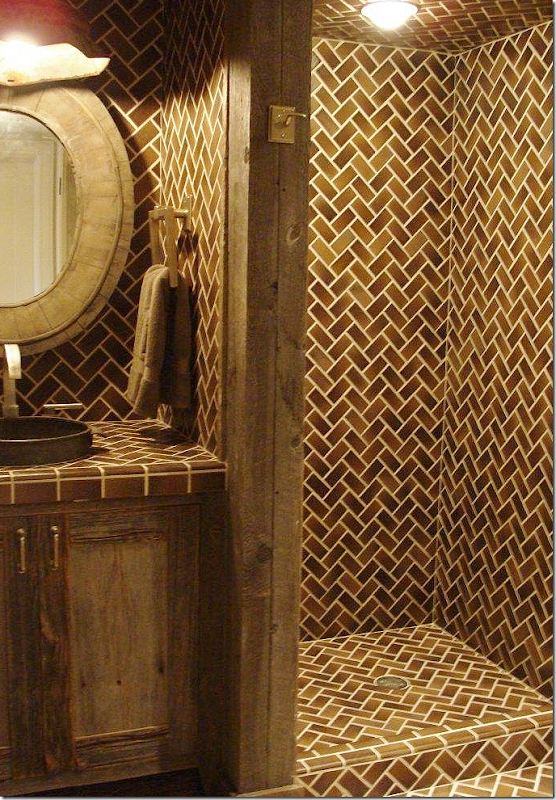
AFTER: WOW! The bronze colored tiles fit well with the bronze tiles in the adjacent kitchen. The shower is open to the room, thus making it seem somewhat larger. The patterns of the tiles creates an additional design element. The cabinetry and paneling is a rough wood. Just wonderful!
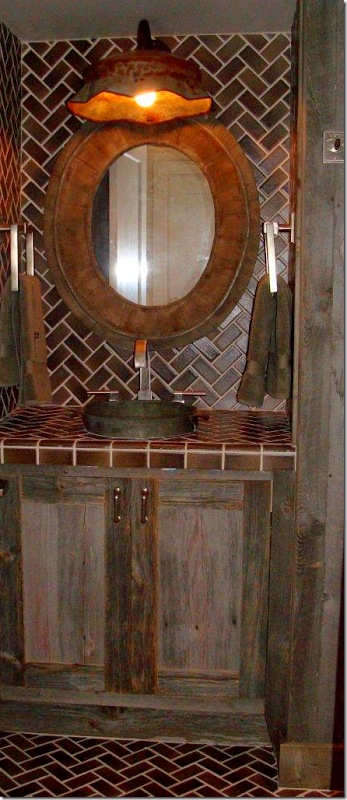
AFTER: Close up of the rough wood cabinetry and notice the hanging light fixture.
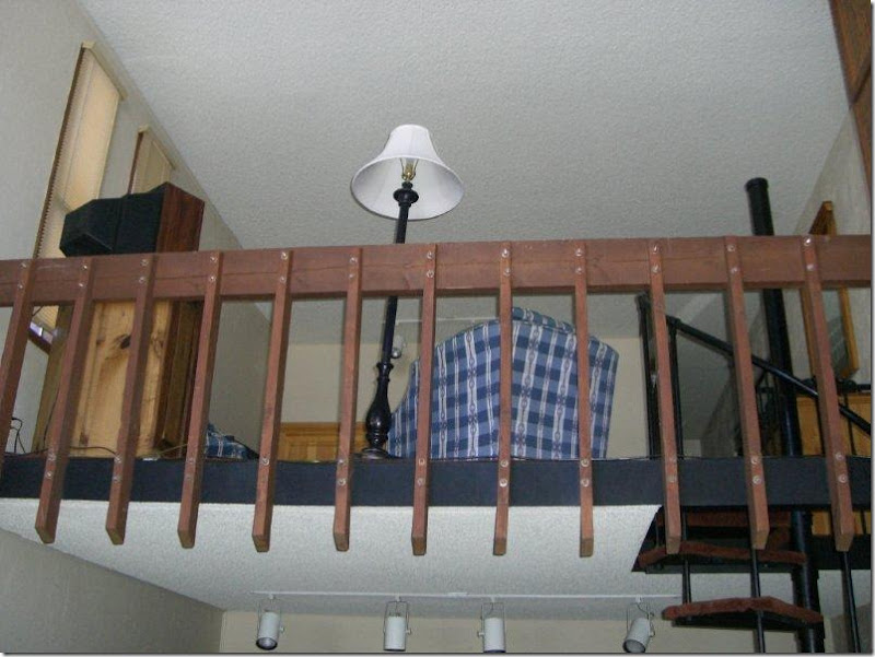
BEFORE: Above the kitchen/dining area is a loft room and bathroom. Previously this area was open to the living area with a dated wood railing.
AFTER: In this picture – to the left of the fireplace - you can see what Jenny replaced the wood railing with. Instead of an open rail, she put in a half-sheetrock wall, providing a bit more privacy to the loft area, which is used as a master bedroom. The top of the wall is finished with a piece of stained wood and there are stained rafters that Jenny added to the condo. Notice, here too – the rustic latch used on the TV cover. For such a small space – there is a lot of detailing that was put into it – all adding up to a more interesting scheme.
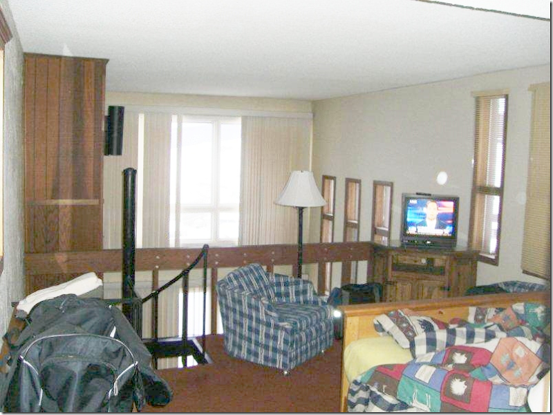
BEFORE: Upstairs overlooking the living room below. You can see the wood fireplace mantel at the very left.
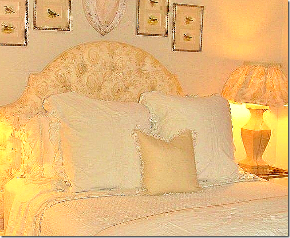
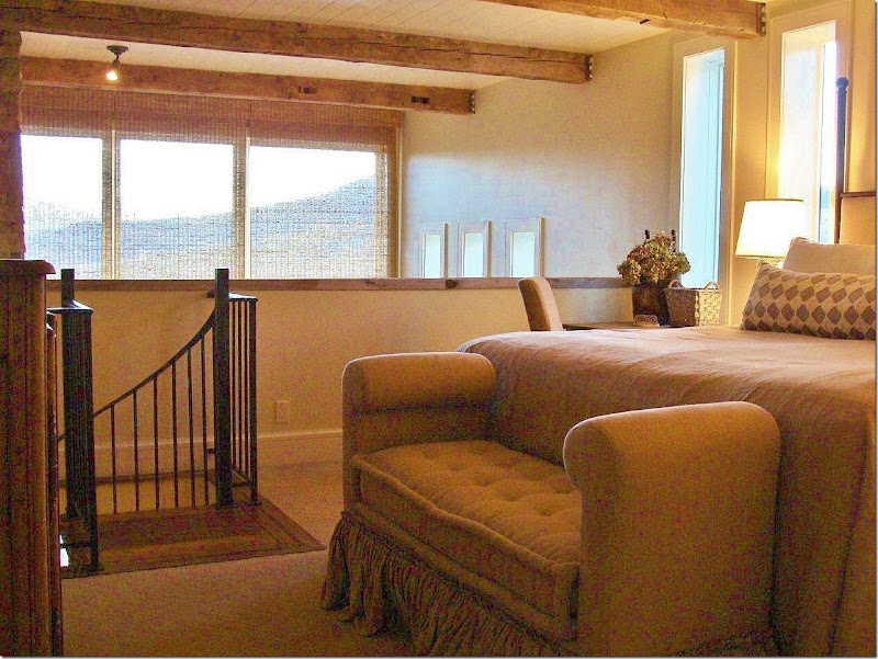
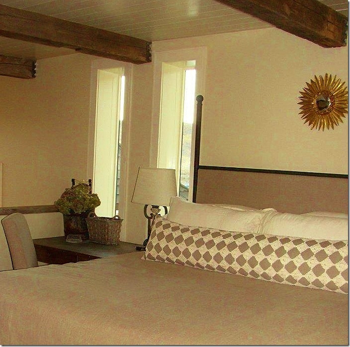
AFTER: The loft area is now the master bedroom – with the beautiful view outside the tall windows. The railing is now a half wall providing a bit more privacy, while updating the look. At the foot of the bed is a tufted bench with double ruffling. So pretty! Jenny installed the rafters which add to the rustic look. And between the rafters is beadboard, just another detail that adds to the charm.
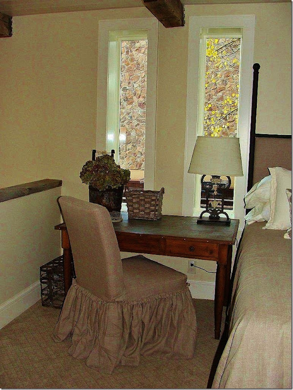
AFTER: A slipcovered chair with similar flange edged, double ruffling sits next to a desk and the bed. The odd shaped windows which can’t be changed out, once had dark stained molding surrounding them. By painting the molding white – the windows tend to disappear in the background. The carpet here is a tone on tone flat pattern.
AFTER: Across the bed, one long lumbar pillow adds the only pattern in the quiet room.
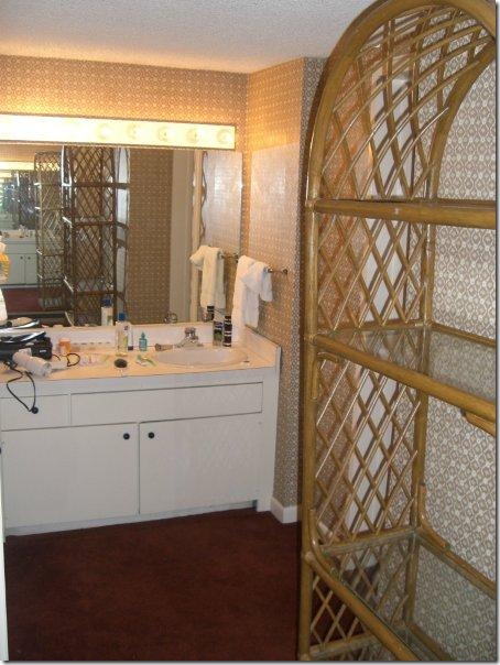
BEFORE: The master bathroom is a mess, outdated and ready for a complete overhaul.
AFTER: Using the same beautiful cabinetry as the kitchen and guest bathroom, Jenny put in a double vanity with a lowered makeup area in between.
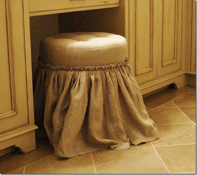
AFTER: The tufted stool is done in the same master bedroom linen with the same flanged edge double ruffle detailing on the skirt.
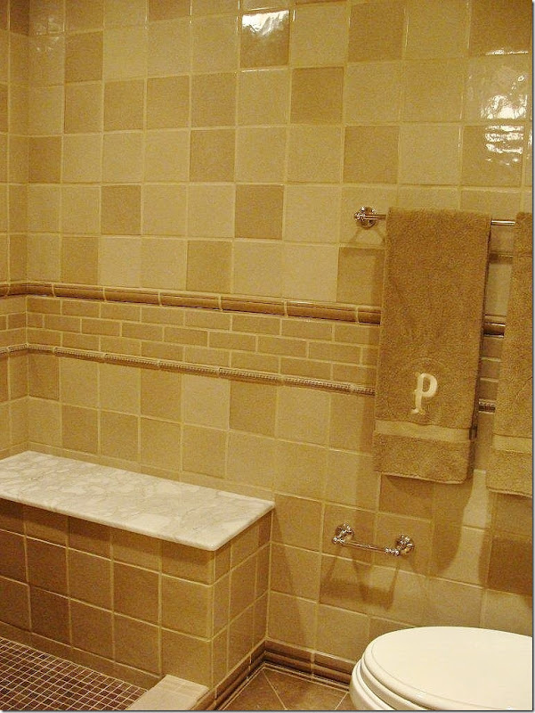
AFTER: The tiles are mixed with white marble in the bathroom. Since this is part of the master bedroom suite, the tiles and tile patterns are sophisticated and quietly elegant.
I hope you have enjoyed seeing how a dated and unattractive condominium can be updated for the new decade. Despite its small size, the space reads large and functional, with a rustic Colorado ski lodge atmosphere that is sophisticated at the same time. Thanks Jenny for sharing this!! It’s beautiful!
Interior Designer Jenny Johnston can be reached HERE.
NOTE: Don’t forget there is a new Skirted Roundtable interview up with Meg Fairfax Fielding of Pigtown Design. Next week – David Easton will be our guest! Listen HERE.









That kitchen remodel is spectacular!!!!!!!
ReplyDeleteAnd I'm swooning over the dark brown herringbone patterned tile work in the bathroom!
Jenny really did a swell job :)
Sweet of you to promote her, too :)
xoxo,
Andrea
Wow to the remodel and to your The skirted Roundtable celbrating ONE! Wow to y'all!
ReplyDeletepve
Is it fair to say, "Before & After", with the Crested Butte redo?
ReplyDelete"Before" was classic college fraternity house, at least my era, for boys to party, drink too much &, well, you know the rest.
Aaaaah, the after is for grown-ups.
FABULOUS.
Garden & Be Well, XO Tara
I am swooping down a Canadian ski hill...that I can see from here..for that honeycomb patterned backsplash in the kitchen. Amazing!
ReplyDeleteCONGRATS ARE IN ORDER AND THIS MAKEOVER IS TRULY MARVELOUS!
ReplyDeleteL.
Wow! What a stunning transformation. I love the fabrics and the tiles. She did a fantastic job.
ReplyDeleteWell, if anyone comments that they liked the before better, we should all just close shop and go home... Jenny did a wonderful job. I love it! Thanks
ReplyDeleteMiraculous!
ReplyDeleteWow - what a fabulous job. I would never guess it was the same condo. Amazing!
ReplyDeletethe trendy railway sign in the kitchen contains the name of ski runs at the Crested Butte ski area. what a creative way to incorporate the location into the decor.
ReplyDeleteThat was such a fun before/after to see. What a transformation! I anticipated each photo as I scrolled down the screen. Well done!
ReplyDeleteWhat a transformation!!!!! It reminds me of the ugly duckling and the swan story. She certainly did the condominium justice with the new decor. A thumbs up for Jenny Johnston
ReplyDeleteJenny did a great job. Neutral palettes are tricky, but this definitely unified the small space and created a soothing flow. I think value contrast is important when you are not changing the hue much. She did it quite effectively. A stellar transformation.
ReplyDeleteWow. I'm fairly sure I've stayed in the before condo, over and over again! What heaven to come in off the slopes to such luxury and beauty.
ReplyDeleteI really like the statement that the Subway art makes and also the giant fire place! I used to live in CB...beautiful country that I miss...except the cold! lol
ReplyDeleteMy favorites are the fabulously dramatic bunk room bath, the wonderful kitchen, and that great plaid ottoman! Thanks for sharing!
ReplyDeleteKaren
Good makeover, but not exceptional. The kitchen is my favorite room. Please post photos in two years when the renters have stepped all over the long skirted chairs, and ottoman. Too nice to rent out, but a little more luxury if you don't would be in order.
ReplyDeleteThat's an incredible transformation--perfect for a ski condo. I could happily spend a week there!
ReplyDeleteCrested Butte is my favorite place on earth! We have been going there for 20 years. Where is the condo? Fabulous makeover!
ReplyDeleteLove the kitchen redo - looks wonderful...
ReplyDeleteWow, Joni! That is one incredible transformation! I had to laugh at the "before" pictures. They look like the apartment of every guy I knew in the 80's! Someone had a lot of vision to see the potential there. There's not one thing I didn't like about the new condo, but I'd say the standout favorites for me were the new slate fireplace and the backsplash tile in the kitchen. I'm guessing this place is not going to be a rental? It sure is beautiful.
ReplyDeleteJenny Johnston is a real treasure! Not only does she have great instincts, lots of experience, and creative vision as a designer, but she also happens to be one of the best people you'll ever have the privilege of meeting.
ReplyDeleteFabulous as always, Jenny! I'm honored to call you friend. Thanks for connecting us, Joni!
Wishing I were in Colorado right now!
Linsey
Wow, what an improvement!
ReplyDeleteThe place was definitely in need of an overhaul!
I particularly like the intriguing tiles she used in the kitchen and bathrooms -- they lend a rich, graphic touch to the spaces and are anything but ho-hum.
Nicely done, Alcira
thenerochronicles.blogspot.com
Jenny- Another incredible transformation! All the finishes are incredible, and your attention to detail is what made this so-so spot (even in the 80's) a HOME. Beautiful, relaxing, luxurious...
ReplyDeleteLWB
xoxo
* This transformation is just ONE of the FUN n'INSPIRATIONAL reasons for reading decorating/design blogs~~~ ESPECIALLY YOURS, Joni!
ReplyDelete... Suspect I'd have passed right over that kitchen tile, thinking "too busy"~~~~ wow, JJ knows her "STUFF" cuz WOULD I HAVE BEEN WRONG!!!~ Great vision, JJ!!!
Immensely enjoyed seeing it ALL & so glad you shared JJ's expertise w/ us!!!~~~ We built a smallish ski house in "MY" dreamy, fabulous Park City, UT, right before the Olympics there... I had the SHEER JOY of doing EVERYthing from start to finish, and I had the TIME of my LIFE~~~ I'll never forget the sheer JOY n' FUN of it all (& quickly forgot the "CONS" of the project, once it was completed & we were enjoying it when we went there!). It was an unforgettable dream come true!
THANKS to you, Joni, and to JJ!!! "She's the MA'AM", for sure!
Blessings,
Linda in AZ *
bellesmom1234@comcast.net
Good grief. Now that's a 100% improvement. I love the colors used and all the rooms except that one bath which seems a bit too rustic for my taste. Great post. Thanks for sharing.
ReplyDelete*** BTW, WHY on earth is the REFRIGERATOR HANDLE on the "WRONG" side?!?!?!?!?!?!"...
ReplyDelete... Annnnd, it appears the great chairs are originals, as witnessed by the brass plate on the back rung of each chair... Sooo "bitchin'", huh?
Grins, Me ***
Adorable! Do they rent the condo out? I want to go! Rindy
ReplyDeleteWhat beautiful fabric in the Rosemary Beach "Before".
ReplyDeleteSad to change it to something so mundane.
OMG! Gorgeous job!!!! Absoluteley night and day. Great job Jenny!!!!!!
ReplyDeletePacks a punch for a small space, especially that great graphic tile in the kitchen {and bath}! A redo that should stand the test of time...wonderfully traditional yet fresh and modern! Well done~
ReplyDeleteI definitely like the after of that condo better. Jenny kept the rustic feel of the condo but injected it with a punch of modern/classic. She really was able to do a lot with such a small space and it looks wonderful.
ReplyDeleteNow that is amazing! To be able to take a small, boxy space and transform it into something so warm and inviting takes a lot of talent, and Jenny has got it in spades! Especially love the black and white subway? signs in the eating area.
ReplyDeletewhat a transformation!!!
ReplyDeleteevery aspect of this major gut is sheer perfection.
what a fun read joni, from 1972ish? to today. GORGEOUS.
kudo's to jenny
debra
happy anniversary to the wonderful ladies of SKRT
What an incredible transformation, I love every last detail. Bravo Jenny~ you are one talented lady!
ReplyDeleteThanks for sharing her work with us Joni.
xoxo~
T
The kitchen, baths and fireplace are wonderful. Loving the cabinetry choices. I wish I could see that open shower! Beautiful fabrics, really love the lone bolster. Great post this morning to brighten a gloomy day here in Georgia :)
ReplyDeleteLove the rustic charm combined with classy sophistication. Looks like a great place to kick back and rejuvinate!
ReplyDeleteJenny, you are gifted!!
Ruthie
Lovely! I have that identical pine armoir in the family room if anyone wants to steal it at $400
ReplyDeleteI'm so over white subway tiles, so I'm thrilled to see a kitchen plus 3 baths that don't use it at all! It's refreshing and totally unique.
ReplyDeleteAny idea what the source is on the kitchen hex and the bathroom herringbone tile?
Really interesting post. As others have noted, GREAT transformation.
ReplyDeleteI love that new fireplace, but have to wonder how anyone watches TV, since it is so high up and the room is so small.
The guest room seems as if it is from a different project, except for the (ugh) deer head. A little too frilly for my taste.
Someone postulated it wouldn't age well once renters had their way with it. I'm wondering if it is indeed a rental, since that was a two-year project. I would think most rentals would have gotten a much simpler, quicker update so as not to halt the revenue stream for that period of time.
As always, thanks to Joni for all of her work.
It's a big mistake to place the TV so high. Does this designer have no degree or does the ID curriculum not cover ergonomics? I know it covers lighting and dimensions of aisles, doors, seat hights, and so forth. Most of us watch TV. I wonder if in the future the owners will think the placement of the TV is the problem or will they want to get a new sofa, when everything hurts? It would be far better to have a TV exposed in the corner, on a bracket, than to hide it in a ridiculous cupboard at this ridiculous height. Otherwise this is a welcome sight in skicountry, and I, too, have stayed in the "before" condo over and over like ground hog day. I may keep commenting about TV's like groundhog day.
ReplyDeleteFantastic transformation! Have to agree about the TV height, but perhaps when on vacation, one does not need to be watching a bunch of TV? Plus it looks like there is another TV in the Loft.
ReplyDeleteLOVE the tile and light fixtures in the kitchen.
Very pretty! All of it.
This is a fantastic MAKEOVER! LOVE IT!
ReplyDeleteCongrats on your year in Pod casting!
I was working on my design school homework yesterday enjoying you ladies chatting. Funny thing, I feel like I know you all! That must mean you are doing a great job! Keep up the good work as it appreciated. K
Joni I cannot believe it has been a year for SRT!!!
ReplyDeleteThis post shows you that no matter what the style, the design can work beautifully if done right!!
Xoxo
Karena
Art by Karena
WOW! Are those words the words of our Joni Webb I just read in House Beautiful this month? Thanks for the party tip Joni! You're everywhere now aren't you?
ReplyDeleteThis place is absolutely beautiful now. I am deeply impressed!
ReplyDeleteHi there "Joni Readers"...Jenny here. To answer a few questions:
ReplyDelete1. The tiles in the Kitchen and Bunk Bath are all from Seneca Tile. The tiles in the master Bath are from Walker Zanger.
2. Unfortunately for all of us, the condo is not a rental...i know, bummer, because i want to stay there too!!
3. Fortunately for me, these clients WANTED the tv to be hidden. Whew...for once i didnt have to figure out what to do with the tv?!?!? So, since this is their vacation home, and since they knew they wouldnt be watching it much, we chose the correct scale and height of the box to be in porportion with the fireplace. AND the tv is on this cool arm that swings down so you dont have to crane your neck to watch. So - overall tv problem solved! The tv is also not nearly as large as the box...again, scale and porportion reigned here.
4. The dining chairs are from the fabulous La Lune Collection!
5. All the cabinetry is by Elegant Cabinetry in Vail, CO...Nicole is a delight to work with! www.elegantcabinetry.com
6. My favorite part of the whole place - the incredible Aldo Bernardi lighting system in the kitchen. Carol Ollier is a true gem! She distributes the Aldo line through BROWN (if you are in Houston). www.carolollier.com
7. The signage in the kitchen I customed ordered thru Mecox Gardens. I had them printed using the name of the ski runs.
8. If you are in the Crested Butte area, and are in need of home remodeling/construction, I HIGHLY recommed Duane Johnson(Summit Construction) to handle your project. Efficient, knowledgeable, easy-going, are just the first words i can think of to describe Duane. He will not do you wrong!
Glad you enjoyed the post...thanks again, Joni for featuring my project!
-Jenny
As a Coloradoan that spends a lot of time in ski houses ... I love this! I could do without some of the ruffles but overall it is gorgeous.
ReplyDeleteJoni,
ReplyDeleteWow, that was fun. Amazing---I love what she did with the kitchen/living room. I don't love the tile in the kitchen but that's just a personal taste thing---a little too busy for me. The cabinetry and the rest of the place looks great.
Congrats on 1 year of the Skirted Roundtable.
Absolutely gorgeous! Would love to see more of her work!
ReplyDeleteAwesome! I loved everything. The tile colors are a bit too retro for me, but that's ok, I know I'm old...
ReplyDeleteI would have replaced the front door, I hate plain doors.
I have to say my favorite thing is the fireplace. It adds alot of character in a timeless way--you don't know what year the fireplace was remodeled. I love that!
The "before" pics remind me SO much of the place my husband lived in with a bunch of guys up in Vermont before we were married... What a fantastic transformation! I especially love what she did with the fireplace and OH, the TILEWORK!! Kitchen backsplash, herringbone tile in that one bath, and the little strip of mosaic backsplash tile in the master bath. I love delicious details.
ReplyDeleteWow, I couldn't find one thing that wasn't exactly right for where she put it! Amazing how she brought roughness - for the guys - with such softness and it balances perfectly!!! Fantastic job! Thanks so much for sharing!
ReplyDeleteStonework and cabinetry are Great! smiles.
ReplyDeleteFabulous transformation! I love,love,love the dining room table and chairs....TDF! The whole condo is just wonderful!!!!
ReplyDelete~Des
Thanks for replying about the TV. I see I jumped to a concludion without having all the facts. Sorry. But I am glad that that has been explained. I have seen tv's installed over fireplaces plenty of times. I am Jenny Johnson and I got yout tile samples from Ann Sacks by mistake some months ago, i think, and I took them down the street to Jenny Johnstone, and she brought them back, then I got a call from Nancy Judy at Ann Sacks, to please send them to Louisiana. It had to have been to Jenny Johnston. Funny. Thanks for commenting on the sources.
ReplyDeleteLove the remodel AND your post about it! I never cease to be amazed by designers vision--and how they can see beyond existing structure and not be restricted by it. I envy that talent.
ReplyDeleteI love how the ski/mountain theme was not taken overboard. The condo is beautiful; I would love to relax there after a day of skiing!
ReplyDeleteI would have done a few details different but for the most part it fits my tastes to a T. I too have stayed in the before. I would label it serviceable before, beautiful after.
ReplyDeleteSo much better that the previous redo you posted. I have sat in the 1900's L shape sofas in the after design. They hold so few people without bumping knees. It could have been updated much more to my liking with the same furniture arrangement.
Our tastes all differ.
Boy this condo redo made me think of Arizona and all the condos that could be updated like this- I really enjoy this kind of posts and would love to see more of these its more approachable and in most people's budget and can be adapted to their budget. Great job and post1
ReplyDeleteWhat an amazingly gorgeous transformation!!
ReplyDeleteE+J
It definitley was in a time warp and not a good one!! Love the transformation, the kitchen and eating area are stand-outs!! Kathysue
ReplyDeleteGorgeous. She can come and decorate my house any day.
ReplyDeleteHey, I saw you quoted in House Beautiful! I was so excited I woke up David (who was sleeping beside me as I was reading in bed). He wasn't quite as excited as me. Congrats. I love getting recognized (never happens!) but love it just as much when people I admire do too!!
xo Terri
Great Post!
ReplyDeleteI also wanted to let you know that I'm back! Come by and say hi!
~Aimee~
http://agardentoremember.blogspot.com/
Joni please, go back to design school or see your eye doctor for a consultation. This is not worthy of a design blog and if this project took two years,heaven help all of us. You don't help your blog reputation by showing this utter bottom feeder quality design work. The only merit to be found is in some elements of the kitchen Whoever paid for this stuff, should ask for a refund. This is laughable.
ReplyDeleteanon 7:37 - bottom feeder? really? wow. I think this place is wonderful = a total transformation of a small, 70s condo. Not overdone, Not glitzy, just homey and cozy and up to date-exactly what a condo should be. I hate all those over done condos filled with fancy fabrics, tacky accessories and fake plants everywhere. I happen to really like this condo and enjoyed seeing the before and after - plus I got lots of ideas from it: the fireplace, the tv, the kitchen, the kitchen lighting system which I love, the tiles, the bathrooms. I'm sorry you didn't like it, but that's what makes horse racing - whatever that means!!!
ReplyDeleteThanks to everyone for your great comments! I'm glad you liked the before and after as much as I did. Special thanks to Jenny Johnston for sharing it with us.
ReplyDeleteAND thank you to all who mentioned our one year anni on the Skirted Roundtable. Actually, that was in May - we are going on 1 1/2 years now!! And thanks for mentioning the House Beautiful quote. It wasn't much and i"m certainly NO entertainer, but it was so exciting to be included!!!
Joni
I love the renovations and redecorating! Beautiful job designer!
ReplyDeleteDesiree
I think the update was lovely! It was elegant without being to fussy. Exactly how it was meant to be. With a lot of designs and revamps I see they use furnishings and things that I could never actually use in my home. A great amount of people have children and pets that are going to be living in the space also and you want it to fit everyone. Not just go into a magazine. Homes should feel that they can be lived in. This one really does feel that way, even though it is just a vacation home. Job well done Jenny!
ReplyDeleteJoni has wonderful taste and is a wonderful writer!
Belinda
Once again, Joni, a great post. I love the transformation. Responding to AllThatIsPie - the question is what will propel the next remodel when this one seems so timeless? INHO, it will be the bunk bathroom. Nice now though.
ReplyDeleteI have to think the Anonymous poster who told Joni to go back to design school is a jealous fellow blogger who does nothing more than regurgitate press releases and throw a lame French phrase around now and then. She can only dream about getting 70 responses to one of her topics.
ReplyDeleteThis would be so perfect for anyone- such lucky owners!!!! Love the design ..Night and Day! Also, perfect balance of masculine/feminine
ReplyDeleteLooks like a ton of ski condos we've rented in Vermont back in the 80's( before)
Topaz, there were no French phrases in my post, nor do I blog. I would suggest you do a better job in the art of supposition.
ReplyDeleteI will retract one comment - the use of the word "bottom feeder" was poorly chosen given so many implied meanings of the phrase. What I should have said was the design looked like the work of a "newbie". I think the decorator attempted to soften the overall feel by adding gathered skirts to the sofa, ottoman, etc., but it fails because of the heavily textured fabrics. While the kitchen cabinets are nice, the busy tiles in the kitchen and master bath detract from their beauty. I have stayed in a beautiful condo in Jackson Hole and I know at least from that experience that it's possible to put more luxury into these places and not sacrifice the needed practicality. There is absolutely nothing to see here worth the time it took Joni to download the pictures and write the narrative. There are far more beautiful examples of "makeovers". Now go study your French dictionary so you can give us a phrase or two in your next comment.
Anon - HUH?
ReplyDeletei am having trouble understanding what is wrong with her skirts - the heavy fabric? it's linen for God's sakes - the perfect fabric for skirts. And what's wrong with adding softness to furniture with skirts? I happen to LOVE this look and find her use of them one thing I particularly love in this condo. but, I assume you are the anti-slipcover stalker which would explain why you hate the skirts so much even though these are not slipcovers. why would you even come back to leave another comment - you much do this to create a comment war ala the Christmas fiasco you started. oh well. it's so transparent. back to the condo:
yes, the cabs are gorgeous - but so are the tiles. they add so much whimsy to the condo, a sense of liveliness to a rather quiet place.
I showed this because I thought it was a good example of how to change up a plain dated condo which most of us have experienced when traveling to beaches and ski resorts. I also found this design to be every bit as pretty as what is published in design magazines. I think there are plenty of interesting details to show - the design of the fireplace, the removal of walls, the window treatments, the cabinetry, the tiles, the remodeled baths and kitchen.
As for Topaz - she thought you were a blogger and I think I know who she is referring to - that's why she mentioned the french.
Christmas fiasco, Joni?????
ReplyDeleteI love skirts, they just don't look appropriate on fabric that looks like a burlap sack nor in a design scheme playing to the rustic elements so prominent in this condo. I had not focused on the fact that the fabric might have been linen given its heavy weave nor to the fact that slipcovers were even used. The overall scheme is boring and lacking quality except the cabinets in the kitchen. Now go fight with another of your phantom posters given the serious persecution complex you appear to have.
Loved the post. I lived in Crested Butte for 7 years so was very interested in reading this.
ReplyDeleteanon: oh, whatever. persecution complex? well, after having recv. about 50 comments from anon on last year's christmas post, call it persecution if you want. i call it boring. can i ask you something? has it EVER occurred to you that the designer AND the owners of the condo are reading the comments? that they have feelings? does that not matter to you at all? just wondering.
ReplyDeleteJoni, if the owner/decorator of this condo expects to have their endeavors published on a design blog, don't you think they should be willing to take the criticism along with the praise. Perhaps the NFL should have a new rule - no more score keeping, just a Sunday afternoon slug fest and we will call it a draw - REALLY? I would suggest that if one can't take the heat, they get out of the kitchen. This is not a deliberate attempt to offend, but an honest observation. If feelings are what matters here, I would suggest you make certain that those you feature can handle the negatives as well. This post purports to document a "redo" or "makeover". Yes, there were some improvements, i.e., the kitchen, master bath, but really the owners did not get much else for a two year effort. In fact if it took that long to pull this together, heaven help the one year job.
ReplyDeleteyou said: This is not a deliberate attempt to offend, but an honest observation.
ReplyDeleteYet - you ALSO wrote:
Joni please, go back to design school or see your eye doctor for a consultation. This is not worthy of a design blog and if this project took two years,heaven help all of us. You don't help your blog reputation by showing this utter bottom feeder quality design work. The only merit to be found is in some elements of the kitchen Whoever paid for this stuff, should ask for a refund. This is laughable.
This really isn't constructive criticism, it's just mean and rude IMO. You COULD have said:
While I like the cabinets, I don't think the I.d. went far enough. I find the design lacking in this way, etc.
Constructive criticim.
You seem caught up on the 2 years - remember this condo is in CO, the I.D. lives in Florida and the owners I believe, live in Texas. So, I suspect that the work on the condo was timed around visits to Colorado which would explain the 2 years. Or they might have chosen to do it one room at a time, which takes longer. I'm not sure why you keep denigrating the time it took. I think it's just another attempt to be mean spirited, as usual.
And I don't moderate comments - I CAN take them, I have thicker skin - BUT designers and home owners who aren't used to the blogger world are shocked and hurt when they read such mean spirited comments. Also, as I have told you numerous times - I am one of a FEW bloggers who doesn't moderate comments. at all. most bloggers do and I can assure you these types of comments you leave don't make it in public.
I love every single thing she did with this project. Can you say perfection? Yes, if this remodel is in the picture, you can. Wow! And I want to say, "WOW!" again. This was a feast for the eyes and just an outstanding remodeling project. The details are wonderful.
ReplyDeleteThank you both for sharing, Joni!
XO,
Sheila :-)
I think this project begs the question why a Texas client would go to a Florida decorator to do a project in Colorado. It should be evident to anyone that a Colorado decorator could have accomplished the redo in half the time, at a much lower cost to the client and with the convenience of local resources and no shipping constraints. That appears to have been the clients' first mistake in this project. A local decorator always knows the best subcontractors, fabricators, etc. These facts are evident and don't have any bearing on someone's feelings. My comments are not meant to hurt anyone, but they are my candid observations. The Florida decorator explains a lot and perhaps the condo does not reflect the taste of the owner as much as the lack of taste of the decorator.
ReplyDeleteI think this person is just trying to get a rise out of you. The place is lovely and if they don't like it then that is just their taste. Not everyone is going to have the same opinion and this is 1 person out of SOOOOO many others that love it. No need to say the things they did though. A MATURE person would not comment in that fashion. There is no reason for this client to explain why they chose a designer from another state. None of this persons business. I'm sure this happens all the time.
ReplyDeleteI don't have a blog or account but I do sign my responses with my REAL name. This person is so embarrassed about what they write that they can't even say WHO they are. Shame...
Belinda
Topaz, why don't you name the blogger who throws around french phrases and has few who comment on her post or would it be crass to do so at this time. Speak up or shut up, Twit!
ReplyDeletethat's a tight space.
ReplyDeleteThe design of this house is nice and cozy, it is great for a large family. Another thing I noticed is that in order to protect your child from the fall of the TV, I hide it under the TV cover. And I advise you to do so, as children are very fond of TVs.
ReplyDelete