The other night I was breezing through the grocery store and stopped at the magazine section, which is a rare occurrence for me these days. Ever since www.Zinio.com – the digital magazine company – started selling issues online, I subscribe to as many design magazines that are available via the computer. It’s so easy! The magazine comes directly to your laptop and stays there – no more mailing in subscriptions or schlepping across town to a book store. And best of all – there are no longer enormous piles of old issues staring at you while taking up precious storage space. But it’s not all great in Zinioland. You would think that the digital Zinio issue would arrive to your computer faster than the supermarket racks, right? But there it was – the new December issues of House Beautiful and Veranda sitting on the grocery shelves, while Zinio still hasn’t updated my computer. I must say that I was so proud of myself when I resisted the overwhelming temptation to buy those two issues anyway instead of waiting for Zinio to update. But, I digress.
What really caught my eye that night was the new Architectural Digest. The cover looked so fresh and so, how do you say…un-Architectural Digest-ish. I eagerly flipped through it and got all giddy! Finally!!!! Architectural Digest is back!!! There were so many features that looked interesting I could hardly wait to run home and read it. Wow. I haven’t said that about an AD issue in years. In fact, everyone has been so down on the magazine lately, including all three of us on the Skirted Roundtable, that I was eager to spread the word that AD’s new editor Margaret Russell’s touch is really evident. So many of the houses in this issue look like they could have been in Elle Décor – the magazine that Margaret had headed up during its entirety.
Former Elle Décor Editor Margaret Russell now on tap to head up Architectural Digest.
In case you were out of the country earlier this year, the magazine world was rocked when it was announced that Margaret was leaving Elle Décor for AD. More shakeups was news that domino’s Dana Caponigro was coming to Veranda and Stephen Drucker was leaving House Beautiful for Town & Country. Dara and Stephen’s influence on their new magazines has been subtle so far, changes haven’t seemed all that dramatic at either magazine – yet. But, it’s all perception. Still, Margaret at AD – wow, now that’s some change. Looking at December’s issue, the differences are sooo obvious! I just couldn’t wait to spread the good news. Like I said - what an idiot!
Luckily before I printed this, I checked the Editor’s Page at Architectural Digest to discover that Margaret Russell hasn’t even taken over yet! Her first AD issue won’t be until January!!!! The egg on my face was dripping all over my computer. All I could think was THANK GOD I checked that Editor’s Page!!! I had totally forgotten that Margaret wouldn’t be at AD until January – the announcement had been made so many months ago. I would have blabbed on and on about how WONDERFUL the new AD is because of Margaret Russell. What a complete idiot!!! Still, my assumption DOES tell me that the January issue is probably going to be fabulous, because the December is pretty damn good itself.
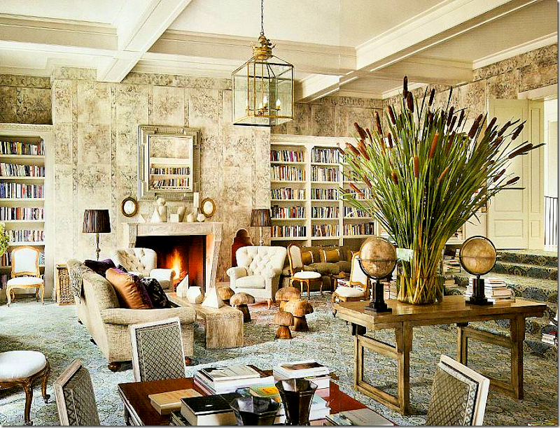
First, there is this house by Stephen Sills that really got me blood pressure up. Look at those WALLS!!!! They are burlap! Pattern painted on burlap!!!! Can you believe that?!?! Gorgeous. And look – wall to wall carpet. Over stairs – when was the last time you saw that – and how fresh is it? It looks so warm and inviting. And those two globes. The lantern. The mushroom family. This is a library for this decade, young and sophisticated. It’s hard to see but there is a banquette against the shelves on the right. Notice the fabulous library table – just waiting to be opened and piled up on. But, those WALLS!!!!!! Gah!!!
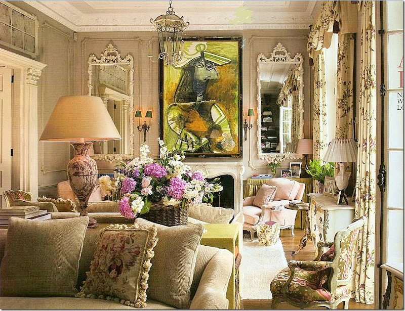
Next, over in London, is this little townhouse by the incomparable Nicholas Haslam. Owned by two art collectors, they wanted a home, not a cold contemporary museum. I mean – is that just any painting over the mantel? It’s a PICASSO!!!!!!!!!!! I have never seen such a large Picasso handled so casually before. And I love the color of the paneling – it looks like Iced Coffee. Notice the chartreuse skirted table next to the fireplace. The back to back sofas are divided by a console table that also picks up the chartreuse in the painting. Light pink French chairs. Total eye candy. YUMMMMM.
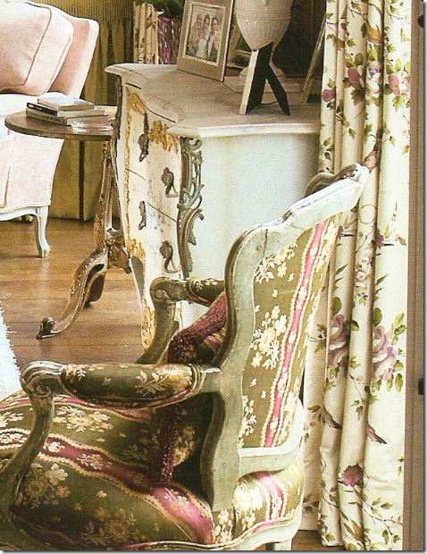
A closeup view of the fabrics: I love how Haslam still unashamedly still uses those blowsy English chintz fabrics. I adore the curtain fabric. He says this room is in the spirit of Nancy Lancaster and he is so right. That chair!!!!!
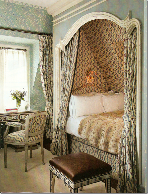
Then, there is this little guest room in London by Haslam. Notice the French curve on the alcove. Is there anything in life prettier than a Louis XV inspired curve? I love his mix of the two fabrics. He is wonderful.
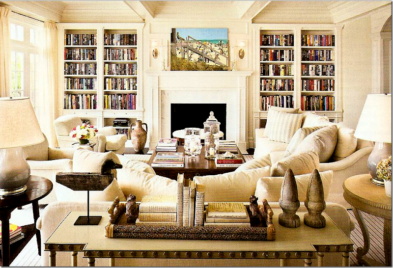
The next beauty is a beach house by Alexa Hampton in Bridgehampton NY. Another view of what a library for a young family should look like. Loving the striped rug and pillows. So casual for a beach house, yet still sophisticated. Not an easy mix to do right.
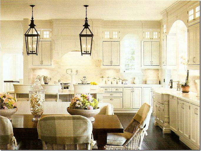
Alexa Hampton: Great kitchen. But something about this kitchen seemed familiar? Those chairs with their plaid half slips, the two lanterns. Seem familiar?
Remember this blog famous kitchen in a showhouse? The same exact chairs – with the same plaid half slips, similar double lanterns. But it’s not the same house. I wonder if the owners were influenced by this picture – or vice versa?
I thoroughly enjoyed this Architectural Digest even though it wasn’t edited by Margaret. Now, I can’t wait for her first issue next month. I am so anxious to see her changes – I wonder what they will be?
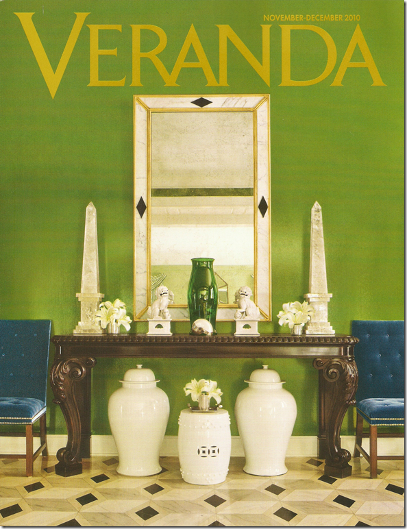
And for more idiocy from moi! Last month, I blasted the new Veranda. I think I spoke too soon. The new December/January issue to TO DIE FOR. The cover story is a house in Houston designed by the incomparable MILES REDD!!!! YES!!! This must be the first house in Houston that Miles has done and it’s a stunner. Look at those rich green walls, with tufted sapphire blue velvet. That floor!!! Veranda always has the best photographers and this Miles Redd story was snapped by the world’s best Fritz Von Der Schulenburg. For once, we can finally see big, huge pictures of Miles’ interiors – bright and clear, every tiny detail visible. What a rare treat.
The Miles Redd Houston living room with stripes, icy blues, persimmon accents, chintzes, and a fabulous center table by John Rosselli Antiques. Is there anyone out there that would or could do a fancy living room like this? Every room Miles does is so different, so completely original and unique. What a genius. And what a coup that Veranda got this house.
A peek at the Saladino house shown this month in Veranda. The Master.
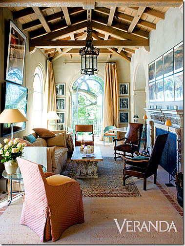
Also in this issue is a new project by John Saladino – worth the price of the issue alone, and another one by Vicente Wolf. Stellar issue! A keeper. The only ho-hum is the house by Veere Greeney seen a few times before, but it’s such a fabulous project it’s worth the second glance. Dara – you outdid yourself!!! I could have cried over this issue!!! Fabulous!!
And a note to Cote de Texas readers:
Harrison Howard print – last week’s giveaway.
The Harrison Howard print giveaway is now history. It was a great success – so many people entered it. Be sure to visit his web site www.harrisonhoward.com if you are interested in purchasing one of his prints.
And – this week, I am having a NEW giveaway that will be the biggest ever. EVER. Think crystal, think lighting, think gilt.
Look for it in the next few days. You will be sooooo excited!!! I PROMISE you! I can’t wait!!!!






Joni: Love the painted burlap walls. Somehow, I missed this when I read the magazine. I have to really give this some thought...
ReplyDeleteDear Joni, I have read and seen enough of your blog to know there is no idiot in the house, only a passionate worthy reporter. Thanks for the great visuals and topical updates. Come visit me sometime.
ReplyDeleteWhat an adorable idiot! Mmmmmhhh is it possible that some changes occurred already in AD? or the transition between Rensen and Russell will occur overnight? In any case it is refreshing to know we can now buy AD again! Thanks Joni.
ReplyDeleteStill me..."bytheway" who won the "giveaway"?
ReplyDeleteI love anything Haslam does. This one especially!
ReplyDeleteI loved this post! Haslam is one of my favorites, and last month Miles Redd came to Birmingham and entertained us at the Botanical Gardens Antique show. We saw pictures of this house, among others, and he chuckled about those pagoda curtains. But they work! I love his use of color.
ReplyDeleteI love those burlap walls!
ReplyDeleteThis comment has been removed by the author.
ReplyDeleteOur print magazines are still doing it Joni!! Fabulous photography!! My favorite designers!!
ReplyDeletexoxo
Karena
Art by Karena
Don't beat yourself up. Let the blog world do that. But in regards to AD I thought the same when I got my issue at home this week. But I too looked for a welcoming page for the new editor and noticed only that Noland was still listed as emeritus editor in chief sans the usual photo.
ReplyDeleteAt any rate, change is usually always good. Just like it will be for the coaching staff in Dallas. Sorry wrong blog. :)
I think this would have to go down as my favourite post for the year.
ReplyDeleteI find it very refreshing when editors move from magazines to magazines. It forces them to bring a new point of view which for the readers is such a plus.
ReplyDeleteLove the burlap walls...
I love that Alexa Hampton home! Gorgeous kitchen! Love the idea of burlap walls!
ReplyDeleteJennifer
You are so funny! LOL!
ReplyDeleteI am in love with "Town and Country" since the former HB editor moved over there. He's done a fantastic job with it. I will have to check out these two issuse you mentioned because I still buy magazines and hoard them. ;-)
Who won Harrison's print, Joni? Did you say, and I missed it? Congrats to the winner!
XO,
Sheila :-)
I've been wondering about Zinio. Living down here in Brazil puts me a good two weeks behind the curve on any new issues. Sad, sad, SAD! You've sold me on the service (now, to get the Hubster to buy me an iPad to read with!)
ReplyDelete...this makes me so happy!(...not the idea you think you were an idiot...that could never be with our joni)...but the truly truly beautiful design in all these spaces...the london townhouse is to die for...absolute perfection...
ReplyDeleteLOVE the new header! I guess everyone is getting a new look these days. What a detective you are Nancy Drew...I am waiting patiently for the mystery of those kitchen chairs to be solved. xxx
ReplyDeleteI've loved AD magazine off and on over the years and I'm hoping that Margaret Russell makes it a little more people friendly then it being so far out of our reach. Lately I've had this thing for tufted anything, love it but I haven't been able to get around the husband on it.
ReplyDeleteHi there- thank you for this funny post- loved it!The Miled Redd Interior in Veranda with the striped black and white decor is VERY Cecil Beaton- his black and white racing crowd design for My Fair Lady - love it .
ReplyDeleteFunny, but even if you had posted that error, I say, the only people who don't make mistakes are those who don't DO ANYTHING! ...and that, in itself, is the biggest mistake of all!
ReplyDeleteKeep up the good work. You have an amazing blog and I really enjoy reading it!
CC
http://currentlychic.com
Can totally relate to this post - just by the new AD cover alone, I would have assumed Margaret was working her magic. ADORE the Haslam guest bedroom! And Dara is indeed doing wonders at Veranda. I'll tell you a little secret - in researching one of my recent posts, I wanted to include a fabulous project but was asked by the "creator" to please not include it because it was just shot for Veranda and they didn't want to preempt the article. So - let me promise you there are fabulous things in store there!!!
ReplyDeleteDon't beat yourself up too much. There is a very faint line between idiot and genius -- Picasso is a good case in point. People who worry about being idiots never do anything fabulous! And you have such grace and humility, telling the whole world about your "oops" when you could easily have rewritten this post before publishing and none of us would have been the wiser.
ReplyDeleteI love seeing actual BOOKS in these libraries, not faux books or books-by-the-yard color-coordinated to the drapery fabrics, or backwards books etc. The patterned burlap walls are really interesting, too. Lee Jofa has a seagrass wallcovering in their Soprano collection with a metallic gold pattern that I used in a coffered ceiling recently. Now, looking at that library, I'm thinking about the different kinds of effects that could be achieved with textured wallcoverings and decorative painting -- a subtle, barely-there broken damask pattern over burlap or seagrass, in exactly the unexpected color combination I need, is just a phone call to my decorative painter away! :-)
I agree; Architectural Digest is unrecognizable -- in a good way! Maybe everyone at AD is freaked out about the impending leadership change and they did the December issue with that in mind, trying to anticipate what Margaret would want for job security? Either way, I love it -- I'm renewing my subscription!
By the way, I was too late for your giveaway, but I think it is SO COOL that you did a giveaway on Harrison Howard's artwork. I bought four of his prints for myself, I know this is a resource I will use for client projects in the future, and I probably would never have found him if it wasn't for you. It is so generous of you to use this platform to support the work of others. Thank you!
Are you familiar with Lisa Luby Ryan who also had a client's house in this month's Veranda? It is a small 1600 sq. foot house designed by Ryan and then decorated for the holidays. She has a shop in Dallas called Vintage Living.
ReplyDeleteI just love that living room by Haslam...totally taken with the colors, so soft. The drapery fabric is my favorite! Recently I asked a sales girl how much chintz is being sold in their (local large) fabric shop and was almost laughed right out of the store. Thanks for not making me feel so silly for the things I adore!
ReplyDeleteJoni, thank you for yet another amazing post. This one tops them all. Such great photos, so much detail!
ReplyDeleteIf it makes you feel any better I have a subscription to AD and mine isn't here yet. Now you've got me wanting to run to the store to pick up a copy....I must resist!
ReplyDeleteCan't wait to see the new AD. Didn't make it to the P O Box this weekend. Thank you for sharing these gorgeous images.
ReplyDeleteHave a great week, Joni.
Teresa
Can't wait to see the new AD. Didn't make it to the P O Box this weekend. Thank you for sharing these gorgeous images.
ReplyDeleteHave a great week, Joni.
Teresa
I can't believe it - an issue of AD that I would actually spend longer than 3 minutes flipping thru the pages and pitching in the bin. Our realtor has given us AD as a gift for the past 4 years. It was always museum like houses with no appeal or soul. I can't believe it has taken them this long to realize they have been way off the mark. Congrats to Margaret!
ReplyDeleteJoni, I am going to check out the online magazines...... hmmmmm....it's hard to imagine not actually holding the magazine.
ReplyDeleteI'll try it with AD and see.
Now, WHO won the givaway!! I also missed who won MY mirror last time ha ha!
Great post belle dame!
I just picked copies of those two mags. last night and had exactly the same reaction (and I checked for the editors, also): over the top fabulous with a richness and design scope that we have not seen in a long time. Great post.
ReplyDeleteGreat post... I will now go back and actually read the magazine that has been sitting there next to my bed since it arrived - I opened it - started looking for the editor's page and fell asleep - never opened it again! I will now go back and enjoy the pages. Thanks for the preview!
ReplyDeleteHi Joni, I haven't bought a copy of Architectural Digest in over a year. I hope Margaret brings some life back to the magazine. Thanks for sharing these wonderful rooms.
ReplyDeleteWow, so much to absorb here. I had a hard time getting past the burlap walls! Looking forward to AD in January--it will be interesting to see how Margaret Russell influences the direction here. Thanks for the tip about online magazines too. I will check it out.
ReplyDelete~Delores
PS: Come help me celebrate my one year blog anniversary with a giveaway straight from Tuscany!
So good to hear I wasn't the only one disappointed with AD over the past few years--in fact, I had cancelled my subscription. Hopefully, with fresh blood, it will once more become my most anticipated magazine each month. I always love your honesty--and we all know you are NOT an idiot! Keep your wonderful blogs coming!
ReplyDeleteI too love the December issue of AD and can't wait to see what Margaret has in store for us!
ReplyDeleteJoni you are too funny, and definitely not an idiot by any means, you just made an excited mistake! I love your enthusiasm over the magazines you read and all the lovely rooms you share with us. I love looking through your well edited eyes!!! Keep up the good work,you never disappoint!!xo Kathysue
ReplyDeletePS when I got my new Veranda I just stood and looked at the cover it is gorgeous, Love Mr. Miles Redd!!
I LOVE LOVE LOVE your blog but have you redesigned/used a new typeface? I'm so sorry but I've found the latest post really hard to read - or maybe that's just me/my eyes/advanced age!!??
ReplyDeleteAfter reading your blog, I signed up for a Zino trial offer but was disappointed when I couldn't copy favorite photos/pages from the online mag. I'm always tearing out pages from my hardcopy mags to save for future reference. So, I guess online mags aren't for "tear 'n save-rs" like me.
ReplyDeleteOh my God - Sills, Haslam, Redd, Hampton, Saladino and Wolf - all my favourite designers! I can hardly wait for these two issues to hit the newsstands here! If subsequent issues of AD are as yummy as this one, I'll definitely be buying it regularly.
ReplyDeleteYou're definitely not an idiot, Joni! I assumed the same thing as soon as you showed the cover of AD.
Joni,
ReplyDeleteYour humble folksiness is approachable and your posts more informative and delicious than ANY of the magazines.The London townhouse is the loveliest room I have seen in years. Thanks for this blog. You are a treasure.When you start your magazine, I'll sign up for a lifetime subscription.
Margaret
Funny! That is the first thing I noticed about the new Architectural Digest too! They are certainly turning over a new page with Russell!
ReplyDeleteBeautiful pictures and I can't wait to see what they do with AD and Veranda, but it looks as if they are off to a refreshing and gorgeous start.
ReplyDeleteLove the Miles Redd hallway but, with apologies to that incredibly talented designer and the owners, those striped curtains in the LR remind me of the Hamburglar at
McDonald's.
I am practically panting with excitement! I haven't gotten my hands on either one of these yet. Must dash to the store asap!
ReplyDelete~ Elizabeth
Hello,
ReplyDeleteJust wanted to let you know that we've featured your blog on our Houston page at Remodeleze:
http://www.remodeleze.com/local/houston-tx.aspx
We hope it brings you some added traffic and exposure.
many thanks for the great blog.
I am always on the wait for your new posts. These gorgeous images/design are too attractive when even no one like it still design the same way.
ReplyDelete- John Devis
Magento Themes
Obviously, the people at AD are working at their peak level right now, so I'll have to go out and see if I can find this issue on the newsstand. I already subscribed--after a ten-year gap--but I won't get my first copy that fast. The new Veranda looks great, too.
ReplyDeleteThe Haslam room is a knockout, that's for sure, but there's something weird going on in the magazine's photo-editing department. Check out how the Picasso has assimilated part of the paneling & sconce on the right.
I was thinking of emailing you about the latest Veranda issue featuring Miles Redd in Houston.
ReplyDeleteThe AD looks great I used to subscribe but it was so cold I gave it up. May reconsider it now
I am always shocked, but shouldn't be, how well you draw connections between photos like this. I love it! I also love the lilac floral chintz curtains along side the pink ribbon print french chairs.
ReplyDeleteJoni-
ReplyDeleteFunny post....the AD cover was to die for....real people inhabit this dwelling and inhabit a few other of the houses in this month's AD. Don't you think magazines are getting better all the time? Maybe the internet, in the end, will help the quality since so many more people will be willing to subscribe over the internet and will be begging for quality over quantity.
NOW...if we can just get Southern Accents back!!!
Leigh B.
That's so funny Joni, I did the same exact thing when I saw the AD at the bookstore yesterday.
ReplyDeletehaha but I didn't realize that she has not taken over just yet and flipped through it liking what I see.
I just love real hard versions of magazines,, although I think that the digital are great for blogs for sure, I have a hard time parting with the real thing.
Have a wonderful week!
My best
Edyta
I love your new header Joni!
ReplyDeleteHugs~
T
You know, I loved the Haslam interiors, but to me Miles Redd has become his own cliche. Those striped curtains were laughable and he repeats so many elements from project to project that he's lost all interest for me.
ReplyDeleteI, too, thought AD had finally been pried from Paige Rense's grasp after the ridiculous Rob Lowe issue, which had so many mediocre projects crammed into it, including Lowe's, that I figured she was paying off favors while she still could.
Well, personally I'm glad over your impulsive buy of those awesome mags. I think there's drool on my computer and my nose might have actually touched the screen from looking at those gorgeous rooms. I'm crazy over that kitchen!
ReplyDeletexoxo
Lila Ferraro
hahahaha this is why i love you!! (I so would have probably not even checked!) love your honesty and can't wait to get my issues.
ReplyDeletexoxo,
lauren
This is a lovely place. Very inspiring too.
ReplyDeleteDeirdre G
Don't you just absolutely LOVE the blogging world! Thanks to you I got to find out about Zinio! Oh my Oh my! The overseas mags in South Africa cost 3x or sometimes 4x the cost of a local mag
ReplyDelete! Would have to take a quick flip at the local bookstore without drooling over the beautiful pages! Now thanks to Zinio I get to read at my leisure at the cost of a local mag & hopefu
lly not shorting out my laptop with drool! If you were standing next to me at this moment you would definitely receive a massive hug & kiss (less the drool of course).
Because of this post, I am actually going to buy my first issue of AD in YEARS. Here's to no B-list celebrities on the cover ever again!!!! EEE
ReplyDeleteBONJOUR,
ReplyDeletej'aime particulièrement l'élégance de votre blog, il est très agréable et beau...
Isabelle
Kiss from my PROVENCE in FRANCE
This has nothing to do with your post, really, but I have to vent: I love what you show because not every piece of beautiful furniture has been painted white!!!!!
ReplyDeleteJust love the "Cosmos" almost as much as the fabulous "Elizabeth". What a gifted artist Julie is. Wow!
ReplyDeleteI love the Angela Chandelier. THe glazed silver leaf just can't be beat.
ReplyDeleteso so hard to choose.....I love the Mollie, the Savahhnah but the Carol Crown is mouth watering. But if I won the Ingrid my living room would be enhanced by its presence even though I am generally drawn to more french styles....so Dear Ingrid, you will be happy in my home if I am fortunate enough to win you over.
ReplyDeletecmahru@lfschools.net
OMG, Joni! I had the exact same reaction. UNTIL...I hit the Cohens' "fantasyland house". Then I knew it couldn't be Margaret Russell's first issue. I'd buy anything featuring a Miles Red interior I must confess. That Stephen Sills house had that stunning library, but the rest seemed off, especially those master bedroom bubble chairs blocking the French doors. Alexa's beachhouse was ho-hum. Can't wait for Margaret's debut issue! Best-
ReplyDeleteI still haven't gotten my veranda magazine in the mail yet -UGH -but it's at the cvs across the street! i may just end up buying it.
ReplyDeleteI read AD last night though before bed and was SO excited -the best issue in YEARS. THey have been continually better ever since that sham of gerard butler though, seroiusly. I can't wait to see how the magazine is transformed further under margaret! Happy times are here again -haha.
Joni, thanks so much for introducing us to Julie! Because of your blog, I have actually found a beautiful pot rack and, it's a chandelier!!! (I thought I could only have a light fixture, or a potrack with the design of our kitchen) I love, love, love the Sylvia Potrack Chandelier. My husband will be delighted that he can finally hang his beloved pots and I will actually encourage him to do so!
ReplyDeleteHello,
ReplyDeleteI hope this is where I am supposed to comment about the Chandelier Giveaway because both of these chandeliers are beautiful and I would love have one in my home.
After looking through all of the lovely Chandeliers Julie Neill Designs has to offer, I have chosen my favorite. The Cinderella Chandelier is beautiful. It is a successful meeting of a whimsical fairy-tale and functional household lighting.
Testing! It seems that my comments do not show on here!
ReplyDelete@ lndy, I can see your comment, you got this wrong info.
ReplyDelete- Tanya
Web Designers
Joni, you are a fabulous designer, a fun blogger, and a great writer! I'm hooked! I perused Julie Neill Designs and found a beautiful mix of glitter, iron and gild. I love the Elizabeth and Victoria chandeliers, as well as the Hallie. The sconces are also a perfect blend of metal and crystal without being over done. Please enter me in the drawing-pangus@sjs.org Thanks!
ReplyDeleteFabulous!!!!
ReplyDeleteI can't believe it! When I was young and poor, I used burlap bags from a feed store to cut up and cover all the walls in my living room. This was 1974! Ahead of my time.
ReplyDeleteOh my oh my!! Now this is definitely where to get some fab lighting! Love Love Love. I is very hard to just pick one, but if I don't I'll go on forever.... i adore the carol's crown st chandelier!!! the crown makes it a bit different, but still looks very italian. i love it! and thank you so much for posting all these wonderful places. i may not be able to shop at all of them but it gives me great ideas and lots to dream about :) i would of course love to be entered into the contest. lauren.lafollette@gmail.com
ReplyDeleteHi Joni!I LOVE your blog! I have been following you faithfully for so long but have never entered a giveaway. It was a really tough choice but the Jenny Bubbles Chandelier makes my heart sing! It was a party lighting up the room! Lisa twinkabelle35@yahoo.com
ReplyDeleteGreat Posting, enjoyed reading the post shared a lot well done....
ReplyDeleteCommercial Buildings for Sale
That's a Cool Post.. love to reading it..
ReplyDeleteSteel Building Design
Lovely posting love to reading it..
ReplyDeletePre Engineered Steel Buildings
Shedsafe
Steel Building Design
louis vuitton uk are diversified in various kinds, handbags, backpacks, portable bags, purses, wallets and pouches. All kinds are popular among the whole word people.louis vuitton Store Online Handbags can also bring great accuracy as well as practical applicability and fashionable.Have you ever dreamed of being as charming as Madonna? Have you ever thought of becoming an envy of all your friends? If so, come to louis vuitton outlet.
ReplyDeleteAt the coach outlet online you have the largest selection of the day. If you touch the item and like it, keep it in your possession until you make your final decision.The coach factory outlet has been in business for many years. You can log in to find more information about its products and services.You know, Coach items are so perfect and fascinating. Now I grow up, and find coach outlet on the Internet offering affordable products with reliable quality.
ReplyDeleteThere certainly are a amount of methods to acquire affordable coach products at coach factory outlet,it could possibly the most effective options.the most vital cause may be the reality that you simply can purchase genuine coach products at there.It is believed that you will like the products on the coach factory online. There are spacious sizes and different colors, styles and so on.in the market you definitely can find various colorways that are designed in as well as the high quality that applied in. For most of you would like to come. So just come to our coach factory outlet online store to choose one.
ReplyDeleteThere certainly are a amount of methods to acquire affordable coach products at coach factory outlet,it could possibly the most effective options.the most vital cause may be the reality that you simply can purchase genuine coach products at there.All people give the good comments for the coach factory online, and now the Coach outlet store provides many discount goods online.Coach bags enjoy high popularity throughout the world. I would like to share the coach factory outlet online with you. What are you waiting for? Just come to visit.
ReplyDeleteThere certainly are a amount of methods to acquire affordable coach products at coach factory outlet,it could possibly the most effective options.the most vital cause may be the reality that you simply can purchase genuine coach products at there.It is believed that you will like the products on the coach factory online. There are spacious sizes and different colors, styles and so on.in the market you definitely can find various colorways that are designed in as well as the high quality that applied in. For most of you would like to come. So just come to our coach factory outlet online store to choose one.
ReplyDeleteWhat a great space. So casual and relaxed! So nice to live in a place like this.
ReplyDeletePhilippine properties
The Coach bag is from the latest release of Coach Bags. Its crisp, scribble material, leather handle, perfectly complements the relaxed shape of this stylish pouch. All the items of coach outlet online Store fit all of your essentials and more.Bright colors, exquisite workmanship, durable material and up-to-date style all lead to the great fame of the goods in coach outlet.As a fashion and modern lady, you can never have too many bags but Coach, Coach is a great leather handbags brand. coach outlet store online have different look according to different designer concept.
ReplyDeletearchitects digest is fascinating.
ReplyDeleteBeautiful kitchen by Alexa Hampton!
ReplyDeleteThe Miles Redd Houston living room with stripes, icy blues, persimmon accents, chintzes, and a fabulous center table by John Rosselli Antiques. Is there anyone out there that would or could do a fancy living room like this?
ReplyDeleteNo, there isn't anyone else who could or would do such a thing and we should all be grateful for that because his work is tacky beyond belief. His ridiculous attempts at originality and "updating" classic style almost inevitably produce garish parodies of modern glamour. His work is little more than stolen ideas smothered by banal attempts at playful irony. The man is overrated.