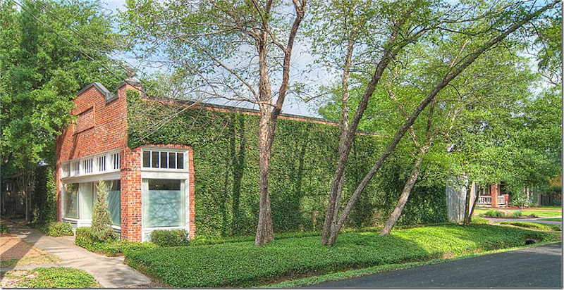
A kind reader sent me this listing. Is it a store or a home? It looks like a store, kind of… Actually it started out as Morton’s Grocery. I can sort of relate to living in a grocery store. My family was in the grocery business, my father was a partner in one of Houston’s first grocery chains – a chain that came about when two families combined their three stores each. My first year of life was spent in the industrial town of Galena Park, in a small house on cinder blocks, right behind our store #3. By my first birthday, we had moved into town to Memorial, leaving behind the house behind the store! Unfortunately, neither that house, nor that store in Galena Park possessed any of the charm that this old Morton’s possesses. For example: Built in 1928, the front façade has two bay windows with a center double front door. Above all this is a row of transom windows that probably once opened to let in the cool gulf breezes that were needed before the days of air conditioning. The ivy covered building is all brick and boosts two corner finials adding even more importance to the façade – although these are probably new. Right in the center above the front doors is a design in the brick work, again a charming detail. The store/house is located in the hip, quasi Heights area between Katy Freeway and the Loop.
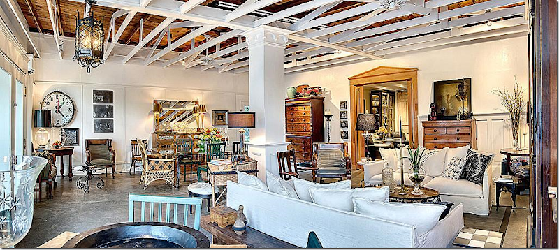
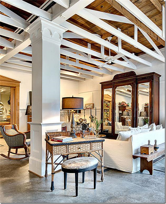
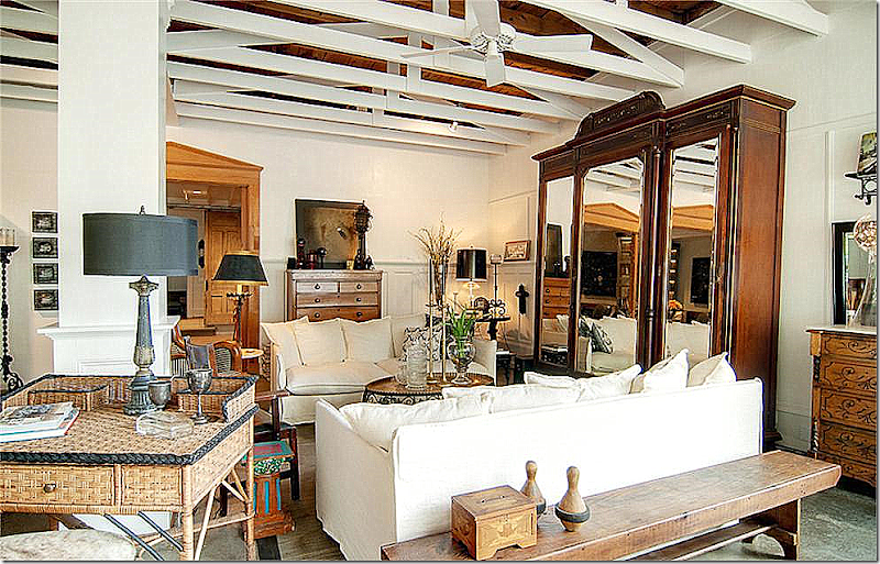
Whoa. This is so fabulous! Inside, there is a main living dining area with 14’ ceilings and exposed beams. Through the large architectural doors is the kitchen and breakfast room. There are two bedrooms and one bathroom.
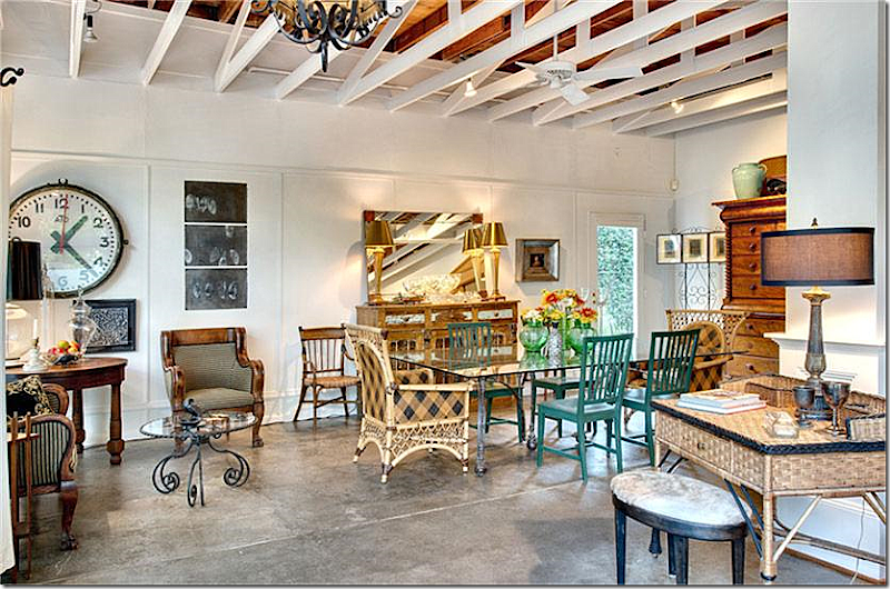
Walking in the double front doors – the dining area is to the left. The door seen here leads outside to the garden.
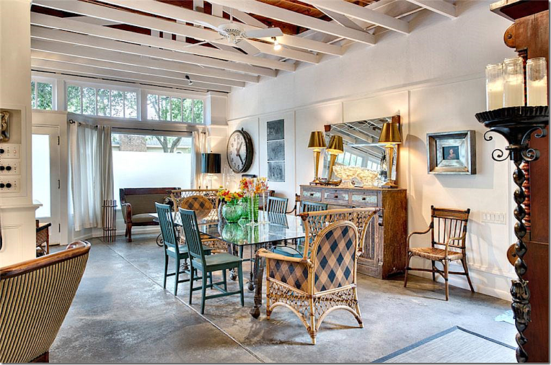
The same dining area – looking towards the front doors. The floors are concrete.
From the double front doors, to the right is the living area with a smaller games table.
A huge armoire hides the TV, I’m sure! The small desk attempts to hide the load bearing column. Notice its molding.
A close up of the living area – through the doors on the back wall is the kitchen and bedrooms.
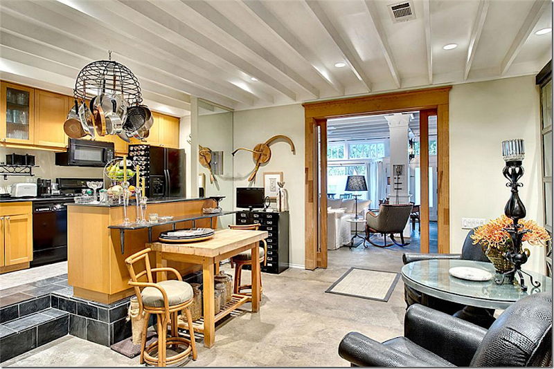
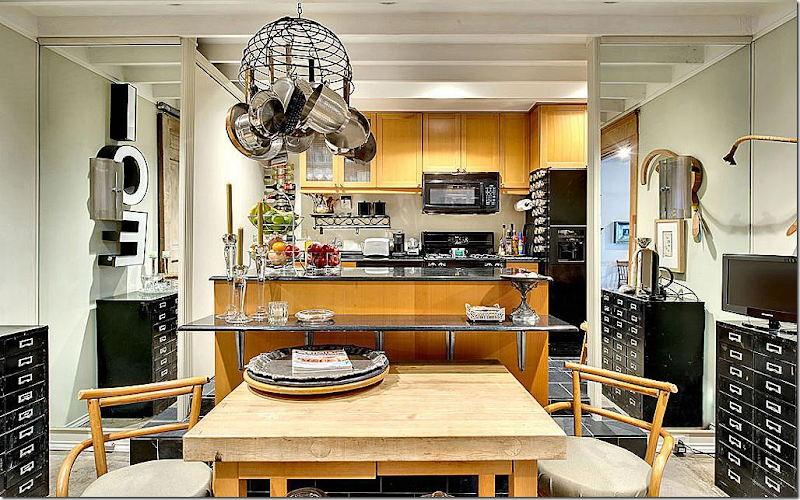
Through the double doors is the kitchen and the breakfast room sitting room.
The kitchen is elevated up a few steps and mirrors flank the opening to it on both sides. There is an eating bar and a table and chairs.
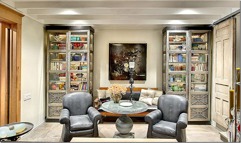
Across from the kitchen is a small sitting area – filled with an antique settee and industrial style bookshelves.
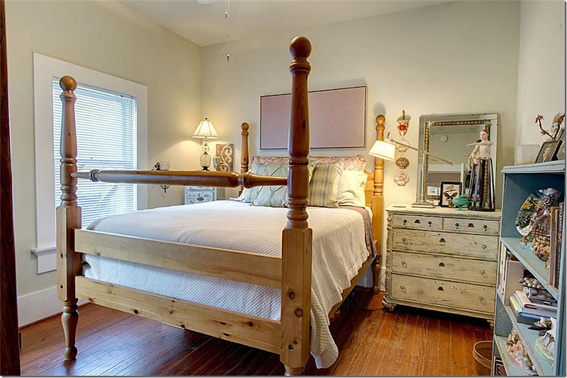
This bedroom, one of two, is most serene room in the house! You can tell a woman with feminine tastes lives here.
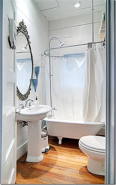
The bathroom fits in with the age of the house/store with a clawfoot tub and pedestal sink.
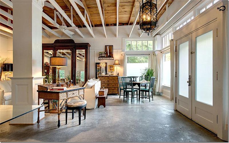
Looking back in the main room out the front windows – you can really see the ceiling beams and rafters in this picture. I just LOVE this space!!!! Do you see that black wire coming out of the column – what is that?????!!!???
A side view of the building shows it is located on a corner, just like any corner grocery store would have been!
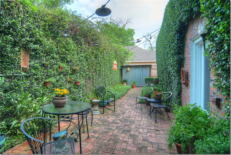
A brick paved courtyard runs from the front to the back off the side of the house.
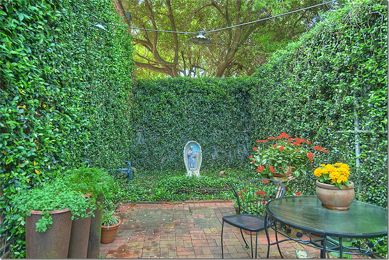
Another look at the courtyard, facing the other way. What would you pay for this piece of history?? It is 1780 sq. ft. and is listed on the National Registry of Historical Places & is a Houston Landmark Property. Would $375,000 be too much to pay for this unique home? I think it’s a steal! Unreal. If I were single or didn’t have children, I would love to live here. BTW, someone agrees, the house is now sale pending. HERE.
FAUX:
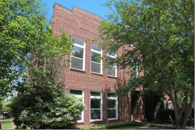
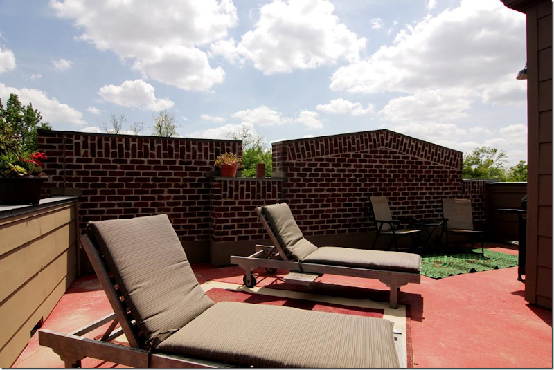
What if you like the look of a store, but don’t want to live in an old house? This brick house is new construction, but looks a lot like converted commercial property.
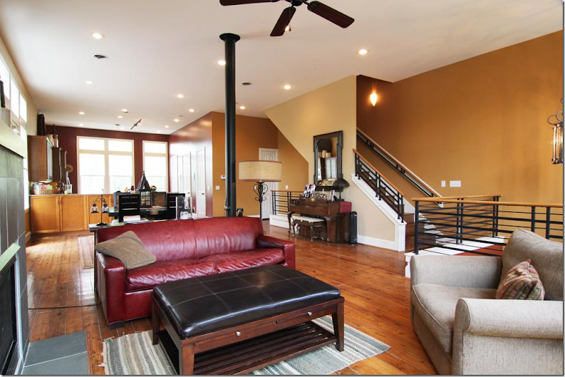
Inside the house is modern with an open, loft feel.But the best part for me - I love this third story sunbathing deck! I’ll bet the views are fabulous from up here. Built in 2001, at $494,000 and over 3,000 sq.ft. - the price seems very reasonable and even quite low! HERE.
REAL:
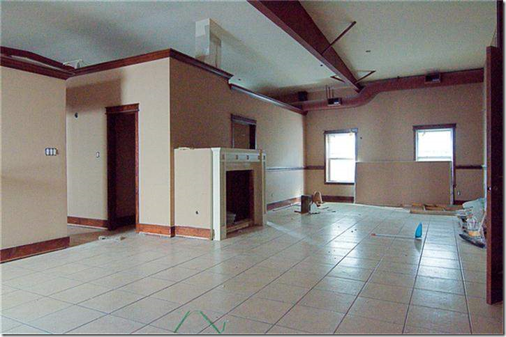
This commercial building in the Heights was built in 1971 and is waiting for some TLC to convert it. Its square feet is 3,680 – three times the size of the grocery store, but the price is also high, almost $6K. Steep.
Judging from the pictures, it needs a lot of work. HERE.
Real:
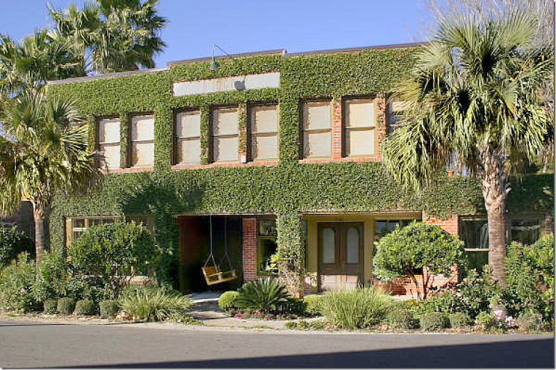
This house on East 27th was built in 1925 and was a drug store/post office. Later it was divided into 8 apartments. The current owners gutted it in 2005 once the neighborhood had undergone it’s own transformation first. Today, the ivy covered brick building has more than 50 windows, concrete floors downstairs, antique light fixtures and a great terrace and bricked courtyard. Unfortunately, not for sale and no interior pictures!
Real:
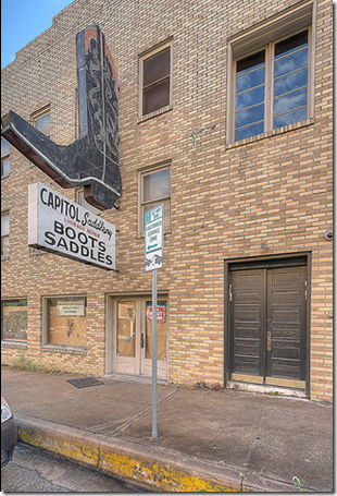
Anyone who’s lived in Austin is familiar with this sign! Today, the old boot and saddle shop is a gothic loft – now for sale at $4 million. Yikes!
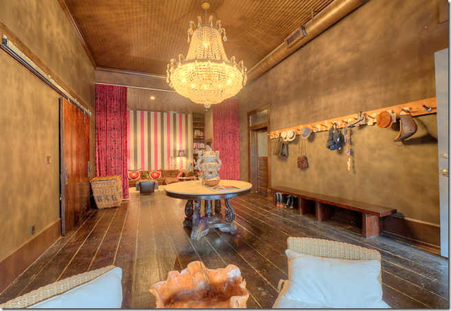
Even the entry hall has a huge crystal chandelier from a Las Vegas casino.
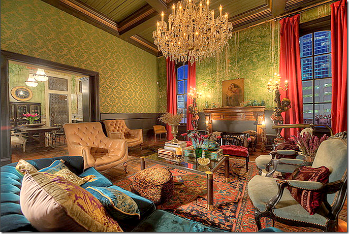
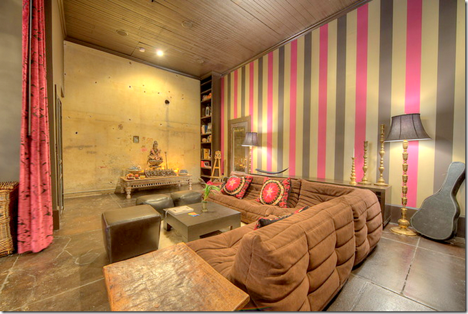
The owner says she was inspired by Fortuny when decorating this loft.
She says she never thought she would ever move, but….if she can’t sell it, she will rent it out for events.
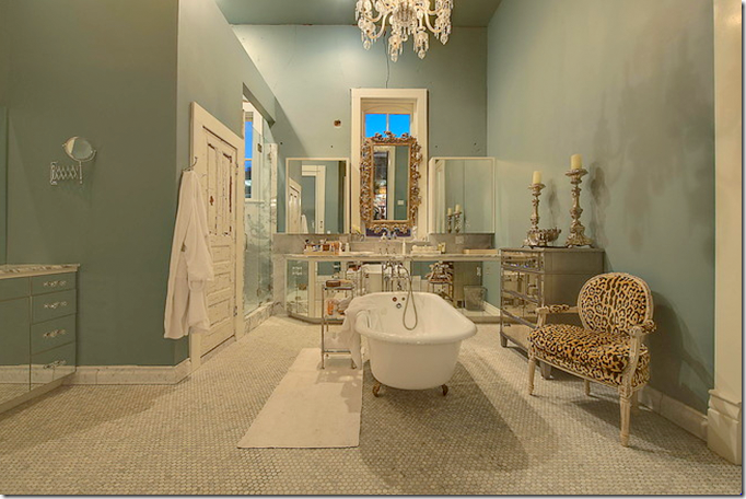
The bathroom is my favorite room. I love this room!
Even the old Otis elevator was restored.
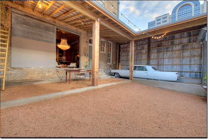
Only in Austin – vintage Cadillac and cowboy boot store! The home now has three bedrooms and measures 5,476 square feet.
Around the U.S.:
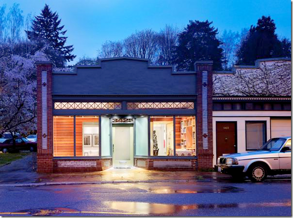
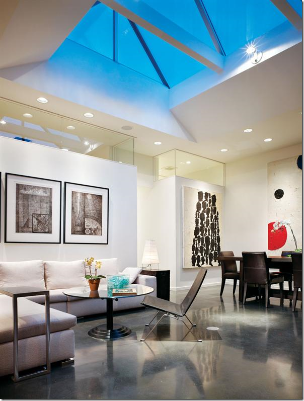
Looking at these local commercial buildings converted into homes started me thinking and ending up with me google searching for days and days, seeking out other revitalized buildings. This beautiful storefronteeeeeeeeeeeeeeeeeeeeeeeeeeeeeeee is located in Portland, Oregon. Amazing how the front looking almost the same as the Houston grocery store house with the transom above!The storefront is from the early 1900s. A large skylight was placed over the living/dining room. Again, the floor is concrete. The bedroom is located behind the sofa wall.
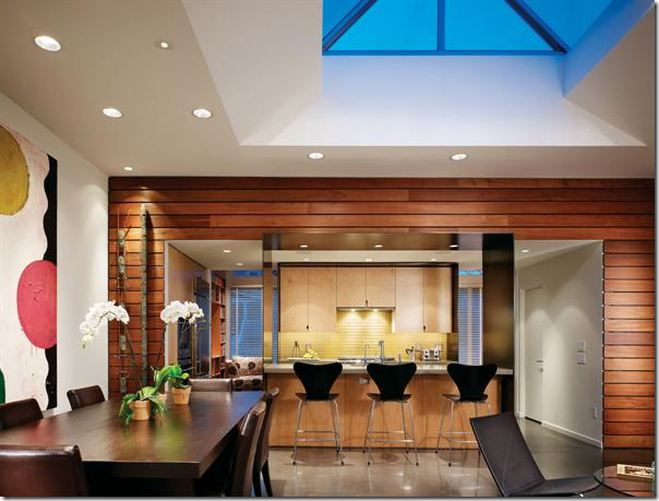
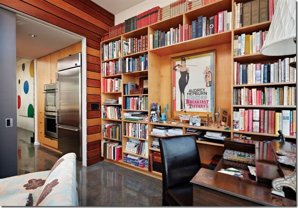
Looking at the dining room side – the kitchen is placed between the study which overlooks the front store windows.
The study which overlooks the front windows. This couple are art collectors, but that poster is found in every teenaged girl’s room that I know!
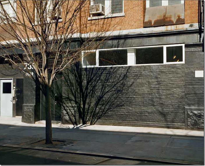
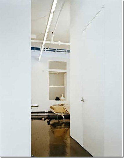
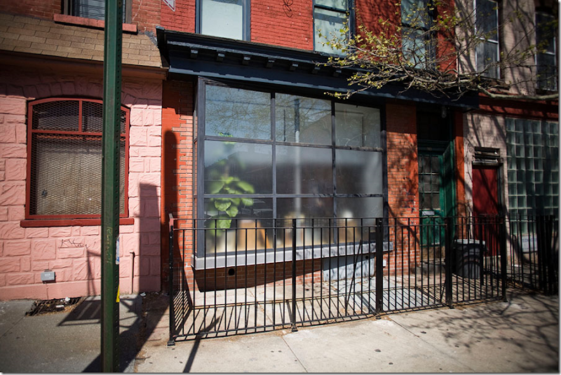
This storefront is on the lower east side, NYC. Minimalistic - it is so beautiful. Love how the brick and sidewalk was painted black but the concrete nearest the house is painted white.
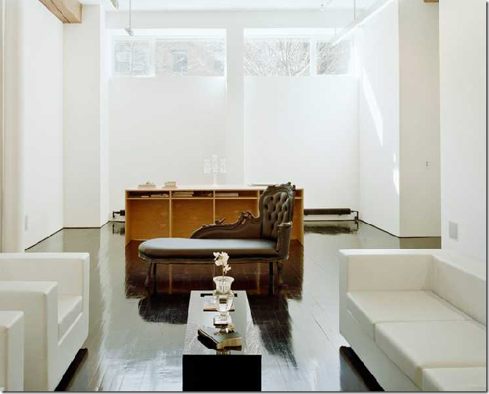
Architects were Messana O’Rorke HERE. Hard to believe this was once a storefront. The tiny front windows are disguised behind what appears to be floor to ceiling shades. That’s a desk in front of the windows. I love the décor.
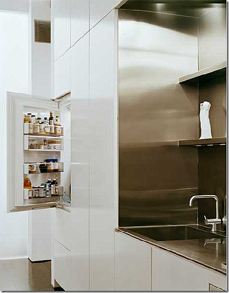
Gorgeous kitchen and table set – who really needs more???? Notice the light fixtures over the table, they disappear almost.
Surprise!
The bedroom. Notice how the black floors are like mirrors. Beautiful! Found HERE.
The bathroom.
Real:
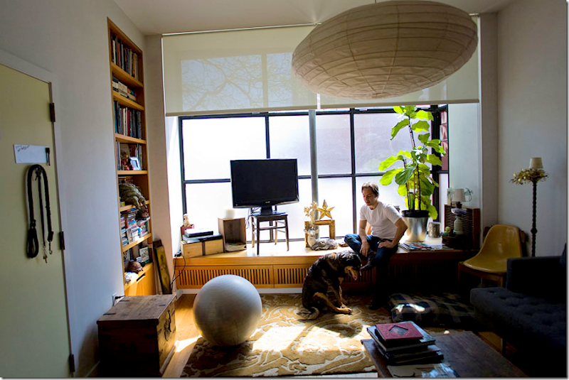
In New York, there are many store fronts that are converted into spaces. Not many are as sophisticated as the one above with the white walls and black floors. This one certainly seems more user friendly.
This was once a barbershop in Brooklyn. The front façade is made up of nine large pane of glass. Notice the asymmetry of the large light fixture, the ball and the TV – all perfectly balanced with each other.
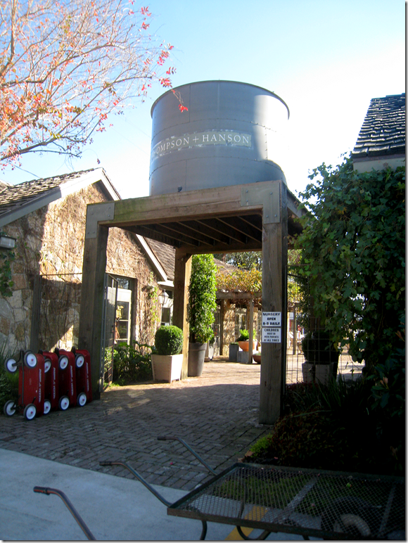
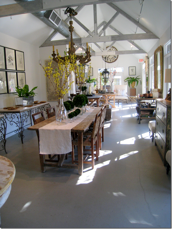
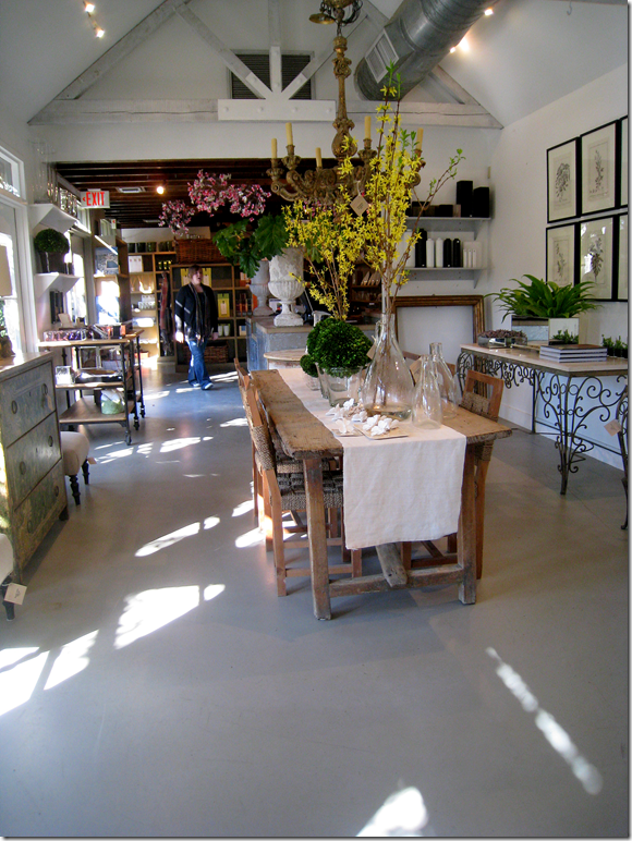
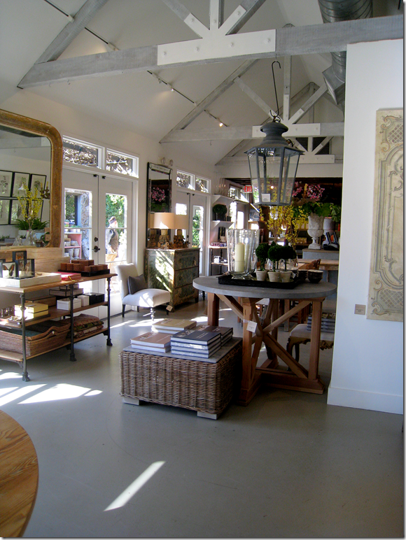
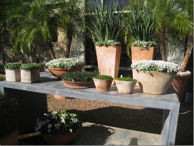
So…..is there a building in your city or town that you have once thought of living in? I have several that I dream of making my home whenever I am shopping there. My all time favorite to move into would be Thompson Hanson, the nursery/décor shop. Living there would be like living in Belgium! HERE.
OK, I’d take down the water tank first. I guess. But, to live on this property, with its two stone buildings, would be nirvana.
Gah…kill me! Could I keep the furniture, too????
Looking at the other end. I’d probably put the kitchen back in the storage area and put the bedrooms in the other building – then connect them with a screened alleyway. Done! Didn’t even need to call Kirby. hehe
Remember when this building used to be Mom’s Kitchen, which is now 2620, the fabulous antique store just up the street?
At least my landscaping would be fabulous.
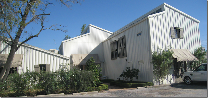
Another building I would love to live in is Indulge Decor. HERE. This large barn like, metal covered building was redone and added on by Cynthia’s talented architect husband. The building is beyond fabulous.
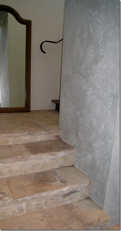
Just look at the staircase with its terra cotta stairs, iron rail, wonderful wall treatment. Cynthia, when can I move in????
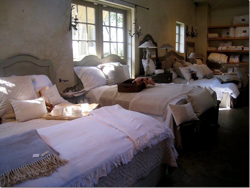
The building is almost as cute as the décor! btw – Cynthia just got in a huge shipment of Blanc d’ivoire.
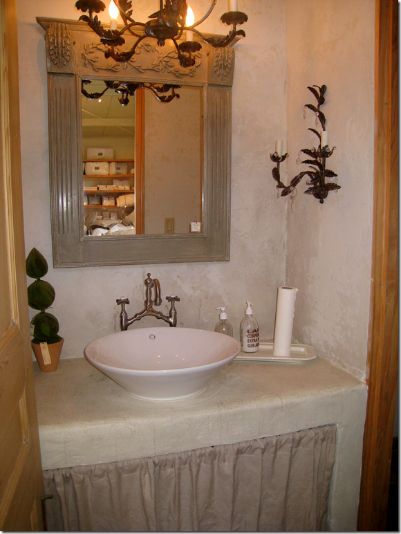
I wouldn’t even have to put in a bathroom! Is this too cute?!!
OK, ok. I am just noticing something. Most of my favorite antique stores are places I would like to live in. That’s a pretty sick statement in and of itself. Calling Dr. Freud! I mean, who wouldn’t want to live in BROWN???? HERE.
And then there is Kay O’Toole’s. I could live in her charming, decades old brick shop. But, then – just to aggravate me - she had to go build this fabulous house out back, designed by Murphy Mears HERE. I take either the shop or the enfilade or both. No questions asked.
The list could go on and on – I would love to live in the little house behind Shabby Slips, another great one would be the old laundry turned into antique store Neal and Co., or how about the cute shop Watkins & Culver?
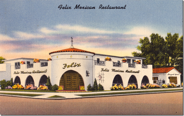
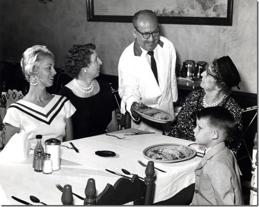
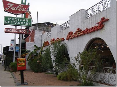
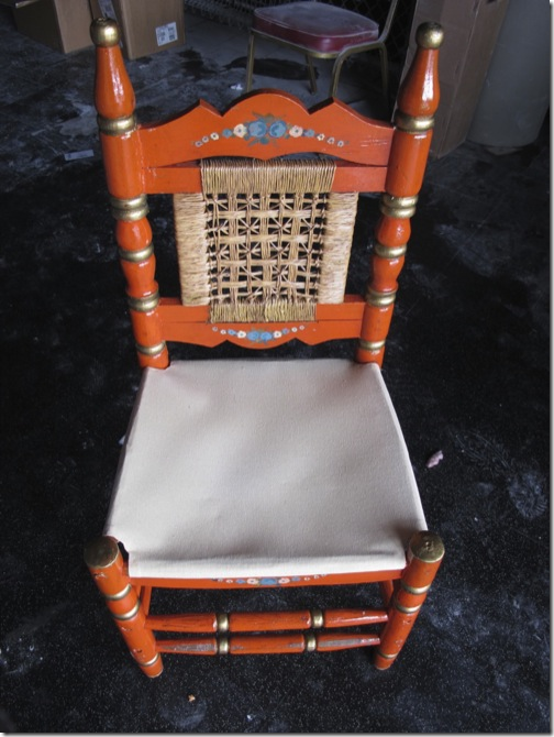
But, one of the my all time favorite buildings that I used to think would make a great house is the old Felix Mexican Restaurant on Westheimer. Everyone used to eat here – we would go with the Webbs several times a month for dinner and then there were the lunches. The best times were the ring side seats to the annual Gay Rights Parade. The chain was opened in 1948 by Felix Tijerina, one of Houston original Hispanic stars. There were once 5 or 6 Felix’s around Houston, all in their signature Mexican Villa style, but one by one they all closed except for the Westheimer location. Whenever I would go, after walking through the double height entry way rotunda, I would think – this would make such a cool house. No one else must have felt that way. After it closed, it languished on the market for 3 years, becoming a home to the homeless. When it finally sold, it was shadow of its former self. Pieces of the restaurant were sold off – menus and paintings. The distinctive chairs were to El Real Restaurant along with some of the fixtures and photos. Their signature recipes for chili con queso and guacamole were sold to El Patio, another veteran Tex-Mex Houston landmark.
The saddest thing is that a chic Austin sushi restaurant bought Felix.
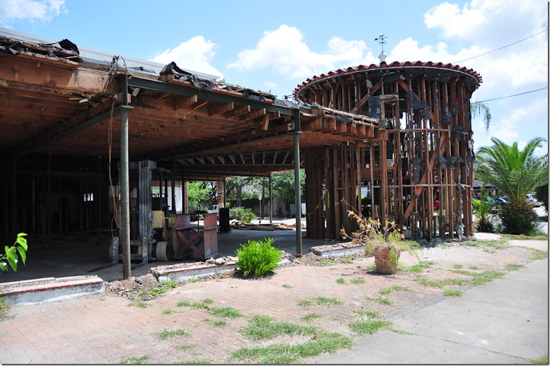
It was once so clean and well kept. After it closed, it all went downhill, fast.
Its getting ready to reopen as a chic sushi hotspot. Here, it was cleaned out. The fabulous rotunda is so sad looking. The color tile floor is now gone.
It’s all gone, except for the shape of the rotunda which I suppose the new owners kept. And to think I once wanted to live here!
The original Felix chairs, sold to another Mexican restaurant. Life moves on.
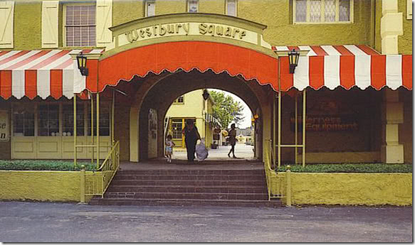
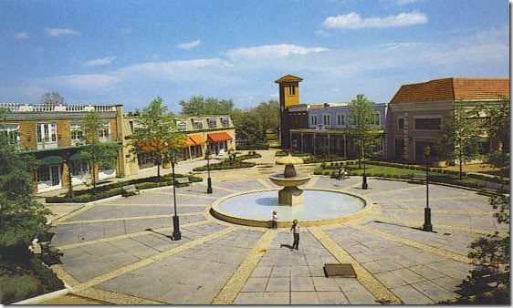
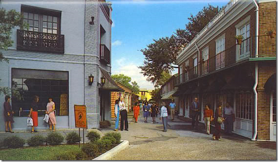
And finally, one last favorite commercial/residential Houston memory. Westbury Square was a one of its kind – a romantic, quasi Disney inspired shopping mall, built in the 60s before there were shopping malls. It was a magical European village, stuck in the middle of the barren prairie of southwest Houston. There were candle making shops, a chemist shop, an ice cream shop, a Dutch shop? - all kinds of small merchant stores and a few restaurants. But most remarkable to me were the apartments that were built over the shops.
When we would haunt the small walking streets going from shop to shop, I would peek up to look at the apartments through the French doors and Juliet balconies and dream. I thought it would be the most perfect place to live, above the stores in this charming little bit of France and Germany.
Here you can clearly see the apartments over the shops – the French doors, the iron work balconies. Then came the Galleria and that was the death knell of Westbury Square. It took a while to kill it completely, but in the end, Westbury Square ended up a pathetic place surrounded by big box stores. No one knew what to do with it. It was a money pit. IMO, they should have turned the entire square into apartments and houses instead. I know I would have been interested in living there as a young single!
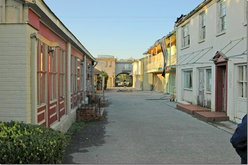
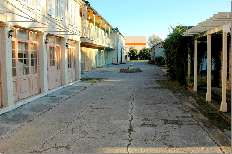
The same view as above, how it was in the end. A wasteland. But still, you can still see evidence of its once charming façades. The awning frames are still hanging on for dear life.
Another view, with the big box store behind it. Makes me want to cry just looking at these pictures!
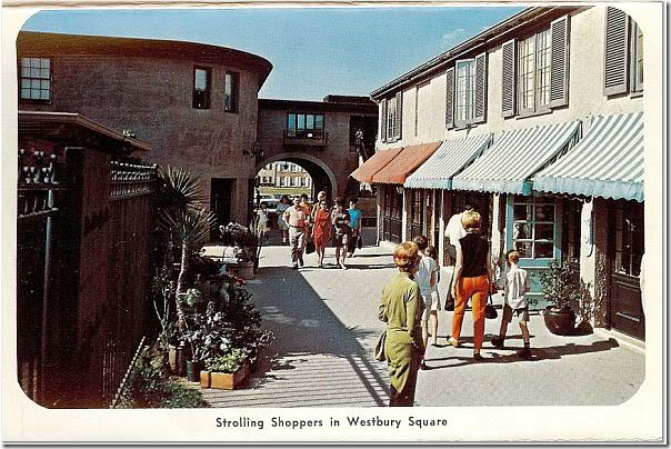
This view shows all the cute stripped awnings – off the side entrance.
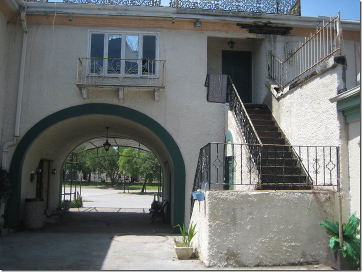
That same entrance – with the upstairs apartment that intrigued me each time I came in through that arch! Even though it’s all falling apart, you can still see the romance of it all, the stucco walls, the iron railings, the outside staircase, the Juliet balcony – why???????
A special treat to Houston baby boomers – we all ate our fair share of ice cream here.
So, can you think of any wonderful old commercial building or shop in your city or town that you could live in? Do you live in a former store or commercial building? If so, we would love to see your photos!!!
And finally…..
Mary Kay Andrews’ newest book, Summer Rental, is now out! Here, Andrews writes about her beach house rental – her other books have been about buying the house on Tybee Island, renovating it, and all the mishaps and laughs that went with it! She’ll be Houston for a book signing this coming week. So, be sure to join her – I’m betting it will be a fun event.
Mary Kay’s beach house on Tybee Island, available for rent!
To see Mary Kay Andrews – come to the Blue Willow Bookstore at 14532 Memorial Drive – this Saturday, June 11 at 4:00 pm.
To read all about Mary Kay’s ADORABLE beach house for rent, go HERE.
And to purchase Summer Rental and all her other books, go HERE.
Residential or Commercial???
Subscribe to:
Post Comments
(
Atom
)











Perhaps I could live in a library?
ReplyDeleteLoved this post. The first house is divine and I bet it looks wonderful at night. And I love the one with the three beds... just like the three bears. Charming.
Joni a really intriguing post. I loved it in part because my sister owns a loft/ former warehouse building in the West Bottoms Revival area here in Kansas City.
ReplyDeleteLove seeing what has been created in all of these properties you have shown.
Be sure to enter my awesome $250 Giveaway from Tracy Porter!!
xoxo
Karena
Art by Karena
Wonderful post today. I love your insanely large number of photos! Keep 'em coming! Huge fan
ReplyDeleteOh, another wonderful post that speaks to me in so many ways! I'd love to live in Thompson & Hanson or Indulge, too!
ReplyDeleteBut the Westbury Square photos really pulled my heartstrings. So many wonderful times spent there with my mother looking at LaLique Crystal animals in the antique shop in the front..I so remember the Dutch shop that always had yellow wooden clogs out front. And Cargo Houston - the great home furnishings shop! The candle shop...and of course, Rumpleheimer's for candy dots on long rolls of paper and ice cream!
All such wonderful memories - it seems like a dream now.
Thank you for the smiles :D
Great post. Ah...the result of all the big box stores killing the Mom and Pop's....empty store fronts to be turned into private residences. I so could live in that first one. There are many empty store fronts I could imagine living in. There is an old church in my home town my Dad thought about buying to turn into a residence. It has since become the town library. Which is a very good use for it.
ReplyDeleteThat last shopping center you posted is just darling...such a shame for it to go to waste like that. only about 6 blocks from me is The Paseo which was an early shopping district much like that area you showed. It was built in the late 20's.
It gradually went down hill until it was mostly deserted then a forward thinking investor started buying up the buildings and in the late 70's he started renting it out for artist galleries. It now is a very vibrant little community with monthly art festivals. Now there are galleries, and shops and three restaurants with more to come...just this last year the very last building was fixed up and is currently turning into another restaurant.
This is what needs to happen with that shopping center you showed. Luckily the Paseo is in the middle of historic neighborhoods so people love to walk there and browse but I shudder to think what might have happened to these buildings if someone hadn't had vision.
Here's a link to when I did a post on them...
http://modvintagelife.blogspot.com/2010/07/paseo-arts-district.html
One of my most recent properties was built in the 1950's as a neighborhood ballet studio, but has been converted to a Texas urban loft style space.
ReplyDeletei love the concept of an older commercial space being converted.
ReplyDeletethere were so many details in this post that where loaded with charm and creativity.
xx
LOVED the post!!! There is a (recently) restored shoe repair shop on studewood in the Heights, that used to be so decrepit, but is now quite lovely, and was transformed into a house. The owners even repainted the sing that says "shoe repairs" on the glass just as before, I guess as a reminder of the building's past life.
ReplyDeleteWho decorated the morton's grocery store, do you know?
My guess: the wire coming out is just that, wire. Why it wasn't painted is interesting. However, I certainly do not appreciate you pointing it out as it is now driving me nuts! Ha ha. The phone below is gorgeous though. The owners must know about that "cord." It may be considered a public service; look into it, Joni! I have faith in you:)
ReplyDeleteFantastic post, loved every minute of it. It's great to see those commercial spaces turned into the most fantastic homes!
ReplyDeleteDianne
XOXO
Interesting and informative post. I am not sure if I could ever feel "warmed up" to some of the interiors that feel a little cold/industrial to me..even though the first one is very nicely done, walking in through those doors still feels to me like a store or even a furniture store, it doesnt' look like a home. I also find it incredibly sad that these small privately owned businesses are getting pushed aside by the huge mege corporations....very sad so on that note I am happy that these buildings are being used in a positive sense and obviously being given a lot of love. Really so interesting!
ReplyDeleteThis has to be one of my favorite posts you've ever done. I love the creativity and interest it generates.
ReplyDeleteThanks for the heads up on Mary Kay Andrew's newest book.
Great post! Brings back so many memories of growing up in Houston. So sad about Westbury Square. It was a special place. Such a well researched and inspiring post demonstrating ways to revive and recycle our heritage buildings instead of tearing them down--as is so typical of Houston. Thanks, Joni.
ReplyDeleteI love this post! I think the first store/home is adorable, and would be a really cool spot to live without kids. One of my favorite local stores is located in a restored schoolhouse. When it first opened I had a dream that I lived in there... so you are not alone in that ;)
ReplyDeleteMy grandfather owned an ice cream business in NYC, which is now someone's home. One day HGTV featured a tour of it. I kept thinking, "Why didn't anyone in my family have vision??? We could have had prime real estate!!" :)
Me too. I almost hate that these great livable places are wasted on commercial. Love/work would be OK I guess.
ReplyDeletewhat a great post, joni!! i loved the first place so much, but, is it just me, or did the rest of the place (sitting area, kitchen, bedrooms) not seem to fit with the feel of the main living area?
ReplyDeletethe wire coming out of the column is a telephone cord - that's a wall phone.
thompson hanson nursery and indulge are amazing!
joni, the first space featured in your post today is the home of brilliant interior designer (and dear friend) Andra White. in an earlier comment, someone says they would love to see the space at night: i think it is even more charming at night. besides being a fabulous designer Andra is an amazing cook and hostess. i have had many amazing dinners chez Andra.
ReplyDeletei loved this entire post. i love the free assocation/meditation on commericial/residential space. you are always brilliant, but especially brilliant today.
thanks!
Melanie
Joni,
ReplyDeleteWe have been living parallel lives! My father was the in the grocery business, my mom grew up in the Heights and we were all so sad to see Felix close. Thanks for the walk down memory lane.
I enjoyed seeing these spaces, they are so cool, I could imagine living in one myself.
ReplyDeleteGreat post! Such interesting spaces!! I think it would be amazing to live in a space with such unique history. When I was little, I used to want to live in Celebrity bakery in Highland Park Village in Dallas. It was like a small pink doll house with pastries.
ReplyDeleteLoved this post. Brought back lots of memories growing up in Houston. Westbury Square was a weekend regular in the late 60s. It had such possibilities, too bad someone couldn't visualize what it could be. Thanks for the wonderful trip down memory lane
ReplyDeleteJoni, The depth and detail of each of your posts continues to amaze me. I loved seeing all of the different spaces and the New York one was by far my favorite. Thanks for sharing-
ReplyDeleteI really enjoyed this post! In these cases it takes extra talent and vision to turn the spaces aroun, but what a fantastic result! This was a really interesting read - thanks!
ReplyDeletehttp://bjdhausdesign.blogspot.com/
this is a great post. so interesting! I instantly knew the Portland OR space when I saw it- just from the surroundings and the car parked out front! :) (I'm an OR girl....he he)
ReplyDeletethe second to the last photo looks SOOO much like the apt. in Roman Holiday! Thanks for sharing this!
Joni,
ReplyDeleteYou really pull us us in with your great photographs and well researched posts. This was fascinating to read. Well done! Cindy
Joni, this is such a wonderful and bittersweet post. I love all of the spaces you included. The old commercial spaces are so charming. As someone who has grown up in Houston and has seen how little consideration this city has for our architectural past, tearing down lovely old buildings in favor of strip malls, this post made me wish things had been differently. My mom has mentioned Westbury Square to me before, but I had never seen photos of it. It looks so charming. You're right, it would have made such a charming residential community.
ReplyDeleteJoni, this entry made me so sad, this is going on across America.Architecture being torn down, wonderful buildings with so much style, history and potential.Hopefully your wonderful eye will intrigue others to open theirs.I think its wonderful to revamp existing buildings and not tear them down, thats what recycling is truly about not traffic counts.
ReplyDeleteHow intriguing this post is. Great research and back ground stories. I especially loved the old images of how things used to be.....usually very charming and of a more human scale.
ReplyDeleteI think I know where the Westbury square used to be and what they have build there now.
It is amazing to see how quickly buildings/developments residential or commercial can go obsolete in the States.....and get redevelopped/torn down. It sometimes breaks my heart.
As you may remember my showroom was formerly a small tabacco shop ( with a family living in the back) later a flower shop. The reno (you posted on) I did is geared to residential use, for the future. Either used by me or another family. Great plans for furniture and room layout are ready. This will be exciting.
As always I enjoy your posts, but this one especially.
Ron ( empel collections)
I'm also a lifelong Houstonian.
ReplyDeleteYou really took me down memory lane with the pictures from Westbury Square! I spent SO many days as a child walking from store to store with my mother. It really is a shame to see that it was left to ruins - to this day!
And, Felixs'...I sure do miss that queso! :)
This was a fantastic post! I love seeing the creativity that one can put into these old buildings.
What about the old JMH? That would have been another great building to transform IMO.
Mandy
I think the wire sticking out of the post, is an old telephone. The grocery store/home was AMAZING. But, my heart is broken over the story about the Mexican restaurant. So sad.
ReplyDeleteWhat a post Joni!
ReplyDeleteSo many beautiful and inspiring images. So many great and original idea.
Have a great Sunday.
Teresa
xoxo
Joni! Love this post and have been waiting for it eagerly! The larger photos on your blog show the store/house so much better than the very small ones on HAR. I'm not at all surprised it sold so quickly. And it's wonderful to know from a previous commenter that the store/house was owned and designed by a very talented decorator/entertainer. I was about to begin suffering from severe depression thinking that the ordinary person could pull this off!
ReplyDeleteI've only been in Houston 20 years, so the days gone by of places like Westbury Square and Felix' are experiences I'll never enjoy. How wonderful a city to have grown up in and how sad it must be to see the over-commercialization that we have to maneuver through in order to find the wonderful off-the-beaten path places you feature in your blog. By the way, I'm keeping a little notebook full of some of the businesses you've blogged about that I've yet to shop with in our fair city!
Great post and one of my favorites. I'll keep my eye out for more :)
What an AMAZING post!!! I've been in many, many stores that I could move right into, but these images blew me away. I'm bookmaking this post to read over and over and over again!
ReplyDeleteStacy
I loved this post...beautiful interiors! It just shows you what can be done! Thanks for a lovely post! I don't always comment but I look and enjoy your posts regularly.
ReplyDeleteI :)
I could look at the first home over and over again. Joni I am always excited when you have a new post. Your hard work and great mind and eye are so appreciated !!
ReplyDeletethis is the best post, joni --
ReplyDeleteI love the reaction it elicited -
fascinating to me to see how we all crave barn-like, loft-like, free & open, vaguely mercantile spaces, slightly commercial, lightly industrial - it is a reference that you either get or you don't-------
I get it, girl --
You got it, girl ----
thanks
Joni, I enjoyed this post so much. I love the creativity that went into making these commercial properties into residences! And oh, I want to live in the stone cottages that are currently a nursery. And now that I clicked over to see Mary Kay's beach house, I'm ready to go rent it! How fun that would be. laurie
ReplyDeleteOh, man -- I LOVE LOVE LOVE the Fortuny-inspired living room with those gorgeous green damask walls! If I lived there, I would wear fake eyelashes and a boa EVERY SINGLE DAY. And the restored Otis elevator reminds me of the one in Thoroughly Modern Millie (with Carol Channing, Mary Tyler Moore and Julie Andrews). Remember their quirky elevator that would get stuck, and they had to do tap dancing to make it go again? There I'd be in my loft, wearing false eyelashes like black caterpillars, a flouffy red feather boa, and tap shoes... :-)
ReplyDeleteWhat wonderful examples of the owners' vision! Had to share it on FB and twitter. Thank you for the great tour. You are right that Mexican restaurant could make for an interesting home.
ReplyDeleteCheers,
Claudia
Having just moved into the Westbury area 4 years ago, I peek into Westbury as often as I can, and want to cry that it fell so far to the wayside. And I have to say that your pictures didn't help - we had that picturesque little place around the corner, and now it's little more than a memory?? Aargh....
ReplyDeleteI have to say that I have fantasized over owning the Tea's Nursery that was on Bellaire forever. That stone house with acres to go with it??
Fun, thoughtful post. Thanks!
I think the wires coming out of the post in the first home are connected to an old fashioned, early 1900's land line phone, the kind our kids have never seen!
ReplyDeletea wonderful, enjoyable post.....how to recycle these wonderful buildings without tearing them down.
the wire coming out of the column is a dog leash
ReplyDeleteI just loved this post! I'm a big fan of adaptive re-use. Which reminds me, I have a longstanding date with a gentleman whom lives in a converted bank. The place is just wild inside and absolutely wonderful. I need to speak with him soon as he's well into his 80s.
ReplyDeleteSo sad about that wasteland shopping center!! Is it in a terrible place in town? Why wouldn't an investor gobble that up? It's so charming!
Really enjoyed every bit of this post (I'm sure I'll be back to re-read it appx 5x). ;)
Andrea
What a great post, Joni! I'm a big fan of adaptive reuse, and love most of these projects. Converting these stores to houses is a great idea.
ReplyDeleteAs to what that black wire in the first one is, it's part of the original telephone or intercom system.
It's ironic that Westbury Square didn't last, considering the massive resurgence of the concept of that kind of "mall" with apartments and offices upstairs (or fake ones, actually, much of the time!) that we've been living through in recent years. In some ways, it appears that this development was way ahead of its time.
ReplyDeleteOh that black telephone, I would love to have a large column that I could have a wired telephone hanging in it. I would love to live in the first place, as you said it is so charming from the outside.
ReplyDeleteI can't believe a developer didn't take that small outside mall and make housing out of it. In so many areas the small outdoor shopping is making a comeback with glaleries and restaurants, it is a shame it isn't happening there.
I always wait until I have some quiet time so I can sit and digest every little bit of your post and tonight was so worth it! That first store/house is so freaking amazing and I’m not surprised it sold so quickly. That wire hanging out of the column looks like an old telephone to me. I wish I could call those people because I want to know where they got their lamp that’s sitting on the desk I want that lamp please! If I were single I would have purchased that store/house in a nanosecond it’s way gorgeous. Another stellar post and I truly loved this one!
ReplyDeleteAwwww....Westbury Square! I can remember my mother and I driving from San Antonio for the day just to shop there. Thank you for fond memories!
ReplyDeleteJoni, Thank you so much for sharing the building in the Heights. I drove past that building so many times wondering what the inside looked like.
ReplyDeleteWestbury is so sad. I too remember those cute shops, my girlfriend lived near Westbury then in the 80's. What a loss.
Joni, What a truly enjoyable post this is! I an a sucker for old architecture, and this had me spellbound! I love seeing how old buildings are repurposed for residential use. Once again, what lovely and interesting info you so graciously provide!
ReplyDeleteWow Joni. You are a "Wonder Woman" with these posts. What a blast from the past. I loved WB Square and for that matter Meyerland Plaza and of course Felix. Great photo spread! Thanks
ReplyDeleteDoes anyone know where the "plaid "wicker/rattan dinning chairs in the first house are from?
ReplyDeleteHow are you doing Joni?
ReplyDeleteWhat can I say about this post? EXTREMELY interesting! I couldn't stop loving the 1st place. I'm in love with it. The only thing that I wish it was different was the kitchen. But at that price, it's easy to change.
This is a post that is blowing my mind! :-) Loved it!
Wishing you a very blessed week!
xo
Luciane at HomeBunch.com
How are you doing Joni?
ReplyDeleteWhat can I say about this post? EXTREMELY interesting! I couldn't stop loving the 1st place. I'm in love with it. The only thing that I wish it was different was the kitchen. But at that price, it's easy to change.
This is a post that is blowing my mind! :-) Loved it!
Wishing you a very blessed week!
xo
Luciane at HomeBunch.com
Joni, I think I'd KEEP the water tank. Because, who cares, once you are inside??gah .....is right! I am wondering if this is what our heaven will look like?
ReplyDeleteFabulous post. Thanks for the great fun. xo Lidy
Felix's was the BEST and I miss it too. Their queso was my favorite.
ReplyDeleteOh wow, what a trip down memory lane..I lived in Houston for a while, and remember hearing tales about those grand lost places. A great post+thanks xxpeggybraswelldesign.com
ReplyDeleteBoy! you really did your homework on this one!!! Loved the first residence.They did a great job with it.They way you included pictures of old Houston were a nice addition... We are lucky when they redid the Farmer's NationalBank were Beadboard is located, they put is a gorgeous loft with 12 foot ceilings and a commercial kitchen....Noone knows it is there........Nice Job Joni!
ReplyDeleteMaryanne xo
I can definitely see my family living in a converted commercial property!! Love the idea, especially with inspiration like you've shared.
ReplyDeleteGreat post Joni.
xo~
T
I love the old converted grocery store, and I think $375,000 is a steal too! Love the private courtyard area! I so enjoyed looking at all of the old buildings and their architecture...so much character and charm. Great post!
ReplyDeleteAh Westbury Square. My grandparents lived near there back then and it was always a treat to visit this place. I still have the Russian nesting doll I bought there 40 years ago. It's sad to see such neglect.
ReplyDeleteI got to know your blog 3 years ago when myself I was starting my company coté bretagne. Indeed, I am french coming from Bretagne but living in Norway. I love your blog!
ReplyDeleteI am importing french antics, I am the agent for Atelier Brou and I am making my own brand by astrid guguen. Atelier Brou is a unique french company making stylish furniture. Have a look www.cotebretagne.no or www.atelierbrou.com
, a bientôt Astrid
That house in the Heights is right behind the street I grew up on and I spent many a day in that building in the 80's. My friend and I called it the Punk Shop- I'm sure that is not what it's real name was but it was a neat and quirky shop that we would love to browse on saturdays. So great to see it here- I did not know it was a grocery store but I'm sure my mom did.
ReplyDeleteI cannot tell you how many times I've passed old businesses in my area and wished I could renovate them to live in, leaving the original character as much as possible! So of course your post was right up my alley! It breaks my heart to see all the big boxes where these charming buildings used to be. My husband's father ran the old Walgreen's store downtown, lunch counter and all. He has great stories to tell of those days, selling flavored ices to those passing by. And in the days of cheap electricity, leaving the doors open to let shoppers feel that cold air conditioning in the store was a sure way to lure them in!
ReplyDeleteIn the pic with the "wire", it does appear that is a land line phone, with cord included. There are light and dimmer switches below it.
Coming to your blog I never fail to be amazed at the vision people have! I see a store and see... a store. But those commercial places that have been converted have such charm! I especially love the living area in the first place you profiled. That ceiling and those rafters - wow!
ReplyDeleteThanks for an inspiring and educational post. Hope you're doing well!
I love your blog but the pictures load so slowly. Has anyone else mentioned that? It is slow at my house and at Starbuck's so I know it's just not my connection.
ReplyDeleteGreat post! Love the buildings and yet it's always sad when old buildings get run-down. I've always wanted to live in an old commercial building.
ReplyDeleteWow! So many possibilities in old buildings. I'd love to have a church or school do fix up. My daughter and here architect husband own an old power plant, with tower. It is overgrown, no roof, and estimates for his plans ran half a mill 10 years ago. They have no money for that but hold on to it for "someday" (which will never come).
ReplyDeleteOnce again a fabulous post! I just loved the first grocery store/home and the metal siding barn. For years, I have been designing spaces for clients from converted warehouses, garages, even churches! I am always intrigued and challenged but the hight ceiling, vast volumes and how to create dedicated spaced without walls.
ReplyDeleteIn Iceland, due to absolutely lack of wood, many houses are constricted with metal siding and metal roofs, i loved the look. I am in the process of building a storage shed for tractor and other garden equipment and opted for a metal roof with raw mill cut wood clapboards. Will share the result..
Hi, thanks for the posts.
ReplyDeleteThe black facade in Manhattan does not have a black sidewalk. What looks like paint on the sidewalk is just a shadow. Cheers, H.
Girl you go off on great tangents!
ReplyDeleteLove all the spaces and all the stuff in them. We have lots of old corner stores here in NOLA that are now houses. Alberto and I always covet them.
xo xo
PS Loved Mary Kay's perfect beach book...
Here in America, we tear down everything. If it's 20 years old, it has to go. If Europe had the same minset, what would it look like today? Just so sad.
ReplyDeleteToo long, lost my interest.
ReplyDeleteJoni, If you had a raw space with an exposed brick wall. How would you incorporate it into an updated kitchen. Grappling with this issue right now. Cover or highlight???
ReplyDeleteWow...what an interesting post...I love my house...especially after years of painstaking renovation...but I know my next home will be a commerical/residential space...my design studio on the ground level and living area above...I need to hold on to some of these images for inspiration...
ReplyDeletewww.ajbarnesonline.blogspot.com
Organized content is the best way to display or post an article, thank you for making it easy to digest your post.
ReplyDeleteCommercial iron doors
Amazing how simple it can be to communicate with people and have them understand a certain topic, you made my day.
ReplyDeletecommercial iron doors
Right,Good to see these useful info here..Thanks a lot for sharing them with us….
ReplyDeletecommercial iron doors
That's a great storefront!
ReplyDeleteSt Charles Glass and Glazing St Louis area Glass Company Commercial Glass and Residential Glass.If so, St. Charles Glass & Glazing has just what you need. commercial glass doors commercial store fronts - For all Your Residential and Commercial Glass Needs! Proudly We have the experience to handle all your glass or glazing needs, from frameless shower door installation to automobile window replacement and commercial projects, we do it all serving Greater St. Louis, MO, Wentzville Mo, Chesterfield MO and surrounding area. Our other services commercial store fronts, glass repair st. Louis, commercial glass, glass glazing st Louis, st louis auto glass, glass company Missouri, saint louis auto glass, st charles home glass door, home glass repair Missourihome glass repair Missouri, home glass repair Missouri, glass st Louis, shower doors Missouri, shower doors st Charles, shower s st Louis, shelving st Louis, shelving st Charles, shelvingMissouri, shelves st Louis, shelves st Charles, shelves Missouri, commercial glass doors car glass repair st Louis, car glass repair st Charles, car glass repair Missouri, st louis glass, glass & glazing st Louis, commercial glass companies Missouri, commercial glass company Missouri, glass and glazing Missouri, residential glass Missouri, residential glass st Louis, residential glass st Charles, commercial glass st Louis, commercial glass st Charles, commercial glass Missouri, car repair st Louis, glass st louis mo, residential glass replacement.
ReplyDeleteSt Charles Glass and Glazing - For all Your Residential and Commercial Glass Need. saint charles glass,auto glass repair st. Louis, commercial glass doors, commercial glass windows, commercial store fronts, glass repair st. Louis, commercial glass, glass glazing st Louis,stlouis auto glass, glass company Missouri, saint louis auto glass, stcharles home glass, home glass repair Missouri, glass st Louis, shower doors Missouri, shower doors st Charles, shower doors st Louis, shelving st Louis, shelving st Charles, shelving Missouri, shelves st Louis, shelves st Charles, shelves Missouri, car glass repair st Louis, car glass repair glass.st Charles, car glass repair Missouri, stlouis glass,glass & glazing st Louis, commercial glass companies Missouri, commercial glass company Missouri, glass and glazing Missouri, residential glass Missouri, residential glass st Louis, residential glass st Charles, commercial glass st Louis, commercial glass st Charles, commercial glass Missouri,car repair st Louis, glass stlouismo, residential glass replacement, stlouis auto glass repair, glazing glass, stlouis glass repair, the glass workbench, commercial glass repair, stlouis auto glass replacement, car glass company, glass source, vehicle glass repair, glass workbench, glass commercial, saint louis
ReplyDeleteMy dad needs to get some new windows really bad. They are starting to get old and are beginning to crack really bad. This has some good insights on what he should be looking for in one.
ReplyDeletehttp://www.newjerseywindow.com/Roxbury_Township.php
Find Capital City Scape price in Sector 66, Gurgaon @ Kalra Realtors(9650019588). Sale retail Shops GF FF SF on golf course extension road with Facilities & quality standards in Capital City Scape will be Grade-A.
ReplyDeleteVery informative post. I really do hope and pray this stuff works.Thank you. best carpet cleaning service PA
ReplyDeleteEverything I did was told them that I was prepared, willing and ready to begin assisting them with their "Investment Realty" needs. What I realized during the main year was that in the event that I could make a situation for my customers to take in more about real estate investing that they would express gratitude toward me in an assortment of ways.. the opus condo
ReplyDeleteNice post !
ReplyDeleteThanks for sharing informative Article.
Ameetuff - FIRE PROOF PAINT, FIRE RETARDANT PAINT, FIRE PROTECTIVE PAINT, FIRE SAFETY PAINT Supplier, Exporter in India.
commercial property for sale houston
ReplyDeleteWhen searching for a commercial real estate for purchase, your search begins with HBA. We have licensed real estate agents who are experienced with diverse types of commercial real estate.
https://houstonba.com/commercial-real-estate
#commercialpropertyforsalehouston
ReplyDeletebusiness for sale houston
is a major decision! You have devoted your time, money, and energy into building, running, and operating your business. It may well represent your life’s work. If you have already decided that now is the right time to sell, you want the very best professional guidance you can get. This is when working in tandem with a professional business broker can make the difference between just getting rid of the business and selling it for the very best price and terms!
Following are some of the most common topics and questions frequently brought up by sellers. If you have any questions that we have not covered, please don’t hesitate to contact us.
https://houstonba.com
Thanks for sharing this post about residential or commercial property it will be helpful for them those are looking for better and affordable property. Keep giving updates.
ReplyDeleteAtlanta property management