I got an email from a reader who wanted me to show her kitchen in the Readers Kitchens series. But after seeing pictures of her entire house, there was no way I could only show her kitchen! The house is located in a gated community, Chatham Park, in Fulton County, Georgia. When the owners first saw the house, it had been left unfinished for over three years. For the past year the owners completed building the house and decorating it. After living in it for just a short while, they decided to sell their dream house and move to the beach – which is where their hearts really are! Currently the house is for sale through Beacham and Company Realtors HERE. All these beautiful pictures were taken by Blayne Beacham and were also shown on her own blog, The Photographer’s Life HERE. While I usually don’t like to show houses that have already been featured on a blog, this house was just too beautiful to pass up and I knew you would all like to see it. So, let’s go past the gates to the neighborhood, where the house sits on a slightly hilly lot….enjoy!
The house is two stories with a fully finished basement. It has 7 bedrooms, 7 bathrooms and 3 half baths along with six fireplaces. The ceilings inside are 10 ft tall. To the right of the house is a 4 car garage. The lot sits on over 1/2 acres of land.
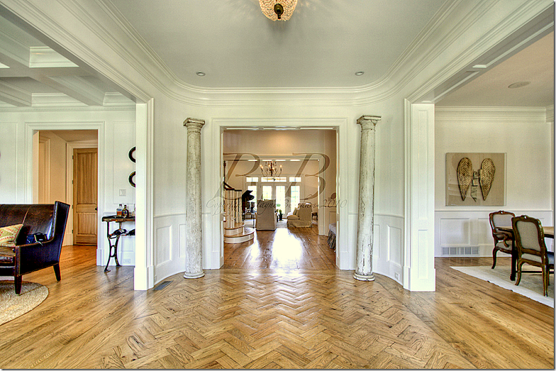
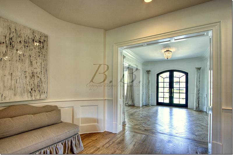
Walking in the front door, you step into a wide center hall with herringbone patterned wood floors. To the left is the study and to the right is the dining room. Straight ahead, past the staircase foyer, is the living room. In the four corners of the entry hall, the owner placed 4 aged columns.
Looking from the staircase lobby back towards the front door. NOTE: All these photographs bear the watermark of the photographer. I wish they didn’t because the marks are so distracting, but just try to pretend they aren’t there!
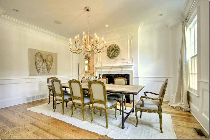
Facing the dining room.
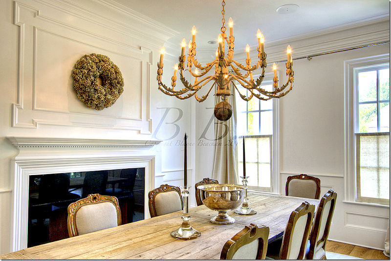
The dining room has a fireplace and a set of gilt French chairs. The table is Belgian inspired Rough Luxe.
I love the silver mixed with rough wood. Great chandelier.
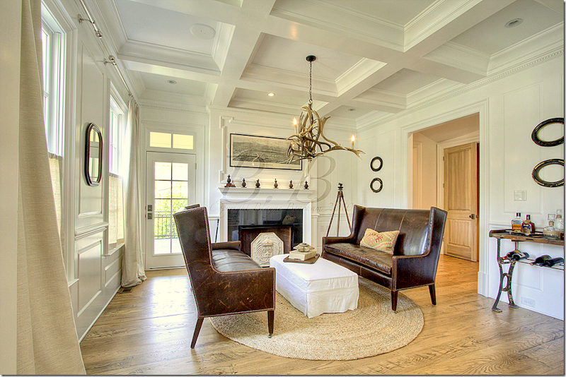
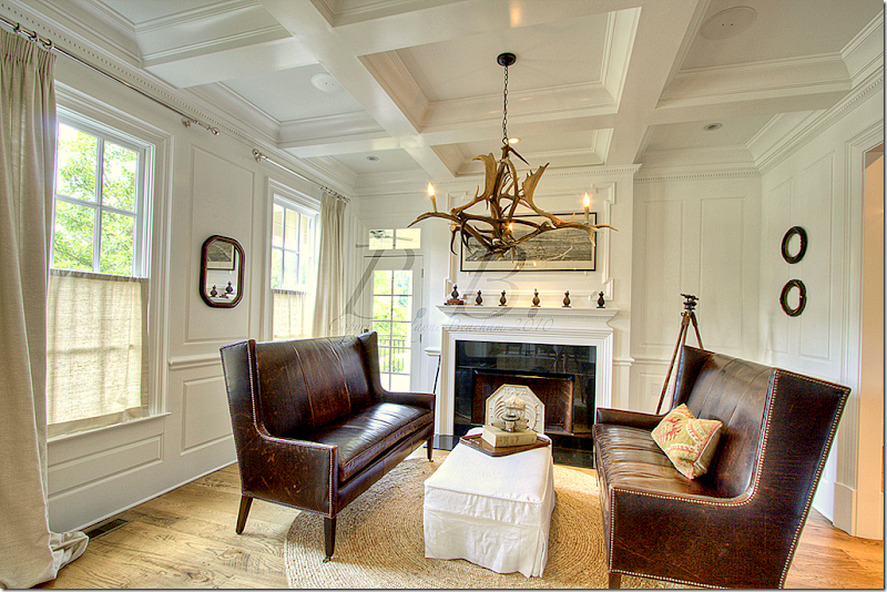
Across from the living room is the study with its charming antler chandelier. A pair of leather love seats face a white slipcovered ottoman.
A view towards the front of the house. Notice the linen shades that cover just the bottom half of the windows for privacy, yet they still allow the light to come through.
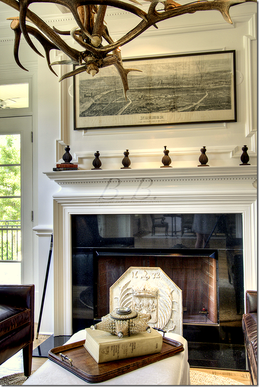
A close up of the mantel with an antique map.
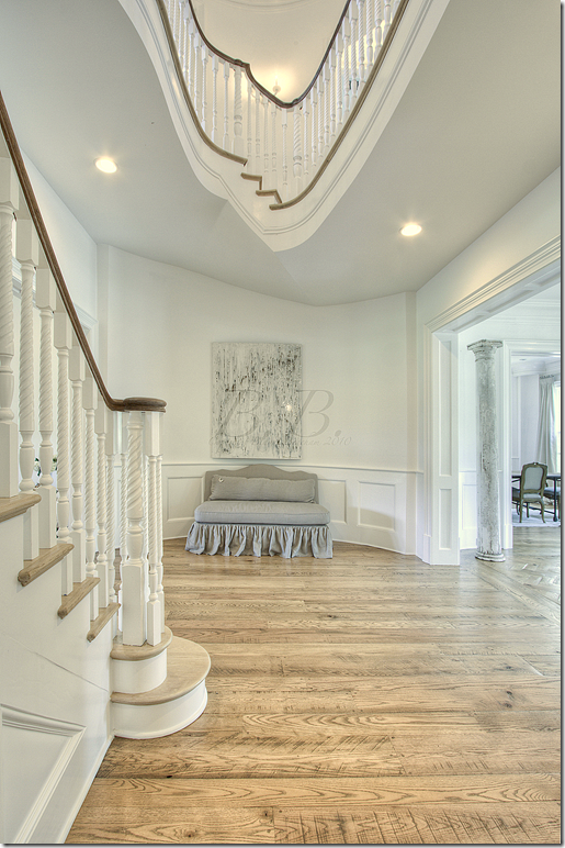
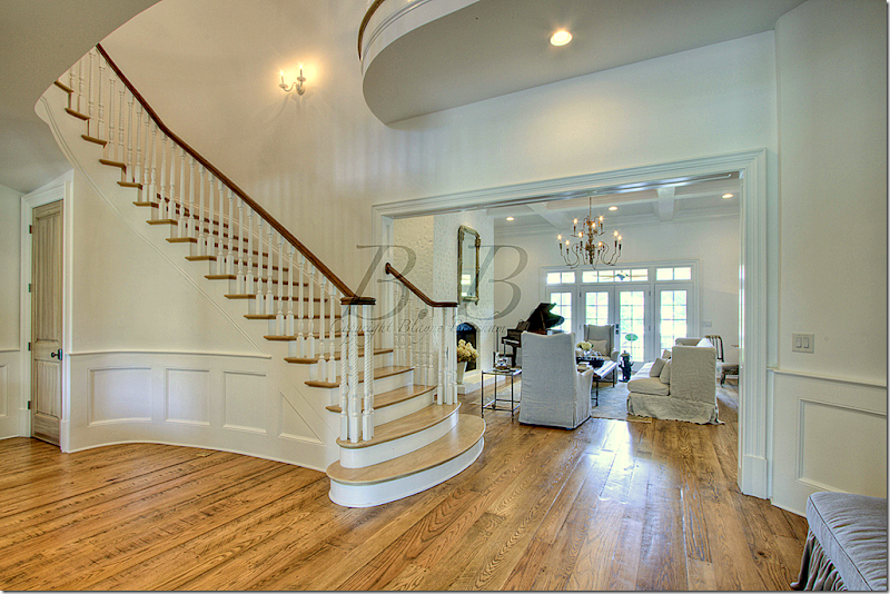
The staircase lobby is beautiful with the curving lines.
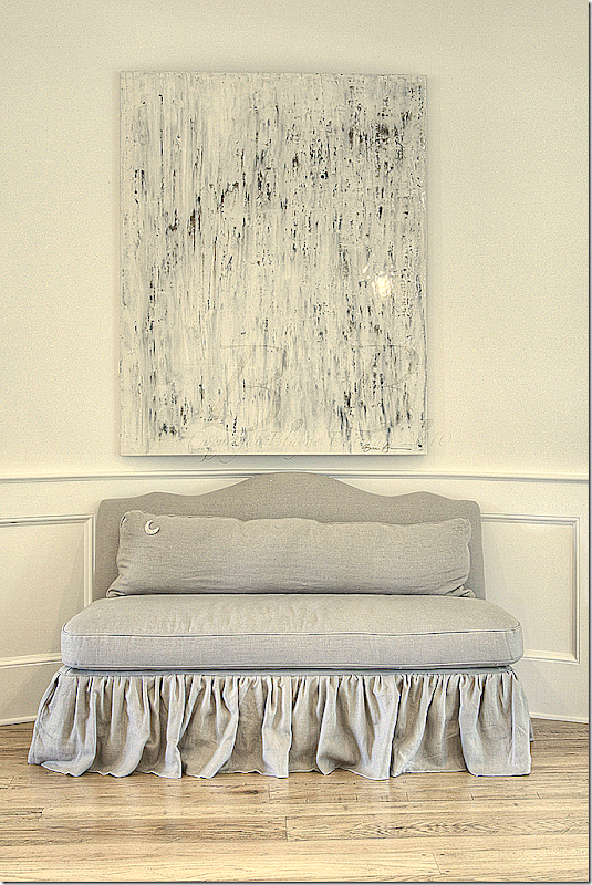
I love this slipped settee with its long lumbar pillow in the staircase lobby. So, so pretty!
Past the staircase is the living room which overlooks the backyard.
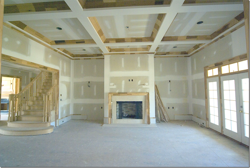
The house sat in this state, unfinished, for three years before the owners “saved it.”
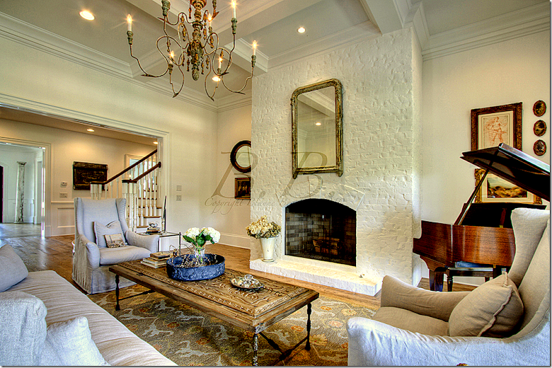
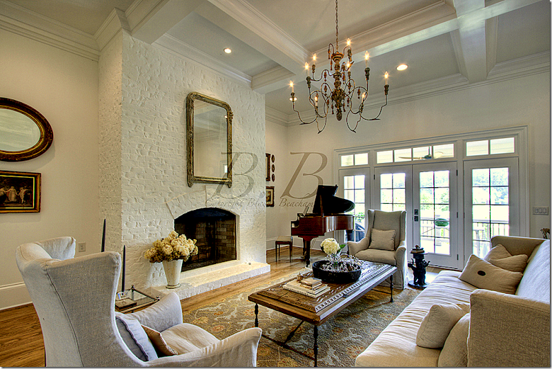
And today…the fireplace is painted brick with slipcovered covered furniture and a piano in the corner. Beautiful Italian wood light fixture.
The view towards the back porch and yard.
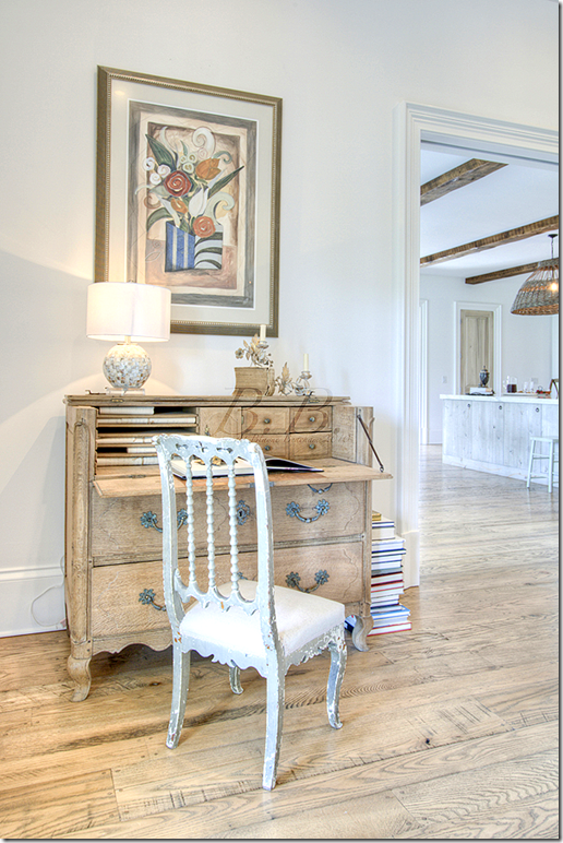
An antique desk sits on the wall that connects the living room to the kitchen.
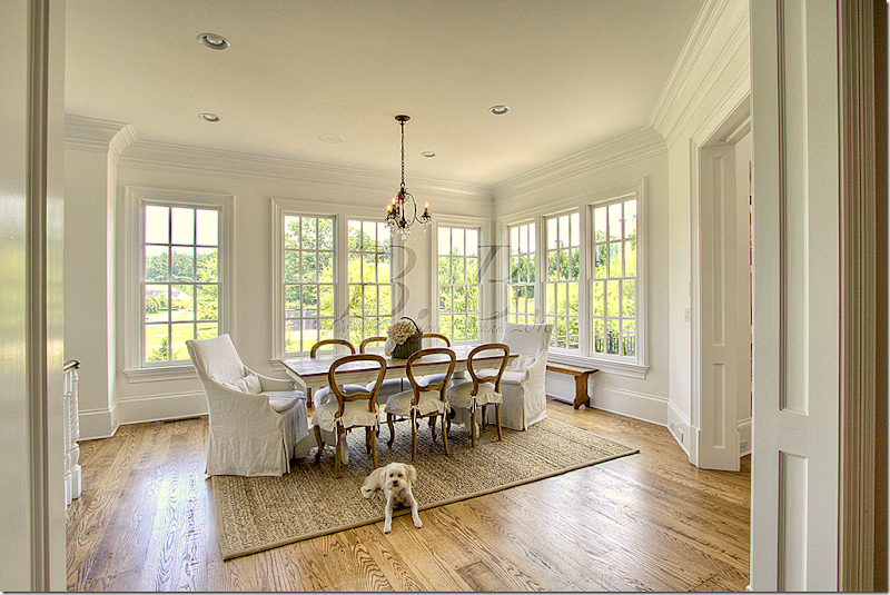
The breakfast room has a charming mix of slipcovered chairs.
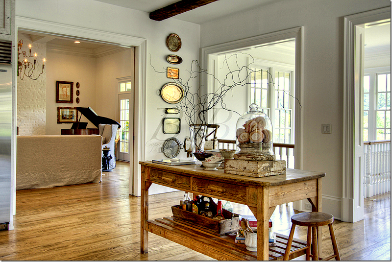
Looking at the living room from the kitchen which is next to the backstairs that lead to the basement.
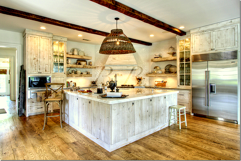
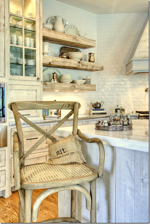
The kitchen is an amazing mix of textures and surfaces. The counters are Calacutta Ora marble and zinc. The backsplash is subway tiles. The open shelves are the same rough wood as the island. I love the wicker light fixture!
The view back towards the living room.
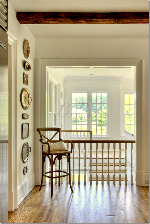
The view towards the back stairs overlooking the yard.
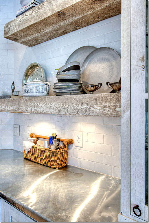
A close up of the rough wood shelves and zinc counters and shiny subway tiles. Such a great mix!
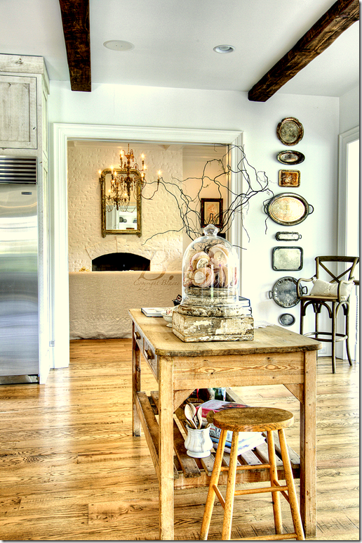
Close up view of the kitchen.
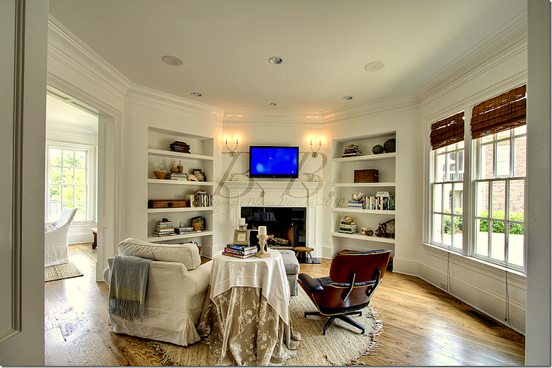
Past the kitchen and breakfast room is the “keeping room” for quiet TV watching. Another fireplace is located in this cozy room.
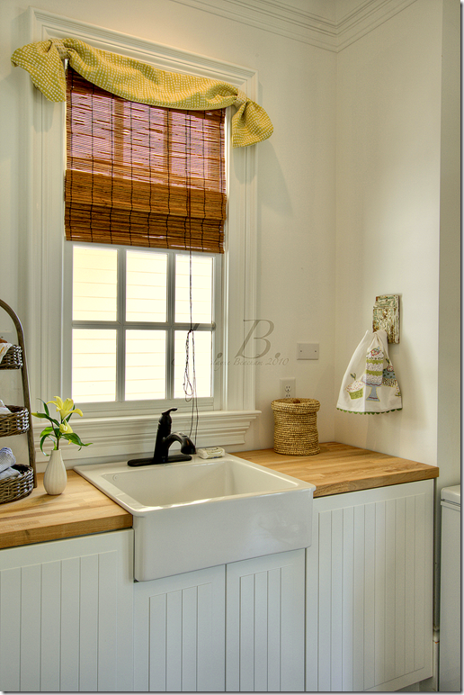
The laundry room has a farm sink and beadboard cabinets.
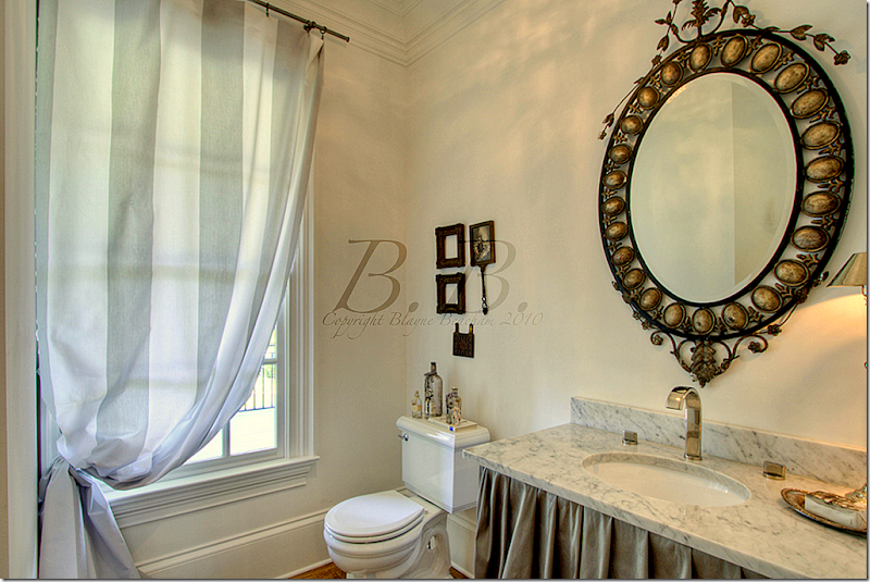
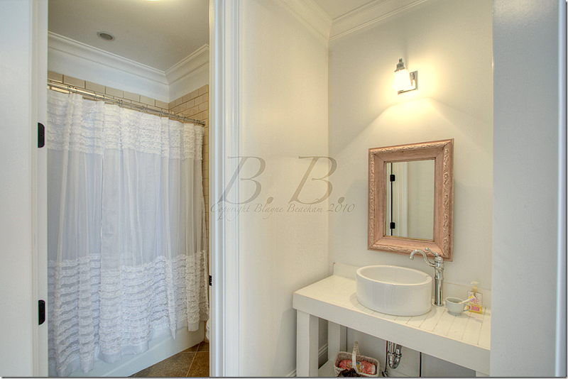
This powder room has a marble countertop with a skirt.
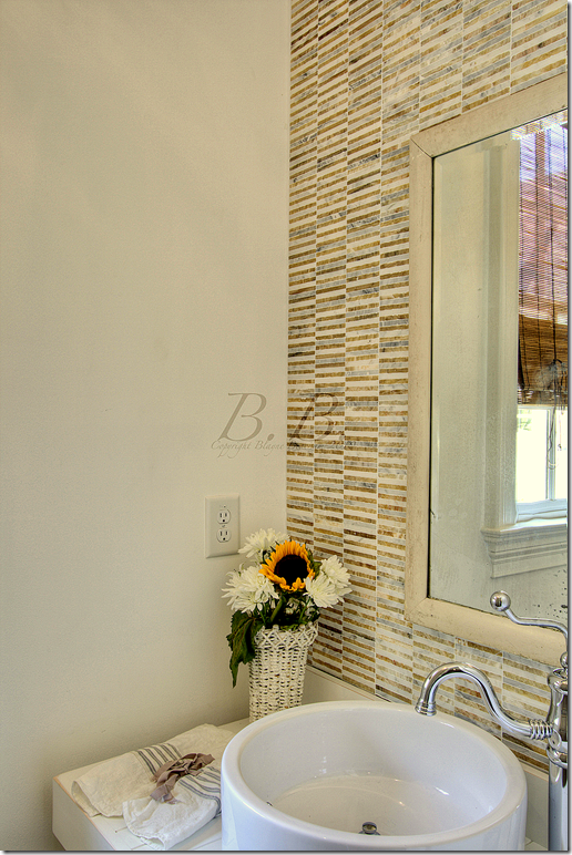
This powder room is more contemporary with its tiny tiles and hardware.
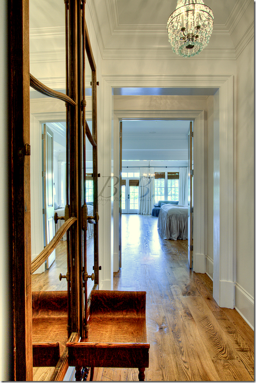
The hall leading into the master bedroom, located on the first floor.
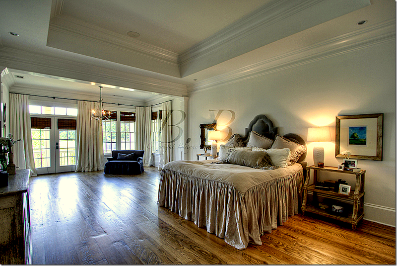
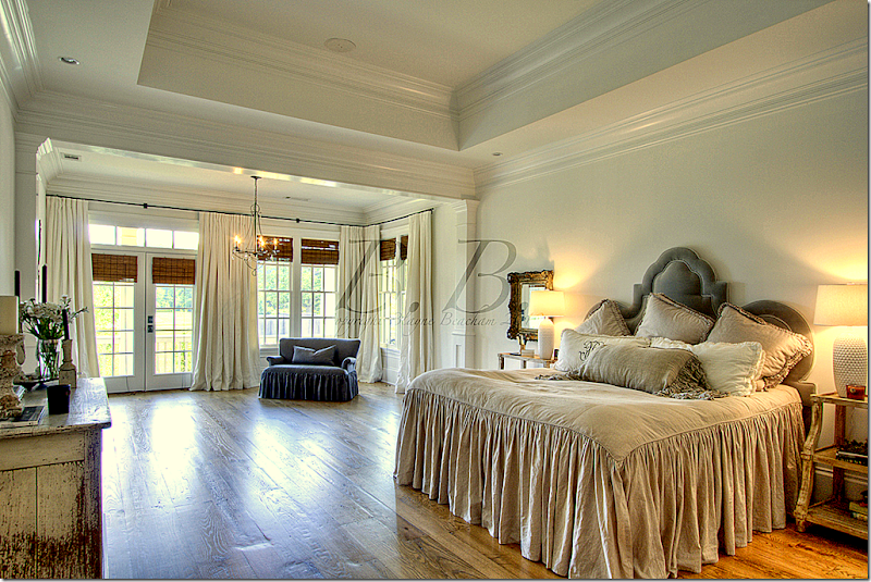
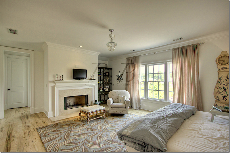
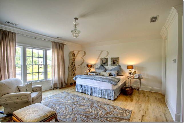
The master bedroom has its own sitting room and porch. Such a pretty bed!
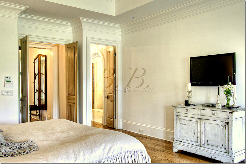
Here you can see the door that leads to the bedroom foyer and the other leads to the bathroom.
Another view of the bedroom and its siting room.
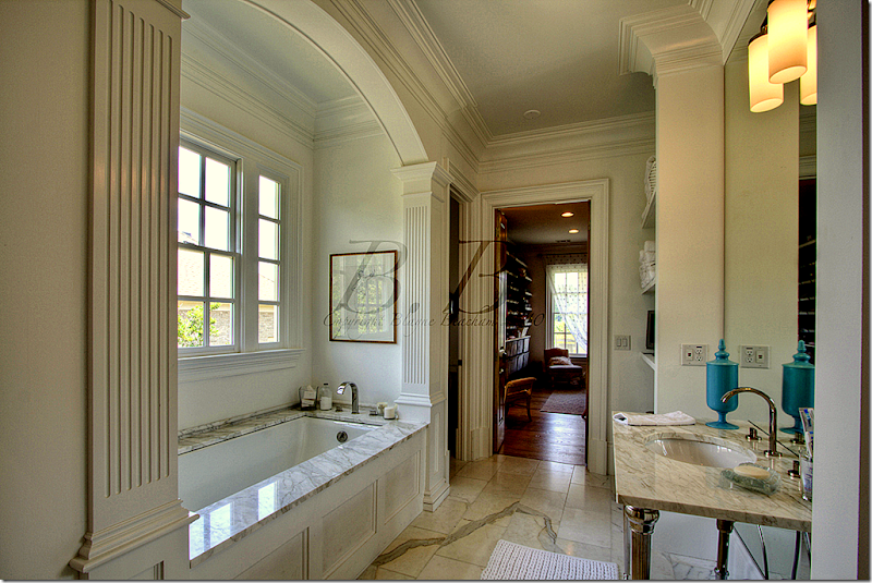
The bathroom is white marble. This side is the lady’s and it leads to her closet.
On the man’s side there is a large walk in shower with glass windows. Beautiful!
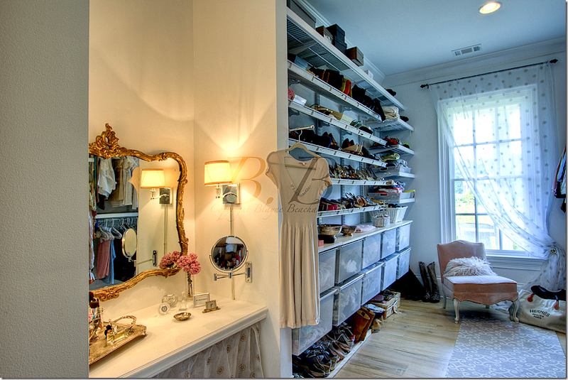
The lady’s walk in closet has its own vanity area. What a closet!
A closeup of the purses and shoes section and the vanity.
The porch off the master bedroom connects to the back porch that runs the width of the house.
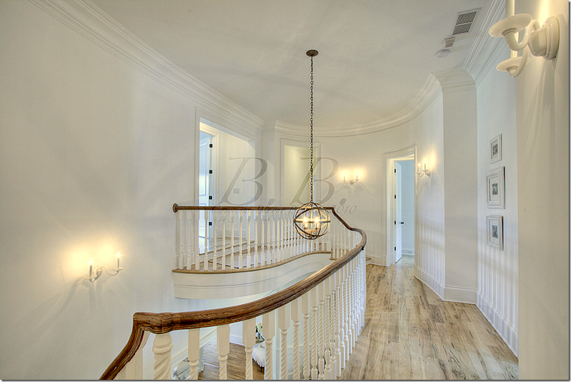
Upstairs, there are five bedrooms.
This is called the InLaws suite. It has its own fireplace.
Another view of the InLaw suite.
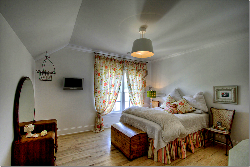
This is called the pink and green bedroom.
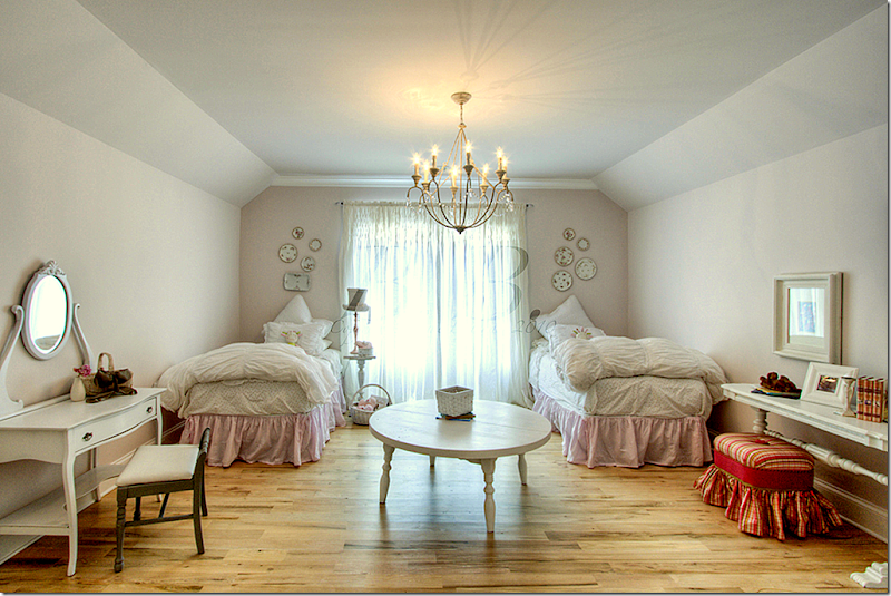
And this is called the pink bedroom.
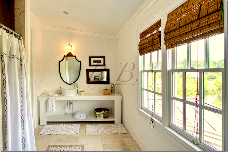
This bathroom connects to the pink bedroom. Each bedroom has its own bathroom.
This bathroom has great views out the windows. I love the vanities with their open shelf space.
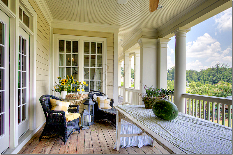
The large back porch that overlooks the yard.
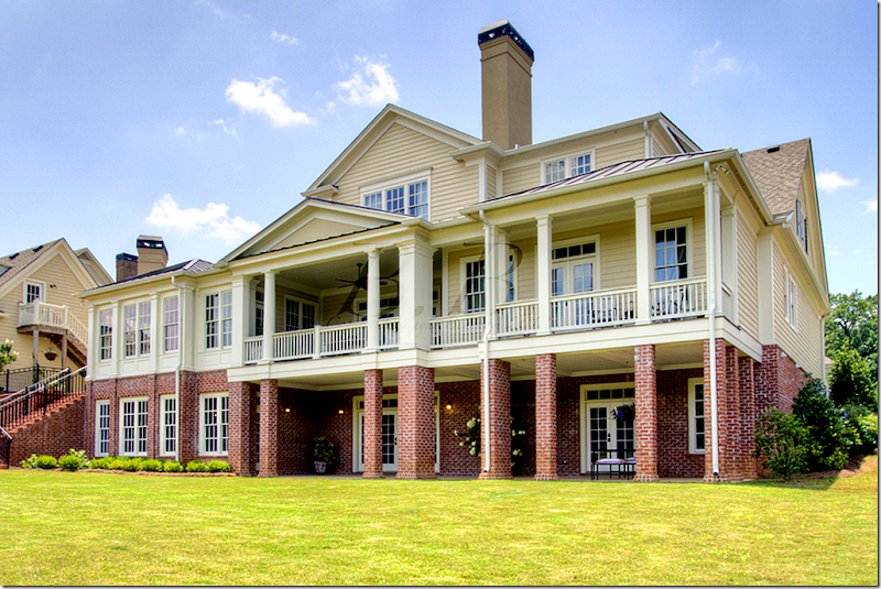
This picture of the back of the house shows the basement level and the first floor with its large porch off the living room and master bedroom. The garage is on the left.
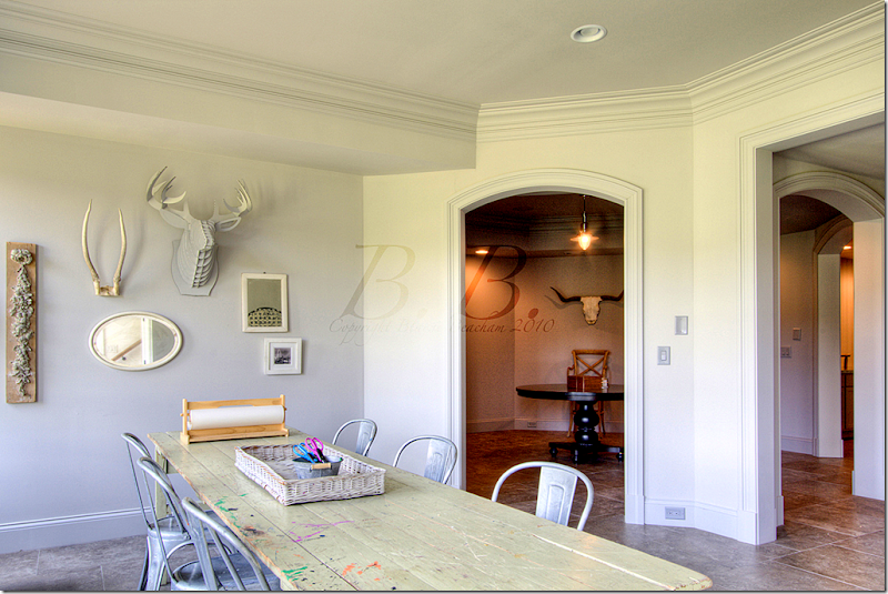
The hobby room in the basement. I can’t imagine how nice it must be to have a finished basement! We don’t have basements in Houston – it must be such a luxury of space.
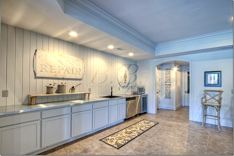
The basement has its own kitchen! Wow!!
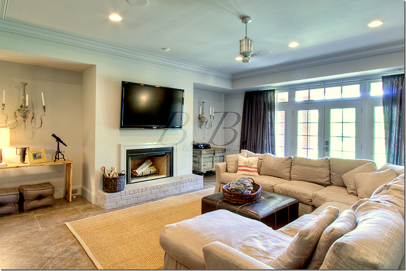
And its own media room, with another fireplace.
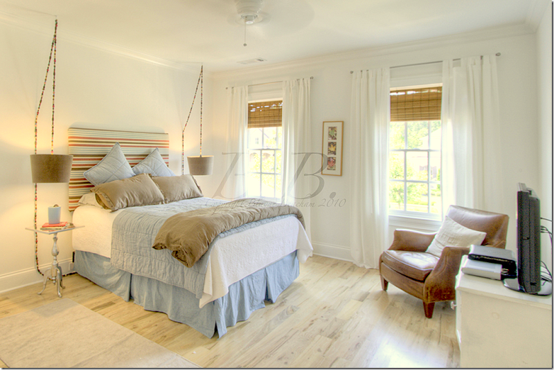
The son’s bedroom is in the basement, the only bedroom down there.
I hope you’ve enjoyed seeing this Georgian house in Georgia! Not shown is an exercise room and a recreation room. Be sure to contact Beacham Realty HERE if you want to see the house in person. And, visit Blayne’s beautiful blog HERE to read her take on the house and other houses she has taken photographs of. Thanks a million Blayne for sharing your beautiful pictures!!!!!
A Georgian in Georgia
Subscribe to:
Post Comments
(
Atom
)






Joni, I love this house. I could move right in. The wood floors are great. Thanks for sharing.
ReplyDeleteWow, what a beautiful home. I dunno if I could tear myself away, even for the beach. Glad you showed us more than just the kitchen!
ReplyDeleteBeautifully done!!! Thanks for sharing your great photos!!
ReplyDeletexoxo, Maryam
www.athomewithmaryam.com
Gorgeous home. I loved seeing such and all american type home on the outside because you just don't see much of that any more. Although the inside was very European. It was beautiful....but if it were mine...I would have the inside decor reflect more the style of the home. But not let it get stuffy. I adored the master bedroom. And the kichen was very unusual and really great and I really really liked it but not in this house. It seemed totally wrong for this house. Still it is a beautiful home.
ReplyDeleteThis is pretty amazing - and fun. Thanks for sharing this with us.
ReplyDeleteNow, here is a question - I notice this stylish homeowner is hanging the flat screen TVs right on the wall. Is this OK now? What are people's thoughts?
I agree with Nita. As lovely as the interior design is, it seems totally out of place in this Georgian style home. I feel certain that the furnishings will look much better at the new beach house. The ivy covered brick home in West U. last week had the same disconnect between the interior and exterior also. The beautiful kitchen in the Paris apartment however, was a perfect reflection of its location and surrounding architecture.
ReplyDeleteBut really, who cares? It's a gorgeous home. Thanks for posting!
Joni,
ReplyDeleteI think this house is fab. I love the edited pared down monochromatic look she has going. The restrained color palette she used to fill the house shows. Lucky people who tour the house. Do you think the home owner would answer questions; and will she please show us her next house at the beach!!!!
Beautiful....definitely the beach vibe that is their true love is felt here, which is an unexpected twist in a Georgian, its so light and airy...LOVE the floors. I also love the sons bedroom, feels totally coastal, all thats missing is an ocean view. Beautiful dining and kitchen as well.....very stately, tons of curb appeal and hopefully they will get their buyer soon so they can move to the beach. Thanks for sharing!! Beaautiful!
ReplyDeleteWow, if I had a dressing room with that lovely vanity I might never leave home! It is a very nice house but I was left with the feeling that there was too much empty space in those huge rooms. I know realtors love that but it seemed sparse in a few rooms.
ReplyDeleteomg omg omg. just perfection. really enjoyed this house, so thanks!
ReplyDeleteashley
I. AM. SPEECHLESS. By far, my favorite of all you've featured. Love the clean white walls, bleached woods, linen, sea grass, zinc, leather...the combination of modern and cottage-style and the contrast between light and dark furnishings...and the brilliantly edited collection of furnishings and wall decor. I will keep these photos for a long time! Thanks, Joni.
ReplyDeleteGORGEOUS!!!!!!!
ReplyDelete-linda,ny
I agree with some of the above; the interior is a disconnect from the architecture (both interior and exterior). As pretty as many of the rooms are, they do not fit the Georgian house. The mouldings, trim, archs, ceiling angles, etc, fight with the decor. I'm sure the beach house will tell a more consistent story.
ReplyDeleteJoni!
ReplyDeleteI SIMPLY cannot believe this house cost "only" $1,325,000! If this house was here in Canada, especially anywhere close to Vancouver or the Okanagan, it would cost close to 5 mil+! I love real estate and seeing amazing houses like this one at this price is just amazing. I know it's a lot of money, but it can't be compared with prices we have here in Canada.
if I could buy this one, I'd ask to leave as it is, because it's just PERFECT! I went through these pictures a couple of times and love every detail of this space.
Thank you so much for this gorgeous post, Joni.
Wishing you and your family a very blessed weekend!
xo
Luciane at HomeBunch.com
I just loved this house. I am used to seeing Blaynes watermark on her pics so I wasn't distracted by it...what a house! I loved the kitchen~and the front doors were amazing too. Well everything was. Not too many rugs on the floor I noticed. Seagrass in the basement.
ReplyDeleteI would love to know the colors used on the outside of the house if the owner would share! This home is absolutely gorgeous in every way!!!
ReplyDeleteThis home is stunning; I love the large rooms without a lot of clutter. I must be getting restless, though, because I am beginning to tire of this look, as beautiful as it is.
ReplyDeleteOh my gosh. Neeeed those floors. Especially the herringbone in the foyer. Also especially loved the tiny tiles in the powder room.
ReplyDeleteI'm sure they're beach home will be insanely gorgeous!!
xoxo,
lauren
Joni, What an amazing home...gorgeous! Thanks for sharing.
ReplyDeletexo,
Sherry
Beautiful house but good lord it's a little on the HUGE side no?! Too big for me personally but that kitchen is amazing! I love that it's unique and the mix of textures. Great ideas for inspiration files!! Thanks for sharing! - BOO
ReplyDeleteI wouldn't call this house Georgian in the classical sense, but it has Georgian elements. It's such a shame that the owner obviously did not hire a professional to help design the interior space. Every room looks like the owner had received in the mail a current design magazine and decided to try out a new concept. The flow of the house is terrible from a decorative point of view. The outside front of the house while spare on landscaping would cause one to believe there was something to see here. Unfortunately, Joni, you wasted a blog post on this one.
ReplyDeleteThere are simply no words. Would love to see how another owner with taste to match the asking price transforms this home. Of all the sparse, under designed, flea market looking rooms, the dressing area was the kicker. Didn't someone tell this woman to clean up.
ReplyDeleteI am right in there with my comments, like some of the above. The home is wonderful, but the decor, lacks a lot. Looks like they did it on a budget and was done by a Design Star competitor. I agree a beach house would fit there taste much better. I would take this furniture out of this house before I listed it for sale, as I feel it takes away from the wonderful details the home has to offer. If you want a contempary interior, get a space that works with that design. I for one, think it is a colorless mess. Richard from My Old historic House.
ReplyDeleteHoly Moly! At first I thought 'another way over-sized neo-Colonial Revival.' But the inside was such a surprise. Still seems huge to me (how do you live in all of it and do you ever see the other members of the family - or do you really only use a few main rooms?) While I'm definitely a traditionalist who typically wants the interior to reflect the style/period of the exterior, I really like the freshness and unexpectedness of this decoration. It may not be in tune with the Adam style architecture and all the heavy mouldings, wainscoting, etc., but it lightens them up considerably. Sure it's not historically correct, but this is not a historical house after all. And I particularly like the juxtaposition of the rough and rustic materials with the formal woodwork and the continuity in feeling with the tarnished silver and old iron and wood accessories and furniture. LOVE the floors and the kitchen (even the X-backed bentwood stool). The master bath is amazing with the arches and groin vaulted ceiling and lovely marble. The pilasters and crown mouldings don't look out of place there. While the other baths are more modern, again it doesn't bother me. They do this all the time in Europe - old shell, modern fittings. Just think how this would have been decorated ten or fifteen years ago. Personally, I like this approach. Great photos, Blayne!
ReplyDeleteHi Joni, there are so many beautiful aspects of this home, and others that are lacking. I found so many things in the home I like and others not so much. The back of the home is so warm and inviting, I'm wondering are they finished with the decorating or still in the middle of it? All of us have budgets we follow, maybe they have one and are truly sticking to it... an interesting post. hugs ~lynne~
ReplyDeleteLove the bones of this home. Was it staged for the photo shoot? Took a look at Blayne's blog. Grand job you two. xxpeggybraswelldesign.com
ReplyDeleteHey! I 'know' the owner and she is lovely. She also has her won showroom here in ATL in Miami Circle!
ReplyDeleteLoved seeing her home!
I want this home!!! It’s amazing with its elegant simplicity! I love their lack of cluttering this home up by keeping the furnishing and area rugs at a minimum, they made the furnishing stand out in this manner. They kept the rooms quiet, calm and soothing. While colonial homes are not my thing I would buy this place in a nanosecond if the furnishing came with it….and if I could afford it…lol. The photography is amazing as well. The only compliant I have is once again the TV above the fireplace I really don't like that in homes but it's a small compliant.
ReplyDeleteI just read some of the other comments and while I will agree that the interior design doesn’t match up with the exterior I feel they’ve missed the point of the design inside. Take a look at the pictures again everyone and look at the architectural detailing, it says a lot and you don’t want to over shadow that so I totally understand the subtle design, the owner let the details speak.
ReplyDeleteIt isn't Tara but I would take it !
ReplyDeleteSorry, Joni, but this house is a confusing mess! As one poster noted, this home needs to be emptied for marketing. The current furnishings look so sparse and random...it really distracts from the home itself. And quite frankly, that kitchen should be replaced. It is so discordant with the rest of the house...in this type of vast showplace the kitchen is meant to be the crowning "jewel". This kitchen is not only completely wrong for the style of the house, it is also quite small in relation to the overall size of the house. This reminds me of a lot of huge homes...size can be purchased, but good taste can't.
ReplyDeleteHow could they sell this house? I love everything about it! But that kitchen is what got me. I love it! And the breakfast room. Yes, it is sparsely decorated, but it also gives the feeling of breathing room. No need to clutter it up. What a fantastic home. I wonder what they will do to the beach house....
ReplyDeleteHey, come over and see me sometime! I have a big announcement! ~Delores
You know, Joni, I was thinking as I scrolled through this lovely post... how very influential Rachel Ashwell was on American design. It seems her style has permeated the traditional in a way I would not have thought possible when she first introduced it. While this house could never be considered "shabby", it has clear elements of the Shabby Chic style in every room. The distressed columns in the entry hall. The weathered wooden pieces everywhere. The old plates hanging on the walls. Even the faded hydrangea wreath above the dining room fireplace. And certainly the colour palette is a direct descendant of Rachel.
ReplyDeleteIn some quarters it has incorporated Swedish and Belgian flavours, but it's still greatly made up of the Ashwell style. Do you agree? Or am I nuts?
Have you ever interviewed her for the SRT?
Joni, Thanks so much for visiting me, I know how busy you are, and I was thrilled to see you!
ReplyDeleteAs always I never know where to even begin, I could write an entire post on what I love about each room you have shown us, a magnificent home!!
I do dream of having aged oak herringbone floors!
Blayne Beacham is one of my very favorite young women in Real Estate and the blog world!!
xoxo
Karena
Art by Karena
I think the commenters are a bit harsh, esp. if the homeowners never fully intended to live in the place.....furnishing and decorating a house of this size to look like a truly lived in space/home would take time....
ReplyDeleteThat said, I am in cardiac arrest over the asking price.....makes my home on a postage sized lot in Dallas look like a dump?!? I am confused and am wondering about the location b/c the price just seems so off!
Love the interiors of this home,just wonderful looking Joni.
ReplyDeleteLMF.
I enjoyed Blayne's post on this house very much and appreciated the photos when she showed them on her blog but wished they had been bigger. Ta da!!! You offered them in your customary large size and I loved seeing the rooms in large enough format to appreciate the details.
ReplyDeleteThere were some beautiful vignettes and individual pieces and I loved seeing this homeowner's style. Please thank her for sharing her home with us. Since few of us live in such a grand space with so many pretty finishes and vistas, it is lovely to get a peek inside which was so rare before the internet.
Acquired Objects, after a second look particularly at the architectural details inside the home, I am even more appalled at the decor. Adding insult to injury is not good design. First you have a very traditional exterior and mostly interior except for the bathrooms and kitchen. I agree with the poster above who said that the kitchen was completely out of sync with the house - it belongs in a farmhouse. There are no vanities in the bathrooms, only these very small, very contemporary after thought looking sinks the owner probably bought because they were on sale. The distressed columns in the foyer was my first clue that the owner had the wrong taste for this style home and boy did she not disappoint. There is not one room in this home where the design speaks to or compliments the architecture. In fact, quite the contrary. The decor is an insult to the architecture. Better to buy a home that you can afford to decorate rather than buy one you can't or buy a home where these furnishings are more suited to the home's style.
ReplyDeleteThanks for sharing this! I loved your living room re-do, by the way. I thought it was more sophisticated and prettier.
ReplyDeleteThis house is gorgeous, and I have to admit I would love to have it. But, it's hard for me to look at a house this large and expensively furnished without thinking that taxes on the wealthy are too low in this country. I'm sure the owners have worked hard for their financial security, but wow, oh wow, is that a lot of house.
I really love that antique desk and the family room is wonderful ! I have to agree that the beautiful kitchen is wrong for that house, sad because I do really like it. Love those floors! I think it is important not be too shocking with an interior that doesn't match the exterior. For the sale, empty might be the way to go.
ReplyDeleteP.S. I forgot to say, change out the antler chandelier before the for sale sign goes up.
ReplyDeleteAnyone else spot the IKEA cabinets, counter and sink in the laundry room? Well done installation.
ReplyDeleteHi Joni!
ReplyDeleteThere are some elements of this house that I love: the beautiful millwork and the oak floors. I also love some of the furniture and the kitchen, just not in that house!
I'm not a big fan of huge houses with more rooms than any human being could possibly need. How many rooms with sofas does anyone require? A keeping room? It just looks like another living room! And the "study" really made me laugh! There are no shelves, no books, no desks - how can it possibly be a study? It just looks like another living room!
Sorry, only an American could love this house. It's a hideous bricolage of everything "classy" but comes of as a half furnished marshmellow MacMansion show house. There are so many things wrong with this house. If I had the money I could think of so many other beautiful wonderful homes to buy and decorate. I'm sorry to be mean or rude, but every comment doesn't have to be positive. BTW, Joni, love your blog.
ReplyDeleteToo many rooms and not enough soul, character and heart. It would be interesting in a year or two, Joni, to compare these images with the owners' new beach property, which, one hopes, will feel like a real family home instead of a sterile experiment in square footage. Best wishes.
ReplyDeleteThis is a stunning home exterior and interior. I am speaking strictly of the bones of the house. This abode exudes the casual, aristocratic southern lifestyle that we have viewed in many design books, magazines and movies of the past. That being stated .... now to the interior design aspect of the house. The interior certainly lacked the pizzazz needed for this type of home. Not that the interior had to be strictly traditional but it just did not speak to me nor arouse my interest. It was stark, sparse, bare and meager (as if no life existed within its walls). And I have to agree that the kitchen design was a disconnect. In one regard I don't mean to embarrass or hurt anyones feelings .... heaven knows I could never afford anything like that but if I could I would decorate it differently.
ReplyDeleteComments regarding the size of the home and whether or not people who should buy them is not the issue. These comments comes from the "jealous, class warfare" sector of our population. People should be able to have what they can afford. I haven't seen any criticism of the expansive homes of celebrities which have been shown on this blog nor of highly successful designers. The real issue is the decor. The decor is totally wrong for the house. The fireplace in the living room which is painted brick is not at all Georgian. It looks like it would be a better fit on the patio. This house has spec builder written all over it. Perhaps well built, but full of gimmicks.
ReplyDeleteWell, I'm not jealous.
DeleteWhen we lived in Georgia, we could afford a rather large house, so we bought it (complete with the walk out basement and basement kitchen). And we hated it. Sometimes, it was hard to know if someone else was in the house or not. It might take 10 minutes for my kids to find me - I know, 10 minutes - but it seemed really long for them.
We left Georgia and moved to San Antonio. We couldn't immediately find a house so we lived in a 3 bedroom apartment for a few months. It convinced us. Our family likes to be together. We are often all four (or maybe 3) on the couch together - and my boys are over 6'! We just like being together. So our current house is considerably smaller - and our next will be even smaller.
Bigger isn't necessarily better.
Libby
Disclaimer - i'm not posting anon for any other reason than i don't have a google ID.
ReplyDeleteI have to agree that the house is totally random. I like some of the rooms, but the kitchen doesn't go, the rooms are devoid of character & it looks like it was done on 1/2 a budget?
I agree that I think it's a house Americans would like.
There must be a book out, how to decorate your McMansion.It's pretty obvious the homeowner doesn't "love" her house and was ready to move on.It shows.The huge island in the kitchen shows a bar stool but is there an overhang to the counter? And, for pity sake, put a rug pad under thin rugs on hardwood floors.
ReplyDeleteAll out gorgeous! I'm sure glad she was willing to share more than the kitchen! I'm dying over the herring bone entry and the columns. Wow.
ReplyDeleteP.S. The shades in the bedroom drive me WILD! Why are they hung at different levels?
ReplyDeleteMy favorite was the slipped settee--WOW--what a beauty. And those zinc countertops were special.
ReplyDeleteJoni, thanks again for a great post. More images are going into my "future plans" file.
OK, now where do I start? I agree that the interior decor does not exactly match the exterior architecture. But, does it necessarily HAVE to? Does this home need to be historically correct or a period home? The interior architectural details are also amazing, by the way. If this were my home, I probably would decorate it a little differently & some rooms do appear a little sparse (to me). The decor, as is, is overall more in keeping with a coastal home. But there's something to love in every room, I feel. A home should ultimately reflect the owner's personal taste & style. No one else has to like it. This is where you get to "have it your way". (With that being said, I probably would have "staged" the closet in the master bedroom a little differently for the real estate photos. Keep in mind, however, that this comment is from a woman whose own closet is in need of some serious help!)
ReplyDeleteMy kind response to this being "too much house". Now without personally knowing this family, how do we know this? This could be a blended family, extended family, etc. living in this home. How do we know that these people don't "give back" to their community in some way. I say if they are honest, hard working people who do "give back" in some way, then enjoy this home and the next one on the beach. (Just my opinion since everyone's commenting.)
But, it's hard for me to look at a house this large and expensively furnished without thinking that taxes on the wealthy are too low in this country.
ReplyDeleteHey, maybe we should force them to let other families live with them like in Dr. Zhivago? You're comments say more about you than the owners of this house.
Breathless! What a gorgeous house. Joni, you always find such fabulous homes to share with us. Thank you. So much beautiful detail.
ReplyDeleteI think I could live in that closet. And the decor - understandable since the owner is moving to the beach...the simplicity and lack of clutter shows off the house better (but I would have gone a different direction with the kitchen).
Lauren
This wasn't the best interior you have shown. Some of the rooms looked almost empty. A few looked crowded and unedited, but they may have depicted real life and the personal choices of the owner. The chair paired with the Eames chair seemed wrong, but my husband loves his Eames chair and I love my overstuffed chair and that pairing would functionally work for us. There were elements I liked, especially the little striped stool in the pink bedroom which reminded me of the Pate Meadows tuffets. Sometimes it works when the interior and exterior have a different flavor. I don't think this one pulled it off.
ReplyDeleteAnon.4:26, you are so right. It doesn't matter whether they give to the local "community chest" or "pass go" and don't give a dime. It's their damn money. That being said, the comments about the size and cost of the house is not relevant. This is a design blog, not a leftist, redistribution of wealth political blog, so let's stay on topic.
ReplyDeleteThe design is underwhelming. Is it because it represents the taste of the owner, or is it because it represents what the owner had left after purchasing the home.
It appears to me that it is a victim of "blog decorating". You know the people who see something on this blog or a multitude of others and cherry pick ideas without a single thought to continuity or flow. I think this is a prime example of blog "fall out". This is why bloggers should be more circumspect and discerning when posting.
Joni! What's not to love about this home! Love love...but a few surprises I loved even more...the little tiles in the powder room..a modern touch...love.....and the draping table runner on the back porch table! Love.
ReplyDeleteAnon 4:26 It does remind me of blog lands greatest hits, gone wrong, however, I have a file of what not to do and I find it useful. I bet Joni was silently screaming about the size of the rug under the breakfast room table among other things. Due to its' size, the house was a bear to stage and it shows.I'm so happy my house isn't on tour next week!
ReplyDeleteOh for pity's sake, what kind of fool has a lobby in their house? And how are you going to teach the maid how to vacuum the "trains" on the dining room curtains?
ReplyDeleteI stand behind my previous comment. And Anon 5:49 is right. This IS a design blog, and we Should stay on the subject. I only included the comment about giving back (there's ways for everyone in every socioeconomic level to give back btw), because some do have a problem with those who are able to afford a home of this size. That's all until the next great post from Joni. Have a wonderful rest of the evening!
ReplyDeleteAnon. 7:38, there is not a rug in the house that has been sized appropriately for the space. Take a look at the keeping room with all the furniture crowded onto the undersized rug. This is not a great expense. You can have a rug cut and bound for any size room, you don't have to buy standard sizes. A decorator could have chosen the appropriate size for each of the rooms where rugs were used and it would have made a huge difference in the warmth of the room. If this owner truly has a booth at the Atlanta Design Center as one commentor has said, this story is all the more amazing. Like many posts before this one, either Joni could care less about the quality of her post, or this represents what she believes is good design. I have to chalk this up to the Houston heatwave.
ReplyDeleteAs an Australian who loves your blog, I am amazed at the size of this house and the apparently low cost - something like that in Australia would cost between 5-10 million or even more, depending on the location. However, I don't think there is much of a market for such big houses here.
ReplyDeleteLike other non-American readers, I find it hard to justify the need for a house that big and showy. It's seems that austerity should be promoted more, especially when America is in debt to the rest of the world and possibly going to default on its loans next week, which could badly affect the rest of the world. There seems to be something very wrong in your country.
Kate in Australia
Anon 8:17, I agree and disagree. All the rugs are dead wrong among many things but this post is of great value. It is by studying what is both beautiful and injurious to the eye that one develops a sense of scale, taste, and appropriateness.It can be learned but the "lucky ones" are born with it. I kept looking for Jeb and Ellie May in the family photos.
ReplyDeleteYes,Kate in Australia, there is something very wrong in our country and its name is Barack Obama.
ReplyDeleteAlright Kate in Australia, get a grip on yourself and let's not place the entire U.S. debt on the shoulders of one homeowner. Just because the U.S. government has issues with debt doesn't mean that those who have worked hard to earn good living and can afford a large home should move into a one room shack. If you're so displeased with the U.S., perhaps you should keep your web browser pointed to Australia.
ReplyDeleteThis comment has been removed by the author.
ReplyDeleteThis is an incredibly beautiful property, and as Kate says, at least from an Australian perspective it looks amazing value.
ReplyDeleteHowever, I'm not too keen on the kitchen!
Thanks Joni for another fun post. I love the painted fireplace in the livingroom, even if it isn't correct for the home. The great thing about building your own home is that you get to choose what you want and build to your own taste... however if you follow all the trends you may have trouble selling it later. The floors are so beautiful and the detail in the home is amazing. I wish the owner lots of luck and hope that they will share their new beach house with us as I think their style will be more appreciated there.
ReplyDeleteWhile I agree that the kitchen has a different feel from the rest of the house, it's the only room that has feeling to me. This huge house is lacks soul and heart. It feels like a jumble of tear sheets put together without a passionate vision. I much prefer rooms such as your own living room waiting to become that killer library it was really meant to be for you to live in.
ReplyDeleteI absolutely love the interior design and furniture type/placement.
ReplyDeleteDoes anyone know what kind of wreath is hanging above the dining room mantle?
Just stunning. Thanks for sharing this with us, Joni.
It's evolved into a bonafied Georgian hair pulling fest, land sakes alive! (Barack is also in the middle of this, somehow.)
ReplyDeleteBTW, what's up with the dining room rug? Is it a blanket? Quelle intrigued, actually.
Keep Calm And Carry On...resume hair tugging.
It wasn't until the very last photo, of the son's bedroom, that my eyes perked up.
ReplyDeleteIs there anyway you can tell me the treatment they used on the cords to hang the bedside lamps? It's whimsical and beautifu1. I have just the place for this...if only I knew what it was.
Thanks.
Looks like they placed beads over the cords on the boys lamps and then put on the plug.
ReplyDeleteThe wreath above the mantle
is most likely dried green hydrangeas.
...first of all...anyone living in the atlanta area will tell you...home prices here are very very very reasonable... way below the ntional average...if you have the money...you can have a very large and amazing house...there is simply no comparing atlanta with california...new york...washington dc...second...it seems to me that perhaps the homeowners have already moved many of their furnishings...rugs...books...even some furniture...the house looks empty more than just spare...this is a place that seems to say "i have been staged to sale"...in any event...as in life...there are many aspects to the home that are appealing...others not so much...
ReplyDeleteNeeds more beige...Blech!
ReplyDeleteLaney right on!
ReplyDeleteI've been out of town and out of touch for a few days. Wow! Rough crowd.... According to Joni's introduction, the homeowner took a house that was unfinished and standing vacant for years and did a marvelous job finishing it. The architectural detailing and finish work is beautiful. Its formality is part of the Southern aesthetic. That being so, we all live more casually than in the past, and that's reflected in the interior. Can't imagine how painful the comments must be to the homeowner.
ReplyDeleteDear Joni,
ReplyDeleteI discovered the house on Blayne's blog already and I loved it!! The owners have a incredible taste! The paneling is awesome and I just love all the English styled chimney pieces! This house is definitely my style.
The kitchen looks very Belgian inspired! Congratulations to the owners of this house and I do hope that it will be find soon a new owner who has respect for all the work the owners have done! And thank you Joni for the big photos on your blog!!
I wish you a wonderful Sunday!
xx
Greet
There seemed to be quite a few overly critical commentors in this post. I'm not sure how this house and disparaging remarks of the United States relate.
ReplyDeleteWe all have different tastes and you may or may not like the decore of this house but I felt a few comments were just "sour grapes".
It's always interesting to see how people decorate whether we agree or not.
Naz, sour grapes you say? If I understand the term correctly, to have sour grapes is to be jealous or envious. I don't see that in any comments except perhaps those that have criticized the home's size. In addition to those comments, are many that observe the decor being sparse (it could have been staged that way, who knows?), inappropriate for the home and its architectural style and randomly put together. Yes, people do live more casually now, including in large homes but that is not to say that casual equals flea market taste.
ReplyDeleteBlayne really took some beautiful pictures of this house.....I loved the settee in the entryway.... Was that linen surrounded with organza on the skirt?????? Love that! Also loved the kitchen. I can see why you wanted to see more of it!Maryannexo
ReplyDeleteI posted the first comment which stated this was a house only Americans could love. I didn't say that to be xenophobic but only because this is the type of architecture which is the product of a particular time and place in American culture. America is the birthplace of the McMansion and I believe at this time the idea that a certain class of American can just pick and chose randomly from different cultural traditions (Beligan, Italian, French, English were a few from this home I can mention off hand), shlep them together and produce a "desirable home" is the basis of a certain prominent trend in home decor. This house does not in anyway seem desirable or homey to me and outside of North America (I'm living in Canadian and so I stand corrected, McMansions have been imported here with great gusto) you'd be heard pressed to find someone who would actually want to live in this "Georgian". I stand by my original comment: this house is inexcusably wasteful, self-indulgent, uninviting and soulless.
ReplyDeleteSherry
Cudownie...piękna rezydencja hmm......
ReplyDeleteSherry, coming from a country which gave us socialized medicine and whose citizens flock to the US for medical procedures, I have to disagree with you. The McMansion concept is truly not at play here. There are plenty of homes far larger than this one. Have you been to L.A.? I think the issue is not staying true to the basic tenets of the architecture. It is offensive to the eye for what it did not live up to, not for its size. The house has potential and a new buyer will negotiate a price to make the potential a reality. I hope we get an opportunity to see what the new owners do. If you look at the unfinished photo of the living room you can see that the original owner/builder as the case might be, was actually going to install the appropriate fireplace design. it was obviously changed to something far less grand and far more informal than what appears to be in the original design. I don't think the current owners understood what the house required, but I also don't think that you understand that coming from a country hell bent on socialist concepts your observations are inaccurate and offensive. If the owners can buy this house, good for them. I only wish they had decorated it to truly reflect its beauty.
ReplyDeleteSeriously, wire hangers?!? Who are these people?!? One less slipcover and they could buy 60 wood hangers
ReplyDeleteWow, this house feels like a dream! =) Thanks for sharing!
ReplyDeletehttp://bloobreyplace.blogspot.com
"But, it's hard for me to look at a house this large and expensively furnished without thinking that taxes on the wealthy are too low in this country."
ReplyDeleteThe "wealthy" who already pay more than 99% of the taxes in this country? The "wealthy" who directly drive the economy that every single person in the US benefits from. Really?
And since you're criticizing someone for being "wealthy" and owning this home, I'll tell you that there are many, many hardworking "regular" people who are being overtaxed and own homes much more expensive than this one. For the $1.3 million this house is listed for you couldn't buy much of anything in any major city in this country -- New York, Chicago, all of northern California, Los Angeles -- and Houston! $1.3 million will get you a tired three-bedroom ranch home that needs a lot of work in Silicon Valley. So are the people who own those very regular-looking homes wealthy?
Envy is ugly even on a blog.
Anon. 6:33, you are so correct. Envy is ugly, but unfortunately succeeding in our political and social-economic environment. I wonder just who initiated that conversation. It seems I recall it was initiated by someone living in one hell of a large house whose color happens to be white.
ReplyDeleteJust a thought here but I feel like this has gotten sadly personal.
ReplyDeleteThis isn't a show house or a picture from a designer's portfolio. This is someone's home and they obviously put a lot of time and effort into decorating it. They didn't ask Joni to feature their whole house -- they just sent pictures of their kitchen. Joni asked them if she could post the photos of the rest of the house.
We all have different styles and different tastes and comments about layout and style and architecture are great here. But the very personal criticisms are inappropriate.
The people who own this home can spend their money any way they want. None of us have any idea how they made that money and, unless they stole it, they have every right to buy this house or any other house that suits their family.
And just because you don't agree with their design choices doesn't mean that you need to attack them for making those choices.
I think if most of us were honest, we'd admit that we should only be so lucky as to live in a home -- complete with its flaws -- as lovely as this one.
What a wonderful work of the silver mixed with rough wood. Awesome and great collection of chandelier in each and every room. The staircase lobby is beautiful with the curving lines.
ReplyDeleteTo me the house looks cold and empty!! But thats just me.
ReplyDeleteThanks for the post!
Great post as usual - you do a wonderful job finding homes of interest. To me this home is perfectly decorated. While the exterior might have a slightly pretentious aura, the interior projects the perfect mix of elegance and warmth. The rooms are homey and not overly decorated and I love the rustic kitchen. The decorator is truly talented.
ReplyDeleteJoni, you are fabulous!!
Janice
A lot of interesting comments. This IS a design blog, and this particular home falls far short on many basic design principles. Despite some remarks on the perceived wealth of the homeowner, it actually looks like they may have underestimated the cost of bringing this home to life. There are many very cheap elements (the site built "vanities" with ceramic tile tops, the home center type single light fixtures above the bathroom sinks, etc.) The vastness of the house is quite apparent because it really is not decorated or properly finished. Had it been done well, it would be stunning.
ReplyDeleteHaving run out of homes in West University, it looks like Joni turned to Roswell, Ga. The facade of this home is so fresh and inviting, the back needs paint on the brick to match the house and some serious gardening. Once inside, the reader can only ask "why" was this house featured. The zinc countertop looks like it was the fabricator's first attempt to install this material and as one comment above notes, the on site vanities with ceramic tile would suggest that perhaps the owners may have done some of the interior work themselves. The flimsy window treatments in some of the bedrooms looks like a DIY project gone bad and the columns in the entry are just plain tacky. This is a new home and well selected antiques would have been a beautiful addition, but trying to take new materials and beating them up to make them appear old is simply offensive to the eye. Joni does the owner here no favor by posting these pictures.
ReplyDeleteTo Kristi 10:08 8/31 -
ReplyDeleteTouche, Very well said. Totally agree with you.
Janice
Kristi:
ReplyDeleteI mean 10:08p.m 7/31. Sorry!
Janice
no need to comment an indictment of America and our government over a blog post people... it is a house ...it is a free country here you can have the outside look like a Cotswolds cottage and the inside look like a mid-century ranch.. no one cares ... so the rugs don't fit the space? quell horreur!! no one cares do what you please for God's sake you are all taking your selves too seriously .. no one cares
ReplyDeleteAnon. 5:41, no one is taking themselves seriously except the person who sent these pictures to Joni to be posted on her blog. Go public and expect to get public opinions. Your opinion is just as good as the rest of us so go have a little toddy and cool off a bit. If you don't want both praise and criticism, stay off design blogs. It really isn't rocket science or at least it isn't to most of us.
ReplyDeleteI rarely read the comments and I now know why. The pure nastiness here and there is astounding. I wonder if some of the anonymous commenters will be brave enough to show their more "tasteful" homes..
ReplyDeleteWow I've seen your blog on so many blogrolls I just had to come check it out and I love it. But what I am shocked by is all these controversial comments. Blogs are sapposed to be about personal inspiration and sharing and noone is forcing anything on anyone. Everyone has personal taste and if you don't like something you don't have to say anything especially on a blog comment. I have only the highest praises for your blog and I LOVE the floors in this house. The key to happiness in life is finding the good in everything! Hope you pop over to say hi too!
ReplyDeletexo
Sharon
www.fashion-isha.com
Nice shoots. Lovely.
ReplyDeleteVery nice house. Love it
ReplyDeleteGORGEOUS!
ReplyDeleteWish I could have it.
Thank you for sharing such a beautiful view of house here with us.
ReplyDeleteWOW.... some people just don't get it. Absolute perfection. Thank you for sharing.
ReplyDeleteYou mentioned that the owner's hearts were at the beach, and looking through this house, that is clear. It has a very elegant beach house feel to it.
ReplyDeleteI don't "get" some of the negative comments...first, the owners really didn't live here that long, so I can assume that their "to do" and "to buy" lists still had some things on them. To pull together so many rooms in such a cohesive fashion was no easy feat.
How utterly divine, four members of PARTY CASINO POKER FAMILY have shown up to anoint the comment section with their home fashion expertise. I suspect one of these bedrooms belongs to each of them. Ha Ha Ha - very funny indeed.
ReplyDeleteOh, my goodness. I have to agree with some of the other commenters who said there's no need to be so mean.
ReplyDeleteWhat good comes out of making a rude comment? Particularly knowing the poor owner is probably reading it? Does it make the world a better place or spread joy?
No. It allows the nasty commenter to feel superior for one brief minute and that is all. How sad.
To those who have insulted Joni for "another wasted post" -- have you NO shame? Do you pay to read this blog? No, you do not. Do you have one of your own we can take
potshots at and insult you personally?
Joni, once again thank you for all the work you put into your lovely blog and best of luck to the owners selling their home.
The price is great for Atlanta, though this community is in Roswell. A similar McMansion in Atlanta would likely cost more.
ReplyDeleteWhat in the world is wrong with you negative people?? This house is a work in progress and looks amazing. The homeowner has not even been able to finish the house and the pictures were not fussed over for hours to get them to look like a magazine -- they were originally done for real estate to sell the house. Real people, with real feelings live in this house. Also, this homeowner does not have a showroom anywhere. She is a regular person, just trying to enjoy her own home.
ReplyDeleteRegardless of how anyone feels about the decoration of this home or its appropriateness for the home's style, certainly one posting on line photos with a real estate agent would have had the presence of mind to tidy up the closet a bit and maybe borrow some furniture for the foyer. Perhaps someone staged the home and if so, there was far too much editing. The closet could have been organized so as not to make it look like attic storage instead of the wonderful walk in that it is.
ReplyDeleteWell, i want to chime in here. you all know that i don't moderate comments - unlike 99% of other blogs who do. So, i do tend to get a lot of negative comments - which then feed on themselves. Still - you hate what I do, my house, fine. comment all you want. but when someone is nice enough to share their beautiful house with us, try to remember that they will also read your comments. I do happen to really like this house or I would not have shown it. I thought the kitchen was interesting - different than just another typical huge custom kitchen. I like her furnishings and her accesories. I do like quiet houses without much color or pattern. that's personal. I just do. I welcome negative comments when they are thought provocking or when they add something we can all learn from. I happened to like the discussion about america and mcmansions. But just to tear something down because you just really don't like me. Well, it's rude, imo. And no, i haven't run out of West U houses to show. there will always be more houses to show. some you will like, some you won't. but try to imagine the homeowner when you bashing their home, that's all i ask.
ReplyDeleteas for this house, the owners lived here just 8 months. she didn't have time to finish furnishing it completely. she didn't use an interior designer - she did it all herself. they knew they wanted to move to the beach. still, i think its lovely and so much nicer than others i have seen in magazines and real estate brochures. I can't wait to see what they do at the beach and i hope she will be nice enough to share it when it is built.
...and all God's children said...AMEN
ReplyDeleteInteresting that Joni saves her comments until she has a new post on coffee tables.
ReplyDeleteYou say the owners finish a home that has been sitting for three years, then live in the house 8 months and decides it's the beach they prefer. I would say that kind of rational planning accounts for the interior of this house - shot from the hip. It is quite clear that no decorator was used or at least no decorator would dare put their name on it.
If the owners didn't plan to live in this house, why finish it in the first place. I suppose one can make any excuse one wishes as to why the furnishings are spare. It is not the lack of color here, Joni, it's simply the lack of . . . . . (you can fill in the blanks). There is no relationship between one room to the other and the furniture looks like it came from one of those big box warehouse stores - very randomly chosen and meaningless. Yes, we are waiting with baited breath for the beach house to show up. Perhaps it will be more compatible with the owners' taste than this house in Georgia.
I actually live just a few miles from this home. Several years ago there was a tour of home for Roswell Womens Club. I did some of the faux finishing on one of the homes in the tour. One must see the homes in person to appreciate the scale and architecture of the homes. This is a special home decorated by a special person. I love it! I would think it only fair that the mean anonymous blogger share her home with us. Learn some manners.
ReplyDeleteThey say everything is bigger in Texas, well come on over to Atlanta, we would love to have you stay a spell, we have lots of room!
Anon.6:42, just which mean Anon are you referring to? There are many anon posters who have stated that this home fell short of its potential. This blog post was not about the lovely character or lack thereof of the owner, it was about taste and the appropriate design concept for a lovely house like this one. You obviously can't separate your personal feelings about the owner long enough to be objective about the empty rooms, diy window treatments, contemporary bath fixtures in a traditional home, farmhouse kitchen in a traditional home, empty rooms, flea market decorating, and the empty foyer which is the first thing one see when entering a home. It is apparent that the homeowner decorates on the fly at week-end yard sales, monthly flea markets in Atlanta, or in the county in which this house is located. Some people find great joy in doing this, but don't publish the results without expecting some comments from people who know a bit more about design. The first indication that this was not going to be an interesting post was the empty foyer - who would do that???
ReplyDeleteI know this goes down hard with you as you obviously are friends with the owner, but be honest here. There are no pieces of furniture or antiques ofenduring quality here. So sad that the owners did not bite the bullet and hire someone to make this a showplace. The house is lovely. The bathrooms look like after thoughts but that can be changed easily by new owners. The rest of the house has a lovely floor plan and great garden potential in the back. I hope the owners learned some valuable lessons from this home to incorporate in the new beach house.
Does Anyone know where the slipcovered chairs came from in in the living room?
ReplyDeleteAmazing home! Hoe could you just show the kitchen? By the way, loved how there are chandeliers through many rooms. Job well done :)
ReplyDeleteThis is a very good blog and I like it alot. This post is very well written. Thanks alot for writing good quality posts.
ReplyDeleteNice wooden floor and structure.
ReplyDeleteI would like to move in that house right now.
ReplyDeleteI went to this open house a few weeks ago and this house is absolutely gorgeous! Every single inch of it! They painted the foyer walls a silvery green color and the ceilings in the living room as well. The floors are to die for!
ReplyDeleteThey took out the columns and things the owner will be keeping. Like the antler light fixture and basket light in the kitchen. The new chandeliers are gorgeous too! The last picture of the boys room is actually one of the 5 bedrooms upstairs. There is a another master bedroom suite in the basement that is not completely finished.
The kitchen is beautiful! They changed out the zinc countertops to a granite. They also added a mirror into the moulding above the fireplace in the dining room.
I love everything about this house!!! I hope you get to show pictures of their beach house! The real estate agent told me they are building the same house only a little smaller in Charleston, SC! I would love to go shopping with the owner. Her taste is impeccable!
Such a nice large space!
ReplyDeleteREALLY APPRECIATE.....
ReplyDeleteWELL DONE..
ALL THE BEST FOR FUTURE......
That first house had the most gorgeous wood flooring, and ceiling treatments, and breakfast room. Wow!
ReplyDelete