Elizabeth Munger, an interior designer from Houston, emailed me with a few pictures of some kitchen renos for the Readers Kitchens series. But, after looking at Munger Interiors’s web site, I was so impressed with their portfolio, I wanted to show it all! Elizabeth and her sister Amy started Munger Interiors in 2008. Besides interior design they also offer full service advisory for art acquisitions and collectors. Here are several projects Munger Interiors worked on recently – some of the rooms have “before” pictures. Enjoy!!!
THE FIRST HOUSE IS LOCATED IN THE WOODED AREA OF MEMORIAL:
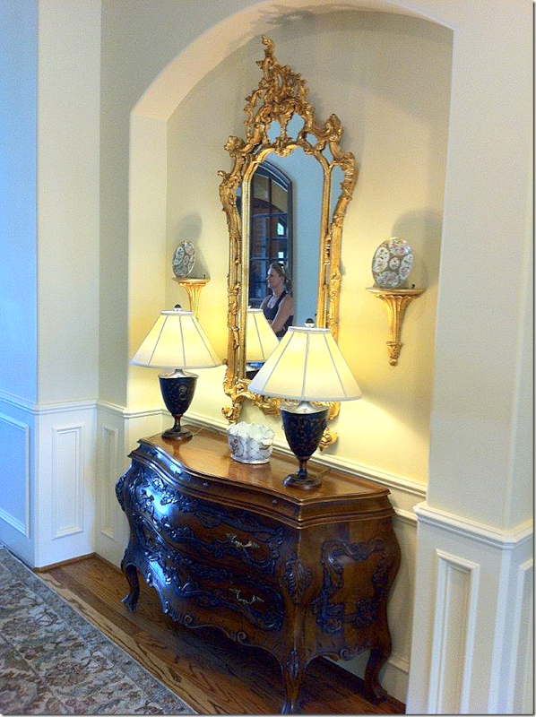
BEFORE: the entry hall and house was rather dressy.
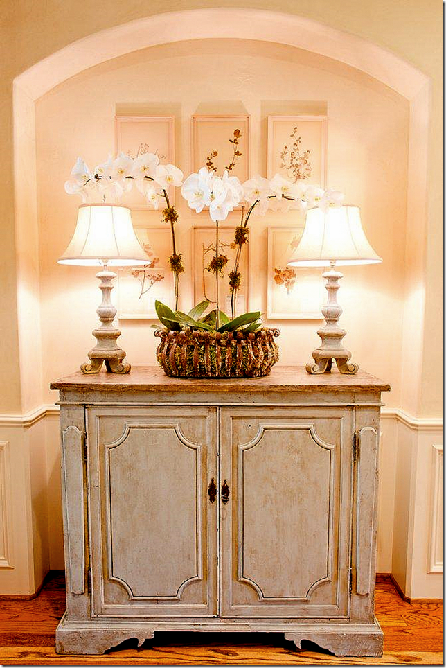
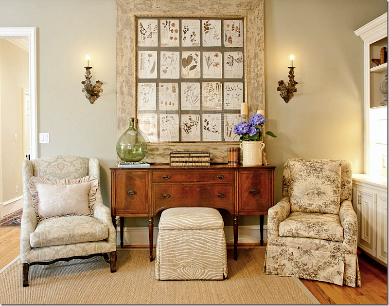
AFTER: Today, the space is casually elegant, though less formal. A set of herbiers from Watkins Culver take the place of the ornate mirror. French styled painted wood lamps sit atop a painted cabinet, also from Watkins Culver. I adore this newly designed entry! Leslie Sinclair of Segreto Finishes plastered the walls throughout.
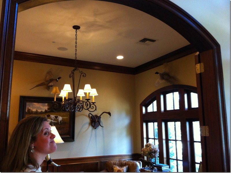
BEFORE: The study seemed very masculine with stuffed birds and hunting dog prints.
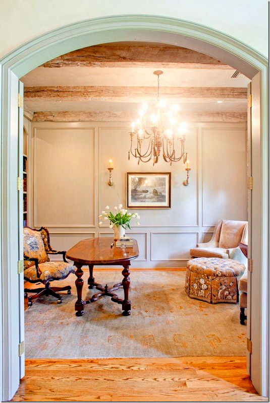
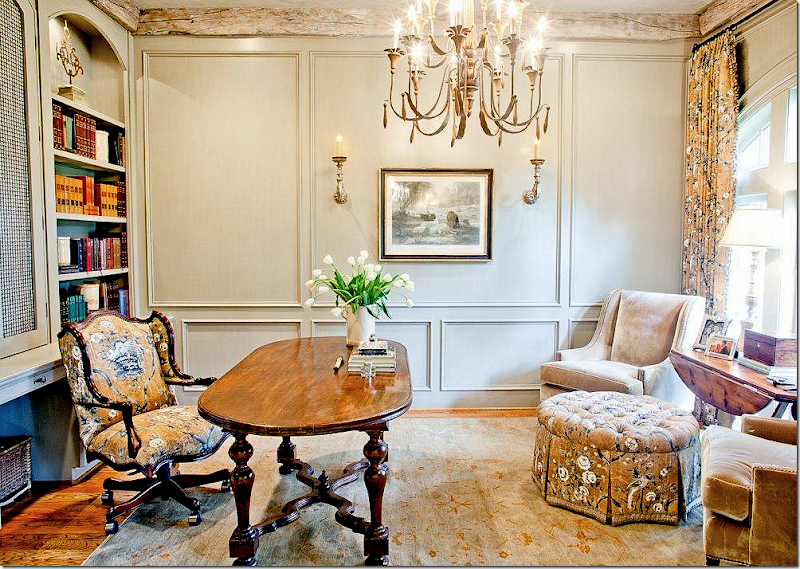
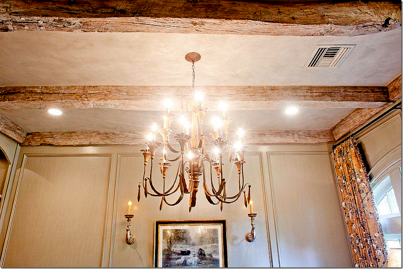
AFTER: The space was completely redone. The room was paneled by Custom Cabinets & Wall then painted “Intellectual Gray” by Sherwin Williams. Rustic ceiling beams were added. The Pierre Frey fabric on the ottoman, chair and curtains is one of Charles Faudree’s favorites. French accessories came from Joyce Horn and the desk is from Shabby Slips. Potter Construction was the contractor. Segreto did the plaster ceiling and the finishes on the the cabinets and paneling.
BEFORE: The chair was recovered and the rug was replaced.
The desk chair looks so much better now, upholstered in the Pierre Frey fabric. That desk!!!!!
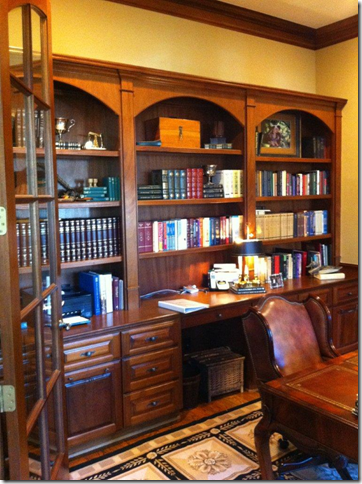
BEFORE: the book cases were nice, but busy looking.
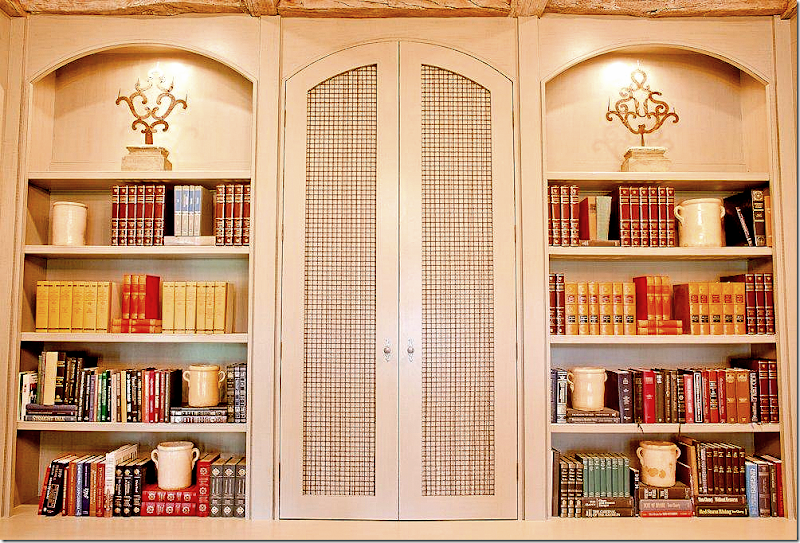
AFTER: Leslie’s finishes really make such a huge difference in a house. It’s hard to see how beautiful her work is on the computer – but her plaster and finishes are the best in Houston. Leslie has a book coming out this September and I can’t wait to read it! The desk is really special – just gorgeous.
Closeup of the bookcases. The more unattractive books are hiding in the new enclosed section. And yes, some books are not quite as pretty as others.
The beams are incredible looking! So antique looking!!
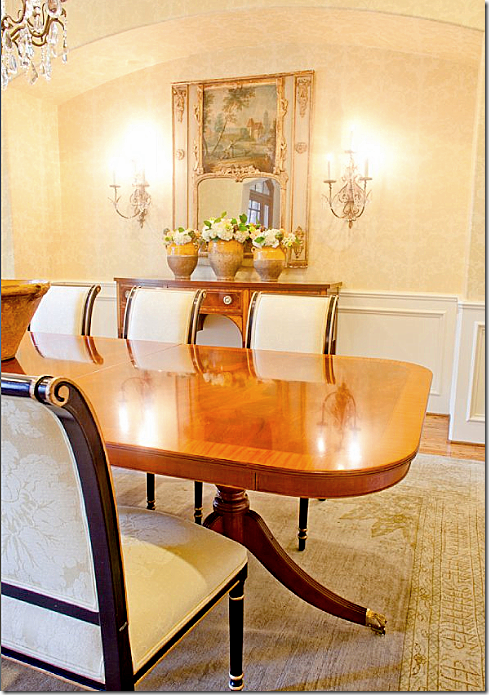
The dining room received a rug from Carol Piper while the sconces are from Vieux Interiors. The trumeau came from an antique sale.
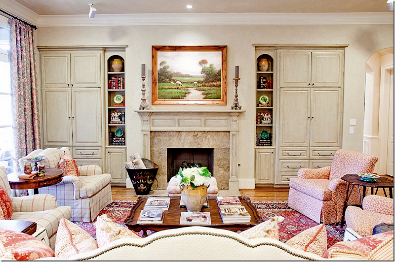
The family room has a definite French feel to it. Again, Segreto Finishes make all the difference with their softly fauxed cabinets and mantel.
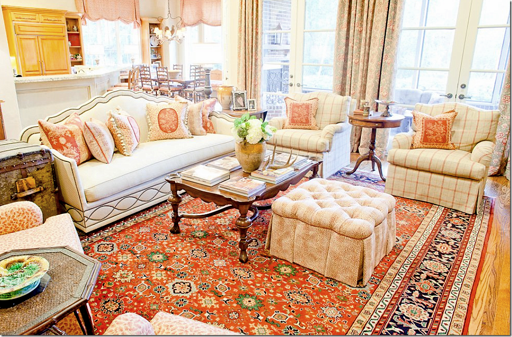
The club chairs are from Shabby Slips – the right pair wears a Cowtan and Tout plaid and the left pair wears Bennison’s famous linen leaf fabric. Pillows are Marvic and Cowtan and Tout. The sofa is custom.
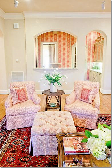
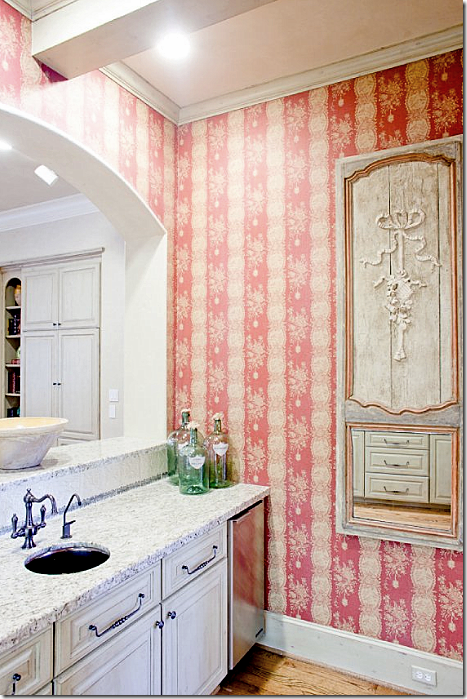
Here, the family room looks into the wet bar with its raspberry Marvic wallpaper. So cute! Custom Cowtan & Tout ottoman.
The trumeau is gorgeous – from Joyce Horn. Gorgeous hardware throughout.
NEXT THIS HOUSE IS LOCATED IN WEST UNIVERSITY-HOUSE #1:
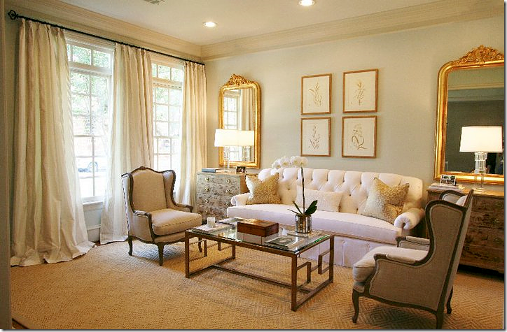
You know I’m going to love this house with its monochromatic living room! I love the touch of gilt in the contemporary Mecox coffee table and Louis Philippes. Sooo pretty!!!!! It’s elegant and dressy, yet youthful and not stuffy at all.
The paint color is Aloof Gray by Sherwin Williams. The wing chairs and chinoiserie chests came from Carl Moore Antiques. Prints from Vieux Interiors and the lamps are Circa. The rug is Stark.
Custom drapes are made of fabric from the Silk Trading Co. The sofa has such gorgeous lines. What a beautiful room.
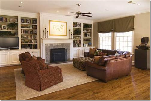
BEFORE: the typical fireplace.
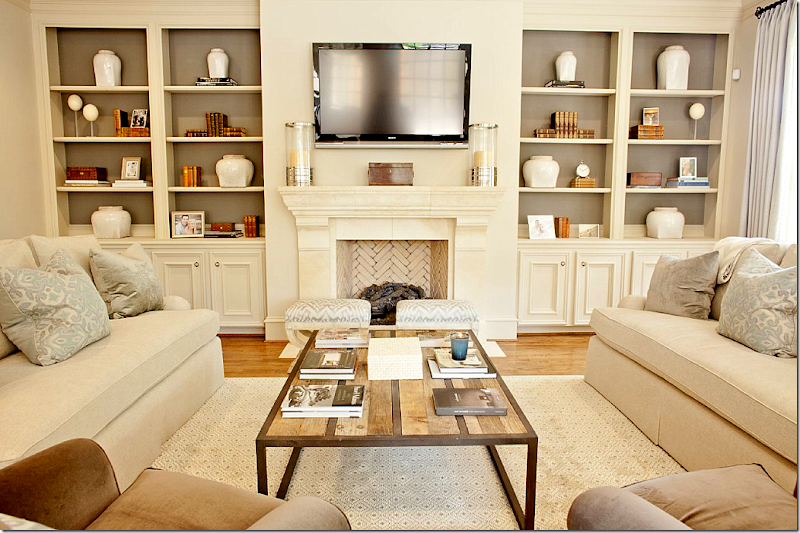
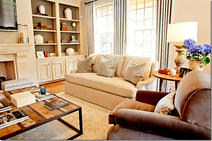
Wow! Gorgeous new fireplace. The beautiful fireplace is from Materials Marketing with a great herringbone pattern of cream colored bricks – love that. The family room is done in aquas, creams, and browns. The rug is from Stark, the David Hicks Collection. The hurricanes came from Krispen, with other accessories from AREA, along with the coffee table. MAI, a sponsor on Cote de Texas provided additional antique accessories. The fabric on the sofa is Donghia, Schumacher is on the benches, Fabricut velvet is on the pillows, and Pindler makes up the curtains.
The lamps came from Boxwood Interiors and the side table is from Mecox. I love how the back of the cabinets are painted a dark gray brown. It really makes all the accessories pop.
I love all the soft creams and aquas mixed with the brown velvets. So beautiful.
In the breakfast room, the shades, chairs and benches are Pindler and Pindler fabric with Samuel and Sons trim on the shades.
The lantern came from BROWN. I can’t wait to tell you this – but next month we are having another BROWN giveaway – a chandelier. Wait until you see it!!!! It’s fabulous. OK, back to the house! I really like the window treatment with the soft gray tape on the shades. Just the right amount of trim – understated!
BEFORE: kitchen and breakfast room.
In the kitchen, the walls are painted Benjamin Moore’s Baby Fawn, while the cabinets are Wickham Gray. The rug is Dash and Albert. Antiques from Joyce Horn.
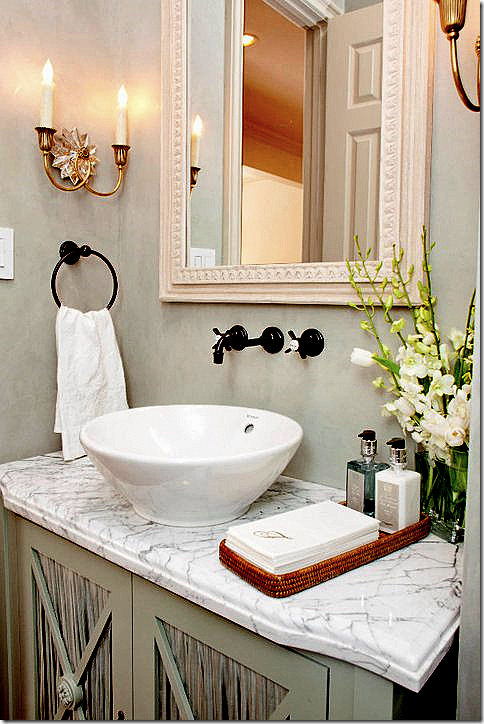
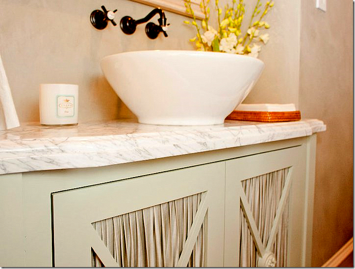
The powder room has a white marble top on a cabinet with skirted doors. Segreto plaster walls.
A close up of the beautifully pleated fabric from Rose Tarlow.
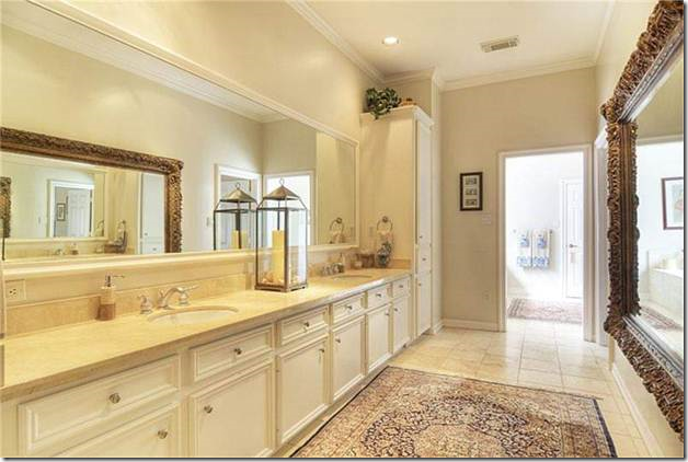
BEFORE: ho-hum master bathroom.
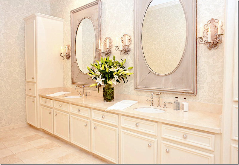
The master bathroom got a redo with fabulous painted mirrors from Joyce Horn and the sconces came from Boxwood Interiors. Amazing what new hardware, mirrors, sconces, and wallpaper can do to update a bathroom. I want to do this so badly to my own master bathroom. It really needs an update!
BEFORE: The playroom. Just wait for the update!!!! Are you ready?????
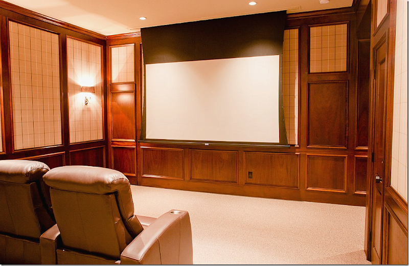
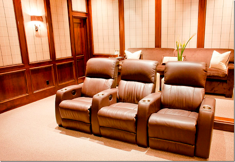
AFTER: A home theatre. Hard to believe this is the former play room! It’s so sophisticated looking. Potter Construction. AV: The AV Guys. Fabric on walls is Romo, Stark carpet, and Circa Lighting sconces. The side tables came from AREA.
Another view. I like the mixture of the theatre seats and a comfy sofa.
HOUSE IN SOUTHGATE – HOUSTON MUSEUM AREA:
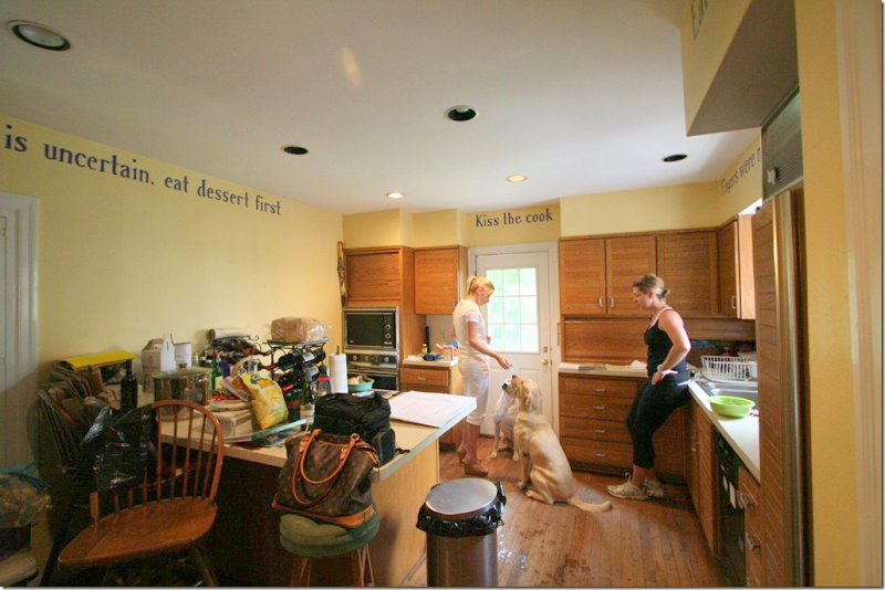
BEFORE: The kitchen was really dated and inefficient.
BEFORE: Another view of the kitchen looking towards the dining room. Ready to see the AFTER? Really???? You sure?
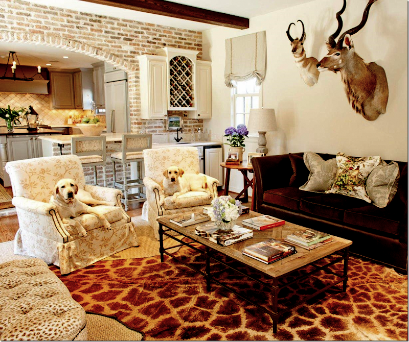
AFTER: Totally renovated kitchen. Incredible. Is this the same house? Walker Zanger silver leaf backsplash, Crema Marfil honed countertops, island countertop is walnut. MAI supplied the iron fixture. Custom color on cabinets started with BM’s Coventry Gray. Ashley Norton hardware.
A new sitting area off the kitchen. Club chairs have Rose Tarlow fabric. The sofa is leather and velvet with Rose Tarlow and Scalamandre pillows. Boxwood Interiors provided the lamps. The ottoman wears Cowtan and Tout fabric. Coffee table from Aidan Gray. Wall color is Sherwin Williams Dover White.
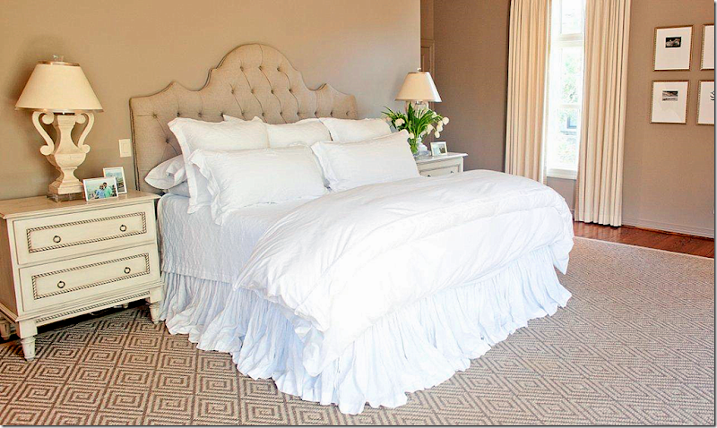
The bedroom is so pretty and serene. Stark rug, custom tables by The Joseph Company, Matteo bedding, Festoni lamps. Photographs by Andy Biggs.
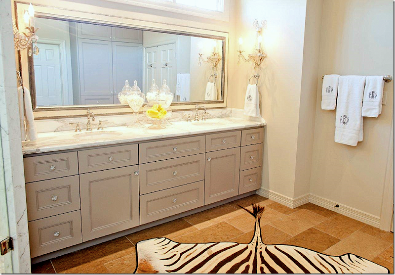
Master bathroom.
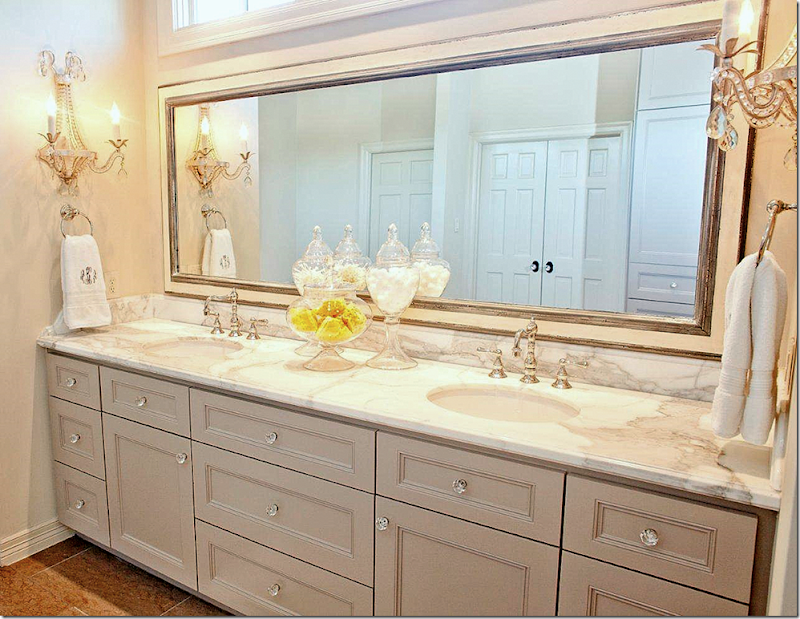
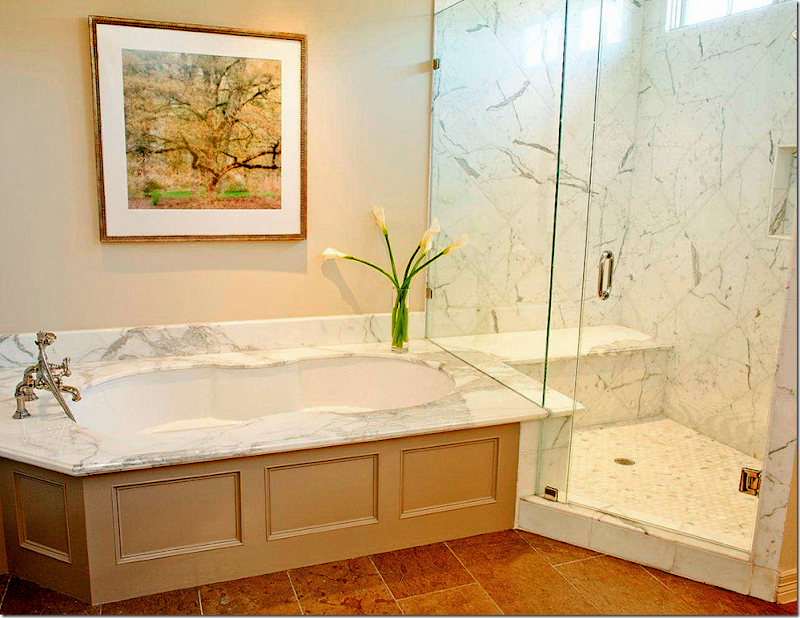
Another view. Baldwin crystal knobs. Calacutta marble. Custom mirror by Frametek. Curry and Co. sconces. Rohl faucets. The vanity is painted BM’s Ashley Gray.
Photograph above tub: artist, Lynn Geesaman
GALVESTON BAY HOUSE:
This bay house in Galveston was a total gut project. It was completed in just 5 weeks from start to finish! The contractor was Neil Potter with Potter Construction who finished in just five weeks, which is amazing judging by the pictures. Munger Interiors took two full days to install – the homeowners walked into a house with lit candles, fresh flowers and champagne in the refrigerator. That’s how an installation should be done – all at once, not piecemealed. The Munger sisters say this bay house was a dream project.
BEFORE: A typical beach house with lots of wicker furniture.
Really boring.
Now, remember this project took just FIVE weeks. Ready to see it finished????
What a huge, huge difference! WOW!!!!! Amazing.
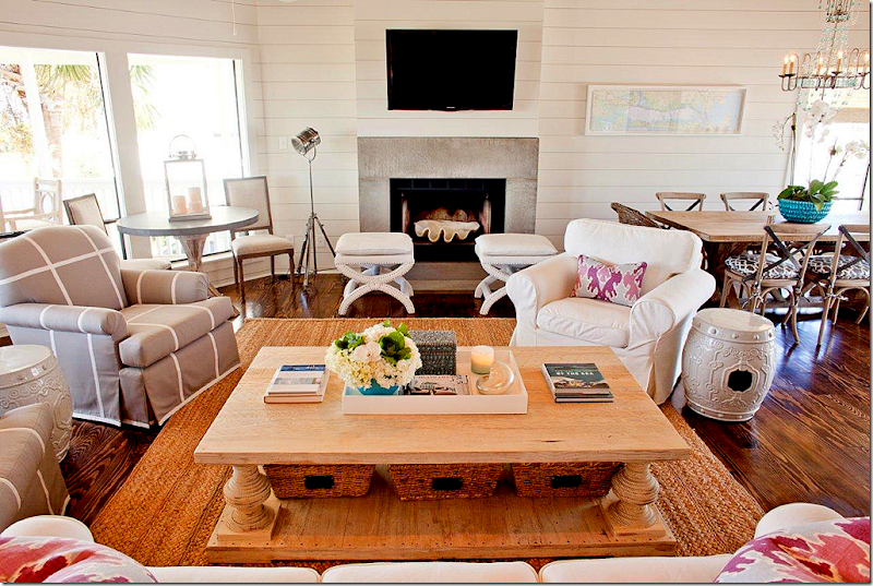
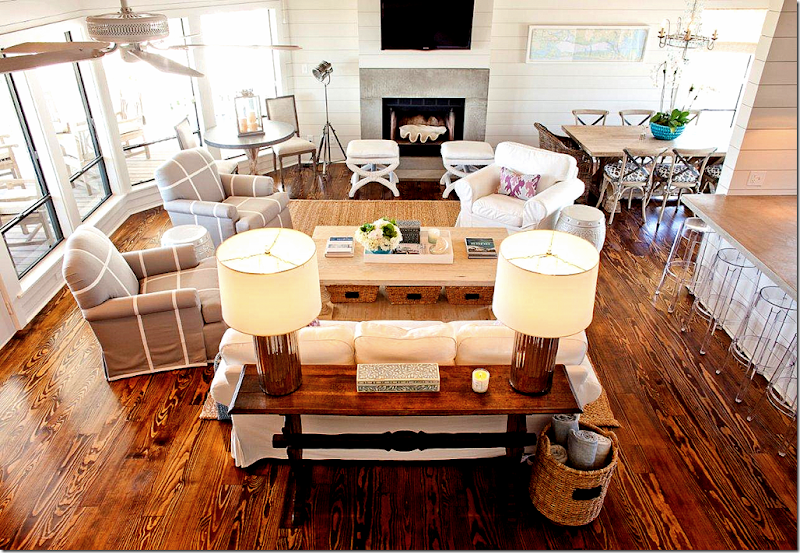
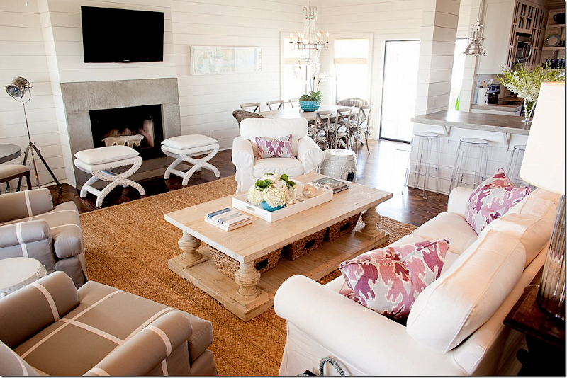
Looking down from the stairs. The kitchen is to the right. Here are the deets: Pine floors, concrete fireplace surround, shiplap walls painted BM China White, Pottery Barn rug, lamps and chandelier from Arteriors, Knoll bar stools, Lee Jofa Ikat pillows, Sunbrella fabric on the club chairs. Kitchen chairs are Aidan Gray with laminated Schumacher fabric cushions. The kitchen table and coffee table are Custom Furniture LA. Restoration Hardware ottomans in Sunbrella fabric. Game table with zinc top by Joseph Company. West Elm lacquer tray and Target Smith and Hawkin baskets. Got all that?
*
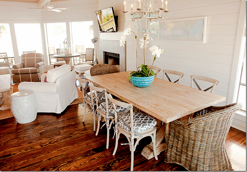
Loving the turquoise chandelier and the mix of the Kooboo with Aidan Gray chairs. Great dining room table.
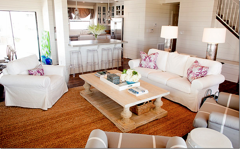
Looking towards the kitchen. Love the Kelly Wearstler ikat fabric on the pillow. The shiplap walls make all the difference here, along with the dark, pine floors. Both elements totally update the bay house that seemed stuck in the 90s.
View towards the dining room. Love the large clam shell in the fireplace – cute idea!
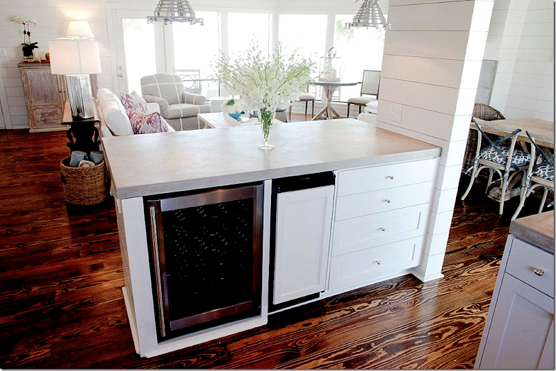
The kitchen opens to the living area – here they have a wine refrigerator and ice maker.
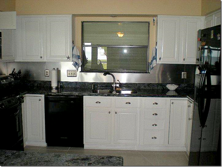
BEFORE: the kitchen had all black appliances and dark granite countertops.
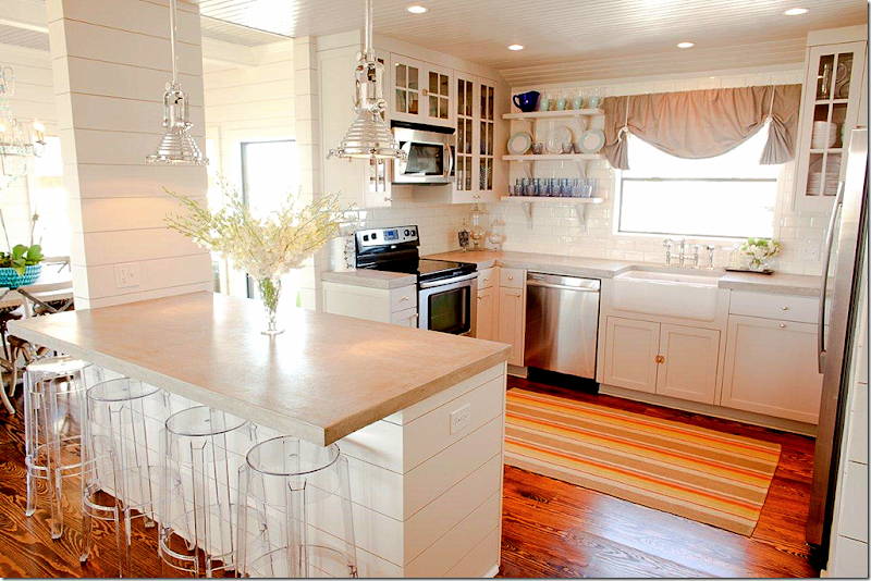
Now, there are light concrete countertops, Restoration Hardware light fixtures, Rohl Shaw farm sink and Dash and Albert rug. Cabinets are painted BM’s Harbor Gray. Glassware and dishes are from Ikea and Villeroy and Boch.
On to the bedrooms now.
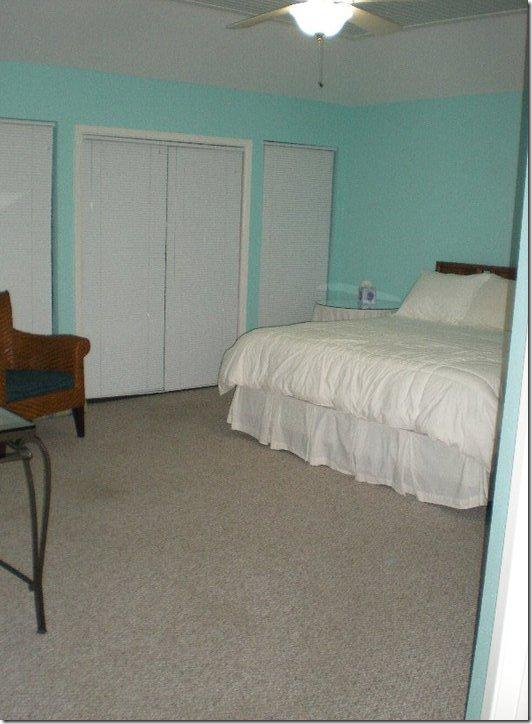
BEFORE: Boring master bedroom is a sea of gray carpet.
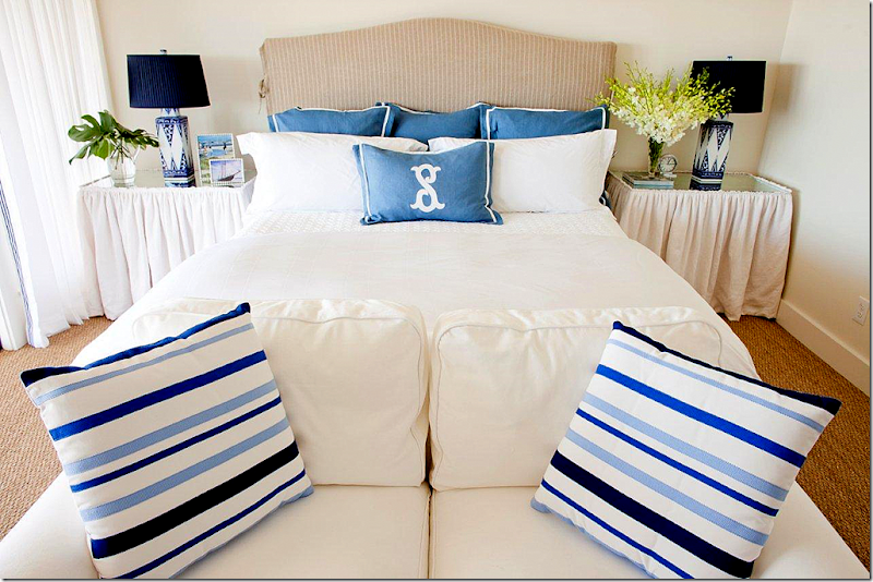
AFTER: So bright and beachy! I love the matching skirted tables. Lamps from Arteriors, bedding is Home Treasures from PLUSH, white loveseat is the famous Ikea slipcovered line. I love small sofas at the end of beds – a great alternative to a bench or stools. And seagrass – which is perfect for the beach.
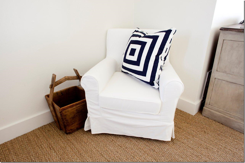
Master bedroom sitting area with the Ikea chair and pillow from Krispen.
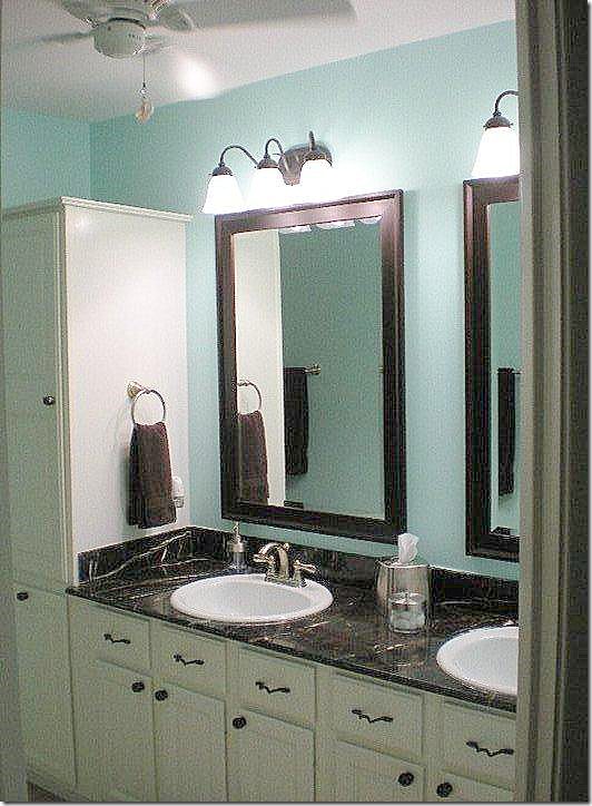
BEFORE: Master bathroom.
AFTER: Absolutely fabulous! Love this so much!
Great mirrors from Restoration Hardware. Sinks are Duravit. Rohl faucets. Dal Tile on the backsplash and walls. Arizona Tile on the floor.
The console is fabulous – it’s from Custom Furniture LA. I Love the wall hung faucets, too.
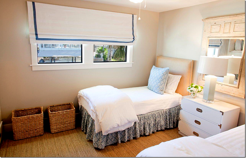
The girls bunk room has Pine Cone Hill beddings. Target lamps with custom shades, and Ikea baskets.
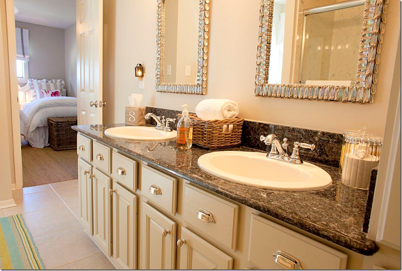
This bathroom just got cosmetic changes. The mirrors are Currey and Co., Dash and Albert rug, and Arteriors accessories.
BEFORE: Boy’s bunk room.
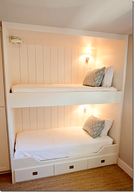
The boys bunk room has Pine Cone Hill bedding, Arteriors lamp, and the chest was a before item. The Mungers had it lacquered and replated. You can see it in the before picture – all brown.
The boys bunk room actually has real bunks – room was made for them by removing a closet. Darling.
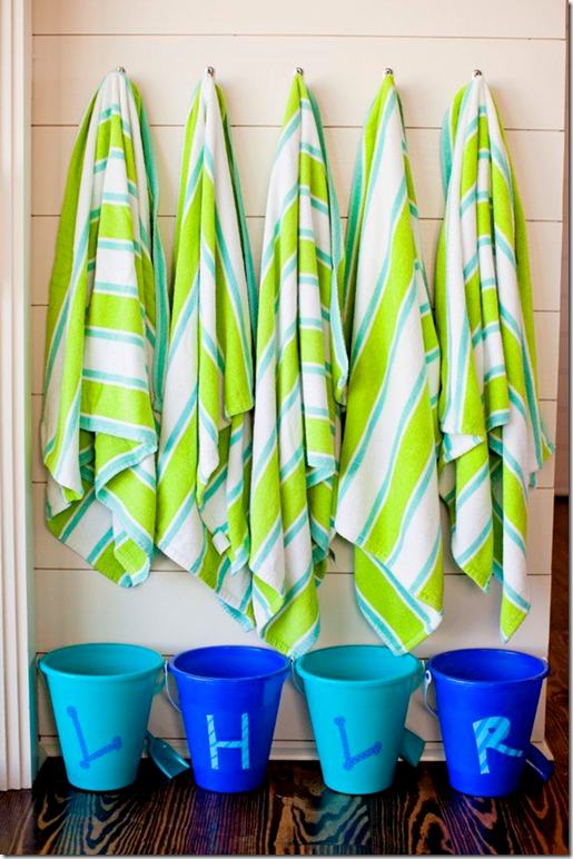
The Mungers bought these buckets at Michaels and painted one for each child as a surprise on their first visit to the “new” beach house. Towels are from Target. Details like this are what separates the mediocre interior designers from the better ones. It takes time and a lot of effort to take care of small design elements like this.
The boat house was outfitted with furniture from Restoration Hardware. Trina Turk fabric was used on the chairs. Garden seats are from Z Gallerie.
What a great place to eat – day or night.
Party’s on!
WEST UNIVESITY HOUSE #2:
BEFORE: This house in West University was in need of a total update.
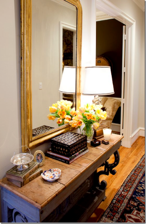
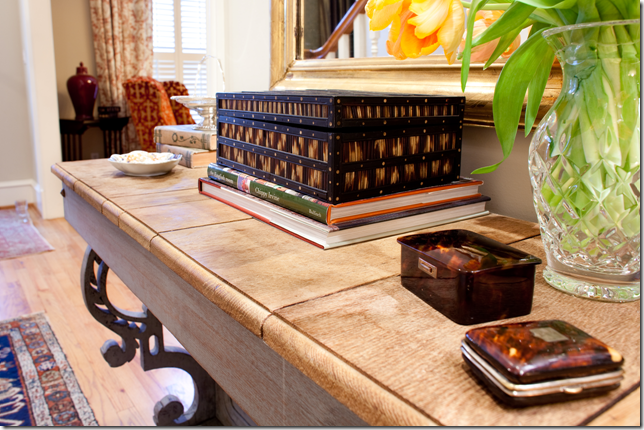
AFTER: The entry hall with a console from Carl Moore Antiques. The owners collect quill and tortoise shells boxes from London. Mirror is from Joyce Horn Antiques.
Close up of the tortoise shell and quill boxes.
The colorful living room is painted BM Bleeker Beige. Chandelier and trumeau are both from AREA. Curtain fabric is Carlton V, Scalamandre is on the wing chairs. Family antique table is on the left side, the other table is from AREA. Rug is from Nouri and Sons.
Another view – showing the curtains.
The dining room is completely changed with Stark wallcovering. The table is from Carl Moore and the chairs are from AREA. Silkworks fabric is on the backs. The host chairs are custom. Festoni candelabra, Joyce Horn sconces and confit jars.
BEFORE: the study, kitchen, and family room.
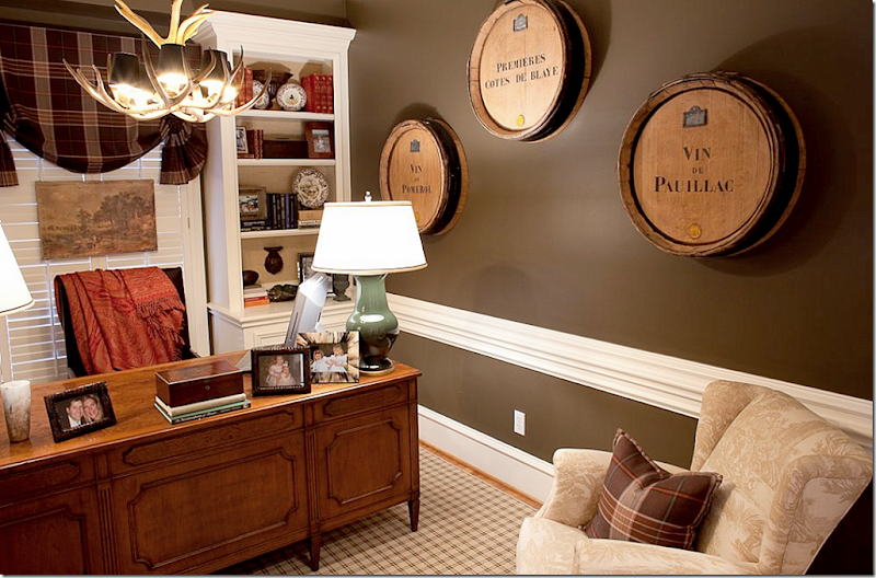
The study was painted a dark gray. The rug is from Stark with Festoni lamps and Ralph Lauren fabrics. The desk chair is custom. Wine barrels from Joyce Horn. I think the barrels are such a cute idea, especially in a man’s study.
The family room is done in sage greens while the back of the shelves are painted darker. I’m thinking I should do that too!
The herbier is from Joyce Horn, sconces from Round Top. Both chairs are in Brunschwig fabrics. I love that herbier!!! Such a pretty photograph.
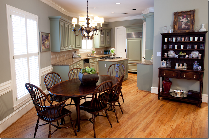
The kitchen and family room are painted Nantucket Gray with Sherwood Green on the cabinets. Carl Moore Table & Chairs
The console in the back entry way. Love the trumeau.
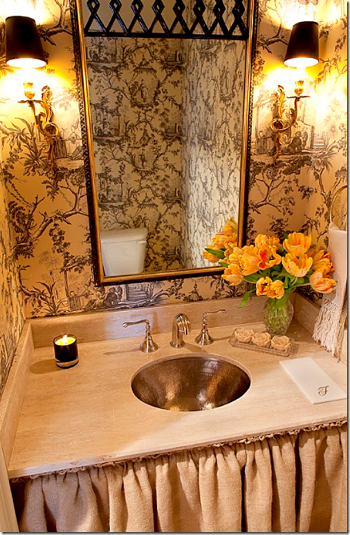
The powder was updated with Brunschwig paper and a new pewter sink and skirt.
BEFORE: The upstairs master bed and bath.
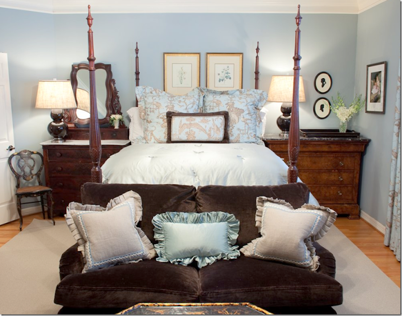
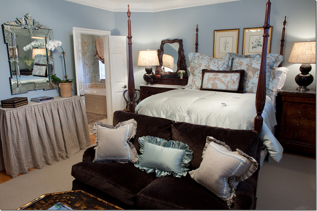
The homeowners original furniture was used and updated with new bedding and lamps. A velvet loveseat is in the sitting area in front of the bed.
The Mungers added a skirted console under the Venetian mirror.
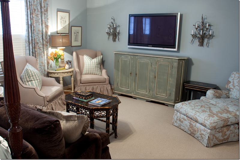
New seating and a painted console were added to the sitting area.
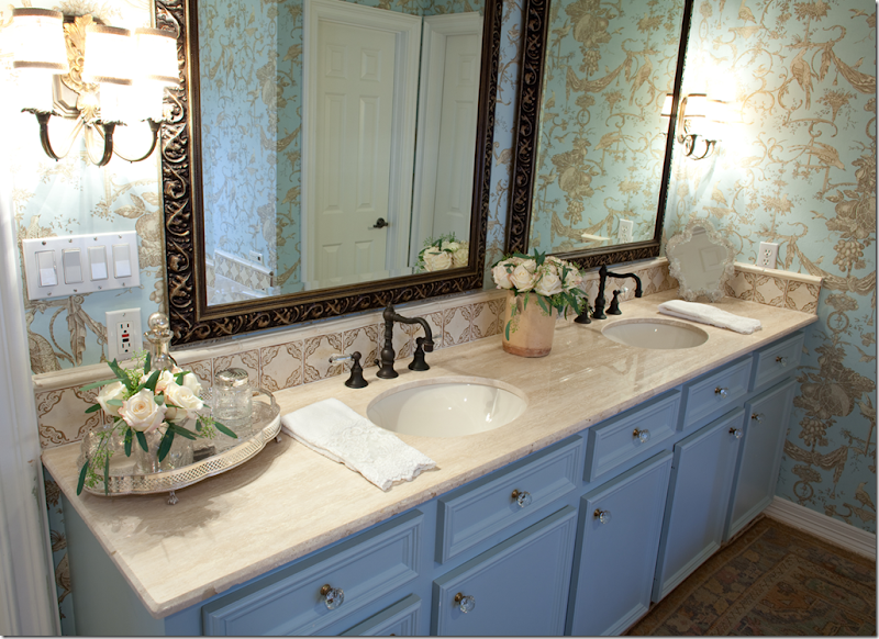
The bathroom was totally updated with new travertine, wallpaper, mirrors, faucets and tiles. The wallpaper is Brunschwig and Fils.
In the daughter’s room, custom cornices were used with Chelsea Editions fabric. Plush Home bedding. Stark carpet.
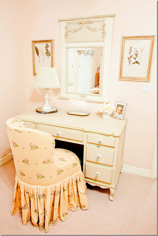
The desk and vanity chair – perfect for a little girl.
This bedroom has Stark carpet, Plush Home bedding, and chandelier by Joyce Horn. Of course I love this – it reminds me of my bedspread!!
And the vanity area – love the skirted kidney table.
AND FINALLY, TWO LAST IMAGES:
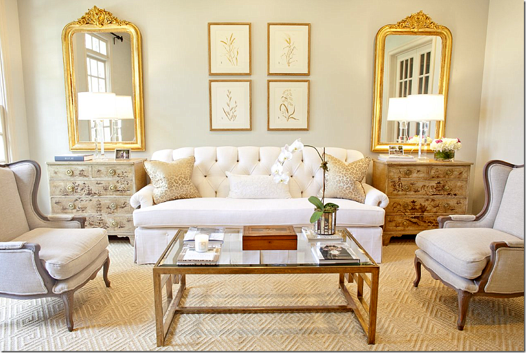
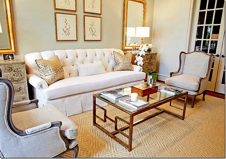
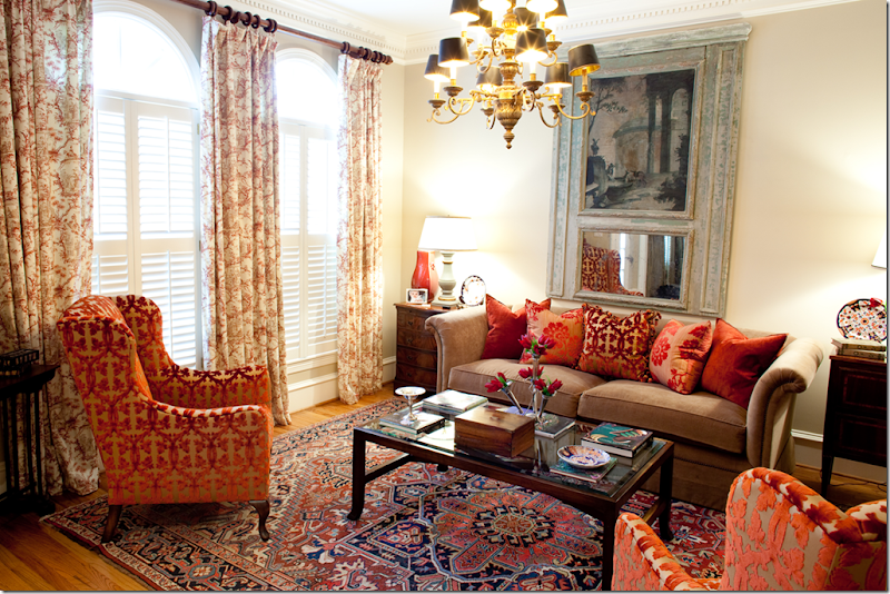
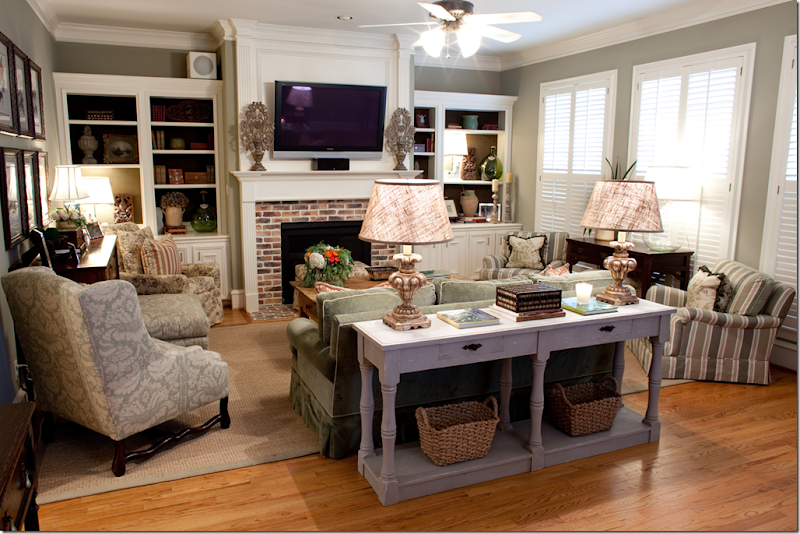
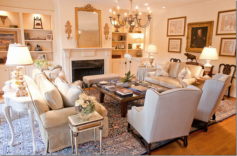
I found this image on the Munger’s web site and thought it looked so pretty. A family room, dressier than most, it shows the range of the Mungers. And it also shows, for once, that not everyone in Houston have white slipcovers and seagrass!! So beautiful.
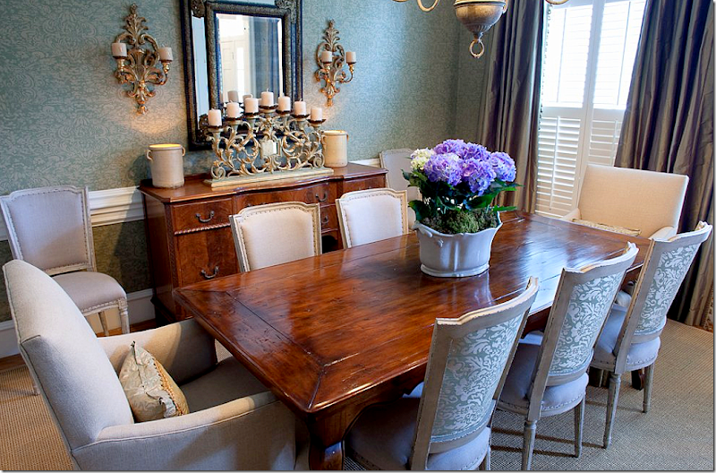
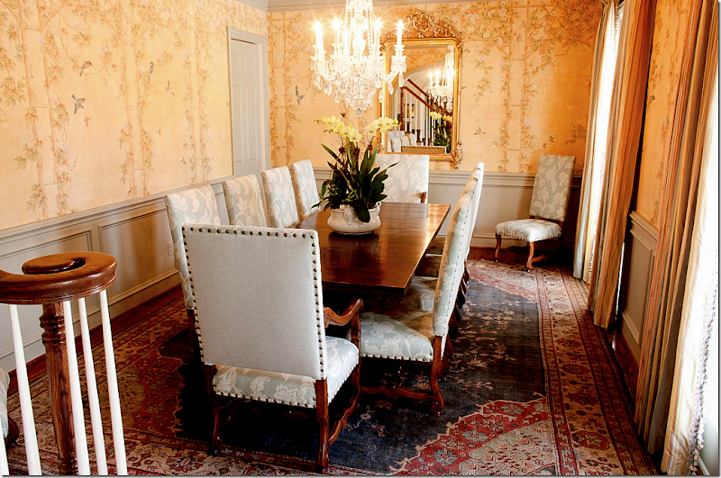
And I also found this image of a beautiful dining room. I just love the wallpaper – or is it a painted mural, hard to tell. This room really is pretty and again, dressy yet inviting. Just love this room.
Whew. I’m exhausted! It’s not often I get so many pictures of complete houses. It’s unusual in these times to get clients who want a total redo of every single room! What is your favorite house shown? My favorite is the West University #1 – with the white sofas – of course! I just loved that house and thought it was so elegant and lovely.
A huge thank you to the Munger sisters, Elizabeth and Amy. Be sure to visit their web site HERE for even more photographs!!
Today, I want to welcome three new sponsors to Cote de Texas. And, I want to take this time to thank all of you who click onto the sponsors web sites and look around. I have tried to choose sponsors whose merchandise has the look of the blog so that you all would enjoy “window shopping” with them.
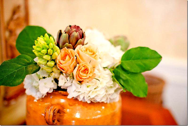
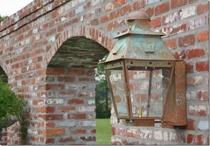
The first new sponsor is La Caze, an online décor shop, which specializes in furniture and in gorgeous lanterns, like the one shown above.
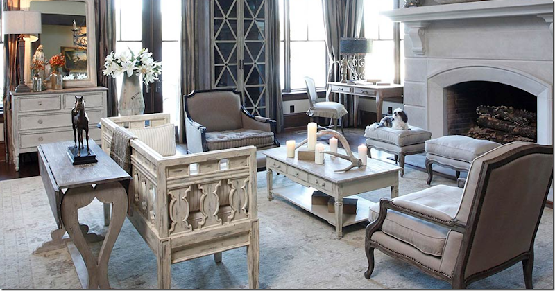
Next, we have Gabby - décor with a story. Their web site is so beautiful – this picture was taken directly from it.
And finally, we welcome the newest sponsor Boxwoods Fine Furnishings – who have everything from furniture to whatever you need for entertaining.
Remember, to visit any sponsors web site, all you need to do is click on their picture on the left sidebar.



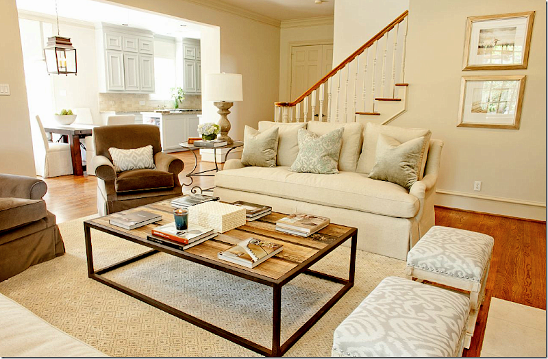
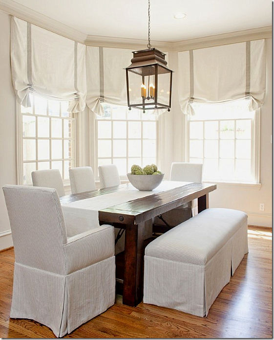
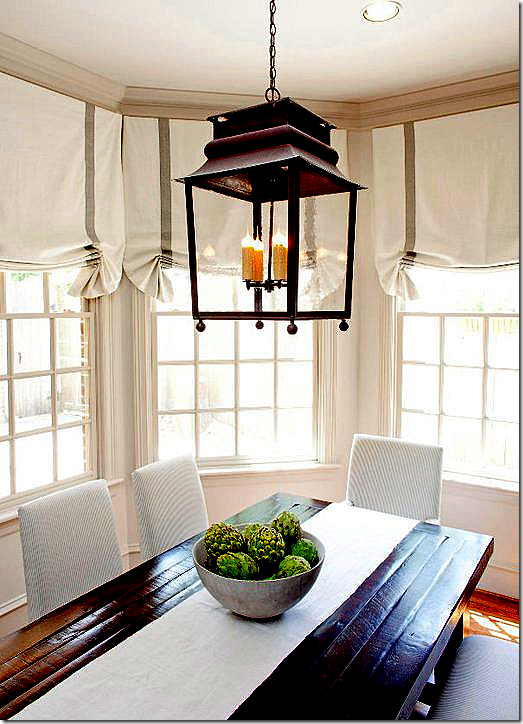

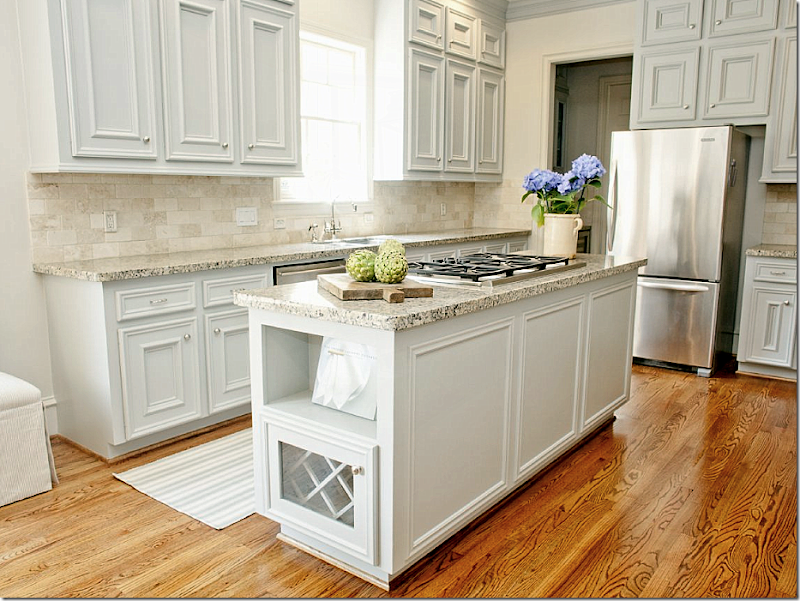














There is nothing better then seeing before and after pictures and I loved seeing what the Munger sisters have done bring people into the 21st century. Everything looks so fresh and updated and so beautiful. Thanks for sharing these two wonderful designers!
ReplyDeletethe wall colors and fabric selections are some of the most notable differences in these fabulous befores and afters...lighter colors, more soft and muted, makes such a huge impact..as does the addition of the beams in the study and the brick arch in the kitchen..what beautiful interiors...
ReplyDeletebest,
maureen
Love the dogs on the Rose Tarlow covered chairs! That would be my house
ReplyDeleteLove the concrete countertops in the beach house.
ReplyDeleteI'm in Houston and would love to know who did them.
Very beautiful work!
Thanks Joni for always putting in so much effort to present the most informative and beautiful blog site on interior design.
ReplyDeleteGreat befores and afters! Thanks for putting this together for us!
ReplyDeleteJone, this is a beautiful post. Love the before and afters. Quite a few miracles performed here.
ReplyDeleteHave a great day.
Teresa
xoxo
This post is truly unbelievable! Jaw-dropping, stunning, gorgeous....these are some seriously talented ladies. Congrats on your new sponsors, too. I LOVE Gabby and will check out the other two!
ReplyDeleteStacy @ www.conspicuousstyle.com
Best. Post. Ever. !!! I want to save every picture and use it as a guide. My house looks like the first one - the before shots, ha ha!! Thank you Joni! And thanks for all the resources - Beth (in Houston!)
ReplyDeleteso many rooms to love here Joni. I was noticing that they like to use botanical prints in a lot of their rooms...you called them herbiers, which was new to me!
ReplyDeleteWow! I saved 10+ pictures as inspiration for my future projects. This is wonderful! Thank you=:)
ReplyDeleteClaudine
www.DCMetroMom.com
Wow, what a meaty post!
ReplyDeleteThere are some remarkable transformations here!
I'm particularly taken with the Galveston redo -- love the fresh, youthful yet sophisticated vibe.
I can personally vouch for the power of painting the backs of shelves and spreading seagrass around -- I posted a couple such projects this week up over at Nero.
Ah, change is good.
Cheers, Alcira
nerochronicles.com
Tons of great eye candy there. Especially loved the gray-painted cabinets in those two kitchens. Thanks, Joni, for putting this together for us.
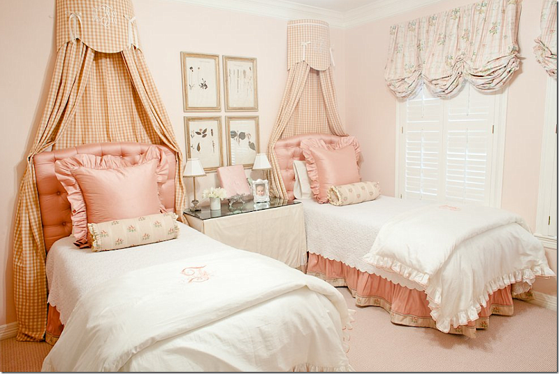
ReplyDeleteThe beds with coronets are my favorite. I plan to have coronets in my youngest daughter's room. The monogramming on the checked coronets was darling.
ReplyDeleteLovely. They are very talented sisters. My four year old daughter went through the pictures with me and she was "oooing" and "aahing" at how beautiful they were. It was her first time viewing your blog and I was explaining the before and after pictures to her. I was surprised to see how interested she was. A kindred spirit in the making...
ReplyDeleteI was also surprised to see the leather chair in the first den covered with fabric. I didn't realize you could do this. I don't know why I didn't think of this, but is it done often? We still have our leather english roll arm sofa and even though it is comfortable, it looks so heavy in the room. I'd cover it in a second--but I wonder if it would be less expensive just to buy a new sofa. I've tried to upcycle different furniture pieces with varying results in the past. It doesn't always work the way I imagine it should.
Thank you for the time and effort you put into your blog. I look forward to reading it each week.
Love it all...amazing post!
ReplyDeleteWow. These are amazing. I love before and afters. The re-do of the study in the first house in Memorial was wonderful - love the beams - and there were good bones to work with. But the one I loved the most was the Galveston Bay beach house. What a transformation! I guess I'm more of a 'caz' type person. Thanks for such a long juicy post, Joni.
ReplyDeleteI, too, love a setee at the foot of a bed...I have my morning tea there...just me and tea. Wonderful "creations" as always! franki
ReplyDeleteI enjoyed this post tremendously but the house in Southgate stole my heart! That kitchen is gorgeous!
ReplyDeleteWOW. Beautiful rooms. This post should convince everyone to update their style and how to do it.
ReplyDeleteThis post had me scribbling down paint colors--they're gorgeous! Really love those Wickham Gray cabinets in one of the kitchens. So soft and pretty. Makes me want to revamp mine now!
ReplyDeleteThese are two talented women. Wow.
ReplyDeleteDebra
It was great having my second cup of coffee with you this morning Joni!! What a fabulous post! Thank you for all the time it took to load all these fabulous images and giving us a guided tour. Your efforts are very much appreciated by me, Kathysue
ReplyDeleteWowee.... They are so talented! Maybe the most beautiful homes in America are in Houston! Love the before and afters. Thank you!
ReplyDelete-linda
Nice variety of work by the Mungers. The first foyer was beautiful as it was but perhaps with the new decorations, the redo was more in keeping with the rest of the house. A lot of improvement here for sure. The last house did not seem to be decorated by the same people although obviously it was. I suppose the taste for darker colors and heavier furnishings by the owner is the difference. Some of the rooms still look dated.
ReplyDeleteWhat great before and afters! Great examples of updates to bookshelves. I so enjoyed this post, thank you!
ReplyDeleteWow this was a chock full post full of all kinds of great eye candy!! Loved all the paint colors, made note of a few, and the before and afters are always such a treat. Everything is so beautifully done that it warrants a 2nd and 3rd relook!
ReplyDeleteGreat eye candy from the Mungers! Lots of ideas too.
ReplyDeleteI especially loved the dogs! haha.
Nice to see Leslie's Sinclair's finishes too. I had lunch with her yesterday here in SF! She is such a doll!
Great post Joni.
OMG! Best Post Ever!!! This is the eye candy I have been craving!! Thank you for sharing and for the extensive list of resources and photos! Brilliant!
ReplyDelete"And it also shows, for once, that not everyone in Houston have white slipcovers and seagrass!! So beautiful."
ReplyDeleteThank goodness! The space done so well and standing as the perfect example of classic decor selections is beautiful.
Darleen
We always love before-and-afters. They're the best way to show how much you can change a space for the better. And this is definitely a showcase. Great job!
ReplyDeleteSo proud of you Elizabeth and Amy!! Your work is beautiful and all of the recognition is so deserved! Sp thankful that you get to help me with our house here and there. =)
ReplyDeleteBeautiful work, but whoa...that kitchen redo in Southgate!!! Love the brick, the arch, the cabinet color. Whoever bought that home had vision..and knew who to call to make it happen. Well done!
ReplyDeleteThanks for sharing!
Linsey
That was quite a post! Their design work is impressive and beautiful. Thanks to them (and you!) for sharing it with us.
ReplyDeleteDeborah
These rooms are all beautiful, but somehow I felt they weren't quite as warm and cozy as I like...
ReplyDeleteIt will be interesting to see how long this current gray/cream color scheme stays in fashion.
Okay, probably my favorite show case here recently!! I love absolutely everything they did!!! Can I have everything they did/do!!?? haha. Love it, the blog, as always!!!
ReplyDeleteHi Joni, I'm new here been lurking for about a month. I love your blog. Todays post is amazing. My favorite is the kitchen re-do in Southgate. I ohhh and ahhh so loud that hubby had to come see what was going on in my office, lol. I've been checking out your sponsors also. Thanks for sharing your talent and the beautiful pictures showcasing the talent of other decorators. Vikki fm Virginia
ReplyDeleteThanks again for sharing. I love befores & afters. I learn so much from you.
ReplyDeleteOH MY WORD! stunning. that's all i can say! so stunning!
ReplyDeleteashley
WOW!!! All beautiful!
ReplyDeleteLoved these makeovers. Wow! What a difference. The home owners have to be thrilled. Don't we wish all our clients would take the plunge and really do it right? This post will be great to refer to. I think we often live with things so long we just don't realize how dated everything has become. Everyone is not exposed to the latest and greatest daily like we are. Thanks. Joni. Have a great weekend. Mona
ReplyDeleteGorgeous rooms Joni - I love the last pic of the family room you showed. Great firm, tons of talent!
ReplyDeleteI started a new feature on my blog called: "A Picture is Worth..." it's a call back to posting pics of CDLV, I really hope you'll stop by and check it out! :) xo,A
They certainly have the magic...
ReplyDeleteI get lost in your posts.. I mean, it's a trip of inspiration. You know how long it takes to analyze all the pictures and enjoy doing that? That's just me.... I do that all the time with your posts. I like to read and look carefully. I enjoy them so much!
ReplyDeleteSo, I guess I want to thank you for always taking the (long) time to make a REAL post for us. This is the kind of post I love!
Wishing you a blessed weekend!
Many hugs to you.
Luciane at HomeBunch.com
Everything is so lovely! The interior is well designed, the colors are balanced and most of all the furniture are so lovely esp the seating. Great post, check out also 3D Rendering
ReplyDeleteYou amaze me every time with the posts you do! So enjoyable- and sooo much work!
ReplyDeleteJust love the French feel of the makeovers, these are really beautiful rooms.
Thanks Joni!
Bea
Wow, thank you all. Just one kind of negative comment. That is a first! amazing. I knew you would like this. They really are talented. Thanks again everyone for such great comments. Glad you liked it!
ReplyDeleteJoni
What a great post! Such talent! Southgate is my fave - - minus the animals (the ones on the walls and floors.)
ReplyDelete; )
Jennifer
I enjoyed this post mostly because of the oriental rugs. I've inherited my grandparents rugs, in fact we built our house around one particular rug because of it's size. It's always a pleasure to see how other people decorate.
ReplyDeleteYou must not have left your computer for a week! Really enjoyed the extra-long post! I have the same master bedroom fabric in my bedroom, and noticed that one of the little birdies is flying upside down in the photograph (see her on the rectangular velvet and toile accent pillow on the four poster bed?) Bless her heart!
ReplyDeleteI have been blessed to be a client of the munger sisters for several years. As you can see they are obviously talented, but what I appreciate most is how they make your spaces feel so warm. There are so many designers who once they are finished the space is left cold and not somewhere you can curl up with a good book almost anywhere. The munger sisters have fresh new ideas and their spaces are all so unique. They don't have a recipe preconceived-seagrass,slipcovers,etc. They also do an amazing job of making spaces functional. Many of their clients have young families, and they make sure work with the entire family in mind. Thanks Joni for the wonderful article. You did a great job of highlighting their talents. Look out for these sisters-they have only been in business together for 3 years!!
ReplyDeleteI'm a new fan - and I love your blog so much! I wondered if you might know the manufacturer of the coffee table in the West University House - the one that is in the family room by the fireplace? I was about to purchase the RH table that is similar, but like this better! You said it comes from AREA, but they don't have a website that shows it.
ReplyDeleteWOW! a lot of...well... pure fabulousness here!!! Congratulations on your new sponsors as well. I shall pop over and check them all out!
ReplyDeleteHappy Weekend Joni!
Love the before and pictures...my favorite part of interior design is seeing what a little elbow grease, imagination (and $, natch!) can do to a ho-hum space. Good job!
ReplyDeleteHey Ladies-
ReplyDeleteLet's give it up BIG TIME to Joni, who is one of the FEW bloggers who is not STINGY in providing resources and sources for items shown in her gorgoeous photos!
She is one of the few design bloggers who that takes the incredible amount of time to provide this invaluable information! Let's face it, source information is one of the main reasons we adore and salivate for great design blogs on the web!
Dear Joni, we love you and thank you for all that you do for us out here in the real world - especially those of us that are not design professionals, but individuals trying to create our own beautiful interiors, on our own, at home...
Bravo to you!
PS - Your taste in Rob Pattinson is not bad either:-)
I love these rooms, but the symmetry is just too much. It is obvious that these pieces are not antique since everything in in doubles. Very expensive none the less. I love symmetry, but I feel like these rooms are just taking it a little too far.
ReplyDeleteanon AREA does NOT have a web site = either call them or try another store. i have seen them in department stores furniture sections and i think ballard designs has one too. good luck.
ReplyDeleteas for sources = munger was extremely great sharing all the sources. most designers aren't quite that nice!!! some just don't want to share, that's ok, but the mungers really were great about sharing.
thanks again!!!
Very elegant!
ReplyDeleteLove the before and after transformation.
Very creatively designed.
Cassy from Acoustic Guitar Lessons
This was a fabulous post, loved all the before and after pictures!
ReplyDeleteWhat a great post! Love the details of where to find what. The first set of chairs in WestU house #1 sent me scurrying to a previous post of yours about getting the look on less....these are almost identical to chairs from Restoration Hardware. Thanks again!
ReplyDeleteThanks so much! I will call area on Monday!
ReplyDeleteHello, I am an interior designer, and have been looking through your blog photos back into 2009. I am amazed at the total lack of variety in your photo choices..as well as your personal tastes. Interior design is meant to encompass a wide variety of colours and textures and styles. Your design knowledge seems to be merely white slipcovers, seagrass carpeting, French styled accessories! You claim this is HOUSTON STYLE. I claim it is a mere lack of any design thought processes. You need to be educated in interior design, to be taught to widen your choices. I am sure there are MANY homes in Houston that contain colours and fabrics other than beige, white, and linen!!!!!!
ReplyDeleteOnce of the most popular and effective [url=http://herbal-shop.tk]herbal supplements[/url] which can be found on the market today is
ReplyDeletewithout a doubt [url=http://herbal-shop.tk]SMOK-OX[/url]. This unique natural formula represents the first step towards a healthy life long
distant from any discomforting choughs or state of fatigue that ultimately can lead to cancer to the lungs
or throat. Many people have expected a well developed treatment against the addiction and now through
SMOK-OX they have it at their disposal.
[url=http://herbal-shop.tk]Click to read more about how you can stop smoking with SMOK-OX![/url]
Your blogs are so comprehensive. Really liked seeing the Munger sisters' work -- especially the beach house.
ReplyDeleteSimply Stunning! Loved this post, thanks for sharing Joni!
ReplyDeleteLooks really great! I really like the custom cabinets you put in, they really ties the room together. About how long did it take to complete the remodel?
ReplyDeleteI saw really much worthwhile info in this post!
ReplyDeleteBeautiful Work! Thanks from Massachusetts
ReplyDeleteI really like your work it's beautiful...Really awesome.. I liked your designs..Thanks for providing such a good design and materials....
ReplyDeleteRegards
http://www.thebuilderdepot.com/crema-marfil.html
Where did you get the coffee table (reclaimed wood and iron) in the picture above?
ReplyDeleteLove the mirror in the bathroom.
ReplyDeleteI think that is so nice, when it comes to furniture hope it can make a better place for dreams to come true.
ReplyDeleteNeed hosting? Get the top deals at http://hosting.
ReplyDeletetop-information.net/
My blog post ... posterous.com
Hello, I loved so many of the ideas used here! I was wondering what the countertops in the kitchen of the House located in West University-House #1. Looking to use that in a project I'm working on right now.
ReplyDeleteThanks!!
Your blog is very nice... interior design
ReplyDeleteThe elizabeth munger first series in the wooded area of memorial at the start of the post is my favorite. very pretty. Fabulous transformation in the entry hall, etc.
ReplyDeleteI am in search of the right paint....which is proving difficult. Can you by chance remember the name of the paint you used in the bedroom of the "HOUSE IN SOUTHGATE – HOUSTON MUSEUM AREA" that is shown in this post. That would be MOST helpful! Thank you so much for your time! You do such beautiful work!
ReplyDeleteTotally renovated. All these things shows perfection.I like the antiques and the designs. Light color paints gives an extra look to the Kitchen Remodeling. The girls bunk room has Pine Cone Hill beddings. Target lamps with custom shades, and Ikea baskets.
ReplyDeleteThanks for sharing this information via blog.We are globally furniture supplier.We are office
ReplyDeletefurniture suppliers USA.We are also Office,Home, Restaurant and Canteen furniture suppliers Dubai.We are online furniture stores
USA, UAE and Southern China.