Recently, interior designer Cheryl Ketner from Plano, Texas submitted her kitchen for the Readers Kitchen Series. When I looked at her photographs, I was intrigued. Most kitchens that have been submitted have been white or some variation of white. This kitchen was red! Through the years I’ve been accused of showing only houses with gray paint and white slipcovers. I thought that this would be a perfect departure from that norm. I asked Cheryl to send more photographs of her house and was pleased to see that it was a total renovation – taken from plain builders grade to custom. I love total redos – I think they are a great help to those of you who are currently undergoing a renovation. Here are the before and after pictures of the “Red House.” Enjoy!
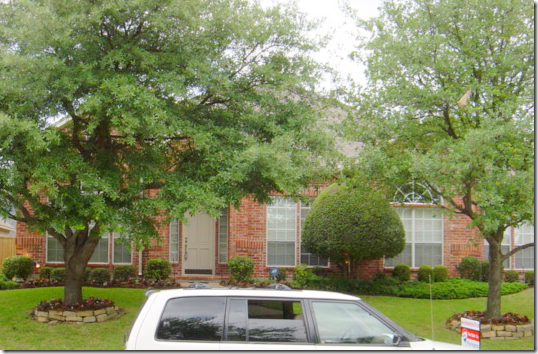
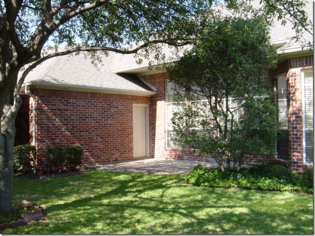
BEFORE: The house in Plano, Texas was a typical red brick home when the Ketners purchased it. Cheryl, an interior designer, sometimes works on projects with her husband Kerry, who is a contractor. Of course, this was one job they both were heavily involved in – their own house!
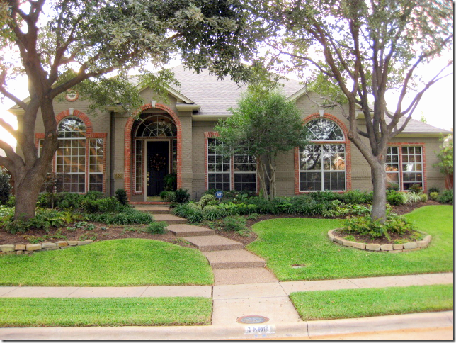
AFTER: in an unusual twist – the brick was painted a dark taupe color, but a row of red brick was left exposed around the windows – which highlight their arched shapes. This is such a great idea. Also, the trees were thinned out and the landscaped beds were greatly enlarged, creating much prettier curb appeal.
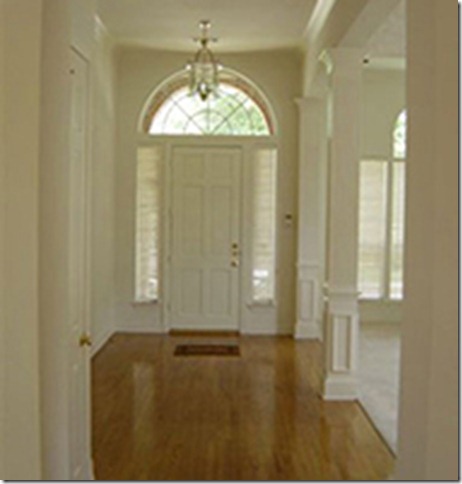
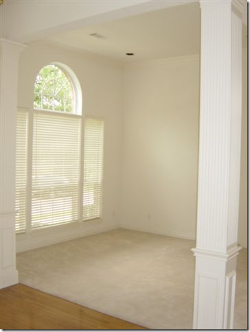
BEFORE The Entry Hall: The house had good bones, pretty moldings and high ceilings. But, Cheryl loves bright colors. Builders grade cream paint would never do for her.
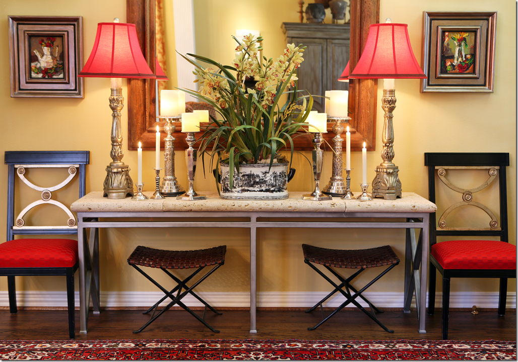
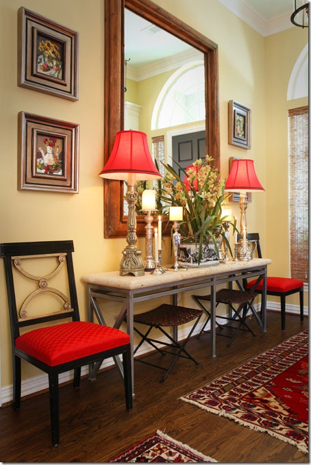
AFTER: Bright yellow paint fills the house. The moldings are painted white to highlight them. And red is introduced at the front door through the lampshades and chair fabric.
A variety of rugs cover the entry hall floor. Cheryl loves symmetry – as you can tell by this perfectly balanced vignette. I’m a symmetrical person too – you either are, or aren’t. Notice how the large mirror is the exact right size for this area.
BEFORE: The living room and dining room are off to the left side when you enter. This room was carpeted.
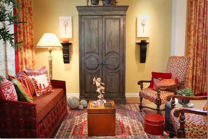
AFTER: The bright yellow room is now carpeted in wall to wall seagrass. Love that. An Oriental rug is layered over the seagrass. Red and yellow toile curtains hang in the living room and the dining room – to the right. A daybed takes the place of a regular sofa and the large armoire anchors the furniture arrangement.
The Ketners – Kerry and Cheryl. This is the only picture of the dining room – so you can see the homeowners too!!!! I wish we could see more of the room – the chandelier, and the table. Notice the elegant shades that are layered behind the curtains. Very pretty picture Cheryl!
BEFORE: The family room had a blah looking built in and was carpeted.
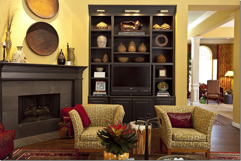
AFTER: The Ketners added hardwood floors in here and layered oriental rugs over them. Again, the walls are the same shade of yellow – makes for great continuity when all the public rooms are painted the same. Amazing – the bookcase looks brand new, but it was just painted black and lights were added to the top. Corner fireplaces can be tricky when arranging furniture – but Cheryl came up with the perfect solution.
Here you can see into the living room and dining room from this view. And you can see where Cheryl added lights to the bookcase – making them seem much more custom. Great idea. It also looks like crown molding may have been added to the bookcase too. The mantel was painted to match. Luckily, the tile surround was already dark and didn’t need to be changed.
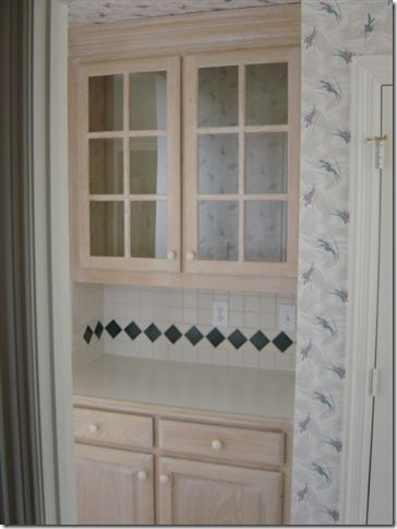
Before – The Butlers Pantry, between the dining room and kitchen, was stained the same as the bookcase.
TODAY: Fauxed black with red undertones, the paint completely customizes the pantry. Also new hardware updates it, along with seeded glass in the doors. All great ideas to emulate when updating cabinetry.
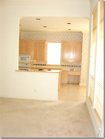
BEFORE: Looking from the family room into the kitchen, with more light stained cabinets.
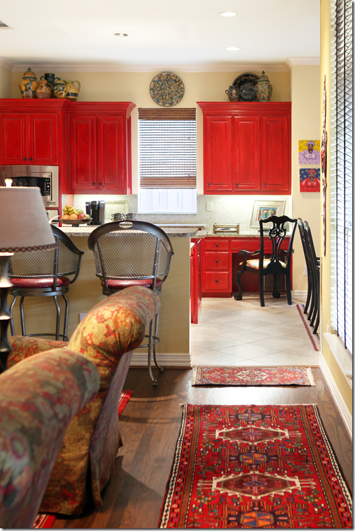
AFTER: The bar’s countertop was extended to make it more usable. And new tile was added – placed diagonally, which helps expand the room.
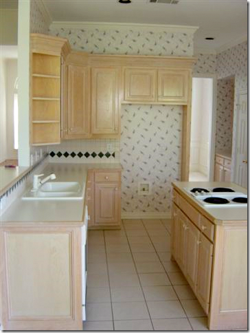
BEFORE: The footprint of the kitchen didn’t change at all. But, all the design elements did.
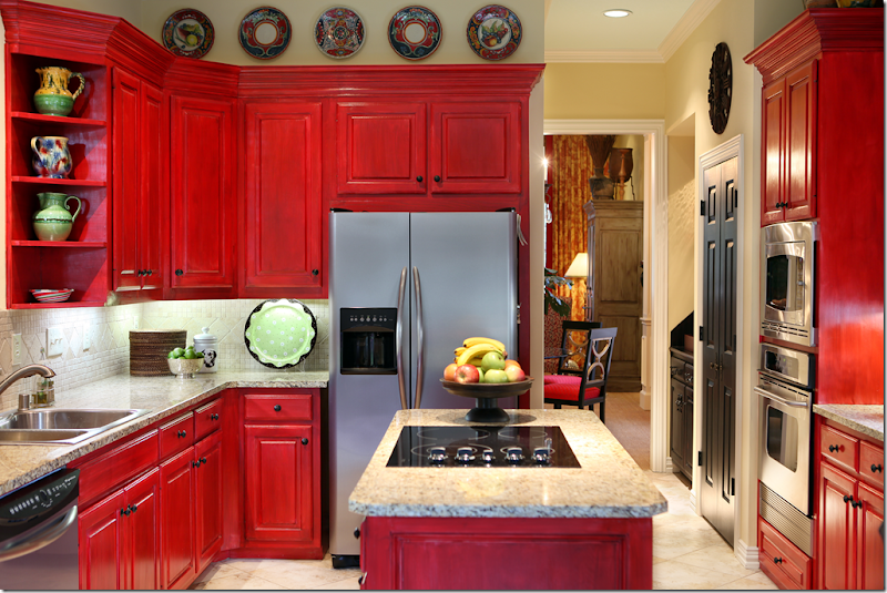
AFTER: New granite countertops and stainless appliances, along with a new tiled backsplash make the kitchen more custom. But, the biggest change is the red painted cabinets. They were fauxed to add more dimension to the paint job. New hardware was also added. The pantry door was painted black – a trick I like to do too. Who says a kitchen has to be white????
BEFORE: The powder room was nothing special.
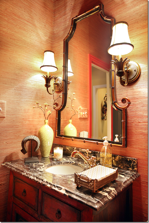
AFTER: It is now a little jewel box with richly veined marble and a red oriental cabinet. Grasscloth on the walls adds texture.
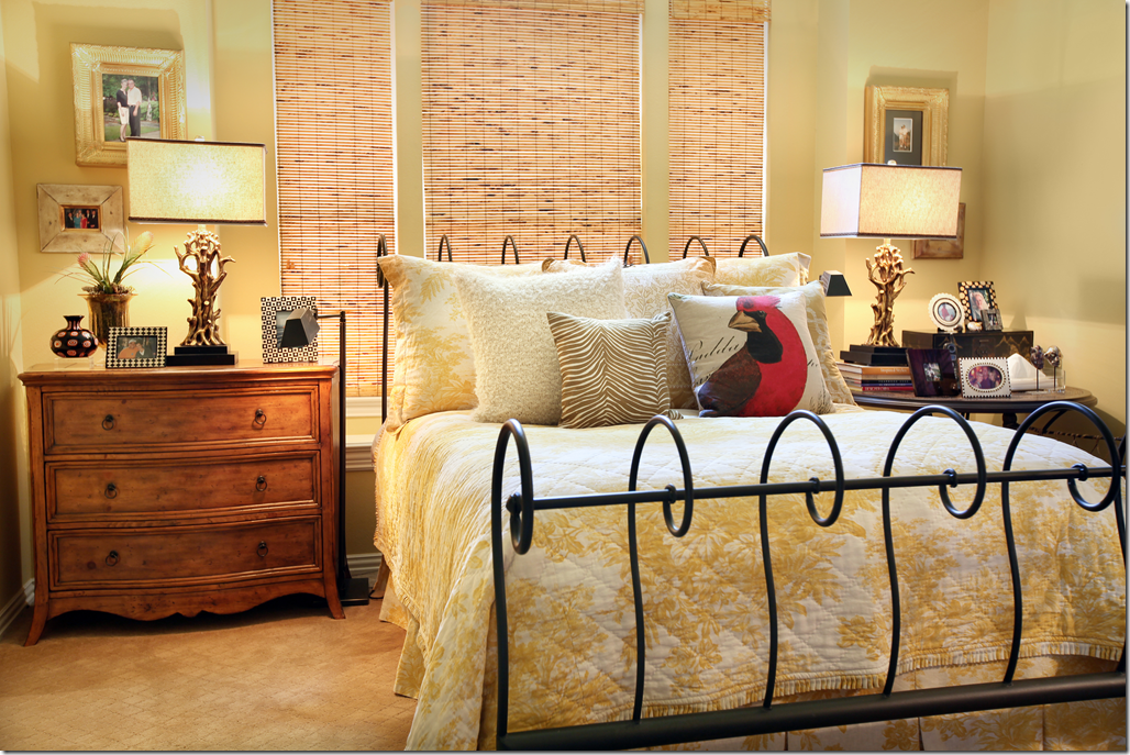
The Master Bedroom has the same paint – with a newly added textured carpet. Mismatched tables add interest. I really like the shades here – very pretty.
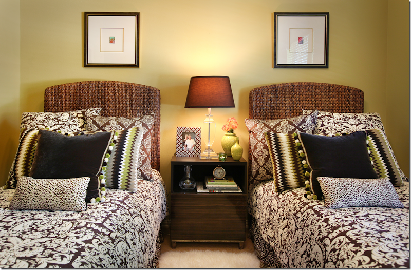
The guest room has brown and white bedding mixed in with greens and blacks. I love the touch of green.
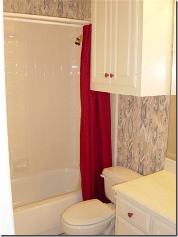
BEFORE: The guest bathroom.
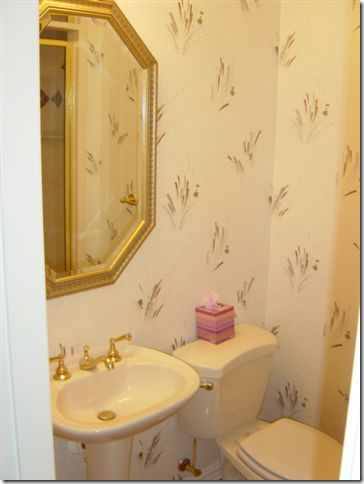
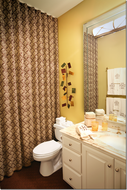
AFTER: Two great ideas to update a 90s bath without breaking the bank. Remove the cabinet hanging over the toilet! And raise the shower curtain to the ceiling. It looks so much more custom when raised. Add a mirrored frame around the mirror and new marble countertops to take it a step further.
The office is dark brown and very dramatic. The light colored desk pops against the dark walls. Red pops up in the accessories and the fabrics.
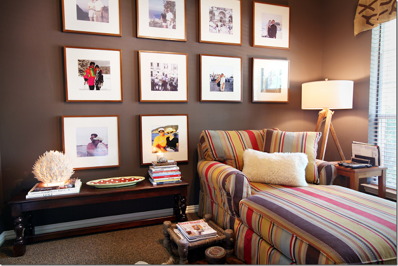
And here, in another room, the same dark walls are the perfect backdrop to the wall of art – another way to decorate without breaking the bank. Purchase identical frames and blow up your favorite family photos. The white mats really pop against the dark, brown walls. Again, red shows up in the fabric. Love that carpet.
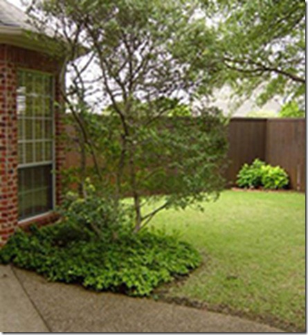
BEFORE: The back yard – with the red brick.
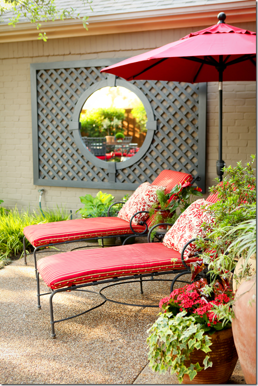
AFTER: With the brick painted a dark stone color – Cheryl added a mirrored trellis to the brick to create a focal point. All the outdoor furniture is covered in red and white fabrics – bringing the inside – outside. Another great way to add continuity to the design.
BEFORE: The back yard was all grass leading up to the fence.
AFTER: Now, instead of just grass, there is a large deck with benches that surround it. Again the red follows from the inside out.
I hope you have enjoyed looking at the Ketners colorful home! They took a rather bland house and turned it into a cozy, warm and inviting home – by painting it a bright yellow and using vibrant red throughout.
To read more about Cheryl, visit her web site HERE and to learn about Kerry’s contracting company, go HERE.
A million thanks to Cheryl and Kerry for inviting us to peek into their house!!!
AND NOW FOR SOMETHING COMPLETELY DIFFERENT: RED!
Subscribe to:
Post Comments
(
Atom
)







Very nice, Joni! I actually loved this post for two reasons, 1. It is a bit different than what we normally see in your readers kitchens series, and 2. I just decided that red was the perfect accent color for this photoshoot on Wednesday and this gave me some ideas! :)
ReplyDeleteGreat work Cheryl and Kerry! Beautiful home. Bravo!
This is great house, it's devoid of so many of the cliches that we see everywhere, truly an original.
ReplyDeleteNicely done.....
ReplyDeleteLots of great ideas here, and it's always funny to see how stuff you have at home looks in someone else's house. I've got the same gold coral lamps that she has in the master bedroom, and we both spiffed them up by adding black ribbon to the shades. Small world.
ReplyDeleteIt's a beautiful, warm and inviting home! I love how Cheryl added her touches of drama with black. Beautifully done throughout thank you for sharing!
ReplyDeleteI am not a red person, but I can appreciate how Cheryl made those changes and then used paint to create such a personal environment. She had one great idea after another! I thought the landscaping changes were huge too.
ReplyDeleteNice.....
ReplyDeleteHere is what I have to say. Even if you NEVER use certain color in your house, but if you see it done properly, you'll like it. Like is something different than embracing though.
ReplyDeleteRed is perfect for this time of the year and I really like the examples you posted today. Different? Definitely! And let's be honest, don't we all crave "different"? Yes, we do. Especially when we work in this area.
Thank you for this "wake-me-up" post, Joni.:-)
Wishing you a wonderful day!
xo
Luciane at HomeBunch.com
I enjoyed seeing this, thanks Joni! I just purged all the red in my house with the exception of my guest room. But seeing this, makes me think, well, maybe it's still ok! I have the exact lamps she has in her master bedroom - Z Gallerie !! I love seeing ways to update and do it without going broke and this was an inspiration! Beth
ReplyDeleteLOVE this house! What talent and taste. I have actually thought seriously about a red kitchen before (not mine in this house - ugh -all that black granite I would have to contend with...) - I think this one is great! What a treat to see their whole house - it is wonderful!! Thanks Joni!
ReplyDeleteThe only thing missing is a pair of flamingos in the front yard.
ReplyDeleteWow! I'm not a red person at all. But I love what she did here. I love seeing someone go with what they love and making it their own. She took a ho hum house and made it fabulous! I loved all the red in this home and when there was a room without it, I was disappointed. Where's the red. I love how gutsy that kitchen is. Paint the cabinets red!
ReplyDeleteYAY!!! You had me at "Red," girl! :-)
ReplyDeleteI love so many things about this home. Fearless color like this is not for everyone, but it is so beautifully done here. How could anyone ever have a bad day if they lived in such a sunny, cheerful home? I especially love the transformation of the butler's pantry with faux finishing, new hardware, and art glass on the upper cabinet doors. I also love the balance in this home between traditional oriental carpets and color stories, yet with contemporary fabrics and furniture shapes peppered throughout to keep the home feeling fresh, current, and not at all stuffy. A beautiful, elegant, but very livable home.
I like all the oriental rugs, color and texture, especially the powder room. I have to say the kitchen:not so much. It might have pushed the color scheme over the top. The space planning is great though.
ReplyDeleteI can appreciate this house because it is nicely done. Just not my style. Can't say I love all the red. Especially the red kitchen cabinets. That's ok though because it's not my house.
ReplyDeleteVery fun to see. Thank you for including in your blog. Now back to the real you!
ReplyDeleteI am not a red person either as several of the other readers but Cheryl did a fabulous job of bringing in the red and completely changing the original look of the house. Wow! And the landscape updates are awesome.
ReplyDeleteOnly positive things to say about this home and great ideas for those of you who do love red. Beautifully done to the homeowners.
deanie
Love seeing some color finally after years of all white and greige (which I still love but am getting a bit tired of). All anyone even talked about at highpoint market was color color color. Exciting!
ReplyDeleteAs a decorative artist my heart goes pitter pat when someone does a kitchen in a bold color! I often hear clients say they want to go with color but get so afraid that it will be too much or that they will get tired of it or whatever else their fears are or friends convince them of and then they end up going with a "nice cream with a simple glaze" or white. lol, sigh.
ReplyDeleteThis kitchen rocks!! Personally I would have liked to see the crown molding in the kitchen have a little something extra, say maybe an extra layer of glaze to darken it up a bit but otherwise I could hug this woman and I'm sure the artist who got this job was jumping for joy at not doing another white kitchen!
Really beautiful home.
Thank you.
I for one love red. It is my favorite color. This is a first for me, as I have never seen red kitchen cabinets. She has guts and it works. I like that she has carried the red through out. Most people are afraid of color so they do not use it. While the all void of color is a good thing, color sure is more exciting. Just look at it like, what if a;; flowers were white? Or all food was white? Or all cars and cloths? I think it is good some people are venturing out there and showing there true colors. And good for you Joni, for varing off the garden path. I love it all. Richard from My Old Historic House.
ReplyDeleteJoni, I am going to say I am sorry up front. I'm sorry! This is to the anonymous poster who mentioned flamingos, why don't you send some pictures of your house, I would love to see your taste? And it would be nice to maybe have your name tooo? Richard again from, My Old Historic House.
ReplyDeleteJoni, I can tell that Cheryl has paid great attention to the details in her home. She has created a warm and inviting environment. I like that it does not look like everyone Else's home, you can definitely see her taste and style in her home. That is what I call good design!! Thank you for sharing, Kathysue
ReplyDeleteThis whole job is stunning and dramatic. Did you notice the ceiling color in the entrance? I love that idea! And, it's something I can instantly incorporate, that and the black doors.
ReplyDeleteI am not a red person. Once as a little girl I cut a hole in my nicest smocked Sunday dress because it was red and I didn't want to wear it! However, I love this (but not for me). Cheryl and Kerry did a great job. Painting the built-ins and mantel black was brilliant, and I love the faux work on the butler pantry. I think the kitchen is a total knock-out - so cheery (and cherry) and so different from that drab, lifeless room before. One of the most dramatic differences is the landscaping, which so often gets overlooked, and I love the painted brick with the rowlocks left exposed. Lots of inspiration here.
ReplyDeleteSo good to see color. I am a huge fan of red, too. What a beautiful home.
ReplyDeleteI love the color...it is alive and vibrant...so beautiful in a world where we've seen so much grey!
ReplyDeleteWhat a gorgeous redesign! Love the touches of red throughout, especially the cabinets in the kitchen.
ReplyDeleteI love the powder room best - grasscloth and yummy sconces, a fabulous mirror, what's not to like? I prefer deeper shades of red to cherry, but the kitchen looks so happy and welcoming.
ReplyDeleteI've also raised shower curtains to the ceiling - but wanted to add this is not a care-free option or one for a busy bathroom, as the steam needs to escape somewhere! Resistant fabrics like Sunbrella might be the best bet.
LOVE isn't strong enough of a word for this re-do.
ReplyDeletethe red kitchen blew me over!!!!
and the use of BLACK.....
always a favorite of mine.
love you xx
ps I AM HAVING MY FIRST AND PROBABLY LAST GIVE-AWAY.
it is chinoiserie !!
I really enjoyed the transformation of this home. It went from ordinary to extraordinary! So many wonderful textures and fabrics to look at. I also love red, I think of red as a neutral because it really goes well with so many other colors. Nice post, very well done. Thanks!
ReplyDeleteRichard, just want to say Amen to your response to Anonymous!
ReplyDeleteLove this house! So glad to see color used in such a great way. Just enough dark to feel warm and cozy for the cooler months but the yellow and white are light enough to feel airy in the warmer weather.
Glad to see someone think outside the box!
Kudos to Kerry & Cheryl, what they have done to make this house a home! Grand post as always. xxpeggybraswelldesign.com
ReplyDeleteTHANK YOU .....Thank you for sharing the Red House....such a happy house....I am one of those that would like you to show more color....French does not have to be WHITE WHITE WHITE.
ReplyDeleteThank you!!
Stunning!! So nice to see a homeowner's personality shine in her space. And beautifully, elegantly done
ReplyDeleteI would never want red in my house to that extent, but what they did is gorgeous and I admire their confidence in their own taste. Bravo!
ReplyDeleteThe images just pop out at you and the house now has a massive personality. All the little touches just pull the whole look together. Red kitchens were popular in the 80's before the neutral look ruled the world!
ReplyDeleteWe have red bathroom units in our showroom which people either love or hate - same applies to this house.
I love the clever re-modelling of the kitchen and bathroom units, I am going to be adventurous on my vacation home in Florida - but perhaps not red - I feel a dark brown moment coming on to get rid of all the limed oak.
Greetings from the UK everyone - Fiona.
I love everything she did. She knew exactly what she wanted at this stage in her life. Kudos to her! Great post, as always, Joni. Big hug, neighbor...
ReplyDeleteI love how warm this home is with the yellow walls and red furniture and accents. And how great those colors are with some of the carpets. I would love to know the name of the yellow paint!
ReplyDeleteI love this house! Thank you so much for sharing it with us.
ReplyDeleteBeautiful home, would also love to know the name of the yellow paint!
ReplyDeleteJoni, Thanks for showing us "something different"! The choice of colors, patterns and textures flow so well from room to room, with no feeling of disparity. The homewoners accessories worked beautifully, from room to room, as well. I really love the fact that Kerry and Cheryl "did their own thing"! This is a really beautiful home that is warm and comfortable!
ReplyDeleteLove it! An inspirational transformation! I really enjoyed seeing something different Joni. Vanna
ReplyDeleteI love vermillion and have a few specks in my home.
ReplyDeleteThis home is designed well, and it is obvious the decorator loves red too.
Thank you for sharing, Joni.
Teresa
xoxo
My husband and I are red people. In our kitchen I have red toile wallpaper with a Viking Red stove and hood! I chickened out on red cabinetry- I have cream with mocha strie.
ReplyDeleteJoni I so enjoyed the colorful home please bring us more for the variety.
The woman is very smart at using what is there and painting it to make the place great. THANKS!
Loved this transformation! Please include the yellow color of paint. It is yummy!!!!!
ReplyDeleteI wonder if the owner would share her source for her shades in the living room, style, color, etc.? Great house reformation!
ReplyDeleteI AM A SERIOUS RED PERSON! THANK YOU FOR SHOWING SOMETHING DIFFERENT.
ReplyDeleteThe outside transformation is my favorite!!! Brilliant!
ReplyDeleteThe only thing I would respectfully suggest to the homeowner is to paint the crown molding in the kitchen the same color as the cabinets. It looks very odd not to have the two coordinate.
I am just blown away by the amazing blog post and all of the comments above about our home. I appreciate all of them. Thank you so very much. The yellow paint is Benjamin Moore Golden Tan 2152-40. Don't get frightened when it first goes up. I promise ... it gets lighter... and you'll be glad you did it. The blinds are all from Texton in Dallas, Texas. Thank you again, all! Happy designing.
ReplyDeleteHahaha.. It was like i was reading the show "Dress my Nest". The transformation of your house is really cool. Beautiful indeed. I love the color re, the carpet brought the house alive. Terrific job!
ReplyDeletebeautiful! i too, have yellow walls in my kitchen and family room with lots of red accents...i was thinking of toning down the yellow by painting the walls cream but i like the yellow in the kitchen...is it the same as the yellow in the family room? i can't quite tell...could you share your paint color?
ReplyDeleteLOVELY :)
I LOVE this post. It is a great example of how ingenuity can totally transform a space. I love that nearly all of the changes that Cheryl made required no change in the footprint of the rooms, yet the rooms are totally transformed! Very talented!
ReplyDeleteAnd PS, I love the use of color in the space! I'm a little tired of all the beige and gray we seem to see everywhere. Brava, Joni, for showing the work of this talented designer!
Karen Watson
dekawatson@bellsouth.net
Love it! Great job Cheryl and Kerry....a happy home for sure!
ReplyDeleteIt has an Alessandra Branca vibe, another designer who loves red.
-linda,ny
Shock and awe!!! This is lovely beyond words. Thanks for posting the journey of a design project. Think I'll go look at it again!
ReplyDeleteThis house's "before" really reminds me of my sister's house in Dallas. She's been frustrated with it - I'm going to forward this post to her for inspiration. It's just beautiful.
ReplyDeleteJoni: Do you know who makes her dinning chairs? - they really caught my eye.
Thank you (and Cheryl) for sharing these pictures.
This comment has been removed by the author.
ReplyDeletei like to mix it up...red is nice! really like the grass cloth on the walls! and the bed frame is very pretty too!
ReplyDeleteashley over @
{hookedonhickory}
I love Cheryl's ethnic vibe. I wonder what that framed textile (?) is over the sofa.
ReplyDeleteJoni, This house really spoke to me. Thank you for expanding my design ideas. Lots to love here. As always, you are the best.
ReplyDeletePenny
I never get tired of red...especially that runner!
ReplyDeletePS. I got my sister in San Diego reading your blog and she says your blog is pronounced Cote de Teha... I speak a little French, but is this true?
ReplyDeleteJoni, I enjoyed this so much! Not only are they a beautiful couple, but they have transformed that space into such a goodlooking home. The yellow color is perfection, and I loved all the pops of red. Red is one of my favorite colors, and they used it like a great shade of lipstick for the house. It just pops like an exclamation point, signaling excitement.
ReplyDeleteThat guest bath is one of my favorites, and I love what they did in their study with the mocha walls and the chaise in the stripes with the wall of color photographs. Congratulations to them both on a job well done and many thanks to you and to them for sharing this with us. Thorougly enjoyed it!
XO,
Sheila
P.S. I almost forgot to say how much I enjoyed seeing what they did to the exterior. The line of brick around the windows reminds me of some of the historic buildings in St. Augustine with terra cotta outlining certain architectural elements. Hastings and Carrera did that on the Ponce, and the Lightner (formerly the Hotel Alcazar) has poured concrete towers outlined in terra cotta elements. Cheryl and Kerry gave the exterior a wow factor, and really opened it up!
I really love this post! It reminds me just a little of the post you did a while back on Alessandra Branca who also loves red (which was my all-time favorite post!).
ReplyDelete-Keri
I'm a red fan myself and love her use of pattern and color in every room. Most people are afraid of color. Though I do love looking at all the white and greige that is so popular now, I wouldn't want my home to be void of color. I love seeing homes with color. This was fantastic...so was the new landscaping!
ReplyDelete~Nancy
What a wonderful post and a beautiful house. As always. Have you ever noticed how so many of us are on the same wavelength? How when you have something on your mind, you seem to notice it everywhere? We just did a post on symmetry in Georgian style, and as I'm reading blogs this morning, it's the first thing I'm picking up on. Adore your blog!
ReplyDeleteThe result is so amazing! The color, the ambience... Everything looks perfect!
ReplyDeleteYour are really talented.
The red is so energizing! very inspiring post Joni!
ReplyDeletebisous
Kit
Outstanding! Love the house, the creative ability demonstrated over and over and over. Someone said, "Red is a neutral"? I'll have to look in my file. I agree! Different strokes for different folks and all that. I would never get bored in that house, always something interesting to see.
ReplyDeleteI have trouble understanding why people feel called on to make unkind remarks about this house, or any one on the blog. If you don't like it, don't do it, but why be mean spirited? I don't get it.
This was a nice change from all the neutrals, which I also find attractive. At heart though, I'm drawn to red. Thanks so much for allowing us to see it and for posting it.
This is such a beautiful home and very original. I love painted brick. but can't say I have ever seen a row of red or original brick left as trim...it looks amazing and keeping with their love of red inside and out. So so pretty!
ReplyDeleteReally loved it all, but especially knocked out by the butler's pantry. Love the black with red peering through, and it looks like antique mirrors on the back of the glass cabinet? I would like to know if that is so! Amazing & lovely renovation & decor. This is the reason I read these blogs.
ReplyDeleteThe chairs look amazing in the same shot as the flowers!
ReplyDeleteGaudy is not better. I get so sick of this mentality. Things do not have to be bright or noisy to be alive.
ReplyDeleteThis is gorgeous! Thank you for sharing!
ReplyDeleteMy name is Linda Roberson...I don't really mean to comment as anonymous it's just quicker lol. I SO love everything you did. Quite amazing. The outside of your home is just breathtaking but I have to ask about painting brick. Is that going to make that brick high maintenance? I mean the paint will peel and you'll have to touch up and repaint right?
ReplyDelete