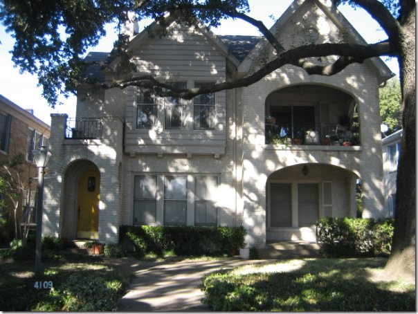
Before and After: Exterior of the duplex located in Dallas.
Through the blog, I get a few emails requesting design work. Unfortunately, many requests are for houses not located in Houston. Since the blog takes up so much of my time, I no longer am able to travel far from Houston for design work. When a reader doesn’t live here, I try to recommend a local designer, if I know of one. If not, I’ll recommend a designer who does online decorating. Such was the case with this one reader who wrote that she was moving from Houston into an 80 year old duplex in Dallas.
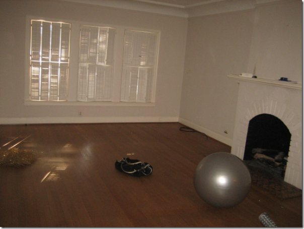
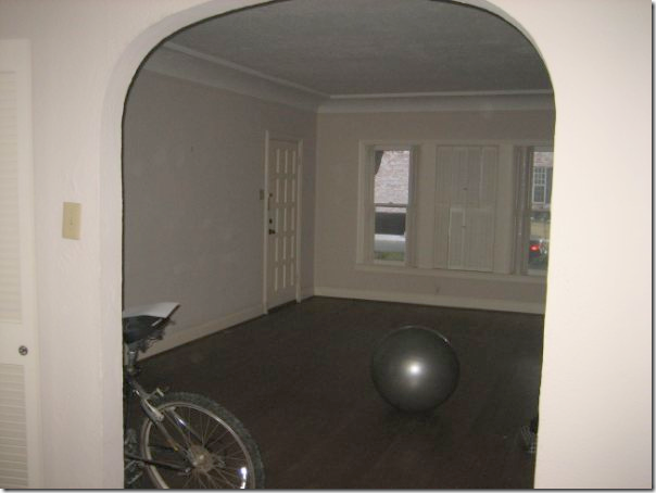
The homeowner sent me these pictures before she moved in to show me what she had to work with. The duplex had a lot of character - there were hardwood floors and a painted white brick fireplace.
Additionally, there were lots of windows and arched doorways, along with a health addicted former tenant. Despite the exciting challenge, I didn’t think it would be in her best interest to work with me – she needed someone in Dallas that could take her out shopping and then return to the duplex to bring it all together.
I referred her to fellow designer Emily Johnston Larkin of the very popular Material Girls blog HERE. Emily and her friend Lauren started Material Girls around the same time as Cote de Texas. Emily wrote about Dallas, while Lauren wrote about Houston. Today the blog has grown - there are now six Material Girls who write for it from all over the country. Emily and I had a special bond – both our spouses are named Ben and both are rabid University of Texas fans. We would email each other with tales of our respective Ben screaming into the TV over some football loss or win. So, when thinking of a designer to recommend in Dallas, I knew the homeowner would be a perfect fit with the beautiful Emily. A positive was that Sarah, the homeowner, and Emily are closer in age and probably closer in design aesthetics. After I made the referral, I didn’t think of it very often. I didn’t even know if they ever connected until a few weeks ago when Emily emailed me with photographs of the finished living areas! I was very pleasantly stunned – to say the least. Emily said she wanted to keep it all on the q-t until the job was over so that she could surprise me - and surprise me, she did.
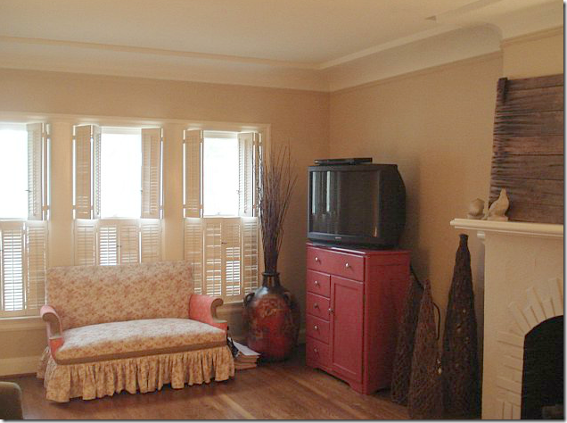
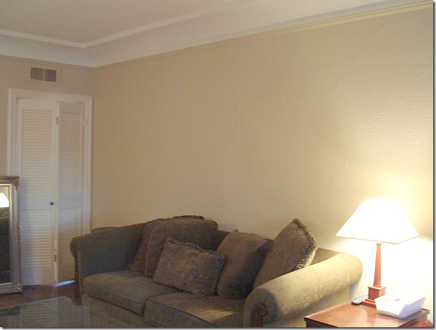
Here are the before shots of what the duplex looked like after Sarah had moved in and before Emily was hired. She owned a cute settee, along with a persimmon painted chest.
There was a green sofa in the living area.
After moving in, the one change Sarah made was to paint the walls a soft khaki color. Notice the pretty cove ceiling.
AFTER:
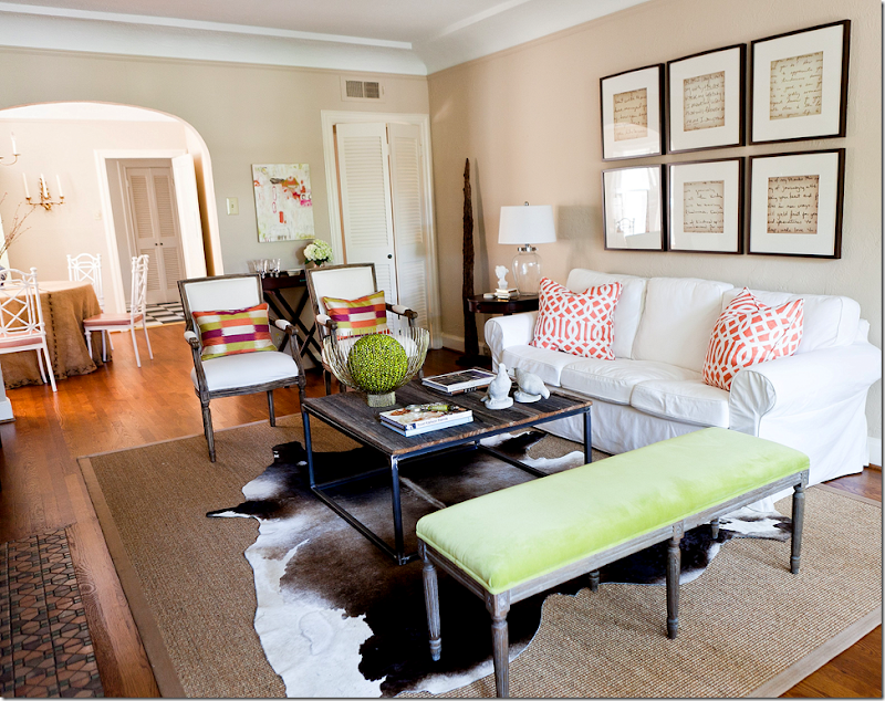
And here is what it looks likes today – thanks to Emily! What a transformation!!!! Wow.
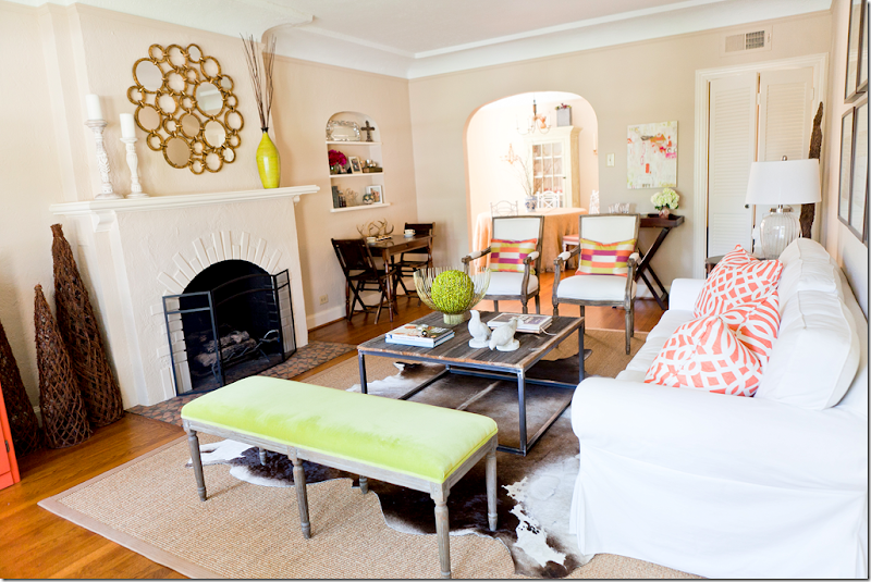
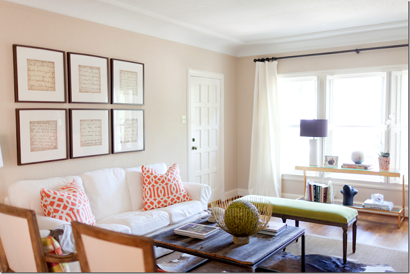
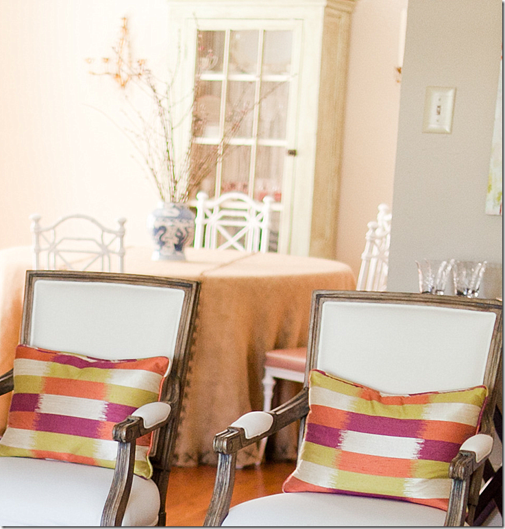
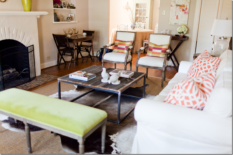
Another view of the living area and into the dining room. I love the color scheme – the white upholstery mixed in with pops of chartreuse and bright orange. The color choices makes the room look youthful and hip.
Here’s what Emily had to say about the design scheme. The homeowner, Sarah, didn’t have a huge budget, so Emily mixed high and low elements to get as big of a bang as possible. The cowhide rug was Sarah’s, so that was a plus. It was layered over a new sisal rug. Emily says that Sarah said she liked a “Cote de Texas” look – so she knew Sarah would love the sisal and cowhide mixed with a new white slipcovered sofa from….IKEA! Yes!!! The famous IKEA sofa. Look how good it looks here – at first glance, I didn’t even realize it was from IKEA, I thought they had slipcovered her existing sofa. But as Emily knows, slipcovering an existing sofa is twice the price of a new $389 IKEA sofa. Great choice. She added two new French inspired chairs from Palacek, along with off white curtains from Restoration Hardware. The French bench also came from Restoration Hardware which was recovered in a chartreuse velvet from Pindler and Pindler.
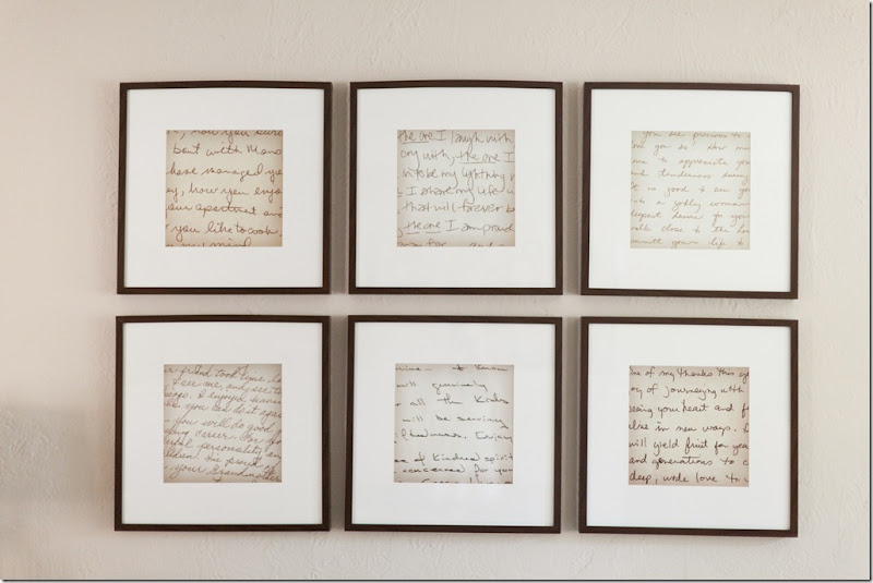
The artwork above the sofa are old handwritten notes from Sarah’s grandmother, mother, and teachers that she has kept all these years. First, she enlarged the notes on a copier, then she placed them in frames bought from IKEA. The notes are a wonderful idea – they add a personal touch to the space, plus they look like a big piece of art when framed and hung like this. Great idea!!!
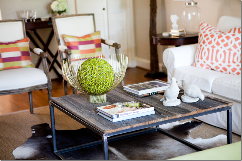
Sarah really wanted a bricklayer’s table but didn’t want to pay a fortune for what is essentially a rustic piece. Her father came to the rescue and made it himself with the help of a welder.
The modern gold bowl came from Stephanie Anne – a favorite store of Sarah’s in Dallas. This was one high priced accessory – most all other accessories came from Anthropologie and Home Goods.
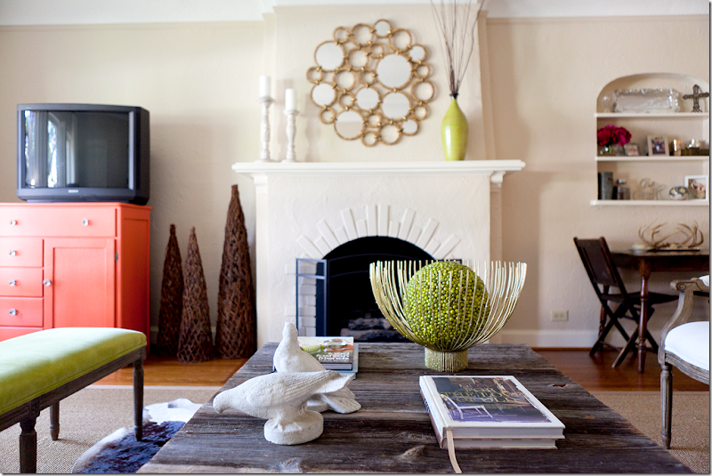
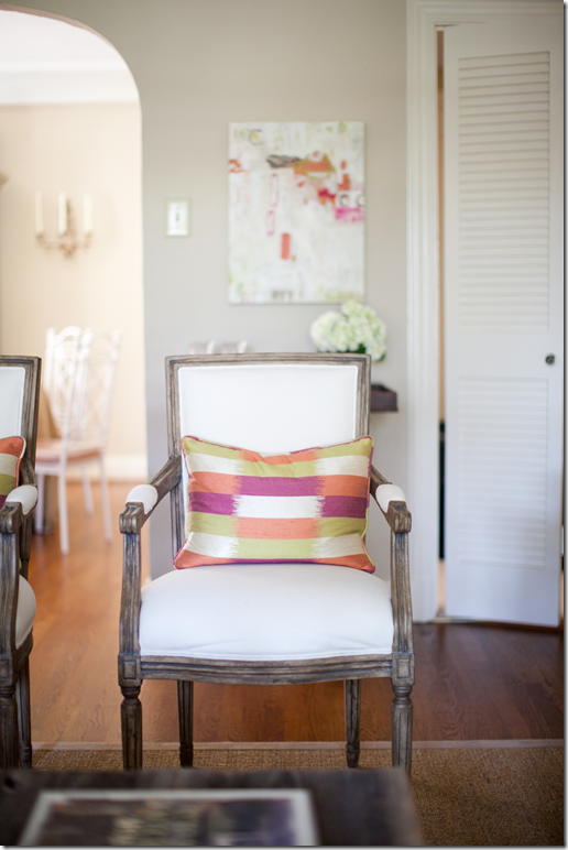
Emily added glass knobs to the orange chest to dress it up a bit. Notice how all the greens tie in together. The orange of the chest is repeated in the pillow fabrics.
Restoration Hardware curtains soften the window side of the room.
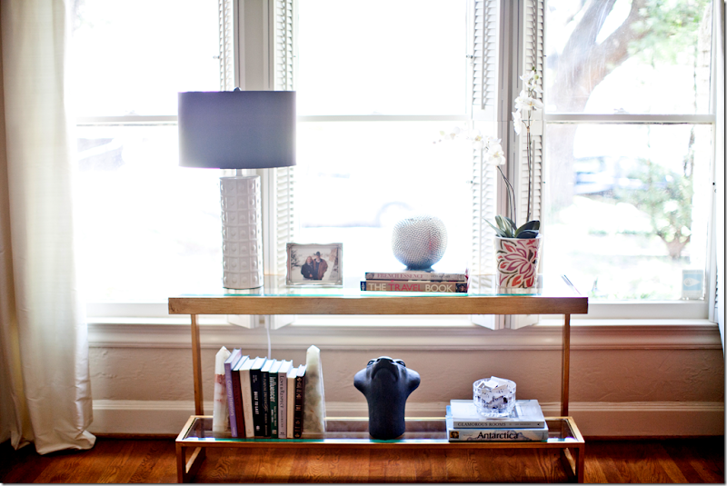
The gold and glass console adds a contemporary touch, as does the white lamp. I love the touch of lilac found in the shade.
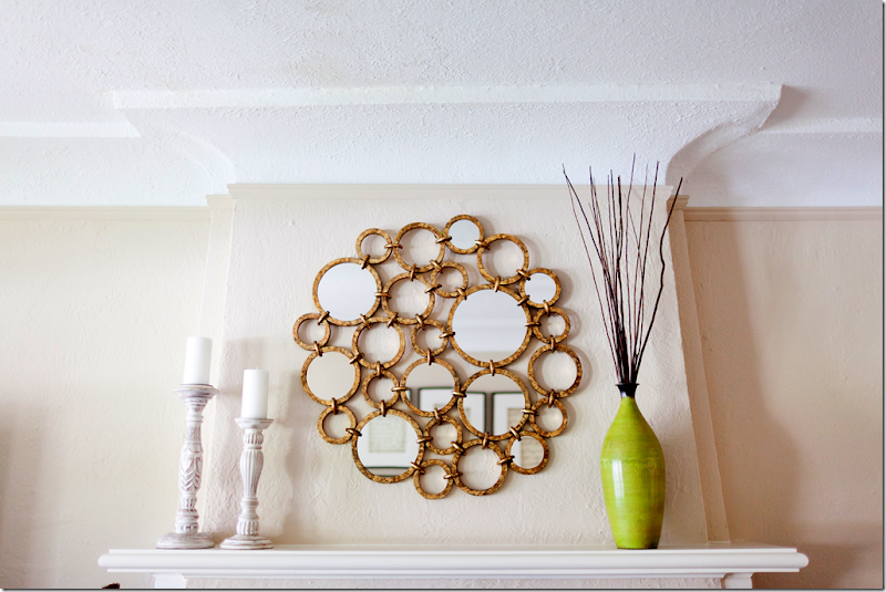
More contemporary touches is the gold mirror from Horchow. The vase brings in another touch of bright chartreuse.
The bright pillow fabric ties in with the other pops of color. Behind the chair is a commissioned work of art.
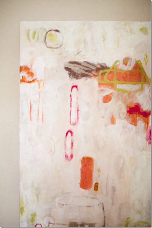
One special touch is the commissioned canvas by Dallas artist Lindsey Meyer HERE. The art work brings in all the colors used in the duplex.
Sarah collects antiques at Round Top and had inherited some from her beloved grandmother – these were used to give the room patina and character.
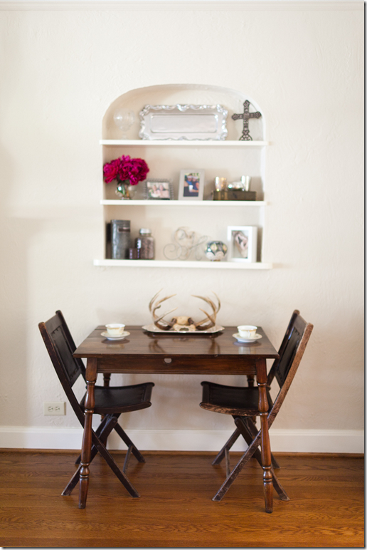
More personal touches are the antlers resting in an old silver tray. I love this juxtaposition between fine and rustic.
I really love monograms – a bowl of matches like this is handy for lighting candles and is a great guest gift. Other items to monogram are paper napkins, soaps and guest towels. Pottery Barn has a great selection of gift items that can be personalized with your monogram.
A glimpse into the dining area shows a skirted table with a painted white case, sconces and an unseen chandelier.
The burlap skirt is dressed up with X stitchery and white painted Chinoiserie style chairs. Cute black and white tiled floors lead into the kitchen.
Emily added this following story about the homeowner:
Sarah was very close to her 101 year old landlord, Katie, who passed away this past summer while we were working on her living room (Katie had lived in the unit above Sarah since the 1960’s!) At the urging of Katie’s friends, Sarah took ownership of both duplexes. The décor in Katie’s unit hadn’t changed since the 60’s so Sarah and her dad (through blood, sweat and tears J) renovated it. Once they were done, Sarah buried a letter that she wrote, under the floorboards of Katie’s former duplex that told Katie’s story. Her hope was that fifty years from now, another landlord would find it and know how special the duplex was to both Katie and Sarah.
To contact Emily Johnston Larkin, please visit her web site for all the details HERE. A huge thank you to Emily and Sarah for sharing the story of their before & after!
A Material Girl Before & After in Dallas
Subscribe to:
Post Comments
(
Atom
)






What a great before and after. I like how you mentioned the fabrics giving the space a young and hip vibe. I think they mixed neutrals and color pops perfectly. Thanks for sharing.
ReplyDeleteFresh, traditional and hip all at the same time! delicous colors!
ReplyDelete*** The change is simply wonderful, Joni, AND, the story about Sarah & Katie truly touched my heart, making me smile... and, thinking somebody "up there" totally loves the sentimentality of the letter!!! I know I do!!!
ReplyDeleteWarmest,
Linda in AZ *
bellesmom1234@comcast.net
That is so neat about the letter being buried.....sounds like it was a labor of love. Nicely done..its so pretty and fresh, and love all the pops of color. Thanks!
ReplyDeleteThis is such a beautiful home! I love the coral, which is such a lovely color. The letters enlarged as art? Genius. Thanks for sharing!
ReplyDeleteBeautiful!! But for some reason all of the images didn't show up for me...dayum!
ReplyDeleteReally lovely, and it's easy to see the Cote de Texas influence! Love the story about the hidden note. Thanks for sharing!
ReplyDeleteThe two rooms are really adorable.The pillows on the side chairs and the artwork are my favorite elements.
ReplyDeleteI have to say, as the owner of one of those Ikea sofas, I hate it. It is so uncomfortable that we just shoved in a corner in the basement.It is darn cute though.
Joni, What a great post. I love the transformation. Two memorable items stick in my mind: the cool circular Horchow mirror and the commissioned painting. Finally, I love your conclusion to this post--almost "Paul-Harveyish"...now for the rest of the story. Fast forward 50 years... Cleverly written! P.S. I haven't forgotten about sending you the before and after pics of my daughter's kitchen. We were displaced four months ago, the result of a plumbing mistake--HUGE mistake. When I get moved back into our home, in probably 6 months, I will find the cd of the pics and send them your way. Thanks for your patience.
ReplyDeleteHi,
ReplyDeleteI truly appreciate by reading this new and informative real estate article titled "A Material Girl Before & After in Dallas ". I expect more and more articles in upcoming future.
I remain by wishing you a very happy New Year !
the grouping of handwritten notes is just brilliant. donna
ReplyDeleteGreat story, and I love seeing a transformation on a budget that looks high end. Very Hamptons! Would love to see antiqued mirror backing the wall cutout, and please someone, this gal deserves a flat screen. What is the source on the console?
ReplyDeleteWow - amazing transformation. I really enjoy your blog - every one of your posts is enjoyable and full of great ideas. The eye candy is fun too !
ReplyDeleteBeautiful rooms, that is a well served client. I love the use of the script in the frames, and that the dad was involved in the project. That's so sweet.
ReplyDeleteI really enjoyed looking at this space especially because it was a high-low design. Too many of the interior photos floating around are gorgeous but expensively so. This was charming and attainable!
ReplyDeleteJoni a wonderful post with a special story.
ReplyDeleteThe blending of a fun color palette and layering of old/ new; high/ low end makes this home feel so natural.
Favorites are the art, the coffee table, the Horchow mirror, and so much more!
Xoxo
Karena
Art by Karena
I used to drive by this duplex all the time when I worked for a design firm in Dallas! I always daydreamed about what it looked like on the inside and fantazised about owning such a charming little piece of real estate for myself. Beautifully done!
ReplyDeleteThose rooms are picture perfect! I love the letters idea - totally stealing that!
ReplyDeleteLOVE the handwritten notes transformed into artwork! What a clever idea. I'm sure we'll see more of great DIY project/idea in the near future in other homes.
ReplyDeleteWonderful of you Joni to pass the address of Emily and congratultions to the home owner to follow your advice to hire Emily! Well done!
ReplyDeletexx
Greet
Very nice duplex with lovely porches, nicely sized room and molding. Do you have pictures of the kitchen, bedroom and bath areas. Love the table inherited from the owner's grandmother. It adds depth to all of the lighter pieces and the framed letters are very effective.
ReplyDeleteLove this! My favorite idea is the handwritten notes that are framed. It's so sentimental but modern looking at the same time.
ReplyDeleteI love that apartment and perfect for a young woman. I also love Sarah's idea of the letter what a sweet way to remember her friend. So many wonderful ideas to take away now I must go check out that artist.
ReplyDeleteXX
Debra,
Great job! I know this house and that neighborhood!
ReplyDeleteBeautiful! So excited to see my lovely and talented friend Lindsey Meyer's artwork featured on my most favorite blog. YAY!!
ReplyDeleteGreat job ladies...love love the idea of blowing up the handwritten notes. Z Gallerie has a great silver alternative to that gorgeous bowl on the coffee table. http://www.zgallerie.com/p-9473-paquet-bowl.aspx
I am a watercolor artist, so embracing the persimmon chest by adding a complementary color such as chartreuse is perfect. The eye loves such a contrast. The new space is fresh, sophisticated and most importantly, it looks cozy and comfortable! Thank you all for sharing the project, and inspiring and reminding us that we don't have to put off updating our homes until we win the lottery.
ReplyDeleteInspiring! Emily, you are a rising star! Sarah, love the framed words (letters)! Your home is picture perfect! xoxo
ReplyDeleteJoni, you are one of the best bloggers for teaching me design tenets that previously escaped me. So help me out here? There is something about this living room that is off for me, and I don't know what it is. Perhaps if you explain it to me, I'll have a learning moment! It seems like it belongs in a catalog, rather than to a real person, but I can't figure out why. I think it is lovely, balanced, youthful, etc - all those great things, but something is just "off". I don't mean to disparage the designers great work in any way, more than I'm trying to learn more about discerning good design choices and how to complete a room so it doesn't look overly designed. Help?
ReplyDeleteRobin
Adored the letters framed- Grand Idea! Great post Joni..xxpeggybraswelldesign.com
ReplyDeleteWhat a loving before and after! It proves that you don't need lots of money to have a beautiful place. It's the thoughtful tie to family that makes Sarah's home distinctly hers. Not cluttered, but filled with the things she loves!
ReplyDeleteSo much fun!!! Love the framed note idea...really charming and sentimental.
ReplyDeleteWow, what a transformation and what a gorgeous color palette! The neutral foundation is perfect for these colors to shine, yet it's done with restraint and elegance. Great work!
ReplyDeleteIf you ever get a request for a decorator in the Montgomery, AL, area, please send them to Karen Rainey Interiors! www.karenraineyinteriors.com
ReplyDeleteThanks! LOVE LOVE LOVE your blog.
labellechambre.blogspot.com
getgrounded, what may appear off to you is that all of the colors seem to be the same value. My eye immediately went to the stained table and two chairs in the corner because that was the only place that had depth. With all of the fabrics being light, there is not much to ground this room. While it is the owner's choice, I don't think the bench was the best choice as seating space given that it and the cocktail table are the same height.
ReplyDeleteLoved this re-creation! Have to agree with the comment about the Ikea couch that looks so good but is so very uncomfortable.
ReplyDeleteI'm ready to incorporate some of the ideas from today's blog into my home for sure.
I love so much about this renovation! The juxtaposition of traditional-contemporary; neutral-pops of color; rough luxe and sleek smooth; vintage and new. It makes for fun, livable and beautiful home!
ReplyDeleteI aspire to this environment in my own home. Thanks for the blog. You keep me dreaming!
Hi Joni - you were so sweet to introduce me to Emily. I love working with her - she is just as professional as she is fun. Thank you for the post, as well. As a huge fan of Cote de Texas, I'm so humbled. If you could only see the FUN we've had in this room...watch parties for the Oscars, The Bachelor, the Royal Wedding, a tea honoring Katie after she passed away, birthday parties, and so much more. Thanks for sharing about Katie too - she was so dear. Blessings Joni!
ReplyDeletethanks to all! So glad you enjoyed seeing the room. I too loved the letters idea. What a great idea. I would have never thought of that!
ReplyDeletea few comments -
the ikea sofa. i had never sat in it before my daughter got one and I just have to say that i find it very very comfortable. that's weird that a few of you said you didn't. I was surprised how nice and soft it was. So - it's personal. If you are in the market for one - go try it out yourself first. don't go by me or the ones who say it isn't comfortable.
I still say that for the price of an expensive meal that we all know how that ends up after we digest it - flushed down the toilet - instead you can have a nice, new, stylish sofa that you can work almost any design around.
ok - get grounded and anon (hi there! - I was curious as to what you would say today.)
One issue GG is having might be the professional photography. It tends to make everything look a little sterile and hands-off. I am wondering if that might be what is bothering you.
I see what you mean by "over designed" - yes, it DOES look like she hired a designer. You can see what it looked liked before - and after. Not sure why hiring a designer would be a negative though. Given a choice between the before and after - which would you honestly choose?
Another thing that might be bothering you personally - there are a lot of accessories as opposed to books. Some people don't like accessories around - things that have no use except to look pretty. You might be one of those. People like you would feel happier surrounded by books they've read, magazine stacks, etc. There isn't much of that in this room. your coffee table might be piled high with oversized books and a basket filled with remote controls. This room is a little more dressy for your style perhaps.
The contemporary touches also might not be your choice - the mirror, the console, again - the accessories. this is a personal choice. The designer used the contemporary touches to make the room trendy, fresh, and youthful with a touch of glam. that's just not your aesthetic. You just aren't relating to this design on a personal level. Nothing wrong with that - it's a good teaching exercise for someone like you.
And, one more thing - you might not like accessorizing mantels. You probably would want candlesticks that you truly used up there, or shells that you collected on a trip, etc.
GG, I know your living room - you are much more organic and like a more casual, beachy look. This room just isn't your style. I bet that you liked the dining room though. just wondering if you did?
On to anon - I have to disagree about the room not being grounded because of the white. I find that cowhide rug being dark grounds the seating arrangement. Also, the coffee table helps to ground it. Perhaps if there was a small wood accent piece between the two chairs, it might feel even more grounded.
Funny you mention the card table and chairs - that was the one element that i felt didn't look as great as the rest of the room! interesting how design appeals to people in different ways. you might be right about the height of the bench and table, but I have to say - I adore the look of the bench with the bright fabric. It pops the whole room - I loved it even if it might be a tad too high.
The card table with its nice patina adds a lot of warmth as would one additional antique perhaps in a taller piece.
ReplyDeletespeechless and touched joni - lovely post. sarah sounds like quite a girl and i love the katie story. emily is so talented. the rooms are gorgeous. sometimes i think i could design, and then i see what someone does on a budget lie this and i am speechless - all the wonderful touches, the whimsy of the antlers, the contemporary notes, the cote de texas vibe...just fabulous.
ReplyDeleteexcellent matchmaking, by the way! congrats emily and sarah. so sorry about katie - what a gift to make a friend like that.
xo terri
Oh, now this is adorable. What a sophisticated, yet happy approach to a young gals home. Emily did a great job for her! I want to go and visit!
ReplyDeletexoxo,
Andrea
So pretty and such great investment pieces! I doubt the homeowner will be tired of anything in that room. The art work makes an amazing difference and framing the enlarged letters was a super creative solution!
ReplyDeleteWhat a great story! I lived in Dallas for a while, and I think I know about where this is -- or at least some buildings like it. These older buildings have great character and charm, and the ladies did a wonderful job making it look fresh and smart.
ReplyDeleteJoni, thank you for the lesson! I went back and looked at the photos, and you're right, it isn't the design. I actually like the layout, the bench, the chairs, etc. And the room is definitely grounded, all the wood flooring, sisal rug, black fireplace screen, so no problems there. It's the orange and greens with nothing to cool it off. Just not my personal taste! Even the flooring has a lot of orange in it. And you are very correct, when I looked at the photos I did think that the dining room was better - of course it's that textural burlap that made it for me. That helped me a lot, the way you explained it, thanks. Not enough texture for my taste, and too hot visually. But that's merely a personal preference and has nothing to do with taste levels. It's all good, and she did a great job. Thanks!
ReplyDeleteIt's pleasant. There are very few fresh ideas here. Even the throw-pillow fabric is tired. But if you want to be surrounded by what you've seen a thousand times, it's fine.
ReplyDeleteI like it. I love the general serene Cote de Texas look (why else would I be here...?) to look at but for myself, I need some pops of contrast. Also, I love chartreuse. So I like the look here, overall.
ReplyDeleteI do think just a TOUCH of darker contrast - ebonized wood, perhaps, on a Louis chair with light upholstery? A chartruese pillow with black trellis? Would have grounded it a bit. But I believe even the lightest room needs a touch of black, so that's my bias there.
I love the persimmon chest, though. And I have sat on the IKEA sofa and I at 5'0" and my husband at 6'2" both found it comfortable, which almost never happens! That's why its still on my list for when I get my next sofa.
I love the cowskin. My husband hasn't let me get one yet. Jealous! :)
Joni, I've got it. It's too symmetrical for me. I know you love symmetry, and I'm one of those people who avoid symmetry as much as possible. There's pairs of everything in this room, and that's why it doesn't feel like it has any life to me. Again, just personal preference. Whew, glad to figure it out.
ReplyDeleteSome day the persimmon piece may go into the dining area for storage and a taller wood tone piece could take its place. I really like the little niche above the card table, but I think it would be very pretty painted inside some day when that dark taller piece may be in place. The accessories look purchased for the job rather than collected. However, this is a young person who has not had the time to have acquired a lot of personal objects. That will come in time and then the mantle will take on more interest. Mantles can be difficult to dress and compliment at the same time what is happening in a room.
ReplyDeleteI ignored whatever you have written, i just kept on scrolling down to see more of pictures. I myself is Interior Designer and this gives me Inspiration and idea for my work. How much all those things cost?
ReplyDeleteOops, not dressing monks here. MANTLES needs to be MANTELS. Don't you just hate English? Sorry about that for all of you great spellers out there.
ReplyDeleteAnon. 7:23
Martins, of Interior Designer Chicago fame, it looks like you have already figured out the cost of design and have found inspiration of your own. You also look smart so why the deliberately written poor grammar such as "I myself is" and "how much all those things cost"?
ReplyDeletembuka@martinsbuka.com
ReplyDeleteMartin has found his zen through the practice and teaching of yoga. With a BA in Interior Design from the Chicago School of the Arts, Martin Buka specializes in crafting one of a kind results from concept to creation.
So Martin, grow up and enjoy your own successful practice and work a bit on your grammar. Keep that wrist limp and work a bit more on your snark.
This room looks absolutely lovely. I love the fact that it has some fresh, youthful colours and modern accents mixed with some very classic pieces. It is a look that can be easily updated very inexpensively. Well done!
ReplyDeleteWhat a sweet story and a lovely makeover! Love the color choices here. Very young and fresh, a nice mix. I love the antlers on the silver tray. Great idea.
ReplyDeleteBeautiful makeover, made so much better by the wonderful story. Thanks for sharing!
ReplyDeleteGreat design with the old/new... I liked it. Thanks
ReplyDeletePretty, fresh, youthful, girly and glam!
ReplyDeleteLovely!
Thanks, Joni, Emily and Sarah!
-linda,ny
What a fabulous transformation! I really love all the elements especially the rugs, sofa and silver tray with antlers. The colors are great too. I also love that you, Joni, passed on the job to Emily - that's great. Just shows what a great group of bloggers we all are!! I would love to have a home look like this. ;-))
ReplyDeleteFantastic interiors! Love the painting as well! Thank you for sharing it!
ReplyDeleteATTENTION! If You or Someone You Love is Struggling to Get Pregnant, Then This Will Be the Most Important Article You Will Ever Read...
ReplyDelete"I Thought I Was Infertile But Contrary To My Doctor's Prediction, I Got Pregnant Twice and Naturally Gave Birth To My Beautiful Healthy Children At Age 43, After Years of "Trying". You Can Too! Here's How..."
-Get Pregnant Quickly and Naturally Within 2 Months
-Give Birth to Healthy Babies
-Reverse Both Female and Male Infertility Issues
-Improve the Quality of Your Life Dramatically!
http://f114f3s4s3tqy-so5aq8dj530n.hop.clickbank.net/
Anon. 6:17, you must be kidding, right? A worthy endeavor, not the right place to advertise.
ReplyDeleteHi,
ReplyDeleteAgain I explore something new and informative in your Blog which attract my eye to read more. The Blog titled “XYZ” is truly unique and contains additional feature that people would love to discover ! I hope you will keep continue new blog more and more in upcoming days….
Have a wonderful day!
Excellent job! I really like the use of color, and the pillows.
ReplyDeleteWell i didn't knew that i will be criticized because i say poor English. For some people English is not main language, so error happens.
ReplyDelete@Anonymous
Use your real identity and talk.
I LOVE what Emily did here. It looks like an entirely different space. I love the color pallete she chose. That brass and glass console table is a dream. I love the framed letters. I'm totally doing that with old love letters sent throughout the years from me and my husband who was overseas. This room is a dream. I hope the client is happy.
ReplyDeleteDoes anyone know the fabric that is on the chairs? Thanks!!
ReplyDeleteDowntown Dallas is in Texas, USA. It is considered as the central business district (CBD ) of Texas. It is worth noting that the area is transitioning from resi.
ReplyDeleteApartments Downtown Dallas
The good news for you is that drainage systems in Dallas are always good. This definitely guarantees you of a healthy hazard free comfortable stay. Most apartments in downtown Dallas are equipped with clean toilets, nice bathrooms and 24 hour water supply. They have hot showers and hot water boiler to increase the comfort of your stay.
ReplyDeleteApartments Downtown Dallas
For many renters the possibility of using a rental situation to save money is a foreign idea. These renters often bemoan the fact that they have to rent a prope .
ReplyDeleteApartments in Downtown Dallas
I'm amazed, I have to say. Really rarely ever do I face a blog that's equally educative and entertaining, and enable me notify you, you might have hit the nail on the head. Your concept is excellent the issue is something that not sufficient people are talking intelligently about. I am very joyful that I stumbled throughout this in my look for for some thing referring to this.
ReplyDeletemoving from dallas
fort worth moving
Interesting and impressive blog for Interior Designers. Your blogs provide us many ideas and inspire us for making our house more beautiful and amazing. Please keep sharing.
ReplyDeleteI like the house and its form. Enough space for me and my family. But the problem here, is if you want to rearrange the things it will be difficult to move side by side.
ReplyDeleteThis is my first-time i visit here. I discovered so many entertaining stuff in your blog, especially its discussion. From the tons of comments on your articles, I suppose I'm not alone having all the leisure here! Keep up the superb work.Blood in stool Houston
ReplyDeleteIt's so pretty!
ReplyDeleteNail Art Course in Singapore
Nice post, I am so happy to see your home after renovation. All things looking so pretty, designing and decorating are also looking pretty. I must say it is beautiful to see the color combination of furniture and walls. Keep sharing such a nice post with us.
ReplyDeletereal estate investment austin