We are thrilled to welcome Joe Lucas and Parrish Chilcoat to this week’s Skirted Roundtable. These two Californian interior designers bring a unique combination to their clients – they are male and female – a rare partnership first made popular by Sibyl Colefax and John Fowler. Together, Lucas and Chilcoat bridge all the masculine/feminine issues when designing interiors, their rooms are a beautiful mix of the two. Lucas and Chilcoat joined forces in 2005 with their firm, Lucas Studio, Inc. and in 2008 opened up Harbinger, their retail showroom, now located on the trendy design street La Cienega in Los Angeles. Both hail from the East Coast, but now have a definite Californian vibe which can be seen in their elegant, yet casual designs.
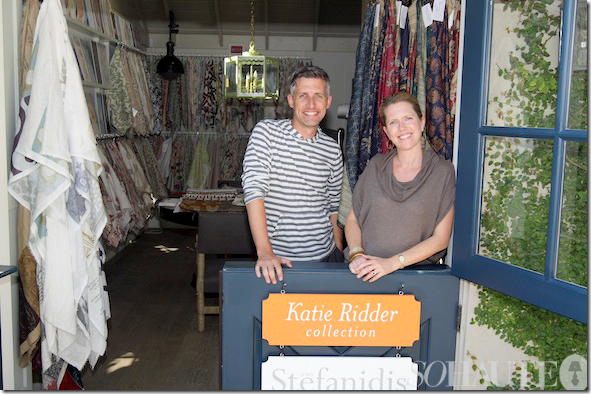
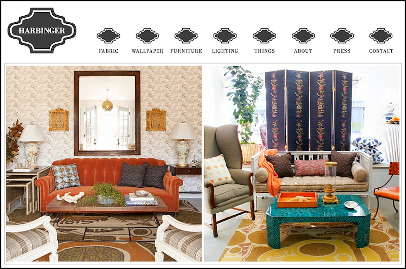
Lucas Studio at Harbinger, their retail showroom.
How Joe and Parrish started in the business is a fascinating tale. They ended up working with the greats Michael S. Smith and Suzanne Rheinstein – both having no design experience to speak of. How can that be? They spill the beans on The Skirted Roundtable – giving it up to all of us who have ever dreamed of working for a top interior design firm.
Since teaming up, Lucas Studios has won all kinds of awards – including those from magazines such as Traditional Home and House Beautiful. The two are effusive and warm – we can only imagine the witty bantering that goes on their offices!!! Below is a look at their stellar portfolio. The link to the Skirted Roundtable is HERE.
House Beautiful recently ran a large spread on Lucas Studio’s California house designed for a 29 year old hockey player: Party Central.
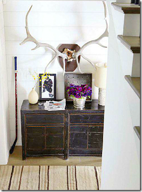
The entry hall – love the oversized horns.
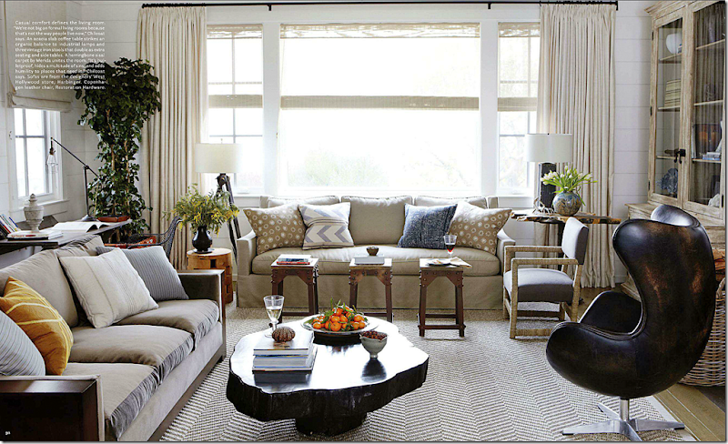
Designing for a man doesn’t have to mean recliners and leather sofas. Lucas Studio prefer to design casual living rooms – for how people really live today. They use natural fabrics – cottons, linens, silks and velvets. But, they state, they start almost every design with a textured rug, such as sisal or seagrass. Here, the leather chair from Restoration Hardware is so sexy looking – it almost becomes the focal point of the room.
Throughout the house, Lucas Studio used painted white paneled walls – with yards and yards of matching white curtains. The curtains were a tough sell for the 29 year old hockey player. But, Parrish doesn’t feel like rooms are finished without curtains (I agree!)
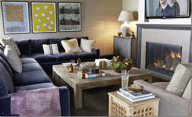
The hockey player plans on entertaining a lot – hence the ‘Man Cave’ with a plum colored velvet covered sofa.
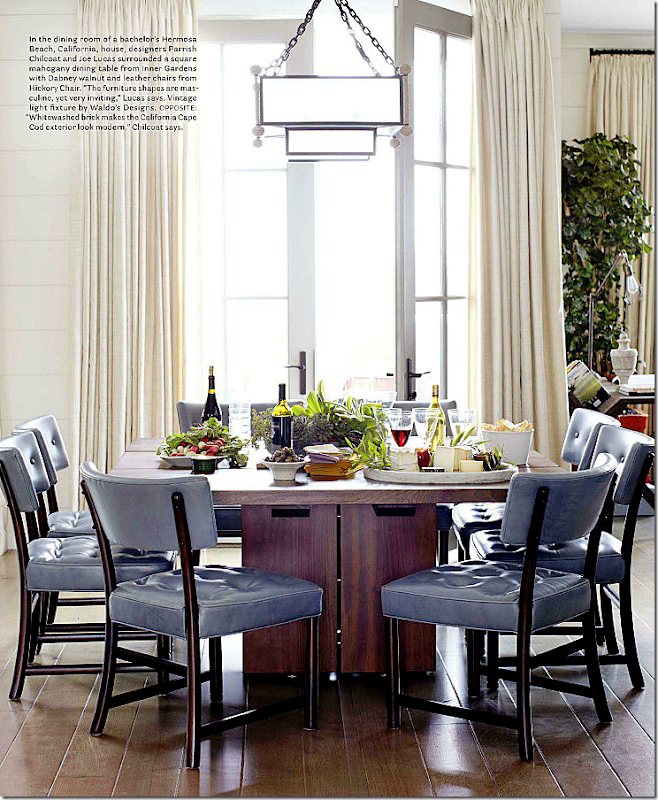
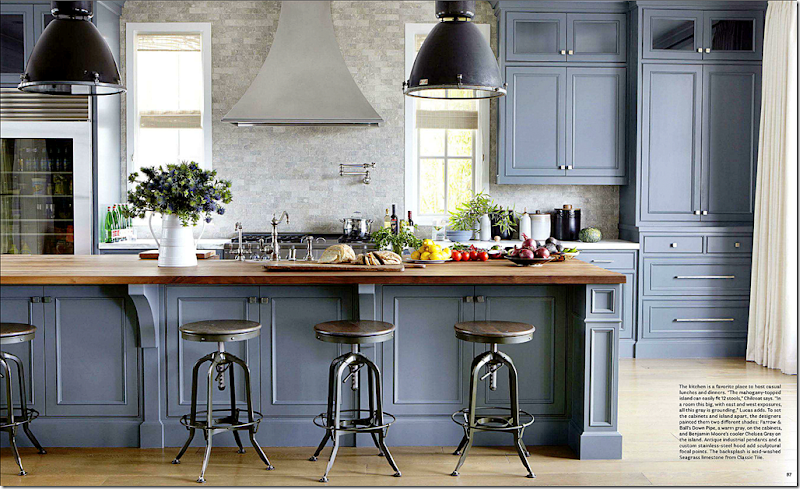
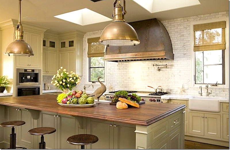
The kitchen is fabulous – painted in two different shades of gray – the island topped with mahogany seats 12. It’s such a beautiful kitchen – and it’s not even white!!
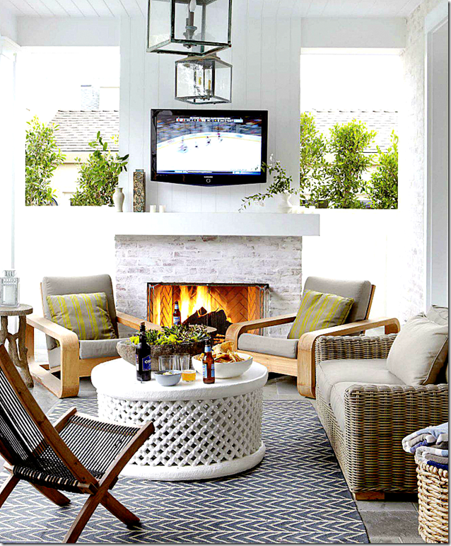
His terrace is designed as another entertaining place – note the outdoors flatscreen.
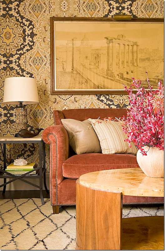
Other interiors from Lucas Studio – this wallpaper!! That art work!! Love it. Lucas Studio use this salmon color in a lot of their interiors. They also use blues and greens a lot.
In this living room, I’m loving the brown and white rug, wondering if this is a dyed skin? Again, the salmon colored velvet – mixed with sage greens.
Love, love, love this! This room shows that mix of masculine and feminine elements. Lucas says to enlarge a room – paint the ceiling and walls the same color. Notice the greens and salmons and blues – how wonderful they look together.
Four chairs instead of a sofa. The patterned pillows are the color pop.
Another beautiful kitchen with the wood topped island and industrial styled antique pendants. The slightly oversized pendants are so much more effective than the just-right size.
This family room caught my eye because of the large cork board used as a gallery wall of the children’s artwork.
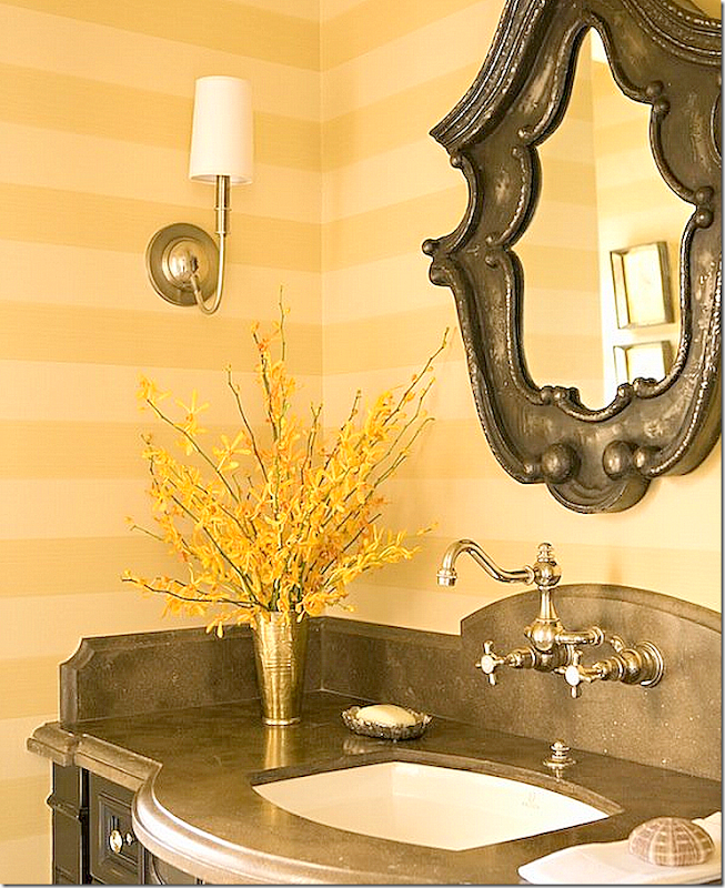
This might be my favorite of all their living rooms. I love the mix of the rug and seagrass, the textured chairs, the navy sofas with a mix of pillows. The tree stump table brings in a bit of folly. And I love the symmetry of the two lanterns and two sconces. The entire room is a study in symmetry – a decorative element Lucas Studio excels in. Beautiful!!A Lucas Studio powder room – great faucet mounted on the arched stone backsplash!!
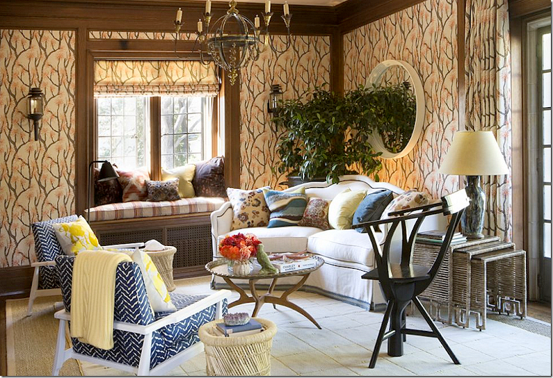
At Veranda’s Greystone showcase – Lucas Studio created this room – with fabulous fabric from Ferrick Mason used for wallcovering.
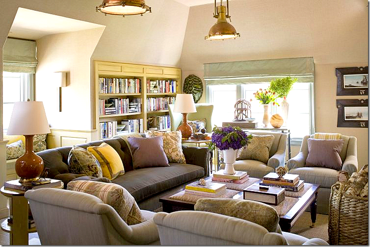
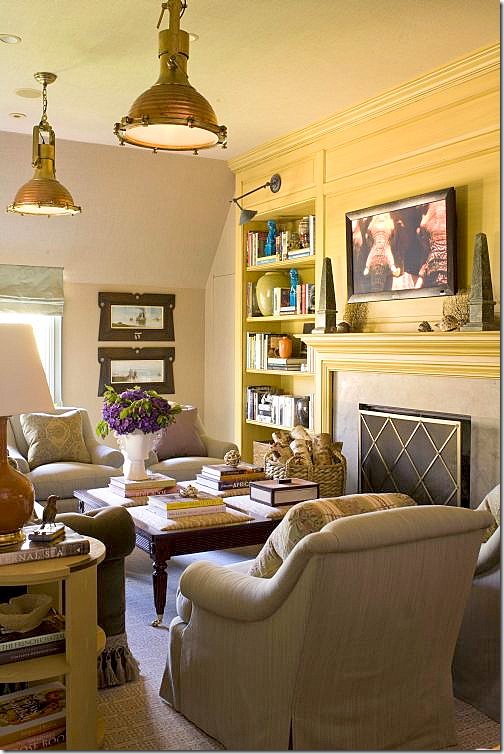
For the Stately Homes by the Sea, Lucas Studio designed these two rooms. The first – a living room – with two industrial styled pendants.
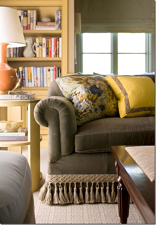
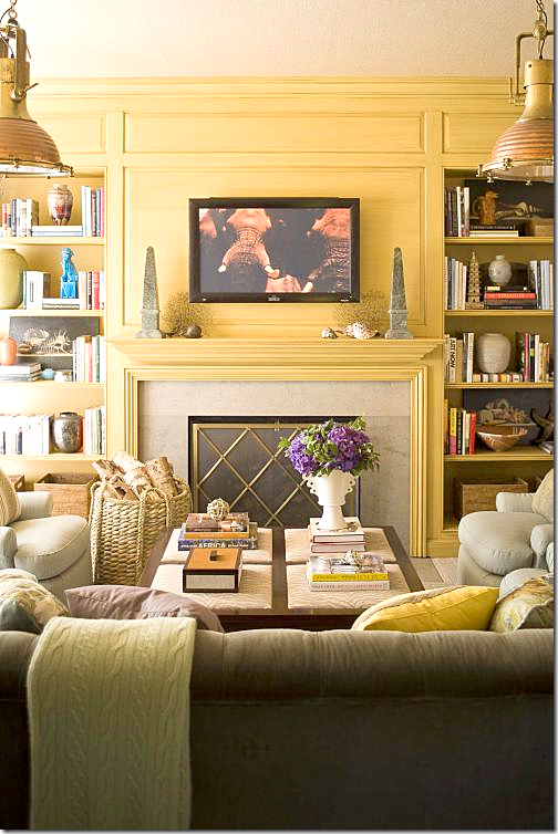
A detail of the sofa trim and pillows.
The fireplace wall is highlighted in yellow, while the rest of the space is wallpapered in a neutral grasscloth.
Notice the coffee table – a cross between an ottoman and a table.
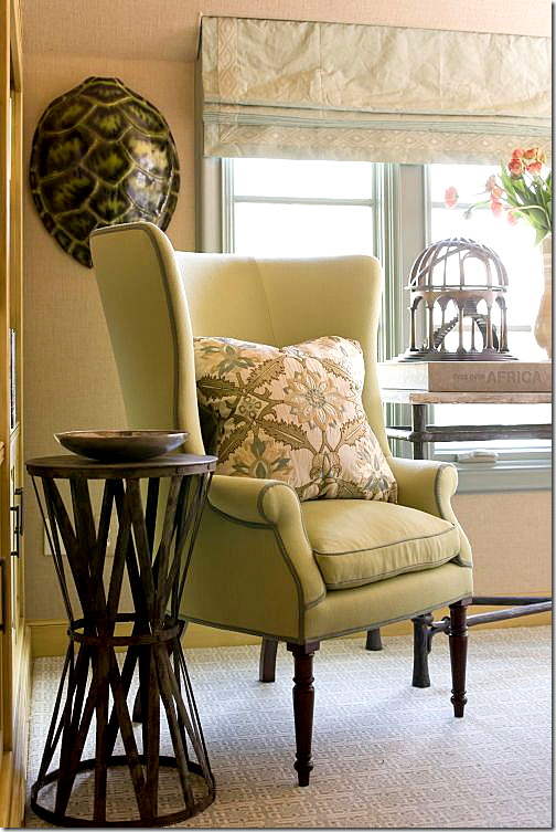
Behind the sofa is a window seat, beautiful shades.
Next to the sofa – a modern take on the wingchair.
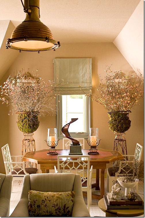
And off to the side – the dining area. Lucas Studio really likes symmetry – which is played up in this area. Beautiful urns and chairs!!!
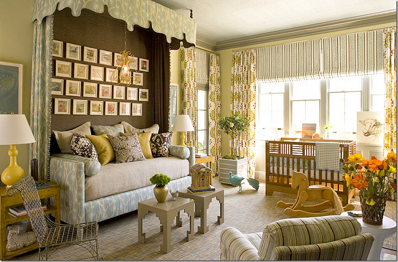
The second room they designed for the showcase is the …?? Can you see what kind of room this is? That’s right – a nursery!!!! Gender neutral, of course. I love the daybed and the canopy. The dark fabric behind the bed makes it look like an alcove or built in bed – great idea to borrow.
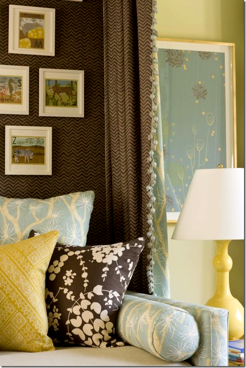
Close up of the bed’s fabrics.
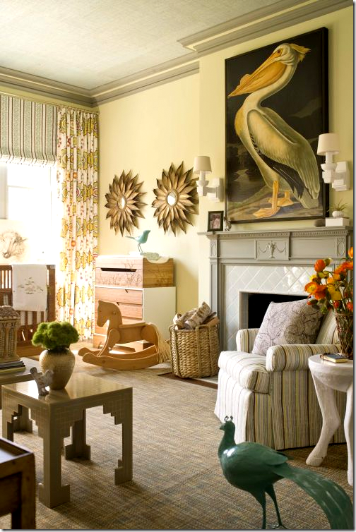
Don’t you wish all nurseries had fireplaces in them? Of course you would never light them for fear the baby would get in the fire somehow. Love the stork with it’s double entendre.
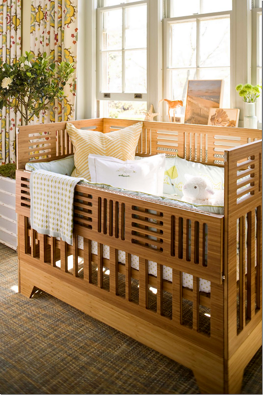
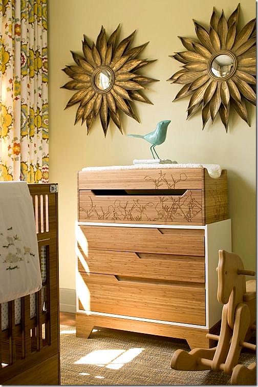
The crib has an Arts and Crafts Movement look to it. Notice the beautiful suzani fabric by Martin Lawrence Bullard used as curtains.
Above the changing table, symmetrical sunburst mirrors.
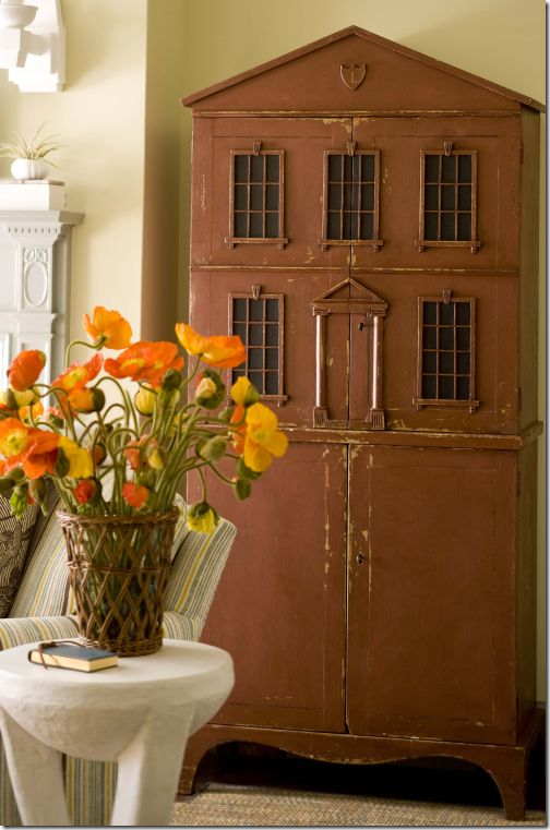
And, an antique doll house sits next to the fireplace. Pictures of the showhouse come from Style Beat’s Blog HERE. Photographs by John Bessler.
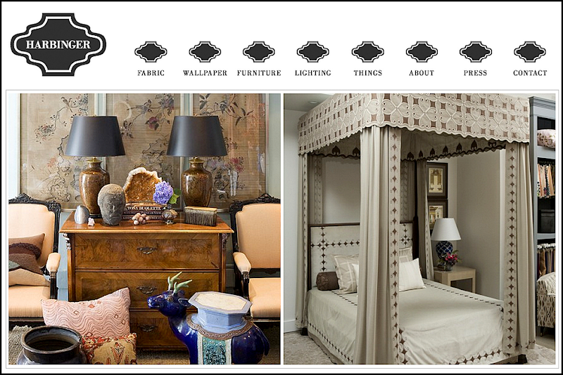
Be sure to visit Lucas Studio and Harbinger’s web site HERE – images from the Harbinger shop are shown. Also, there are many, many more portfolio pictures to peruse.
I hope you have enjoyed a look at Lucas Studio’s beautiful portfolio. And a huge thank you to Joe Lucas and Parrish Chilcoat for stopping by the Skirted Roundtable. To listen to their recording, go HERE.
LUCAS STUDIO STOPS BY THE SKIRTED ROUNDTABLE
Subscribe to:
Post Comments
(
Atom
)





i have been swooning over the kitchen in the "party central" house for months, in fact i was showing it to my husband just this morning! one question i have about the gorgeous acid washed limestone subway tile...with that honed, velvety finish, will it be a complete mess to clean behind the stove burners? if you seal them with something that would protect them from the WHOPPING MESS my husband makes when he cooks, wouldn't that make them shiny and ruin the stunning effect of the soft, porous, finish? what do you think?
ReplyDeleteHONED surfaces are easy to clean - but if he makes that much of a mess, anything will be hard to clean up, right? so get what you love!!!! it's a gorgeous kitchen
DeleteI love all these rooms and that house for a 29 year old is fabulous, I think I'm a little jealous! That house will be able to grow with him without looking dated. I like how relaxed all these rooms look and livable.
ReplyDeleteHappy Holiday!
XX
Debra~
Joni,
ReplyDeleteThose are the most gorgeous, liveable rooms I've ever seem! Love each one - thanks for sharing! Beth
Very talented duo! Beautiful, elegant but not stuffy or fussy...and I see a trace of that laid back California vibe in there too! That nursery is to be believed..wow!! Thanks for sharing..have a great day.
ReplyDeleteNice story but that is a pelican not a stork.
ReplyDeletereally????? hahah!!!
DeleteGreat story, as always. The bachelor pad is beautifully balanced for comfort and good looks. Thanks for your wonderful posts. I look forward to them and like to see you in your email in my inbox.
ReplyDeleteJoni I adore this very talented design couple and their use of luscious fabrics and trims. Still all comfortable rooms with classic elements. That nursery! The 29 year old Hockey Player. They have injected the elegant with the "Guy Vibe" Perfect!
ReplyDeletexoxo
Karena
Art by Karena
Love!!! This look is what I love about California and miss sooooo much. Great use of subtle color also and I love all the velvets.
ReplyDeleteOh wow, what amazing designers and what an interesting post. I am in love with that wallpaper in the room with the salmon-colored couch -- can anyone help with identifying it?
ReplyDeleteJoe Lucas and Parrish Chilcoat do excellent work. I look forward to shopping at Harbinger the next time I visit friends in Los Angeles.
ReplyDeletePerhaps it was a demand of Party Central Dude's but the placement of his television outdoors is a decision that probably leads to noise pollution projected onto the properties and into the houses of the people nearby. Unless Hockey Dude and his guests listen to the outdoor television through headsets only, it's unlikely the amplified sound from it is kept on Dude's property only.
Unwanted amplified noise projected into the home from outside has a deleterious health impact on the people living there.
For information on noise pollution, see:
The Florida League of Conservation Voters article on NOISE POLLUTION
http://www.heraldtribune.com/article/20080624/COLUMNIST13/806240707?p=all&tc=pgall
The Deleterious Impact of Projecting Noise into the Home Environment
http://www.barkingdogs.net/exposeindex.shtml
The World Health Organization's Guide for Community Noise
http://www.who.int/docstore/peh/noise/guidelines2.html
Excessive noise exposure is a public health hazard. It is as important as air and water pollution.
I would suspect the property is large enough that the noise isn't an issue for the neighbors. But thanks for the links!!! I really hate lawn blowers = i wish we could outlaw those.
DeleteFabulous work -- I love that the rooms don't look overly "decorated." The nursery is definitely fit for a little prince or princess. I've been looking for a simple fireplace screen like the diamond patterned one in this post. I saw something similar in Suzanne Kasler's book. Anyone have a source?
ReplyDeleteMaureen
I think that's my most favorite Nursery EVER! AND AHHHH who's wallpaper is that behind that salmon sofa?!!!!!! LOVE LOVE
ReplyDeleteLove, love, love your blog! Any day that I find a new post in my inbox is a good day! I especially love your "readers' kitchens" and "readers' houses" posts as well as pictures of any of the projects you have done. Also, I will be ordering Phoebe Howard's book per your suggestion.
ReplyDeleteOn a different note, I am coming to San Antonio with a girlfriend next month (we live near Chicago) and we will have a few hours to do a bit of shopping. We both love your style and wonder if you have any suggestions of shops in or around San Antonio to visit. Any help you could give us would be much appreciated! thanks---
No, i dont! but i would suggest trying to find a blogger who lives in San Antonio - there has to be plenty of shops there. If not go to Austin, there are lots of great shops there and it's only an hour away.
DeleteAAAAAARRRRGGGGHHH! every room is more gorgeous than the last....I love so many things on your posts, but these designers are jaw-dropping for me....every time I make a comment I hope that I am witty and original and here I am sounding like a gushing schoolgirl with a serious crush...only this is a crush on THESE ROOMS!! The nursery bed, that last canopy bed, the velvets, those wallpapers....everything is beautiful and I LOVE how it just looks interesting and tasteful and comfortable...not "Oh! look at me- "designed"......will be studying these rooms for inspiration on a couple of projects that I am working on...and I can only HOPE to achieve such wonderful results!!
ReplyDeleteThanks Joni for showing us this uber-talented pair and I am going to listen and learn at the roundtable right away!!
Cheers!
Meredith
p.s. I hope that some of the questions on wallpaper sources are answered....will be checking back often to see;-)
thanks for your sweet comment!!! i tried to email you, but there wasn't one.
Deletei have no idea about that paper - and i even wonder if it's a fabric???? Someone should just call the office and ask them. !!
What beautiful work. I love the casualness of the decor and I am so glad were seeing more wallpaper.
ReplyDeleteLovely to see beautiful rooms without an over zealous white paint brush having been there first. I adore the mix of masculine and feminine - which makes them both "pop" as they bounce off each other, without making things too busy, which you might otherwise have feared would be the result = Such talented designers. Neither do any of the rooms you show look too "done" which I think is definitely down to great curatorship.
ReplyDeleteI appreciate the fact that you highlight the repeated choice of a salmon colour and suspect that Joe and Parrish are heading up a trend towards some classic designer colours schemes, championed by Elsie de Wolf, Sister Paris (before Hadley updated her so much), Nancy Lancaster and John Fowler which I keep seeing popping up here and there and which I suspect will shortly be making a grand re-entry. All of these decorators seemed to have a common love of salmon and apricot tones. The current popularity of Coral is a step on the road to leading us all back to re-discover this palett - Because really, when you get your head around the concept (as it has been very battered, bruised and made-ugly in times past), apricot/salmon is a beautiful and versatile colour range, if you choose the right shades (see Farrow and Ball Fowler Red and Dead Salmon as two shining examples).
Gosh, this was a very long comment. Hope you don´t mind. I´ve been following your blog for while now and so enjoy the descriptions of how you see things - this post they made me so enthusiastic that I felt the need to gush.
Thanks for such a wonderful blog.
Sarah.
I'm intrigued by the use of velvet on the sofas in these beautiful interiors, particularly in the Man Cave. How will this wear, with the inevitable spills? I need to recover the sofa in my family room and have considered velvet. However, I am concerned about the wear and tear. Anyone have any wisdom and experience to share?
ReplyDeletesome people love the way velvet wears - and it does wear. plus a spill - well. i don't know - some people swear by velvet. I've used it before myself. Does anyone want to answer this? haha. I'm not willing to take the responsibility.
DeleteI use a fabric protectant/cleaning company to protect my client's draperies, furniture, rugs. I THINK they're a national company. And they have a really good warranty. ULTRA-GUARD FABRIC PROTECTION 866-667-6685 The sales rep (Mary) sent me this YouTube video link which is helpful. http://www.youtube.com/watch?v=0cz4FRtS-k0
DeleteLadies, thank you for your replies. I will check out the site you recommended, Camille. And Joni, I would never hold you responsible! :) I have an antique loveseat and chairs covered in velvet, but they are in the parlor and never get used. The family room is a whole new ballgame. I'm not sure I'm brave enough, but I do love how this designer has used it. Thanks for all the inspiration!
DeleteHi Joni~ ~ ~Great post. I love their use of color in mostly dusty shades. The salmon, blues and greens are lovely. Would love to have this duo do my next house.
ReplyDelete~ ~Ahrisha~ ~
You are so much fun, and so gracious. Even though their rooms are not my particular sense of style (it was at one point in my life - now moving towards a more austere), it is so obvious they are talented and their passion shows up huge! I bet there store is nothing shy of candy for the eye! Thank you for featuring so many amazing designers.
ReplyDeletee
Love all these comments on a wonderful blog + thank you,Joni xxpeggybraswelldesign.com
ReplyDeleteI'm in LOVE with these room! Each one made me have to go back and look at the one before it because I had sworn I LOVED that room the most! I want to cuddle up and hang out in every single one of them, THAT VELVET! Glad I haven't bought anything but a sofa for the living room which is a pretty neutral because these guys have really given me some things to think about. The pillows all just make the rooms too, all the different ones that somehow just flow together like they were never apart, beautiful. Nothing has to "catch" my eye in these rooms really, everything is so beautiful...you don't need a focal point..you just want to take it all in. The rooms are not exactly over done or underdone as far as accessories, somehow they are exactly just right and feel completely livable. If only I could afford one of those amazing rooms. Very talented indeed!
ReplyDeletePS Thank you Joni for this wonderful post and all of your hard work. We really do appreciate it!
Loved this post! Every room was so beautiful with wonderful use of color! Thank you for brightening my day!
ReplyDeleteJust adore their work. I am going to California on Friday for the design conference and will be attending an event at the store - I can't wait!! Will have to listen to the podcast before I leave!!
ReplyDeleteYou are the best it ever gets. Ann
ReplyDeleteNice to see some color!
ReplyDeleteOh my goodness! Thank you for introducing us to this incredible duo. I am obsessed with their design aesthetic. That is the coolest nursery I have ever seen. Great post!
ReplyDeleteK
I saw those, i have NO idea!!! must be something new they put in fireplaces??? anyone know?
ReplyDeleteThanks everyone for your kind comments. I know this is a departure from what i usually show but it's so nice to step outside the box and explore things - like color!! if you have time - check out the Skirted Roundtable with them
ReplyDeletejoni...i love and have enjoyed your blog so much over the years...no one is quite like you!...however it has become almost impossible for me to manage the viewing of your posts...and it is very very difficult to read and post comments...i am wondering if anyone else is having the same problems...i am not having the problem else where...wondering too if you have changed something...of if the problme simply lies with me...thank you much...laney
ReplyDeletejoni...i love and have enjoyed your blog so much over the years...no one is quite like you!...however it has become almost impossible for me to manage the viewing of your posts...and it is very very difficult to read and post comments...i am wondering if anyone else is having the same problems...i am not having the problem else where...wondering too if you have changed something...of if the problme simply lies with me...thank you much...laney
ReplyDeleteLove this post! I remember this article on the Hockey players home, and thought is was so well done! I am in love with that ethnic wall covering.. whether its fabric or paper not sure but I must find it!!! As usual fantastic post!!!
ReplyDeleteLiked their work very much too, Joni. In the living room that you loved, do you have any idea where I might start to look for a similar lamp - the one that looked like a metal canister of some sort?
ReplyDeleteAnd about the kitchens, my special interest, I liked them so well because they were not white. White is fine in kitchens, but everywhere. (Loved the dollhouse with storage beneath -great for a grand daughter I don't have yet.)
Now this I love!!! These rooms are so warm and INTERESTING. The wallpapers, fabrics and rugs stand out like art work. I have to spend more time studying the photos and their web site.
ReplyDeleteThank you for such an inspiring post.
Kathy
I love his work so much! Last year, I was in CA for the Design Bloggers Conference and I was able to go to his studio. It was amazing and his style is impeccable.
ReplyDeletewww.idesignlove.com
What a beautiful and informative post! So I took the advice and put up drapes. How right you all are -- drapes are sooo necessary to pull everything together. Before, my furniture kept looking out of scale -- I kept rearranging it -- until the drapes. And now it looks complete. And I did it on the cheap with panels from Ikea, matchstick blinds from Cost Plus and wood rods and rings from Lowes. Three windows for $160.
ReplyDelete...That's a pelican.
ReplyDeleteVery Inspiring, yet I have issues with TVs over the fireplace.
ReplyDeleteI just listened to the Skirted Round Table recording this week and truly enjoyed getting to see these photos to follow. Such talented designers. Thank you for sharing!
ReplyDelete