A few months ago, a reader emailed me asking if I would like to tour her house. She said her friends had encouraged her to contact me, saying I would really love it. And I have to say, they were completely correct! Located in a close-in, gated community in Houston, the house was around 15 years old when the current owners bought it - then totally gutted it. Before, it had been a rather bland traditional with large, nicely proportioned rooms. But, the decorative elements were all wrong for Kay, the current owner. Upon meeting the quiet and somewhat shy Kay, it is quickly apparent she is highly intelligent. Although not schooled in design, she undertook the massive project with more knowledge than many who are. Her exquisite taste drove the renovation. The house was stripped bare of all its superfluous details. Today the house is sophisticated and elegant with classically correct moldings and trims, executed by expert tradesmen. Kay read “The Theory of Moldings” before the renovation, and it shows. No detail was too small to be overlooked. The window placement and stair rail were executed with mathematical precision. The floor plan is near perfection – it would be hard to imagine changing a thing. Throughout the house there is a continuity of color and décor. White rooms flow together from one to another, evoking a quiet, museum like atmosphere. The repetitive design theme is one of the more alluring aspects of the house. There are three teenage boys, each with their own bedroom and bathroom – yet the decorative choices for each are the same. Their baths all have the same marble, tiles and plumbing fixtures. Their bedding is the same. Why choose different elements, when the first choice is so perfect?
If the architecture is the star, the hardware by Nanz is the supporting cast. The surfaces are alive, allowing a patina to develop, aging the handles and pulls. Some hardware is burnished brass, others are burnished nickel. In the kitchen, cabinets open with knobs made out of silver, a luxurious and beautiful choice rarely seen. The house is clutter free – scattered about here and there are leggy slipcovered antique sofas and chairs – allowing one to see the house itself instead of its contents. But, this is not to say that Kay doesn’t collect. Her library is filled with almost every design book ever published and her cabinets are laden with gorgeous antique place settings. Creamware is another much collected item – her pieces made me green with envy. It’s been a few months since I visited with Kay and since then the house was put on the market. Some of these photographs are from the professional real estate brochure and some are from before the renovation – most are mine. Enjoy!
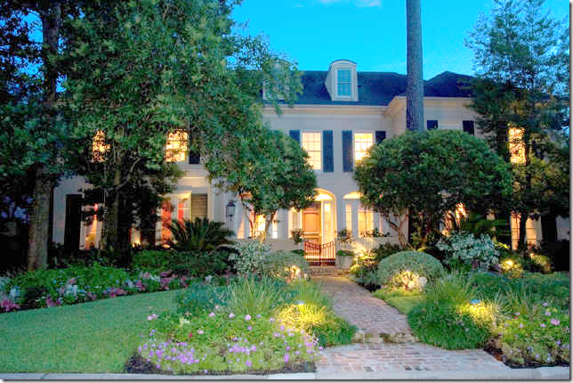
BEFORE: Built in 1993, the house was hidden behind the landscaping.
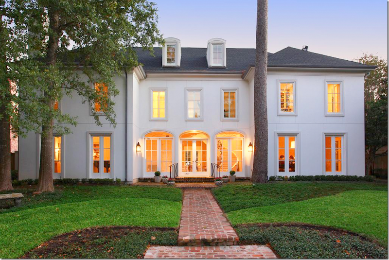
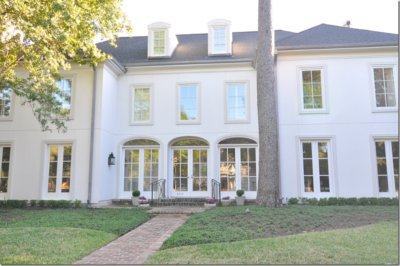
AFTER: Now, you can appreciate the clean lines and perfect symmetry of the façade. All the windows were replaced and the shutters were removed. The entire front entrance, with its three sets of French doors, was also changed.
The large foyer with staircase is in the middle section behind the three French doors. To the left is the living room and to the right is the dining room. Past the foyer, large double doors open onto the family room. The house is 7,500 sq. ft. with six bedrooms and bathrooms and 2 powder rooms. There is an elevator which reaches the third floor, seen here behind the dormer windows.
Before: The layout of the house was nice, but typical, with its large foyer and public rooms. Those drapes!
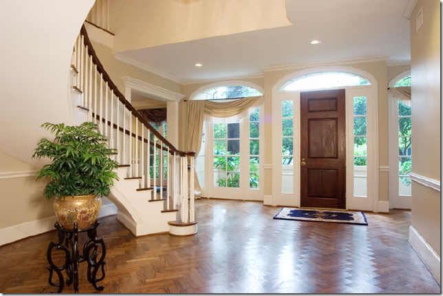
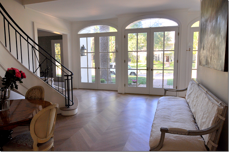
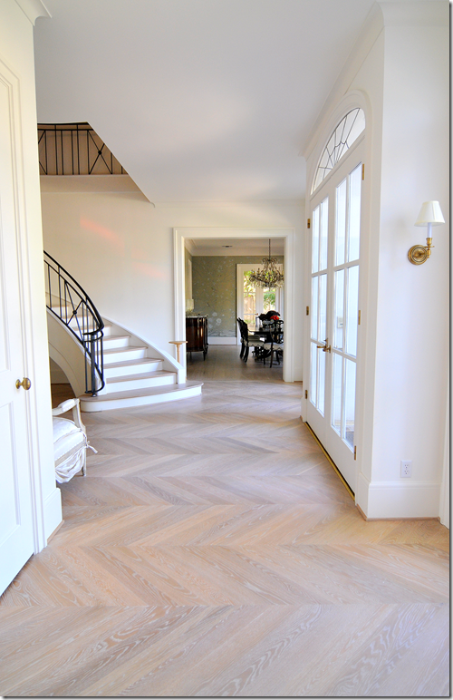
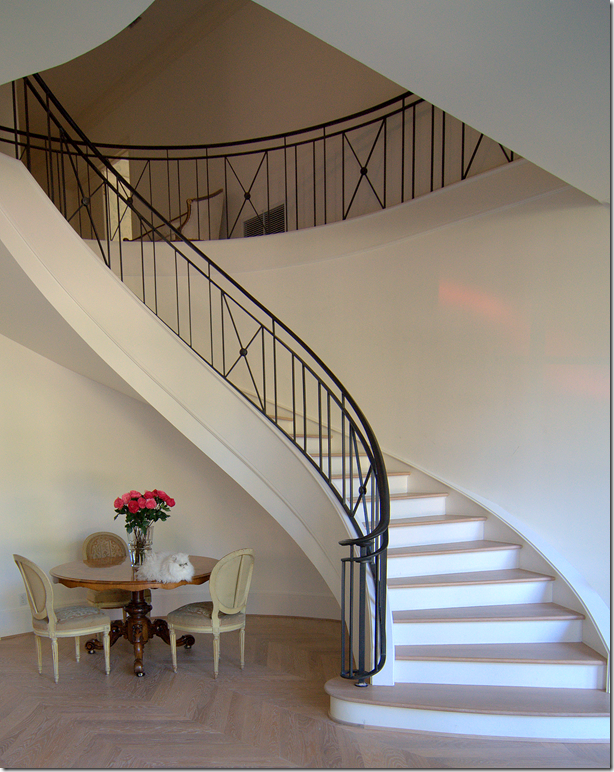
AFTER: The staircase was completely replaced, as were all the windows and doors and floor. Today the hardwood floor is Carlyle 8” wide, old growth planks, done in a natural Belgian finish.
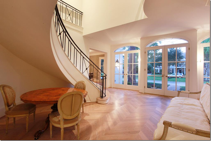
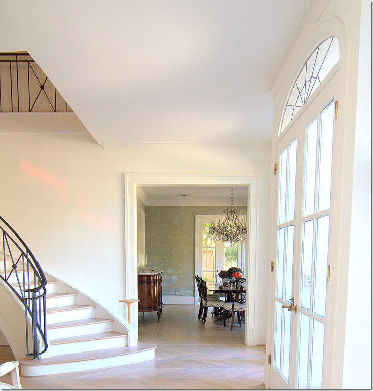
The elegant floating staircase is the focal point of the foyer. The staircase is inspired by one Kay had seen in a hotel in Argentina.
To the right of the staircase is the dining room, to the left is the living room. Past this table are double doors that lead into the family room.
The view at dusk.
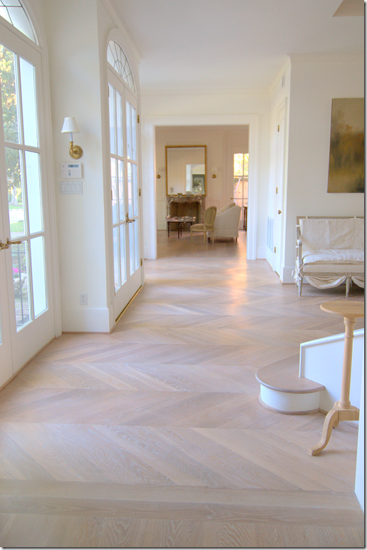
The front door is slightly indented from the French doors on its left and right. Here you can see the living room which sits at the end of the front hall. This hall runs from there to the living room.
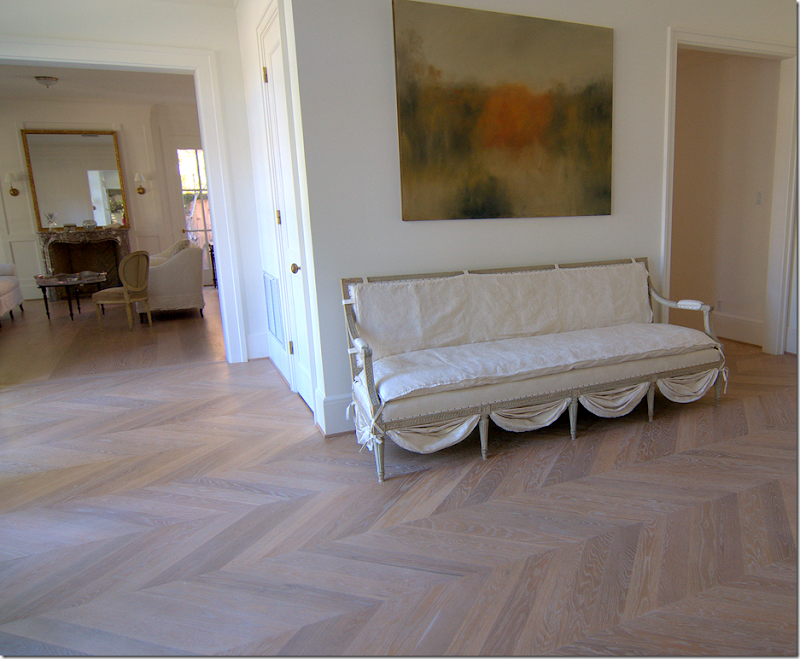
The French settee is slipcovered. I love the detailing at the bottom. To the right of the settee is the back hall that leads to the powder room and the library.
BEFORE: The Living Room. Its cabinets were replaced with French windows which lets in more light. The fireplace was also replaced. The library is through the double doors on the right.
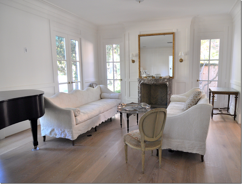
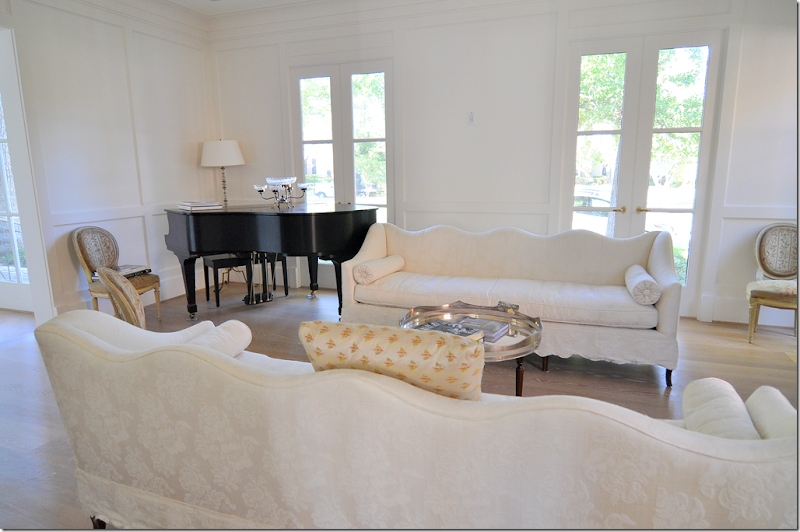
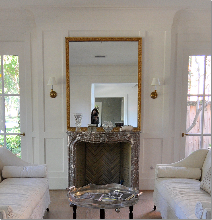
AFTER: The Living Room today. The fireplace, from a John Staub house in River Oaks is a French antique made of Bresia marble. The firebox is ISOKern. The walls are paneled and painted in a dead flat white oil. Amazingly beautiful.
One sofa is antique, the other is a custom copy. They are both slipped in an elegant white damask. The scalloping on the sofa’s back is repeated in the hem. All the windows let in light from each direction. As Kay says – the house is about light and subtle color. Beside white, soft aqua is the second color found about.
A close up of the fireplace – notice the beautiful firebox, a feature rarely ever seen.
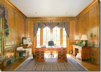
BEFORE: The library was paneled and rather boring.
After: The Library. This room is Kay’s private domain. French styled bookshelves ring the room. Each section has a pull out shelf. The paneling is also painted in a flat oil.
At dusk. The French doors overlook the patio and the swimming pool in the back yard
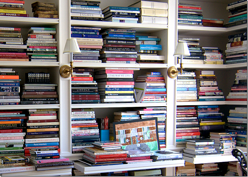
The owner has collected almost every design book published! I see so many titles I recognize. “Paris Interiors” looks well read! Totally swoon worthy.
The long front hall, from the living room – looking into the dining room.
Almost at the dining room. I love how the light from the street is reflected back into the house as pink stripes along the stair wall!
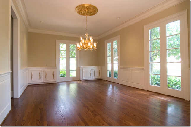
BEFORE: The Dining Room: The cabinets and moldings were removed. The one door to the kitchen became two doors on each end of the wall. All the windows were replaced with those with a slimmer profile and fewer panes.
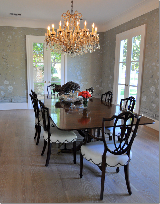
AFTER: The DeGournay hand painted wallpaper was custom colored in a soft grayish celadon which matches the blue green gray eyes of Kay’s white cats.
I love the scalloped nailhead trim on the chairs. The gorgeous dreamy chandelier is antique from Kay O’Toole.
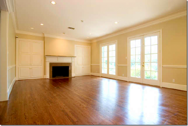
BEFORE: The family room windows overlook the swimming pool.
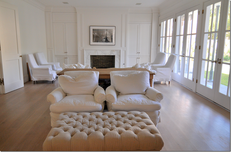
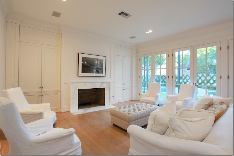
AFTER: The Family Room is off the foyer, to the left through double doors. New cabinets and fireplace with Calacutta Ora marble. The two French doors were replaced with a wall of doors in the 2 over 3 panes. The room is divided into two sitting areas with matching tufted ottomans. The kitchen and breakfast room open onto this room through large French doors.
The flatscreen hides behind the cabinet.
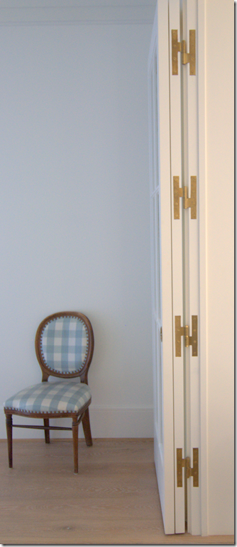
Between the family room and kitchen area, French doors fold back flat. All the hardware was custom made to order from Nanz. Notice the beautiful H hinges in the door.
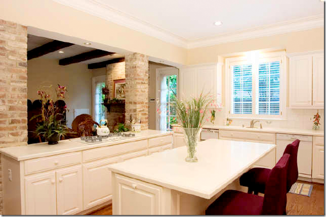
BEFORE: The kitchen and breakfast room was divided by brick columns that were removed. This entire area was completely gutted and taken back to the studs.
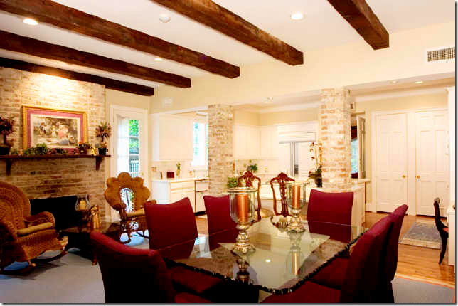
BEFORE: The Breakfast Room - the beams, bricks and fireplace lend a country vibe. All these elements were removed, including the fireplace!
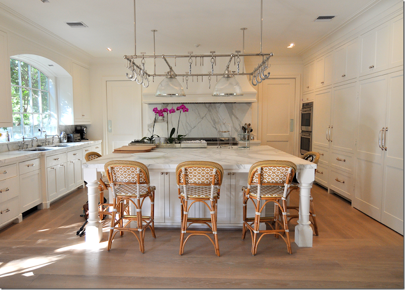
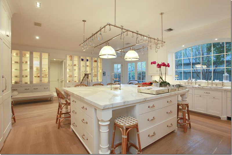
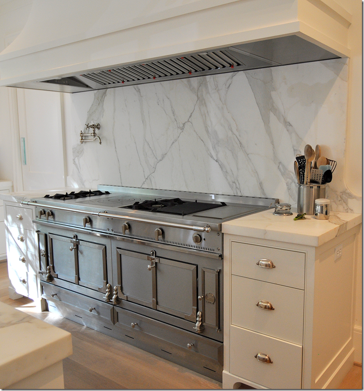
AFTER: The kitchen island, with seating for 8, is topped with a gorgeous Calacutta Ora marble slab. Included here is 2 sinks and 2 dishwashers, 2 Wolf ovens and a range. The subzeros hide behind cabinet doors. The marble slab behind the range along the back wall is a focal point, as is the fabulous pot rack. On either side of the range along the back wall are the two doors leading to the dining room
Notice the silver hardware – it is just stunning. Here you can see into the family room on the left and the breakfast room area on the right.
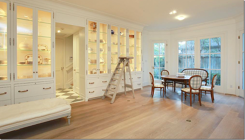
A row of lighted cabinets in the breakfast room area hold collections of creamware and antique place settings. Two sinks sit side by side under the arched window.
What can I say? The marble is incredible.
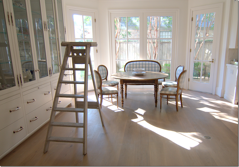
The fireplace was removed and replaced with a bay window. An antique style French library ladder sits in front of the cabinets for ease.
Charming antique French table and check covered chairs in aqua, the second color found in the house.
An antique French day bed sits in front of the cabinets. In the middle, is the back hall that leads to the back stairs, butler’s pantry and garage.
A close up of one of the display cabinets, fitted with sapphire glass shelves. Pull out shelves come in handy when setting the table. The silver knobs, handles, and hinges are left to patina instead of polishing.
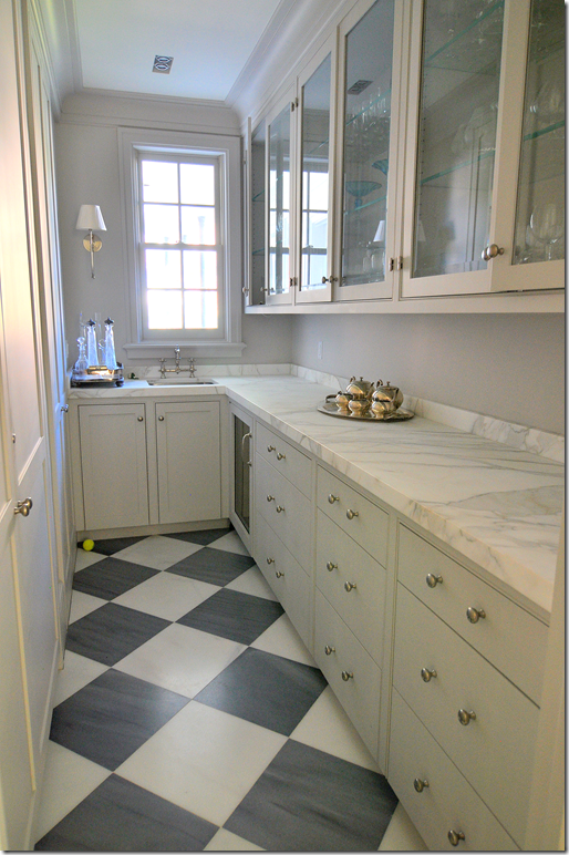
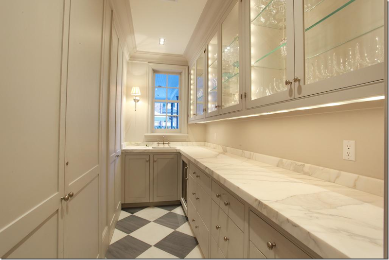
The Paris Ceramics gray and white marble floor is a rare pattern found in the mostly white house.
At dusk, more gorgeous Calacutta Ora marble countertops.
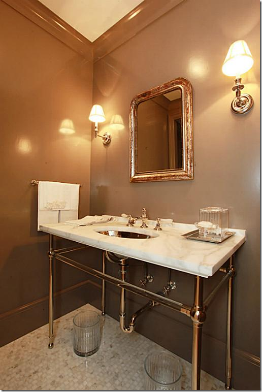
The powder room is off the library back hall, next to the elevator. The Waterworks crystal wash stand has a Calacutta Ora marble countertop, along with a hammered French nickel sink. Notice the marble mosaic tiled floor and gray-brown lacquered walls.
BEFORE: The bedroom suite was completely redone.
BEFORE: This all became part of the master suite.
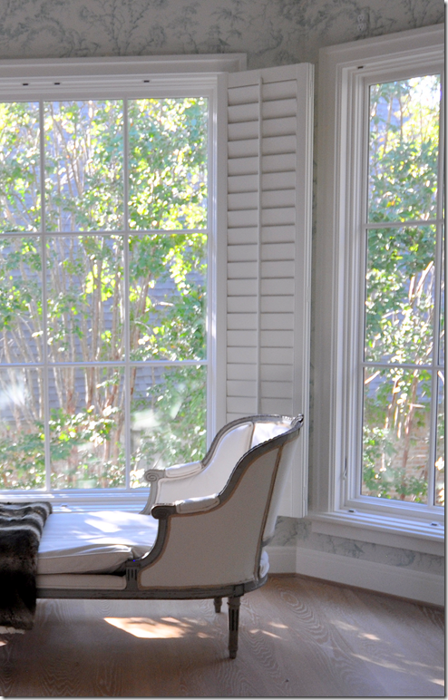
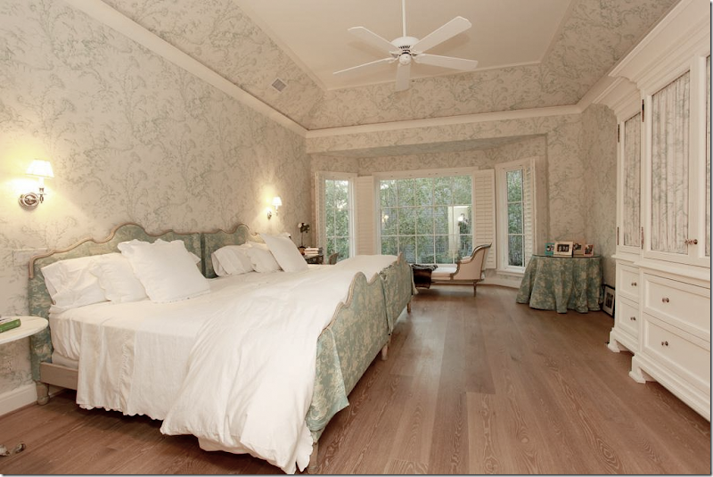
AFTER: The Master Suite. Double doors lead into the European styled master bedroom suite on the second floor. The new bay window sits atop the matching breakfast bay window downstairs. The room is wallpapered in Scalamandre’s Oriental toile in soft aqua. The 8” old growth hardwood floors are continued upstairs. The ceiling was raised and coffered.
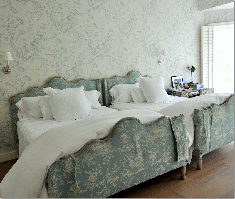
Matching antique French bedframes have a scalloped head and footboard. The footboards wear cute little corner slips to guard against the cat’s claws!! I love how the duvets are extra long and fluffy – note: order king for a double bed to get this effect. It’s so much more luxurious!
Across from the bed, a wallpapered jib door to the left of the built in cabinet leads to the bathroom and closets.
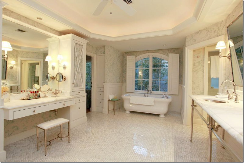
The same elements in the powder room are repeated in the master bathroom: Waterworks crystal marble vanity with hammered nickel sinks and Etiole faucets. There is an exposed Etiole thermostatic shower. Kay’s vanity to the left has its own tiny hammered nickel sink. The floor is Calacutta Ora mosaic tiles.
There are His and Hers private water closets in the suite. Against the back wall, the linen cabinet is lined in Scalamandre Oriental toile.
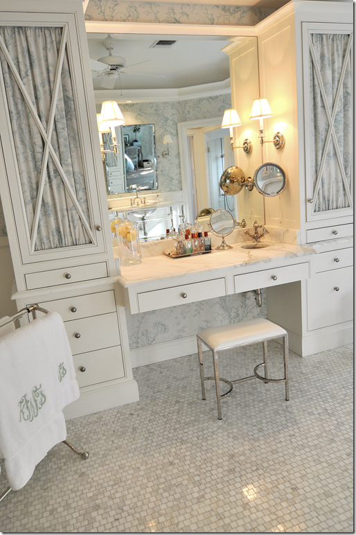
Across from the sink vanities, is Kay’s makeup area with its own tiny sink. It sits between two linen towers with lined fabric doors.
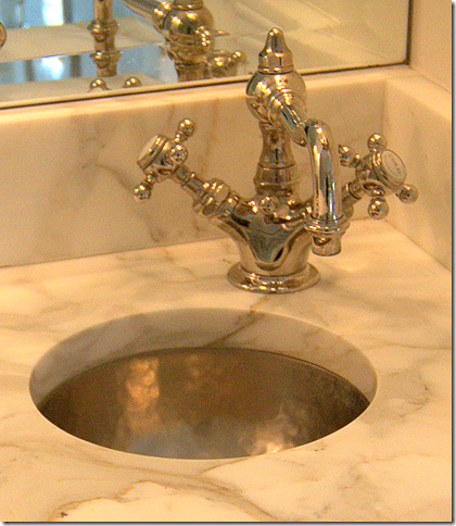
A close up of Kay’s tiny hammered nickel sink and corner faucet. So cute!!
The freestanding bath sits under an arched window.
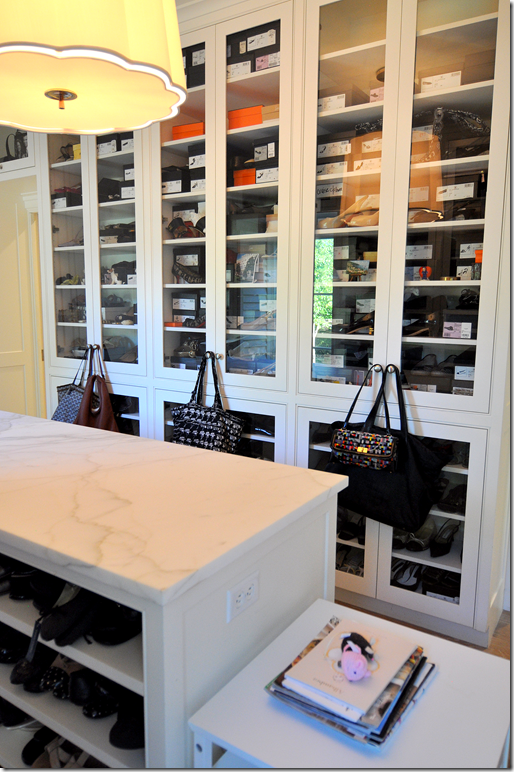
Kay’s closet is all behind glass and wood doors.
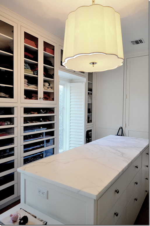
Her center island is topped with Calacutta Ora marble. I wonder if there is any Calacutta marble left in the world???!
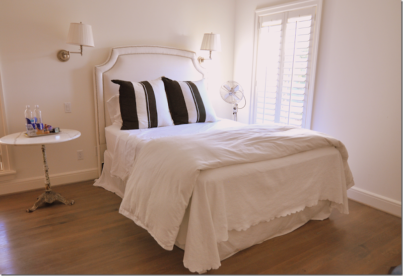
The three teenage boys each have their own bedroom and bathroom – all on the second floor. Each has a built in desk and their black and white bedding is also the same – providing more of the continuity seen throughout the house.
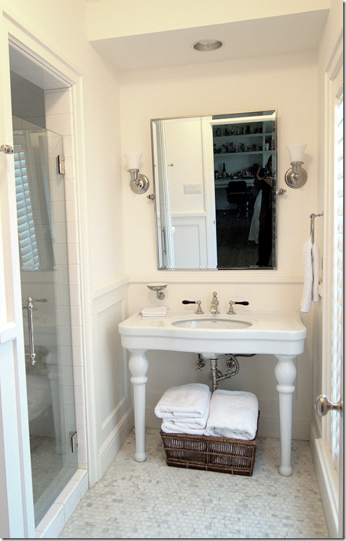
Their bathrooms have washstands and mosaic tiled floors.
Their showers have an Etoile thermostatic rain shower system with white subway tiles. To dream – I want this!! I want this!!!
The second floor laundry room has its own marble countertop. Wait – this isn’t Calacutta Ora! Shock!!! Actually, here, and in the third floor bathroom, the marble is Imperial Danby.
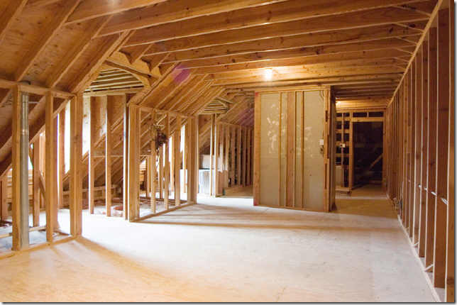
BEFORE: The third floor wasn’t finished. Today, it has a study and 2 huge storage closets, along with a bathroom. The elevator goes up to the third floor, which is a huge luxury when you have packed luggage.
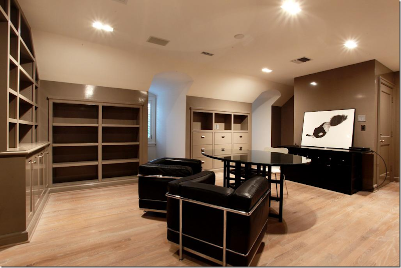
Today, the third floor is finished out with lacquered book shelves – this would make another fabulous library – if you needed it!!
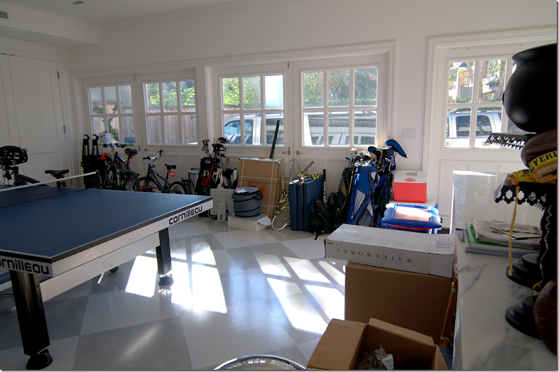
The 3 car garage is so cool. The doors were removed and replaced with carriage house styled double doors. The floor is painted in large gray and white squares. The garage now doubles as a sports haven for the boys and their friends.
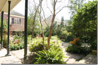
BEFORE: The back yard was a landscaping mess.
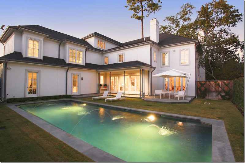
Today, seen at dusk, the back yard has a pool set simply in the grass, European styled. Surrounding it are vine covered fences. Here you can see the layout of the house – the garage is on the left. In the corner is the family room and at the far right is the library.
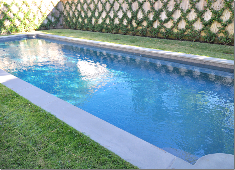
And, finally, the swimming pool is vivid blue when seen during the day. Dreamy.
I hope you have enjoyed this second installment of the Readers’ Houses Series! A huge thank you to Kay and her family for welcoming us in for an in depth look into their beautiful house. (I just had to show this photograph again – I think the foyer is so gorgeous!!)
To see the HAR listing, go HERE.
And remember to send in your own house for the Readers’ Houses Series. Don’t be shy. Not all houses are as fabulous as the first two have been. In fact, I’m hoping to get a lot of small, redone on a budget houses. AND, the Readers’ Kitchens Series is still going strong. If you have sent in your kitchen – don’t worry, I’ll get to it. I have a lot of kitchens still left to show. And if you haven’t sent in your kitchen, do. I hope to show these two series into 2013!!

















I need to go to medical school in my next life so I can have a hugantic amazing house...wow!
ReplyDeleteHave a heart!
DeleteThis home must belong to my husband's dermatologist in Wilmington, NC.
A reader from NC
I think it's in Texas.
DeleteVery nicely done, Joni. Especially beautiful photographs along with the usual insightful writing. I believed every word until I read three teenage boys live on the second floor - wow! Great job.
ReplyDeleteWhat a wish list for most of us! The attention to detail is amazing!
ReplyDeleteWell Joni, I think this one really misses the boat. I admire the effort that went into this house; however it is so unpersonalized and so stark, that it looks like a generic, unfinished stage set. And, the exterior was so much prettier in the before shots. I realize what was trying to be accomlished, but I can't fathom living in a home so lacking in character. The kitchen has some spark and personality; however, I do not find that in the rest of the house. I love the "theory" of the Houston/white look; however, when a home looks like a theory, a learned and copied lesson, but lacks personalization, charm and interest, I can't help but wonder how successful the final effort really is.
ReplyDeleteI completely agree with the above comment. The house looks like a beautiful museum waitng for artwork.
DeleteITA!!! Call me *old fashioned* but what's not to love about trees and flowers and wood banisters and stairs??? And wth are the pots and pans???
Deletey'all - there in nothing wrong with all that. BUT some people don't want that. just like some people want mustard, some want mayo. The house is gorgeous. Gorgeous. Not for everyone's taste, but if you like white and marble - you will love it!!
DeleteYou've written what I was going to write as well. I kept wondering when they were going to move into this home that was obviously devoid of life, but Joni says that teenagers live there somewhere. The very first "after" picture of the landscaping being ripped out and water-sucking lawn put back in made my heart drop. The landscape just needed some trimming and tweaking, not stripped barren by a control freak. Sorry to be harsh, but this post really provokes me. It feels pathologically controlled, almost like a Twilight Zone episode.
DeleteI love the pool. Would love to have a pool like this one.
DeleteRarely Joni do I disagree with you, but this house made me want to cry. Starting with the exterior...Maybe some of the landscaping was a bit overgrown, but dear God, to rip it all out? What was left seemed to be crying out "help", hire a landscaper pronto. Even the pots on the front entry were entirely underscaled, and pathetically planted. What was wrong with the shutters? The whole thing made me want to shout "give most of the money you spent to charity instead of replace, replace, replace....Such a very cold and unloved appearing interior. The only room that looked at all used was the library, and even then, it didn't look comfortable. It would seem with the huge amount of reference materials, the lady of the house could have done a better job, or maybe just hired a pro such as yourself.
DeleteI don't know, I'm just completely underwhelmed with the whole thing....the backyard, I'm not even going there. Really sad with the good bones the house had it could have been truly wonderful....Gayle
Good Grief! What a gorgeous home.
ReplyDeleteJoni , you could / should have your own shelter magazine. The home featured is stunning! I m a huge fan of white and airy , this was right up my alley. My favorites are the marble ( swoon) and the kitchen hardware!!! Wow! I have 5 kids and promise that living with white makes things easier. The setting is calm and bleaches beautifully. Thank you for a gorgeous post.
ReplyDeletePS I have a question about door hardware . Should one stick to one finish or mix according to room finishes ? If the answer is mix , then how does one address hinges if knobs alternate ( ex. Chrome or Nickel bathrooms)? Thank you.
ITA. This family has 3 teenagers, plus a few cats and dogs - maybe five total? And that also helped define choices, i.e. no rugs. Kay is a HUGE animal lover.
DeleteI happen to like one hardware throughout. that's just me. Kay mixed finishes. Urban Grace and Velvet and LInen both like to mix finishes. It's just a choice. But me, I like one finish. You can't go wrong, you just need to decide which YOU like!!!
I cannot make up my mind about this house. On one hand it is so beautiful, on the other so cold and impersonal. However, I would move into that library in a moment. Thank you for sharing it.
ReplyDeleteThat has to be one of the most boring, albeit well done, houses I have ever seen! No a painting anywhere. Plain dull walls, too much white and no warmth.
ReplyDeleteJDM
haha! there's a huge painting the entry. Plus, there are some wonderful black and white photography. And mirrors. Myself - I love mirrors in place of art.
DeleteNaturally, they are less expensive.
DeleteThat has to be one of the most boring, albeit well done, houses I have ever seen! No a painting anywhere. Plain dull walls, too much white and no warmth.
ReplyDeleteJDM
i love the simplicity and clean lines of this home. Can anyone tell me what the paint is? I have never heard of flat white oil.
ReplyDeleteMC
The architectural details are fabulous, and I love the master suite and bath. However, I cannot believe 3 teenaged boys live in this house. There are no tables in the family room. Where do they set a glass? And their bedrooms lack any personality or individuality. My two daughters would never stand for that!
ReplyDeleteit's not really like that - there are built in desks filled with trophies and books, etc. I just didn't show the messy teenaged space. Did you see the garage filled with all their stuff?
DeleteThis post should be called The Good, The Bad and The Ugly. Beginning at the front door, the owners destroyed the warmth of the entry by eliminating far too much of the landscaping. Perhaps if they were attempting to turn a beautiful Georgian traditional into a French chateau they needed to remove the shutters, but not necessarily. If you have seen one room in this house you have seen them all.Probably the most egregious act was destroying the library - the one room if left alone could have housed the book collection and added the much needed warmth to the house. Instead, the owner created a room that looks like a neighborhood book nook. Only the dining room, kitchen/breakfast area and dressing room live up to the hype of the narrative. The kitchen is beautifully done with wonderful display cabinets and lots of storage and convenience. While the landscaping in the back certainly needed addressing, the rear of the house is now stark and plain with a pool practically in the back door. It looks like the book "Under Decorate" was well used here. Overall, very cold and austere.
ReplyDeleteomg - the entry is the most gorgeous area in the house. it is stunning. yes, it IS under decorated. That's the point!
DeleteHmmm. Beautiful start but looks half done and rather boring. Hope the owners are willing to work with an interior designer in their next home to give it some personality and warmth. It needs art, flowers, mirrors, carpets, pillows and accessories. Just some color would help.
ReplyDeleteJoni, I do understand the aesthetic which the owner desired; would have loved to see some of her fabulous collections on display.
ReplyDeleteIt is a superb house architecturally; amazing staircase!
PS What is going to happen when one of the teenage boys wants to put a poster up on his walls!
xoxo
Karena
Art by Karena
I am so surprised of the comments you got. They are all so different. I really like this home. It is interesting. It just needs the little details added to the decor.
DeleteWhat a beautiful home. I love all the changes. Looking at the photos I thought okay this is my favorite room, then I saw the next room and thought no, now this one is my favorite room. They are all so soft and have a European feel. The only thing I would change would be to have some flowers in the landscaping. I love roses and hydrangeas.
ReplyDeleteIt have a very European feel to it. It's so not a typical house, but that is the beauty of it. I wish people would realize that a family lives here and loves it. This is their choice to decorate sparingly. That's the intent.
DeleteI personally loved the new exterior....all white and monochromatic, standing stoic where it can now be seen. I pinned it. xo
ReplyDeleteI hope the owner had a great deal of pleasure creating this home, dancing to her quiet drummer. I can only imagine how much will be ripped out by the next owner!
ReplyDeleteMaybe not much ripping out as appreciating the fact that they will certainly have a blank canvass to work with. The walls already look primed.
DeleteWhile it is pointed out that you don't approve of the curtains in the entry hall used by the former owners, it is far better than a home where the owner has chosen to ignore the windows. The only windows that were treated with any kind of covering were the bathrooms. Part of the starkness of this house is the lack of softness which could have been added with window treatments. There is not one room, except for the master bedroom that looks finished. The boys' rooms look like anything, but boys' rooms. White coverlets??? Girls, yes; boys, no.
ReplyDeletePlease, please, please share whomever created the railing for that staircase! I live in Texas and seriously need to give them a call!,
ReplyDeleteThanks.
I believe it was Patina Metals? But Kay designed it - using mathematical equations - after a staircase she saw. YOu should contact her. She could help you with yours. The staircase is gorgeous in its simplicity.
DeleteJoni-
ReplyDeleteLove every inch. Unbelievable transformation. Add some accessories, perfection!
I love the library, and the bedroom is fabulous.
Thank you for sharing, and happy Saturday!
Teresa
xoxo
Thanks - same to you!!!
DeleteI agree with most of the comments regarding the outside. The before shot of the front was much prettier than the after. It is stark and uninviting. It would benefit of some landscaping. The kitchen is beautiful, that range - love. The living room renovation is much better, however, I think all the exposed bookshelves in the library are overwhelming and would preferred some solid cabinets. The dining room is gorgeous but I don't like that chandelier it seems too ornate and brassy? While the homeowner met the mark on some rooms, others were a miss. It gives me an appreciation for the years of training architects and interior designers go through. There is much more than design books and magazines to great design.
ReplyDeleteThe railing inspired by Argentina is absolutely fabulous. I have to say, I was shocked that 3 teenage boys live there!
ReplyDeleteSeems odd that the only place boys can be boys is in the garage. What do they do with their cars?
ReplyDeleteWhat? Who do you think lays on all those sofas and chairs in the family room, watching TV. Plus their computer is set up in that room. The house is very lived in!! I wish some of you would understand the aesthetic. It's understand by design.
DeleteGood design challenges us to think outside our boxes. I have to admit that I have been thinking about this house ever since I left this post. I agree that we all have different aesthetics and I applaud the homeowner for having her own and putting herself out there for us to see. Not sure I would have the courage.
DeleteGlad to hear the guys lie around the house. Obviously the wife portrays her interests in her library with all of her decorating books and I am equally sure the man of the house has his space as well. Still think that it is unusual that with a house this size the guys have to have their "toys"in the garage and the garage doesnt house cars...To each his own. We are not here to judge lifestyle but to learn more about ourselves as we are voyeurs into other people's lives. By viewing many styles of living we are able to refine and elevate our own taste.
I have learned so much from your blog. It is by far my favorite and I realize that I have learned a lot about quality from this house. My aesthetic may be entirely different just as yours is, but I do recognize quality when I see it.
Thanks for the good work and kudos to the homeowner for being willing to put up with all of us who are weighing in on her life. She is a great sport With three teenaged boys she would have to be.
The cat is hilarious.
ReplyDeleteI think there are 3 cats. and two dogs. all white. But this cat followed us around from room to room. he is in every picture I took!!!
Deletethere are 3 of the white cats i think and 2 dogs. that one cat followed us from room to room. he is in every picture i took. had to crop him out of some.
DeleteJoni, This is a gorgeous home and I especially love the kitchen and the master bedroom. Though the furniture is beautiful, I would love to see some decorative accessories and art added. I notice there are no lamps?? Thanks for sharing this lovely home. xo, Sherry
ReplyDeleteOne of the most wonderful houses I have seen! I filed almost every picture!!! Congratulations to your reader!! Just gorgeous!!
ReplyDeletexx
Greet
Greet = of course you would love it - you are European and from Belgium!!!! must seem like home to you!!!
DeletePretty in a way that you look at decor book or a beautiful painting but not to live in. "Museum like" is an appropriate description. From the stripped landscaped front to the somewhat separate beds in the master, this house seems cold and impersonal. The before pics at least were full of life and movement. The house seems sad in its current reincarnation. I can't imagine teenagers not wanting to personalize their own spaces. The library had the most personality.
ReplyDeleteWhat a beautiful home every time I thought a room was my favorite the net one was just as gorgeous. Unbelivable chandelieer in the Dining Room.
ReplyDeleteCynthia
www.clochesandlavender.com
I cannot believe everyone is allowing themselves to be sucked in to painting everything white. That library paneling was gorgeous. Well, in ten years, everyone will be stripping that white paint off. I also am just not liking the wallpaper. Been there done that back in the 70s. Teddee Grace
ReplyDeletewhat? the 70s? wallpaper is making a huge comeback esp. with Gracie, deGournay and Farrow and Ball. The paper in the bedroom is one my all time favorite papers. Its so beautiful. Dan Carithers uses it a lot.
DeleteI really like this house. What I found interesting was that the owner's personal space was so filled up and almost a bit on the messy side and the rest of the house was completely opposite. It was almost like she was trying to convey a sense or order that when she is relaxed in her office, she doesn't really need. Beautiful finishes and attention to detail, but they need a good landscaper!
ReplyDeletekelley ; 0 )
thanks Joni for this great tour!
Good job featuring the house. I normally love all white interiors and very clean lines. I love , love, love most everything you feature but this home left me feeling cold. I agree with some of the other posters who said the landscaping was ruined. The before shot was so much more pretty I almost cried when I saw it all ripped away. I also think maybe some lamps, pictures, etc. would not have ruined the aesthetic but enhanced the personality a bit. Love your blog.
ReplyDeleteThe outside looked much better in the before pictures, I would have taken out the 2 trees that seem to be blocking the front but all the flowers looked so much better than the blank look. The house needed updating but it looks so stark and plain now, it doesn't look like anyone even lives there. I wouldn't want to live in that home like it is. Not a single rug for comfort, no window treatments, few tables, no art, and all the white is just TOO harsh to look at. It looks so unfinished. Like it's been primed and waiting for the rest to come.
ReplyDeleteMy kids would also HATE those bedrooms. They want the space they spend so much time in to reflect themselves. Those rooms look like quest rooms, not a teenage boys room.
The kitchen was the only room that I thought was more finished looking and could be used.
Btw, I am a minimalist. I don't like clutter at all but like I said, this house just looks unfinished.
DeleteI love the floors - Joni you wrote this description of them : "hardwood floor is Carlyle 8” wide, old growth planks, done in a natural Belgian finish.."..
ReplyDeleteI wonder if hardwood DOORS can be finished this way along with wood trim moldings around the doors ? The finish seems to "soften" the wood tones which
is the look I wish I had gone for in my home.
she explained the floor process. it was very precious, but i can not for the life of me remember what she did to them to get them like that!! It wasn't easy though. It was a true labor of love. I'm sure you could do doors similar to that, but the wood itself would have to be the same to look just like it, i think!
DeleteThank you for your Readers House Series. I think we can learn as much, if not more, from things we don't like as from things we like. I agree with the majority of your readers. In spite of the many beautiful elements in this house, it is neither warm nor inviting. There are a number of white interiors that are absolutely breathtaking, but this house had none. It seems like a work in progress, rather than a finished house.
ReplyDeleteWhat a great series dahhling! great house.
ReplyDeleteThe description that comes to mind is very pristine and pure. She's done a such a lovely job with the envelope. The minimalist approach really shows all of the painstaking details of the construction. Love the floors and the stair. I've never had a client that didn't want some kind of window treatment in living spaces for night time privacy. Quite unusual!
ReplyDeleteI loved seeing this home. Thanks so much for sharing it with us.
There are some beautiful rooms in this house. The kitchen and bathrooms are gorgeous, as is the flooring. Most of the rooms, however, look like the owners just moved in and haven't quite finished unpacking. I appreciate that the owners don't like clutter (except in the library), but there's lack of clutter and there's downright boring!
ReplyDeleteI was heartbroken when I saw all the beautiful landscaping removed from the front yard. I'd give my left arm to own those plants! And the library in the before picture was amazing. Why, oh why, did they tear out the gorgeous panelling? There were already enough white rooms in the house. They didn't need another one. They could have just bleached or limed the panelling if they wanted it lighter.
And the poor teenage boys! Those are about the girliest boys' rooms I've ever seen!
My favourite rooms? The powder room, the kitchen and the bathrooms.
It appears that the object here was to be "cat friendly" rather than family friendly. There must be some explanation for the lack of furnishings, tables, lamps, paintings, etc. Perhaps it was just over staged by the real estate company.I too nearly cried over the library paneling and the plant removal. The owner obviously had no professional help inside or out.
Deletelove, love, love this series!! I would love to submit our home when we are ready. We are currently building in hunters Creek and hope to be in by December. Have a wonderful weekend!
ReplyDeleteCold and icy. Interesting comments above as many agree. Do love the floors.
ReplyDeleteSimple yet elegant! My favorite rooms are the kitchen, library, master bath and the dressing room. I do agree with other commenters about the landscaping. Having two boys, I was shocked to see their sons bedrooms and baths. My boys would have them trashed in no time flat. And, I too was left wondering where all their stuff is. Even with all their sports equipment and such in the garage, there is not so much as a smudge on those floors. Is the house in such pristine condition because it is on the market, or does it look like this all the time. If so, the owners must wear booties over their shoes and gloves on their hands.
ReplyDeleteOne more question, does the silver hardware in the kitchen have to be polished? It is stunning but seems way too high maintenance for me.
Thanks so much for sharing!
Maureen
the boys rooms all have very messy and cluttered long, built in desks. Her sons are all extremely high achievers, very well mannered, talented, and athletic. When they came home, they created an energy in the house. Trust me their rooms don't look that neat all the time.
DeleteHi Joni, I have to say this house has great bones but is dead and sterile. It definitely needs some color and plants and that certain something, I guess lived in comfort.:(
ReplyDeleteWow, wow, wow!! The transformation of this home is incredible. Absolutely incredible. I have to say the kitchen is my favorite kitchen ever , ever, ever, and I have seen a LOT of kitchens. The VISION of the homeowner has to be commended. Hours of thought went in to this home. I also like the use of wallpaper as it is used in this home-artistic and subtle. Having just had a home on the market I can understand the minimal use of personal items-after all the house is on the market and the homeowner must highlight the features of the rooms. Important not to be distracted by personal things. No formal training?-then this would translate to her first design project? Well-wow, wow, wow. I hope this homeowner continues to showcase her talent-hopefully by being hired to do so. Thank you for the opportunity to view this fabulous home Joni and homeowner.
ReplyDeleteThe bones of this home are fantastic- a perfect backdrop to the white decor. Love it!
ReplyDeleteOh Dear- too sterile for me- I agree the Master Suite needed a do over but the rest looked like English Country especially the paneled library. To each his own.
ReplyDeleteDear Joni, thank you for this post. Always love your photos, story behind them and, most importantly, your running commentary.
ReplyDeleteLove about 80% of what was done to this house and I have to guess that the lack of lamps, rugs and artwork was due to the fact that this house's decor and lack of warmth (as so many readers have pointed out) was partly due to the fact that the owners had decided to put it up for sale and wanted to leave a blank canvas for buyers.
We can't expect that all of us have the same taste (nor to the same degree of minimalism), but I personally have to bemoan the fact that the library walls were obliterated (they could have been limed) and that they tore out the aged brick fireplace which offered some relief from the palette. The kitchen, beautifully executed, was too large and had so many cabinets that it reminded me of a working French patisserie, and not of the small variety.
B
P.S. What would really be interesting, is if you could arrange a visit with the subsequent owners once they're settled in, and see what they do to this home. Now that would be lots of fun! Say you’ll do it!!!
DeleteI agree, that would be fun, but I doubt they would agree. If I could afford this house, I would buy it!!! Or if I entertained. It's a great entertaining house. Or if I cooked. haha! Or had more than 1 child who is at college. I guess the house is really too big for just Ben and me. But, I would love the copy the elements - the white walls, the hardware, the kitchen, the stairs, the bathrooms....
DeleteJoni, I would love to see this house with you and your style in it as well. For you would warm it up, add some feminine textiles and softness and turn it into a home. Beautiful architectural details are right there waiting for you to work your magic.
DeleteThese individuals certainly seem to have a love affair with the color "White". After viewing this fabulous home ... and indeed it is a beautiful home architecturally ... my first thoughts ran along the lines of pristine, holy and virginal. These are not meant to be sarcastic remarks .... I truly thought this!!!!!! It appears they took a traditional home and renovated it into a European / Belgian country estate. I like the exterior of the home .... it could use a little more greenery for softness but all it all it is very lovely. I could live with the entry way but thought the remainder of the downstairs could have used more color (soft color) rugs, art, small tables and etc. It shows extremely stark .... but perhaps starkness is what they were looking for. There was an infusion of soft color upstairs in the master suite of which I liked. I most likely would have had some very sheer curtains in the home .... maybe not in every room .... perhaps wooden/woven blinds and etc. Loved the butler's pantry and the downstairs powder room. Thanks Jodie for the post and thank you Kay for having the courage to show your home and handle the critiques.
ReplyDeleteI absolutely hate what they did to the front yard! It was so pretty before and so dull with the changes, not so much to the front of the house itself, but the garden! I love the kitchen and bathrooms, but really don't like the rest of it. The bannister is beautiful, though!
ReplyDeleteI feel the house in its previous version had more warmth and character. I think The home was great as is and the remodel is worse. Looks like a professional wasn't used- the scale is off in the fireplace and mirror in the living room. I loved the landscaping and it's all gone so it feels like too open no privacy especially in the pool area! Speaking of privacy, the house looks like an open fishbowl to the public with all the windows and no curtains.
ReplyDeleteI have always loved the Scalamandré pattern in the master...so timeless. The bistro chairs in the kitchen are perfect...hardly have any "pins" but I pinned this one. Thanks so much.
ReplyDeleteAmazing what you can do with a house that has good bones, a very American home transformed as a French home, but still keeping the American spirit.
ReplyDeleteI love it, so interesting to see the evolution of this beautiful house.
decogirlmontreal.com
It looks like it might be in River Oaks to me, which is one of my favorite areas of Houston. But it might not be based on the age of the house. I loved some things about this house and other things seemed a bit cold and impersonal. I would be uncomfortable with people being able to see in at the front of the house, even if it is perhaps set back from the street. But curtains would have been wrong on those beautiful windows and doors, so I don't know the answer. Still all in all a very lovely home and I'm so glad you shared it with us. You'll find me in the library.
ReplyDeleteSam
Curtain would have done wonders for the windows. We have seen hundreds of these windows. They are not special by any means and we have also seen designers dress them. Perhaps too much money was put into marble everywhere and certainly in places that was not particularly important. Better to have beautiful fabric on the windows any day than marble on a counter top in a dressing room.
DeleteAm really enjoying this series Joni -- so interesting to see how others choose to live. You do a lovely job of showcasing all the homes ... you are a beautiful writer! Thank you for all you put into pulling together these (and all) your posts.
ReplyDeleteI must say, though, that I haven't been able to quit thinking about this home since viewing it earlier today ... and not in a good way. Like many of the commenters before me, I just don't understand completely the homeowner's design aesthetic. Of course, to each her own. But the main thing I just can't get over is the fact that the homeowner decorated all 3 of her teenage sons' rooms identically. When I first read that, I thought simply, "that's odd" ... but then when I saw the example of the room it made me sad. Who would want to decorate all her boys' rooms IDENTICAL, and like that? Oh those poor boys! (and it's not just the bedrooms). I don't really have words. So I'll stop as I know I should.
BTA (mother of two teenage boys with individuality)
Having a hard time wrapping my head around the boys rooms also, but then again after going back to look at the house once again, I simply cannot believe that one would decorate this space and not have lamps or even a table for a drink to sit on for guests. This is the most peculiar house I have ever seen in so many respects. The LR mirror should have been mounted inside the molding above the fireplace rather than on top of it. For all the design books in the library, there is not much to show for them.
DeleteI was excited to see a French design home in Texas - but so disappointed that there was no color to speak of. Very cold and sterile feeling. I agree that it was museum like - no artwork on the walls - creepy like! Sad boys rooms. This house is beautiful but not "homey."
ReplyDeleteI can't believe she would want to move, what is the reason, you must tell me...ghost? bad neighbor? rodents in the basement? what????
ReplyDeleteI think it is great, yes I would add some color but that is easy. The house itself is killing me. I think I will jump on a plane to see an open house.
I agree with Becki... it is very beautiful..but too sterile... i needed a hot cup of tea after looking at all the white and cold marble! ( beautiful marble.... )... my favorite rooms are the library (probably because it is a little cluttered and has pops of color from the books, the master suite and master bath...and swooning over the backyard!!!
ReplyDeleteI wanted to like it something awful but I can't. Especially the exteriors. I did like the master bath, the butler's pantry and the dining room for the most part. All in all, this house reminds me of the movie, "Beetlejuice".
ReplyDeleteSome good rooms, but mostly it looks like they just moved in and can't decide how to finish the house. They definitely need the service of a good interior designer! They need some softening with accessories. Ann Bellevue, WA.
ReplyDeleteHi Joni, Another wonderful post! Enjoyed the tour but not my favourite to date. Have you considered having a vote of top favourites when you finish this exciting series? NB in Ontario, Canada
ReplyDeleteThis may be my least favorite house shown on cdt. I appreciate all the studied details but would never want to live there. Perhaps a sign that the all-white trend has peaked?
ReplyDeleteThis comment has been removed by the author.
ReplyDeleteThis comment has been removed by the author.
Deletewow
ReplyDeletejoni
this is a stunner of a home.
love it.
and i can see your input big time.
xx
Oh give me a dirty martini and a few hours in that library...PLEASE! And while you were oogling the marble in the kitchen I was drooling on my laptop over that RANGE! Heavens to Betsy!! And that pot rack!! Oh. (but would love to see some well loved pots and pans hanging)
ReplyDeleteThanks for thee fab tour Joni! Did it sell??
Joni - I love these Reader's Homes series which you post. I drool over this and last week's beautiful luxurious-money-is-no-object houses but, as you suggest, I also like to see smaller low-budget type places too. Bring all of them on!
ReplyDeleteIn this house I just love the beautiful white slipcovered furniture and the calacatta marble and bathrooms. At first I was a little disconcerted by the sparseness of the house but now I think the sparseness is beautiful because of the luxurious furnishings.
It feels like an obsessed female's creation. Including the WEIRD bedrooms!! I laughed out loud at the MBR and the teen boys' spaces. Kids live in servants garrets, perhaps. Really funny. Is she allergic to rugs? Does the family have to scamper past the fishbowl entry at night? This was hilarious!!!
ReplyDeleteDearest beloved Joni,
ReplyDeleteI haven't responded in a while but, this time, I must.
Previously, the house wasn't "hidden" behind the landscaping; it was surrounded by beautiful flowers and plants. Currently, the "landscaping"--if it can be called that--is barren and lifeless. And sad.
As much as I love French doors, the change in the front door just looks dumb. Plain speaking, I know, but change for the sake of change is not improvement, it is merely change. It is apparent this homeowner did not know that. Or, probably, care.
The living room mirror is too wide for the beautiful mantel and does nothing to enhance it. Ugh. Pitifully bad furniture placement.
Is the family just moving in or are they already in the process of moving out? Terribly barren walls and tabletops and, while I often love undraped windows and French doors, these need much more than this homeowner has provided. Unfinished. Incomplete. Uninteresting.
And, in regard to the library, um, well, let me say this: Before... the library was paneled and rather... beautiful. Especially as compared to the present chaotic and unfortunate mess.
The kitchen is exquisite but... where is the food? Where are the lemons, the limes, the oranges, and apples? Where are the cooking tools, the pots and pans, whether copper or stainless steel? I mean, WTH? A big, gorgeous kitchen like this for people who don't cook is sick and sad and wrong.
And the ladder in the breakfast room, well, I'm so sorry, but that just looks stupid. I thought it was an oversight. Like whatever that was on the floor next to the kitchen island in the earlier photo.
What I learned from this entry was, when in doubt, throw some white paint, white slipcovers, and marble (in addition to a whole helluva lot of money) at it. Yes, these are marvelous components in good decoration and design. But they are not enough. Clearly, they will not compensate for an approach that is soulless and impersonal. In short, this home is terribly lacking in intimacy, humanity, grace, and true beauty. So much to like but so much more to deplore.
I will add this: These owners used your blog and your wide and loyal readership to gain "air-time" for their home, knowing they intended to place it on the real estate market. Thus, they deserve our full honesty and candid observations. These are not people sharing their intimate personal spaces to whom we need to be especially kind and understanding. Opening their house (no, I cannot call it, in its current incarnation, a home) is a premeditated move to gain the largest possible audience for a calculated attempt to get the greatest possible exposure for the sale of a property, doubtless at the highest possible price. A house, perhaps even a home, that was loved by previous occupants but by these owners... I think, not so much.
Love you and your blog, Joni, and I learned a lot from this post. Perhaps not all of it intended. As usual, thank you for all you do and do so well!
Francine, you couldn't be more wrong. Kay called me because she loves her house and she knew from my blog that I would too - and I do. Still, I am getting a little upset by what some people feel they have to say here. She didn't use me to sell her house - snort. Come on. She has one of the best realtors in Houston doing that. So, no that doesn't give people the right to be downright mean because they like their own house and landscaping and not this more European approach to most. The popular beta books show house after house that are very similar to this. I guess you either get it or you don't but that doesn't mean you can just nit pick and be so rude because you don't agree with their choices. And = with 3 boys, and a kitchen like that, do you honestly think they don't cook? WTH? as you say. She straightened up her kitchen because she knew I was coming over.
DeleteThey way some of you have been today is going to make everyone scared to death to show their house. What ever happened to manners? Some of you did the same thing to my sister in law when i showed her closet and her guest house. Its the same thing over and over again. You forget there is a person who lives here. I am really upset right now and disappointed and truthfully embarrassed.
I would be embarrassed too -- trying to get one over on your readers.
DeleteWhat a shame. The enormous waste of resources. Beautiful floors ripped out and replaced, and not to mention the beautiful windows and doors. And after all of that...they're moving.
ReplyDeleteJoni,
ReplyDeleteI stand by everything I said. None of it was rude. All of it was honest. I acknowledged that there was good but also that there was much that was less than good in this house. The owner "straightened up her kitchen" because she knew you were coming over? Really? The cat is on the table in one photograph but she can't have a pot hanging from a pot rack in the kitchen?
You are a wonderful, generous blogger and you do great work but you've said it yourself that you value people's comments even when their take on things doesn't agree with yours.
I am not one of the people who was rough on your sister in law but I did sympathize with some of your readers' comments. Egregious excess is becoming quickly outdated in these tough economic times. Sometimes because we have a choice and choose to make do with less but also because of necessity.
You say you either get it or you don't? And if you don't like it you are nit-picking and rude. I don't think so.
People won't be scared to show their houses, Joni. Not when their houses are authentic expressions of their personal views of design and decor... and of home.
But people should not expect a free pass just because they have a truckload of money to throw at a property. People shouldn't expect our fawning admiration just because they have the "courage" to put some photos online.
We do indeed "get it". Excess marble everywhere, no garden, very little furniture, boys rooms that look like there was some uncertainty as to what gender they were being designed for, windows without curtains, walls without paintings, hospital like sterile walls, etc., etc. I think we do indeed "get it".
DeleteOh my goodness - I randomly decided to come back to this post and my jaw dropped at so many of the comments! I always try to live by, "If you can't say something nice, don't say anything at all." Each comment I read, I couldn't help but think of the homeowner reading them. I hope she did/does not get her feelings hurt!
ReplyDeleteAnd you are right, I was going to submit my home when it is completed, but not I am a little terrified!
Again, thank you for posting this series! Loving seeing real homes. Have a few glasses of wine tonight and de-stress. =)
By the way, I can spell! I meant "now" I am a little terrified. I was eager to push send!
ReplyDeleteDon't be terrified, Christi. Everything will be fine. This blog is about design and decor, not world change. : } Ain't no Arab Spring happenin' here.
ReplyDeleteWhat, are you afraid somebody might not like what you do? Please. Believe me, count on it... somebody won't.
And as for "If you can't say somethin' nice, don't say nuthin' at all" it works well for children's films but not so much for adult's dialogues. Not if there's any seriousness at all to those conversations. Or to democracy. Remember that pesky ol' First Amendment?
Absolutely on the money. If you can't stand to have the opinion of others, don't ask for it. Enough said.
DeleteAs to the landscaping being European. I had to laugh out loud. Joni, have you been to Europe? Unless one lives in an apartment, Europeans love their gardens, entertain in them, and love their flowers. The owners took a chain saw to their landscape and substituted live plant material for undersized containers by the front door. Perhaps the owner should have invested a little more money in gardening books rather than design books. They ruined a once beautiful home. Sorry you are embarrassed, but perhaps you would do well to select your homes more carefully.
LOVE this series and look forward to reading your blog in 2012! I appreciate the home owners courage regardless of any intent. The stair railing design is simply stunning!! Looks similar to Chanel's interior stairway. I love the redesign of the family room bookcase/fireplace wall.
ReplyDeleteWhat were the size of the beds in the master bedroom? I love that idea and my husband and I have often talked about making our bedroom more like a hotel room with two beds... we have different bed preferences - tucked/untucked, lots of blankets/only one blanket, etc. so I would love my own bed!
Hi!
ReplyDeleteI am really delighted with blog. It's beautiful, well structured, interesting, sweet, amazing [probably your own qualities right?] and it has completely got me hooked, so I'm your new follower now... i think we're going to get along just fine! ;)
I'd like to invite you to visit my humble "house" as well. I’d be very pleased.
I wish you lots of success and will surely come back often.
ps - I want to move into this house now!!!!!!
kisses
http://cottoncandy-peaches.blogspot.com/
WOW, what a stunning home!! Lots of Swedish eye candy which I love love love!! Love the floors, and did I say the furniture? I see a lot of check patterns! Great home!
ReplyDeleteJoni, I find every house you present to be very interesting. This one was no exception. There are many things I liked about it. I love the new staircase railing, the gorgeous kitchen. The kitchen table and chairs were just up my alley. LOVE the bathrooms. I may have to go over to Waterworks and take a look at those vanities. I could go on--so many good ideas in this house.
ReplyDeleteThanks for another lovely post.
Joni, I don't think folks are being rude about their opinion of this house, but rather honest in their comments. When photos of a home are posted on a blog, and comments are asked for, I believe they should be real, not "oh how gorgeous" regardless of ones true opinion. These comments for the most part to me seemed to be thoughtful, and reflected a definite desire of the commentors to give their view based on a close study and evaluation of the pics.As a working designer of over 35 years, the owner would have done well to hire a designer such as yourself to give her some guidance. While some of the details were stunning, the overall picture missed the mark, especially in the scale, and of course the comfort of the surroundings...My opinion, but isn't that what comments are for? Gayle
ReplyDeleteWhat happened to tolerance? Do we all have to be the same? Look the same, speak the same, or decorate the same? Wouldn't life be boring if that were the case?
ReplyDeleteThis was a tour was of someone's home. Kay has pursued her design aesthetic and I applaud her for her efforts. By observing how design is interpreted by her I can enjoy another's view of beauty, grace, balance, proportion and craftsmanship. It helps me understand what I like and don't like for myself. I feel that it is ok if you don't care for this minimal approach. It is not a question of first amendment rights. You can make "honest" comments and still be tactful and respectful. I don't think it is ok to belittle someone else's efforts.
I am sorry, Jonie, that some people are so insensitive and intolerant. I want to thank Kay and her family for opening her home to us.
I came back Joni because I really want you to know I love so much about this home. Enough has been said already.
DeleteIt does take a brave person to open their home to the top designers and bloggers who visit your site.
It IS too bad they are selling after making this into such a uniquely individual home for themselves.
xoxo
Karena
Art by Karena
Thank you Karen. You have always been one of the nicest bloggers/commentors. Your support of other bloggers is unreal. You are everyone's #1 cheerleader and I myself really appreciate that. I can only imagine how hard it must be to have to move on from a house where you gave your heart to it. That happened to my own sister and believe me, it is hard to do. On the other hand, like me, I've lived here for all my married life almost and I would LOVE to move to on!!! I say that, but just the thought of moving terrifies me at the same time. Life ain't easy.
DeleteJoni
Just beautiful. I love the house and the white persian cat! Thank you for sharing such a lovely home.
ReplyDeleteI'll go against the grain here and say that I actually enjoy that the house has some "holes" in the decor. I think many of us (myself included in this) feel the need to rush out and fill every last wall and corner immediately when we move into a house. How much better the final result, and more personal, when we take our time and fill a home with perfect things that we collect over the years.
ReplyDeleteTo the folks who find it stark and museum like, I agree that pictures make such all white rooms appear that way. But, having been in a few rooms similar to these, the "in person" experience of the textures and subtle hues in the white really can give rooms like this a depth unlike any other.
Its a shame the owners are selling something they obviously poured a lot of work and money into...I hope they got to enjoy it for a few years before deciding to move on.
Brandon, you are o right about the subtle hues of white. I just can't tell you how beautiful the white really is in person and the light in the house- it pours in from every direction. No one loves curtains more than me, but truthfully, I couldn't imagine curtains in these rooms - I can't say why, but it would seem overdone with curtains. There's something very pure about the house and the design of the rooms - the mirrored sizes of them, the long front hall, the symmetry. I would love to see who buys it and what they do to it. I also can't stress how much this house reminds me of a house in a BetaPlus book from Belgium or France. I'm sure you are familiar with those. I'm also surprised by some people's response to the landscaping. I loved the changes. Myself, I thought the before backyard was a mess compared to the gorgeous vines w trained in the pattern - you can see if from inside the house and it creates an added pattern to the interior.
DeleteThank you Joni and Kay for this fantastic post. I thought this house must be in River Oaks too..but I see that it is not. Taking inspiration from the palette and discipline to edit so completely. A lovely home.
ReplyDeleteI really hope that Kay doesn't take what is written here too personally. Because she is selling I hope/guess she has let go of the emotional attachment.(Which also may be the reason that the critique is rather harsh. I mean really...haven't a few of us "dished" on a showhouse tour because no one really "owns" or is selling the house?)
ReplyDeleteThey have made a beautiful start with the interior renovations. (Sorry, I agree that the landscaping is not appealing but maybe it just needs to mature?) That fabulous staircase!!... and the kitchen, baths, windows and floors are stunning! Just needs some tweaking with some more decorating and lighting to warm it up. What do the comps look like? If Houston is like other major city markets in the US I would think they would to need compete for a buyer in their price point and could benefit by hiring either an interior designer or a talented stager to help sell the investment they have made so far. I wish her the best! (After reading all this it's almost like I know her...oh dear....I need a life!!)
Joni...I LOVE your blog. It is my favorite hands down. You are a great writer and researcher. You have a gift for finding appealing topics and also sharing your life and style. I'm sitting here thinking and smiling over your escapades of Elizabeths college apartment and Ikea! I look for ladies in white linen on the floor evertime I step into Ikea! And please....your commentary on Million Dollar Decorators was so much fun! And your sister in law's closet was a jem!! And many, many other posts as well. Looking forward to more reader kitchen and home series. Thanks!
Thanks for your kind words. I need to update about lizzy's apartment. she moved to another one in same building after her puppy ruined the carpet. OY!!!!!!!!! She made a lot of changes to it and is like a little homemaker. It cracks me up. Ikea and World Market are her favorite stores now.
DeleteThanks again for asking about her!
JOni
This house has good "bones" but to make a beautiful body one needs more than bones. Somehow this all white palate seems to lack life, vibrancy, a welcoming milieu. A Sleeping Beauty... awaiting a kiss. Rho
ReplyDeleteThe loved the prior landscaping. To me it was not overgrown or hiding the house. It was beautiful to me.
ReplyDeleteGlad this is a "House" Series as this does not look like Home to me. I can appreciate the vision and work and money spent on this BUT I could not imagine cozying up anywhere in this house. It is devoid of personality. Like many previous comments, I much preferred the "befores". My opinion. The beauty of decorating is that we can each put our own stamp on our own homes. I love color and have been accused of being too daring at times but when I walk into my home, it is my home. Just as this is someone's home. I just could not imagine my sons and their friends in this house when they were teens. I could imagine locking myself in the library for hours but I would bring my quilt and own cozy chair :)
ReplyDeleteI love the house. I hope she would let us see the next house she and her family moves into. Americans love their stuff. With the absence of stuff, what makes the house sing, the quality of the materials. There must be certain times of day when the light is right that the house is playing a symphony.
ReplyDeleteKaren
Hey Joni:
ReplyDeleteI didn't go through all the comments, so I apologize if you've already answered this, but where did she find the amazing cabinet hardware in the kitchen?
LOVE those oversize drawer pulls!
All the hardware comes from Nanz - and it is amazing. The silver in the kitchen is to die for. You can either polish it or just let it patina, which she has done, but probably after a few more years, she would polish it. you can probably order that hardware in the kitchen in another finish, I"m sure = one that isn't as pricey as silver, like polished nickel.
DeleteWhat a great house! Spacious, simply perfect!
ReplyDeleteI LOVE THIS HOUSE and the design path the homeowner chose!!!! I often peruse the comments for links to paint colors, appliance and lighting info etc., but, goodness some of the comments are sadly embarrassing to read. As women we should be motivated to help to inspire one another-part of the reason I love and view Joni's website as I consider her a true sister in sharing her many discoveries in an effort to inspire others. I've always assumed that is the purpose of Joni's postings and particularly the reader's home series. Edification. Inspiration. Now of course people have the right to comment on the blog subject but, perhaps it is best to comment on the house-not the style of living of the people nor the children nor the pets that inhabit the home. To post one's ASSUMPTIONS is ignorant and well, sadly, bordering catty. The transformation of the home is miraculous! Many design and architectural elements are inspiring. I am indeed in awe of the transformation! I applaud the homeowner for bravely sharing and as always appreciate Jon's time and efforts.
ReplyDeletemy thoughts exactly. a few have said, she needs to hire a designer to finish it. excuse me? i'm sure if she WANTED to hire a designer, she would have. She is prefectly happy in HER home, with HER choices. They might not be your choices, but you have your own home to make your own choices. And yes, I do show homes that I feel someone can find something in it to inspire them. For instance - I found her paint treatment something to take home - using flat oil. Her bathrooms - I think they are gorgeous, simple, but gorgeous with the marble mosaic floors and washstands. YOu could go to pBarn and use their vanities and get the look. I don't see why people have to make nasty comments about every little thing. some of the comments have been great, and others have been downright mean. YOu know - I KNOW when I show a house, which one is going to be well recieved and which one will be 50/50. IT's usually a big house that gets the most negative comments for some reason. I think people who live in smaller houses that are diy - if people don't like it, they stay pretty quiet out of respect that the person tried her best with what she had to work with. But, it the person is wealthy - well, the gloves comes off. Years ago I showed a house and the owner emailed me - crying - that she couldn't believe how rude people were and looking back, the comments were so tame in comparison to what people say now. I actually had to pull that story about that house because of the owner's reaction. I haven't talked to kay, but i'm sure she knows that not everyone will love an all white house that is not cozied up with curtains and rugs. she told me she knew that I would "get it." and she was right. I do. totally. Is it how I live? No. but trust me, I found so much to admire. I LOVE that she knows what she loves and went with it. Like the bathrooms. And I told her that at the time. I love that they are similar with similar choices. I like that. A lot. Like the facade and the yard. I pulled up the house, I didn't even need an address - I KNEW which house it was. It was so gorgeous amongst the more "normal" houses on the street. It's so proud now - stripped bare of the English garden landscaping. The perfect symmetry. The wonderful front door that is set back from the others just slightly. The way you can see the stair case when you are walking up to the house. It's obvious that someone with taste created it. It might not be your aesthetic, but it certainly is hers. To question someone's choice of pets is pretty low. She loves animals. In her bathroom, there is a hidden cubby for the cats - it was so sweet that she thought of their needs, upstairs and down. She sent me a picture of her cat that had just died after 20 years. Why people would even comment on someone's pets is beyond me. I actually chose my younger dog to "match" the older one. I wanted a Blenheim, but chose a tri so she would match the colors in my house and my older dog. Sue me. And, by the way, one of her cats is dark, not white. I can't even believe I need to say that!!!! Come on. I probably shouldn't show owners houses on the weekend when people have to time to study the pictures and write comments!!! That might be a lesson for me.
DeleteBut my thought is this - I wouldn't leave a comment saying something that I wouldn't say to aperson's face. Right?
Indeed, how could you miss a house that sticks out like a sore thumb with no landscaping. That's not rocket science, Joni. As to the pets, well it is pretty obvious they get more consideration here than the children. So now, you want to play the wealth card, right? There are plenty of readers here that live in comparable homes. This is not about wealth envy as you so desperately need it to be, but is a response to this owner's particular style and taste.
DeleteJoni; I think it's funny that Kay thought you would "get it". Maybe you and Kay both need to read more design books? I think you were right on when you referred to it as a museum because it is definitely cold and uninviting. Having a lot of money doesn't make one a good designer. I've seen a lot of wanna-be designers do much more with a lot less. Hopefully the new owners will finish the house.
DeleteA truly serene, beautiful home!!! Loved it! The homeowner did a fabulous job with all of the architectural details and design choices. I think the reason a lot of your readers are confused as to why this house may look sterile is because you chose not to mention (nor photograph) the "lived in" areas. I think it would have helped your readers to have mentioned & shown the pictures on the walls, the desks in the boys bedrooms, etc. People can appreciate all of the beautiful details of this house but we also want to know that the homeowners are like everyone else with kids... clutter is a realty. We can't blame the homeowner on the readers comments on how sterile the house looks. I really think you should have shown us the "real" parts of this house, Joni.
ReplyDeleteBeautifully executed home. However, I noticed little if no lighting except for sconces and under cabinet lighting in the kitchen. They poured a lot of money into first class finishes, but lighting makes a room. Would wonder how it would look at night. Be that as it may, the house is simply magnificent. I agree with some of the other posts that it would do well to get a bit more color, perhaps with a rug underfoot in the family room, or in the dining room. There is also a lack of the personal touch, ie artwork. I'll just have to buy it LOL and put up my own art! Thanks again for bringing us into such beautiful and inspiring homes.
ReplyDeleteIt's certainly a meticulously crafted house. The finishes are beautiful. Love the wall paper and fabric in the master bedroom and bath.
ReplyDeleteI simply love this home .I hate brick a brack and clutter so this home seems perfect .My favorite make over part is the library it was so depressing before. I have saved the pictures to inspire me in the future.Thank you so much for posting this beautiful home .June
ReplyDeleteWhat a lovely redo!
ReplyDeleteA lovely house, it would be interesting to see how the front yard matures and I liked the changes to the entry as they certainly give the house presence. The pool is fantastic and once again, the landscape needs to mature. At first I found the house too stark and sterile but the details are easy to appreciate, especially that staircase. Since it is for sale, it makes sense to have it "barren" so someone can walk in and imagine what they would do with it. As for the lack of personal stuff, I am a clutter queen and although it was museum like and hard to imagine teenaged boys in the house...after recently sitting with the designer and lookng at the photos she took of my bath for a remodel....yikes....I will re-read this post to reinforce I need to corral and jettison my clutter. This house is lke a strand of pearls waiting to be worn, beautiful and with endless possibilities. Thanks to the home owner for sharing and as always to you for your great posts.
ReplyDeleteI think the shell of this house is really beautiful, but IMO it looks completely unfinished. I understand the direction she was going in, and I LOVE marble and white and spare, but it missed the mark. She needs a designer to execute the design of the interiors and take this house where it could go. The kitchen is fabulous and the master bedroom is almost there, but every other room in the house looks like it is in waiting. I love spare interiors such as these when they are done correctly, but this one is just not done at all. I would love to see a follow-up of this house after a pro got a hold of it. Also, I understand the french, spare landscape aesthetic the owner was going for, but it doesn't really fit with a house that only has 25 feet from the front door to the street. I think it looks more appropriate when surrounded by acres of land.
ReplyDeleteYour points about the landscape aesthetic is so true. You needs acres to make this work, not a half acre or less on a city street. In addition, some of the lack of landscaping in the front could have been mitigated by the use of larger scaled containers by the entry.
DeleteMy thoughts exactly...the entry could have had one huge pot with a mature boxwood or even a tall plant on each side....All the pics I've seen of french and Belgium gardens usually feature a definite planting, usually in a formal pattern, and featuring mature plants, trimmed into definite shapes, and mostly green. The homes that have no foundation plantings have large pots of plants, vines, and usually gravel. Also regarding Belgium design and beta-plus, even in the sparest examples, which in some cases aren't actual lived in homes, there is a warmth that is mostly missing in these rooms, sorry. In no way am I suggesting the original was better, except for the front garden with a bit of clean up and removal of some overlarge shrubs, the architecture and finishing materials, except for total white paint was lovely. I'm sure she's a wonderful person and the house reflects her taste, but comments should be honest, although certainly not personal, nor rude. Gayle
DeleteAnyone who sends pictures of their home to be posted on a design blog believes first and foremost that there is something to see that the readers can appreciate and learn. There are others, of course, whose egos allow them to believe that their homes are magazine worthy and this is the easiest path to exposure. This owner, like others before her, sought out Joni because she needed the affirmation that her home was beautifully renovated and that while not a professional designer, she has equal talent. I think the majority of the comments here would show that the owner is wrong on all fronts and did not receive the accolades she covetously desired. If she is offended or hurt as a result of this exercise, that is unfortunate. I don't think hurting feelings was the object of these comments nor the object of most comments that are considered negative which have appeared on this blog about past post. You can't put yourself out in the public domain and expect everyone to beat a path to your door with the fawning praise of sycophants which is typical of so many design blogs. One particular commenter complimented upstream for always being supportive and the nicest reader also happens to be one whose names shows up first on almost every design blog site and who constantly oozes praise on every post. If an author presented a post on the health benefits of dog food, she would be front and center in support. This is not honesty nor is it a beneficial discussion. I hope that the new owners of this home will allow us the opportunity to see the changes which are certain to come.
ReplyDeleteThis is a very perplexing house. I am not familiar with the Houston housing market, so I don't know if it is typical of the expensive homes in the Houston area. It is certainly apparent that the remodeling of the house was a "labor of love" by the owner, so it is rather confusing that once finished, the house is now on the market. I think it is interesting that all their pets (cats and dogs) have white fur. God forbid if a black lab got loose in there :)
ReplyDeleteI thought the same thing about the white pets!! ha!
DeleteAnd I just don't get those white comforter and white bed-skirted bedrooms for teenage BOYS?! Nothing masculine about that. And I have never in all my life heard of a mother decorating all of her children's rooms identically ... wow! That's bizarre in my mind. Sorry.
Agree with the majority of posters about the rigid coldness of the decor. Three boys and their father live there too?? Really? How odd that there are no side tables in the family room -- NONE at all! Actually I guess there is a sofa table, but there is nothing on it. No lamps either. Love the wallpaper/fabrics in the master. Great little extra sink in the bathroom; nice utilitarian touch.
Also, I think I would have felt better about it all if the homeowner had just found a house whose architecture she liked rather than trying to take this one and make it into the European manor she was desiring. There are plenty out there. Oh, I've got it! Maybe that's why they are moving ... doing what they should have done in the first place.
I'm astounded at some of the uneccesarily rude comments. Every style is not for everyone. If it were, there would only be one style in a very boring world of design! If you are not 'wowed' by this design, no problem. Just find the little garbage icon and click it! The next post may be your dream home.
ReplyDeleteAs far as I'm concerned, you can lock me in the library and throw away the key!
There are many things to love in this home. The graceful stairway is beautifully designed. The over sized windows bring in an abundance of light from varied directions. The closet with glass doors to minimize the dust that settles on items not often used. The small table thoughtfully placed by the beautiful free standing tub. There are a lot of ideas to glean from this home.
Thank you for sharing it with us.
Oh, by the way, if Kay's 3 sons are anything like my 13 year old grandson, inside is the last place they want to be. All the action is outside or in the garage........a teenage boy's dream!
My best friends father owned the nicest dress shop in town. When she whined, ewwww I don't like that dress, he told her it was too nice for her to understand it. I believe some of the readers have the same problem with this house. I suspected it would elicit the rude, uncouth comments, which is a shame. It's a lovely home. Certainly I don't, nor does my family, have the discipline to live here. My white upholstery didn't last a month before it became irrevocably stained. (I should have used slips!) Designing the re do of this house would have been the death of me. I do wish you could remember the process for the floors. They are lovely. The bones of this house are now fabulous and a new owner could easily add what many of the commentators have cited as missing; lamps, tables, art work.
ReplyDeleteThank you Joni for the post and Kay for your graciousness in sharing it with us. One last thing, get a load of those curtains in the before photo of the bedroom;swags and jabots and trim, ha, ha!Oh, and the loolipop trees had to go, no question!
Joni, I feel bad that this comment thread has made you feel embarrassed and disappointed. I haven't read every comment carefully, but I didn't see any that I thought were outright mean. I think the difficulty with design is that it is so subjective. I can appreciate the talent of many designers but don't always like everything they do. I think that's sort of the situation with this house. I think many people can appreciate the thought and energy that went into this home's renovation, but they don't necessarily like the end result. And maybe they didn't convey their feelings the most artfully but I don't think (from the dissenting posts I read) that anyone meant their comments with any malice. I DO think that when you put your home out for public consumption, you have to consider the risk that many won't like it (and, many will). And I also think when you put your home out for public consumption, you are -- deep down -- seeking validation for your design decisions. And, that's okay. But you have to do so with a thick skin. My skin is not so thick, which is why I would never submit pics of my home for consideration. But, I LOVE my home and that's enough for me. If Kay loves her home, then that is what is most important. And no one's dissenting opinion should diminish that.
ReplyDeleteAs for you, Joni, I have been and will always be a loyal, grateful follower. You publish fantastic posts and I have learned so much from you over the past few years. That said, I haven't always loved everything you've shown but I don't need to. I follow you because I love so much of what you do post and I appreciate all of the effort, research and devotion you put into your posts.
Jenny C.
First, we want to say we very much enjoy this blog and have been following it for some time, but have never commented on anything. Today is a first...
ReplyDeleteDefinitely lots of gorgeous design eye-candy! We don't agree with all the esthetic choices made, but understand the theme behind the design.
HOWEVER....
It completely looks designed and staged for a magazine photo shoot, or for retail merchandising, not designed to live in.
No different from what you frequently see in many design magazines / TV shows where they were going for "the look", but make very impractical choices.
Folks have commented on many examples above that we noticed and agree with, such as lack of lighting, emasculating teenage boys room and bathroom (imagine the fighting on that one?)...
Here's another: Anyone notice the lack of a cooking "triangle" - it is a huge "U" - what a pain that would be to hike around the behemoth island for sink - stove - refrigerator.
But gosh it looks great!
Any buyer who falls in love with the look will quickly find out the drawbacks once living there. At this implied price range, the buyers likely have the money to go so far as to "start over" if they want, like these folks have, so it probably is no big deal to them. So, maybe it was a very wise investment on the current owner's part after all!
Everyone settled the heck down. This house is up for sale. When we put our home on the market we partially moved out and totally depersonalized our home, including our son's room and we hide the cat box under the basement stairs! It sold in two days, with two offers and one back up offer.
ReplyDeleteAlso, formal European gardens are very, very manicured, very balanced and very symmetrical. They are not an over grown mess unless it is a country garden. Thanks, Joni, for a great post about a beautiful home. Kudos to the home owner for doing it on her own! Not hiring a decorator is probably how she afforded the gorgeous marble, LOL!
There are many, many beautiful elements about this home (the staircase, the windows, the doors, the marble, the furniture, etc.) and I understand what the owner is attempting to accomplish. However, it made me very sad. Where is the soul in this home? Other than the library and the gargage that she has staked off for the children, it looks like no one lives there. It's as if the owners moved away taking with them all their personal treasures and memories and what was left was the skeleton of the home. Even the master bedroom with the separate but equal beds made me want to cry. Everything about this home was cold and un-inviting. I wish I didn't know that a family actually lives in it, otherwise I would be raving about it. A home should be full of life and where family memories are made. I can't help but think that if you want to eat, play, and laugh you must go into the garage....
ReplyDeleteSo the take away with your comment is that those who do not like the house because it is undecorated, cold and uninviting simply do not understand it. What we do understand is that it appears that this so called "shy and intelligent" homeowner designed a home without any apparent consideration for the family that would live there except for perhaps the finished attic where her husband may hang out and the garage for her children. Do you see a man being comfortable in any room in this house outside of the kitchen, the attic and the garage? Three boys have identical bedrooms. Did it ever occur to her that perhaps each boy might like a bit of input into how their room would be arranged, the color to be used and how the space might reflect them? How many boys do you know want frilly white coverlets on their beds? I dare say not many. It looks like a project of pure selfishness. It certainly would be interesting to know why the house is on the market after all the expense of the changes have occurred.
ReplyDeleteAll I can say is WOW! actually luuuved most of this reno. My faves were the entry, kitchen, living room, family room ---very chic ottomans! Floors, of course, and all of the bathrooms. ALTHOUGH, coulda used your Houston asthetic and LAYERED! How bout some seagrass/apple matting to ground her spaces, then Joni's special window treatments of linen panels and bamboo blinds. Next just a tad of glam...think Windsor Smith, brush in a few more accessories of aqua, gilded patina, and plumpy pillows. This home owner was going for drama, yes, but she didn't push the envelope quite enough. That is why I believe commentors are left feeling cold.
DeleteThat said, YES I would move there in a heartbeat! Thanks, Joni>>>Mela
Ugh! So gorgeous!! I am amazed at the little to no window coverings? How do they do that? Can someone PLEASE tell me where those kitchen counter chairs are from? This is the second time i see them and still no idea where i can find them.
ReplyDeleteI had a visceral reaction to this house. I found myself holding my breath as I moved through the photos. It was if I wanted to exhale and couldn't. I think this house goes against the need in most of us to embellish. I think this need is natural. Even Adam and Eve knew they needed fig leaves. For me, what this house needs is more fig leaves. I love living plants in a home and this house, in my opinion, needs softening with greenery. A friend, who is a practiconer of Fung Shui, commented that she hoped this house had not brought the owners bad luck (lots and lots of sharp angles, furniture backs to windows and doors, etc.). Perhaps, on some level, many people are sensing this.
ReplyDeleteWhile I am more of a color person in decorating, I did like a lot of this house. The kitchen and master bedroom/bath were absolutely stunning. Love the staircase railing and the dining room wallpaper. While I liked the original library, any room with that many books is a dream room to me! The built-ins and moldings are fabulous. I do see why other commenters thought some areas seemed a bit stark, but I would guess that is because the house is on the market.
ReplyDeleteI did, though, prefer the "before" front exterior. The landscaping was much nicer (although may have needed a trimming and cleaning), and I liked the shutters. Changing the front door to the french doors, however, in my opinion makes it now look like it should be the back of the house. But overall, a lovely home -- one that I would gladly live in!
...would it be possible to go back to the original comment box...for some reason this format is very hard to manage...it skips and will not load properly...am i the only one having this problem...thank you...
ReplyDeleteGreat library! I love this French evaporated look of the whole house. I still miss some colour though! Or some flashy gilded accent somewhere-anywhere. Don't you think?
ReplyDeleteLike you, Joni, I am wondering why so many people had such a negative reaction to this post. I agree that it would have been much less hostile if the house was small and it was apparent that the homeowner had limited resources. Would the reaction of readers have been more positive if you had omitted the "before" photos that were really quite attractive... the front hall, library, and exterior front? In these tough economic times, does it offend us that someone ripped out features that we would have been pleased to have in our own homes? Perhaps readers feel free to be outspoken when they see that someone else has so much more that they do. I thought the house was lovely and the post was enjoyable, but the opulence was so apparent in the before/after photos. I think readers had the same reaction to all those beautifully wrapped gifts in your Christmas at the ranch post; if you'd only showed a close up of a few presents, they would have been more well received. I offer this advice only to save you strife in the future. Yours is my favorite design blog and I do so enjoy it. And to Kay, the gracious homeowner, my apologies for all the insensitive comments... you have a beautiful home.
ReplyDeleteOnce again a feeble attempt to suggest that "envy", not design aesthetic, is the reason for less than flattering comments. Usually one can spot the envy comments because they are shrouded in the usual code words regarding sharing with the less fortunate, giving to charity, etc. Not one comment has even remotely suggested a reference to the owners not spending their money as they choose. Actually, what is going on here is that the owners perhaps stopped short of spending enough to make this home more finished and complete. Nice try
DeleteI agree, truly what gives with people?! I look at blogs and design resourses to INSPIRE me, not to judge the people that live there or who designed the space. ( see my comments above at 11:26 am )Of course, we all have opinions, and thats why we have a comments section. But I hear alot of hate and green envy going on...just rediculous! Mela
DeleteUmmm, I don't know what envy you are referring to. Everyone is in complete agreement that the shell of this house is STUNNING. Most are in agreement that the decor is LACKING. You seem quite obtuse if you can't see the difference between an honest opinion and envy. The last readers' house was stunning and people unanimously loved it. Why would that house not incite jealousy? Why would everyone be so envious only of this particular person?
DeleteOk, so I came back to this post today to check out the be gorgeous rain shower fixture in the boy's bath. If you look closely at the mirror, you can see the desk area complete with trophies and other personal items. In my comments yesterday, I wondered where all their stuff was, not so much as a criticism, but curiosity. Yesterday I spied a tennis ball in the beautiful butler's pantry and just assumed the family has a dog -- and probably a blond one. Why? Because I have a blond dog and that's why my floors are light (and for most rooms bare) and I have lots of white slip covered furniture. Then when I saw the white bed covers, I thought maybe the dog sleeps with one of those boys -- maybe even in his bed. That bedding is probably much easier to clean than what I have on my boys' beds. Great idea!
ReplyDeleteI can also relate to the continuity of white used throughout the house. My decorator chose SW "Nuance" as the paint color for the entire upstairs of our house, including my boy's rooms. I was skeptical, but I love it!
Some other things I love about this house: the sapphire glass shelving in the kitchen and BP. I'm not a fan of wall coverings, but I love the wallpaper in the dining room. It is so subtle. And, I love that she matched it to the color of her cat's eyes. What a personal and intimate choice. Some of us might not "get" that. But I'm guessing that's what Kay thinks of every time she looks at those walls. I love those dining room chairs with the nail heads (btw, are they covered in leather or cloth?). I'm not a fan of window treatments in general. I would never dream of covering those stunning windows and doors. And, being the curious (nosey) person that I am, I would love to walk my dog past that house at night to see it all lit up.
Bottom line, it is the subtle nuances of this house that speak to me. I can tell Kay put her heart and soul into it, and I'm sure she will miss it dearly.
Thanks again for sharing!
Maureen
I'm new to the french decorating, the white with no clutter, esthetic. I'm currently clearing my "clutter." Slipcovers and seagrass are becoming my personal favorites since I fell in love with the feminine softness and personality of Joni's home.
ReplyDeleteThis home pushes my feelings on the trend to the max which is why I appreciate the opportunity to see it. I find I like certain details, ie. Paris Ceramics in butler's pantry and the new library with all the books. Love that the house is pet friendly. Wishing I had space for a kitty cubbie in my bathroom.
The silver in the kitchen inspired me to pull out my Grandmother's silver teapot and put it up where I could see it. Hardly the same as silver hardware. But there it sits, most of the silver polished off, reminding me of Grandma and home and family. Personally I enjoy pops of color in house and garden and other details that look lived in to me, emphasis on "to me."
Kay, thank you for sharing your home. I truly appreciate the inspiration, thought and detail that went into it as well as the opportunity to stretch my decorating possibilities. Think I'll have to check out these Beta Plus books to visit and better understand the origins of the style.
Thank you, Joni, for all the work you put into bringing beautiful homes to us through your blog.
~Pat
I really loved the foyer and the kitchen in this lovely home. And yes, other things not so much... but it is not my home and I want to thank kay and joni for letting us take look around.
ReplyDeleteI also want to say, I hate this new format! It does not work well for me skipping and freezing all the time. I wish you would let us vote, I bet more than me would vote for the old one...
ReplyDeleteGorgeous! I'm a little surprised by some of the comments inferring that decorating in white is something new and will soon become passe. We built a home 22 years ago with all white walls, trim, white kitchen, carrera marble, etc. and it still looks beautiful today with only the updating of appliances from white to chrome and the addition of white plantation shutters for a clean, airy feel. White is classic and timeless. Congrats to Kay for creating her vision!
ReplyDeleteQuality over quantity should be the mantra for serious amateurs & professionals alike. For the life of me I don't understand why there was not a single rug throughout the entire house, not a one! And a house of this size and caliber could definitely use some. Even simple sisal rugs would have gone a long way to add a layer of depth and texture to accentuate the architecture and details found in each room. This is why the bathrooms and kitchen tend to look better as they're more or less self contained with tiling, fixtures, lighting etc but that the bedrooms, living room, library and others look hopelessly lost. As a pro I can clearly see that serious money was spent... but so close and yet so far away in pulling together the house. If one makes the effort to photograph a room for public viewing, I think one should also make the effort to organize and style the room. Otherwise why put on a gown and show dirty feet?!? Too many photos and not enough effort went into editing either stylistically or proper cropping. Case in point, the La Cornue stove wall is stunning, but what's the crock of mish-mashed utensils doing on the right? I'd rather have 1 or 2 really really well designed and accessorized rooms to feature for discussion than 12 sloppily executed rooms.
ReplyDeleteAnother important element missing is scale, and I suspect that the owner didn't have a furniture plan developed and scaled. The living room pieces feel too small and incoherent, same goes to the breakfast area, the odd ladder placed in front of the glass cabinets makes me wonder if a painter just got done with touch ups and forgot to take it with him? And the purpose of the chaise near the ladder? I suppose one should always be ready at a moment's notice, putting china away one moment, and collapsing on the chaise for a quick snooze the next minute. Lastly, I think it was a serious error to replace the entry door with glass doors instead because it makes the front of the house look like, well the back of the house, and if it wasn't for the pathway leading to it, visitors might be tempted to look elsewhere to ring the door bell. There's something to be said about a solid wooden entry door to announce the house, it's a classic architectural detail done since the beginning of time. Maybe there's a book about doors somewhere in the library.
Amen! Well said. This comment gets to the heart of so much that was hinted at our shouted out by myself and others. Thank you for the well-thought out and insightful observations. Thank you.
DeleteDang! Amen to that comment. You so nailed it with your keen and observant eye.
DeleteAnd I want to add: I love white on white. On white. White on cream on soft beige, white on dove gray on white, white on bleached wood on white. And of course white and black or white with vivid colors. But I really, truly adore white on white on white.
ReplyDeleteMy reservations about this home have nothing to do with a distaste for white on white. Not at all. Color is good. Monochromatic is good. It's all good. When well put together. When soulless and lifeless, not so good.
I also love marble. Adore marble. Love French ranges. Love lots of windows and French doors. Love, love, love wood floors. (Both the before and after, here.) Wonderful tile. Great plumbing fixtures. Wonderful hardware.
But all of the (above) criticisms are valid and deserving of consideration. How very odd it seems to me that there is such INTOLERANCE here for a difference of opinions. Very odd indeed.
And that anyone here assumes that one's self-esteem is dependent upon universal agreement... how very strange and incomprehensible. There is little, if any, rudeness demonstrated among the comments shared here. Merely differences of opinion. Some surely sharper than others but none hateful or disrespectful or, if any are such, there are only very few.
While I (and others) could not remain silent while Joni defended the butchering of the gardens, Joni has a right to her opinion. And I have a right to mine, and others have a right to theirs. While Joni insists that there are indeed signs this home is occupied by a family (including teenage boys) and pets, I will stand by my observation that the kitchen looks unused. Really, what is rude about that? It is merely an observation, based upon the photos supplied.
Don't slice and dice me just because I may not agree with you. And especially do not do so in the name of "civility" and "tolerance".
Joni,
ReplyDeleteI loved this house, even asked my husband to purchase it for me! OBVIOUSLY, the photos were taken for an MLS listing and not a photo shoot. SOME of your readers are INTENSE! I thought that all of the changes she made were amazing! I could never have such vision, so I appreciate when someone does. I'm a Pam devotee too!
Dear Pam Devotee, Pam would not have ever put her stamp on this house, EVER!
DeleteI think that most of us will agree that the bones of this house and the architectural details are beautiful. IMHO, that isn't a controversy. I would love to have the windows, the woodwork, the marble and the staircase is a work of art. It's the decor that is feeling unfinished. No side tables in the family room means she doesn't want anyone to eat and drink in there, I assume. No lamps means you aren't supposed to read in there, either. I look forward to seeing what the new owners do with the beautiful bones.
ReplyDeleteJoni, this may be my most favorite CDT house ever. It is so beautiful and serene. The white marble and the kitchen are to die for and those display cabinets ... love it! Yep, I'd have to put in a few tchotchkes to make the place my own but oh boy what a great canvas to work with!
ReplyDeletehi dear, your Blog is splendid. Your taste impeccable too, question : I own my grand'mother's antiques and would like to sell it to connaisseurs in French antiques from the 18 and 19 century, do you have any suggestion and would you be interested, i have pictures and it would break my heart if it would be unapreciated! dining room hutch and fram table, collection of Vieux Rouen valuable plates, Louix the XV queensize bed and night stand, 2 Louis Philippe chairs in black carved wook, and more.
ReplyDeletecontact me at nicpilou@yahoo.com. It would be an honor to sell to such an educated decorator like you.
cordially,
Nicole GILBERT in Morristown, New Jersey
Lots of interesting comments! While I think so much of the architectural detail is amazing and beautiful and definitely an improvement over the "before," I have to say this house leaves me cold. I think the main stairway is particularly lovely, and I like the master bedroom and opulent bathroom; in fact all the baths look great. I'm sure the homeowner spent a huge amount of time, effort, (and money) setting her own personal stamp on the house, and if she and her family are happy with it, then that's great. However, I don't get the family room at all - no lamps, no side tables (as others have noted), and all white and wheat with a houseful of teenage boys? Why are there no pots and pans on the huge pot rack in the kitchen? I realize some of the personal items may have been edited out for real estate photos (though why for Joni?), but the only rooms that have any life in them are the library and the garage, though apparently the boys' messes weren't shown in the pictures - which may have helped convince us that they lived in those rooms. I understand what they were trying to do with the landscaping to give it that formal French symmetrical look, and it does look newly placed and will fill in more in time, but I feel that it makes the house look stark and bereft, especially on a smallish suburban lot. (And please put in larger pots and plants at the front entrance!) In general, I find myself agreeing with much of Francene's comments, but I mean no insult to the homeowner, and, yes, we should all be true to our own personal style.
ReplyDeleteThe bar stools look like TK Collectioms. French Imports, available throught the Trade.
ReplyDeleteSo, if we don't agree that this is the most beautiful house ever, we don't "get it"? Really? I expected more of you, Joni.
ReplyDeleteGet use to it. If you don't "get it" with what the author of this blog believes to be beautiful and cutting edge in design, you are just some rube in the hinterlands with no taste, no money, and no design acumen of your own.
DeleteThis is the first time I've checked the comments to see if people had the same negative reaction as I did. It's not so much that the house is minimalist; it's that it's a mystery, three teenage boys live here? and sleep in white french beds?
ReplyDelete~The kitchen is well done.
ReplyDelete~The living room looks like the movers wrapped the furniture in white sheets and are waiting for Joni to finish taking pictures so they can do their job.
~The front of the house looked much better in the before picture. The after picture looks like the gardner drank too much and lost control of his mower.
~The library is so out of place with the rest of the house. Most of the rooms are cold and sterile, yet the library looks like the local Goodwill donated all of their unwanted books to Kay.
~The scale of the gold mirror above the fireplace is so far off it's embarrassing.
I still want to know why the house is on the market after so much effort to transform it into the living space the owner desired. I think the answer to that question may in fact be the "rest of the story" on this renovation.
ReplyDeleteThis house has a lot of good rooms of good size. If I was the next owner I would paint and furnish more like the home Joni lives in. The owner may read the comments and get a feel for why this home is not selling.....73 days on zillow and just had a price reduction. I wonder if a lot of buyers just can't see past the current decor.
ReplyDeleteWow some rather harsh comments. I totally get what she's doing and love so much of it. Those couches are gorgeous!! It looks to me like she's just patient too, and was waiting on the perfect pieces of art, etc. to finish off the rooms. Love what she did to the exterior too.
ReplyDeleteHaving pumped your house so many times, Sally I'm sure you are here to rescue this post for Joni. It looks like you are in the minority on this one, however. Yes, it does indeed take patience to wait for that perfect antique, artwork, accessory, but it looks like waiting was really never the issue in this house. The owner worked several years on this project. Certainly a couple of year is long enough to find a few nice pieces of artwork in Houston and a few more pieces of furniture. After all, isn't Houston the antique mecca of the southwest?
DeleteP.S. Like others, I'm curious why they're selling after putting so much into the renovation. Any clues?
ReplyDeleteI think there is alot to like about this house! I think Kay got the floors bang on in the hallway, the door and window changes are an improvement and the attention to detail on the hardware everywhere is superb. The kitchen is WOW, the family room is WOW - it is my favourite room in this house, the bathrooms are WOW! I too prefer the landscaping and the library of the former owner. I also agree that the whole house seems a little bare and unfinished (lamps, rugs, stuff) however, Joni did point out at the start of the post that this house is up for sale and that some of the photos are from the real estate agent. I presumed on reading this that that the house had been depersonalised for the sale and that the owner has been busy cleaning and squahsing her family's stuff into cupboards for viewings (I know that's what I did when I moved two years ago, I packed away half the house into storage)! So, I'm surprised at some of the more rudely negative comments posted here. It's okay to disagree with someone and everyone is entitled to their own opinion when it is honest and well considered, however I don't think it's okay to be comment anonymously when you are being quite frankly rude to both the host blogger and to the family that own the property by commenting on how they view their children and pets. This house isn't perfect, but show me a house that is!
ReplyDeleteSharon
Well, some parts of the house were absolutely gorgeous, however, overall, I think this house is way too sterile looking. It seems like all of the character of the house was stripped or painted over. I thought "those drapes" on the front windows in the before photo were lovely and when I saw the paneling removed in the library I wanted to cry. While I can appreciate the whole "everything white" decorating style that you and so many others find so appealing, I guess I'm personally getting a bit tired of it. I also think the previous owner's landscaping was so much nicer than this. To each his own, I suppose.
ReplyDeleteJoni, it is your daughter's apartment all over again?? I love your blog , your design aesthetic and your charm. You put so much work and pride into every post. I think it is so disrespectful how many bloggers( ESP. Anonymous bloggers comment so rudely) people need to remember that these are people's homes , homes are sacred spaces for families. Please people show some good manners.
ReplyDeletethis post brings to mind another post that you have done on "clutter vs. no clutter" where you showed a room with a "bare" aesthetic and then showed your space in various stages...many comments ensued liking some of your more "cluttered" incarnations such as the photos showing your living room over the years. what I find interesting is that comments are being made regarding the owner's "bad" sense of scale, warmth and making judgements that she needs a decorator to "correct" these seeming flaws such as the fireplace. I personally LOVE the change to the stone fireplace mantle as it seems very much in keeping with her style where the old fireplace just looks like a standard upscale builder's boring fireplace..expensive maybe, but no character but people are commenting on the over-sized mirror as if she didn't know any better and had a "bad" sense of scale etc. It is very obvious to me that she made a deliberate choice. agree or disagree is one thing, to tell her she is "wrong" is what is unpleasant. I personally would put in more rugs and curtains (even a white or silvery grey silk would be better FOR ME) and I thought that the bedroom was very bare FOR ME- but if I were to be called in as a designer I always tell my clients that I am not going to be living in the home, THEY ARE! So, if presented with a question by the owner "what would you do here understanding that I am going for a clean, airy, "bare" look?", I would say that I would add some fabric in a light, monochromatic understated way to add a little softness. it really does not make sense to me that the owner that could purchase those settees and have that fabulous slipcover made with the draping does not know what she is doing and is making very personal, specific choices. To tell her that she needs to get a decorator in is silly. That does not mean that we have to agree with her choices, or be silent about her choices that we disagree with...it is more the tone of the objections that I find harsh in many ways....is that really necessary? I really appreciate the rooms and homes that are shown here and I learn a TON from both what I like and what I don't. The whole point here is food for thought, isn't it? I would hope that anyone that puts their space up for viewing would be treated respectfully, and when I send in my kitchen for the reader's series I will look forward to the comments, observations AND objections that I will receive....but I will not loose any sleep over them, and I will continue to love the place!! Thanks, Joni for showing us this home and all the others...I will continue to be amazed and I will continue to learn. Oh, and that staircase is magnificent, I am loving all the metal railings that I am seeing lately, and I hope that I have a client some day that would like one!! Cheers, Meredith
ReplyDeleteYour post is based on an assumption that there are no designers commenting here. Scale is very important in design. If the owner loved the mirror and wanted to hang it outside the confines of the molding which she also chose, then so be it. Once having made that decision, however, don't be surprised that those noticing this will make a comment. As stated by several upstream, the only reason women participate in the home series is to receive affirmation that they have design talent. Often, they don't realize the huge blind spots and get their feelings hurt with negative comments. If you play the game, you have to expect some bruises.
DeleteI am very aware that designers are commenting- I am one...but when a decision is made to do something "overscale" that is a design CHOICE - it does not imply that the choice was made with a lack of knowledge of scale. several commented on the size of the mirror being wrong as if the homeowner just liked the mirror and if it was too big then so be it...I was pointing out that it was in all likelihood deliberate, not haphazard, and therefore to comment that she needed a designer to keep her from making that mistake seemed silly. That does not imply that those that commented that they did not care for the choice of mirror were not allowed to comment or object or disagree with the owners choice- on the contrary they can voice their opinion, as can we all....it just seems rather pedantic to flatly state that the owner was "wrong" or needed a designer to "correct" her.
Deletesorry that I made such a long comment- i'll try and do better the next time! thanks for listening;-)
ReplyDeleteHave had this post and the many comments on my mind much of the weekend. You know you've struck a chord with your readers when you have almost 200 comments!
ReplyDeleteI'm neither a designer nor a blogger, but wanted to share a few thoughts.
Regarding the house: I'm of two minds, and agree with many of the readers' comments, both positive and negative. I think the kitchen is beyond gorgeous. Same with the master bath . . . one of the most beautiful I've seen in a long time. The wallpaper "makes" it. The dining room is lovely too - again, love the wallpaper.
At the same time I definitely understand the feeling here that the living and family rooms lack a few much needed elements, namely lighting, area rugs and the tables on which to set a drink, etc. As well, while I prefer Kay's landscaping and understand what she was striving for, the plantings seem (to my eye) too small. However, I love the pool!
Also - while you mentioned that the house if for sale, I'm still not clear as to exactly how that affected what we are seeing in the photos? Were the living room and family room truly always that "spare"?
As someone who especially loves the Readers' series, a few additional thoughts:
Joni, perhaps you already do this, and if so, just disregard the following. But since you posted that you are embarrassed by some of the commenting, it left me wondering? I hope that you are very upfront with homeowners whose rooms and houses are going to be featured on your blog. As you have posted right at the top of the blog, you have over 71,000 unique visitors a month and often receive over 100 comments on any given post. Your blog has been mentioned in countless publications, including House Beautiful. In other words, being featured in your blog is no small potatoes! The homeowner is really putting herself "out there." So after touring and photographing Kay's home and deciding that you wanted to feature it, I would hope that you stressed to her that while many of your readers would love seeing her home and appreciate her aesthetic, some may be more neutral, and a certain percentage would not like it, and would say so. (Most politely, and a few not so politely.) Most of your commenters are informed and opinionated design enthusiasts or professionals. You post, we react (ideally in a gracious way) . . . and for the Readers Series, every homeowner should bear that in mind. And also . . . if they truly are "Readers", they would know that very well already, true?
On the other hand, perhaps you need to lay some ground rules for commenting on Readers' House Series posts? Stress that these posts are to be read and appreciated in a different way than most posts that you do . . . that you prefer that comments be used to thank the homeowner for sharing, to compliment, to ask questions, etc. I'm just throwing this out there . . . if a homeowner is kind enough to open her kitchen, her home, or even her closet to thousands and thousands of people, maybe readers should approach this post with a different frame of mind. (I'm suspect many will disagree with this thought, and I myself question it, since again, this is a highly regarded, professional design blog.)
I hope I've made some sense here. Again, I personally find the most inspiration from seeing inside other readers' homes and want to see the series continue! But if all we do is leave a trail of hurt feelings, it may not last long.
Last comment - Joni, thank you for all that you do, and Kay, thank you for sharing your home with us!
Jennifer
Jennifer - thanks for your thoughtful comment. I have warned homeowners before that the commenting can get a little "involved," but as to warning people, wouldn't you think people would have the good sense to know exactly what you said? It's as if there is no filter. I don't get it. At all. i don't know what the answer is. I"m not about to start moderating the comments, I can't. and I don't want to. But still, people should moderate themselves. The truth is this house is a very beautiful house - it's decorated in a very very personal way that some people just don't care for. I get that. I KNEW that. I thought people would see the beautiful elements and not judge so harshly the ones they didn't care for, but I was wrong. Like I said before, when the owner has a small diy house people are more respectful, because they can relate to it and don't want to be disrespectful. But when the house is large and the owners are wealthy, it seems that people feel more free to let loose. The same thing happened with the beautiful house in Mississippi. The rude comments made about that house were unreal. The comments were against the architect, the owners, the owner's wife, their charitable contributions, the owner's job, even the state of MIssissippi!!! Think about that. This house got off easy compared to the Mississippi house which was incredible. Was that house for everyone? NO. The architect was so excited to have the house shown and I can only imagine what he felt like afterwards.
ReplyDeleteA lot of complaints about this house was there weren't lamps, ie it's not cozy - well when I showed by sister in laws closet - which was very cozy - many of those comments we awful.
Meredith = exactly. what i have been trying to say. exactly. thank you!!!
ReplyDeleteJoni
So now it is suggested that we must issue a caveat at the beginning of a Readers Home Series that honest opinion must be kept to a minimum and the largest cheerleading squad this side of Texas must get in full gear and praise the feature whether deserved or not. Get real! Get your dang house off the internet if you can't stand opinions. Joni, again, you miss the point. You are searching for reasons why there are negative comments including playing the wealth card. How pathetic of you. What you are implying is that out of all of your readers, there are none who could afford this home or one like it. Perhaps you cannot, but many of us have homes of this size and value and larger. You continuously insult your readers with comments like this and that is why you find yourself having to go back to your homeowners and apologize for the comments. No one viewing this house is the least bit envious. It is cold, uninviting, sterile and rigid. It is anything but enviable. Get over yourself and most importantly get over your attempts to play the class envy card. Your readers are too smart, to savy and probably also too financially well off to play your game. Do you homework first when you vet these homes and perhaps you will get the reception you desire for yourself and your featured homeowner.
ReplyDeleteHow many negative comments did you leave here for this story? how many? Care to count? No one said ANYONE was envious. When did I say that? I said, that when the house is smaller and diy people are much more respectful of the owners feelings, as if the richer the owner, the less their feelings count. YOu don't believe me - look it up and see for yourself. And no one said that no could afford this house. I"m sure plenty readers can afford it and more and no one really cares if they can or can't. Good for them. You are the worst of the worst - you always come here and leave the rudest comments. And YOU are the one who is always bragging about how big your house is, how wonderful it is and you know what - no one cares about you or your house. I can't tell you how many people email me asking to block you off here. And honestly, I should. You foment hate. YOu must be a miserable person.
ReplyDeleteThere is NOTHING wrong with being kind and nice. You could say - I admire what she tried to do, but it's not my style. Instead, you come on here and talk about pets and pots. Opinions can be given with respect and civility. But you know nothing of that.
I am begging you to just leave my blog. As I have said so many times before = you hate it, why bother? Why come here at all? You must obviously be from the north because you constantly put down Texas, you put down MIssissippi. You insult my mother in law, you insult my family. YOu insult my daughter. What is your problem with me?
I don't insult my readers. Period. I insult the trolls like you who come here anonymously and post comment after comment trying to rile everyone up with rude comments about homeowners, architects, wives, husbands.
I stand by what I said. When the house is smaller, the comments are more respectful. When the house is large, it's a free for all most of the time. Not always, but usually. Not everyone is going to love every house. They may not even like every house, but if you wouldn't say what you say here to a homeowners face, then don't say it. AND commenting anonymously proves that you don't have the guts to be honest about who you are and what you believe in.
Now, move on little anonymous troll. There are other blogs you can terrorize besides mine. Oh = no, there aren't??? Because they all moderate your nasty comments!!! Got it. I know your game. And I can stop it.
Well, I loved this house and I'm stunned at how much effort Kay must have put into it to get every single, spectacular detail so perfect and pure. The tour blew me away. Stunning!
ReplyDeleteOh, and big bonus for me----I've been looking for photos of fabulous bedrooms with two double beds, but could find nothing. And then, there it was and it too was perfect. I'm quite inspired.
Nancy