Last year I showcased the design firm Dodsen and Daughter, looking at “daughter” Julie Dodsen’s portfolio. Her aesthetic is hard to pin down because she decorates in both traditional and contemporary styles, and often a mixture of both. A few months after that story, Julie emailed me gorgeous photographs from her two latest projects – one a French styled townhouse in urban Houston and the other a mix of classic and contemporary in a large house outside of west Houston. I’m not sure which is prettier – the interiors or the photography. The pictures, taken by Julie Soefer, are a testament to having your work professionally photographed. These images are just gorgeous – drool worthy, but then so are the interiors. I’ve been dying to show you these two projects – so sit back and enjoy the latest from Julie Dodsen.
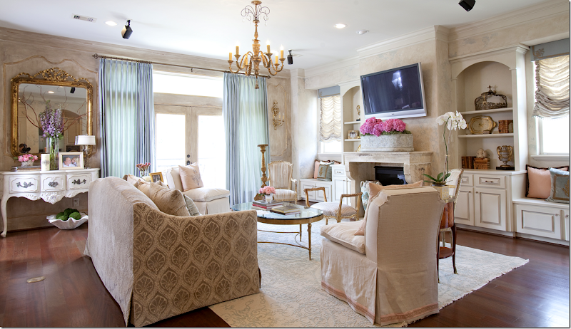
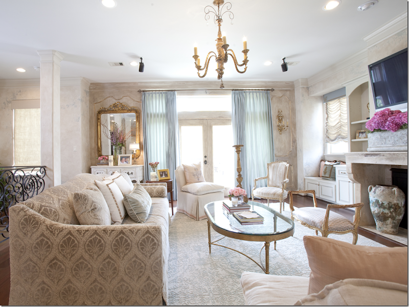
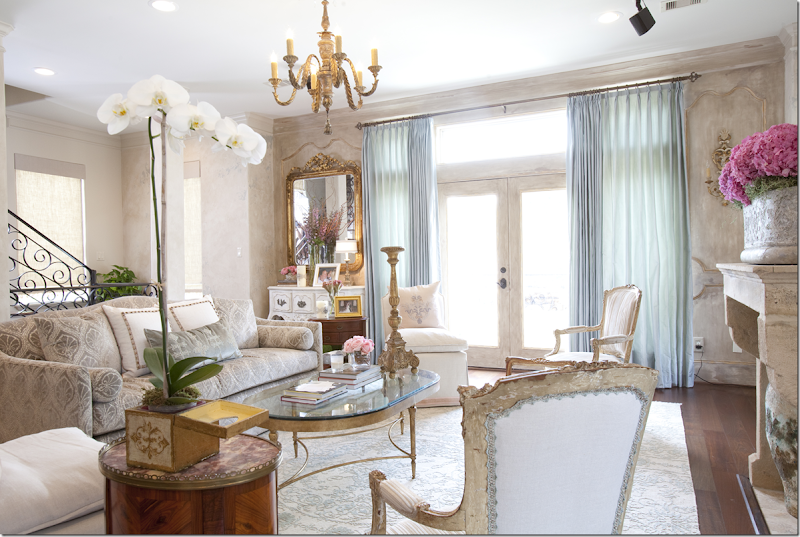
From last year’s story – Julie Dodson designs traditional interiors….and contemporary interiors…And a bit of both.HOUSE #1:Continuing with the Interior Designer Series where we showcase local and national designers, Dodsen & Daughter has two new projects. The first is a new townhouse located near downtown Houston. In many of these “inside the loop” neighborhoods, three and four story townhouses are built on lots that once housed small bungalows. Typically, the garage and a flex room are located on the first floor, the living areas are on the second, and the bedrooms are on the third and fourth floors.The second floor of this townhouse is open – with rooms flowing into each other. Here you can see the living area, the dining room towards the back left and in the middle the kitchen and breakfast area. The beautiful scrolled iron railing stairway leads up from the ground to the upper levels.The townhouse is inspired by French design – it is dressy and very feminine. And it is so beautiful! The walls are stucco - softly fauxed by Jay Iarussi which add to the romantic look of the townhouse.
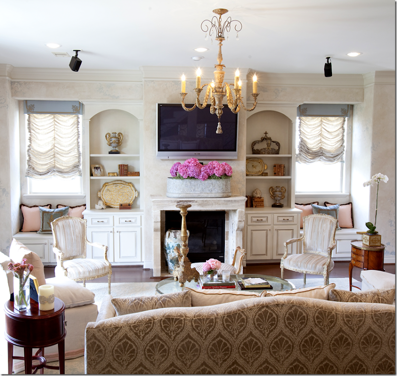
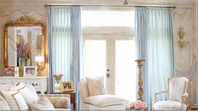
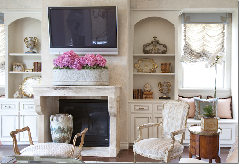
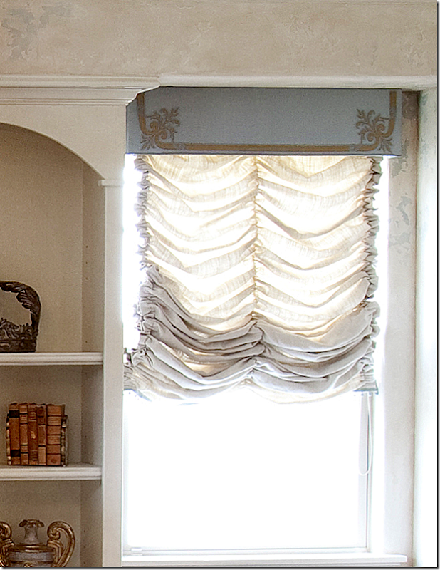
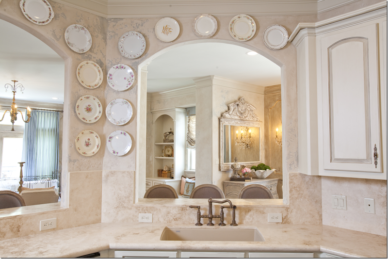
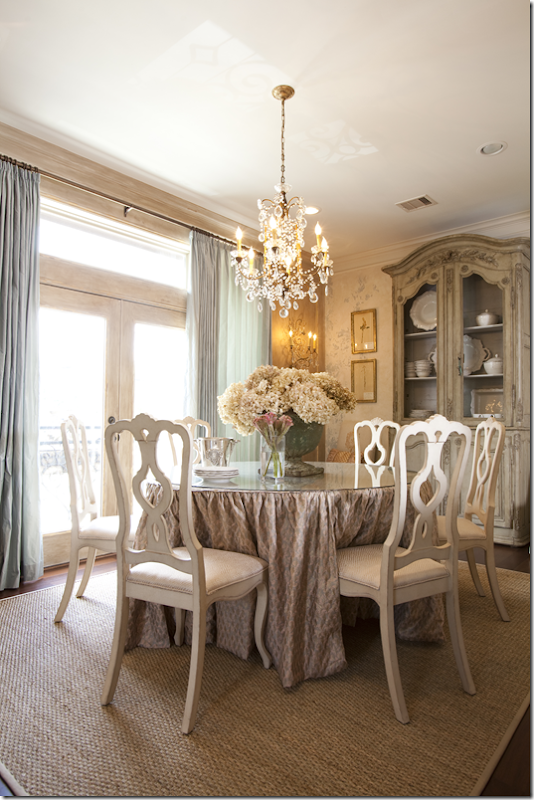
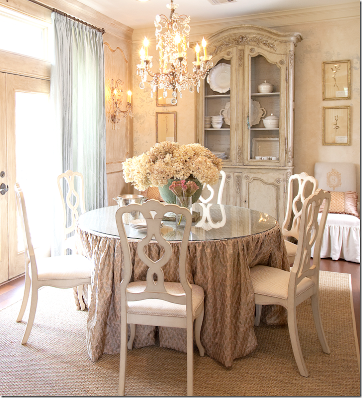
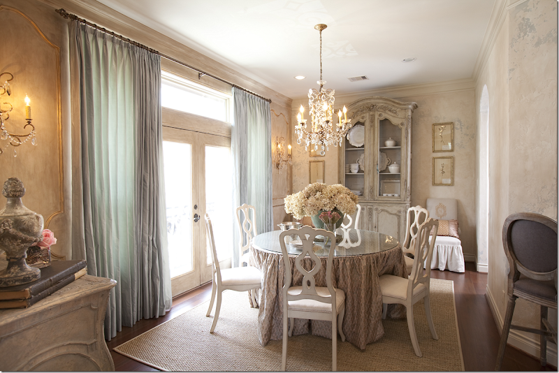
Looking towards the stone fireplace – twin window seats flank it.Everything is so soft and pretty and subdued. Even the rug has a faint scroll pattern. Light blues and pinks are accent colors to all the creams and ivories.Flanking the window – the walls are painted to resemble boiserie – the trim is gilded to highlight the “paneling.”Close up of the “paneling.”I love the trim on this chair. Two slipper chairs sit on either side of the sofa. Notice the pretty curved back on the sofa.Beautiful stone mantel adds age to the townhouse. Silk and velvet pillows in pink and blue on the window seats.Notice the shade’s valance – beautiful detailing.Beautiful trim details on the velvet and silk pillows.The kitchen and breakfast room are behind the arches.Looking out from the kitchen with its stone counters and backsplash. Notice the stucco wall finish.Past the living room and kitchen counter pass-through is the dining room. The same blue silk curtains are repeated here.All light painted wood, crystal chandelier, and skirted table make for a soft, romantic look. Seagrass rug.Does it get any prettier than this? The stucco walls with the soft faux treatment continue into here.
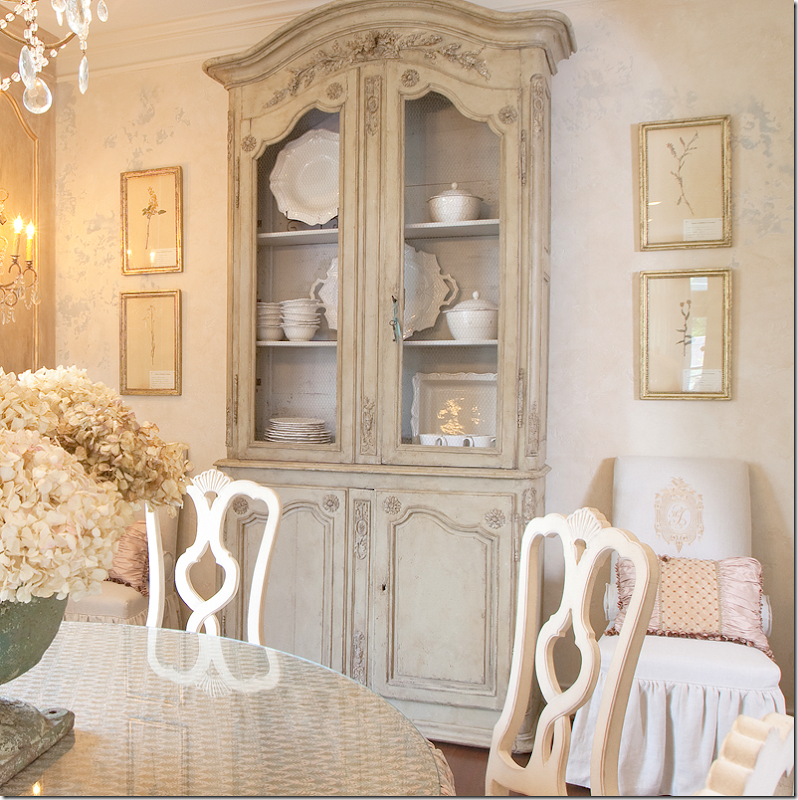
Painted armoire with check wire is filled with creamware. Botanicals and monogrammed slipper chairs complete the vignette.
On each side of the window – gilded trim work becomes painted boiserie. Crystal sconces flank the window.
The view back towards the living room.
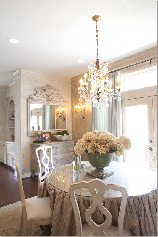
Close up of the painted commode and mirror. Here you can see the faux boiserie and sconce.
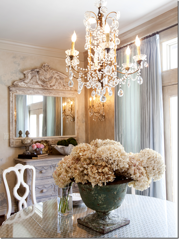
Old crusty urn mixes with hydrangeas and crystal.
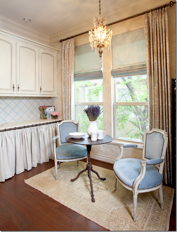
Next to the kitchen, the breakfast room has a linen skirted cabinet. Damask curtains – with the same blue silk shades.
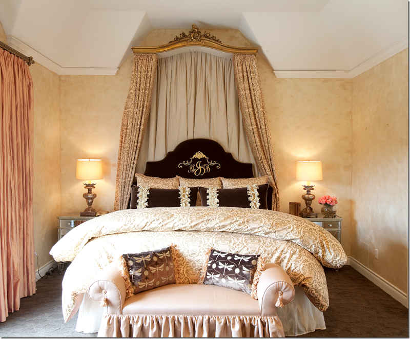
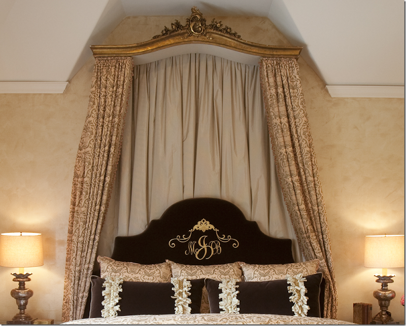
The master bedroom is a vision in peach, brown, and ivory. Silk curtains and monogrammed velvet headboard.
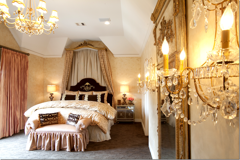
Large mirror flanked by crystal sconces mix with crystal chandelier and mirrored side tables.
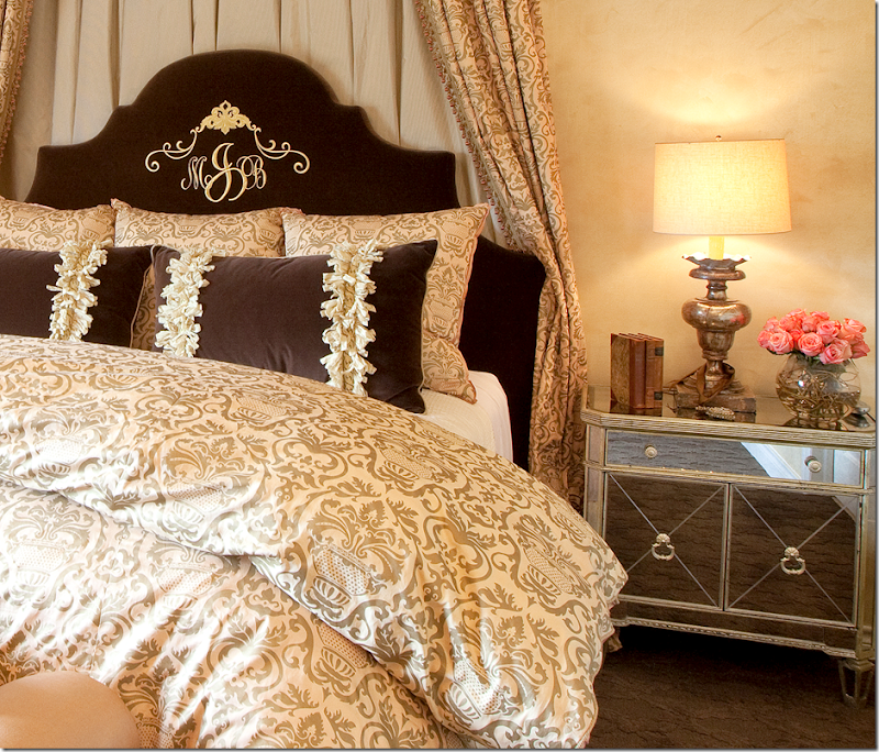
Close up of the damask fabric and trim and monogram on brown velvet. Beautiful lamps.
Close up of antique cornice made into canopy. Beautiful.
The brown carpet is patterned and sculpted – the bench is peach silk.
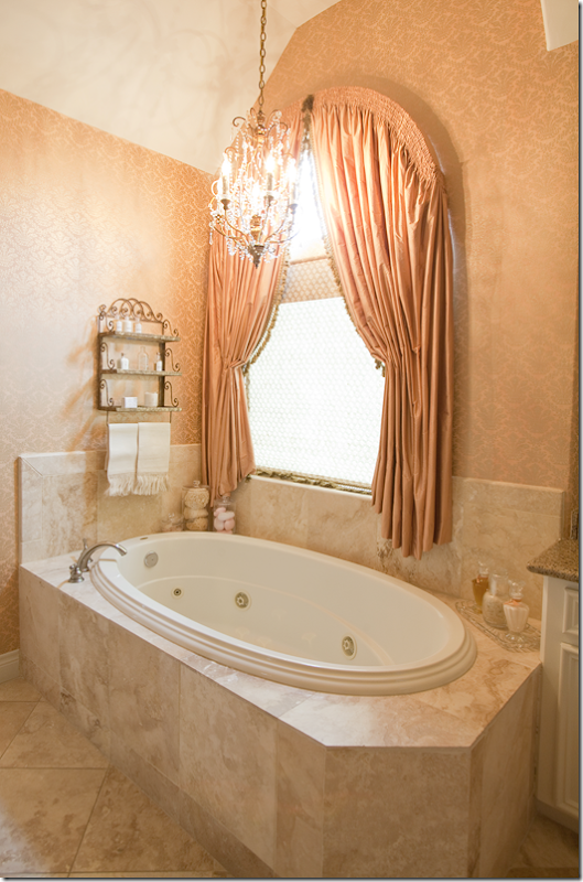
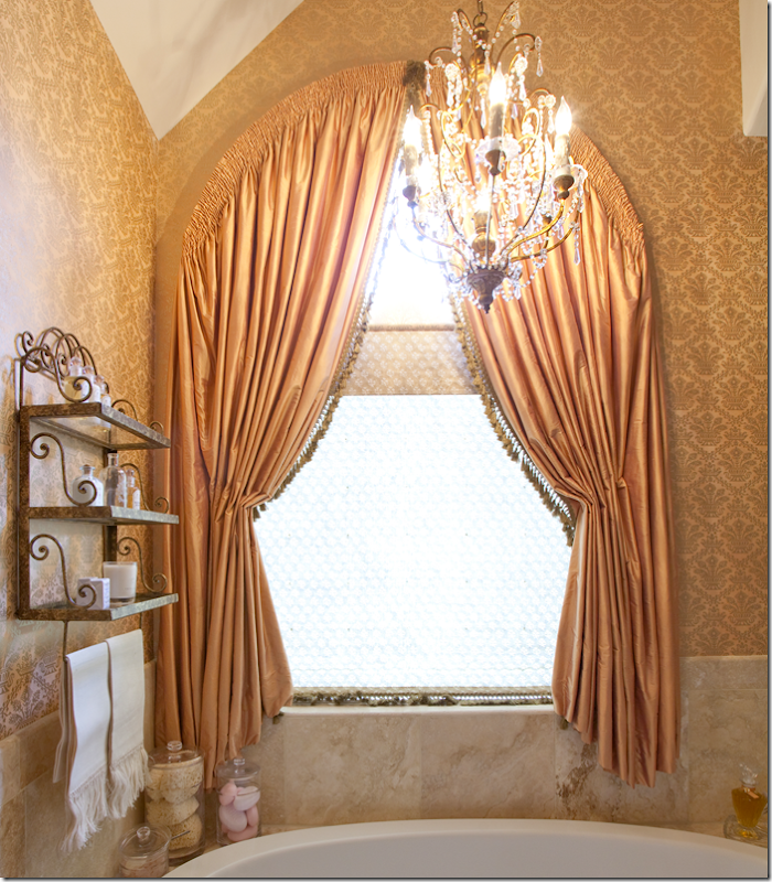
Smocked, peach silk curtains – follow the arched window.
Notice the trim detail and shade. Dodsen’s attention to the smallest of details is amazing. Crystal chandelier and damask wallpaper.
And finally, the powder room in gold with bisque sink. It’s hard to remember seeing another house this romantic and pretty and feminine!
HOUSE #2:
Today’s House #2 is located in Fulsher, a town west of Houston where planned communities feature beautiful custom homes overlooking large yards and lakes.
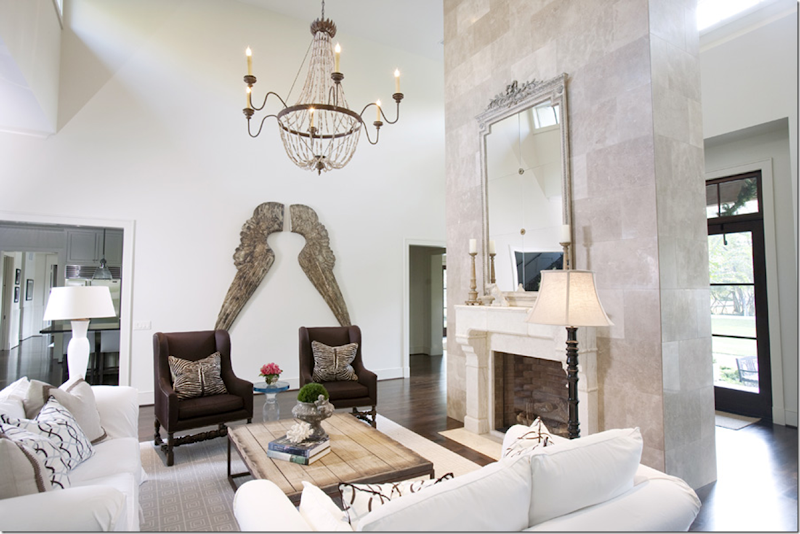
Here, in this custom Kickerillo house (a very popular and long time Houston builder), you can see from the entry that this house is a soft contemporary mixed with classic furnishings. The gray and white tiled floor sets the stage. Dodsen really excels at this mix of styles.
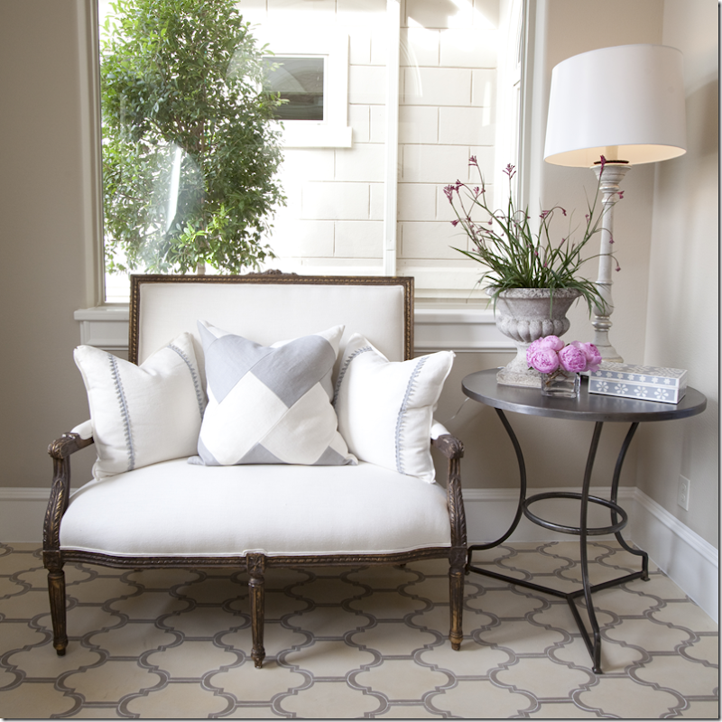
And antique French settee takes on a modern look with its gray and white pillows. The owner hired Dodsen after seeing her bedroom and bathroom at the 2010 Pink Ribbon House (more about that, below.)
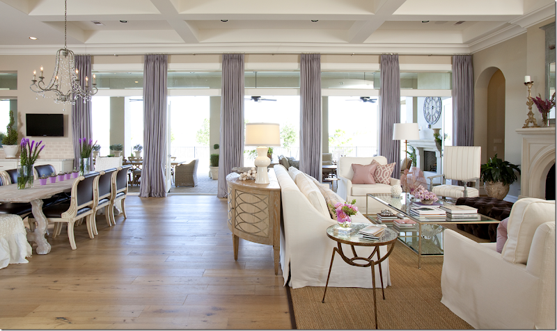
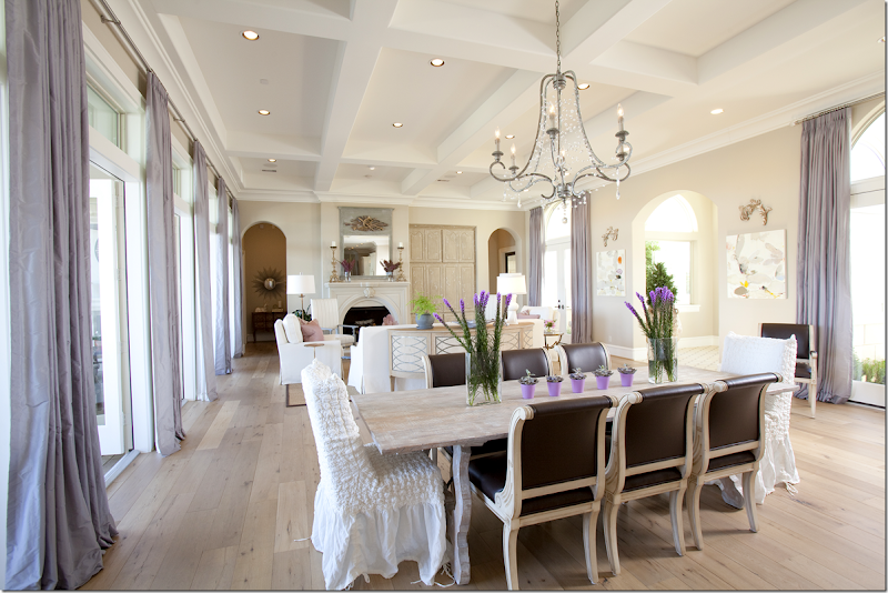
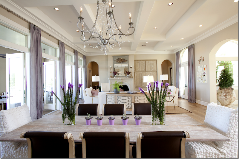
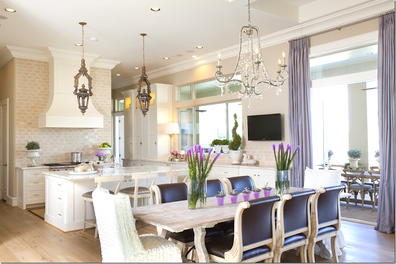
The main room extends from the kitchen on the left to the dining room to the living area. This large expansive room opens to a covered patio that overlooks the back yard.
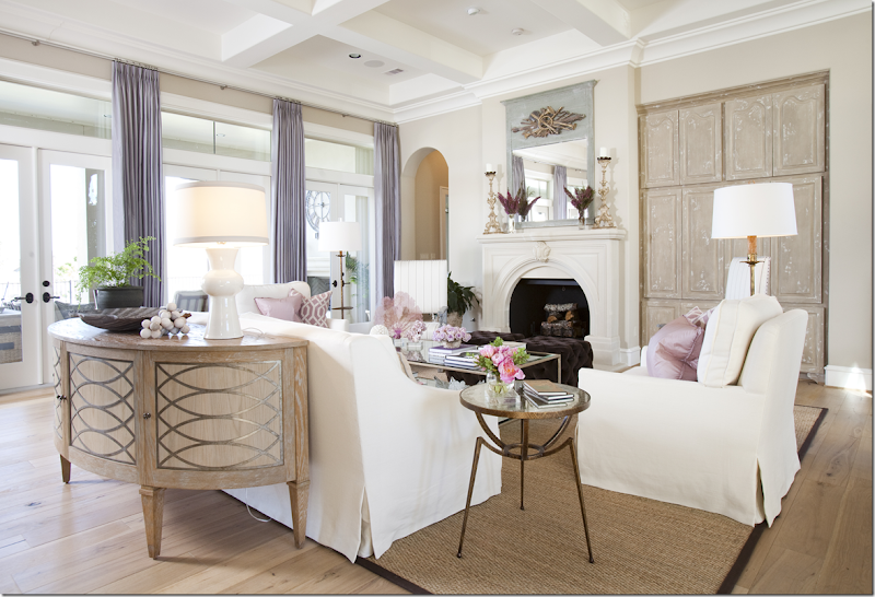
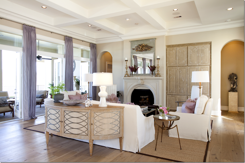
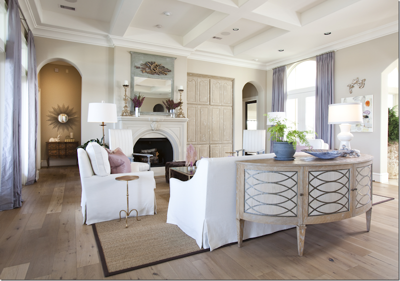
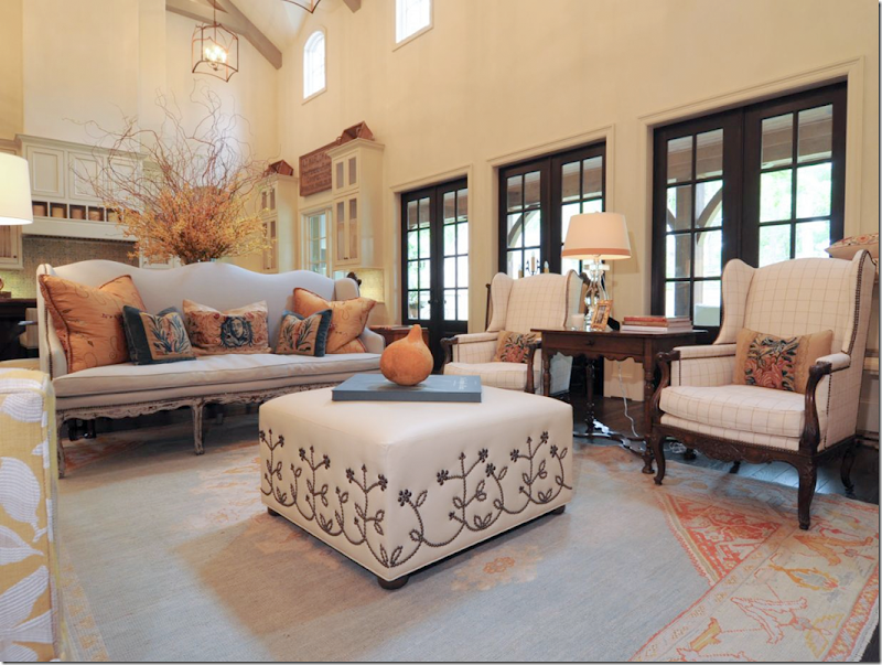
The living area is divided from the dining area by the Niermann Weeks Renishaw Commode. The furniture is slipped in tight, tailored white linen. The floors as well as the media center are done in Belgian inspired bleached wood.
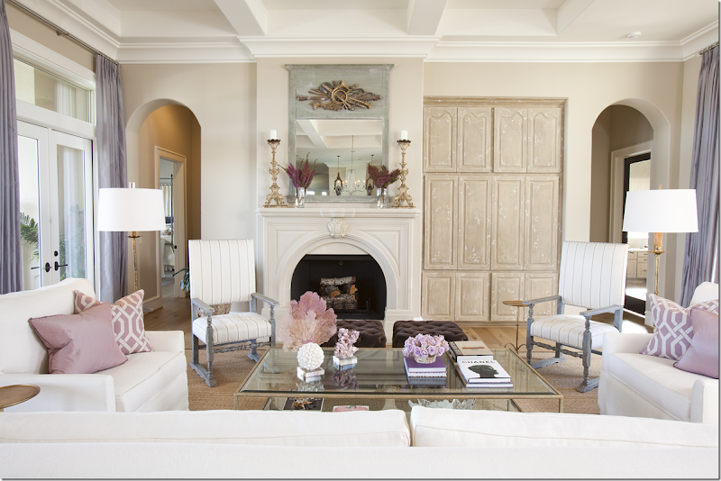
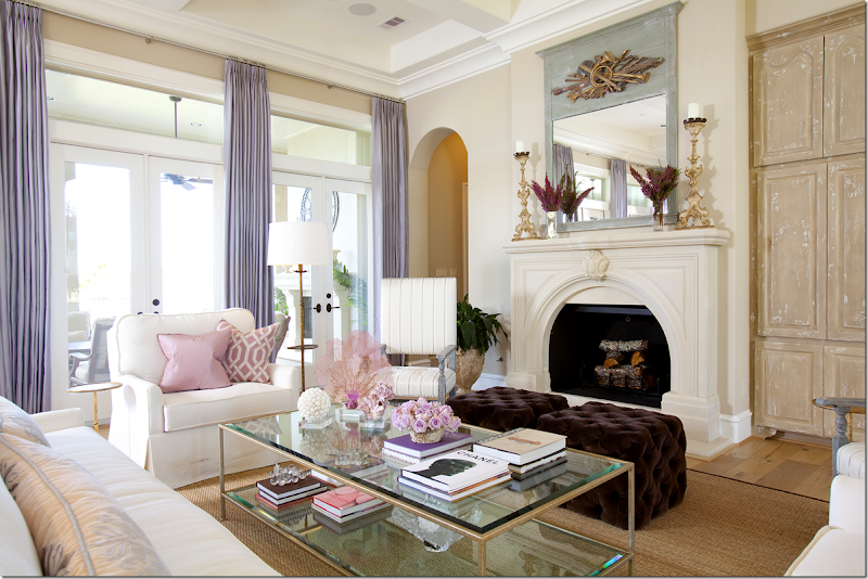
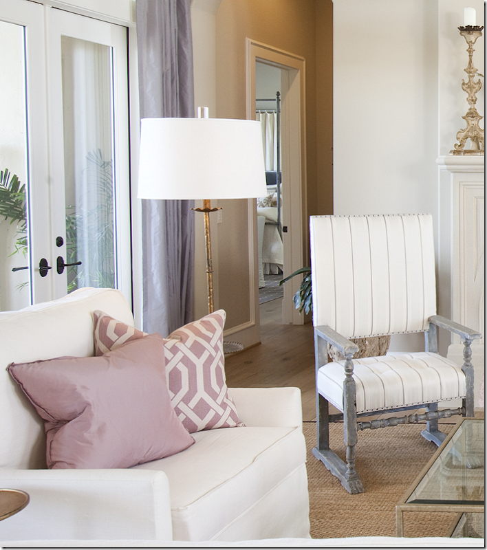
Windows on each side of the room are done in a faux silk lavender, while pillows are a bluish pink. Gray painted tall antique chairs wear a gray and white stripe.
From this view, you can see the covered patio that is used as an outdoor room – it is completely furnished.
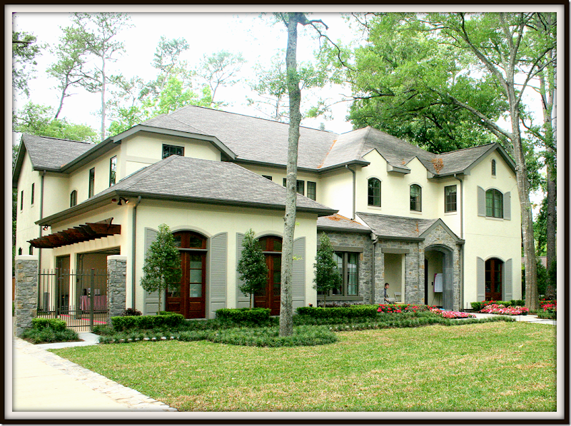
And looking to the right, the front side of the house. Symmetrically placed arches lead to private areas. Through the left arch is the master bedroom which overlooks the back yard.
Matching brown velvet ottomans are tufted. A mix of coral and seafans and crystal sit on the coffee table.
Beautiful celadon trumeau reflects chandelier and lantern. Always have mirrors reflect something beautiful! A pair of gilt altar sticks rest on the mantel.
Love the pillow and chair fabrics – especially paired with the curtain color.
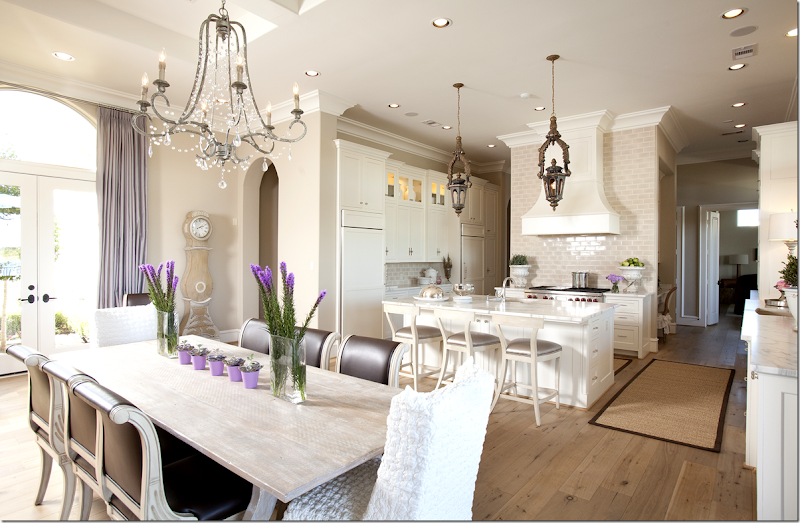
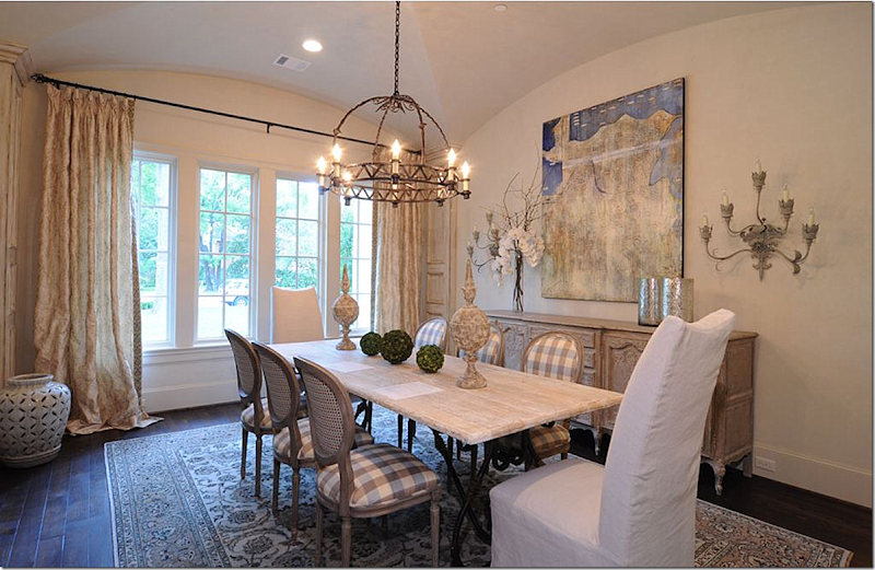
The bleached Spanish styled table sits underneath an iron and crystal chandelier. The chairs are covered in family friendly brown vinyl. The host chairs wear Arte Pura slipcovers found exclusively at Beadboard Upcountry. Notice the cove ceiling. The entry hall is to the right- through the middle arch.
The curtains really make the room – they are so pretty, the color is so soothing!
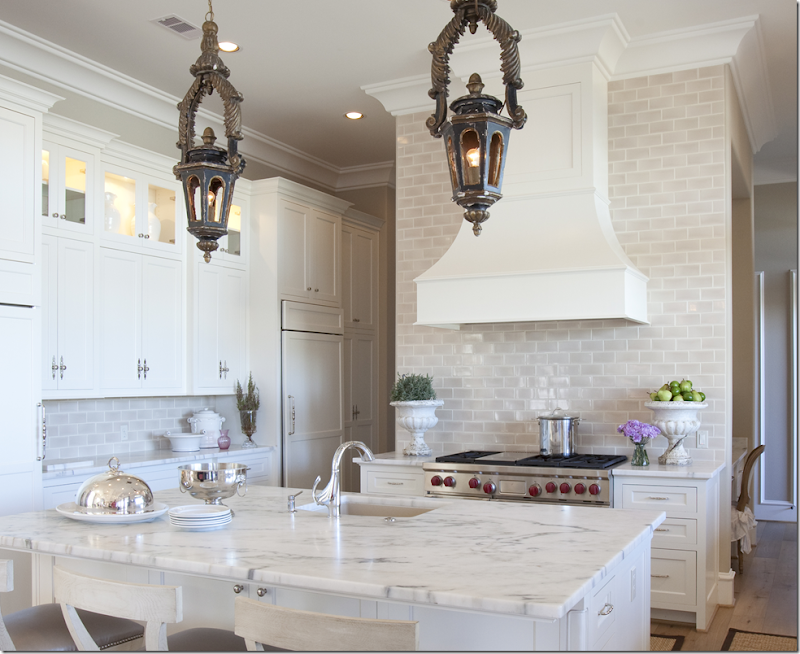
The kitchen – all in white marble and cream subway tiles – sits next to the dining area. Antique styled lanterns define the area.
Facing towards the front side of the house, a Swedish Mora clock stands off the dining area.
The island and countertops are covered in white marble. Notice the vent hood. So pretty.
The refrigerator and freezer blend into the cabinetry.
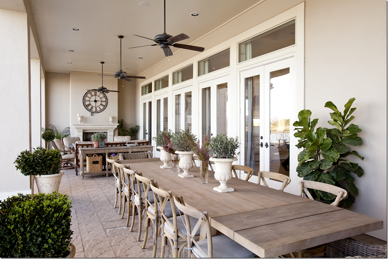
The covered porch has a huge table that seats 14!!! On the other end is a seating area and fireplace.
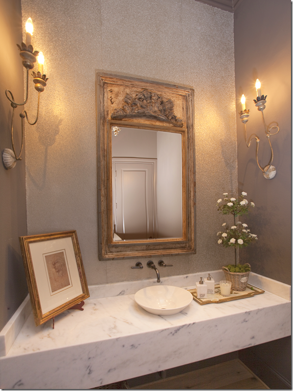
The powder room has a floating marble countertop with gold trumeau and sconces.
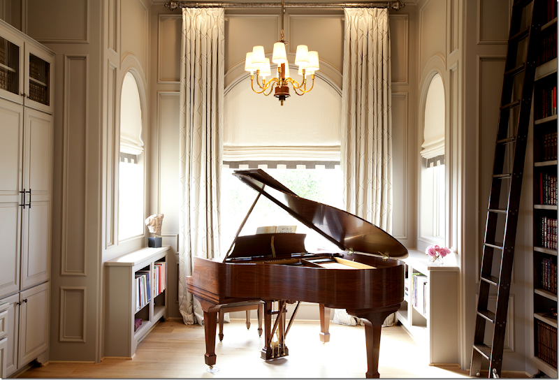
A smaller, more private room is the music/library. Great detailing on the shades.
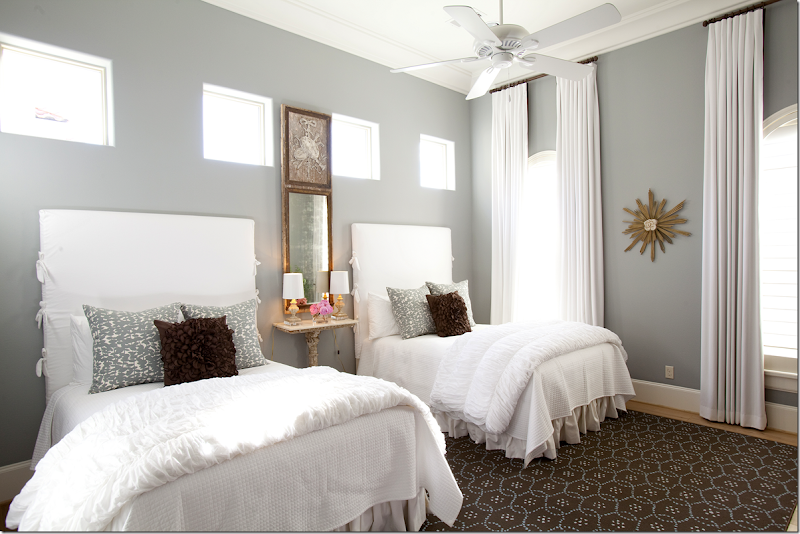
The guest room has twin – double beds. The tall headboards are slipped in white linen. Gray and brown picks up the colors found in the living area.
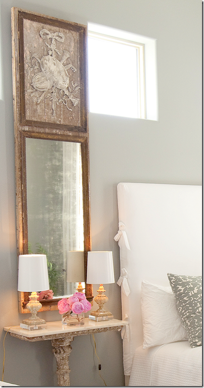
Detail of trumeau and night table – so cute!
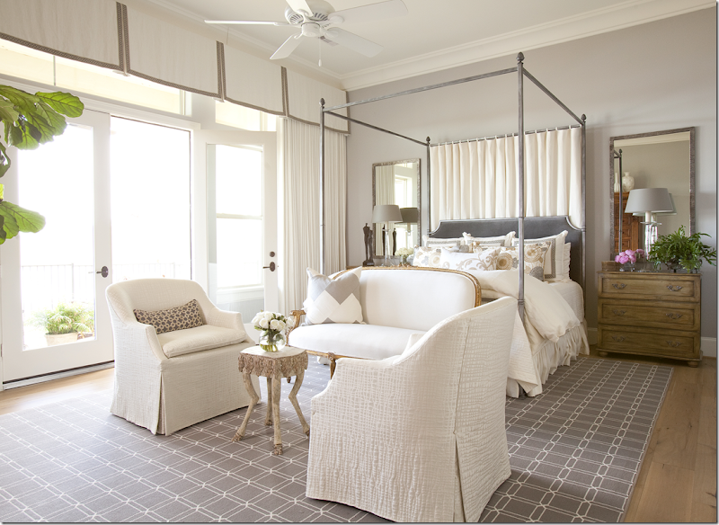
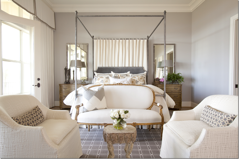
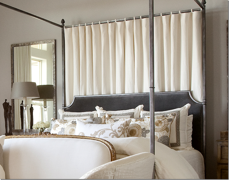
The master bedroom is also in grays with touches of brown. Notice the trimmed valance on the cornice. Matching mirrors flank the velvet and steel headboard.
A subtle white and gray fabric covers the chairs. The gilded antique settee adds just the right mix to the mostly contemporary room.
Closeup of the patterned pillows on the bed.
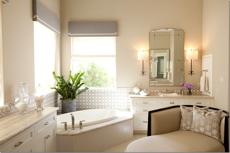
And finally, the master bathroom with its contemporary styled gray and white tiles.
Long time Julie Dodsen friend and Blogger, Baylor Says, also wrote about this house, HERE.
To reach Dodsen & Daughter, their web site is HERE.
To contact photographer Julie Soefer, go HERE.
And, to read the first story on Julie Dodsen on Cote de Texas, go HERE.
And a huge thank you to Julie Dodsen and the homeowners for sharing these photographs with us today!!
The 201o Pink Ribbon House
Beginning in 2003, every other year, a new Pink Ribbon showhouse is built and furnished by a group of Houston’s finest interior designers. Established by the Lester and Sue Smith Breast Center Advisory Council, the Pink Ribbon house is dedicated to raising funds and awareness for breast cancer research and patient care at the Lester and Sue Smith Breast Cancer Center at the Baylor College of Medicine.
This year’s house is currently under construction in Memorial’s Hunters Creek Village. Designed by Hollenbeck Architects, the French country-style home is being constructed by Levitt Partnership.
The 2012 Pink Ribbon house will be open the weekends of April 27 and May 4.
Julia Blailock of Blailock Designs designed the beautiful dining room in 2010.
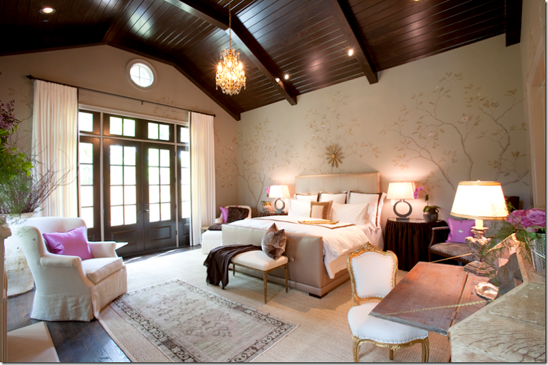
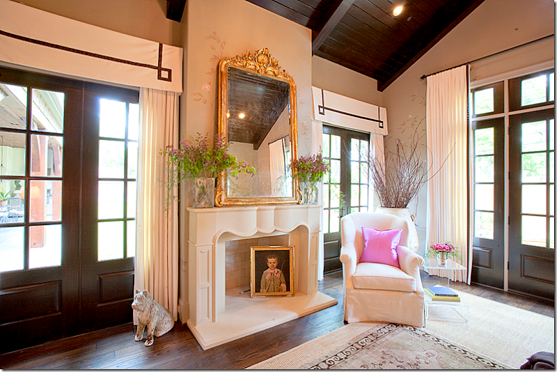
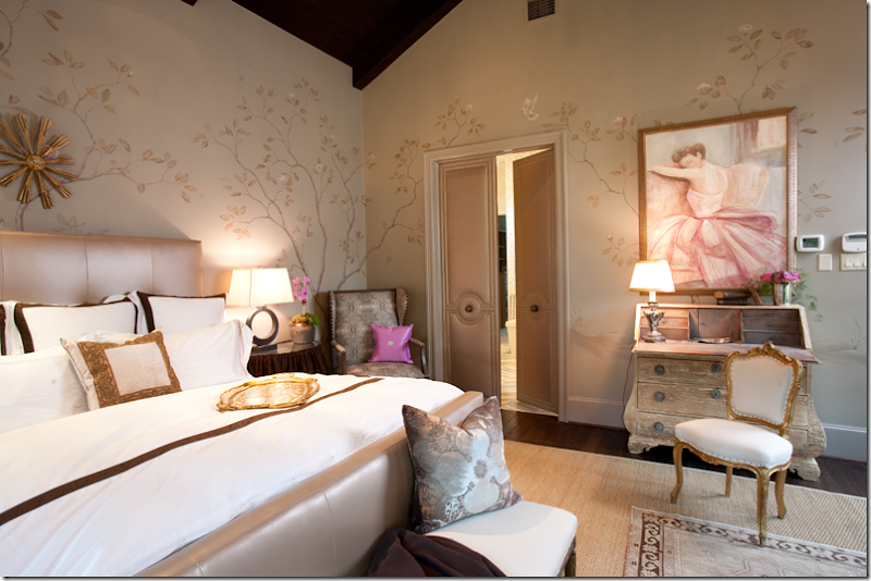
And, in 2010, the master bedroom was designed by Julie Dodsen.
Can you recognize Julie’s signature detailing on the valances?
Beautiful hand painted walls were the focal point of the bedroom.
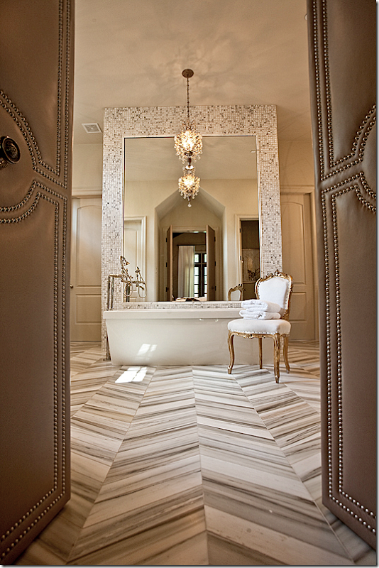
Dodsen also designed the master bathroom with its striking tiled floors.
This year for the Pink Ribbon 2012 House – Julie will again be designing the master suite and study, while her mother, Trisha, will be designing the entry, powder room, and dining room.
Julie says: “Having the opportunity to be involved with the breast cancer house has been a true privilege and honor. I have met some of the most amazing, strong, and determined women who have changed my life. Cancer is a disease that we are all affected by at some point in our life and for me it is a way to give back, honor those who have fought this disease and to help get one step closer to a cure.”
In addition to Julie and Trisha Dodsen, other designers this year include: Valerie Cook, Julia Blailock, Rachel Reppond, Belinda Bennett, Lauren Amber Prestenbach, Christine Ho, Leslie Sinclair, Molly Sullivan Levitt and Molly Oshman.
The home will be available for public tours on the weekends of April 27 and May 4. Tour hours are Friday 10 a.m. to 3 p.m., Saturday 10 a.m. to 5 p.m., and Sunday noon to 5 p.m. Tickets are $15 and will be available at the door.
For more information – please go HERE















so so so beautiful!!!
ReplyDeleteThese homes are breath taking but the second one inches out slightly for me because of the patio. They're feminine without being so much so that a man couldn't feel comfortable. They're absolutely beautiful you really live in a town of very talented people.
ReplyDeleteXX
Debra~
Absolutely gorgeous!
ReplyDeleteThis post was the best I have read in a long time! The first house is my dream house style of decor~so many things to love and be inspired by, thank you Joni!! And the second house was also fabulous, but the first one blew my mind!! Just gorgeous! What a talented design team.
ReplyDeleteVanishing Threshold onto patio seating 14 is perfection. Had me talking to the screen !!
ReplyDeleteThen the foyer pic with window onto wall with SQUARE downspout? OMG, dreadful. It should be ROUND.
Doesn't matter how fabulous the interior is, if the landscape is 'off' the first impression is made.
Love the rooms.
Garden & Be Well, XO Tara
Tara downspouts are not part of a landscaping. They are part of the architecture of the house. Considering that we have not seen the outside of this house to pass judgment, and considering further that the downspouts are painted, I doubt that there was a lot of consideration given to them other than to have them disappear from the facade of the house. Were these copper downspouts and if we knew more about the architecture, you may have a point but there are no hard and fast rules on shape of downspouts. My home is French, I have copper cutters and downspouts and they would be considered square. With my particular architecture, round copper gutters would not have looked as good nor function as well in taking water off a large roof as the square ones. Maybe you should stick to vanishing thresholds.
Deletetara - clueless about the gutters. never even realized there was a dif between square and round gutters. if the facade is ccontemporary would square gutter be alright?
Deletebeautiful vanishing threshold - i agree!
Neither square nor round indicate architectural style. It's a matter of choice and often sheer visual preference. Tara would be better sticking to her vanishing thresholds rather than playing amateur architect.
DeleteEnjoyed today'a post. I was so happy to see the walls in the first home, so much like my own. I am glad I did not go with the masses and paint over them. Loved the purple used in the 2nd home, also a favorite of mine and the Italian trays, I collect those. It was great! Thanks!
ReplyDeleteWow this is a fabulous post!! SO much beauty all in one place.....they are all beautiful, love the colors of the first one, the opennes and that loggia of the second and the great room of the third. Will absolutely need to come back for a revisit to "dissect" the rooms as there are many interesting and noteworthy details here worth looking at again. And so agree great photography can make a world of difference!! Thanks Joni for a beautiful post chock full of gorgeous images!
ReplyDeleteI was totally enthralled with this post. Every space perfectly executed. So many beautiful spaces in one post! Loved the slipcovers on the chairs from Arte Pura. I think I loved every room!
ReplyDeleteHouse #1 has a beautiful Family room but that TV above the mantle spoils it. What about using one of those "mirror" TV's?
ReplyDeleteHI Joni- thanks so much for showing yet again another gorgeous house. It truly is lovely. I am such a sucker for the fabrics!! My only pet peeve was that massive TV above the gorgeous stone fireplace. You would think that with all the money spent in that room (house), some solution could have been found to "hide" it when not in use. I know that this is a pet peeve of mine-as it is a pet peeve of many out there. With all of the soft colours in that room it really does stick out- enter black hole!! But apart from that it truly is a gorgeously appointed home. Thanks again.
ReplyDeletei know, i know. i get it. but where would you put the tv? myself, i hate them over the fireplace because they are too high - tvs should be eye level. obviously they are really into it all because they had surround sound too.
Deletebrooke giannetti came up with a great idea - the tv was set into the wall and painting covered it - that rolled up and away when the tv was on. at the same token, it's their house and they want their tv front and center. they only other solution would been something like what brooke did.
This is such a tough subject....I posted a 'real house' on my blog the other day and got a comment of how refreshing it was to see a TV since magazines and designers always decorate as if people don't have TVs. Not real life. So I feel bad that you can't win here. :-)
DeleteJoni-
ReplyDeleteThank you Thank you Thank you!!!!!! The post was lovely! I really appreciate you taking the time to feature not only my work but to help raise attention to the Pink Ribbon House that is opening in a few weeks! It is such a great cause and one that means so much to me and millions of others out there! So THANK YOU again!
Joni, Julie is so talented in the design field and stands out like a shining star!
ReplyDeleteWhat I notice is the soft soothing colors palettes, an attention to detail unsurpassed, some of the most unique lighting and mirrors throughout. The trims, the walls, I am in Love!! Every accessory is special; again that choice of something special for every space..I would work with her in a heartbeat!
Xoxo
Karena
Art by Karena
That coral colour in picture nr.2 - silk curtains + accents *swoon*
ReplyDeleteThank you for introducing me to my "new" favorite designer... She is AMAZING
ReplyDeleteWell, where to start? The townhouse is totally amazing, livable & lovely. The Fulshear home is wonderful, love all the open areas and really love the outdoor seating areas. I would totally live out there. Brilliant, Joni !!
ReplyDeleteYes a lovely house but so safe. In my opinion it begs for some interesting art on the walls. Not art that matches the decor but that elevates it. Throw in a Basquiat or a black and white photograph or flowers, or go to Art Basil.
ReplyDeleteMany of these houses are so soothing I just fall asleep.
Totally agree. Also, the wall-mounted TVs in both places really detract from the aesthetic, especially the big one over the fireplace in the townhouse.
DeleteOh my that townhouse is GORGEOUS!!!! I am drooling over the shade and valance. So so fabulous. Julie is so talented! Thanks for showcasing her beautiful work, and thanks for the link Joni! XOXO
ReplyDeleteLauren
Baylor Says...
Since Lavender is one of my favorite colors!These shots are stunning. Congratulations, Julie. Grand post, Jonixxpeggybraswelldesign.com
ReplyDeleteThank you for sharing this most incredible work by Julie Dodson. She is gifted!
ReplyDeleteI particularly enjoyed her use of some pretty colors we have not seen much of for long time -- silvery lavender and pale peach. I am bookmarking this one to look at over again.
Lovely soothing colors, lots of really exceptionally beautiful touches and finishes. There is just something that strikes me as "a little much" about the townhouse though. It is a TOWNHOUSE with faux plaster walls?? The wall painting is beautiful and well done of course, but it strikes me as the new faux Tuscan, the yellowy fake plaster look that was everywhere a few years back. Call me crazy but I would have liked the townhouse better with plain cream or grey unfauxed walls, it would look more authentic to me . ..and I am not all about authenticity as a rule, but I don't like a very obviously trying extremely hard to be something it completely isn't space either.
ReplyDeletewell, there is NO way this wall treatment will be the yellow fake plaster of yesterday. this is too hard to replicate with such a soft touch. that's what i love about it - it's so subtle. just a few spots in the corners etc. it's not heavy handed at all - and it just is dreamy looking - like the living room itself. i think we are safe from the yellow plaster!
DeleteWhat beautiful homes for single women! It's wonderful to be able to decorate without having to consider what a man would like.
ReplyDeleteI love her subtle use of colour.
ReplyDeleteLovely.
I want to have dinner under that covered porch...you know it would be a fun party.
ReplyDeleteSo pretty!! Also sending you my gratitude for always posting nice large-sized photos.
ReplyDeletethank you!!!!!!!!!!!!!!!!!!!!!!!! i know people complain because they take so long to load - but aren't they worth it - to see every little detail? God, these pictures are so gorgeous - seriously. that's why i said - what is prettier? i love when someone sends in professional, large sized photos. they are just eye candy.
DeleteGorgeous! I drooled through every photo and took notes for a few ideas in my little casa, lol.
ReplyDeleteJoni,
ReplyDeleteWhat a beautiful home the first one is. I love the calming neutrals. The fabrics and accent colors were so amazing.
Karen
House No. 2 is lovely. I like the soft atmosphere and felt each room had a soothing quality. I thought the bedrooms were done especially well - very sophisticated.
ReplyDeleteWith the exception of the lovely living room in the townhouse, the remainder of the decor looked like a bordello on steroids. It looks like two different people decorated it, especially the bedrooms.
Really beautiful spaces, Joni! I don't know which I like best, or that I should even try to pick a favorite. They're both so lovely - I'll take both! What I'd give to be able to move to Houston right now!
ReplyDeleteYour posts are better than hot buttered popcorn at the movies...I can't get enough! These pictures are so amazing! Now I want to move, or build, or go by furniture...like yesterday...
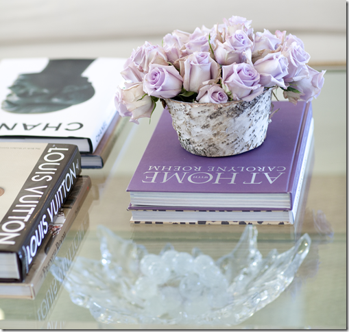
ReplyDeleteHouse number 2 gets my vote hands down. I must say that I'm LOVING lavender these days! The color grabbed my attention with that very first photo of the sweet lavender roses sitting on top of those pretty books.
ReplyDeleteThanks for another great post.
Maureen
Totally digging the tile in the larger suburban house.. Agree with a few others about the walls in the townhouse. I thought they were too 'heavy'.
ReplyDeleteHey maybe that downspout belongs to a neighboring house.
ReplyDeleteI really love what this designer does with window treatments -- always a light touch, yet always fresh and decidedly custom. My favorites are the bold, solid taffeta drapery panels in neutral spaces. It's easy for clients to fall in love with patterned fabrics when looking at swatches, but sometimes a solid, bold color can be much more dramatic.
ReplyDeleteshe spends a lot of time on the little details. and it shows. no one commented on the shades in the first living room - i thought they were works of art.
DeleteI adored this post as the pictures were gorgeous; so nice and large and their content was exquisite. The soft purples in the second house with its large well appointed patio stole my heart. The kitchen makes me swoon in all its unobtrusive but stunning beauty. I would love to live here, so dreamy. Thanks for sharing this talented designers work.
ReplyDeleteWhile changing the entire contours of your house, you can even add designer dinning accessories to it. Reason being, it will enhance the look and feel of your dining room as well as make mood while you will be having any meal of your day. Choose designer dinning accessories from Dubai for yourselves and make your room look stylish and chic.
ReplyDeleteWhat a great wall color! I'm definitely saving this idea for when we move apartments.
ReplyDeleteGorgeous!
ReplyDelete-linda,ny
This house is a dream! Enough said. :D
ReplyDeleteAs beautifully dressed what the first home was; two thumbs up for the 2nd one as prefer its simplicity of elegance.
ReplyDeleteWonderful post as usual Joni! -Brenda-
I love the covered porch. Lovely arrangement!
ReplyDeleteClearly one of the prettiest areas of the home.
DeleteThis designer certainly does fabulous work. Both of the homes are exquisite - no detail was spared! I guess that would be my one complaint though. While they're both equally beautiful, they also both look totally "decorated". I don't see anything in either of them that is a personal touch, or looks like it was acquired over time. Gorgeous though!
ReplyDeleteGreat pictures Joni! I think the two different styles proves Julie's talents as a designer and also her ability to respect the taste of her clients. Thanks so much for the mention about the Arte Pura Slipcovers, this is the first picture I have seen of them in there.......They are a milky white the Naturale.........The second house is my personal favorite...... And Julie is a pleasure to work with..........I am happy that she is getting the exposure she deserves.........The pink ribbon house certainly seems like it will be a stunner with the designers you listed.......I'll mark my calendar. Maryanne xo
ReplyDeleteThe interior design of this house is amazing. I really love the color and lighting. Totally awesome. Kudos!
ReplyDeleteJoni!!!! I cannot find your email address and I guess I can understand why not. We just bought a house and I am a little anxious over a particular room. It's a small family room where walls are covered with wood planks, which we'll remove. It has beams that are very thin, which will come down, too, so you can see the skylights and vaulted ceiling but the fireplace wall is all brick. Very plain brick. I would so appreciate if you'd tell me what you'd do. Is it best to paint it white and see about getting a wood surround, whitewash it, should we try to remove it. It's our first house, so not a lot of experience and probably not a lot of money left over either. Thank you!!!
ReplyDeleteScale and proportion seem a bit off in both & agree the walls are 'heavy'in the townhouse. + the living room draperies are so 1950'spinch pleats & not full enough for such a room. Why not some lovely goblet pleats or something more interesting & billows of fabric?!
ReplyDeleteAnon. Six inch French pleats are not outdated. The owner obviously wanted a more tailored, columnar design. It's really amounts to what look you are seeking. Not every situation calls for ultra full drapery no matter how beautiful.
DeleteGreat--I love most all of it - especially the window treatments.
ReplyDeleteBTW here is a news flash -Jason Russell, 33, was arrested Thursday morning by the San Diego Police Department and the earliest reports detailing the incident suggest it was one hell of a day already for the Invisible Children co-founder and proclaimed “mastermind” behind the Kony 2012 viral video.Police say he was described as "in his underwear" when the first 911 calls were made. San Diego Police Department Lieutenant Andrea Brown tells a local NBC affiliate that Russell was found masturbating in public, vandalizing cars and possibly under the influence of an unknown substance at around 11:30 am on Thursday.
read more :
http://rt.com/usa/news/kony-2012-arrested-masturbating-777/
Who cares????
DeleteShell, really? Is this adding anything to the conversation?
DeleteThe other day there were numerous people posting about how they were supporting this KONY viral video organization and this guy--Jason R.-- was the mastermind behind the movement. So SOME people should care. I was skeptical of the whole thing and posted my doubts. I said investigate where your money goes before donating. So if you didn't read the many posts by people jumping on the bandwagon to support the Invisible Children movement - fine - but there are readers of this blog who did jump and they now have more information about the coo-coo for cocoa puffs guy behind the whole deal. OK?
ReplyDeleteShell, I read this blog. While there may be many posters on other current events blogs that supported this organization, there were no comments on this blog. Get your facts straight. I seriously doubt that folks that read design blogs take political/social positions about KONY here - perhaps on other sights.
ReplyDeleteBreathe slowly in a paper bag - it will be all right.
I DID show the video!!!! and made a short comment about how everyone should watch it. Shell, i don't know what happened to Jason. Perhaps he has personal issues. But i don't think it matters compared to the actions of Kony. Sounds like maybe he was drunk? Still, its sad because it takes away from the message, something he has worked on for years and years. oh well. i never understand when things like this happen. like that senator and the twitter bs in his boxers. really sad!
DeleteSadly, he, like the flight attendant this past week on American Airlines, may be bi-polar and not on proper medication. This seems to be an emotional and mental breakdown totally out of character and thus should not be harshly judged as we might have judge Congressman Anthony Weiner who showed his weiner to the world.
DeleteBy the way, his idiot wife is still with him. Go figure?
Shell, my apologies. I did not read the comments on the "This and That" post. Having gone back, I found that is where the comments on KONY first occurred. I don't believe they have a place on this blog, but nevertheless, they were there and your reference now makes sense.
ReplyDeleteOMG STOP!! The eye candy!! I love all of the curtains and the pillows! The pops of color are incredible -def. an inspiration! Thanks you!
ReplyDeleteAs for Jason -omg can you believe that totally just happened here in my neck of the woods?! Just goes to show that once power and fame get to a person sometimes they just break into a fool! However, that doesn't/shouldn't take away from the bigger message of Kony.
it's great that the name Kony is now known to millions but this particular charity is questionable. There are other charities out there that are perhaps more boring but much more transparent and have a long, stable track record. Research both the good and the bad stuff. Kony 2012 fails the sniff test. It's the sketchy finances IC has been keeping, I'm all for fighting the good fight and what not, I just think people need to be more smart about blindly trusting an organisation because their video went viral.
ReplyDeleteI absolutely adore the second house. The kitchen, patio, floors, bedroom, foyer tile...had me in awe!!! The floors are amazing. Any idea what wood species and finish these might be?
ReplyDeleteshell just curious - what issues with the record keeping are you talking about? I hadn't heard that. And if someone suffers from bi polar that really shouldn't be a judgment against them when they go off their meds or their meds need adjusting. perhaps that is why he is so sensitive to moral outrage? the list is long of people with bipolar who have ended up naked and screaming in the streets. actually my heart broke for him when i saw that video. the timing is awful and that might be what is behind it - too much stress. and i love when people tell me what does and doesn't belong on my blog. is there a blog rule somewhere that i violated? let me know that url because i want to be sure to violate those terms again. listen - i'm all up for topics to discuss. it gets hard to constantly come up with unique things to talk about. oy. you should only know what i went through this weekend with this blog.
ReplyDeleteIt seems like a lot of compassion has been shown in the comments regarding the "assumption" that he may be bi polar. The reference to the flight attendant was not to cast scorn but to point out that bi polar individuals must stay on their medication. In the case of the flight attendant, she had not been taking her medication. We are only making an assumption here. The issue may be something totally different. No matter what, however, it was very heartbreaking indeed.
DeleteJoni
DeleteI'm not saying you should not put whatever you want on your blog--of course you can and should do that. All I was saying was to the many readers you have is investigate before donating money.
I have no objection to you putting whatever you want on your blog.
The other day I read this:
"Invisible Children has been condemned time and time again. As a registered not-for-profit, its finances are public. Last year, the organization spent $8,676,614. Only 32% went to direct services (page 6), with much of the rest going to staff salaries, travel and transport, and film production. This is far from ideal for an issue which arguably needs action and aid, not awareness, and Charity Navigatorrates their accountability 2/4 stars because they lack an external audit committee. But it goes way deeper than that..."
that was from:
http://visiblechildren.tumblr.com/post/18890947431/we-got-trouble
There were other things I read as well - if you google invisible children you will get numerous other articles.
I also felt sorry for Jason when I read about what he did. I thought he might be over the edge from the recent criticism his organization has been getting.
I wasn't condemning him. I just posted that bit about him being in custody after his bizarre behavior as a piece of information. It wasn't
a "judgement". Well I guess my "label" of him as "coo-coo for cocoa puffs" can be seen as a judgement. THAT was inappropriate on my part. I really DO feel sorry for him.
Shell - first, I didn't say you made that statement about my blog - an anon said it, not you.
DeleteSecond = did you read the IC rebuttal to that tumblr story? I found it quite enlightening and feel you should read it.
http://s3.amazonaws.com/www.invisiblechildren.com/critiques.html
Several points made on the tumblr were very misleading esp. about funding and strategy and Kony's threats. i found this comical:
First Oyston attempts to negate kony's threat here:
Foreign Affairs has claimed that Invisible Children (among others) “manipulates facts for strategic purposes, exaggerating the scale of LRA abductions and murders and emphasizing the LRA’s use of innocent children as soldiers, and portraying Kony — a brutal man, to be sure — as uniquely awful, a Kurtz-like embodiment of evil.” He’s certainly evil, but exaggeration and manipulation to capture the public eye is unproductive, unprofessional and dishonest.
Yet Oyston then states:
Still, Kony’s a bad guy, and he’s been around a while. Which is why the US has been involved in stopping him for years. U.S. Africa Command (AFRICOM) has sent multiple missions to capture or kill Kony over the years. And they’ve failed time and time again, each provoking a ferocious response and increased retaliative slaughter. The issue with taking out a man who uses a child army is that his bodyguards are children. Any effort to capture or kill him will almost certainly result in many children’s deaths, an impact that needs to be minimized as much as possible. Each attempt brings more retaliation.
so, which is it? Either he doesn't kidnap children and use them in his army OR no one can kill him because he surrounds himself with an army for children.
after reading the rebuttal I feel stronger than ever about supporting IC and feel the criticism is a shoot the messenger tactic.
another interesting thing is how the criticism appears to come from different groups yet their criticism uses exactly the same words making you wonder why they find IC so threatening.
Also i assumed Jason was bi polar. apparently he hasn't been diagnosed that. rather he is said to have been drunk and dehydrated. i wonder if he will be diagnosed now that he is hospitalized.
good discussion, as always.
I'm reading the rebuttal now. Earlier today I came across this:
DeleteInvisible Children Funded By Antigay, Creationist Christian Right
Oh my… from the link:
http://blogs.alternet.org/speakeasy/2012/03/11/invisible-children-funded-by-antigay-creationist-christian-right/#disqus_thread
Any time an article begins "antigay, creationist, christian right, I stop reading. This blog has it's own agenda and truth is not one of them.
DeleteIf Jason was a coke snorting, gay porn star, his meltdown would have become the new "Occupy" model.
Love, love, love the lavender/pink accents in the second house.
ReplyDeleteNot so much the faux finish walls in the first. In my humble opinion, I think that one can fake age (make something look older) if done well, but run into trouble trying to make something look like something it's clearly not. Unless, of course, the effect is done in a very tongue-in-cheek, humorous kind of way. No matter how skilled the painter, a modern townhouse will never be mistaken for a crumbling villa. Something like a polished Venetian plaster (trending now), with a subtle sheen/color/texture, could add interest and depth without looking too "out of context" or "trying too hard" (for an example, see www.armourcoat.com, polished plaster).
I also have a round dining table with a gathered linen skirt (first house). On the few occasions I entertain, I "protect" the skirt by covering it with a spongey rubber protector cut to the exact size of the tabletop (they look like carpet underlays, but are designed for tables). I top this with a square white linen tablecloth from Wisteria. The two linens look pretty together, and I can toss the Wisteria cloth into the wash if a guest spills wine (while my more expensive, bespoke skirt is safe under the rubber). I think it looks nicer than a glass top (although it may be less practical if you use your table often). One tip that Donna Brown from Houston's Gray Door gave me: add an inch to your table's diameter before you start your gathered skirt (i.e. so the gathers do not hit your tabletop, but rather start below the table edge). The skirt looks just as nice and you don't have "bumpy" gathers interfering with your forearms or table settings.
i also use a topper with guests - but i first put down a waterproof tablecloth inbetween -- you just cut the fabric to fit the top of the table = that way if anyone spills wine, etc. it doesn't ruin the bespoke tablecloth. you should get one. any bed bath and beyond or linens n things carries them!!!
Deleteoh wait = i just reread what you wrote and you DO use the waterproof tablecloth. ok. Donna huh? I thought that was MY genius idea!!! hahah
DeleteAll the work Julie has done here is wonderful.Such a talent with color and creating the atmosphere the client desires.
ReplyDeleteFirst house and second both show the difference's between the two clients wishes and her ability to ahchieve them.
A lovely tribute to Julie and her mom, Trisha!
ReplyDeleteI am a fan.
I'm so glad you posted this.The interior design of this house is amazing.I really love the color and lighting. Totally awesome.Mr. Builder – Painting and Decorating is a family operated services business. We have been offering clients with top quality renovation services for over ten years.Painter and Decorator Chelsea
ReplyDeleteYour blog is very nice... Diploma fashion courses
ReplyDeleteBreast aesthetics, there is a lot I do not know about. There are those from Turkey you recommend Dr. Ali mezdeği. Do you have that information?
ReplyDeleteMeme estetiği
Great. You did a great job. I would like to read few more articles from you. Keep sharing! fashion design colleges in chennai
ReplyDeleteAfter reading some nice stuff in your article I really feel speechlesscustom video productions
ReplyDeleteThanks for the post its a really nice and amazing article.I love your furniture's and colourful lighting and painting
ReplyDeleteIt has been some time since I visited website with such high quality informationcustom video productions
ReplyDeleteThis tutorial is indeed useful. custom video productions
Your Blog is awesome !!! All images are beautiful.
ReplyDeleteyou are doing a great job. i am really much impressed by your work. it is simply an awesome one.
ReplyDeleteBedroom Furniture Online
Just amazing picture share. Great work thanks for sharing the picture and article.
ReplyDeleteThis is the article which reveals the interior designing. Please do refer Interior Design Courses In Chennai
ReplyDeleteWhat gorgeous houses, I follow Julie Dodson on instagram and she is one of my absolute favorites! I adore pretty much everything she does, her style is so spot-on for me. One thing I noticed in these photos, what do you think about the cove ceiling in the family room of the second house? It is unusual to me because it has just drywall "beams" and no trim... I actually have a similar ceiling in the family room of my (builder basic) house and have been assuming I should have it finished out with trim and paint to turn it into a more standard coffered ceiling. Is this is a more modern take on the coffered ceiling?? I've searched and searched online, and most special ceilings that I see are beamed (with wood) or coffered (with trim/paint)... this seems unique??
ReplyDeleteServices provided include programming, design development, construction drawings, permits, bidding and negotiation, project management for individuals as well as for real estate developers. Interior Designer
ReplyDeleteNice blog,
ReplyDeleteThanks for sharing this excellent blog! Keep blogging!!!
Interior Designing Courses In Chennai | Interior Designing Colleges In Chennai
You have made your points in a smart way. I am impressed with how interesting you have been able to present this content. Thanks for sharing a nice information. Do support us
ReplyDeleteFashion Designing Courses In Chennai
Interior Designing Colleges In Chennai
Inifd Bangalore
Interior Designing Colleges In Bangalore
Great work by you. Very nice. thanks for sharing
ReplyDeleteFashion Designing course in Dehradun
Drawing & Painting Course in Dehradun
Fine Arts Course in Dehrdun
Animation & Multimedia Course in Dehradun
Journalism & Mass Communication Course in Dehradun
Commerce & Management Courses in Dehradun
I really enjoyed your blog Thanks for sharing such an informative post.
ReplyDeletehttps://myseokhazana.com/
https://seosagar.in/
Indian Bookmarking list
Indian Bookmarking list
India Classified Submission List
Indian Classified List
Indian Bookmarking list
Indian Bookmarking list
India Classified Submission List
Indian Classified List
I found your blog while searching for the updates on interior designing, I am happy to be here. Very useful content and also easily understandable providing.. Believe me I did wrote a post about tutorials for beginners with reference of your blog.
ReplyDeleteFashion Design courses in chennai
Interior Design Courses In Bangalore
BSC Fashion Designing
Interior Designing Colleges In Chennai
Fashion Designing Courses In Chennai
Nice Post thanks for the information, good information & very helpful for others,Thanks for Fantasctic blog and its to much informatic which i never think ..Keep writing and grwoing your self
ReplyDeleteduplicate rc in delhi online
duplicate rc in ghaziabad
duplicate rc in online
duplicate rc in greater noida
duplicate rc in mumbai
duplicate rc in bangalore
duplicate rc in faridabad
duplicate rc in gurgaon
duplicate rc in noida
death certificate online