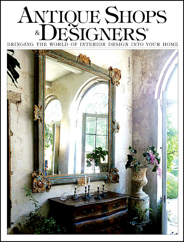
The new issue of one of my favorite magazines – Antique Shops and Designers – is out and is now available online HERE. I like to show this magazine’s highlights on the blog because it’s printed here in Houston and many of you might not get a chance to read it otherwise. The magazine keeps getting better and better and this issue kept me happily engaged for a few hours. Two articles in particular stood out – Barbara Carlton’s townhouse and Megan Megas’s house. Both have close ties to two of Houston’s great designers, as you will see:
Barbara Carlton is the mother of Renea Abbott, owner of Shabby Slips in Houston. I always talk about the designers I think are instrumental in starting the “Houston Look” but somehow I don’t mention Renea enough. Her store is now 20 years old – amazing – and when it opened, it was a very casual place to go get your furniture slipcovered in loose linen. That didn’t last long though. Shabby Slips quickly became one of the better antiques and decor stores in Houston who just happened to slipcover custom furniture in tight, tight slips – some were impossible to even tell that they were slipcovers. Renea has a special mix she uses – White linen, black accents, modern tables and lamps, gilt mirrors, and fancy antique chandeliers. It’s a look where the antiques are covered in white, casual fabric and mixed with contemporary art work. Lots of zebra and leopards are mixed in to create her look. Her mother, Barbara, also has excellent taste and it’s easy to see where Renea inherited her own aesthetic from. Barbara’s style is more casual than Renea’s glamorous look. She’s more into white interiors than Renea.
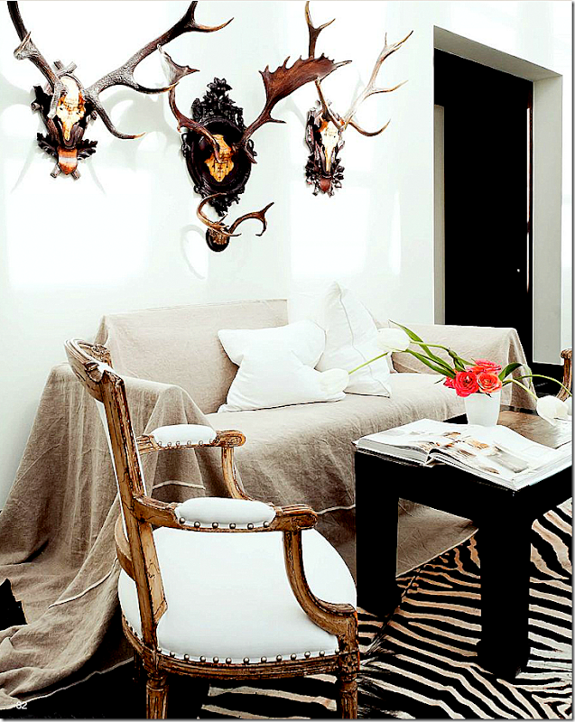
Pictured in this issue is Carlton’s new townhouse. I’m loving this first picture – the sofa was “too white” so she had this loose slipcover made for it out of linen. Wow! I LOVE this and want to copy it!! What a great idea to have a second set of slips made like this for a quick change out. Walls are white, there’s a zebra rug and a black table. The French chair, one of a pair, is dressy in its gilt frame but made accessible in its friendly white fabric. The antlers are antique. And notice the pillows - two centered in the middle. That’s a great idea, you never have to move them when you sit down. Shabby Slips makes the BEST pillows in town. They are soooo overstuffed with down, it’s insane.
Photography by Jack Thompson
Dark floors, white walls and seagrass – mixed with white chairs, ottomans, and a linen sofa – all slipcovered. Again, loving the two pillows. As always – there are antiques mixed in to create that friction – here a dressy black coffee table – sits up high. An antique chair is angled off to the side. I love the sofa’s scalloped back AND arms. It’s unusual to see scalloped arms. Old floor lamps take the place of side tables. And – a huge horse painting gives motion to the room.
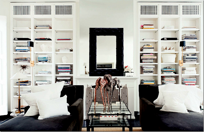
Matching chaises in deep brown velvet with pops of white linen pillows sit opposite the linen sofa and white chairs seen above. Notice the fab sconces on the bookcases. And on the mantel – it looks like an empty frame is placed on top of a mirror. There are no captions, so I’m winging it here!
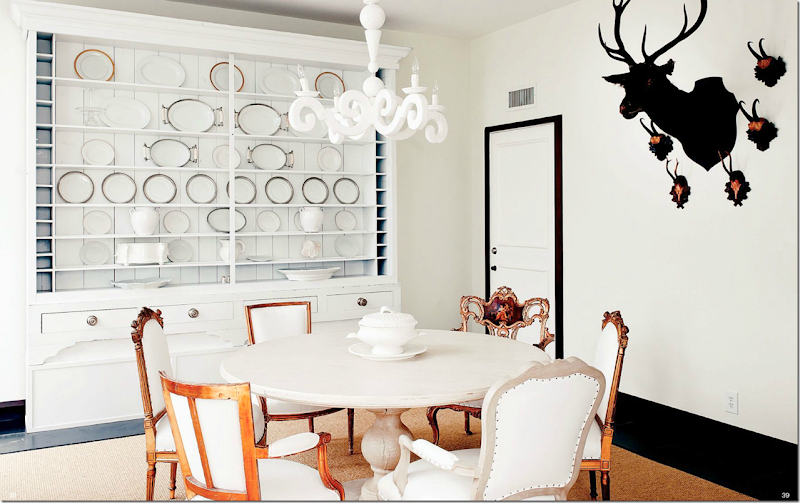
A mix of chairs around a fabulous limed washed table. The large piece was probably stained dark and repainted white. The light fixture – look familiar? It’s the same plaster fixture from France that was seen in Sally Wheat’s dining room. Notice the black painted trim around the white door. The floors are black – and the walls are dead white. It looks like the floors are some kind of stone or tile – maybe marble? Hard to tell with no captions.
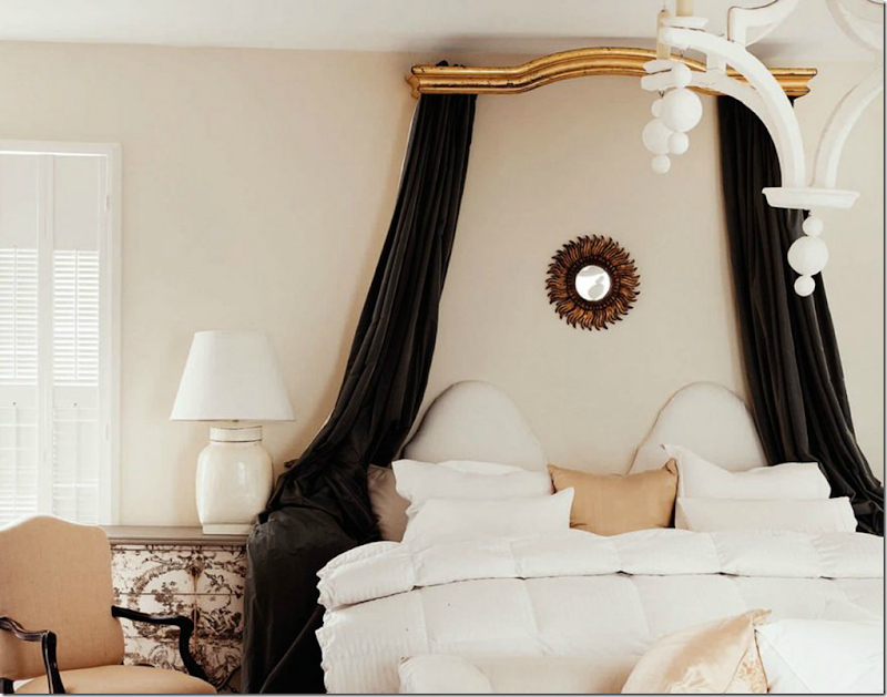
The master bedroom – has a romantic antique curtain valance now used as a canopy. As always, there’s a touch of gilt. Painted chest and French chair mix with a white painted light fixture and a fun sunburst mirror.
A close up of the headboard – I love this – the dual ovals. And all that white mixed with a brown swath of dreamy velvet.
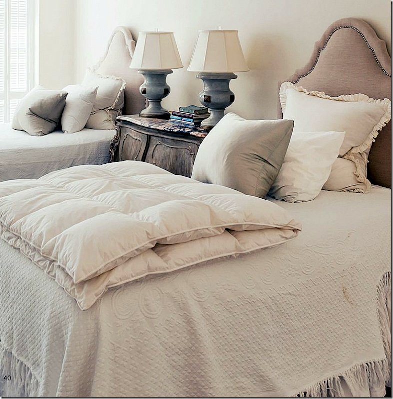
And finally, the guest ro0m has two headboards – with nailheads, lots of overstuffed pillows and a pair of wonderful blue lamps that provide a hint of color in the room. The duvets are European styled.
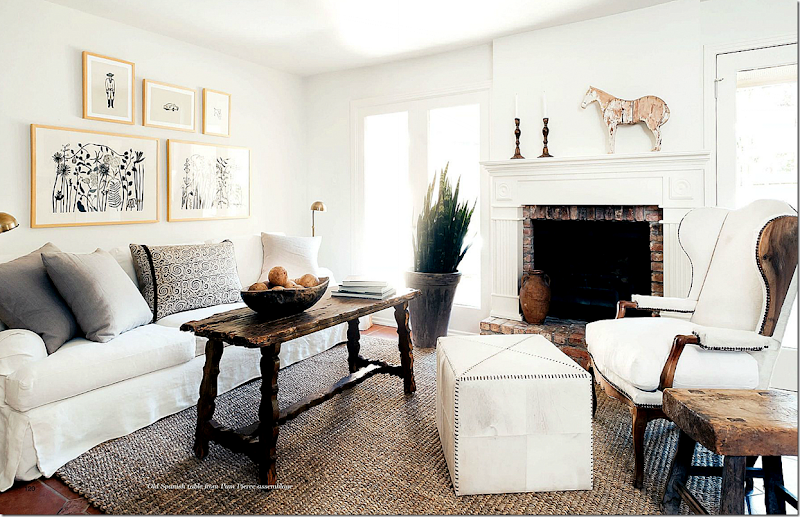
While Barbara Carlton is the matriarch of Shabby Slips – another story in this issue shows the house of Megan Megas. Megas has spent the past decade working for Houston great Pamela Pierce (maybe one week will go by when I won’t mention Pam???) Megas is just now branching out on her own, with Pam’s blessings and encouragement. Megas says Pierce is her mentor and looking at her house, I can see the connection. But Megas has a definite style of her own. In her living room, she mixes a white slip sofa with a dark Spanish style table. A fabulous wing chair is paired with a contemporary ottoman and an organic wood side table. Her accessories are large and few. To see the rest of her house – read the magazine online!
Then there’s the spread on another Houston interior designer pioneer – Beverly Jacomini’s Round Top area farmhouse. Look at this fabulous screened porch! More pics are online.
Another great article this month is on Axel Vervoordt’s house. The man behind the Belgian look – it’s a good tie in with the “Houston Look” that this month’s issue is full of.
As always, the advertisements are just as good as the articles.
Oh wow! Look at this advertisement! Now, I would really hire this designer!!! She looks so fabulous! Who IS she????
This ad for Found For The Home announces their new location in the West Alabama design corridor. It’s amazing how many design stores are in this area now! You could spend one day just visiting them all – it’s a real destination. Be sure to check in with Found For the Home in their new store now open at 3433 W. Alabama.
And this ad announces the new web site for Shabby Slips at www.myshabbyslips.com. Additionally, Shabby Slips is remodeling their main store. There’s also the store out back and the house behind the store!
To read this latest issue of Antique Shops and Designers, go HERE.
I thought I’d show a few of Renea Abbot’s designs that I’ve loved over the years:
One of my favorite houses Renea ever did was this one featured in Veranda a few years ago. The house is in California and is so stunning. This image was on the cover – and I’ve always loved it. It’s so Renea – the white slips, the gilt antique chaises mixed with the contemporary art work and antique sconces. It’s just perfection.
A vignette from the same house – again perfection. The antique chair and bust mixed with the contemporary pedestal – all under a gorgeous chandelier! Those floors!
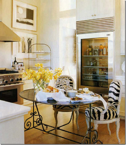
The kitchen has this beautiful white marble island mixed with the French pastry stand.
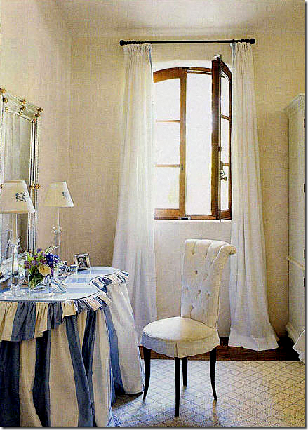
A killer blue and white striped vanity table! So adorable – especially with the glam chair.
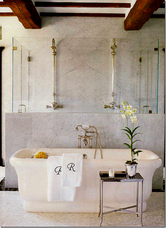
This picture of the bathroom from that house is all over the internet. That’s a marble and glass enclosed shower behind the tub.
The property is incredible. This area shows how trend forward Renea was – years ago - with the antique station clock and row of lanterns. Wisteria is selling a pair of those antique metal urns right now. I wish I had all the pictures from this article – but this is all I have!
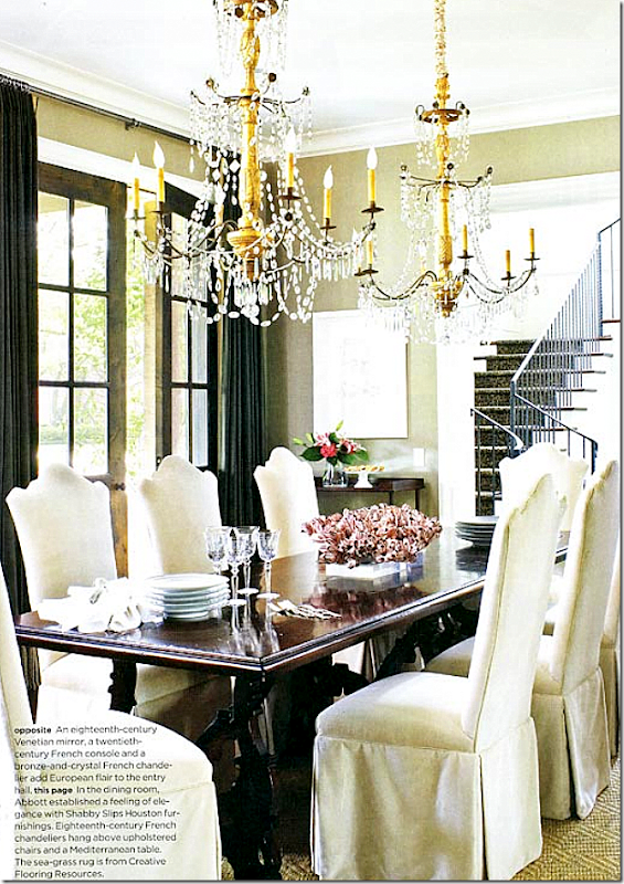
This house Renea designed is in Houston. I’m crazy over its dining room – so wonderful because of this gorgeous pair of chandeliers!! 18th century French. Stunning!!
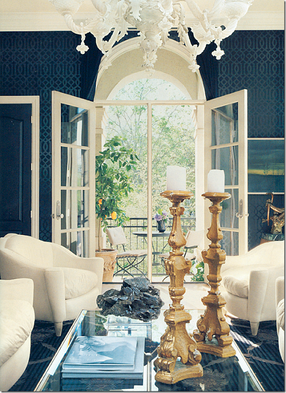
Her own townhouse which she shares with her husband who just happens to own the best carpet/rug store in Houston: Creative Flooring. The walls used to be white – and then one day she hung the Kelly Weartsler paper in black! And in a stroke of genius – she adds the chair in the same pattern. The light fixture is to die for
Another view – out the balcony.
This view shows one of the pair of mirrors and the mirror chest.

Today, this room is a dining room – but back then, it was a family room. The mirrored wall is made to look antiqued.
Her kitchen is all white marble. I still love that table and would kill for it!! And those chairs!
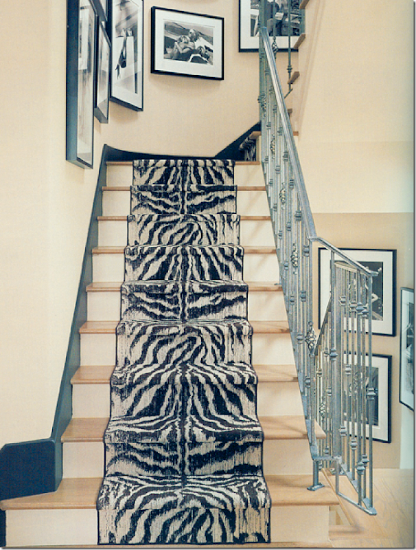
The runner is just beautiful.
Her bedroom – another stunning chandelier. There are 100s of photos of her portfolio on the Shabby Slips Facebook page. Many show her townhouse in views not seen before. If you are a fan – don’t miss it! HERE.
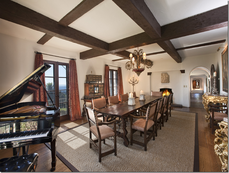
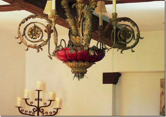
And, remember the story I did on Diandra Douglas’ estate HERE? Well, if you ever admired her light fixture and wanted it – here’s your chance!
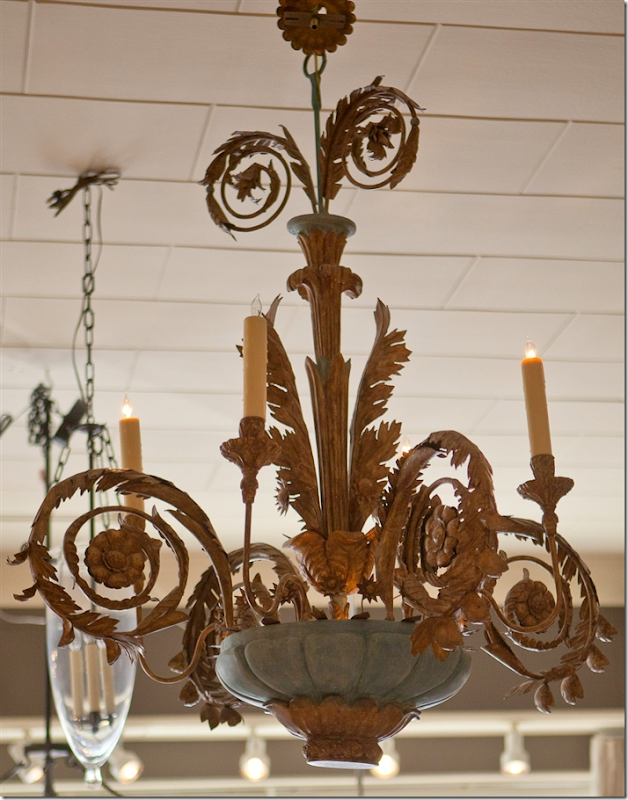
Close up of the chandelier.
I noticed the same fixture is now for sale on Shabby Slips web site! This one is in green which I like so much better than the red. To visit Shabby Slips new web site – go HERE.
To read the latest issue of Antique Shops and Designers online – go HERE.
and Houstonians – it’s that time again!!! The Urban Market Houston is this weekend:















This is one of my favorite magazines too and like you I love the ads as well they're so well done. Please mention Pam all you would like since I'm in love with her work as well. I can't wait to read everything!
ReplyDeleteXX
Debra~
Joni -- I LOVE this post!! Especially Renea's style. The two overstuffed feather-filled pillows in the middle of the sofa -- how creative and practical! All the details are stunning throughout. I also loved the striped fabric on the vanity. So feminine. And now I'm on a hunt for a French pastry stand. Thank you, once again!
ReplyDeleteFabulous, Joni! You are so fortunate to have so many great design stores in your area. Hmm, I wonder who is behind the lovely Webb Design??!!
ReplyDeleteWow, this was 2 coffee cups worth of eye candy! Will keep this window open up on my laptop and come back to it again today. Love your ad too - looks terrific!
ReplyDeleteLove this publication! it's always full of so many inspiring pictures and articles. And designer's ads, ;-) !!
ReplyDeleteJoni, living in the 'burbs of Houston, I love your posts about local shops and resources. Oh, how I wish you would do a "shopping map" again !! I would love to take a few days and visit all the design shops. I just know there are some awesome hidden gems out there!! Beth
I'm with Beth. I'm over in San Antonio but could come to Houston for the day - if I had a shopping map, I could maximize my time! Love you, Joni!
DeleteOh, and I think I've figured out how to be Libby, and not Anonymous. Let's see....
Libby
Makes me want to live in Houston once more! can't wait to visit again for clients. xxpeggybraswelldesign.com
ReplyDeleteLoved the contrasts. Picture number 1 is lacking the perfect "finishing touch:" a guest appearance from the camera shy but most photogenic Georgie. Funny after seeing your family room so many times with your dogs in it, my brain "photoshops" these kind of rooms and drops your perfect shades of brown/white dogs into them. In a recent interview David Elston asked the question who needs gilt anymore. I think many of us like our gilty pleasures!
ReplyDeleteso wishing to be at houston.. i'm an antique lover and these are such collection you have..
ReplyDeletethank you for the post..
contemporary furniture
Joni I so wish we had this kind of design district in Kansas City. We have an antiques district, and The Crossroads Art District and of course fabulous shops everywhere, however your Designer Stores all in one area is fabulous!
ReplyDelete2012 Artist Series Featuring the Gifted Decorative Painter Theresa Cheek
Xoxo
Karena
Art by Karena
Hi Joni,
ReplyDeleteLOVE this magazine. How do I subscribe? Sometimes on my cross country trips I just want something wonderful in which to immerse my mind that does NOT come on a computer screen.
Also, I wish to renew my request that you do a post on why the Houston area is such a hotbed of French styled homes and French Antiques. I have been coming there for over 30 years and you have always had great antique shops. I remember once seeing an absolutely monumental oil painting of Madame de Pompador that was at least 8 feet tall and 6 feet wide. (Couldn't aford it but have never forgotten it!)
Was it due to early settlers, oil money, an influential architect or some Grande Dames of society? That would make a very interesting post!
Thank you for introducing many of us to such a wonderful magazine. So many great ideas! The only thing I didn't particularly care for, was the trophy of Bambi's mother after the fire, in the fifth photo.
ReplyDeleteHope you enjoy an absolutely gorgeous weekend in Houston.
What not to love, superb images, great designers (Joni included). Tried to Pin some images but it does not allow me...I'll try to do it in another way.
ReplyDeleteRenea Abbot's work is absolutely stunning. Such an interesting collection of pieces and used with sophistication. Hope you will post more of her work in the future. She is certainly one of the finest talents you have featured out of Houston.
ReplyDeleteI cannot believe how beautiful this post is, Joni. Renea's work is so luscious; there was barely an element in her rooms I did not love. The most impressive is her choice of chandeliers and gilded chairs -- some of the best I have ever seen. I looked at her website, but there were no prices. Is she just to the trade? Thank you so much for all of this eye candy. I am having a terrible time with my kitchen reno, and you definitely made my day.
ReplyDeleteAll the best...Victoria
Wow, Victoria, I hear you! Our home is a new home but reasonably authentic Country French. I am doing as much as possible to erase the unnecessary touches of modernity the builders left behind. We had granite countertops put in several months ago. Hubby wanted solid granite slabs along the backsplash but that look is much too contemporary. Therefore, I decided to do tumbled marble. Couldn't get a layout to satify me until I realized that the electrical outlets had to go!
DeleteThe electricians I hired (who did a very good job by the way) just left. It was to have been a 3 hour job. Stub off existing electrical outlets and put in power strips under the cabinets. "As long as they were here", I decided to upgrade the under cabinet lights. That meant I had to drop the work I was doing for my "real" job and head off to Home Depot. A very exhausting day for me because of decision after decision PLUS doing emails, travel arrangements and proposals for the job that pays the bills. However, everything is cleaned up, my kitchen is back together and now all I have to do is the tiling this weekend. Ah, the lengths we go to make things "just right".
That "slip" that she "had made" looks to me like it's just a drop cloth with a seam in it, even, and the salvedge edge not hemmed. Not that there's anything wrong with that. It's harkening back to when people covered their furniture at the summer "cottage" (mansion!). Didn't we all have a version of this in our first apartment? Looks interesting in a photo shoot, but would you seriously "have one made?" Just buy two lengths of linen, seam them together carelessly, and throw it over the sofa. The end.
ReplyDeleteJoni-
ReplyDeleteYou helped make my day! Something new and beautiful!
Happy Friday.
Teresa
xoxo
que buenas imágenes de interiores están buenisimas
ReplyDeleteLots of Renea's decorating projects look familiar to me from from seeing them on the net over the years. I actually have that issue of Veranda, for some reason I mistakenly thought it was Pamela Pierce.
ReplyDeleteLove, love Renea's work...I have poured over that issue of Veranda many times...and yes, that oval iron table and chairs is definitely to die for. Mona
ReplyDeleteLog onto the King Architectural Metals website http://www.kingmetals.com/DesignConcepts/index.html
DeleteThey have every kind of scroll, curve, metal rod or tube that you might want. If you call their showrooms in Los Angeles, Dallas or Baltimore they might give you a list of blacksmiths who could duplicate that table for you. The metal parts would cost about $100 and the glass about $100. Labor should be no more than $200.
A similar table with a wooden top is found at http://www.bellacor.com/productdetail/butler-specialty-company-4139025-metalworks-black-metal-console-table-635694.htm
Another similar table with a zinc looking top is found at http://www.homedecorators.com/P/Gramercy_Console_Table/910/
Your photos are just amazing! I am so in love with them!
ReplyDeleteThank you for this...so much fun to look so many gorgeous things! Inspired!
ReplyDeleteJulie in Fort Worth
Every picture is more beautiful than the next. Amazing Design Ideas. When I was decorating my own place, I spent a lot of time using Simply Decorate. While I do work for them, their room designing tools and ideas were honestly a huge help. They made the whole process much easier and are really worth looking at.
ReplyDeleteMy very first slipcovers were from Shabby Slips almost 15 years ago. I wanted white and my mom talked me out of it, saying I'd be happier with a darker color that didn't show dirt. I was a young bride, but wish I had listened to my gut instead of my mom that time! :) I'd still have them if they were white!
ReplyDeleteHappy weekend!
Linsey
love this post.
ReplyDeletei want to go shopping with you.
xx ;)
Great Webb Design advertisement. This whole "Houston Look" makes me want to live in Houston.
ReplyDeleteyah.. its amazing...
ReplyDeleteRboxStar TV | Pacquiao vs Bradley Free
Beautiful pictures! I especially love the space with the matching chaises and empty frame over the mirror. What a clever idea! Thanks for sharing with us!
ReplyDeleteLove that runner Joni... fantastic! xv
ReplyDeletePretty nice looking setups. I wish I was fancy enough (and rich enough) to get someone to come and decorate my home!
ReplyDeleteOkay, this is amazing!!! Beautiful pictures. Just book marked the issue to be read tonight! Can't wait! Love the ads too!
ReplyDeleteHave a great week.
beautiful antiques. and everything is designed very well. I liked it.
ReplyDeleteNice post, thanks for sharing this wonderful
ReplyDeleteWow, am I ever pleased I clicked to your website. Good details! In bathroom remodelling lighting takes a strong place because bathroom is a place where we need appropriate lighting. Last month I have done my bathroom remodelling where helps me a lot to choose the suitable lights.
ReplyDeleteI really want to create a more vintage feel to my new home, so I'm glad that you posted some of these ideas! What would say is the best way to do the lighting in a more vintage house? I want to make sure that everything blends well together.
ReplyDeletethat doesn't look antique to me... it seems it been preserved.
ReplyDeleteI personally like the archaic feel that hanging candle lanterns gives to a house's exterior.
ReplyDeletePositive site, where did u come up with the information on this posting?I have read a few of the articles on your website now, and I really like your style. Thanks a million and please keep up the effective work.
ReplyDeletemelbourne designers online
My friend mentioned to me your blog, so I thought I’d read it for myself. Very interesting insights, will be back for more!
ReplyDeletewww.designeroutletsales.com