Today’s reader first sent me pictures of her newly remodeled kitchen last year. Right before I was going to show them on the blog, she got word that her kitchen was being considered for publication in a national magazine. The scout, the famous Bonnie Broten, asked that I please hold off showing the reader’s kitchen until the pictures were published. All that takes a lot of time. First the project has to be approved, then there is a photoshoot, and usually there is a long wait until publication. The magazine, BHG’s Real-Life Kitchens and Baths, only comes out a few times a year, and this issue, Summer, was just released a few weeks ago. All the kitchens and baths in this magazine are “real life” – meaning the budgets are more realistic than those found in some of the other magazines.
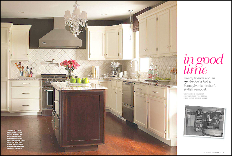
Here’s a screencap of the article called “in good time” about the reader who hails from Pennsylvania. The article shows the before pictures and gives a break down on the budget.
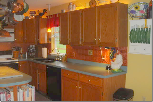
Here’s a look at the “before” kitchen, with its dark cabinets and green countertops.
Notice the up lights above the cabinets!
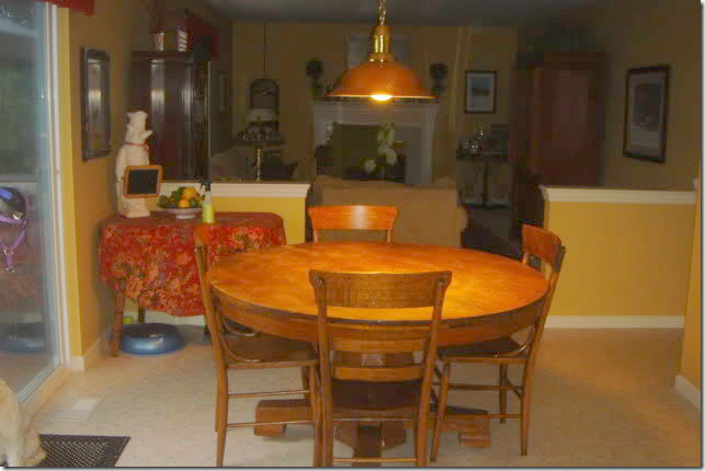
The attached breakfast area leads into the family room – through half walls.
The reader and her husband had been happy with their kitchen, until they attended a home show in their Lincoln University neighborhood. Once they got back home, they were afflicted with that same disease that strikes many people after touring show houses – “ihatemyhouseitis.” Their once loved kitchen now seemed dated and dark and they decided it needed an update, STAT. To keep costs down, they did all the work themselves – except for the installation of the granite and running the new gas line. Friends chipped in with their labor and expertise. In all, the renovation took a year.
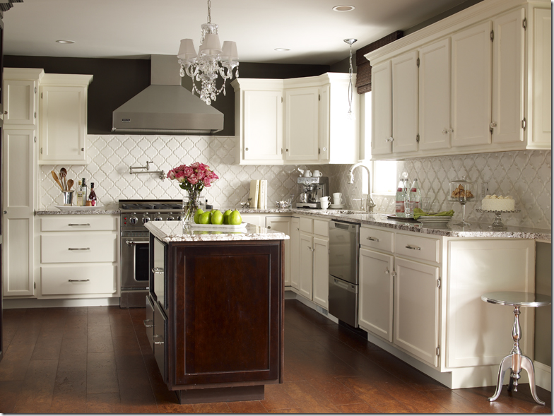
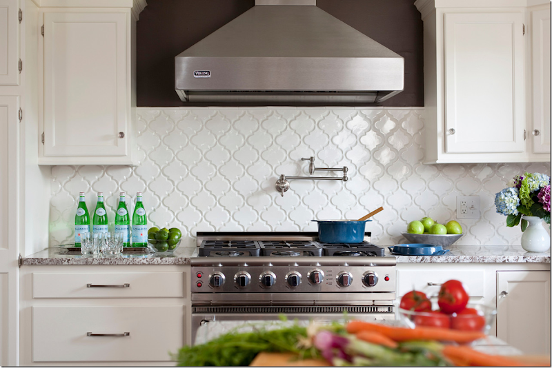
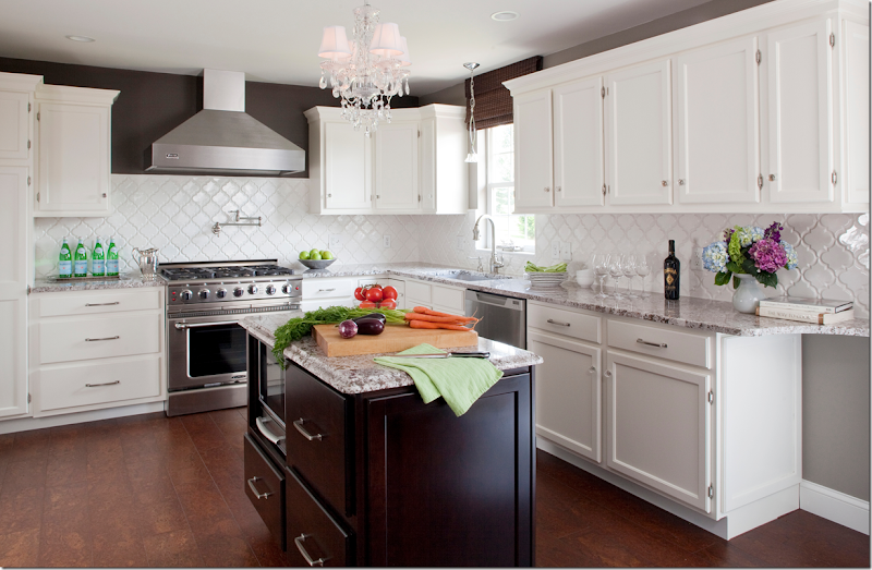
AFTER: the biggest change was the cabinets. Since they were in good condition – all they needed was a coat of white paint and new hardware. The biggest splurge was the new countertops – a Bianco Antico granite. Besides the granite, the white backsplash is the eye catcher here. In contrast to all the white paint, a band of dark brown (Italian Leather by Balspar) was painted around the tops of upper cabinets.
The backsplash is white tiles from Mission Stone and Tile called Beveled Arabesque Tile- Glossy White. Amazingly, the reader won the backsplash in a contest from Mission Stone and Tile!
Here you can see what a difference the backsplash makes. The white really pops next to the brown paint and the granite. Besides the granite, the other big splurge was the appliances – a new professional styled range and a built in refrigerator by Thermadore.
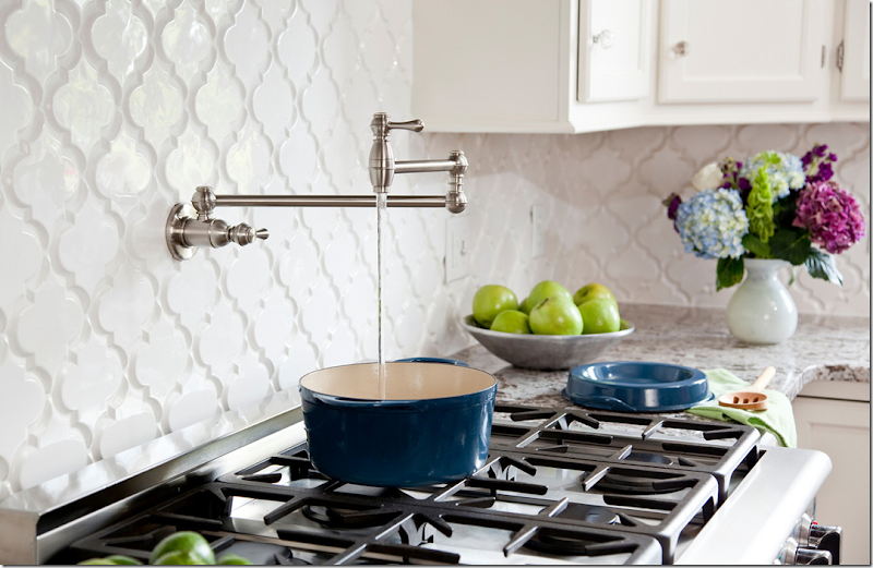
Above the range, the homeowners added a convenient pot filler. I love this picture, it’s amazing how good a few apples, limes and bottles of water can look!!!
Pot fillers are so convenient.
New plumbing and a sink were added, along with a pendant light by Elk Lighting.
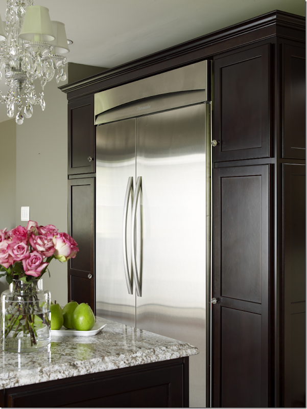
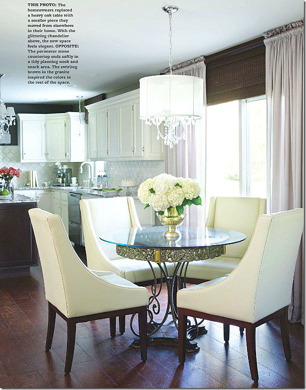
The built in refrigerator from Thermadore was added across from the island. The cabinets were painted in the same dark brown. The crystal chandelier adds sparkle and glamour to the room. Beautiful photography by the great Tria Giovan.
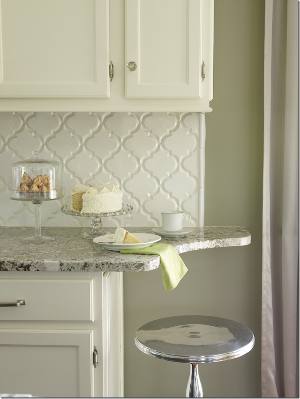
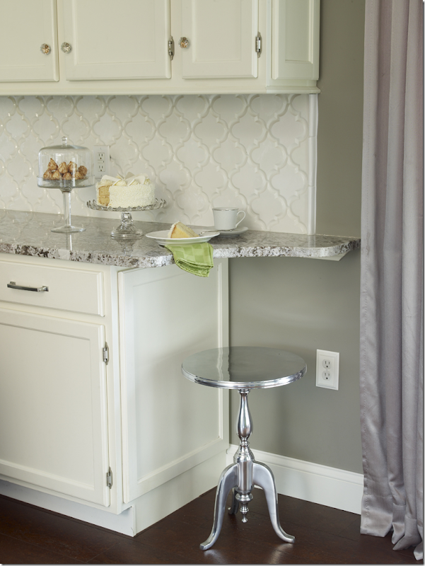
Instead of just ending the countertop – it was extended, adding a space for the reader to sit and have a cup of morning coffee.
If you have the space for this – I think this is a great idea!!
The short wall between the breakfast area and family room was removed – making for a smooth, open transition. Notice how perfectly executed her curtains are: no dead space and the perfect shade color which matches the brown paint on the walls.
Finally, the most amazing thing is the floors. No, it’s not wood, it’s cork! The reader saved a lot of money by using cork, plus it’s a great product for the kitchen because it’s easy on the feet. I would have sworn this was wood!
A huge thanks to the homeowner for inviting us into her kitchen and to stylist, Bonnie Broten.
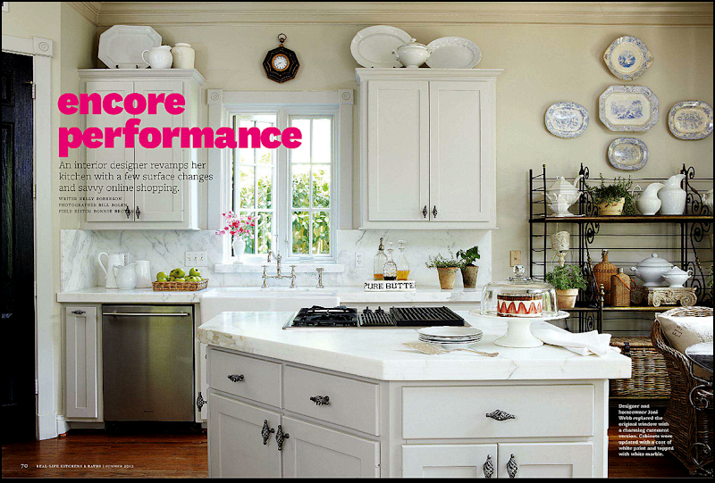
While perusing the magazine the reader’s kitchen was in, another article caught me eye, maybe because it said it was a blogger’s kitchen!!!
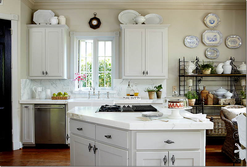
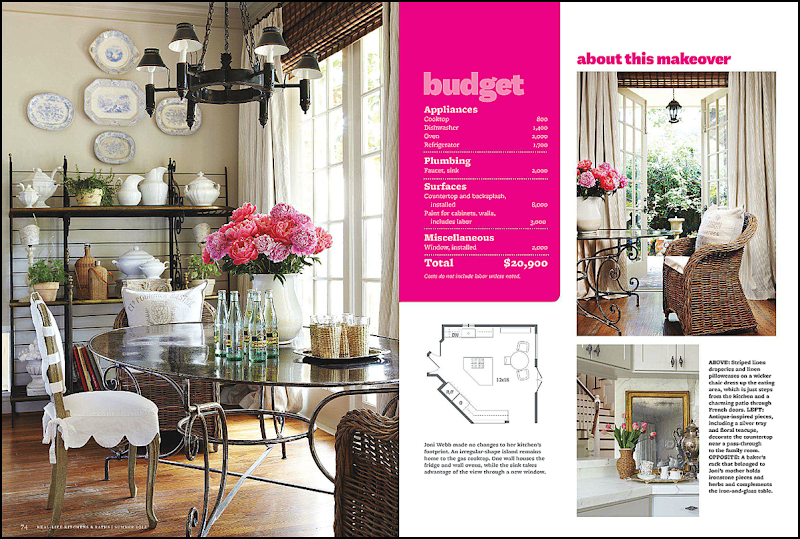
Well, will you look at that! I’d know that kitchen anywhere!! Of course it never looks this good or styled in real life, but that’s why they pay stylist Bonnie Broten the big bucks. Photography by Bill Bolen. The baker’s rack was my mother’s – and it’s antique. It’s rather short which is why I added the blue and white platters above it. Usually there is a small flatscreen on the middle shelf, but we took that out for the photoshoot. It looks so much better without it – I’d love to do away with it altogether.
Here’s the original shot without the magazine’s writing all over it – notice on the right, the slipcovered chair was removed for the magazine – too cluttered looking, I suppose.
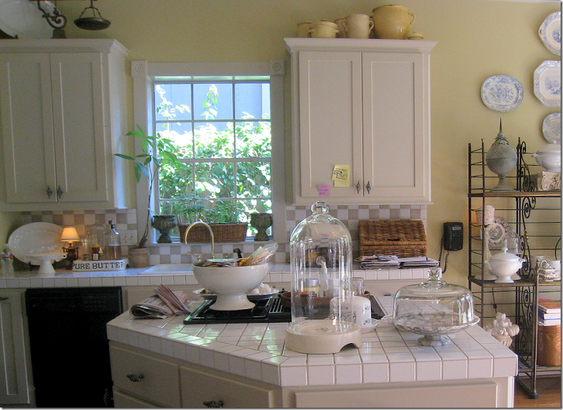
BEFORE: UGGH!! White square tiles and taupe and white backsplash, yellow walls, black appliances, white sink, brass fixture, old cheap aluminum window. What a mess!
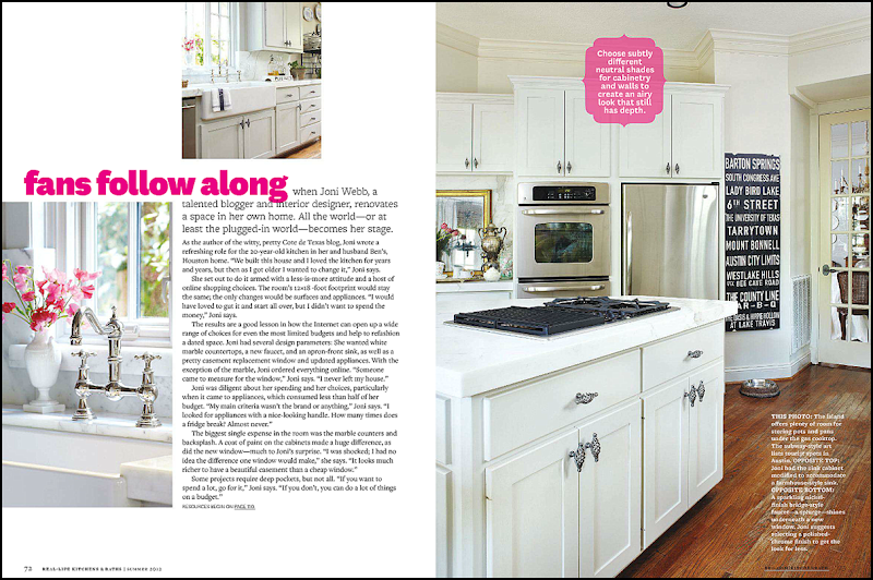
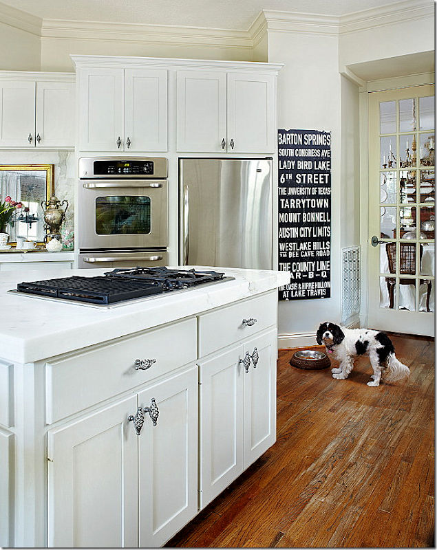
The second page – shows the other side of the kitchen. I love how the writing covers up the worn stain on my wood floors. This is where it is the worst in my house – in the kitchen – and in front of the sink and pantry. I bought that subway sign at Mecox for Christmas for Ben’s office. It never made it there. It lists all the great places in Austin, Texas – Ben is a huge longhorn fan. There is actually an ugly Ozarka water cooler that usually sits in front of it. But, of course, that didn’t make it into the magazine.
Poor Sammie Jo didn’t make the final cut. She was deleted from the picture in the magazine. She’s probably wondering where the water cooler went to. Oy, that floor! I have to do something about it, asap!!
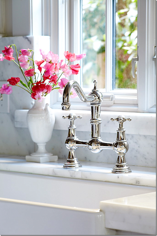
My three favorite things in my kitchen: my farm sink, the faucet in polished nickel, and the new casement window. That pretty white vase is another hand-me-down from my mother. (Oh, my sister Cathy is going to be reading this and saying – I want that!!!)
And in this picture, we opened the window for romantic atmosphere. HA-HA!! Probably to take your attention away from those floors!
The next page shows the breakfast area and the floor plan. I love the way the table looks. The editor wanted the old and new chairs mixed, so we drug one of the old antique slipcovered chairs out from the garage to mix with the Kooboo chairs that I use now. I do think they look cute mixed together. I know, I see it. Guess what I am talking about. Uggh.
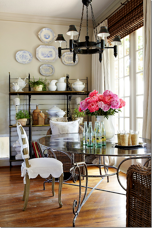
Here, you can see the doggie door to the left of the baker’s rack. The chandelier is another hand me down – from, you can only guess! I am cracking up at how much I have that is handed down!! Well, I did buy the table and chairs myself. This tole chandelier used to be in my dining room, but I moved it here when I got my new dining room chandy and the old one in my breakfast room went to my mother-in-law’s house. Move em in and move em out. I love the way Bonnie styled the baker’s rack and the table top.
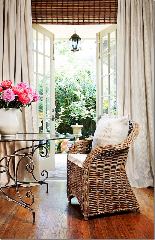
Now, this picture was a total cheat. Along the back wall of my house, there are five French doors – but only the center one actually opens. So to make it look like the one near the table opens, we moved the table in front of the center door. It really does create a much prettier picture – and now I wish I had the ability to open the door in my breakfast room! This is my favorite picture from the shoot. You can actually see the pin stripes in the curtains for once. And those lanterns on the porch – there are five of them – one in front of each French door. We used to have ceiling fans out there but they rotted, so we bought these lanterns. I bought them years ago before I was really into lanterns – today I would buy much larger ones than these. But, truthfully, now that I remember, at that time, I couldn’t afford the bigger size!!! The curved base of that table looks pretty here. Usually it’s hard to see with the chairs in front of it. OK – this is how my floors look everywhere else. Not as bad as in those spots in the kitchen.
Bonnie worked on styling this corner for about an hour. Usually, this is my bar and it’s filled with bottles and glasses and is more cluttered. Also, the mirror is not usually here, although it does look pretty. My mother, two aunts, my sister Cathy, and myself all have the same china – shown here. We have about a billion place settings if we put it all together. It’s pretty – pink and green with a celadon border. I think that’s a great idea – if everyone in your family cooperates and buys the same china. I think we seriously could have a small wedding and use all of our china. That candy jar is an old jar inherited from you-know-who! More laughing!! And through the bar – you can see the staircase. Usually on this bar – there are two lamps from Aidan Gray, but those were removed for the shoot.
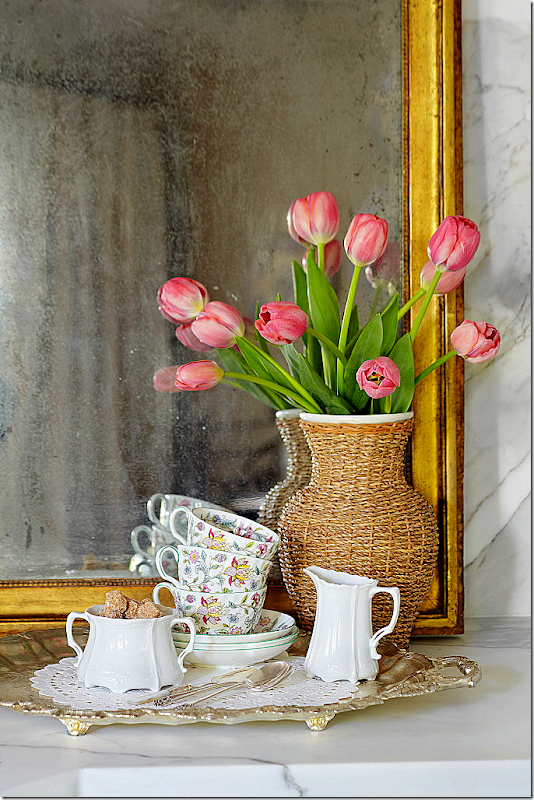
Here are a few detail shots that weren’t used in the story. Another really pretty photograph.
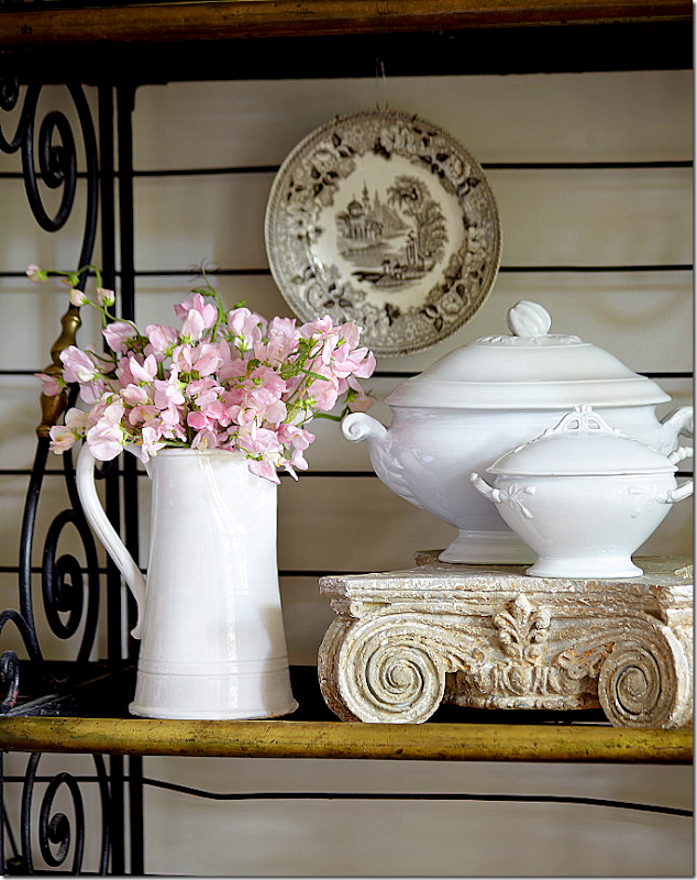
A detail shot of the baker’s rack with the white ironstone tureens. This picture also wasn’t used.
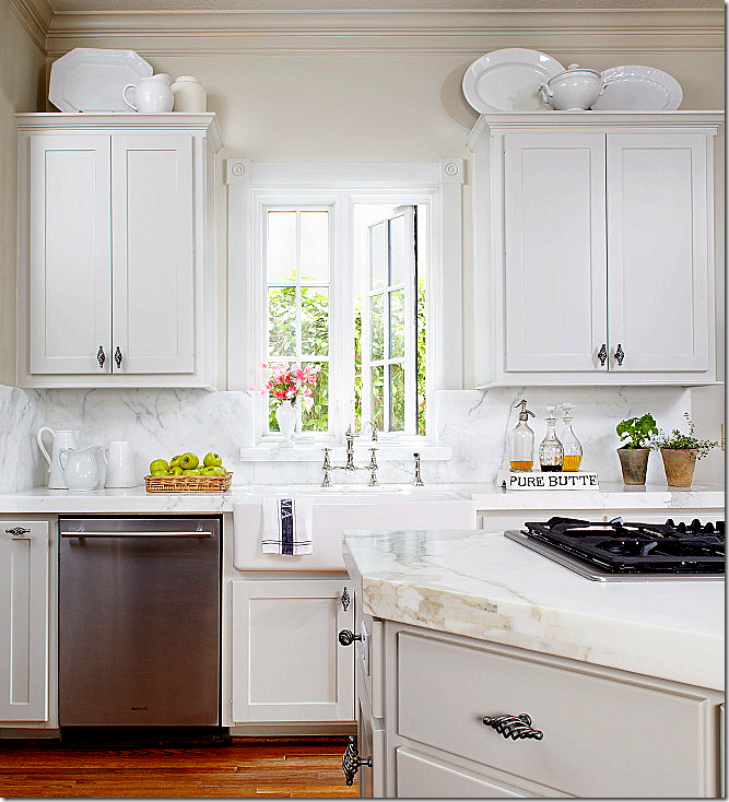
And this shot wasn’t used. The kitchen looks so white here – but it’s really gray – gray cabinets and gray walls.
When Ben read the magazine article, his first comment was – wow – these pictures look so much better than the kitchen actually does! And it’s true – the coloring looks better in print (especially compared to how it looks online. In the magazine, these pictures look even better.) Between the styling and the brightness, the photographs don’t really show the reality of the kitchen. Everything looks so crisp and in focus, while in real life, it’s more soft and darker.
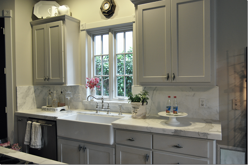
I took this picture on that day – and the lighting is more realistic here. This shows a styling scene that was discarded. Bonnie didn’t like it so she started over and completely redid it.
And here is the mess that happens when you have a photoshoot. Everything is cleared out from one room and placed in another room. That’s Bonnie on the right and her daughter who assisted on this shoot – on the left. Georgie, as usual, is hiding from the camera. I am always exhausted after a photoshoot, but Bonnie is just fine! I don’t know where she gets her strength from, but she is amazing. If you ever get an email or call from a Bonnie Broten asking to photograph you house – yes, it’s legitimate. I’ve gotten so many emails over the years from people who have shown their house or kitchen on this blog and then gotten a call from Bonnie. It’s always the same question – “is this for real?” Yes, it is.
Thanks again to the homeowner, to Bonnie and to the photographers Tria and Bill.
P.S. If you have turned in pictures of your kitchen or house, please have patience. I will get to them one day!! Also, if you haven’t turned in photographs of your house or kitchen – please do! I’m still accepting entrants for the Readers Houses/Kitchens series.
READERS KITCHENS SERIES
Subscribe to:
Post Comments
(
Atom
)











The owners of your readers' kitchen prove that with patience, vision and talent, homeowners can achieve beautiful results in their own kitchens. What a beautiful transformation. These owners have to be very proud of this lovely and functional kitchen.
ReplyDeleteyour reader's kitchen is gorgeous. I had picked up the magazine the other day to read about your house and zeroed in on their remodel. I think the one photo of your french doors leading outside is a perfect example of Tara's vanishing threshold!
ReplyDeleteI wanted that Haddon Hall china for my "second" set when I was married. The groom did NOT want it so... we ended up with Clipper Ships.... nice china but chipped very easily .... groom is gone... so perhaps I should find some Haddon Hall just for me. This whole post was much more "real life" for my style and I am going to do something, anything, and soon to my dark dated kitchen!!!!
ReplyDeleteGreat post - loved it! My fav pic is the last one - Ha! Several years ago we had our house on HGTV - they used to have this show called "My House is Worth What?" - sort of an appraisal show - they didn't do anything, just went through and evaluated things that added to the value (up arrows) and took away from the value (down arrows) - so you wanted more ups than downs. Anyway, the shoot took 12 hours (single camera, one sound guy - every single scene had to be taped about 4 - 8 times - we were punchy by the end)and the final segment was 7 minutes! Anyway, like you did, we also moved - no joke - at least 1/3 of the stuff in our house out into the garage. A friend of mine that helped me "fluff up" the place called the garage my "sh*t store"! It was hilarious!
ReplyDeleteKaren Watson - dekawatson@bellsouth.net
About your garage store.......my daughter has a friend who calls all the excess "stuff" many of us add to our rooms "shittery". Isn't that a great name for it?! I am guilty all too often, then have to make a sweep.
Deletei love that name!!! omg, too funny.
DeleteI enjoyed this feature--Bonnie just finished shooting one our our kitchens last week from 11 Magnolia Lane (in fact we blogged about the photoshoot today)...and you are right she does mention you right off the bat! She did a great job, and now the long wait for publication begins! Your kitchen is gorgeous, as is the first one you featured. I especially love how you used the extra thick marble, something I wish I had done in my new kitchen (vs standard). Congratulations on the feature!
ReplyDeleteAmy
Beautiful rennovations - both kitchens! It is great to see what can be done by people with "normal" resources. We have a rental house with the dreaded "Golden Oak Cabinets". We plan to downsize in the next year or so and that is where we will land while we build our "final dream house". Overall, the kitchen layout is pretty funtional. However, I am definately having the cabinets painted a lighter color - probably ivory with a mocha glaze. Hubby wants a Fratelli Onofrio range in Sunflower Yellow. Wow! Maybe, but I need to see the color chip first.
ReplyDeleteSince the room is fairly small, we are thinking of removing the upper cabinets on both sides of the range and replacing them with thick shelves supported by corbels or wrought iron brackets. Two of the upper cabinets are only 9" wide - a really ridiculous size to be of any use. (%#*@ builders!) Shelves will be much better. It also has a dropped ceiling that is only 7' 8" high to accomodate the 3' x 6' built-in flourscent fixture. Ugh! That is coming out, too. Can't believe that 20 years ago I thought that was cool! I will be sure to take photos as the reno proceeds. Hopefully, it will match the beautiful standards set by these two kitchens.
can't wait for you to send in the pics when you are done!
DeleteYour reader's new kitchen is absolutely stunning but I also liked the "before" kitchen. While it was not going to be on the cover of any publication it was warm and homey. I have no doubt that hundreds and hundreds of delicious meals were lovingly prepared in that kitchen.
ReplyDeletesnort. doubt it. i don't cook. omg. i wish there were a lot of meals made there!!!
DeleteLovely and warm. I love light kitchens. Since I live in New York City, I can only dream of what it's like to have a kitchen island and so much space!
ReplyDeleteWell, it's great to find you :) Love the reader's kitchen and yours is gorgeous as well. Funny, we are in the middle of
ReplyDeletea kitchen re-do...I may send some photos your way soon. Love your blog, been looking around a while.
From Louisiana
Becky @Buckets of Burlap
Hi Joni, I love the post, love you, love the blog and love your house. However, every time I see a photo of your family room, I cringe over the mantle area. Has anyone ever pointed out that the convex mirror over the mantle is totally out of scale on that wall. You need a much bigger mirror or piece of art in that space! The convex mirror is gorgeous and I know it would look great in another area of your home. In addition, I also think the space is too busy. if you get a burst of energy or motivation some day, please experiment with a new "mantle scape".
ReplyDeleteOf coarse design is subjective and like opinions, everyone has one but i am curious if anyone else feels this way or has mentioned it.
(dont you just love opening your self up to world wide criticism) :) you are always a good sport!
I admire convex mirrors, but they usually seem too small for the spaces I need them in... however, I recently saw a picture of a convex mirror layered over a larger rectangular mirror that I liked (you can see it here: http://interiordesignmusings.blogspot.com/2011/08/those-extra-little-touches-add-up.html?utm_source=feedburner&utm_medium=email&utm_campaign=Feed%253A+blogspot%252FHqPFg+%2528interior+design+musings%2529). I have been noticing more of these mirrors and pictures layered over other mirrors. I don't know if this is a trend, but I think it is interesting.
DeleteThe mirror would look more in scale if the vases on either side were taller or had something in them. Convex mirrors are usually rather small in scale. It's hard to know from the above pictures what belongs and what doesn't since the magazine people seemed to have a lot of their props sitting there.
Deletehmmm. the convex mirror is actually rather large. i don't think its out of scale at all???? but what do i know? hah! I actually love my mantelscape. funny you don't. i'll go look it over and see what i'm missing.???
DeleteCongrats Joni I love both kitchens so much, just the family size kitchen most people have and not pretentious! I have the same hardware you have in your kitchen, in my master bath.
ReplyDeleteXoxo
Karena
Art by Karena
Wow! Moving the fridge to another wall and removing the micro-wave-over-the-range really gives the kitchen breathing room plus more usable counter space where you need it. I also like the visual impact of having the range and hood centered on the island.
ReplyDeleteWe are thinking of putting in a microwave-in-a-drawer when we remodel. Does anyone have experience with this? I like the idea of getting the microwave out of the primary cooking area AND off the counter.
It's not even that hard. I have an island, up on legs, and on the side away from the stove, one cabinet door opens, and the microwave is inside. It is not built in. It's very small, the smallest Target sells, and when it breaks, I just buy a new one. it is hidden, and all you need to do is have power to your island, which I think was required by code in Austin anyhow. But since the AC three conductor runs up through the leg of the island, the island cannot be moved. I don't want to move it anyway. I like having it out of the way and out of sight.
DeleteI thought about using that approach because the drawer Microwave ovens are ridiculously expensive. However, hubby is very tall and HE doesn't want to bend over that far to reach into a door that opens like a standard microwave.
DeleteThe cost of building a microwave must be pretty minimal since you can buy basic models for $29 to $39. We currently have a built in wall microwave with all the bell and whistles. I rarely use it for anything else but steaming veggies and heating water for soups and hot drinks. Right now Sharp is the only company that makes drawer microwaves. Wish someone like LG would give them some competition. If the prices were lower, more people would buy them and THAT would drive the prices even lower.
Anyway, I may follow your suggestion and mount it below the counter. Hubby doesn't cook THAT much.
Any other input from Joni's readers?
Love the tile back splash and the kitchen table.! your kitchen is very nice. I know pictures are supposed to look beautiful. But faking it , is kinda cheating. Puts so much pressure on us folks that see these and try so hard to create them. :) lol.
ReplyDeleteQuestion for Reader kitchen:
ReplyDeleteInteresting coffee corner overhang. How do you find the ergonomics in real life use? In retrospect would you make it longer/shorter/wider/different shape or is it perfect (in case anyone wants to copy? Do you make much use of it, or still find yourself heading to the breakfast table for coffee?
Your counters are gorgeous. I like the reader's wall color and Roman shade. Guess I'd better buy the magazine!
ReplyDeleteAfter reading this...I am going to restyle my baker's racks...so far they have just been functional (and there is a darn tv in one that can't be helped).
ReplyDeleteand please come do mine... I moved my baker's rack out to the yard as a potting table... now I want to bring it back in and style it!!
Deletecome redo mine too. i wish they still looked like they do in the magazine!
DeleteI really enjoyed see this and especially the before and afters!! It reminds me that I need to take more befores! I love the arabesque tiles! What a job well done on both kitchens!!!
ReplyDeleteQuestion for Joni:
ReplyDeleteYour "before" picture makes me giggle. Did you haul out all of your crockery and post-its to make your "after" look so much better? :^) You couldn't possibly have been cooking on that range top. The "tidy freak" in me would also like to touch up your "after" photo: change the cross shape of your blue and white platters to two rows (large two plates on top, small three on bottom, aligned approximately with top of cabinets) and remove all of the ironstone on top of your cabinets. Cleaner lines.
My question concerns cutting your window trim in half (wood on top, marble on bottom). My first instinct would have been to keep the trim intact, and cut the marble to fit around it. What was your rationale? Would you do it again today? Does anyone else have any opinions/solutions for this issue? I also have a kitchen reno in my future, and a similar window.
My kitchen also has a small side wall to the left of the countertop with the sink. Backsplash it (but the marble ends abruptly and there's no symmetry on the other side) or don't backsplash the side wall, only the back one? Joni, why did you think backsplashing the side was a better choice, and do others agree?
well, i loved the marble - so the more the better. that's why i used it on the side. as to the molding, i don't remember. the fabricator made that decision. i think he felt it needed to be done? can't remember exactly.
Deletei do like the ironstone on top. but i'll take a look at the blue and white and see about redoing it. probably won't = i'd have to get the ladder out and well, i'm too lazy for that!!!!!!!!!!!!!!!1hahah
Re Joni's kitchen: where could one find a similar (a) PURE BUTTER platter, (b) iron dining table, and (c) what are the names of the china patterns for the flowered cups/saucers and white creamer/sugar bowl next to them? The china detail vignette is so pretty.
ReplyDeleteJoni or anyone else with a similar iron dining table: how is it to live with? Any cleaning or scratching issues?
ok - look on the left side of my blog and you will see a picture of a pure butter plate - click it and it will take you to the site.
Deletethe table has no issues at all, cleaning or scratching, you have to google it to find one though. they are pretty rare.
the china is haddon hall. not sure of the exact name of it, but it has a pretty celadon border.
You could probably improve the worn out hardwoods by rubbing some stain on them, stop/let dry, and adding more layers until the color approximates the areas around it. A "lick and a promise" until the time comes when you redo them entirely.
ReplyDeleteJoni,
ReplyDeleteYour blog is my first "read" in the morning . . . it's fabulous.
I would love to submit pictures of my kitchen, but for the life of me, I can't figure out how to do it . . . do you have a link somewhere on your website??? Thanks!
email me the pictures
Deletemrballbox329@aol.com
Joni, what is the name of your marble? Does it always come in one thickness, or are there several to choose from? After laying the marble, one then builds up the edges to make the countertops look thicker, right? Did you make your edges triple thickness?
ReplyDeletecalacutta ora. yes, it was 1 inch thick and it was built up to look thicker. trickery. yes triple.
DeleteOMG!!!!!! Of course, I love your kitchen, but that kitchen in PA is AMAZING!!!!! Must run out and buy that magazine TODAY!!!!
ReplyDeletexo
-linda
Wow your kitchen looks amazing! I wish Bonnie would come take pics of my kitchen and then I would frame them all and just be satisfied staring at the pics instead of the real kitchen! I wondered if you ever thought of painting the french door black...in the shot where Sammie Jo is wondering where the water cooler is. I think the floors aren't as bad as you think they are, lived in and not perfect~just right!
ReplyDeleteMajor love for the Austin area sign, where on earth did you find it? Makes me homesick and
ReplyDeletewant to boomerang back home!
mecox in houston, i bet they have more. it's fabulous - i love it!
DeleteYour kitchen always looks so pretty (probably does even with dirty dishes!)... My husband always says our house looks better in pictures too. What a difference in the reader's kitchen, but I agree with some of the other comments that also liked the homey "before" look too...
ReplyDeleteAbsolutely beautiful. I have to go find this magazine. I love the tile in the first kitchen, love the shape of it. I alos love the white marble counter tops in your kitchen. Much nicer than the tile. I also love your polished nickle faucet.
ReplyDeleteWaoo I Love that your kitchen designs Cool.
ReplyDeleteI've watched a few photo shoots from time to time. My daughter has a ver photogenic home and local magazines have used it many times. IT's a tedious process but the results you show here are just great. Thanks for all the photos etc! Great blog post.
ReplyDeleteV
I love the look of your thick marble counter tops. Is the marble really that thick, or is there some sort of trick to achieve that look that you'd be willing to share? (btw- I love the look of the worn wood floors - it helps make the home look lived in and real and just adds to the appeal in my opinion!!)
ReplyDeleteit's a trick. it's only 1 inch thick but the edges are built up to 3 inches somehow.
DeleteWhat's with all these outdated white kitchens?
ReplyDeletewhat planet did you just drop in from?
DeleteThose homeowners did a fantastic job. It looks beautiful.
ReplyDeleteThe first thing in your kitchen that looked so familiar was the Pure Butter platter that you use for your dish soap. Then I realized it was your house after seeing the baker's rack and clock! Congratulations!
J'adore your kitchen, Joni!!!!! I NEVER tire of looking at it. :)
ReplyDeleteThanks for a GREAT post!!!!
While I was in line and the grocery store I grabbed a copy of this magazine and started thumbing through it- then I saw your kitchen and was like "why does this look so familiar to me?" turned to the beginning of the story & saw it was you! So I bought it and brought it home to peruse through it all- LOVED the kitchen that you featured here today and of course yours as well. And sad to admit I have that same tiny square tile top island that you "use" to have- it makes me want to rip it off right now!! Its awful isnt it! so hard to keep clean & just plain ole ugly!! Your kitchen has been an inspiration.
ReplyDeleteWith all these remarks, I do not know if you will even see this comment, but I just want to say that there is SUCH a need for more like this, with real homes that are not architect/designer billionaire homes. Real houses, real budgets, compromises between the possible and affordable, ways to infuse style if you are not a millionaire, etc. Whoever continues to teach these possibilities will have a following like no other. You are such a good teacher. I applaud your detailed blogs with the emphasis on how to do things right and avoid the common mistakes we non-designer types are likely to make. Thank you.
ReplyDeleteI noticed some additional details in the Reader's Kitchen that were BIG improvements and probably did not add signifcantly to the cost.
ReplyDelete1. Crown Moulding on top of cabinets. If you or a friend have a chop saw with mitre adjustments, you can do this yourself for $100 to $200.
2. Joni noted that the drapes were done correctly with a shade to fill the space between the top of the door frame and the bottom of the ceiling. The shade in the kitchen was also mounted at the ceiling. In a room with 8 foot ceilings, this really draws the eye up to make the ceilings look higher.
3. The little "coffee nook" had an additional cabinet added above the counter that was not there before. This nicely fills in what would have been wasted space between the end of the cabinet run and the edge of the new curtains. In the Before photo, that space was filled by a little white plate rack that was too small with a very modern black and chrome trash can below.
4. Simply having a unified color scheme will make any room feel larger. I do not think there was a color scheme in the Before photo. There were equal amounts of brown, beige, red, yellow and green PLUS black and white appliances. It is best to stick with a max of two colors of metal. I noted wrought iron, copper, antique brass, polished brass and chrome.
Had the homeowner not had the money for such a fabulous rennovation, here are two suggestions for a more economical redo:
Paint the white fridge black - same for the range top. Replace the white microwave with a black one. These 3 changes would cost from $600 to $800. Crown moulding on the top of the cabinets, as noted before, will add $100 to $200. Rotate the island 180 degres so that the messy cookbooks do not show. Paint formica countertops matte black with a special paint formulated for formica. Another $100. Since yellow was already a major color in the family room, I would carry that color into the kitchen by painting the backsplash tiles to match. $50? Paint all the cabinet knobs, hinges, door knobs and, yes, even the kitchen faucet black to match the potrack. Clean, use self-etching primer, black spray paint and finish with a satin clearcoat. About $30. Edit the potrack and declutter top of cabinets. Paint plate rack on wall black and raise it so that the bottom is even with the bottom of the cabinets. Decide if the accent color is to be red or green. Choose one but not both. Finally, add 4 can lights in the ceiling. Probably $200 if you have a friend who can pull wires.
This look will be dark and cozy. However, for people with a limited budget, these changes could be made for under $1,500 and would give a much more cohesive looking space.
For a "light look" simply paint the cabinets white and have the black parts of the range painted white. If the black parts cannot be painted white, replace entire range with a white one. (White, refurbished ranges are easily found at used appliance stores.) Replace all polished brass and antique brass fittings with brushed chrome. Leave the wall-mounted plate rack white but replace the black and chrome trash can with either all chrome or all white. Do all the other things I suggested and the price will be about the same - under $1,500.
For extra design punch, wait until you find an interesting, beautiful or quirkey hanging light on Craigs list or on sale at Home Depot, Lowes or Bellacor to replace the potrack. As Joni's Tole painted chandelier and other chandeliers show, an interesting hanging light is the frosting-with-cherry-on-top!
great suggestions - as always!
DeleteThere is so much to say but before I forget please, please don't change your floors. I love that the most used spots show years of loving and living! Not a retraction in the least little bit. Both kitchens are great and since redoing our kitchen 3 years ago I no longer buy that publication but this time I will. Your place is wonderful, I can't decide what I love best but I think it's your mom's chandelier. And the fact that her things are still in service, beautifully. My mom is 84 & about 20 yrs ago she started giving me her things for my birthday and holidays, the stuff I grew up. She loves coming over & seeing us enjoying them. As to the flatscreen in the kitchen, unless you are following a chef & preparing the same dish, I found it was a distraction from the pleasure of cooking for those I love & so I don't want a tv in there anymore. Thanks for keeping it real for us because so much of what we see that is perfectly styled/edited leaves us feeling "less" about ourselves & makes us want "perfect". I find if perfection is my goal in creating a home, then because in real living it is unattainable, I am left with a hollow feeling. Love both kitchens, kept looking back at the before pictures w/amazement. Our kitchen remodel was a modest investment. We live in a '60s rancher off the Intracoastal waterway in So. FL. W/a very open floor plan. We have a dressy/casual style that I call Colonial with a British and French accent. We used shuttered door cupboards for the island way of life we lead. Dark cherry. ( It was formerly bright yellow Formica with mirrored backsplash! Pretty challenging but I made it work.) I think it would not be of interest to you but I could take some pictures if you like. I wish I had heard your idea about family members all buying the same china 40 yrs ago. Have a great day. Suzi pblapere@att.net
ReplyDeletethanks for your comment, i loved it.
Deletesend in your pictures - mrballbox329@aol.com if you like! i love british colonial.
Joni, by giving the "behind the scenes" secrets on this photo shoot, you have actually taken a great weight off of me, and I want to thank you! I am currently planning my dream house, and am constantly collecting pictures of kitchens just like yours. I've been agonizing over how to possibly incorporate into my kitchen all the wonderful features I see on these blogs. It was a lot of pressure - how could I ever get my kitchen to look like that?!? But now I realize, even THESE kitchens don't really look like that! Just knowing that you don't actually have those french doors behind your breakfast table (sorry!) somehow has eased my mind and let me know that I shouldn't expect myself to have an every day, operating kitchen that looks like a magazine cover from every angle. Now that I say it, I don't know why I ever even thought I should. So....thanks! I absolutely love your blog.
ReplyDeleteit's called - coveritis. wanting your house to look liKE a magazine cover when i can't possibly! thanks to the inspired room for that term. i've always loved it, since i suffer from that disease.
DeleteJoni, your kitchen is most definitely magazine worthy! Gorgeous. I would love to know your cabinet color and wall color.
ReplyDeleteJoni, like another reader above, my only question is where did you find your iron dining room table? It is divine and already has me searching for one just like it.
ReplyDeletethe paint on the cabinets was custom - a few colors put together out of necessity or error.
Deletei bought the table from joyce horn, but google it. sometimes one will come up on the internet or 1st dibs.
Your home looks beautiful!
ReplyDeleteI love that you've included pieces inherited from you Mother.
Your house isn't perfect... but it is perfection!
Congratulations, Joni.
xo
Brooke
Doing a kitchen remodel in DTLA will send pictures + Your kitchen is marvelous + the other remodel as well. Happy Weekend. xxpeggybraswelldesign.com
ReplyDeleteEveryone's remodel is wonderful and I'm going to pick up a copy of this magazine because I need to know the first owners brand of espresso machine...I need a new one and hers is beautiful. Yes looks first and I don't want a huge honken one under my cabinet. Joni I had the same problem with my kitchen floors so when we remodel I put in soapstone tiles that hold up under anything. I love this series and if you run out of kitchens let me know and I'll send mine.
ReplyDeleteEnjoy your weekend!
XX
Debra~
Joni
ReplyDeleteSo glad to see your kitchen unveiled at last. I am heading out to buy the magazine. You are always so generous with others...finally you get some kudos! Everything looks absolutely beautiful, and I love all the hand me downs that's what makes it real! You are lucky that you get such wonderful things from your mother....mine all end up in the closet. Your mother obviously has the same wonderful taste as you. You make me laugh...my floors look like yours...I still have the same square tiles in my kitchen...mine needs a redo as well! Loved the post as always!
Congrats Joni, your kitchen is gorgeous as is the reader's kitchen. Lovely.
ReplyDeleteJoni, thanks for always posting beautiful homes on your blog. I always look forward to every 3-4 days...I have something new to read. Your kitchen is amazing and I LOVE, LOVE, LOVE the Topo Chico bottles displayed on your table! :)
ReplyDeleteThe reader's kitchen is very nice too!
Love your kitchen, and the behind the scenes secrets. My dream would be to have someone come style my kitchen and do a photo-shoot. So cool to see it on the pages of a magazine. I should send you my before & After.
ReplyDeleteCindy
That tole chandelier is really great, and I know someone who has a similar vintage one that is yellow! I have one I could trade you
ReplyDeleteI was wondering if you could share the beautiful warm shade of gray on the cabinets and walls? The new kitchen is amazing. Love it!
ReplyDeleteCharlotte
Hi Joni,
ReplyDeleteAs always, you make me laugh! Your kitchen looks wonderful, even before the amazing styling! Congrats on the article, and please keep the "real world" homes coming! Thanks, Beth
Of course I recognised your kitchen immediately, those benchtops are beautiful. Also, I've always loved your antique kitchen chairs and think it is a pity that they are consigned to the garage.
ReplyDeleteThe reader's kitchen looks good. I've never seen a water filler tap over a cooktop in my life and now I'm obsessed. Can't get it out of my head.
Your kitchen is beautiful and so is the reader's kitchen that you shared. Congratulations for being featured in a magazine!
ReplyDeleteThis comment has been removed by the author.
ReplyDeletelove all of it ... the tile back splash in kitchen 1 is beautiful...how lucky to win that ... I also knew kitchen 2 was yours right away... I love all your ironstone.. I display mine.. it has such a clean vintage solid look... I see we have some items in common.... on big platter I found at a thrift store for $5 sadly I don't see much of it any more.. but I'm always on the hunt for more
ReplyDeleteThe reader's kitchen is gorgeous but what struck me the most was the styled vs. un-styled shots. What I love most about your house and your blog is that it's you. I love that you love that Texas look, and the seagrass, and the high style but also that you uncompromisingly love those things that are precious to you personally. That's what makes your blog and your home so appealing. Thanks for not only your uncompromising eye for elegant design but also your willingness to keep it real!
ReplyDeleteOK Joni, I'm doing it! I'm sending you a couple of pics from my kitchen redo even though it's probably because I have had one too many margaritas tonight. I always thought renos on your series had to be more high end but my little update might make the cut.
ReplyDeletehttp://www.urbanorchardinteriors.com/kitchen-sinkplant-hospital/
Your blog is so inspiring and provides so many beautiful images! Thanks for keeping it real!
-Lane
Joni,
ReplyDeleteHi! Lovely post today. What a difference!!
I've been wanting to turn in my kitchen remodel but I don't know where to send it! When I go to your profile there is no email!! Can you please email me at sheilairwin@sbcglobal.net and let me know where to send my kitchen photos?
Thanks so much!
Best,
Sheila Irwin
send it to mrballbox329@aol.com
Deletethanks so much!
I am IN LOVE!!!! *SWOON* This reader's kitchen, in every detail is a dream to aspire to. I am heading to the store after I type this to purchase this magazine. Thank you for this Joni. As ever, you are a delight in your generosity. Your kitchen, is a delight with every lovely hand me down you mention. Your china is so lovely and the fact your family has the same china is fantastic. So classic and elegant. Thank you for sharing the vignette creations. Bonnie Broten is a genius stylist. What a talent she has.
ReplyDeleteI just bought the magazine and just having the pictures right at hand is simply marvelous. An inspiration to strive and dream about.
DeleteSuch a great kitchen post! The reader's kitchen is just gorgeous . . . love everything they did! The tiles really "make" it. How exciting to be published in a national magazine!
ReplyDeleteYour kitchen is wonderful, as always. Congrats to you for being published as well! You are very deserving of the honor. Thanks for sharing the behind the scenes details.
I do wish this had been two separate posts . . . the reader deserved our full focus in the comments section (just my opinion, of course.)
Also - Joni's email is posted toward the top of the blog, on the left side, fourth box down.
Last, as always, thanks for ALL you do Joni - - this will always be my favorite design blog!
Jennifer
Wow great job! To the both of you of course! I redid my kitchen, from a brand new spec house with maple/granite (flavor of choice for Seattle!) to a all white perimeter with large espresso brown island, and white marble countertops/white subway tile back splash. If i can find enough before/after pictures, will forward along to you. I am always inspired by your readers homes, maybe mine will strike a chord too!
ReplyDeleteThanks Joni for another wonderful post! Mela
Oh...I loved loved loved that readers kitchen. That tile!!!!! Oh...I want that tile. Then I loved seeing lots of shots of your own kitchen. I adore that mirror in the kitchen...so unexpected and adds glamour and patina to that corner of the kitchen. I've been playing around with adding a mirror to my own kitchen but I have black countertops and it reflects up in the mirror and does NOT give me the look I want so I am sticking to silver trays for now. Someday I hope to have white marble like your's. I saw this issue on the magazine rack and wondered why you never showed that shot of your backyard just past the table and chairs. Now I know why...because you can't really open the doors. Well, I think you need to fix that immediately. It looks so fresh and elegant...like you could be eating a croissant and then just step outside to enjoy the fountain.
ReplyDeletei totally agree! but it would cost so much money. so forget it. it will never happen!hahah!! but it would be pretty.
Deletethank you all so much!!! so many kind words. I really appreciate them all. so much.
ReplyDeleteJoni
Joni! I love the paint color of your kitchen walls!Can you tell me what paint color and brand you used?
DeleteYAY!!!! I am SO happy for you! Now I'm going to rush out and buy my copy so I can clip your kitchen and file it in my "favorite kitchens" folder!
ReplyDeleteHi! Congrats, your kitchen is very wonderful as is the reader's kitchen. Nice..........
ReplyDeletekitchens toowoomba
Joni, could you please pass along the make of your apron sink and whether you are happy with it? Is it porcelain? It's just delicious! Many thanks!
ReplyDeleteLove your kitchen! Could you please tell me where you ordered your roman shades from?
ReplyDeletegood style,I like it
ReplyDeleteHi nice information. I like it.
ReplyDeleteWow, my mom has that exact same china as well! We ate on it every single day growing up, how fun!
ReplyDeleteAwesome kitchen collection.Thanks to share this information .
ReplyDeletebuilding contractors toowoomba
Cute bench! Nice tiling job!
ReplyDeletewhite marble tile
That looks awesome!! Thanks for sharing.
ReplyDeleteYour kitchen is amazing. Any tips on where one could find that amazing bar stool? We just remodeled our kitchen and have been hunting for just such a bar stool. It almost looks like a little table!
ReplyDeletewhat a nice and beautiful images you have share in your blog every one will be attract with your blog.
ReplyDeletekitchen toowoomba
Nice Post.
ReplyDeleteInteresting and valuable information is here.
Thanks for sharing with us.
Granite fabricator
We are finishing our kitchen re-do this week (fingers crossed, contractor has been a mess lately!). I know this is an old post, but I'm wanting to display our newly inherited silver in the odd spot between the cabinet tops & high ceilings. Did you set your displays on something or are they built-up? The trim on top of our cabinets puts or treasures into a hole of sorts. Can't wait for our grey & white kitchen to be finished, started the re-do 2.5 years ago and have been going one step at a time. Your kitchen is gorgeous!
ReplyDeleteI have a question on the Encore Performance article. Do you know the style and color of the natural wood shades used behind the curtains?
ReplyDeleteI high appreciate this post. It’s hard to find the good from the bad sometimes, but I think you’ve nailed it! would you mind updating your blog with more information chicago kitchen sink countertop installers
ReplyDeleteThey’re also cast as heels, allegedly crafted due to the McMahon family’s belief that the far right cost Linda the election. A tag feud between these two seems a natural fit, with Darren Young cast as the good guy. Find out more
ReplyDelete