
Bobby McAlpine, award winning, renowned architect, is one of my all time favorites. I think I love everything this man does, whether it’s designing a custom house, renovating an existing structure or just doing interior design - he is a unique talent, a true genius, and someone who was blessed to be born with great taste. Nothing he touches isn’t fabulous. His work is awe inspiring and jaw dropping. Even since he started popping up in Veranda years ago, I’ve been crazy for his aesthetic. He creates magic when he designs – his ceiling heights create rooms within rooms which he then will separate with just screens or doors that become moving walls, he mixes textures both rough and shiny to create an energy, he places fine antiques next to contemporary furniture, his rooflines are works of art – put together, his houses are fabulous and totally original. They are temples, places to worship the architecture not just to live in. Dramatic and overblown? Not really. He is truly that special of a man. And I don’t use the term genius lightly, I was subjected to his mind for one hour when he visited the Skirted Round Table. The three of us were stunned into silence, barely able to keep up his with the stream of consciousness he spewed. When the hour was over, we were shell shocked, and not feeling particularly very smart!
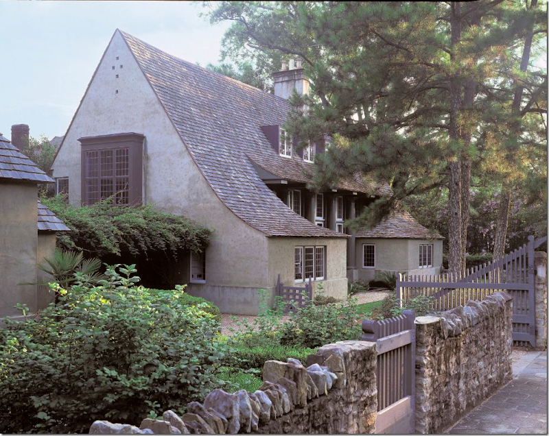
I’m sure you have a favorite McAlpine Tankersley design, that one house whose dog-earred clippings you’ve kept all these years. I have several choices, but my all time favorite will probably always be the house McAlpine designed for himself, years ago, in Birmingham:
That roofline, those windows, the two small rooms that jut out, the stone fence and wooden gates - was there ever a prettier or more romantic house? I wrote an extensive story on this house HERE.
I don’t know if McAlpine’s company has designed any houses before here in Houston, but this year McAlpine did design a house which was open to the public to benefit Habitat for Humanity in The Woodlands, a suburb north of town. You might have visited the house or seen it on another blog, but I recently saw the virtual tour of the house and wanted to share the beautiful pictures of this very special house. In truth, I wanted to immerse myself in the house and study it for hours – so what better excuse to do it but for the blog? The interiors were designed by another personal favorite Bellacasa from Houston. I found it interesting that Bellacasa was chosen to team up with Bobby because I’ve always felt they were influenced by his own interiors. Looking at the pictures, I almost forgot that Bobby didn’t design them himself instead of Bellacasa, which to me is the ultimate compliment.
So, enjoy the pictures! If you have seen the house before, take a second look today. I think it’s worth it.
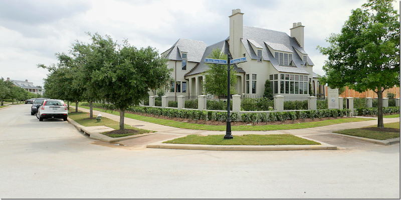
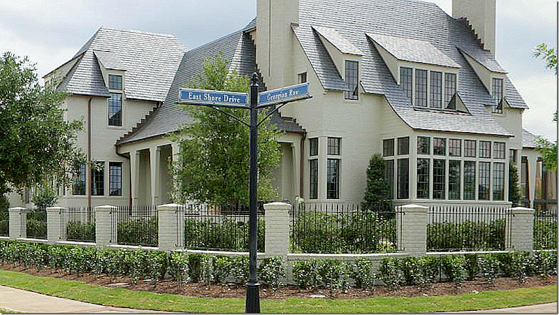
The house sits on a corner right across from the lake in The Woodlands. It’s obvious it’s a McAlpine house – the roofline, the symmetry, the bay windows give its creator away.
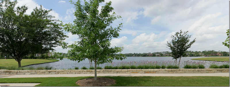
The sweeping lake view – right outside the front windows of the house.
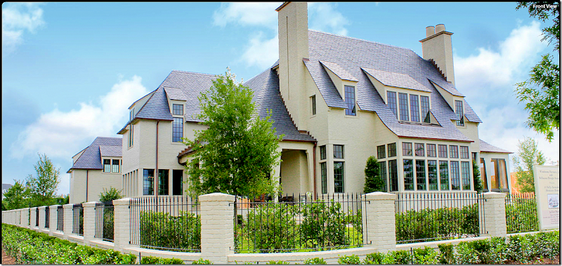
The front side of the house is perfectly symmetrical with the two fireplaces and porches on each side of the large bay window. Beautiful and classic details such as the slate roofline, copper gutters, the brick and iron gate, and black trimmed windows – all set the house apart. The house has 6 bedrooms, 5 full and 2 half baths with 4 woodburning fireplaces! That’s one detail I love – 4 fireplaces. Wow. It’s a total 8400 sq. ft. The front door is through the open porch on the left of the main bay of windows. The living room is at the front where the large bank of windows are.
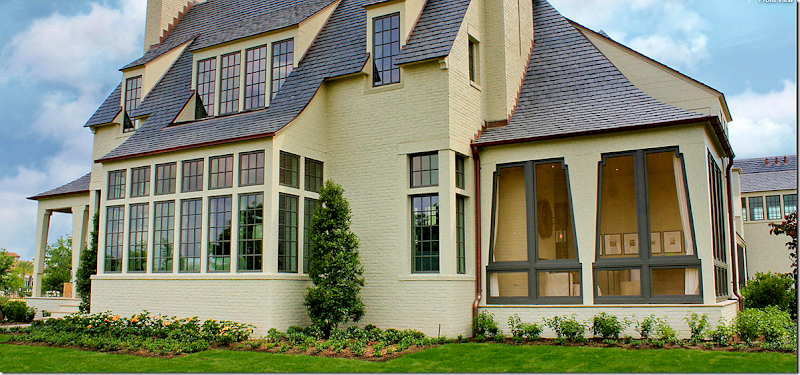
The house is on a corner, with lake views. Here is a view of the right side with its screened in porch. Notice the way the beams are designed on the right side - they actually look like tied-back curtains.
Walking past the screened porch – is this view of the right side of the house. To the left – the high bank of windows is where the main staircase in the house is located.
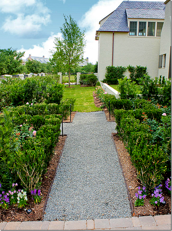
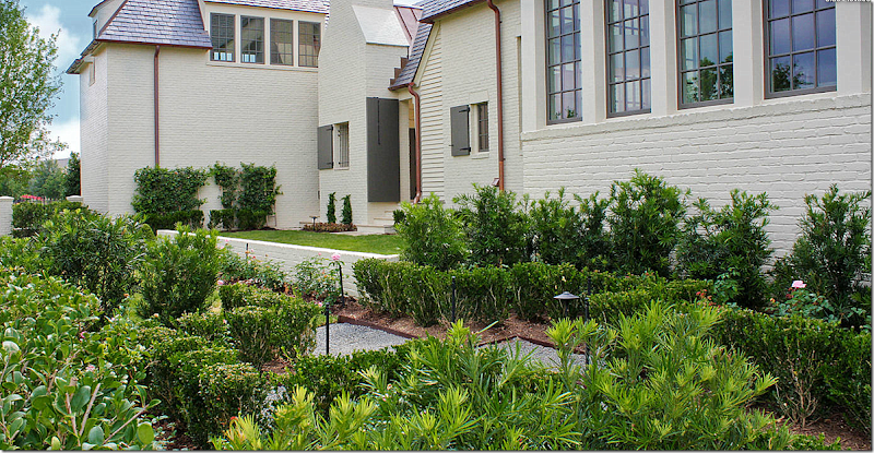
This view shows the other, the left, side of the house – that faces the street. This is a view of the landscaping, with its English garden look and gravel pathways.
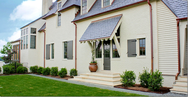
And another look at the left side of the house, shows the shutters on the smaller windows. At the very left is one of the two garages, with a bedroom above it. The half brick wall creates a grass terrace off the side entrance.
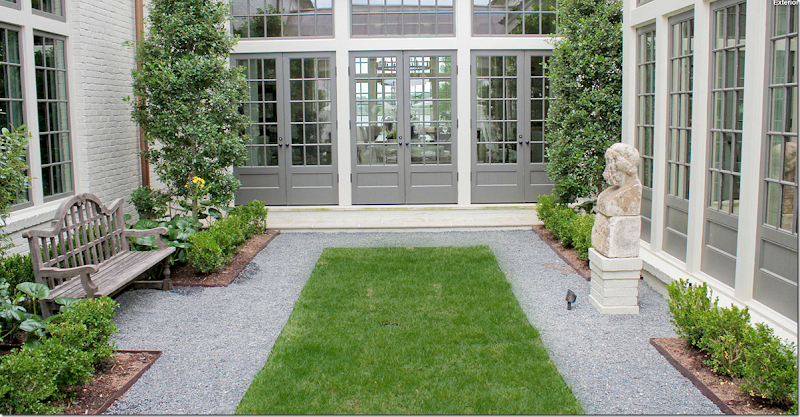
The design of the entire house is symmetrical. It’s in an elongated U-shape around a large, long central courtyard. This side of the courtyard shows the French doors that lead into the living room that faces the front of the house and the lake.
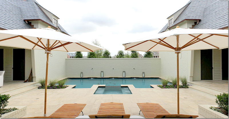
The opposite side of the courtyard ends at the rear of the house – with the swimming pool. Each side of the two wings are symmetrical – as seen here on the left and the right. The two garages flank the swimming pool (there are two 2 car garages on each end of the back of the house) To the left is one garage and to the right is the other garage. Each has a bedroom over it.
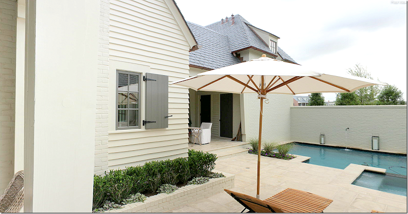
To understand how symmetrical this design really is - here you can see the left side of the swimming pool, with its small porch. The door leads to the left side garage. This side is identical to:
identical to the right side of the pool with its small covered porch. Through this door is the right side garage. Notice how the interior windows have the charming wood shutters.
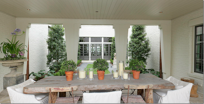
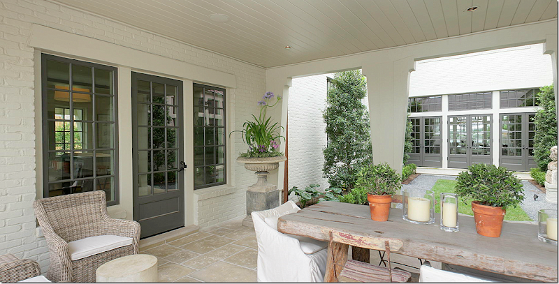
I love the way Bellcasa designed this area – that urn on the pedestal is so beautiful! The dining area of the courtyard is covered and sits directly in between the garden area and the swimming pool. The left side of the dining area is identical to the….
identical to the right side of the covered dining area. The courtyard has the same stone flooring as is in the interior of the house – creating the inside/outside feel of the courtyard. Notice too, that that the columns are cut in the same “curtain” design as the ones on both the front and screened in porches. The chairs are a mix of Kooboo wicker, white slipcovered and old French park chairs. The table is a large, Belgian styled rough luxe model. Love this setting!!!
Here is a close up of the courtyard. The three French doors lead into the living room. The windows to the right are the kitchen and the windows to the left are the family room. So pretty!
The slipped chair used in the courtyard is from McAlpine’s Lee Industry line HERE. Several pieces from McAlpine’s furniture line were used in the house.
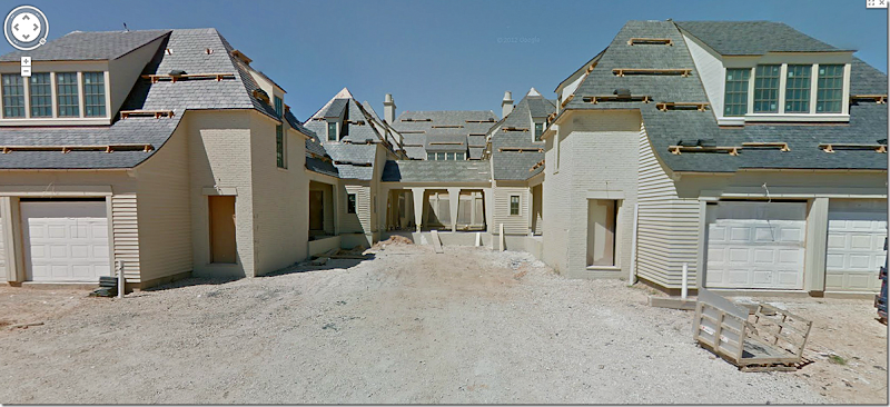
EEEK, what is this? Unfortunately, there is no picture of the back of the house and as you can, on Google Maps, the house was still under construction when this picture was taken. But I need to show it so you can fully understand the floor plan. Here you can see the garages – there are two 2 car garages – one on each wing of the U shape. The blank spot in the middle is where the swimming pool will go. Past that, you can see the covered porch area through the courtyard to the living room! You can really see the U shape of the house from this back view. There is no “back yard” – instead there are the two side yards and the courtyard in the middle.
And this view shows the house during construction, looking down. The front is on the left side overlooking the lake. You can plainly see the U shape of the house. In the middle is the courtyard, with the roof over the dining area in the center. Past it is the open area towards back where the swimming pool will be built – between the two garages. Understand? I hope so! I wish there was a floor plan!!!
Ready to go inside?
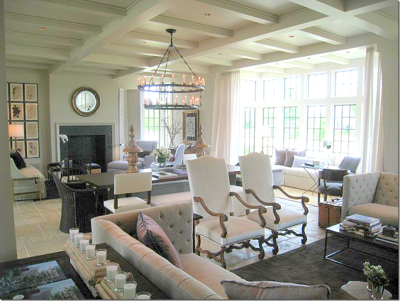
Entering through the front porch on the left, you come through the door into the great room – this is the room that overlooks the lake on one end, and the courtyard, at the other. As is the house – the room is symmetrical. There are two fireplaces – with seating areas on each side of the room and a huge table in between. Here is the seating area on the left side. This room serves as the main living area AND dining area. Through the brick arch on the right is the kitchen.
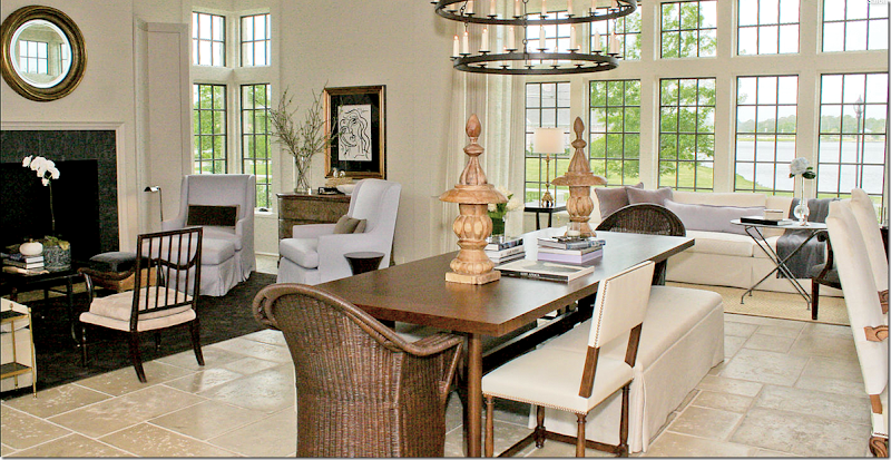
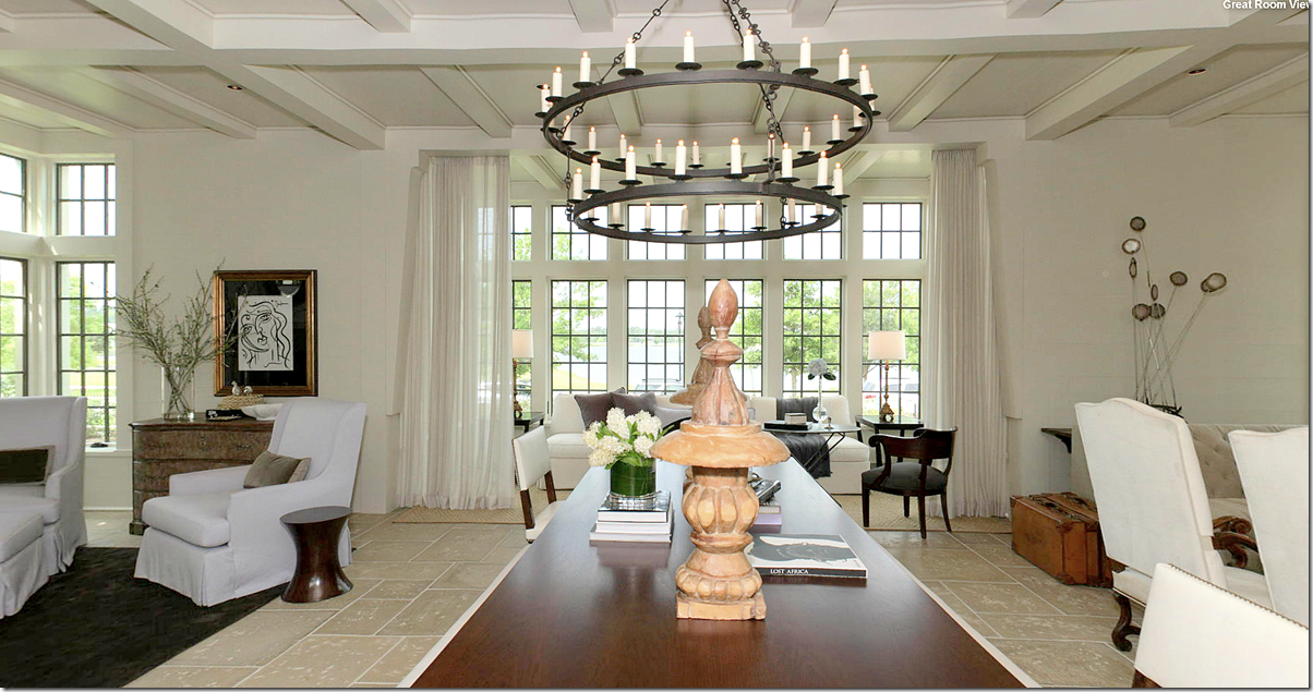
A look at the entire room – with the two seating areas and the dining table in between. At the far right is the bay window overlooking the lake with its own seating area. Hanging over the table is a large, double row iron chandelier.
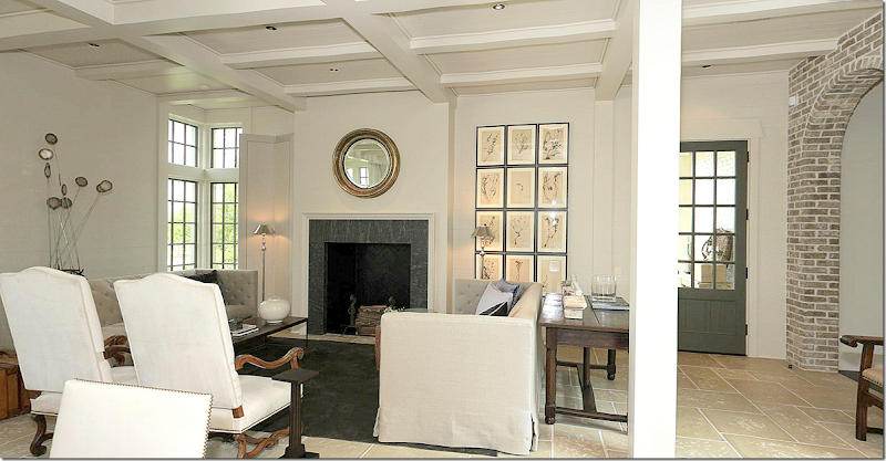
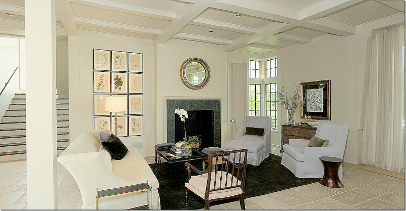
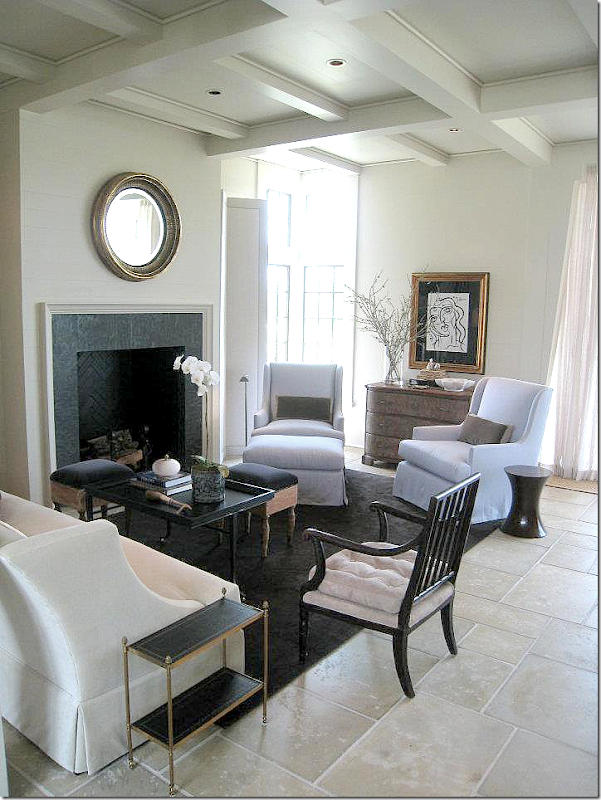
A larger view of the left side seating area with the fireplace. A set of herbiers hang together to make up one large piece of art while a round gilt mirror hangs over the fireplace. The two shelter arm sofas face each with two tall French styled chairs in between. Behind each sofa is a long desk. This one looks like an antique piece. To the left of the fireplace is a tall double screen. There’s another one on the other side of the room. McAlpine loves screens and uses them to divide rooms and also to create vignettes.
In this view of the left seating group – you can see the sofas are tufted. A bricklayer’s style coffee table sits atop a dark rug. Velvet pillows are in shades of deep and light lavender – a color that Bellacasa uses throughout the house.
This view shows the right side of the room, along with the center table. Two wicker chairs, two accent chairs, and two benches surround the table. This mixture of chairs and benches around the table is a look that McAlpine frequently uses.
This view shows the central table and the window that overlooks the lake. Notice how the unlined linen curtains are hung outside of the alcove, making that seating area more cozy and closed off. That is another trademark look of Bobby’s that Bellacasa used here in homage to him. To the left of the table is the second seating area.
The right side of the room – shows the identical fireplace with its matching set of herbiers and mirror. The seating arrangement is different though, with one sofa and two arms chairs and an accent chair. To the left is the main staircase. Beautiful wood accent chair. The two arm chairs are covered in the lightest of lavender.
Another view of this seating arrangement. Love the back vignette and the two antique stools that surround the coffee table. The two brown rugs anchor the light covered furniture and play against the lavender.
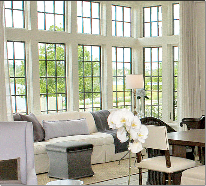
Looking from the right seating area over the dining area to the left seating area. My favorite part of the room is the bay window seating area, behind the sheer curtains. The chairs on this side are the light lavender as are the accent pillows in the bay window.
The bay window seating group has a long white sofa with a velvet ottoman used for a coffee table. Sisal rug sits underfoot. To the right you can just barely see the wood accent chair that makes up the rest of this grouping.
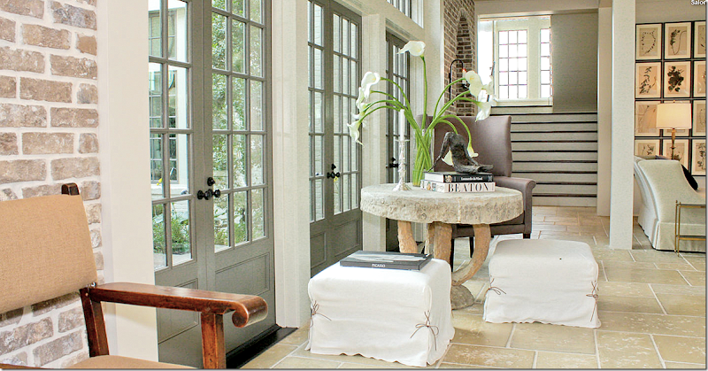
Opposite the front bay window overlooking the lake – are these three French doors that lead out to the courtyard and swimming pool. Outside, under the roof – you can see the eating area shown before.
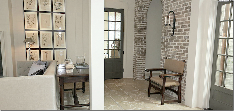
Another view of the 3 doors leading to the courtyard. Two slipped ottomans surround the concrete table, along with a wing chair. Again this arrangement is so Bobby! The staircase is in the back. Walls of brick with arches lead to other parts of the house. I love how Bellacasa chose to use so many design elements that Bobby is know for! It makes the interiors perfectly coordinate with the design of house!!!
And a closer view of the doors leading to the courtyard. Love the chair and concrete table.
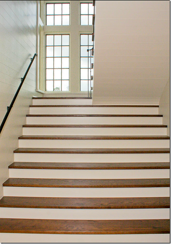
I love how McAlpine designed the stairs – they are double width on the first section – creating a grand look. Past the landing, the width becomes single – which you can see on the upper right. Notice the horizontal paneled walls.
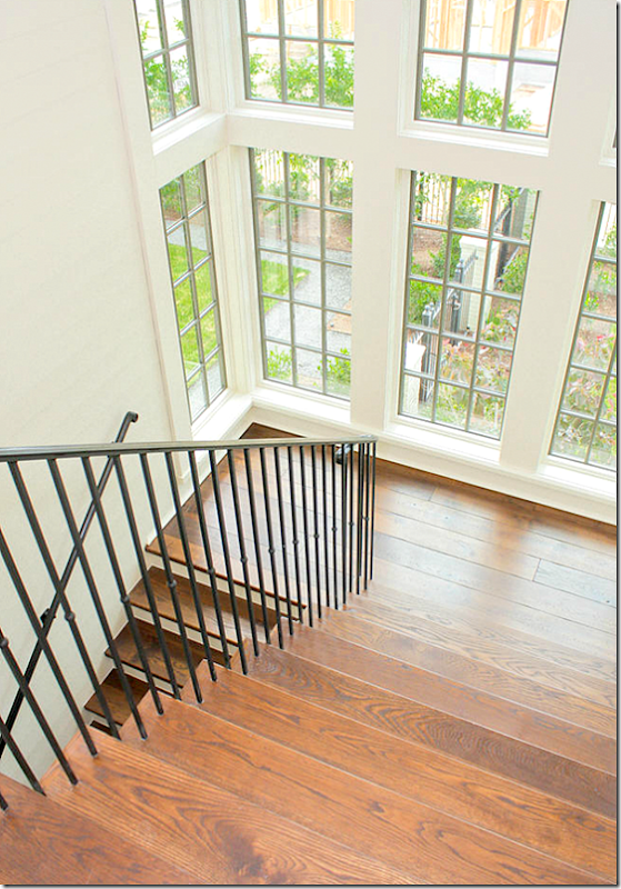
A view from the upper stairs – the window bay overlooks the right side of the house.
To the right of the stairs is the screen in porch, furnished in a Kooboo wicker sectional and an organic styled chair. Touches of the accent color lavender are brought out here from the living room to the porch. The porch is softened with sheer curtains that match those found in the living room.
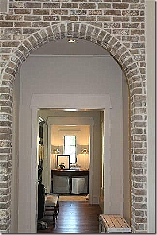
To reach the kitchen - you pass through this brick arch near the front door of the living room.
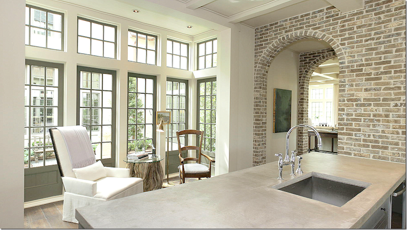
Walking from dthe living room (you can see it through the arch), past the double brick arches is the kitchen and breakfast room. A small seating area sits in the bay window that overlooks the courtyard. I love this vignette with the organic table, large contemporary chair mixed with an antique and a brass floor lamp. Hanging behind is a tiny painting. Wide planked wood floors run through this part of the house. The countertops are concrete.
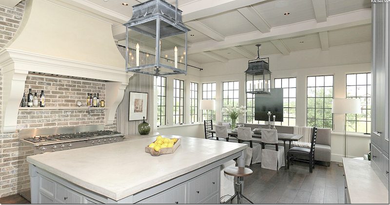
A larger view – shows the stove which sits alone under its wood hood. A large island is in the center of the room. The dark gray wood door leads to the pantry. Notice how the ceiling is the same as the ceiling in the living room – these details, repeated throughout, gives the house continuity.
This view shows the rest of the kitchen. The breakfast room overlooks the left side of the house – the street side. Two gorgeous lanterns light up this space. To the right is a gray painted cabinet. I love the way the stove is set alone in the space under its large hood. And notice how all the bay windows (two in this room alone) –bring a design continuity to the house. It’s all so balanced and symmetrical – which gives you a wonderful grounded feeling.
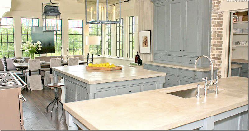
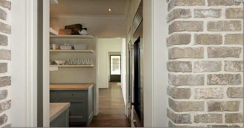
Here, you can see the butler’s pantry on the right through a sliding door. NOW, where is the refrigerator? Is is hidden in that gray cabinet? Is it in the butler’s pantry? Is it underneath the island – inside those cabinets? Where?
Actually, the large refrigerator and freezer are located in the butler’s pantry, behind the sliding door. In this view – you can see past the pantry into another room that leads out to the porch, then the garage. This room wasn’t on the tour, but I assume it’s either the game room or the “extra room.” Since there is no floor plan, I am just guessing here. If you toured the house – let me know which this is!
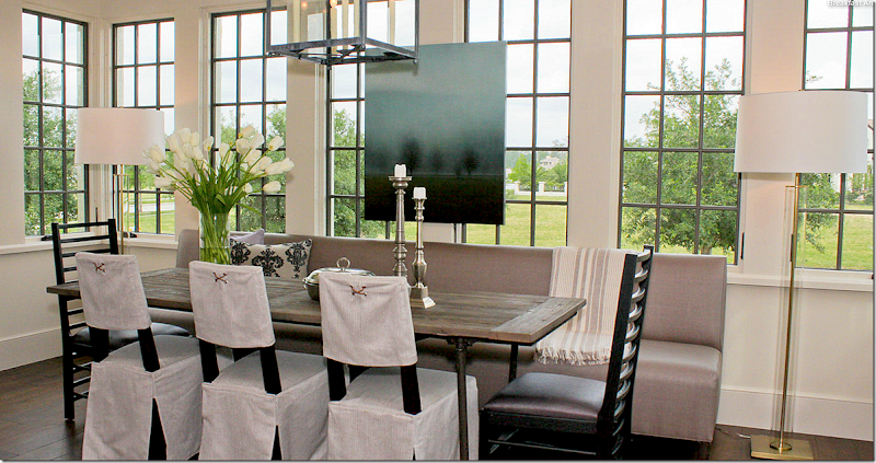
The breakfast area continues with the symmetrical feel – with a long banquette on one side of the brick layers styled table – along with three slipped chairs and two accent host chairs. Two tall contemporary lamps flank the setting – while a large painting hangs over the windows. So pretty!!!
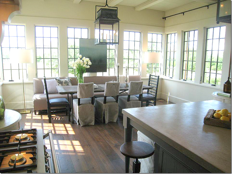
Another picture on a sunnier day.
And, the view of the sink and dishwasher – overlooking the sitting area into the courtyard. You can see through the courtyard into the room on the other side of it. Brick arches on both side of the kitchen provide the symmetry.
Now, if we go back to the living room – on the other side of the U – past the brick arches, we enter the den:
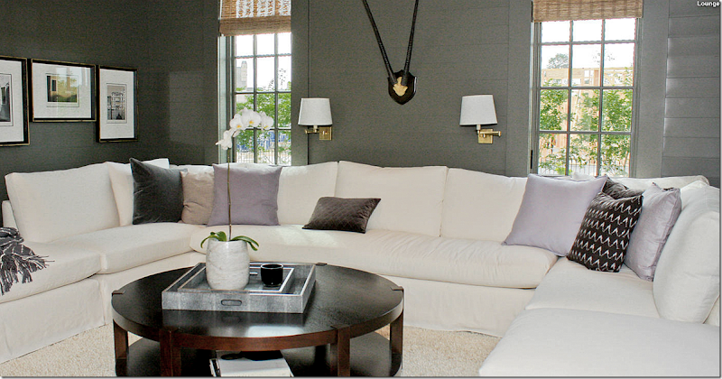
The den has a huge slipcovered sectional perfect for TV watching. The pillows are, again, an assortment of shades of lavender and purple. The horizontal paneled walls are painted dark gray, which offsets the white perfectly. This is the only picture of this room. It overlooks the right side of the house. And on the other side, it looks onto the courtyard. Now, since there is no floor plan, there is a little confusion. On the HAR web site, there is a dining room included in its inventory. I have no idea if this room is supposed to be the formal dining room – or is the room next to it? Bellacasa designed the living room to include the dining room, so perhaps this room is meant to be a dining room if the owners choose so? If you toured the house – let me know, ok? I am really curious!!
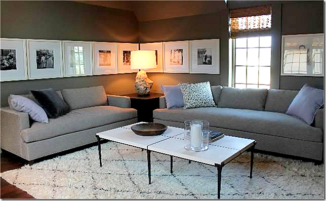
I did find this one picture of this room that wasn’t on the virtual tour, it might be the room next to the family room pictured above. More lavender pillows, a Moroccan rug, and a series of photographs were used here. I wonder what other rooms are missing from the tour?
And this small picture shows the hallway leading from the family room to the porch that goes to the garage. Notice the molding around the door – especially the top of the doors – such a great detail.
Ready to go upstairs?
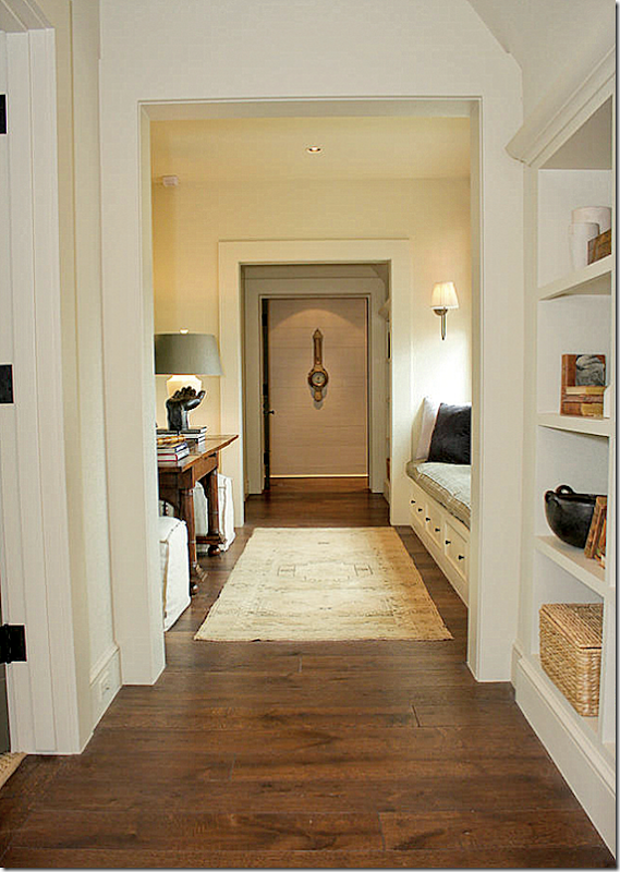
Coming off the main stairs – you reach this hallway, which overlooks the courtyard. The master suite is at the other end of this hall. Notice the antique barometer that hangs here.
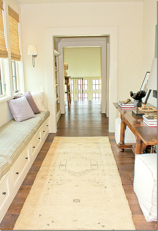
And looking the other direction, towards the stairs. I love the way Bellacasa decorated the house with a mixture of antique wood tables and chairs throughout - such as this console. And in the stairhall landing, notice the sculpture that sits on the pedestal. This would be a great place to read on a rainy day!!
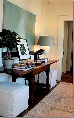
Here’s a view of the antique console with a lamp, sculpture, books, print and painting. Two slipped stools flank the console.
The master bedroom is located right over the kitchen – which is to the very left of this picture. The bank of windows in the front of the house hold the “boys bathroom."
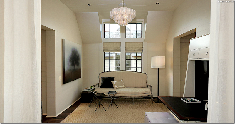
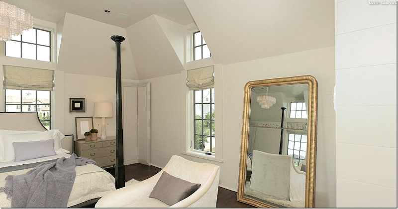
The master bedroom suite is divided into two areas. The sitting area is slightly smaller. This window overlooks the courtyard. Bellacasa used an antique sofa here, along with a new desk. The stool is in the soft lavender color. A seagrass patterned rug sits underfoot. Soft linen unlined curtains divides the bedroom from the sitting area – seen here at the left and right of the photograph. Matching fixtures hang in both areas.
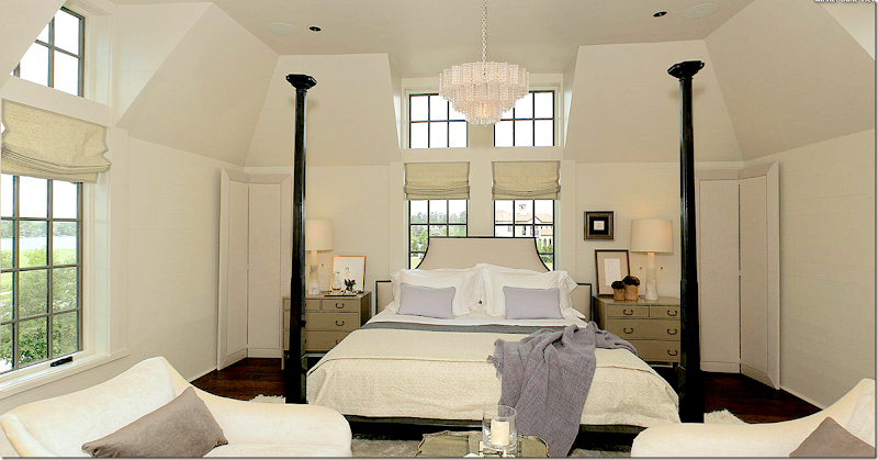
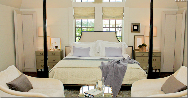
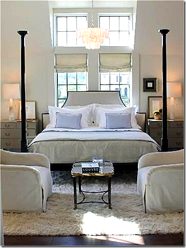
The bedroom – is furnished with furniture from Bobby McAlpine’s line for MacRae. In the corner are his famous screens that he uses in his designs. Two arm chairs sit in front of the bed.
Close up of the bed with the lavender accent pillows and throw. Mirror tray cocktail table. The bed fits the space under the dormer perfectly!
A large antique mirror reflects the sitting area.
This picture shows the chairs sitting on a white Flokati rug.
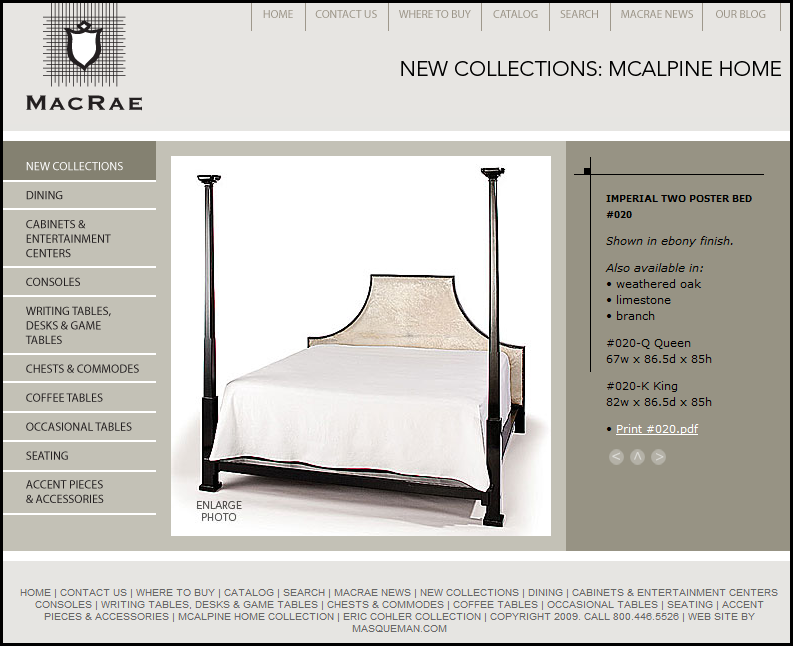
McAlpine bed used here – from MacRae
Similar to this McAlpine chair used here from Lee Industries.
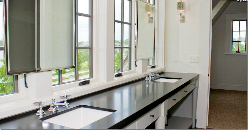
The boys bathroom overlooking the lake. Love the mirrors hanging in front of the windows. Pretty gray cabinet with black matte granite. Those are probably bedrooms that flank each side of the bathroom – wall to wall seagrass. There are no other pictures of any bathrooms or bedrooms! I want to see more!!!!!
And finally, I hope you’ve enjoyed this look at the Bobby McAlpine house built in my hometown as much as I did writing it. I had so much fun trying to figure out the floor plan just from looking at the pictures and I hope you did too!!!! The house is for sale and if you are interested in buying it – go HERE.
w
To order Bobby McAlpine’s beautiful book: The Home Within Us – just click on the title below:
Bobby McAlpine Comes Here!
Subscribe to:
Post Comments
(
Atom
)

















Want a smaller version of this house.
ReplyDeleteWant to enjoy the courtyard at night. Cannot even imagine how this home comes alive at nite.
Garden & Be Well, XO T
Gorgeous, love the shape of the house and the courtyard. Off to buy his book, I have been procrastinating but this post has the cc out. Have a great weekend.
ReplyDeleteSo pretty! Love the home and its great bones and the way it feels so inviting....the color palette is one of my favorites...all those chalky beiges/grays, fabulous!
ReplyDeleteEspecially love the living room and the roofline...people in my view tend to underestimate the impact of the roof on a house, and it can I believe make or break a home....sooo important that an architect 'get' that. He is one talented man! Nice post Joni.
Bobby is one of my favorites! He has done several houses in Charlotte. Great post Joni!
ReplyDeleteLove the simplicity, yet elegance of the home. Not overdone in anyway--and the colors are all my favorites. Another inspiring home.
ReplyDeleteThis is breathtaking!! There are so many special things about this house. I was thinking the same thing as the other commenter-- how this house would look at night! Do you know the paint color of the interior doors??? Or one that is just like it? Thanks again, Joni!
ReplyDeleteJoni PLEEEEASE send some of your talented architects over the Pond to Scotland...we could do with their inspiration!! Fab house, wouldn't want to be the cleaner but sure would LOVE to be the owner!!! Have a great weekend x
ReplyDeleteI can hardly breathe, this design is so stunning. Every single element speaks (sings) to me. Had I been on that tour, they would have had to drag me from the house. So many details to savor. Next...the book, which I hope includes some of this home. Thank you so much for sharing this.
ReplyDeleteGreat to see this, especially since I just got to see a McAlpine house at the final stages of contruction here in Atlanta (not the one I had on the blog - this is a brand new house, and I promised not to take or post pictures!). There were a lot of similar elements - the peacock pavers floors used inside and out, the color scheme, the use of brick in the house.
ReplyDeleteMy favorite elements - the painted brick, and the gorgeous floor to ceiling framed botanicals on both sides of the living room.
Is this house for sale? You mentioned HAR, which made me think it might be - but you also noted it was on a tour for Habitat. It could be a spec house - we have had some McAlpine spec houses here in Atlanta. Regardless, I loved seeing it, loved seeing more of Bellacasa's designs. What a treat this post was! Thank you for all of the hard work!
- Holly
I love his architectural designs both inside and out, and couldn't wait to see the interiors. However, I am not as enamored with the interior decorating. It all seems somewhat dull and cold to me. I see a beautiful home exterior that has English-style cottage charm, that I guess I expect the same charm in his decorating. I purchased his book and so many of the decorated rooms all look the same to me, plus I don't think the book had enough photos of the different interior rooms. I am selling it back to Amazon. To each his own! I like more color and depth and layering to a room -- and I sure many of you would hate what I would have loved to see in the interiors. There is no doubt that Mr. McAlpine is an architectural genius. And while I do appreciate his decorating style, it's just not what I'd hoped to see after viewing the exteriors.
ReplyDeleteBeautiful! Do you know what the cream paint color was that was used throughout most of the house? Many thanks!
ReplyDeleteIn my first home I hunted down the wallpaper featured on the front of Traditional Home many, many years ago. Guess who did the rooms? Bobby! I have always loved his look and of course got his new book.
ReplyDeleteI also have to say how much I love your blog, you have inspired me so much in my new house. Your tutorials are priceless, they answer so many design questions. I would never have hung mt drapes properly without you. Take a look when you have time at my dining room post on my blog, it is thanks to you it looks so good.
thank you so much!
Deleteand thanks everyone for the nice comments - much appreciated.
i would love to know paint colors too. especially the exterior. also, when will the recording of the interview be ready? courtneyej@gmail.com
ReplyDeleteMcAlpine is One of my favorites(of course I adore the lavender/purple pillows) Thanks for all your hard work. xxpeggybraswelldesign.com
ReplyDeleteI totally agree with Carol. The house is gorgeous and I love some of it; however, the interior decorating left me cold. It all looked the same. That said, I do absolutely love the Imperial Two Poster Bed and it is now on my Christmas list!
ReplyDeleteGorgeous! Love the colors! Do you know where I could find the island lanterns?? I am currently searching for kitchen lighting and those are perfect!
ReplyDeleteJoni...is the home still on tour? I couldn't find anything under Habitat or elsewhere on the internet. Would love to run over and see the home. You probably rarely get past Beltway 8, but the Woodlands is a fun place to shop and dine. Try Hubbell and Hudson if you go....great specialty grocery store, restaurant and Viking cooking school!
ReplyDeleteno, the tour is long over. ben used to live in the woodlands and we loved it out there. my sister in law's mother owns maggies!
DeleteFabulous store.....best in the Woodlands. I also shopped at it when it was in Old Towne Spring too....I think I talked to her last week while there with friends from out of state...they loved the store!
DeleteMany of McAlpine's homes are cold inside, including one featured recently on another blog. Often they are decorated by his design firm. The one house he recently completed and featured in the latest book by Phoebe Howard is not that way because Phoebe did the interior design. I suppose the temptation to push your own furniture line is the reason why so many of his interiors look like imitations. They also seem to lack features which would appeal to women including softer looking architectural moldings. While one can't argue with his success, his styles don't appeal to me because they are cold and uninviting.
ReplyDeleteI can't take it, the architecture is stunning, the lines, materials and all those windows, this home hits the mark in my book on so many levels! A dream house reference for sure, Janell
ReplyDeleteWonderful post about McAlpine's design in the Woodlands. I am captivated by the strong symmetry of the floor plan and the moulding details. Thanks so much for sharing it.
ReplyDeleteLiz
The house itself is very beautiful! My PO feels that the interiors has plenty of hits and misses. The colors are fabulous, but probably a bit cold and combined a bit masculine for some people. Most of the furniture is divine, but some of it is too cluttered, to long, having too many in a space and showing a lack of actual creativity, turning boring and over done for that beautiful house. The screens may be his thing, but they look out of place on the side next to the walls of that fabulous bed!
ReplyDeleteI agree. I love the subtle colors of the brick, especially, which provides some much needed continuity. Do like the room that was not on the virtual tour. Could actually live with that room.
DeleteStunning. Agree with Tara that this house must be extraordinary at night with its wonderful festival of lights and shadows. On a personal note, I'm glad to see Bobby is finally putting dining areas closer to kitchens!!!!!
ReplyDeleteStill remember when he dropped the F bomb~several times if I recall~on SRT. I've lived north of the Mason-Dixon for over 40 years, but deep lovely southern male voice can make F&#% sound like bourbon poured over honey. He did give you ladies a fun time. Would love to hear him, Easton and Saladino together. Would probably give us brain freeze!
The F bomb was sheer genius - not. Only the arrogant who believe the rules of civility don't apply would do this. It really did not endear him in a way I believe he thought it would.
Deleteomg, come on. it was funny! it was the first and only time that happened. we could have edited it out, but it was so him. i'm telling you - we honestly were shellshocked when that interview was over. i remember we were like - what did he just say?????? haha! he was definitely out of league in braincells. he is so out there. mensa material for sure.
DeleteHi Joni, Just finished listening to the interview with Bobby. I don't know that he is that much smarter than any of you. However, his mind does work differently. He uses the "form follows function" approach. His rambling with many mixed metaphonrs is not because he is so super smart but because he thinks visually not verbally. People like that have a difficult idea putting things into words and must use pictures. I can see him as a teacher sketching away on a blackboard to make his points.
DeleteBecause he camps out on the building site BEFORE designing the house, that is why his structures feel so right! How many of your clients let you camp out in their house or follow them around to see how they use their spaces. Think back to how residential structures were built in our "caveman" days, or more recently on our American frontiers. Building grew organically on the site. Views to see the enemy coming were critical. A large entry hall was needed to remove and store armour and weapons (and to grab them quickly if danger threatened.) Placement of the fireplace to provide the best heat and best draw for the chimeny and orientation to the sun and prevailing winds were critical for comfort. Forced heat and air conditioning as well as modern building materials such as steel have allowed builders today to build houses that do not take these things into consideration.
We have been humans for over 10,000 years but have only had interior decoration (as an occupation) for a few centuries. Interior Decorators are usually brought in after the building is complete which is what makes the job so hard. We have groused on this blog about the "d$@%m builders" more than once for good reasons. Houses built from stock plans bought from architects (even good ones) feel and function completely different based on the terraine and orientation to the sun. Even flipping to a mirror image makes a huge difference. Very few builders get this. If you were to build an exact copy of a Bobby McAlpine home, it would not feel the same as one he designed for a specific site.
About his comment to decorate the F... out of a poorly laid out home, sad but true. Because of this, you will never run out of material for your "Dear Miss Cote De Texas". So often I think that an architecturally well designed space requires very little decoration because it already has the right "feel". Would that there were more Bobby McAlpines so we do not have to spend so much time and money on corrective decorating.
I doubt that Bobby had any interest in endearing himself to the listener at that moment. No, he chose the most convenient and effective word to make a very valid suggestion of what one can do to compensate for bad architecture. Somehow, saying that he would “decorate the bejeezus” out of a space would not have had the same impact.
Deleteexactly. i'm listening to the recording right now. i haven't relistened to it before.
DeleteWell, that is certainly a design philosphy that none of us will ever forget! Wonder if he was channeling the famous Hollywood designer, Tony Duquette, at that moment.
DeleteAn amazing post! I know how labor intensive a post of this magnitude is with Blogger? The home is just beautiful. Nice to see one locally of McAlpine's work. I'm not crazy about some of the furnishings but love the floor plan. No back yard? I'd like that!
ReplyDeleteBeautiful home, wow!!!! :)
ReplyDeleteThank you so much for all that you teach me as you share such lovely homes.....I really appreciated that you once even answered my email personally...I am just in awe of all you do and share...you are my favorite blog!
ReplyDeleteSharon
Love Bobby McAlpine! I discovered his work many, many years ago in Southern Accents magazine. I have coveted his work with every article about his designs since then. He just speaks to my design sense. In my next life, I want to be his journeyman apprentice.
ReplyDeleteLove this post!
xoxo, Chris
Love,love,love that house,(and he is adorable!)
ReplyDeleteThanks, Joni for showcasing this
-linda,ny
Okay, bear with me, and hear me out. As usual, Joni, fabulous, time-consuming, ""how-do-you-do-it" post. I too LOVE Bobby McAlpine, but I have to say, I got bored with this house! The exterior and brief glimpses of the gardens were enticing. Unfortunately, room after room of the same eventually left me . . . well, bored. The lines of this house are so gorgeous. I just wish the interiors could have been a little more interesting and surprising. I'm loving the move toward a bit more--more color (not much, mind you, just more), more accessories, more interest. Bobby's houses lend themselves to this welcome trend. I just with this house could have showcased some semi-daring details in the interior.
ReplyDeleteDon't know what to say. I happen to like Bellacasa's houses. But you must remember, designing for a showcase is different. There is no client, no personal items, and you are tied to use what you can get - not necessarily what you want.
DeleteBobby McAlpine is my absolute favourite architect! If I ever win the lottery, he's the architect I will hire to build my dream house. It will be much smaller than what he's used to building, though, because I prefer smaller houses.
ReplyDeleteI can tell that he and his design team didn't decorate this house. Although it is attractively decorated, it's lacking the moodiness and sense of mystery his homes usually have.
Another great post Joni!
ReplyDeleteI had the pleasure of touring this home, when it was on tour. I can answer a couple of your questions. The room just past the Butler's Pantry, where the refrigerator/freezer is located, is the laundry room. The laundry room was very simple, with an extremely long concrete counter top, rectangular sink centered on concrete counter top, with stackable washer/dryer on one end. Long bank of windows over the counter top. Opposite this workspace is a large storage closet.
One unusual feature of this home was the horizontal lathe wood, not sheetrock or plaster, on the walls. All of the horizontal lathe was painted, and really beautiful. The lathe continued to the floor, with only an unusual quarter-round at the floor, no baseboard. Also, there weren't any crown moldings, only an unusual sort of half-round at the ceiling edge.
The formal dining 'room' is the table that you see centered in the living room. There is no other dining area, other than the breakfast room in the kitchen.
Other than the Master Bedroom upstairs, none of the other bedrooms were furnished. All had seagrass wall-to-wall, but no furniture. There was another upstairs TV room which was furnished, and the upstairs hallway, which you have pictured, that was furnished.
The builder has an agreement with McAlpine/Tankersley to build 3 of his homes in this same subdivision in the Woodlands. #2 home is being framed next door to this showhome. They had the architectural plans of each of the 2 other homes on display in this home, in the home office.
Your last paragraph seems to imply that McAlpine/Tankersley have gone into spec building in addition to custom? The horizontal lathe does not show up in the pictures. If I understand lathe in the way it is traditionally used, this would resemble horizontal paneling, right? Very interesting!
DeleteWow. on the real estate ad it said the laudnry room was upstairs plus they state there is a dining room. that was what was throwing me off. I did see the wood or lath walls - but it's hard to see in most pictures - so, it WAS everywhere. wow. must be gorgeous. and two more houses? nice for the woodlands!
Deletethanks so much!!!
Joni:
ReplyDeleteThanks agin for the extensive and well-reserached coverage of another of our projects on your lovely blog. A note of correction: our firm did not decorate this particular project. The interior decoration was done out by the owner and developer of the project.
Greg Tankersley
McAlpine Tankersley Architecture
It was clear that Bellacasa did the interior design in the first paragraph. Bellacasa has a beautiful website, by the way, and have done some extraordinary work in the Houston area.
DeleteOops. You are correct. I should have read the article closer than the comments!
DeleteI love that my readers take up for me!!!
DeleteGregg - you crack me up! Now, go back and read the article. I spent a few days writing it. Don't just look at the pretty pictures. hahah!!!
just teasing you!
Joni, your twitter friend
That you should be so fawning when your readers skim over information in the narrative. You didn't ask "Tank" if he went to high school.
DeleteJoni:
DeleteGuilty as charged. I always gloss over words for pictures. Thanks for your efforts in promoting our work. You are a dear (in spite of your Twilight fascination - which I shall never, never understand).
Greg
Hi Joni - First of all, I searched your blog for the Skirted Round Table interview of McAlpine - no success. Is it still available? Then, I followed the link to his personal home with the 3 versions. LOVED Version #1. It felt very Saladino to me. The warm golds, soft terra cotta and soft, clear blue greens warmed my heart. Version #2 looked like the interior of Dr. Zhivago's frozen dasha in Siberia. Version #3 felt like Edgar Allen Poe's descent into depression - walls darkened with linseed oil and dark pigments plus the dreary carpets. No wonder he sold it and moved on.
ReplyDeleteHowever, the architecture of that home and of the new one you featured is wonderful. So nice to see residential architecture designed with furniture placement in mind!
Some years ago we had the opportunity to stay at the Goddards, a Lutyens designed property in Surrey, England. Compare that property and you will see where McAlpine may have received his inspiration. General layout, windows and dormers are vitually identical. One room, especially, will be familiar. http://www.astoft.co.uk/Dscn9428-crop-u2-h405-u0.5-q60.jpg
On a "gardening" note, the silvered, wooden garden bench in the Courtyard of The Woodlands house is a very classic Lutyens design. Love the curvy, "Frenchiness" of it as a nice counterpoint to the rigidly geometric windows and courtyard design.
Charlotte,
DeleteI found it on the SRT site by looking at the list of interviews on the left side of the page. It's a wonderful interview. He is so thoughtful, down-to-earth and interesting!
Thanks! I forgot about the SRT site.
DeleteOMG, thank you Joni for showing me a "Bobby" house that I have not yet seen! The man is genius in my book, I love the way he disjoints the seating areas in a sensible way. He has also mentioned why he eschews formal dining rooms, on the theory that most people don't like being ushered into a formal room to dine anyway. This is why you will see most of his dining areas in the open, with circulation patterns around them. I totally agree with him on that one. My guess is the room that is furnished as a den is a flex room, which could be a formal dining room if the owners wanted it. BTW, McAlpine Tankersley has a new blog out called "finding home"....enjoy!
ReplyDeleteThis is a great posting I have read. I like your article. Thank you
ReplyDeleteMajor swoon! I've never seen new construction with so much character and so tasteful! He knows what he is doing, that's for sure. What a gifted architect.
ReplyDeleteHow about a Bobby house for the next Cote de Texas giveaway?? Lol
I thought the house under construction looked like another McAlpine design from the symmetry. Now I know it is. I live in The Woodlands and never saw anything published indicating this house was even existing. If they did a fundraiser for Habitat, it was open to a very select crowd I guess. Wish I had known. I did find out about it reading comments on an earlier post. I didn't drive by to look at it till yesterday when you posted this. It is beautiful on the outside. No sign indicating it is for sale though. I guess you have to go through The Wdls Custom homes to know. I will watch this new construction. Thanks for a great post Joni!
ReplyDeleteDrool, slobber, gasp. GOR. GEOUS.
ReplyDeleteYou don't get out much, do you?
DeleteTwenty years ago I had a library light which looked almost identical to the two tier light over the dining room table. My friends use to laugh and wonder when it was coming down for something more fashionable and up to date. Wow, if I had only known I could have told them to fast forward a bit and my lighting would be totally in style. Seeing that light brought back a lot of memories and laughs. The only time my light (which I referred to as the wagon wheel) looked great was at Christmas when I decorated it with plaid ribbon and greenery.
ReplyDeleteAll the more reason to IGNORE fashion and buy what YOU love. As Shakespeare said, "the past is prologue."
ReplyDeleteGunnells did all the concrete countertops here. I should have known. They are the best in town for it. If you are interested in getting concrete counters or any other of their services - contact them here:
ReplyDelete4527 beacon hill
seabook, TX 77586
281.326.0070 o
281.326.0072 f
713.927.4447 del cell
gunnellsconcreteinc@comcast.net
Here is the link for the Bobby McAlpine interview!
ReplyDeletebtw - tomorrow we are interviewing Alexa Hampton! Should be a good one!
Bobby's link: http://skirtedroundtable.blogspot.com/2010/08/bobby-mcalpine-need-we-say-more.html
Love Bobby McAlpine and have been clipping his houses from magazines for years. Had the pleasure of meeting him last year on his book tour and we laughed about his interview on The Skirted Roundtable. He said something about how he got in trouble for his language and his interview had been given some kind of R rating. Later after his presentation, which nearly had me in tears I was so touched by his words, my husband, who is not into design and whom I had dragged along with me, said, "He's special." He really is. Thanks for sharing this fabulous home with us.
ReplyDeleteVery interesting and beautiful! Keep up the good work! Check out also 3D Rendering
ReplyDeleteAny one know what kind of flooring was used in the kitchen? I'm in the muddle of a decision and liked the way this floor looked.
ReplyDeleteBased on the regularity of the "chipping" around the edges of the stone, it looks likes pre-cast concrete tiles made to look like limestone. I have seen this advertised in Archtectural Digest and Veranda but could not find an on-line link. I believe the mix of large squares, small squares, large rectangles and small rectangles is call a "Versailles" pattern (but don't hang your hat on that). Another reason I think it is concrete rather than real stone is that is it used on the floor of the covered patio. Because concrete is not as porous as is limesonte, concrete will handle freeze and thaw cycles better than real limestone (if they have such a problem in the Houston area).
DeleteIsn't the flooring material used inside and outside on the patio Peacock Pavers, which is located in Atmore, Alabama and a favorite of McAlpine's?
Deletehttp://peacockpavers.com/architects-designers.html
On another note, does anyone know the manufacturer and width of the french doors leading to the courtyard?
I also toured this house and LOVED everything about it! There were several hidden design features as well. Most of them were for added storage but you wouldn't have known it if not for the people there during show hours to tell you about them. I took as many pictures as I could. I have pictures of the Master bathroom with hidden shower and toilet areas. If you didn't look close enough you would have thought the builder forgot them! There is a small counter/computer space just before you enter the master bedroom with hidden storage on either side of that counter. There is an elevator too! But where? Hidden behind a beautiful antiqued almost ceiling to floor mirror. There is a beautiful hall with a dark block paneled wall and guess what? Yep, more hidden storage. I did call the designer and found out the house is being sold decorated. Yes, if you have the money it comes with all, ALL that beautiful decoration! Whishing, whishing.
ReplyDeleteThanks, for showing your pictures. A while back I thought I sent you the link to the HAR site with this listing. It was in reply to the Dear Miss Cote de Texas question about a dining room with a sliding door and two smaller windows on the other walls. The question was what to do with all the mismatched windows and the sliding door that they were going to turn into a french door. I replied she might want to use the screen idea that this showhouse used in the Master bedroom to hide the two small windows in question.
I can email you all of the pictures I have of the Woodlands showhouse if you would like them.
Thanks, Arla
Simply stunning! Every last bit of it! Oh my...Thank you for opening the doors.
ReplyDeleteMonica
Does anyone know the manufacturer and width of the french doors leading to the courtyard?
ReplyDeleteExtraordinary! Wow! McAlpine is out of my reach, but it's inspiring to view. The Bellacasa decor compliments the architecture perfectly. Thank you, Joni for all of your wonderful research and writing to bring us the best in architecture and decor on Cote de Texas.
ReplyDeleteYour long time fan,
Victoria in Bedford
what a lovely color full image. i like it. Thanks for sharing us.
ReplyDeleteLove this house! So beautiful! Do you have a floor plan of this house to view?
ReplyDeleteI'm really looking forward to see him in person and learn a lot from him!
ReplyDeleteWhat is LED Light? And what is good about them?
ReplyDeleteoutdoor led display
You got a really useful blog I have been here reading for about half an hour. I am a newbie and your post is valuable for me.
ReplyDeletehealth and safety display
Thank you for your post. This is excellent information. It is amazing and wonderful to visit your site.
ReplyDeleteupvc sliding doors dealers Hyderabad
upvc windows manufacturers in Hyderabad
upvc sliding doors manufacturers Hyderabad