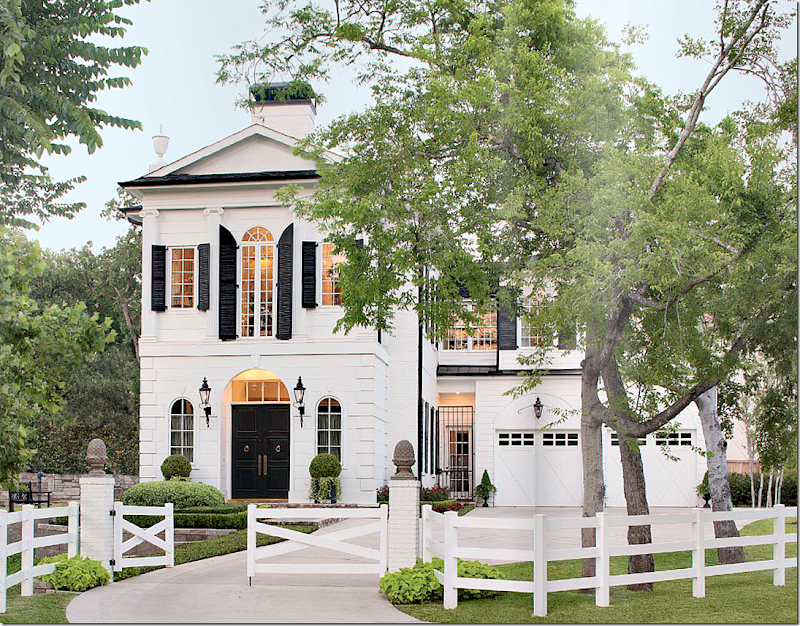
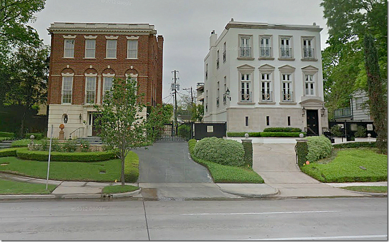
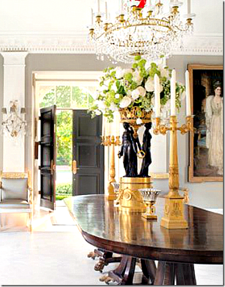
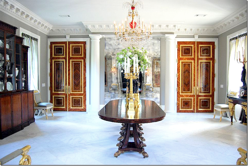
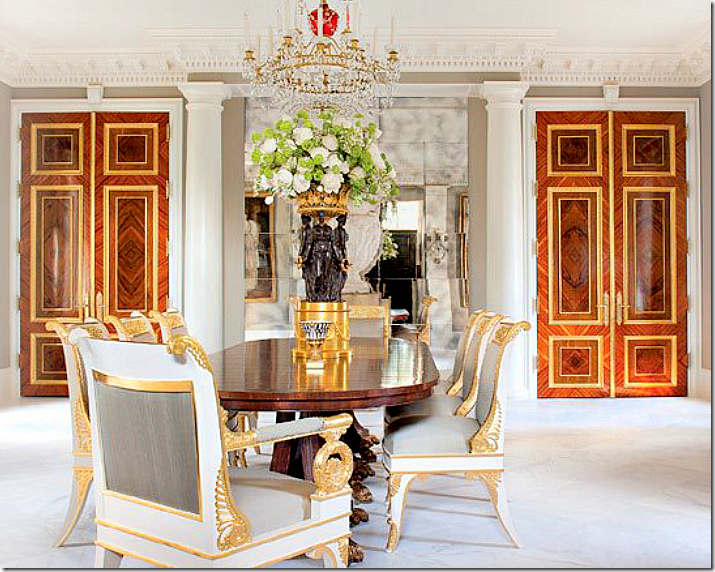
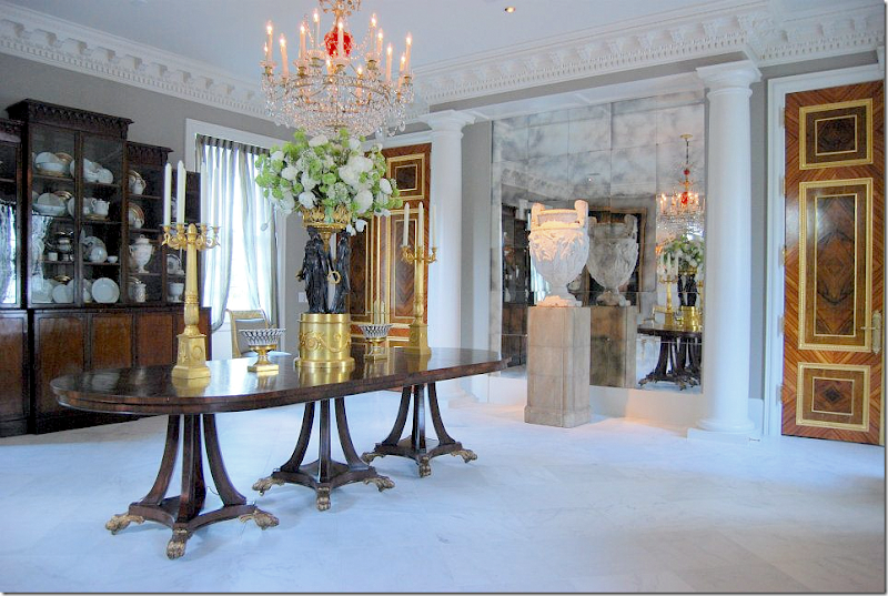
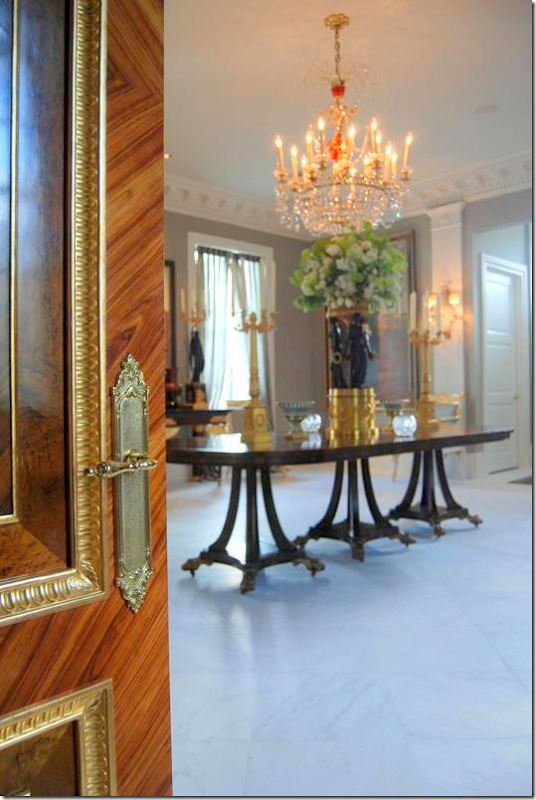
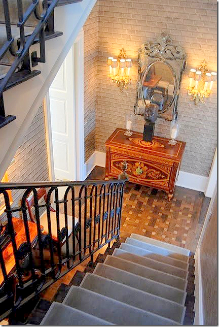
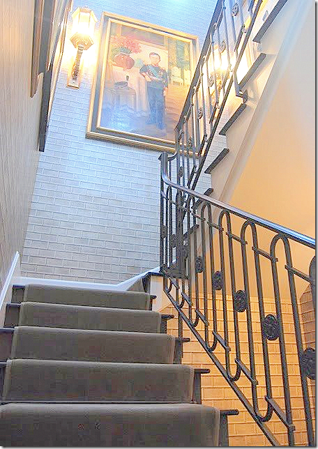
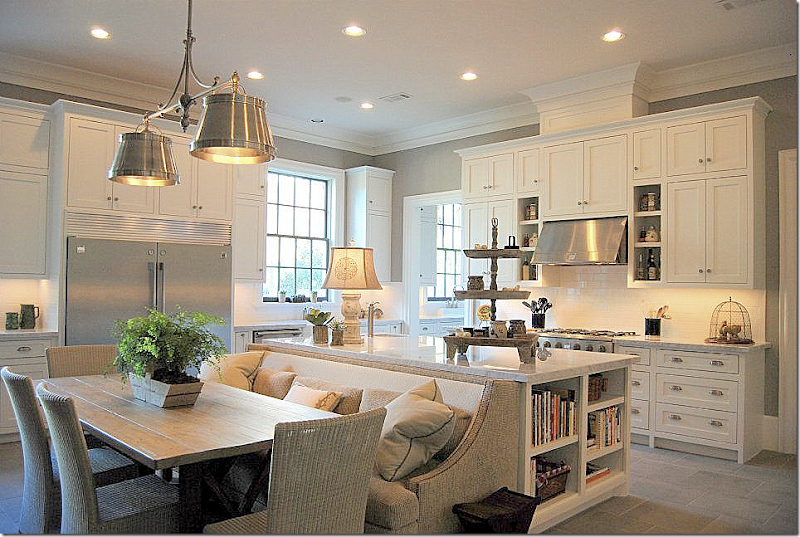
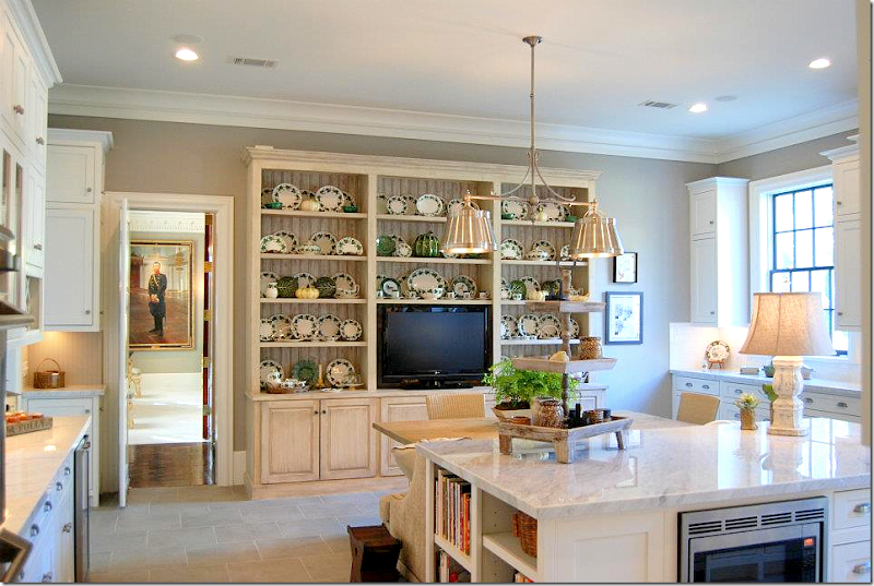
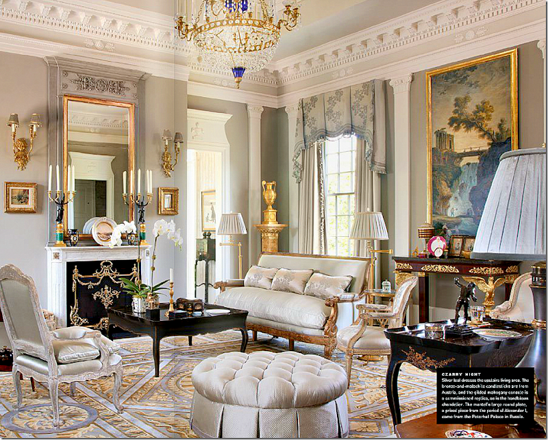
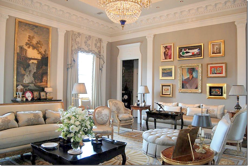
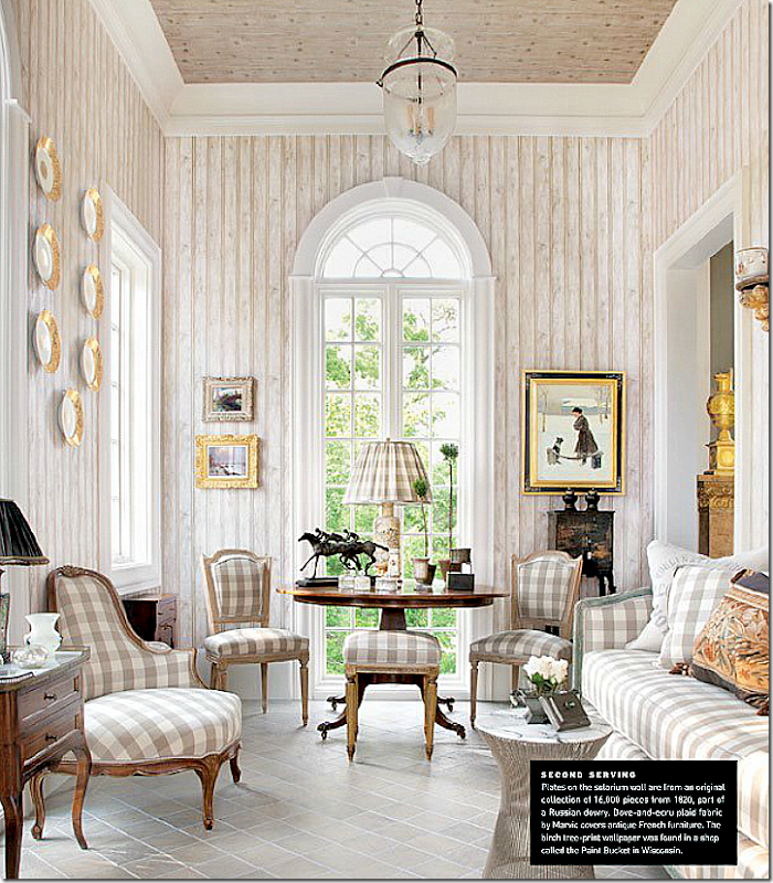
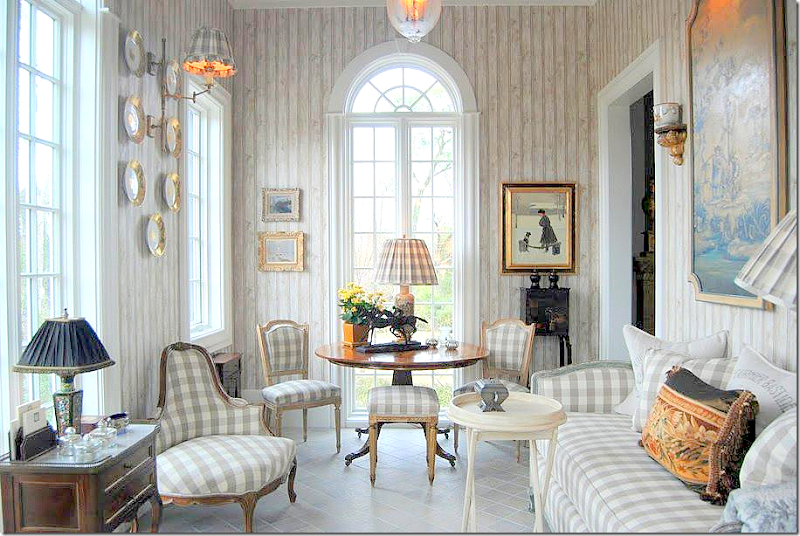
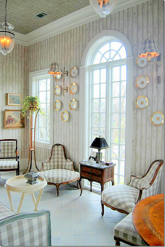
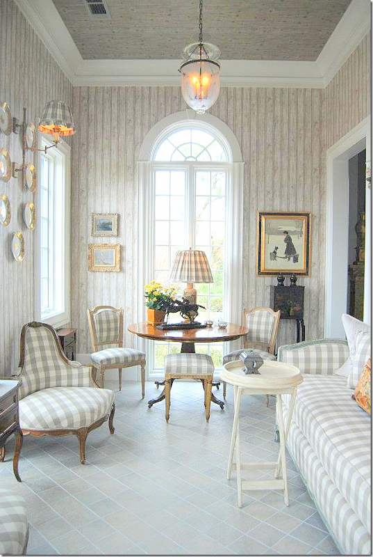
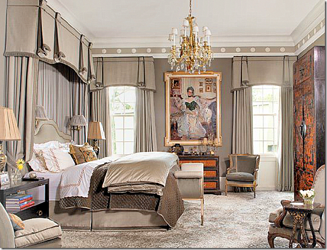
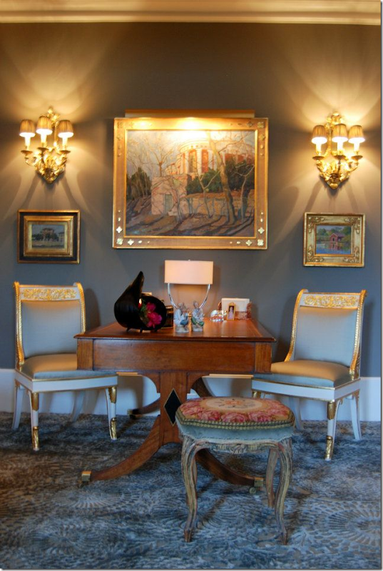
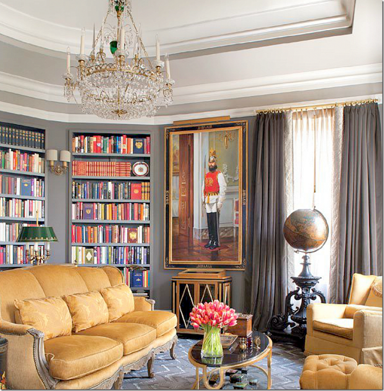
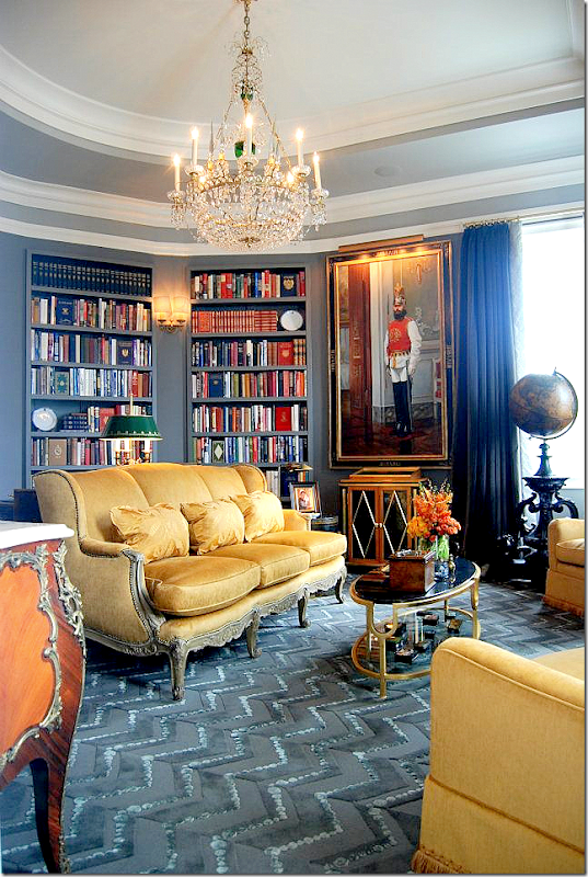
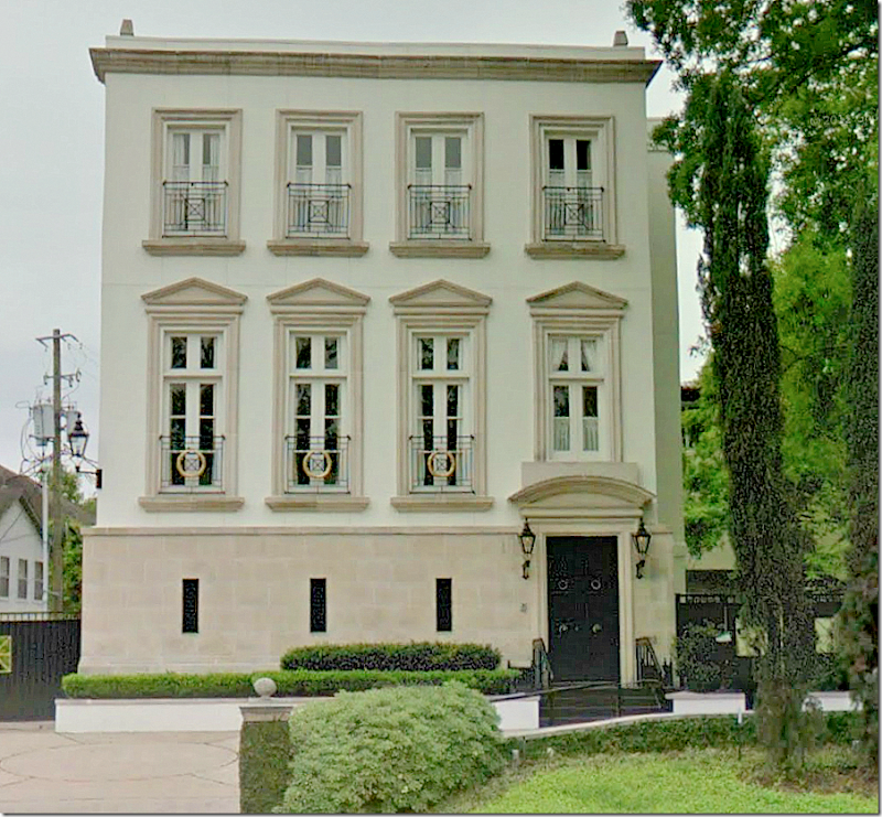
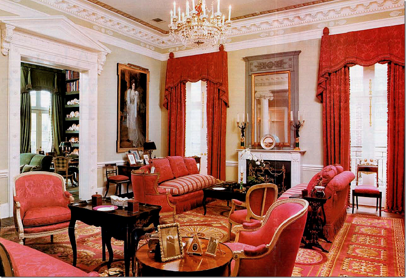
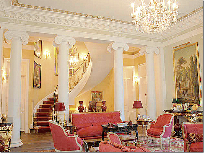
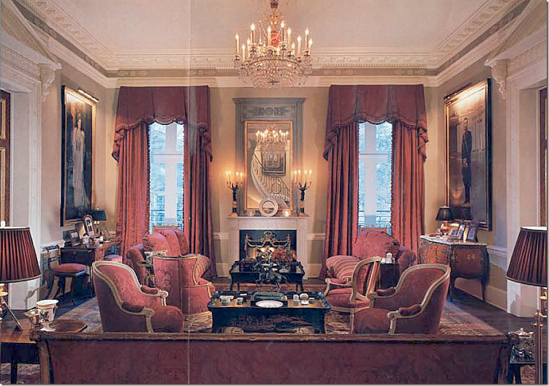
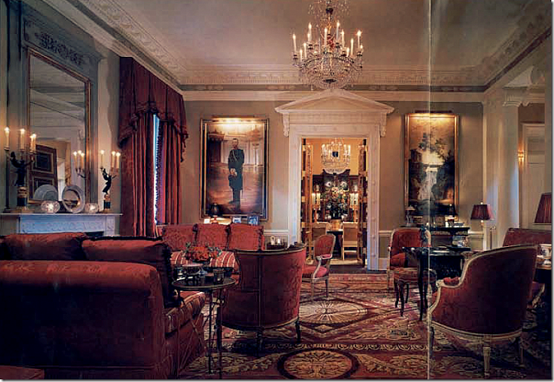
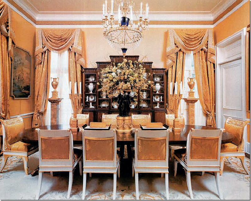
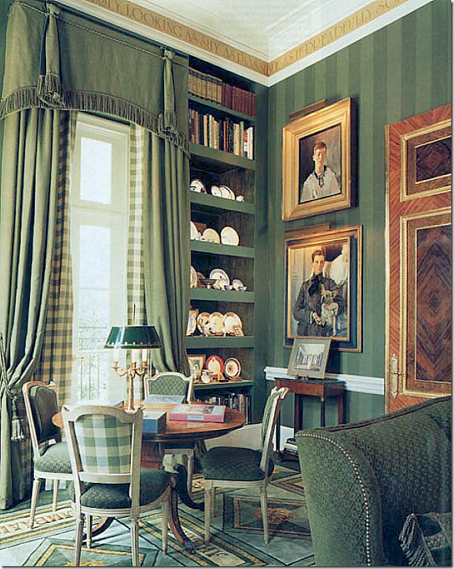
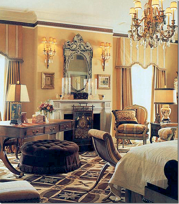
What? A house in Houston without seagrass or slipcovers and no shabby, faux antiques???? Seriously?The new Luxe magazine, Houston edition, has the most gorgeous cover. It stopped me cold and I ripped it open, looking for the house that this beautiful check-laden room belonged to. If you are from Houston, you might have seen the article – but if not, I want to share it with you. The cover is a room in this house, below, which is so wonderful I couldn’t stop staring at it!The Federal Style House near downtown Houston – could it be more charming or beautiful?The most interesting fact about the house is who owns it – the dynamic designing duo of interior designer Michael Siller and his partner, rug designer and CEO of Hokanson Carpets, Larry Hokanson. Once learning these two were behind this white Federal style beauty, I’m wasn’t surprised at all. This is just the latest in a series of houses that they’ve lived in – and each has been a very special treat. This Federal style house and their previous one, a Neoclassical style house, are both the work of San Francisco and NYC based architect John Ike of Ike, Kligerman Barkley Architects.The Summer Derby HouseThe Siller/Hokanson house is based on the 1794 Summer Derby House, built by Samuel McIntire, in Massachusetts. The Summer Derby house was moved in 1901 to Glen Magna Farms, which is today a popular wedding venue. Considered one of the finer examples of Federal style in the United States, the Summer Derby house is a National Historic Landmark. The resemblance to the Houston house is remarkable. If you look at the two houses, you can see that the corner urns are included in the Houston house, but the two large wooden figures of the shepherdess and the reaper were excluded. Other similar details are both houses are white with black accents and the arched window placements are the same as are the shutters and door. The main differences are the center window is much larger in the Houston house and the wing that juts out to the right side is unique to the Houston house. The fabulous picket fence and gate that surrounds the Houston property also sets it apart from the Summer Derby House.While the exterior of the house is a rare look for Houston, the interiors are too. Houston is known for its slipcovers, light linens, and painted antiques, but Michael Siller definitely marches to his own fabulous beat. His personal aesthetic is far from what I call the “Houston Look.” He has a love of fine antiques – the finest there are. He loves color and pattern and delicate silks. And most importantly, he and Hokanson have a particular affinity for anything Russian – Royal Russian, that is. This love of Imperial Russia all started when Hokanson read the best selling biography Nicholas and Alexandra. I can totally relate. I read the same book and became consumed with the mystery of the Princess Anastasia who was purported to have escaped the execution that killed her entire family, including her parents the Czar Nicholas and Czarina Alexandra. For years – almost her entire adult lifetime – the Polish Anna Anderson proclaimed she was the missing Anastasia. Some relatives of the European Royalty families, believed her story and visited their “cousin” sporadically during her long life. Unfortunately for Anna, DNA testing became available - and after her death, she was proven to be a fraud. The real Anastasia’s bones along with her brother, were eventually found – separate from the rest of their family – and DNA also proved this. One of the great mysteries of the Russian Revolution was cleared up, thanks to modern technology. The story of the of the Romanovs, the Russian royal family, with their untold riches, glorious palaces and opulent lifestyle, along with the misery of the hemophilia which struck the crown Prince, is a great romantic tale of epic proportions. Since I too fell under the spell of the Romanov’s tale, I can understand how Hokanson, and then Siller, got hooked on everything Russian. Most exciting though, the two were fortunate enough to take their obsession a little further than most of us.When designing their previous house – the Neoclassical one, Siller and Hokanson went to St. Petersburg’s State Hermitage Museum where they were interviewed for two days by curators in hopes of purchasing some reproductions of the royal furniture. The designing duo had a list of antiques from the Hermitage they wanted copied – but first they had to pass inspection to see if they and their house were worthy. The number of people who are in possession of these Russian reproductions is quite small, actually tiny, and includes European royalty. Siller and Hokanson, along with the plans for their house, passed the inspection and today are owners of exquisite furniture hand made and hand carved in the same exact manner and out of the same material as they were originally crafted. Besides these pricey reproductions, they have a large collection of Russian art work and antiques. They happily lived in their Russian inspired Neoclassical house for several years, before the bug to create a new house bit them. They spent several years with John Ike, fine tuning the plans for their new house – laboring over each and every tiny detail – and that house became the Federal style house seen in Luxe magazine.For this new house, Siller changed up his color scheme. Instead of the more vibrant reds, bright yellows and forest greens of their former house, there is now a sea of gray, platinum and silver which Siller feels updates the look of the period antiques. But, have no fear, despite being primarily gray, there is nothing Shabby Chic or Rough Luxe about this house. Instead it is a house that is the height of elegance and rarefied taste.Despite the changes in the color scheme, one design element didn’t change. Both houses that Ike designed for Siller and Hokanson are Piano Nobiles, with the main floor being on the second story. Additionally, both houses have intricate and extensive molding and classic detailing. One interesting note – when a prominent Houston couple toured Siller’s former house, they tried to buy it from him and Hokanson. At the time they wanted to stay put, so instead, Ike designed a Piano Nobile in the Georgian style, right next door – and Siller decorated it.The two houses designed by architect John Ike. The one on the right, the Neoclassical styled house, is Siller & Hokanson’s first collaboration with Ike. The house on the left was built a few years later – and Siller did the interiors for that house too. As you can see, their former has a much dressier façade than the one they live in today. Read about the Georgian house in Architectural Digest HERE.The Federal styled house is only two rooms deep. On the first floor there is the kitchen and guest room. On the main floor is the living room, with a solarium, and master bedroom. The dining room doubles as the grand entrance. Through a bridge – two studies are found over the garage – one for each man. The ceilings on the main floor are 15’ high which affords them wonderful views over the verdant landscape of their neighborhood.I have photographs of both this new house from Luxe, along with their former house which was seen in Architectural Digest. First, we’ll look at the new, Federal Style house. Ready to go inside?The Ground Floor:You enter through the double black doors into the large European styled lobby. The entrance double as the dining room. Flanking the front door are the large portraits of the Czarina Alexandra and the Czar Nicholas - not seen – commissioned from the Hermitage Museum.At the other end of the entrance hall are the two sets of doors from the Hermitage Museum. The doors are made of five different woods and were moved here from their previous house. Normally the chairs are placed around the walls rather than at the table. The chandelier is one of three from Russia. Notice the gorgeous moldings – they are incredible!Here the chairs are set at the table. Siller and Hokanson had 12 of these chairs made –based on one they saw in Russia that had been made for Alexander 1. The Hermitage put provisions on the reproductions – each piece had to be the same exact size and made of same materials as the originals. This way, the new pieces would be exact copies.The floors are white marble. Between the white columns is a wall of antiqued mirror. In front, is a carved stone urn. Notice the beautiful cabinet. What an entry hall! Behind the doors is the staircase and the kitchen and a guest room. The walls are a warm gray, with a yellow/green undertone as opposed to a cool gray with a blue undertone. I love the color against the white molding.A close up detail of the exquisite doors.Behind the wood doors is the stair hall which runs horizontally to the house. It’s hard to tell if it is lined with brick or that is wallpaper!On the wall is a portrait of the Russian Crown Prince Alexis who suffered terribly from hemophilia. This untreatable, at the time, disease ran through many of the European royal houses which were populated with the children and grandchildren of Queen Victoria who was a carrier.Past the stairhall is the kitchen. White marble and subway tiles, with European styled cabinets. The chairs are from Crate and Barrel, wow! Siller mixes high and low just like everybody! The light fixture is from Houston’s Visual Comfort aka Circa Lighting.Looking towards the other view. Through the door you can see the entry hall/dining room with the portrait of Czar Nicholas. Great lamp on the island.THE PIANO NOBILE LEVEL:The first room shown is the gray living room on the Piano Nobile floor. The gilt & wood console is one of the pieces made by the Hermitage Museum. The chandelier is another reproduction from Russia, one of three in the house. The plate on the mantel is from Alexander I!! Wow. I love the French trumeau and the oil painting over the console. All rugs are by Hokanson, of course. Love the gray silk curtains. Be sure to notice the molding – it is amazing, especially the architrave over the doors. You can see the check room through the doorway. I have to say, this living room is prettier than the Green Room in the White House.Looking towards the back of the room – the staircase and master bedroom are through the doors on either side of the sofa.Close up view of the living room, showing a collection of modern art.The living room is so elegant and serene. Beautiful!My absolute favorite room is the solarium! Taupe check from Marvic covers all the French antiques. The walls are papered in a birch tree print. The plates on the wall are from a set of 16,000 from 1820 – part of a Russian dowry!!! So beautiful!!! This room leads off the living room and is at the front of the house where all the beautiful arched windows are!On the day bed, I spy a pillow from Restoration Hardware – I know because I have it too. Aww, me and Michael are just so alike!!! (I wish!!!!)These two French corner slipper chairs are the cutest things I have EVER seen!!!! This is the front of the house – where the center arched window is. It overlooks the front yard and street.I would be right here, 24/7, with my laptop. Maybe my favorite room ever!!!The master bedroom on the second floor is taupe gray. Notice the medallions on the crown molding. The oriental chest on the right is beautiful! The portrait is of a Russian royal Princess.Another, brighter picture of the bedroom. The curtains are in such perfect proportion to the tall ceilings, as is the bed canopy. Siller is a master at details and execution.A vignette in the bedroom – with two of the Russian Hermitage chairs around an antique desk. Notice the beautiful frames on the paintings.Over the garage wing, each owner has his own study. Hokanson’s shown here is an octagon while Siller’s is in an ellipse shape. Notice that magnificent globe!!! The portrait is of a Russian guard. No pictures of Siller’s office, unfortunately. The chandelier is the third reproduction made by the Hermitage Museum. The golden color on the upholstery is inspired by the Russian palace.Of course, writing this story made me want to revisit the magazine stories about their previous Ike house – one was in Architectural Digest – and the other in Gloss. Also, I had the original pictures from the real estate sale which I showed on my blog – my first year - 2007.Google Map: Close up of the Neoclassical white house, the former house of Siller and Hokanson. It is a Piano Nobile, with the main floor on the second level. This house is certainly more formal than their current one. It also appears to be a lot larger.WOW!!!! The colors in this Neoclassical styled house are much brighter than in the new house with its grays and platinums. Here the living room, on the second level, is all red and gold. Though it resembles the Russian palaces, the elegance and fine antiques remind me more of the Red Room in the White House! Again, Hokanson rugs throughout. Do you notice any of the same pieces of furniture from their new house? The gray trumeau, the mantelscape, the chandelier, the chinoiserie tea table – are all the same, as are the French chairs and sofas. Notice the gorgeous molding in this room! How different it all looks in the gray silks. Which do you like better – the red version or the gray? BTW, Hokanson Carpets has designed a rug for the White House.Looking the other direction: here you can see the gorgeous architecture – the curving stair overlooks the living room separated from the hall by four massive columns. Isn’t this room gorgeous? Look how high the ceilings are! It’s so elegant. I will say – seeing the elegant staircase makes me miss one like this in the new house. This staircase curves through 3 levels. Just stunning.Looking from the stair lobby into the living room – this picture looks so much darker, but I do think the reds are more vibrant than they look here. You can see the stairs reflected in the trumeau over the fireplace. I bet this was an especially gorgeous room at night. Notice the two portraits of the Czar and Czarina which are now in the entry hall of the new house.Looking through to the dining room.The dining room has the commissioned reproduction chairs – upholstered in deep Russian royalty gold. The chandelier is one of the three made in Russia. This is one of my favorite rugs!The green check library. The portrait above is the Crown Prince Alexis.The other view of the study. That’s an old Russian uniform.The master bedroom is filled with French antique. I might prefer this version to the new house. I like the browns. Pretty ottoman.I hope you have enjoyed this look at the interiors of Michael Siller and the rugs of Larry Hokanson! It’s so nice to see a Houston house that isn’t just seagrass and slipcovers for a change!!!! The Luxe issue is now online if you want to read it HERE.Be sure to visit Michael J. Siller Interior’s web site HERE to read the various magazine articles and see more photographs from his portfolio. Also, be sure to visit his Facebook page – I found several pictures of the house there and there are lots more!!! HERE.To visit Hokanson Carpets – go HERE.To order the biography that inspired Sillers and Hokanson’s obsession with Russian Royalty – click on the title at the right, below:
This is Houston? No Seagrass? No Slipcovers?
Subscribe to:
Post Comments
(
Atom
)








Love the architecture of the house. Truly fabulous . ike Kigerman is one of my favorite architectural firm. I was just in the Hamptons last week with Luxe national editor, photgrphing one of my project for the fall and am about to start advertising with them, great magazine.
ReplyDeleteStunningly beautiful! Thank you Joni!
ReplyDeleteWhat fun, to be able to indulge your love of Russian history and furniture. The homes are exquisite. Can you imagine dinner parties in such a grand setting. I hope you receive an invite, Joni.
ReplyDeleteKaren
It looks like the word woven into the carpet in the study is a pre-reform spelling of Livadia, the Russian imperial yacht. Any Russian linguists out there following that can confirm?
DeleteActually, Livadia is a tiny country place, where Russian Imperial family bought RE and where their Summer Palace was built.
DeleteI forgot to add that Livadia is in Crimea area.
DeleteWhat an amazing home right here in Houston! I developed in an interest in Russian decorative arts when I toured Hillwood, the home Marjorie Merriweather Post, several years ago. Thanks for sharing this magnificent home with your readers, especially during this difficult time for you.
ReplyDeleteOh Joni...that fabric in the solarium reminds me of the fabric you used to have on your french day bed...I would love to see a house like that in person! There are several antiques I would love to have reproduced exactly like the real deal...oh to have a deep pockets like that...I can't even imagine. Thanks for all you do!
ReplyDeleteAnother great post! I love the new house with the serene and subtle colors. I'm a fan of gray. The windows and ceilings are to die for, but I would miss that staircase, great lines.
ReplyDeleteThis has to be one of the most inspiring post you have ever done. I am speechless at the sheer brilliance and elegance of the first or current house. While inspired by Russian art and artifacts, it has a timeless and classical elegance that will never be dated. The mark of a master designer extraordinaire for sure.
ReplyDeleteBobby McAlpine, go back to school and learn to be a "real architect". This house is what dreams are made of. Truly in a class of its own. Bravo!
ReplyDeleteWhoa - I think Bobby McAlpine is equally gifted. His homes are so livable!
DeleteWhoa is right! Bobby is a talent, a poet, a visionary....and both are gifted. Different!
DeleteLove this but it does not take away from my enjoyment and admiration of Bobby's work.
This is a fabulous, beautiful place....to be very much enjoyed for its unique beauty. Wow.
You put a tremendous amount of time into this post Joni! It looks like a museum not a home that a normal family would live in. I do love the kitchen, it is the only room that spoke to me.
ReplyDeleteSo many rooms to love. How can one choose just one? While very formal, the furniture in every room looked quite comfortable and was laid out logically. For a residence THOSE are my most important criteria for good design. After that it is just a matter of color preferences and staging.
ReplyDeleteThanks!!!! So glad to finally get to show something dressy and refined for once!
ReplyDeleteWOW! I couldn't stop looking at all of the details in every room, especially the lampshades and carpets! I noticed the magazine photo of the solarium (my favorite room, too!) did not include the wall sconce swing-arm lamps. They are a great addition, circled by those plates. They must make the gold sparkle! And the shades are adorable. Lastly, I totally covet those Louis XV corner chairs!!!!!
ReplyDeleteThe architecture is really beautiful. I'm not sure why they have the black material on the bottom of the pediment. I assume it's some kind of roofing material but I think it's really distracting to have that dark value up there and ruins the lines of the pediment. It's over the top beautiful inside but my favorite thing is the wall of modern art. I just love that juxtaposition.
ReplyDeleteI am speechless. The antique furniture, architectural details, colors........Thank you for making my day. Mary
ReplyDeleteDivine solarium! Definitely not a house for children or pets, but it does inspire. Thanks, Joni! Best wishes.
ReplyDeleteI love the kitchen. It brings up a question I always have....where is the cord to lamp on the island? I can't imagine they drill holes in the marble.
ReplyDeleteI agree with Judi. The kitchen was the only room I liked. Mixing high end with low in had me thinking Crate and Barrel are high end to most folks. !! I guess if you indulge in a cheeseburger and fries you balance it out with a Diet Pepsi. As always great post Joni !!
ReplyDeleteThe chairs at Crate and Barrel are $269.00 each.
DeleteYou are a girl who likes a checked fabric! I love the sunroom, too...elegant but approachable. The kitchen is amazing, too. What a great post....and educational. Thank you!
ReplyDeleteThe solarium with the Louis XV corner chairs in gingham touched my heart, too. Hubby's family was from Pre-Revolutionary Russia. Many middleclass Russians had Dashas out in the countryside. A favored location would be near a pond surrounded by a meadow which was edged with Birch trees. The use of faux Birch for the walls and ceilings of the solarium is a lovely reference to Russian "Country French" style.
DeleteThis home would certainly be the "dress for dinner" code. Divine! franki
ReplyDeleteA history lesson and indulgence in grand elegance in the same post! Their house is fabulous. The colors of the new interiors are divine. The solarium is beautiful and could be something many could copy. Copying is a real form of flattery in the world of decor you know. I took notes, LOL.
ReplyDeleteThe neoclassical piano nobile is hands down, my favorite house in Houston. I took a photo of the façade the last time I was there. Thoroughly stunning! The grey library with mustard furnishings is out-of-this-world gorgeous.
ReplyDelete-A
Okay, now that I'm done pinning everything to my Pinterest boards... :-) I loved this post! It always fascinates me to see the evolution of anyone's personal style, especially a talented designer like Michael Siller. The original home was magnificent, and I'd love to see Michael redecorate the White House someday. Other than the red room -- because I love everything red more than things that are not red -- I prefer the new home, because it feels more comfortable and welcoming. I love Siller's window treatments, with shaped, flat valances that have all of the elegance and architectural appropriateness of swag treatments without the fussiness. And those doors from the Hermitage?! Gasp, drool, lust lust lust...!!!!!
ReplyDeleteI would love to know how many years it took to acquire this splendid collection of art and furniture. In today's world of trends, there are some here of course, but it certainly does not encompass the entire home. Love the buffalo checks. They exude so much freshness in a room and the modern artwork gives a lot of visual energy to the living room. There is so much to learn from these rooms. I wish the owner would write a design book about his journey in designing this home perhaps detailing the "good, better, best" approach he may have taken to make it so perfect.
ReplyDeleteThese interiors are just perfectly classical and timeless. Siller is a master, and his work blends wonderfully with the bones that Ike has created. Thanks for sharing this beauty!
ReplyDeleteI am so happy to see someone dare refer to the "bones" of an architectural design as it was so negatively responded to when referenced in a recent post here by a Reader, Toni, when someone suggested she should concentrate on getting the bones "right".
DeleteSorry, but the basics are highly relevant to getting the design right and it doesn't matter whether we are talking about a multi-million dollar home or a home of very modest means. Playing the hand you are dealt and changing them to reflect your optimum outcome is the same. Sorry so many people didn't get it then and thought it was a pedantic comment, but it is so true. It's not about money, it's about the basis design and how best to showcase it.
I have been in this home and it is even more stunning in person! thank you for sharing these photos :)
ReplyDeleteWow, I too love the solarium, it is so calming and beautiful with the use of pattern and the wallpaper. I also really like the kitchen in the Federal house, and how the entry doubles as a dining room. What a creative solution to having the dining room on the ground floor near the kitchen while also maintaining the piano noble.
ReplyDeleteThanks for sharing this house with us.
Liz
Love your blog. Always great inspiration to enjoy. Fiona
ReplyDeleteI love the architecture on both homes and it was fun to see both. While not my taste their home is absolutely stunning. I can appreciate all the history and detail that went into creating what they're comfortable living in. You always bring us the most researched and well thought out posts, thank you for that Joni.
ReplyDeleteXX
Debra~
I agree with Acquired Objects.
ReplyDeleteThanks y'all so much!!!!!!!!!!!!!!!!!!!!! too sweet.
DeleteAbsolutely stunning - and it is so nice to see that *someone* is still doing such dressy, highly detailed work. Siller has perfection down pat.
ReplyDeleteI love the antiques, and the "antiques" - but where are their own family portraits, etc.? Stunning as it all is, it reads rather like a museum knowing that so much of the artwork actually came from one, and memorializes families other than their own.
There were two large paintings that were unidentified. Wonder if those had any "personal" connections. One was a large landscape on the other side of the fireplace from the portrait of Nicholas. Joni would probably know, but it looked like an Italian landscape in the style of Karl Brullov. The other was a female portrait that looked like a Sargeant.
Deletethe other woman is Czarina Alexandra - that one? not sure which you mean.
DeleteI'm sure they have tons of frame pictures somewhere that you ca't readily see, offices, etc. But seriously - how many people actually have portraits of their long lost relatives? Esp. if you are not royalty.
Gingham to die for. Love this Joni. How beautiful and elegant.
ReplyDeleteLisa
as usual a fine post.. so interesting to look at..it is all too grand and imposing...very rich and elegant ...but it has a movie set feel to it..not very human scale or much warmth.. I don't think of Russian royals when I think of Houston, Texas... whatever floats your boat.. thanks for showing it to us, Joni
ReplyDeleteI think the "movie set" feel is evident by the dining room, but beyond that space, the living room, kitchen, solarium are quite livable and inviting. It's a wonderful study in refinement and attention to detail required by the design of the house. While a bit more casual approach could have been quite beautiful, one is not disappointed when entering the space as we have in other post of lovely homes which have fallen short on interior design.
ReplyDeleteNot everything will please everyone - as this blog has proven over and over again. I love MSiller's taste. it's perfect for his lifetyle. It is elegant and luxurious. And I am not a dressy person - I like casual. BUT this appeals to me on so any levels. That being said - I love the architecture and find the floor plan seductive. i would love this to see BOTH houses decorated more casually! I think that be so fabulous - see what the architecture looks like with a round skirted table in the foyer and swedish white chairs, upstairs, all seagrass and white slips with patterned curtains in an updated chintz or ticking stripe. i wonder what they would look like if someone like Ginger decorated them. js. i would love to see the houses both ways - done and undone. e
DeleteThat's an interesting idea....fun to contemplate. As for the wonderful house decorated just as is, I think it would encourage one to step up to the level of the design and the decorating style. I know people who live that way, to some extent, while I am more casual.
DeleteIt is perfectly beautiful and the paintings of the Russian Royals are fascinating to me. I love them, no matter where in the world they are located....Houston Texas or anywhere else.
A fabulous house and a great post....a treat for all of us. Thanks to the homeowners and to Joni.
Beyond stunning!! My mouth actually fell open when I saw the living room. I think I actually made an audible gasp! I also love, love the kitchen. It is so liveable. Thanks as always Joni for showing such an incredible, jaw dropping home.
ReplyDeleteJust love the room with the checks . . . too gorgeous!
ReplyDeleteJennifer
Joni, Thanks so much for your well-researched and thoughtful posts, especially your photos and personal comments about particular features I may or may not have noticed otherwise. Your blog is a real treat.
ReplyDeleteBest Wishes,
Judith
Well, that was fun! I know most think the curtain details are over the top, but quite frankly I'm glad to see someone loves the grand tradition of curtain making. I fear those skills will be forever lost. Loved the anecdote about John Fowler buying ball gowns and ripping them apart to learn the construction techniques!
ReplyDeleteThe floor plan was beautiful. The attention to detail was staggering And it was fascinating to the see the evolution of style and equally fascinating to find what it is that stuns someone into creation. Of course I loved the red rooms. Agree that the bedroom was beautiful in the golds and browns.
For those who love Russia, you might enjoy the movie Russian Ark. Forget about the plot, just look at the interiors and the art!
Doesn't the room with the checks remind you of a wonderful one done 10 or more years ago by Dan Carithers and probably pictured in House Beautiful?
ReplyDeleteSuzanne on St. Simons
Joni, the checked room looks like YOU!! So you.
ReplyDeleteFinally nice to see a house with color - not gray painted furniture, linen or fragment lamps.
ReplyDeleteL Like your set. Is this from any home furniture houston .
ReplyDeleteThe house looks amazing and the yellow lighting just adds more color to the house.
ReplyDeleteThank you for another wonderful post, Joni. I worked in the interior design group at Ike Kligerman Barkley in 2002-04....John Ike is not only talented, but also a very nice man.
ReplyDeleteBeautiful! I love to see the exterior! I can only imagine seeing the interior! Thanks the inside tour!
ReplyDeleteBeautiful! I love to see the exterior! I can only imagine seeing the interior! Thanks the inside tour!
ReplyDeleteLove the architecture of the house. Truly fabulous...
ReplyDeleteGift card printing
The kitchen is just so beautiful! I am hoping to take some of your ideas for inspiration on my new home. I really like your seating on the other side of the island and planning on doing bench seating (really like the couch idea but having trouble finding one that would work) on the back side of my island but then I am not sure what the length of the table should be? It looks like it may be a few inches shorter than the length of the island or is it the same length? Thanks!
ReplyDeleteBethany
This comment has been removed by the author.
ReplyDeleteFromCut Crown Molding you can figure out how to install the Crown molding in the Home. I like it very much.
ReplyDeleteLove the architecture of the house. Truly fabulous...
ReplyDeleteProperties for sale in Houston
Tune in Music Academy located at West Houston near Royal Oaks, Memorial, Energy Corridor, Westchase & Katy,
ReplyDeleteoffers private piano lessons to children, adults, music lovers and piano players of all ages and skill levels
Tune in Music Academy located at West Houston near Royal Oaks, Memorial, Energy Corridor, Westchase & Katy,
ReplyDeleteoffers private piano lessons to children, adults, music lovers and piano players of all ages and skill levels.
Thanks for visiting.
with best regards
http://tuneinmusicacademy.com/
Beautiful - I have been there and it's all very lush and surprisingly comfortable. Those chandeliers will never be created again, those doors the same. Larry and Michael were very fortunate to get them in the 1990's. Today it would be impossible.
ReplyDeleteWhat a great post! Full of ideas for my next trip. I would say I am in love with your post. As for the solo traveling - this way has always been on top of my list, the posts are such an inspiration.
ReplyDelete