Briargrove – Houston’s hot neighborhood for newlyweds.
It seems like every time I hear about a young couple buying a new house, it’s in the Briargrove neighborhood. I’m not sure why all the newlyweds that I seem to know are moving there, but, as always, once a few claim stakes, friends will follow.
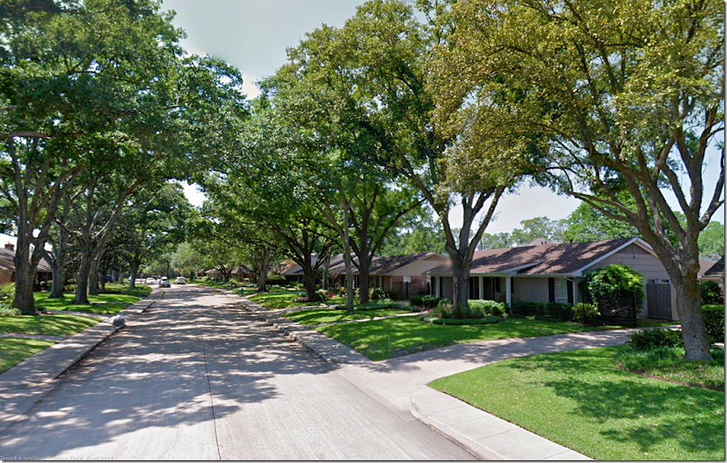
The neighborhood is close in – right outside the loop - with neat, nicely landscaped lots and plenty of curb appeal. Most houses are one story ranchburgers which were built in the early 60s. But like every appealing neighborhood, the smaller houses are slowly being torn down, replaced by larger 1 1/2 story houses. Still, the older houses are charming with front porches and large oak trees that shade the front lawns.
The houses are typically 2,000 to 3,00o sq. ft. and many have been added on to by extending the back family room. The younger set tends to turn the living rooms into the dining room and the former dining rooms become offices or playrooms. The neighborhood is relatively small with only 1,400 houses. Briargrove Elementary is a big draw – it’s one of Houston’s finest public schools. But, going public becomes a problem at the high school level, so families with older children either move out or go to a private school. Despite the high school issue, the neighborhood could not be hotter.
One of my nephews moved into the neighborhood about four years ago and recently his newlywed brother, Jeffrey and his bride Brooke, bought a house right down the street. Luckily it came with a swimming pool for both the brothers’ families to enjoy. The house they bought was in good shape and had been the home of an older art-collecting, single man (something of an anomaly in this neighborhood where families with young children are pushing out all the empty nesters.)
Although the house was quite nice, my new niece had a lot of changes in mind when she signed on the dotted line. Recently I stopped by to take pictures so you could see the before and afters and hopefully get some ideas if you are remodeling and updating a home.
I didn’t get a picture of the outside for some reason, so this is how it looked on the realtor’s web site. It is a typical Briargrove house with 3 bedrooms, 2 baths and just over 2,000 sq. ft. Since there are no children yet, this house should be perfect for them for years and years unless they end up having more than 3 children – then things might get a little tight! The neighborhood is known for its towering Live Oak trees. They are lucky to have three in the front yard.
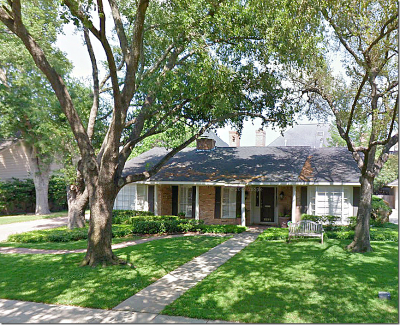
And here is how it looks on Google Maps. So cute!!
When you enter the front door, Brooke has placed an antique pine table and mirror along with a pair of candles on each side. The dining room is to the left and the family room is straight ahead.
BEFORE: This is how the dining room looked with the previous owners. He had installed wall to wall seagrass and art lights for his collection, along with a crystal chandelier. Brooke pulled up all the seagrass because it really was showing its age and needed to be replaced. The former dining room – through the opening - was an office.
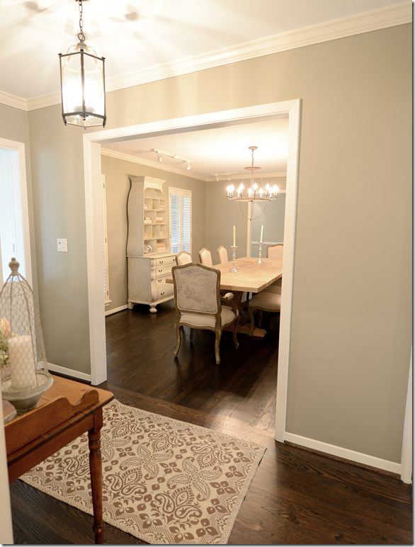
AFTER: And here is a glimpse into the dining room from the entry hall. You can see the lantern they installed in the entrance.
The view from the dining room into the entry hall. Once Brooke and Jeffrey pulled up the seagrass, they installed hardwoods in here to match the hardwoods throughout the house – and then they stained all of it a much darker brown. The walls were painted a light gray throughout, but in the dining room they painted it just a bit darker for effect.
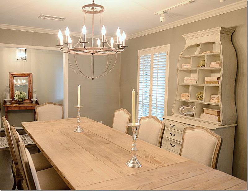
And looking the other direction towards the former dining room. That room will become a study, and then later a playroom – after they install French doors between the two rooms. The fabulous Belgian styled table came from Restoration Hardware and the French chairs with a faded toile on the back came from Zentique. Brooke ordered the chandelier from Ballard Designs.
Though the back of the chairs have a faded toile print, the front is upholstered in linen.
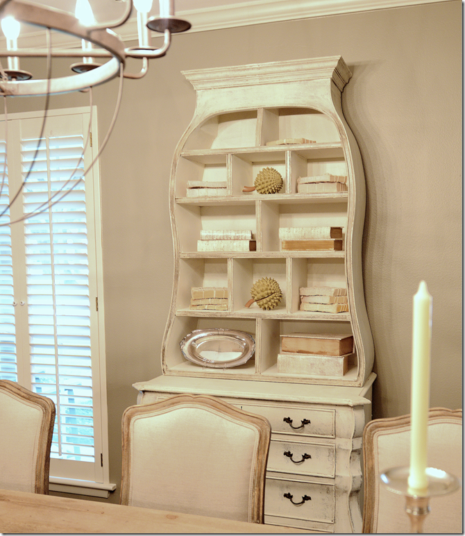
And against the wall is this chest which has been newly painted and fauxed by the great Mr. James Farmer (jfarmer762@yahoo.com or at 713-398-7657.) Inside, Brooke put Tara Shaw’s white books and some string tied books. So cute!
BEFORE: Here is how the former owner had the family room. This side is the original family room and the other side on the left is an addition.
BEFORE: And here is how the former owner had the addition decorated.
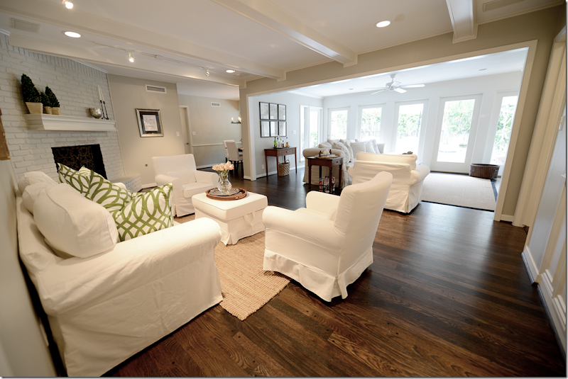
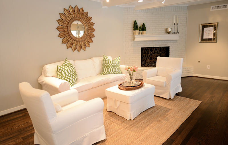
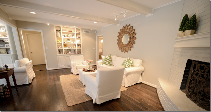
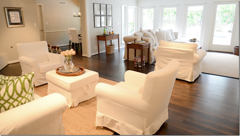
AFTER: Brooke and Jeffrey painted the walls a soft gray (Benjamin Moore Revere Pewter) and the brick fireplace was painted the same color as the walls. Then, they darkened the hardwoods to a much richer, deeper brown. This side of the family room was furnished with the Ikea slipcovered sofa and chairs in white, while the other side has a linen covered sofa.
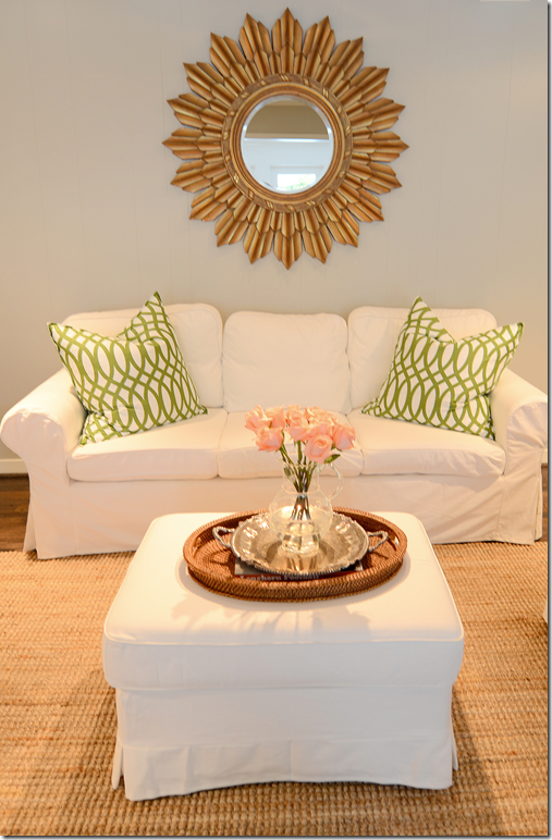
Brooke got the two trellis pillows in green from Z Gallerie to add some pops of color. The mirror came from Ballard Designs. When the newlyweds moved into the house, they didn’t have enough furniture for both sides of the room. So, the Ikea slipcovered furniture was a perfect choice for right now. It is inexpensive enough that it is easy on the pockets of newlyweds, plus it looks stylish. The slips are perfect for babies and puppies - just take them off and wash. One day they might replace the Ikea sofa with a new one, but for now and the near future, it’s the right choice. I still stay this is the BEST bargain in furniture out there!
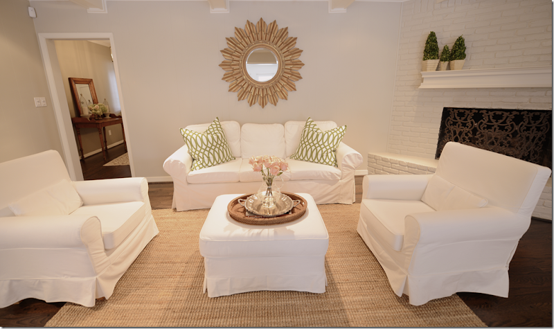
And looking straight on – here you can see into the entry hall. Brooke was lucky the former owner left them a pretty fireplace screen.
Brooke always tries to keep a few roses in her Juliska vase, which she puts on a silver tray layered over a wicker one.
And looking towards the book shelves in the family room. Through the door is the bedroom hall – which also got new hardwoods laid.
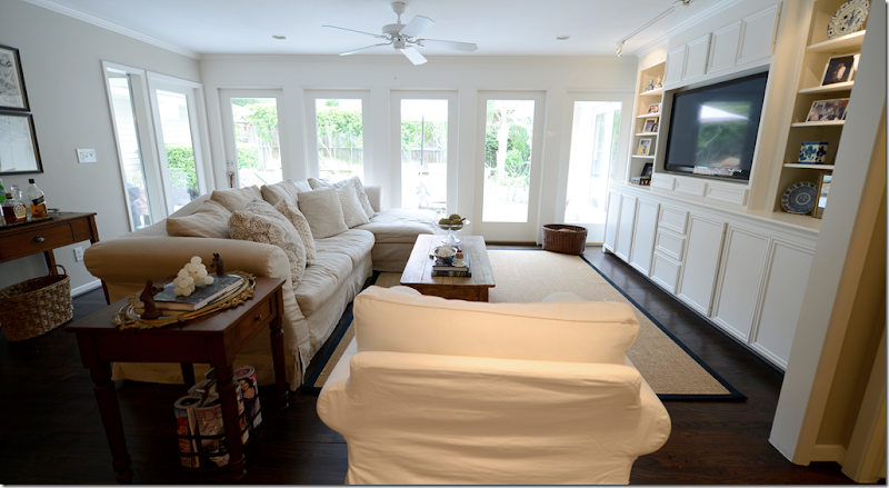
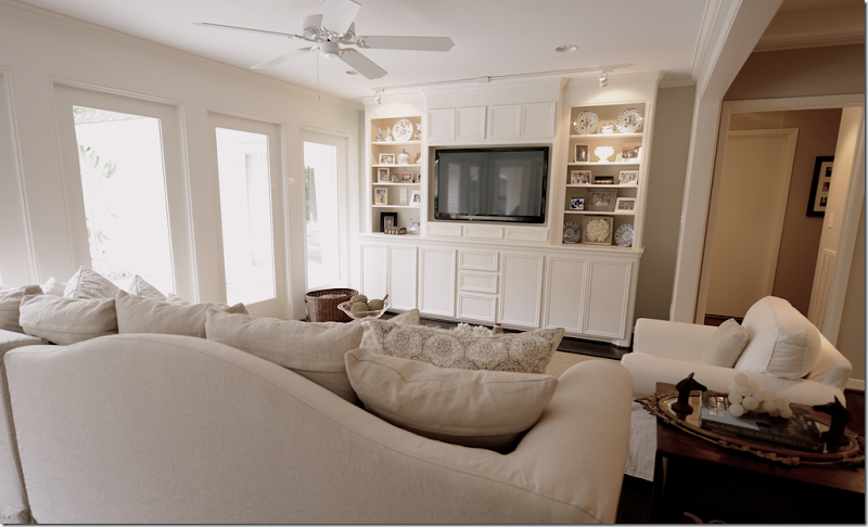
Here’s the addition of the family room – Brooke and Jeffrey added a large built in to house the flatscreen and books.
On this side of the room, they have a linen slipcovered sectional from Halo Styles with gray Les Indiennes pillows in two different sizes from Neal&Co. An Irish antique dining table that has been cut down is used as a coffee table. And that’s Tucker sitting on the sofa! Remember I told you how their puppy Riley got sick and had to be put down? Well, a few months later they adopted Riley’s litter mate and brother – Tucker. And he is soooo sweet! Look at that face! Wait, let me get a close up for you.
Tucker! We can’t wait for this weekend when we get to babysit him for 3 whole days!!!
And here you can see the built-in. Notice how the back of the sectional has a cute arch.
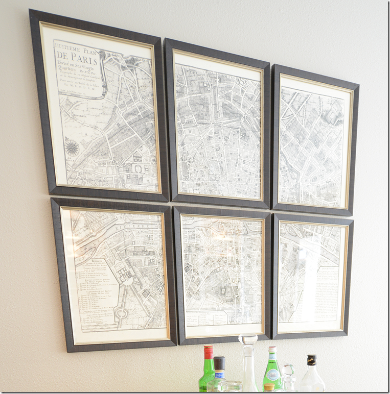
Behind the sofa, Brook added the antique map of Paris that came divided and framed from One Kings Lane. Underneath is their bar, set up on a wood table.
Here’s a closeup of the map of Paris – love this!
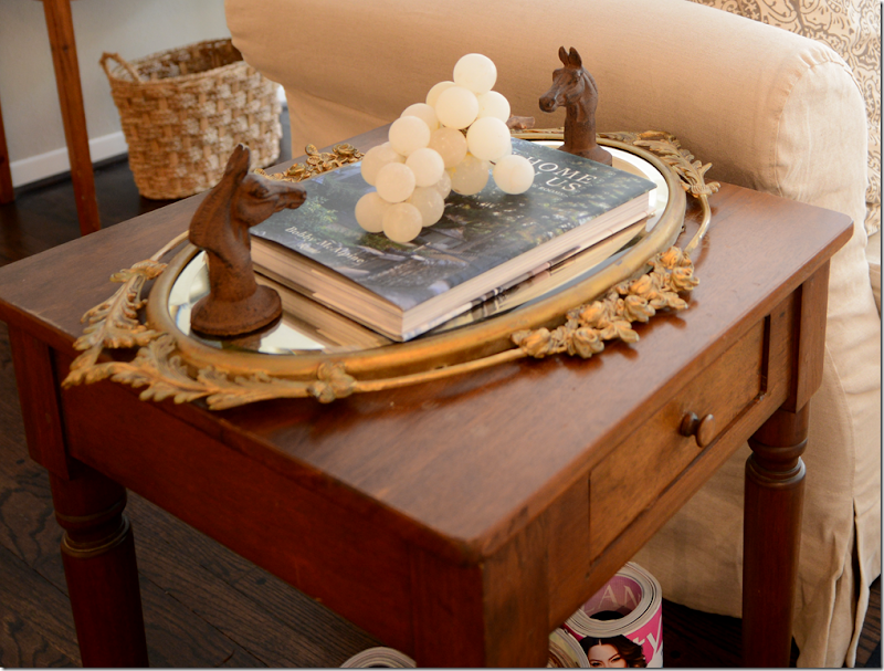
Cute tablescape with a mirrored tray and vintage white alabaster grapes! I spy Bobby McAlpine’s book.
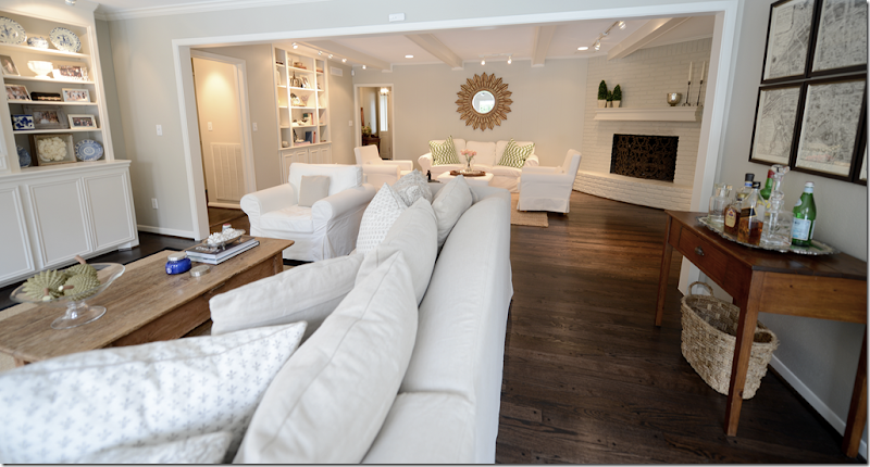
And looking from the addition back into the family room. The layout of the house is really nice – it’s all so open. They can have a lot of people over with these two seating areas. And you can see how pretty the dark hardwoods came out. Before, they were more of a honey tone, and now with the gray walls, the dark woods look so much better.
Raul, my painter and construction man, built the new shelves in the addition – he tried to match them to these shelves that were already in the house and he did a great job. It’s hard to remember those new shelves weren’t always there! Brooke has plans to get bamboo or textured shades for the windows. When you move in, there are so many things to do and buy, you have to prioritize some things and the window treatments are one of those. Not everything has to be done all at once – what’s the fun in that anyway???
BEFORE: Here is the breakfast room when the bachelor lived here. Thankfully he left this great iron light fixture.
AFTER: The breakfast room is past the family room – Brooke and Jeffrey bought the table and chairs at Ikea for their rented townhouse – and it fits perfectly here. Brooke wants to eventually get a round table, but I think this looks great. The chairs are slipped which makes for easy clean ups.
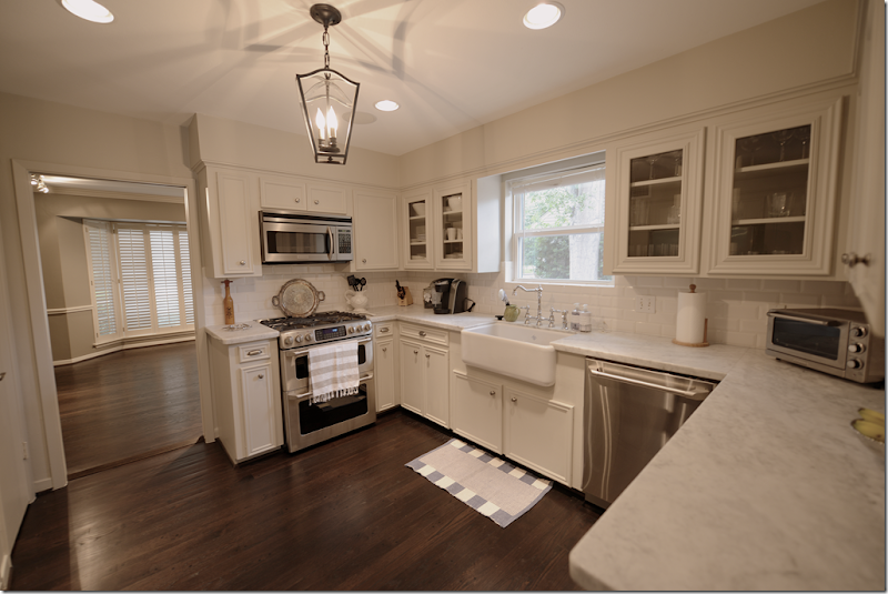
BEFORE: The kitchen as it was when they bought it. This room was probably the most updated – but luckily they had white subway tile as a backsplash to work with.
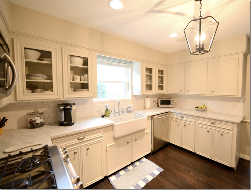
First, the tile floor was replaced with the dark hardwoods, which made a huge difference. Next, Carrara marble replaced the Formica countertops. The Carrara was chosen instead of the Calacutta Ora at a very, very substantial savings. And it really looks great. The honed marble came from Colors of the Rainbow. Next Brooke added a farm sink and a bridge faucet she bought online, along with all new hardware, also at a great savings. She really looked for ways to stretch her budget by buying online. And finally – new appliances in stainless were added.
Other changes were the overhead cabinets got glass doors – Raul just cut out the wood centers and inserted the glass. Brooke added a lantern she bought online which replaced the large fluorescent fixture that used to be there – another huge change. One splurge was the farm sink from Shaw, but then she saved on her fixtures by getting the polished chrome finish instead of polished nickel. You really can’t even tell the difference. The shade for the window is ordered, but hasn’t come in yet. And through the door is the soon to be study and one day playroom – which was once the dining room.
The front room is used as a guest bedroom now. There’s a cute tufted headboard and a crystal chandelier that Brooke ordered on line. The bedrooms all had wall to wall seagrass that truly needed to be replaced – which they did with a flat pile neutral carpet. This aunt begged them to put in hardwoods in the bedrooms too – but her nephew wanted it soft under his feet when he woke up! MEN!!!!!
BEFORE: The bathroom before had all green tile that was original to the house. While I love this particular wall paper, it just didn’t go with the gray paint and hardwoods in the house.
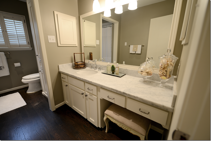
AFTER: What a difference! The tile was all removed – the dark hardwoods went down on the floor and the same honed Carrara marble was put on the vanity, along with a new sink and faucet. The walls were painted a dark gray – the same as found in the dining room.
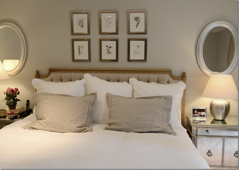
And here is the master bedroom. They got the headboard from Zentique and the night stands from Z Gallerie. The bench came from an online source and it matches the headboard perfectly.
The bedding is white and linen and the two mirrors balance it all out! I didn’t take a picture of their bathroom because it wasn’t changed – luckily it had a nice light gray tile that actually matched the new décor perfectly.
And, I also forgot to take a picture of the back yard, so this is from the real estate ad. They are so lucky that they have this great pool which is a huge plus for Houston’s summers! Next on the list is new outdoor furniture, but Jeffrey got sticker shock while shopping for it. It’s crazy how outdoor furniture can be more expensive than indoor furniture!! Hmm. I wonder if Ikea sells outdoor furniture? I need to look into that.
I hope you’ve enjoyed seeing my nephew and niece’s new house and learning a little bit about their neighborhood – Briargrove.
To search available houses in Briargrove – go to www.har.com – put in the search engine Briargrove AND zip code 77057. Currently, there are just 24 houses for sale – ranging from $375,000 to $1,400,000 for a brand new 5,000 sq ft. spec house.
AND, to read Brooke’s darling fashion blog – Style Wise - go HERE.
We have a winner in the Vero Linen contest! The contest was a great success, so as a thank you for all the entrants, Vero Linen is offering Cote de Texas readers 20% off any order over $300 that is placeddd before September 17th – midnight.
Please use the promo code verocote20 as the code.
After you make your selections, when you are ready to check out – enter the code at the bottom of the shopping cart and then click the update button. This will ensure you get the 20% off.
To visit the Vero Linen site – go HERE.
AND, coming up next, we will have another great giveaway – think coffee tables!!!
A Personal Family Story !
Subscribe to:
Post Comments
(
Atom
)












What a shame they painted the freplace it looked better before in the light brick, but the rest is a definite improvement!
ReplyDeleteWhat a beautiful home. I love how the glass in the cabinets and light fixture in the kitchen really give it some sparkle.
ReplyDeleteBeautiful! Especially love the kitchen remodel. The sink, the faucet, the hardware, the lantern, the counters--everything! I agree with Mrs A about the brick fireplace but, otherwise, simply wonderful. This is a truly lovely home. Need to know: Where did Brooke find that fabulous bed skirt in the master bedroom? Please tell? Joni, thank you for your amazing blog.
ReplyDeletei'll ask her - she told me but i am blanking. well - i have to say i like the fireplace painted! that was my idea too, so. otherwise it would just stick out.
DeleteI second the question, love the bed skirt!
DeleteNice house, so similar to the ones on Meyerland. I will send my pictures soon.
Thanks Joni!
beautiful pictures. good home. website designers bangalore
ReplyDeleteBrooke, Jeffrey and Tucker look like they'll be very happy in their new home for years to come. Their house has wonderful curb appeal but tell Jeffrey to get a pool cover since all those oak trees are going to drop acorns and then their leaves. Thank you for sharing your family's home with us.
ReplyDeleteEnjoy your weekend!
XX
Debra~
well, they are live oaks. they dont really lose their leaves they stay green all year round here! and only the female trees have acorns. i guess he needs to check that.
DeleteWe have the same variety of Oak in our yard - Quercus Virginiana. Saw it in Houston 20 years ago and loved it! We have planted it at every house where we have lived in Southern California ever since. It DOES drop leaves for a week or so in the spring. The new leaves push out the old leaves. It is so quick you hardly notice it. When the old leaves start to drop we spray our trees with a hose and the leaves drop right off. That means just one quick leaf clean up each year. Don't think he will need a pool cover just for that. Acorns come in the fall. We rarely see any on the ground because the squirrels make off with them as they ripen. I suspect the squirrels pick them right off the trees!
DeleteLove seeing change happen!
ReplyDeleteThis is a great house for newlyweds. I love the open floor plan which allows for the accommodation of larger gatherings of friends and family. While I think having all white in every room is boring, the couple has made some really nice improvements to the home, especially the kitchen. The outside of the house is also lovely. This couple has accomplished a lot.
ReplyDeleteTheir home is spectacular. Wow, to be a young couple with a beautiful home like that. Love Revere Pewter. I have it in a guest room and our master bath on the walls and cabinets. Such a pretty greige. Their home is just like one I lived in when I was a child a gazillion years ago in St.Simons Island, Ga.
ReplyDeleteSerene and stylish- great, great job.
ReplyDelete-linda,ny
What a lucky young couple they are - looks like Auntie Joni's good taste rubbed off onto the next generation:-)
ReplyDeletenot really! Brooke has GREAT taste! i didn't help them that much. just with ordering some furniture wholesale, but she picked it all out. trust me. she has better taste than me!!!
DeleteJoni, What a great job they have done with the house!!! So exciting for them to get their first home and work on its transformation. Love the look - and such good bones for anything they might do down the road. Would love to see it again in the future as it unfolds. Thank you for sharing!
ReplyDeleteAs always, you make me homesick for Houston. What a lovely home and the rooms look so much bigger now with the remodel. Fabulous pool too. And I totally agree with the sticker shock on good outdoor furniture.
ReplyDeleteSam
its outrageous!!!! need to check ikea for it.
DeleteThis is the BEST time of year to buy outdoor furniture at a good price. It is the end of the season. Most places are selling their inventory at clearance prices. We bought our outdoor furniture at Lowe's over 10 years ago. We paid $1,000 for a table, 4 dining chairs, 4 lounge chairs and 4 ottomen. All of them have 4" thick box cushions and are a stylish " New Orleans" style.
DeleteEverything still looks great and is in very good condition except the fabric. Since we use them year round here in California, the fabric has faded a little. Not to worry. I am going to refresh the color with outdoor upholstery spray. Should cost about $100. That will hold us another 5 to 10 years.
Just don't wait too long. We bought a house in September once and couldn't find ANY outdoor furniture for it. I don't think there's any at my Lowe's or Home Depot now. Seriously, the Halloween, Thanksgiving, and even some Christmas stuff is already out - there's no room for outdoor furniture!
DeleteThey went to Chair King and just for the table and chairs- it was outrageous. Plus they need 4 loungers and then cushions!
DeleteWonderful..I was mesmerized by the before and after shots...so real and doable.
ReplyDeleteGreat post!
I want to "pin" this whole post! They've done a fantastic job updating this ranch. Lovely neighborhood. So glad they didn't tear down. 60's and 70's ranches have great bones and my favorite floorplans too (I grew up in one in NC).
ReplyDeleteTheir updates are so doable.
Joani, I'd love it if you did a piece on bamboo shades, do's and don'ts, as well as ways to purchase shades affordably? Lovely home.
ReplyDeleteWhile I admit that my personal taste runs closer to the former owner's, I think your niece and nephew did a wonderful job of putting their stamp on their new home. The floors are gorgeous! I wish them many happy years there.
ReplyDeleteJust beautiful! A lovely home for a new couple to begin making happy memories! The dark wood floors are gorgeous, the kitchen updates are beautiful--job well done!
ReplyDeleteLove the transformation Joni. Thanks for sharing all the pictures. Where did she get the nice thick tufted headboard in the guestroom? I could use one of those in mine.
ReplyDeletei think she got that at target!!!!! i will ask for sure.
DeleteJoni, I, too, love the squirrel and acorn print used by the bachelor in the bathroom. Looks suspiciously like the one that Charles Faudree used in several homes. Do you know if it is still available? Hubby's mancave needs a bit of finesse.
ReplyDeleteThe display hutch in the diningroom resembles the Italian one your mother gave you and that you had in your dininroom until recently. If it is the same one, how nice to keep it in the family. It really makes the room.
yes, it is = I think its osborne and little, but not exactly sure. it is an english paper though. yes. good eye!!! that is my piece of furniture that i gave them. we just had it repainted and it looks so fabulous now.
DeleteWhat a great house and beautiful improvements. So glad they adopted Tucker! That's a great solution for those coffee pod things in the kitchen--never sure what to do with those!
ReplyDeleteVery lovely and classic choices! It's ready for some sticky fingerprints and legos on the floor!
ReplyDeleteA lovely home and a lucky young couple. I hope they have many happy years there. Thanks for sharing.
ReplyDeleteFabulous starter home for this sweet couple and their fur baby! Brooke has done some really nice things in this home to bring it current! I love her bedding in the master...any chance you can share the source for that duvet cover? And I look everywhere for those alabaster grapes...I find them in glass in every color it seems but not the alabaster that I really want! Nice find for her! Thank you for sharing. I hope you will keep us updated as the home evolves.
ReplyDeleteim getting the name of her bedding. check ebay for those grapes. they usually have some.
DeleteThis young couple is so fortunate to have this lovely home. And their updates look great. A big thank you to them for allowing you to show us what they have done.
ReplyDeleteok, the bedding is from Kuhl Linscomb - it's pine cone hill. olivine carries it too.
ReplyDeletethe guest room headboard is from target!!
I love it! It's so light and bright. I like how they invested their money wisely in the marble countertops and great kitchen remodel and saved on the Ikea couch. I recognize a lot of their furniture and accessories, and even have some of them myself. It's a great example of how to buy high-low.
ReplyDeleteVery nice home in an ideal neighborhood. My favorite is the room addition. I love what they did with the space. The wall unit for the television and books is great. I also love their color choices throughout the house. And I love a painted fireplace. I hope to see more when they complete the backyard patio. Thanks for sharing.
ReplyDeleteWhat a great post! The updates are wonderful and really this home could be for anyone. I love the fireplace painted and this post has inspired me to do the same to mine. Have been worrying over what to do with it. The floors made such a huge difference. Such a great lesson for all. So nice to see how an older house can be transformed into something so pretty.
ReplyDeleteI can tell she is a Joni Fan, as am I.
ReplyDeleteGreat pictures - especially the"Before & After" shots - that show what a great investment good design can be for newlyweds or anyone who wants to increase the value of a home.
ReplyDeleteWho would have thunk it?I am homesick for Houston! xxpeggybraswelldesign.com
ReplyDeleteLove the house, they are very blessed newlyweds!! Kinda wish my slate was that clean again. Too much stuff in my house!! I painted my fireplace brick and haven't regretted it for a second! Brooke does have great taste!
ReplyDeleteGorgeous! Several friends and family members lived in Briargrove during my youth. I love the nostalgia of your post; it brought back fond memories.
ReplyDeleteJoni, As always a wonderful post. I love all the changes, including the fireplace, and love their Ikea furniture too. Thanks!
ReplyDeleteNice tour, lucky newlyweds! I like the painted fireplace. I had mine painted and the mantle changed to this exact style about 5 years ago. I have never looked back!
ReplyDeleteHi Joni,I just love the before and after pictures...amazing transformation! Can you please share where the lantern in the kitchen is from? And is the beautiful master bedroom bedskirt also from Pine Cone Hill? Thanks, Anette
ReplyDeleteI'll ask her about the kitchen lantern. and yes, it's all pine cone hill.
DeleteThank you so much, Joni, for the information about Pine Cone Hill. Exactly what I was looking for!
DeleteThe lantern in the kitchen is from Ballard Designs.
Deletewhat about the lantern in the front hall way? Also, don't let all those grumps get you down. There are always a few in every bunch. We have been married for 7 yrs, living in Briargrove Park (right down the way from yall) We are constantly updating and changing things since we are on a budget as well. You have a fabulous start to a super cute home!
DeleteWow, kudos to your nephew and niece! Beautiful job!
ReplyDeleteI too love before and after pics and these are wonderful. Such a stylish transformation. Thanks for sharing.
ReplyDeleteThanks, Joni, for sharing this great house. What a lovely home. I live in a rancher as well, and I never thought I could have lanterns because of lower ceilings, but this post has inspired me to reconsider my options. How high are the ceilings in the entry, and where did Brooke get the lantern? Also, I was hoping she would share where she got her bridge faucet and hardware in the kitchen. Thanks for another great post!
ReplyDeleteI will ask her!
DeleteFirst home...wow! Gone are card table and chairs... franki
ReplyDeleteLovely, fresh, stylish! FYI: www.PomPomAtHome.com sells their 100% Belgian Linen Olivier table runner 21x59- 2 to a pack, you place them across the width of the table instead of down the middle, it would allow the beauty of her table to still show through. I just bought a set yesterday, I love the rawness of them.
ReplyDeleteJoni, I love this post because it shares so much of your philosophy. Beauty, simplicity, and taking your time to create the look and feel of your home. And how lucky to have found such a great home in such a great neighborhood.
ReplyDeleteLiz
I love it! Almost makes me long for those newlywed, pre-baby days...now that we have 2 busy school-aged kids, we don't have as much time, energy, or budget for decorating the house!
ReplyDeleteIs the paint throughout the house the same as the den? TKS
ReplyDeleteyes, except for the dining room and guest bath which is darker. but brooke cant remember the name of that paint.
DeleteOrganized but can't remember the name of a paint color - no left overs for touch up - nothing? Amazing.
DeleteJEEZ - Brooke is out of town. Sorry but she doesnt remember the name of it off the top of her head. i'm sure when she gets back on Sunday she can look it up.
DeleteThe dining room, entry and guest bath are Benjamin Moore Rockport Gray which is a little darker than Revere Pewter.
DeleteThank you for this memory trip. Actually, Briargrove was a hot neighborhood for newly-weds in 1970, when my then husband and I bought our first house. It was so exciting to take up the old rugs and have the floors stained, paint the panelling in the "den", and then put up large wooden painted numbers by the front door. I had a fabulous next door neighbor just my age, who had all sorts of fabulous ideas, like having a white Parsons table with wicker fan back chairs, all sprayed white, in her pale lettuce green and pink garden room. I still have some of the furniture that I bought for that house. The trees are certainly a lot bigger now!
ReplyDeleteI think Briargrove stays hot. My oldest brother lived there for about 10 years from the mid-90s on. When we moved to Houston in '98 (with two small tots), we couldn't afford Briargrove, it was so hot.
DeleteMy brother's home was very similar to this one - fun to see the updates!
Ikea does have outdoor furniture, but it seems to only be in the store in the summer--at least around here. Search for applaro for acacia wood furniture or arholma for the woven ratan look.
ReplyDeletebeautiful home! joni, i too searched high and low for comfortable, pretty, outdoor furniture (i live in dallas), so i thought i'd share where i got mine. i purchased pieces of the cabo set from here
ReplyDeletehttp://www.americanrattan.com/r-patiocabo.html.... i loved it that i was able to pick out my own fabric color and it was free shipping and no tax. the company quoted me 4-6 weeks for delivery and i was pleasantly surprised when it arrived in 2 weeks. you can see what it looks like on my patio here
http://pixelimpress.blogspot.com/2012/08/the-backyard-and-pool-reveal.html
What a lovely house and Brooke has done a marvelous job of making it a beautiful home! Thanks for sharing and wishing them a wonderful future in their new home together.
ReplyDeleteLoved this post, they did a great job!
ReplyDeleteLove this post! Love to see a real home on a real budget. The house is gorgeous and homey. They have lots of years to grow into it, personalize it, and add to their family! Great Job Brooke and thanks for sharing! BTW, I too LOVE her bedding.
ReplyDeletesarah
What happened to the crystal chandelier that was in the dining room? Did the former owner take it with him? It was stunning!
ReplyDeleteI think it is hanging in one of the bedrooms. I would have left it in the dining room instead of the cheap Ballard one.
Deleteno = i know! he took that. unfortunately, it was gorgeous. Brooke bought the one in the guest room online somewhere. But come on = the Ballard one is cute! Remember, this is their FIRST home - they have years to buy some stunning chandelier. It just takes a while and lots of money.
DeleteThe chandelier would look so much better if they just changed the light bulbs... 15 watt at the most. It is way to bright.
DeleteEvery 15 watt bulb I have seen also tends to be smaller in size for some reason. Chances are she has 40 watts in the light and 20 watts with a dimmer would be sufficient. I would also suggest personal items in the bookcase/chest rather than books wrapped in white paper with a random silver tray. Why not display some of the nice wedding gifts that may be appropriate. Books wrapped in paper look silly.
DeleteMaybe it's just me but it all seemed so impersonal. So few touches that even indicated that people lived there as opposed to it being a model home. I love personal touches that make a house seem like a home.
ReplyDeletewhat? remember, they have only been married a year. they have just started to collect things! Give them time to clutter it up. Everything they have bought has been really cute and nice. plus = Brooke is really organized and very neat, there are no piles of junk. everything - including the dogs treats - has its own designated place. Now Jeffrey. that's another story. he is not nearly as organized as brooke. my other nephew is super organized and neat as pin.
DeleteBeautiful house. Can you please tell me the paint color for the dining room? Thanks-
ReplyDeleteshe can't remember the name of it. it's like revere pewter but darker. maybe she'll find the can and let us know.
DeleteIt is Benjamin Moore Rockport Gray.
DeleteJoni, I love this but I do have one question about the room with the fireplace (the family room, right?). I would have arranged the furniture to face the fireplace. Is the view from the family room, through the addition, to the backyard a great view? So much that it is the focal point over the fireplace?
ReplyDeleteAs you know, I have trouble with furniture placement - just wanting to learn from a master - it seems like the family room and the addition are a little awkward and difficult to arrange because there's essentially a huge hallway between them. She's done a terrific job with them. Love those Briargrove homes!
well, i'll tell you this - to do that the sofa would be in front of the fireplace and when you walk in the room you would see the back of the sofa and have to walk around it to the kitchen and addition. most people with this same floorplan and the corner fireplace in briargrove just kind of ignore it. i think the placement is correct. any other way the furniture would be weighted too heavily on that one side. plus there isn't that large of a walkway between the two areas. the original room is quite small - this is why they all extend the family room. it's tiny. in the backyard there is a pool, so yes, the view is great. if the room was bigger - perhaps they could have worked in the fireplace, but the furniture is in the correct place. there was a big discussion if the new shelves should go on that side or the other shorted side, ,but in the end, dealing with the sun and space, the shelves were right and that sofa faces the shelves, not the back yard. thanks for asking!
DeleteEven before the family room extension, the corner fireplace seems to be in a very awkward location. (@#$% builders!) However, if it were my home, I would have the couch facing the fireplace with a sofa table behind it. A good decorator can find appropriate additional seating for that area. Perhaps it is my Swedish heritage, but to me a fireplace symbolizes "hearth and home". Can't imagine having a fireplace that is not both used and enjoyed.
DeleteIt's Texas. They aren't going to be building fires.
DeleteBravo! It,s polished and beautiful. My kids are getting into their first homes so this type of post is of particular interest to me. Earlier this year I gave my daughter an outdoor sofa and chairs from Overstock. It's probably not the forever stuff but it's good looking and fit the budget.
ReplyDeletei THINK that is where she got her bedroom bench from. overstock, i could be wrong, but i think that is what she said. i know she shops overstock, i love it too.
DeleteThank you, I will check out Overstock!
DeleteThis is great and so happy for them but I live out of state. I lived in DC and Virginia for several years and now farther south. It seems y'all use a lot of white and gray. Do all the homes look alike? I am not judging just curious. It seems designers in Dallas and other areas do more colors or I guess a variety of looks.
ReplyDeleteno!!! I just personally love that look so i suppose i show it more. my sister's house has gorgeous oranges for instance and not much white and it's beautiful!!! so - no, just me. But it is a look that is def popular here. I'm not alone. Before Brooke didn't have those pillows but she wanted more color so she added them. I think she will continue to add bright pops of color as time goes on. change out the pillows in the addition, for instance. she could do a beautiful peach taffeta silk drape in the dining room. or a bright pattern on the windows and it would totally change the look in there.
DeleteConsider that this home was listed for close to $600,000. They did a lovely job on the redo. Real estate is high in Houston.
ReplyDeleteI have no idea what they paid for that house but if it was under 6k, it was a good deal for the area and the house itself.
DeleteAnd the $375,000 is LOT value only. HAR is listing homes to live in starting at $499,000 for Briargrove.
ReplyDeletethat 375 is pending - but it is completely livable and is kind of cute. someone could redo for under 100k and make it fabulous. but most houses are around 5, 6, 7 for the old ones.
DeleteI know how important it is for young married couples to get their financial feet on the ground, but rooms full of Ikea with poorly constructed slipcovers is not the way to go in my opinion nor is having every piece of furniture done in white.
ReplyDeleteUpon close inspection, these slipcovers look poorly fitted to the chairs/sofa, etc. that they were made for. Why is that?
I would rather see empty spaces adjoined to others that are well executed with investment pieces than rooms full of Ikea white sofas without any other medium or color to ground the decor. It is a home with lots of potential. Unfortunately, poor design advice and the impetuous spending of the owners have made it just "so so". It could have been so much more.
oh come on! they lived with no furniture in that part of the house and i encouraged her to get the sofa. it's only 349! so for under 1k they have a room full of cute, stylish furniture, plus it's practical because of the slips and comfortable too. the sofa in the addition is linen - not white! and that was pricey- but they paid wholesale for it. it's a great sofa. one day when they need to - they will update the other side, but for now, the ikea furniture is beyond good. my daughter has it too in her apt. i would buy it if i needed to furnish something right out of box. i wish they had had when i got my first apt.
DeleteIt's too easy to criticize Ikea. My mother in law always tells me how we are lucky to have it. When she was young there was nothing available in the moderate price range except for very ugly tat. At least Ikea is more attractive tat and serves its purpose. I have some Ikea but I do prefer not to buy too much of it and just leave some spaces empty. So, my living room has a sofa and not much else. Waiting to find some classic english arm chairs for a song on ebay (I prefer Ebay/craigslist to Ikea personally -much more interesting and some great deals available if you can wait and know what you want).
DeleteDarling home
ReplyDeleteWhat a great home for these newlyweds. I am not fond of IKEA slips as they always look messy BUT totally understand the need right now. They tackled some very expensive projects. Zentique and Halo are 2 of my faves and they did well there (perhaps with a little help from Auntie?). They will personalize and make it more 'homey' as they grow together in their years and travels. I think it is a lovely start and they are certainly blessed to have what they have!
ReplyDeleteyes, i ordered the wholesale furniture for them - of course!!!!! it's a starter house, but truthfully, they could live there until they are empty nesters. it's open and warm - with that pool = its perfect.. one day they could even convert their garage into a playroom and just build a porte cochere for the cars - many in briargrove so that.
DeleteI decide to collect some blog related to interior design, furniture blogs to get some new idea how to properly implement those design for me. So I think your blog will help me lots.
ReplyDeleteJust amazing post!! What a nice interior design. I am so surprised. Thanks a lot for sharing. I'll visit your site again.
ReplyDeleteI am so surprised after visit your post. Its really amazing interior post. Thanks a lot for sharing. I'll visit your blog again.
ReplyDeleteThey are excellent conformers!
ReplyDeleteoh stop! you are too much! conforming. now be nice.
DeleteYes, I too agree. Conforming to "auntie". Where does your poor nephew entertain his guy friends for an afternoon of football - on those lily white sofas?
Deletewondering where you have been? you will have field day with my next post - im going to show a room i designed. get your knives ready.
Deletei told you - the sofa in front of the tv is not white - it's linen. and its a slipcover which you just put in the wash machine and it's clean.
and same with the lily white sofas - just put it in the washing machine and it comes clean. why so hard to understand?
oh and by the way - my other nephew doesn't have a white sofa or chair or anything white in their house. ok? it has nothing to do with auntie. brooke likes that look.
Delete"you will have field day with my next post"
DeleteCan't wait to see one more house filled with gray walls, white slipcovers, seagrass, kaboo chairs, faux antiques, - we know the drill.
"i told you - the sofa in front of the tv is not white - it's linen"
We know it's linen, but since when did "linen" become a color other than in your world of white?
oh and by the way those slipcovers from Ikea don't fit properly now. What are they going to look like after they are washed and put into a dryer for an hour?
DeleteThere is not a single original idea or gesture in the entire house. It's The Stepford Ranch.
DeleteI tend to agree except that I give some slack to the fact that this is Joni's family so what else could we have expected except the same design advice that we have seen over and over. I know that young married couples need to spend their money wisely and try to make at least a five year investment in some kind of decor. Unfortunately, instant gratification ruled the day in this instance. This is a great house and the young couple have made some good improvements to the bones of the house. It saddens me to see the same old same old white/gray/slip/ boring decor that we have seen so many times before when with a bit of patience, the couple could have had a more upscale design. Interior designers are suppose to give some long term advice, but in this instance the advice appears to have been buy, buy and buy without much evidence of an overall design plan.
Deleteok, first off - for the 89th time, i did NOT decorate this house - AT ALL. Brooke did it all herself. period. if she likes white - what do you care? what's it to you? so what if you see it on the blog at lot, you also see leather furniture a lot too. and dark furniture and tuscany decor and faux english decor, on and on - you pick what you like and go with it. who cares if its seen a lot here? what difference does that make to their life? they barely ever even read my blog. i am really offended at you instant gratification statement. Really - who are you to tell them NOT to get a sofa and chair to fill up their home until they can go out and buy a George Smith sofa? how long would you consider a couple should have an empty house before they finally buy something they can AFFORD????? They bought a beautiful sofa, a gorgeous dining room table, wonderful dining chairs, a nice headboard. They have a great start on life with a beatufiul house and darling furniture. Sorry that it's not up to your standards or taste. But i doubt you have a house that they would like either. There was no instant gratification - they wanted to have a place for their family and friends to sit down when they come voer and not have to wait years to do so while they save to buy an appropriate to you sofa. What nerve ! REally! They have a large family and entertain a lot - hosting mothers day and fathers day - they had a shower for friends, another night party - so what, they arent supposed to sit down??????? They may never replace their Ikea sofa = i have no idea if and when they will. i kept my junky starter sofa for 10- years!!! and my sister in law has it now.
DeleteThis is just really insulting. First, that you assume i did the decor. I didn't. Brooke did it all. I gave her a few things that I had and she isnt even using them. I gave her a blue and white striped rug that she doesn't want. so. please. she did this all herself. she picked out her own table and sofa and chairs. i just helped them ordering it. i had nothing to do with the decor. and i explained that she wants to add color, which she will - like she did with the pillows. she will add color here and there if she wants. maybe she wont .
They had no interior designer giving them long term advice. I would never give them long term advice. I only suggested she might buy that sofa/chairs and she had already decided to do it herself. thats it. and there has been no buy buy buy attitude. they have been married a year and they both had apartments. and there are a lot of things they are waiting on.
Jeez. this really gets me upset. people are so judgmental.
Joni,
DeleteI can't believe the nerve of Mr.A- (hole)
What a judgemental,ignorant, nose too high in the air human. Does he think all newly weds have tons of money? And if they did they can buy whatever they want, it doesn't have to be expensive. Life is not about material things, and in the end, when your old and dying, all you'll have is going to be in one little bag beside your hospital bed. Or maybe for you, your'll be burried on your a-hole sofa!
ridiculous comment. first of all. if you would like your criticism to be taken seriously, how about sharing your name? or even just what styles you prefer? I don't see the point in posting multiple comments that don't really give anyone anything to think about or add to the discussion.
Deletesecond, I am a newlywed myself and I think its great that they are starting out with such a clean look. it reminds me of the various posts on sally wheat's home..this is such a great starting point for evolving style. they can enjoy it as is or add color and new, more expensive pieces as they grow and discover what they like.
This is a great post, as usual. It's deja vu for me since we moved into our 1960 ranch 30 years ago and never left because we love the house and the location. But what a difference with all the new decor! I love it. Would it be possible to draw up a rough floor plan to show how they "repurposed" the rooms? A house is an ongoing project and when you live in it so long it's hard to visualize any other way. I appreciate that they didn't use the most expensive of everything and it still looks great.
ReplyDeleteOh, a floor plan, however rough, would be great! Please, Joni? Their house looks great and I love that she didn't just stuff it with things. They can accumulate over time. It looks so clean, easy, bright and comfortable. Thank you for sharing!
Deletewell, not sure how i can do that now - but
Deletesee the front door - you walk in and immediately to the left is theh dining room and then the empty study. you can see them in the front windows.
now, in the entry hall - going straight, past the dining room - is the family room. you can see in that picture where the entry door is. the fireplace is to the left and the shelves are to the right.
directly across from it is the addition - which you can see in the pictures.
where the fireplace is on the left side of the family room - past that is the breakfast room - and then behind the fireplace wall is the kitchen. the kitchen connects back to the empty study.
it's a typical plan.
and at the front door - on the right side are the bedrooms - all three are line up one after another down a hall. the master bedroom is the last one and the french doors window leads to the pool.
hope this helps!!!
J
Dinining Room Furniture :
ReplyDeleteNice post. I was checking constantly this blog and I’m impressed! Very helpful info particularly the last part I care for such information a lot. I was seeking this certain info for a long time. Thank you and best of luck.
http://www.decorise.com/diningroom-furniture-s/1921.htm
Back again to look at this gorgeous house.Really, what more does a family need- the spaces are all useful, the light is amazing.....Great job!!!Love.
ReplyDelete-linda
Oh, your nephew lives two blocks away from me! We have lived in Briargrove for 8 years and in two different houses. Moving multiple times within the neighborhood is common - everyone loves it so much. The big draw is all the kids playing in the front yards. My kids can run to any number of neighbors to play (and I'm sometimes surprised to find a bunch of kids in my playroom). Your niece has wonderful taste - her house is beautiful! Thank you for giving us a peek inside. BTW, Ikea has some nice outdoor furniture. If they have a covered patio, they can consider the Kubu-like Byholma/Marieberg chair. I'm still pining for the World Market "kooboo" chairs your featured over a year ago. They can also wait for the Holiday Shopping card to get some discounts on outdoor furniture at Restoration Hardware. I'm waiting to buy my dining room table then. Thanks for a great post, Joni.
ReplyDelete-Catherine
Catherine! hi~ everyone is moving there. i was talking with a friend and both her kids moved there. same with another one - they waited for months to find their house and bought it before it went on the market. and now both my nephews. their 4 yo daughter has a lot of friends - some are older - and now she drives her "car" down to Jeffrey's to see tucker and go swimming. it's great that they are together. he lives on chevy chase. in fact, you can see his house in that picture.
Deleteabout the kooboo - try http://www.artesiacollections.com/ they have the chairs for cheap. it's wholesale, but they usually will fill any order. if not i could order them for you.
Thank you!
Delete-Catherine
Check out Amazon for the outdoor furniture. I got some that I know they still carry that is a dead ringer for what I wanted in the RH catalog. It's held up really well over 5 Texas summers.
ReplyDeleteI will tell them!
DeleteHi Joni!
ReplyDeleteI truly enjoyed seeing this post!!!!!!! She did a fabulous job, didn't break the bank, and I am sure with some advice from you...... It is wonderful to see these type of homes not destroyed, but if they had good bones..Designed to enhance them instead......It also shows you can get that "Houston" look and not have 16 ft ceilings.....Very Very Nice!!!!!!Thank you! Maryanne xo
Lovely redo. Would love to know the name of the darker paint color. Thanks for sharing.
ReplyDeleteSo clean and serene! I want my house to look like that!
ReplyDeleteJoni, when I read Briargrove, I thought that sounded familiar so I looked in my old address book. Sure enough, my brother and his wife lived on Olympia when they were first married! My brother is a contractor in the area and completely redid their house. However once the little ones started coming they outgrew the space and a few years ago build their dream home in the Greenwood/upper Kirby (I think it's called!) area. He bought the lot years ago and had the old brick ranch torn down. I think often times there's too much house for the lot size in these neighborhoods but folks seem to like it that way.
ReplyDeleteYour niece's house is just gorgeous; very charmingly done and I hope they will be very happy there! I wish some of my young relatives would take MY decorating advice; they just want to do it all by themselves!
Wow so beautiful house looking so gorgeous. Thanks a lot for sharing. I'll visit your blog again.
ReplyDeleteLovely home!!! Where is the sunburst mirror from???? I did not see any comments on that.. I LOVE IT!
ReplyDeleteGreat job!
What a beautiful home! I love it. Do you know the white paint used for the built-ins and fireplace?
ReplyDeleteI have one of those sofas and I love it. It is really comfortable, and plain. I think the slips look good.
ReplyDeleteI too , have Ikea sofa's and they are great. I have 2 kids jumping all over them and they are white slips. I just bleach and they look good as new.So fresh and young looking.
ReplyDeleteIt's a fantastic home!! So happy for them.
Love your blog, Joni. This is a beautiful home, and thanks to your niece for sharing it. I do have one question: I'm getting ready to repaint and am looking at Benjamin Moore paints in the same color range as the Revere Pewter, but I'm getting stumped as to which white paint color to choose for the trim. Who knew there were so many shades of white? Anyway, I'm going for a similar look as this home, and wonder if you would mind asking your niece what is the name of the white paint she chose for the trim? It would help me a great deal.
ReplyDeleteBy the way, you have tens of thousands of fans and more, so don't let a few rude critics get you down. Some people can be unbelievable snobs. That kind of rudeness and self-importance just means they have other unaddressed issues. Too bad for them.
Wow...they have done a lovely job!!!! It is beautiful.
ReplyDeletegorgeous home! do you happen to know who stained the floors or have any other recommendations for someone who would do a good job? ours could DEFINITELY benefit from going a couple shades darker. [we're in briargrove as well]. thanks!
ReplyDeleteJoni, do you mind asking your niece what paint color she used on the trim to go with the Revere Pewter? Thank you!
ReplyDeleteJoni,
ReplyDeleteWow, what a great style Brooke has. I'm so impressed with young adult's first houses. Not sure we had the same fabulous resources these newlyweds have these days. Thanks for sharing this, very fun.
Karen
I love it, Joni! It is just adorable. I'm so glad you shared this with us. They have wonderful taste, just like their aunt.
ReplyDeleteI can't get over the transformation. Such a good job!!!
XO,
Sheila
Oh, please thank your nephew and his bride for sharing with us.
ReplyDeleteXO,
Sheila
Thank you for providing such great info and service. More power to you!
ReplyDeleteHi Joni,
ReplyDeleteI have tweeted this post and have used it as a reference for my own new home that I'm getting ready to paint. Do you or Brooke remember what color trim she used? I am trying to decide between BM Simply White and White Dove with Revere Pewter walls, so I thought I'd ask.
Thank you! Gorgeous home and great styling!
Awesome. That's the real beauty of well design furniture for your home and outdoor areas.Its definitely going to leave a good impression on your guests.I really liked this furniture.This gives the opportunity to customize your living space to suit for unique taste.
ReplyDelete__________________
Patio Furniture Dallas
I just picked out Revere Pewter for my open concept home over in the Oak Forest area! Do you by chance know what color paint they used for the trim, ceilings &/ built ins? We are doing a bead board ceiling in our living room and I am trying to find something crisp and bright that will complement the Revere Pewter.
ReplyDeleteBTW, I just recently stumbled across your blog. Thank you for all of the wonderful inspiration. I know what I like but don't know how to piece it altogether into a cohesive design and this blog has been helpful in teaching me. --Christina--
Wonderful post you have here by approaching viewers through your best content with great
ReplyDeleteknowledge. Thanks
carrara mosaic tile
Do you know what color they used for all the trim...there are so many whites.. ABSOLUTELY BEAUTIFUL HOME :)
ReplyDeleteDo you know where she found her kitchen knobs and pulls? I have been looking, and I cannot find any that I like.
ReplyDeleteThanks!
Also, can you tell me where the bed spread in the guest room is from ? I LOVE it.
ReplyDeleteTHanks,
Stephanie
I just came across this blog post and was stunned by some of the negative comments. This home is gorgeous!! Every last detail is perfect (including the painted fireplace and fabulous Ballard chandelier in the dining room). The clean lines and flow are timeless. Ignore the trolls.
ReplyDeleteHi nice blog thanks for sharing ,Searching for fully furnished office space for rent we will provide you the genuine office space
ReplyDeleteI like the content of this blog. Lovely information can be seen in this blog.
ReplyDeleteQuality Beds and Mattresses
your thoughts and way of writing blog is really impressive.. i must appreciate your work. Online Beds and Mattresses shop
ReplyDeleteSo Clean and Crisp...I love it! I have been looking for a warm dark hardwood stain, can you post the brand and shade they used please?
ReplyDeleteHi Joni,
ReplyDeleteThank you so much for this beautiful post! Your niece and nephew are so kind to allow us a peek at the inside of their spectacular new remodel. It has given me great inspiration for my own home remodel. Would your niece mind sharing the paint color she used on her trim? We are painting the main areas of our house in Revere Pewter but can't decide on a trim color. Thank you and your family again for allowing us a peek at their private space. It's stunning!
Sincerely, Cara
Mind Bird Solutions is a proven website design and Development company that is customer centric, is focused on long term stability, and has a leadership team of seasoned web services professionals.
ReplyDeleteWebsite design company Bangalore
Thank you for providing such great info and service. More power to you.......................
ReplyDeletehttp://mindbirdsolutions.com/Web-Design-Bangalore.aspx
This comment has been removed by the author.
ReplyDeleteSherwanis in Bangalore is a symbol of rich traditional fashion with imperial grace and stylishness. Sherwanis in Bangalore associated mostly with weddings and special occasions. Sherwanis in Bangalore be sign of the rich traditional fashion style of India. Sherwanis in Bangalore available in fabrics like cotton, tussah, silk, crepe and often have style work like kudan,embroidery,pearls,beads,zardozi and stone work. Sherwanis in Bangalore can be found in any color or any fabric.
ReplyDeleteSherwanis in Bangalore
empower the online presence of a particular product or service in more identifiable way
ReplyDeleteWeb designing Bangalore
To create the model and design of the entire web page layout.
ReplyDeleteWebsite designing Bangalore
manage your resources and information in an efficient and organized manner
ReplyDeleteWeb application development
manage your resources and information in an efficient and organized manner
Web application development
to provide single window service to our valued customers starting from property search till possession
ReplyDeleteReal estate Bangalore
Real estate agents offer home sellers........
ReplyDeleteNitesh Chelsea
From fabrics ranging from brocade to terry wool…
ReplyDeleteOnline shopping for marriage sherwani
Enclosed by basic amenities along with few special Amenities….
ReplyDeletePrestige kew garden
Prestige gulmohar is perfectly blending the highest level of aesthetics with the most optimal application of practical design..
ReplyDeletePrestige gulmohar
Hmmm..except for the bedroom (btw whoever commented that newly weds don't have a lot of $$, those headboards are very expensive so I don't buy that for one minute). This house lacks character. There...I said it. I much preferred the 'before' to the 'after'. This looks childish all white washed with no character, almost insipid. Very "I ordered all my stuff from Ballard Designs" type of decorating, uninspiring. Sorry..this fell flat.
ReplyDeleteEcommerce Development Bangalore shopping cart software is use to enable you to sell your products to your target market international. Ecommerce Development Bangalore is can either be utilize as an self-sufficient piece or as a part of an ecommerce website development tie together .Ecommerce Development Bangalore is factor of higher reach to people across the world is tall when it comes to Ecommerce. Ecommerce Development Bangalore is because of the facility of internet, the geographical and demographical reach of ecommerce is more. Ecommerce Development Bangalore in order to master the ability to realize how to make money through your E-Commerce website. Ecommerce Development Bangalore is consumers from all walk of life obviously are drawn to stores in the piece and mortar world that are nicely festooned and agreed.
ReplyDeleteEcommerce Development Bangalore
This comment has been removed by the author.
ReplyDeleteThis comment has been removed by the author.
ReplyDelete<a href="http://www.therapedicindia.com/premium%20mattress/Mattress-in-Bangalore-Therapedic-India.aspx”/>Luxury Mattress Bangalore </a>
ReplyDeletePre launch Salarpuria sattva east crest designed to perfection with clear-cut specifications and modernity in mind.
ReplyDeletepre launch Salarpuria sattva east crest
Salarpuria sattva east crest of the most coveted ones is its excellent location linking it with all significant landmarks of Bangalore.
ReplyDeleteSalarpuria sattva east crest
Salarpuria Sattva East Crest is placed in an area which is very suitable for the IT professionals.
ReplyDeletepre launch Salarpuria Sattva East Crest
Salarpuria Sattva East Crest city has been intentional by warm with and coincident single-minded engineers.
ReplyDeletepre launch Salarpuria Sattva
Offers stunning lake views and luxurious apartments …
ReplyDeleteProjects in Begur Road
By yoga classes can change your physical and mental capacity quickly, while prepare the mind and body for long-term health.
ReplyDeleteyoga classes
By yoga classes can change your physical and mental capacity quickly, while prepare the mind and body for long-term health.
ReplyDeleteyoga classes
Apartments for sale in Bangalore…
ReplyDeletepre launch sobha green acres
Helpful recommendations you shared about hotels
ReplyDeleteluxury hotels in bangalore
Prestige Woodland Park located in Banaswadi Bangalore that offers a luxurious living space.
ReplyDeletePrestige Woodland Park
I want to get across my admiration for your kind-heartedness giving support to those individuals that need help on this particular area. Your special dedication to passing the solution along ended up being quite helpful and has consistently permitted i…
ReplyDeleteBr Hills
I want to get across my admiration for your kind-heartedness giving support to those individuals that need help on this particular area. Your special dedication to passing the solution along ended up being quite helpful and has consistently permitted i…
ReplyDeletePre launch Salarpuria East Crest
I want to get across my admiration for your kind-heartedness giving support to those individuals that need help on this particular area. Your special dedication to passing the solution along ended up being quite helpful and has consistently permitted i…
ReplyDeletePre launch salarpuria east crest
I want to get across my admiration for your kind-heartedness giving support to those individuals that need help on this particular area. Your special dedication to passing the solution along ended up being quite helpful and has consistently permitted i…
ReplyDeletePre launch sobha rain forest
I want to get across my admiration for your kind-heartedness giving support to those individuals that need help on this particular area. Your special dedication to passing the solution along ended up being quite helpful and has consistently permitted i…
ReplyDeleteSobha golden quadrilateral
Puravankara city of gold project designed very carefully over the 75 acres of land with ultimate features so preciously.
ReplyDeletePuravankara City of Gold
Purva City of Gold has been to create the perfect home for a modern design.
ReplyDeletePurva City of Gold
Puravankara City of Gold- is varied use of development project by Puravankara positioned at Kanakapura Road.
ReplyDeletePuravankara City of Gold
Prestige Woodland Park is wonderfully landscape, centrally located apartment in the prime residential area of Bangalore.
ReplyDeleteprestige woodland park
Prestige Woodland Park is a unique architecture and graceful design in a green location.
ReplyDeleteprestige woodland park
sobha aspirational homes Bangalore anticipated that would spread over 82 sections of land and this township will be a lodging alternative for around 6000 families with accessibility of 1 BHK and 2 BHK lofts.
ReplyDeletesobha aspirational homes
Paint colors in each room please? Is whole house Revere Pewter?
ReplyDeleteWhat is the name and color of hardwood floors?
The 6000 units here have been manufactured in an enormous space that falls in the section of 645-1210 sqft.
ReplyDeletesobha dream acres
Prestige Song of the South is all around orchestrated only adjoining the NICE Ring Road which relate entire inward and outer bit of the city.
ReplyDeletePrestige Song Of The South
Sobha Dream Series which is ideally arranged in the midst of Bangalore's Golden Quadrilateral, with the spread more than 81 areas of area.
ReplyDeletesobha dream series
sobha Dream series duplexes are made in stunningly arranged four story structures.
ReplyDeletesobha dream acres
us tax singapore substances outside of the customary budgetary administrations area with operations both in and outside of the United States.
ReplyDeleteus tax Singapore