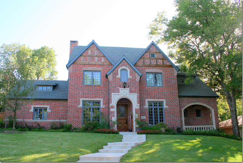
When we first started this contest, Randal Weeks, owner of Aidan Gray, said we would have two winners – 1st and 2nd place. Instead, he picked six houses: 1st, 2nd, and 3rd, along with 3 runners up!!! The 3rd place house – pictured above - is, along with the 2nd place house, located in Texas. Although this house looks older from the outside, it was built in 2010! It sure had me fooled! I think it was the arched porch to the right of the house with the balustrade that tricked me, along with the brick work, especially on the gables. The house is built in the Gothic Revival style, characterized by its steep pointed gables and arches.
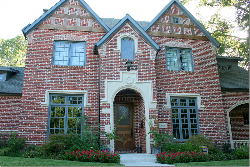
Such a pretty façade! The trim work is painted blue – a color that runs through the interior as well. The house is located on a corner where the side street is the alley. That’s another reason why the house looks old – there’s no front loading garage and no driveway - two features which I wish we could return to. Notice the Gothic styled leaded glass in the front door and the window above it – so pretty!
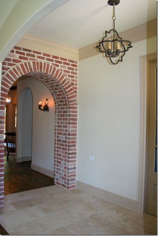
Entering through the front door, there is a limestone foyer. Off this space, there is a library to the right and the dining room to the left.
And looking the other direction, past the brick arch. The family room is at the back of the house and the master bedroom is reached through the arch on the right, past the sconce.
The blue paneled library faces the front side of the house and there is a door that connects to the arched brick patio with the balustrade. This color blue, like the outside trim, is found throughout the house.
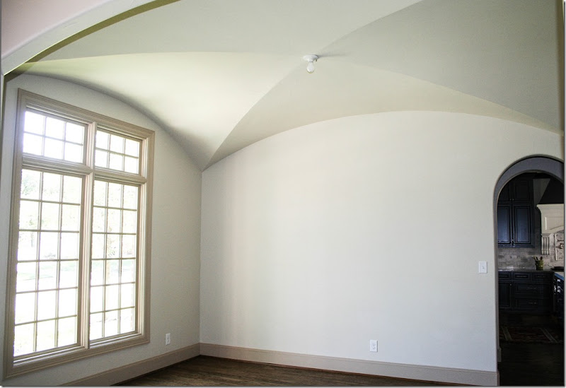
To the left is the dining room with a groined ceiling. It also overlooks the front street. Through the arch is the butler’s pantry and then the kitchen. When entering the contest, the owner told me that the house was still being furnished. They are taking their time to do this – and as everyone knows - it’s a long progress to decorate an entire house!
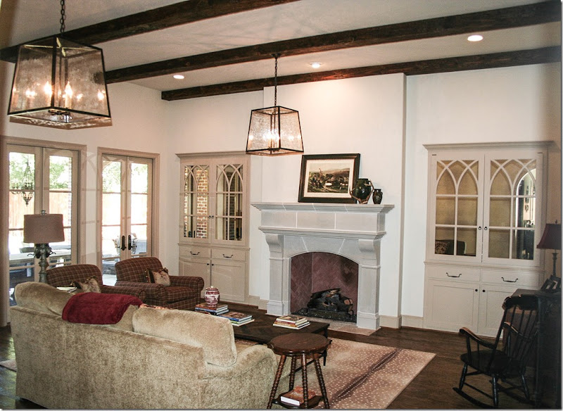
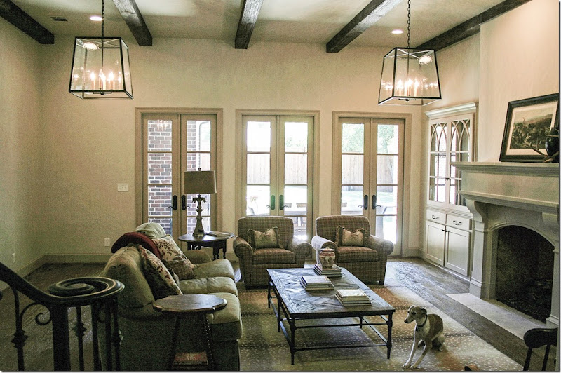
Facing the back side of the lot is the large family room. The fireplace and bookcases are the focal point of the room. Using gothic styled arches on the antiqued mirrored bookcases is a great idea! The flatscreen is truly hidden behind the doors and mirrors which are wonderful design elements.
Along with a wood beamed ceiling are two large lanterns. Love the antelope area rug. At the back, a trio of French doors open to the covered porch.
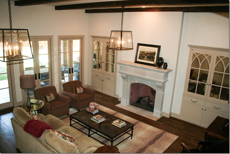
And a view looking down to the space from the staircase. There floors are a pretty, dark, hand scraped wood, which adds much texture.
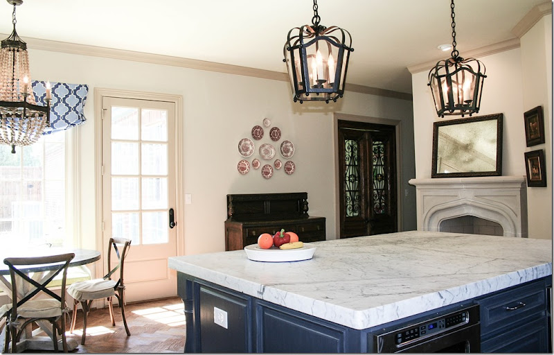
Off the family room is a back hall that leads to the kitchen. These gorgeous wood doors look like antiques. I’m not sure where they lead to – perhaps a playroom and the garage. Notice that the plank floor has changed into a herringbone pattern.
And, the back hall, looking the other direction towards the breakfast area.
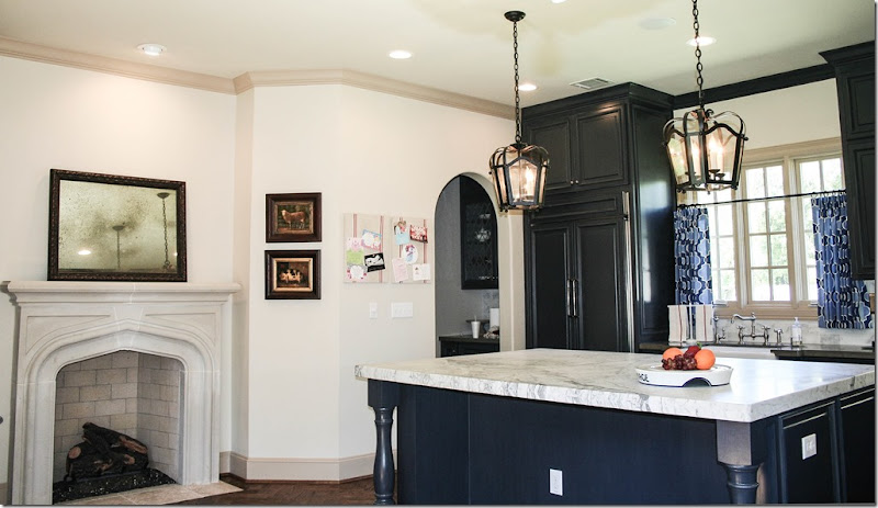
Once you are in the large kitchen/breakfast area, there is a fireplace with a gothic styled pointed arch.
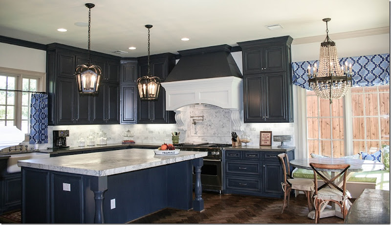
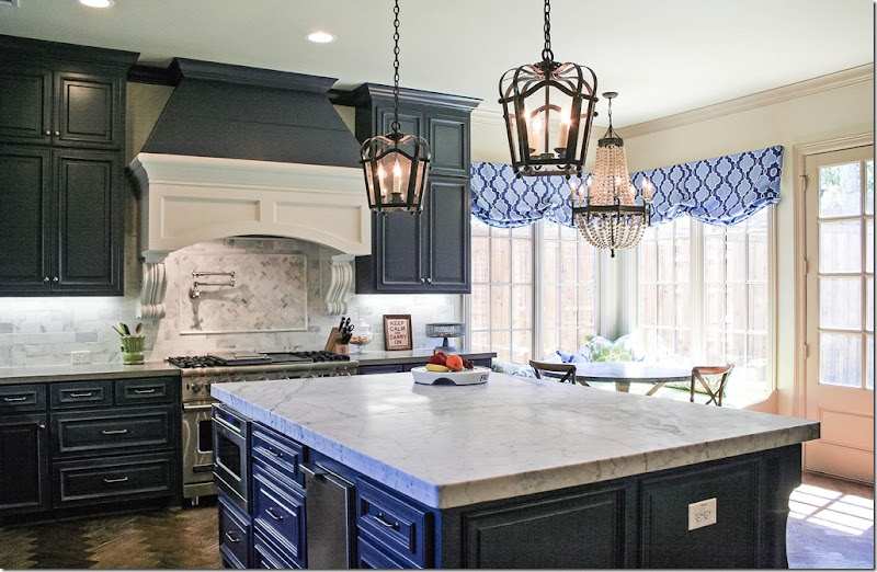
And here is the view of the kitchen and breakfast room. The cabinets are painted blue – like the woodwork in the library. Window shades and café curtains are in shades of blue and white.
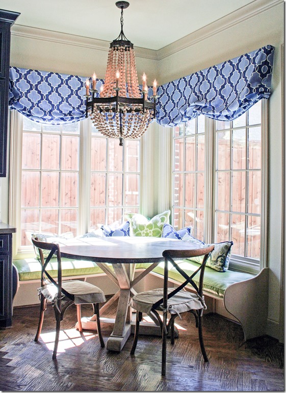
Marble countertops and subway tiles of marble is a nice accent with the dark blue cabinets. Notice the beautiful hood over the range, and the two lanterns over the large, expansive island. There is a chandelier over the breakfast table.
The dining room is through the butler’s pantry where the arch is. I love the fireplace in the kitchen! One day, that would be a great place to put a chair next to it.
And looking towards the side yard. I believe those wood doors lead to the garage, but I think there is another room there too.
And the breakfast table is tin topped with a cute banquette in green. The pillows are all blues and greens together. Love the herringbone floor. And obviously – so did Randal. This kitchen is the room he wants to photograph!
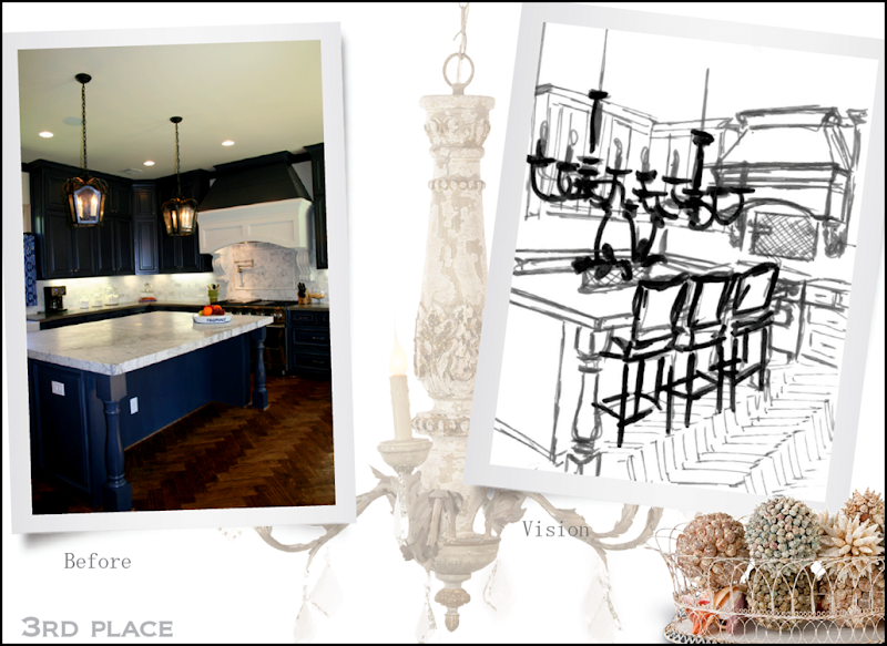
Here are Randal’s plans for the Aidan Gray catalogue. He’ll place two chandeliers over the island and add the bar stools and some Aidan Gray wire baskets. Can’t wait to see how this room looks with all the Aidan Gray merchandise in it.
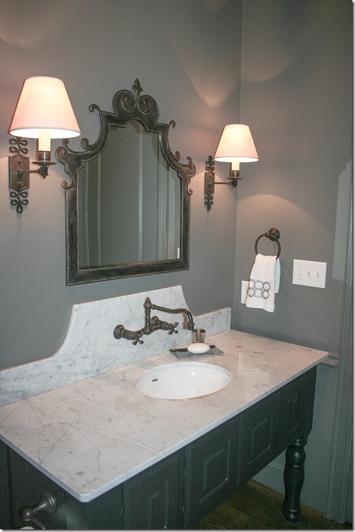
The powder room – I love this! White marble topped vanity with beautiful sconces and black mirror. Love the faucet on the marble – that is so European looking. Love this!
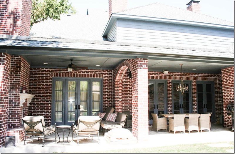
Outside, there is a large brick walled patio with arches and an outdoors fireplace. On the right, is the family room which leads to the outdoors dining area. On the left is the master bedroom which leads out to the fireplace and sitting area.
The view of the outside dining area – cute table and bench with wicker chairs.
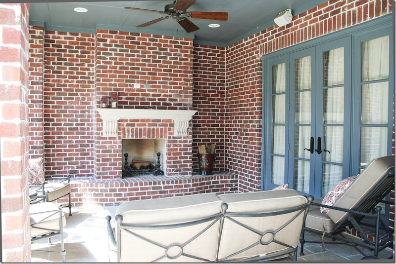
And the outdoor fireplace, which leads directly to the master bedroom. The blue paint, found inside, is carried through to the outside also.
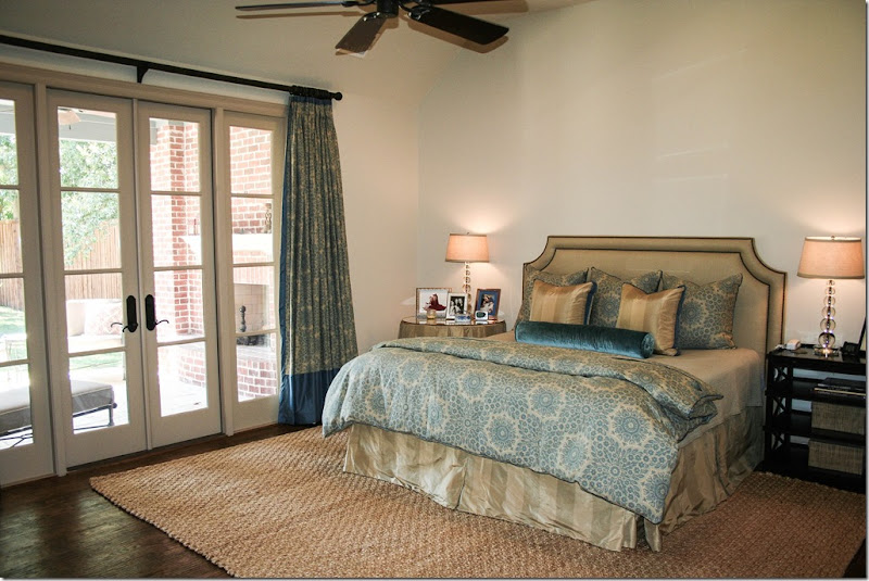
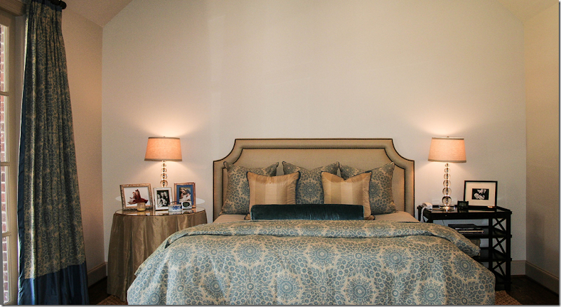
The master bedroom, which overlooks the outdoor fireplace and patio.
This room is furnished in taupes and blues. Very, very pretty – love the color combination.
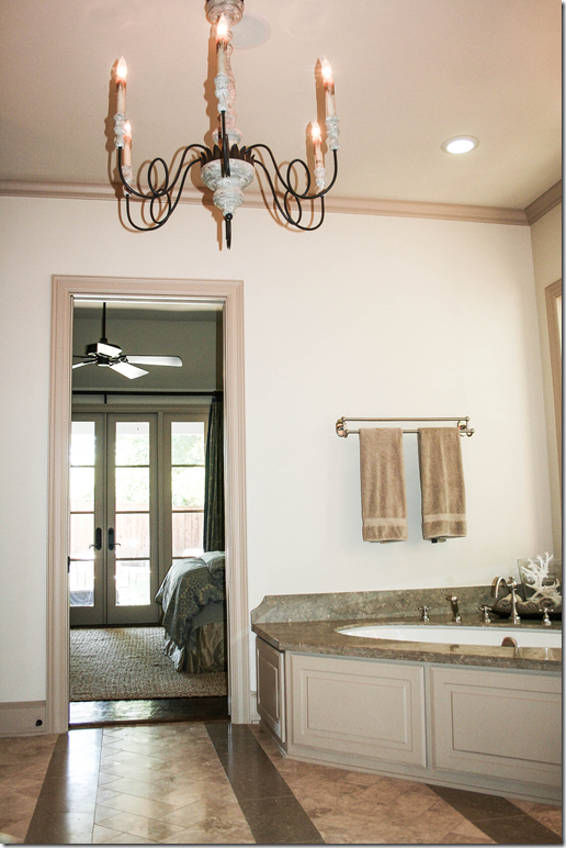
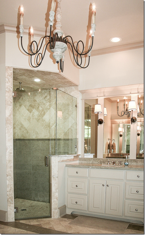
The master bathroom with a corner tub and wooden chandelier.
There’s a vanity on each side.
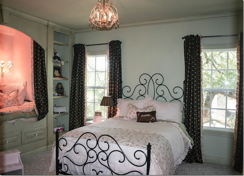
Upstairs, the daughter has a darling bedroom with a European styled bunk.
The room has black accents – found in the star fabric and the curvy headboard.
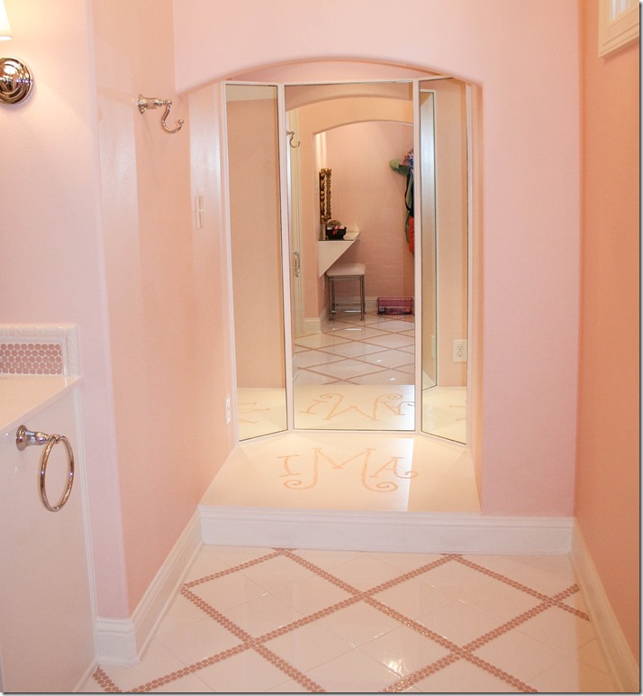
Her bathroom is especially darling in pink and white tiles. I love her mirror – with its stage and her initials spelled out in tiles – what a monogram!! Darling!
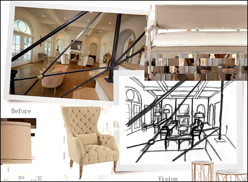
So, now – we have the 1st place house in Louisiana where Aidan Gray will use the living room and window wall and the master bathroom:
1st Place: the living room vision, taken through the iron stair railing.
1st Place: The same room, along the French windows.
1st Place: the last photograph will be in the master bathroom, which Randal will convert into a salon.
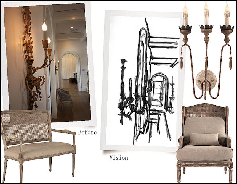
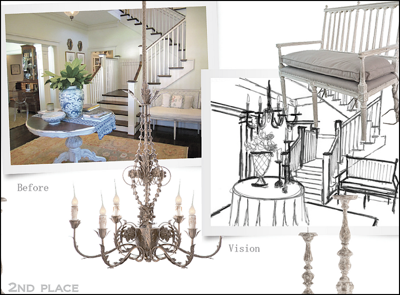
2nd Place: In this Texas house, the entry way grabbed Randal’s eye. He’ll change it up with all new Aidan Gray furniture – so excited to see this one shot!
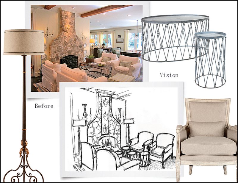
2nd Place: next, the keeping room, by the kitchen and breakfast room with its Texas style limestone fireplace, will be the setting for another photograph. French painted chairs will replace slipcovered ones, along with new lamps and sconces and tables.
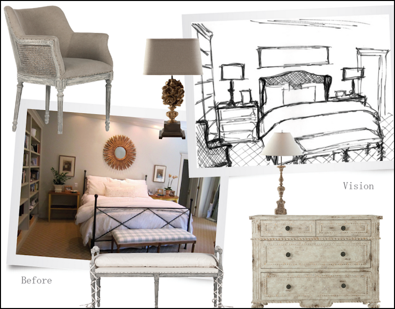
2nd Place: master bedroom will be filled with chests and chairs and a bench, along with lamps and mirrors all from Aidan Gray.
And finally, 3rd Place: another house in Texas was chosen for its blue painted kitchen and white marble countertops, along with its herringbone patterned wood floor. Randal will bring in chandeliers, bar stools and accessories.
So, there you have it! Next we’ll look at the three runner ups, and then we’ll start looking at all the other entries for the contest.
AND FINALLY – SOME HELPFUL BEDROOM TIPS:
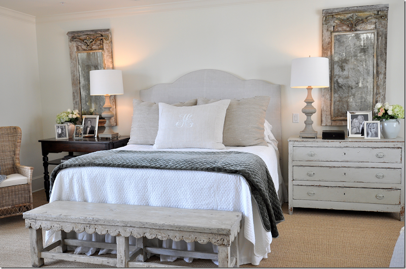
Beautiful bedroom designed by Ginger Barber
Cote de Texas sponsor Vero Linens has created a few videos that you might find helpful:
The first video is called “How to Stuff a Duvet Cover” HERE
Next: “How to prevent your Down Comforter from slipping inside your Duvet Cover” HERE
“When is it time to replace your Down Comforter” HERE
“How to make the perfect Bed” HERE
“Decorating with Throws” HERE
and last, “Making your bed with a Coverlet & Duvet” HERE
I’m going to watch “How to keep your comforter from slipping inside your duvet!!” That one drives me crazy!!!
Thank you Steve of Vero Linens for these videos!!









I can’t get over what stunning homes your readers live in and so big! This is so exciting to see and I personally am glad I didn’t have to chose between these homes I could have never picked just one either. Thank you to all the readers who were so willing to put their gorgeous homes out there for us to see.
ReplyDeleteXXX
Debra~
I agree! Thank you.
Deletewait until you see all of them !!!!! you will die!!! even the teeny guest houses are to die for! there is one in Mexico I can't wait to show! and several guest houses in the hill country that are fabulous!!! - soooo cute!! and mansions and a castle!!!!!!!!!!!!!! in oklahoma!!! so many different houses and each one something special. two in houston - actually about 5 in houston that didnt' win but could have!!! oh, i can't wait to go on and on and on.
DeleteIf this house came in third, it will definitely be interesting to see the houses that didn't place. Mansions, castles, guests houses -
Deletewe are anxious indeed to see the losers.
I would love to have this home! Beautiful!!
DeleteI suppose it would depend on what other options you had. There are some really funky things in this house like that ultra small entry way with the stone floor that butts up to the hardwood. It would have made more sense to have used only one material there. The heavy black cabinetry in the kitchen would be enough for me to never want to cook again. The seagrass in the bedroom is cut way too short for the room. Clearly the owners did not use a designer in this home, but built it and moved the furniture they had into the existing spaces to work in the short term. It's hard to believe that an architect designed this home or even specified some of the materials because they are so disconnected in the general flow of the home.
DeleteDidn't they say this house was built were there are older homes. Most older homes have small lots so I'm guessing there just wasn't room to do a big grand entry. And clearly you are not up to date on what is hot in design. Several big designers have done blue kitchens and this one with the hood is stunning! Clearly, Aidan Gray agreed. And I have to say, I think they definitly used a designer. There is just too many uniuqe items like the fireplaces and armoires and the mirrors in the master bath for them not to have. And all that gorgeous lighting! You have to have a designer to help with that! As for the furnishings...didn't the homeowner say she was working on getting new furniture? I don't know what your home looks like but for me and my friends we would love to have what she has now!I think they did a great job on the house!
DeleteAmy, I am a designer and happen to understand quite well what's "hot" and what's "not".
DeleteI try to steer my clients away from "trends" so that in five to ten years they are not lamenting expensive decisions that were "hot" at the time but had no lasting quality. An entry way and/or foyer is the first impression that guests receive upon entering your home. It sets the stage for everything else. This "foyer" if you can call it that falls miserably short. There is nothing unique about any of these limestone fireplaces. Research houses for sale in your area and you will see multiples of these in French/English homes. We have seen them many times on this site in other homes. You don't need a designer to help you select lighting nor to help select fireplace styles. This would have been done by an architect if the owners had one. Perhaps having all the answers at your finger tips, you might address the curious placement of the fireplace in the kitchen.
Anonymous...you are a designer and you don't help your clients picking light fixtures? I don't know what kind of designer you are but I'm an interior designer too and we help clients with light fixtures, paint colors, building custom pieces along with fabric, etc...so I can definitly see where this home would have used a designer and I think they did a great job! As for the fireplace in the kitchen...are you kidding?! Who doesn't want a fireplace in the kitchen?! You put a chair or bench there and it is becomes a great little nook. As for the flow...I find it refreshing to see a kitchen NOT open to the great room. Reminds me of the great homes of the past. Many people would love to have this home so why are you so bitter? Prehaps your home did not get chosen? Sorry, but I think this is a gorgeous home, so does Joni and most importantly Aidan Gray does.
DeleteBut you go ahead leave us a link to your website so we can see your work or post some pics of your home so we can all learn from your greatness!
Kelly, first of all I did not submit my home. While the potential to win $5000 of Aidan Gray is certainly an incentive for someone, the idea that in exchange for that you must have a photo shoot in your home would certainly not be appealing to me.
DeleteI stated that you "don't need" a designer to select lighting as many homeowners would be quick to tell you. I never said that as a designer I do not help clients with those selections. My observation about this home was that they may not have had a designer and could have selected many of the fixtures themselves. I will repeat that many architects also do this, i.e., Bobby McAlpine for example. Of course, to the extent that a client insists on or needs help with selections outside the scope of what is expected by a design firm, my firm will give them as much help as possible including the selection of sheets and towels, if necessary.
As to the fireplace in the kitchen - you again have misunderstood the comment. My comment was on the peculiar placement of the fireplace, not that a fireplace was in the room. Most fireplaces no matter what room they are in are typically centered on a wall so that as you say a "bench" or seating area can be arranged around it. This fireplace is inches from a hallway/walkway on one side.
I never addressed the flow of the house only to the extent that a walkway was next to the fireplace. I have no idea where the kitchen is located vis a vis the library or great room and made no comment on that. I hope you are a better reader of your contracts.
Beautiful home inside and out....well done!
DeleteAnonymous Designer, I'm with you.
DeleteThis contest was brilliant. Picking additional winners is also a great idea. I cannot wait to see the catalog.
ReplyDeleteGorgeous home and love all the blues. These homeowners have excellent taste and so do you for picking this house as an Aidan Gray winner! Cannot wait to see the finished rooms a la Aidan!
ReplyDeleteYou are kidding, right?
DeleteEvery place you see blue on the facade should have been limestone for an authentic Gothic home.
The inside is a collection of trends, each one trying to outdo the other. What's with the awkward fireplace placement in the dining room? This home truly needs an Aidan Gray touch.
I'm afraid I'm with you on this one. Aiden to the rescue!
DeleteWell, I think you are wrong! The outside of this house has just the right touch of limestone which I'm sure is not cheap! I think this house is beautiful and I can see why Aidan Gray chose it. It has some really great details...I love the limestone fireplaces and antique mirrored armoires. Clearly this home owner has a great design eye and I'm sure with time it will all look gorgeous!
DeleteLimestone fireplaces - do you like the one sitting on the end of a wall next to a walkway in the kitchen? That one, while nicely designed is certainly in an awkward place to say the least. It looks like an after thought.
DeleteSaddened every time I see a beautiful home with dreadful foundation plantings. This is obviously a builder's special!
ReplyDeleteUntil the garden is 'done', it would look better taking out the builder's plantings & letting the lawn go straight to the house. Plant a vine to creep up the bricks near the front door. Many castles, country houses use this 'style'. Edith Wharton included it in one of her books.
Of course they have Pleasure Grounds further from the home. Removing 'ugly' improves the whole without spending another 'red cent'.
No matter the interior, once you've lost them at the Garden.......1st impressions do matter.
Garden & Be Well, XO Tara
Tara honestly every perspective you put forth is colored by your profession. You cannot be objective or rational when posting on gardens/landscaping.
DeleteThe size of the planting may indicate a number of things, i.e., the desire of the owner to keep it simple, low maintenance, not allocating a budget for landscaping in proportion to the overall budget of the house. You have no idea whether this is a builder's house or not. Please go back inside your hut with its vanishing threshold and let others decide how and why they landscape as they do. It takes years for a garden to mature. You should understand that, but obviously do not.
After browsing through your blogs for the first time, my guess is you think everyone should have the flea market look for their landscape. Let's all buy every last piece of crap from the local flea market, paint each piece some ungodly color, throw it out on the lawn and call it a day. :(
DeleteTara, I have been surprised several times by the tone of your posts on this blog. Whether intended or not, your comments often seem rude and "know-it-all-ish". Those sharing their homes with us deserve better. When posting in the future, please consider your own advice; "Removing 'ugly' improves the whole".
DeleteGarden & Be Kind, XO Spike
"...a beautiful home with dreadful foundation plantings."
DeleteFalse. Tara, you're doing your reputation no favors with comments like that.
These homes are so fabulous! I can't believe how gorgeous they are already! The extras from A. Gray will complete them.
ReplyDeleteNancy
Powellbrowerhome.com
Joni I am so excited to see the Aidan Gray magic worked in these fabulous homes.
ReplyDeleteLove and Hugs
Karena
Art by Karena
$75 NOVICA Giveaway
Adore seeing this peak into the winners homes + Can't wait to see the others, I know they are wonderful also. Thank you to everyone! xxpeggybraswelldesign.com
ReplyDeleteThis is a fabulous house. Regarding that antelope rug--I put antelope in our bedroom in Houston in 1990. It seemed like a big investment at the time. Not in hindsight: In 1999, I had it taken up, and bound into area rugs that I moved long distance to NY with me. Those area rugs are still going strong. I have seen our antelope recover completely from both hot chocolate and red wine spills, that were discovered and blotted fairly promptly! I have admired it in very traditional room settings from the 80's and in very modern current room settings--somehow it always looks right.
ReplyDeleteWhy would you want to hide a beautiful home with vines. Please don't put vines up the walls of a house. They just take over. I have lived in several homes with vines (fig and boston) covering some wall or several and they require constant trimming. Love the look HATE the work.
ReplyDeleteI think the plantings are great and in time will fill in and be beautiful. I like the way foundation planting do just that cover the ugly concrete foundation.
Can't wait to see the rest of the homes and these after Aidan Gray does their magic!
Joni, This is a beautiful home and they did a wonderful job making the outside look like a historic house. I especially love all the light fixtures.
ReplyDeleteThis Third Place home is a very lovely home. As you noted, the owners were taking their time selecting their furnishings. I think this is refreshing. They will be able to find items that they truly love. Obviously, some Aidan Gray furnishings will be fabulous in this home. It is a brave homeowner that will open their home to the WWW. Isn't this where many of us find inspiration? Joni, I bet this was a very enjoyable project. Thank you for sharing all of it with us.
ReplyDeleteLove the kitchen, especially the floor and breakfast nook. Question: Is there a driveway in the back of the house accessed through the alley or do they park on the street and lug everything through the front door.
ReplyDeleteCan't wait to see more!
I love seeing the hand drawn sketch of the design plan they would be using....its a beautiful homes and I can see why they would use it.
ReplyDeleteSuch a great idea to use these homes in the Aidan Gray catalog.
ReplyDeleteSo nice that you got to collaborate with them in selecting the homes!
Thanks for sharing. Can't wait to see the catalog when it comes out.
(P.S. Loved Bonnie B. and she sure loves you too, Joni!)
:)
the homeowner sent in this comment to answer your questions and mine:
ReplyDeleteWe moved into the house in 2011 - and with two little kids, I am waiting to finish furnishing the house when they get a little older, and I'm also waiting to do things as I can afford then too. I want it done right so it will take time. Here are the answers to your readers questions.....
The antique doors are from Germany from the 1700s. The doors lead into a playroom. My office and a mudroom are beyond that and we have a back garage off of the mudroom. The kitchen table top is zinc. (I MEANT TO SAY ZINC - NOT TIN!!! - JONI)
The yard is not builder grade...we went with what we felt looked best with the neighborhood same goes with exterior of home....the houses in our area are much older & we didn't want to go overboard with cast stone. And of course there is the cost of doing it all! Oh, if only money didn't matter!
This is such a lovely home, and I fell in love with it at first glance. I showed the top photo to my husband and asked him what year he thought it was built. He studied it for a moment and said, "1920's. Is that in Redmont?" He is in the real estate appraisal business, so I was delighted that he thought it was a fine, older home in an upper-income part of our town. Truly beautiful! Just wondering; what's written on the wall in the girl's bedroom?
ReplyDeleteIt appears to be from "The Princess and the Pea;" is that correct?
DeleteLoving looking at all these wonderful homes. Can't wait to see more. Thanks!
ReplyDelete...a beautiful house...a lovely home...inside and out...blessings laney
ReplyDeleteI've always wanted a bedstede but I think I won't be able to have that when I'm married. I'd rather have it in my daughter's or son's room.
ReplyDeleteI thought I would leave my first comment. I don’t know what to say except that I have enjoyed reading. Nice blog, I will keep visiting this blog very often.
ReplyDeletePersienner
Wow! So many comments. I have actually had the honor of walking through this home with the Designer. I think all designers know that no picture can capture the true "flow" of the space. I can honestly say that the picture of the Entry does it no justice. In photo's everything looks so much smaller, because it is hard to hit all of the appropriate angles in a home. This is a truly beautiful home. What I love about this property are all of the design elements not shown. A hidden dress- up room in one of the girls rooms, the play room behind the antique doors off the kitchen, the wine cellar in the entry between the dining and living you pass as you walk thru the foyer. Again, the photo's do not do the landscape justice. The home is set on a beautiful hill and as it is a new build the landscape is still growing. As a designer myself, it is very hard to create such a wonderful atmosphere with young children. This is a truly captivating home while inside, and I will say from a designer stand point I am a little shocked by some of the feedback. This home won third place, and I feel a designers work should be respected even if there is a difference of opinion.
ReplyDeleteWhat a lovely home, thank you to the homeowner for entering/sharing and Joni and Aiden Gray for the contest! After Joni's first post on the selection thought process I can see why this house fits the bill besides the fact its gorgeous. At first I thought the kitchen fireplace was weird but after looking at it, I could imagine sitting at the island with a glass of wine. Plus I never trust the perspective of photos on the internet. Ditto for the landscaping, I am sure it is very attractive and well sutied to the home and neighborhood. I love the fact the homeowners take their growing family into consideration and are taking their time furnishing it carefully with what they love and with quality. Cheers!
ReplyDeleteOooo! What a great home! I love the kitchen and the back patio as my favorite places in the house though it's all pretty awesome! So many striking details from the rustic floors to the great lanterns and fireplace in teh kitchen. I'm in love with all of the homes from your readers and am so thankful they've shared their spaces with us~
ReplyDeleteLove the tips on styling and links at the end of the post as well..it's really good for people like us that don't really know what to do! :)
I'm thinking that it might not be such a good idea to share our vacation place after all...it just isn't up to par with all these other beautiful interiors!
Joni, I had computer issues the other day so couldn't comment because I couldn't get the edit to work. Hope this goes through today.
ReplyDeleteThis has been great seeing all of these lovely homes and how Aidan Gray plans to use them in their catalog shoot. That one is going to be perfect, and I love the breakfast room area where they are going to shoot. What's so amazing about this house is that it looks like it must blend seamlessly with the older homes in the neighborhood. And I think the owners are so smart to take their time with the furnishing. The things I took time buying are the things I still love. So I understand this completely. Would love to see this beautiful home when it is finished. Thanks so much to you, to the gracious homeowner, and to Aidan Gray for sharing this project with us. It's been a lot of fun to see the homes, and this one was as wonderful as the others. Can't wait to see the rest.
You have good command on the topic and have explained in very nice,Thanks for sharing, I have spent a lot of hours searching for information about this and reading your articles in your blog has helped me a lot in understanding what the topic is all about.
ReplyDeleteWood columns