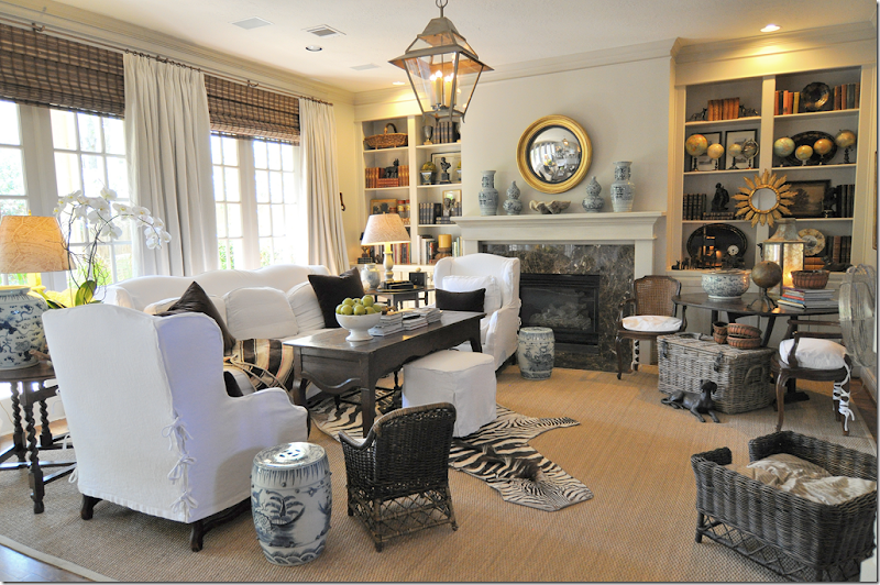
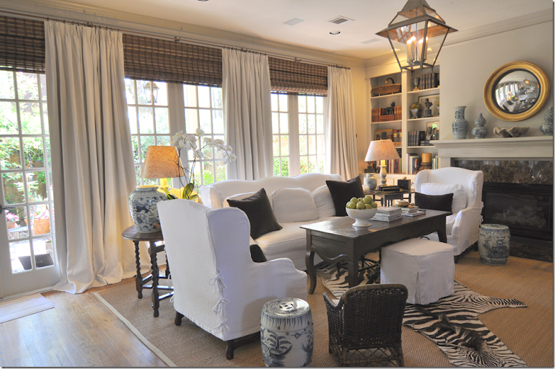
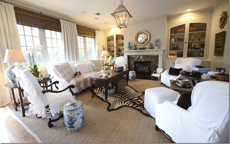
Whenever I show pictures of my family room, I always get the same two comments. The first is – why is that chair blocking the fireplace? You should move it!!
Yeah, I know…it just doesn’t really fit. So, whenever I took pictures of the room, I would try to hide to hide the fact that it was in front of the fireplace.
I would take pictures of the room from a different angle so it didn’t look quite so bad. Also, I would try to push the sofa back a little and the chair too, but, the truth is, the chair is just really too bulky and there is no hiding that fact.
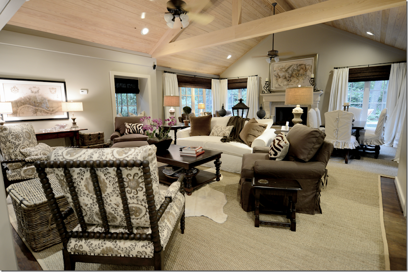
The second comment I always gets it that the room isn’t balanced. The right side of the room feels too light when balanced against the left.
It’s not like I don’t KNOW all this!!! I do, believe me! But what to do? Ben didn’t want his TV blocked by furniture.
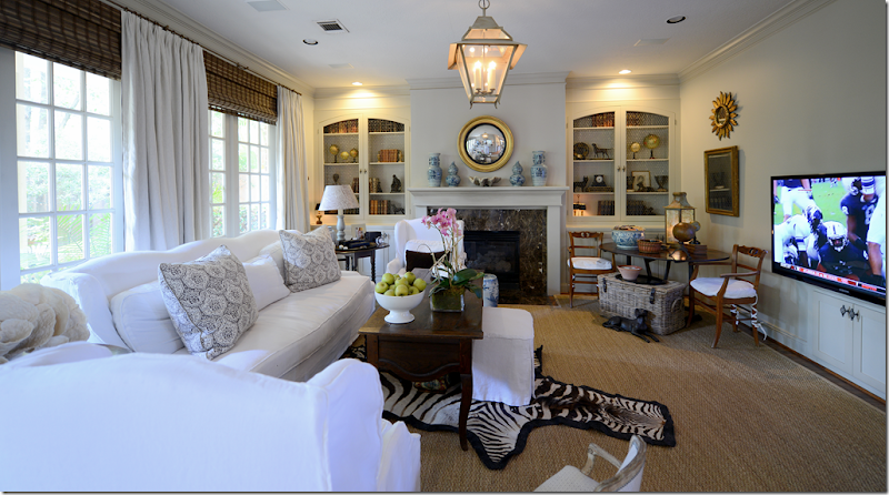
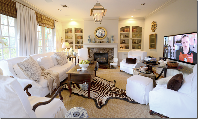
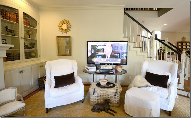
You see, there has been some deception here. Whenever I take pictures of this side of the room, I leave out the flatscreen. I mean, who wants to see that ugly thing, especially since it only plays either football or Fox News. Yeah. I know.
See? Football. There was so way I could move the furniture around without blocking the TV. It was really starting to drive me crazy, because I am decorator. I need to be able to solve issues like this!
When I remodeled this family room for a client a few months ago, I bought their dining room chairs from Hien Lam. I’ve used those chairs a few times before in dining rooms, and also in family rooms. I liked the height of the chairs and the width – tall and skinny. And they come in many styles, including mouton bone legs which match my sofa and chairs.
Lightbulb moment!
If I bought two of those chairs, then I could move my wing chairs across the room and solve both issues of the blocked fireplace AND the uneven balance of the furniture.
First, though, there was the issue of the flatscreen being blocked. When Raul made the screen doors for my shelves, I had him raise the TV up about a foot. I don’t like high TVs, but even raising it a foot still left it at eye level.
Next I chose two dining room chairs from Hien Lam. I went for the ones that were tall and slim (just like me!!) and one that had the curved arch on the back – just like my sofa and chairs. Matchy-matchy!
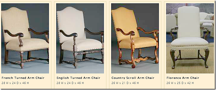
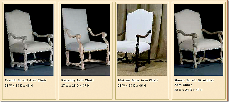
Here are some of their dining room arm chairs:
While I liked the mouton bone chair the best, I went for the Country Scroll because of its measurements. The chairs come unstained and Hong will stain them as dark or as light as you want. I asked for the dark brown stain. Then I asked Ben for a loan!
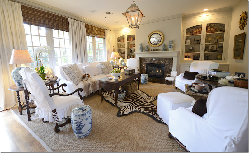
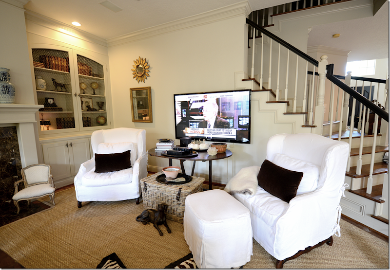
And here is the change! I added the two tall French dining room armchairs on each side of the sofa. Then, I moved the two wing chairs across from the sofa. I put the wine table between them. And look – you can even see the fireplace!! And you can see my nephew-dog Tucker on the sofa watching me.
Here you can see how the wine table fits under the tv but doesn’t block the view at all. Of course I can’t put much on it! But I did put some books and a tea caddy and a candle. See how much of the fireplace is now exposed by the new chair. It’s so much more in proportion.
Here’s how it looks from the sofa. See, the TV is still eye level, but it’s high enough that I can put a few things on the table. Not sure why I didn’t fluff those cushions, but…
Now, I can just hear you!!! You are thinking - how can we see the TV from those chairs. Well, you really can’t BUT if you turn in the chairs a little you can see it good enough. I know it’s not ideal. BUT, one day, when Ben recovers from the new chairs, I can send these chairs to Hong and she can put them on swivels. Of course, then I would have to have slipcovers that go to the floor to cover the swivel and then I would lose the pretty legs on the chairs. It’s never easy.
If I had a large family, the chairs would HAVE to be put on swivels asap. But for us – my little family of three – it’s not an issue right now. In fact, Elisabeth sat in that wing chair with the ottoman the entire Thanksgiving break. If she wanted to watch something on TV, she would angle the chair a little. Otherwise, she sat on the sofa or the new chairs. I tended to always sit on the small chairs by the wine table, so now I just use the new chairs – and it’s all good.
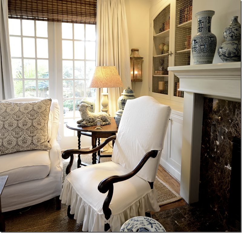
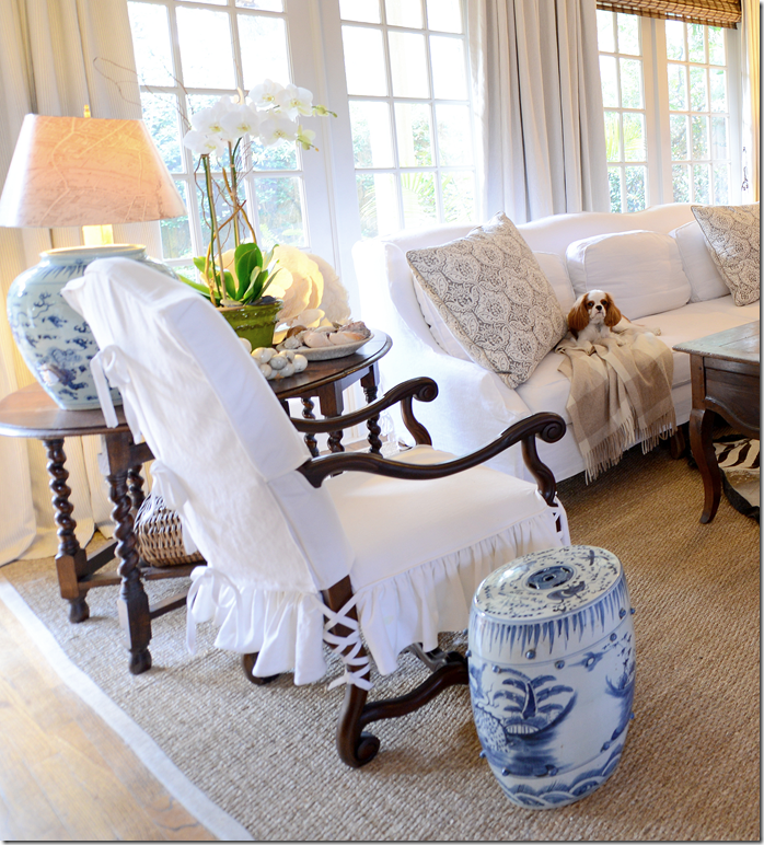
Here’s a close of the chair – you can see the pretty curve on the arms. Your arm actually fits right on the curve at the elbow and it’s quite comfortable. The chairs are also very light – so I can turn it closer to the fire if I want to with no effort at all. And notice the arch on the top – it matches the arches on the sofa and chairs – I love that detail.
Here, you can see how the back is tied all the way down and then there are ballerina ties on the legs. Hien Lam makes the prettiest slipcovers.
So that’s that. You spoke and I listened. In fact when I was telling Ben about the changes that were coming, I used you for the excuse. “Every time I show our family room, everyone comments on that chair blocking the fireplace – and how unbalanced our room looks!” I’m sure he wasn’t even listening to me – all he cared about was that I was going to block his TV.
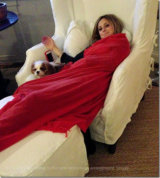
And here is Elisabeth and her puppy Lucy all snuggly on Thanksgiving break!!
Next up, more winners from Aidan Gray and a look at the finished, finally, library!



Love the updates!
ReplyDeleteLove the new chairs and the placement of furniture. It's lovely seeing the fireplace - finally ;-). Thanks to Ben for knowing you'd do the right thing.
ReplyDeleteCathy
YES those new chairs are AWESOME! And having the other chairs on the opposite side (TV side) is great for more conversation seating! I really like your changes and new chairs. What a great change, that and your new cabinet doors has been a fabulous upgrade! Love the ballerina ties on the new chairs too! Your room now shows how large it really is, what a GREAT size!
ReplyDeleteThings take time to develop...I love your improvements, and think it's great that you design for your family. It's stunning.
ReplyDeleteBest, Michelle
Love the new chairs! And who says every chair has to be focused on the TV, ya know! I've looked at those very chairs and they are high on my list.
ReplyDeleteBut Joni please do a post on those of us who have husbands who think the only chair is a recliner !! We are in dire need of new comfy family
room chairs and hubs wants a darn recliner. NO !! Help us with some options! Beth
Our husbands may be related! I had to figure out a solution to the same problem as well. Our house is transitional so in the living room, I put twin Lane recliners. They can be custom upholstered so my fabric is more traditional to balance the contemporary arms. The arms are wide enough to easily support a drink and plates. In the TV room, we have a Relax the Back Zero Gravity chair. It's very sculptural and looks like a work of art on its own - I actually love it. I know I have seen more traditional chairs that look like Joni's slipped wingback chairs that are really recliners - Broyhill, maybe?? I am so sorry not to have paid more attention because my thought was, "If I had known about this!" so I quickly moved on, heh heh. Or maybe you can have a loose slip made for his recliner and throw it on when you expect company?
DeleteI really like your new chairs. I have a pair as well and they are really comfortable and easier on your back than the wing chairs. I am not
ReplyDeleteso sure that you need two pairs of chairs in the room. Perhaps you could move one of the wing chairs and reclaim the pretty tablescape you once had in the corner with the pull up chairs and use the one wing to balance it on the other side of the flatscreen. I know what you are trying to achieve, but the table looks awkward sitting in front of the tv. If the tv actually sat on the table it would look different. Your room will continue to be balanced with only the one wing chair. Just one more suggestion, remove the zebra rug and let the room breathe a little.
yes, i hear you. great ideas. but i love those chairs, i hate to just not use both. but let me try that out, thanks!
DeleteI think I'm one of the assholes that said something about the room being out of balance but I think I was at least polite. What a HUGE relief this arrangement is. The new chair down by the fireplace might still be unnecessary unless a crowd of people are coming over to watch FOX news but that's nit-picking. Thank you for resolving this; I'm going to sleep so much better tonight!
ReplyDeleteVery nice. I approve!
ReplyDeleteJoni - amazing how those few changes made a really beautiful room even better! I have out-of-balance problems here and there and your post was so encouraging.
ReplyDeleteJoni, this just looks fabulous! I love the changes, and you're right, those slipcovers are so neat. The room looks perfectly balanced, and you even pleased Ben about the TV. You are GOOD.
ReplyDeleteElisabeth and Lucy are so cute in that picture. Your baby has really grown up, hasn't she?
I keep thinking that I am going to make it out to Houston to see my husband's family, and it hasn't happend. If we do make it out, I would love to come back with a pair of those chairs! I love them. And I am crazy about the slipcovers. Would you mind if I got two like yours? What do they say... imitation is the sincerest form of flattery? I really do love them. Of course, I have two antique French chairs already which I should just slipcover. I only wish your slipcover people were HERE.
XO,
Sheila
P.S. I always loved your room the way it was. If you hadn't told us, I would still be cluesless about that TV. I was always looking at the overall room from the shots you shared, with all of your neat things... blue and white porcelains, those globes, the stuff on the wine table, the sunburst mirror, books, etc. You managed to distract me with all of your goodies, so I was fine with it like it was. Now, that you explained it, I'm happy you got the balance you wanted. Sometimes critics can be constructive. :-)
ReplyDeleteJoni - it looks not only beautiful, but like a family lives there (and loves living there). Great job.
ReplyDeleteWe have Comcast cable here in Lewes, DE and if you go to On Demand - Top Picks - Yuletide Log you can load what looks like a wood burning fire onto the flat screen, complete with music. I saw one playing at a house tour this weekend and asked the host how she did it
Might think about that - or getting a fine-art DVD to "play" on your player....
thank you for sharing that.............we have Cox but I am still going to check what they have. Isn't it wonderful what we bloggers share with each other?
Deletelove thse ideas! but usually the news is always on. why do you think ben and i almost killed each other durnig the election period?????
DeleteBrilliant!
ReplyDeletexo xo
Love it! I have an old chair like your new ones, think I'll copy your slipcovers--they are so pretty!
ReplyDeleteGORGEOUS!! I love the new chairs and though I thought the room was just beautiful before..think its even prettier now! Just stunning! Happy holidays!
ReplyDeleteLove the new chairs, Joni. The ballerina ties are beautiful.
ReplyDeleteLove your new arrangement, Joni.
ReplyDeleteThe room actually looks bigger now.
Congratulations!
I know your husband is proud of his wife's good taste!!!
I would do one new chair and not block the fp at all. It does look so much better! Love the room.
ReplyDeleteLOVE YOUR SOLUTION TO YOUR "PROBLEM". It looks BEAUTIFUL!!!!
ReplyDeleteI love the updates but either way, that has always been one of my all time favorite rooms on all the blogs I read! And my husband is either watching football or Fox news too!...
ReplyDelete-Shelley
Hi Joni - It looks really fabulous! I love it and who cares if you can't watch TV from the chairs if its only you and Ben anyway - if you have guests over, you'll have plenty of seating. I love that you blame the blogging world, its perfect!! ;-)) Have a great week!
ReplyDeleteI think it looks fabulous, love the slipcovers on new pair of chairs.
ReplyDeleteYou didn't mention the little petite French chair on the right side of the fireplace. it's adorable, is it new?
I have been anticipating to see the library and know it's going to be amazing too.
love the blog, ignore the naysayers!
Betsy
kind of! the puppy ate the wicker one up. thanks!!
DeleteI'm guilty, I've asked about your TV. I was just so darn curious. Looks wonderful!
ReplyDeleteI love the new chairs and the others by the TV. Your slips all look so lovely. You could put the pair of new chairs on either side of the fireplace and the 2 wings opposite so you can view the tv from one of the wings. Your style is fabulous.
ReplyDeleteanother great idea. i'm worried though that the chairs would block the entry to the room?
DeleteI really enjoyed seeing your "process" joni. and so excited that we get a look at the new library soon. I have been thinking about it off and on for a few weeks. donna
ReplyDeleteI think it looks fabulous....have wanted to do white slipcovers for a long time and just have not been brave enough. From what I hear they are as easy as a throw in the washer and I should not worry about it at all. Maybe soon! Love your home!
ReplyDeleteThe discount swiss rolex enhance a woman's style quotient and their pricing comfortably fits into the catier jewellery budget. They being so low priced, people tend to buy more than one mens jackets
ReplyDeleteat a given time. With the hoped for designer miu miu hobo bags being available at such an easy price no coco chanel online one can actually stay away from them. Therefore, if you are contemplating about whether to purchase hermes bag outlet or not, then you should go for them without any delay and buy handbags at will. With the availability of varied color and sassy designer louis vuitton wallets and that too at a cheap price, women can get the omega speedmaster watches according to their preference without any issues related to price.
Wow, what a big difference. We have two chairs in front of the tv that don't swivel. They're just for visiting and I love the way they balance the room. I like your new smaller chairs and how nice the fireplace looks now. I'm not sure about the table under the tv. The Anon who suggested the wine table and one wingback together might be worth trying for a few days and see how you liked it. Your home looks very comfortable and I think your changes are a great investment (one of those words guys like to hear!). Looking forward to the library reveal!
ReplyDeleteI looked at the pictures again and wonder if you've tried putting the table and chairs back where they were (grouped to the left of the tv) and only have one wingback chair in the room. That way the smaller chairs remain balanced on either side of the sofa, the fireplace remains open, you've still got a slipcovered chair on the other side of the room and the table is better utilized. The open space under the tv would look beautiful with a few potted plants under it. Thanks so much for sharing with us!
Deletebut the room would still look unbalanced on that side? not sure. i need to see if one chair would even fit there = those chairs are huge. i will probably try it though. thanks!
DeleteJoni, i like the changes but I miss the pretty, little side chairs that once flanked the wine table. Where do you use them now? That corner vignette with the chairs, wine table and tall lantern was gorgeous, but I understand the reasons for the changes.
ReplyDeletei put them in front of the bar - counter between the den and kitchen with the basket set between them. they actually look good there, but the bar juts out over them a litte. :(
DeleteI like the new chairs but I don't understand why you need a table in the room? It looks way too cluttered. Please remove the table!
ReplyDeleteWhat a perfect solution to your problem, Joni, and I just love your new chairs with the slipcovers. Your beautiful Elisabeth certainly seems to be enjoying the new look!! Her relaxation epitomizes the comfort of your wonderful room.
ReplyDeleteJoni, I love it. The room looked good before but I see what you mean. It looks lovely and balanced now. You must be relieved. I LOVE the new chairs. Gorgeous. I love the contrast of the dark wavy arm. A beautiful detail against the white. Love the serenity of the room (even if football is on). I am sorry to hear about Ben's headache, Joni. I wish he and I could talk about headaches! The poor guy. I feel sorry for both of us. It is a goddamned battle for both of us it seems. All I can say is I got through a lot of ice packs. I put them under my neck, one top of my head, on my face! Does Ben have a soft eye mask? I cannot survive without my eye mask. It helps with daytime sleeping. I also made these soft flannel bags to put my ice packs in so they are soft to sleep on/put on my head. Little things help.
ReplyDeleteYour room looks divine. Love all the elements in there. If you have a garage sale, invite me first ok? I told Holly that too. She hasn't shown enough photos of her new house!!
Hugs, Terri xo
P.S. What is that fabric on your sofa pillows?? It is so lovely. I may have to send you a check and get you to send me some. hehe. Maybe we need to make another Houston trip. We are very boringly trying to pay off the house right now, so not much decorating here...
ReplyDelete:D
Terri (again)
Les Indiennes - they have a web site! im getting ready to do a whole bedroom in it.
DeleteThanks for once again sharing photos of your lovely home. Apparently I missed some of the posts about the room's imbalance. I must be more design illiterate than even I realized because I never noticed. I just always thought the room was entirely lovely. Even so, now that you have added the 2 new chairs it is even more beautiful. The new "dresses" they are wearing are sublime. I can SO identify with the thing about Ben and the tv and it is like waging war if I start changing things around, especially if it also involves spending money. Anyway, you can tell Ben that this follower thinks that the money was well spent.
ReplyDeleteI love the look of yours and your clients. I have my own client that wants to cover chairs in white. Problem is we're in Hong Kong and I don't have much experience with this look. What fabric do you use for the white slip covers. And if it shrinks when washed.... Then what?
ReplyDeleteits just white linen- cotton and demin work good too - prewash, shrink and dry - before making the slips so they don't shrink. easy!!
DeleteOh my, this looks so much better--more balanced! Isn't it amazing how much you see when you take a picture? I love the new chair legs, arms and ballerina ties on the slips! Your room is so interesting; there is so much to take in. I could live in this room!
ReplyDeleteso glad to know you are no longer unbalanced. what a lovely solution to our common problems of how to live functionally in a stylish way. You realize if this were a man blog the tv side of the room would be the focus and swivel chairs would rule; it's all perspective. love the fabric also, thanks for sharing;I always look forward to your next project, like the library.
ReplyDeleteIt looks wonderful, Joni. The new chairs are elegant.
ReplyDeleteBest...Victoria
Joni I never tire of seeing this beautiful room and it just gets better and better. I wish I had a Hien Lam to call on, all the covers you have are fabulous! P.S. Glad to see the Les Indiennes pillows are still there - love them!
ReplyDeleteYou know Joni, if Ben doesn't mind sitting in his own chair with his feet up, you could always raise the television up a few inches so the sofa could sit below it and have everything the same but on the opposite side. That way when guests visit (and the TV is off?), they could sit on the sofa with an uninterrupted view of the garden, the TV would disappear unless turned on and no incoming light would be lost. You are the master, I am the apprentice but just saying.....:-)
Deletehmmm - well that wall is pretty short because of the stairs - but its not a bad idea. actually though ben is a couch potato. with his headaches, he tends to sleep on the couch, a lot. check out my instagram for proof of that.
DeleteI've enjoyed reading your thoughts on the balance/function issue. It's this kind of discourse that gets us seeing our own homes with new eyes.
ReplyDeleteOne suggestion: You don't need six chairs for your small family or perfect symmetry in the room. Sometimes, asymmetry can even make things more dynamic. I'd therefore eliminate the new mouton chair and the little French chair on either side of the fireplace. This would open up the room more, and allow a better view of the fireplace, which is an architectural feature. The other new chair (5th seat in the room, if you count 2 places for the sofa), could be angled slightly more towards the TV/wing chairs for better conversation flow. I know that the little French chair is cute ... but I like the fireplace better and the more open feeling of the room.
I also agree with a previous reader's idea about eliminating the table under the TV altogether. You could use either the wicker basket or the blue garden stool (newly freed up from eliminating the mouton chair next to the fireplace) as an end table for the wing chair (the one without the ottoman). Less clutter, still functional, and more open space. More Pam Pierce-ish, in the sense that you have all the beautiful objects you need in the room, with enough open space to breath and minimal clutter. Just a thought...
Totally agree with this - I think that table under the TV is a bit too high and overall, the room is cluttered.
Deletei hear ya. couldn't you have told me this before i got the two chairs??????????? oy. ok. ok. i'll try it out. but i love clutter too.
DeleteJoni, it looks fantastic....Don't you love when things come together!
ReplyDeleteLoved it before and love it even more now!!!
ReplyDeleteI forgot to mention in my post above I forgot to mention that I also liked the addition of wood on the arms on the new chairs so that there was not too much white upholstery on one side of the room.
ReplyDeleteOh Joni, so pretty! Yes, it looks so wonderful. Well it was beautiful before, but definitely more balanced now, and where to put the TV is such an issue. I think in the house we are building, the TV will go to the side like something you showed in a previous post. We will have cabinets on either side of the fireplace with the TV hidden behind the doors. I just couldn't do the TV above the fireplace thing, and apparently you couldn't either. I think you have a great solution to a difficult design dilemma. I would just get rid of the TV (I'm on the computer all of the time any way, so I don't have time to watch TV) but my family would revolt. The room is refreshing and beautiful, elegant and refined. I love seeing photos of YOUR home.
ReplyDeleteHi Joni,
ReplyDeleteI love how you shared this showing that even decorators have issues that take time to resolve. I noticed the fireplace the first time I saw your room but heavens my southern manners would never allow me to comment! Beautiful new chairs, and enough can't be said about balance in a room. I'm a Libra and really have to watch it on wanting everything in pairs!
Can't WAIT to see see the library.
So much better. Looks great. The black of the TV actually goes with the other black accents in the room. Instead of fighting it, go with it. The TV could use a dark, solid piece of furniture underneath it and a collection of pictures, objets, etc., hung salon-style on the wall around it. Design is a process!
ReplyDeletei have seen that - where people put pictures around the tv like that and it looks great. but my wall ends right at the tv because of the damned stairs!!!!!!!!!!!! i don't like asymmetry as much as many people here do. i'm just a matchy balanced type of person.
DeleteJoni, it looks great, love the new chairs and you found the perfect solution!! Nice and cozy and balanced, xo Kathysue
ReplyDeleteI love the changes you made - function and beauty! I know you've posted pictures of your husband laying on that sofa with his slipper socks :), but I never though of the fact that there was a tv across from that sofa! Your family room is so pretty with all the white slipcovers! I'm excited to see the library too!
ReplyDeleteI love the way you analyze the world Joni! Your living room looks fabulous now! But it always did. x Maria
ReplyDeleteAdore those delicious looking chairs + Good work, Joni! xxpeggybraswelldesign.com
ReplyDeleteBravo, Bravo! Fabulous 'up-date' and love your new chairs! Thanks for the great pictures of the "change-up" - design details always make the room!
ReplyDeleteA home is meant to be "lived in" & you have managed to keep all happy at once- Especially your Hubby!
Nice solution to your initial problem of the bulky wing chairs shunted aside for sake of the dreaded big flat screen TV. I now have one word for you - casters (bet you were afraid the word was going to be "divorce"...) Have casters put on the legs of the wing chairs for ease of maneuvering to view the TV instead of swivels. For the few times there are that many people in the room watching the TV, that will suffice without sacrificing the nice legs of the wing chairs and will be much less expensive. It will also be more in keeping with the air of the chairs, very Edwardian. Add a band of flat passmenterie to the bottom of the chair skirts to lengthen them and hide the casters.
ReplyDeleteexcept the chairs are french and the feet connect to stretchers. casters would be great if there were just feet on the chairs!!!
DeleteJoni
ReplyDeleteIt looks great! Your reasoning cracks me up...sounds so familiar! The next thing I will expect is something covering the big screen....don't tell me you aren't already thinking about that one! I am still staring at mine...not a priority in the boys minds...
Wow, what a difference! Great job! I have studied these pics for a few minutes and I would like to respectfully make two suggestions..The chair on the right. The one your daughter was sitting in. I would angle the chair and ottoman more into the room and move it in about 6 inches towards the tv. Just to the edge of the TV. It just appears to be at a weird angle. I would also loose the basket on the floor in front of the wine table. I would also edit the wine table. Watching TV with so many objects around the tv is alot of visual clutter and distracting to the tv watcher. No right or wrong here, just an observation and personal preference. This room has gone through a few changes over the last two years and it looks amazing. The adding of draperies and the bookcase change made a HUGE impact to this room!
ReplyDeleteHi, the new chairs are great but i still think both wing chairs are too big for the room. I would keep the chair and ottoman on the right and angle it more towards the fireplace. The table and basket under the tv is all wrong now. Balance the tv with one wing chair on the right and your old vignette on the left. Not sure what to put under the tv but that table is all wrong. Thank You
ReplyDeleteLove the new chairs but I still think both wing chairs are too big for the room. I would keep the chair and ottoman to the right of the tv and angle it more towards the fireplace and loose the table and basket in front of the tv. keep your old vignette to the left of the tv but again, loose the basket on the floor. Too much clutter. The only thing I would put in front of the tv is a small table to put next to the wing chair so you can put a drink or a magazine on it.
ReplyDeleteYour taste is impeccable and the room is stunningly beautiful. I'd love to just sit there and breathe in the atmosphere.
ReplyDelete*** Hi, Joni~~~As I haven't been around for a while, I REEEALLY notice these beauuuutiful changes!!! It's all so FRESH and CLEAN and NEW looking... I reeeally LOVE it!!!
ReplyDeleteWarmest,
Linda in AZ *
bellesmom1234@comcast.net
(P.S> And "puppy" is TOOOOOOOO ADORABLE!!!)...
I always thought your family room quite pretty. It is even more so now. Next you should do a time-line post of just the family room from the beginning of the blog until now. It would be so fun to see. Not that you need my ideas as you write a fine, fine blog.
ReplyDeleteWell done, bravo! My question is where did you find curtain rods that long.
ReplyDeleteI am having a crazy time finding rods 153+ inches long.
Happy Holidays.
Jane
they aren't that long!!! there is a connector piece that connects them. antique drapery rod. look for the cote de texas rods!
DeleteLove the new chairs and slips, but how difficult would it be to move that T.V. to the left a bit so it isn't butt up against the stairs? Bet you just love this type of comment, but you did make a decision to reveal all in the post!
ReplyDeleteIdeally the tv would be centered and as suggested above, framed out with things such as black and white photos or prints. One of the pictures indicates a set of doors underneath the tv probably to house the audio/video equipment. Moving the tv was most probably intended to get it centered over the doors. The tv would, however, look best centered in the room.
DeleteIt looks like it's centered with the sofa. If she moved it to the left, the chairs would be off center and the left chair would be right up against the cabinet or wouldn't fit there at all.
Deleteok - there used to a hole above the cabinet. actually there were cabinets ABOVE the hole - i removed those a few months after we moved in. then when flatscreens came out - we put the tv over the hole. the cabinet does have all the equipment in it. can't move it because the bathroom is on the other side of the wall to the left. and it would be off center. right now the tv is centered on the sofa.
DeleteIt's all so beautiful, Joni! Love, love the new chairs. Would you mind sharing the linen that you used for the slips? Is it from Glicks? If I were to call them to order some, how would I describe it?
ReplyDeleteyes, glicks - white linen. they have white white and off white and creamy. you could ask for white white. i think it's about 18 a yard?
DeleteI love it when you publish these kinds of posts! I learn so much from climbing inside your head and watching you work through these issues! You are my favorite decorator. I think your taste is impeccable.
ReplyDeleteIt looks fantastic!!!! Nice to see your daughter! She's all grown up! Seems like yesterday you were posting about her departure to college!
ReplyDeleteHappy Holidays to you and yours!
xoxox,
Ivy
So do people really think we don't know what is wrong with our rooms??? As designers, we are always having to work with room dimensions, certain pieces of furniture and TV's.....for others and ourselves :) The room is fabulous....just they way it is and was fabulous before.
ReplyDeleteExactly! Geez, it's gorgeous.
DeleteJoni your fix is fabulous but then again aside from the chair in front of the fireplace I thought your room looked wonderful. I didn't know you had a big honkin' TV on the other side for some reason I thought it was open space. Stop paying attention to others and let your room be for the way you live. I think your family room is perfection!
ReplyDeleteXXX
Debra~
How about those great new pillows??? I think everyone has the television problem. Your taste is lovely.
ReplyDeleteJoni,
ReplyDeleteIt looks beautiful! Great job.
Karen
My compliments, Madame! And my sympathies re Husband/football/flatscreen. I feel your pain.
ReplyDeleteI didn't think this room could get better but it did! I love it!!!! So pretty…..I wanna come live with you! Every room is just as beautiful as the next!
ReplyDeleteBravo!!!!!
I hate how TVs look when they're off - and mine's off most of the time (no man around.) Anyway online you can buy endless loop DVD's, and I have two: One is of an aquarium and it even makes bubble sounds. The one I use this time of year is a wood fireplace burning - real wood burning and shifting as the coals shift. It's a really quite lovely solution to the blank TV screen.
ReplyDeleteBest,
Jeany
Joanie,
ReplyDeleteI haven't commented in a long time, but wanted to tell you that your family room looks perfect! I love the addition of those beautiful new chairs with their gorgeous slip covers, and the new location of the club chairs looks like they belonged there all along. Even though you have added two new chairs, I think your room looks larger this way. Good job, girl!!!
Hugs,
Anne Nickol
Looks great Joni!!! I love your blog and your home is beautiful!!! I live here in the west u area and I have chairs that need some swivels on them. Can you recommend someone? Thanks! Fran
ReplyDeletehien lam or custom creations!! either one are great.
DeleteThrilled to see the entire room - I would not have envisioned a TV hiding just outside of the borders of your photos, Joni! With or without the wine table in front of the tv, I love it . The mix is beautiful and interesting! Thanks for sharing the before and after pics, and letting us know that you're REAL too and it may not always be perfect but who wants total perfection anyway, right?? ;-)
ReplyDeleteWow!! It looks totally fab now. What a difference. Does your husband like it?! I hope so.
ReplyDeleteHappy Seasons Merry Greetings to you!
xx SP
I really like this,lovely change! My room arrangement is similar, but mine still out of balance, unless one could call a slew of plastic toys on the TV side a balancing element. Lord I pray your daughter doesn't move home with a baby in tow like one of my daughters did. I only experienced being an empty nester for 2 glorious years. Btw, she has crayoned the arms on my white slipcovers. I have not attempted to clean them yet. Like everyone else, I can't wait to see your library!
ReplyDeleteIn a word-Perfect!
ReplyDeleteI can really identify with RKay. Neither of my daughters has moved back in, but I am what might be considered a little more than typical grandmother, since I took an early retirement about 9 years ago and began providing daycare to my grandchildren. This life's transition took place for several reasons.There was my work burn out, the need for cheap(paid for with love)quality daycare for my ever appreciative daughters,and the added bonus of being able to bond with my grandchildren. I am not at all sorry about my decision even though it meant tightening up our pocketbooks around here. The special closeness I have enjoyed with grands has been a character building experience for me and for them. I know the benefits to all of us will last for the rest of my life and also theirs. Meanwhile, it still looks like Daycare Central around here but there is light at the end of the tunnel when the youngest starts kindergarten. Thankfully, the love will last forever. Kudos to RKay and I hope her daughter understands what a great Mama she has!
ReplyDeletelove both of your stories - i kind of hope that happens to me too! i would love that!!!
DeleteI would have solved the problem exactly as you did, it does balance the room so much better and helps spread the larger white pieces around...with all the smaller pieces gathered together in the corner was so out of scale...Taking a lot of pictures always helps... Your rooms are always stunning....Do you ever remove all the slipcovers for winter for a different look? It looks like a room that is fun to change around...love your blog...phyllis
ReplyDeleteThe room looks great! all those 'before issues' bugged me too. I will say that I am still a little bothered by watching TV with a table in front that has things on it. I would be so distracted by those items! I guess if there's a good football game on.....
DeleteLove your blog!
Susan@HotelCalifornia
This looks SO good! Of course it does, but props nonetheless!
ReplyDeleteIt looks very inviting and those chairs! Love. What are your thoughts around your mirrors? And those terra cotta candles? Do they remain or moved about. There always seems to be a domino effect to changing "Just one thing". I am sure whatever you do will look great. T
ReplyDeleteHi Joni,
ReplyDeleteSo nice to see your fireplace come out from behind the chairs. The new smaller scale chairs with exposed arms are charming. I like the curviness they introduce into the room. As for the TV issue, well, unless you hide it when not in use, a big flatscreen is simply too modern to ever look good in a semi traditional, French inspired room.
My 2 cents worth is that you move it to the left and raise it up about 6 to 8 inches. You could then cover it with a tapestry or a painting as part of the decor on your wall. This will separate it more from your tablescape and things won't look so cluttered. Both of our TVs are above eye-level and that doesn't bother us a bit. We tend to lean back into our couches anyway.
Ahh...decorating for real living is a never ending challenge.
Can't wait to see your completed library. Warm wishes, Charlotte
I knew you were hiding a TV because Mr. Slipper Socks was always photographed on that couch. Why else would he be there? : )
ReplyDeleteI think you have done a great job accommodating him and your visitors. People do enjoy watching TV and that room is now more comfortable to do that.
You have provided a great lesson in keeping it real! Thanks!
Dee
It's beautiful - so enjoy your blog and have learned alot. Trying to bring a bit of that beautiful style to my midwestern cape cod remodel.
ReplyDeleteWhat is the right depth for the rod brackets for a similar window treatment? The standard 3.5in depth doesn't seem like it will clear the blinds; the next size is 5.5 in. which seems like it will stick out way to far in my smallish dining room with 8 ft. ceilings. I can't afford custom hardware -
gee, monica does all that! can you ask her what depth she uses? 832-443-1931 call her!! she will tell you. or google her custom creations by monica - and email her.
DeleteI wouldn't worry about how far your drapes stick out into your "smallish" room. The added depth will create interest and coziness. If someone happens to brush up against the drapes it is not the same as brushing up aginst a wall that is sticking 5.5" into the room.
DeleteIt is not necessary to spend a large amount of money on "custom" rods. They are just tubes of metal after all! I get my "rods" from the electrical department at Home Depot - electrical metal tubing. EMT is made from aluminum so is lightweight but strong. They are 10' long and come in various diameters. I have never paid more than $10 for the largest size. Lengths can be joined by a 2' length of wooden dowel which costs less than $3. I buy my finials on-line from King Architectural Metals. They sell balls, spears, twisted cages, etc. for 1/3 or less than you would pay a "decorator".
The metal rings are very pricey - about $2 each no matter where you go. When I want that look but cannot afford the rings, I use rod pockets, fabric or ribbon tabs, or loops of rope sewn onto the top of the drapery panels. Finally, rod brackets. This is where I splurge. Go on-line to the Antique Drapery Rod Company that Joni uses.
What happened to the wicker dog bed, love it!!! and the lantern that sat on the table in the corner, I think it use to be on the wall???
ReplyDeletethe puppy chewed the bed to death, but it's hiding behind the chair next to the tv in the back. i need a new one now. and the lantern is now hanging on the wall to the left of the bookcases, next to the drapes. it looks good there, but i miss it on the table for sure.
DeleteYes after reading it again I noticed both. Wasn't that lantern on that wall before? Please tell me where you get that dog bed, I just love it. I don't think my 90 pound lab would fit but it is more for the look, right? Also love all the changes can't wait to read about the library but need to have no distractions when doing it. Your own house and work happen to be my favorite posts you write, and the Christmas ones, please do one this year, damn the haters. I love your sil's house and seeing all the gifts you guys give each other.
DeletePS Did you see that email about your favorite suv coming back in 2014???
Hi = I liked the room before and I like it now, too. Great new chairs and a good purchase - these chairs can go anywhere and go with everything!
ReplyDeleteJoni, just a thought...Have you considered having the sofa facing the fireplace, the two wing backs in front of the windows with an ottoman in front of the chairs and a round table with a lamp between the two chairs. I think those comfy chairs would be the perfect place to watch TV. Flank the TV with the new smaller chairs. This will spread the weight around the room and makes for a more balanced space. Just a suggestion.
ReplyDeletea million thoughts, like hamlet. yeah, a million times too. but ben likes to lie on the couch and face the tv. damn that man! he is so demanding! hahaha. just kidding. it would lood good like that, but he would freak and divorce me.
DeleteLove the new chairs as well as the new layout. It's really nice to see the whole space and I love how it turned out. I especially love that little chair by the fireplace!
ReplyDeleteJoni, it is just beautiful and looks so comfortable. I could sit all day in that room! I have one little suggestion, though-- not that you really need it, but how about a nice green plant in there?
ReplyDeleteJoni, you are so gracious, and brave, to open your home to us! The room was lovely before and after.
ReplyDeleteYour work is fabulous! Do you have a post about the colors you used on the walls/built-ins?
ReplyDelete