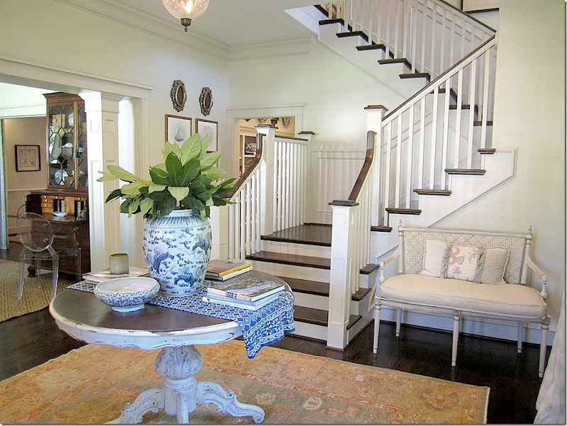
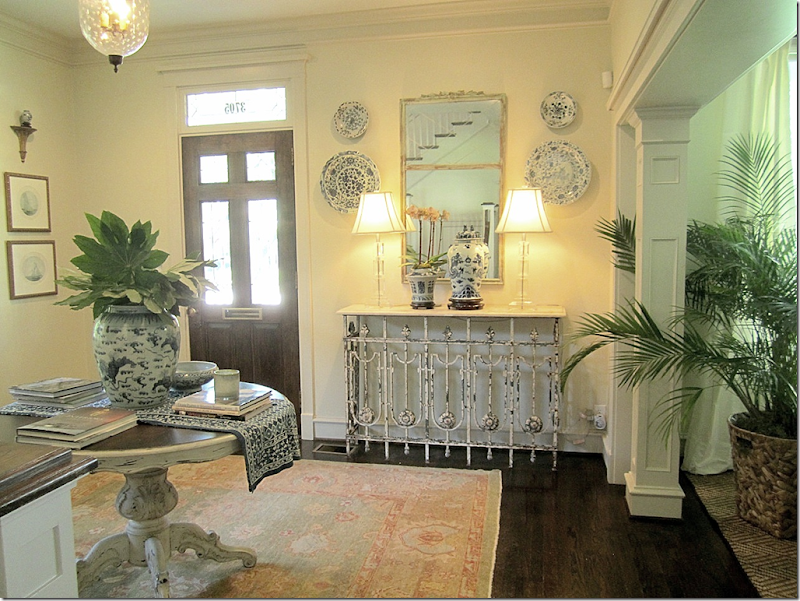
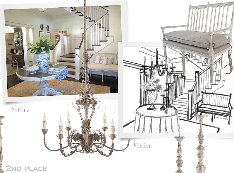
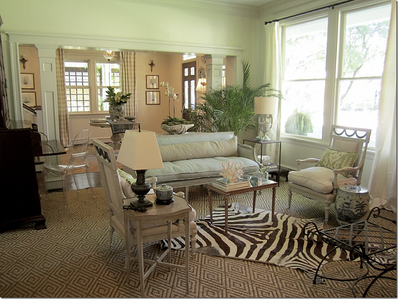
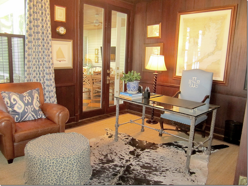
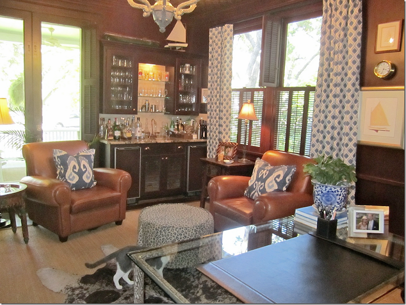
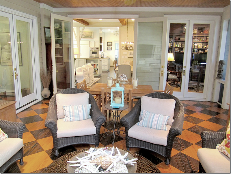
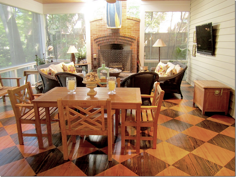
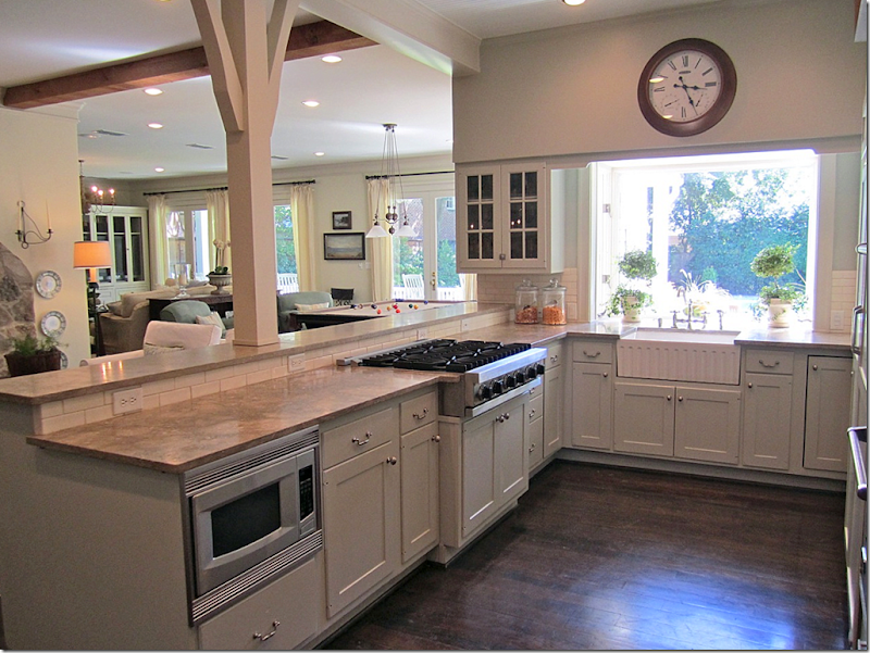
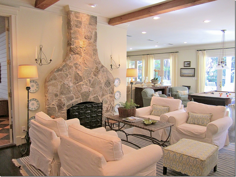
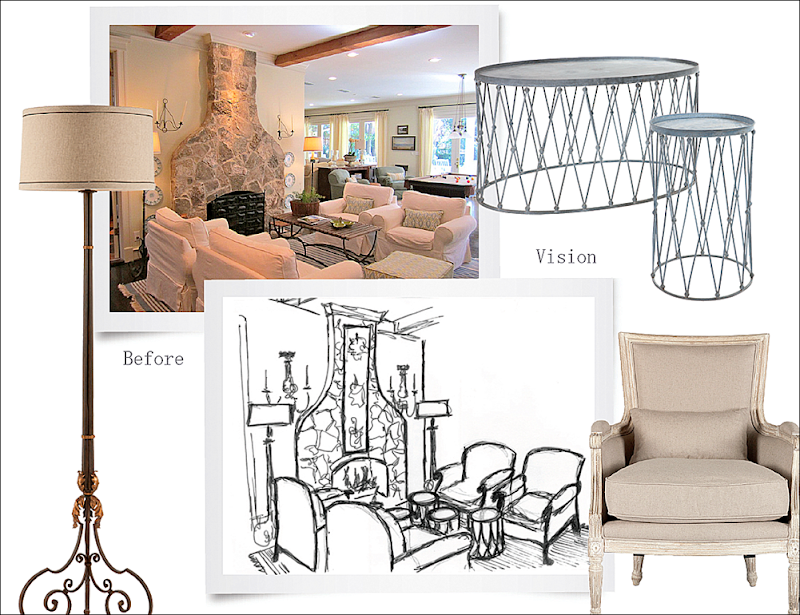
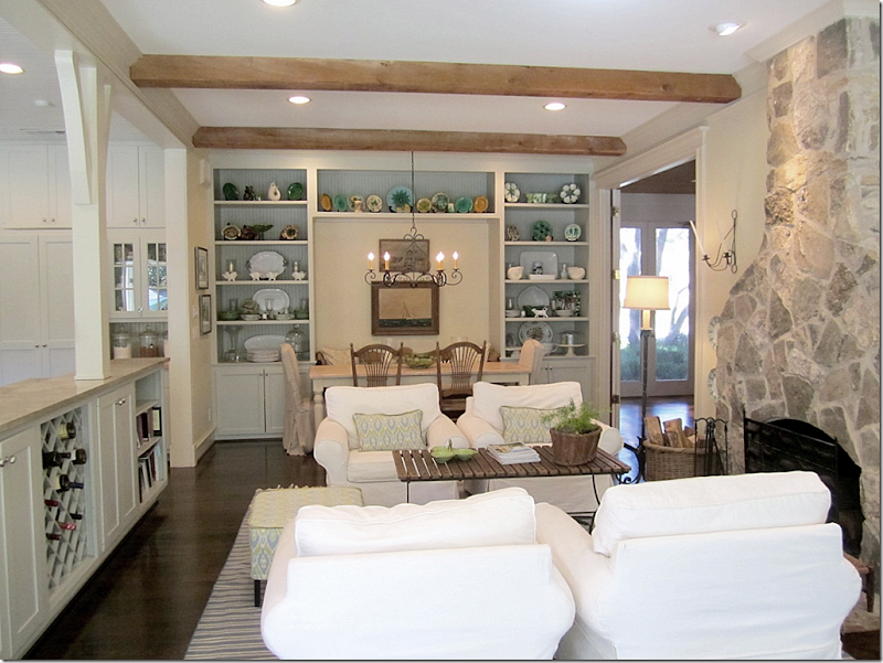
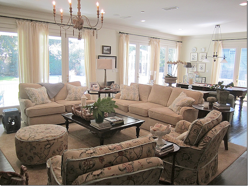
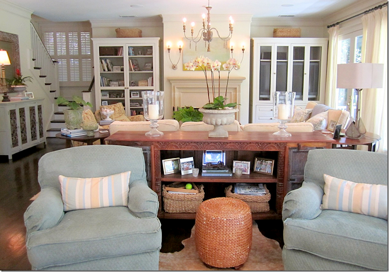
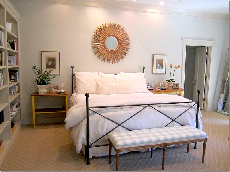
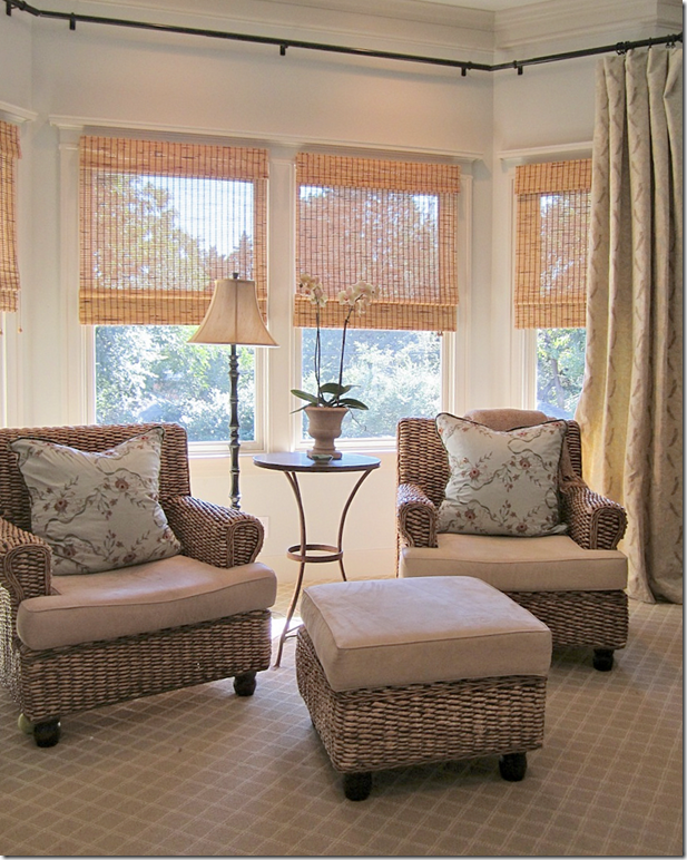
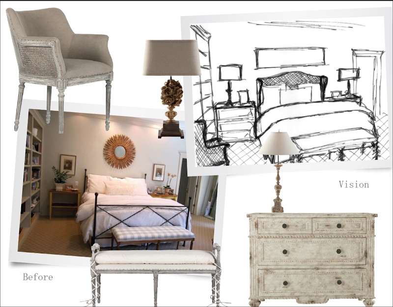
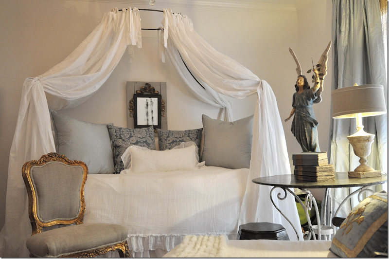
This large, older house located in Texas, is the 2nd place winner in the Aidan Gray Catalogue contest!!They don’t build houses like this anymore – with large foyers that are the size of a room!! What would you do to have a foyer like this??? The owner placed a center table right in the middle and topped it with blue and white items. There’s a lovely antique bench, but the focal point is definitely the staircase! This room is what caught Randal Week’s eye when choosing a winner.Through columns, to the left, is the living room, and you can see further back into the library.And looking the other direction, next to the front door with its beautiful transom with the address (love that detail!) – is an antique iron console with more blue and white porcelains. The room is so lovely – what a wonderful introduction to a house!And here is what Randal hopes to photograph in the entry – he wants a skirted table topped with Aidan Gray candlesticks and wire baskets. He’ll add their own chandelier (and wow – I love this chandy!!) along with their own bench. It will be interesting to see if the final photograph really looks like this drawing!The living room has a sisal carpet with a zebra, mixed with a French sofa and arm chairs. The colors found here are found throughout the house – light blues mixed with creams.And looking the other direction – love the fireplace and the clam shell filled with orchids! The sofa is especially beautiful too. Next – is the library, seen through the door.The paneled library continues with the light blue colors – here, mixed with leathers. Love the curtains and ikat pillows and the monogrammed chair!! And those maps! Through the door is the screened in porch that sits at the front of the house, on the left side.Another view of the library, showing the fabulous bar. What a great house for entertaining. The door opens to the front porch. There are large porches on almost each side of the house. Not showing is the wall of shelves on the left side of the room.At the side of the house is the large screened in porch. It leads into the library and the breakfast room and kitchen through the open doors and to the family room at the left.And looking at the other direction – there is a fireplace and a TV out here! What a great space! I think I would live out here if this was my home!!!The screened in porch leads into the breakfast room and keeping room all the way past the kitchen and here – the butler’s pantry. Great space for storing dishes and for entertaining. There’s even a farm sink in the pantry. Past the pantry is a small office. The door to the left leads back to the entry at the front of the house.The kitchen over looks the back yard with the large swimming pool. Along the back of the house is the family room with a pool table. The keeping room and breakfast room are to the left of the kitchen.Love this! And so did Randal! This room – the keeping room – caught Randal’s eye. Great fireplace with its Texas limestone mantel. Great fabric and love the blue and white rug so much. Love this!!!And here is what Randal envisions for this space. He’ll bring in four of his own French chairs, his own sconces and lamps, along with a few of his wire tables. I love those tables.And looking towards the other direction at the breakfast room. A banquette serves the table along one side, while a mix of chairs are used on the other sides. Beautiful light fixture. The kitchen is to the left and the screened in porch is to the right.The family room overlooks the large backyard with the swimming pool and pool house. Again, the décor is all cream with a touch of blue mixed in.I wonder if Randal was drawn to the house because they have an Aidan Gray chandelier and sconces??? Just kidding, but I’m beginning to think there aren’t many houses without something from Aidan Gray. Many of the people who submitted their houses for the contest had something from Randal’s company!! This is my favorite chandelier of his – the price is reasonable and I’ve used it many times before, including in my own guest room.A sofa table divides the space between the sitting area and the pool table. Towards the back is another staircase.On the landing upstairs is a small sitting area with slipcovered furniture in creams and blues. I love all the fabrics the homeowner chose – the muted patterns in blues and creams found throughout the house. This house is really beautiful – and beautifully furnished.And finally, the master bedroom in whites, creams, and blues, caught Randal’s eye! Love that bench in blue checks!Across from the bed is a sitting area that overlooks the back yard!And here – is Randal’s vision for the master bedroom. He’ll bring in Aidan Gray’s caned bed, night stands (are those new?!!! Love those!!! I need two of those for a client Randal!!!) lamps, and benches, along with a caned chair with upholstery nails that is to die for! I can’t wait to see this room done up in Aidan Gray furniture.What a wonderful home!! It is almost like a dream movie home – rambling, with all these wonderful nooks and crannies to read in, and sit around and talk, eat, and just enjoy being together with your spouse and children. I love that about old homes – large rooms mixed with small rooms, large entry halls, big butler’s pantries, bay windows, front and back and side porches, outdoor fireplaces!! What a lucky family to have such a beautiful, friendly, warm and cozy house to raise their children in. Congratulations on being chosen!!To visit Aidan Gray’s web site, go HERE.NEXT:A few years ago when I redecorated Elisabeth’s bedroom, I got so many comments about where to buy the angel in her room.I had bought mine at Olivine, but mine was the last statue they had. Recently, Helen, who owns the wonderful shop Olivine, told me she had just gotten some new angels in. They are not as large as mine, but that might be better for most people – because mine is HUGE!!!Helen sent me this picture of the new size. You can see it looks exactly the same, just a bit smaller. If you are interested in the angel, contact Helen below.
AND FINALLY – BIG, BIG NEWS IN THE PUBLISHING WORLD:
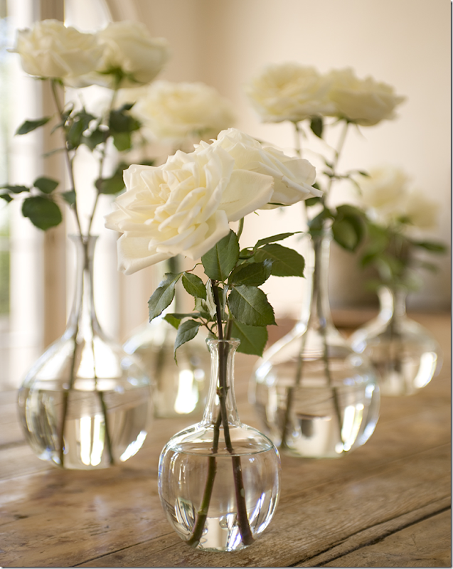
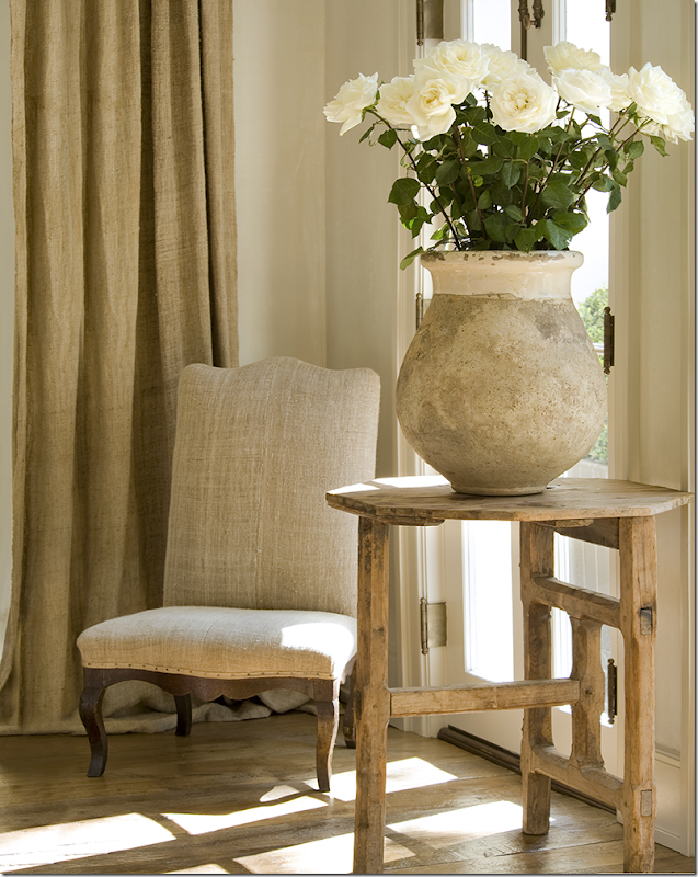
There’s a new magazine coming out – Milieu. It’s an interior design magazine being published in Houston, by a rather popular and ultra talented interior designer. Though the designer is from Houston, the magazine is definitely NOT local. It will be international - with houses, gardens, and stories from all over the United States and Europe, as well. Distribution will be throughout the United States. There will be more information in the near future about where and how to get the magazine when it is published.I’m so excited, I can’t stand the wait! I’ve known about this for a while and had promised to keep my lips sealed, but the introductory “mini mag” will be coming out this January. That gray font alone is enough to make me drool. Care to guess who is behind the new magazine?Fresh white flowers, limed wood. Guesses?Thistle and olive jars. Oh, this is too easy!!!Come on, who is the only designer who can mixed it up THIS good????(all photographs above by Peter Vitale)Give up?I know you know!!Yes, the fabulously talented Pamela Pierce is behind Milieu. Look for more information to be coming out soon! CAN NOT WAIT!!!!!Next time: my new library, finally!












FABULOUS POST!!!!!!!!!!!
ReplyDeleteThe second winning home is beautiful. Congratulations to them and I look forward to seeing what Randal does with it.
ReplyDeleteBest...Victoria
The houses picked are both incredible, although it's a shame that someone with more humble "means" did not win the opportunity to put some lovely Aidan Gray pieces in their home.
ReplyDeleteFrom Joni's earlier description of the lovely homes that entered the contest, it doesn't appear that the prettiest have won first or
Deletesecond place. I hope we get to see the ones that didn't win.
not sure that wealth had anything to do with the choices, per se, but you must understand that the background of the photo must be architecturally interesting. which would mean - either a new, expensive home or an old home, less expensive with great architectural features. not sure how a house like mine for instance would be interesting for a catalogue. there is nothing special architecturally in my house, its just a two story box. Not a pretty fireplace (like this winner) or staircase, like the last one, or bathroom, like the first one. so, it's not money, it's just that people with means i guess can afford to buy houses that are architecturally interesting. OR if people without means, live in an old loft with brick walls, etc. we did have some smaller guest houses in texas that i absolutely loved and wished those would have been picked. they are more "normal" but had great high ceilings, fireplaces, etc. they were small too. i'll show them as the series goes on. so, i hear you, but money isn't the issue - it's strictly the backdrop - even furnishsings don't matter!!! you could have an unfinished house or a house filled with ugly furniture, if the bones appealed to randal, he picked it.
DeleteGuest Houses - that would be a great way to showcase Aidan Gray. I love this idea.
DeleteI'm partial to older homes, especially those that have a fab front porch. And, the interiors are so tasteful and cozy. I like this house better than winner #1.
ReplyDeleteThe exterior of the home is lovely and inviting. It looks like the owner is an avid reader here since it is full of the Cote de Texas
ReplyDeletelook already. I would hope that Randal can rescale the pieces in the living room since they appear too small and unimportant for the space.
Perhaps replacing some of the bulky club chairs with a few more refine pieces will be an option as well. Photography can play tricks on the
viewer, but these rooms do not have the overall design required for Aidan Gray pieces as much as the first house but I am certain Aidan Gray's
stylist can make it look wonderful. I love the wrap around front porch. I hope it can be used in the photo shoot.
the living room? it only has a two small chairs and a small french sofa. ??? not sure what you mean. and again, the furniture doesn't matter at all - he is bringing in their own furniture. well, the back porch is divine too! but i don't think he is using the porches! he should though.
DeleteKUDOS!!! franki
ReplyDeleteI love their home - especially the colors. When lived in Texas I had a foyer that was huge and always wanted to put a large table in the center like they have - but that never happened.
ReplyDeleteballard designs sells skirted tables that are really reasonable. people that don't have antique tables could always use ballards skirted ones. i would!! i still love a skirted table - i have one in the dining room and will probably never replace it unless we move to house a large dining room. plus, you can get great blue and white things so inexpensively - i love what she did in her foyer!
DeleteWhat a beautiful home. Congrats to the homeowners. The screened porch with the painted floor is wonderful.
ReplyDeleteI never get enough of Elisabeth's room. It's so pretty. I'm sure she loves reading a book on the chaise when she comes home for the holidays.
Thanks for the preview of the new ezine. It'll be a great start to the new year!
Can't wait to see the Library!!!
actually the chaise is her closet. its disgusting how she treats her clothes. next subject. it just makes me ill. the chaise was piled as high as the bed with clothes over thanksgiving.
DeleteOh, I do understand! My daughter is a couple of years older than Elisabeth, say nothing more!!!
DeleteI really love your blog and your taste. Especially when you do tutorials on the "right" and "wrong" ways to handle aspects. Truly, that is a gift to your viewer. These homes are already really lovely; it's hard to get very interested in how they can look even better. It seems....materialistic in a wasteful way. I long for more of your great entries on making the somewhat ordinary really come alive. Thanks for your hard work.
ReplyDeleteI always pour a hot cup of coffee and settle in to view your posts! Love the home that was chosen, decorated and yet personal and comfortable. I love a home that looks like it has been collected over time, not bought a store and installed. I think Randall is a genius to use "real" homes, he needs to keep some of that feel in his pics. I guessed Pam Pierce right away as she is a fav of mine. Great post and thanks for all your hard work on this blog, especially during this busy season.
ReplyDeleteWhat are the kitchen countertops made of? So gorgeous!!!
ReplyDeleteWhat a fun house, I cannot wait to see Randall's finished rooms!! I especially love the little cat that snuck into the photo op!
ReplyDeleteCan we buy an angel from Olivine, through Internet?
ReplyDeleteI love yours, is it built in wood? Which is it's height?
Thanks for your extraordinary blog.
probably - just email her! not sure how high it is. wood? seems to be, but maybe it's not. i['m sorry. i don't want to tell you something that isn't accurate. just ask helen. email her!!
DeleteI adore screen porches(why don't they put them on new homes?)Congratulations to the winner + AG will surely work their magic for the
ReplyDeletecatalog shoot. I loved the map of Houston + your angel. And last, but not least, can't wait to view the mag + see your library. Grand
job on the post. xxpeggybraswelldesign.com
I just wet my pants about Pamela Pierce!
ReplyDeleteOh... that magazine!!! I also can't wait.
ReplyDeleteAnd I adore anything from Aidan Gray. Fabulous!
Big hugs to you, Joni.
Luciane at HomeBunch.com
Excited about the last few words you typed in.. I've been wondering how it {the library} turned out!! Can't wait!!!!!!
ReplyDeleteI made a cup of chai tea, curled up on the sofa, and spent a glorious 45 minutes or so in another world: Yours! Thank you for letting me visit.
ReplyDeleteOoooh! Pamela Pierce! LOVE!
ReplyDeleteOrlandi Statuary is a wonderful company. I buy all my statues there, they can be customized, as well!
http://www.orlandistatuary.com/products/angel-of-lightr-goldleaf-45?category=01
xo
Andie
Cannot wait for Milieu! Love Pamela Pierces' work! Very exciting
ReplyDeleteJoni I love the 2nd home for the Aidan Grey shoots!His pieces are so fabulous!
ReplyDeleteI am also excited for Pamela's publication .
Now I want the angel!She is beautiful!
xoxo
Karena
Art*by*Karena
Oh my, I'm in love with this home! I know the first home seems to have the Aidan Grey "look" but forget all that, I want to move into this 2nd place winner today, AS IS! You are right Joni, this home is right out of a movie set. Cozy, comfy, layered and collected in a beautiful older home. Older homes are just the bomb. Can you at least tell me if this home is in San Antonio, TX?
ReplyDeleteOh, please let us know ASAP how we can get our hands on a copy. It looks like its gonna be beyond fab!!!
ReplyDeleteI absolutely adore this home! I love the keeping room and the way they did the breakfast area with the bench and bookshelves. The family room is so cozy. The upholstered pieces in this house are so inviting, soft and plump with beautiful fabrics. Joni, When I looked at the sun porch, I thought - Joni would want to live in this room, then I read what you wrote! I found your blog awhile back through the picture of your daughters room, it is so me all the way! What I would most love to have from the room, besides all of it, lol, is the sconces with amethyst crystals. Again, love reading your blog, it has opened my eyes to so much beauty!
ReplyDeleteyou know me!
DeleteHi, Joni -
ReplyDeleteI do love that foyer.....so gracious and roomy!! I love all the different rooms of this traditional house. Quite a contrast from the first home, which seemed more open. Maybe because that one had very little furniture?? Both beautiful!
Look forward to seeing your library :)
Loi
This magazine looks incredible! I cannot wait for it to arrive. Will it be published nationally?
ReplyDeleteI am moving to San Francisco soon and wanted to see if this magazine would be available to me there? I hope so.
Will this be distributed on the West Coast? I live in the LA area and want to make sure I can get the mag - looks fabulous! I'm a big fan of Pam Pierce!
Deleteyes - the magazine will be international - not houston at all. the houses and gardens are from all over the us and europe! think world of interiors meets elle decor meets veranda??? something like that!!! with pam at the helm, it should be fabulous. her taste is exquisite. and yes, it will be distributed throughout the united states.
DeleteNice home. I was wondering about all the seating areas, though. Unless you have a large family (doesn't seem to be the case as the breakfast table only seats 6) or can't get along with each other, there may be more advantageous ways to use the space. At first I thought the owners sacrificed a formal dining room for all the seating, but this doesn't seem to be the case (a dining room, not shown, may exist on the other side of the living room's pocket doors). So if it were me, rather than have seating in the (1) living, (2) family, (3) porch, (4) landing, and (5) breakfast rooms, I think I'd eliminate the breakfast lounge area and make this space part of the kitchen. That is, create one large gorgeous kitchen to replace the current one which seems kind of small. Just a thought.
ReplyDeletei was wondering about the dining room too - not sure if it really is there or not? i am dying to know though. i think they must have moved in recently because on googlemaps - there is a moving van and furniture all over the yard! too funny. google maps is the most invasive thing ever. .ever. anyway - the kitchen would be big enough for me, esp with that pantry. they could always just move the breakfast table infront of the fireplace and eliminate that sitting area. but, a big house means lots of furniture, that's for sure. i was thinking about that - what would i do if i had such a huge house - prob just go to ikea and get a dozzen of those $350 slipcover sofas and ottomans!!! haha!11 i love the way the house is decorated. so warm and inviting - exactly what a house should be.
DeleteI always look forward to your new posts. I was the one who said that the first place winner was absolutely gorgeous but wanted something more in my zip code. Joni, you delivered! This house is a home. It feels warm and cozy and all put together at the same time. The floor plan is amazing and the homeowner did a fab job with the colors and furnishings. Thanks also for the update on the new catalogue. Looks intriguing and full of amazing photos. Thanks once again for making my day!
ReplyDeleteAs always, what a great post, Joni! I adore this house. It is just perfect for that shoot. It has great architectural bones, in addition to being beautifully decorated, and I see can exactly why he selected it. It is the perfect back drop for his wonderful things. I am wild over their blue and white in the foyer. Nice collection there.
ReplyDeleteAnd speaking of perfection, Elisabeth's room. I love what you did here and always enjoy seeing it. That's great that you shared the angel's source with us. I might have to go check it out. I was also looking at Karen S's things and found something I really want for Christmas or birthday. I bought my MIL something from her a few years ago, and she loved it. You have the best sponsors!
XO,
Sheila
i know !!! also be sure to check out sponsors eleanor brown and greyfreth - they also sell santos like the angel!
DeleteOh, so excited about the magazine. Is it an online magazine? If not, I will have to get you to mail it to me. Haha (joking, but I AM that desperate!). Oh, as I was looking at the photos, I was thinking...it is that woman with the alliterative name that Joni loves (I am sorry, I can't remember the Houston people but I have started to recognize the look very easily) and when I saw the name, I realized I recognized her style. She is REALLY good, I agree. I love her look and it is particular, even though it has many of the usual elements. So excited!!! This has a Veranda classy sort of feel...
ReplyDeletexo Terri
alliterative name? did you mean pam pierce???? that's so funny! yes, you should be able to subscribe in canada and im sure it will be online eventually.
DeleteOh my gosh.....I also think this home is even more beautiful than the 1st place winner, not that the 1st is chopped liver, but this home has such character and warmth that the other lacks.
ReplyDeleteA jaw dropping house! Amazing how they restored it.
ReplyDeleteBeautiful house...this one and the 1st place winner. And a Pam Pierce magazine? YIPPEE, YIPPEE, YIPPEE!!!!!!
ReplyDeleteThat home is heavenly and I love Olivine.
ReplyDeleteTikaa
Drooling...
ReplyDelete.
.
.
.
o
OMG- That house is To- Die- For gorgeous!!!!! Three cheers for Pam Pierce's new venture- she is so talented. Everything is better in Texas!!!
ReplyDeletexo
-linda,ny
ps cannot wait to see your library!!!!
Great, newsy post! Another fine job, Joni!
ReplyDeleteJoni, we are awaiting the reveal of your library. I know it will be lovely so let's get with it!!!! Aidan Gray homes have become boring.
ReplyDeleteLet's see something real.
Joni, I left a comment on this post the first day you put it up, but I notice it isn't there. I also notice there are fewer comments than usual for your posts. Wonder if you are still having blog problems?
ReplyDeleteAnother gorgeous home, and filled with personality and little details that make it so interesting! That's what I hope we get to see later on with the first home....more 'little things' that represent personality (at least to me it does).
ReplyDeleteLove the angel share as well and the new book info!
Have a wonderful weekend, Joni!! :)
Now this is my kind of house! Old, beautifully decorated, warm and inviting. Not too neutral, but no strong color. And, what makes a house a home . . . art, photographs, plants and flowers, cozy throws, an interesting (collected) mix of furniture. Just love it!
ReplyDeleteCan't wait to see the library!
Cannot wait to see the magazine!! Thanks for the sneak peek!
ReplyDeleteI noticed that you're a qualified in your blog site! I will be setting up a webpage soon, and your tips can be very used in me. Many thanks for your complete assist and dreaming you all the accomplishment in your organization. branded apparel
ReplyDeleteYou are kidding, right?
ReplyDelete