1
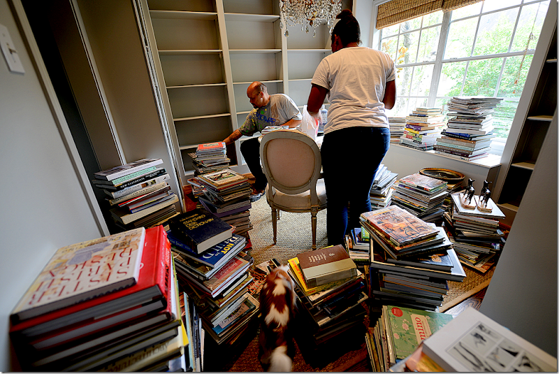
As I told you as few months back, the driving force behind creating a library was that I had too many design books. These beautiful, large, decorative books had overtaken my house. There were stacks of them everywhere – they were under every table, hidden in every basket, getting dusty in stacks in the garage, and even lining the steps on the staircase. It was driving me insane and made the house look even more cluttered.
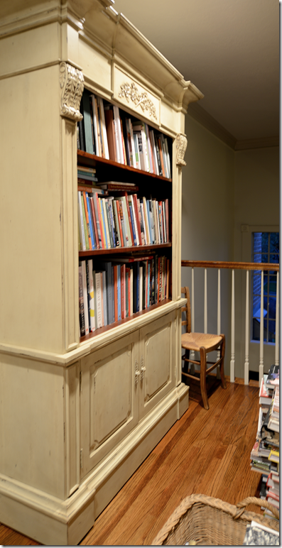
We had outgrown the built-in bookcase years ago and had starting stacking books on the floor in front of it.
When Halo Styles shipped me this bookcase by mistake, I kept it, hoping it would stem the tide. Nope. Even the shelves underneath were jam packed. Besides the space issue, was the organizational issue. I could never find that one book I needed for research or just to enjoy. It was the proverbial needle in a haystack when I needed to find a certain title – forget it. Sometimes I would get so desperate I would reorder a book from Amazon knowing that what I needed was hidden away somewhere. So ridiculous.
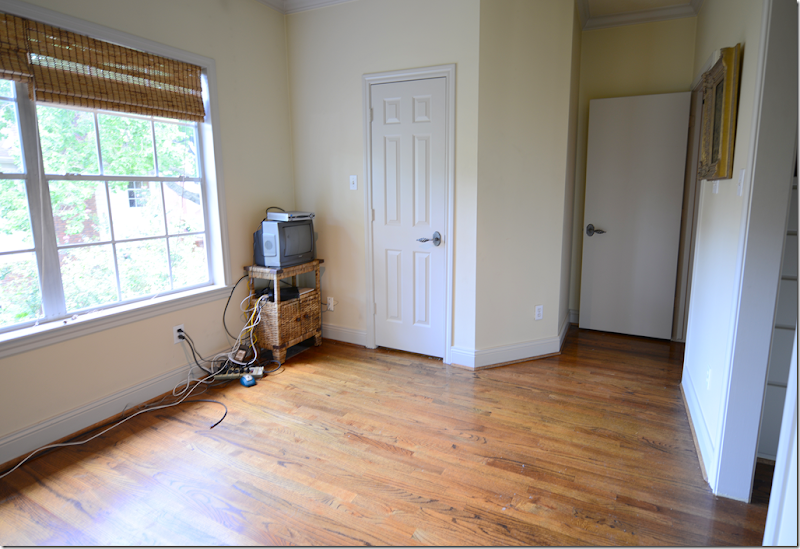
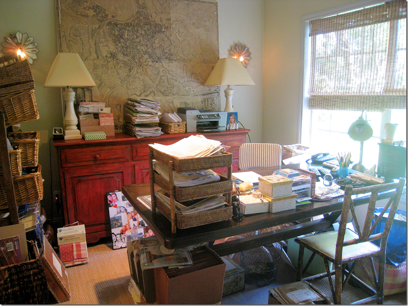
Even more ridiculous was my yellow office with that horrible red console. Before the blog I spent a lot of time in here – I took on a lot more clients back then. But, in the past six years, business has changed, a lot. I never look in a catalogue anymore – it’s all on line. Fabric houses are online too. Emails and computers take the place of paper records and files. I just never really used my office anymore. All my fabric books were neatly stacked in bins in the garage, and this space was just wasted. For the past few years, I’ve been thinking I should built shelves in here – but the whole job seemed so overwhelming, I just kept putting it off.
But, one day, I succumbed and called James, who works for Ben, to come clean it all out. Oh, the junk! So much junk! Drawers and cabinets filled with things like old printers and computers, typewriter ribbon, old manuals and stationery, past due bills from a decade ago – just trash. I can’t tell you how many super sized garbage bags were filled up. The rest went into bins in the storage closet, along with client files where I can easily reach them.
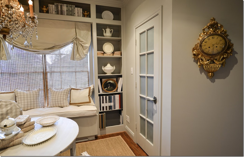
And looking the other direction. That gorgeous door was added when we moved in – this room used to be Ben’s full time office. It was so noisy in here – we added that solid core door to cut down on the noise and had the room wall to wall carpeted too! It helped lessen the noise, but eventually Ben got serious about work and moved out to a real office and about 10 years ago, I had the carpet taken out when this became my office.
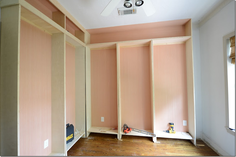
I hired an elderly retiree to do the construction. He was slow as molasses. It took him weeks and weeks to get anything done. I almost pulled my hair out, along with his remaining strands, too!! It was a big mistake hiring him – but he did do a great job in the end. I painted it all gray – and after much discussion here in the comment section over the merits of spraying versus hand painting, Raul sprayed all the shelves. It was fine. You can hardly see the paint on the shelves for all the books – it wouldn’t have mattered either way.
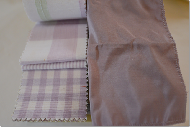
I showed you these fabrics I had chosen, but it turned out these checks were discontinued. So, I picked another taffeta and a beautiful lilac check from Chelsea Editions. That was all fine and dandy until the design books starting going in on the shelves and were soooooooo colorful! My quiet gray space became a cacophony of color!! I spent a weekend in hysterics over the already bought fabric. There was no way I could put in lilacs with such vibrant shelves. It took about two weeks to settle it in my mind. Back and forth, back and forth. I wanted lilac but knew it was wrong. I knew I just needed to keep it neutral. I even thought I should just cover all the books with cream paper or turn the bindings around? What??? It was typical hysterical time. In the end, I ordered an off white taffeta and linen, along with the gray check from Chelsea Editions. Ssssh. Don’t tell Ben!!! One day, the unused lilac fabrics will go in my guest room unless I find a client who wants them before then.
Once the fabrics were decided on, again, I started thinking about the rest of the room. The very first thing I bought was an old Macaroni beaded chandelier on 1st Dibs, along with a faux antique library ladder from “Paris” – sure!! Someone is making a fortune off that scam! The Lone Ranger Antiques sold me two demi lunes and two chairs and surprised me with a gorgeous gilt wall clock!!! I was stunned at his generosity, and most grateful! Bringing the books into the room took several weekends with help from James and his niece, but then I had to realphabetize them all over again when I realized they had put them in order by the publishers. Yep! And finally Monica from Custom Creations By Monica installed my shades and window seat and Anthony (713-861-3000) brought out a fresh new seagrass rug. And so, here it is:
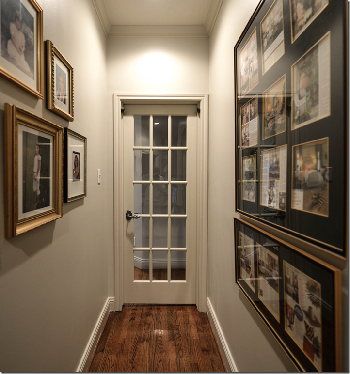
The library is located upstairs off the back hall. I have all my framed photos of Elisabeth here from baby on and some framed magazine photoshoots on the wall. The solid core door was replaced with this French door, which drove Ben insane – “that solid core door was so soundproof! Why?????” Well, look at it! It’s kind of cute!
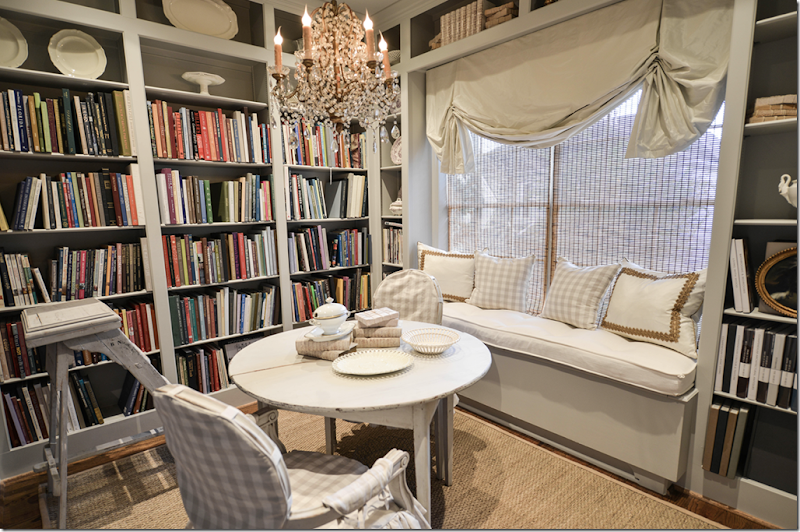
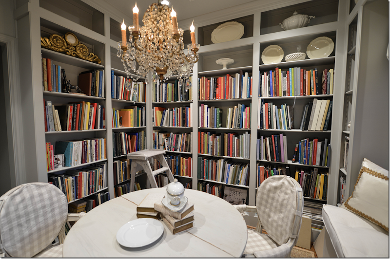
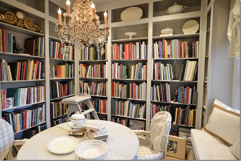
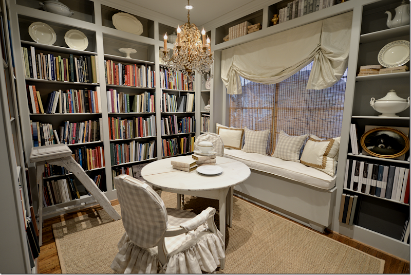
And here it is!! See how colorful the books are and why I was so scared of putting lilac in here? I think the cream and gray check from Chelsea Editions was the right choice.
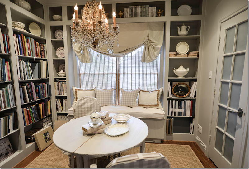
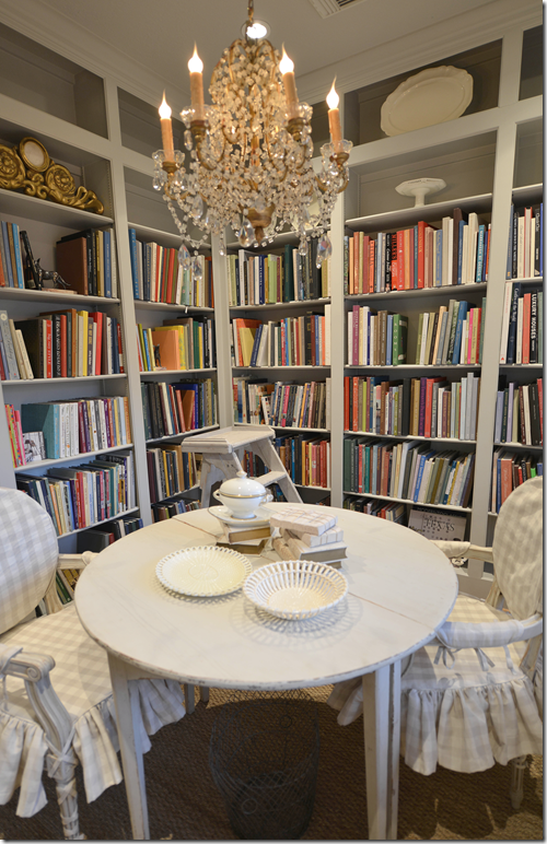
The chandelier is vintage with macaroni beads. The demi lunes and chairs both came from The Lone Ranger.
I filled the empty shelves with creamware and ironstone mostly.
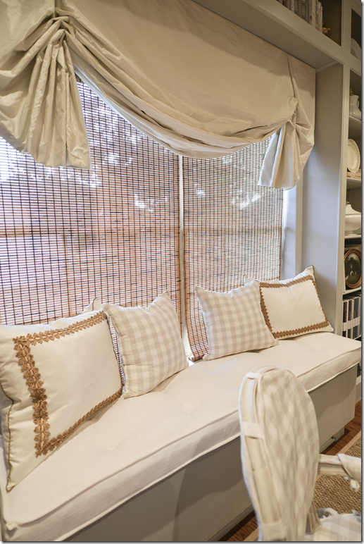
The shade by Custom Creations By Monica is silk taffeta by Schumacher and so are the two pillows. We added some gold trim from Samuel and Sons to dress them up a bit. The window seat is linen. The tortoise shades are a left over from the office. I was going to take them down, but actually the color picked up the color of the seagrass and the trim so I kept them. Plus, the sun is so hot in this room that it really needs shades. I probably should get just one shade, but enough is enough!!!
The closet door got a small French door too. To custom order one with frosted glass was going to be a long wait AND it was expensive. Instead Raul used this spray on frosting that worked out great and kept the price WAY down. The frosting isn’t perfect, it’s a little mottled in areas, but it’s good enough. It’s not the White House, and it’s not for a client so it doesn’t have to be absolutely perfect. I’m easy. The frosting works perfectly though and hides all the junk inside the closet. To the right of the door is the vintage clock from Sweden via The Lone Ranger. He sent this to me on the truck with the delivery – I was shocked and sooooo excited!!! Thanks L.R.
I wanted the shade to be really full and fluffy. In fact, my entire design scheme was meant to be very, very feminine, Swedish or French in feel, quiet and a bit elegant. I love the cool colors of the gray, the creams and the whites. And I love the touches of gilt throughout the tiny room. The gold and the chandelier gives it that dressy vibe I was after. This is definitely a girl’s library and that’s what I wanted. All of Ben’s books went on the built in bookshelves on the landing, finally organized for him, also.
The best part is how functional it all is. It takes me just a minute to find any book I want!
In the corner is the “antique” library ladder from “Paris” via 1st Dibs. Snort. It’s great to reach the high shelves. I elected not to put books on the highest shelves, but if I find I am running out of room – I can always move the books up there. I’m thinking about putting a small TV on the wall by the door and letting Elisabeth use this space when she has friends over. They can sit around the table and on the window seat and have some now sorely lacking privacy. Plus, this room connects to hers through the bathroom. It would make a great mother-in-law suite one day, we could move the table out and put in a chair and ottoman instead. Or, if I ever wanted to use it again as a full blown office, I could work on the table or exchange it for a desk if needed. So, there are lots of possibilities for the space down the road.
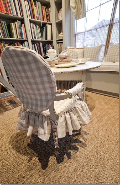
Hien Lam made the slipcovers with a ruffled skirt and tied on arm covers.
There are cute ballerina ties on all the legs – I love that detail. Notice the slipcover comes in 4 pieces – the back, the seat, and the two arm covers.
One of my favorite parts of the library is all my Beta Plus books (all 33 of them!) are finally together – on the right, the bottom three shelves. Some of them are bigger and so they are stacked front-ways, but it doesn’t matter. It’s just great to have them all together in one place. I also organized the books in separate sections – such as French design, English Design, Italian Design, Californian Design, Classical American Design and Interior Design, Country Design, along with window/curtain, bedroom and bathroom design, which again makes finding books super easy! And finally – at one point I was going to put sconces either on the sides of the shelves or above them, but in the end, I thought it was just too-too much. Instead, my electrician added tiny ceiling lights around the perimeter of the room, on a dimmer, which makes the room either very bright or atmospherically dim, take you pick.
From this:
To this!
Better?







Well, if this doesn't beat all of the posts I've been reading! Simply and spectacularly beautiful, Joni! I must admit, creamware and ironstone put a calming effect on anything! This room is fabulous! Love the chelsea textiles prints…we have a bench in this pattern at the shop now. I love your creativity! You are such an inspiration to us all! Especially to me!
ReplyDeletewhat a stunning transformation Joni!!! I absolutely love makeovers and you have done a wonderful job! The chandelier is divine!
ReplyDeleteWow, Just stunning- You will NEVER move EVER ! I love it ! Thanks for sharing- I love Jeffrey (Lone Ranger) he was so good to you ! Tell, Tell, Tell about the 1st Dibs "antique" I shopped there a few years ago furnishing a new house, but haven't lately. Shame on that seller.
ReplyDeleteFABULOUS! CT LOVE!
ReplyDeleteReally nice job Joni!
ReplyDeleteSO AMAZING! Love it!!!! You outdid yourself :-)
ReplyDeletewhat a beautiful transformation. I love it!
ReplyDeleteOh my God, Joni! It's stunning. Absolutely stunning. I love the whole thing - not a thing I can think of that doesn't fit or belong. I think all of your changes to the original plan are perfect, and agree that with all that color on the shelves - the gray just gives this "ah" feeling whereas the lilac might have looked a little like WTF? LOL! I wonder though, what in the world does the rest of your house look like now? Part of what made those little corners and vignettes in your house so interesting were the baskets of books, and the books on chairs and tables, and ....
ReplyDeleteI think back to that entry way table(s) you just got and how stunning it looked with the gorgeous baskets of books underneath. That warm swedish gray juxtaposed with that blonde wicker was just perfect - but now that they're empty I wouldn't think you'd have them under there, so what in the world have you done? Where's that layered Joni Webb look going now that the books are gone? I know you won't live with it empty for long! What's the plan?
Gorgeous! Gorgeous! Gorgeous! I think that this room is my second favorite in your house, next to your formal living room now with all the white slips ... I know you're so relieved that I approve! HAHAHA!
What a wonderful job you've done. I know there were struggles and headaches but it was all worth it. I'm sure you'll love every minute you spend in this room.
ReplyDeleteBe still my heart!
ReplyDeleteSuch a gorgeous transformation. And libraries are my favourite rooms!
You will be spending many wonderful hours in there, I'm sure!
LOVE! :)
ReplyDeleteSo relatable, all of the decorating books placed and stacked all through the home. Thanks for showing your beautiful solutIon Joni.
ReplyDeleteBeautiful! Love it all. I cracked up at you reordering books on Amazon. I'd like to be type A, but have duplicate books because I can't find it when I need it!
ReplyDeleteSo, is this where you blog from now? Where are your dogs?
ReplyDeleteLooks so as they say in French - "charmant"- charming!
pve
Better? I think it's absolutely gorgeous! Wow, enjoy it!
ReplyDeleteJoni...you've topped yourself! Brilliant use of space and color. Seething with envy lol. Oh to have one's books in one place! Que Bella!
ReplyDeleteI really do enjoy everything you do. Im inspired now to redo my chairs and maybe in a check too. Thanks so much for sharing. Fiona
ReplyDeleteYour library is wonderful. I am surprised all the books are shelved with space to boot! The grey is soothing just the way a library should be. Only thing I would do is clear the table so it is ready to be used. Love the use of the top shelves. I would spend a lot of time in this room as it is much more than a storage room for books. It is worth all the hassles to get it finished. Well done.
ReplyDeleteWow.....so much better:) Love it,the gray was a great choice,love the check and the windowseat too. Finally a great resting place for all those design books! Looks like there's room for even more....a big perk! Enjoy it, you did a fabulous job!
ReplyDeleteAbsolutely gorgeous!
ReplyDeleteLove it. I could sit in that library all day. Enjoy the fruits of your labor!
ReplyDeleteReally pretty! Perfect combination of practicality and beauty.
ReplyDeleteIt's truly wonderful; I love every detail. As always, I laughed throughout your story! You are too funny, and I love your unvarnished telling of the mistakes you made - I can relate! Enjoy your beautiful new space. Beth
ReplyDeleteLove it...and still room for more books! Now I want one too!
ReplyDeleteIt's Monday morning coffee & the results are in ... I have library envy! Joni, it's wonderful, calm, organized, inviting, private and feminine. Thank you for sharing the honest before (which I can relate to!) and for giving us all hope (even if only in a dream!) and inspiration. Bravo!
ReplyDeleteSimply stunning!!
ReplyDeleteBrilliant transformation! Love those french doors. I was never a fan of the original fabrics and your final selections are divine. I think there will be some happy handymen this holiday, this post is going to start a library trend! Got a chuckle about the alphabetizing! Have a wonderful week.
ReplyDeleteAlso, you might have already shared the final paint colors but if not, can you please do so and the dimensions of the room and ceiling heights. Thanks!
DeleteI like the mix of plates and tureens etc, to me it makes the space more special/more you surrounded by the things you love and collect. I have never built bookcases but if the books are too big....I have many that don't fit on my shelves just turn them....are those the same demi lunes from your entry or different ones? I too am curious to know what you did with that map??? This post is going to be generating alot of buzz.....Cheers
DeleteThanks EVERYONE!! Wow - you are all sooo sweet! the room is really small - not sure exactly, but its' probably 12x10? not sure! maybe bigger. and the ceiling is 9' tall which is nice. so - we kept the shelves as narrow as possible which is why some really wide books have to be turned. just a few, not that many. yes, the demi lunes are the same kind of table as downstairs, but smaller. james took the map. it was an old one and worth something, but it was pasted on this huge heavy, heavy board and he wanted it, so... plus it was a mess. torn and ragged. it looked better in pictures.
Deletethanks again everyone for your kind words! oh - the paint color. hmm. I need to go find a can in the garage, i just can't remember the number!
Just wondering if you ever got the name for the paint color. Looking to paint an older china hutch and love that shade of gray. Thanks!
DeleteJoni,
ReplyDeleteThe library is stunning and I love the grey on the shelves. It's such a calming space and I can only imagine the hours you'll spend in there.
In case you'd ever like to have a record of your collection of books, there is a wonderful free app on smart phones called Book Catalogue. You scan all the book UPC codes with your phone and it uploads all the information for you. title, author, etc. You'd have it on your smart phone (I'm assuming you have one) and if you're out and see a book you can check to make sure you don't already have it. If you loan out books, you can notate it on the app as well. It's super quick and nice to know what you've got in the Library and not buy duplicates.
A wonderful post and worth the wait to see the library. just beautiful.
Betsy
Betsy thanks for the information on the app, I have so many duplicates and no matter how advanced I try to be with my nook and IPad I won't ever give up my design books! Sarah
DeleteYes! Thanks Betsy for the info on Book Catalogue. Downloading NOW!
Deletewhat a great app!!! i can't tell you how many duplicates i had. embarrassing!
DeleteHave you considered donating the duplicates to one of the college interior design departments in Houston? I am sure Rice or University of Houston has some professors who would dearly love these for resources and would come get them off your hands. And, what a lovely room! Completely worth the wait!
DeleteWholly cow Joni it's fabulous! I've gone back several times already just looking. I think you got exactly what you wanted and it came together so beautifully. We have an extra room upstairs and now I'm going up to so what can be done with it you've given me so many ideas! You lucky gal!
ReplyDeleteXXX
Debra~
Extremely outstanding!!
ReplyDeleteHi Joni,
ReplyDeleteLove the library and so nice to have all your books in one place. I think many of us creatives have the same problem of where to put all our books. I love the colors your chose and am glad you decided against the lilac, the books really do add a lot of color. Funny how it looked like so many more books when they were in different rooms. I would love to have the space to do something like this in my home.
one thing, i didn't say - i culled the books. I gave away a slew of books that were really bad or ones that i didn't read. titles that i had bought from amazon or years ago and that i knew i would never open again. most were just compilation books. not designer's books. books like "Designing for the Seasons" - i just made that title up - but you know the kind. I was amazed how many books were just taking up space. I was going to take them to a library or to half price, but James' niece is studying fashion and design in college next year and she really wanted them - so it's a great for her to start her own library. Also, there were alot of books on the kennedys, the royal family, art, travel - those went into the landing library. i only brought in the pure design books.
DeleteAbsolutely gorgeous!!! It was worth the wait.
ReplyDeleteOh my gosh, Joni, it's beautiful! You must be thrilled. And you have room to add more books:))))
ReplyDeletelove the gray! whay color did you use
ReplyDeletethanks
Karen
I don't know what color Joni used, but if you want to consider a good, clean gray, look at Skimming Stone by Farrow and Ball. It doesn't have a blue or green undertone. It is a perfect foil for someone wanting to use more color in their fabrics.
DeleteWow! It turned out gorgeous! LOVE the fabrics and chandelier!
ReplyDeleteJoni, I enjoyed so much seeing your pretty new library. And, I love your commentary as much as your design. You are so funny! I have the same problem with books (well, maybe not QUITE as bad as yours!) but my husband will attest to the fact that I have tons of books, since we moved recently and had to have them all packed up. He was shocked at the number of boxes required for them. Oh, and the Verandas, and Southern Accents!! AAAGH. What do you do with your magazines???
ReplyDeleteLove your blog!
some are stacked in the closet and some are stacked on the shelves in the corner on the bottom. i still need to tackle those though. i'm only going to keep veranda and SA- the rest are all online mostly now.
DeleteBrilliantly beautiful!
ReplyDeleteIt is fabulous, Joni. I love the chandelier's femininity (I want one just like it.) and the creamware and ironstone that add beauty and calmness to the bookshelves. The clock from Lone Ranger is beautiful. Were you really able to fit your massive collection of books on these shelves? You should be very pleased.
ReplyDeleteBest...Victoria
I don't even know where to start - it is beyond fabulous with so many of my favorite things - BOOKS for a start. What a beautiful way to organize your collection and to have mine alphabetized would be pure heaven! Love the color you chose and the neutral fabrics add such a serene feel to the space, and oh my, the chandelier...perfection! Just love it all, Joni ~
ReplyDeleteThere is no one who writes a blog like you do! Love the details and all the info! Great job
ReplyDeleteLove your new library Joni. Patience pays off and you are right about the explosion of color those spines add to the room. That's a very good note to self for future. Very sweet and charming though I'm surprised you didn't add the library sconces. That shows a restraint I don't have!
ReplyDeletewell, the room is really, really small - i think you would agree if you saw it. i wanted them for sure, but then, with the chandelier - they would have to have a certain look. it just got too complicated and just too much. the lights were a better alternative.
DeleteI think the best part of the post is the detailed step-by-step process so we can all learn how unforeseen obstacles (fabric colors clashing with book colors) were handled as well as nuances like frosting the door panes and dimmable ceiling lights in place of sconces. Thank you for letting us learn from you!
ReplyDeleteI agree! The process is so interesting.
DeleteDid you see Million Dollar Decorators last week? Mary wanted to use lilac but her client was concerned about that color as a backdrop... It all worked out and looked beautiful. Funny you had the same issue.
ReplyDeleteLove the library, and it is so soothing!
i actually agreed with the client. i thought the lilac and green were too much with the clothes, but then again, i'm no mary mcdonald!
DeleteLovely. You were so right about the lavender. And it shows off your fantastic collection of beloved books so well. It's the perfect reflection of you.
ReplyDeleteJoni,
ReplyDeleteYour own space, decorated exactly as you like is worth its weight in gold. You did a fabulous job and I love it! Great job.
Karen
I love it. I just love it, love it, love it. Beautiful.
ReplyDeleteIt is wonderful!!
ReplyDeleteJoni - what a great transformation! I really like it and love the colors and everything. Like you say, truly functional and it can be adapted to something else down the road or if you sell your house. Kudos to you! ;-))
ReplyDeletePerfect! Now I'm just wanting to take a nap on that window seat!
ReplyDeleteI couldn't wait to see what you would come up with in the end. You surpassed everything I could imagine. Excellent choices and a wonderful feel to the room. REALLY enjoyed following this story! Dani
ReplyDeleteSomething is missing...
ReplyDeleteI know a bouquet of live flowers on the table! That can be done whenever you want to feature the room. And in memory of Sister Parish, possible needlepoint pillow in center of the window seat (faded of course) to tie in your Spring colors that the books introduce and also bringing in more of that 'human hand' into the room.
Something else is missing...
on the other side of the room... with no book colors. And book side has no gold.
Bookshelves are slightly not deep enough for the back binding (technical side of me notices)
Not a fan of all those dishware, I think taking out a few would improve the 'room for more' feeling, like unfinished collection and inspired to collect more books type feeling. You are not finished collecting but the a lot of dishes do not relate to the use of the room!
LOVE the dog photo! MORE ADD MORE! The richness that picture (in oval gold frame) is so PRECIOUS! It along with the clock and a few ironstone and creamware really class up the walls and shelves. The clock needs some support on that wall, molding perhaps, to take the builder look away from that side of the room and add a custom feel the way the other walls have all the built-ins. So Asymmetry vs Symmetry in the room.
Not being critical, I am hoping this is taken as constructive criticism (I worked with hard case goods & millwork in my working days, now retired)
This room has a GREAT purpose and incredible realization of your mind becoming more organized (we always show our personal change with exterior manifestation) as the computer uncomplicated your life (and all of ours).
Those chairs and table are so special and sweet! Love the layering of rug and shades being natural adding that hand-natural feeling to the room thus bringing it down to Earth. The great and fantastic dog print does the same thing, humanizes the room so (and brings out a tender emotion to the viewer)!
Very lovely room, but Mary Ruth is right about the shelves being too narrow for the books (spines hanging over the edge). Joni, how deep did your carpenter make the shelves, and for those with experience in millwork, what is the textbook depth they are supposed to be? Not trying to nitpick, but want to avoid a similar situation myself.
DeleteAnonymous, I wanted to reply to those questions that I based my coments on.
DeleteThis might be helpful... The sagulatior: http://www.woodbin.com/calcs/sagulator.htm (depending on which wood you use)
Adding a strip in front of the shelves gives the extra thickness (top of shelf to bottom of strip) that adds strength or run a metal angle brace along under the shelf as well (and a wider-than-the-shelf edging bracket can camouflage it)
Also for heavy books: Using 5/4 lumber (nets out 1 inch thick) or even 6/4 (nets out to 1.25 inch) is stronger if you do not want to put in the ledger strip at the front of the shelf.
When I used to design bookcases I measured the books (the widest ones) because these are design (or sometimes called 'coffee table' books) they are larger than the typical 11" the older bookcases allow for novels. Since most bookcases are made from wood then the width of the board foot was usually the rule of depth, economy of a project always has dictated the amount of shelving and end panels you can get out of a length of lumber (also applies to kitchen cabinet sizes due to how many pieces you can get out of a 4'X 8' sheet of goods). Custom or semi custom changes the sizes to accommodate and thus requires more cost reflected in the price difference.
great suggestions mary ruth = i did keep adding things on the upper shelves for the pictures, but, then I could take some down. i just like the white in there - so that's why i put the creamware. i also had some purple transferware in one section of tiny shelves.
Deletethe depth. well - that is a problem. we went back and forth - measuring books. but there were always books that were bigger than normal and the room was so small - the carpenter wanted to make them even shorter! but i keep pushing it out an inch. I want to say they are 12" deep? maybe 13? the other shelves are deeper in the house, but the back space is wasted and empty. so, yeah there are some that hang over. it is what it is. it's not perfect. i know that. they should be probably be 15" - but it was the size of the room that stopped me from making them over deep. I knew it some would have to be put the other way or hang over a bit, i guess i do wish i had made it an inch or two deeper? urgh. it's hard to do it by yourself!!!
one other thing - I do have them all pulled out to very edge of the shelves. they could be pushed back somewhat- an inch or 1/2 inch. but it's tight, i know that. design books are huge.
Deleteone last thing - i took off all the bookcovers to tone down the books. i think that helped a bit with the color.
DeleteI know what you mean about the size of the shelves! The photo does not reflect that you have that depth already! I hope to see more adorable chien! what a sweetie!
DeleteYes, the bookcovers being off make a nice display!
Thank you for your responses, I appreciate reading what you wrote.
I not only ENVY your library of books. I also ENVY the EXTRA SPACE you have to fill with more books in the future!
Joni
ReplyDeleteThanks so much for sharing your beautiful room! Lovely post! I had a similar dilemma. So I painted my small library a very deep purple. Took guts but the book shelves and other artifacts in the room really pop. I have the same shade as you have in a lovely cream and deep purple toile from Shumacher! Completed the project with a Louis XVI daybed from Ballard. Love it. Finally my design library in one place. Can't tell you how much joy I derive from your posts.
Marion
i would love to see it!!! send in a picture!!
DeleteMarion please please send in pictures, I am not a "purple/violet" type of person but I love the rich dark purples, similiar to eggplant....sorry can't think of a better word. Also I am so curious about the Ballard daybed, I covet their furniture but have never been brave enough to purchase and would love the feedback!
DeleteJoni, I am ready to move in! Every detail is perfect, and I loved the running commentary, too, particularly about Mr. Slipper Socks. Gotta love his comments and yours.
ReplyDeleteI am so in love with this room, and if I were you, I would keep the lavendar fabrics for the guest room.. Those need to live in your house, too, but the colors you selected are perfect for your library.
I would love to hear more about the library ladder from "Paris." Did you know it wasn't genuine when you ordered it? What about it gives it away to you? It seems like there is a backstory there that I'd love to hear!
ReplyDeletewell, no, i thought it was probably original or old. but when i got it i could tell it was just roughed up and painted. plus it is stamped "paris" on it. but in france, it's not called paris. so why would it say paris on it? i guess if i had bought a wood ladder and had it distressed it would have cost as much. it wasn't that expensive. i've seen originals ones from paris libraries before - in shops around town a few years ago. maybe those were fake too? plus the shop had 3 - in three different sizes - another big giveaway. but it's cute, functional and i do like it. so alls good. it just makes me laugh!
DeleteP.S. Your carpenter may have been slow, but wow, he did a super job! And I like the new chandelier and the "French" ladder. I think I would just move in there. That day bed makes it so comfortable that I would move in and just sleep, read, and eat. My three favorite things to do aside from shop!
ReplyDeleteAnd the demilunes and the clock that they GAVE you. What a great friend! And the slips on the chairs with the ballerina ties just cap it off so well. I keep going back to look at the details again. Sorry for multiple posts from me. I was headed out the door when I saw that you posted, and I couldn't wait to see this. So I headed straight back inside and now I'm late. But tough!
ReplyDeleteXO,
Sheila
thanks sheila!!! so much!!! of course my mother emailed me and said. "it's nice, but don't you want a desk for bills and blogging? and that chandelier. i can tell you're happy, that's what matters." hahaha!!! we are always children no matter if we are on social security.
DeleteWow -- it looks great, Joni! I can't get over how SPACIOUS and ROOMY your library looks, even after the bookshelves ate up floor space around the perimeter of the room. You were right to go with neutrals, and I'm so glad you didn't turn your books backwards,rip off all the covers, or paint the spines purple to match your fabric... ;-)
ReplyDeleteAlso, past due bills from 10 years ago?!! Hopefully they were bills that have already been PAID! Congratulations on your beautiful transformation, and finally achieving the library you dreamed of for so long.
Happy Hannukah to you and your family!
thanks! but i did take the covers off. it killed me to do that because some are gorgeous, but then some book covers are gorgeous and we never see them - ala miles redd's new book is like that. the cover is better than the book jacket. i'm noticing that the trend seems to be going away for book jackets though. good! make the cover beautiful!!!
DeleteI've always loved your slipcovers...how feminine they are. Dreams of a painting studio with these details (my design books are stacking up as well)and rough wooden beams come into my head all of the time. For now, I'll take the squished room off of the mudroom. The kids get to paint with me , and there are no worries about clean-up.
ReplyDeleteI think it's beautiful!
Tawna
You outdid yourself. The new space is wonderful + everything is soooo organized! Doesn't it feel grand to have a newly designed room? I would go in there (just to admire my handy work). Happy Monday xxpeggybraswelldesign.com
ReplyDeleteOH it just so perfect I don't think I'd ever want to leave that room. It's wonderful.
ReplyDeleteEnjoy,
Tikaa
Beautiful.....I love that it is a feminine room too!
ReplyDelete~Des
Simply lovely. Major case of envy here. I've always wanted a library as we have books everywhere, too, but no extra room. I've been having to purge and donate. Why is it so hard to get rid of books? Hope you enjoy your beautiful new space and can curl up on the window seat with a good book.
ReplyDeleteI absolutely love this room! Where do you get your seagrass rugs? I have yet to find the perfect source (that doesn't have latex backing or a thick border).
ReplyDeleteAnthony - I added his phone number on the story - go back and look and you will find it where i said anthony delivered the seagrass!
DeleteOh thanks so much..don't know how I missed that :-)
DeleteI think it was very rude to criticize your handyman on your blog. How about just stating he did a wonderful job and keeping it to yourself.
ReplyDeleteyou're right actually but, wow, he was soooooooooo slow because he worked alone. i knew he was slow, i shouldn't complain, but even ben was like - is he ever going to be done? he did a good job and i paid him well for it and he was happy. i would never say his name here and actually i would recommend him. so. point well taken.
DeleteDoes he read your blog?
DeleteWell, Merry Fu*king Christmas! This should shut you up until the New Year!!!! Yeah, Joni! Is this your "Quiet Room" that Romney talked about? LOL!
ReplyDeletejust until new years?????
DeleteJane, your pants are in a wad because of ???????
Delete"Merry Fu*king Christmas" - are you really playing with a full deck today? Also, didn't know
Romney ever talked about a "quiet room", but perhaps a straight jacket for the disturbed like you.
Wow! What a transformation! Not only beautiful, but more importantly, functional! It's hard to believe it's the same room!
ReplyDeleteSue
Beautiful and functional transformation! Congratulations!
ReplyDeleteI'd love to know your paint choices for the room and especially the bookcases. Did I miss them in a previous post? The room is beautiful. I'm afraid I would never leave it to get anything else done. Thx.
ReplyDeleterobbiecantey@gmail.com
Did we ever find out what paint color(s) Joni used
DeleteGorgeous. Glad you decided against lilac. Dishes in the library seems odd - look like space fillers than don't belong. A little empty space can be refreshing!
ReplyDeleteLove it! My favorite room that you've done.
ReplyDeleteIn one word : GORGEOUS !!!!!!
ReplyDeletexx
Greet
Greet, your family business is millwork (for generations if I recall correctly). How deep (profond) do you make bookshelves in Europe? Is there a "standard", general measurement such as 30 cm deep (i.e. 12 inches in the US)? I know people can make their shelves any depth they choose, but what is the "general rule of thumb" for bookcases? Are there any other "standards" such as how high from the floor one commences the bottom shelf, how thick the shelf itself should be to support the weight of books without sagging (2.5 cm/1 inch?), the maximum length recommended for each shelf before the centers are in danger of sagging (75 cm/30 inches?), etc.? The numbers I've mentioned in parentheses are just guesses, included so you can get a clearer idea of what I'm asking.
Deletelet me see if she will come back and answer this! ok?
DeleteEven though I don't like to answer to questions from anonymous readers, I decided to answer your question, because you are a reader of Joni’s blog!
DeleteActually there isn’t a standard general measurement for the depth of bookshelves. However the bookshelves of the cabinetry in ancient houses were not that deep. Most of them had a depth of approx. 30 cm. Aesthetically seen, shelves with a reduced depth are preferred but nowadays not always efficient as today a lot of the book sizes are changed.
We always prefer to take the minimum depth, if possible.
How high from the floor the first shelf of bookcases commences depends on a)the style and design of the bookcase; b) the hight of the particular room - which is very important! If a bookcase has a (closed) lower part and an open upper part, you do have to respect the proportions of both parts.
The thickness of a shelf is depending on his length. The best is to use solid wooden shelves. A 3 cm thick shelf is very solid but doesn’t always look very nice.
Choosing the right proportions is the secret behind designing a perfect look of a bookcase. And yes, of course, also one of the Lefèvre Interiors ‘ design secrets.
Proportions are so important designing a bookcase or a room, or an architectural project in general. A good schooled architect or interior designer will be able to design his projects according to the ‘Golden Ratio’.
I do hope I answered your question in the best way.
Greet
Sometimes shelves are not always thick, but have a bullnose applied to the outer edge to cause it to appear beefy.
Delete@anon #1: Regarding your question re the depth of bookshelves you may want to check your closest library out. One of the oldest libraries in our City still has wooden bookshelves which appear to accommodate most size of books. Another place might be the library of a College or University. Just at thought! -Brenda-
DeleteHOLY S*** Joni -you know that is like every design bloggers dream! I have all of my books piled into my living room and it's a mess. You'll have to invite all of us to hang out and read your books and drink starbucks! ;-)
ReplyDeleteLove it! But I feel like you should confess as to how many of your books you had to weed out to get this fit! ;o)
ReplyDeleteOh the day I have been waiting for is finally here!!! :) To be honest I was selfishly looking forward to the lilac check as I am in the midst of redecorating my guest bedroom in the lilac check Pinecone Hill bedding and wanted to see how the "good stuff" would look. But you were right, lilac coupled with the colored book jackets would have been a hot mess.
ReplyDeleteMy friend you are receiving a standing ovation in Phoenix at this very moment. Well done I say!!!
Lovely. Had you not told us about the lavender check I would not have thought about how much more lovely it would have been. It's so hard to be "bold" when we haven't seen it before - mixed with colorful books, but it would have been lovely. No matter, you must be thrilled! I can't believe you have space still on the shelves, are those all of your books? One suggestion, I would limit your cream ware to just tureens or just plates, much more stylish. I always want all my items out on display as well, but they look better grouped. And that gorgeous dog picture hang it on the outside of the book case "over the books". Lovely Lovely Lovely. T
ReplyDeleteAnd the gold piece fragment over the door. :)
Deleteomg, i will!!!!!!! i just bought that from Janet Wiebe the other day and stuck it up there! yes!!!thanks.
Deletei was thinking about hanging the dogs over the shelves too, but sometimes i don't like that look, but i'll see it if looks good.
I don't know who Janet Wiebe is, but all I can think is "must buy more from her". It's beautiful! And that clock from the Lone Ranger! PLEASE! Beautiful! Hugs T
Deleteomg!!! I just looked up her website, seriously I am making every effort to move to Houston! I saw your piece on one of her chairs - love! By the by, love the trim on our pillows! Wow! T
DeleteWhat a treat, Joni. I'm green with envy!
ReplyDelete...better than better...simply perfect...right down to the antique ladder...once used by a starving artist in paris...i love it...blessings laney
ReplyDeleteAs a fellow book lover, I am in awe of your transformation. Bravo, Joni!
ReplyDeleteNothing makes a room come alive like books.
For the last two years the DC Design House has featured libraries. Both designers decided to cover each book with identical covers so they all "matched". The only reason you'd spend much time in those libraries is to remove the matchy covers to locate the title of each book. Your library is gorgeous and organized to be used.
ReplyDeleteBeautiful office! I laughed when I read the part about having to redo the books. An intern once organized my classroom collection for me, alphabetizing them by author. However, she placed the spines against the wall--so all I saw were pages facing outward. (Poor gal was so proud of herself, too.) Love, love, love the white silk with the grey and creamware.
ReplyDeleteWhat a nice treat this morning, shame on me for scouring this post instead of doing my real work!
ReplyDeleteYour talent really show through in the calmness that you brought to this space. Congratulations, how lucky you are to have the creativity to create this for yourself.
Kind regards,
Congrats, Joni! Functional and beautiful!! I love everything. That entry French door is perfect. Enjoy your fabulous new library :)
ReplyDeleteLoi
It's a stunning improvement. Beautifully soothing color. But why the plates???What purpose do plates have in a library. Must rethink that in your spare time.
ReplyDeletegive me some ideas. i like the white punch, but i'm open.
DeleteI really like the white punch as well. Why not use one kind of something white so that it looks like a collection rather than an assortment. Perhaps all tureens, teapots or plates, but all the same item in white. White and gray are beautiful compliments.
DeleteLove it! I never would have thought about the vibrant book spine colors. Live and learn, right? So funny that your helpers organized your books by publisher.
ReplyDeleteThanks for sharing and Happy Hanukkah!
Maureen
I'm not sure I would ever leave that room.
ReplyDeleteI just love the whole thing! You were so right to store your lavender checks and go with the gray. And I love plates anywhere, although looking at the pictures of your past track record, I fear that the plates are not long for this world and will soon be evicted by books. I know the feeling. Our library media room is totally lined with bookshelves, my husband's office is totally lined with bookshelves, and his large workout room is totally lined with bookshelves. But Amazon packages keep coming! Fabulous idea about the frosted french door--it adds so very much.
ReplyDeleteGood call on ditching the lavender. Love the seagrass with the fancy finishes (your trademark!) I could see a desk in there if you actually need a workspace. This is pretty awesome, Joni!
ReplyDeleteI laughed out loud when you said you bought new books on Amazon, although you knew you had them! I have more books than space, as well. Soooooo many more. I don't think those empty shelves will remain so forever!
ReplyDeleteThough the gentleman took a long time to build the shelves he did a beautiful job! In a few years you can laugh about it!
I recently redid my Library, and though it is not half as stunning as your own, I love to spend my time there, reading in my daybed.
Thank you for the inspiration!
xo
Andie
Wow! This room has gone from college-girl-with-a-flair design to full fledged sophisticate. Just lovely! What did you do with the map??? I covet that map! I've been looking and looking at similar ones and they are all so pricey. Will you put it somewhere else and do you know of a version that is affordable? Spectacular job!
ReplyDeleteWarmest regards,
Alexis
I WANT ONE!
ReplyDeleteReally, really gorgeous! Love the grey, and the pillows with the gold trim are fabulous.
ReplyDeleteOmgosh how exciting to see it all finished, it was worth the wait, GORGEOUS!!
ReplyDeleteXO KATHYSUE
Please... enough with the plates already! My goodness.
ReplyDeletejoni, this is fabulous! how wonderful it would be to spend a sunday afternoon in that room! just beautiful... pam
ReplyDeleteYou hire an elderly, retired guy and then complain that he was too slow? Wow. Next time don't be so cheap and hire a real contractor.
ReplyDeleteMs. Joni, this is simply beautiful. Thanks for sharing. Lakesha
ReplyDeleteFabulous space, you sure have a lot of design books, wow I thought I had a lot :) Such a great feeling Joni! Maria
ReplyDeleteYour room came out stunning!!!
ReplyDeleteFunctional and beautiful all at the same time
I am sure you will enjoy it very much!
Donna
thebeneblog.com
Ooo it's just too fabulous for words! Now all I need is an extra room!
ReplyDelete- Dana
Stunning, stunning, stunning! One of the most beautiful rooms I have ever seen!
ReplyDeleteKerry
oh joni... so peaceful, fun elegant and i could sit there for hours looking thru all of your fun books... so happy for you!!!
ReplyDeletewishing you a joyous holiday... xx
Perfect, perfect perfect!! That is one glorious Library, Joni! Love it, not only as a library, but what fun to have a book club lunch or something else cozy and fun in there. GREAT design, great transformation, and good for you for organizing it all into one usable room. xo Lidy
ReplyDeleteOh my! Its absolutely stunning, I could move into that room permanently. You have now inspired me to completely make over my studio which needs a lot more shelving for books and my artist bits and bobs. I just adore everything about the room. The colour palette is restful and I love the textures you have introduced, especially the wooden blind which looks a million dollars dressed up with the festoon blind above.
ReplyDeleteWonderful job, if I was living in the USA and not way over in New Zealand I would be getting you to makeover my studio.
Lee :)
What a gorgeous, calming room. I bet you must love spending time in there now.
ReplyDeleteYou could charge admission...I could spend several days in there...on the window seat...messing up the pillows....with hot tea and warm cookies served on one of the white plates...dreaming here. It might be nice to have the table closer to with window seat, with the chairs opposite more like a banquet for that purpose. Bravo!
ReplyDeletejoni, I am so inspired. I have a small den that would be perfect for such a change. thanks a million for outlining your entire process. It really helps! your final room is stunning and I know you will enjoy it. donna
ReplyDeleteReally lovely. Enjoy!
ReplyDeleteAdore!!
ReplyDeleteLove the cute chandelier. Perhaps wall to wall seagrass would have made the room appear larger. I agree with a comment above that the shelves should have been an inch deeper and a little beefier for accommodate the weight of the books. If possible, why not install the solid door you took out of the room as the door of the closet. The frosted paint on the glass is not adding anything to the overall appearance. There is paint on the market made especially for class. You can have it tinted so perhaps someday you can just paint the panes a beautiful light shade of gray.
ReplyDeleteI think the final result is truly beautiful! You put what ever you want on those shelves, you have done a lovely job!
ReplyDeleteOh the final result is absolutely stunning!!! I love the colors you went with. I need those slipcovers for my dining room!! Love!!
ReplyDeleteIt's gorgeous! We're getting ready to put built-ins in our dining room to make it do double-duty as an office and dining room, and now you have me completely rethinking how I had planned to do it! Your room is just perfection!
ReplyDeleteLovely. Just lovely.
ReplyDeleteGorgeous, Joni, absolutely gorgeous! I'm glad you didn't succumb to the temptation of covering all the books in white paper or turning them spine out. They look so beautiful (and real) with their multi-coloured covers. I chuckled when I read that you'd culled some of them - I couldn't quite envision ALL your books in that relatively small room. All you need is a pretty white phalaenopsis orchid for the table and you're done. What a fabulous job!
ReplyDeleteJoni, your office/library could not be any more beautiful.
ReplyDeleteYou made perfect decisions on everything in the room. I love the silk taffeta shade!
2012 Artists Series,
Karena
Art by Karena
The room turned out beautifully. The window shade is so elegant, but yet offers a warm feeling to the space. The chandelier is the perfect size and offers that right amount of "bling". I too have so often purchased fabric that I could not use and put aside to later find the perfect use for. Did you find your inspiration from a magazine , book etc or did you have a vision ??!! I love the French door in the hallway also. We added one where the door in our foyer leads to the basement area and it really opens up the space. It seems as if you don't have nearly as many books when they are arranged like this-love it. I can't wait until the next transformation. Enjoy it Joni.
ReplyDeleteKathy P.
Perfect use of a small space. Lovely little jewel-box of a room. Proof positive that rooms need not be grand and/or atmospheric to be beautiful.
ReplyDeleteMuch better! And it is nice to have all the books in one place :)
ReplyDeleteFor the closet door ... have you considered installing mirror instead of "frosted" glass or curtain (from the same taffeta silk) attached to strings on both top and bottom of the glass)on the inside-the-closet part of the door?
like here http://www.frenchdoorcurtaincompany.com/ I got nothing to do with this site, just so you understand what I mean.
Beautiful library! I like the shelves - the gray is perfect. The chairs are adorable with the ties on the legs. I think the fabric choices are fine and will stand the test of time and will go with everything. I do think you might consider stacking the books on the upper shelves also - this would add more height and drama to this space. I would have some books upright (as you have all of them) and some books laying flat and stacked. Then go ahead and add the dishes ( I think they work great)throughout. Kind of mix it up a bit. This is a great use of space and I think the room looks bigger. Also, maybe embrace some rich color here - don't fight it. In my own home I don't like a lot of jarring colors (I do like seeing it in other peoples homes though???)but I do like contrast. Something black - one of those tapestry pillows - would add contrast here. I am a decorating nut so I am just throwing out these ideas because I love to do it and can't help it! I do think your library turned out great and will just get better and better! I enjoyed the post - thanks!
ReplyDeleteBeautiful...a treat to see, and then to read all the details, the "back story"....nothing like your blog. The comments were interesting to read also. I am continually entertained and educated and inspired. Thanks for letting us look over your shoulder.
ReplyDeleteJoni, fabulous as usual! Love the fabric choices and the CLOCK! Don't despair about the ladder--maybe it's from Paris, Kentucky...or Versailles??
ReplyDeleteHave many lovely hours of serenity in this room, my friend--well done.
Gorgeous!!!! Pure heaven.
ReplyDeleteHappy Holidays to you Joni.
xo~
T
The library is just beautiful. It has always been my dream to have a library in my house! I am so glad that you posted this beacuse I have the bookshelves surrounding my fireplace filled with colorful books, and I too was worried that it would be too colorful. So I painted the shelves a soft grey/cream color and it tones the colors down.
ReplyDeleteYour hallway is great too - what color did you paint the french door trim?
STUNNING!! Jen X
ReplyDeletePerfect, as always. What style and grace it projects. And so peaceful I could curl up on the window seat any day!
ReplyDeletezoeripley
Beautiful job Joni! Particularly love the relaxed faux roman shade and ..... oo-la-la .....the chandelier is definitely something to rave about. -Brenda-
ReplyDeleteHi,
ReplyDeleteI am in Australia and dip into your blog at least once a week. You are so thorough! Love it.! I think that your new scheme is perfect. The lilac was too 'old lady' (which your not) Thanks for all your posts, always an indulgent pleasure!
Well done, Joni! I love it! I think it's awesome that you've take a conventional room and made it into something that's perfect for you. I'm missing my cozy library in Houston and have dreams of creating one here someday. Adding yours to my inspiration file (aka Pinterest!). Hugs!
ReplyDeleteI love this room! Great call on the creams and grays. It is so calm and soothing. I can completely see spending hours in there reading and sipping tea with no one interrupting me or screaming "mommy!" or "honey!" It would be like a mini-vacation - sigh. I may have to reclaim one of the rooms in my home as my very own now that I've seen this.
ReplyDeleteSo beautiful and so feminine! What a lovely retreat you've created -- Thank you for sharing your beautiful blog and talent with us!
ReplyDeleteSabrina
Overall it's very nice, however, the ladder looks a little silly since there are no books placed high enough to even need the it. :)
ReplyDeleteJoni
ReplyDeleteYour library is just lovely. I too think you made the right decision to forgo the lavender due to the books. You will probably have readers rushing to buy the lavender fabric anyway. I normally don't read comments on blogs but some of your readers comments crack me up! Post the paint colors for the walls and the cabinetry if you get a chance! Great choices!
Please, please share paint colors???
ReplyDeleteThe library is nice, but I liked the office better myself. It's the map that I find so appealing I think.
DeleteLove all of this. Thank you for sharing. Can you please share the color of gray you used on the shelves?
ReplyDeleteBetter! It looks awesome. You made the right decision in staying neutral.Love it.
ReplyDeleteCindy
WoooHooo! and Glory Halleluiah! It's fabulous and wonderful and glorious! I adore that gingham check, the chandy is divine, the round table is precious, and the colors are perfect. What a great makeover!
ReplyDeleteCindy
Joni, This is a dream library! I love your fabric choices and the slipcovers are gorgeous. Enjoy your beautiful new space. Hugs, Sherry
ReplyDeleteFirst of all, what an elegant room. Seriously, I can see why you opted for the more neutral colors versus the lilac. Given that I have a bazillion books and little shelve space, I have both room and shelf space envy. I did want to ask you about the concept of "function." When I was a pastry chef, there was a fairly rigid concept that if you didn't feature, say, raspberry jam in a dessert, then you didn't put raspberries on top of a chocolate cake, even though the raspberries upped the presentation factor by a thousand points. It seemed misleading. A lot of people ignored this (especially the food mags!) idea, but it was (and I assume remains) an issue of some debate. And I thought about this debate again when I saw how you used the teapots and plates as a way to break the open space of your shelves. Given that this isn't a kitchen, is there a debate in design circles whether the teapots and plates are "appropriate" given that this isn't a room devoted to eating or dining, or whether it is more appropriate to break up the empty space with design touches that, well, effectively and elegantly break up the empty space. Just curious whether this is a debate or not.
ReplyDeleteHi, Love this room!!! What are the dimensions? I want to do this in a small bedroom but I don't think its big enough to have the whole room done with built ins. Please let me know the size of your room. Thanks!
ReplyDeleteI love everything that you have done with YOUR room! Creamware breaks up the constant of the books...I love it! I love the unexpected, what doesn't 'go' is perfect to me! The fabrics are quiet, subtle yet, as you wished, feminine and that chandy? Want it! the gold clock is the gilt on the lily! I would be very happy in Joni-World! Just lovely!
ReplyDeletexoxo, Chris
Oh Joni!!! This is AMAZING! I am a bit behind on my blog reading and this is just breathtaking!!! I love every detail - especially the chandelier! The demilunes are gorgeous, the french chairs beautiful! I love the fabric choices you made! And the gold trim! Oh wow! It is all just amazing!!! Wonderful job - as usual! Thank you for sharing!
ReplyDeleteJoni
ReplyDeleteI am building in Dallas- I am fashioning my new library after yours- it is so inviting functional and unique- could you please tell me the color grey you used? I live in NY and am building in Dallas and not there to oversee colors so I am trying to work from a distance. Its all so beautiful
Wow! The transformation is not just better, but it is absolutely amazing. I have always thought of implementing a full floor-to-ceiling book shelves storage concept such as this in one of my spare rooms, but I have always wondered if the entire room might turn out looking cluttered instead. However, after looking at your refurbished home office, I guess it is the arrangement and organizing of all the items inside that is important.
ReplyDeleteCould you please publish colors u used for this gorgeous library- thank you
ReplyDeleteI would love to know the paint colors you used. I am currently building a home and I am thinking about doing gray in the library because of this post! I think the books look so beautiful on the gray shelves. Please do tell!!!
ReplyDeleteUseful information shared. I am very happy to read this article. Thanks for giving us nice info. Fantastic walk through. I appreciate this post.
ReplyDeleteinterior design singapore
You done your job with beautifully .you design a library with good color combination and all.
ReplyDeleteIts look beautiful . Your ideas,color combination and furniture are all perfect.http://www.mhmremodeling.com/
ReplyDeleteHey! I have read all your Blog this So Nice and Awesome service you have provided, I learn many new things from here and want implement my website. If you are also Know for dog groomers bramhope related to this then visit my website.
ReplyDelete