Today’s reader first sent me pictures of her newly remodeled kitchen last year. Right before I was going to show them on the blog, she got word that her kitchen was being considered for publication in a national magazine. The scout, the famous Bonnie Broten, asked that I please hold off showing the reader’s kitchen until the pictures were published. All that takes a lot of time. First the project has to be approved, then there is a photoshoot, and usually there is a long wait until publication. The magazine, BHG’s Real-Life Kitchens and Baths, only comes out a few times a year, and this issue, Summer, was just released a few weeks ago. All the kitchens and baths in this magazine are “real life” – meaning the budgets are more realistic than those found in some of the other magazines.
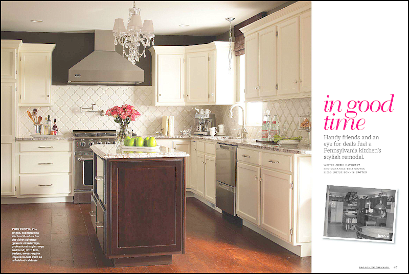
Here’s a screencap of the article called “in good time” about the reader who hails from Pennsylvania. The article shows the before pictures and gives a break down on the budget.
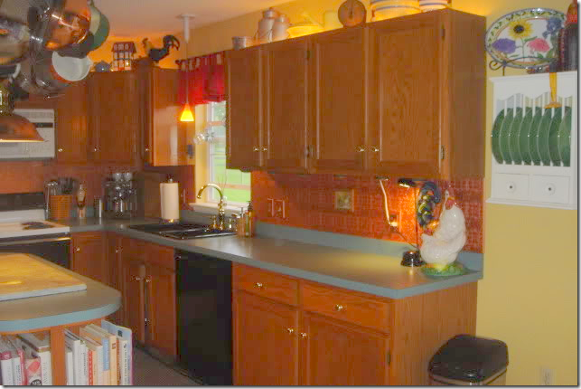
Here’s a look at the “before” kitchen, with its dark cabinets and green countertops.
Notice the up lights above the cabinets!
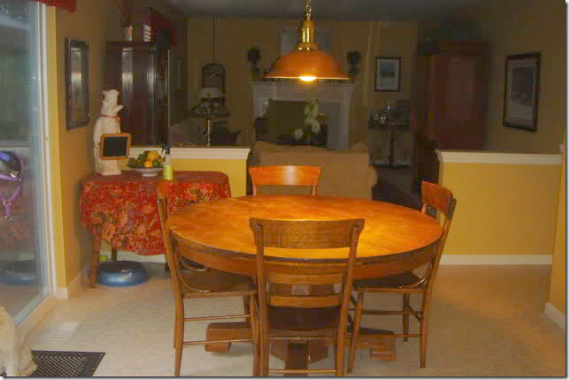
The attached breakfast area leads into the family room – through half walls.
The reader and her husband had been happy with their kitchen, until they attended a home show in their Lincoln University neighborhood. Once they got back home, they were afflicted with that same disease that strikes many people after touring show houses – “ihatemyhouseitis.” Their once loved kitchen now seemed dated and dark and they decided it needed an update, STAT. To keep costs down, they did all the work themselves – except for the installation of the granite and running the new gas line. Friends chipped in with their labor and expertise. In all, the renovation took a year.
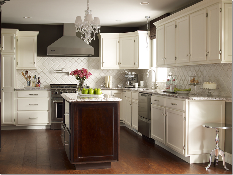
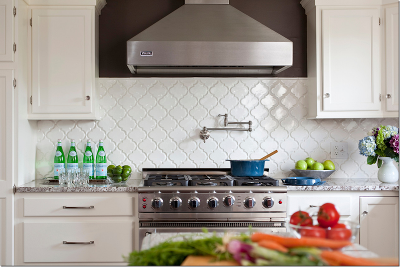
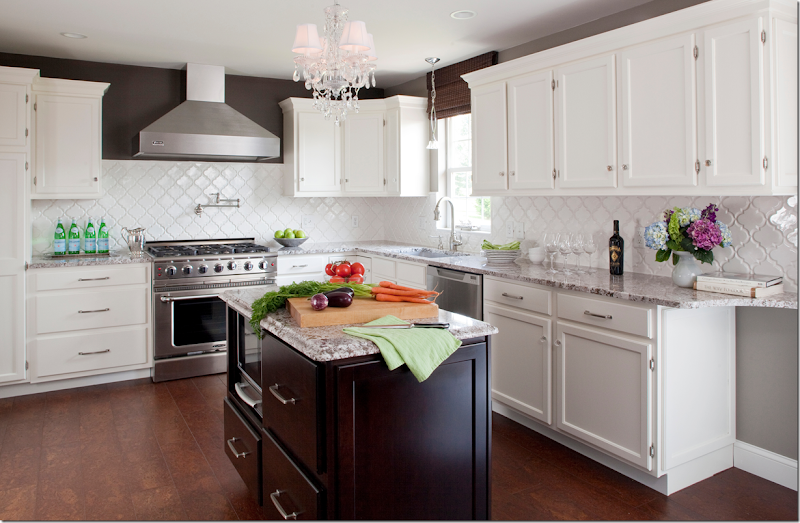
AFTER: the biggest change was the cabinets. Since they were in good condition – all they needed was a coat of white paint and new hardware. The biggest splurge was the new countertops – a Bianco Antico granite. Besides the granite, the white backsplash is the eye catcher here. In contrast to all the white paint, a band of dark brown (Italian Leather by Balspar) was painted around the tops of upper cabinets.
The backsplash is white tiles from Mission Stone and Tile called Beveled Arabesque Tile- Glossy White. Amazingly, the reader won the backsplash in a contest from Mission Stone and Tile!
Here you can see what a difference the backsplash makes. The white really pops next to the brown paint and the granite. Besides the granite, the other big splurge was the appliances – a new professional styled range and a built in refrigerator by Thermadore.
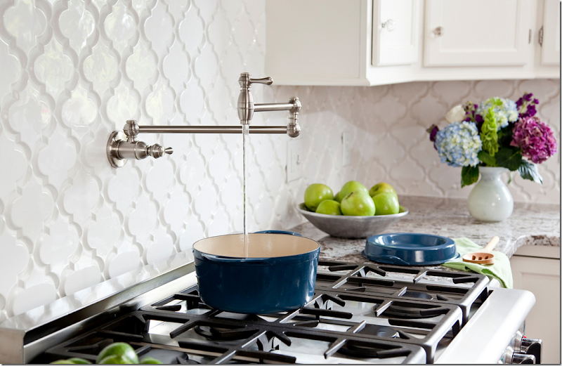
Above the range, the homeowners added a convenient pot filler. I love this picture, it’s amazing how good a few apples, limes and bottles of water can look!!!
Pot fillers are so convenient.
New plumbing and a sink were added, along with a pendant light by Elk Lighting.
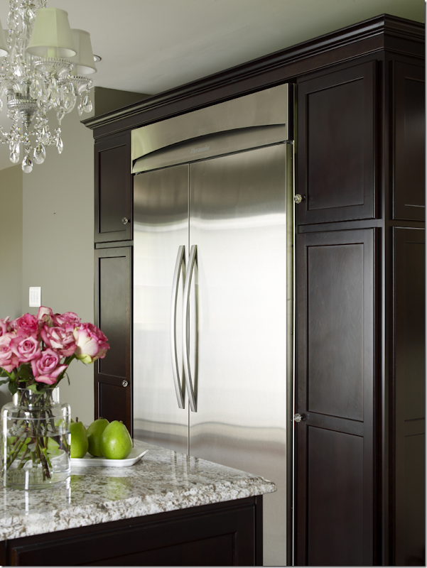
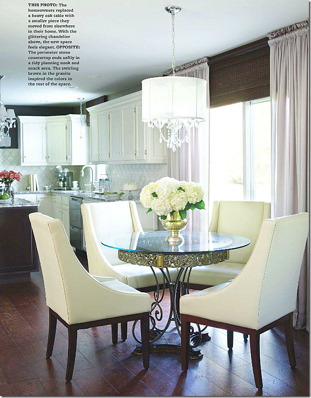
The built in refrigerator from Thermadore was added across from the island. The cabinets were painted in the same dark brown. The crystal chandelier adds sparkle and glamour to the room. Beautiful photography by the great Tria Giovan.
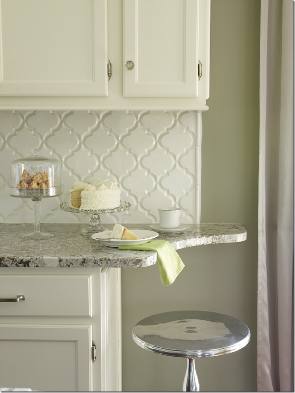
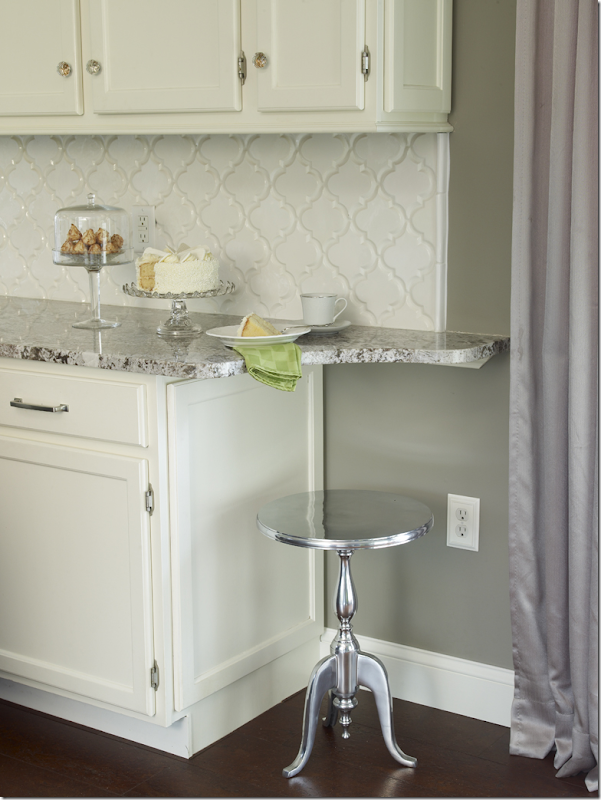
Instead of just ending the countertop – it was extended, adding a space for the reader to sit and have a cup of morning coffee.
If you have the space for this – I think this is a great idea!!
The short wall between the breakfast area and family room was removed – making for a smooth, open transition. Notice how perfectly executed her curtains are: no dead space and the perfect shade color which matches the brown paint on the walls.
Finally, the most amazing thing is the floors. No, it’s not wood, it’s cork! The reader saved a lot of money by using cork, plus it’s a great product for the kitchen because it’s easy on the feet. I would have sworn this was wood!
A huge thanks to the homeowner for inviting us into her kitchen and to stylist, Bonnie Broten.
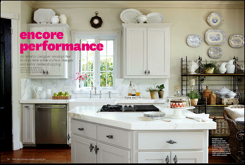
While perusing the magazine the reader’s kitchen was in, another article caught me eye, maybe because it said it was a blogger’s kitchen!!!
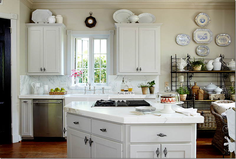
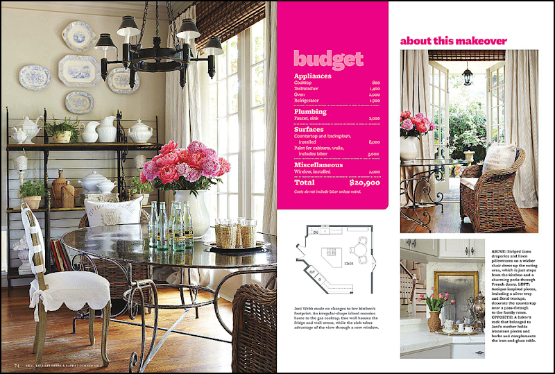
Well, will you look at that! I’d know that kitchen anywhere!! Of course it never looks this good or styled in real life, but that’s why they pay stylist Bonnie Broten the big bucks. Photography by Bill Bolen. The baker’s rack was my mother’s – and it’s antique. It’s rather short which is why I added the blue and white platters above it. Usually there is a small flatscreen on the middle shelf, but we took that out for the photoshoot. It looks so much better without it – I’d love to do away with it altogether.
Here’s the original shot without the magazine’s writing all over it – notice on the right, the slipcovered chair was removed for the magazine – too cluttered looking, I suppose.
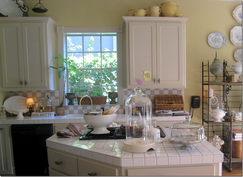
BEFORE: UGGH!! White square tiles and taupe and white backsplash, yellow walls, black appliances, white sink, brass fixture, old cheap aluminum window. What a mess!
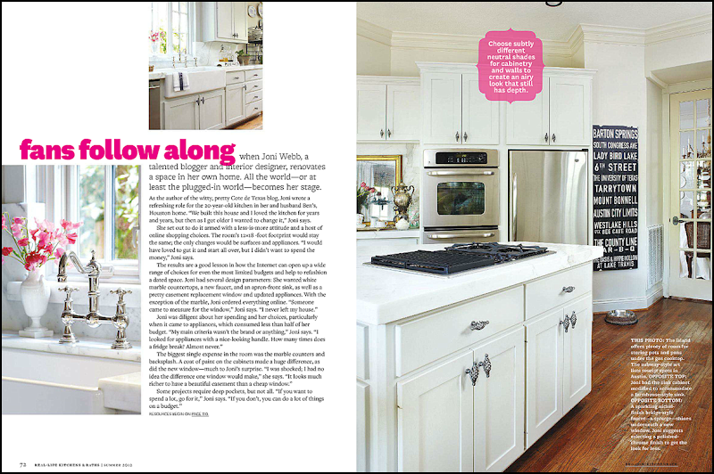
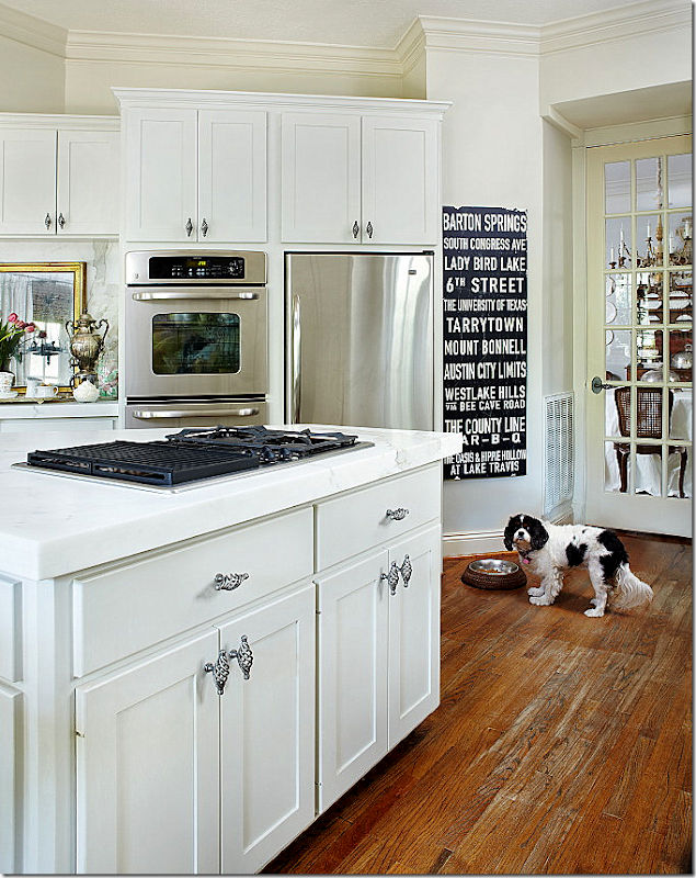
The second page – shows the other side of the kitchen. I love how the writing covers up the worn stain on my wood floors. This is where it is the worst in my house – in the kitchen – and in front of the sink and pantry. I bought that subway sign at Mecox for Christmas for Ben’s office. It never made it there. It lists all the great places in Austin, Texas – Ben is a huge longhorn fan. There is actually an ugly Ozarka water cooler that usually sits in front of it. But, of course, that didn’t make it into the magazine.
Poor Sammie Jo didn’t make the final cut. She was deleted from the picture in the magazine. She’s probably wondering where the water cooler went to. Oy, that floor! I have to do something about it, asap!!
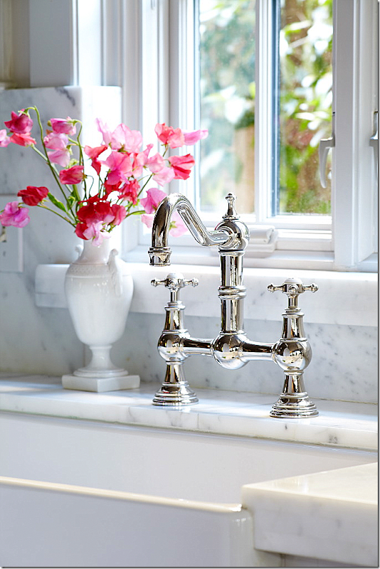
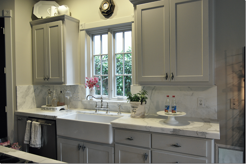
My three favorite things in my kitchen: my farm sink, the faucet in polished nickel, and the new casement window. That pretty white vase is another hand-me-down from my mother. (Oh, my sister Cathy is going to be reading this and saying – I want that!!!)
And in this picture, we opened the window for romantic atmosphere. HA-HA!! Probably to take your attention away from those floors!
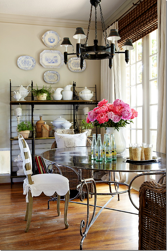
The next page shows the breakfast area and the floor plan. I love the way the table looks. The editor wanted the old and new chairs mixed, so we drug one of the old antique slipcovered chairs out from the garage to mix with the Kooboo chairs that I use now. I do think they look cute mixed together. I know, I see it. Guess what I am talking about. Uggh.
Here, you can see the doggie door to the left of the baker’s rack. The chandelier is another hand me down – from, you can only guess! I am cracking up at how much I have that is handed down!! Well, I did buy the table and chairs myself. This tole chandelier used to be in my dining room, but I moved it here when I got my new dining room chandy and the old one in my breakfast room went to my mother-in-law’s house. Move em in and move em out. I love the way Bonnie styled the baker’s rack and the table top.
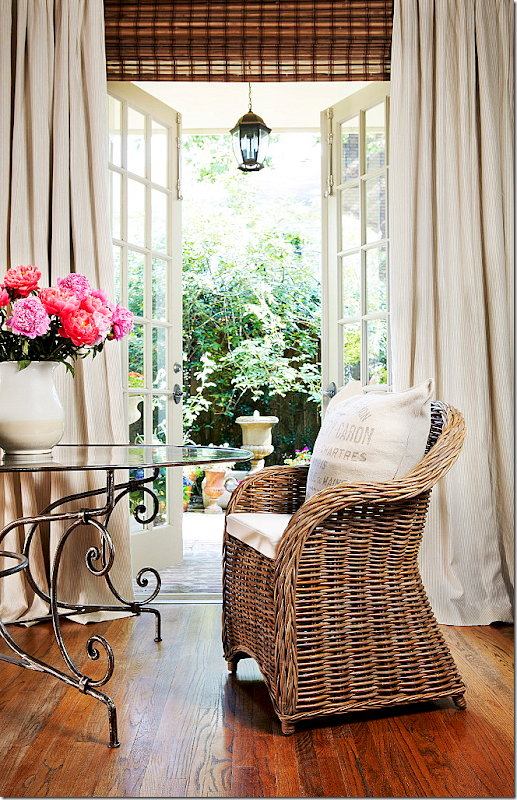
Now, this picture was a total cheat. Along the back wall of my house, there are five French doors – but only the center one actually opens. So to make it look like the one near the table opens, we moved the table in front of the center door. It really does create a much prettier picture – and now I wish I had the ability to open the door in my breakfast room! This is my favorite picture from the shoot. You can actually see the pin stripes in the curtains for once. And those lanterns on the porch – there are five of them – one in front of each French door. We used to have ceiling fans out there but they rotted, so we bought these lanterns. I bought them years ago before I was really into lanterns – today I would buy much larger ones than these. But, truthfully, now that I remember, at that time, I couldn’t afford the bigger size!!! The curved base of that table looks pretty here. Usually it’s hard to see with the chairs in front of it. OK – this is how my floors look everywhere else. Not as bad as in those spots in the kitchen.
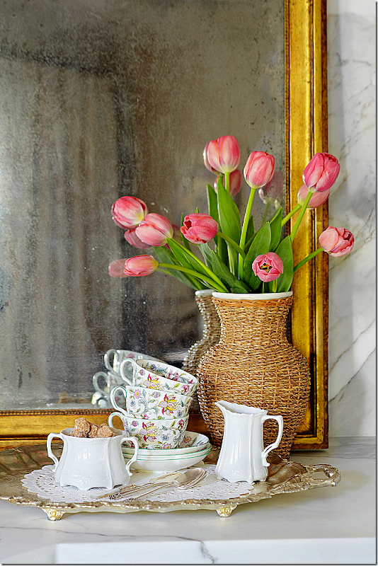
Bonnie worked on styling this corner for about an hour. Usually, this is my bar and it’s filled with bottles and glasses and is more cluttered. Also, the mirror is not usually here, although it does look pretty. My mother, two aunts, my sister Cathy, and myself all have the same china – shown here. We have about a billion place settings if we put it all together. It’s pretty – pink and green with a celadon border. I think that’s a great idea – if everyone in your family cooperates and buys the same china. I think we seriously could have a small wedding and use all of our china. That candy jar is an old jar inherited from you-know-who! More laughing!! And through the bar – you can see the staircase. Usually on this bar – there are two lamps from Aidan Gray, but those were removed for the shoot.
Here are a few detail shots that weren’t used in the story. Another really pretty photograph.
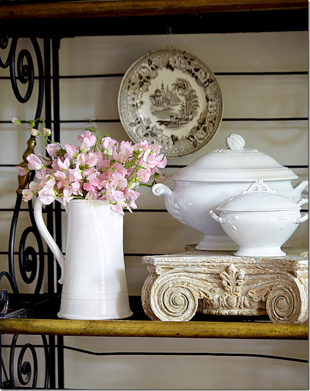
A detail shot of the baker’s rack with the white ironstone tureens. This picture also wasn’t used.
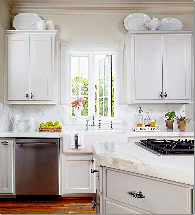
And this shot wasn’t used. The kitchen looks so white here – but it’s really gray – gray cabinets and gray walls.
When Ben read the magazine article, his first comment was – wow – these pictures look so much better than the kitchen actually does! And it’s true – the coloring looks better in print (especially compared to how it looks online. In the magazine, these pictures look even better.) Between the styling and the brightness, the photographs don’t really show the reality of the kitchen. Everything looks so crisp and in focus, while in real life, it’s more soft and darker.
I took this picture on that day – and the lighting is more realistic here. This shows a styling scene that was discarded. Bonnie didn’t like it so she started over and completely redid it.
And here is the mess that happens when you have a photoshoot. Everything is cleared out from one room and placed in another room. That’s Bonnie on the right and her daughter who assisted on this shoot – on the left. Georgie, as usual, is hiding from the camera. I am always exhausted after a photoshoot, but Bonnie is just fine! I don’t know where she gets her strength from, but she is amazing. If you ever get an email or call from a Bonnie Broten asking to photograph you house – yes, it’s legitimate. I’ve gotten so many emails over the years from people who have shown their house or kitchen on this blog and then gotten a call from Bonnie. It’s always the same question – “is this for real?” Yes, it is.
Thanks again to the homeowner, to Bonnie and to the photographers Tria and Bill.
P.S. If you have turned in pictures of your kitchen or house, please have patience. I will get to them one day!! Also, if you haven’t turned in photographs of your house or kitchen – please do! I’m still accepting entrants for the Readers Houses/Kitchens series.


