The Milieu Mini-Mag

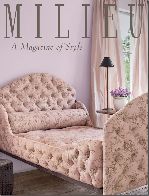
Could you just DIE from this cover? The gorgeousness of it?????
I told you a few weeks ago about a new magazine coming out soon – “Milieu.” The brain-child of interior design great Pamela Pierce, Milieu is set to be on the stands this fall. It’s been so exciting to watch the magazine come to life, started from an idea to become the real thing which you can hold in your hands.
Recently Pierce talked with me about her goals for Milieu. She spoke about quality design magazines of old. In those earlier days, a photo spread might be as long as 18 pages, with full sized photographs of such wonderful quality that the images leapt off the pages. Today, décor magazines show smaller pictures, rarely, if ever, giving a full two pages to one image. And, a photoshoot might be only 8 or 10 pages – 18 is unheard of now.
Then, there are the editorial descriptions that are written obtrusively over the photographs with dark and bold fonts, hiding the image behind the words.
Another concern is the quality of the paper. Speciality decor magazines once used the finest paper, so heavy and thick when the page was turned. But no longer, it’s a luxury that’s gone by the wayside. What a shame.
Pierce knows all this. She’s been featured many times in design magazines and she knows firsthand the differences in today’s magazines. When planning Milieu, she strove to bring back the lushness of the photography, the thickness of the paper, and the more in-depth stories with clean, single and double page photographs.
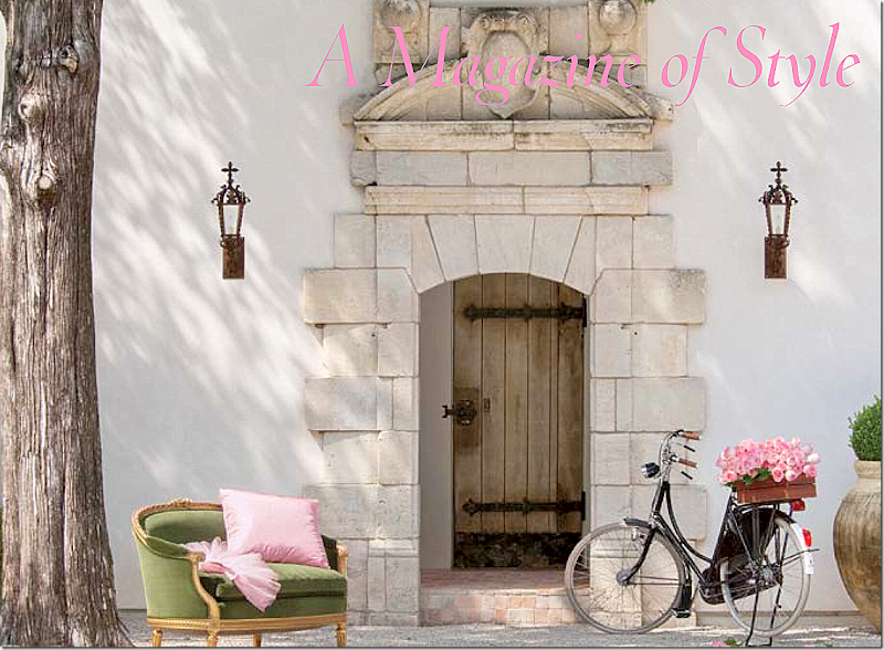
Milieu will contain wonderful photographs of interior design and gardens found in the United States and Europe. Additionally, there will be features stories on other subjects, such as jewelry and art. The operative word is quality in design, quality in product.
While the first issue is slated to debut this fall, Milieu has produced a “mini-mag” which is a small issue used to introduce the magazine to potential advertisers. Pierce is proud of the mini-mag and has graciously allowed me to show some of its images since it won’t be published.
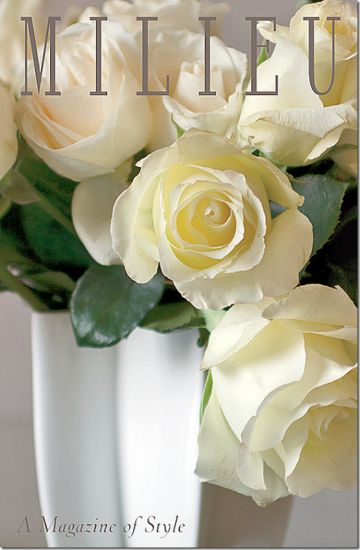
One aim of Milieu is to always show houses that haven’t been published before. How many times have you paid for a magazine and then found that you’ve seen the house before? Milieu will show only fresh, never-before-seen images – which can be really hard in this day of web sites and pinterest and instragram. So, while some of the photos in the mini-mag have been on the internet, this will not be the case with the magazine. It’s a lofty goal, but one that Pierce will strive to accomplish.
Today, I am thrilled to share with you some of the photographs from the Milieu’s mini-mag! I hope you will enjoy them as much as I did!
1. The Schatte Residence:
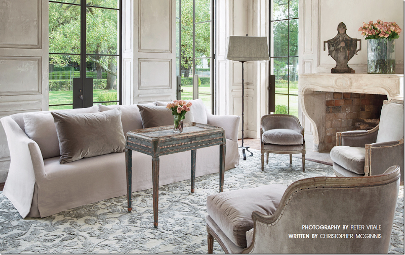
This gorgeous house in the museum district is the home of Andrew and Annette Schatte. Annette is a well know antique dealer. Here, in the living room, the sofa is Belgian inspired and the rug was custom made with silk and metallic threads. Standing, is a iron floor lamp with a rectangular shade, a trademark of Pam Pierce.
The house is stunning and its position across from the Museum of Fine Arts is even more impressive. It is made of stucco and was built with antique architectural elements in a blend of the classic and the contemporary. Notice the wonderful stone mantel and the paneling. And also be sure to notice the steel doors and windows that overlook the fountains on Montrose.

In the powder room, notice the gorgeous antique doors, painted a soft French blue. An antique stone sink is set into the wall where a single faucet looks so chic. Hanging above is a Louis XVI gilt mirror.
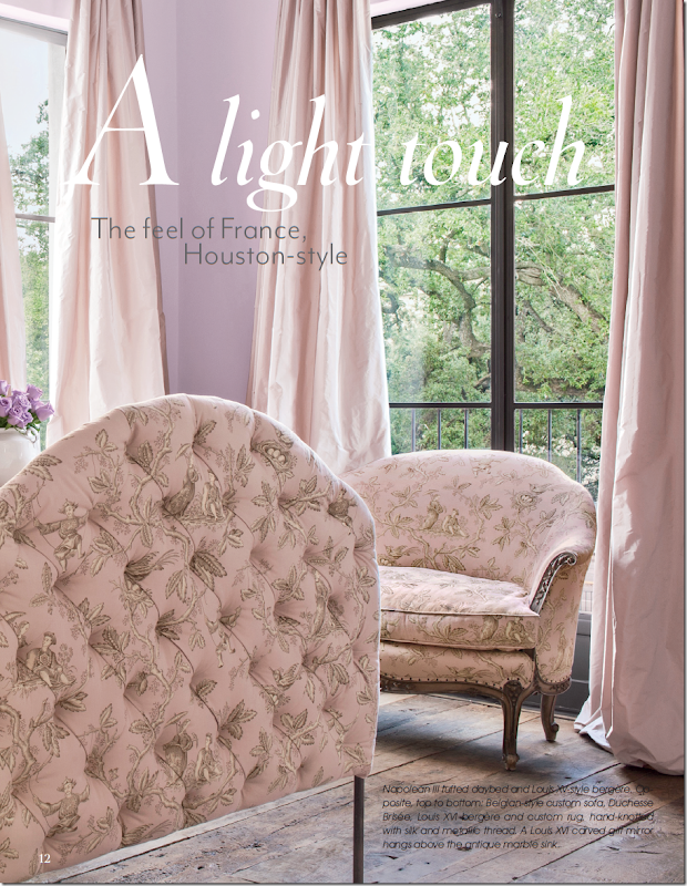
And another photograph from the guest bedroom, with the Napolean III tufted bed and a Louis XV style bergere, wearing my favorite oriental toile fabric! The curtains are a blush silk taffeta that are simply gorgeous. Also, notice the wood floors.
The homeowner, Annette Schatte first became known to design lovers when her former house on North Boulevard was decorated by Babs Watkins and photographed for Veranda. I always say that that photoshoot of the North Boulevard house was one of two houses by Watkins that were the start of the “Houston Look.” Schatte has a beautiful eye for design and antiques. She teamed up with Watkins to open an antique shop – Watkins Schatte - that became THE place to buy one of a kind antiques from Europe. Schatte later opened her own shop further down on Bissonnet, where she continued importing the finest pieces, introducing Houston to the light and painted woods that are now so popular. She sold her shop to Margaret Naeve, and today she offers her antiques at 2620 and on the internet HERE.
The Jane Moore House:
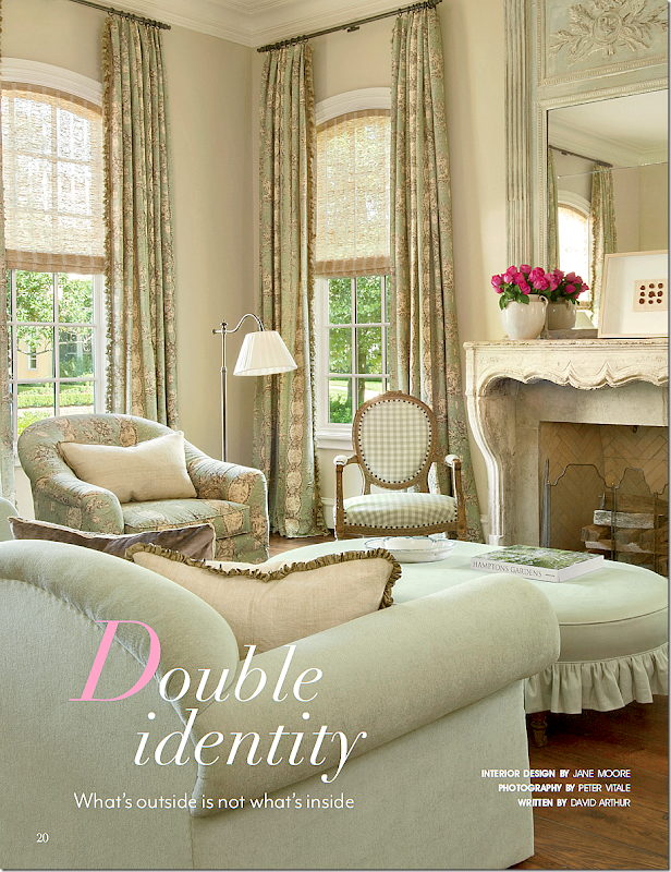
The second house is located in River Oaks and was designed by Jane Moore, whose own townhouse was recently featured in Veranda. This house has a classic Georgian exterior, but the interiors are a mix of French and Swedish design. The living room has a beautiful antique stone mantel with lovely toile and check fabrics in green and khaki. The trumeau is so pretty!
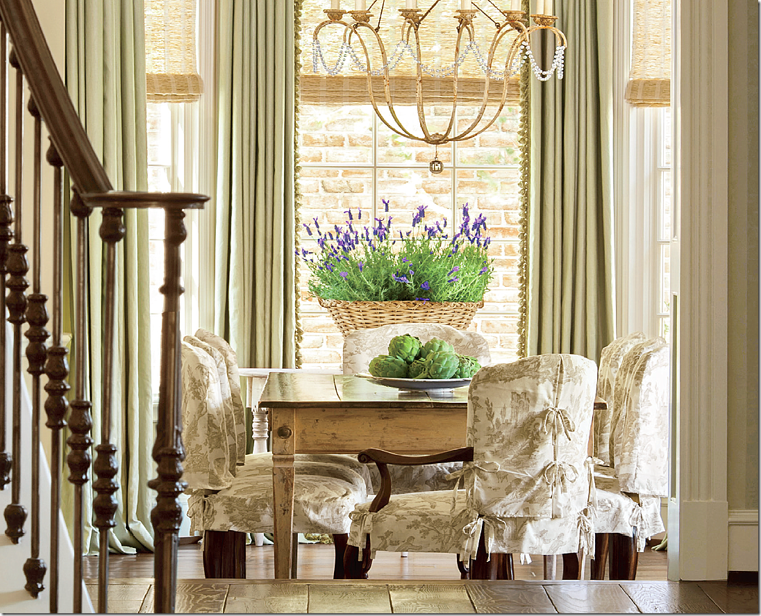
The dining room was made more casual with chair slipcovers made of linen toile. The ties are such a charming touch.
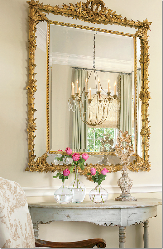
The dining room chandelier is reflected in the mirror above an antique Swedish demi lune. I love Jane’s aesthetic so much. Such beautiful photography by Peter Vitale.
Santa Fe House:
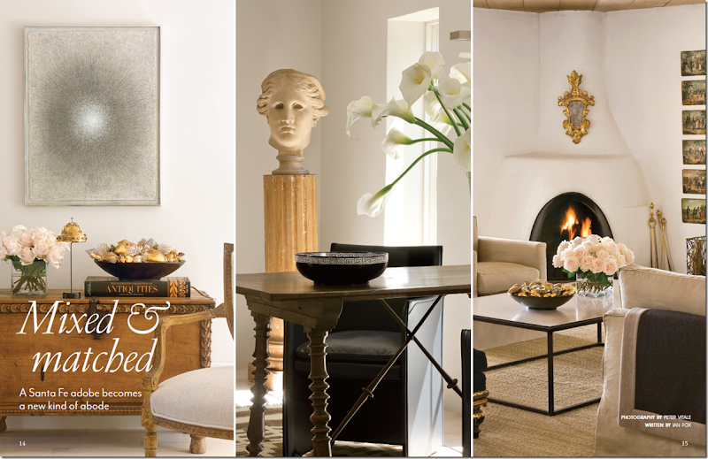
The third main feature of the Milieu mini-mag is a renovated Santa Fe house. Here, in a two page spread, three vignettes of the family room are shown. The house is a mix of contemporary pieces, such as the coffee table and art work, and fine antiques, such as the Spanish desk.
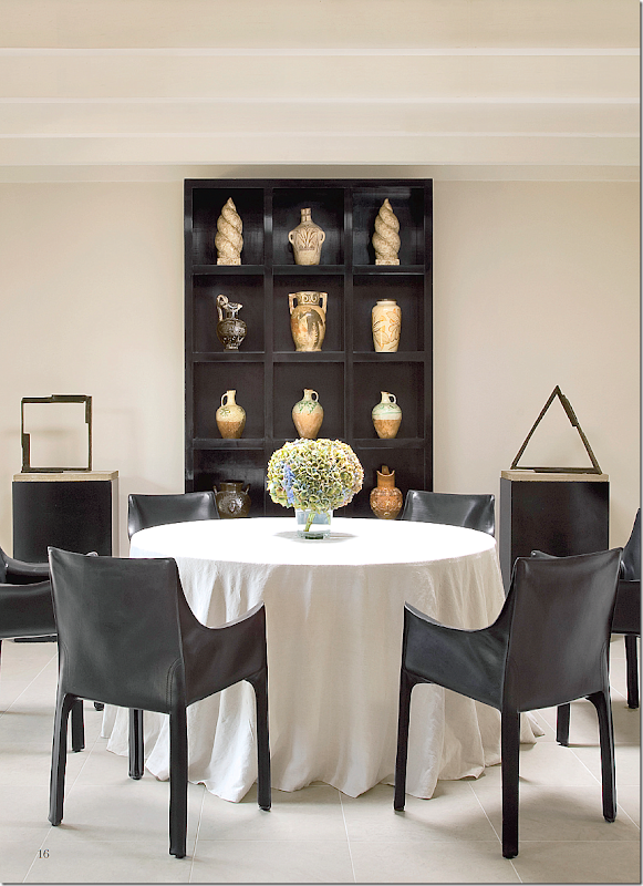
The dining room is an eclectic space, with a linen covered skirted table and modern sculptures.
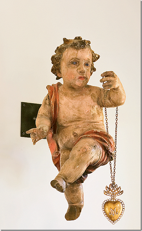
Hanging on the dining room wall is an antique cherub with a dangling necklace.
I hope you have enjoyed this small glimpse of the Milieu mini-mag. I don’t know about you, but I can hardly wait for the first issue this fall! If the magazine is anything like the mini-mag, it will be incredible!!!
For questions about advertising rates, please go HERE.
And, for information about subscriptions, please go HERE!


Can't wait! I've been admiring her work for years. I have an issue of Veranda with a PP feature that literally fell apart because I looked at it so much. Thanks for the update...I'm going to subscribe now!
ReplyDeleteme, too!
DeleteJoni, I want to see more -- especially that Santa Fe home. Will subscribe immediately. What a treat to have a great design magazine led by one of my favorite designers available. I hope this will lead to a revival of quality design magazines. My old Southern Accents are getting lonely on the shelf.
ReplyDeleteI love the Santa Fe home, too. It is Peter Vitale's home and it was featured in the 2007 November-December issue of Veranda decorated for Christmas. It looks like they've made quite a few changes since then. He has an extensive and beautiful collection of ex votos like the one hanging from the cherub's hand.
DeleteMichelle
it is peter's house. look at his website petervitale.com for even more images the minimag didn't name him, so i didn't - but i know you all know it's peter's house!!
DeleteJust did! Anticipation....franki
ReplyDeleteWow, it looks beautiful. I'll be impressed if they are able to keep the paper quality up for more than a year or so, even at a relatively steep rate for a sub. People outside the magazine business rarely realize how expensive paper is, which is why most magazines have gone to a lesser quality. And the real kick in the teeth is that when your paper quality goes up, the most expensive part of magazines --postage-- goes up too. I'm thrilled to see a "real" design magazine launching (vs. digital only which will never, ever hold the same appeal for me as a proper printed magazine) and I wish them great success. Perhaps this kind of magazine will prove to the design world that magazines are important, print is not dead and great design is out there.
ReplyDeleteNeedless to say, I just subscribed. I have been in patient anticipation since the teaser you presented to us. Also, this is my first time commenting and ironically, it is the first time I am speechless by the images. I am compelled to thank you for bringing the esoteric untouchable world of design to us with such accessibility and enthusiasm, making it accessible and attainable if even for a moment. Following your blog is an absolute treat I treasure time and again. Thank you for sharing your talent and all that you are privy to with such generosity. My best regards always....jeannie
ReplyDeleteI just subscribed and am looking forward to what will be, I am sure, a beautiful design magazine. The images in the mini-mag are fabulous. I was amused to see the lovely cherub with the sacred heart necklace; I have an antique cherub hanging alongside the doorway to my guest suite and he has my grandmother's crystal rosary hanging from his arm. Thanks, Joni, for bring us the best of the best in the world of design.
ReplyDeleteXO, Victoria
I am most pleased to hear that she will not be using images already seen in the web. I am tired pf buying magazines and books that are full of houses I have already seen on a blog. Plus the text in the magazines...OMG...often so tiresome. Can't wait till the release.
ReplyDeleteLove it, especially the outdoor cover with the bike full of pink roses. Pink is my favorite color -- noticed that many of the rooms you featured have vases of pink roses. And, I was happy to see my favorite Niermann Weeks chandelier in the River Oaks house.
ReplyDeleteI love Pam Pierce and her work and I'm so excited for her magazine. I've just subscribe and can't wait for my first issue. Thank you to you and Pam for allowing us a first glimpse into what I know will be fabulous. Sure to be a keeper and I wish Pam years of success!
ReplyDeleteXXX
Debra~
One of your favorite designers. Yay! Wouldn't it be fun if you could write an article or two for her? You do such a good job here on the blog. Can't wait to see more.
ReplyDeleteVery exciting news Joni. new images, yay!
ReplyDeletexoxo
Karena
2013 Artists Series
Absolutely fabulous. Today the only magazines which have a semblance of paper quality is Oprah's (which I never purchase because it always
ReplyDeletehas her picture on it - so self absorbed) and Martha Stewart. I would expect nothing less of Martha than to produce the finest quality
magazine. Some of them are so pretty, you simply cannot throw them out.
I can't wait for my first issue of Milieu. The cover with the white roses killed me. You did not indicate whether or not resources
will be shared. I certainly hope so. Move over Elle Decor!
I love the concept. It sounds like it will it fill the void left by Southern Accents or even surpass it. I hope they feature a wide range of good design, rather than only the Houston/Belgian style. It would also be refreshing to see rooms that are less styled. European design magazines do this, featuring rooms that are high on design but still look lived in, real. Is it just me, or would anyone else like to see more of that in an American magazine?
ReplyDeleteThe images in the mini mag are gorgeous. I can't wait until the Fall. It will no doubt be a source of great inspiration. Thanks so much for sharing.
ReplyDeleteJoni:
ReplyDeleteDon't want to wait - want to see more right now!!!! Will definitely subscribe. Thank you Joni for all the wonderful work you do and obviously it is recognized and respected by Veranda and the design greats. You are a great yourself and your blog is a priority for so many. You are amazing! This sample of Milieu is gorgeous and Pierce is such an extraordinary talent. Love that she used Jane Moore's (another favorite) home. They appear to have similar aesthetics. Always looking for and admiring work they both do. Thanks again Joni and am so looking forward to this magazine.
Janice
This publication is what we have all been wanting for so long -- looks fabulous. I subscribed and am considering advertising with them. I hope they are very successful and keep the magazine going for many years. Other than content, I am wondering how they can succeed where the big ones failed. I'm sure we all will eat up every photo on every page -- just so exciting.
ReplyDeleteFour issues per year at $19 - sounds like a real bargain especially when it is on good paper! Yes, yes! Please fill the gap left by Southern Accents. Considering that many design books cost $39 and more, this would be about 1/2 the cost of a nice design book AND provide up to date resources to purchase products. Has Pam given any thought to selling albums to keep the issues in once place?
ReplyDeleteSmiles from Charlotte (currently freezing, but happily perusing French decorative items in Dallas)
Love everything about this mag. I will subscribe! It will be a keeper I am sure. xxpeggybraswelldesign.com
ReplyDeleteWow! What a great looking magazine. I must order.
ReplyDeleteI'm so excited!!! I just subscribed. It will be so nice to look forward to a Great magazine worth getting all cozy with a cup of tea and going over each and every page! I can't wait!!!!!
ReplyDeleteOh, Joanie! Oh, Joanie! Oh, Joanie! Gorgeous! I just subscribed and can't wait for the first issue!
ReplyDeleteMilieu will be a treat four times a year. Thanks for the heads up! The River Oaks house captured my heart. Like you, I love the green trumeau.
ReplyDeleteWow!! Someone check to see if I'm still breathing. This is beautiful, and I can't wait to get mine in the mail!
ReplyDeleteEight years ago I worked in publishing for a top billed quarterly fashion magazine in Canada {called FQ - Fashion Quarterly}. We were over-sized pages printed on top quality paper which made the creative presentation spectacular. Printing a quarterly publication with quality allows the editorial and art directors to produce a product of quality rather than just quantity.
ReplyDeleteFrom these early images it is apparent that Pamela and her creative team are aiming for a standard unlike other publications.... now they just need to perfect the fonts.
I'm looking forward to capturing a copy.
Stunning photos and layouts, I will definitely subscribe if I can from Europe. I think Milieu will be a wonderful addition to the Veranda/House Beautiful staples and I wouldn't expect it to cannibalize this market. There's certainly room for another great design magazine (I used to subscribe to over a dozen, back when such a number still existed).
ReplyDeleteJoni, I'd also love, love, love for you to do a post on Bab Watkins, showing the images from the two houses you believe launched the Houston style. I discovered "Houston Style" late in the scene, and have never seen these images. Many thanks for your kind consideration of this request.
does anyone have that old veranda? mine is mia!!!
DeleteWhat month/year was it? I will check and see if I have it in my stacks. I went through a long period when the kids were babies when I did not subscribe to anything...too tired dealing with kids to think of decor! But, I have many Verandas from the past 15 years.
DeleteJoni-
ReplyDeletePlease do a blog on the Charlotte Moss Auction. I was just on her website and the auction is at Doyle Galleries Mar 1-5. The online catalog is available late Feb. I know Charlotte is coming back to SRT it would be fun to hear what is being listed and why- I bet its all GORGEOUS.
Thanks Kris in Seattle
Drooling and ordering a subscription! T
ReplyDeleteI'm sorry, Joni...I was so excited I misspelled your name not once, but three times. Thank you for all the fabulous posts you do!
ReplyDeleteI cannot wait to get my hands on a copy of the magazine. OH MY GOODNESS! I think my heart skipped a beat just looking through these pics. :)
ReplyDeleteJoni,
ReplyDeleteOh, I wish I could subscribe right now. This looks amazing. Will you let us know when it's actually on newsstands?
Karen
I ordered before I even thought about commenting. Wow!! I am a print magazine junkie and I know I will LOVE this one.
ReplyDeleteThanks so much for posting.
I'm subscribing right now!!
ReplyDeleteMary
Wow! What a great looking magazine. I must order.Gift card printing
ReplyDeleteLove the idea of two page spreads again. She has great marketing skills having you build demand for her!
ReplyDeleteHow beautiful is the photography? I feel like I can smell those white roses.
Simply stunning! Subscribing immediately and will be waiting on pins and needles for the first issue.
ReplyDeleteJoni - do you have any additional information about the pink oriental toile and blush silk taffetta curtain fabric?
And thank you so much for sharing your passion and talent. I'm completely addicted to your blog!
Alexa
NOT SURE whose fabric the silk is - maybe you could email Pam and she would let you know.
Deletethe toile is Colefax and Fowler - Oriental Toile!!!
What a beautiful magazinr, Joni, and such lovely homes!
ReplyDeleteThank you so much for sharing this with us.
XO,
Sheila
How is it any different from Veranda?
ReplyDeleteReread Joni's post. She describes the differences in the first few paragraphs.
DeleteWhen I visited Houston in October, I stayed at the Hotel ZaZa and walked by the most beautiful house between the hotel and Rice...I took pictures, and walked by in the evening so I could try to peek inside. It was surrounded by a beautiful iron fence, so I couldn't get too close, but it looked like the most incredible house.
ReplyDeleteBased on the steel windows of the house in this post, and the view out the window, I feel certain that it is the same house. Such a treat to get a peek inside!
I come first time at your blog. Your work is unmatchable, great job. All images are looking very beautiful, i have no words for your work. Its amazing. Thanks
ReplyDeleteTruly breathtaking pictures . . . am in LOVE with the Jan Moore house! You can bet I'll subscribe!
ReplyDeleteThe dining room of the second house designed by Jane Moore is gorgeous! It's got the European look but is warm at the same time.
ReplyDeleteI will definitely be a subscriber!
Nancy W.
Joni, I linked to this pretty post on my post about slipcovers today.
ReplyDeleteThank you.
dare I say that this is the first that I'm hearing of this unbelievably gorgeous magazine? I'm in awe of all of the stunning rooms. just amazing!
ReplyDeleteI'm so excited about this new magazine...I'm a Pamela Pierce idol.
ReplyDeleteSo it is a federal crime to blur out a face,
ReplyDeleteremove tats and add writing on a photo that may be used for an escort ad? You've got to be kidding. Then there are thousands of guilty parties out there if that is the case.
Bellevue Stucco
Stucco Contractors Seattle
Seattle Stucco