1
Vermeer: Lady with her Maidservant
Dear Miss Cote de Texas: I would love your guidance on how to use color and texture effectively to create a focal point and maximize style in Great Room, Breakfast Room and Entry. I'm open to changing or adding color, introducing new fabrics & area rugs and slip covering yellow stripped chairs in GR.
This homeowner has a lot going for her already. She has nice furniture and accessories and a very pretty house. She just wants to pull it all together and get a more decorated look. In my opinion, the best way to get a “decorated” look is to have professional made window treatments and pillows. Have a proper sized rug. Accessorize the shelves and the tables. Just be doing these things, you could use an Ikea couch and chair and tables from a catalogue, and your room would still look professionally done.
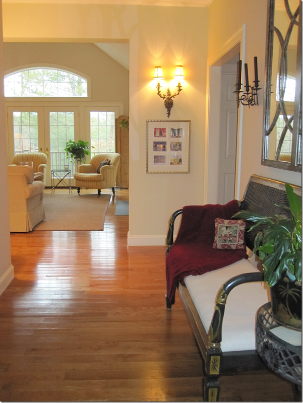
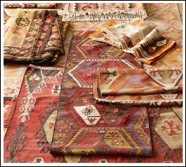
Starting in the entryway, she could use an area rug here. Perhaps a flat weave with a pattern in it – like this:
Assorted antique Kilims from Pottery Barn would be a nice choice with lots of color. Or she could go a bit quieter with one of their plainer textured rugs.
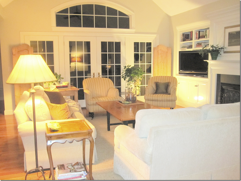
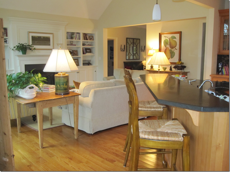
The family room with sofa and love seat in a soft cream and two yellow chairs.
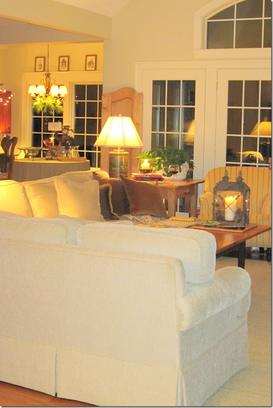
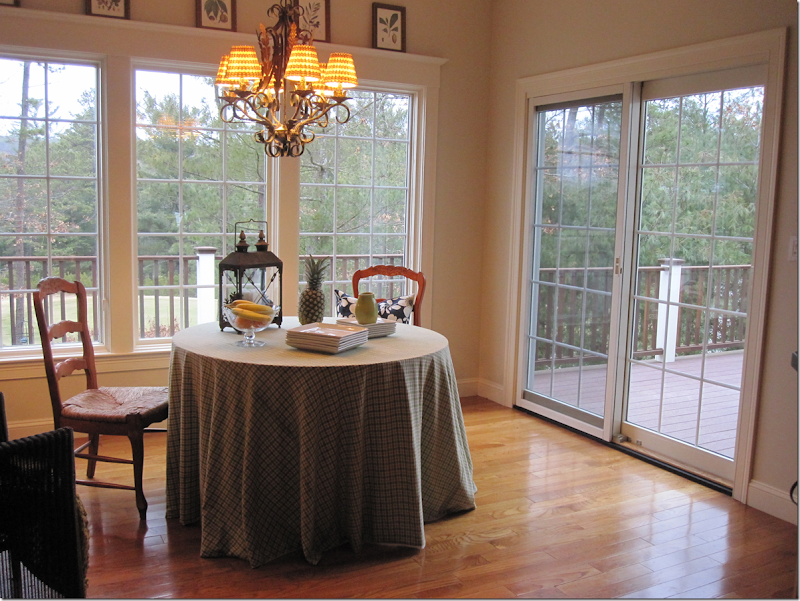
Looking towards the breakfast room.
And from the kitchen back towards the family room and entry.
The breakfast room leads to the deck.
What a great view!!! Wow! So pretty!!!
OK, I’m going to give you all my ideas – just as if you were my client.
The main problem I see is everything is the same tone, the same color – a light creamy yellow. Nothing really pops, except perhaps the chair fabric with the stripe. Everything just blends into each other. To solve this:
1. I would recover the sofa and slip them in white linen to pop the room with a brighter shade. The white would really lighten up the room and create some contrast.
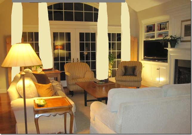
2. Another big problem is the window – it really needs curtains. But, the issue is the arch above the bottom windows. It’s the typical problem window without one easy solution.
Now, if this was my house, I would have the window removed. It wouldn’t cost that much at all to do this and it would really make a difference. Once the window was removed, I would get a curtain rod and hang it about two feet above the windows. Then I would buy one textured shade and place it in the “dead space” between the rod and above the windows/French door. Next, I would hang four panels of 1 1/2 widths of fabric across the windows.
The reason why I recommend removing the window is that if you place a shade over the arched window, it’s just too wide. Here is how it would look with a shade hiding the arched window. See how wide the shade is? By taking out the arched window – you could lower the rod a foot or two and it would still be make the windows taller than they are now, but more in proportion. Check to see the price before you say “no” to this idea! It is probably much cheaper than you imagine it.
How the windows would look covering up the arch window with a shade. While this does heighten the window element, the shade is just too wide.
If taking out the window is not an option - would it be better to hang the curtains and just not use the shade? Probably. Here is how it might look:
Better than with the shade.
Here is how it would look to just ignore the arch and just use curtains on the bottom windows.
An another view.
Just as long as you don’t handle the arch like this!
Or like this!
So, to sum it up – you have a few options:
a. Remove the arch window. Use a rod 2 ft above the windows/French door and put a shade under the rod to hide the dead space.
b. Keep the arched window. Put a rod over the arch and hang 4 1 1/2 width panels from the rod. No shades.
c. Hang a rod right above the windows and just ignore the arch.
I put them in order of which would be the best route.
3. Next, I would use a patterned fabric for the draperies and the pillows. Make the pillows 24” and use two per sofa and one lumbar pillow for each chair. Down inserts only. Use a simple seam or a 1/4” flange.
4. I picked out some fabrics from Calico Corner that could be used with what you already own or with the white slipcovers on the sofa:
The top two are new Nate Berkus fabrics which you could use for the curtains and then mix and match pillows. This would certainly brighten up the room and they are youthful looking, too. Plus I love them mixed with white linen.
I also like this Suzani fabric for the curtains:
Or you could go for a lighter look with these two fabrics:
Or a brighter gold and yellow and white:
I love the gray mixed with white and gold:
I love these mixed with the white sofa and whiter walls:
5. All your tables are the same color, which blends into the floor, again not giving you any punch. Think about painting the coffee table black and staining the side tables a rich brown. Also, I would think about switching the two tables.
Get a garden stool for between the two chairs. From Wisteria.
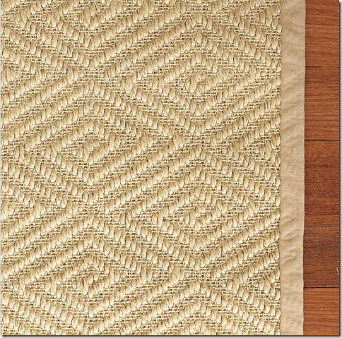
6. I would get custom cut seagrass for both the family and dining room. If you can’t find it custom cut – try this Stark rug that is now available at Pottery Barn. These rugs will add some needed texture and the pattern adds some punch:
For even more punch, layer a white cowskin over the rug, under the coffee table.
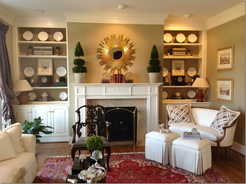
7. Your shelves: Think about painting the shelves a darker shade and then redo them with white accessories. A reader sent me these pictures of her shelves – which would be a great look for yours:
Here are the reader’s shelves and I love the way they look! You could paint the back of yours a much darker shade than is on the walls. Then, use a set of white plates instead of a lot of books and framed pictures. Don’t have white plates? Look on EBay! And I love the sunburst mirror on the mantel, instead of the framed print you have. The sunburst really pops. See how these shelves become a focal point? Very well done!
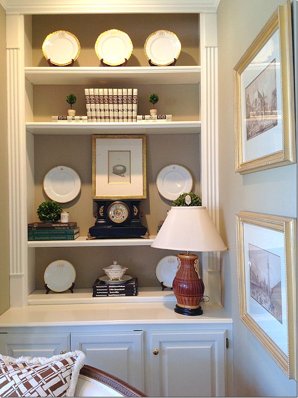
Close up of one side of shelves. I would remove the second shelf from the top on your bookcases so that you could do something more dramatic on the next shelf – like this.
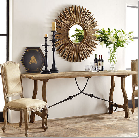
Wisteria sells a great sunburst – two sizes.
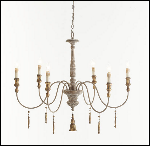
Add a chandelier to the family room – from Wisteria.
In the breakfast room – I would extend the décor from the family room here. Whatever curtains you use in there – use here and use the same rug. For the windows, raise the rod about a foot over the molding, put a textured shade in the dead space, and use 3 panels of 1 1/2 widths on this window, and 2 panels of 1 1/2 widths in the other panel. Remember – always use interlining and lining. I ALWAYS use a blackout interlining to keep the sun from shining through the fabric and to make the draperies look thicker, heavier, and more luxe.
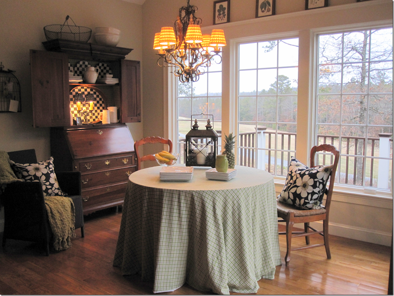
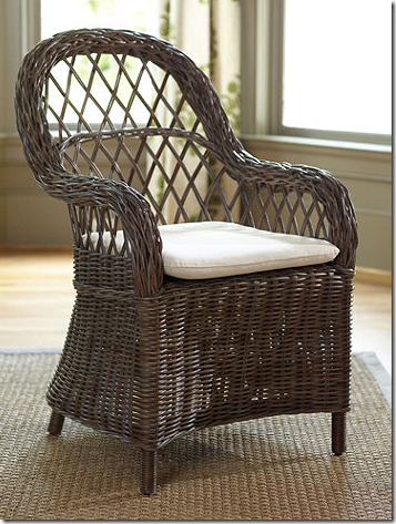
Your table seems a bit small – maybe get a larger one at 48 or 60 inches. If you use white slipcovers on your sofa, use the white linen here too. I would also get wicker chairs to place around the table. They would be bulkier and would better fill out and anchor the space. Put the chairs you are now using on either side of the cabinet. Make slips for these seats and the bar stools – either out of the white linen, or one of the patterned fabrics. Take off the shades on the chandy– those are a little distracting and replace them with plain shades.
Ballard Designs makes these great looking wicker chairs. These would help fill out the space and add lots of texture and punch.
I hope I’ve give you enough ideas to give your rooms more texture and focal points. Thank you so much for sharing your beautiful home with us!!!
If anyone has any other ideas for the windows – or the rooms in general, please leave a comment to share them!
AND, if YOU have a decorating question – email me at mrballbox329@aol.com
FINALLY - WOW!!!!! A sale at BROWN!!!!!!!
Dear Miss Cote de Texas–A Decorating Question
Subscribe to:
Post Comments
(
Atom
)





Joni, this reader has a lovely home and it appears that the floor plan gives a nice flow to the house. I too have a question about the window treatment for the french doors with the arch. While anything is possible if one is willing to spend the money, instead of removing the arch or leaving it and using the 4-1/2 widths of fabric for the curtains, couldn't you more simply make the curtains full enough to have the stack back on each side of the stationary section of the french doors? This would simplify the look and give the owner benefit of the arch. I would still place the rod above the arch.
ReplyDeleteIn looking back at the picture, you would never miss the arched window. A transom would have looked better if done in the first place.
Hi Joni! What a pretty home and I love your suggestions too. Love the snaps you've shown of the built ins with the dishes! ;)
ReplyDeleteHope you're doing well.
Be a sweetie,
Shelia ;) from Galveston
The mirrors on Wisteria.com are ON SALE right now! 15% off!
ReplyDeleteI like the character the arched window adds to the room, so I would not take it out or disguise it. I say 4 long panels and no shades. In my opinion, what the 3 rooms lack are a unifying color. Yellow runs throughout. However, the dining area also has pops of green and black and white while the entry has pops of red, black and gold. Since all three rooms can be seen at one time, visually, they are the same room. First your "client" needs to decide what mood she wants to set for the room and select a unifying color for the rooms. Since she already has a strong connection to the outside, I think green would be a good choice as it would further the connection.
ReplyDeleteShe also has a lovely green tea canister lamp in the living room and a Pear Print on the wall. Both of these are green. I like your 4 suggestions for green fabrics. Joann's is having a 40% off sale on their decorator fabrics this week so that would be a source for additional ideas.
Another problem you have noted is the color of the wood in the living area. I think the two side tables, coffee table and bar chairs should be stained a darker color to match the chairs in the eating area. Or, for real excitement, painted balck. (She seems to like black as an accent.)
Finally, the entry floor. I would go with something that has green and a light golden color with a touch of black to pick up the black in the settee and candle holders. Ditch the red shawl on the settee. It doesn't relate to anything else in the room. If one is needed use yellow or green.
Rather than remove the window -why not cover it with a bamboo shade or something - it would make the other windows all look taller and would fill in that 'dead' space that happens when you put the curtains so high? Of course -the custom huge bamboo shade that long may be more $ than having the offending window removed in the first place! haha
ReplyDeleteGreat idea! Or even use a custom-made faux wood shade in the color of your choice!
DeleteVery helpful tips to complete her look.
ReplyDeleteGreat suggestions Joni! I think you pointed out everything and more than I would have.
ReplyDeleteBTW - everyone looks super cute in the Wedding Photos.
ReplyDeleteSmiles, Charlotte
I have looked multiple times and see no Wedding Photos. What are you talking about?
DeleteSorry Anon, I thought most people looked at the personal photos Joni posts every week. The wedding photos are on the left side bar, just under the Boxwoods advertisement. AND, check out Joni's new haircut and make up. Chic!
DeleteOops, I misunderstood. I thought you were seeing wedding photos in the reader's house and I couldn't believe your eyes were that good.
DeleteYes, I look at Joni's pictures from time to time. Doesn't she look good in these photos?
Yep...the house does need some easy updating for sure. I think I would paint the secretary in the dining area, either in a white wash, or a complimentary shade, remove the panels from the top and replace with some wire, so the doors could be closed, but could still see inside. Remove the skirted table for something larger for sure, and change out the brass hardware to a bronze. And if it were me, I would remove the sliding door and replace with a true french doors. I hate sliding doors, it always screams tract housing.
ReplyDelete"Yep. . .the house does need some easy updating for sure".
DeleteOnly if you want to be a slave of the design industry and trends that change continuously to keep businesses thriving. This is one of the best and least needy houses I have seen in the Dear Miss Cote de Texas series. Some have been more about poor design skills than about updating. This house is clearly well maintained and cared for from what I can see in the photos. The window may be lovely from the outside of the house, but a decorating nightmare on the inside. There really are no elegant ways to address the issue which is why Joni suggested taking it out.
I agree. I have one too and have held off adding window treatments just for this reason. In hindsight, we would never have added it . We just always loved the look.
DeleteHmmmm.... Isn't this a "design" blog. It seems that this person asked for some help in updating her look. It's the so called "trends" that help take it there.
Deletedidn't i do that? i told her to get some trendy things like a garden seat, a sunburst mirror, edit her shelves with a new collection, update her fabrics, shades, pillows, etc, get a new rug - really, what else do you have in mind? curious.
DeleteI'd love to find the person who started the trend of the arch window above the other windows. The only drama the combination offers is the one you face trying to dress the windows.
ReplyDeleteI like that you point out how much pop can be achieved by using a white sofa. People shy away thinking 'it will get dirty', but every colour looks bad if it is dirty. The key is having a fabric that can be cleaned no matter what shade you choose. And if there is anyone who has proven the effect of white slip covers, it is you. Love it.
the white is so easy to keep clean - just pop it in the washer once a month and viola. yes, the white really does pop in a room full of yellows, gold, and beige. i hope she gets one.
DeleteAs always I 'm liking your suggestions! So agree about white slip covers.
ReplyDeleteWell... I think the arched window is all about how it look architecturally from the outside of a house, but they tend to forget what a nightmare it is to dress on the inside.
ReplyDeleteI love your advice for this pretty home. We have one of those terrible arched windows and it remains uncovered because I have no clue how to make it work. It's nestled into the top of the cathedral like ceiling (but it's not a really tall cathedral- just high enough that I can't reach the cobwebs up there). 50's sandstone on the outside is hard to match or find so we are leaving it rather than covering.
ReplyDeleteThe dining room table cloth stood out as needing a thicker fabric. I was surprised seeing the red Suzani fabric, but I like that because it helped me see things work that I would never have combined.
I'm really hoping you can help with the George Washington Smith in Santa Barbara too... :)
what? santa barbara? what?
DeleteReading your blog is like attending a class on interior design. Thanks Joni for your blog!!
ReplyDeleteREMOVE THE WINDOWS!!!!!! Please don't remove that window. Couldn't read anymore on the decorating once I read that part, I'm sure your ideas would be beautiful. But those windows as they are are just beautiful. Sorry, I just cannot see that happening. I love the open airy feel of windows. The bigger the better where ever they may land.
ReplyDeleteUsually I agree with you on everything Joni but removing the window is the one time I have to say no. Those windows face out to that great open view out the breakfast room why take that away? I think it's a nice architectural feature that brings in more light and makes a statement. Yes curtains make a room look dressed but keep the window.
ReplyDeleteXXX
Debra~
The only window Joni wants removed is the arched one above the french doors in the greatroom. And she is right
ReplyDeletethey scream 90's and make adding window treatments difficult. Most rooms need the softness and texture that
the fabric of well done panels can add. The addition of the shades covers the dead space and adds more layers
of texture for an interesting mix.I would switch the tables by the sofa and place the larger table in the corner
between the sofas or get another of equal size to balance the heftier one. Well done Joni and so kind of you to
share your wealth of information.
One of these days I'm going to make my book shelves look at nice as yours!
ReplyDeleteAs always, I love your ideas. Thank you so much for your willingness to share your knowledge.
ReplyDeleteI had an arch above my window and what I did was have a sunburst style plantation shutter installed. Have you seen this done before? She could move the levers if she wanted light or just keep them closed like I did. What do you think?
ReplyDeletei forget about those,but yes, that's a good idea for sun and privacy - but you can't see out? right? but yes, i do love plantation shutters.
DeleteThat setee in the foyer is fabulous!! Agree that the coffee table needs jazzing :) franki
ReplyDeleteRather than go to the expense of removing the window, and perhaps ruining the facade of the house, frost the glass on the interior, and have a carpenter remove all the trim and drywall over the window. You would still have the architectural feature on the exterior, but a clean wall surface on the interior.
ReplyDeletegreat idea!!!!!!!!
DeleteThis is a really great idea. Thanks for sharing.
DeleteFirst, embrace the window arch; it's there...it's facing what appears to be a private area and is, inspite of being difficult to decorate, is beautiful. Secondly, I can't help but shake my head at the derogatory comments, "tract house" and "screams 90's", among a few. From what I see in the photo, this is a large, generous house with a huge backyard or private view. Many of us would be lucky to have such a home and many more of us could not afford a custom built one. Are there really people out there who would look down their noses at someone's home because it' window style reminds them of something from only 12 years ago?
ReplyDeleteHave we become so vapid and shallow? No wonder husbands are driven crazy.
We're talking here about an architectural, structural detail of a house, not a paint colour.
Geez, louise...
You make good points. The same people who scream 90's are always the first one who want to fill up their space with vintage
Deletefurniture from the 50's. Go figure???
i never said tract house - is it? looks pretty nice to me and that view and backyard are to die for.
DeleteHee hee.. It was me, but I wasn't referring to the house, I think it beautiful, I was referring to the sliding door in the dining area. It looks like a tract home item, and this house looks nothing like a tract house.
DeleteJoni: When Cote de Texas is in my Inbox, I know it's a good start to the day! Love your blog, ideas. I must disagree on one, however. I was (REALLY) shocked at the thought of removing the window. Q.Who started the "trend" of those arched windows?? A: Andrea Palladio. Classic architecture! Are you southerners so spoiled with sun that you want to remove a classical architectural detail?? Horrors! Check out Mary McDonald's portfolio "Livable Elegance" for an idea of full, wide-striped, airy drapes for dressing this window. Still love you.
ReplyDeleteYes, Palladio may have started the exquisite window, but contemporary builders have just plunked them willy nilly everywhere, without regard to the style of the archecture. I have seem them just floating on the exterior of a home--usually in a stairway inside, but they have no relation to anything. I think that is more what commenters are lamenting, and not palladian windows placed properly in the correct vernacular. This particular one is nicely framed and pretty to look at, but still no relation to the style of the home and a problem child to dress. Overall though, the home is lovely. Best, Beth C.
DeleteNot every arched window is a Palladian window. True Palladian windows have a very specific look. The top part is a half circle. The bottom, rectangular part is based on a very specific mathematical ratio used by the ancient Greeks. (I think it is about 61H to 39W.)
DeleteWhat bothers me the most about the arched window is that the dividers for the lights do not match up with the dividers in the lower windows. However, I still don't think they should take out the window. I would make adjustments in the fabrics, patterns, and wood colors first. Those are the easiest and least expensive things to do. Color is always a decorators best friend.
The homeowner did not even say the windows bothered her. Joni's suggestion of adding 4, long, straight panels seems like the cleanest solution to me. If the window still is an issue after that, the window can be changed in the future. The panels can be used no matter what the homeowner does with the windows.
i siad i would do that to my house, but i gave her 3 alternatives. that's so not a palladian window!!!
DeleteThis is such a lovely home already, especially with that gorgeous view. I can imagine that it sounds a bit hollow, though, with the hardwood floors and tall ceilings. I don't feel strongly one way or the other about the window. I'm not sure hanging the curtains above the arched window will be possible, though, because of the angle of the ceiling. It might be the way the photos are taken, but it appears that if you extend a rod from one side of the ceiling to the other, at the top of the arched window, the far edges of the curtain will be hanging inside the doors. Just one other comment - I love those shutters and would be more than willing to take them off the home owner's hands, but they don't seem to relate to anything. Of course, if you add curtains to the doors, there would not be room for them. Can't wait to see the end result of this home and any others that have been included in the Dear Miss Cote de Texas series.
ReplyDeletei had already talked with the owner via email and discussed the rod on the right. not sure she can hang the rod, but didn't want to get into that on the blog. she might have to just remove the casement on the right side. or else hang the curtains low. or do without. it's a real dilemma which is why i asked for some help.
DeleteFun post that gets us all thinking about the possibilities. No window comment here, that's pretty well been covered.
ReplyDeleteI love the Nate Berkus fabric selection!! I think a bit richer wall color just a couple of shades darker throughout the space would be nice. Joni, I also love your suggestion to go with darker shelf color and your dining area ideas.
What a lovely home - and a beautiful setting! If I had those windows in my home, I would be thrilled at the amount of light and sunshine that I'm sure they allow into the home. A perfectly decorated house is pretty to look at, but for me, living in a bright home does so much more for my mood than any amount of decorating. No idea the homeowner's thoughts about natural light, but I cannot imagine removing any window! I think some lovely suggestions have been made that address her question of how to add texture and color to maximize style - and I agree with Joni that draperies, rugs and pillows are an excellent way to do that. I think the home is beautiful, and hope that the owner will provide an update after she makes any changes - would love to see it then also!
ReplyDeleteJoni,
ReplyDeleteGreat suggestions! Those arch windows can be a pain. I agree with taking them out. But, if her husband is like mine, he might be aghast at the thought of removing them! Adding the 4 panels with the arch works great too. Great fabric choices too.
Hi Joni Agree on all except removing the arch window, The more windows the better with that amazing view.
ReplyDeleteI did have to laugh at your photos on what NOT to do with the arch...Ha!
Adore the fabric choices, yes fresh and current and a nice pop of needed contrast!
I have written a post for my blog friends; I hope you will come and visit.
Love and Hugs,
Karena
I love the Nate Berkus fabric. The Suzani too.
ReplyDeleteOkay, so here's my issue: although the books shelves you've shown are beautifully styled and look fab, I rarely see book shelves that are filled with plain old books -- not the books that are covered in uniform paper or fabric. When did it become so taboo to fill your bookshelves with books in common areas that you actually read and reference? I feel a bit wistful when I see books go under wraps. What's gonna happen when books become obsolete, which seems inevitable given today's technology?
Lovely home and great post!
i know i know! but don't they look great????? just books sometimes looks boring when they aren't antique books - and messy too. i just think a decorated bookcase with some books looks beautiful111
DeleteI am with you one thousand percent on removing that arched window! It does nothing to enhance the view--it's too high to see out of! Thanks for your wonderfully instructive posts. Best, Beth C.
ReplyDeleteOh, I forgot one thing: I would change out the casing on the French door slider in the breakfast room to match the window casing of the adjacent window. Best, Beth C.
ReplyDeleteUpon reading this blog, I got a lot of new ideas to share and plant for renovation. Thanks.
ReplyDeleteAbout the window.. you must see this:
ReplyDeletehttp://www.skurman.com/GreekVilla.php
First column, third picture down.
omg!!!!!!!!!!!!1 i actually did see that when looking for pix and almost showed it!!!!!!!!! it just seemed too grand though. great minds.
DeleteOMG, gorgeous pix at http://www.skurman.com/GreekVilla.php.
DeleteNo agonizing over arched windows, and the window treatments were lovely from the inside and out. Thank you, Laura!
Oh how I wish I lived closer, so I can send you pics of my space too :( LOVED this post and all the ideas I got. Specially liked the bookcase paint/decorate idea as I am planning on putting similar ones in soon (crossing fingers!)
ReplyDeleteHugs from Africa
Haha, Joni, where do you find the examples of what not to do? So great! Loved your ideas! x Maria
ReplyDeleteBy searching the internet of people who make curtains and often you see stuff like this in their portfolios, believe it or not.
DeleteThese aren't your windows are they Maria? lol
DeleteCraigslist and Real Estate ads provide a never ending supply of hilarious "what NOT to do" photos.
Delete10:01 am - exactly!!!!!!!!!!!!!!!!!!!!!!!!!! from drapery companies - there are millions of horrible examples out there. sorry, but it's true.
DeleteJoni, another great post! I have been laid up today (actually for several days), and I decided to try and read blogs today in between napping. I always enjoy your before and after series. You really steered her in the right direction. That window needs to go if possible. I don't understand why builders put windows like that in homes as they are so difficult to drape and look awkward if you try to drape the windows beneath them. That being said, I think with your suggestions, she will be well on her way. Good job as always.
ReplyDeleteXO,
Sheila
they put them in to save money . it's cheaper to put in a fake transom above too short french doors. the doors and windows need to be much taller for that ceiilng, but it costs more to do that. this way it's just cheaper. that's exactly why they do that. my builder wanted to do the same exact thing in my house but i held out for taller french doors in the den, instead of too short doors and a transom. not that i don't love a pretty transom, i do, when it's right and not just a way to save money.
DeleteP.S. Thanks for the tip on the Stark sisals at PB. That's great to know particularly after what the hordes did to my sisals several years ago.
ReplyDeleteI don't think using the term tract housing is bad, But this home defiantly has all of the bells and whistles of a custom home until you get to the sliding door. The French doors should have continued into the dining area. I think before I would even think of removing the sunburst window, I would remove the slider first
ReplyDeleteI do agree that sliding doors would never be a recommendation for a custom home. I would definitely remove it (also for security reasons) and put in its place another access to the outside.
ReplyDeleteGee, this reader is a lucky, lucky lady! I LOVE all of Joni's ideas, but just one question that I'm hoping against hope Joni will answer. I love the home owners colors, it's what I currently have in my family room. But we just had our 13th grandchild and my cream, chenille couches are so impractical. But I love a soft color way. It's just totally impractical if you entertain family regularly, and we do. We have to "live" in our home, but sure would love to know how to do so beautifully, yet practically. Others have suggested microfiber, but that will never be an option. I love soft colors, but a bold statement. Would love to hear your counsel Joni.
ReplyDeletep.s. Just had my sofas cleaned for the 5th and FINAL time. I feel like I'm putting money down a sink hole.
gee, polly this is soooo simple!!! get a slip cover in linen - in any light shade. then when you wash it, just do it in cold water so it won't fade and air dry or dry on lower heat. or just get white and bring in soft colors with pillows. like white with soft aqua pillows or pink pillows, yellow - etc. bring in more splash of pattern with curtains. you sound like the exact right customer for slipcovers. no question. im the same way and would be constantly cleaning my sofa. instead, i just wash it once a month = sometimes even less depending on the usage. go for it. why not try it first with the $349 sofa from ikea. if you hate them, you could always sell it on craig's list.
Deleteyou are spot on joni and very brave. as i am looking at the home i am wondering, how will joni address this? with aplomb & with incredible style
ReplyDeleteyou are the best!
debra
Could you please tell me the paint color for #7 Shelves section. I have been looking for a paint color and I love this one!
ReplyDeleteRemember that the dolor inside a bookcase will appear darker than when applied to the walls of a room. That said, I used a beautiful
DeleteF&B paint called Light Grey and achieved the same look in white bookcases. If that isn't to your likeing, Mouse Back is also a good
color. The Light Grey was neither particularly light, nor grey. It was a med. to dk. taupe, but I just adore it. Wish I could duplicate the shading on the walls.
Thank you for the information. I also like the wall color. Could I have the name also? Your home is beautiful.
Deletehopefully the reader will tell us!!
ReplyDeleteI love all your recommendations to update this house!! I always swore I wouldn't buy a house with arched windows, so of course we ended up with lots of horrible 90's arched windows! The one in our formal dining room, (that we're converting to an office), is the worst - vaulted ceiling and a huge arched window, 64"w with a 30" tall arch!)! I actually thought about emailing you about it a few weeks ago because I'm sure you've seen a million houses just like ours before, 90's Texas red brick one story with arched windows. I love the light that comes in our arch, but just can't figure out what kind of window treatments to do for it and it's driving me crazy!
ReplyDeletehi,have a question, what if a dresser has already been painted over. I have a black dresser, I want to paint off white. How should Kim approach this? Also the drawers of this dresser has glitter and up raised patterns of paint on them, definitely would sand those, right? Any ideas would be appreciated.
ReplyDeleteWonderfully crisp and always interesting!
ReplyDeleteVery Nice Post.This information will increase more and more people to know about buying online furniture.I use to do buy furniture online as its time saving.
ReplyDeleteoffice furniture online & office desk furniture
Buying home furniture online makes a lot of sense, and buying from American furniture stores is not only being patriotic, but also environmentally responsible.
ReplyDeleteoffice furniture online & Office refurbishment companies