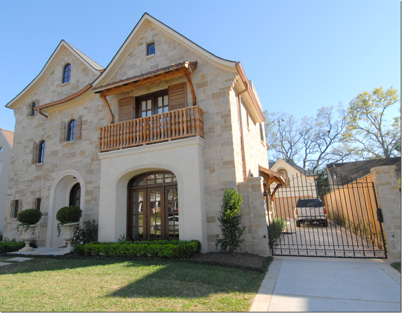
This three story, stone house is located near mine – right on the route to my hairdresser’s, so you know I’ve driven by it a million and one times. I watched it being built about five years ago and have been anxious to see the inside of it ever since.
Imagine how ecstatic I was when the owner submitted the house for the Aidan Gray catalogue contest! Finally, I got to get a glimpse at the interiors and they were even prettier than I imagined.
I truly thought this house was a shoe-in for the prize, but while it made the semi-finals, it didn’t make the finals. Still don’t understand why not!!!! But then again, most of the houses submitted were pretty enough to be a winner.
Notice in this picture the cute wood awning on the right side of the house. And notice the pretty iron detailing on the driveway gate.
Enjoy!!!
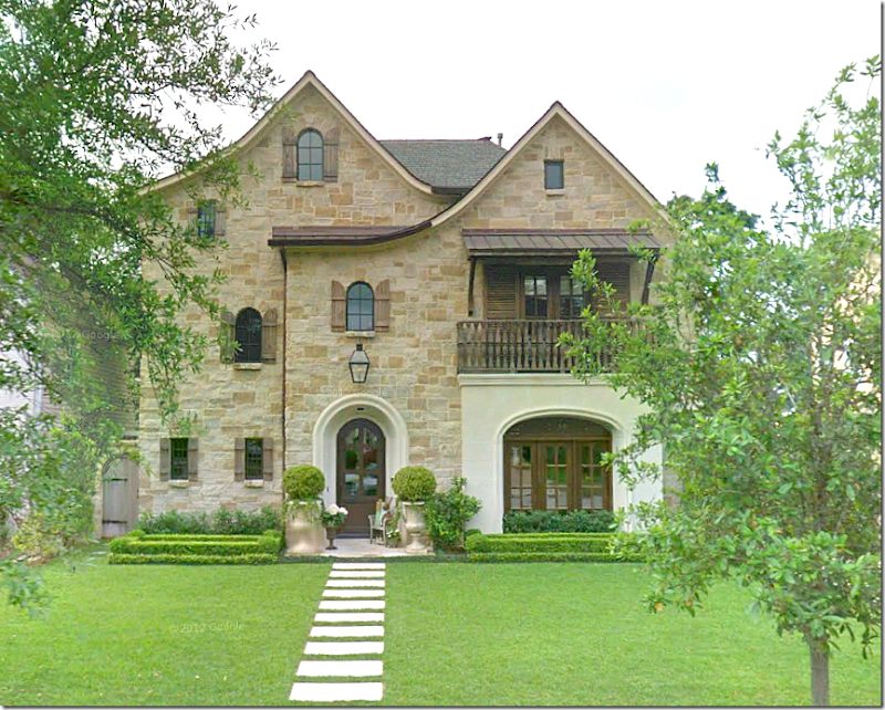
Three stories of stone and stucco, wonderful shutters, arches and balconies. I love the way they used pavers instead of a concrete sidewalk – and I love the clipped box shaped into big rectangles. Notice the charming gate at the left of the house.
At the right of the center hall is the dining room where the large front window is, and at the left is the grand winding staircase that reaches up three floors. The living room is at the left of the hall and the family room and kitchen are along the back of the house.
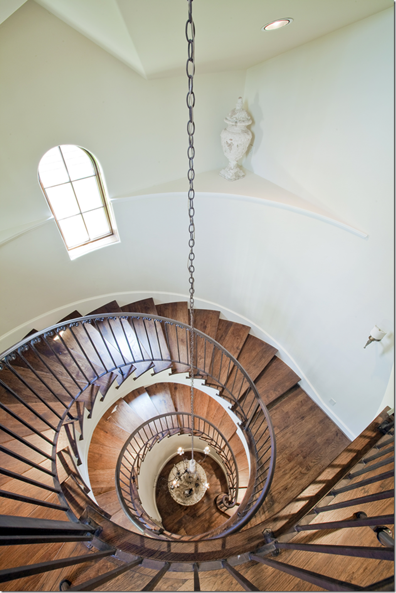
Reaching up three stories, the winding staircase has iron railings and wood treads. At the ceiling of the highest floor a large Italian styled chandelier hangs down. Lighting the way are sconces that are placed along the curved walls. I really like the railings – simple, yet pretty, with just a tiny bit of curved detail at the top. Perfect!
And looking down from the top level. See that niche? I like the way she accessorized it with just a single crusty urn. No silk flower arrangement, no “wow look at me” lighted spotlight – just an elegant urn. Again, just perfect! It looks like there is a round skirted table in the entry – but no picture of that!!!!
In West University, usually when there is a third floor, it is just a room or two - a media room, a guest suite, a playroom. There aren’t any pictures from the top floor so I’m assuming it’s probably one of those choices. I wish we had one!
Having that third floor is such a bonus!
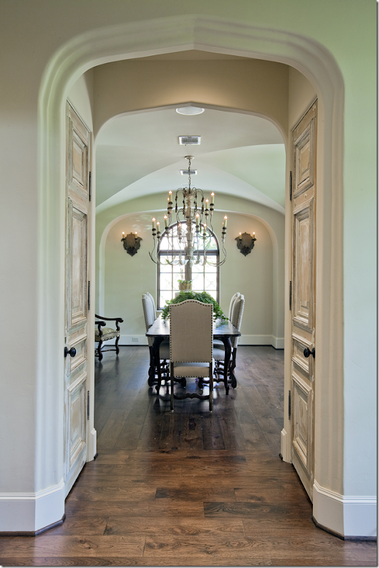
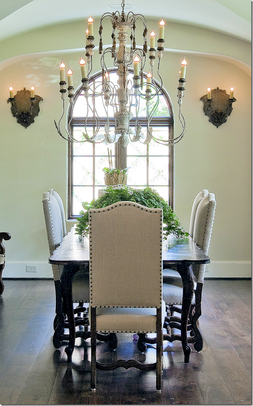
Off to the right of the front door is the dining room. Notice the two doors – are they old or faux painted? Either way I love them! The more special you can make your doors, the more special it makes your house. Along with the large window that faces the front of the house, there is an arched window to the side with adds a visual destination for the eye when looking into this room. Notice the elegant groined ceiling and notice the way there is an arch around the window wall, making an alcove of sorts. Great architectural features.
Here’s a close of the room – the chandelier is incredible! I love its size. Pretty Os de Mouton leg chairs with nailheads and trim. And I love those sconces!!!
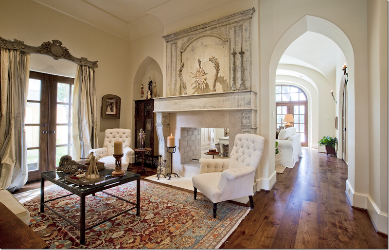
To the left of the front door is the living room. The large fireplace opens to the family room behind it. Beautiful striped silk curtains – constructed perfectly! And the antique cornice piece – to die for!!!!! More features – the pointed arches over the doorway and the shelves. And notice how thick the wall is. Also notice the beautiful crown molding – simple, yet so gorgeous. I like her collection of Santos spread around the room.
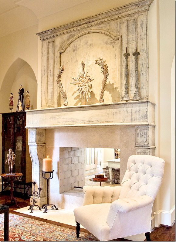
The showstopper of the room is the fireplace and its beautiful, painted wood mantel. Again, not sure if it is old or not – but who cares??? It’s beyond FABULOUS!!!!!!!!! There’s a large trumeau above the mantel which is decorated with a few water gilded pieces. Limestone surround and beautiful stone bricks inside. This is really, really beautiful. Makes the whole room!!!
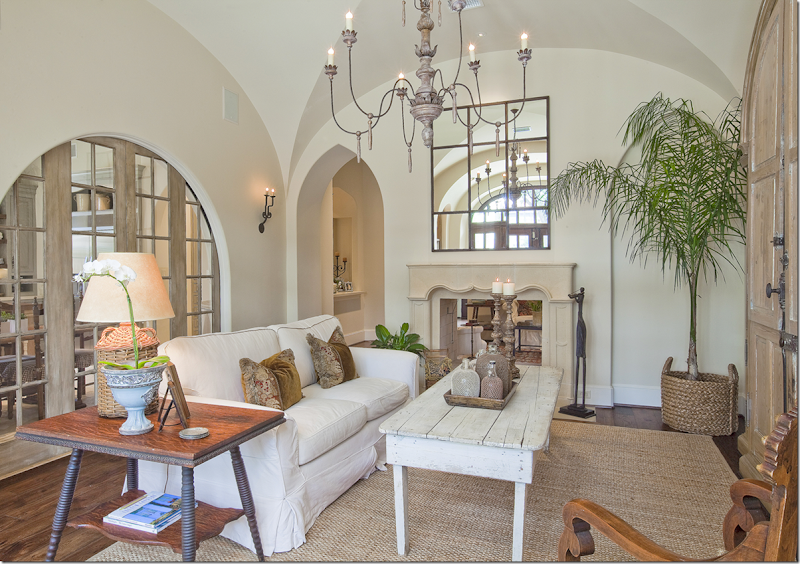
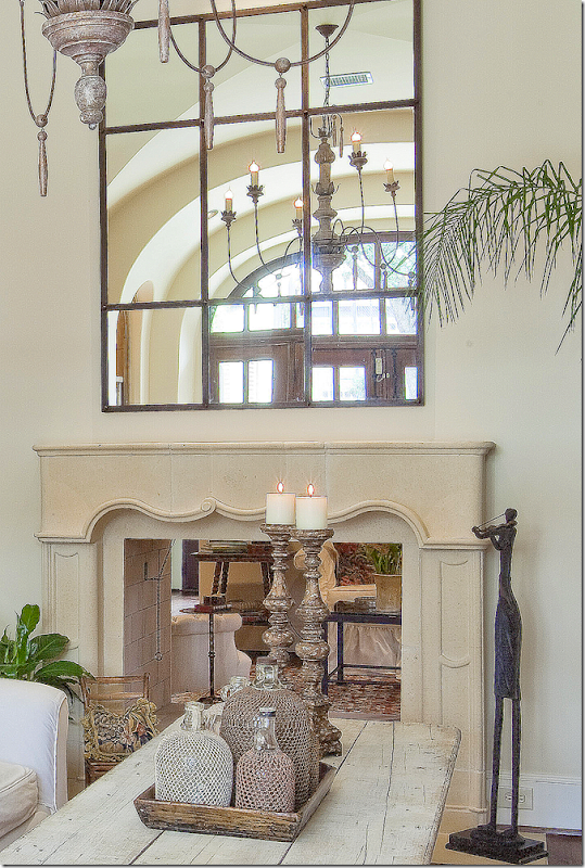
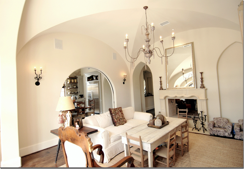
On the other side of the living room is the comfy family room. This fireplace is a French inspired stone mantel – not quite as grand as the living room, but just as pretty. Above is a paned mirror that mimics the arched doors between the family room and the kitchen. Again, those doors are architecturally beautiful. And there is another elegant groined ceiling in this room. I’m dying to know who the architect was!!!!!! The wicker bottle lamp is repeated with a collection of bottles on the coffee table. And through the arched doorway – you can see the wet bar on the left.
A close up of the mantel and the accessories on the coffee table – an assortment of mesh covered bottles!! Love!
Here is what it looks like with the doors open to the kitchen. Notice the iron sconces. And the chandelier is wonderful here too!!! This is an earlier picture – the mirror is different here and so is the pillow. You can tell it’s a happy, family home – love the little chairs for the kids pulled up to the coffee table.
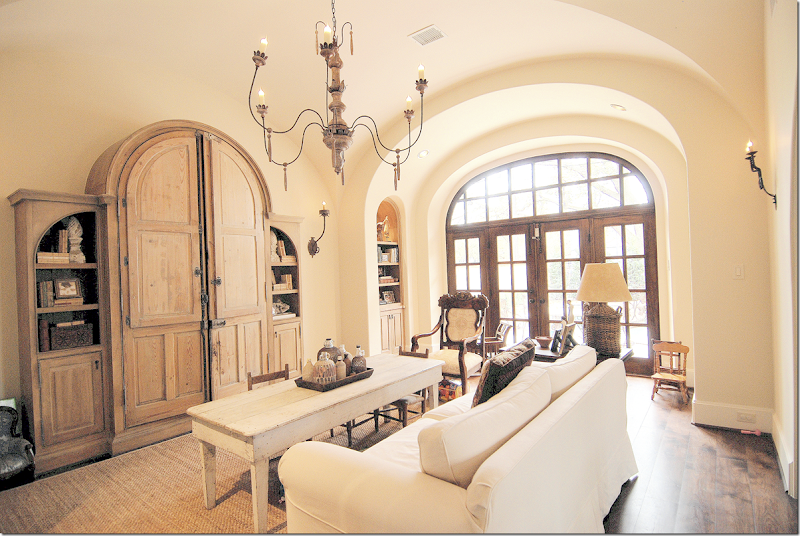
Looking towards the back yard, you can see the arch around the French doors – just like in the dining room. Arched bookcases are on each side of the alcove. And, the pine bookcase with its own arches is the perfect shape for this house. More sconces on this wall – this time with one tall arm.
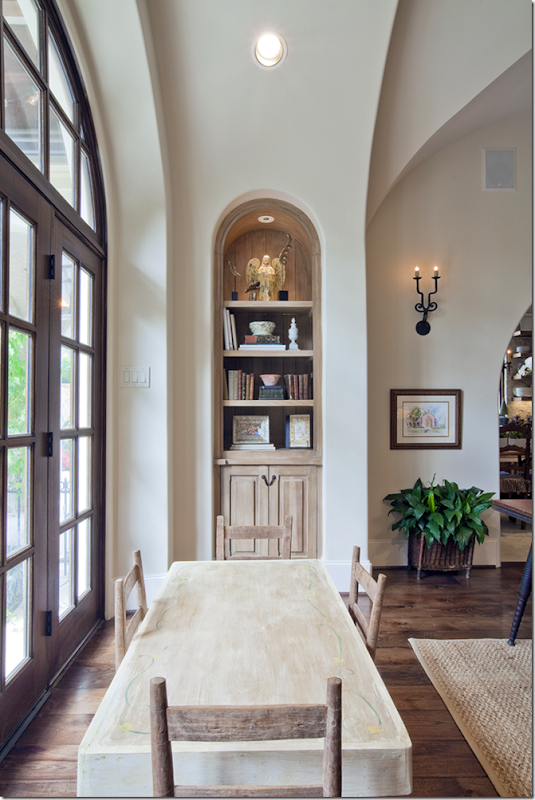
In the arched alcove near the window – you can see the bookcases with their wonderful paint treatment. Love the kids table here – great for art projects!!!!
Ready for the kitchen??????
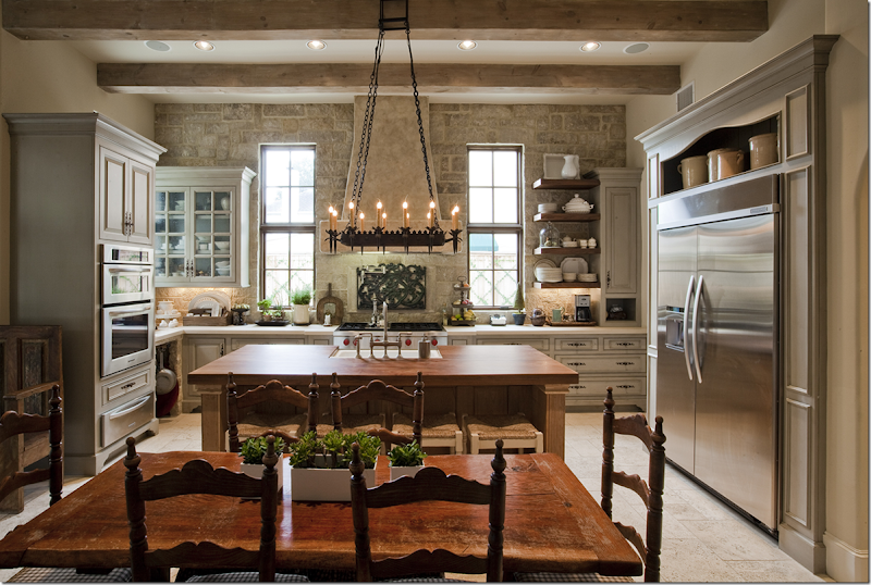
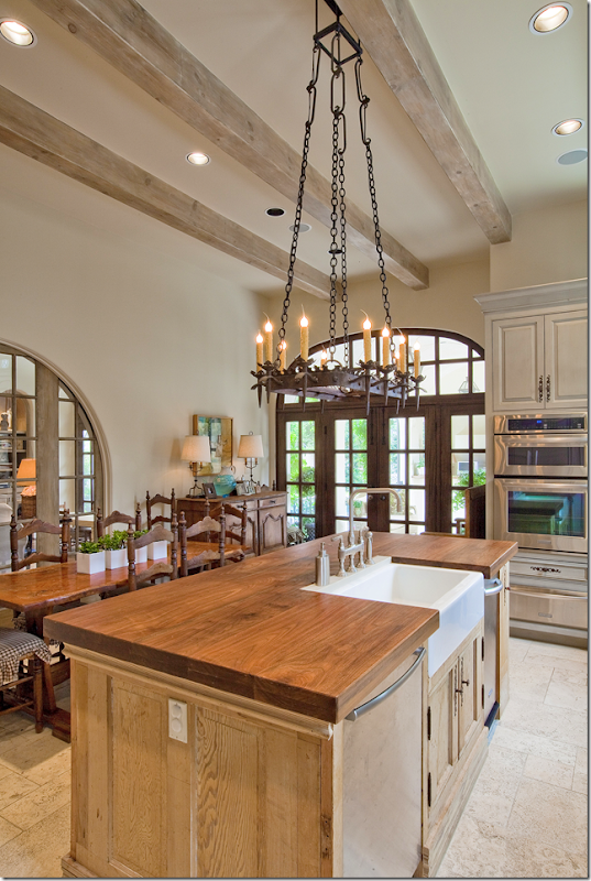
Beamed ceiling, with a back wall of stone – the kitchen is warm and friendly, yet sophisticated. The range sits along the back wall while the sink is in the island. In front sits a French table with chairs. Notice the wood surround around the refrigerator – and I love that open shelf filled with yellow ware!!! The floor in the kitchen and adjoining butler’s pantry/wet bar is limestone.
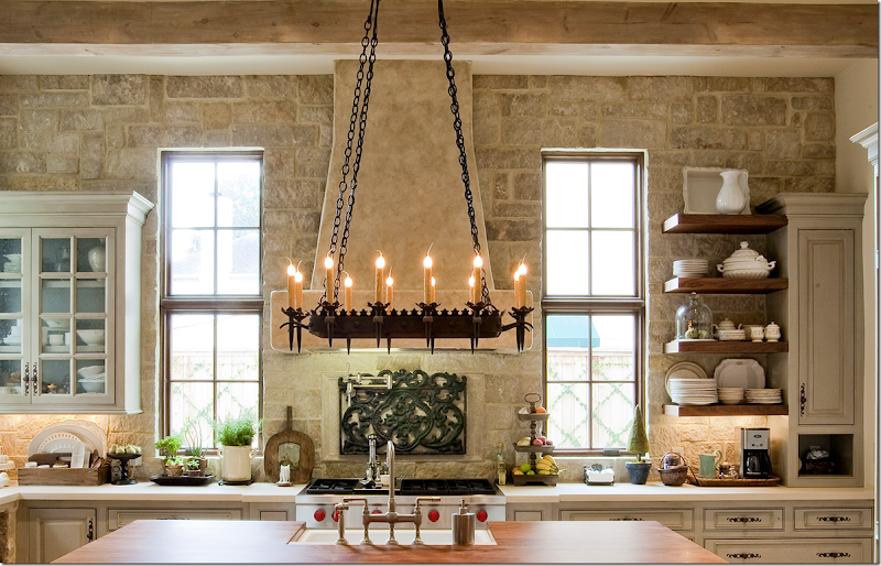
Here’s a closeup of the cooktop with its stone hood and stone wall. I love the stone!!! The countertops are limestone (I think!) – and the island is wood. Pretty open shelves on the right side. Love the subtle paint treatment on the cabinetry. And notice the iron chandelier over the island. There’s another iron piece that is imbedded in the stone wall, over the cooktop. This really shows you that kitchens don’t have to be all white or dark – you can use beige as a base color and get this look!!! But, then again, you’ll need a stone wall and beautiful windows, beams, cabinets, and on and on!!!
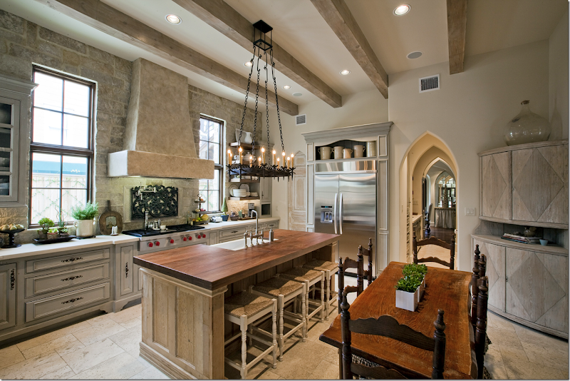
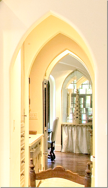
Another view. In the right corner is a wonderful antique Swedish cabinet! Love the large demijohn above that makes the piece seem taller. Through the doorway is the butlers pantry/wet bar – that leads to the dining room. Look at those series of pointed arches!!! SOOO pretty. Notice to the left of the refrigerator – the pantry door is arched and fauxed.
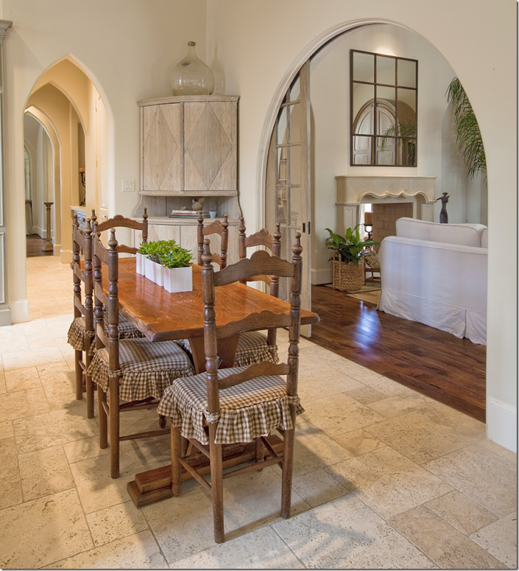
Closeup view from the kitchen into the dining room. It looks like there is a skirted console in the dining room in a mirrored arched alcove – wish I had a bigger picture of that! I wonder if there are two of those – one on each side of the front window?
Looking towards the backyard through the French doors.
Along the back wall is an antique French buffet. Pretty faucet and farm sink.
And the view into the family room and the butler’s pantry/wet bar. I’m in love with those sliding doors that separate the kitchen and the family room. Actually that is a perfect idea. If you have an open living concept and ever have a fancy dinner party – you know that having help in the kitchen can kill the mood of the party. The caterers or cleaners are banging and clanging the pots and pans, plus there is all that heat from the kitchen – with doors like this, you just close off the kitchen from the entertaining areas!! Perfect solution!!!
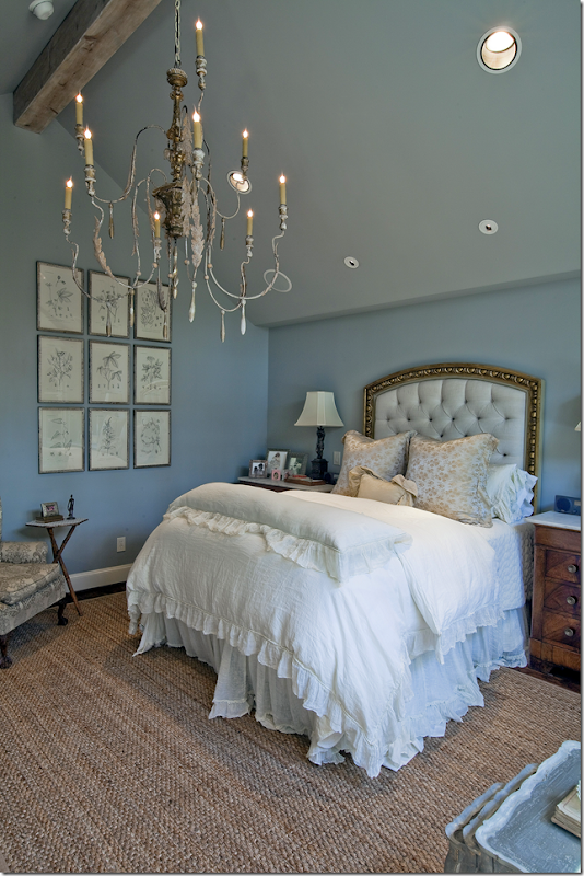
The master bedroom has pretty French blue walls and another killer chandelier. The ceiling is vaulted and beamed – but the dark wall color, also on the ceiling, along with the large chandelier, tends to make the room seem cozy, even those it’s vaulted. Also, notice how low the sides of the vault are – maybe just 7’. Another great way to cozy up a high ceiling room. Who is the architect?????
Closeup of the beautiful chandelier and the set of framed prints – love!
And another close up of the headboard – which is so beautiful. It looks like a gilded picture frame, while the inside is a tufted blue linen. Such a pretty room!!!! Dying to know where that headboard came from?!!!
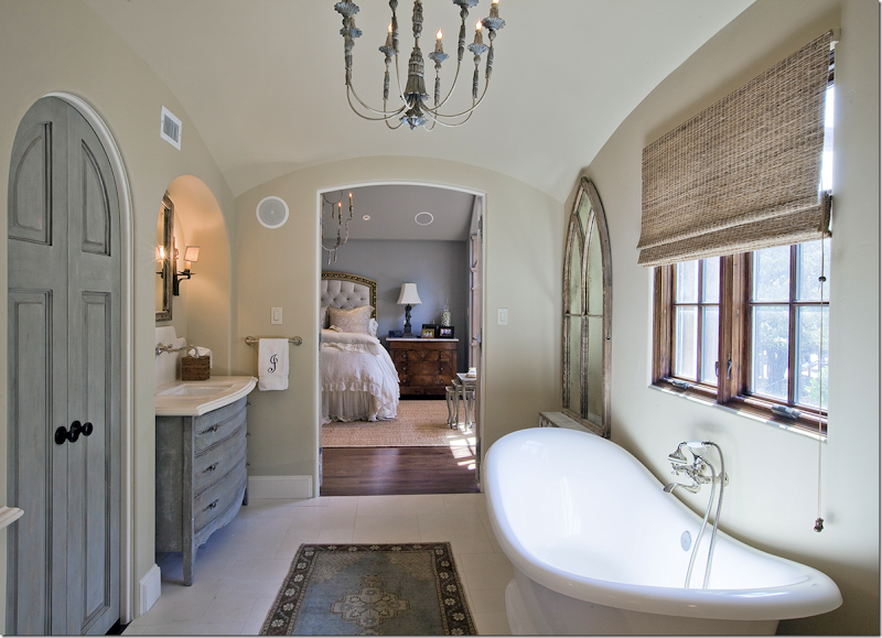
And the pretty master bathroom. The sink cabinets are painted blue – and so is the closet door. Notice how pretty that arched door is – it really becomes an focal point!!! Notice the limestone backsplash over the sink – and how the faucet is installed there. Love that look. The bath is also beautiful, right under the wood windows. Arched mirrors flank the tub. Love the bathroom rug – instead of a bathmat. And of course, there is a pretty chandelier, this time painted a soft blue.
And finally – the back yard has a covered porch, with more arches. This leads off the kitchen and the other window is off the family room. There’s a stone fireplace on the porch!! So nice. Hey, I have that same concrete table! Love all the lanterns and well, I just love this house!!!!
A huge thank you to the homeowner who shared this beauty with us today. I’m in love, that’s for sure.






What a complete design vision. The repeats of the arches, the kitchen....wow. Love the blue in the bathroom. I wish there was a picture of the sliding door closed, are they glass?
ReplyDeleteJust pinned that fabulous kitchen. Lovely.
ReplyDeleteOMG- gorgeous!
ReplyDelete-linda,ny
When I think I am tiring of this look, along comes a beauty such as this and I fall in love all over again! What a pretty house!
ReplyDeletedefinitely my dream house, so lovely :)
ReplyDeleteThe homeowner might not have won the contest but in my book is still a winner! Stunning home!
ReplyDeleteThis house didn't win because it does not need the assistance of Aidan Gray. If anything they may acquire some of this homeowners idea's for their own resources.
ReplyDeleteThe kitchen is a perfect balance - truly outstanding. The colour palette and choices of textures used throughout the entire house are consistent yet not contrived. And for once it is nice to see a home owner not covering the appliances with faux cabinet faces.
Thanks Joni!! Stunning! Love the kitchen!
ReplyDeleteGorgeous home! I'm in love with the master bathroom...but everything is truly spectacular
ReplyDeleteJoni, do you think the homeowner would mind sharing the paint color of the master bedroom? This home is amazing - inside and out! Thank you so much for sharing it with us.
DeleteWhat a beautiful house! I loved everything about it. How do we all keep from hating our houses now?
ReplyDeleteThe mantle in this house is new, painted by me. I also painted the "stone" range hood, the pair of cabinets in the master bath, and the sconces in the dining room.
ReplyDeleteThe designer is my friend Lisa Irvin.
The mantle is incredible!!
DeleteGorgeous!!! Any chance you would share the basic color you used for the cabinets in the master bath?
DeleteGREAT WORK!!!Does Lisa Irvin have a blog or facebook?
Deletebeautiful, beautiful! joni--you are just the best! sitting here with a hot cup of coffee, my cavalier snuggled up next to me and another fab blog post by Y-O-U. can't think of a better way to begin a Saturday!
ReplyDeleteBeautiful!!!! dreamy, on the covered porch the ceiling is mosaic?
ReplyDeletewow.
Joni, as always, another AMAZING Houston home. I am smitten with the size of the rooms in this home, it is so refreshing to see someone who can afford to build a "McMansion" choose to build a smaller scale home. I have a large home that is by no means grand but I have noticed that 3500 square feet of "home" is much more space than my family of 4 actually needs. Coziness is so important! Buying a reasonably sized home is so much smarter, not to mention that you can then afford to fill it with better furnishings. We will definitely be downsizing when we buy our next home.
ReplyDeleteIf you pay close attention to the lot size, a "McMansion" as you say would not fit on it. The lots in West University are probably no more than a quarter to half acre at best.
DeleteThe more Joni shows the runner ups, the more I now understand why the winner was chosen. This house has over dosed on a couple of architectural details - gothic arches run amok. The kitchen is certainly a pretty one despite the counters filled with a lot of clutter. It is definitely the best room in the house.
Sorry, but this is a more tasteful McMansion done in the currently fashionable "french", "beligian" and "other" mishmash. The exterior is odd and not very attractive. Distressing everything doesn't make it chic (maybe in Houston it does but..) The kitchen is massive and that tudor/gothic style chandelier is just odd. Sorry to be the meanie, it just doesn't work for me.
DeleteI agree with you. The architect referenced his textbooks and looked under the heading gimmicks. The wooden balastrade and the wooden canopy just look like more "look at me" stuff. Houston has an abundance of these houses where classic architectural design is thrown to the winds to accommodate gimmicks so that the great unwashed swoon.
DeleteWow! Wow! Did I say wow? I dare anyone to find fault! Those arched pocket doors between the kitchen and family room--perfection. The groin vaults--stunning. Here's one observation I would love you to comment on, Joni: That fabulous, oversized chandelier in the dining room. I think it's swoon-worthy. We are just beginning to furnish our newly built (production) home in Florida. When I showed the sales woman at a local lighting store some of my favorite options on my Pinterest board she discouraged me because they did not meet the "rule of thumb" that the table should be about 12 inches wider than the fixture, and also because our ceilings are "only" 10' she thought 40" high was too much. Huh! I remember reading Alexa Hampton saying don't be afraid to go overscale and that it's better than making the mistake of going too small. In this fabulous house I see that the dining room chandelier seems to slightly overhang the table, and it is very tall as well, with not much chain. I would love your thoughts on size of the light fixture vs. scale of the room. Best, Beth C.
ReplyDeleteSuch a pretty home and so well done in every room.I especially love the big stone wall in the kitchen..thanks for sharing!
ReplyDeleteWhat a beautiful home. Thanks, Joni, to you for posting this and thanks to the homeowner for sharing. I love how warm and inviting this home is without being over decorated. I strive to 'keep it simple'; not having too much stuff. It takes great restraint to stop accessorizing at a certain point!!!!
ReplyDeleteStunning! Now I know why they didn't win the contest - they didn't need the help!! It is beautifully decorated and the architecture is fantastic! Thanks for sharing this home, Joni.
ReplyDeleteLeigh
There is NOT ONE THING I would change in this most "incredible home!!" The thought that went into this design is...priceless. HAPPINESS! franki
ReplyDeleteA beautiful house, especially the kitchen and its pocketed doors. Love it. Congratulations to the talented painter (and designer (mentioned above).
ReplyDeleteBest...Victoria
oh my goodness gracious!! Beautiful home!
ReplyDeleteJoni, I love that you always show so many photographs in your blog. So much eye candy! I must know who made the chandelier in the master bedroom. It's totally perfect--the one I would have designed if I designed such things. Is there any way you can find out for us?
ReplyDeleteThanks so much for the stellar (as always) update,
Alexis
My, the architect and home owners thought of every surface. The design--interior and structural--is so coherent! I always like to read your posts, look at each picture, then at the end see which picture stayed in my mind. The first kitchen shot was the most memorable, with the Gothic arches telescoping back as the second most memorable. But, in this home, every detail is gorgeous. I could move right in! Thanks for sharing all the loveliness!
ReplyDeleteLove it, especially the arches and "groined" ceiling in the DR. Never knew what that style was called. Does anyone know where the bedding came from? I'm looking for some gauze-like fabric for a bed skirt.
ReplyDeleteThanks for sharing.
Belle Notte linens are gorgeous. I drool over them. When we finish out house I'm buying them for my beds.
DeletePlesae let us know who the architect was. Just lovely.
ReplyDeleteThis is a beautiful home and the decor and finishes are so fitting and flow from room to room. My only disappointment is the outside front facade is not balanced. The windows to the left of the front entry are too small in scale for me. Inside, the side wall in the living room lets in plenty of light via the French Doors, so I would think the smaller front windows wouldn't look balanced from the inside either, unless fabric on the windows creates the illusion of larger. The window in the staircase is also out of scale for my tastes, especially since it is a three story vault.
ReplyDeleteBeautiful home, I would love to know who the architect of this beauty is. Such a talent to create this lovely home.
ReplyDeleteA-maz-ing! Simply gorgeous. Love the architecture. Love the finishes. Love the interior design. Though the table, chandelier and sconces in the dining room are beautiful, my only teensy criticism would be that the dining room needs something; some color, maybe, say in a rug. And, personally, I don't like all the upholstery everywhere to be plain white or off-white. (I seem to be alone in this, as it's definitely the Houston look, as in white slipcovers, but then I don't live in Houston.) But that's quibbling. The architecture is fantastic. Those pocket French doors are fabulous, though it looks like the doors themselves are rectangular, and only the opening is arched. Still, very clever. If it were mine, though (ha, ha, ha), I'd want a bigger lot. This house is a winner, contest or no.
ReplyDeleteThank you for sharing this with us!!
ReplyDeleteHappy weekend!
xx
Greet
This is absoulutely a beautiful home!! Thanks for sharing with us!
ReplyDeleteHi Joni, It is probably one of the best designed new house that I have ever seen. Every single detail is perfect.
ReplyDeleteMary
If you can ever find out who the architect was, please post it.
ReplyDeleteThe home has many beautiful aspects, but I would ask; why were balconies chosen on the exterior that have virtually nothing to do with the architectural style of the home, particularly the roofline? Why was basically the same light fixture (different sizes but exact same style) used in almost every single room of the home (with exception of the kitchen)? It's the "we'll take 10 of those" style of decorating. I love that type of fixture, and have one in my kitchen, but why not creatively find other fixtures so all are not the same? It's like using the same fabric in every room. And, looking at the photo of the master tub/into the bedroom, why in the world did they not paint all those speakers to match the walls??????? Many peole have wired-in speakers, but they are not a decorative feature!. You paint them and no one knows they are there. Air flow grates the same - why not paint them? I think this home has many nice qualities, but to me it doesn't hold a candle to some of the others.
ReplyDeleteLOVED the central staircase and many of the architectural details. However, just like putting on jewelry, you have to know when to stop. The balcony treatment is much too rustic for the rest of the facade which otherwise is gorgeous! Too many different types of arches on the interior. They made me feel nervous.
DeleteWould love to see this house again in a few years after the owners have had time to really make it "lived in". Right now it feels like a high-end spec house that has been staged for sale. For heavens sake, the fireplaces have never even been used!
Gorgeous home, Joni! Have a wonderful weekend!
ReplyDeletexoxo
Karena
Art by Karena
This is absolutely beautiful and looks like an Italian Villa. It will take me days to go thru it again and try and grasp every detail. Joni, your description of each space was perfect. The faux finishes, etc. are all simply outstanding . This is definitely one of my favorites.:) Thanks !!
ReplyDeleteThank you Joni for another beautiful post!! Love your blog! This home is amazing!
ReplyDeleteMichelle
I love this house! The exterior is just stunning and the interior even more so. The house looks old, which is the best compliment you can pay a house. Thanks so much, once again, for sharing such a beautiful home.
ReplyDeleteI love every detail...Going back over this one a few times. Thanks so much for sharing. Just curious...did you receive my email a couple of days ago? Have a great weekend. Mona
ReplyDeleteWow, wow, wow! That house is the stuff daydreams are made of...
ReplyDeleteHi Joni!
ReplyDeleteHow are you? This home is beautiful......Seems like a lot of AG already in there.........Love the gothic arches with the points and how they were backed up by the lanterns. Since there were several wooden chandeliers in there I might have changed up the styles a bit.......The one in the entry way didn't seem to live up to the wow of the entryway.......Needed some crystal maybe???????? There are so many options now.... But truly this was a lovely home.......I also loved the fireplace that was two sided......Thanks for showing it..........Maryanne xo
Love, love, love it!!
ReplyDeleteIt is a lovely home, I especially love the living rooms/fireplaces/ceilings doors. Thanks to you I can now spot Houston style a mile off!
ReplyDeleteJust drool-worthy. I love it and have pinned that stone wall in the kitchen. Love it. Thanks Joni, I appreciate you more each time I visit.
ReplyDeleteI always enjoy your home tours!
ReplyDeleteI thought the fireplace was interesting. Do you think they are going to put in gas logs? I know the fireplace season is not long in Houston, and clearly a fire has never been lit in the fireplace, but I was wondering why the long black rod.
The kitchen is pretty. The big arched pocket door between the kitchen and the family room reminds me of architect Jack Arnold's house that was featured in Veranda a few years ago - he noted the same thing you did, about how nice it is to be able to close off the kitchen to the caterers when entertaining, but have it open in day to day family life.
- Holly
The living room window treatment is exactly contrary to what you suggest homeowners do with their windows. Not knowing the height of the LR ceiling it is difficult to know what to suggest, but clearly the scale is off with the window. This window needs a transom and the rod for the curtains needs to be high enough to match the scale of the trumeau over the fireplace. The windows look too short and the wooden cornice a bit silly. In other areas a flat arched transom has been used to give height. Why was it not used in one of the most important rooms in the house.
ReplyDeleteAgain, I have to look at the furniture. It looks like Early American gone Gothic trying to be french. The owners were not well served by their decorator or else they used furniture appropriate for another style home when they built this one. The furniture is too country and too repetitive in design.
I don't know how this house became a runner up.
The designers did an excellent job! An absolutely beautiful and stunning mixture that is also relaxed. Yes, a home can have Gothic, French Country, Early American, lots of texture, and soothing neutrals all under one roof if it is done properly, and this home is a perfect example of that! That gorgeous kitchen is rich and realistic!
ReplyDeleteMmmm... I am head-over-heels for that KITCHEN! A beautiful home, inside and out.
ReplyDeleteOne of the best you've ever shown. Thanks
ReplyDeleteThe house is beautiful but I am not so sure that I am head over heels about it like some others. I feel like it's trying too hard to be something it is not. That being said, there are so many other elements that make it quite lovely. The bathroom and master bedroom are just exquisite. And that spiral staircase! Oh how lovely. Thank you for sharing! I look forward to each of your posts!!
ReplyDeleteWow! I particularly love the kitchen.
ReplyDeleteOh my, I love this home! Every single room is just beautiful, warm, and inviting! The outside is also wonderful.
ReplyDeleteJulia
what is going on in houston?! extraordinary, felt like i was viewing a stunning french home......ohhhh, the details
ReplyDeletedebra
fantastic home, thank you
ReplyDeleteWhat can I say? I'm totally stunned.
ReplyDeleteWow, This is one gorgeous home!!
ReplyDeleteGreat house! Love the kitchen, especially the window view with the balanced (but not identical) upper cabinets on each side. By making them different, yet symmetrical, the kitchen looks so much more interesting. I also love the mix of materials: stone, wood floors, painted cabinets, etc. The only thing I'm not feeling are the gothic arched doorways. There's so much great architectural detail already in the house that to add these feels gimmicky.
ReplyDeleteomg this house is gorgeous. especially the kitchen. I wonder how much the windows cost? , and some don't have curtains, but look so fabulous
ReplyDeletei wish my neighborhood had at least one house took forwad to pass by.The one you are showing is beyond beautiful. One of my neighbors put a pink flamingo in front of his house. Really? I wonder why people have such bad taste sometimes.
ReplyDeleteHow on earth sis that not win! that is gorgeous, and I am so in love with that kitchen!!!!
ReplyDeleteThe spiral staircase reminds me of every one of the dozen or so apartments I had in Paris. LOVE the autenticity of this site! Thank you for finding such grace in the midst of all the dark, heavy Texas design.
ReplyDeleteOne of the best designed homes I've seen on your site.
ReplyDeleteThanks for sharing
I enjoyed viewing this beautiful house so much, especially the kitchen. Thanks for sharing!
ReplyDeletewow~~~~~~~I hope I can have such a house in my hometown, very very very nice interior designs!!! and can I share these photos on Pinterest?
ReplyDeleteWow. That's really a huge and beautiful home. What an elegant custom home shutters they have. It adds beauty to the house.
ReplyDeleteBeautiful! Glad you got to share it with us. LOVE the stone in the kitchen, all of the lighting, and what a fabulous master. Is there any chance of finding out any info on the lights she used. or the color of the master. I am doing an extensive remodel right now....would love some info. Thanks soooo much for all the work you do with your blog so we can enjoy.
ReplyDeleteFantastic architecture. I just loved everything about this house. Especially the interior design and windows installation. Thanks for sharing.
ReplyDeleteBeautiful makeover! I love how simple gel stain is to work with. It looks amazing! Thanks for sharing.
ReplyDeleteThanks for sharing these wonderful images. The style and décor of the home interior will inspire many people to choose the best way to renovate their homes.
ReplyDeleteI really love all this. lot of inspiration in the post... Thanks for sharing this gorgeous post... and I like your blog too... will come back soon for more... Thanks
ReplyDeletefunny coffee mugs
funny mugs uk
I also wish to say thank you for sharing this post. Really good taste and comfortable to live in. Very thoughtfully done. I am showing this to my friends too.
ReplyDeleteD from London UK
You have done great work, thanks for sharing this interesting blog post, i hope you will add new project shortly and they are also useful and informative for all the members and visitors. :)
ReplyDeletePrecast Concrete Products
It's beautiful, stunning, restful and just like the homeowners wanted it to be....just like my home is like I want it decorated (or can afford:) I thought the fireplace black rod is probably the gas fireplace and will be a simple flame in that black rod?? Loved the long table with the kids chairs in the family room. Thanks for sharing, I can usually pull ideas from most any design and this one is no exception!
ReplyDeleteDid Adam and Alexander Kliebert, owners of South Hampton Montessori and Hudson Lounge build this stunning home?
ReplyDeleteAmazing Such a beautiful House Beautiful pictures Thanks for posting.
ReplyDeleteProperties for sale in Houston
Beautiful houses plus beautiful furnitures...that would be great!
ReplyDeleteThis is a beautiful home that looks very well built. It's the perfect combination of class, color, and has an imaginary feel to it. It's awesome that we have services like this that build nice custom homes like this one Home builder in Houston
ReplyDeleteWow This is really good design and color.I like your article and blog.Thank you.Rugs online Australia
ReplyDeleteThanks for sharing beautiful information.Wool silk rugs for sale
ReplyDelete