When I got this submission for the Aidan Gray catalogue contest, I was thrilled! I had been following the homeowner’s blog, Nubury Lane, and even years before that, when she was a big star on HGTV’s Rate My Space, where she was known as HPJ185. If you used to visit Rate My Space, I’m sure you’ve seen the pictures of her former house(s) here.
Recently, she and husband bought a new house in the Virginia, close to Washington D. C. They have been busy remodeling it and making it their own. I love seeing the before and afters as they change things up. One of the prettiest things about the house is the setting. The slate roofed, stucco house sits high atop a hill that overlooks a pond. Their yard is so large and expansive! There’s a pool with lots of wrought iron and lanterns. There’s even a basement with Saltillo tile and a second kitchen that leads out to the swimming pool.
Right now the stucco house is painted a soft pink and the brick is a light red – which will all change when it is repainted the same color. But, as you know, there’s always lot to do and the fun is taking your time to avoid making mistakes, and prioritizing.
The house is airy and bright with lots of pretty windows. I really love her style – she mixes French and Belgian looks together in a soft, muted palette that looks so soothing.
I hope you enjoy seeing these pictures of her beautiful house. I went on her blog to get a few “before” shots so you can appreciate all the changes that have happened these past few months.
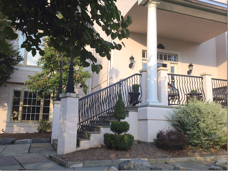
The slate roofed house with its stucco façade. The homeowners plan to paint the exterior along with the wood trim and the brick so that it will all blend together.
There is a slate walkway that leads to the stairs and front porch.
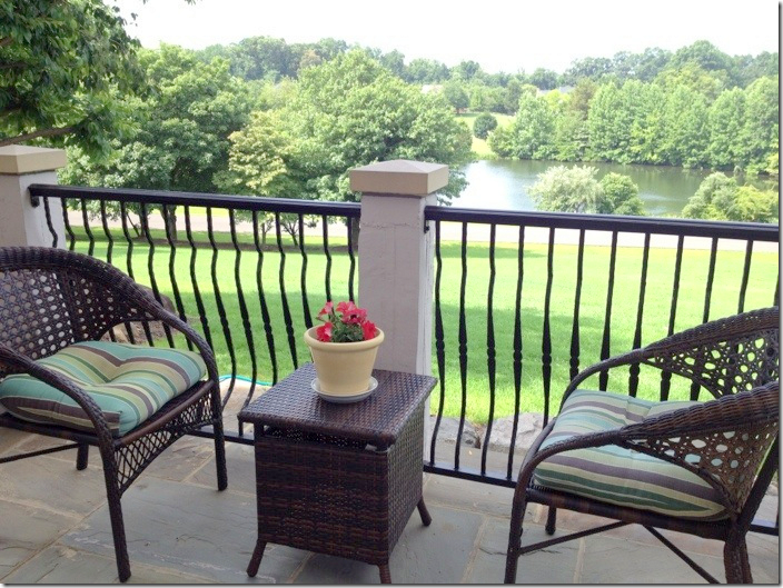
The front porch overlook the expansive lawn and the pond. Isn’t this view gorgeous?!! I can’t imagine having a view like this!
At the back of the house, there are covered porches and decks.
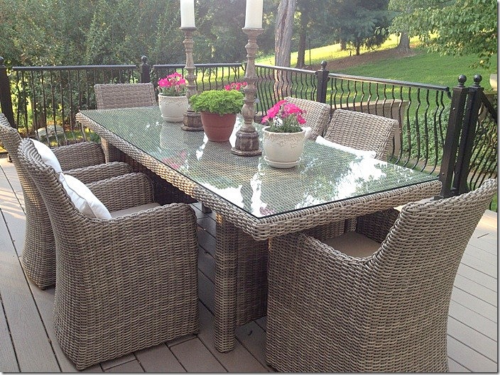
The wicker dining table and chairs on the back deck. Love the hilly landscape! What is it like to have hills in your yard????
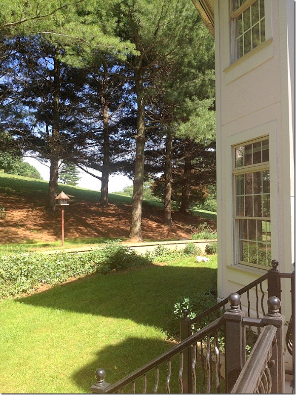
The view of the hill off the dining deck.
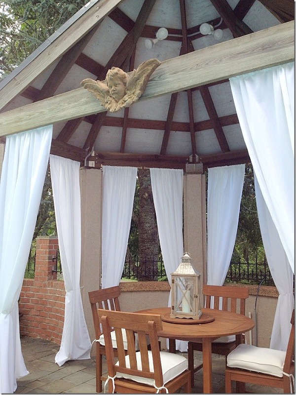
In order to catch the best sun, the swimming pool was installed to the right of the house. The owner chose white cushions and taupe and white striped pillows and towels. Love the curtains in the gazebo!
The gazebo. So cute!!!
I love those pillows (maybe it’s because I have them in blue!!)
The view towards the back yard.
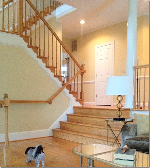
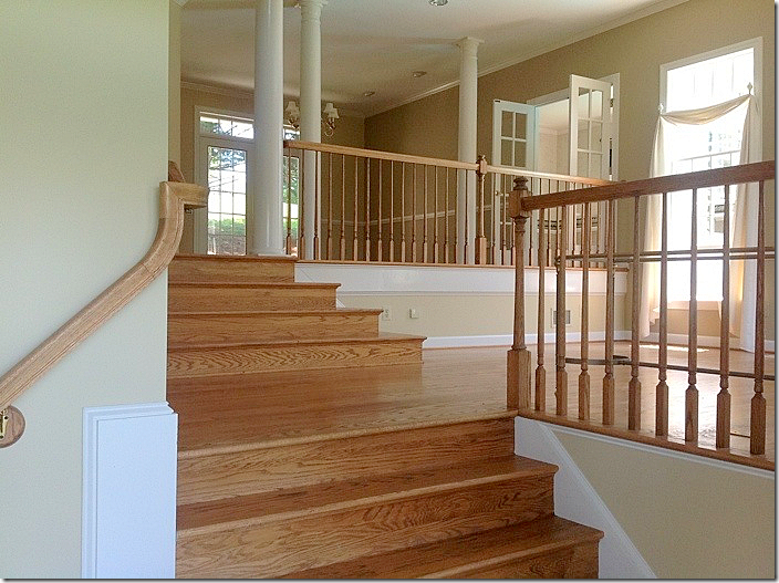
BEFORE: The walls were painted a yellowish taupe and the stairs treads were wood.
BEFORE: And also, the balusters were wood. This all changed!
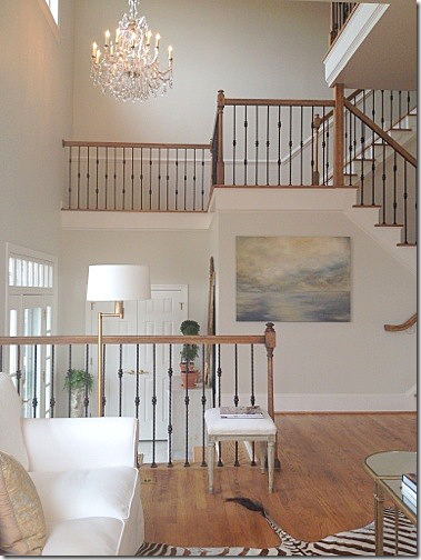
AFTER: Today, the walls are a soft gray and the balusters are beautiful black iron. What a difference! Also, the home owner added that gorgeous chandelier in the foyer.
Another view of the new railings. Notice the huge difference the white treads make.
And, again, the foyer.
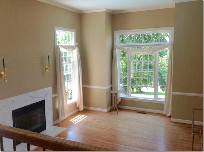
BEFORE: The living room with the marble fireplace, dark walls and curtains. The windows are really pretty in this room – the front ones overlook the pond, while the side ones overlook the swimming pool.
DURING: The living room has been a work in the progress. Once they painted the walls, this is how the room looked.
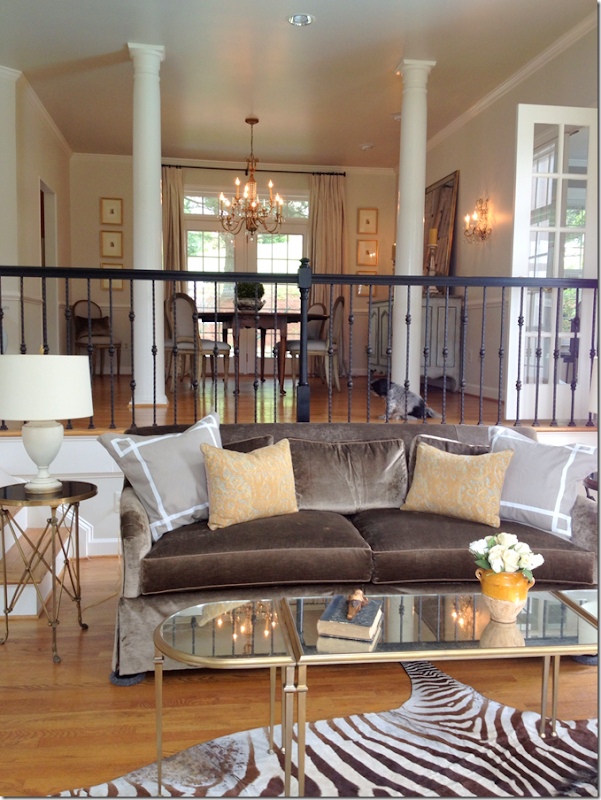
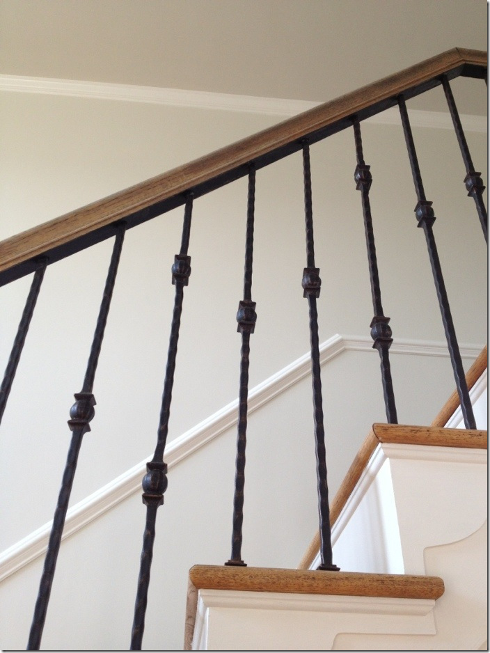
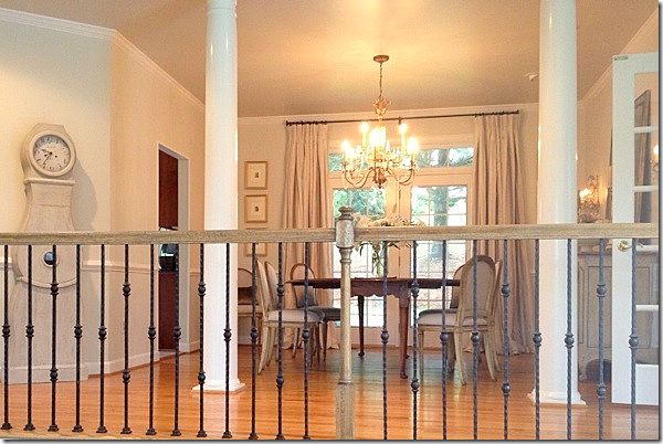
And looking up at the dining room. But, things have changed. First, the marble fireplace was redone. And new sofas were ordered. And returned. And curtains were added. Now, notice the stair bannister is painted black? That lasted a day! After they were all painted, the homeowner hated it and had them stripped back. But, the upside of the mistake? After they were stripped, there was still black paint in the crevices of the wood which made them look even prettier than before. Look:
The bannisters after the black paint was removed, a mistake that happened to turn out for the better!
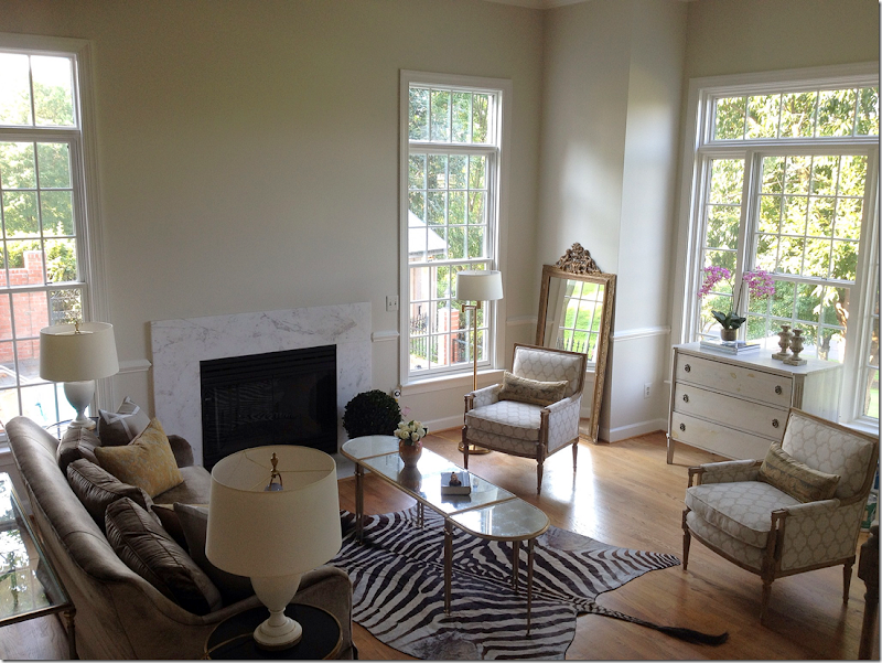
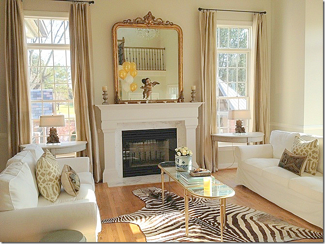
AFTER: Today, the living room looks like this! Notice the new mantel which her husband built! Amazing! What a difference. And I love the curtains. The homeowner had two IKEA slipcovered sofas so she moved them in here until her new sofas arrive. I actually love these here!! In the windows there are two Swedish demilunes with cute lamps. She bought the demilunes on One Kings Lane which means they are probably from The Lone Ranger (where mine came from too! Great minds….) And the antique mirror is perfect here.
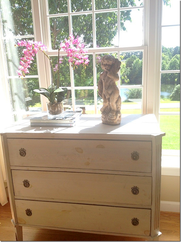
In the front window, there is a Swedish chest. See the pond from the window? What a difference this room is now from when they first bought the house – so beautiful!
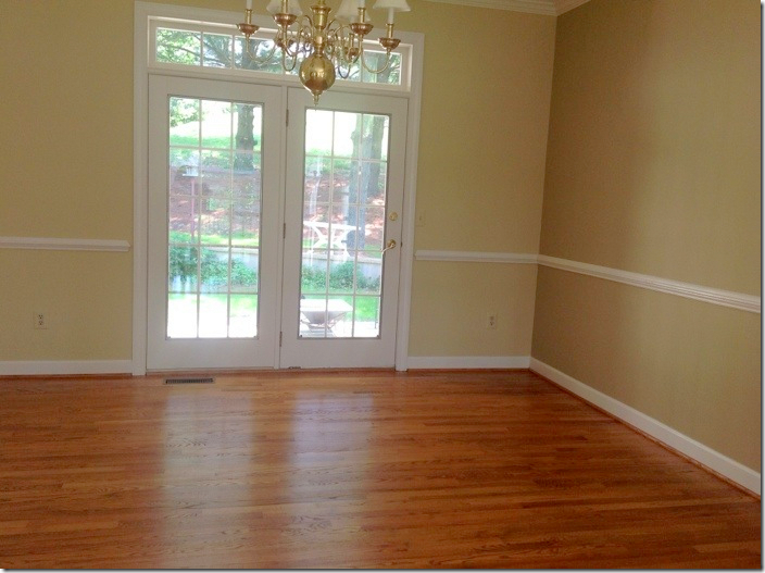
BEFORE: the dining room.
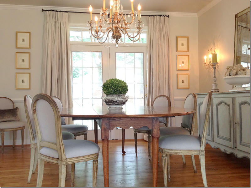
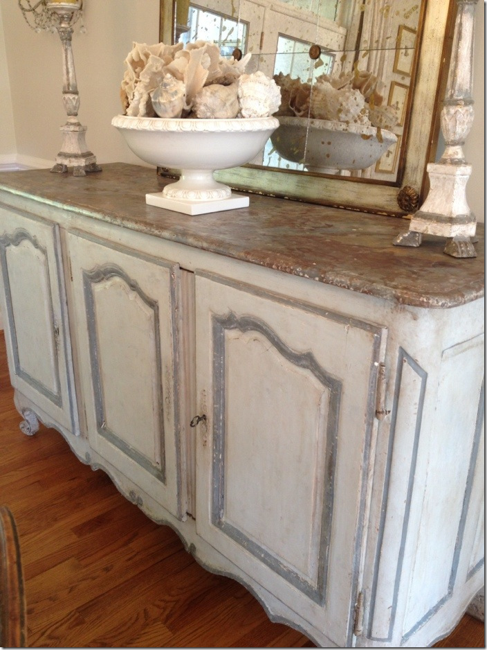
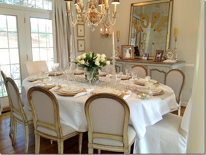
AFTER: The dining room is so gorgeous! She has painted antique French chairs and an antique enfilade, painted in cream with blue accents. I love the sconces and the chandelier and the mirror, too! Striped silk curtains.
So beautiful!
Close up the beautiful enfilade.
Decorated for a recent party – with a white tablecloth.
And on the wall leading from the dining room, she has this pretty Swedish Mora clock.
BEFORE: The family room. Notice the fireplace.
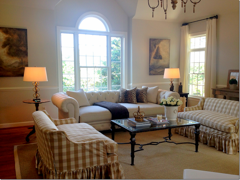
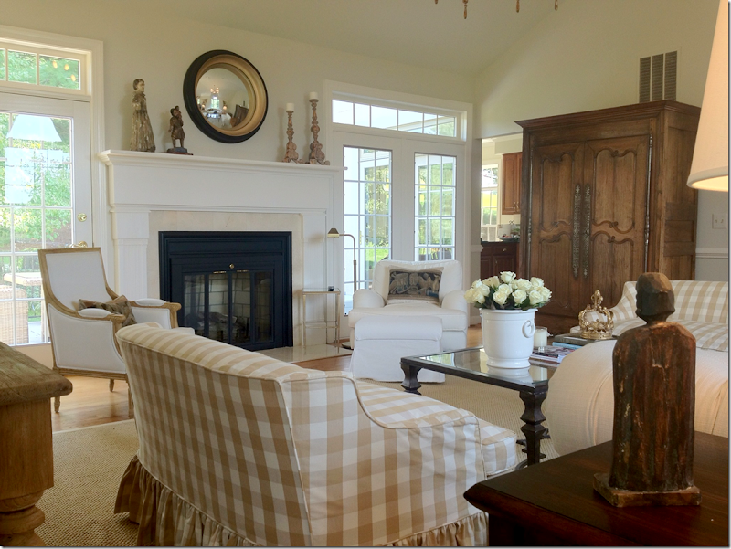
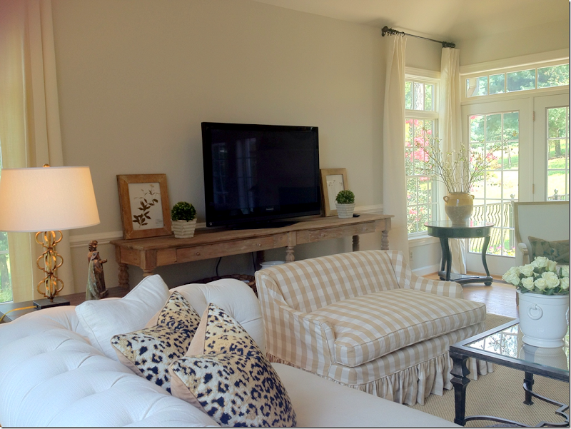
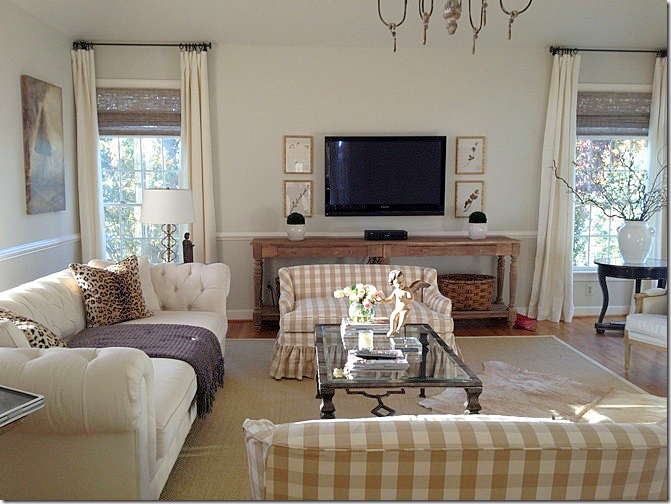
AFTER: The family room is my favorite room! I just love it – especially her twin slip covered settees in the checked fabric. And I love her white tufted sofa in front of the beautiful window.
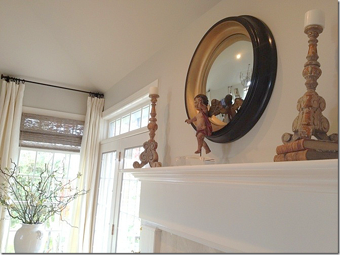
Here is the new fireplace – quite a difference! I love her pillows made with tapestries.
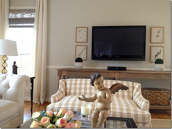
Along the back wall. Today, she has hung the herbiers.
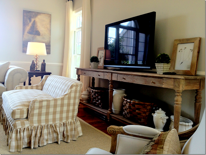
Great console – I love the length of it and the color of the wood. Plus, she has a great assortment of baskets and ironstone below.
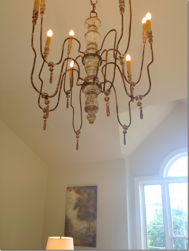
In the vaulted ceiling is this wooden chandelier.
A newer picture with the hanging herbiers and her new putti on the coffee table. Plus, she hung textured shades in the windows.
Close up of this putti.
And the other!
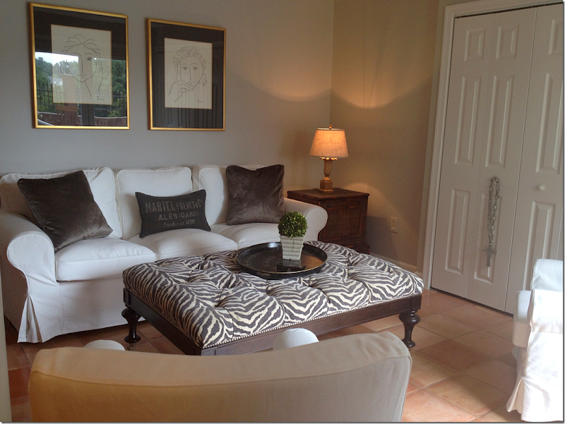
The basement has Saltillo tiles and leads out to the swimming pool. She’s used white slipcovered furniture and a zebra print ottoman down here.
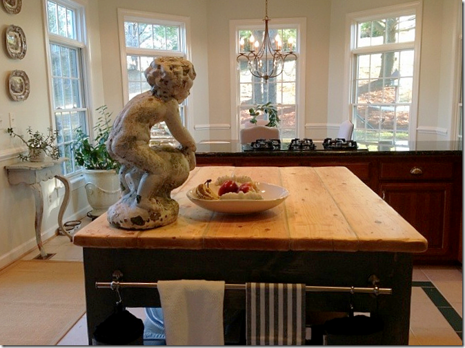
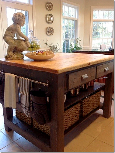
And finally, the homeowner’s kitchen is waiting for its remodel. In the mean time, her husband built her this amazing island!! Once the kitchen is redone, the island will go down in the basement kitchen. I’m impressed!!
And here’s another view!
A huge thank you to the homeowner for opening her house to us! I love her style so much. To see how her aesthetic has changed over the years, go HERE to see pictures of her former house on My Sweet Savannah. That house is just as beautiful!!
And to visit Nubury Lane blog, please go HERE.










What a stunning home! I love what the homeowner has done to the inside and lucky them to have such a light filled space. They are lucky to have those views we have the same kind of views and feel so fortunate. I love how when she knows she doesn't like something she's willing to jump back in and change it. Fabulous home and thank you both for sharing.
ReplyDeleteXXX
Debra~
i fell in love with her previous home on RMS when she was known as HPJ185! I even had some euro shams monogrammed much like hers in her former master bedroom. her new home is coming together so beautifully! did you know that she recently hurt her hand and that has slowed down some of her progress (i believe she is a hairdresser - very successfully it appears - and the hand injury must have been devastating to her). i'm anxiously following this new renovation. thanks for sharing joni!
ReplyDeleteSuch a lovely home. The rooms are generous but not cavernous. I love the fireplace surround the husband made for the living room and their kitchen island. The changes to the balusters make the home look custom rather than what a builder would choose. And, of course, the setting is spectacular.
ReplyDeleteBest...Victoria
Oh my goodness!! What an absolutely beautiful home! It is decorated wonderfully & you can see the personality of the homeowner in it. She could be a professional designer! I also love how there is warmth in the rooms, especially with it being such a large home. The grounds are beautiful, too! The rolling hills and all of the greenery outside is why I ask anyone what is the attraction to living in a big city?!! Thanks for sharing, Joni!
ReplyDeleteLeigh
This is such a beautiful property and home. The owner has wonderful taste and a great idea for detail. This is certainly
ReplyDeleteone of the best entries in the contest and had it won, I would not have been surprised.
STUNNING! Honestly, just STUNNING!! franki
ReplyDeleteWhat a beautiful home! There was one thing that my eye immediately noticed. The textured shades are hung on the window and not in the space above, as a certain designer has suggested so often. If she moved them up, they would add height..
ReplyDeleteDid Joni make this gorgeous transformation, haha!! Joni, it looks so much like something you would do - it's stunning!! Thanks so much for sharing this, made my morning.
ReplyDeleteAnd yes, what would it be like to have hills in your backyard. :-) Here in Houston, we make bumps in our landscapes just to get some elevation!!
Joni, my heart skipped a beat when you posted this home because I was a fan of Hpj185 years ago and lost her! Interesting to see how one's taste evolves over time. Thank you for this post. I love your style,
ReplyDeleteGorgeous!!! So nice to FINALLY see a widescreen TV in the room...we all have them...so let's see how to work around them! So very pretty!
ReplyDeleteBlessings,
Cindy
Lovely. :) I wish she'd add crown molding or a planked ceiling though.
ReplyDeleteHi Joni, Thanks for the introduction to Nubury Lane. What a beautiful home with spectacular views! I love her style and willingness to experiment. Her unintentional treatment of the stair banisters looks to be an excellent finish for basic stained oak. I think I may give it a try. Oh, and as always, I love reading your blog! ~Kristie
ReplyDeletevery very pretty home. who knew how much difference painting the riser on the staircase could make? just great. now i wish they would consider redoing all the floors with stain. maybe dark brown. maybe gray tone. just something to rid the space of the orange color throughout.
ReplyDeleteputto - singular
ReplyDeleteputti - plural
enfilade: one room leads into another
Enfilade - A piece of furniture, usually a buffet, in which the cabinet doors reveal connected compartments in a row. From the French “enfiler” meaning “to thread.”
DeleteThank you ! Didn't know that. Over here it's mostly used in an architectual connection.
Deletethank squeak and anon. i always say putti. putto sounds so weird!!!
DeleteWell, you were correct, there were TWO!! But, seriously, I love how we can find such interesting details in the houses you share with us....we can each take something and make it our own! I have had two cherubs for years that I love, but they are hard to display because they are fairly large and they don't have any kind of stand....so I have resorted to propping them up in out of the way corners (I don't have a cathedral ceiling or even what could be termed a "high" ceiling in sight, lol)but these two putti got me thinking and now I have several ideas percolating as to better display them, and I may even have my husband fashion some sort of elegant stand for them...this house is beautiful and very accessible...LOVE that, thank you so much for sharing!!
DeleteCheers,
Meredith
Beautiful! Beautiful! Beautiful! What an amazing setting, gorgeous architecture, exquisite interior design. What a treat! Thank you.
ReplyDeleteWhat a beautiful job she has done with her home! I especially liked the "Before" on the staircases, the "After", AND then the "After, After". We have a rental house that has what could be a gorgeous staircase. Unfortunately, it is done in that same, horrible orange-blond oak from the mid 1980's. We have already decided to change out the oak spindles for wrought iron ones. However, we have been debating about what color to paint the hand rails. I have been thinking deep mochoa to match the ORB light fixtures and door knobs - but, maybe not. Guess we will have to paint or stain them to see.
ReplyDeleteBTW, replacing wood spindles with iron ones is a fairly inexpensive fix, especially if you keep the wooden hand rail. Anyone with average DIY skills can do it. King Architectural Metals, which distributes nationally, has an excellent on-line catalog and will send you a free one, if you request it. Replacements for each spindle range from a few dollars to around $20.
Thanks! that was my first question, and I was pretty sure that someone would have the answer here!!
DeleteAmazing what these little details can do...
Cheers,
Meredith
For DIYers, here is a "How to" video. However, there are many more websites that show how easy it is to replace wooden spindles with iron ones.
Deletehttp://www.youtube.com/watch?v=t-lq5WWgy-c
Joni~I am so happy you featured Heidi's home! She has a gorgeous home and really admires you {like many!} I am honored too that you mentioned my blog at the end of your post! Made my day! Thank you, and thanks for your wonderful blog! Melaine
ReplyDeletewowza! gorgoues home, gorgeous taste! Love all the befores and afterss and afters!.lol
ReplyDelete-linda,ny
I love when you show befores and afters. This is a gorgeous house, inside and out. I imagine you cringed when you saw how she hung the textured shades, all the dead space!
ReplyDeletesomeone else mentioned that too. i noticed it but a lot of people including designers hang them like that. it doesn't look bad, i just prefer it the other way, obviously!!!
DeleteI've been following her for a while and love her taste...so fun to see her home it all at once like this. LOVE the pool area!
ReplyDeleteGreat re-make! Love to know the fabric on the checked love seats--so gorgeous.
ReplyDeleteThe house is so unique, but yet seems traditional! I really like the "wide" staircase. It reminds me of an old library staircase in our town that as long since not been used.
ReplyDeleteJoni: Do you happen to know the grey color used on the walls? Such a beautiful home..thanks for sharing!
ReplyDeleteWhat a beautiful home in such a spectacular setting! I love that it is a work in progress too. I don't know what I would do if we ever finished decorating our house. Happy Sunday, Joni!
ReplyDeleteI used to follow her on RMS and follow her blog. She has such BEAUTIFUL taste. Thanks for featuring her. XO, Pinky
ReplyDeleteJoni,
ReplyDeleteThank you so much for such a wonderful post on my house! I was so excited to see this when I got up this morning. You do such a great job of explaining everything in detail. I can appreciate how much time it takes to put together a post now that I have my own blog! It is truly an honor to be featured on one of the most popular blogs in existence!
To answer a few questions, I can't remember who made the check fabric on the settes, it's just a cotton, I really wanted linen but couldn't find any at the time. Chelsea editions textiles has the best linens at reasonable prices. To the comment about the textured shades, I thought about hanging them higher but because I wasn't putting curtains on all the windows I was worried it would throw off the balance in the room. If I had hung curtains throughout I would have done that. The wall color in the main rooms is Ben Moore Ballet White mixed 25% darker. In the family room it is Winds Breath also 25% darker. The colors are very similar. I love that they are soft, pale cool toned but with warmth at the same time.
I have plans to add some wood beams in family room & kitchen, refinish the wood floors (keepin them as pale as possible), add wood flooring to kitchen & entire upstairs, repaint the exterior, remodel the kitchen, etc etc etc.....
Thanks again Joni & everyone for all the sweet comments :)
Heidi
Thank you for the additional information. Congratulations also on doing such an outstanding job on your lovely home. It is
Deletefresh, young and beautiful. The Charlottesville, Va area is near to my heart. You are so lucky to live there.
Is it possible to get rid of the two large white pillars between the dining and living rooms -- or are they load bearing? I find them very distracting.
ReplyDeleteAnd I love 'em. : }
DeleteThe pillars are distracting for me, too. The diningroom is lovely. The pillars seem to be in the way of traffic. Perhaps they could be moved farther apart to better frame the view of the diningroom.
DeleteMy preference would be to remove the pillars as well but my husband thinks they are load bearing. One of these days I will get an architects opinion
DeleteYou have already done a HUGE amount of work on your home so I wouldn't blame you if you gave it a rest for a while. Looking at the photos, the pillar near the staircase is definately load-bearing. While, I suspect the pillars in the dining area were added simply to echo the pillar at the staircase and to add visual height. (Good reasons to keep them but move them farther apart.) If there are no walls or pillars directly below them in the basement, that would be another tip that they may not be load bearing. Your diningroom appears to be about 16' to 18' wide. That span is easily handled by normal framing.
DeleteHowever, it is always a good idea to get an opinion on these things from a structural engineer which wouldn't cost very much. Your local building department may even be able to help, for free!
You already have a lovely home. The pillars are minor details, I know, but it is clear that details are important to you.
Best wishes, from My Slice of Provence,
Charlotte
Hello !
ReplyDeleteFantastic house ! I love the dinning room and the french enfilade !
Céline, french watercolorist.
I love the home and the interior design! I noticed that the rug in the familyroom is quite a distance from the walls. I think it looks good. I recently read an article by a designer who said seagrass, jute, etc. should be 6" to 12" away from the wall. I'm curious what the general rule is...or does it depend on the room? Jan Walton
ReplyDeleteJoni, do you have a list of go-to fabrics for slipcovering? I can't decide between a natural linen color or white (think it's white duck?) and thought maybe I'd get some samples of your favorites! I am soooo overwhelmed with recovering furniture, but I know I want neutral no matter how many friends say do a print.... Thanks so much!!!
ReplyDeleteI have looked at these pictures several times and I just love the airy feel of this house. My favorite room is the living room. It
ReplyDeleteis so quiet and calming - not over decorated, but perfectly balanced. I also love the dining room chairs, chandy and sconces. Would the
owner provided her sources for these items as well as some of the lovely Swedish pieces.
Kudos to her husband for being a part of the design process and his beautiful handiwork. She's a lucky gal.
OMG!!! I remember her from RateMySpace. She was a legend. Had no idea she had a blog! Going to follow her now - love this house!! LOVE! I've got some photos of my new decor up on the blog - hope you'll stop by and tell me what you think!
ReplyDeleteHere's to spring!
A
Lovely.
ReplyDeletebeautiful home, thanks for sharing, i have been busy catching up on rate my space and her blog! I would love to know what outdoor furniture she used, specifically the wicker dining set and the chaise lounges? Does she store them for the winter or keep them out year round. I think I should road trip to VA for a new hair cut, I can't imagine the talent she has as a hair dresser!
ReplyDeleteLove the zebra rug.
ReplyDeleteInteresting choice with the metal roof in the front.
ReplyDeleteGorgeous home! In love the with gazebo!
ReplyDeleteawesome post about information ofswimming pool gratings if you are looking for equipment
ReplyDeleteof swimming pool visit this site : http://www.potentwatercare.in
I was amazed by all your pictures here, amazing!
ReplyDeleteThanks a lot for a gathering of good tips. I look forward to reading more on the topic in the future. Keep up the good work! This blog is going to be great supply.
ReplyDelete