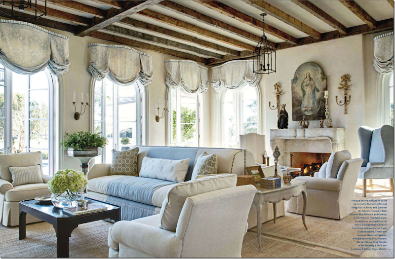
Do you have a favorite living room - an image from a magazine that you’ve keep in a folder for years and years? I do. And recently, I’ve realized I have a new favorite that I want to share with you. I started writing this story a few days ago and as it grew, the road to the end twisted and turned and took me to places I never intended to go. With each picture, one design inspires another inspires another. It’s a lesson learned – classic design isn’t born out of the nothing. It’s all about inspiration.
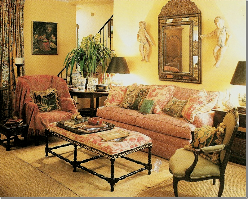
This was my favorite living room for years and probably will always be – Carol Glasser’s former house. It didn’t matter how often she changed it around (and she did, quite often) – it was always beautiful. Glasser influenced so many people through the years. She was the first with seagrass and slips and putti and oushaks and transferware – the list is endless. But she didn’t make it all up – she was inspired by the grand country homes found in England. She just happened to be the one to bring it all back to the south, beautifully. I can’t stress how influential she was to an entire generation raised on Southern Accents and Veranda.
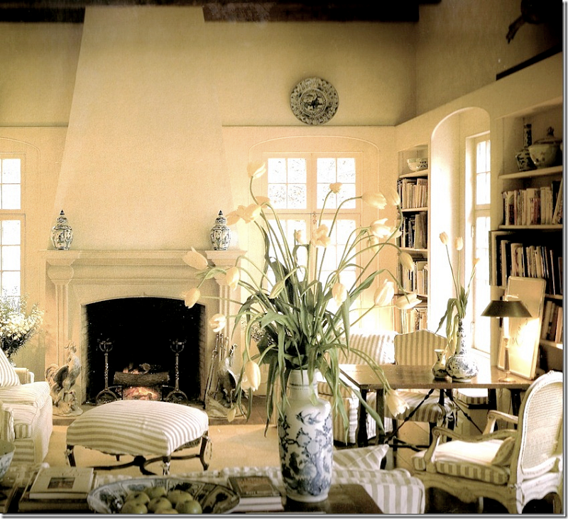
I know I just showed this, but this Dan Carithers living room was a favorite for years. And still is, along with almost any of his other living rooms, and bedrooms – he was the best there is. I love the way he used French antiques in his designs.
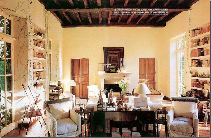
I obsessed over Rose Tarlow’s living room for ages. And, her entire house. I still love it. Tarlow has such impeccable taste, nothing is ever a compromise with her.
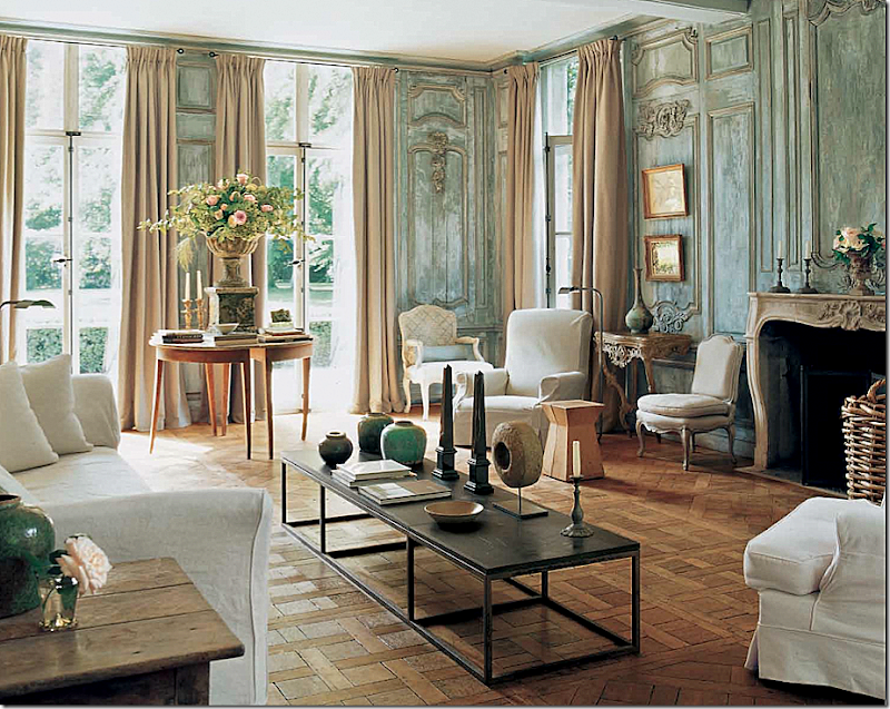
This Belgian house of Edouard Vermeulen is so beautiful – I didn’t think it could ever be beaten – and still don’t. The paneling is unreal gorgeous. How many people attempted to create those walls and probably failed? Impossible to imitate.
David Easton’s summer house was a favorite – and so is Penelope Bianchi’s living/dining room. She modeled her house, especially this room with the dual fireplaces, after his. Gorgeous room, gorgeous house, gorgeous property. Each time it was published I just stared.
For a few years, I thought Carolina Irving’s NYC apartment was exactly what a living room should look – warm, casual, welcoming. It still moves me with its slips and Robert Kime ottoman and blue and white rug and books galore. Another living room in the states that should be in the Cotswolds'.
My obsession with this beach house is significant because it’s not even a house. It’s the set from Something’s Gotta Give. I’ve always said that if I ever write a book, it will be about how this movie house influenced homeowners around the country to decorate their own houses. That Mora clock? Yes, it started right here.
Jane Moore’s design for her daughter – still influences me today – years after the room was published. One of the first houses in the south that used painted Swedish antiques throughout. Perfection. How many designers were influenced by Moore? Probably too many to count.
Last year, this living room by James Howard became a new favorite. While I wouldn’t have done the window treatments like this – I still believe this a beautiful room - so peaceful, so elegant and casual at the same time.
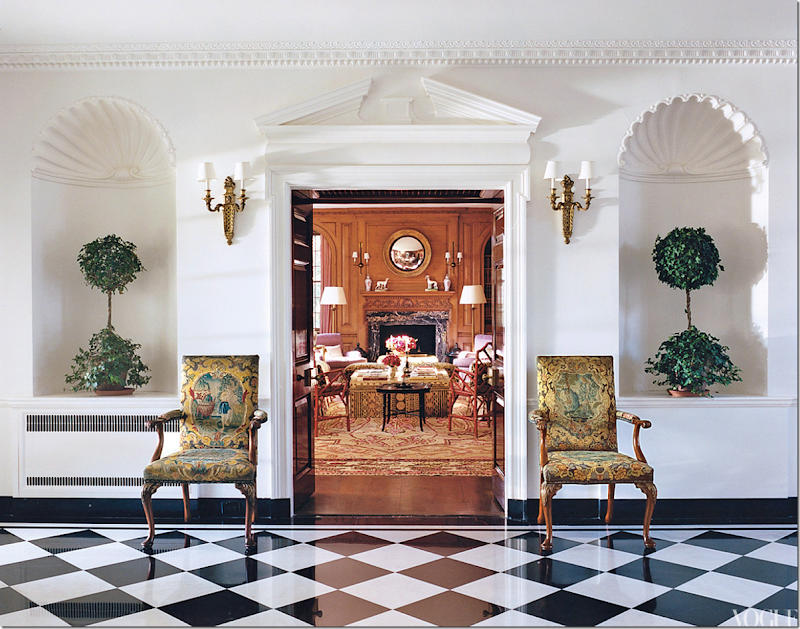
My new favorite living room is located in this house built in 1929 in Southampton, New York. There are 25 rooms and the house is 180 ft wide from left to right. It is owned by fashion designer Tory Burch – these pictures were first seen in Vogue and then in almost every blog on the web. Still, I can’t help but show it again here. It’s just that gorgeous. It was designed by the uber chic architect and designer Daniel Romualdez, and decorator Eve Hood, a friend of Tory’s since they were 19 and away on a summer at sea program. Romualdez is incredible, a true genius. He is influenced by classic design and doesn’t try to hide it, instead, he celebrates it. Norman Jean Roy, photographer.
The entry hall has classic black and white marble. The double wood doors open up to the library. Unfortunately there aren’t pictures of this room. These two chairs actually came with the house.
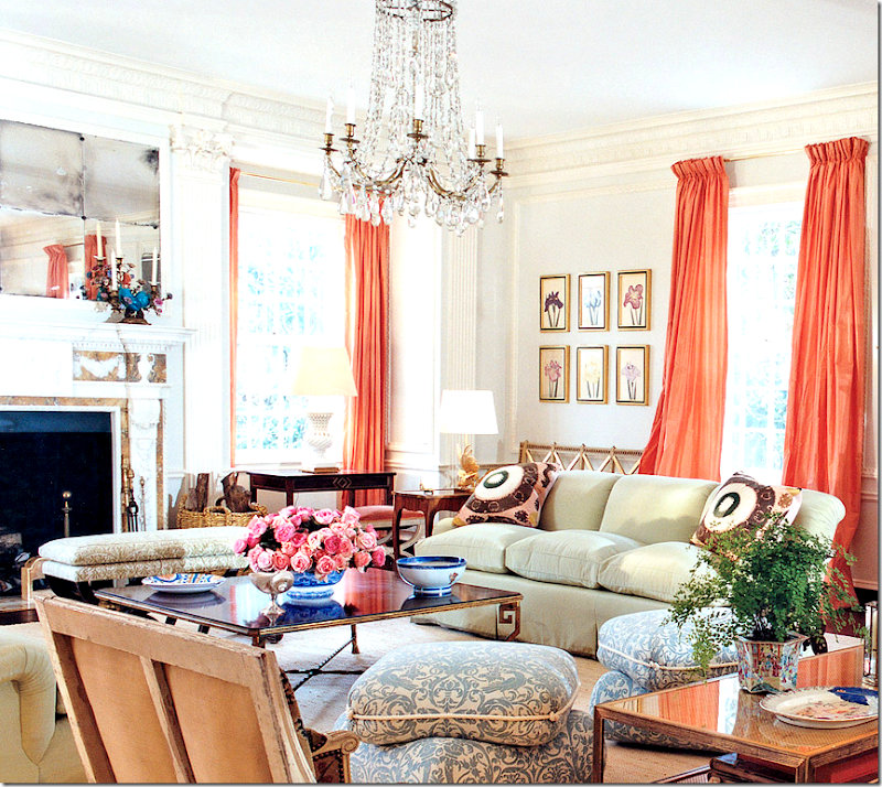
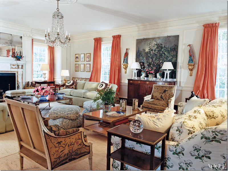
And here is the living room that is now on my most favorite list. Isn’t it gorgeous? I just could stare at it forever. Lucky Tory Burch gets to live there!
Looking at this makes me feel so inadequate. I would love to be talented enough to put together a room like this. It’s just such a beautiful design, without flaw or mistake. It’s perfection. And it makes me want to break out of the “Houston Look” rut and bring in color and pattern everywhere. But, don’t you first have to own a house like this?
I’ve been feeling this way about color and pattern for a while. And I know it won’t change how I want to live, it does make me yearn for a second home to decorate just like this! Of course, first I’d have to win the lotto – but that’s what dreams are all about, right?
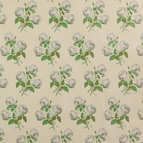
There’s really nothing new here. The fabrics are well known and old. The slipcovered sofa in the chintz is just the well known Colefax and Fowler print, Bowood. But, has it ever looked better or more fresh??? I know I said I wouldn’t change a thing, but I would of course. I’m not a huge fan of the John Dickinson white lamps and I would probably do stools instead of pillows on the floor – but those are just tiny details. Would I ever choose those luscious taffeta curtains in peach – or pink grapefruit - as they are described? No. Never - I wouldn’t have thought of that. But don’t they just make the room? And I wouldn’t have peacocks either, but again – they are so perfect there! Everything is. And the chandelier – something about that dressy, crystal confection is so right for the room – like that perfect necklace or brooch that completes the outfit.
Who am I kidding? If I did this room, it would be all white and slipped and that’s the whole point. Am I getting ready to branch out? Are you? Does this room affect you the way it does me? At this point, I’m ready to ask it to get married!!
The classic Colefax and Fowler, Bowood, on the slipcovered sofa.
Close of the second seating arrangement by the fireplace. Two celadon covered sofas face each other – with Suzani pillows. I love the blue fabric on the pillows.
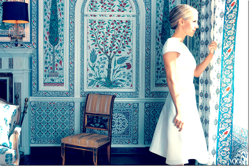
The dining room is covered in custom Iksel. Incredible. These panels are based on Persian Iznik tiles. I wish we could see more of this room!!!!
This wallcovering has gotten popular in the past few years. Here, it is used in a Californian dining room:
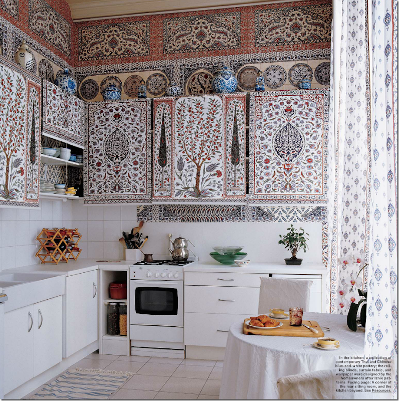
And in the apartment that the owners of Iksel live in - they used the same pattern in the kitchen! The cabinet doors are actually shades.
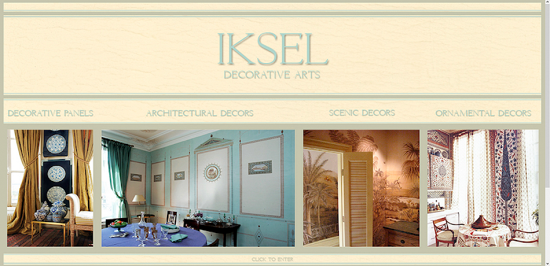
To read more about Iksel, go HERE.
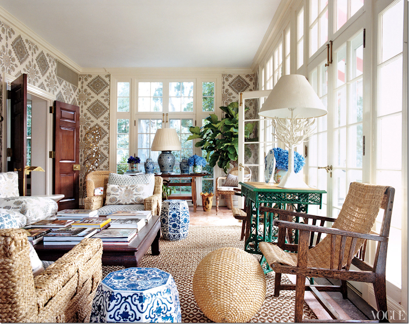
Tory’s solarium is all kinds of wonderful. Great textured rug and vintage John Himmel chairs. The fabric on the walls and chairs are both from Quadrille. The walls just make the room. Love the blue and white garden seats. The doors are so beautiful too. It’s so classic. So pretty to look at. Eye candy. Just gorgeous!!!!!!!!!!!!
The Quadrille fabric on the furniture and walls.
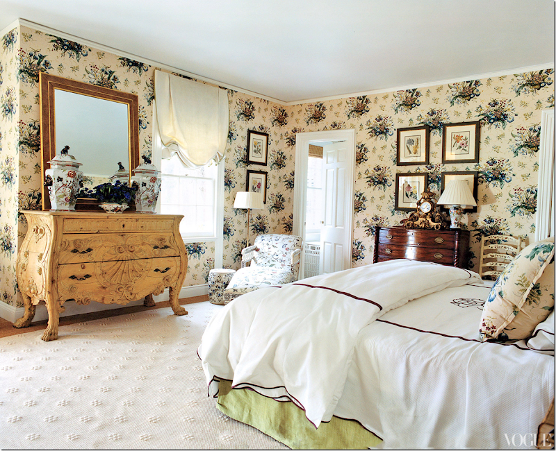
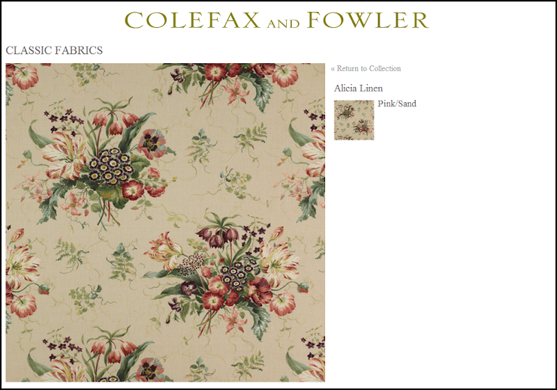
The master bedroom has a Colefax and Fowler classic print that lines the walls and is on the pillows. Beautiful chest. Love the oversized jars on it. The walls make the room have a vintage feel, but the bedding and rug updates it for today.
Fabric on the walls but in a different colorway.
There are more pictures of the outside of the house on the web site if you haven’t seen them before. HERE.
And more…
Tory lives with her three sons in an apartment in the Pierre Hotel that is several suites put together. Again, the wonderful Daniel Romualdez worked with her on this, and he also does all her stores. Here’s a few pictures:
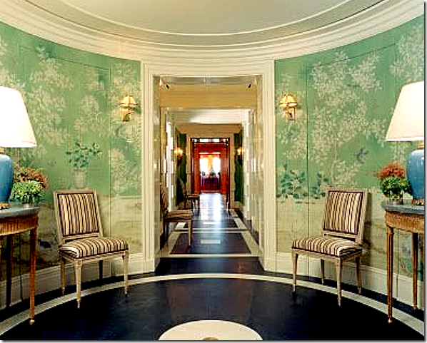
The foyer with the painted floor and beautiful hand painted wall paper.
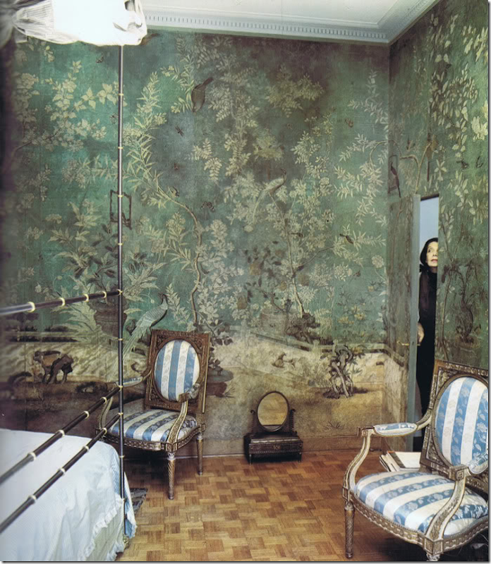
Was Romualdez influenced by this Pauline de Rothschild bedroom in Tory’s entry hall? Maybe not directly, but certainly indirectly - this image has caused a resurgence in hand painted chinoiserie paper.
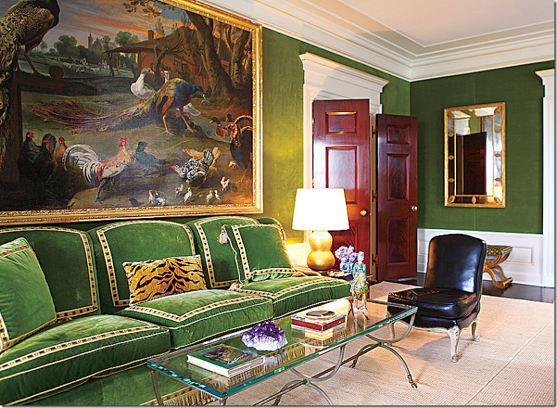
The drawing room is covered in moss green velvet with simple textured rugs, beautiful double doors, again, and wonderful porcelains. This sofa sits against the front wall facing the fireplace.
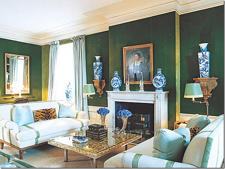
Across are two white sofas and lots of blue and white antique porcelains, which I love.
That painting is amazing. I love the blue and white against the green velvet.
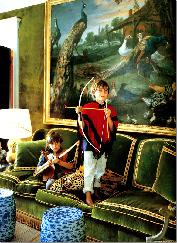
History repeats itself: you can see here at Hôtel d'Orrouer, the Paris home Hubert de Givenchy, where Romualdez might have gotten his inspiration for Tory’s living room with the same green velvet sofa with trim, the leopard pillows, even the green pleated shades. Classic design never goes out of style. Today, this color green is so in vogue.
And further, was Givenchy influenced by Charles de Beistegui? Or did Beistegui influence Romualdez directly? Photograph from Mark Sikes HERE.
More pictures of Tory Burch’s NYC apartment are available in this book:
And more…
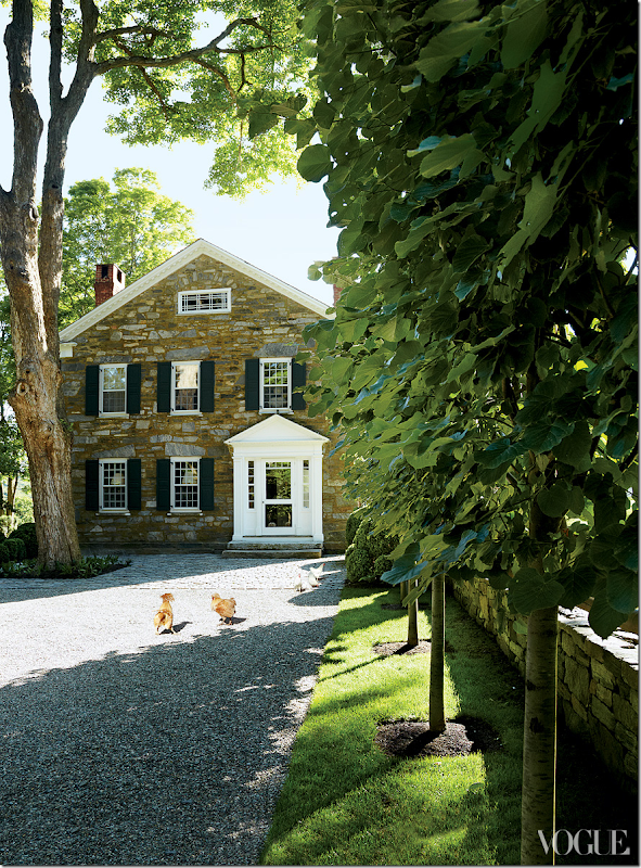
Architect designer Daniel Romualdez is the man behind all of Tory’s houses and her stores. And his own houses are also incredible. I believe he owns five, now, including this one in Connecticut that once belonged to the late clothier Bill Blass. It’s an 18th century, former tavern - made of stone.
Romualdez had seen the house before. But, it sold to someone else after Bass died. Once they put it on the market, he looked at it again and this time bought it. The maple floors are original to the house, from 1779. Love the juxtaposition between the fine and rustic here in the entry hall.
The living room is a double sized room, just like the master bedroom. Painted bright yellow, it so different than what it looked like when Bill Blass lived here. “Bill had beautiful pieces of furniture,” remembers Oscar de la Renta of the living room, “but it was designed for no one to have a conversation in!” Today it looks cozy and warm and certainly right for conversation.
Apparently, Blass used this a bar area.
“I never, ever bought a Windsor chair in my life before!” says Romualdez, laughing. “It wasn’t exactly my aesthetic. It was a big learning curve, but now I’m obsessed. And I can’t believe that you can buy a beautiful, super–high quality eighteenth-century Windsor chair cheaper than a chair from Crate & Barrel or Ikea.”
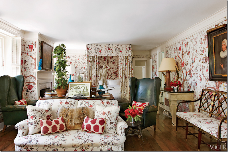
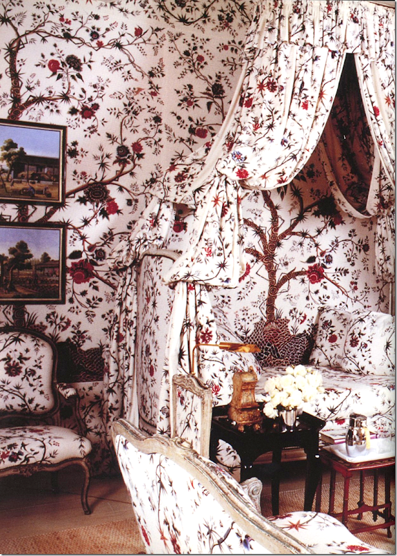
Yes. Well - what can I say? Drop dead gorgeous!!!!!!!!!!!!!! The bedroom. The fabric is Braquenié’s “Tree of Life” and it’s a stunner. I’d NEVER leave this room!!! Love the pops of blue throughout. The antique wing chairs are divine. But it’s that fabric!!!!
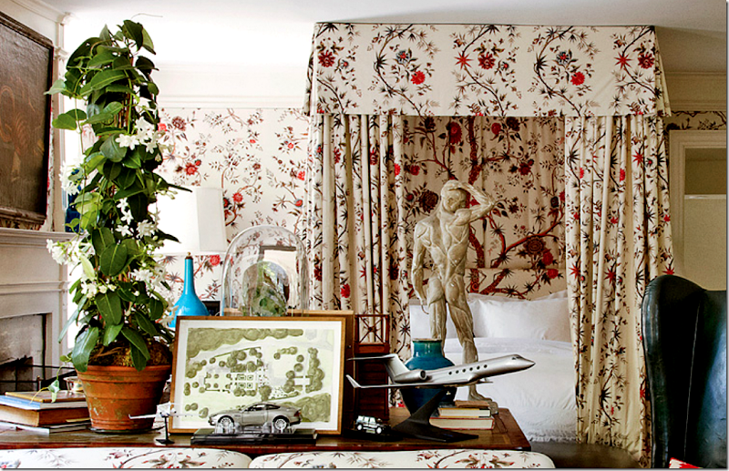
Close up of the table between the bed and sofa. On the table is the plan for the house’s gardens and the model of a plan he outfitted for a client.
Again, just like in Tory Burch’s NYC apartment where Romualdez was influenced by Hubert Givenchy – here you can see in this bedroom of Givenchy’s he has used the same exact fabric. Again, classic design never dates!

And, here is how the bedroom looked when Blass lived here. So different!!!
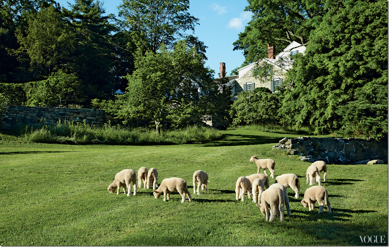
The property with sheep grazing behind the house.
To see more of Daniel Romualdez properties – the Wall Street Journal showed them HERE.
And back. Any excuse to post this picture again! It’s really interesting though, how one picture can take you on a road trip that you really didn’t intend to go on. From my own favorite rooms to my new one…to Tory’s NYC apartment to Givenchy’s living room..to Daniel Romualdez’s Connecticut home to Bill Blass and back to Givenchy again. All these rooms that connect through great design and inspiration.
I hope you were inspired too!!!
Do you have an all time favorite room and a new favorite one???
Leave a comment and tell us about it!

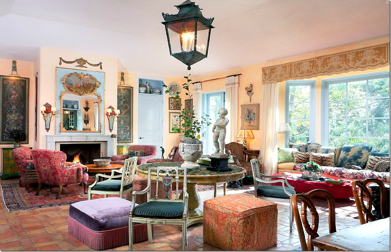
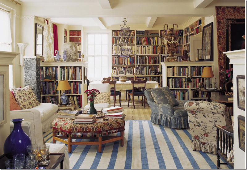
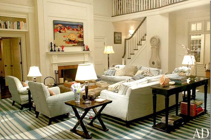
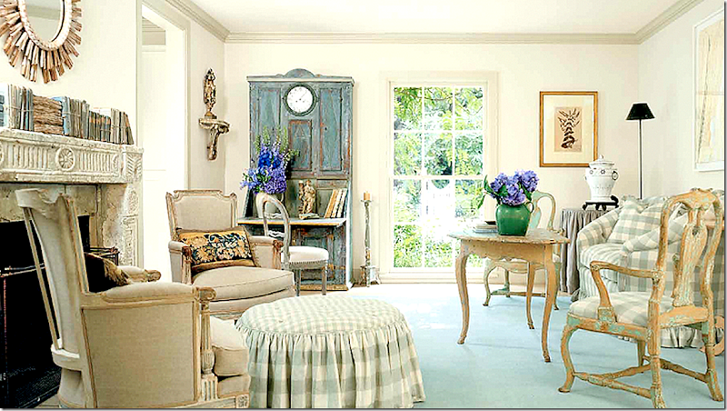







I also keep a file of tearsheets of my favourite rooms.
ReplyDeleteI must say that although I can't say I am a huge fan of Tory Burch's products, I am a huge fan of her homes. Beautiful, classic, and yet livable all at the same time.
But the wow for me was that kitchen with the blinds instead of doors - that was a knock out and I might have to keep that pic in my files.
Really enjoyed this post.
joni
ReplyDeletemind blowing!!
the panels in the Belgian house of Edouard Vermeulen...to die.
love.
the iksel line picked up by the house of quadrille is no surprise to moi.
i almost always ended up there for my fabrics.
sending love
rf
Yep I keep a folder with rooms I love too and it’s fun too see how my taste changes over the years. I’m with you love Tory Burch’s living room and those orange drapes are to die for! As for the blue fabric on the pillows in her living room you love that fabric is “Uccelli” pattern by Fortuny.
ReplyDeleteI hope you're enjoying your weekend!
XXX
Debra~
I love Tory Burch's products, which is obvious by the obscene amount of things I buy from her store. I have to admit I was surprised when I saw how she decorated her home. I expected something a little more modern. While her house is well done, it's way too traditional for my taste. The Something's Gotta Give house has always been one of my favorites, but when I look back at it now I keep thinking it needs a little punch to it. I suppose favorites can change over time. Or, I'm adding more modern elements to make me feel younger. ;)
ReplyDeletePinky Peter's house in Charleston, South Carolina is my all-time favorite. It was first published in a book called Romantic Homes. It was recently published in Charleston Magazine and placed on tour for the spring Historic Charleston house tour 2011.I was fortunate enough to have a personal tour of the home by Mrs. Peters. It was more beautiful in person than the photographs. Can you tell, I loooove the house. Anytime I stray from this aesthetic, I look back at the photographs to get grounded. Frank Babb Randolph's houses are always a huge inspiration. A few well chosen pieces speak volumes in a room. His rooms are a permanent addition in my files, and they never fail to inspire. Looking forward to reading about others inspirational decorators.
ReplyDeleteKaren
Joni, an incredible posts. The Tree of Life fabric is one I believe is currently being used by Lee Radziwell in either her NYC apartment
ReplyDeleteor in Paris. I believe it's paired with a deep pink sofa - So Lee.
I encourage you to trust your instincts and the next client who wants color in their life as well as pattern, go for it. You know you want
to!!!!!
Correction: I am honing my research skills to be more "joni-like".
DeleteLee Radziwell's fabric is by a French company called Le Manach and is a Louis XV document Chinoiserie. It is, however, quite
similar in color, scale and feel to the Pierre Frey fabric Tree of Life.
i thought that too at first! then went back and realized it was the le manach. she uses their fabrics a lot!!!
DeleteI Can't even speak this was such a wonderful post. , as usual. Not just because of the gorgeous pictures but the way you present them with such a valuable point of view. Thank you Joni, what a nice treat to share my Sunday coffee with your blog. Always an education for this antique dealer picking and choosing what to buy on my trips...
ReplyDeleteJoni, I can certainly see why these are your favorites. Good choices! I have also come to love Penelope Bianchi, and her living room is one of my favorites, too. A stylish classic and so comfortable.
ReplyDeleteTo answer your question, one of the images that stopped me in my tracks was in a magazine (maybe AD) from the 1980's. It was a Georgia barn turned into the home of designer/antiques dealer Furlow Gatewood. It is still one of my favorite living rooms, but all the rooms they showed of his were equally great. He has such style, and I loved how he effortlessly juxtasposed classic pieces like camel-back sofas and fine portraits on rustic board walls. He also used a lot of blue and white. Fast forward to 2011, and he had another stunning home in a magazine. I believe this time it was featured in Veranda, and it was an antebellum cottage which he had moved to a gorgeous piece of property with large urns of hydrangeas lining the drive. Everyone went wild over it. I know I did, and it was fresh and modern in terms of the colors and fabrics while being timeless and classic. Along those same lines and focussing on his business partner, I love the barn turned guest house that belongs to Bunny Williams and John Rosselli. On a more formal note, I adore the mantle that they have in their NYC apartment with that wonderful clock, the bronzes, and the reticulated golden baskets of flowers. And the dining room in another house of theirs that sits on their country estate. It has the greatest curtains and Zuber wallpaper as I recall, an empire sideboard, and a round table skirted in dark green flannel with fringe. I could move right in!
Then there was that room by Alex Papachristidis with the double-sided chinoiserie bookcase and some Ikat cornices as I recall. Next? Mario Buatta's classic yellow living room with all of the dog paintings and chintz and that iconic bedroom he did for Kips Bay, John Fowler's lodge, several Keith Irvine rooms (a yellow living room that was so great and his country house family room that had that cozy fireplace and a portrait of a boy in tartan, etc.), just about anything Roger Banks-Pye ever did, the study in the Mass. home of designer Betsy Speert that had lots and lots of animal oils, and I loved the photos of Charlotte Moss' store as much as the rooms she designs. I still want a clock she sold that was a small bronze and gilded flower in a cachepot. I love traditional rooms with character and interesting objects. There's a chest with an enviable collection of wooden boxes stacked on top of each other, over which hangs a portrait of a gentleman flanked by two black tole candle sconces that was in a Connecticut artist's studio in Lyme which stopped me in my tracks. It was featured in the "New York Times". And in terms of neutrals, Jackye Lanham is the queen. I love everything on her website. And I love the way you mix neutrals and textures, too, Joni. Your tablescapes ALWAYS make me stop and study as they are so well layered. I'm sure I've forgotten something, but those are high on my list. Our actual residence (not the playhouse) is very traditional with lots of art and antiques. I love traditional, English Country, and touches of Chinoiserie. My favorite magazine is "The English Home".
so many of yours are favorites of mine too!!!!!! mario especially. roger banks pye. betsy = she has a blog now. alex p! yes! i alsmot used that one too!!! jackye yes!
DeleteI am loving the color in these rooms as well, however, I think I would grow tried of them . To me and maybe it is my age and the look has been here before, they seem "old" to me. I enjoyed the post, will read it again, but it is not for me.
ReplyDeleteGreat post, once again I learned alot. I have been coveting a green velvet sofa with gold trim and a leopard pillow ever since I saw Tory's with her sons playing on it. I love the peach/grapefruit drapes and think they make the room, there was another New Orleans home with drapes in a similiar color that I have saved. As much as I love pinterest I still love to tear out pages from my magazines and make a folder, who am I kidding they aren't organized, they are thrown in a hat box! I am so jealours of Kare seeing the Charleston House, I know exactly which one it is as I saw it in Romantic Homes. Some of this was just to "busy" for me but I love how it all comes together. Have a lovely Sunday. Sarah
ReplyDeleteMario Buatta, zillion years ago in House & Garden, said we recreate the rooms that first inspired us as children.
ReplyDeleteReading that quote, in my living room, I looked up to see a perfect copy of a home in Augusta, GA, that inspired me at age 8.
Its garden too.
Garden & Be Well, XO Tara
Hi Tara, An interesting observation from you and from Mario Buatta. Don't know what my first inspiration room might have been, because I, too, decorated my first room in my preteen days. However, I remember that the roon was a sunny yellow. Did not get that from my mother because she liked beige, brown, garnet and forest green - what Maria Killam calls "dirty" colours. Every room I have created for my own use since then has ivory (not white or beige) and other golden tones. Never use beige, geige, or gray.
DeleteI follow the same color principles with my clothing and jewelry and even ordered a "golden colored" gravel for my garden pathways. Now you have me thinking. I will need to go back and try to figure out what that influence might have been!
Smiles from My slice of Provence,
Charlotte
mine started around 13 with my stepmother!! she had a gorgeous French apartment that i've been recreating ever after
DeleteNice article and great knowledge. Thanks for the share. I love this story and enjoy with your words!
ReplyDeletesubway tile
On of my all-time favorites is the living room that you've shown many times in your top-ten design elements. I have no idea who designed it, but I think it contained most all of your ten elements.
ReplyDeleteyes! love that one too!
DeleteNicky Haslam's sitting room at his country house has always been my favorite, and his new book is gorgeous, i can sit for hours with it!
ReplyDeleteCheck it out! sonya
What a fabulous post! The next time you are in Manhattan, go into Tory Burch's boutique on the Upper East Side. One of the chambers is decorated much like the drawing room you included in this post, but with a really sharp acid green/chartreuse velvet on the walls, blue and white porcelains, and if memory serves me, shiny black woodwork, at least on the fireplace. It was a jewel box of a room that was both exciting and serene at the same time.
ReplyDeleteBrilliant post, Joni! It's amazing how we absorb images and then tuck them away for subliminal references in our own homes and design work. Amazing, too, how our own tastes evolve based on the compilation of our favorites.
ReplyDeleteTory just sold that house because of severe flooding problems and had to reduce it by millions of dollars. The new owners are going to raze it. Thanks for another great post. A really great post.
ReplyDeleteI think that "tear-down" was a different house in Southampton that she sold. If you look at the Feb 2012 Vogue article about this house, it mentions she moved here from a flood-damaged home nearby.
DeleteHi Joni....really enjoyed this post! I have to say that it is difficult to pick a favorite room but my all time favorite fabric has to be the classic Bowood! I totally get your desire to branch out of the Houston look rut and play with color! The problem for me is I don't think I could ever live with so much color. It is incredibly beautiful to admire in photos and I think the photos you chose for todays post are probably the best out there. Thanks for a wonderful post!
ReplyDeleteJoni, This comment has nothing to do with the content of your blog.....that's because I couldn't find any other way to contact you:) why do you send the whole post to my email address in feedburner?
ReplyDeleteThat way folks can read your whole blog post without having to go to your actual blog, WHERE THE ADS ARE!!! If you want to know how to just send the first few sentences, email me, and I'll walk you through it. If your blog is read in an email, it doesn't count as a page view......just sayin'!
Hi Betsy,
DeleteOn your blog the other day, you mentioned that The Wall Street Journal said that Chintz was coming back. If Joni is starting to get tired of the very neutral Houston look, then we need YOU to come out of retirement!
So much of what makes the rooms that Joni has featured here, beautiful, are the proportions and the architectural details. LOVE how you have the courage to "rip it out" and rebuild if the architecture isn't working. People who think they have to live with blah boxes should visit your blog to see what you have done with your current home. Inspiring!
Smiles from My Slice of Provence, Charlotte
Amen to that! I'm a Joni fan, obviously, however, Betsy's rooms make me smile. Vikki in VA.
Deletebetsy - i think people would revolt if i didn't do that!!! but yes, it would add to my numbers considerably since so many subscribe. oh well. life is more than numbers.
DeleteJoni,
ReplyDeleteDo you have any information about the coffee table in Tory Burch's solarium or the one shown in Daniel Romauldez's living room? I'm really looking for just the right table for my space.
Thanks.
Anne
Joni, I have many of the same rooms over the years. Great minds think alike...ha! This was a fabulous post and filled with the best of the best. Only think I am wondering is why my house only came with dust and cobwebs instead of like those 2 incredible chairs in Tory Burch's house?!
ReplyDeleteThis post was a tremendous feast! Love all the pattern and color - not jarring but beautifully blended. If you're a fan of Downton Abbey, I just came back from a trip to Scotland and posted on Thursday about my tour of the castle they used in the season finale.
ReplyDeleteTory's Solarium...perfect...love the walls. I'm reading this post again. Thanks for a perfect Sunday morning.
ReplyDeleteInteresting, well-researched post. These rooms shown here seem to be a far cry from Pamela Pierce's. So which is it, Joni? I guess that's the great thing about good design - there's room for many types of expression. Personally, I'm glad to see some more pattern, color, and accessories. But then I love that serene monochromatic 'monastic' look, too. Schizo? Maybe. That's why I always thought how nice it would be to own different houses in different styles. Ha, lotto dreams, as you said.
ReplyDeleteyes design schizophrenia. i wrote about that years ago. it's crazy. to want both looks at the same time!
DeleteBilly Baldwin in New York: brown walls, Fabulous brass bookcases, wonderful books and the Korean screen. Nancy Lancaster's 'Butter yellah' drawing room at Colfax's in Brook St., London. You can walk up to the first floor and see it! David Hicks's blue and white Persian vase wallpaper at Britwell. Early on Mark Hampton did a great room with blood red walls and a Modigliani painting, the Modi helped enormously. In San Francisco:early Michael Taylor?
ReplyDeleteBest
Herts
love all of these!!!!!!!! early michael taylor over late taylor - EXACTLy!!!
DeleteThanks Joni, a gorgeous Sunday Morning post to enjoy. Many of my favorite homes are featured!
ReplyDeletexoxo
Karena
Art by Karena
Haha I would take out the two pillows on the sofa because they look like eyeballs.
ReplyDeleteOf course, I have favorite living rooms, but hoping you could do a post on bathrooms? : - )
ReplyDeleteFabulous post Joni! Those first three photos have always been classics for me too. I would love to know just how many hours I've spent studying those photographs! I totally agree that the James Howard room is stunning sans the window treatments that totally ruined the french doors.
ReplyDeleteI'm happy to see color and pattern come back too. So much beauty in all types of design. I personally think Stephen Drucker as editor of HB was instrumental in bring back "pretty" as he seemed to be the first to really give it a voice about 6 years ago, or so. That said, after living with color and pattern for many years I now prefer the calming effect of more neutrals to live with. Many of these photos, while beautiful to look at and learn from, make me feel a bit anxious and agitated. I also think I have design ADD and fear I would tire of a bold pattern quickly!
Thank you for the time and energy you put into all of your posts- it is greatly appreciated!
joan
Yes, Yes, and YES - to all of the above! I thoroughly enjoyed reading this. As grand as these homes are I fell in love with the stone Bill Blass house - so wonderful! And, how fun that the Rose Tarlow living room has creeping something? on the walls and ceilings! I am guilty of trying to copy those incredible Belgian walls - on a test board, of course - and you're right...they cannot be copied!
ReplyDeleteIf you have time, I have a fabric that I would love for you to identify for me. I purchased four large curtain panels at an estate sale and sold two of them out of my trunk before I left the place. Sure wish I had those panels back now that I am adding blue back into my decor.
I think it has some age because the edges were really worn, but I suppose it could have been sun damage.
I truly would appreciate any help you can give me about the fabric and thanks for inspiring me to embrace my love for blues again.
http://www.mybluecreekhome.com/2013/01/ive-got-blues.html it's down a little in the post.
Thanks!!!
Rhonda
I think the success of some of these rooms is due to the absolute exquisite architectural details of the rooms themselves. Floor to ceiling windows, mouldings, marble mantles, high, beamed ceilings--these are elements that not every house has. These rooms can carry all this color and fabric in a way that I don't think a typical house can. I am a devotee to white slips and seagrass as well--it fits with my lifestyle and the architecture of my NE shingle style house. But... if I had an apartment at the Pierre....
ReplyDeleteThanks for another great post!
Maybe after years of white and neutrals the pendulum will now shift to color and patterns. However, I've found that colors and patterns date rooms. Remember the avocado green appliances? Everybody's mom wanted one. How about all the pinkish colors of the early 90's? They put that color even in bathroom tiles! Let's not forget the craze of dark red dining rooms. They were all over the country! All these trends end up being just that. People get tired of them and after a while they become impossible to tolerate.
ReplyDeleteMy all-time favorite living room is Dan Carithers. I remember reading in one of the old books that featured it that all major elements in this room had neutral colors. However, once the blue porcelain was added it became a "Blue Room". For me it was an aha! moment. Of course! Just by changing the colors of the accessories and using the pattern du jour in pillows the whole room changes and gets an easy update. I never get tired of this room. Classic never gets old.
Over the years I've noticed that only checks, plaids and certain stripes have endured the test of time. Most everything else comes and goes.
Thanks again for a great post Joni!
Anny
i love dan's living room so much too = love it. and checks and stripes. not plaids as much, but checks ? i could only use checks and be happy.
DeleteJoni- My favorite rooms in my tear book is the Tori Burch living room and Penny Bianchi's, as well as an old Michael Smith room I've kept since the 90's. We live in lots of color and pattern - you need it in gray Seattle- and couldn't do the Houston look- its not our style. So glad to see this beautiful inspiring post especially with regard to chintz which to me has never gone out of style. Bravo! Kris in Seattle
ReplyDeleteWhat a fabulous post! So much great information!!
ReplyDeleteWho knew that that exact copy of Givenchy's sofa! (I am all for copying beauty and taste!!!)
I was shocked and so pleased to have my living room included in that group of beautiful rooms! I almost fainted scrolling down!
YIKES!!!
Frankly, I find all of those rooms completely timeless!! Every one!
Joni,
ReplyDeleteYou asked if any of your readers are tired of the white slip look. YES~~!! For people who have invested in them, how about tea-staining them? Then add pillows with a bit more color. LOVED this post! Appreciate how much time you spend putting these together.
Francis Elkins's home in Monterey, Ca is still modern today!
ReplyDeleteomg i know!!!!!!!!!!!!!!!!!!!!!!!!!!!!!!!!! exactly!!!! exactliy!!!!!!!!
DeleteI adore the Edouard Vermeulen room in Beligum. In fact, I would be hard pressed to pick the one that was my favorite. Grand post. xxpeggybraswelldesign.com
ReplyDeleteHi Joni, This post is going right into my "favorites of all times" file. You hit all of my favorite spaces and then some. Yep, I'm getting inspired. I have been dreaming of color, saturated color, for a couple of years.
ReplyDeleteThanks for making me ponder and envision.
Mary
I like the first room the best. It looks cozy enough to curl up in a chair with a good book.
ReplyDeleteVery exclusive and wonderful collection here looking so great. A big thanks for sharing with us !!
ReplyDeleteExotic and beautiful collection!
ReplyDeleteJoni Webb - at her best ! WOW !
ReplyDeleteI am still enjoying looking at this. These rooms are indeed classic and pretty. I loved patterned fabric and never get tired of it. When I saw the pillows in the Burch living room I thought they were actually upholstered stools, not actual pillows. . I have seen seating that was trompe l'oeil pillows stacked straight up, and these look the same except rotated 50 degrees.
ReplyDeletePersonally, I'm tired of seeing so many white slips. I think the same with all the chalk painted furniture. Nothing grabs my attention more than the patina of natural wood and I'm such a fabric nut that I can never just "look" at fabric and not buy. It seems almost every blog today is mostly the same look - slips & chalk painted furniture. Don't get me wrong, it's pleasing to the eye but I love seeing posts like this. If for no other reason, it breaks ups the monotony ;)
ReplyDeleteGreat post Ms. Joni! I have been in love with Tory Burch's solarium since first seeing it in Vogue a couple of years back. It truly is all kinds of wonderful! It is my inspiration photo for my own sunroom. I love the fabrics, wicker table, garden seats, rug ....everything! After locating the fabrics and learning the price-per-yard I quickly realized that was not in my budget. I would love for you to feature a blog post on how to recreate this room for less! Are there similar fabrics and furnishings available at "TJ Maxx" pricing? There has to be, it's just a matter of knowing what resources to use. Please consider doing this post - it would be a fabulously fun and inspirational read! P.S. Is the Aidan Gray Lantern, which you collaborated with Randal, available yet? Has pricing been set? I haven't seen it on their website.
ReplyDeletethat fabric would be hard to duplicate. i could try to find one. the one it really looks like - a peter dunham - is expensive too.
Deletethe lantern will probably be in the next catalogue - but i dont know for sure!
Hi Anon -
DeleteChampagne taste on a Beer budget is something that most of us, moi aussi, must endure. At some point I will get my own blog up and going where I will help people get "The Look" without breaking "The Bank". In the meantime, here are a few things you can do...
1. When you find an image of a room you love, cover various parts of it to see what makes it appealing to you. Often, is just one or two items, not everything.
2. Shop at nice antique stores, but do not buy. ("Apologies" to many of Joni's sponsors.) If you have only $10K to decorate a room or even your whole house, you are NEVER going to buy anything substantial at a nice antiques store anyway. However, it is important to get an idea of what things look like, how they are made and finished. Think about each piece individually. Analyze why you like it? Is this something you could duplicate or find a reasonable facsimile? If you want to be be polite to the store, you can buy something small like a nicely scented candle, some linens or a small decorative item. That's one of the reasons they carry such things.
3. Once you have educated your eye, shop on eBay, Craigslist or at nice consignment stores. Typically you should pay 30% or less on Craigslist. 40% to 50% at a consignment store or eBay. Try to get on the mailing list for a high-end Estate Sale company. The prices at Estate sales can be shockingly low - 10% to 20% of retail.
4. Use only solid colors on your large upholstered pieces. Then, it won't kill you to spend $100 per yard for a few throw pillows in a dynamite fabric. However, that same fabric for drapes would be astronomical and the pattern gets lost when the drapes are drawn.
5. Paint is a decorators best friend. Once you have your main pieces in place and your decorative, colorful pillows, choose a color for the walls to tie everything together.
6. Remember that you can paint or stencil fabric. If you can't find that wide cabana strip in the color you want, paint the fabric.
7. Read Charlotte Moss's wonderful book, "Creating A Room, A Designer's Master Class from Floor Plan to Footstool". While written nearly 20 years ago, her principles are spot-on and the furniture and colors surprisingly up to date.
8. Flowers and plants really "make" a room. If you can't afford fresh flowers every week (and most of us can't), use live, flowering plants. They last longer, cost less and often remove toxins from the air which cut flowers do not. After flowering, mine end up in the garden to be enjoyed far into the future.
Well, that's enough for now. Saving the rest for my blog.
Smiles from My Slice of Provence, Charlotte
My all time favorite is Mark D. Sikes from the December/January 2012 of House Beautiful. If I could I would copy every little detail...not "make it my own" but copy every exact detail and bring it into my own home! The blue and white...the tortoise shell boxes...the seagrass rug...the rattan furniture...it was love at first sight!
ReplyDeleteI too fell in love with the Bill Blass house when it featured in an English magazine just before he died, pleased to hear it is still in the hands of good taste! I could quite happily live in Tory's solarium - fabulous!! But my all time favourite is the 'Somethings Gotta Give' house, all the eye candy in blogland stills fail to surpass it yet still continues to emulate it. Great post Joni x
ReplyDeleteHey! I have that bubble glass orb on the sofa end table, too!!! YES! franki
ReplyDeleteHi Joni, fabulous post! Thanks for your wonderful blog.
ReplyDeleteAs much as I love looking at beautiful pictures of beautiful homes, I can never recreate it in my own home. my take is that I have to own items as seen on the picture, and with no budget for these... I wonder if there is a way to create beautiful rooms with the existing items one has. I have felt so tempted to email you pics of my home in the hope of getting your opinion. I think you are a fantastique interior designer with an amazing creativity!
Hi Joni - this is a really good post. I do think our taste evolves over the years, especially if we study design and keep current with what is happening. For me, some things always stay - the classic black/white floor, silver pieces, good furniture and antiques, books! I do like contrast and I like a pop of color - not rich dark colored walls though. And, I love wallpaper in certain places (powder room, closets, dining room - depends). When I go to someone's home, I love to see their personality show! A couple of years ago, I went to a meeting at a girls newly redecorated home - a big old house, really great. But once inside, I was so disappointed. So "curated", so decorator "done"and all new. Afterwards, I thought, I walked through that entire home and I cannot tell you one thing about the owner other than she spent a ton of money on home decor. The house had no personality. I do love the old English country (or city) look - the mix of old & new, the collected over time feeling. But it does have to be tweaked to stay current or it becomes old feeling and murky. I like many of the photos you have shown - I too, am wanting to add more color in places and branch out - but, just a little at a time!
ReplyDeleteNo doubt Tory Burch's home is beautiful but I prefer yours.
ReplyDeleteahahahahahahahahaha. let me laugh a little!!! thanks, but come on. let's be honest here!! ha!!!! seriously? - you are sweet to say that.
DeleteYours Joni!!! With mister Slipper Socks on the sofa!!
ReplyDeleteReally inspiring post. I've been doing a little flirting with the idea of adding bold color, pattern, leaning slightly more English than French. Tory Burch's living room is over-the-moon amazing.
ReplyDeleteKeri
I'll swim against the tide on this one. I seek sanctuary in my home not to be energized (or dizzy) with too much pattern. I've always loved the Houston style you've curated, but maybe I'm just the lone voice here. If I added some color, it would be a calming color, not a spicey one. I'm just probably a little behind on these trends.
ReplyDeleteI seem to admire colour in other people's homes but end up creating a neutral palette in mine... I want to be braver... I really do... but I never seem to get there...
ReplyDeleteI think there are favourite rooms to admire and then there are rooms we live in... :) xv
Although entirely different, the Carithers and Vermuelen living rooms are timeless. I could live with either and never
ReplyDeletewant to change a thing. Good design never goes out of style.
Tory Burch's home is beautiful but way too much pattern for my taste. I love the orange living room curtains though, however, they don't seem to relate to anything else in the room...
ReplyDeleteOne of your readers is right about the "pillows" on the floor! They are ottomans; Billy Baldwin designed them and used them a lot! There was an identical pair that was in the auction of the beautiful Villa Fiorentina in Cap Ferrat decorated by Billy Baldwin! Maybe Tory bought them!! May 2001. They are described as "tabourets". I love them!
ReplyDeleteBilly Baldwin put them in the apartment of Jackie Onassis in the late 60's early 70's. Frankly, I think they look silly. They look
Deletelike a place for children to flop. For your information, Villa Fiorentina in Cap Ferrat has been exhaustively studied and written about by an Atlanta blogger The Blue Remembered Hills in the event you are interested in more information. The author has somewhat of an obsession with one of its former owners, Roderick Cameron. The information, however, is well written and well studied and worth the read. It's also a great blog.
The living room furniture sofa is always fun to scope out for new ideas. Thanks for making it happen!
ReplyDeleteI'm amazed, I have to say. Really rarely ever do I face a blog that's equally educative and entertaining, and enable me notify you, you might have hit the nail on the head. Your concept is excellent the issue is something that not sufficient people are talking intelligently about. I am very joyful that I stumbled throughout this in my look for for some thing referring to this.
ReplyDeletesell gold Houston
gold buyers in Houston
You are so right, Joni...Inspiration is always drawn from somewhere ans this is a very inspiring post.
ReplyDeleteJoni - at first I was overwhelmed by Tory Burch's living room but now I've grown to love it. I love the Colefax & Fowler Bowood fabric. I myself am heavily influenced by you and although I love these colourful rooms filled with pattern I know I will always stick to white linen and seagrass because I would never get sick of it and could dress it up with cushions and pillows, lamp covers etc. etc. I think these beautiful colourful rooms are too restrictive and hard to change for people of limited means. I also love the green velvet sofa in her NY apartment. I have a green velvet sofa fetish.
ReplyDeleteSpeaking of Rose Tarlow (above) did you note that she is decorating Oprah Winfrey's Santa Barbara home? I would love to see the results of this.
ReplyDeleteI would like to say thank for sharing this great article. We can’t get this kind of information from
ReplyDeleteI am so smitten with anything Daniel Remouldez does. Although I would tire of all those patterns, I agree what talent it takes to put it all together. My forever favorites are all the Beth Rubino/Nancy Meyers living spaces!
ReplyDeleteGorgeous opulently rich decor Joni. I provide interior designers and the 'well to do' with art glass. Please stop by any time.
ReplyDeleteKind Regards,
Anna@BohaGlass
Thank your for sharing! So many beautiful rooms I don't know where to start?! Okay, yes I do. The beach house from Something's Gotta Give. It is my absolute favorite! I am obsessed with the rug! I would love to have white couches like that, but how can you keep them that white? It's like a target for dirt. Have you seen The Great Gatsby yet? I think you will love the interior of Jay's mansion, and Jay. Who can resist Leonardo DiCaprio? Thanks again.
ReplyDeletehouses for sale in East Windsor, CT
I am currently at a turning point in my life as it is time to grow up as an independent girl and trust my instincts more and just let my creativity run rampant! I no longer want the "cookie cutter" look where everything is coordinated. I want to branch out and try new patterns and enliven all of my senses...both visually and textually (is that a word?) And Tory Burch is coming to the rescue! I love Daniel's work,but what I especially like is that his "look" changes depending on the client as it should be. I love Tory's living room, foyer and solarium. They excite me and make me think outside the box. And they motivate me to make the changes in my rooms that will reflect the changes and growth in my self. Im inspired so much by these rooms that I am excited to move forward in my life! They are rooms that will be a delight to dwell in!-Elizabeth an Interior Designer in Richmond Virginia
ReplyDeleteSo nice of design this.
ReplyDeletehttp://designedgearchitects.in/pages/home/home
I am in the process of having a velvet sofa made and you would be surprised at how hard it is to find a shade of green like in Tory's drawing room. Most of
ReplyDeletethe fabrics I find are too drab. If anyone has any information on this fabric/color or know of one similiar I would be so grateful!! great article!
Thank you, Marie
As always, totally agree with you! And speaking of Bowood...have you seen the April cover of House Beautiful? Have not had a chance to comment lately, since I'm here - I loved your library that you did. How long ago was that? I'm losing track of time!
ReplyDeleteBest Regards,
Lisa Mule'
Such a beautiful work of decoration. really amazing.
ReplyDeleteI am just loving your work very much. specially this decoration.
ReplyDeleteClipping Creations India | ecommerce image editing service
Great work man. Love the decoration.
ReplyDeleteclipping path |clipping path service
clipping path services |back ground removing service