I recently made a big change in my family room. While I was lo0king at all the old pictures of this room through the years, it was just a tad embarrassing to see how much the room has changed. But in my defense, I think most interior designers suffer from the same illness – the constant changing and updating of a space that never seems to end.
And, we have lived here almost 20 years so some change is inevitable and expected. …..Sure it is…!!
I started out with taupe walls, white trim, and a gray and white ticking stripe sofa and chair bought from some long ago closed discount furniture store. At some point, we got rid of that sofa and used a slipcovered khaki linen sofa – along with all red and black accessories and freshly painted yellow walls. The khaki slips later became white slipcovers – which are the first pictures I have of the room, below.
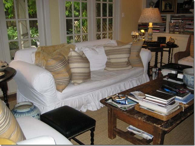
A long time ago – an old sofa with white pleated slips, yellow striped pillows, wicker chair, old coffee table.
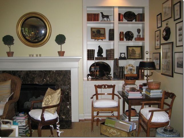
And across the room – the small game table and French chairs.
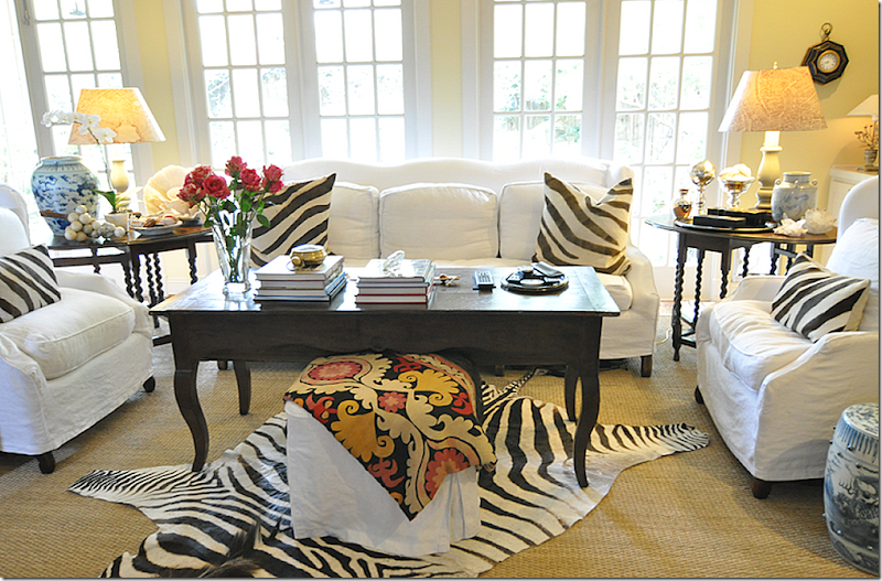
Several changes later – a new sofa and two wing chairs, along with an antique dough table from France.
Les Indiennes and brown velvet pillows.
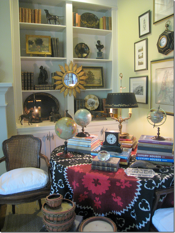
This suzani covered the wine tasting table that replaced the game table.
The next big changes: gray walls (Pratt & Lambert Feather Gray) replaced the yellow ones and new curtains were hung. The curtains were made of a taupe and white ticking stripe, very neutral, with just a hint of color.
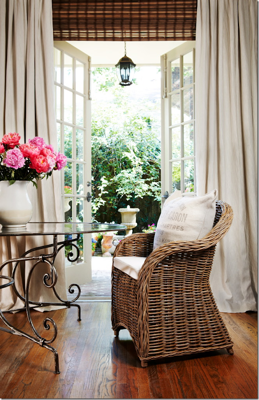
The curtains ran from one end of the breakfast room to the family room. You can see the pattern in the fabric here – just very muted and quiet. Not sure why I just didn’t go with plain white linen which I love?
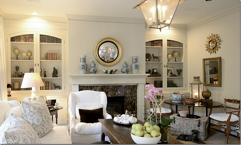
Another big change came when I added the arched doors w/chicken wire over the bookshelves – which I think helped tone down all the accessories on the shelves. The shelves made a big difference and, along with the curtains, helped quiet the room somewhat.
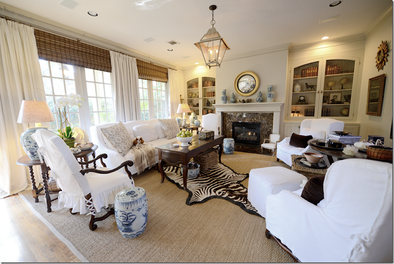
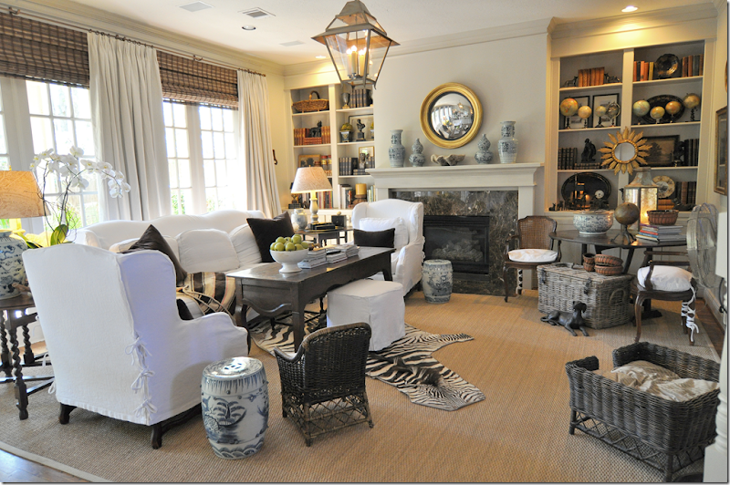
The last big change was getting the two new side chairs. Every time I showed this room on the blog – I would get so many negative comments about the furniture arrangement – “your wing chairs block the fireplace” or “the room is not balanced – you need to add something more on the right side” – and on and on. And, yes, I knew it was all true – so I finally bit the bullet and moved the two wing chairs across from the sofa, flanking the French wine tasting table – and centered underneath the flatscreen. The two new chairs I chose – from Hien Lam – were purposefully tall and narrow to create a variety of heights in the room. Their top is arched, just as the sofa and wing chairs are, and they have pretty French wood (Os de Mouton) legs. That’s sweet Tucker on the sofa!
Lucy, Tucker, and Micki!
But by far the biggest change in this room was the puppies. For the past two years – we have had 4 puppies here. First, we had Elisabeth’s Lucy, then our new puppy Micki and we also had two puppies who stayed here quite a bit – my nephew’s two puppies – Riley and Tucker. And all four are Blenheim Cavalier King Charles Spaniels! One of the puppies (not naming names!) chewed up the miniature wicker chair and the wicker dog bed, the zebra rug, and a host of wicker baskets, amongst other things. Plus, we have had lots and lots of puppy “accidents.” Thankfully seagrass is very price friendly, easy to clean and cheap to replace.
But, the biggest problem became the curtains. While I love a puddle on curtains of 3, 4 or 5 inches – so did the puppies. Day after day I would find the puppies laying on the curtain puddles and no matter what I did – I couldn’t break them out of this habit. After a while, it became a real problem – I had to have the curtains taken down and cleaned, more than once, which actually didn’t really help at all. They would return “cleaned” with all the puppy spots intact.
In order to stop the problem, the curtains needed to be shortened and as long as I was making a change, of course I wanted to make a BIG change – more pattern and color. Monica – from Custom Creations by Monica – whipped up new curtains in just a short three weeks – before I really even had time to think it all through!
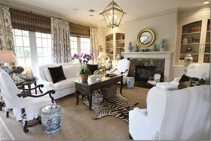
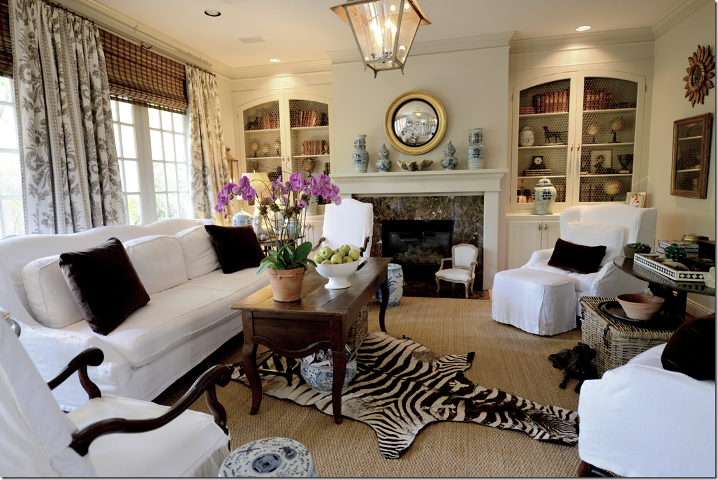
And here is how the new shorter curtains came out:
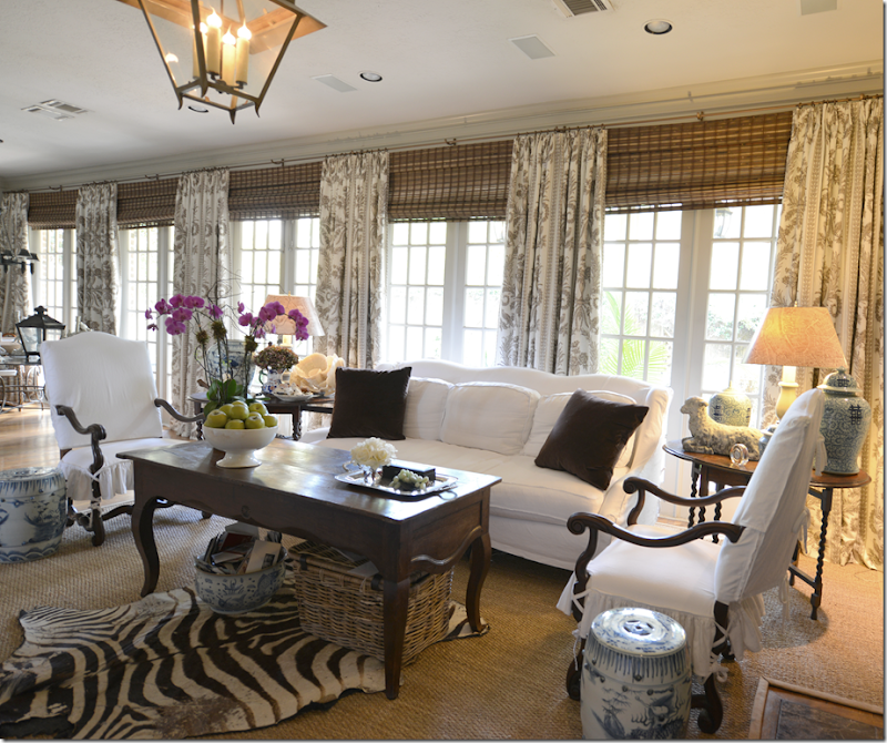
I chose a brown/gray/white toile from Vervain. I love the way the pattern is so vivid and it really warms up the room. I was just craving some pattern and color in this room – and the curtains gave me the perfect opportunity to satisfy that itch.
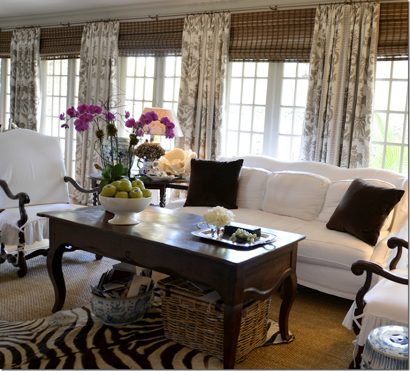
The difference the new curtains make is huge – though it’s not as easy to see in the pictures – and the entire room seems cozier, warmer, and more alive. It makes me want to use patterned curtains everywhere! I’ve tended to shy away from busy patterns on curtains, but doing this in my own house gives me the confidence to go with more pattern, more color in clients’ houses. So get ready!!! Here – you can see how the curtains cover the entire back wall - from the breakfast room to the family room.
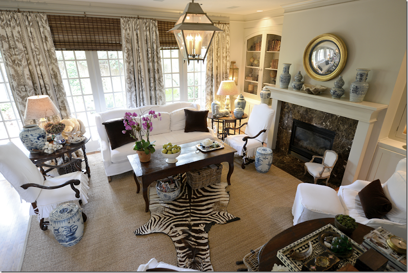
Looking down from the stairs to the family room. As always – I paired the curtains with shades – to hide the dead spot of drywall between the crown molding and the top of the windows. Also, all the curtains are lined and interlined with blackout fabric – which keeps the sun from showing through the fabric, allowing you to see the pattern vividly. Plus, the added weight of the blackout lining adds to the lushness of the curtains. We puddled these curtains only 1/2 inch – so that the puppies can’t lie on the curtains, yet they aren’t too short or skimpy looking. I don’t ever iron in pleats in curtains. I like them unstructured and loose and full looking – rather than two stiff looking panels of ironed fabric.
If I want to brighten up the room, I have hot pink linen pillows I could add, but I still like the brown velvet. Maybe next summer I’ll try the pink pillows.
The toile is Vervain:
The fabric is Vervain’s linen Doucette in Pewter HERE.
And speaking of curtains paired with textured shades:
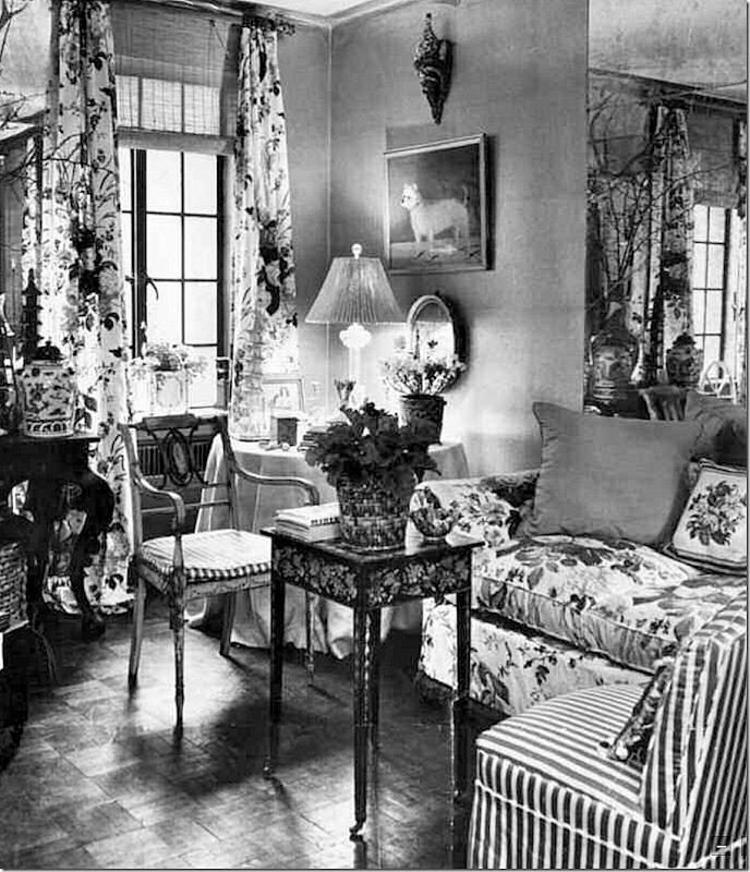
Mario Buatta’s 2nd Apartment from the early 60s.
While perusing Mario Buatta’s new design book, this image really struck a chord with me. It shows his second apartment for the early 1960s – done in all Rose Cummings chintz and stripes – and antiques. But, who wouldn’t want this as a sitting room today – with the gorgeous tea table, the beautiful antique chair, the silk covered skirted table, the plant stand? I would add a rug, and call it a day. Amazing that this photograph is now over 50 years old, and is it really that far off from something Miles Redd would do today?
Of course the curtain treatment really caught me eye – how perfectly Buatta executed them. Notice he brought the rod up over the window and placed it right under the ceiling – thereby elongating the view and fooling the eye into believing the window is taller and grander. He covered up the tell-tale drywall dead space with the ever-chic rattan shade. And for even greater effect, he recreated the shape and size of the window with the aged mercury mirror behind the sofa. By mimicking the window, he makes the tiny room look twice its size.
Antiques don’t date, and neither does good design. And this image just goes to show the anonymous commenter is way off his mark - who insisted that textured blinds are a product of the south, used only in Texas, by inexperienced designers like myself. Had to laugh seeing the New York born and bred Mario Buatta using textured shades in the same exact way we do in Houston, Texas.
Speaking of Mario, I mentioned that we interviewed him on the Skirted Roundtable last month – so be sure to give it a listen HERE.
Buatta’s ageless and timeless look. His book shows over 50 years of his designs – and it’s hard to say which is his new work versus his older work.
To preorder Mario’s book – click on the book below.
double click the book to order!
And finally:
We have chosen the seven winners in the BROWN giveaway – after Labor Day Sale!!!
As you may recall, BROWN, that fabulous décor/lighting store in Houston hosted a large sale after Labor Day – and ran a contest searching for seven winners in honor of Cote De Texas’ 7th year of blogging.
Jill Brown – besides being so talented and creative – is also one of the sweetest, most giving human beings I’ve ever known. Truly, she is a doll and a real mensch.
Jill hand picked ten items for the giveaway – and here are the pictures below. The first place winner will pick the item she wants below, then the 2nd place winner will pick her item, then, the third place winner – and so on and so on until all seven winners have picked their prize.
The first place winner is : Patsy Fox
Patsy has her pick of any of the ten gifts below. Once Patsy picks, the 2nd place winner, Jeri Windrow gets to pick her gift – and so on, until all seven winners have picked.
Have I said how much I LOVE Jill Brown?
Here are the 10 prizes being offered by Brown – in no particular order:
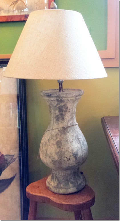
A pair of cream table lamps with their shades, valued at $450.
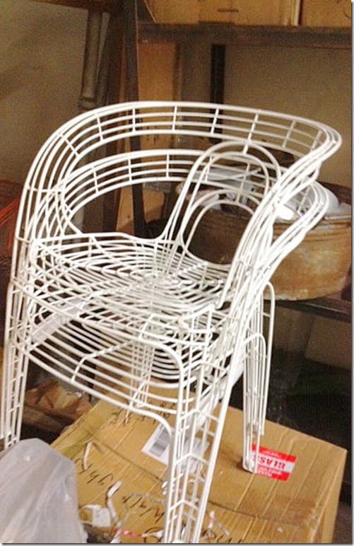
A set of 4 white Palacek outdoor chairs, valued at $1100.
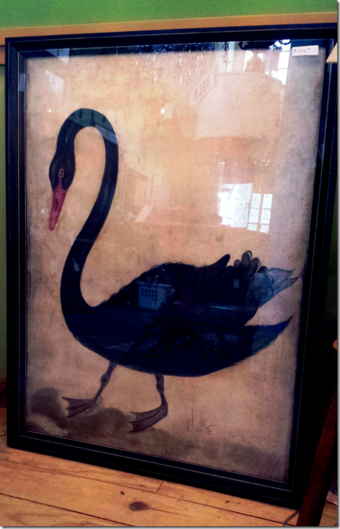
Black swan print valued at $750.
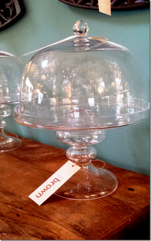
Glass cake plate with dome, valued at $235.
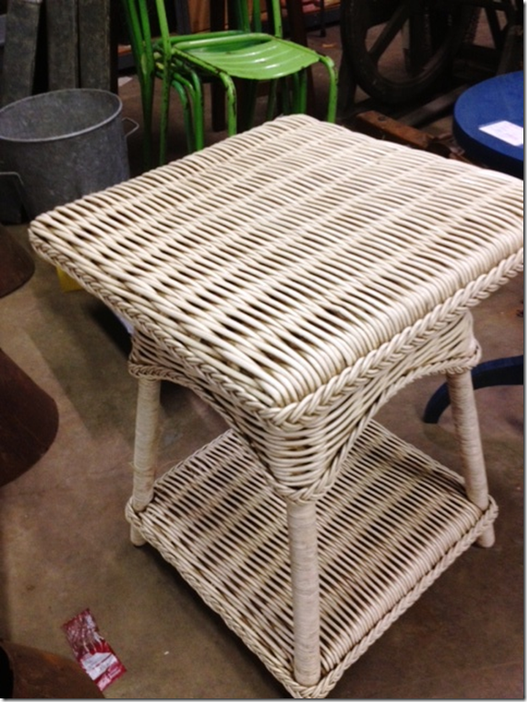
A pair of woven rattan side tables.
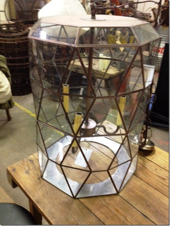
A large, geometric glass lantern.
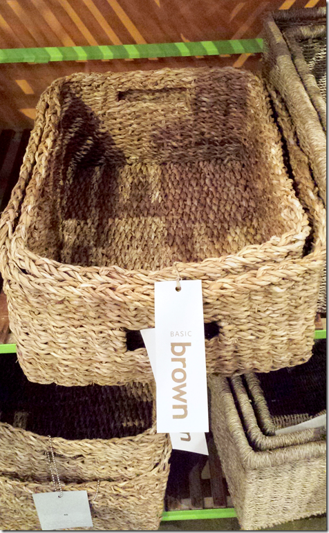
Set of Seagrass Baskets, valued at $100.
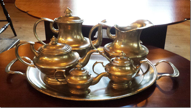
A pewter tea set, valued at $750.
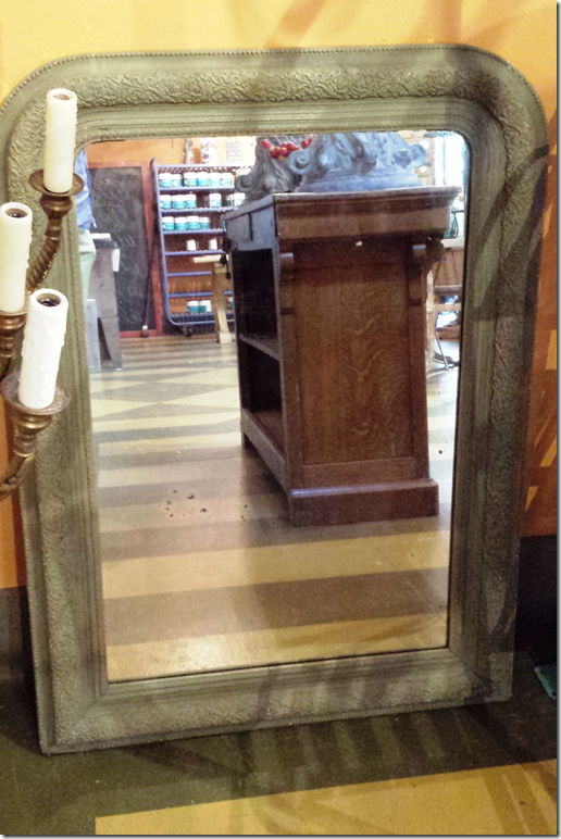
An antique mirror, valued at $975.
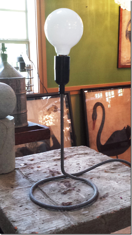
Charming coil table lamp, valued at $125.
Six assorted hand-made candles, valued at $180.
So – as soon as I hear from the first place winner, we will then go onto the next six winners!
Visit BROWN HERE.






I love love love that fabric Joni, and it looks absolutely magnificent as curtains in your family room. I remember when you had slips made for a clients wingbacks in that Vervain, and I have loved it ever since. Great change! Looks amazing, as usual.
ReplyDeleteThat poor zebra, though. Ouch.
xoxo,
A
And the apples from Ballard Design orchard - double ouch!
Deleteyeah, i know. i know. i didn't realize how long i had had those!! i just like the pop of green color. but yeah - they need to go!
DeleteThe green color looks great. Perhaps you can find another object, even a nice piece of pottery in that color to replace the apples.
DeleteReplace them with real apples and see if anyone really notices the difference. Honestly! Leave them.
DeleteAlso, how pretentious is it to comment on whether someone uses the word drapes or curtains?
Kerry
Its really something unique!This room seems simply awesome!This is superb that or meetings and group meals, there is also a fireside meeting room and a sweet library hideaway.
ReplyDeleteWow! I love your new curtains! The print is so fantastic...it adds so much to your room! I had to laugh about the puppy problems. Oh..yes...living with dogs is not good for decorating...but I don't want to live without dogs. I'll fix the problems they cause because they are more than worth it.
ReplyDeleteIt has improved with age, like (some) people and good wine. But, as a salute to your first incarnation, you haven't changed the basic structure, only tinkered with it, and so the first structure has proved the test of time.
ReplyDeleteI too loved that fabric ever since I saw it in your client's home, I was wondering if it was the same fabric and when you were going to have the big reveal. I couldn't live without my pets, especially my Kevin, I did discover my silk drapes had some type of pet gerb in the puddle, I was a little peturbed but figured thats why there are dry cleaners. The zebra adds just the right punch (sorry Artie) and I would love to see the pink pillows!
ReplyDeletethe zebra. there is actually a new pristine zebra waiting in the garage for micki to grow out of her chewing phase. and yes - i put that fabric on a chair in a client's house and have loved it for years and years!!!
DeleteReally regret dragging home a Juju thingee from Africa and not getting the zebra. I was hesitant to use the word "drapes" as I used to always use "curtains" I see from the comments the error of my ways. Another regret is getting rid of a white slipcovered sofa, it was so easy to throw in washer with bleach, thanks for the headsup on the linen source! Hope everyone has a fantastic weekend.
DeleteLoved seeing the progression of the room and listening to the reasons things got switched around. The toile is beautiful and so are the puppies! Looking forward to listening to the interview with Mario Buatta!!
ReplyDeleteLove the fabric and love your room...its so gorgeous and love how the layering makes it so interesting and of course all the blue and white touche. The Feather gray is such a beautiful color with just a hint of color and the chicken wire was a great idea. Fun to see your room evolve!!
ReplyDeleteI loved the suzani draped wine tasting table, but for function and balance, the new arrangement is my favorite. The curtains add so much texture and warmth to the room, but my favorite change was the screened doors on the bookcase. Now the room is perfect and you can have fun changing the pillows from time to time.
ReplyDeleteJoni, you crack me up!
ReplyDeleteI do my house ONCE, and then leave it alone. Things get changed when they develope holes......
I'm a product of my upbringing. My mother kept everything the same, and replaced warn out fabrics with as close a match as possible.
HOWEVER.....I love the transformation of this room. You rock, big time, girlfriend!!!
I change my rooms a couple times each year. I cannot imagine keeping something long enough to get holes! Why do you bother reading this blog if you never change anything?
DeleteI am crazy for patterns. I am really glad they are coming back, although I never left patternville.
ReplyDeleteI personally love your zebra hide and your ballard apples! :) I tried to find your email address but couldn't. I have to ask. Are your old drapes for sale? I'm really interested! lakeliving4@yahoo.com
ReplyDeleteMelaine from My Sweet Savannah :)
The "drapes" are probably for sale, but you will have to pay extra for the additional yellowing at the bottom and the unmistakable scent of pet urine. This could get you right back to full retail. BTW, the pet hairs are thrown in as a bonus.
DeleteStop with the scare quotes around "drapes." The English language has synonyms. We have more than one word for the same thing! "Finish" and "complete." "Respond" and "react." "Policeman" and "cop." "Curtains" and "drapes."
DeleteYou obviously don't read here enough to know that "curtains" is the word of choice. I don't believe I have ever seen the author use the word "drapes or drapery". The word "drapes" has been the subject of multiple posts on other sites for several years. I personally find no offense in it, but others do which is why I put it in quotes. Actually, most of us here do know that the English language has "synonyms". We weren't sure you did until 1:42 when you submitted your English studies resume.
DeleteActually, my sister in law took them. AND - the only two that were affected were the ones at the center - at the door. NO pet urine! But they were just dirty from laying on them. no pet hairs though.
DeleteMy favorite comments always start "You obviously..."
DeleteMine as well, Anon 10:36. Some people are just so "obvious" that they "obviously" assume that the "obvious" is also "obvious" to other people who for "obvious" reasons do not understand the "obvious" so they come back with an "obviously" ignorant comment like yours, Anon.
DeleteAnon. 1:42, should we click our heels first while rolling up the sleeves of our brown shirts? Who elected you writing queen of the comment section? I will put quotes around any word I so choose and you can lump it, control freak.
DeleteYour new draperies are absolutely gorgeous!!! The room has been totally elevated to a new level!!! WOW!
ReplyDeleteKelley, you fogot to use "scare quotes" around the word draperies. If you don't know what "scare quotes" are asked the anon who doesn't know the definition of "tedious".
DeleteWell I am totally in love with your additions Joni. Love,love,love the drapes that pattern has always been one of my favs.
ReplyDeleteLove the brown velvet pillows a bit of luxury, love the furniture placement have to be honest the chair in front of the
fireplace always bugged me. The cabinet doors and tweaking you have done in furniture placement make this one of the most
beautiful family rooms I have ever seen. Livable and lovely wonderful job.
Joni,
ReplyDeleteI could never imagine the room with printed curtains. Just when I finally catch up and get my room to look similar to yours, then you change lol, but I cannot believe what a difference the curtains made. It is almost like going from blurred vision to 20/20. The room is richer looking and vivid. I love it !!!!!! So I guess, I am back to my drawing board once again. I always especially love your blogs where you show your home. Your blog is one of the first ones I started with and I shall never tire of it. The puppies are the most adorable accessory of all . They are all lying there and who would ever dream that he/they have chewed a rug, wicker,etc Soo funny and cute but pets make a home. :) Love you Joni,
Kathy
The curtains make more impact on your room than the original ones; however, I believe you dress them down considerably with the wooden blinds. Why not try the same treatment using a different fabric rather than the wooden blinds - perhaps a sheer pleated up like a blind that would serve the same purpose and would not be so jarring to the eye. While I realize you get great glee out of your attempts to disprove a reader's assertion, I would not be willing to bet that 50 years later Mario Buatta would do that same window treatment again. After all, we must assume, and the record speaks for itself, that this would not be the treatment of choice in an elegant living room. What looks good to you at age 20 isn't always so good at age 70.
ReplyDeleteAs to your reluctance to venture into color, I believe you should listen to your interview with Mario once again. He studied paintings and learned how artists used color and moved it from place to place on the canvas to achieve balance. You have no art in your home and perhaps have no desire to have, but it would be helpful to you to take some of his advice.
As to your doggie issue, I suspect you will have it once again as the pet stain odor is probably in your rug and into the hardwood. It wasn't your curtains they liked, it was their scent and unfortunately new curtains will not likely change that.
THat is the point of the blinds, to dress it down. THat is what makes it look good. It's appropriate here , in texas, to have atleast something rustic in the mix in a home.
DeleteSo I am assuming you would also wear brogans with a silk evening gown to a black tie affair because THat is what makes it look good there in Texas. If you need to dress something down per se, then choose a more casual fabric. THat is what most people would do. I am not certain that "dressing down" was the motive here as this is already a casual room.
DeleteI'd rather have the blinds. Makes for a better balance of textures and materials. Too much fabric, like too much wood, can make a room tedious.
Delete"So I am assuming you would also wear brogans with a silk evening gown to a black tie affair...
DeleteComparison makes no sense. NOTHING in that room says either "silk evening gown" or "black tie affair."
"Too much fabric, like too much wood, can make a room tedious"
DeleteDepending upon your fabric choice and how the fabric shades were constructed, it would not be tedious at all. In fact, you would hardly notice them. In the case of wooden blinds as used in the picture of Joni's family room, they look like giant eyeballs bulging out of beautiful cascading fabric. Had she picked a neutral tone from the fabric, the look would have been a lot softer. There is already a lot of wood tones in this room.
"they look like giant eyeballs bulging out of beautiful cascading fabric"
DeleteI enjoy your psychotic imagination, but you're just making up a problem to solve.
". . . ., but you're just making up a problem to solve".
DeleteI didn't make up a problem - it's an observation, twit!
If you like wooden blinds go for it, but there are prettier ways to deal with the dead space between the window frame and the crown molding. Apparently, you have never learned this.
Anon 1:45, you are obviously completely dense or have some limited reading skills. The curtains are lovely, well made, hang beautifully except they have hanging between the panels something that totally distracts from their beauty - the wooden blinds. Hence, (now read closely because I know this is very difficult for you to understand), That in essence is like wearing an evening gown to an event with totally inappropriate shoes, i.e., brogans. The comparison makes perfect sense in that both the blinds and the shoes do not compliment what they are meant to adorn. Now, do you finally get it? Probably not!
DeleteYes, the lady who fantasizes about seeing "bulging eyeballs" is famous around here.
Deleteomg - brogans?!!!
Deleteeyeballs? - i don't have the shades in my living room or dining room and they look fine - and i think the shades look great in the fmaily room. they aren't dressy, the room isn't supposed to be dressy. you either like the look or you don't. i do. i love the look, obviously.
Joni, ignore the broganspeak.
Delete"Broganspeak" - did that word come from the same dictionary where you found your definition of "tedious"?
DeleteYes indeed, those rooms with too much fabric are getting very tired and weary from hanging so long - lol.
I agree with the lady who is against brogans........ at a formal dance!!!!
DeleteIt makes..........no SENSE!
I once saw Tony Duquette......at the MONTECITO 7-11!
Klunk!!!!!!!!
I once saw Penelope Bianchi washing drapes at the MONTECITO Wash n Dry! She had just returned from Venice . . . . . California where she was an inductee into the NATIONAL TREASURES Society.
DeleteKLUNK!
Loooove the new curtains! It is fun to see how things evolve. It is a good reminder that a few changes can make a huge difference. Best, Beth C.
ReplyDeleteWOW! Your living room has bloomed nicely! It gives me faith to keep working on mine. :)
ReplyDeleteAre you still taking decor questions? I have a few about my living room and I would luuuuuuuv your advice! Do you have an email address for questions with photos?
yes for sure!!!!!!!1 mrballbox329@aol.com
Deletesend it in!
Dear Joni,
ReplyDeleteI always love seeing before and after pics. It has been fun to see the changes over the years.
Your style is timeless as you can see in Mario Buatta's work. Thank you as always for bringing us the best of the best!
xoxo
Karena
Echoing another reader, I have to say I never left patternville. I have just had patterned curtains altered and remade for each move we have made since the early nineties. I hope I have gotten a little crisper and more restrained in my deployment of pattern, but nothing better absorbs the chaos of throws, books, papers, pictures, collections, laptops and all the other things that are part of a well lived in room. Plus, I cannot imagine living in a really cold climate without the warming effect of pattern that you point out. My favorite pattern is Brunschwig's La Portugaise. I waited a very long time after I first fell in love with it in a picture of Brooke Astor's famous red library until we could afford to put it on upholstered pieces and it has traveled with us for many years now. And now Brunschwig has made one of their oldest classics, Le Lac, in a brown-blue colorway with accents of Chinese red and peach. It is perfect with antique rugs worn to the weft with soft oxidized colors. It looks great with really old blue and white, but alternatively with brown and white Staffordshire, which I have seen in your collections in some of your pictures. The most lamented discontinued patterns for me are the beautiful black grounded multicolored flowered chintz Ralph Lauren once had in his line (my curtains have been altered three times now) and the black background Beauport Promenade, from Brunschwig, with elephants and camels in a stately procession (my grown son is still using the sofas in this pattern that he spent his teenage years stretched out on spilling Coca Cola. The ultimate child-and teenager-proof fabric.)
ReplyDeleteI love the fabrics you named! Le Lac always makes me think of Mrs. Blandings - that was her favorite too. great comment!!!
DeleteYour living room is very pretty. I am glad you discussed curtains. I am so indecisive about curtains for my front room and dining room, which are across from each other as you enter the front of the house. Lots of beautiful light comes in and we have big trees and rose bushes right outside the windows. I really don't mind the view at all. But, curtains/drapes would bring some softness to the room. I just have no idea what pattern to choose. Anyway, I love the pattern you have chosen for your home! Thanks for including the maker;)
ReplyDeletetexassky
I love pattern and chintz, it's classic and will never go out of style. I do think the extra large france in texas look is passe though, so I'm hoping the next thing you change are the scale of your furniture. Perhaps it's the slips, but it looks so large and lumpy and the white slips are so cold and tired. Reupholster Joni, and admit the error of your ways.
ReplyDeleteBTW, I love your blog and you're a wonderful researcher and a good writer.
oh - i will NEVER live without slips! maybe in another color, not white, not i have to have slips that i can wash. lumpy?????????
DeleteI had to laugh when I read about the puppies "messing" up your interior! I have two small dogs that still have accidents, muddy paws on my white slips, etc. BUT, this is real-life living! I so love how you just work around it. I would rather have a life with all of its foibles than worry endlessly about my things! By the way, your curtains are beautiful & I agree on how much warmer it makes your room.
ReplyDeleteKat
The FIRST thing I noticed seeing the photo of your new curtains is how well it brings out the stone in the fireplace! Small detail but that is what I like...details...like your blog! :) franki
ReplyDeleteLove the new curtains + all the photos. I prefer not to use puddle curtains just because of that reason + always tell clients + myself that puddles invite dust + other things. Adored MB round top discussion + his book. xxpeggybraswelldesign.com
ReplyDeleteJoni. I had recently posted this in an old post...thought it would be more appropriate here: I love your blog and follow it regularly! You have beautiful style! I have been on a month long search for the perfect white linen...not stark white...not too yellow(most of the off white are!), washable (preferably prewashed), thick enough to cover a faded pattern underneath but to still have a soft hand...I would love to know the duralee linen you prefer...or any other particular linen names (maybe from Pindler or Kravet) that you love to use on your gorgeous slipcovers! This may be top secret info but would be soooo appreciated!
ReplyDeleteToni
I use pindler now. the duralee listed on the blog is discontinued. it's not secret. but it does depend on what you need - pindler has white, off white, gray white, yellow whites - and i always wash it myself - don't depend on the vendor for that. i don't know the name of the pindler off hand. but just go there and look at their whites and find your perfect one. mine changes each job depending on the wall color, the rug, the fabrics, etc.
DeleteDoes your fabricator do the washing? I have always struggled with this as my fabricator and upholsterer (both of whom I love)don't have the capability to wash several yards of fabric...so I have always thought that I have to do it myself...and never found a reliable source....not even sure what to "google" lol Any suggestions? The new version of your room looks fantastic and I totally get making the accommodations for the pups, I am always covering things up for my 2 cats! Life goes on!
DeleteCheers!
Meredith
(p.s.) I am another one who is looking forward to the next chapter on the royals....
So much fun to see your family room transformation through the years, and it's been beautiful each time! I do love the current room, and the curtains are gorgeous. It's amazing how they cozy up the room and add a whole new dimension. I live on the water and have no curtains in my family room, but just maybe you have given me an idea!
ReplyDeleteDisciplined. Congratulations. Ann
ReplyDeleteJoni, Your home is beautiful and one of my absolute favorites! I love everything and especially the curtains.
ReplyDeleteHugs,
Sherry
Joni, your new curtains look gorgeous! I use your blog for inspiration in my suburban home (I'm just outside Austin), and I have to adapt my look for financial reasons and because I have two little boys, which is kind of like having puppies. I tried beige linen curtains, and I love the look, but after a while, they just felt so bland. I found some gorgeous printed curtains from West Elm that you probably wouldn't like, but they really liven up my living room. I love the added color and texture, and now I feel like I have your blessing, since you did it, too! I think it's great to take a risk every now and then, and since they are just curtains, you can always switch them out. Oh, and I love adding pink pillows for summer, and then darker ones for fall and winter. Keep up the great work!
ReplyDeleteThanks for the evolution of a designer. Love the new curtains. Have always loved pattern. What grabs my heart the most is the way you love your dogs and then your decor. Quite a handsome foursome they make!
ReplyDeleteGOTTA get some variation in those slipcovers, Joni. Even different shades of off-white and beige would be better than all these monotonous shapeless blobs of white.
ReplyDeleteThere's also that "You're dirty!" message the white slipcovers give off. The chairs look like they belong in the waiting room of an infectious-disease hospital.
Good job with the curtains.
Joni, your family room is beautiful! Love it! I would only give one small idea, and I am not near the decorator you are, so you can disregard if you want.....Buy feather / down inserts for your accent pillows! They are reasonable and makes your couch so cozy! In fact, I used a feather mattress I wasn't using anymore and put an insert on top of the foam rubber in our couch cushions (seats). Oh my, what a difference! A friend of mine (she reads your blog too) gave me this website: http://www.unitedpillow.com/catalog/Pillow_Inserts-6-1.html
ReplyDeleteI love your blog...
thanks! all my pillows are down. thanks for the link!
DeleteJust when I think that room is perfect, you change something and make it MORE perfect! I loved seeing the transformations. Just beautiful!
ReplyDelete-Shelley
In case your readers are searching for some lovely 8 foot long Bennison Orchid Lily drapes, I'm selling 4 pairs on ebay which I bought at an estate sale. Just query "Bennison Orchid Lily" on ebay. And yes your living room looks great with the patterned vs plain drapes :)
ReplyDeleteThis is beautiful. Oy vey, you have the most hateful group of anonymous posters. I would love to see their homes and have someone dissect them accordingly.
ReplyDeleteI couldn't agree more with you. They hide and are snide!
DeleteJoni,
ReplyDeleteI have always loved your house. Your kitchen is one of my all time favorites! This latest version of your family room is fabulous. I love the patterned curtains and your shades, but the overall room is beautiful. You do such a great job. Living with dogs is always challenging, isn't it?
Karen
How cool are you?? Living with dogs is the only way to really live!
DeleteJust my opinion!
Penelope
Love the new curtains but I have to admit my favorite ever is the photo with the suzani draped on the ottoman and the zebra pillows on the couch! That was the image that got me reading your blog in the first place!
ReplyDeleteLove the new drapes, Joni! But I loved the other ones, too. Any chance you want to sell them?
ReplyDeleteKerry
I love the comment about the anon haters. I wish they would post examples of their perfect taste. Then we might see them as something other than cranks. Easy to to criticize hard to create.
ReplyDeleteJoni, I have read your blog for awhile now and love it! I love all the details you give and the pictures. I also love your decorating style. And the white slip covers? Love. I think it is a shame that those who would be critical do so anonymously. It seems that if they have something worthwhile to say and if they are truly wanting to give helpful advice that they could at least leave their name. Hiding behind anonymous just seems wrong. I would not take what they say as credible information. "To thine own self be true" (Shakespeare).
ReplyDeleteCan't wait to see what you do next.
I love the new drapes and now think I should do the same thing! They add such character to your room.
ReplyDeleteI love the new curtains...! it's one of those things that while the white looked amazing these just look even MORE....and I can feel the extra layer of cozy to your space. Lovely!
ReplyDeleteI never noticed the pattern on your old drapes and simply assumed they were white linen. I think your new drapes are beautiful but I usually prefer the white linen look. Interestingly enough, I'm hoping to have my offer on a house that Carol Glasser did the interiors. Her amazing checks (in yellow) are on some curtains and shades. I plan on moving all of my white slip-covered furniture in and was going to replace the drapes in that one room....now you have me thinking....I will live with the checks for a while and see. I have dogs, love them..I love being able to wash my slipcovers. I don't find white sterile and cold but rather soothing. Funny though, I have french antiques and an very soft aqua toile in my husband's waiting room and exam rooms. Patients love it and feel it is homey. I think I'm more creative in a white room????? I love gray too. Great job on your entire house!
ReplyDeletee
oooh - this sounds interesting! what house? what street????? ;) email me!
DeleteOh LORDY!
ReplyDeleteYou have so many comments....and they all love you......I just cannot read "drapes" so many times! (Drape is a verb!) does everyone in Texas? no.....you have International readers. Could you just tell them they are "curtains" "drapes go on a coffin" (my curtain man told me......and my research confirms) "drapes " is a "tacky??" way to describe "curtains"??? COULD YOU SAY SUCH A THING??
JUST MY Opinion!
I realize I just stepped into a minefield! Lordy! Landmines are going off all over the world! Whew! I am on the internet........no landmines there; I hope! (I am also thrilled beyond that you recovered from "puddles " with your curtains! You are so smart! That is, in my opinion , an "affectation" that makes no sense in our world today!
I cannot wait to hear the roundtable with Mario!
I was completely shocked and did not know that he was recently very ill.......(with a staph infection) and hospitalized for months!
We can never take any of us for granted for one second! He is an "International Treasure!!"
and all of the people who love him took care of him! (he did not tell me......so I am not betraying a secret! (Christopher Mason ) was just one!! I was in tears!!!
You are a complete and utter treasure in the design blog world!
I know Mario......we went on two "Save Venice" trips together.....and I also know EmilyEvansEerdmann.....(aka EEE)....("klunk"is what I say when I "drop" her name!!!) She is divine beyond words! (when one drops something heavy......the noise is "klunk"! So when important names are "dropped; I say: "klunk"!!! It has served me well!!)
I preordered this book the day she told me about it.......I will lock myself in the closet.......and read the entire thing......cover to cover......and then again and again!
Did you read her book about Madeleine Castaing? I MET MC in her store......(mentally.....not sure she was there.......) but I WAS!! EEE is an astonishing author!
Mario is......well......for me.......BEYOND!!!!!
WHAT FUN!!
DECORATING IS FUN!!
COMPLETELY!!
Penelope
Klunk, klunk, klunk. . . Is there a time when you aren't "klunking"?
DeletePenelope, your doctor may want to order a head MRI.
DeletePenelope, who really cares if someone uses drapery, curtains, window treatments? I know boat loads of designers who would never use the word curtains to describe what hangs in someone's dining room, living room, etc. They probably would use curtains to describe what hangs in one's kitchen, bathroom and maybe bedroom depending upon the window.
DeleteBTW, thanks for keeping the light on for us at Motel 6 - KLUNK!
Well Jeez Louise, the Anons are out in full force. Penelope has enough energy to light up a small village. She is her own person and her own style. I have never met her, but know from others that her enthusiasm is authentic and real. More than I can say for the Anon haters. Anyone who loves life as much as Penelope. Anyone who loves animals (down to ducks and chicks), loves decorating from the heart and who has been so supportive of other bloggers has her own sweet karma.
DeleteSuch a pretentious comment from penelopebianchi I can't help but comment...
DeleteDrapes are distinguished from curtains for having a lining sewn in them. I'm sure Joni had her drapes made with linings as they hang impeccably. The word Drape is both a verb and a noun. Please don't "school" Joni's readers as many of us are design professionals. Thank you.
Anon. 2:08, perfectly stated. Bravo!!
DeleteHome Before Dark, you seem to thrive on the use of the words "anon haters". It appears that when an anon says anything with which you disagree, you automatically assume that hate is the reason ,and only those who agree with you are full of good karma. You live in a very small world my dear. Penelope may be all the things you say about her and I have no doubt that what you say is true, but it also doesn't carry logic to it's ultimate conclusion that some who comment here find her name dropping (klunking), endless know it all drama infused and capitalized verbosity a bit annoying at times. So she loves animals and loves to collect and decorate. So do most people who read here, so what? Most of us prefer to state our opinions in small letters instead of preaching from the rooftop in all caps. It is evident that Penelope needs to be known for who she knows and not what she knows.
DeleteI enjoyed the post and really like your curtain fabric choice! I think your book shelve door addition really was an outstanding idea.
ReplyDeleteWould love to see you use those pewter tones to select a color for the back walls of those shelves!
I do not think that you should be embarrassed about changing your room! Unlike most people, you have been in the same home for a long time, and it must be fun to see it evolve with the times! It is just beautiful!!! PLEASE PLEASE tell me how you clean peepee from the seagrass!! I have NOT had an easy time of it, and I have a King Charles too!!
ReplyDeleteAbsorb as much moisture as you can with paper towels then go over the spot with paper towel dipped in water with vinegar added (for odor), then dry that with a paper towel and cover in kitty litter. Leave it until the spot is dry (even 24 hours) then vacuum. Works like a charm.
DeleteI really love what you did with the drapes (curtains :)). I loved it before, but now it really adds depth, without being overwhelming! It's so fun to see all the changes you've made over the years. Thanks Joni!
ReplyDeleteGorgeous! Love the evolution and reasoning behind each change. I would also love to see a close up shot of panel. Eps the top portion where fabric meets rod. I was intrigued by your non ironed pleat but couldn't clearly see it. Best, lizziefitz
ReplyDeleteAbsolute jealous-worthy gorgeousness!!!!
ReplyDeleteI am super excited to be a WINNER of the Brown giveaway! My daughter and I went in on Saturday and were absolutely blown away by the amazing selection that Jill Brown has put together. Lamps, chandeliers, mirrors, antiques, candles... oh MY! Thank you, thank you for this exciting treat. If I may select the gorgeous antique mirror, that would be divine! My daughter and I will absolutely be adding Brown as one of our favorite stores for the coolest décor in Houston!
ReplyDeleteJeri Windrow
as long as the 1st place winner doesn't want it - you can have the mirror for sure! i'll email you!
DeleteYour family room has evolved into a stunning display of casual elegance! Looking at all of the pictures I can see how your taste have grown too. You should high five yourself for a long time. I'm sending you a high five right now because those drapes are fabulous!
ReplyDeleteJoni, I love your patterned drapes. Fabulous! The pattern suits you...feminine, classic yet fresh. I post under anonymous as I have an old bellsouth acct not because I am a hater. I'm a big fan! I adore your enthusiasm for good design and your intellect and research put into your blog. I love how you get flowers each week. I am going to give you the girlfriend with a glass of wine sitting on your sofa opinion of your family room. And yes, I would be willing to post a picture of my family room for your critic! Here it goes.....Joni darling, you need a piece of painted furniture in this room. All your wood is matching. Love that bulls eye mirror over fireplace but its too small. How about a bigger mirror or a piece of artwork leaning toward modern. Perhaps,an abstract landscape or a really cool black & white or sepia photo. Are you familiar with encaustic art? But whatever it is it has to be BIG...it is Texas for crying out loud. And the blue and white needs to find a new home. I know, I know, you love your blue and white but it ain't bringin' anything to the party. It looks too crowded on those side tables. I would rather your lamb shells, and grapes take center stage. They aren't getting the attention they need. One diva per room please. Yes, darling, I would love another glass of wine. I love this couch it's so comfy. Wanna pop some corn and watch gossip girls? xoxo
ReplyDeletelvoe this!!! the mirror? omg. it's the perfect size! but it doesn't matter - i'm going to get an antique mantel from france. from chateau domingue. one day. for sure. sure!!!!!!!!!!!! hahha i wish!! i love blue and white! no to contemporary art! i'm not so easy. I have three pieces of painted furniture in the entry hall. right next to the family room. come over for wine. we'll drecorate.
DeleteJoni, it's time you listen up. Please, please listen to Anon 5:08. She/he is absolutely correct. Your lovely mirror over the mantel is way to small for the space - sorry. I saw this and frankly with so many other things you could do to liven up the space, it was not necessary to point out, but you do indeed need art work - badly. Please consider these suggestions. The art does not have to be modern, but your space is begging for color and energy and it has none. I believe this Anon has given you some great suggestions. Perhaps with a bit more color your blue and white which I also love will be even more beautiful. Just mix it up a bit. Two of each piece doesn't look collected. Mix it up, please!
DeleteDon't have a clue who this Anon is, but Joni you have been given some wonderful advice and it's free. Please go for it. This is probably the best comment of the thread. Someone who is truly honest and has your interest at heart has written a very thought provoking comment. I hope you will take it seriously.
DeleteWhat you are missing in your design and perhaps what your clients may be missing as well as a result of this is your lack of interest in art. You cannot, and I repeat, you cannot be a serious designer without some knowledge and appreciation of art.
Painted furniture is no substitute for artwork - never. Whatever gave you that idea, Joni?
DeleteArtwork - I got it...how about a large portrait of those darling dogs?
DeleteThe colors of your dogs would go with your room and if they were on grass, you'd have all that green, which would be a great addition to the room.
I think artwork should mean something to you and... they do.
I have been taking stock of my rooms with regards to the art, painted furniture and less clutter. Great advice from anon 9/13 and 9/14, thanks very much! I love "one diva per room" and not to be an minimialist but have each piece count for itself. I never really noticed Joni didn't have any art probably because I am not a designer and never dissect rooms. I am always confused by "french style" or "english style" or "swedish style" but her family room does seem like a cozy cluttered English room which may be why I prefer the suzanni when it was draped over the ottoman or the picture where the sunburst mirror was mounted on the bookshelf and the suzanni was draped over the table.....argh....I can't even use the word "drape" without cringing! Such a challenge to be able to have a collected and evolved look and have it all flow. I guess its easy for me to just be "sh*t shack" which is what my designer friend called my family room.....but at least my pets and kids love it, I never knew designing was so difficult until I started reading Joni's comments!
DeleteYour family room looks wonderful! LOVE, love, love the window treats! Do you mind sharing what type of pleat was used? Thank you! :)
ReplyDeleteDefinition of drapery in English
ReplyDeletedrapery
noun (plural draperies)
cloth coverings hanging in loose folds:
the hall of the school was hung with green drapery
*(draperies) long curtains of heavy fabric.
*the artistic arrangement of clothing in sculpture or painting:
the effigy is notable for its flowing drapery
Origin: Middle English (in the sense 'cloth, fabrics')from old French draperie, from drap 'cloth' (see Draper)
Thank you!!!
DeleteJONI~
ReplyDeletecould you tell me what the clearance is under your lantern hanging from the ceiling? I have one very much like that filled with candles and I want to hang it center of my living room over the coffee table.. not sure how high or low it should be? My room has a sloped ceiling and hoping that won't look weird. Thanks!! Marcy
my ceilings are 10 ft. -the bottom of the lantern is at 7 ft
DeleteHi, I love the sheep sculpture on the end table. Can I ask where it came from? Thank you, Wendy
DeleteLove the new patterned curtains or drapes who cares, they look great!
ReplyDeleteReally great. I have a preference for plain linen, but your pics have
giving me something to think about.
Love the new curtains. I have no issue with the size of the round mirror over the mantel, as combined with the surrounding vases/ornaments, it reads as large enough to fill up that space. Alone, the mirror would be too small.
ReplyDeleteTo me, the room reads as warm, cozy, interesting. Very English in the sense of lots of smaller objects, items on and below tables, i.e. a "filled" room. Like Buatta, but with a more pared down color scheme and fewer frills. Very nice.
If I were to play "decorate this room" for my own tastes, I'd go a little more Pam Pierce-ish. What I've taken from studying Pam's rooms, more than anything else, is the art of having the perfect object in the perfect place, and nothing more. So I'd clear out all the small stuff, except perhaps the items behind the chicken wire shelving which, because of their grouping and isolation, can read as "one". I'd add a single large mirror or artwork above the mantel, one or two larger objects on tabletops instead of collections, and have more negative space on/below tables so you can see the woodwork/curve of the legs. A few lush cushions. The idea is not to go minimal, but instead to make each piece count in and of itself in terms of bringing beauty to the eye. Just a thought, for the next time you get the urge to try out different arrangements.
yes. i know. i hear you. except - i'm not Pam Pierce. And I"m not sure I want to live with just "one statement" on each table. but that is a great lesson - for those who do. And i am listening to what you say too for clients. I tend to do more little than just one big. i prob should do anway with the baskets under the tables, but truth is - we use those for things. like elisabeth's jewelry projects - magazines currently being read, catalogues. that kind of thing.
Deletebut - now, i want to move those baskets away. maybe i will today!
Even if you don't want to do the Pam Pierce style of extreme editing, you do need to edit. I tried to count the number of objects on your tables and really could not accurately count them all, but it's obvious that one would have a hard time finding space to sit down a drink. While you tout your style as French, your rooms really are more English. I would remove the baskets, find a more appropriate place for Elizabeth to store jewelry projects, and seriously edit your tables. The room needs some breathing space and your guests need to feel like they walked into someone's home, not a furniture/accessory boutique with an explosion of "stuff".
DeleteAnon 7:17, while reading some of your suggestions I was mentally taking stock in my own library and living room. These are great suggestions. I especially think the advice to remove the clutter created by the baskets under the tables is an excellent one. I would love to see Joni implement this advice and show us in a few weeks how this looks. It would be really beautiful and her room would appear so much larger and welcoming.
ReplyDeleteGORGEOUS! Really do make a huge difference ...and although lovely before, make the room more beautiful!
ReplyDeleteThe new curtains really open up the space and provide a dynamic connection between rooms. The brown pillows are elegant, but I wouldn't mind seeing a splash of pink! I am also a winner of the Brown contest. I'd like to request the swan print or the cake dome, if either are still available. Thanks!
ReplyDeleteemail me your name so i can save it for it!
DeleteYour room is lovely. The new curtains make the room look more dimensional, lush, a rich look in an understated way. I also love tat you have baskets in the room to keep stuff. Rooms that don't look lived in come off as sterile and stiff to me.i chuckled when I saw the extra large arms on your sofa in one of the rooms earliest iterations. I don't know why furniture makers did that. I adore before and after posts!can't wait to see what you decorate next!
ReplyDeleteHello Joni,
ReplyDeleteWhat a lovely choice of fabric- it adds so much warmth to your room- I especially love the long view of windows- just beautiful!
XO
Mimi
There are at least 7 and perhaps 8 pairs of things in your room. The room would look more collected if you could eliminate some of the
ReplyDeletetwinsies and use single items instead. You have two pairs of chairs, a matching pair of tables, matching lamps, several pairs of matching blue and white, a matching pair of garden stools and that's just what is obvious from the photo. Do you still have Mario's number?
Gosh, who knew reading blog comments could cause an onset of depression? Wasn't expecting that. I thought decorating/design was about creating comfort and pleasure, not dis-chord. It's as silly as people arguing over abstract versus representational artwork when it's a matter of personal taste, nothing more. No wonder the world struggles with violence when people make so much out of such insignificant matters.
ReplyDeleteAnd just for the record, here in Southern California (which is far from Texas, just to be clear), rattan shades placed behind curtains/drapes is a look embraced by many talented designers. It's prevalent in numerous model homes and frequently shown in local design magazines. It's fresh and casual, and very fitting for our lifestyle out here. I love it myself and in fact often times prefer it to fabric on fabric, which can easily feel fussy/frumpy and dated. I don't know how old or where the person lives who thinks it's a look limited to Texas design only, but I'd like to make the suggestion that he/she try to get out more.
Joni, thank you for being willing to share the evolution of your beautiful home. Your humility is both evident and admirable, and you clearly have the patience of a saint. Here's hoping some of it rubs off on those who have none (and feel compelled to let us know about it.)
The best designers are not doing "model homes". They are too busy working for clients and would rather not work for home builders. If you prefer the Pier I Import look, go for it. There are more elegant ways to accomplish the same objective. How do I know this? I do get out a lot, perhaps you would do well to not base your taste on spec home decorating.
DeleteShe did not write that the best designers are doing model homes.
DeleteShe said it was prevalent.
Yes, I understand. Why then take your cues from designers that depend upon spec builders to launch their careers?
DeleteVervain is one of my favorite fabric resources, Joni, and I love the fabric you chose for your draperies! Especially in an otherwise neutral space, there's something so compelling about making a strong statement with pattern at the windows.
ReplyDeleteJoni, thank you for showing us each iteration of your family room. It's a lovely room and keeps getting better and better over time! Your window treatments are beautiful. I do agree with some of the other posters on the volume of accessories on the tables. Your lamps look a little crowded and it looks like there are fragile items perched near the table edge. Once you have grandkids, I'm sure that problem will be fixed right away to avoid tempting those curious fingers!!!
ReplyDeleteReading comments here is very entertaining!
ReplyDeleteJoni, your room is lovely. The symmetry from the pairs of objects is pleasing, the blue and white is timeless, and the mirror is not too small over the mantle. You go, girl! Thanks for a beautiful blog. Don't listen to the snarky comments.
ReplyDeleteThis is not junior high basketball. Some things are obvious and pointed out because they can be improved. Comments like yours Nanette only show that you just qualify for the cheerleading squad. The mirror is way too small for the space between the mantel and the ceiling. It's a lovely mirror, but would look much better in a space where it can be center stage. Perhaps a Louis Phillip of some significant size would fill the space more appropriately. Having multiple pairs of things is not necessarily what symmetry is all about. Joni's room architecturally is not symmetrical but she is trying to make it that way with pairs. I would eliminate one of the wing chairs, one of the garden benches, substitute another style table for one of the matching gate leg tables and some of the blue and white which could be pretty in her display cabinets. The room looks like a furniture store except that even in a furniture store there would not be so many pairs used in one space.
DeleteI have nothing interesting to add but I did fine this link to a relevant article to a stream of comments here.
ReplyDeleteNot that I am saying this is definitive but just a fun read is all! Your blog is always so entertaining Joni!!
http://www.nytimes.com/1991/10/24/garden/the-lowdown-on-curtains-from-lady-velcro-herself.html?pagewanted=all&src=pm
Great reading, thanks for the share!
DeleteYour room is gorgeous! Could you tell me how the drapes/curtains are finished at the top? It's hard to tell from the pictures.
ReplyDeleteLove it!I especially love how the puppies helped you redecorate the drapery! I think the new drapery is fabulous and the room looks so chic!!
ReplyDeleteBest,
Karolyn
I think the mirror above the mantle is not so much too small as it is too bright gold. It draws the eye too much and looks a little cheesy. Other than that, come on you guys, it's a room people actually live in, not a staged magazine shoot. And 'drapes' is short for draperies, just like 'phone' is short for telephone. Sheesh.
ReplyDeleteApparently you don't know the difference between 18c gold and "cheesy". Depending upon the angle of the camera and the lighting in the room, the color underneath which is referred to as the "bole", may not be reflected in the mirror. There is nothing "cheesy" about this mirror and chances are you would do well to own one. You apparently don't have a clue about how antique mirrors were made.
DeleteBeautiful...both then and now. But, those drapes are GEORGEOUS!!!!!!!!
ReplyDeleteI love reading your posts. I learn something every time i do. Every incarnation of your room is so pretty...
ReplyDeleteI have puddling curtains too, and my dog does the same thing, so now even my curtain rod is bent... guess i better take some inches off just as you did. Seems like the zebra rug has made it through all the incarnations, and it's such a wonderful piece ... Anyway, i live in nothing but a little cape cod bungalow, it's so small, and so is my budget, but either way... you offer such great classic decorating ideas and suggestions, so thank you so much for sharing all your knowledge about design and beautiful spaces. I see trends come and go, but i know that if i like a zebra rug, and Joni does too, and it's going to be cool and timeless.
Cindy
Can I ask where you get your beautiful slip covers? I love them!!! Especially the ones on the chairs that tie - SO cute!!
ReplyDeleteThank you.
Hi Joni,
ReplyDeleteWhat a beautiful space you have! I've just started following your blog and I appreciate your conversational style of writing.
Chinese restaurants in Texas are really attractive place facilities of restaurants very well.
ReplyDeleteMario Buatta is a good friend. I know his legendary work very well. In my honest opinion, Miles Redd is no Mario Buatta.
ReplyDeleteBeautiful. Can you comment on the hardware used for the curtains? Where did you find it, or did you create it?
ReplyDelete