First, a huge thank you to a sweet Cote de Texas reader who saw this house for sale and thought I would like to write about it! I can’t tell you how much I appreciate all the tips you readers send in. Please, please, continue to do so!!! I’m always looking for new stories and new houses to show here!
An Enfilade: rooms that open up – one after another
Several years ago I wrote about enfilades and Lanternes HERE. Enfilades are houses where rooms connect through doors set up in a straight line. Houses called a French Lanterne are houses that are one room deep with windows on the front and back that are lined up – making the house virtually see through. Imagine the romance of the Lanterne - approaching the house at dusk, perhaps as a party is just beginning, and peering into the dining room with its candles glowing and then looking further out to the backyard, where tables are set up and fairy lights are twinkling. It doesn’t get any better than that.
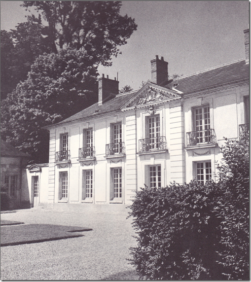
The Lanterne gets it name from the famous 18th century hunting lodge found in Versailles Park in France – called the Pavillon de la Lanterne. La Lanterne is considered a most beautiful house and it has been copied through the years by various architects. The house is owned by the French government and its presidents use it as a country house. The former president Nicolas Sarkozy particularly loved the house and he and wife Carla Bruni stayed there quite a bit – they even spent their honeymoon there.
Pavillon de la Lanterne at Versailles
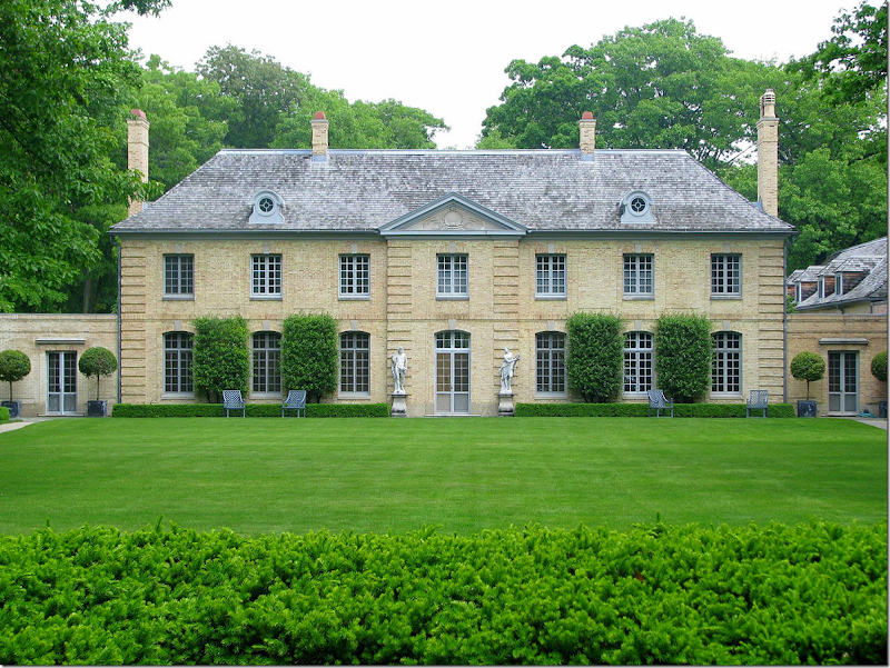
One of the most famous copies of La Lanterne is the David Adler house built in the ritzy Lake Bluff area of Illinois, on a bluff above the shore of Lake Michigan. This house is on the National Register of Historic Houses and is now listed for sale. Before we look at the house as it is today, let’s step back to its beginnings.
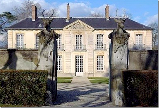
The French house - “Pavillon de La Lanterne” sits behind gates topped with huge deer heads.
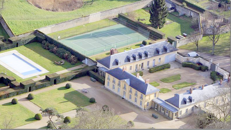
An aerial view shows the center house with wings on each side. Adler’s design was not quite as symmetrical – his wings were different, with one side having a tower. Notice how awful the tennis court is – and how it has ruined such a beautiful house which was totally restored in 1994! They should remove it and turn that area into a formal French garden! I’m surprised no one has suggested that!
And Today:
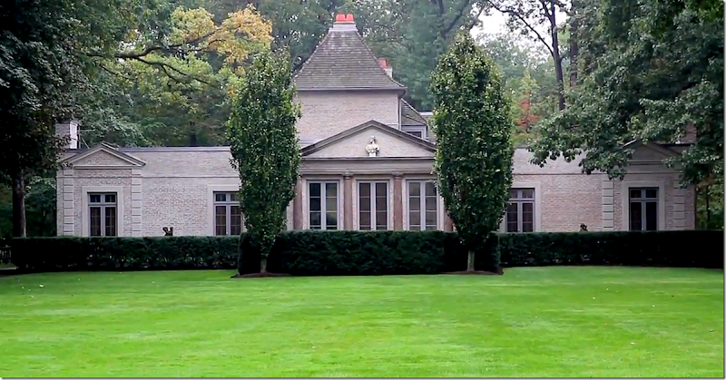
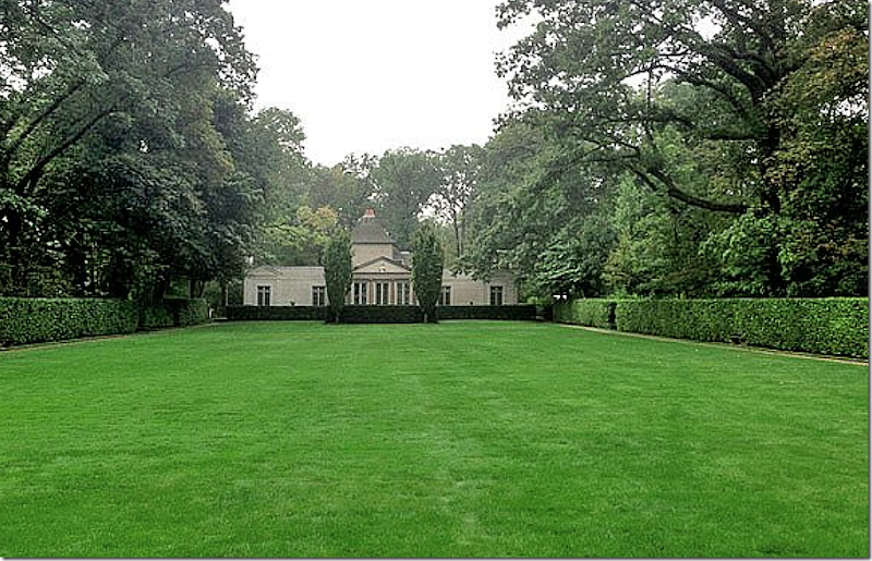
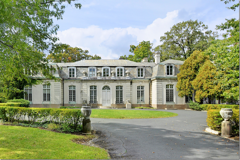
The Carolyn Morse Ely estate has a central entrance with pediment, and six windows on each side of that entrance – all just like the French Pavillon de la Lanterne. Most of the statuary around the estate is original.
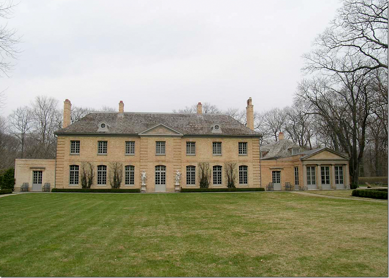
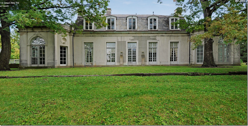
The American La Lanterne house which the famous architect David Adler designed in the early 1920s for Mrs. Carolyn Morse Ely. The house was based on the Pavillon de La Lanterne of Versailles. The above picture shows the garden side of the house with its one remaining wing on the right side – with its Greek Temple facade. The opposite wing – on the left side - was removed in the 1950s during renovations. The wing was actually sold to the owner’s friend and was moved to the other side of the lawn where it now faces the main house! The moved wing was extensively added on to during the years and is now a large house.
The Garden Side of the house, again. At the very right is the South Porch which is an enclosed family room. At the very left – the corresponding North Porch is now gone – since that wing was removed in the 50s.
The story of the American La Lanterne is rather interesting. It was built for an elusive well to do divorcee, Mrs. Carolyn Morse Ely, in the Lake Bluff neighborhood of Illinois – where the upper class built mansions used as summer homes. Ely fit in very well as she was born to one of the richest men in the world. The Ely house was meant to be a large country estate, which would house the many servants who would be needed in order that the house would run smoothly. Adler was hired in 1914 to design the estate and he spent 10 years working on it. The estate was located on 17 acres and at that time it fronted Lake Michigan. After all the many years spent designing the estate, Mrs. Ely only lived there for a short while, moving out in 1928 to an Adler designed apartment. Once she moved – portions of the large estate were slowly sold off and today, it measures only six acres, while the house is a large 7,200 square feet.
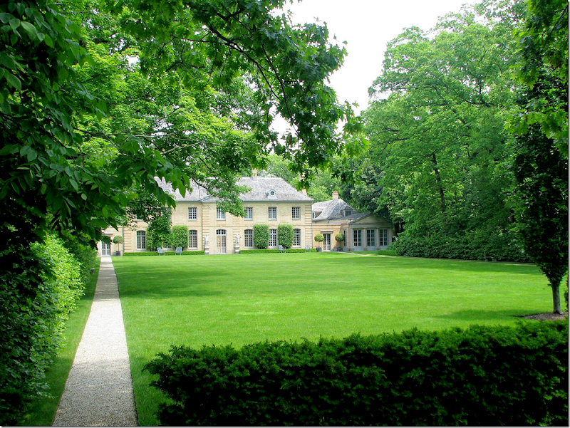
The garden façade. To the left of the house the current owners added an outdoor room, hidden here behind hedges, to balance the missing wing.
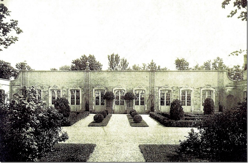
The first part of the country estate that Adler designed for Mrs. Ely was the orangery. Next, he designed a pair of gatehouses, called cottages, that faced each other on each side of the street leading into the as-yet-to-be built main house. Mrs. Ely lived in one of the tiny gatehouses for years until the manor was finally finished. Adler’s first design for the main house was rejected, but his second presentation – the copy of Pavillon de la Lanterne was met with Mrs. Ely’s approval and was ultimately built.
When designing the house, Adler went on European shopping trips where he bought French boiserie for the living room, limestone mantels, and crystal chandeliers and sconces. Also, the house was filled with handpainted wallpaper – that remains to this day.
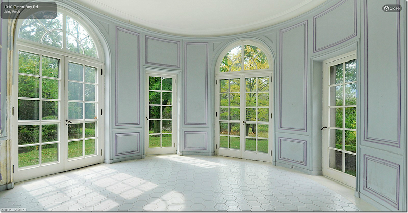
One of the most fabulous features of the house is that it is filled with light since it is only one room deep. There are windows on at least two sides of the main rooms. The South Porch has windows on three sides as do the upstairs bedrooms.
The house was designed for a single woman, who entertained women and who needed many women servants. To meet this need, the upstairs in the main section of the house consists of the master bedroom and sitting area, a small maid’s room, and a guest bedroom. Over the one remaining wing – there are five bedrooms built for staff, although today, only three are used as bedrooms. The house has a total of seven bathrooms and 5 bedrooms. There is a gracious powder room for the ladies, but the men’s room is rather Spartan, hidden beneath the staircase. There are also rooms designed for ladies – a card room and a flower arranging room – but rooms designed for gentlemen of that era are glaringly absent. Mrs. Ely was definitely not planning on having any gentlemen callers!
One problem with the house today – is the set up of the bedrooms. There are only two bedrooms in the main house while there are three to five bedrooms in the wing. This might be fine if the new owners have lots of visitors and grown children – but for a family with small children – this house wouldn’t work unless there was a nanny sleeping in the wing! It will be interesting to see if the bedroom setup hinders the sale of the house.
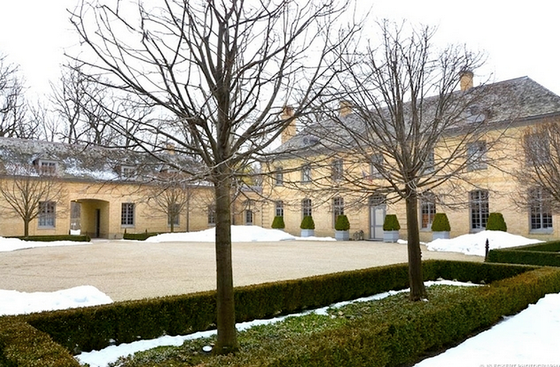
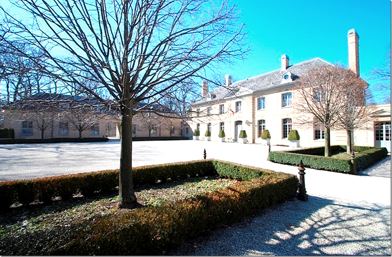
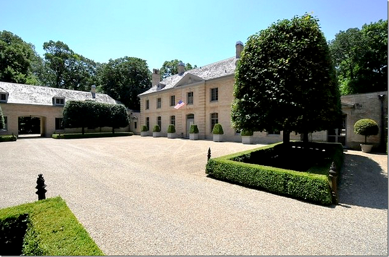
The main entrance court – shown in winter when the trees are bare. Quite a different look than the leafy green of summer! Notice the “dog trot” that Adler placed in the wing to allow traffic through it. The garage is to the left of that arched opening. This is the side of the house that faces Lake Michigan.
Not a great picture – but here you can see how long the wing actually is. The garage is on the left side of the wing – its doors face the opposite direction. The kitchen is located on the other side of the wing. The five staff bedrooms are above this wing. On the other side – the wing that was moved was only half as long as the remaining wing – it stopped almost where the opening is – right in the middle.
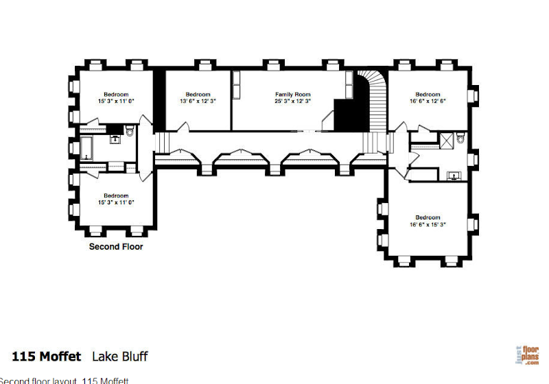
Adler’s floor plans. On the left, past the card room (today called the Library), that entire wing including the North Porch is no longer there. This is the wing that was moved to the main lawn across from the house. The current owners, who have lived in the house for 15 years and did a total renovation of it, created an outdoor room to replace the missing wing.
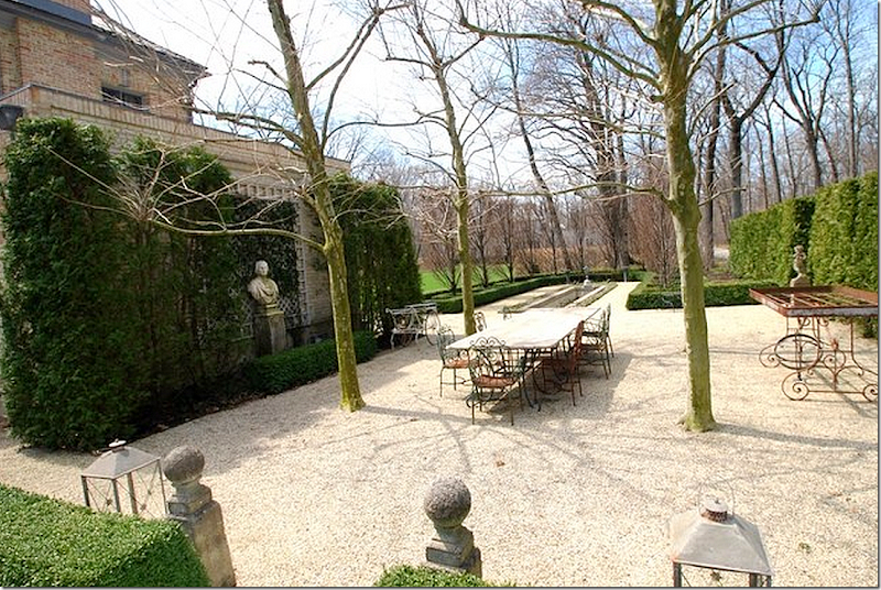
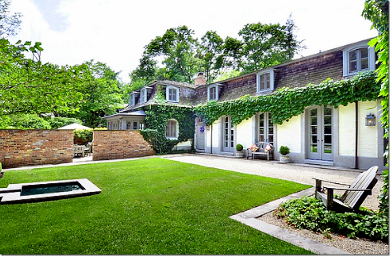
The current owners built this outdoor room on the space where the wing once stood.
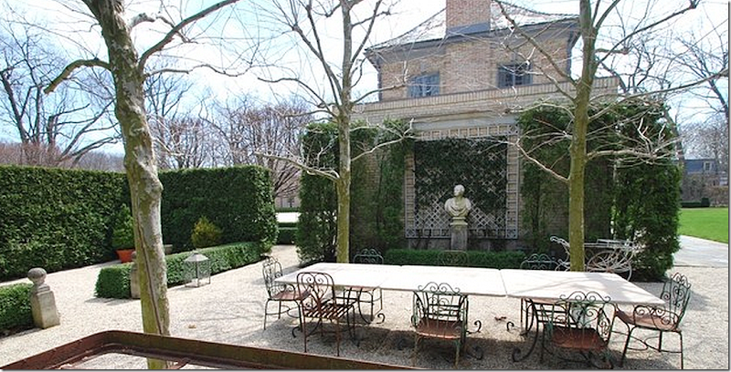
Another view of the outdoor garden room. The area was planted with plane trees (as they would be in France,) high hedges, and box – mixed with a gravel floor, again, just like it would be in France! This is the winter view of the outdoor room.
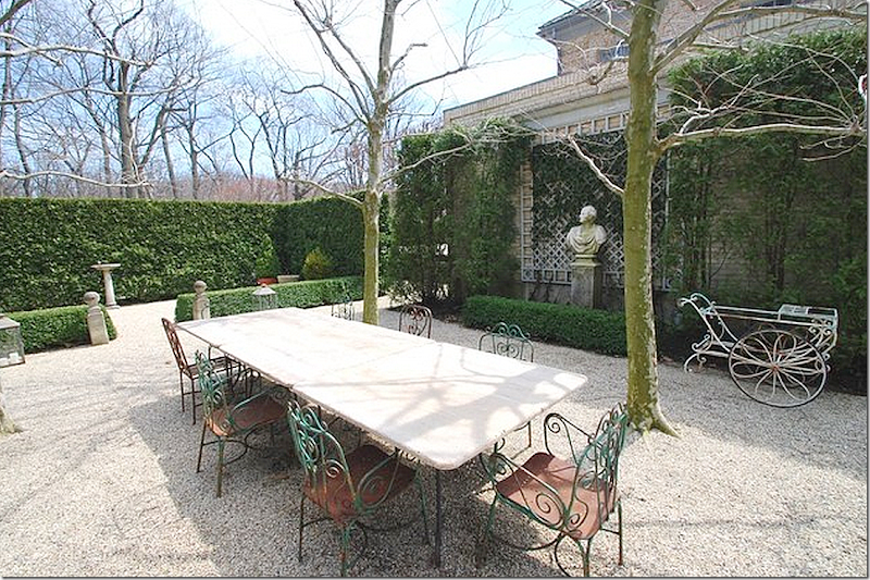
Here is the outdoor room in summer – which makes such a difference.
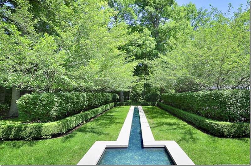
Past the outdoor room is a long, water fountain, that sits alongside the garden. During the summer months – this area becomes a dense forest.
And here it is – the water feature in summer.
Let’s take a look at the site plan that Adler drew for the estate:
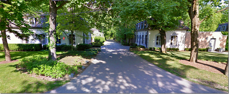
You reach the property by entering a street that is flanked by the two matching gatehouses. The road forks. To the left, you drive through an allee of trees, past the lawn, to the front of the house – which faces Lake Michigan. There, you can drive through the dog-trot in the wing to the back where the garages are, and then, later, take the opposite road back to the front of the property – passing the orangery along the way.
Here’s an aerial Googlemap view taken in the dead of winter – you can see how bare it all is. Here you can also see how the large estate was reduced over the years. Gatehouse #1 and #2 are privately owned (and#1 is now also for sale!) The orangery is also now a private house and includes a pool house. And across the lawn from the main house is the removed wing which has been greatly added on to over the years. This is also privately owned.
And a Bingmap view taken during the summer where you can see how different the forest is when green! Here is the main house and at the end of the lawn, you can the removed wing with its tower intact. At the left you can just barely see the orangery and its pool through the trees.
And looking the other direction facing Lake Michigan. Here you can really see the house and the remaining wing and the motor court. At the end of the mowed lawn is the moved wing, which now faces the main house. To the right is the orangery and the pool/pool house.
Moving A Wing?????
A rare view of the removed wing. Notice the center section with the Greek Pediment is what was once the North Porch. The tower behind it was over the wing. The house has been added onto with wings on the left and right of the center Greek Pediment room. The couple who bought the house in the late 20s from Carolyn Morse Ely lived there until the 50s. They were the ones who sold the wing to a friend who moved it across the lawn. Lucky friend. But, moving wings wasn’t all that uncommon in this area – it helped keep the enormous heating bills down.
Here is how the moved wing looks when looking at it from the main house – at the end of the lawn. I suppose it doesn’t look bad at all - but it must have been so much nicer without the wing there.
On the left of the lawn – between the moved wing and the main house is this gate which leads to the orangery – now a privately owned house.
The Orangery:
Here is the orangery – as designed by Adler. The garden is so pretty the way it is landscaped. Total, that is all gone – a parking lot takes its place.
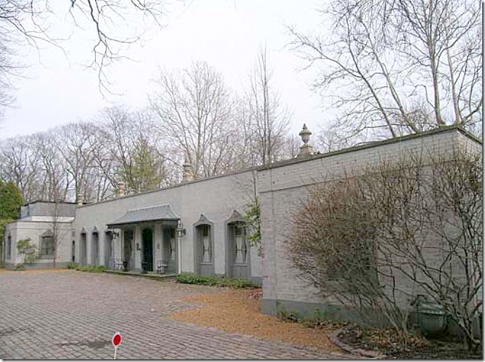
The orangery today – turned into a house. An owner added the metal awning and painted it gray. And the pretty landscaped garden is now gone.
Across from the orangery is this pool and pool house – so cute! Not sure if the pool was built by the owners of the main house or by the owners of the orangery.
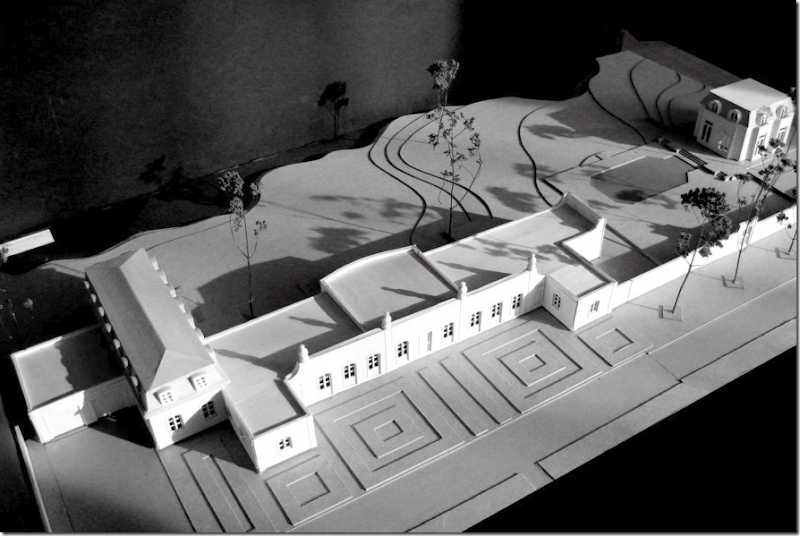
There are plans to turn the orangery into a large, million dollar house – here is the model. There will be 5 bedrooms when it is totally restored. You can see the standing pool house at the very right. And see – the gardens will be totally restored to as they once were.
The Gatehouses:
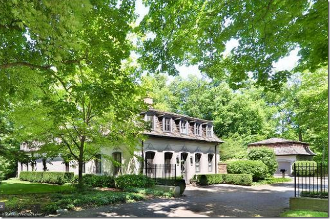
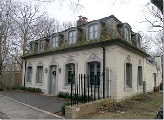
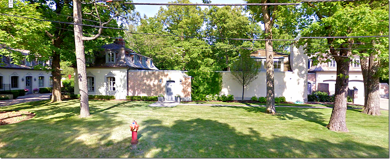
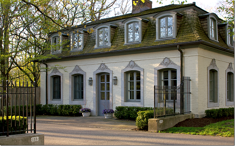
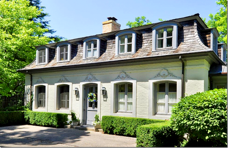
One of the two gatehouses that stand at the entrance to the property – designated by the iron fence. The second gatehouse is right across the street. These houses were once mirror images, but now that they are privately owned, they have been added on to and are very different. This house shown above is now for sale, as is the main house.
The second gate house. This house has been totally renovated by the same company that is now renovating the orangery. I’ll show the photos further below.
I like how all these buildings are painted a matching gray. The moved wing, the gate houses, and the orangery all look similar – with a decidedly French flair – but the main house is yellow brick. If I bought the main house – I would paint it a similar gray.
The Main House:
To understand the rooms – to the very left is the card room – or library as it is called today, then the living room, then a small hallway, and next there is the entry hall. Past the entry hall is the powder room, the dining room, the pantry, and then the south porch – or the family room. Above are, from the left, the master bedroom and sitting room, with the guest room on the right of the stairway. The remaining 3 bedrooms are above the wing on the right side of the house. There are another two bedrooms which are not being used as such. There are seven bathrooms. The house is 7200 sq. ft. and the asking price is $5,995,000. HERE.
In this picture you can see the right wing with the Greek façade and see how much the moved wing still resembles this section of the house.
In this rare photo – you can see the wonderful South Porch or family room – with the windows on all three sides. Past this room is the kitchen, the huge pantry, and you can see the dog trot. Past that – you can see the garage doors. There is also a large BBQ grill set up here, outside the kitchen. Seeing this room and how beautiful it is – it just kills me that they removed the North Porch and the left wing!! That has to be the craziest decision every made!! The new owners should rebuild the wing. I would – if only I had the funds!!!
The other side of the house which faces the lake is actually where the front door is. I love all the gravel. So French. Ready to go inside????
The Entry Hall:
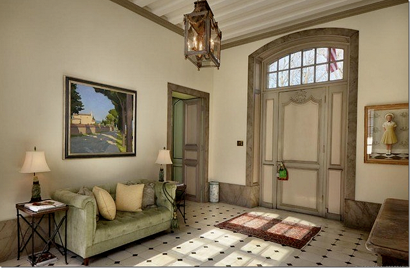
The entrance hall has two front doors – one on each side of the house. The marble floors are original. Notice the very wide baseboards.
In this picture – you can see the beamed ceiling – and get a feel for how large the room truly is!
Now – just a word about the house. It was bought by these owners 15 years ago. And, it was decorated at that time in a French/English style with antiques from both countries. The décor is very nice – but like most designs, after 10 years, it is starting to look a bit dated. Actually, with just a new coat of paint and some new fabrics on chairs and sofas – and the house could look totally up to date for today. So – when looking at the room – imagine what you might do if you were to buy this house and decorate it yourself.
I would paint it all – instead of having the molding painted a much darker shade – I would paint it all one color, or two colors that almost match.
My Vision:
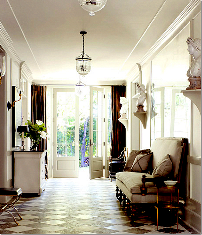
Here – in this Windsor Smith designed entry hall – is how I would love to decorate the Ely house. I love the portieres at the door and all the busts on the walls.
The Hall:
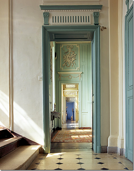
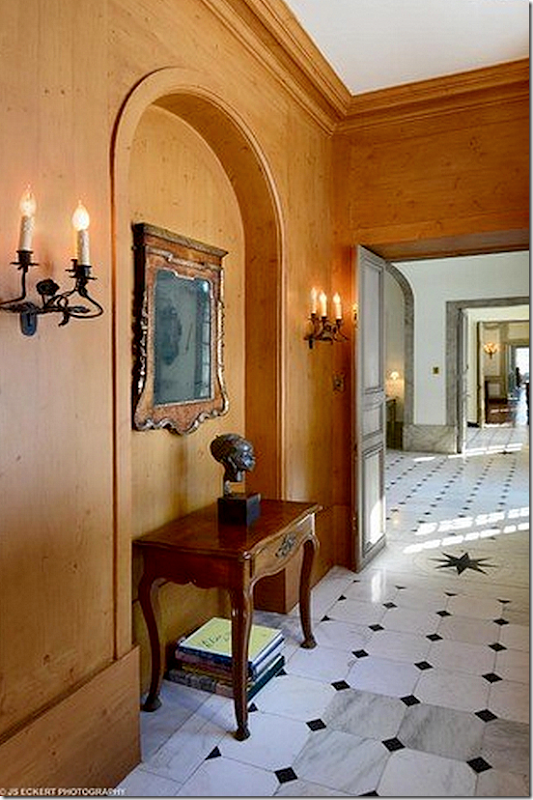
Behind the staircase is this small hall. It really isn’t wood – but the owners had it faux painted. I would remove this – and just let it be painted with real paint. The stars in the marble are an Adler trademark. You can really see the enfilade of the rooms in this photograph.
The Ladies Powder Room:
The ladies powder room – very fancy with original mirror and moldings. The men’s room is very plain, hidden under the staircase.
The Living Room:
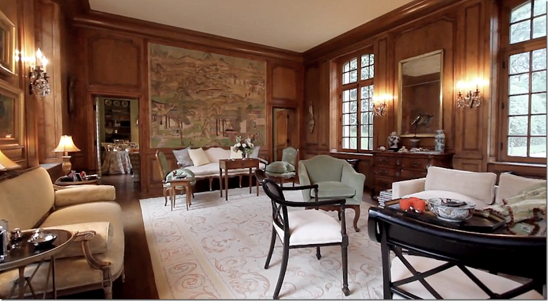
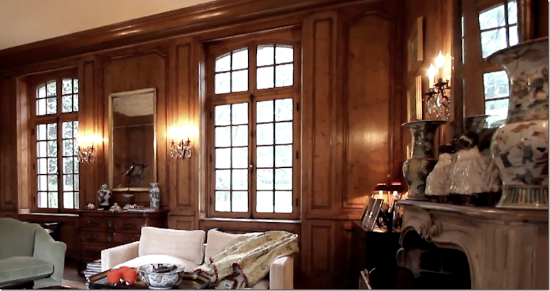
The living room with the original boiserie that Adler found in Europe. The current owners waxed it four times to restore it. The handpainted wallpaper is also original but totally restored.
A larger view of the living room. Through the two doors is the card room or library as it is known today. Adler bought these crystal sconces in Europe.
The mantel is original – also bought by Adler in Europe.
My Vision: Now if I bought this house – I would probably decorate it like this:
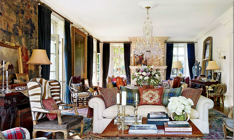
This is Ralph Lauren’s country house and I love the way he decorated it! The Ely living room would look so fabulous like this – with the wood painted cream and dark velvet curtains and layered rugs. Love this!!!!! Would you keep the paneling stained dark? I think I wouldn’t.
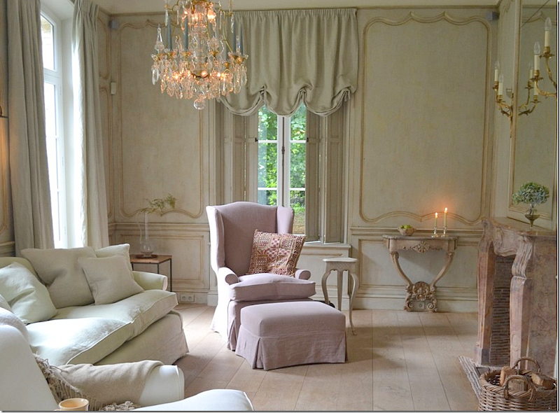
Or, would I paint the molding to look like this and furnish the room more sparsely, as in Belgium? Gorgeous room and woodwork by Lefevre HERE.
Or, would the living room look best with an assortment of French antiques? So hard to decide!
The Card Room/Library:
I love the card room/library – and how it is decorated. The wing used to be reached from this room – there was the large living area and the North Porch. Now, the outdoor garden room is located just beyond this room.
And the view towards the living room – with the limestone mantel. Notice how beautiful the doors are!
I love this house so much. Imagine you live here – you would walk through the kitchen – through the dining room, entry, and living room just to get to the library. That’s the beauty of a enfilade – you use the entire house. Here you can see the rooms lined up on the right side.
My Vision:
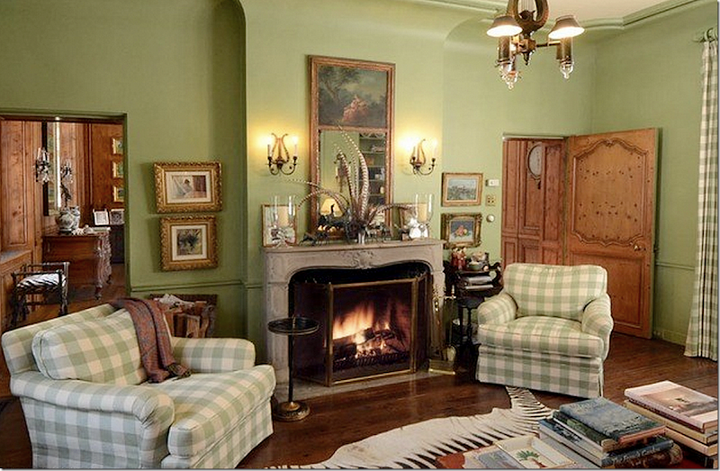
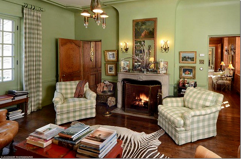
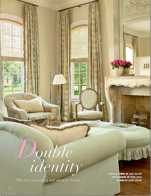
This room by Jane Moore would bring the library just a bit more up to date with fresh fabrics and lighter colors.
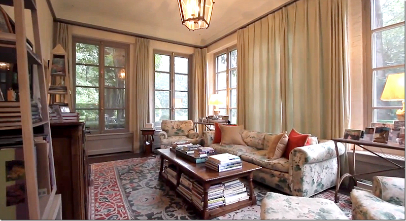
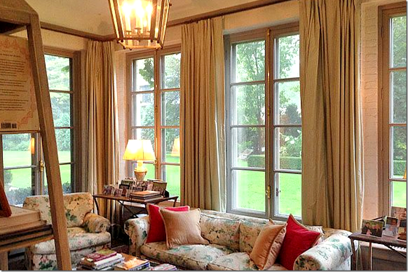
Or would the library look better like this – with a mix of antiques and chintz?
The Dining Room:
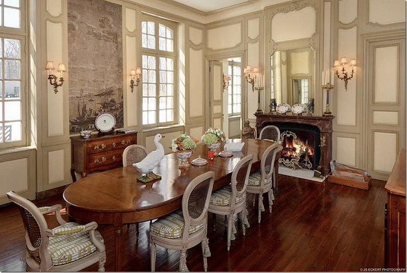
Here’s an early view of how the owners furnished the dining room – taken right after they moved in.
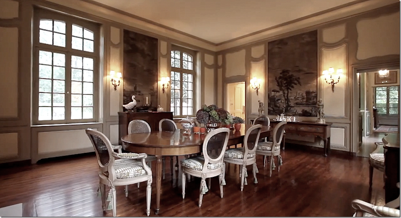
And today, the room is furnished like this – with French caned chairs. Notice the grisaille wallpaper that was restored. Now, I don’t care for the way they painted the molding here – and feel like it should be painted one shade to avoid this busy look. I do miss wonderful taffeta curtains in the room – and knowing me, I would have a skirted table for a softer effect. But what a space!!! Windows on both sides of the room – create the lanterne effect and a fireplace!!! Wow. Just love this house. The floor plan is fabulous.
Looking at the other direction – showing another wall section with the grisaille paper. Through the door on the right you can see to the South Porch or family room. On the left is the butlers pantry.
My Vision:
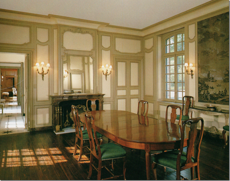
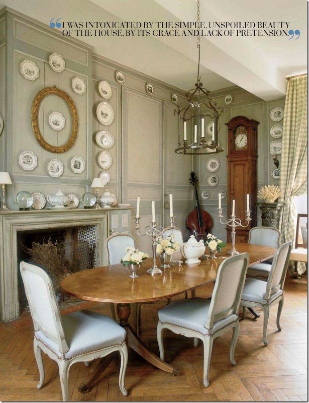
Beautiful dining room found in France - I love this room!
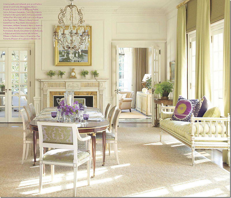
Or, the dining room would be lovely decorated like this.
The Butlers Pantry and Kitchen:
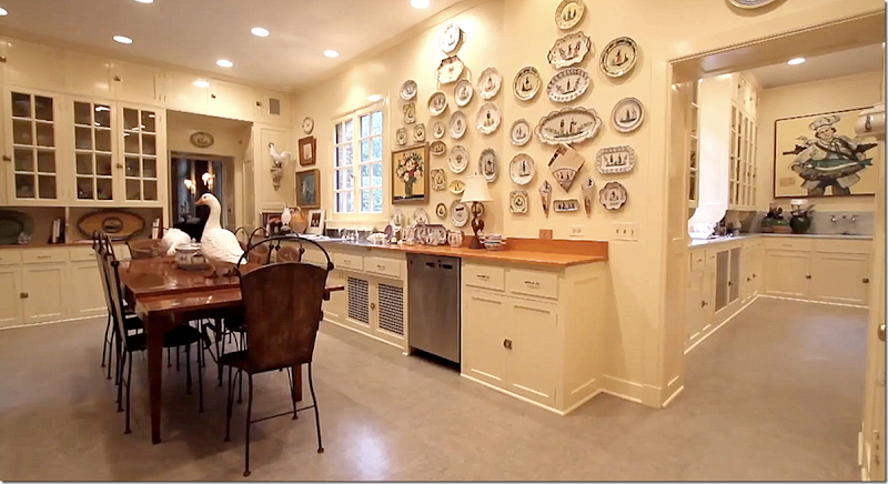
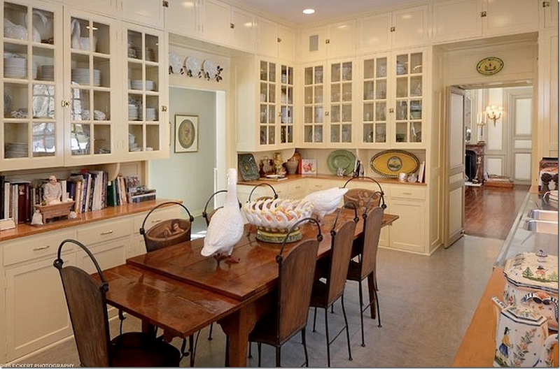
Here is the butler’s pantry – and through the door is the kitchen. Well, this is beyond huge. It was designed for the servants – Mrs. Ely never stepped foot in this space. Behind the kitchen is another large dining room – for all the servants to use. The new owners updated these rooms somewhat – but kept the cabinetry it looks like. Maybe not – it’s hard to tell. Still, this room needs updating – painting, new countertops, lanterns, etc. I would find a fabulous antique store counter to use as an island instead of a dining table. Also, the flooring needs updating. This room is actually called the Serving Pantry on the floor plans.
And looking toward the dining room – the butler’s pantry. What a great space to get organized in!!! Unreal.
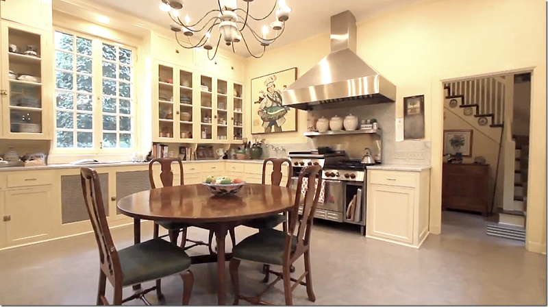
And the kitchen – very similar in design to the butler’s pantry. Through the door are the stairs that lead to the bedrooms above the wing. Behind here is another large space that was once the servant’s dining room. Not sure what it is used as today. On the original floorplans – behind the painting there was once another door that lead to a room called the Servant’s Pantry. I suppose their dinnerware was kept there?
Look at the fabulous marble sink. That has to be original!!
My Vision:
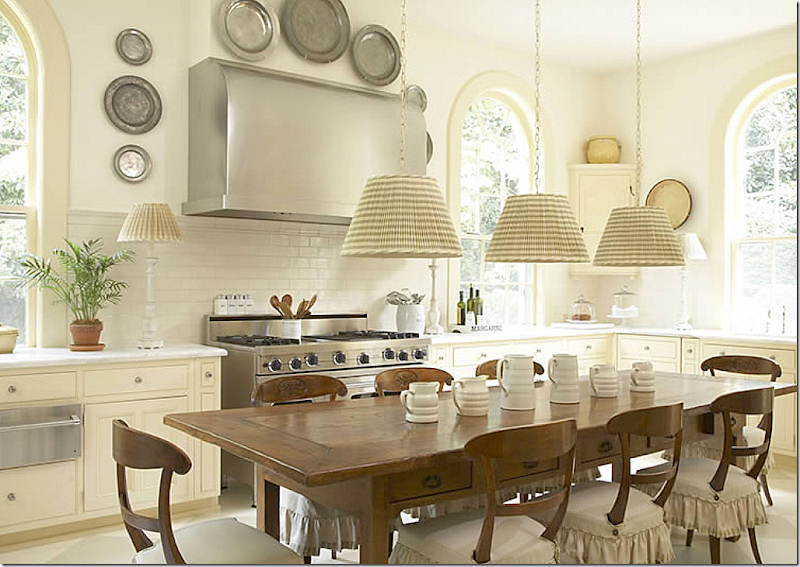
Suzanne Rheinstein updated her same vintage kitchen with a painted floor and a wonderful island.
I love this kitchen – updating it like this would keep the vintage feel, yet seem more today.
Another vintage kitchen, updated for today – love this!
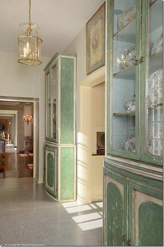
Here – leading from the enfilade to the butlers pantry on the right and onto the South Porch/family room, are two painted cabinets.
The South Porch/Family Room:
The South Porch – was once used by the servants. Original windows and beautiful hardware. Think about how you would decorate this room for today?
In this picture of the family room – you can see the walls are brick.
My Vision:
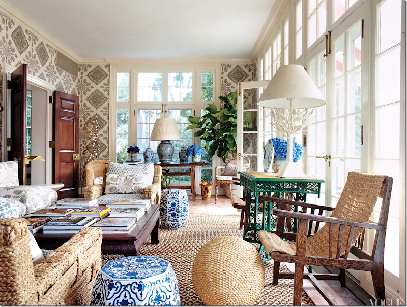
You could use a quiet palette mixed with stripes and prints.
Or you could go with color and pattern – fabulous!!!
Upstairs: Master Bedroom Suite
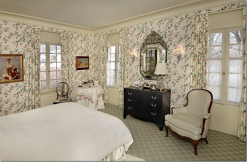
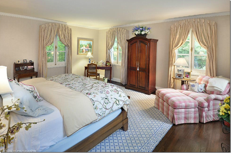
The master bedroom – with windows on three sides – is done in chintz. I love the alcove the bed fits in. The bathroom is on the left, while you can see the hallway on the right that leads to the other rooms.
Another view of the room. Beautiful molding and windows.
My Vision:
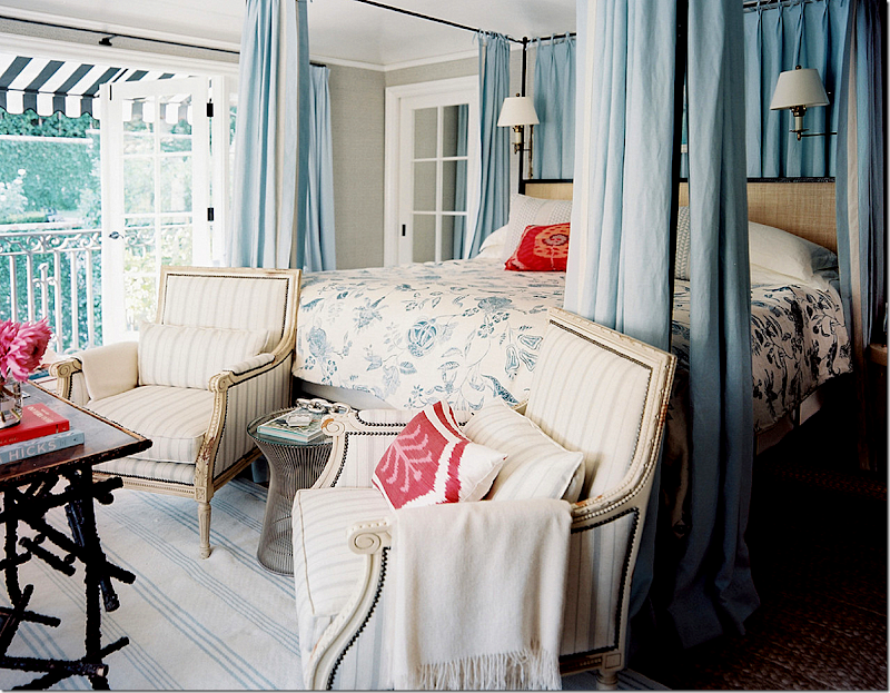
I love Mark Sikes master bedroom – and can see how wonderful this would work in the Ely house.
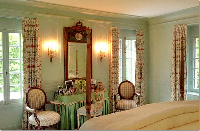
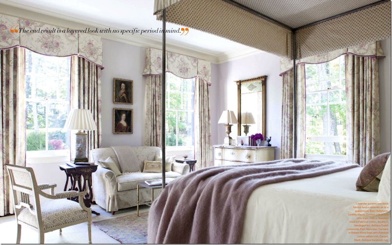
Or this lovely, classic room in lilac.
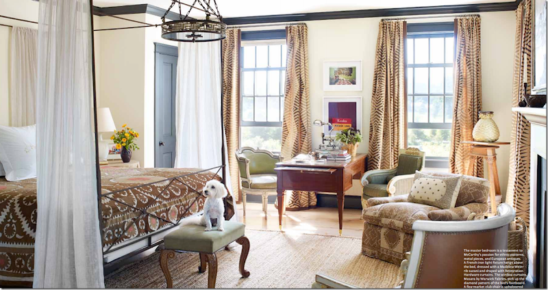
Or for a younger couple – a more fun mix of fabrics.
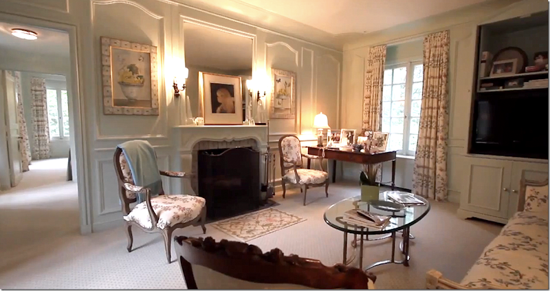
Past the closets and bath is the sitting room – with its own fireplace. I would probably never leave this room in the winter! Notice the mantel and two paintings that flank it.
Notice the tile on the fireplace – and notice the frames are made out of similar tile.
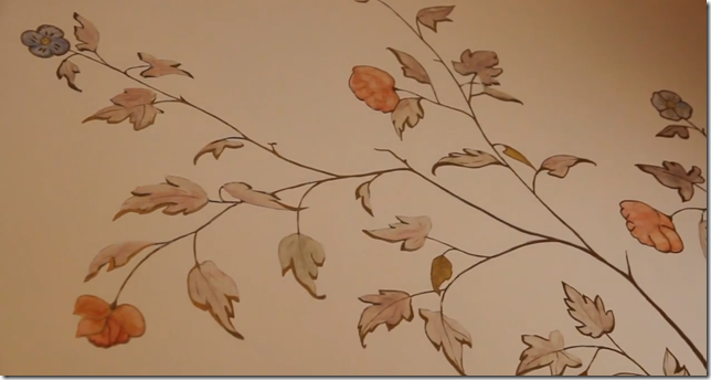
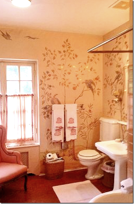
In the master bathroom – the owner discovered handpainted wallpaper hiding under vinyl paper!! She restored the paper, above.
And here is a view of the handpainted wallpaper – hard to believe they covered this up!!!!
The Guest Room:
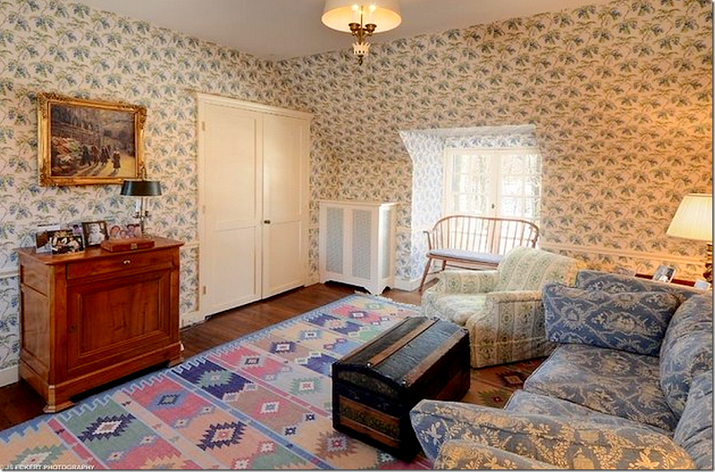
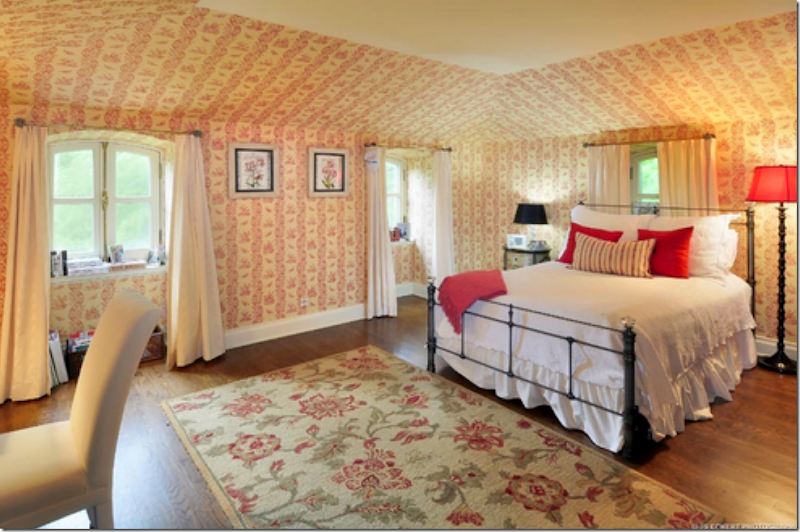
At the other end of the upstairs – is the guest suite, totally wallpapered. These rooms must be quite large – after all, this room is above the dining room.
My Vision:
Instead of a chintz wallpaper – use a handpainted paper with a leopard rug to really bring the house into today.
The Five Rooms Above the Wing:
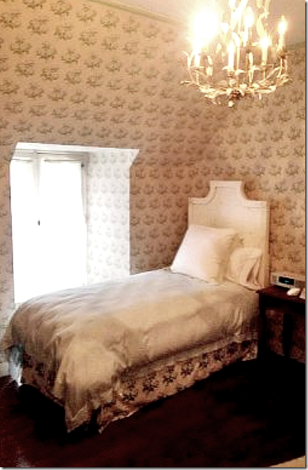
Once a bedroom, this is now a sitting room for guests. All these room have charming dormer windows – on both sides - just like the main house because the wing is one room deep, too.
One bedroom.
This looks like it might be decorated in Bowood wallpaper.
And the third bedroom.
My Vision:
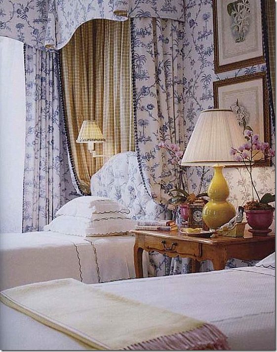
It would be so much fun to decorate all these bedrooms. Here is a room with one fabric pattern used. Beautiful antique table and lamp! You could go classic like this.
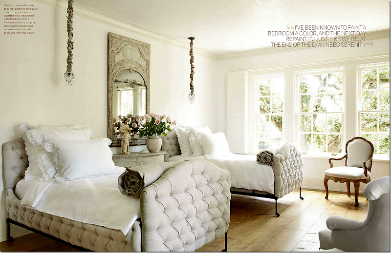
Or use antiques in a more modern way, like Pam Pierce did here. Love this.
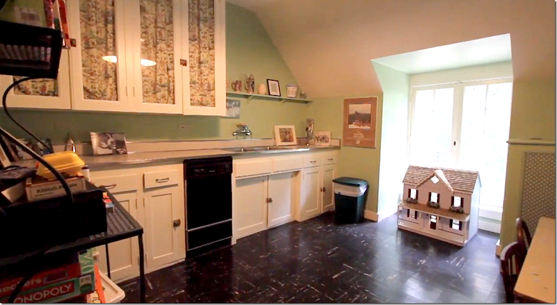
The fifth bedroom is now a kitchen/playroom.
Wow. I just love this house. I would love to decorate it!!! I can’t imagine how much fun the current owner must have had designing the rooms – it’s beautiful and like I said, it really just needs a little updating for today – but not much.
$5,995,000 is the asking price for six acres and the house. Any takers? Here is the real estate portfolio.
There is a fabulous video on the Carolyn Morse Ely La Lanterne house if you want to watch it – HERE. It shows the current owners- I think you will love it!
The Gatehouses:
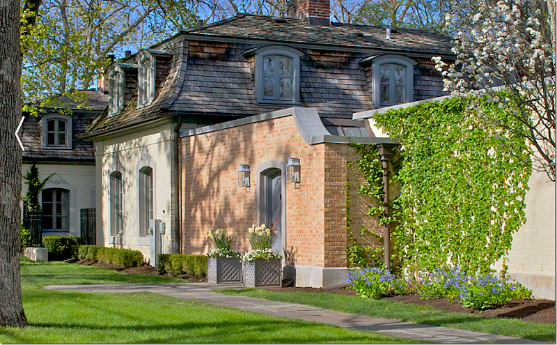
Both gatehouses have been updated – one is currently for sale. Built in 1916, the elusive and mysterious heiress Mrs. Carolyn Morse Ely lived in one of the gatehouses during the years the manor house was being built. Today they are both privately owned. Both gatehouses are much larger today than they were when built and while their exteriors are similar, their interiors are totally different.
Aerial winter view of the two gatehouses. You can see their footprints are mow totally different.
The street that leads to the main estate, the orangery house, and the moved wing house – along with several other houses that were built on the former 17 acre estate.
Gatehouse #1
From the side – you can see how much larger this gatehouse is now. The original house stopped at the brick wall. Now the house extends all the way to the garage – by a series of pavilions that are connected. Hard to imagine Mrs. Ely living in such a tiny space compared to how big her house was when eventually built. She probably lived with one servant in this house – and the other servants lived in the second gatehouse.
The front façade of this gatehouse (both actually) hasn’t changed over the years. Notice how this house blends with the orangery, and the moved wing house. All are painted in shades of gray. But – the manor is still yellow. The new owners should paint the yellow brick gray so that all the buildings blend together!
The street side view. You can see how close the other gatehouse is – just across a narrow lane! Neither gatehouse has a front lawn. The same company that is renovating the orangery renovated this guest house too.
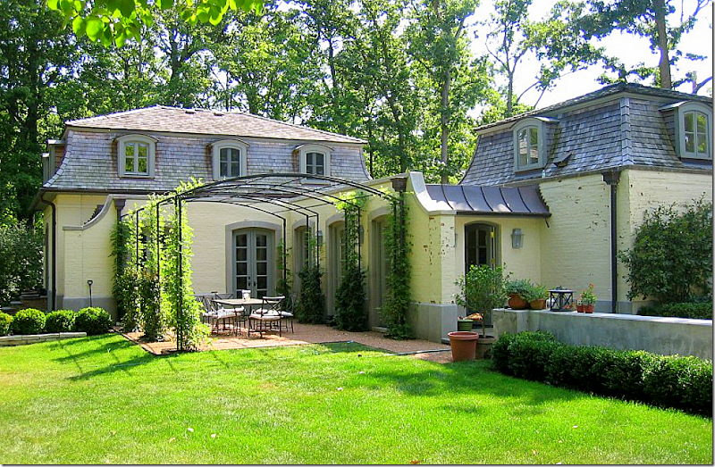
The back part is the garage – which connects to the middle section by this enclosed walkway, with a side terrace under an iron pergola. So charming! Originally there was just one bedroom and a tiny second bedroom (which was probably where Ely’s maid slept.) The new owners tripled the size – adding on 3500 sq. ft. to the gatehouse. A master bedroom suite was placed over the garage. There was no garage before!
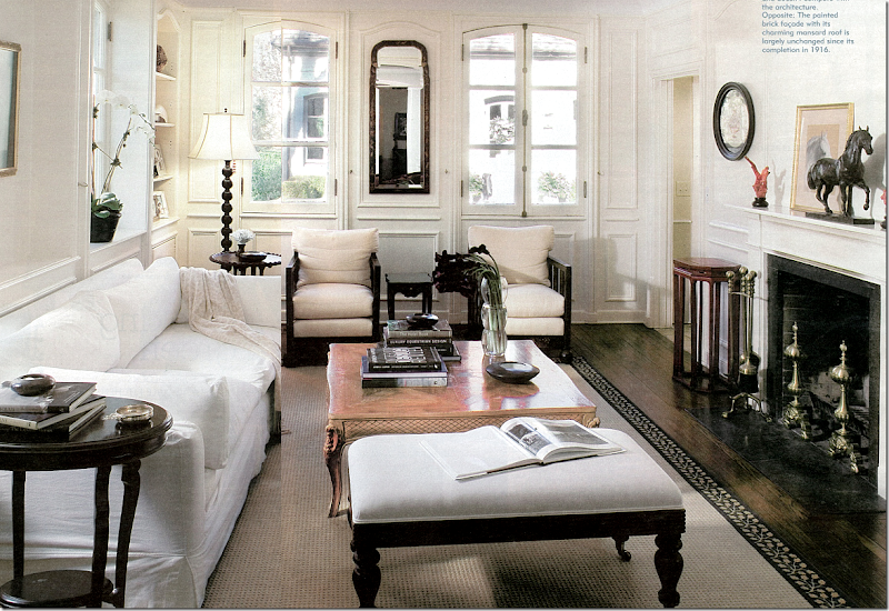
The main living room is located in the original building. Great pains were taken to use correct design elements in the new section – such as the same windows were used, along with the same hardware. These windows and hardware look very similar to those used in the manor house. The front door is located through the open area next to the fireplace. Notice the second gatehouse through the windows! The inside is painted throughout in Benjamin Moore’s Linen White – the molding is painted in oil base, while the plaster walls are flat paint.
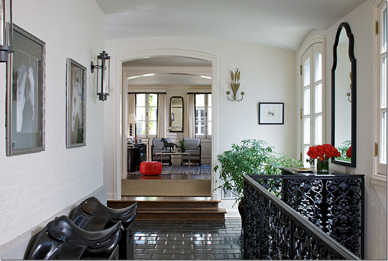
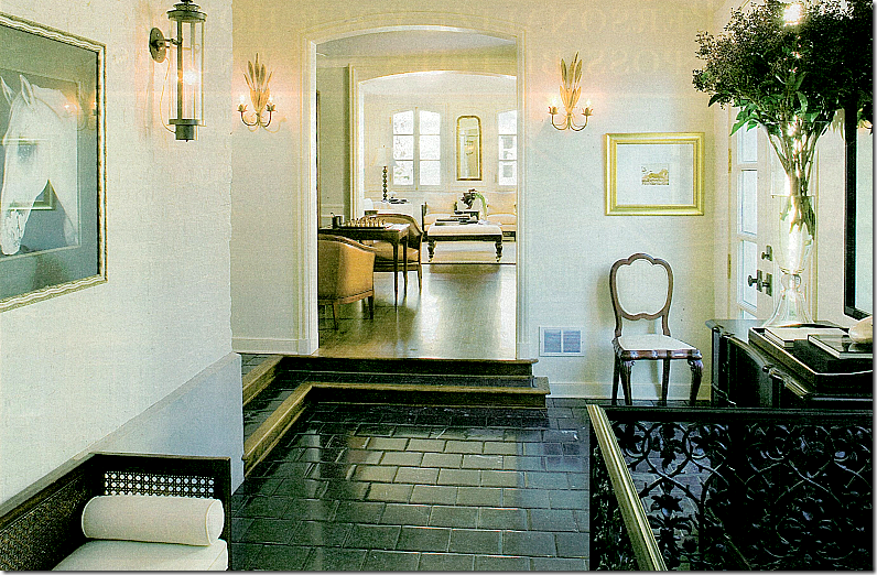
This enclosed walkway leads to the second pavilion. Stairs to the basement level are behind the iron gate. Original brick walls remain. The floor is black stone to replicate the once-garden walkway. The owner rides horses – which is why she has displayed her saddles.
In a similar picture – you can see there is a room between the walkway and the living room – in the original house.
The dining room and kitchen.
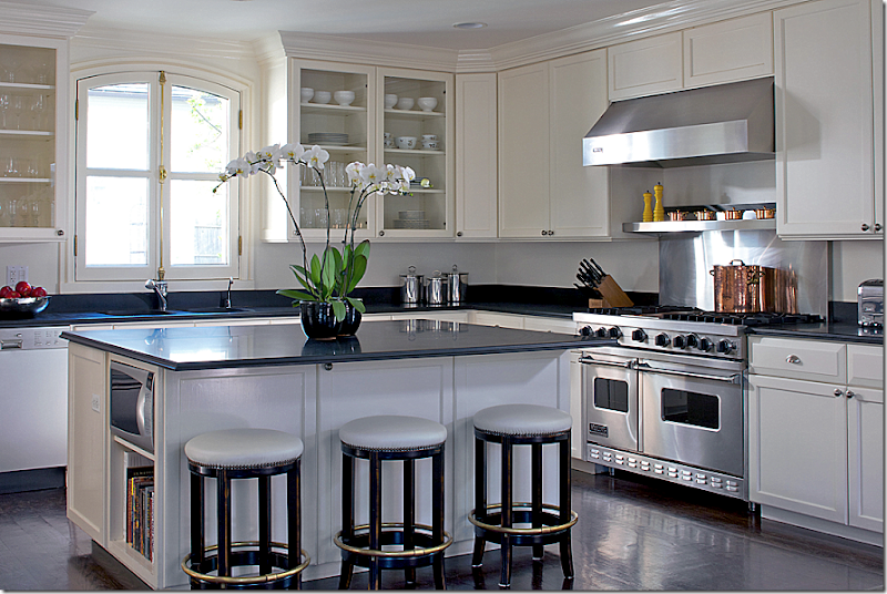
Beautiful kitchen – love the windows and dark hardwood floors!
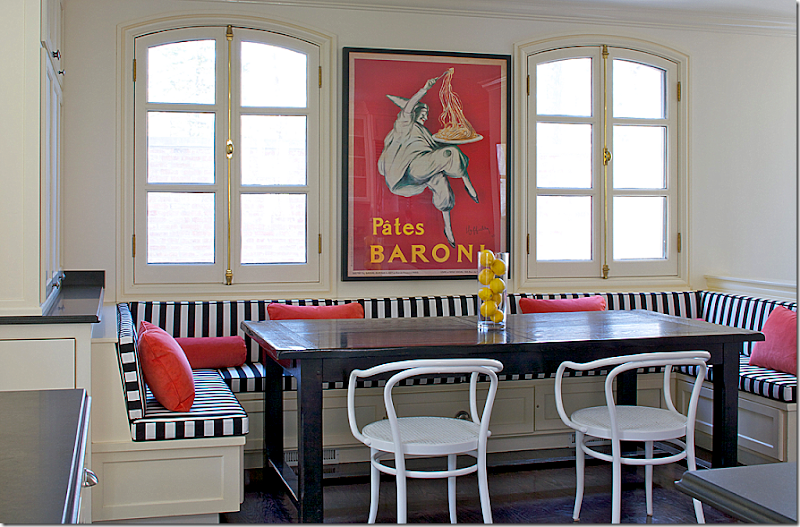
The breakfast room with a wrap around banquette.
Gatehouse #2
This gatehouse is currently for sale for $2,295,000. It has 5 bedrooms and 3 1/2 bathrooms and is almost 5,000 sq. ft. This house, like the other gatehouse, was greatly extended – but these architects took a much different approach to the addition. I think I prefer this house to gatehouse #1. Like the manor house, these house needs a little decorating updating – new paint colors and fabrics – but the furniture is very pretty! Not much needs to be done to this house at all!
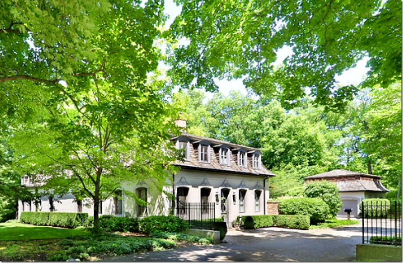
The exterior of gatehouse #2 remains exactly as it was when built. The garage is off to the right, and it too resembles the French style of the gatehouses.
The two gatehouses are painted the same to keep continuity.
The original gatehouse now holds the kitchen and the study. The living room and master bedroom are part of the new addition.
Upstairs, the two front bedrooms are located it the original house, while the family room and back bedrooms are new.
Facing the new living room is a water rill which resembles the water feature in the Manor house.
The old house holds the kitchen, which is behind the brick wall in a secluded garden. Like the previous gatehouse, the windows were built to be the same as the old ones.
The arrangement of the house takes in the wonderful, green wooded view. The lot size is 1 acre. All the major rooms overlook this area of the yard.
The new living room/dining room overlooks the backyard and water rill. They have placed the dining room in the middle of the room. Not sure I would do that. In fact, this set up reminds of blogger/designer Penelope Bianchi’s fabulous living room. I would try to emulate her aesthetic in this room if I decorated this house:
Penelope Bianchi’s living room:
Center table and dining table on one side. Love her house so much!
The red study is in the original part of the gatehouse.
And so is the kitchen. They added on the breakfast room, though.
The master bedroom.
A charming upstairs bedroom.
Which gatehouse did you prefer? The more modern one, or this one that is for sale? I think I like this one best.
And finally – care to own and totally renovate your own David Adler mansion? Adler’s Ralph Poole estate is now for sale. Built in 1913, the French styled house once was located on a much larger plot of land, but today – it measures 8.26 acres and the house is over 9,000 sq. ft. The house has a slate roof, 13 ft ceilings, terrazzo floors, boiserie and stucco walls and a gorgeous stone staircase. The problem? It needs a massive renovation!!! The house is just under $2 million HERE.
Adler modeled the symmetrically designed house after a mansion in France and a hotel. The similarities in the design elements between this house and the Carolyn Morse Ely house are striking.
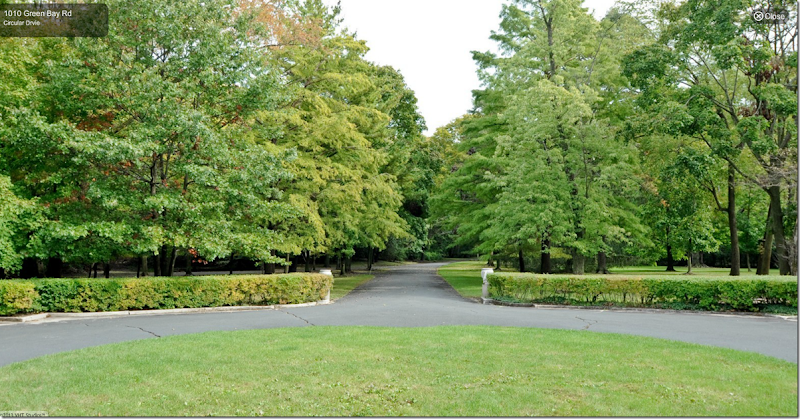
To enter the estate – there is a hidden road. The road leads only to this house and no neighbor’s houses.
Aerial view - in summer the house is totally surrounded by forest land. The 3 car garage with quarters is to the right. The swimming pool and house is off to the left, not seen. The landscaping has to be put in – there is no landscaping at all.
The house is symmetrically designed with two round shaped rooms on each side – the dining room and the porch which is now enclosed. The rooms are on an enfilade – but note, the house is NOT a Lanterne like the Ely house because the house is not one room wide and the windows aren’t set up so you can see from the front side through to the backyard.
The view from the front door of the lawn and the private driveway.
The house has a French styled mansard roof with slate tiles. The windows and hardware are all original. This is really a beauty. With s lot of TLC and paint – this house would be stunning.
The view of the back yard. Again, it is totally symmetrically designed. At each end are the round shaped rooms.
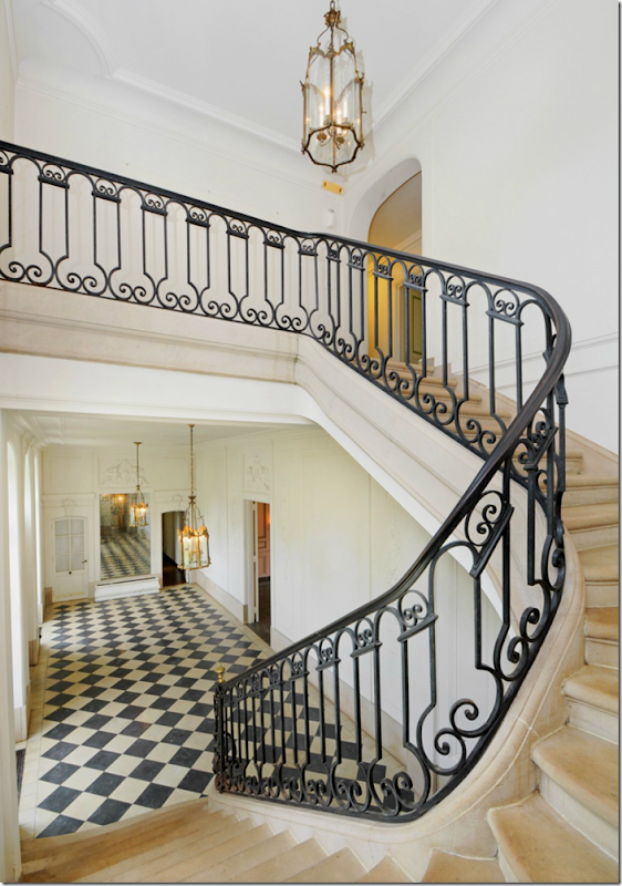
The double front door opens to a beautiful gallery – with a stone staircase, original iron railings and windows. Amazing!
The view from upstairs. Through the center door is the living room.
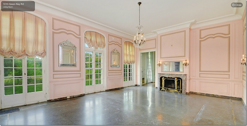
The living room is now painted pink – but imagine this repainted. The crystal chandeliers and sconces might be original. The floor is terrazzo. The ceilings downstairs are 13’ high. How would you decorate this house? Cluttered or sparse? French only – or a mix of different countries? Antiques or more contemporary furniture?
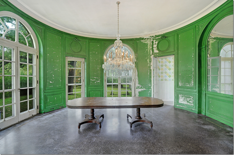
The dining room – this could be so beautiful. The crystal chandelier is not original, but still it is beautiful.
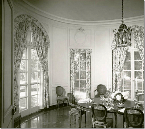
Here’s an early view. I would bring all the curtains up to the same height. But this shows how pretty this house could be with the right owner and designer.
The rooms were designed for men and women. There is a music room for women and a gun room for men! Totally different than how the Carolyn Morse Ely house was designed – just for women.
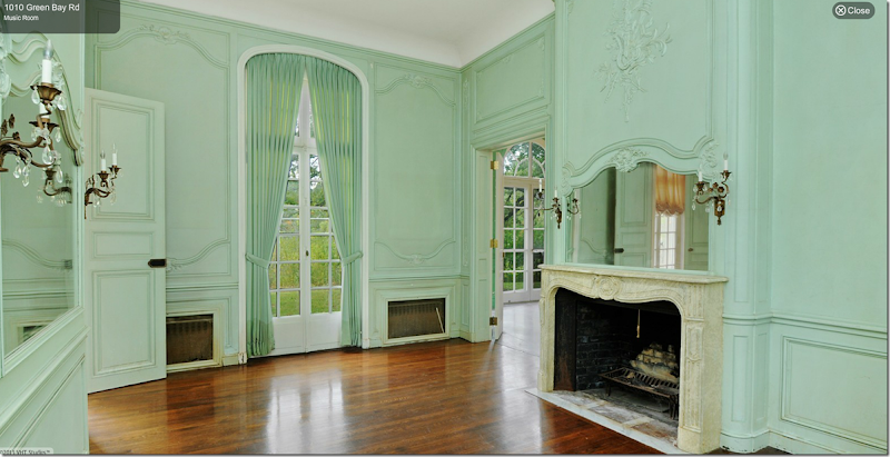
Boy - they REALLY tried to ruin this house! The music room – again, this beautiful room is just crying out for a good decorator.
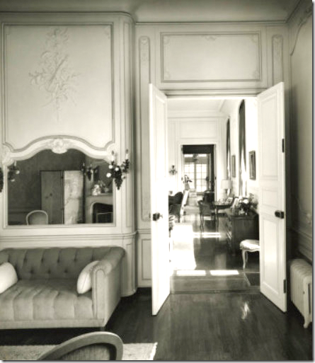
The enfilade from the music room to the living room through the library to the enclosed porch.
The oval porch. The guest room on the first floor could be turned into the master bedroom, while the gun room could be the bathroom and closet. AND, this room could be the master bedroom sitting room. Upstairs would be the children’s rooms.
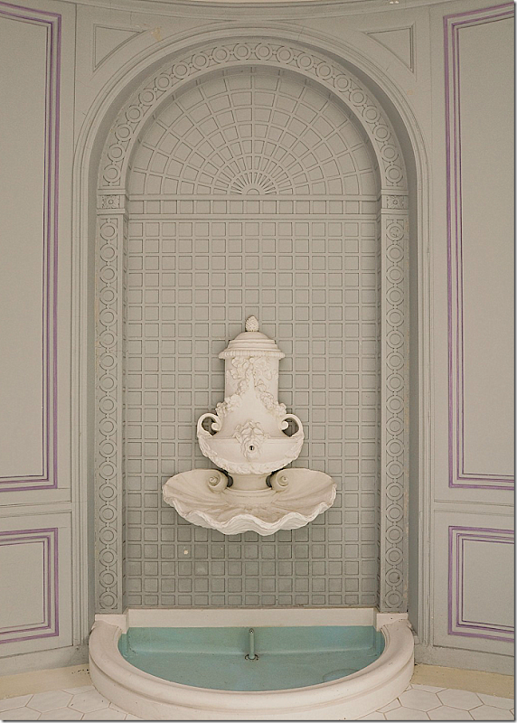
A fountain in the living porch.
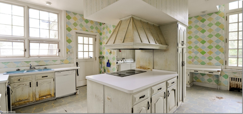
The kitchen with its servants dining room – is a total redo.
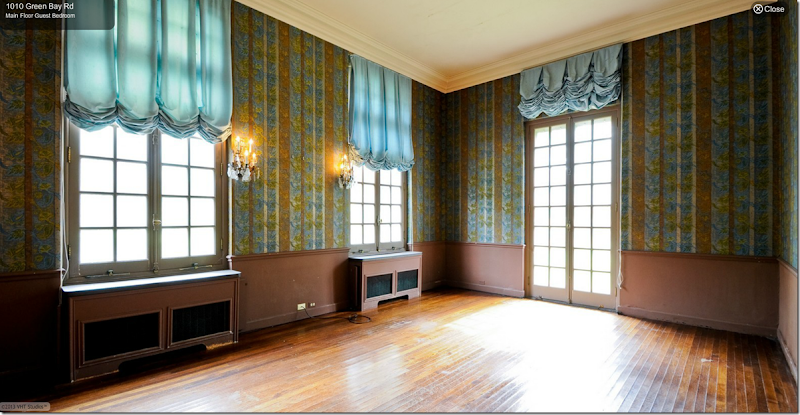
The guest room that could become the master bedroom.
My Vision for This House:
I would probably decorate this house with a European feel – like this house in Belgium.
Or maybe a more American feel – like this room designed by Windsor Smith. I would definitely use cool colors in the house.
Or this quiet look – with glorious antiques – by Pamela Pierce.
The dining room could be ethereal looking like this room.
This would be a good look for the dining room – cool grays, French antiques.
How would you decorate this house? Does this make you want an old house as opposed to a new house? Or would it be just too much work to restore a house like this? At 2 million it looks like a bargain compared to the Ely house – but the renovations would probably be at least another million? Which house do you like better, this one or the Lanterne house – or do you prefer the smaller gatehouses?
SO many questions!!!














![[image_thumb167%255B2%255D.png]](http://lh3.ggpht.com/-DlErQ9NujJA/UZFo9xkm_mI/AAAAAAAB0wY/1aGEHfFzTmY/s1600/image_thumb167%25255B2%25255D.png)













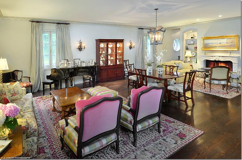
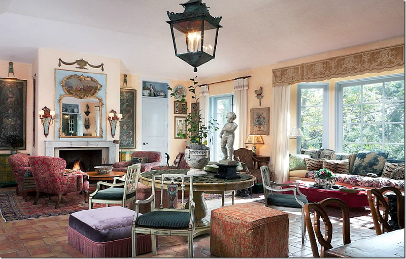
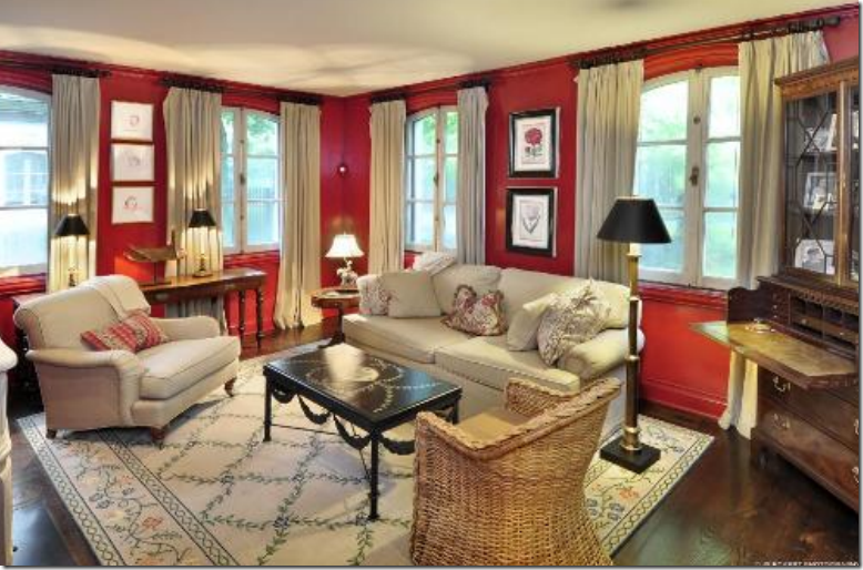
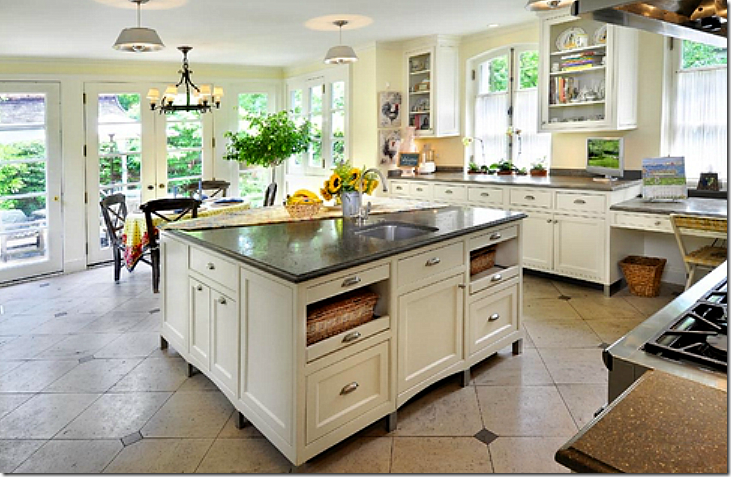




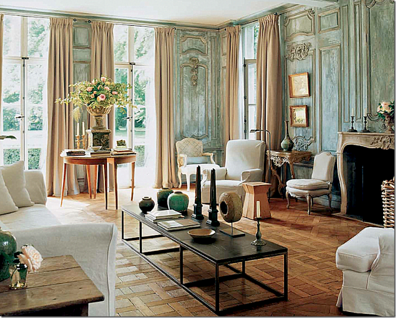
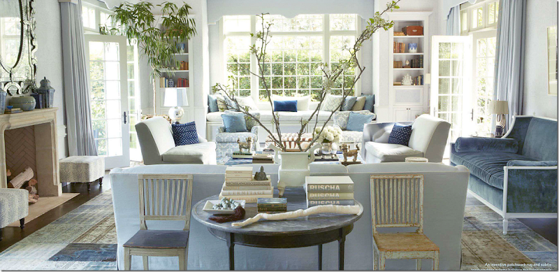
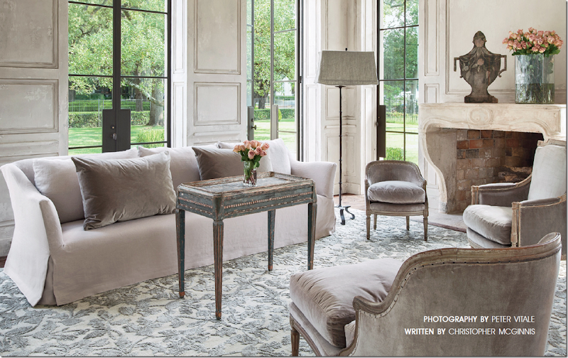
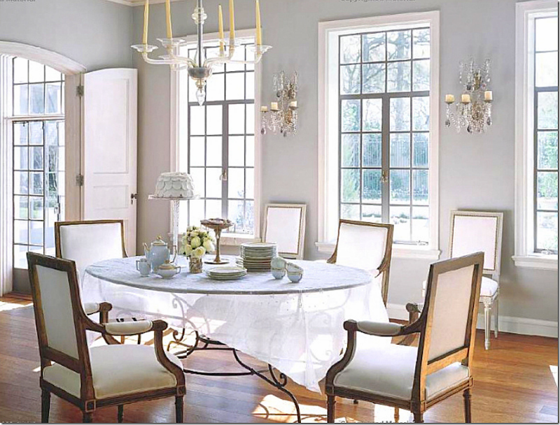

Joni, this is one of the most beautiful houses I have ever seen! So very very elegant ! A dream house!
ReplyDeleteWhen I saw the first pictures of the façade, it reminded me of my client's house where we brought in the paneling as seen on the picture of Lefèvre Interiors, you showed here today. Well, the house is also a French Lanterne house and it looks very similar to this Adler house but it is not so big.
Thank you so much Joni for featuring my company's work here! I so appreciate it! I wished we could come to the US to panel all the rooms !
xx
Greet
You have such wonderful posts but invariably the pictures are too large to even see in an email and when I go to your site, only about half of them post.
ReplyDeleteFor me the email is just a prompt to go the the website and enjoy the pictures that adjust to the exact width of my screen. No problems downloading. Surely a faster computer and internet conection would help you.
DeleteNEVER EVER read the blog through the email!!! It's not intended to be read that way! It really doesn't fit - when you receive the email, just double click on the title and it will take you to the web site!!! Please please =- don't read the blog on the email!!!
DeleteI always view your posts from your website, always have to hit reload multiple times (this time no less than 5) for it all to load, and have to minimize (ctrl -) the pictures because they are too big for my screen. This one was particularly difficult to load. Also, I can't have anything else open. I've wondered if it was just me or if others have problems, too? It's not a criticism, Joni- it's worth the effort!
Deletemaybe your modem is old? I didn't have any of those problems loading this. If your modem is old - call your server and ask for a new one - should be free. not sure what else to say?????
DeleteSo many cool things to look at and read! I could be on here all day.
ReplyDeleteI'm curious as to whether the last house has been flooded at some point- there appears to be moisture/water damage around the base of almost all the rooms extending up a foot or two... Gorgeous post, though - I love that first gatehouse!
ReplyDeletekind of looked like that to me too. can't imagine it flooded though? from where? the lake? it's too far i think.
DeleteJoni, seriously? Did you consider faulty plumbing, maybe it's built on a slab and heavy rains plus poor landscape drainage. It could be any number of things even water weeping in around the doors and windows. Abandoned homes can deteriorate very quickly.
DeleteJoni,
ReplyDeleteThis was a well done post. Several years ago you posted a photo of this home when you were blogging about Lanterne style architecture. My comment on that post was that I had helped the current owner decorate the home. She had a very clear vision (and wonderful innate taste), and wanted to keep the home as Adler and his famous sister Frances Elkins had planned. The Living Room and Dining Room are still quite spectacular and totally in the vernacular of the home., proving that good design IS forever. I am not certain that you would be allowed to paint the outside of the home today, as you would have to receive permission to do so - changing anything designed by Adler is a bit "touchy" in this part of the world! While this home is well priced for the market, I would love to get my hands not the last home you mentioned. You could purchase it for well under $2,000,000. It is very run down and needs a lot of work, but it would be fun to restore it. Anyone want to join me?
You did a wonderful job. The living room and dining room are timeless and beautiful. Only the perpetually dissatisfied would think otherwise.
DeleteThank you! If I ruled the world I would require all future owners of homes designed by David Adler to study the history of the home and to honor the genius of Adler's design. Hopefully, that would keep them from making such mistakes as painting the incredible fruitwood paneling in the Living Room of the home described in this blog. I think to be an owner of an historic home - such as the Ely home - one must think as a preservationist as well as a property owner.Many of David Adler's homes were decorated by his sister Frances Elkins., and her interiors are timeless and stunning. There are two excellent books written by Stephen Salny that showcase the work of this pair.
DeleteYou did an exquisite job!! It truly would be criminal to paint that boiserie. And I adore the marbleized skirt boards and molding in the entry. The restored hand painted or hand printed wallpaper is beautiful. The owner had or has exquisite taste.
DeleteI also think that because the house was too big; the way they preserved instead of destroyed the one wing and the gate houses and poorhouse; is not a mistake, but a brilliant
way to divide it. The view from the main house to the former wing is exquisite.
The house was too big to heat and maintain. Beautifully done, in my opinion!
I love the gravel courtyard garden with the treillage .....I really do love all of it....I hope the tennis court is screened from the house. I think it is; I couldn't see it anywhere but in the aerial view.
Those books by Stephen Salny should be required reading for anyone buying an Adler house.
I find the interiors of the Ely house completely timeless. No need for "updating" None.
Much as Mario's rooms. Most of them he did since 1963 I could move in with my toothbrush. This is entirely different. Mario has to make up many of the architectural interest; these houses already have them! Incredible proportions, beautiful irreplaceable antique boiserie, fireplaces, and light fixture. Holy cow!!!
OOPS!! That is "poolhouse", not "poorhouse"!! HA!!!
DeleteCarolyn, thanks for the clarification. I had assumed the living room was burl, but fruitwood makes sense. Those who don't approve of it would be bowled over by its value. I agree with you, as a historical property one must be very measured in maintaining it according to the standards implied by the original intent. If you read the blog, Reggie Darling, the author has done exactly that in a beautiful Federal house in the Hudson Valley of NY. It was recently featured in AD and it's classic design and interiors are a testament to restraint.
DeleteOOOPs again! The tennis court is in Versailles!! No wonder I couldn't see it!
DeleteThank you Penelope. I have seen your lovely home - so well done! And your gardens are unbelievably beautiful. The owners of this home have the same sensibilities and well educated taste as do you. I loved that someone opined that they loved that the owners had not done a trophy kitchen in the house. One of my favorite Adler Estates is Crabtree Farm - also in Lake Bluff - which still has it's original 1929 kitchen. The stove/oven is incredible and would work beautifully for any chef today! And the architecture, cabinets etc. of the kitchen are still fabulous and timeless. Obviously, I am passionately addicted to Adler architecture!
DeleteI am too!! You seriously did a magnificent job! And Frances Elkins was one of my very favorite decorators. Again; her interiors are timeless. My daughter just bought a Monterey Colonial house in Montecito very reminiscent of her house in Monterey. The Montecito house was built in 1934. Again, photographs of her house are proof of the timelessness of her decoration!! And the interiors for her brother's clients were absolutely timeless; and a huge addition to his beautiful architecture!!
DeleteI have to agree. Even the kitchens are perfect and I wouldn't change a thing. So much character and beauty.
Deleteso enjoying your conversations! P: I love FRances too - her designs are so classic. Carolyn, I love what you did! I hope I stressed that enough in the story how beautiful the rooms are still - 15 years later. Dying to see who buys the house that needs renovatoin. Will be so interesting.
Delete'No landscaping at all' at the David Adler mansion? Centuries of experience produced what you are looking at. Low meadow, maintained woodland then wildwood. Layers of green, canopy-shrubs-groundcovers, unskilled labor for upkeep, maximum pollinator habitat & sustainable.
ReplyDeleteDiscovered this type of garden design in Europe during my first study tour over 2 decades ago.
Entry from the public is a planned dense wildwood with a tiny lane meandering thru woodland to a clearing to the main focal point, the house.
This is Vanishing Threshold, house/garden in balance with ego + humility, or what I call the 'poverty cycle'.
Garden & Be Well, XO Tara
.
Love the post Jonie, thanks for the time you put in....and knowledge
Tara is exactly right about this landscaping! This is the best landscaping I can imagine! The driveway through the woods; the simplicity of the landscape with the focal point being the beautiful house! (Poole house)
DeleteI would change the driveway or at least the courtyard part to gravel, and perhaps a simple, low fountain in the middle of the center lawn. Divine!! and the lattice on the walls on the back! Swoon!
The Ralph Poole estate would need an entire gutting, new plumbing, wiring, HVAC, French drains, grading, etc. Joni, if you purchase it (cough, cough), plan on $5 million in renovations alone. Perhaps there would be a smidge left over for those curtains you want to change; however, go back and look again at the picture. If you bring the curtain that surrounds the door up to match the arched ones, you would be obstructing the lovely medallion over the door. Things are not always as easily done as said.
ReplyDeleteI agree here! No covering up the medallion in the boiserie! I don't love the style of the curtains on any of the windows....and that little dumb valence on the lower window isn't right!
DeleteBut I adore the tole and porcelain flower lantern in the original dining room picture! So much better and understated than that gross huge crystal thing in those revolting green walls!
DeleteEEEEK!!!!
Que gran trabajo y dedicación, felicidades!, eres mi nueva favorita.
ReplyDeleteJesús Moguel (méxico)
Another amazing, extensive post, Joni. Isn't it fun to dream, "If this were mine, I'd . . ."? However, it doesn't take long to imagine the dollar signs to bring you down to reality. I do wonder about the means of the people who can buy, renovate/remodel, furnish, decorate, landscape, and maintain these kind of places. You've been on a bit of a high-flying kick lately (with royals, grand estates, et al.). While the architectural history aspect of it is informative and I appreciate that, I'm beginning to feel these posts aren't grounded in any reality I can embrace. I gave up illusions of grandeur a long time ago (though not sure if I ever really had them).
ReplyDeleteWhy do you assume that the post must be "grounded in reality that you can embrace". Everyone's reality is different and yes there are people in this world who own these homes and have the means to decorate them. Would avoiding these posts for some ditzy do it yourself look that permeates design blogs make you feel better or is it better to be inspired by something more unattainable in it's totality, but attainable in parts? As to the "high flying kick", almost without exception the readers here thoroughly enjoyed the royal estates and asked for the series to be continued. It seems you just need to see one more kitchen redo in suburbia or another living room filled with white linen and seagrass - ugh!
Deleteit could ahve been said nicer - but i do agree. There is so much to learn from things we can't obtain. For instance - take that molding above the window. The medallion. All these houses with problem windows - perhaps you could take that idea and replicate it in your own house. Wouldn't cost much - but it would add so much. Think about too short French doors - how adding a medallion might be an answer. Or painting baseboards. Things like that. There are always ideas to glean from those who have excesses - (only good taste excesses though!) And I do try to show both spectrums. with my Dear Miss Cote de Texas.
DeleteAfter watching this huge collection carefully I came to believe there is still a hope of learning the art of home decoration with proper understanding of color management from room wall to glass table tops with care.
ReplyDeleteP.S. I would never paint that gorgeous original boiserie in the living room in the Ely main house. There are plenty of other rooms to paint however you wish.
ReplyDeleteTo each their own. I see what Greet does with the same wood, just a different stain and i love it. I don't think there is anything wrong with doing a lighter stain treatment like Greet's.
DeleteGreet has the advantage of building her rooms with raw wood and it appears to be generally oak. She uses the lightest of stains and/or glazes to achieve that look. Once stained a darker color, wood must be bleached and you never know what you will need up with. I would love to hear Greet's opinion on this.
DeleteI would love to hear what she has to say about this. Greet????????????????
DeleteJoni: once again a fabulous post-- the photos are all great and I learned a lot-- I really like the look of this type house on the outside -- so french-- so versailles-- and I loved going to Versailles.
ReplyDeleteI like the way you describe the house as "enfilade" --- where all the rooms continue one into another from front to back. In the 1940's and 1950's no one called it enfilade --- it was called a
"shot gun house"--- but then I guess it really depends on which side of the "tracks" you live on as to what is it called today. After looking at the decor of all the houses shown it would take a lot of effort and vision to bring the inside up to par with the feel of the outside. The main house was probably never decorated properly from the beginning to equal the exterior design that David Adler created. So sad--- it is just another example how " money does not discriminate " anyone can have money--- but do they have taste ????
"Anyone can have money - - -but do they have taste???"
DeleteWell, you tell me, anon. While we do not have the privilege of seeing how this home was "originally" decorated nor how it was decorated by subsequent owners before the current one", I can assure you, the current owners have "taste". I would agree that the one thing that dates the decor is the abundance of wallpaper, but that aside the furnishings are lovely. It is obvious that they haven't bought into the "trophy kitchen" craze yet perhaps preferring to spend their money on travel, art, antiques, etc. While it is not indicated what kind of wood is in the living room, the room exudes old money just like Adler intended. To paint it would be criminal. I suspect that it is an exotic wood which today would cost thousands of dollars to replace. New owners may want to designate this as the library and choose another room as their living room. It looks like this house would give one a lot of flexibility in doing just that.
I agree here. The beautiful marbleized skirtboards in the entry hall; and the restored hand-painted wallpaper and gorgeous woodwork should never be touched!! "updating" must be done with utmost care; I agree the taste level of the owners of the Ely house is extremely high. To paint the woodwork that was "faux bois" would be criminal , too! Frankly, I think the wood used in that room is unavailable. You can't get it; David Adler bought brought back antique boiserie.
DeleteI would change very little in the Ely house.
the other house is a different story. Where were the "color police?" But much of the "bones" and boiserie is intact! Just all the wrong colors! I hope they were colorblind!
A "shotgun" house is different from a "Lanterne with enfilades" A lanterne house is sideways one room deep with doors lined up (my daughter's Monterey Colonial is not "lantern"; but does have enfilades and is sideways one room deep. "Shotgun" houses are one room deep lengthwise; so you could shoot a shotgun from the front door and it would go out the back! Not good for light at all! But shotgun houses in New Orleans can be totally charming. Challenging to decorate!
DeleteTo Anon at 11:47
DeleteI did not mean to be unkind when I shared my comment regarding the decor of the house. I will give you two examples of things that are not tastefully done. One---- everything in the entrance hall should "go" with the exception of the floor. The sofa does nothing for the room and it is poorly upholstered and the two tables look like they came from Marshall's or T.J.Max ---they are cheap looking and do nothing for the area. Also the painting hanging above the sofa is dwarfed by the high ceilings and large wall space. It is not in proportion with the door entrance area. There needs to be a large frence trumeau mirror hanging on that wall with a really nice table or credenza under the mirror in place of the sofa --- or at least a beautiful french settee upholstered in silk velvet or mohair velvet placed under the mirror. And what happened to the rug--- did it shrink --too small. If you look closely ---everything in that entrance area is all at the same height--- it is all at eye level or lower--- so when you walk in to the entrance all you see is things that look stunted and small and less grand --- even the lamps are way too small for the room. The way it is now resemble what you would see in a 3 star hotel lobby. That is why I don't stay in a 3 star hotel. Number 2---- the other room that is sorely in need of help is the south porch/family room--- the sofa and chairs are way past their prime and the fabric choice was poor when they were new. This whole room looks like a room that you would find in a fraternity house at UNC Chapel Hill, N.C. --- somewhat classic but run down. I do not know what part of the country you live in but I live in the south and we are used to fine furnishing like Henkel Harris mahogany --- Statton Mahogany ----Hickory chair etc. At the very least they could have placed a hugh mahogany highboy or some fine english piece of furniture in that entrance hall with some decent artwork. I am sure that the people who own this house are fine people but I was only commenting on how I would decorate this house if it was mine--- and that is what Joni asked on the blog and she certainly gave many examples of how to make it better-- And regarding the wood in the living room--- it is just old pine -- can you see the knots in it?? It was the wood of the day in the 1950's and there is nothing about it that is "old money"--- it's just "old" . The only wood that should be on those walls is walnut or light mahogany or cherry. This house is a beautiful house on the outside and I am sure that when walking around the grounds one would feel a since of quiet calm like when walking the grounds of Versailles --with only the sound of footsteps in the gravel --- but the inside is a thrown together mess that looks like an old hotel with worn fabrics and furniture that would be a total redo ---- I will put it this way------ It has a long way to go before it would be 10 percent as nice as the Biltmore Estate in Asheville, N.C.
Oops!!! Silly me ! I spelled french in the french trumeau mirror comment incorrectly---
DeleteAnon. 2:19, where do I begin? Have you been to your local, southern drug store lately and visited the laxative isle? Honey chile, you really need to, bless your heart.
DeleteHenkel Harris, Hickory Chair, etc. are not considered the ultimate in fine furnishings. What hole are you living in? In addition, you have no clue from looking at the pictures what the quality of the upholstery is, nor the price of the painting in the foyer. Some of the most dramatic pieces of art are small and hung with purpose on a large wall to make the viewer come closer and really study its content. As to the wood in the library, do you really think that Adler would recommend that his client import pine from Europe when it is so readily available in Illinois? While I am not presumptuous enough to suggest that I know the species, I would guess that it is burl. From the sound of it, you are a housewife who took a few design courses at your local community college. You have learned enough to speak the language of design, but your are still in very shallow waters. I suggest that you take your little row boat out a little deeper. Clearly, you are spending a lot of time scouting out fraternity digs, and shopping at T.J. Max and Marshalls. Why don't you visit a few more upscale houses and you may begin to remove the scales from your eyes. And by the way, I am serious about that laxative. As to the Biltmore Estate, if you had an ounce of common sense you would realize that there is no comparison between the two, nor would any sane person attempt to make it.
Meant to type aisle, not isle in case Miss Southern Decorator Queen needs to correct it.
DeleteLord have mercy! "Old pine"???? David Adler did not bring back old knotty pine from Europe!! That is fruitwood. Probably 18th century. Painting it would be a sacrilege; and that boiserie was put in when the house was built! The living room is where that fruitwood boiserie.
DeleteHickory Chair? My mother called furniture from those companies "Grand Rapids"!! (not a compliment!!)
Seriously. Research needed!
And the house was beautifully decorated from the beginning by David Adler's sister ; Frances Elkins. Please. Why would anyone assume it was not well decorated in the beginning!? (Anon 11:17)
And, believe me, it was called an "enfilade" for centuries! Also, in the 1940's and 1950's!
This is the best post ever, Joni!!
Fantastic!!!
By the way Anon.2:19, the French do not use "highboys" nor do they use "linen presses" which you are familiar with based on your regional paradigm . Were this a Virginia plantation restoration, perhaps those furniture pieces would be appropriate. To do this house justice, one must have a sense of context between the exterior and the interior and the scale of the structure. While Joni presented some interesting photos of what one could do to up date the home, few of them hit the mark and most definitely the Ralph Lauren living room was the most egregious one.
DeleteAnon. 2:19, of course you don't stay in 3 star hotels because a Motel 6 doesn't have that high a rating. You are use to an air mattress on the floor of some frat house in Chapel Hill.
DeleteAnon. 7:56, If you will go back and look at the beginning where Joni showed the entrance hall--- she made the statement that when the owners moved in 15 years ago they decorated in both the english/french style. That is why I made the comment that a highboy or some large mahogany piece such as a china cabinet (maybe stocked with flora danica porcelain) would look great in that space. If you think that only "french pieces should be used in the entrance hall then why did they choose furnishings that are not "french" at all??? Anything would look better than that sofa and those tables sitting in that room. If you notice the master bedroom the four poster bed is not french at all--- totally english-- . Right now the decor suffers from the shop worn look with pieces that don't necessarily work well together. I am sure that if Charlotte Moss decided to decorate the entrance hall with a beautiful mahogany breakfront with satinwood or yew wood inlay that looks like it belongs in Dumfries House in Scotland and stock it full of flora danica
Deleteporcelain and antique books, that many of you who read this blog post would think it would look great.
Charlotte Moss would be the last person I would choose to decorate this home. I said that the French did not use highboys nor linen presses - they have almost exclusively been used in English interiors. While I would agree that I personally would not put a Chesterfield sofa in this foyer and that I would attempt to brighten the space with lighter colors, I spoke to your comment that the sofa was poorly upholstered which you have no way of knowing unless you have seen this piece in person. You have no clue as well as to the origins of the side tables nor the condition of the furnishing which you refer to as shop worn. I think a better job could have been done with staging for the photographs and better lighting used to take those photographs because the house is relatively dark. Period antiques in the French style, however, are going to be small, including chairs, tables and settees so if using antiques, scale is still going to be a problem. I would not, however, try to amend that with an English highboy.
Deleteo.k. First let say that I would agree that Charlotte Moss would be the last person I would choose to decorate this house too. I guess I should have given the name of the person that I would choose. I only used her as an example as someone who most women think "she can do no wrong" with her choices and whatever she does women seem to
Deleteooh! and aah! over all her work. No one wants to criticize her at all and I have seen some things she has done that I love and others that looked awful. That is the nature of this business---- what appeals to one woman and her home does nothing for some other woman. Charlotte Moss leans toward the Dorothy Draper look -- loud and lots of color. Have you been to the Greenbrier Hotel in West Virginia?? Dorothy Draper decorated that place back around 1950 and it is still as it was ---- if you go you need to put on your sun glasses before you go in to avoid being blinded. I have stayed there and I love the place and it probably needs to be decorated the way she did it-- but it would not work in most places. Joni did say in her post that the family who owns it now decorated it in the french and English Style. That is why I suggested the mahogany english look. Now-- about the sofa--- My husband and I build furniture (sofas, chairs, headboards, cornices) here in North Carolina. That is why I can tell that that little sofa in the entrance hall is not done well.
The sofa in the porch/family area is old and faded and tired looking with rump sprung cushions and no staging with better lighting for photos will make that look better. Now I am curious to know just how you would decorate that entrance hall ??? I wish there was a way for you and me to work on what we would choose and then compare to see just how different we could make that entrance look---- it would be an interesting way to learn where other people are coming from and how they chose what they did.
I have been to the Greenbriar several times, but not after its most recent renovation. From current pictures, I believe the designer (and it could have been Carlton Varney), used even larger patterns and saturated color than I remember it. Bearing in mind that the Greenbriar is a resort, a designer can push the envelope a bit. One of your complaints seems to be about the scale of the entry hall. Just from looking at the photograph, I am assuming the ceiling height is 12 feet, but I could be wrong it may be even taller. Standard size pieces are going to look small no matter what you put there, but there is no law against negative space. I agree with you that the sofa looks out of place, but more so because of its masculine style, not because it's a sofa. I think you could design it around a "salon" scheme and use a pair of sofas, preferable with a tight seat, or an over stuffed single cushion. They could be in the Belgian style (a la the Axel look) done in a beautiful silk or very fine gauge linen. A beautiful pair of French gilted mirrors could hang above them with sconces on either side with perhaps a small tea table to one side for convenience. Rather than flanking the front door with chairs, I would put a matching pair of tables with taller lamps than currently being used. You could also do the same scheme with a pair of French settees, only they would likely be smaller in scale. One of the issues with this foyer is light. The space is very dark. I would do whatever necessary to lighten up the space not only with lighting, but with a lighter paint color and definitely get rid of the dark paint on the crown molding. I don't know how deep this foyer is, but a beautiful French or English writing table with a lovely chair, lamp and the existing painting would be beautiful opposite one sofa or a beautiful Louis chest with marble top.
DeleteThe owners are obviously selling this house unfurnished so the need to opine on how frumpy you believe their furnishings to be is a moot point. I am sure they are in the process currently of designing a new space and some of the furnishings will be disposed of and some will be recovered.
If you live in North Carolina then I understand your obsession with English style mahogany. The truth is that the companies you name no longer manufacture in your state but out source to China and Viet Nam. The quality and finishes you were accustomed to thirty years ago no longer exist. Now if you have such keen vision that you can critique through the lens of your computer monitor the quality of a sofa or that someone's springs are sagging, then you should share the name of your company on line and perhaps you will generate a lot of out of state business unless of course you find yourself too busy hanging out in Chapel Hill - just joking!
As to Charlotte Moss, dizzy is only the half of it. If you have been to Monticello lately you will see from the paint colors that Charlotte must have presumed that poor Mr. Jefferson was running a resort. You can barely appreciate the fine sense of balance and composition for the bombardment of color. Somehow, I think if Tommy could see this, he would have to go out on the porch and light up a little hemp to calm his nerves.
Deleteanon. 1:10
DeleteWhat part of the country do you live in? I totally agree with your idea of the two sofas and french gilded mirrors and I agree about the darkness and the need for different paint color. That is the way I would approach this space as well. I wish there was a way for me to get your email address so I could email you a photo of a french settee that I just built in silk velvet for a photo shoot for a photographer here in my area. One of the chairs that was used in the shoot-- I painted french grey and gilded in gold leaf and glazed it and I build it in pink mohair velvet for the shoot for two little girls to use. The henkel harris furniture has always been built in Winchester Virginia ( never overseas) and Bill Henkel and his son Mark just sold the company to the Gum family in Winchester. I and my family have toured their factory several times over the years. I just called them last week and they are going to repair a table for my daughter. Also Statton company are in Hagerstown Maryland and they are american made as is Hickory Chair. I pass the Hickory chair plant at least twice a month when I am in Hickory and I have toured the plant and they are running strong at the moment. The reason I mentioned Hickory Chair in my earlier reply was that they built the now deceased Mark Hampton line and now his daughter Alexa has continued that line with Hickory Chair and they also build a line for Suzanne Kasler and others like Thomas O'brien-- to my knowledge all of these companies do not outsource-- I know for a fact that Henkel Harris absolutely is all american made and Hickory Chair as well. Also all of Pottery Barn upholstered furniture is made right hear in Hickory and they label their furniture as "Proud to be American made". Craftique was another company that was all american made in solid mahogany and cherry and they closed last year and I was there in Mebane the day they closed and Craig Shoemaker the owner was very upset and in tears because he said that he never thought he would see the day in this country when the demographics would change to the point where the best companies would be put out of buisness because most people would want the trash furniture. I used to live in San Diego Calif. back in the 1970's for three years--- ugh!! due to my husband's job and I would go into the furniture stores and look for fine furniture and I could not find any real mahogany, Even the decorators would show me the junk like bassett and broyhill--- all the crap that is made of particle board. These decorators were quite ignorant of what real furniture was--- Once I told one of them that that is not fine furniture and she disagreed. I finally told her that back east where I am from we use that furniture for fire wood. Now the reality is even worse--- there is "Rooms to Go" in every city selling trash to people who are more ignorant than ever. So much for higher education in this country -- If you want to hear it from the horses mouth about the terrible conditions of "lack of taste" that is all around us today-- simple go to the Skirted Round Table blog that Joni participates in and find the list of decorators on the left side that they have interviewed--- click on the one they interviewed with the decorator David Easton ---- listen to it and you will get an ear full of what he thinks has brought this country down to the level that we are at with regard to taste and style. Also listen to the skirted round table interview with Mario Buatta and he had a lot to say about how even the young decorators today are "not like they used to be" when he started. If you can figure out how to exchange emails please let me know--- that is-- if you don't. The only way I can think to do it is for you to get on my Etsy store page and send me a message telling me you email address. I will not give you my shop name unless you want to do that. I do agree with everything that you said about how to make that entrance better ----
While you seem to be more in the know about the furniture manufacturing scene, I do know from someone in the design industry who attended the wedding that the daughter of the Henkels was married a couple of years ago in Lexington, NC. Having heard that, I assumed that the family lived there and that their manufacturing base was still in the State. I am not doubting your veracity, but manufacturing furniture in Virginia seems to be a bit odd to me. Many years ago, some of the finest furniture was made in Grand Rapids and was infinitely nicer and more high end than many of the NC firms. I believe Kendal (if I am spelling it correctly) was one of the companies. Maryland is doing a good job of attracting some very high end companies, i.e., David Iatesta and Neirman Weeks to name two. I don't know if they are a union house or not, but their price point is much higher than those companies you have mentioned.
DeleteTo Anon. 8:47 If you get on the Henkel Harris website and click on the "about" them at the top you can read the entire history of the company. I bought my first pieces from Henkel Harris in 1973. It took me 15 months to get it delivered because each piece is handmade ---- to my knowledge there are only 5 companies left today that are what I would call the real backbone of fine furnishings in this country and they are all still american made--- 1. Hickory chair (started 1911) 2. Kittinger Furniture ( started 1866 Buffalo NY) 3. Statton Furniture ( started 1926 Hagerstown Maryland) 4. Kendel Furniture (started 1901 Grand Rapids, Michigan) 5. Henkel Harris (started in 1946 Winchester Va.) I know of the two companies that you mentioned to me and they are in the Annapolis, Maryland area --- I know all about Annapolis as my husband is a Naval Officer ) their goods are american made but they are all over the page when it comes to style and design. But when I buy a piece of furniture I like to know that first, it is solid mahogany, cherry or walnut ( no veneer) -- and that the design and quality has stood the test of time and is made just as is was 100 years ago or more. Back in the 1960's Mr and Mrs Henkel found out that Walnut trees were being cut down to make way for a golf course in California and they made a deal to bring back all of those trees to Virginia and they built some beautiful walnut pieces until that wood ran out. Those are the hardest pieces to find in their line because they were limited and hard to get at the time.
DeleteTo Anon 8:47 (Continuation of my comment above) You mentioned the price point of the Neirman Weeks and David Iatesta companies being higher than the companies I mentioned ---- Yes they charge a hefty price for upholstered goods--like a sofa for $ 10,000.00 ??? I would rather invest my $5,000.00 in a solid mahogany bedroom dresser and another $ 5,000.00 for a dining table because those pieces can be passed down to my kids. But with a upholstered piece -- I don't know of anyone who would want to keep upholstered furniture long enough to justify spending $ 10,000.00 for it. Because of where I live there is an abundance of fine quality fabrics --- belgium linens and mohair velvets--- silk velvets-- beautiful silk damasks piled in warehouses so I have never had to sacrifice quality fabrics to get a great price on a finished sofa or chair. I have come to realize that in the decorative home furnishings business, people who determine the value of something based solely on price point is usually someone who really doesn't know quality. Every time I have watched the millionaire decorators series with Mary McDonald and all the other ones in the group--- I got the idea that they determined the quality and value of items based on what they paid for it. Sometimes I would laugh and laugh at the ridiculous prices they paid for things like when Mary went east to buy her hand painted gracie wallpaper -- Even my husband watched that show and said-- who would pay that stupid price when you can go to Hong Kong and get it custom done --- hand painted silk backed on wallpaper for pennies on the dollar of what it is in this country. We used to live in Hong Kong and I know what back allies have for you to discover there. The decorators today want to "go to market" and walk down the aisle and turn in the order and pay the piper--- and then pass the bill on to their client who probably doesn't have the slightest idea what value they got for any part of the job done because their decorator makes them believe that because it "cost a lot" it must be worth a lot. I have known decorators to sell grasscloth wallpaper to people for way over $100.00 a roll and you can go to the Philippines and buy it for less than $ 5.00 a roll. Well market is coming soon ( next week) so I hope that all those decorators will come to High Point and turn in hugh orders for all sorts of upholstered goods because the more they order the more rolls of fabric are produced and therefore more leftover fabric will be piled up in the warehouses next spring for me to pick from. OOH! I do love to make silk velvet headboards for pennies on the dollar.
DeleteFor clarification purposes, I am not suggesting that a higher price point is indicative of quality. I mentioned those two manufacturing firms in Maryland with the assumption that their price points were driven by union shops and I stated as much in my comment. Both companies, however, make beautiful furnishings with exceptional styling and attention to detail.
DeleteI really have to laugh when you proffer the price of goods for what they sell for at the High Point market and ultimately to the consumer against what one would pay if purchasing in Hong Kong or the Philippines. Unfortunately, you did not factor into your cost the amount of travel expenses to and from those destinations to avail yourself of those basement bargains and the tariffs to bring them into the country. Your assumptions can be made for any consumer good you purchase today from home furnishings, appliances, electronics, all the way to apparel and cosmetics. There are some decorators who are having their own brands produced in Asia and bringing them back to the states at luxury prices. One decorator of renown is having a North Carolina company finish and upholster her chairs which are made either in Asia or India. That company is not one that you have mentioned in your commentary.
I don't know any one who buys fabric from an upholsterer any more for several reasons. The availability of designer fabrics is readily available over the internet and secondly, the fabrics that end up in the hands of upholsterers were most likely the left overs that did not sell well in the manufacturers' line of offerings. A good deal is worthless if it's not what a client wants. For consumers using decorators, the offerings are infinite. It know no boundaries and has absolutely nothing to do with where you live. Most good decorators shop the large design markets in New York, Dallas, Atlanta, etc. They are combing through warehouses looking for a bolt of this and that.
DeleteMeant to say, "they ARE NOT combing through warehouses looking for a bolt of this and that.
DeleteGod. This is why i will NEVER moderate the comment section. Fabulous discussion. I want to say this about fabrics. Yes. cheaper fabrics sometimes fine instead of more expensive ones. Plain linen for instance. Or even taffeta or silk. BUT BUT BUT - I love at the very expensive - MATTE - taffeta on my skirted dining room table and NOTHING compares to it at a lessor price point. NOTHING. It is so gorgeous, so thick, so matte - luscious. And worth EVERY PENNY. Fabrics like Bennison - or Robert Kime = yes overpriced i supposed, but what is better or comparable? nothing. Lee Jofa's linens are gorgeous. But expensive. F Schumacher - Mary McDonald's linens - worth the price. Nothing compares to the thickness of that linen.
Deleteso I just have to totally disagree about expensive fabrics. Yes, some like velvets or cotton or linens - you can "fake" - BUT a gorgeous silk velvet? no. you can't fake that. You just have prioritize. LIke my dining room - I spent the money on the skirt, but saved on the curtains - a cheaper taffeta. And everytime i look at them I wish I had the money to buy the more expensive taffeta for the curtains.
love this comment section! y'all are great!!!
So, you think the Ralph Lauren room would be all wrong? I dont' know why. It's just a different look. I supposed if i owned this house, I would do only French- and add some lighter Swedish pieces too. I probably wouldn't do the Lauren look, but I do think it would look great in that living room.
DeleteWrong only because the RL room has an English country look and I just personally believe that the interior of a home of this stature should have a contextual relationship with the architecture. The RL room is very busy and unsettling. I agree that French/Swedish would be fabulous in the Lake Bluff home.
DeleteAnon 2:24 " OOH! I do love to make silk velvet headboards for pennies on the dollar."
DeleteOOH!!! I imagine you like marking them up four fold as well.
how i adore your photos + i'll take the Lanterne house, please + the guest houses are too small for my family! + go big or go home as they say in Texas + grand post. xxpeggybraswelldesign.com
ReplyDeleteJoni, the pair of chairs in the powder room look like the same chairs from a June 25 2009 post you did on Mignon Topping. I thought you would get a kick out of that. They are stunning.
ReplyDeleteBingo! Catie! You have a "photographic memory"!!
DeleteThat is an essential and invaluable tool if your choice of work is an interior decorator!
The chairs are EXACTLY the same! What an eye you have! I just bet you are young!
My mother, (when I was six and displayed a similar talent); said......"You may want to be a decorator!! 2% of the population has a "color memory" (I have)
and 1% of the population has a "photographic memory" (which you and I both have) ; and those who can "visualize" are even more rare.....(as in seeing what a room will look like with furniture,fabrics, curtains.....etc.. seeing it in your head!)! You probably have all of these......they are related.....I was born with all of them!
If only I could "develop the film"!! "label the faces" and place where I saw them"!! No....that would be asking too much. I regard them with the greatest gratitude and respect. These are things I was born with.....like"blue eyes"; however immensely important to my career!
Bravo Catie!!
You won the jackpot! Are you a decorator?
I really enjoyed this post. Thank you for the daydream. Now, back to reality!
ReplyDeleteThe LUXURY of an ENTRANCE HALL! ugh! Or a BEAUTIFUL GALLERY with IRON RAILINGS and WINDOWS! Or just the proportions of the rooms and moldings! If they just painted the Alder's Ralph Poole estate all Linen White they could increase the price by $500,000. Stunning, wonderfully detailed post, Loved it! Joni, love your "visions" for each room. By the time I reached the South Porch room and saw your first "vision", I began to talk to the computer, "Or, they could redo the sun room in the style of Tory Burch's sun room.", only to scroll down and see you had it posted next! :) "Definitely Pamela Pierce.", "Belgium" I guess that's what you would call an interactive blog post. :) Your post also fixed a problem in my home. I live in a neighborhood in CA, on a cul-de-sac, with a beautiful glass front door, at night we are living in a fish bowl. The answer : Portieres from Windsor Smith's entry hall. THANK YOU. We need to some how send your post to the Wall Street Journal, they could use you on their staff. Laurie'
ReplyDeleteStunning. One of my favorite posts.
ReplyDeleteThank you Joni for another amazing post! If only I had the extra moola to restore the last house I would in a heartbeat *winks*...I'm wiping some drool from my mouth at all the delicious granduer! Lol! Vanna
ReplyDeleteOh Joni, Joni my head is twirling with delight.
ReplyDeleteI will be coming back because Pinterest is probably crashing today!! Ha!
You could have a monthly magazine with Each of these special properties!!
Xoxo
Karena
Art by Karena
Coming in late here. Thanks for a great post. I love lantern houses and Joni, you have collected the best images available of La Lanterne, considering that it is now the weekend/summer residence for the French President and not open to the public, though the Bruces of the USA lived there after WWII when Mr. Bruce was the Ambassador.
ReplyDeleteRather than get into the scramble about decorating these homes, I would suggest that all take a look at the interiors of similar structures, such as those at the Grand Trianon and Petit Trianon at Versailles to get a bit of an idea of what would be most sympathetic for these homes, at least color-wise. Blanc du Roi paint and picking out some moldings in a shade lighter or darker, with upholstery in plain velvets and damasks, with simple checks on occasional chairs and delicate floral curtains would capture the garden atmosphere these homes were meant to evoke. La Lanterne, and the Trianons, may be at Versailles, but were intended as an escape (relatively speaking..) from the grandeur of Versailles.
Once a plan is settled on to recapture the overall feel, then modern comforts, furnishings and decorations can be thoughtfully inserted to make them livable as well as beautiful. On one specific I do agree, bring back that beautiful and well-scaled lantern and get rid of the over-sized crystal chandelier in that (horribly painted) green room. The chandelier is too heavy and 19th century in style to comfortably get along with the 18th century ambiance of the room, it is more suited to a grand hotel's ballroom. The original gilt bronze sconces and lanterns however, add the bit of discreet glitter these boiserie and marble floor graced rooms demand.
You,"Quatorze", are the voice of reason and taste! How wonderful to hear from you!!
DeleteI have been a follower of the Bruces all my life! I did not recognize the house! Evangeline has been my idol forever! Her curtains.....by John Fowler started here! ended up in Georgetown! Yowzers! Or did they start in London? (John Fowler "pinked the edges!!!) Oh my heart!!!
Never mind.......she was the original......"get the curtains right once" and then drag them with you for your whole life!" YIKES!!! I would kill for them.....but I am happy her son has them!!
Now their son has the curtains......the rug......the whole shebang! things I have followed my entire life! That is what "taste" is about!! (or not!)
My favorite thing is the tablecloth! I am hiring someone to paint it!
This is what makes people happy!
BRAVO!!!
Wow! Some of these comments are cruel! If you can't say anything nice, don't say anything at all!
ReplyDeleteYou are completely correct! My Mother taught me that!!! Good call!!
DeletePenelope
Actually the "mean" troll has been on good behavior this go around!! He is being informative and adding great ideas.
DeleteJoni: Just curious which mean troll are you referring to --- I have read a lot of good ideas. would you give us the date and time of the troll you are speaking of because I want to make sure I did not miss another good idea. Love your post. I used to save your post for my morning coffee---- now I save it for my evening wine!
DeleteAnon, you pose a good question. I am waiting for that answer along with you. What did I miss here???
DeleteJoni...
ReplyDeleteI have followed your blog for sometime. Love it! Thank you for sharing.
Suggestion...eliminate the COMMENT option on your blog. The ugly, tasteless and rude comments from some are unnecessary for your continued success.
Good things!
The comment section is one of my favorite parts of this blog, and I return again and again to the post seeing what new people have added. I've learned as much from comments ("ugly, tasteless and rude" included) as I've learned from Joni. You don't have to read the comments if they bother you.
DeleteAnd what would you know about success, Anon? You are not forced to read the comments are you and more importantly, since when do you have an inside track on what makes a blog successful? I don't think you have been hired for your marketing expertise.
DeleteI have to agree - I love the comment section. If they offend you - please try to skip those!!! Most comments are nice and we all learn so much. I have from these. Just thinking about decorating that house with plain velvets and silks and linens with a touch a checks and some accessories! Why didn't I just say that myself?????????????????/
Deleteexactly!!! brilliant!!
DeleteAll I can say is WOW! What a great post! I'm a little overwhelmed by it all. The only opinion I have is that I would keep the wood panelling the way it is. I love the warmth of it and it is really beautiful wood. Would be a shame to paint over it.
ReplyDeleteJoni, what a great post. I would keep more the things they way they are in the main house -- seems like they fit with house even though I am sure many think they are dated. -- like the wood paneling, Keep up the good work.
ReplyDeleteOh and BTW - the Anonymous poster with all the negative comments is a coward!
And you, my dear, with the negative name calling (coward?) are so much better? People in glass houses shouldn't throw stones.
DeleteIgnore, just another suck up rearing her ugly head.
Deleteok ok ok - you WERE behaving!!!! Now, try to behave again!!! ;)
Deleteok ok ok, I take it all back. Not a suck up rearing her ugly head at all, just a control freak a-hole. Now is that better????
DeleteJoni,
ReplyDeleteWow, that was fun. You always give us the most thorough and interesting information on homes and designers. Thank you. I love seeing these estates.
Karen
Thanks Joni, you go to so much effort to bring us these posts. Love them.
ReplyDeleteGreat thread!
ReplyDeleteChicago Magazine has a monthly column called Deal Estate written by Dennis Rodkin--it's covers the local real estate market
.
The Deal Estate online site also has some video home tours--that Lake Bluff house was recently featured: http://www.chicagomag.com/Radar/Deal-Estate/September-2013/Bonjour-from-Lake-Bluff/
or through You Tube: http://www.youtube.com/watch?v=azxqGhlSFi4
I gave the link to that video - EVERYONE should watch it!!!!!!!!!!!!!!!!
DeleteWonderful, detailed post, no wonder we hadn't heard from you or a few weeks!
ReplyDeleteI think I prefer the first Gatehouse and l love white slipcovered living room, small and cosy. The Ralph Poole house reminds me of the house used in the 1974 Great Gatsby Robert Redford movie. That round dining room is just beautiful and has so much possibility. What must it be like to have the money to buy one of these old places with unlimited decorating funds. We can only dream.
I'm just reading back over the comments section. Who is this misery guts Anonymous poster? Is it one person or a few? Clearly, the Anonymous poster must be a true fan of yours because he or she is forever commenting on your blog, leaving nasty messages on all of your posts (maybe a backhanded compliment as he or she clearly puts a lot of time into each comment). The silly sausage is inadvertently showing what a fan he or she is.
ReplyDeletejlonit, your comment is interesting for only one reason, the term "sausage" was a term used prolifically by the Third Reich during WWII. This term says a lot more about the kind of person you are than whomever you are directing your comments to. It appears that many people prefer to post as Anon. It clearly annoys you. Deal with it! In the meantime, learn a bit of history. It could be beneficial.
DeleteI'm of British/Australian descent and calling someone a silly sausage likens that person to a doddering fool not in control of their faculties. I was actually taking pity and being kind to you, I feel sorry for you because deep down I think you must be very twisted and unhappy, so much so that instead of gaining enjoyment out of this blog your insecurity turns you into an obviously hostile person.
ReplyDeleteI don't know which anon you are referring to and frankly it doesn't matter. It also doesn't matter what your ancestry is. If you were not an unsophisticated dolt, you would know that "sausage" or "little sausages" was a term used by the Germans during WWII to define the object of their tyranny, namely, the Jewish people. In the event that you are unaware of this fact, the author of this blog happens to be Jewish. Your use of this term to define anyone in your childish effort to play playground bully is nothing short of an ethnic or racial slur. You need to disappear from this comment section or make an apology to many here who may be offended. You are indeed a control freak albeit British/Ausie, or whatever. I do believe that Joni asked for opinions and many people through their comments gave them. You don't like them. We frankly don't give a damn! Go whine your sorry ass somewhere else where your racial slurs will be appreciated.
DeletePlease note that sausages (a food) existed in Britain long before Hitler ever lived - I have never heard of the above reference (either would most Brits) and for that I suppose I should thank you for educating me. To a Brit or Australian a sausage is just that - an actual food product. Your insularity is quite painful, the fact that you castigate me for being unaware of the above references to sausage and the fact that you are ignorant of the innocent/jocular use of the word in a British context (i.e. in English, the language in which you speak and write). This is the last comment I will make on this matter. You need to get a life, or maybe your own blog. I suspect that you already have a blog which no-one reads (or not as many people as read Joni's) and are insanely jealous of the success of Cote de Texas. Goodbye and good luck. Actually, just make that a goodbye.
ReplyDeleteI am hard pressed to identify a commenter on any blog that I read (and by the way I do not write one nor have a desire to write one) that is as big a bitch as you are. This has absolutely nothing to do with Joni although you are trying very hard to make this about her. There are 70 plus comments here today and not one of them has in the least been negative toward her nor toward this post which I believe most of the readers have thoroughly enjoyed until your reared your ugly foul mouthed head. I could not care less what your frame of reference is nor your language. You are so poorly educated that you must use ethnic slurs to insult people and then have the unmitigated gall to show up again and attempt to excuse it by declaring that sausage is a food product despite having called a commenter a "sausage" in a pejorative context. Wow, I had no idea that Hormel had weiners, brats and knockwurst commenting on design blogs. Your back tracking is both comical and painful to watch but it is typical of belly crawlers like you who find their hind parts caught in the wringer of truth. Now take one of those British bangers and stick where the sun doesn't shine - poor banger! At least you have announced to the readers that this was your last comment. Can we count on that?
DeleteClearly, you are unwell. I sincerely hope that you have family/friends looking out for you with love and concern.
ReplyDeletejlonit, you are so unreliable. We thought you had made your last comment - lol!!!
DeleteTime out. Yes, I am Jewish, but no - I have never heard "sausage" used as a slur against Jews. I just haven't. Maybe it is in certain parts of the world, but here in Texas, I've never heard "sausage" used in any other way than to say a woman was stuffed like a sausage into a too small skirt. And JLonit is a long time commentor and reader. I'm sure if she was trying to be disrespectful to me, I would have known this 7 years ago. So, Anon, please apologize to her on my behalf! I would appreciate that. Greatly.
DeleteNo way!!! The term "sausage" or "little sausage" has been a Germanic term used to belittle someone to whom you feel superior and as mentioned earlier, especially with the Jews in Nazi Germany. You would never hear this term used in Texas. I don't care how long JLonit has read your blog, she used the term and in such a pejorative context that the only response was to put her in her snooty place. Then have gotten her tit caught in a wringer, she tried to save face by reference the fact that the word sausage was a food product. Seriously? As though the world didn't already know that. If you feel so inclined to apologize to her for her ignorance, be my guest, but I fail to understand why I should apologize to her on your behalf. Let this little twit grow up. "Stuffed like a sausage into a too small skirt" - lol I see it every day!
DeleteThis may have been the beginning of your offensive, rude, and pathetic rants. I see the beginning of the "bullying"; the references to "unwell"; the suggestions of "needing help"!
DeleteI hope you will go away. You are a very sick person. I hope YOU get help.
You won't chase those of us who love this blog.....and it's animated participants away from it! This blog is GREAT FUN!! That fun won't stop!
First, I am a new "anon", not involved in any of the previous comments.
ReplyDeleteSecond, I'd like to point out that most of us have been followers of this blog for years, and are perfectly aware of the tone and nature of the comments. We're all adults, and can judge in our own heads whether we agree or disagree with particular opinions, or the way they've been expressed. It's unnecessary and banal for some to take up commentary space announcing that there have been negative comments or that "If you can't say anything nice, don't say anything at all." Really, who hasn't already heard this adage? And further, what gives you the right to silence somebody else's free speech? Do you have censorship rights by the mere fact that you think you're a "nicer" person?
Moreover, the "negative" comments on this post actually had some decorating content to them, and one could scroll up to try to see what the person was talking about regarding upholstery, scale, etc. The comment censors, on the other hand, added nothing but stating the obvious ("there have been negative comments") and name calling ("coward", "silly sausage", "twisted and unhappy"). This has nothing to do with decorating, is boring, and clearly a personal attack. I do not see how such comments makes one morally superior to the original poster, or why they'd merit as interesting enough for the rest of us to read.
Finally, an adult enters the room.
DeleteWhy, thank you! ;)
DeleteI've learned so much from this post and comments, and would like to further this knowledge.
ReplyDelete1) Can anyone tell me more about "fruitwood"? What kinds of fruitwood are there, which were popular in the 17th/18th centuries for boisserie and furniture, and are they now depleted/rare? Any books/web articles you'd recommend on this subject?
2) Any good books/web articles you'd recommend on architectural styles -- i.e. Lanterne houses and other European architecture, American architecture, etc.?
Fruitwood is a term for any wood that comes from fruit trees-- apples, pears, cherry --- It is just a generic term for what I would call an inexpensive piece that is generally used mostly to make kitchen cabinets and cheap end tables --- lower end line furniture companies (like Hammary, Bassett and the like) have used it for over 50 years to make all of their case goods because it is cheaper. These companies do not attract people who want fine woods like mahogany and walnut so this is the wood of choice for most companies who appeal to the medium price furniture shopper. The wood can also be stained darker to look like a more expensive wood such as mahogany or cherry. Example of what fruitwood is used for---- If you look up the website called vision furniture and click on their chair called Chiavari--- your will see their fruitwood chair stained to look like mahogany, walnut, clear and also what they call fruitwood finish. These chairs cost as little as $ 37.00 each. This wood is so plentiful it is actually used for bar stools at home depot and just about every other form of furniture in the lower end of the decorating world--- you can buy fruitwood folding game table chairs for $ 26.00 each. When you have a fine piece of wood like solid mahogany---it is just that-- fine wood.. On the other hand fruitwood is used to mimic just about anything you want it to look like and that is why you will see tons of it used in kitchen cabinets and stained in numerous colors to look like something else. If it was used in great quantity in Europe in the 17th/18th century -- a time that we in the country have now come to revere--- it is not because it was particularly costly or valuable--- it was used because it was plentiful and easy to find.
DeleteIf you are buying chairs for $37.00 and folding game table chairs for $26.00, you ARE NOT buying fruitwood, and certainly not antique fruitwood. You are probably buying basswood or pine with a stain the color of fruitwood. After googling the name fruitwood, I was led to several sites which sell junk that they call fruitwood. The site Alibaba is certainly not what most people reading this blog would be interested in. I don't mean to be dismissive here, but you would be better off and so would the person who made the inquiry, if you would refrain from answering these questions as you clearly don't have a clue about the historical context of fruitwood as it was used in English and French antiques. I would like to see either Greet or Penelope weigh in on this question as I believe they have much more hands on knowledge.
DeleteAnon. 11:51 You need to get on the vision furniture site that I stated above and they will tell you that their chairs ARE made of fruitwood and they can be stained any color you require. Also if you go into any furniture outlet on Highway 321 in Hickory N.C. ( one being Broyhill) or even better yet go to the hugh furniture mart in Hickory and look around-- everyone will tell that a lot of the medium price lines ARE made of fruitwood and stained various colors to suit anyone. The only other wood that is plentiful and cheaper that is used to make most of the furniture in this country is Oak or pine. Very few companies make make mahogany and if they do --it is not solid ---it is veneer and what do you think is under all of that veneer--- cheaper wood like fruitwood. Believe me I have been around all these plants in Hickory all my life --- Century, Sherrill, Hickory Chair, broyhill etc. and they will tell you that fruitwood is used is lower end furniture and stained to look like fine wood furniture. I didn't say that because an antique was made out of fruitwood that it wasn't beautiful --- I only said it is a cheaper wood than some others and can be stained to look like other woods --- Personally I really like the living room walls in this lantern house that Joni posted and they suit the house really well--- I certainly would not change them or get rid of them because they are part of the history. But they are certainly not all that valuable as wood goes--- Mahogany or walnut would have added more value to the home today.
DeleteIf you can get out of your Hickory/High Point corridor and look at other information and talk to experts, you may begin to change some of your deeply entrenched views.
Deletehttp://www.1stdibs.com/furniture/tables/desks-writing-tables/french-fruitwood-writing-table-desk/id-f_435186/
The French writing table in fruitwood exhibited in the above link is hardly a two buck fifty item.
http://chicagotreasurehouses.com/page/2/
DeleteThe house which is the subject of the above site is an Adler house that sold several years ago for more than $9 million. If you search his homes, one of his signatures is wood paneled walls. Their tone is always in the warm medium range and they appear to be a similar wood. In fact, one of the photographs in this piece looks very much like the living room of the Lake Bluff house including the large painting although with a different interior design.
Anon. Oct. 13 11:09, Vision Furniture is hardly a source for fine fruitwood furniture. In fact I laughed out loud when visiting the site because it is a rental site for party furniture which explains their pricing. The fruitwood chairs they show are indeed not fruitwood at all. They use the word "fruitwood" to designate the name of a particular stain for the chair to distinquish it from the many other colors they offer. I am stunned that you do not understand the difference between authentic fruitwood and what one would describe as a fruitwood stain since you tout your knowledge of the furniture industry so vociferously.
DeleteAdler bought that boiserie n 1920s in France - it was antique then. so it must be 18th century? or 19th? i happen to LOVE fruitwood over mahogany. I love the rich, warm brown of the wood - it has that distinctive color - used in most French Provencal furniture - like armoires and tables, etc. I know everyone is horrified that I said i would lighten the paneling - I really don't see why you can't use a lighter stain if it is YOUR house and YOU are living there. Granted you would lose the patina, but if you loved the hosue and that was the only thing keeping you from buying it......
DeleteOf course, when you own a home you can do whatever you like. However, a light stain over a darker stain will not result in a lighter color. The stain soaks into the wood and the result is a different stain color, but not a lighter one. The one thing that might be possible, however, is to use a very thin glaze of a lighter color which would essentially sit on top of the wood much like paint, but break the surface of the wood first with light sanding so that the glaze adheres. Otherwise, if the wood has been beeswaxed, the glaze will peel off.
DeleteAnon. Oct. 13 11:09 I went back and looked at the vision furniture ( I knew that they are a party rental) site and you are right--- their furniture is not made out of solid fruitwood--- I never said that this site is a fine furniture site--- I just said that they sell fruitwood chairs-- but -- in hindsight they do not--- I had never heard of that company until I clicked on fruitwood-- but as can see-- that is the low quality sort of company that shows up when you do click on fruitwood. To my knowledge there are no sources for fine fruitwood furniture. I can tell you this --- I just found another site that I never heard of and the name is Thorn Creek-- in New Mexico-- this guy says that he mills all kinds (varieties) of solid fruitwoods and I also laughed when he told on his site what these woods are used for --- in his words ( not mine) he says fruitwood is suitable for general culinary use---picture frames --- model shipbuilding ---dollhouse furniture---- bird houses--- turkey callers--- gun and knife grips-- tool handles---- just to mention a few of what he said. Now-- would you be proud to pay a lot of money and display what you would consider a "fine" piece of furniture in your home knowing that the same wood it is made of could also be same wood that your crappy fruitwood stained kitchen cabinets are made of -- or better yet your culinary handles or garden tools are made of??? When a kitchen cabinet is sold as fruitwood it is in fact really made of birch or maple and it is only stained fruitwood. I hope you would agree that it is not good when furniture companies can make furniture out of just about any kind of mystery wood and put fruitwood stain on it and call it fruitwood. If I was looking for furniture and ask the salesman "what wood is this made piece made of" and the salesman said fruitwood --- I would run the other way because that is a clear indication that he does not know what the piece is really made of --meaning it could be made of anything ( cheap that is) --- because fruitwood is not a species-- it is a generic term for a variety of woods--- none of which are considered "fine" wood --- I do think that people have a right to know what they are getting for their money ---no matter what their price point is--- How would you feel that when searching for what you consider to be your dream bedroom or dining room furniture, and pay out your $ 5,000.00 or more and come home so happy that you found just what you wanted---- only to realize that you had bought the same quality level of wood of your kitchen cabinets or cheap fruitwood stained kitchen table ??? You said in your post that you are stunned by my lack of understanding about fruitwood--- I don't mean to be unkind but I am stunned by the fact that you do not understand the hugh difference in value between woods--- box stores now carry birch and maple kitchen cabinets ( some stained fruitwood) in stock for take out and install for very cheap prices and people can probably spend as little as $ 2,000.00 to $ 5,000.00 just for cabinets alone---- but if you want fine wood cabinets you would have to do what I did--- go to Craftique Furniture Company where they make "fine" wood mahogany or cherry cabinets and in my case the cabinets alone for my kitchen were $ 92,000.00. And I will have to admit -- when I got that quote, I too was stunned by my own misunderstanding of what the difference was between woods. But after looking around my bedrooms, dining room and living room and realizing that every piece of furniture I have is made of fine mahogany, I could not settle for anything less for my kitchen ---- it was worth every penny. After all, isn't that where people spend most of their time with their family ?
DeleteNow, this is the strangest philosophy I have ever heard. What on earth does the type of wood your kitchen cabinets are made of have to do with your furniture???
DeleteIn lovely old houses most kitchens were built to have their cabinets painted! Built-in cabinets have nothing whatever to do with furniture, do they? Not to my mind!
Oh dear, every single piece of furniture in your house is made of "fine mahogany"? It wouldn't be my style; but if you love it, that is your house.
It simply seems irrational to have your kitchen cabinets have to be the same "fine mahogany" as your furniture. "Settle for less????" And spend time with your family? in some sub-standard wood?
Anon. 10/14 5:05 pm - I really don't know where to begin. Something tells me that you know you have made some design mistakes but need to rationalize them by attacking the knowledge, sophistication and experience of others who have responded to you. If you paid $92,000 for kitchen cabinets I can only opine that you have one hell of a large kitchen or you were royally taken by some country bumpkin cabinet maker who had your number when you showed up. I know lots of people who have chosen stained cabinets in their kitchens which are beautiful but not one of them have mahogany. If you research some of the high end cabinet makers and I mean truly luxury lines, they don't offer mahogany because there is no value in terms of strength and performance of mahogany over many other wood products to perform the way cabinets are meant to perform. In addition, if you are not aware, let me break this to you gently, people do not buy bedroom suites any more. People buy separate pieces and put them together for a collected look, not the I went to the furniture store look. I don't mean to sound unkind or uppity, but your frame of reference is entirely different than most of the readers here. I hope that you will continue to study and read here and educate yourself. The next time you pay $92,000 for kitchen cabinets, I hope that it's some exotic wood imported from Africa or Indonesia, not something that Craftique concocts.
DeleteDear Ms. Joni, I loved this post! Your blog is by far my favorite and this post if the best! It is like a final exam, showing all you know and all you have learned over the years! I started to read the posts above mine but it looks like the villagers are gathering their torches again...
ReplyDeleteKeep up the good work! I love how you explained the old houses and showed how you would update them.
Nothing in Cote de Texas is going to solve the world's problems, but this is an oasis where i can go and get away from the ugliness that is out there. To all the nasty comments, STAY OFF THIS BLOG! It is reserved for people like me who love visual beauty and the solace that it brings.
Pamela Bozanich
Deputy D.A. Los Angeles County,
Retired
Pamela, you had me ... and then you lost me. I would not have expected "Stay off this blog! It is reserved for people like me..." from someone with your background and education level. See Oct.13, 9:28 comment for a more mature viewpoint. Come to think of it, why did you include your former job title, especially as you are retired? I've never seen anyone else do this. Are you implying that you're going to police these villagers?
Delete"Are you implying that you're going to police these villagers?"
DeleteActually Pamela would like nothing better. I realize it's hard to believe how deeply entrenched the police state mind set has become in this country, but her use of her title tells us two things about her. Although she is retired she misses the authority to throw her weight around as the Asst. D.A., and she is still living in the past. She didn't tell us her political party affiliation, but it's easy to guess.
I adore the last house. I can totally envision it redone. This post was almost too much to absorb. So much good stuff. But here is my request....I want to see more of Ralph Lauren's country house! How over the top fabulous is it? Great post as always, Joni!
ReplyDeleteI am fairly new to the blogging world and have been so busy with my own blog and trying to get my interior design business into the realm of social media that I have never gotten around to leaving a comment before. Just want to say that your blog has provided such inspiration and that I enjoy your posts tremendously. My Pinterest boards have many of your images and I have used several on my blog (with links to you of course). Again just want to say I appreciate you! Have a lovely week!
ReplyDeleteCan anyone recommend any good books/web articles on architectural styles -- i.e. Lanterne houses and other European architecture, American architecture, etc.? Thank you.
ReplyDeleteJohn Thackett who writes The Devoted Classicist blog is an architect and would be a great source for a recommendation. I would pose the question on his blog or write him an email.
DeleteAlso, design historian Barry Leach who writes The Blue Remembered Hills several months ago recommended A History of Architecture by Sir Banister Fletcher. Hope this gets you off to a good start.
thank you, Joni, for this wonderful post! It is full of great information.......and SO ARE THE COMMENTS!!
ReplyDeleteA wonderful trove of great information!
Steven Salny wrote two great books........one David Adler: architech ; and the second Frances Elkins ; they were wonderful collaborators!
what a gift to be able to work with your talented brother in such a way!
Penelope
This comment has been removed by the author.
ReplyDeleteThank you for posting the photos of the Ralph Poole House interiors. I don't know what's worse: the state of neglect or the dreadful choices made for the wall colours and finishes of the last owners. Let's hope the new owners follow your blog and take note of your wonderful suggestions.
ReplyDeleteNice Information! I personally really appreciate your article. This is a great website. I will make sure that I stop back again!.
ReplyDeletewhitefish lodge montana
Way late to the party here, but I loved your proposed re-do of the Poole house. One of my favorites that I'm determined to build out East one of these days.
ReplyDeleteThis home is currently going through a complete restoration and remodel.
ReplyDeletesd
ReplyDelete