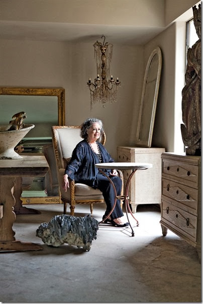
The Gray Door’s Donna Temple Brown. Photo by Jenny Antill
One of Houston’s finer antique stores recently moved – and probably for the last time. After years first located on West Gray, Donna Temple Brown’s The Gray Door moved to a shop in the trendy antiques area off West Alabama. After a few years there, Donna recently moved yet again - reopening on Ferndale this past May. The new space is located on the ground level of a large townhouse, while Donna lives upstairs on the second and third levels. Yes. She is now living above her store! Just imagine waking up, getting coffee, dressing and walking downstairs to work. What a dream commute – it’s no wonder she took the plunge of moving one more time.
The contemporary townhouse was originally built for another antique shop owner who also lived upstairs. When Donna heard if was for sale, she jumped at the chance to simplify her life and real estate. Once she took up residence, she began a renovation to make the place her own. The shop’s side entrance was moved to the front. The classic black and white tiled floors were removed to expose the concrete underneath. And the biggest change came when Donna turned the garage into extra shop space – enclosing it for a more valuable usage of its square footage.
While the shop has been open for business for a few months already, the living quarters are taking a bit more time to remodel. Donna is hoping to be through with all those changes by the holidays. Hopefully, we’ll get a peek at the upstairs when she’s through.
It’s no wonder the upstairs is still being tweaked, the whole process happened so quickly, she’s barely had time to get settled. After hearing the Ferndale space was for sale, she put her own house on the market – and sold it one day later – which is no surprise at all. Donna’s former house was a real showpiece – it had been published many times in both magazines and books.
I’ve shown a few pictures of her house before – but now with the real estate photographs available, it’s a real treat to see it one last time:
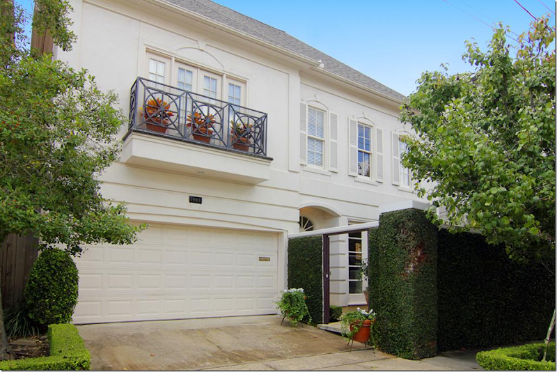
Donna Brown’s former townhouse – creamy stucco with balconies and several courtyards.
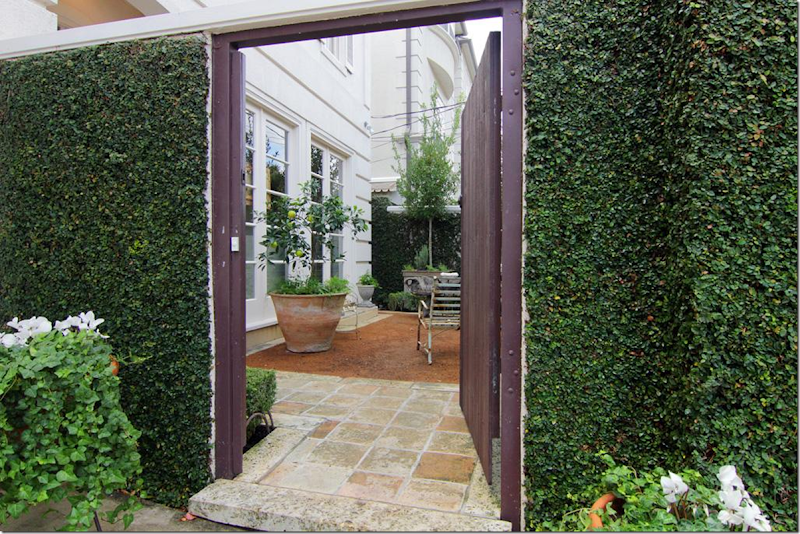
The front door is located behind a gate, off the front courtyard.
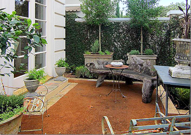
Donna used as assortment of antique patio furniture, a fois bois bench, and urns to decorate the stone and gravel courtyard.
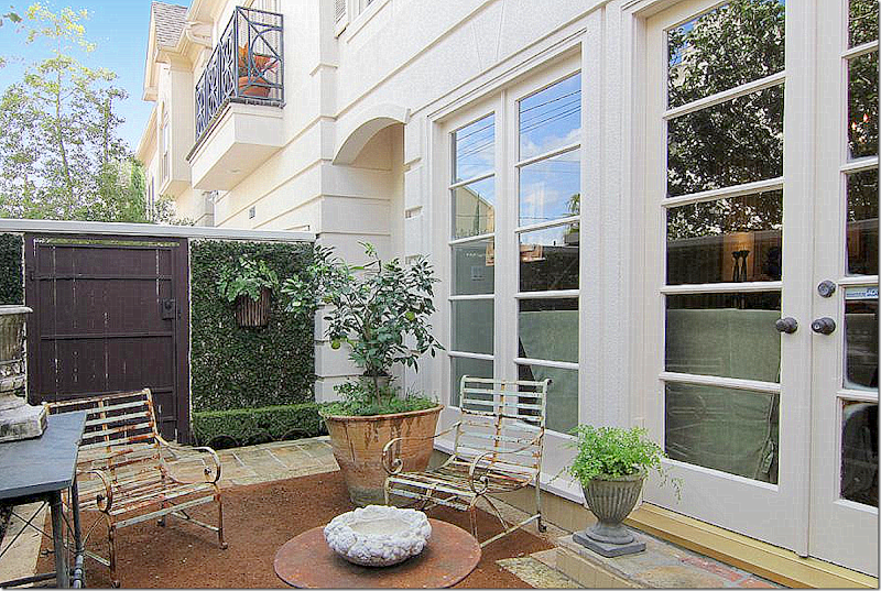
Looking back towards the front gate.
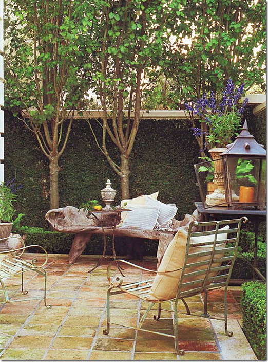
For a Veranda Magazine photoshoot, the courtyard was styled with pillows and lanterns.
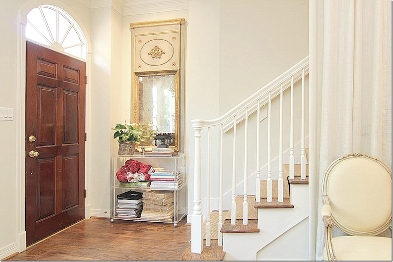
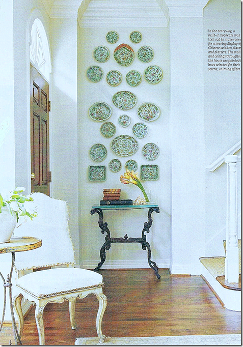
Donna’s house was featured in several magazines and books throughout the years. The different photoshoots give you an opportunity to see how the interiors changed over time. Here, the entry hall is furnished with a trumeau and a contemporary stand. Notice how Donna treated the staircase. Because the steps looked into the living room, Donna created a separation by hanging a linen portiere. I love this idea!! It really makes a huge difference.
Originally, Donna decorated the entry with a large collection of antique export plates. I loved this look, but, it’s best not to get too attached to things when you are an antiques dealer!!
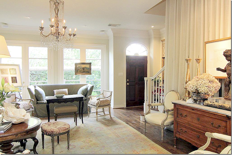
When Donna sold her house – it looked like this – with a chest in front of the portiere and the sofa by the front French doors.
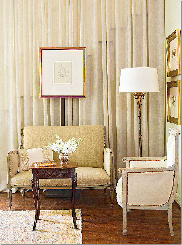
But, for a photoshoot – she placed an antique settee in front of the curtain. See, how you can just barely see through the linen? Anything thicker would have lost the appeal. Notice too, how Donna placed the painting on a steel brace – another great idea that turns the linen into a wall.
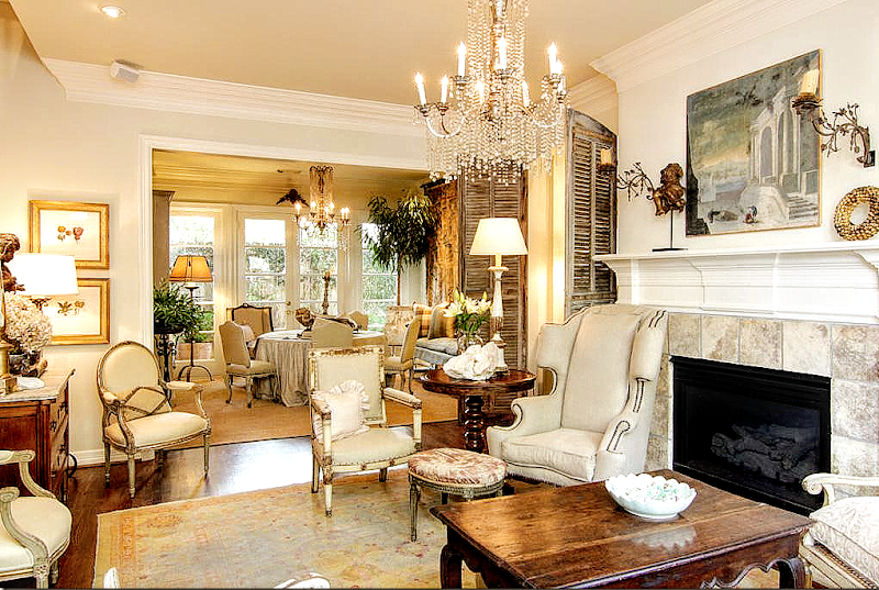
And today – looking towards the dining room. The focal point of these two rooms are the matching chandeliers – with their dangling crystals that look like icicles. Through the years – Donna has changed these two rooms around. For years the dining room was in the living room and vice versa. And notice the antique shutters that flank the fireplace.
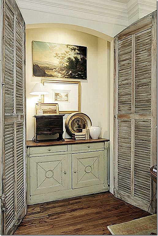
With this shutter open - you can see inside with its antique chest and art work.
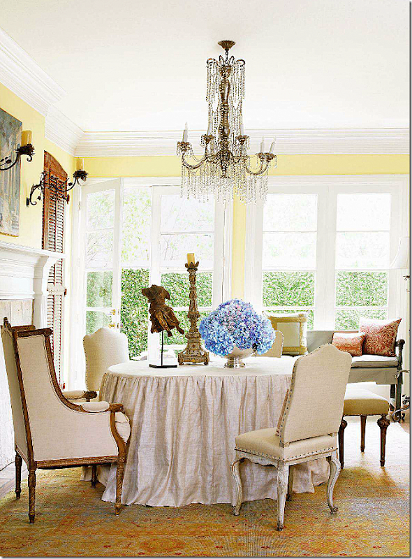
For this photoshoot for Country French magazine, for some reason they chose to re-color the walls yellow! Not sure why they did this. I wonder what Donna thought? Here you can see how the living room was once the dining room.
And for the same photoshoot – they even recolored the cabinet to match the walls. What????? And they even covered up the fireplace with fake stones. Way too much photoshopping going on here!
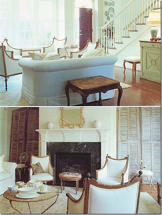
For this photoshoot – taken right after Donna moved in, you can see how the shutters had yet to be hung. There is no linen curtain camouflaging the stairs and a set of antique chairs becomes the focal point before she had hung the two chandeliers. The black marble fireplace surround was later replaced with creamy limestone.
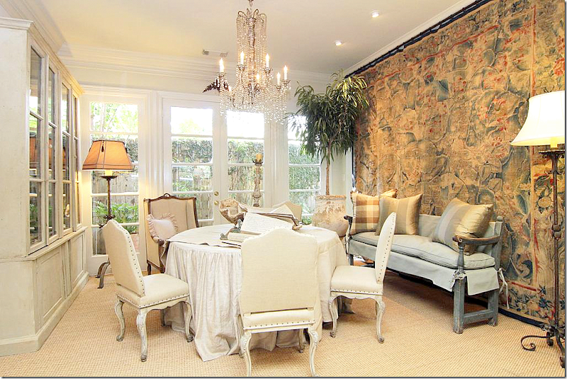
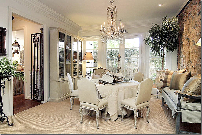
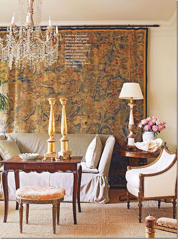
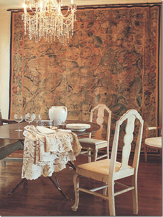
The dining room today. Notice the glorious antique tapestry. It is amazing! At one point the chest was upstairs in Donna’s bedroom – but it looks like it was made for this space!
Another view – iron gates separate the dining room from the kitchen on the left. Beautiful French chairs surround the table, which is skirted with vintage linen.
An earlier photoshoot – showing the dining room styled as the living room.
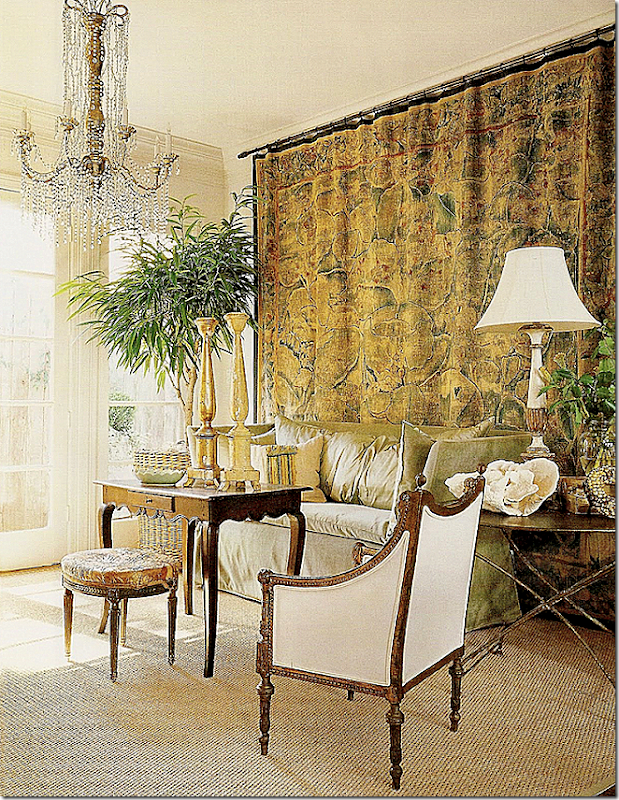
And yet another photoshoot – showing a metal table next to the sofa. Just beautiful!!!
And one more view of the same space – right after Donna moved in. Love the iron table and Swedish chairs.
It’s amazing how with just a few key pieces like a fabulous tapestry and chandelier, you can move furniture around and each arrangement looks better than the next.
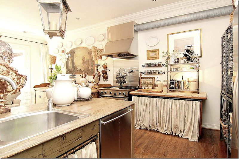
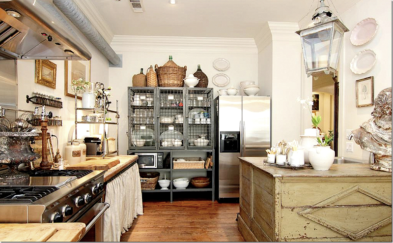
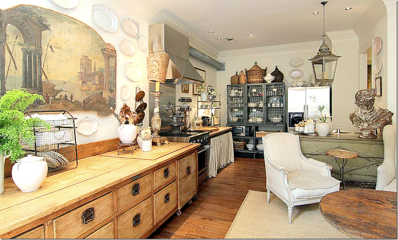
The kitchen/family room is the most amazing room in the house. The day Donna moved in, she demolished the perfect new kitchen and created an “unkitchen.” She was one of the first decorators in Houston to do this and many followed in her step. Donna simply went shopping at The Gray Door and picked out a few pieces which became the basis of her new unkitchen. Here on the left, a shop counter holds the sink and dishwasher.
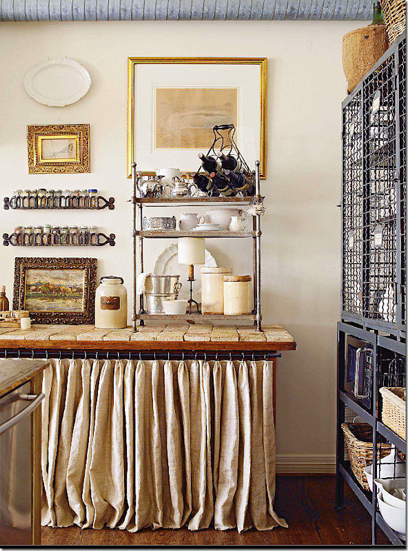
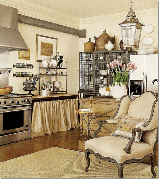
Old stone becomes the counter, while a linen skirt takes the place of cabinet doors.
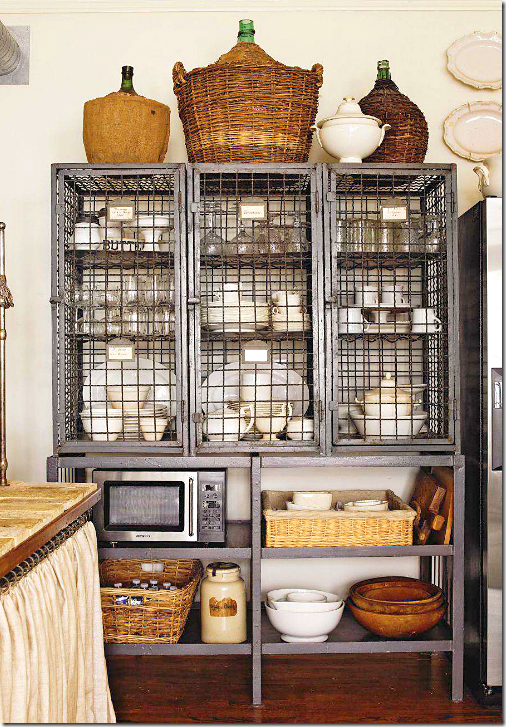
Next to the refrigerator, an industrial wine piece holds Donna’s dishes.
Here’s a close up of her china cabinet.
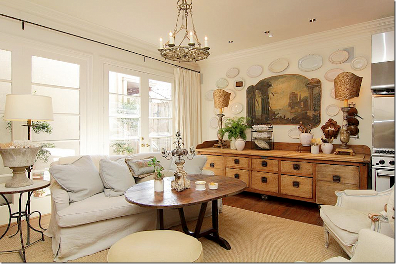
An antique file cabinet extends from the kitchen into the family room.
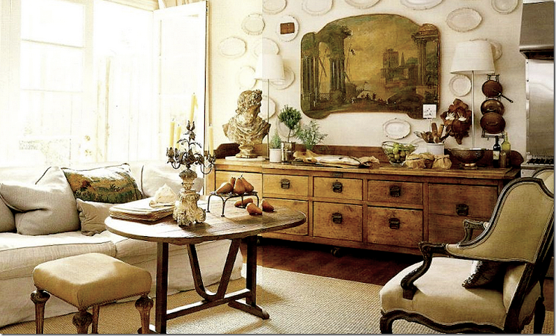
An early photoshoot shows a subtle change of chairs.
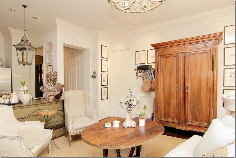
I love the painting over the cabinet – flanked by the tall candle lamps with Fortuny shades. And I love the plates surrounding the painting. Instead of a large breakfast room, meals are taken around the wine tasting table that doubles as a coffee table.
At this earlier photoshoot – a slight change in lamps – surprisingly contemporary.
A French armoire hides the TV.
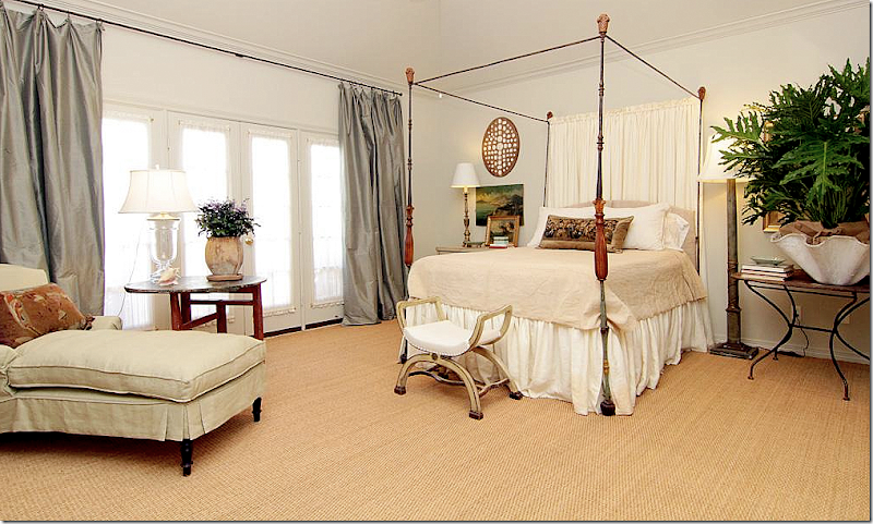
Upstairs is the master bedroom with its four poster bed, silk curtains and chaise.
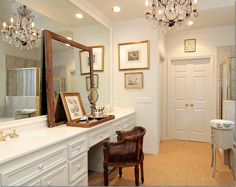
Donna decorated the bath with an antique mirror and a fabulous cane chair. Love! She added wall to wall seagrass and a beautiful chandelier.
Donna’s second bedroom was used as her office. By the way, she sells a wonderful assortment of new baskets at The Gray Door.
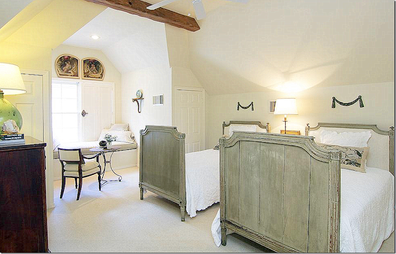
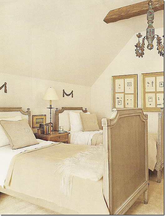
On the third level is the guest room – with its twin French headboards.
For an earlier photoshoot – you can see they added a chandelier and different pillows.
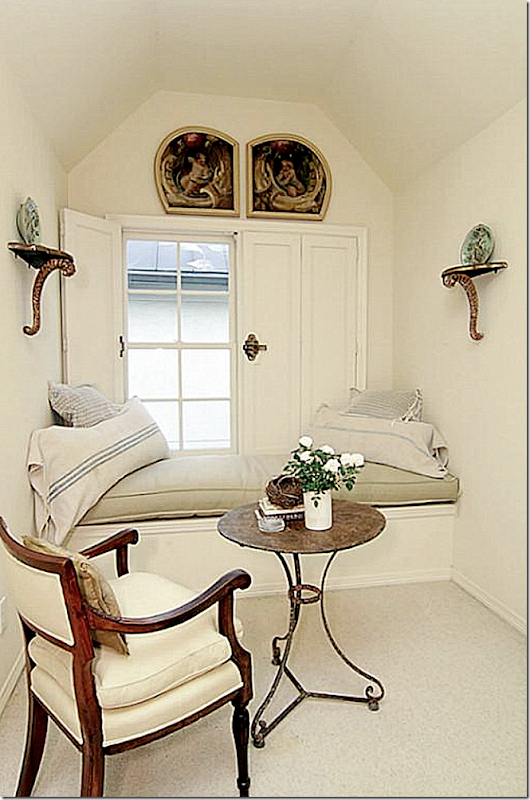
The guest room windowseat. Love the shutters with the big latches.
I can see why the house sold in one day!
The Gray Door:
I stopped by the new Gray Door a few weeks ago and was pleasantly surprised at all the changes. Before, the building’s façade was decidedly contemporary, but Donna Brown is changing all that. She moved the shop’s door from the side courtyard to street side. The original antique convent doors that she has used at her past two shops were installed under a charming scalloped awning – next to a French lantern. Inside, she’s made even more changes.
The new façade – the antique doors to The Gray Door are now at front, rather than at the side. More changes to the front are coming soon.
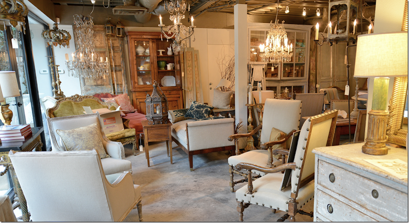
The Gray Door is filled with handpicked antiques from Europe – specifically France, Sweden, and Italy. Her collection of mirrors is outstanding.
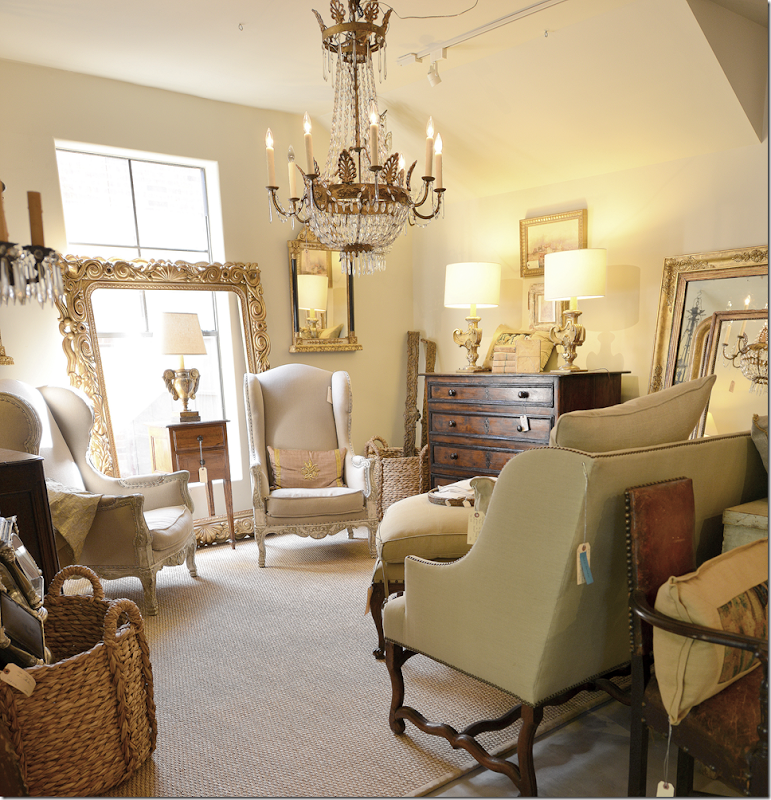
The new shop is divided into several different rooms, like this one showcasing a fabulous sofa and pair of chairs.
This room features French chairs and a dining table. I love the map against the back wall.
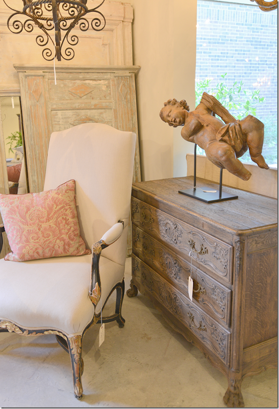
Beautiful putti! There is also a large selection of pillows made out of antique tapestries and Fortuny fabrics.
The biggest change is at the back of the building. Donna enclosed the garage and made it part of the shop – increasing the square footage.
Great Swedish demi lunes with painted chairs.
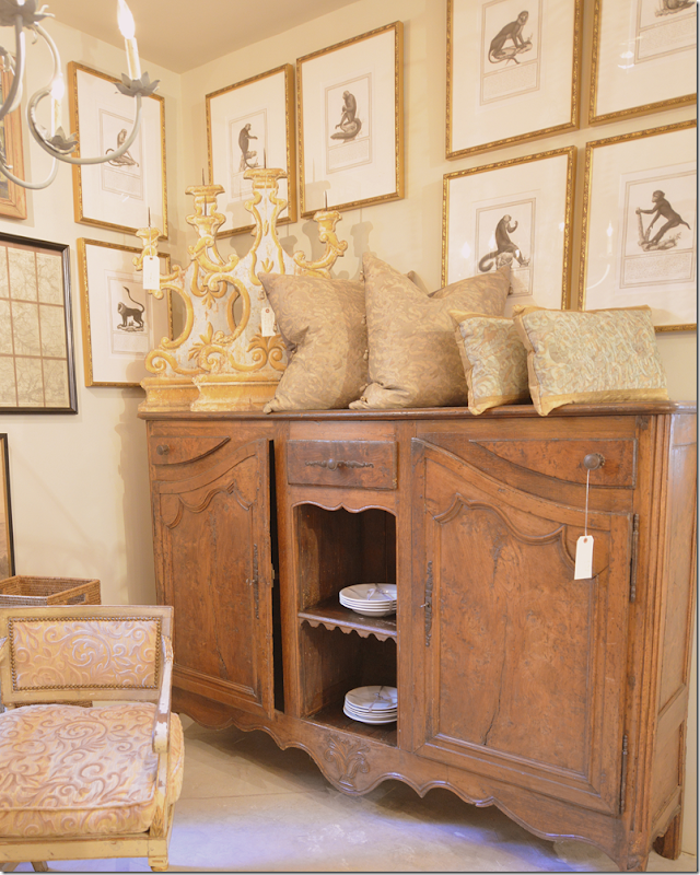
Fortuny and French furniture!
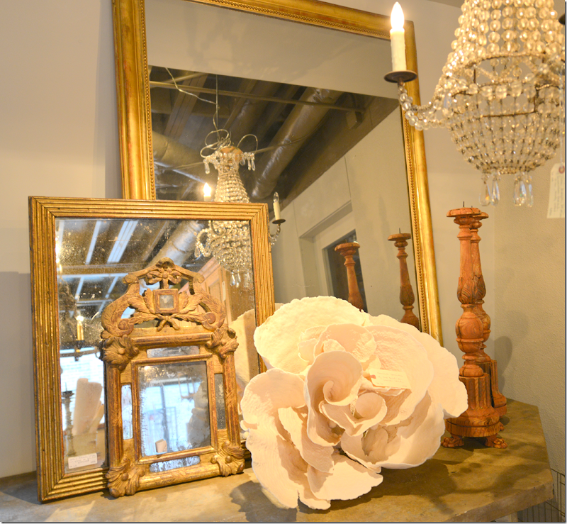
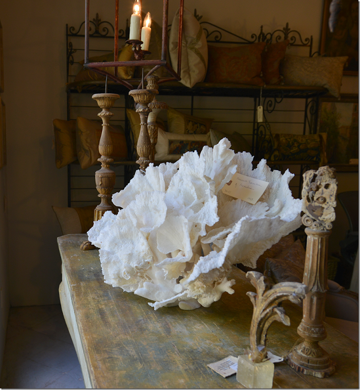
The coral rose is stunning. In the back are a few of the pillows available.
Before: The Townhouse
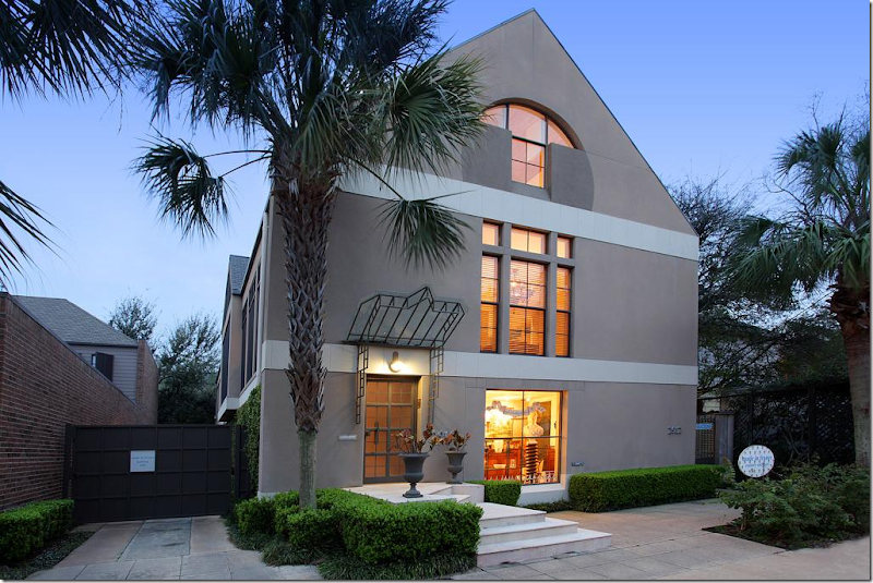
Here is a glimpse of the townhouse before Donna Brown bought it and moved in. It was designed by architect Bill Anderson. Donna has since changed the façade. Gone is the contemporary awning. A more traditional awning is now out front, along with a pair of antique doors that open directly to the shop. Here, the door on the left opens to the stairs that lead up to the living quarters.
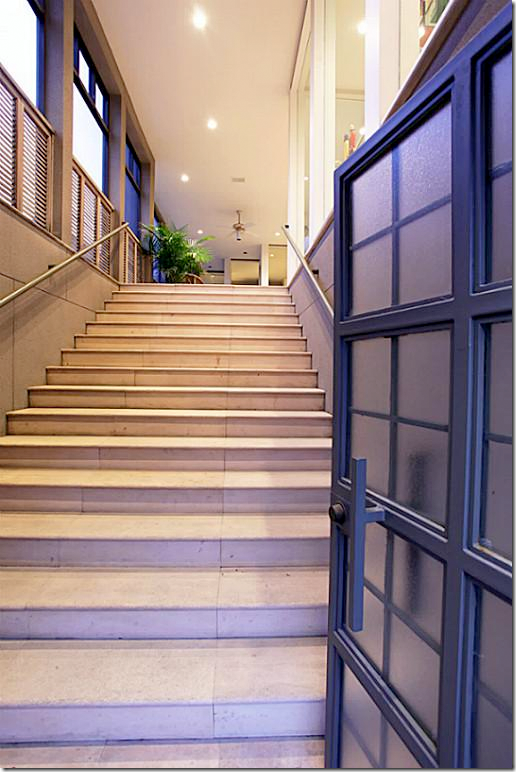
I can’t wait to see all the changes Donna makes in the house. These stone stairs led to the screen porch which runs along one side of the townhouse.
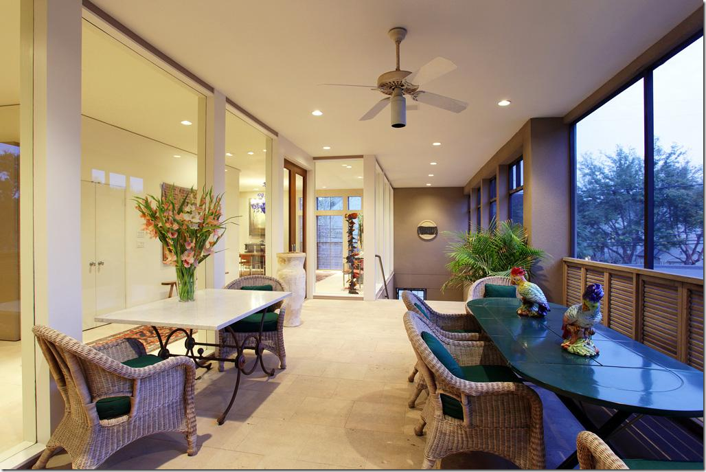
Here is the screened in porch – which overlooks the side of the property. Ferndale is an interesting street. It’s half commercial and half residential, with some businesses – like this - with living quarters above. Many other businesses occupy spaces that were once private houses.
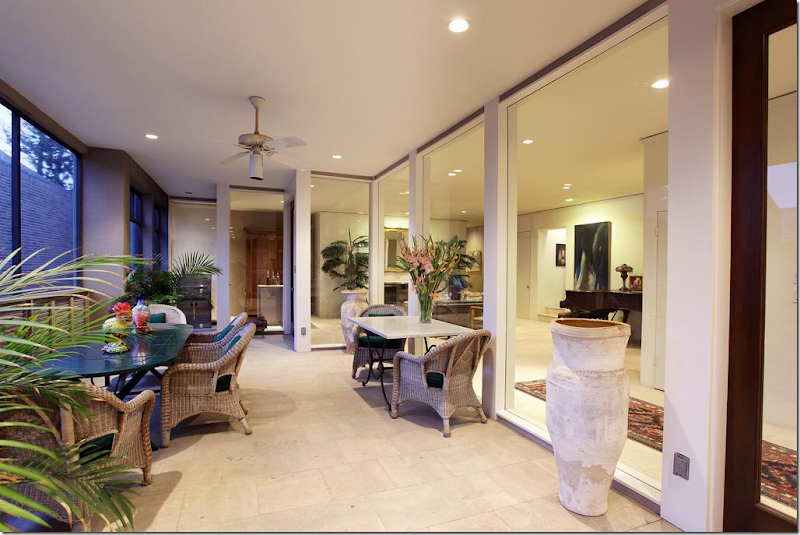
Looking at the opposite direction of the screened in porch.
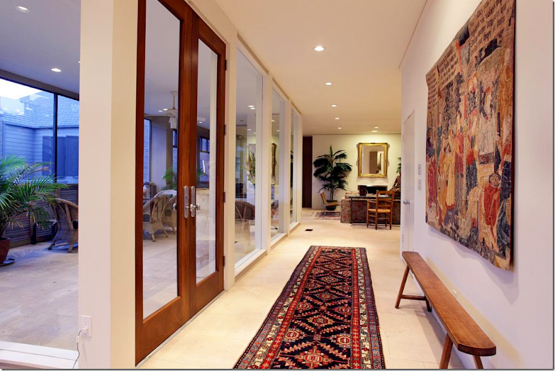
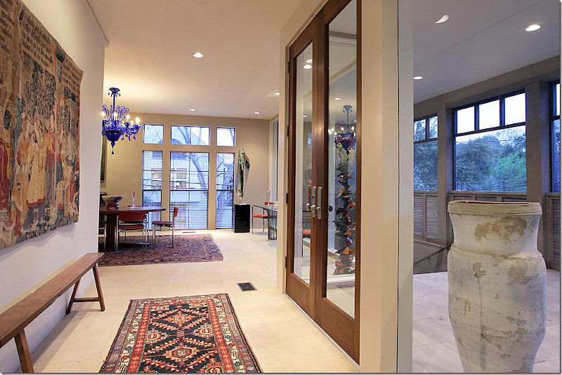
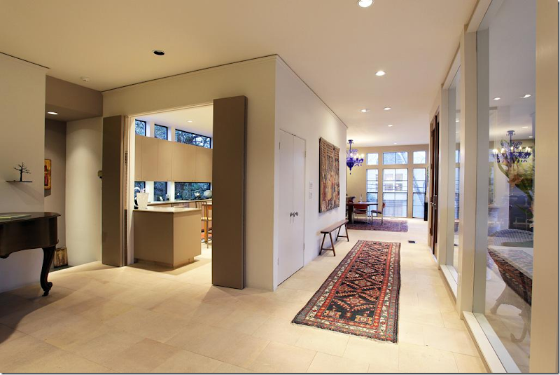
The main hallway runs along side the screened in porch. The living room is in the distance.
The front door – with the dining room on the right.
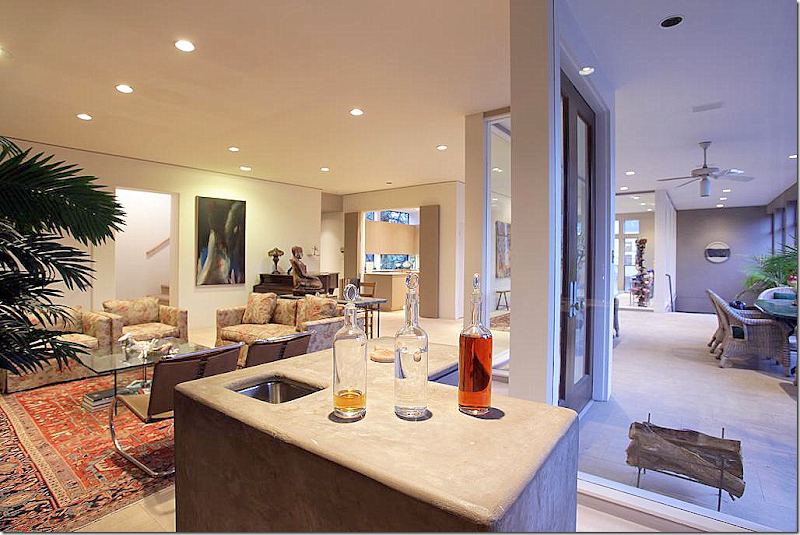
The living room with a unique wet bar. Although the former owner was a shop owner who specializes in French antiques, her furnishings are surprisingly quite contemporary. Again, I can’t wait to see what changes Donna Brown makes – and I can’t wait to see how her wonderful antiques look in this beautiful space!
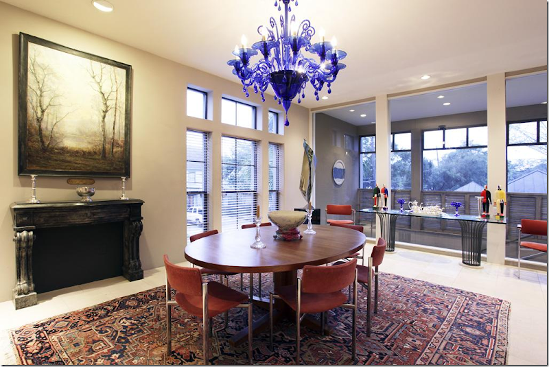
The dining room – these windows over look Ferndale. The windows on the right overlook the stone stairs from the entry.
The contemporary styled kitchen is behind the main hall. I can’t wait to see what Donna does with the kitchen. Will it be unfurnished like her last townhouse?
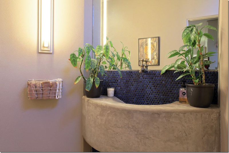
The powder room – I love this and wonder if Donna left it like it was? Love the faucet.
And just in time for this story – look what came in my email today!!!
WOW! A 30% off sale at The Gray Door!!
Out of town? See what’s available for sale on the web site HERE.
And Houstonians:
Please make your calendars for two exciting events that are scheduled at Carl Moore Antiques:
Jan Showers, Designer and Author
Tuesday, November 12: 10 a.m. – noon
and
Judith Miller: Conversation with an Antique Expert!!
Thursday, November 14: 5:30 - 7:30 p.m.
Go HERE for more information










Joni, her old townhouse is my favorite magazine and book featured home of all time! When she did the first photo shoot my jaws dropped looking at the unique way she put that place together and I loved reading how she gutted the kitchen…it was pure genius! My hubby and I were in Houston and visited the last store a few days after she sold the townhouse. She was so much fun and pleasant to meet in person. I look forward to seeing her new store and a 30% off sale may give us a reason to hit the road. This post was a real treat!
ReplyDeleteI, too, have always loved Donna's home from all the magazine spreads and had the pleasure of meeting her while browsing in her shop one day. I am therefore thrilled to see all of these photos, from different camera angles, for a couple of reasons. First, they are so much more complete than any magazine spread, and show how each room/corner/angle relates to the other. Second, they really illustrate how good the pro photographers are at their jobs. There are a lot of beautiful things in a relatively small space, and the pro photos really capture the essence of the home with a few well chosen angles and vignettes. A beautiful and inspiring post, Joni.
ReplyDeleteHi Joni,
ReplyDeleteAmazing--design, inventory, of course THE FORTUNY, and vision. What an amazing lady!! Thanks for taking me back to Houston.
Mary
Dear Joni, what a fabulous post to read this morning....better than any morning show on TV..I am so inspired, I want to run around and change everything....how fortunate for you, this wonderful shop is in Houston! Her un kitchen in her former home is beyond magnificent...and her combination of all white ceramics and baskets, so interesting, not boring at all...beautiful...thank you for this, Joni...N.xo
ReplyDeleteWhat an amazing home she had! That kitchen! Those shutters on either side of the fireplace! Just everything. Love how she used that steel stand to display her art. And why on earth would that magazine color her walls yellow??? She has some beautiful pieces, and the tapestry really is glorious. Maybe she took down the plates in the hall because they tell you not to display collections of things if you are selling your house. I can't imagine that in her house it would make a difference. Maybe she just wanted a change. I liked how she shielded the staircase with the curtains. Great idea. And I also love the idea of living above a shop. I hope we get to see how she decorates her new place. I enjoyed this so much!
ReplyDeleteWonderful post!! Amazing home and store!
ReplyDeleteVery much enjoyed this post. I have been a fan of Donna Temple Brown since her first townhouse appeared in Country Home in 2004. When it was featured in Veranda in 2009, I studied every photo over and over. In that article she stated she sought out designer colleague Pam Pierce to help her achieve the open "European influenced kitchen-family room". Their collaboration is the perfect "unkitchen". Brown as well credited taking a cue from John Saladino using drapery to define areas. Her taste, keen eye in creating rooms with charm and character is magnifique from my perspective. Can hardly wait to see what she will do with the upstairs living areas. The long screened porch is a coup in townhouse living. Thanks, Joni, for another glimpse into Brown's design and new shop!
ReplyDeleteI love the painting over the cabinet!! Her creative spirit on walls is just...exciting! This entire presentation is just...fantastic. We await more...always more... franki
ReplyDeleteOh what an interesting new space -i can see why she moved! Hope it gets published (here or in a magazine) so we can all see what she does to the place.
ReplyDeleteLooking forward to seeing the new living space. It looks like Donna will be changing things up a bit, as her website shows two of the antique pieces from above as already sold (the settee in front of the curtains in the magazine photo and the green chest inside the shutter closet). Does anyone know what the white plates with scalloped edges hanging in the kitchen/family room are called? Are they simply "ironstone" or a particular type, since all the ironstone plates I've ever seen have smooth edges. Is it more difficult/costly to find plates with scalloped edges?
ReplyDeleteJoni,
ReplyDeleteHow do you manage to find us such amazing homes to view and long for. I love the various rooms you've shared with your readers. I'm a little surprised that her new town home doesn't seem to have any of the same antiques she had in her lovely home. Still a work in progress, I imagine. Great post, thank you.
Karen
The photos of her new townhouse were taken before she bought it. All the furniture belonged to the previous owner, who also owned an antique shop.
DeleteRight. And the previous owner sells french antiques too - which is a surprise. I think her husband must love contemporary and it's a compromise.
Deleteloved seeing this! + was in her shop when it was off West Alabama + can't wait to see what she does with the house + How smart of her to move. xxpeggybraswelldesign.com
ReplyDeleteJoni,
ReplyDeleteLove all the photos!
I remember her home from the Veranda article and marveled at the kitchen, along with the rest of the home. Thanks for showing the additional photos. The staircase in my home is very similar to the one here. It starts at the front door and is open to the living room. I may try hanging a linen panel the way Donna Brown did, but it probably won't have the same effect as it did in her living room!
ReplyDeleteOh Joni thank you for sharing Donna's house with us! it is one of my absolute favorites! I'm not surprised at all that it sold in one day...I bet she had a list of people who said "Hey if you ever decide to sell it?" *winks* I can't wait to see what she's done with her new home!! And if lived anywhere near that shop I would be bankrupt....But my house would sure look amazing lol! Vanna
ReplyDeleteJoni,
ReplyDeleteThank you for sharing! While I am in Houston I will have to visit The Gray Door! I just loved all the pictures. Amazing home & shop!
Blessings My Friend,
Although Donna's previous townhouse was truly magnificent, I can certainly understand her desire to simplify things at this point in her life. It is somewhat ironic I think, that the older I get, the more contemporary architecture appeals to me. Thanks for yet another wonderful post. You are the best!
ReplyDeleteThe un-kitchen is divine!!! What a feast for the eyes! The whole story is engaging to read. Thank you!
ReplyDeleteLove the design ideas :) Just got a new apartment and I'm excited about decorating but I don't know where to start. Please do an inspiration board for 1000 thread count fitted sheet or bedroom style inspiration, thanks!
ReplyDeleteLOVE LOVE LOVE IT!
ReplyDeleteTHAT KITCHEN...............WOW!
She definatly has the EYE!
Joni, What a gorgeous home and shop. I adore her previous kitchen and the wonderful antique shutters.
ReplyDeleteHugs,
Sherry
Wow! I have seen photos of that kitchen and pinned them and loved them and I never knew whose kitchen it was. I adore it. I am having a hard time envisioning her things in the new place. That kitchen is terrible! But I can't wait to see what she does with it.
ReplyDeleteNoted her use of plants...especially the large plants set high on tables, nearly touching the ceiling. Thanks for some much needed inspiration.
ReplyDeleteJoni! Joni! Joni!! I love this post...late for work because I had to devour every pic, especially the UN-KITCHEN! I cant wait to see the new digs!
ReplyDeletexo
Jeanine the Queen
I love the creamy white exterior color of D.T.B.'s former townhouse. Wish I knew what paint would approximate that look. Also, love the kitchen. Everything is gorgeous.
ReplyDeleteWOW....THAT kitchen!! How brilliant to live RIGHT above your store!
ReplyDeleteI love the exterior colour of her former home - not white and not cream, I wish I knew what it was. I particularly loved the green plates on the entry wall and also her beautiful guest room with the twin beds and window seat.
ReplyDeleteI can't wait to see what she does with the contemporary space upstairs in the new building, I think French antiques and contemporary spaces go well together. Me, I could quite happily set up house and live in her showroom.
Another eye-filling full post. Thank you. Love the idea of the un-kitchen!
ReplyDeleteSuch a fun post to read! Loved it all! I am so inspired by that kitchen!!
ReplyDeleteIndeed.I enjoyed reading it and the pictures, all beautiful ♥
ReplyDeleteAn awesome post...I absolutely adore her style.
ReplyDeleteThe centered font is VERY unnatural for the eye to read.
ReplyDeletePlease consider left justified. (You can read studies on it if you don't want to take my word for it).
Thanks.
The deconstructed kitchen may be beautiful and interesting to photograph, but I would not be comfortable eating a meal prepared on so many wooden surfaces that are
ReplyDeletenatural breeding grounds for bacteria. The owner should have chosen a hard, non porous surface for food prep. Marble would have been beautiful.
Love the whole house. Haven't been in her shop in awhile but making plans!! Previous comment....always use washable cutting boards even if I had marble. I have granite & butcher block but always want to put those boards in the dishwasher.
ReplyDeleteThanks, Joni....you always nail it.
Although I really like the classic look of her old townhouse, I can understand why she decided to go with the new one. Her new home leans toward a more modern trend, and those large windows gives it a more spacious feel. I can’t wait to see how she makes the space her own.
ReplyDeleteTop Ten Classified Website List, Pakistani Classified Sites, USA Classifieds, Indian Classifieds, Entertainment Articles, Entertainment News, Entertainment Pictures, Bollywood, Hollywood and Lollywood Pictures and Videos, Entertainment Latest updates, Hot Entertainment News and Pictures Funny Entertainment Pictures, lol Pictures, Funny Pictures and every thing you want...
ReplyDeletewww.hotcurrentaffairs.com
Hello, Joni. I'm a newbie to your page and from the Dallas area! I think Donna's style is tasteful and so elegant--I love everything!! Can you possibly find out where she purchased the metal 'china closet' shown in her kitchen? Thanks!!
ReplyDeleteThis comment has been removed by the author.
ReplyDeleteThis comment has been removed by the author.
ReplyDelete