Last week I showed the renovation of Charlotte Moss’ East Hampton weekend house – the Before and After photographs. Charlotte was sweet and tweeted me that she had forgotten about a lot of the décor themes!! She also said is working on a new book, but it isn’t about her NYC townhouse redecoration. Hopefully a magazine will do a photoshoot of it for us! Her new book will be all about gardens and the book tour will start next April.
Today, Part Two of Designer Renovation is Mark Sikes’s house – the beautiful 1920s Spanish inspired home in Los Angeles that the popular decorator and blogger lives in with his partner, Michael Griffin.
OK, OK– I know every blogger has shown the new pictures from Veranda (and I’ve linked my favorite blog stories about Mark at the end) but I wanted to put it all together – all the Before and After photographs in one neat package.
I actually hate repeating stories that others have already blogged about – but there are so many of us out there now, it’s almost impossible to be original, so I try to add something new if I can (hopefully I don’t fail too often.) Some of these Before photos are new, not seen before, but they show how much hard work and decision went into making this house as beautiful as it is today.
When Mark’s house was first seen in House Beautiful just two years ago (!) – I flipped out and immediately wrote about it because I felt like I was looking at a design twin. So many elements that Mark used in his house, I did too. It was like we had the same aesthetic, although Mark’s taste level is miles above mine. Umm, I’m just being honest here. Still – he loves blue and white, and blue and white garden seats, indoors and out, and mirrors, and wicker, and slipcovers, and handpainted wallpaper, and crystal chandeliers, and striped & zebra rugs and seashells and seagrass, and on and on – all design elements that I have in my own house. I’m sure Mark wasn’t too pleased that I dared to compare his gorgeous house to my POS (google that on www.UrbanDictionary.com) – read the story I wrote HERE.So, when rumors began circulating that a major remodeling had taken place at Mark’s house, I was beyond excited and couldn’t wait to see the results. I couldn’t imagine what he had changed. I mean – Mark’s house was beyond perfect as it was. Perfect! It was warm, inviting, sophisticated yet casual, just a perfect house. So, why change a thing?
Well, Mark has excellent taste and he has a brain full of wonderful inspirational designs. His blog showcases the classic designers and style setters of today and yesteryears that he loves. And he is a designer and designers get tired of their house. Of course he would want to update it!
And the Veranda spread proved that the changes he made are even better than the original. Each room has been improved upon, some rooms have more dramatic changes than others. I would have been scared to change a thing, but seeing it updated, I get it. It’s a huge improvement on perfection. Is that even possible? I love that he didn’t move, but worked with what he had - which is great breakdrop for his ideas.
Let’s look at the befores and the afters and see what you think. Better? Yes? No? I’ll be curious to see your comments.
Finally, the most fun of all is that I found a cache of photographs of the house before Mark bought it. OY! What he has accomplished is really a masterpiece! When you see these original pictures, you will see what a beautiful job he truly has done with his house. Fasten your seat belts!!! Grab that coffee!!!
The first cover. Mark Sikes started his blog before this cover story and since then he has become quite famous and extremely popular. His style struck a chord with so many people – they identified with his house and his decorative choices. Who wouldn’t??? After this pictorial, Lonny featured him in a large photoshoot. After these two stories, word leaked that Mark was redecorating. I couldn’t imagine why. But now….!!!!!
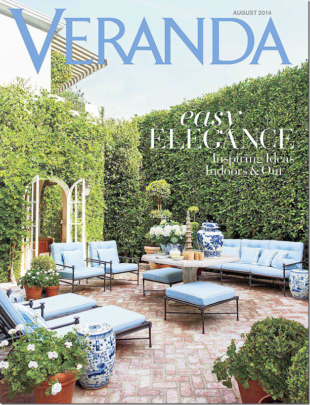
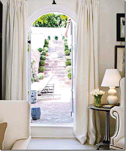
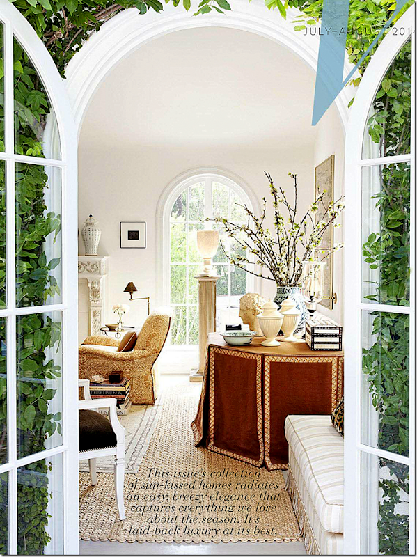
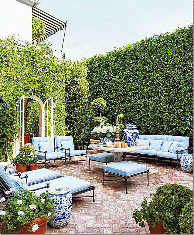
The new Veranda with Mark Sike’s redecorated 1920s house. All rooms overlook this terrace. He told Veranda you can hear the fountain from each corner of the house. So romantic! The living room is seen through the double arched French doors. Guests eat either here or in the living room, never in the dining room which has become a library of sorts.
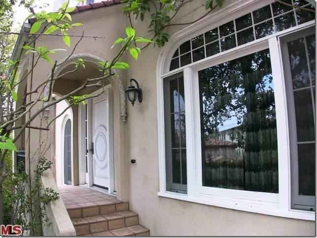
ORIGINAL: This is how the house used to look! Beige stucco with this crazy, modern metal gate??? What is that? Why?
ORIGINAL: A view of the house with the gate opened.
AND TODAY: Barely recognizable, the same house now painted white, with tamed landscaping and a beautiful iron gate that Mark designed for the driveway, along with the stucco gate post.
ORIGINAL: Here, at the front door – new paint, new lanterns, and lots of box woods, make a big difference to visitors using the front door!
TODAY: Steps lead up to the white house, which is hidden from the street behind vine covered walls. When Mark and his partner first built the house, they did a major renovation. He told Lonny that he used the Dominican Republic houses of both Bunny Williams and Oscar de la Renta as inspiration for his interiors. That was his first go around.
This second time around, the house seems much less beach inspired, more classic.
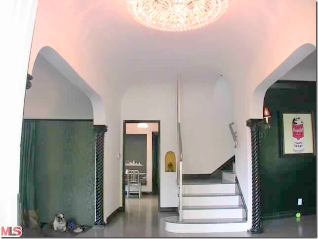
ORIGINAL: The columns were a lacquered black and the door was painted black and white.
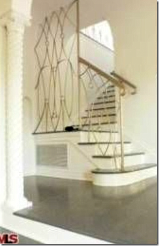
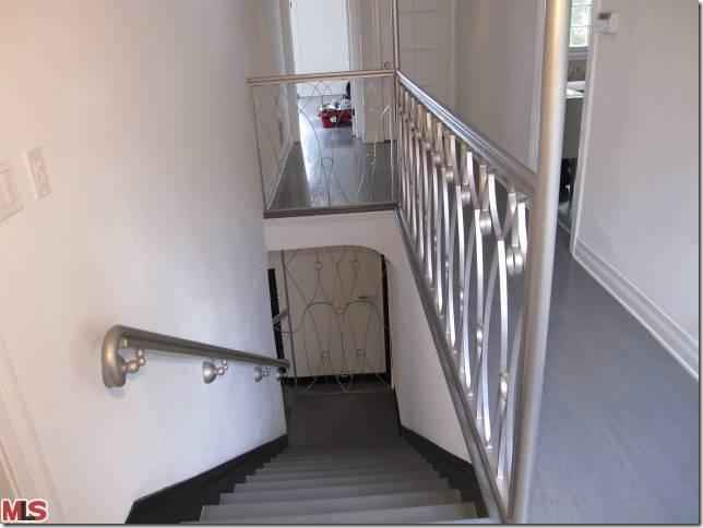
ORIGINAL: Black walls in the dining room and dark damask wallpaper in the living room all had to be changed. But – the metal railings on the stairs were a real surprise! I suspect those were removed the first day!
ORIGINAL: More of the Art Deco metal rails.
BEFORE – the first remodeling:
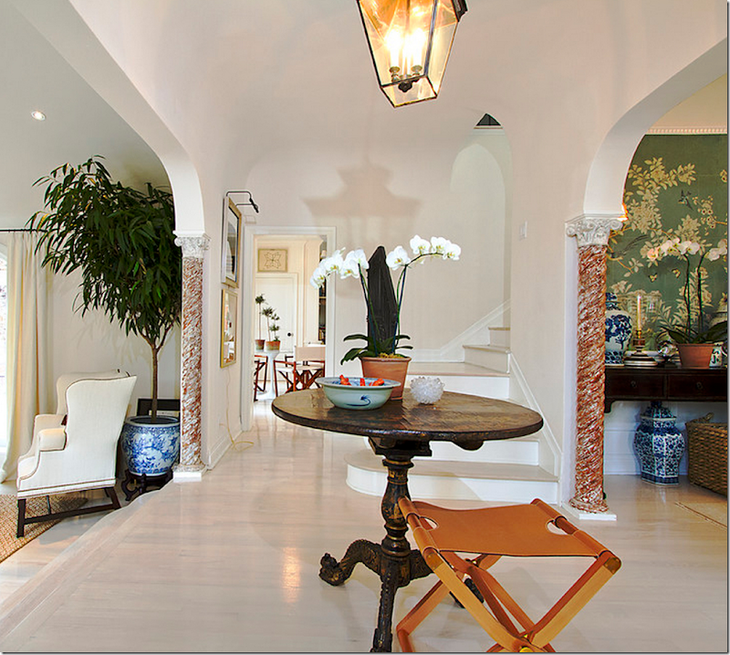
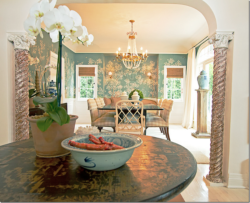
A series of photographs were taken when Mark first moved in, before the House Beautiful spread. The walls were painted white and the floors were stained to match. The columns were fauxed to look a bit rustic (so much better than lacquered black!) The living room and dining room open to the entry hall through large arches and columns. Towards the back is the family room/kitchen area.
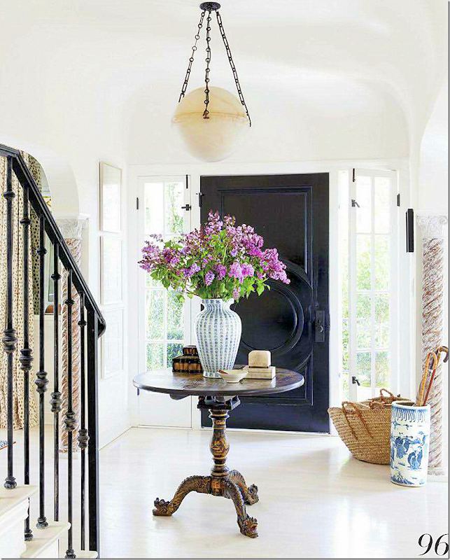
HOUSE BEAUTIFUL: entry hall staged for House Beautiful, 2012. Love the chinoiserie center table. Straw baskets and blue and white porcelains. The doors were painted black. Mark added the lantern.
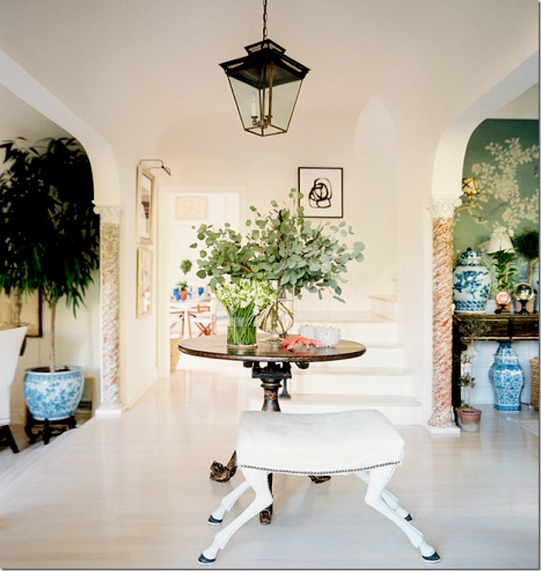
LONNY: staged for Lonny – new bench.
TODAY for Veranda: The newest changes – there is a new light fixture – updated from the lantern. I never realized those windows next to the front door open. I never thought I wouldn’t prefer a lantern, but this alabaster light is a chic update.
ORIGINAL: The dining room. Yikes! The large arch on the left wall has been covered up, replaced with a door.
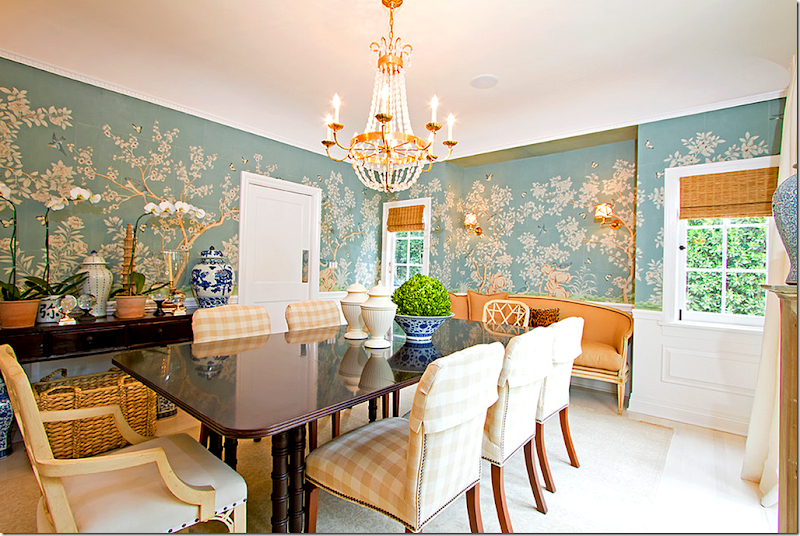
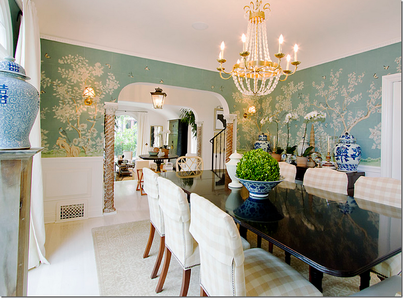
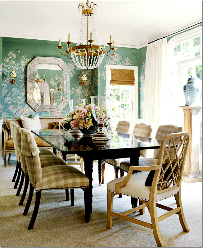
BEFORE – The First Remodeling: From the foyer into the dining room with the handpainted Gracie wallpaper. The crystal chandelier is a reproduction, but it has the classic lines found in antiques. These pictures were taken before Sikes added the Venetian mirror on the back wall. Just beautiful!
Mark mixed chairs at the table. Some had checked fabric with slipcover headrests. In the alcove is a sofa (which is later dramatically moved to the living room in the remodeling.)
Looking into the living room and foyer.
HOUSE BEAUTIFUL: Photoshoot. A gorgeous shot of the room – with the mirror, now in place. It’s amazing how much prettier a professional photographer can make a room. Just beautiful.
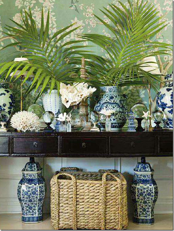
HOUSE BEAUTIFUL: This shot of the console piled high with Sikes’ blue and white urns and shells was pinned a million and one times!
Mark says that he had decided to update his master bedroom, and of course, he would only want Gracie wallpaper in there. But...the dining room already had handpainted paper – you can’t have two rooms with similar paper. What to do? This dilemma created a domino effect. In order to redo the bedroom, the dining room had to be redone, and then – so did everything else!
AND - Today, are you ready????
TODAY FOR VERANDA: The dining room is completely and totally different. Gone is the Gracie wallpaper. Let’s talk about that first. When I saw this, I was disappointed at first – because I loved the wallpaper that was there. I didn’t realize he had papered the master bedroom. BUT, once I saw the Master Bedroom, I totally understood his choice. While the paper was so pretty in the dining room, it really didn’t “go” with the look downstairs. And the wallpaper looks so perfect in the Master bedroom. Good choice.
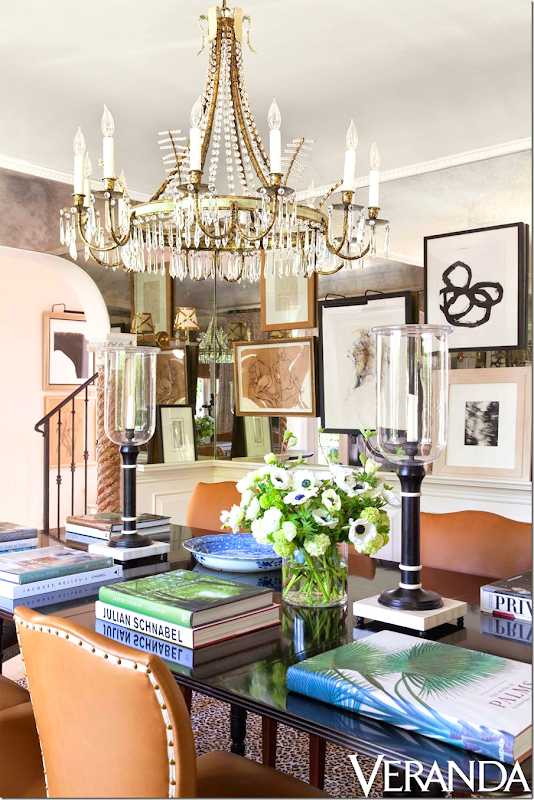
Now – the dining room is not really used for eating. That’s not how Mark and his partner entertain. Because of this, he has turned this space into a library of sorts. It’s a place he can go and spread out his books or he can use it set up buffets at parties. The gilt console from the living room was moved into the alcove where the sofa once was, and the light fixture was replaced with this new David Iastesta chandelier. Wallpaper was replaced with the antiqued mirrors.
The rug is trendy Starke. The chairs? The same, just covered in chic orange leather with nail heads and trim. The art – mostly collected in Paris. I’m going to guess that this room looks spectacular at night when the lights and candles play against all the mirrors.
The dining room is one of the rooms with the biggest change.
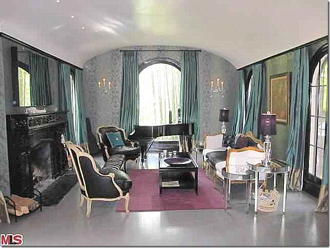
ORIGINAL: A pretty room despite the furnishings – with an arched ceiling. The mantel was painted black and the walls were wallpapered – all had to be changed out.
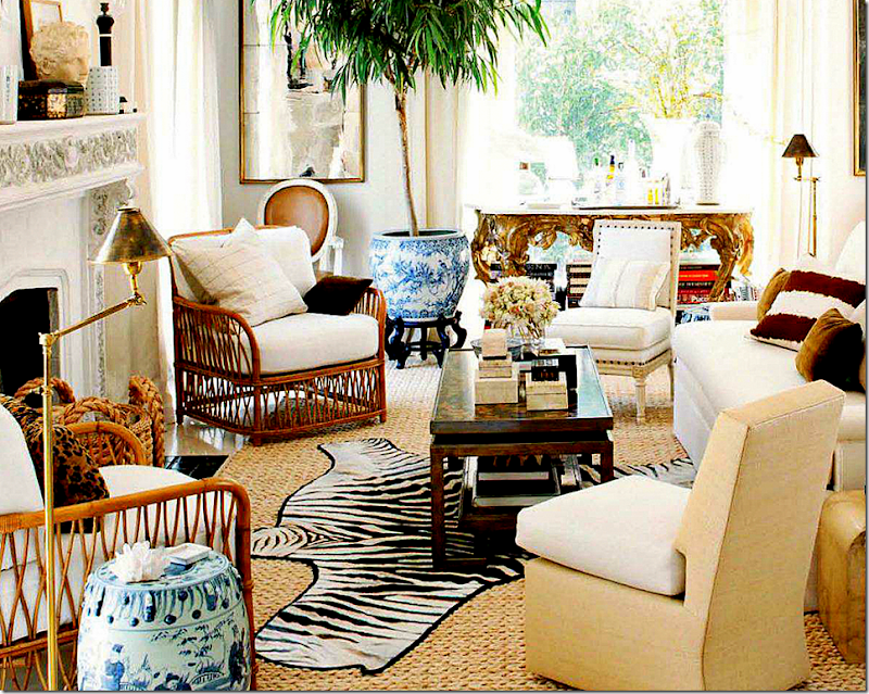
BEFORE - the first remodeling: This early photo shows the lightened up fireplace. I love how the room was decorated with the zebra rug, the rattan chairs, and the slipper chairs.
Love this SO much! Just wonderful. I love the large trees in the blue and white vases, the tall, black oriental piece, the gilt console (now in the dining room) – all the textures.
The view from the French door out to the terrace. Pretty alignment.
Totally crazy over this décor!
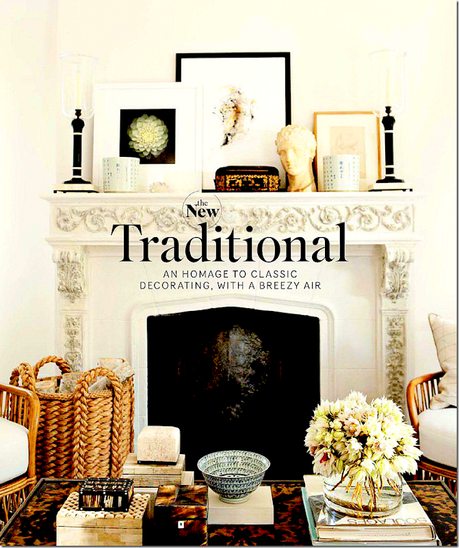
Mark added a large tortoiseshell in the fireplace.
AND NOW, THE LIVING ROOM TODAY:
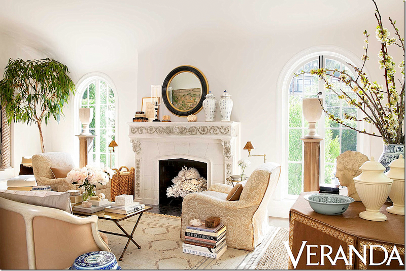
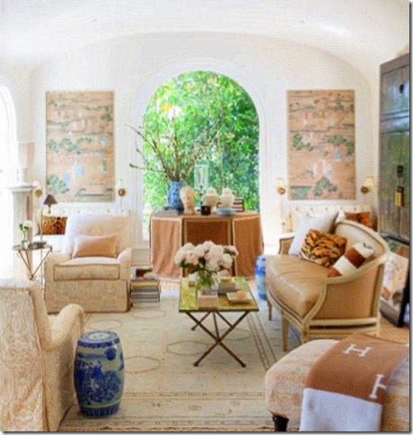
TODAY FOR VERANDA: WOW!! I love the changes Mark made!! It’s all more sophisticated. He added a beautiful round mirror to the mantel and filled the firebox in with his shells. Tall pedestals hold urns in the window. A Moroccan rug replaces the zebra for a subtler look. Two beautiful club chairs are placed instead of the more casual rattan ones. The Jaspar sofa from the dining room is moved in here instead of the white one, that now looked too big. Funny, how I never noticed that before – but the smaller settee just fits the space better. Mark took down the curtains for a cleaner look.
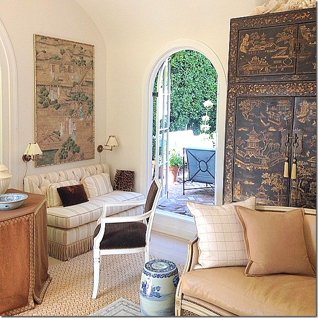
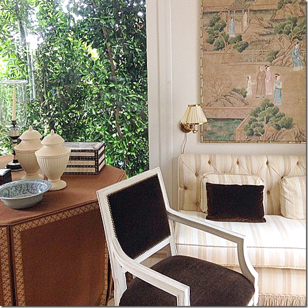
The mirrors are gone, replaced with Oriental screens and twin tufted banquettes which sit underneath. A skirted table sits in between the two banquettes.
Close up of the striped banquette and the skirted table with creamware.
A look inside from the outside.
And a blurry picture – the only one that shows the symmetry of the two banquettes at the back wall and the chaise longue on the right. That chaise came from the guest room upstairs.
ORIGINAL: The kitchen is a huge change. I’m not even sure how it was accomplished and which wall was opened to make the one large family/kitchen area that it is today. It appears that the left wall was taken down and an island replaced that row of cabinets.
And floating around the internet is another version of the kitchen before the wall was removed. This version is more in keeping with the style of the house.
BEFORE – The first remodeling: Here is a photo just after Mark’s renovation was completed. He extended the cabinets up to the ceiling, making them look more in keeping with the age of the house. He also added beadboard and marble countertops and backsplash.
I love this space. And you can see from the before pictures just how far this space has come!
LONNY: Looking out towards the terrace
LONNY: A view that shows where the tiled powder room is located.
House Beautiful: a mass of colorful pillows plus Mark’s darling puppy!
AND THE KITCHEN TODAY:
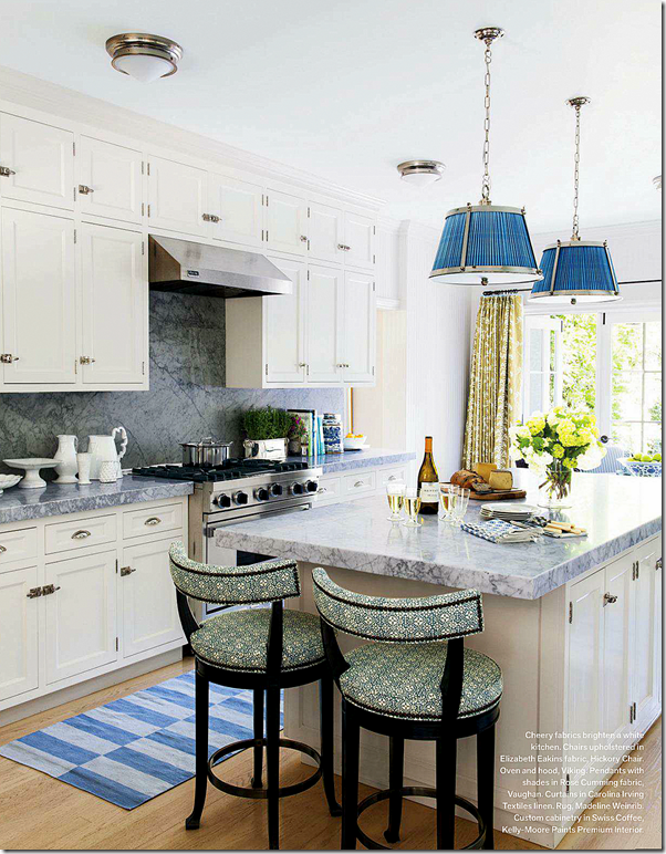
TODAY FOR VERANDA: The changes are all in the fabrics and rugs – yellow stripes were changed out for blue striped Madeline Weinrib rugs. White fabric in the light shades is now a bright blue. Curtains were added in a green Carolina Irving fabric. Finally, new bar stools wear more new fabric by Elizabeth Eakins.
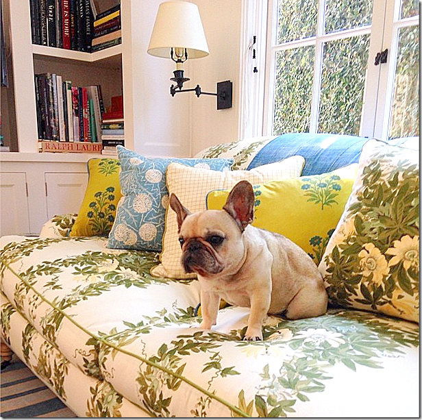
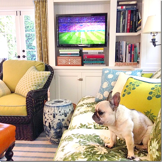
Love the changes here. The new Jasper sofa fabric is fabulous- as are all the pillows in greens and blues. Now THIS is how you mix fabrics. Compare the pillows now and before. If anyone ever wanted to know how to mix and match fabrics, I would show them this picture. The mix is perfect, IMO. Love the window shade with the blue trim.
And a close of Mark’s darling Pug. Crazy over that sofa fabric!!!!
Love this view of the room with the chair and the curtains showing.
The beautiful tiled powder room off the family room. Gorgeous!!
Original: Upstairs, here is more of the strange railings.
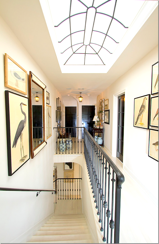
AFTER: And, here is how Mark Sikes redid the upstairs hallway. Notice the beautiful skylight!! The doors are painted black, which I love.
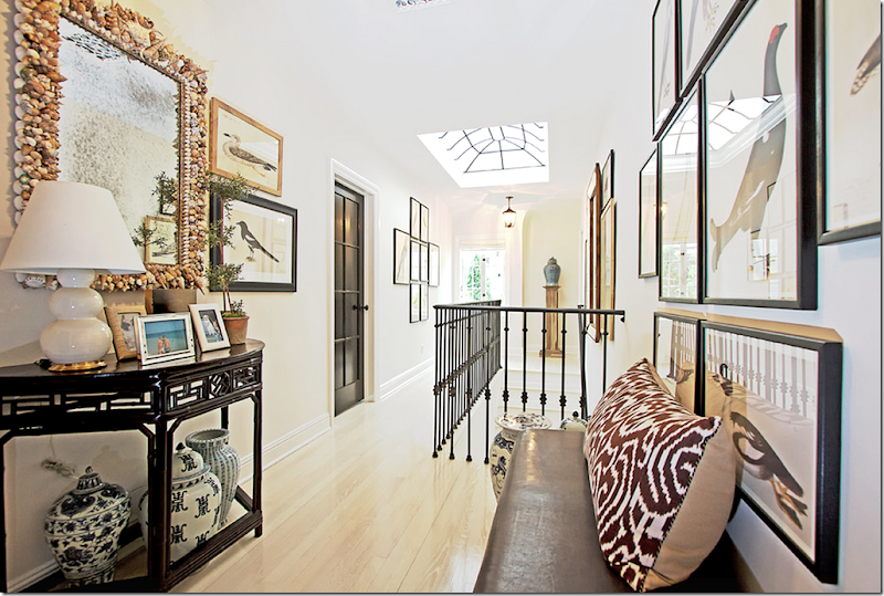
And, a look down the opposite way. The landing looks like an art gallery – which is a good lesson to take home – don’t neglect to decorate spaces that are in private areas only. Most people would probably just leave an upstairs hall blank – but here, you can see that by adding a few paintings and some furniture – the space becomes dramatic.
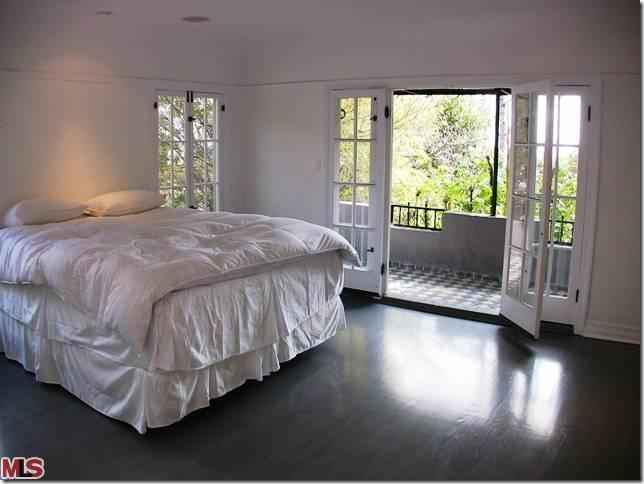
ORIGINAL: The guest bedroom and porch – when the house was for sale. The windows and hinges are so pretty.
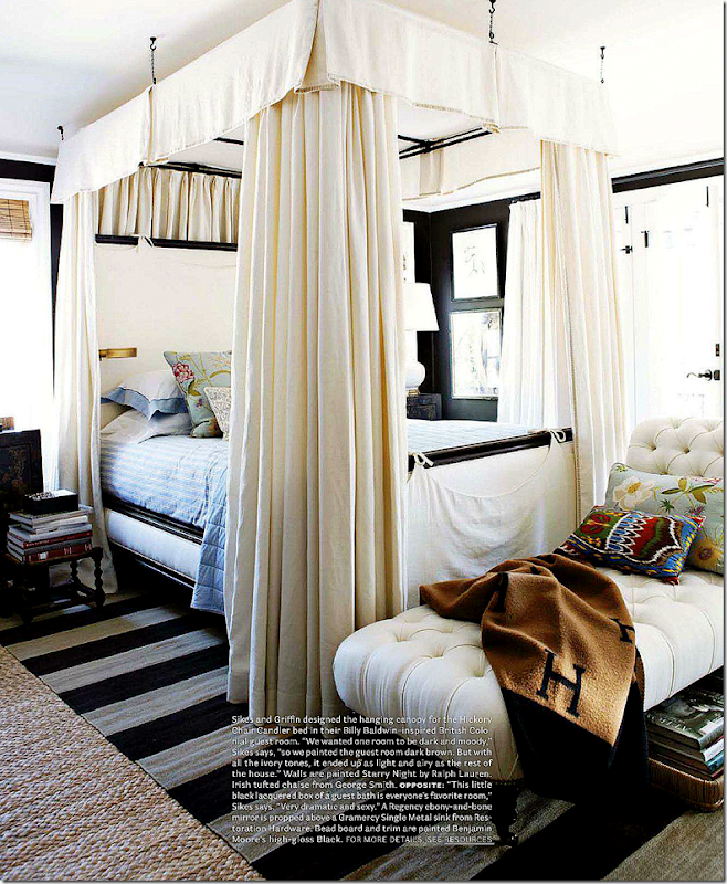
BEFORE – the first remodeling: Here’s a rare shot that shows the guest room before Mark added the canopy. What a difference the canopy makes as you can see below!
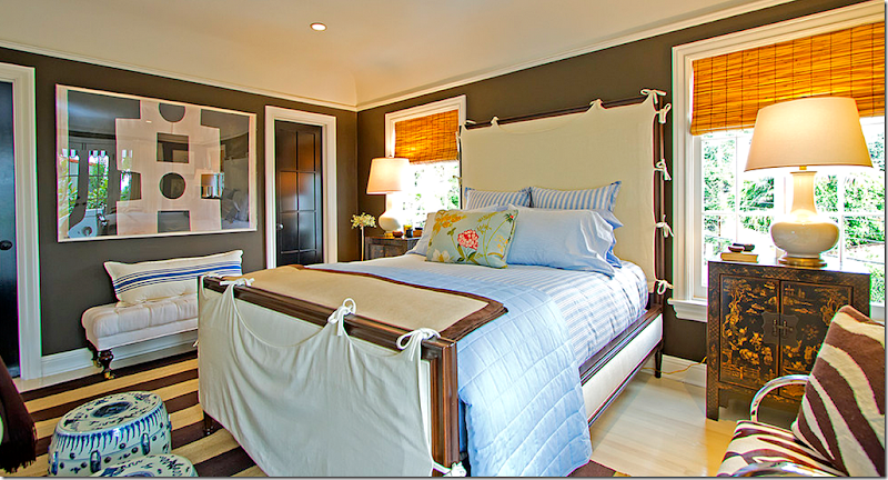
HOUSE BEAUTIFUL: The guest room with the canopy bed. Mark said the room was inspired by Billy Baldwin and the British Colonial style. Today, the chaise has been recovered and is now in the living room.
LONNY: a view of the Indian inspired armoire across from the bed.
Now, this guest room is perfect! Why would anyone change it? Could it be more perfect than it is now? Well….the answer is YES!!!!!
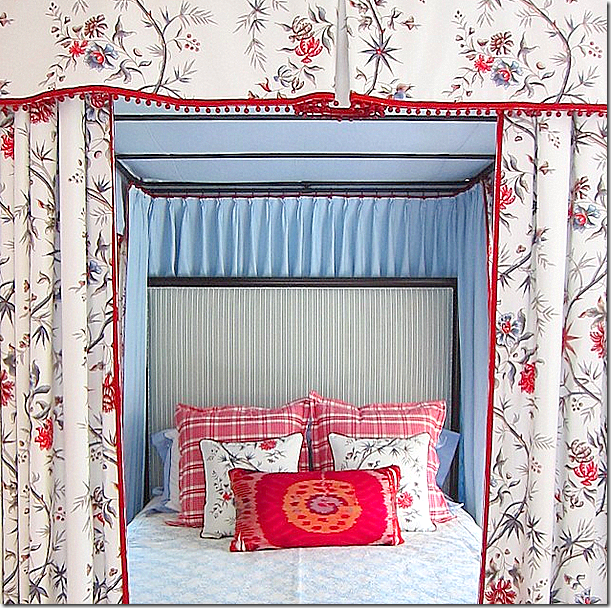
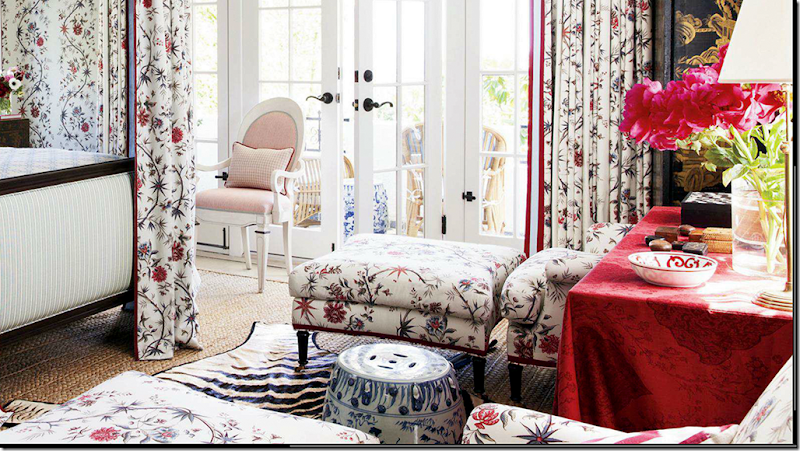
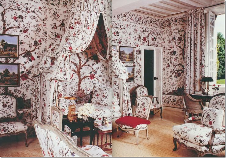
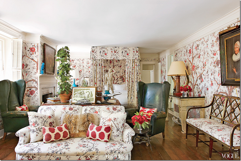
TODAY FOR VERANDA: The guest room today – simply GORGEOUS!!!! Just fabulous!! Inspired by Givency’s country house with its guest room where the same Braquenie fabric is used. I love how he mixed the green striped fabric on the bed frame. This has to be the prettiest guest room I’ve seen in a long time!!!! Wow!
A close up of the inside of the bed with its blue fabric. Love the red bobble trim on the toile fabric.
Across from the bed are two chairs and ottomans with a square red skirted table between them.
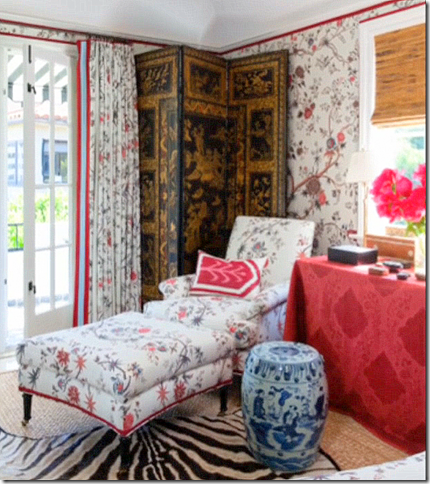
Wish this wasn’t so blurry – but in the corner is an oriental screen. Love that touch!
The decorated patio off the guest room.
Mark says he got his inspiration for his new guest room décor from Givency’s own guest room – using the same fabric. Both rooms are beautiful. This is making me want to use this fabric too!! (bad crop/scan)
My personal favorite use of this fabric is in Daniel Romualdez’s bedroom. All three rooms are to die for, that’s for sure, and it shows how important a wonderful fabric can be. Would any of these rooms look as good in just white linen? Hmmm…
The link to this Pierre Frey fabric is HERE in case you are inspired to go full out on this tree of life pattern.
Original: the tub was ultra contemporary, as was the sink. Total gut job.
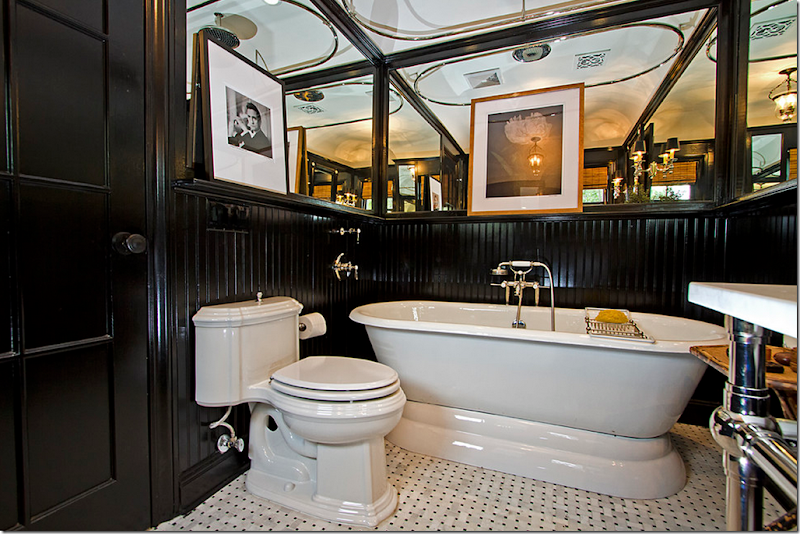
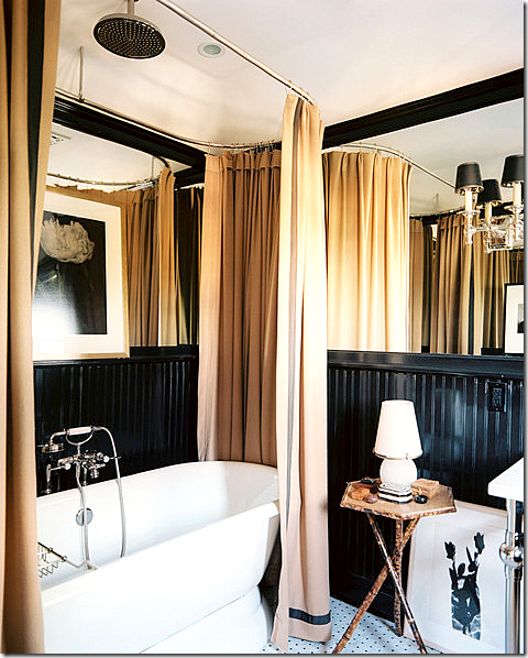
AFTER THE FIRST REDECORATION: And a look at the guest bathroom. Here – it is seen without a shower curtain. Love the bead board painted black.
And here there is a curtain. I have a feeling this bathroom has been completely changed to match the Tree of Life décor.
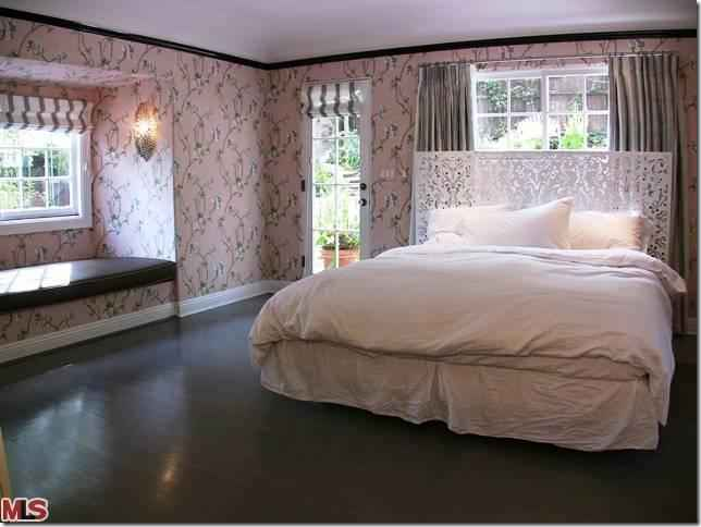
ORIGINAL: Not that bad! I could probably make this work. Pink wallpaper, dark wood floors. But of course, Mark had MUCH better ideas for his master bedroom:
BEFORE: Now, the room that started it all. When planning to enlarge this room, Mark wanted hand painted wallpaper in here – but there was already a beautiful pattern in the dining room. With that – the total redecoration began. Again, the master bedroom before was wonderful. A canopy bed, striped chairs, and a pretty linen print on the bed.
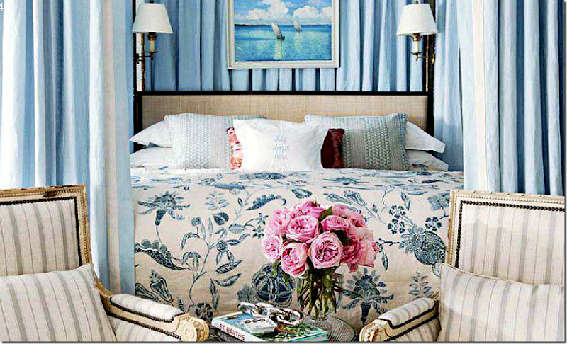
Two chairs sit in front of the canopy bed.
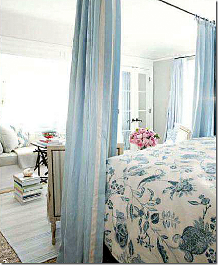
Striped rugs were layered over textured matting. There is a large window seat and a balcony.
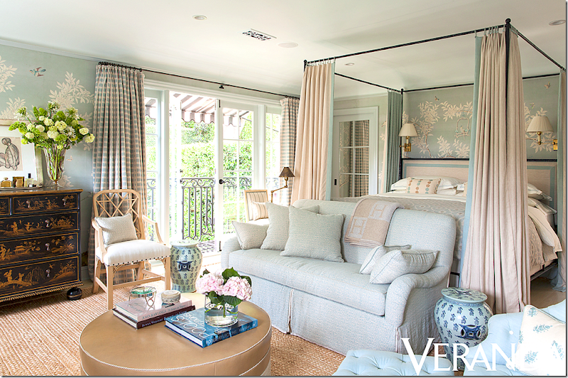
AND NOW TODAY, THE MASTER BEDROOM:
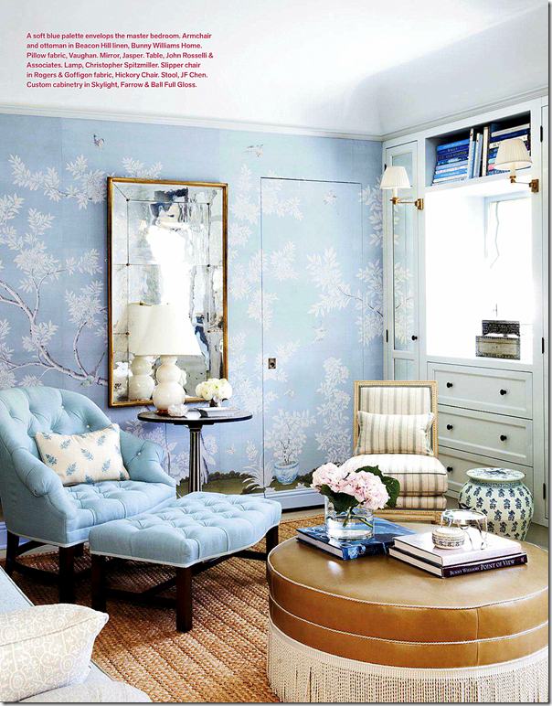
AFTER FOR VERANDA: The room has the same blue color scheme and California feel – but with the wallpaper, it is taken up a HUGE notch. Plaid curtains and creamy linens on the bed. The remodeled master bedroom looks more sophisticated with the wallpaper. The sofa and the curtains on the canopy also make it seem more sophisticated than before. The before was beautiful – but this is just a bit prettier, a bit finer.
Beautiful tufted chair and ottoman.
The mirror has moved from the downstairs living room.
Oriental chest and art work.
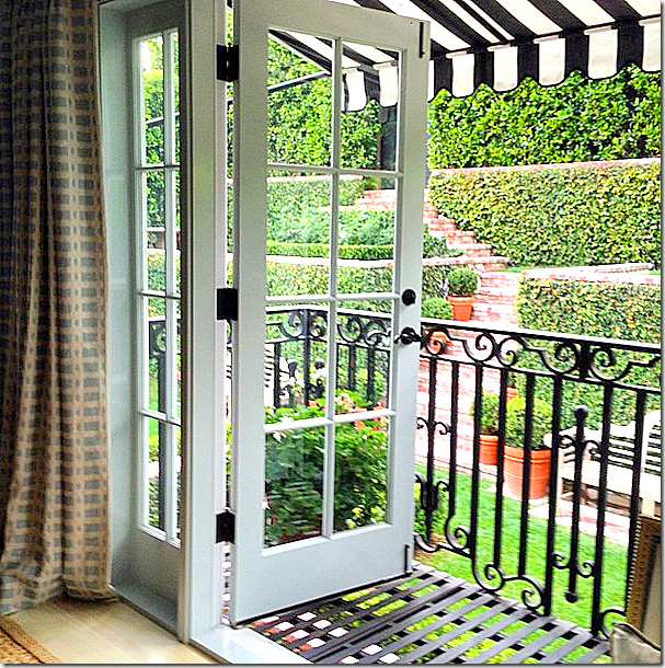
And the view from the master bedroom’s balcony.
Original: the bathroom with the pink and black tiles. Pretty, but surely Mark can do better!
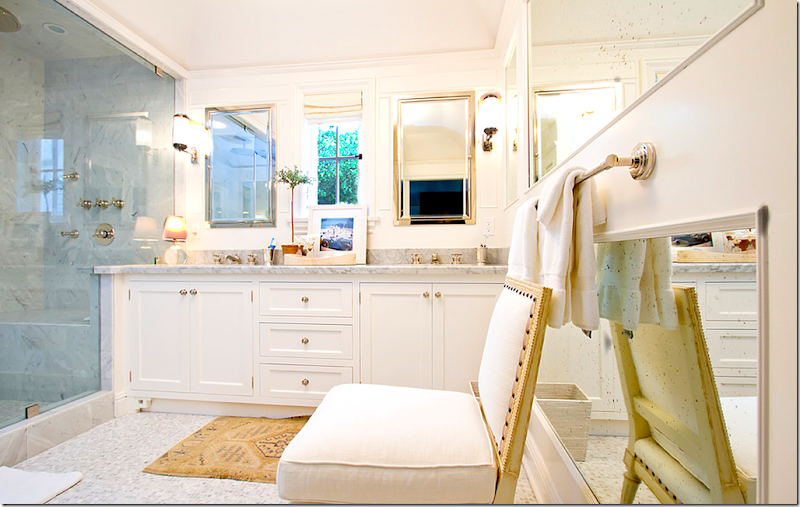
AFTER: Beautiful, perfectly executed combination of classic elements – marble, mirror, nickel, cabinetry.
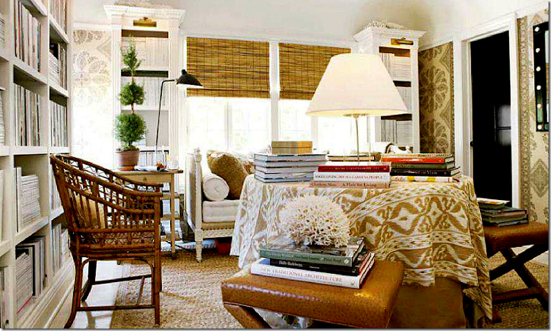
BEFORE – THE FIRST REDECORATION: The upstairs library as it once was before Mark wallpapered it in the familiar Peter Dunham Samarkand pattern. He added all the shelving with lights – turning a bedroom into a reading room.
HOUSE BEAUTIFUL: Here, a while later, Mark added the Samarkand pattern to the walls, along with chairs and ottomans.
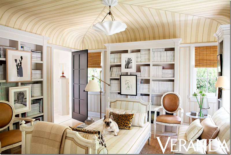
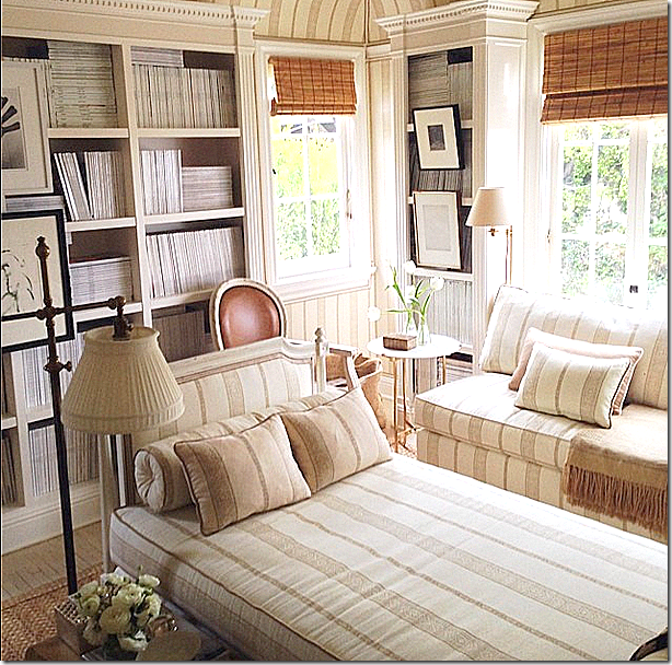
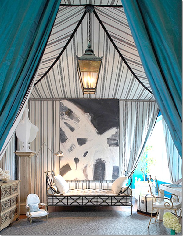
AFTER: A complete change! The ceiling is now tented – inspired by the Charlottenhof Palace in Germany. The skirted table is replaced by the day bed, while a new banquette is added by the window. Topping it all off is the new light fixture. The new tented ceiling really makes the room seem so much more substantial.
Mark said the inspiration between this new design is the tented room at the 1829’s Chartlottenhof Palace in Germany:
Charlottenhof Tent Room – Mark’s inspiration for his library.
Paula + Martha, interior designers based out of NYC, also used the Charlottenhof Palace tent room as an inspiration for their Hampton Designer Showcase House room HERE.
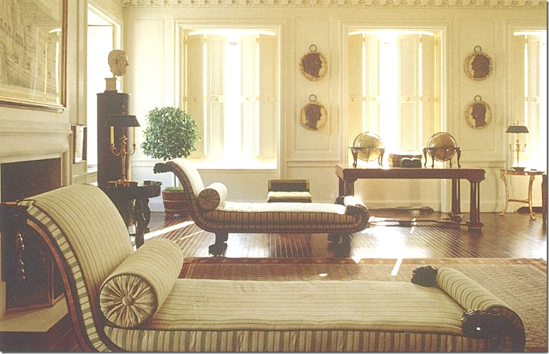
And, Mark had another inspiration for the library – Bill Blass’ living room in NYC HERE.
Little Augury wrote an interesting blog about Mark’s fashion inspirations HERE.

Library bathroom.
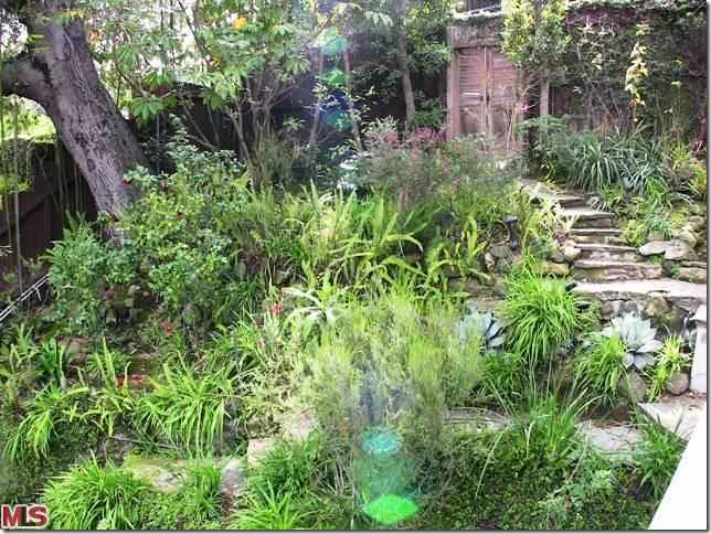
ORIGINAL: You can see the terrace was not always such a beautiful place.
ORIGINAL: And an even bigger mess was the back yard that is now neatly terraced. Before, this back portion of the yard was a total mess – a jungle!! This really shows how important landscaping is. Mark’s gardens turned this space into another room, a place to entertain or just to be alone with the paper and a cup of coffee.
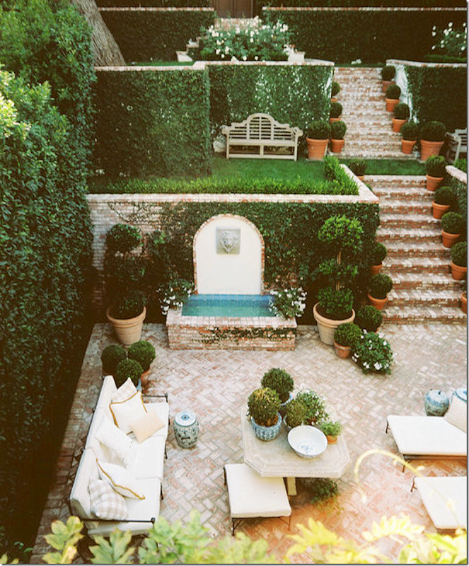
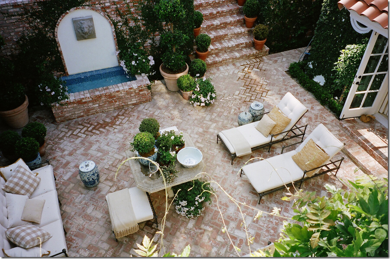
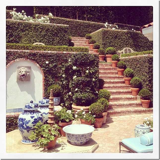
HOUSE BEAUTIFUL: Here is how Mark changed it all. The back hill was terraced with a set of brick steps, creating small rooms along the way. The brick terrace is now surrounded by walls of greenery.
Instead of a contemporary fountain, now it is the focal part of the garden. Mark says that the fountain is heard throughout the house. LOVE!!!!!
A view of the living room below and a balcony, in the guest room, above. Is this France???
TODAY: And finally – a new look to the outdoors with fabrics in blue to blend in with the décor inside.
Makes me want to go out and buy some more blue & white!!
So – how do you like the changes Sikes made to the house? The new dining room is now mirrored, no longer papered in the beautiful Gracie? Do you like the more sophisticated and coordinated living room in shades of golds and taupes? What about the bedrooms? Do you like the new wallpaper in the master bedroom? Do you think it makes more sense to paper the master bedroom than the dining room? What about the new guest room with the beautiful tree of life fabric? Do you prefer it like this or before, in the more British Colonial Style? And finally – the library? Do you like it tented or not, as it was before?
My vote is for the redecorating! I love all the updates – especially the bedrooms, the master and the guest room alone is worth it all! I love the new living room and the library. And I really like all the new patterns and colors in the family room/kitchen. My only regret? I do miss the Gracie paper in the dining room, but I understand the thought process behind the change.
In all, I think it’s a total winner and Mark Sikes continues to be someone I love to watch and follow. To read his blog, go HERE.
To following his travels and antics at home – visit his Instagram – Markdsikes
To read more about Mark Sikes’ renovation, here are some good blogger stories:
La Dolce Vita HERE
Colour Outside The Lines HERE
and Little Augury HERE



























Great article!! I loved the before and I love the after.Who could choose? I think his dog is a French bulldog.Doesn,t look like a pug but maybe you are right. Thank you for all the time you put in to make a wonderful treat for all of us!
ReplyDeleteI thought the same thing; that's a very cute French bulldog! Wonderful, well-researched post - thanks!!! Anabelle
DeleteEvery single one of his recent changes are absolutely outstanding!
ReplyDeleteHe has really transformed each room beautifully.
I can't tell which I like the most, they are all so good!
The mirrored dining room is light, chic and superb; the stair railings a huge improvement, the kitchen is incredible the way he opened it up; that library with the tented ceiling is darling, the master bedroom is beautiful with the blue, the bathroom is superb with the walk-in shower, and the garden is so sophisticated!
Proof of natural talent. But a sincere question for you, Joni. Why did you like the red pom fringe on the guest bed? Why isn't this fringe perceived as being "granny"?
ReplyDeleteJust perplexed at both his use of the fringe and your approval - or is everything old new again? Thank you for a marvelous post.
I don't know - I have always loved bobble trim and it's so out that it looks great - in this context. it's the perfect place for it. I just love everything about that room and wish i could afford to do my guest room just like it!
DeleteJoni, I am as amazed by your compilation of the way-befores and the up-to-todays as I am of Mark's work. You are both incredible. This post took enormous effort and, as do all your compilations, teach so much. Thank you. Now to comment on Mark's house. I, too, miss the Gracie wallpaper in the dining room, but LOVE it in the master. I wonder if he could have used a scenic Gracie in the dining room? It would have been softer than the mirrored walls. I love what he did to the kitchen! (By the way, great call on combining fabrics!) I adore the tented reading room and the inspired, terraced garden. From the beginning, Mark took a sow's ear and made a silk purse. What vision…what talent. Thank you for taking us on this journey!
ReplyDeleteThe dining room is the only one that stumped me. I get it. I do = totally. But it was beautiful before. Maybe i'm not a fan of all the art work on the mirrors? not sure. but who cares? i love the house.
DeleteI'm thinking the dining room is one of those spaces you have to be in, and experience, to really appreciate it.
DeleteOh, to be besties with Mark! I could easily live in both renditions!
ReplyDeleteKaren
Thanks so much, Joni! While I don't think I've ever seen an interior I like less than the "before" version, I could move right into Mark's updated home. It is absolutely perfect! So cozy and fresh, so comfortable and elegant without being overdone. I LOVE it!!!
ReplyDeleteWow; every room was incredible before, but you're right - he improved them! Love, love, LOVE his house - thanks for this great post! Beth
ReplyDeleteEnjoyed this so much ! You hit a home run! Both were gorgeous but I still prefer textured solids on large pieces over the busy prints.
ReplyDeleteThanks for sharing!
Tina Ramer
Joni, as always, a fab post! I loved all of the latest changes EXCEPT the dining room. It was so gorgeous before, I think covering that green Gracie paper was a travesty! Who says you can't have two rooms in a home with beautiful paper? I don't care for the mirrored walls, the orange leather, or the books piled on the floor. The dining room is right off of the foyer and now just looks sloppy as you enter the house. what a shame.
ReplyDeleteI can't believe you'd worry about repeats. Who has the time to read other blogs if they are as detailed and thorough as your posts? I certainly have better things to do when I get to the office on a Monday morning but... This is a great post. I cannot believe the change from the original photos that you posted. Yes I love your kitchen style and this makeover as well. I could have done without the blue fabric on the pendants above the island though. I prefer the guest bedroom prior to the canopy bed. But still, what an interesting read.
ReplyDeleteThanks Joni
oh but i DO worry. I try not to google when i start to write a story because i know its been done before. i'm just slow. it takes me a while to decide what to write about and that's part of he problem. i just don't run for the computer when i see a story. maybe i should. but i hate to repeat myself and i do, all the time.
DeleteThank you for this post - so inspirational. I liked his style before and love the afters. Interesting how both he and Furlow Gatewood use blue and white china in such a contemporary way. And I agree with you about his fabric mixing - wow! And that guest room? Before I die I want to have at least one room in my house completely covered (a la Lee Radziwill?) in one beautiful fabric. Don't know if there's enough in his house for a book, but if so I think it would be like "One Man's Folly", something I'd turn to daily for inspiration. Many, many thanks for this lovely post!
ReplyDeleteThis home has haunted my dreams -- in the most wonderful way, of course -- ever since its first incarnation. And, I am thrilled with the latest rejuvenation. Mr. Sikes is probably the only designer I would gladly let loose in my home; no questions asked. I have found my design muse. Thanks for the wonderful recap.
ReplyDeleteThis is a fantastic post. Where do you find all those photos? I love Mark Sikes style. Am I the only one who likes the BEFORE house better? I prefer the more neutral color scheme. The new master bedroom is too busy and colorful for me, but he is absolutely masterful at what he does. It is beautiful but I would vote for the previous decor!
ReplyDeleteI am one of Mark's # one fans. I adore his design aesthetic. I could easily move right in to his home and be completely comfortable and live happily ever after! Fabulous!
ReplyDeletexoxo
Karena
The Arts by Karena
Great post -- but the sweet dog is not a Pug, but a French Bulldog! : )
ReplyDeletei know that! Why did I call it a pug????????????????????????????? so stupid. getting too old!
DeleteGorgeous! I'm wondering what type of plant, or shrub he used as a hedge at the front of the house to wall off the garden and house and provide privacy? He seems to have used that throughout the garden areas.
ReplyDeleteThanks again, Joni, I loved it all. Still, I am so besotted by the Gracie in the dining room and Samarkand upstairs that I can't get too excited by the new changes. It is lovely for sure, and I like the upgraded furnishings but for me it all is too much pattern- a lot of it in similar scale? ***Love*** Daniel Romualdez’s bedroom and the Pierre Frey fabric, but the this one is pretty, but not the same league for me. Can't quite figure out why...Mark is a wonderful talent and his blog is another daily click, but where I loved every single thing about the first renovation, this one is mostly love. LA
ReplyDeleteWith no criticism implied, I liked the first redecoration better than the last one in every room and in the outdoors as well. This is not because the later redo is flawed, it is because my taste is in the earlier direction.
ReplyDeleteAs usual you have done a magnificent job. Every week I so look forward to your presentation. It is always remarkable. My gratitude to you because you both entertain and instruct. Ann
Anon 1:17 and 1:57 - I understand. I probably would vote for the first dining room even though the paper no longer works with the new lving room. but the guest room? no question. i love the new room. And i do miss the samarkand too, a lot. but he's lived with it, i haven't. he's probably sick of it.
DeleteYou're right, Joni, I'd like to have a chance of getting sick of Samarkand : ) and that green Gracie just sings for me. I thought about your post half (most!) of yesterday. I think the bedroom is too crowded for my taste (because I love the fabric). I went back to the DR room and compared. I love those blue leather wing chairs and the bare floors that give a spareness to a busy space. I think that- and the size of the room is what makes that one so much more appealing for me. That said, I'd love to spend a night or two in Mark's : ) just to see if I would fall in love with it in the morning... I also was knocked over by the outdoor redo. Loved the first incarnation and went nuts for the the new version with the blue- I am decidedly unhappy with my very lovely (but not blue!) flagstone patio today.... Again, thanks Joni. Leigh Ann (aka anon 1:17)
DeleteI know this will come off badly but I find his work soulless in a way that I can't pinpoint. All of the details large and small are there, it just seems so studied - a lot of Michael S Smith (obviously), a little bunny, a dash of Charlotte etc. While his work is meant to be classic, the fact that he redecorated his entire home so soon quickly implies, to me, that he is a trend chaser, and this is contrary to "the look (s)" he's trying to achieve. Much prefer the first make over by Ms Moss (a true star IMHO) - they will never be in the same league. Anyway, thanks again for another great post Joni.
ReplyDeleteI asked for opinions. we asked MIles Redd about inspiration and he said - quote - i've only designed 3 things in my life. One was the famous zebra door. Miles admitted everything he does is inspired by someone else and yes, you can see that in his work. Is it wrong to see a bathroom with a wall of blue Portuguese tile and want one yourself? I don't think so. But i know what you are saying. It's hard today with the constant onslaught of photographs not to be inspired.
DeleteThanks for your reply Joni and apologies for so many typos (usually blog read while holding a baby and talking to at least one other kid). I agree it's hard not to be inspired but I do feel some designers are able to fuse inspiration with their own style and I don't see that happening. Though most of his rooms are gorgeous and perfect and totally up my ally, I'm just not feeling this house and I think that's why.
DeleteI prefer the first dining room with the wonderful wallpaper, but love the wallpapered bedroom as well. Great post Joni. Thank you.
ReplyDeleteHere I am devouring this post when I should be working! That man has style!!
ReplyDeleteI want the furniture that he got rid of! His House Beautiful version of his house is my all time favorites. I would love the remodel if I hadn't seen what he changed. Last spring one of the sales people at Hollyhock told me that Mark had totally change his house after we got to talking about him because Mark had done a display in Susanne Rheinstein's store. I really loved the casual mix with traditional elements. But, hey, things have got to change. I didn't have to look at it everyday, although I wish I did.
ReplyDeleteWell, I think the dining room is much better - I did not think the wallpaper was good there and personally I didn't care for the coloration of that paper. I love the new wallpaper in the bedroom though! I preferred the original living room - I think it would of went well with the new dining room. The living room now looks so stiff (very Bill Blass here) and so 'done' to me - I don't care for the new furniture pieces in there. I think they could of updated the living room without going to such a drastic end. Of course the rest of the house is gorgeous and the outside is so classic - really well done. Good God, decorating must pay well for these people! I just cannot fathom it- it makes me wonder, truly, what in the world these high end designers charge for their services? I guess they are working on huge homes - millions of dollars and if they get a percentage ....unreal! I love beautiful homes but sometimes it can seem so excessive.
ReplyDeleteI prefer the first version in almost every room - but - I wonder if that's a reflection of me, rather than Mark (may I call him Mark?). I'm very comfortable with the befores - they are my colors and textures, too - and I wonder if he's pushing forward to the next look while I'm not quite ready for it. Do you know what I mean? That's why he's a designer and I'm not! I like the new kitchen the best even though I loved the yellow version, too.
ReplyDeleteThanks Joni for such a great post!
I agree. While I cannot say one bad thing about his "after", I absolutely loved, loved loved the "before" living room. I have saved that House Beautiful for that room alone, could never get tired of looking at it. Thanks again, Joni!
DeleteCongratulations, Joni, on another fabulous post. I feel like I just sat through a lecture on interior design with a brilliant professor, namely you! Your posts are so engaging, love all your hard work. This home is so beautiful, my favorites include the family/kitchen with the blue and green, and the master bedroom. I love all the blue and white used throughout the home and outdoor spaces.
ReplyDeleteWhat a beautiful house. I love most of it except the living and dining rooms. I think the first dining room was pretty but not right for the house and it didn't look *finished* to me. With the current dining room the carpet is wrong and I think the curtains are too. I don't think the mirrors have to come down but it needs to be softened in some way.
ReplyDeleteBoth living rooms are nice but I wasn't a fan of any of the seating in the first and think it's improved in the second. The mirror over the fireplace is nice, but not there. I'm glad he replaced the zebra but think the current rug isn't providing enough to the room. The upholstery is kind of lost on it. Not a fan of the fireplace styling but love the columns and urns in front of the windows. Overall a beautiful house, especially that guest bedroom. My house is a 1930's california house and looking at these pics makes me want to start making big changes.
A wonderful post Joni, thank you. I'll be looking at these pics all week.
I would love to know who owned the house previously. The Adams family perhaps? Elvira? It was downright creepy! I am in awe that anyone could see the potential in that haunted house and then turn it in to a bright, sunlight filled oasis. His second look is even more refreshing.
ReplyDeleteWe are kindred spirits. Could feel the 'ick' factor in all the before's. If it weren't Joni I would have quite looking !
DeleteGarden & Be Well, XO Tara
I liked the dining room and library better in the first version and the living room, kitchen and bedrooms better in the second.
ReplyDeleteI loved seeing the house evolve from the start to its current look. Thank you for another fabulous, well-researched post.
ReplyDeleteThis is one of the few houses to which I have returned a second time and that was after giving the initial post a great deal of attention. I think the fascination has to do with how Mr. Sikes did NOT 'clean house' but instead shifted furniture and accessories between rooms (living room furnishings moved upstairs.) His furnishings look fresh & new; not re-used. And, that speaks highly of his skill. Also, Joni, yours'. My perception is he bought what he loved the first time around and has simply refreshed & repurposed; not chasing trends or being excessive. That said, not a fan of books piled on dining table since dining room 'not used' for 'dining'--conundrum, there.
ReplyDeleteThanks for taking the time to compile the before and after tour. It must have taken some effort. This does a great job at demonstrating the move from traditional to transitional, almost even beach-cottage-esque. You can see the subdued blues, linens, and other elements that are so popular right now. Those fabric bar stools really pop!
ReplyDeleteJoni-
ReplyDeleteLoved every minute! Stunning post, as always.
Teresa
xoxo
Thank you once again for a wonderful post. Just wonderful. And you should not worry about covering a subject that's already been written about. I checked those links, and, while I think they are sweet and fun, no one, absolutely no one, writes the way you do. It's a wonder you have not been asked to write a book yet. Keep up the good work! Very few share your talent.
ReplyDeleteI can't get over the master bedroom after. It is so soft, elegant, and refined. And that wallpaper! I have my guest bedroom painted in similar color. Since I can't quite afford beautiful wallpaper like that, I wonder if I could paint the walls with acrylic myself (I'm an artist)... Or is it a bad idea. Great post!
ReplyDeleteGreat interior decoration and interior furnishing..
ReplyDeleteI love seeing the before because it makes me appreciate the afters all the more! Mark is a master!! Such an amazing job he did -BRAVO!!
ReplyDeleteThat was an amazing post, BUT I'm commenting on something completely different. I was just viewing your old post on Shirley Fortenberry's Galveston home. That has long been one of my all time favorite homes. I remember if well from Country Home magazine all those years ago! Has anyone ever done a tour of her log cabin that you mention? I bet that would be a treat and you would be the perfect person to do it! Thanks, Marianne
ReplyDeleteDon't for one minute think we don't know how much time you put in on these posts! You really know what you're doing and it shows. Thank you. Judie
ReplyDeleteI came back to this post and I focused on the fabrics - such an amazing mix and so well done! It really made me think about mixing more fabrics into my own home. I love fabric but I think I may be too careful... well, I AM too careful. I looked at the living room again - I do this all the time, at first glance I don't think I care for it, but now I think its growing on me. I do miss the blue & white in there though. This is a good design 'lesson' - its interesting to look at the designers choices here. This really is a stunning home from top to bottom - I like all the color - mostly done in the fabrics. I like a neutral background so fabric is the place to do color. I do need more color in my own home - I need to work on that!
ReplyDeleteThe original living room which was featured on several other blogs was indeed my favorite. It was a bit of masculine, hip, sophisticated and modern and yet welcoming and comfortable. Despite the fact that the current living room is beautiful, well appointed and sophisticated, it has no vibe. I really loved the rattan chairs that lent an air of casual sophistication and yet a bit of a surprise to the original living room. When something works, leave it alone.
ReplyDeleteMark's designs are livable and gorgeous! I love this post, and the article in Veranda. You could have repeated it several times, and I wouldn't tire of it. And Joni, no it's not wrong to see a bathroom with a wall of blue Portuguese tiles (Azulejo) and want one yourself! Or two for that fact! :) Fantastic post as usual. Thank you! Rié
ReplyDeleteLike some others here, I also liked his first version better.
ReplyDeleteThere's something about this 2nd decoration that just doesn't appeal to me.....that dining room, for example. I don't get all the books on the table - it's too "vignette-y", like the room is always ready for a photo-shoot.
Again, thanks Joni for the detailed post. You certainly do great research and I always look forward to reading your blog.
Gina from The Midwest
I am a fan of the first redecoration. It is more my style, but beauty is in the eye of the beholder. Great post!!
ReplyDeleteI saved that HB issue because I loved the outside terrace so much. I'm not crazy about the blue. I thought it was perfect before. Thanks for another great post. Of course you pointed out a lot of detail I never would had picked up on. That's what makes your blog so much better than the rest!
ReplyDeleteAm I the only one getting a hint of Nicky Haslam?
ReplyDeleteHow could you ignore the ENFILADE to the terrace ! "Pretty alignment", indeed.
And you had a pair of pics for inclusion in a Double Axis book but separated them. Will email you when I post their Double Axis glory.
All the nerdy things I obsess over.
Quite fun, almost a visit thru the home. But, better.
Garden & Be Well, XO Tara
What does get repetitive is praising Joni to the skies but it has to be done as she is simply the best design blogger on the Internet. Not only that but she gets better and better. This
ReplyDeletefantastic post is an example of that. And Mark Sikes is a true design genius who, in my opinion, created one of the few most beautiful houses ever published. But since you asked for opinions, Joni, here's mine: I think it's sad Mark would destroy that. Couldn't he have found another space in which to do his new thing? It wasn't that long ago that he created his masterpiece. Why the need to delete it so quickly? It's like painting over a great Picasso. And as another commenter pointed out--wow, the money that went down the drain! Doesn't money mean anything to Mark? I like the Before much better as it was Perfect. And although some of the After rooms are still terrific (although I agree with the commenter who said they are lacking in the soul the first renovation had despite the fact that the color of the wallpaper in the new Master Bedroom is magnificent and the upstairs hallway looks great), it's amazing how tastes vary--that mixture of fabrics in the Great room is hideous to my eye. I also think getting rid of the skirted table with that fantastic fabric should be a felony.
Thank you, Joni. for your wonderful blog. You're a treasure.
You are a treasure! Your attention to detail is incredible; and you continue to amaze and delight! You are a fantastic teacher!!!
ReplyDeleteThank you!!!
I remember the incarnations of this house, I especially loved the guest bedroom and the view from the courtyard of the house from the guest room, I had a photo of this courtyard on my wall at work. I like the updates to the house (even though it didn't need them) however I prefer the original guest room and master bedroom, as beautiful as the Gracie wallpaper in the master bedroom is there is still something about the original bedroom that I love. The new mirrored dining room is a triumph and I prefer it to the previously wallpapered one.
ReplyDeleteA big thumbs up for the upstairs tented library however if you look very closely it is magazines only! This is the first magazine library room I've seen - I want one.
I know that you state in the beginning of this post that it is hard to be original but don't worry - you really are original in your posts. There is nothing like them anywhere on the decorating blogisphere.
Exactly! There is nothing like your posts! There are excellent ones (Velvet and Linen springs to mind)!
ReplyDeleteBut that is completely different! When I started (why did I start???) there were not anywhere near as many!
Yours is so completely individual; different, unusual......and no one does the research......You do win the complete prize of sleuthing and analyzing!
Bravo! Your research and your finding of old photos is wonderful and.....most of all.....so educational!
I have often told young people...."don't go to school" for decorating!
Now I say; find the best blogs that represent the "style" you love. Study the "blogs"! You are among the top ten!
Wonderful! Thank you!!
Penny
I realize that designer have to re-do their homes in order to garner publicity for themselves and their retail designs -- and I do appreciate when they re-use items throughout the new phase! I am very torn about the re-design here -- especially the tented room -- the dust must be choking! Yes -- they have servants to do all the cleaning (and everything else) but all that fabric must really hold the dust!
ReplyDeleteJan at Rosemary Cottage
Dear Joni
ReplyDeleteI have been reading your wonderful blog for quite some time, Im afraid I am shy with my comments! I just want to thank you so much for putting such attention to detail and interesting information in all of your posts, and especially this one about the very talented Mark D Sikes. I have been an Interior decorator and florist for over 20 years, and I always always learn something new when I read you. I am extremely grateful for this
I come away feeling rejuvenated and inspired, and considering it is 1am here in the Uk it will mean some 'midnight oil'!!
My sincere best wishes and thanks
Sally
Thank you for such an amazing post, this house is my most favorite ever!!! So fabulous to see it redecorated twice; I almost can't decide which version I like better.
ReplyDelete-Haley
I love both versions and feel that I can learn a lot from studying all the photos. I just hope that he left the Gracie wallpaper under the mirrors in the dining room, though!!! Mark D. Sykes is very talented at translating iconic interiors with a twist - has it occurred to you Joni that he copied YOUR bedroom. Same chinoiserie wallpaper and same curtains!!
ReplyDeleteJust want to say that you've knocked it out of the park with your last 3 posts. I love the before & afters and your ability to spot what was reused. I can only imagine how much time and effort went into pulling them together and I wanted to make sure to share how appreciated they are.
ReplyDeleteTotally correct and brilliantly said! Bravo Joni! and bravo commenters! And for whatever reason I do not know.....the troll....who just wanted to take me (and others) down....is somehow "disabled" or dead......or gone somewhere else! Thank the Lord! And thank Joni!
DeleteAnd thank everyone!!! Happy days!!!
Penny, please restrict yourself to one comment per blog post.
DeleteHello Miss Joni, I am really inspired with the photos you've posted.. its all very beautiful interior and the colors is so elegant. I'm gonna visit your blog always so that I could see your new posts.
ReplyDeletexx Carol
Gold Coast
I LOVE the gorgeous guest room! I agree, the last version is the best one.
ReplyDeleteYou transformed it beautifully. Great luxury home builders in los angeles.
ReplyDeleteFurniture is that primary thing enhances the charm and magnetism to your home and adds versatility to your life. The kind, size and color of your furniture actually discloses the real you and your approach towards and lifestyle and livelihood.
ReplyDeleteTimber Outdoor Furniture
I love the alabaster light in the entry. Where can I get one that is similar?
ReplyDeleteOh well!!!
ReplyDeleteI always like your blog post because you always comes with different ideas and information. I always shared your site post with my friends. Keep posting and i will follow you.
ReplyDeleteinterior design singapore
Ralph Lauren Outlet
ReplyDeleteKate Spade Outlet
MCM Backpack Outlet,
MCM Backpack
UGG Boot Clearance
Oakley Sunglasses Outlet
North Face Outlet Online
Marc by Marc Jacobs
Your blog has given me that thing which I never expect to get from all over the websites. Nice post guys!
ReplyDelete
ReplyDeleteشركة عزل خزانات بالمدينة المنورة
اعزل خزانك مع شركة الندي شركة عزل خزانات بالمدينة المنورة مع افضل خدمة عزل خزانات بالمدينة المنورة قد تحصل عليها و تعيد خزانك كالجديد مرة اخري صالح لتخزين المياة لفترة اطول قد تدوم سنين باقوي مواد العزل المستوردة و تحت اشراف الفنيين باحدث الطرق العلمية لعزل و تنظيف خزانات بالمدينة المنورة
عزل خزانات بالمدينة المنورة
اتصلوا بنا علي
0508726070
http://www.elnadaa.com/653/Cleaning-tanks-medina
مكافحة النمل الابيض بالرياض
ReplyDeleteشركة تنظيف بالدمام
شركة تنظيف مساجد بالرياض
شركة تنظيف بالرياض
شركة تنظيف مسابح بالدمام
شركة تنظيف بالقصيم
شركة تنظيف بخميس مشيط
I got such a good information on this topic its very interesting one. You made a good site and I have found a similar website, please check this one Awnings and Patios Sydney visit the site to know more about Rsquality
ReplyDelete