Recently I was sent pictures from an interior designer, Stacy Jacobi, who specializes in flipping houses. Stacy has moved 12 times in 12 years – each time updating the new house for her family. She also renovates and decorates for clients.
The pictures today are from a house her family lived in after she totally renovated it. It was purchased for $550,000 and a year later, it sold for over $1,100,000! Wow!
The renovation was not a total redo – she reused cabinets in the kitchens and bathrooms, but she installed a new striking, custom iron banister that became the focal point of the redo. The house was a dated, soft contemporary with cream tiled floors and soaring ceilings. Stacy installed hardwood floors and marble countertops and subway tiles and fabulous light fixtures to turn the house into an updated warm and friendly family house. It’s an amazing transformation – from modern to cozy.
Describing the style of this house – Stacy calls it: “New England modern with a hint of Hollywood went to the farm!”
Here is the house – clapboard with lots of windows on a small hill.
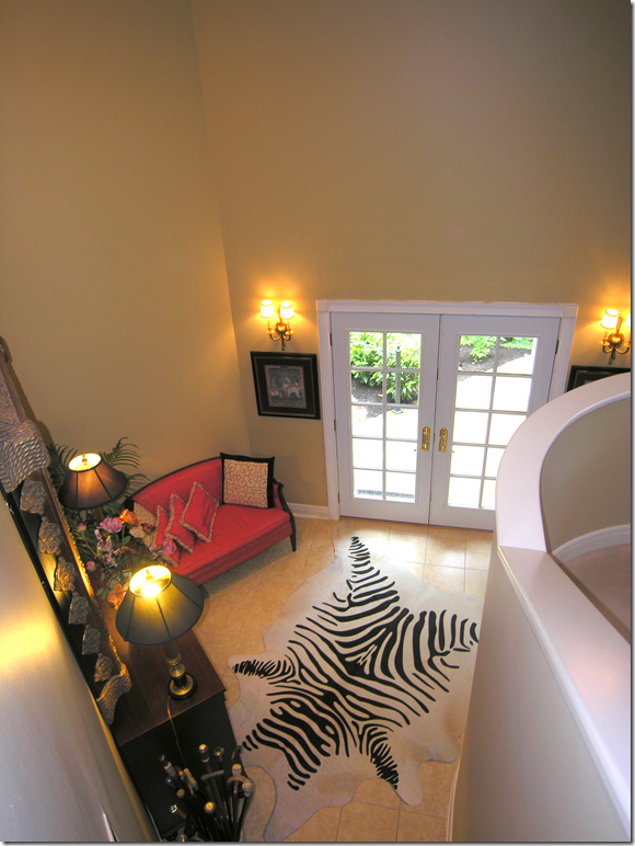
BEFORE: The front door and entry hall. To the right is the original staircase with its solid rail. Cream tile floor throughout.
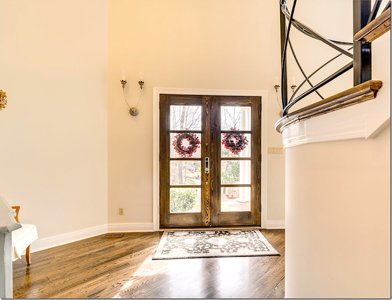
AFTER: Stacy installed new front doors with a more modern look than the previous French doors. New sconces from Aidan Gray. To the right – you can see the new iron railing that was built by an artisan. One of the biggest changes is the dark hardwood floor that replaced the stone tiles. The hardwood makes a huge difference throughout the house, turning the house from modern to warm.
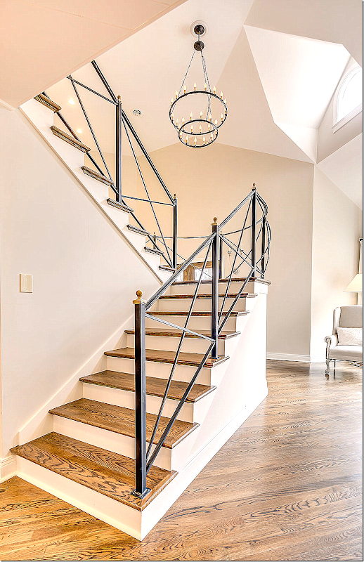
A look at the gorgeous staircase with its new iron railing. Fabulous! An iron chandelier hangs over the stair – tying them together aesthetically.
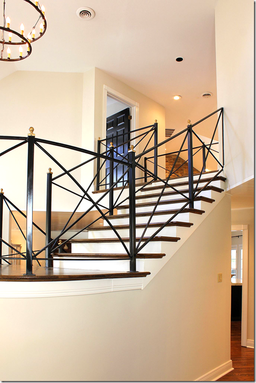
Another view of the staircase, updated with new railing.
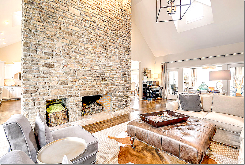
Past the entry hall is the large family room. The stone fireplace reaches to the ceiling. At the end of the family room is a smaller TV room, through French doors. The kitchen and dining room and entry hall are on the other side of the fireplace.
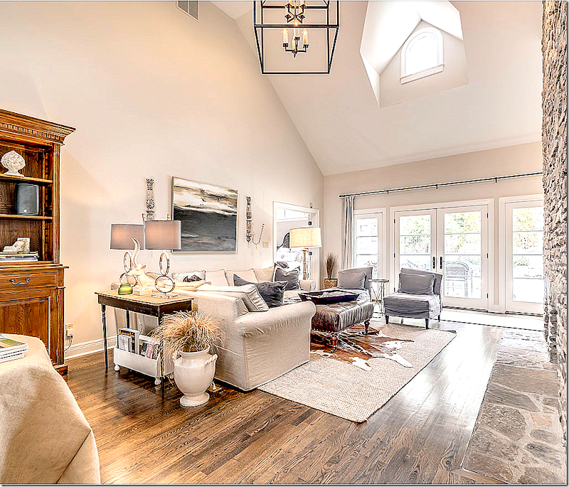
Looking the other direction of the family room – towards the outside. Stacy loves to layer cowhides over seagrass.
Between the family room and the TV room – Stacy added a burlap covered skirted table which acts as a hall table room divider.
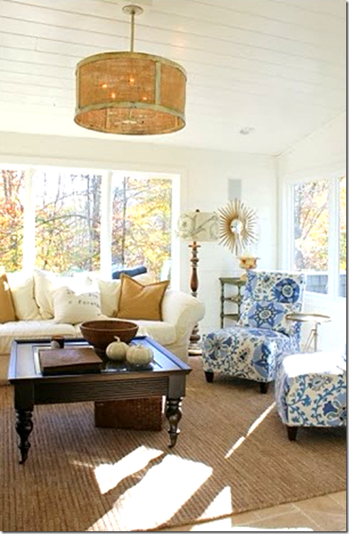
In the TV room – Stacy painted the shiplap walls and ceiling the same color. Love the Carlton V fabric on the slipper chairs. Because the TV room has a porch-like feel, Stacy installed limestone floors instead of hardwoods here.
Stacy found the sunburst mirror at Home Depot of all places. Designed by Martha Stewart it cost $39, the kind of a steal of a deal that Stacy loves.
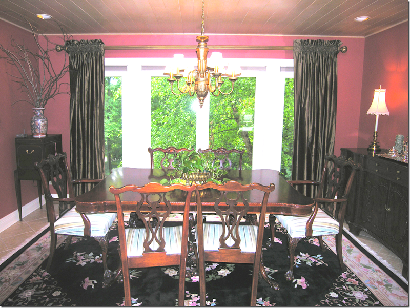
BEFORE: The dining room. Painted red, Stacy says that she doesn’t care for red, never has had a red room and doesn’t wear red clothes or red lipstick!
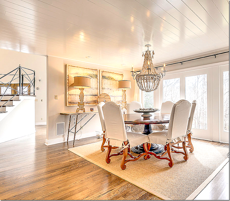
Since Stacy doesn’t like red, the dining room had to be repainted. It is now Benjamin Moore Natural Crème, flat, on the walls and White Dove high gloss on the wood ceilings. The chandelier is from Low Country Originals and is made with hand strung oyster shells!
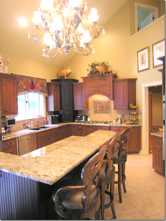
BEFORE: The kitchen had dark cabinets that were in good condition – so Stacy just painted them. But the island bi-level top had to go!
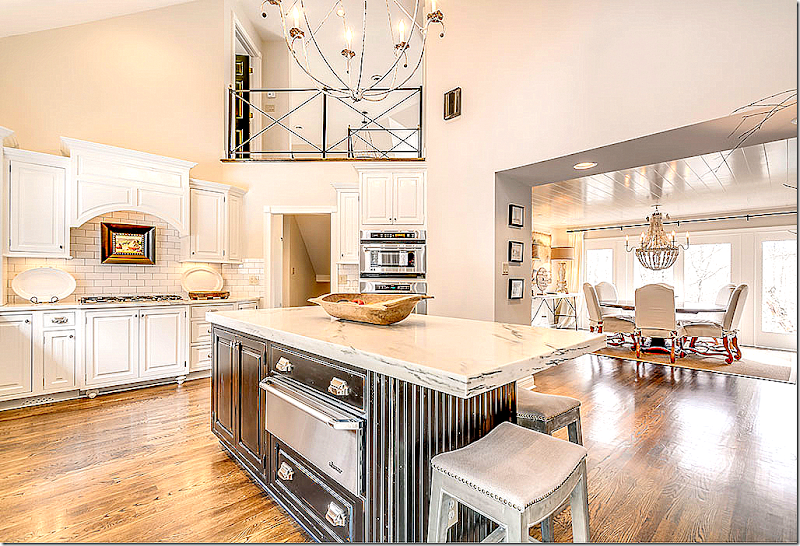
Wow! What a difference cream paint makes. Stacy replaced the backsplash with cost friendly subway tile with a dark grout. Notice the new island countertop – one level with white marble. Again, the hardwoods make a huge difference.
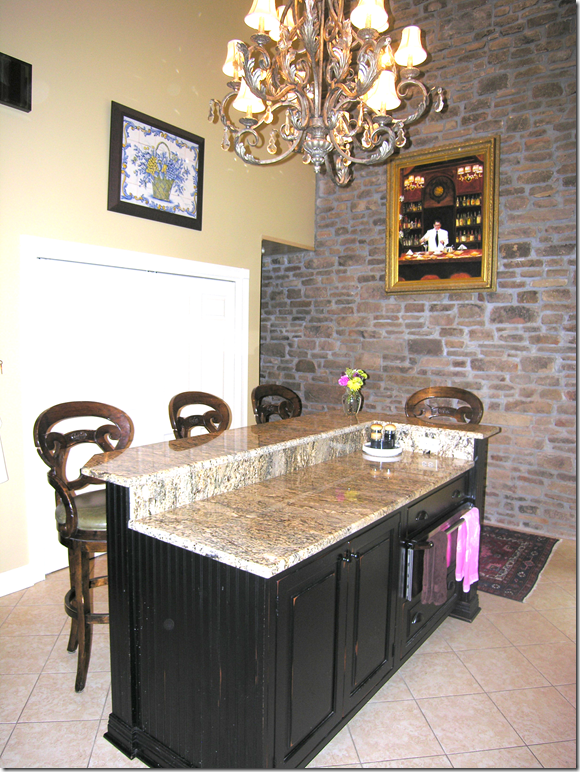
BEFORE: The island with the high low top. The stone wall is the opposite side of the family room’s fireplace. The pantry behind the island was removed – and the area was opened up to the dining room.
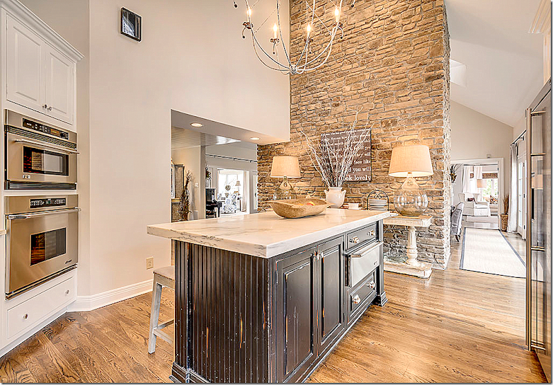
Another view of the island and the stone wall – with a beautiful console table and lamps that look great against the stone. I love vignettes like that – with pairs of lamps. I have quite a few of those myself! haha!! Here you can see how the wall was opened up to the dining room when the pantry was removed. On the right, past the family room behind the stone wall is the master bedroom.
In this view you can see the adjacent dining room, off the foyer where the pantry was removed. So much better being opened like that. At the top is the new iron railing, along with the iron chandelier that ties in with it.
Stacy used shiny hardware with the creamy cabinets and installed a trendy farmsink. Love the dark gray grout used with the subway tile. That small amount of contrast adds so much! And notice the light installed above the sink. Love that!
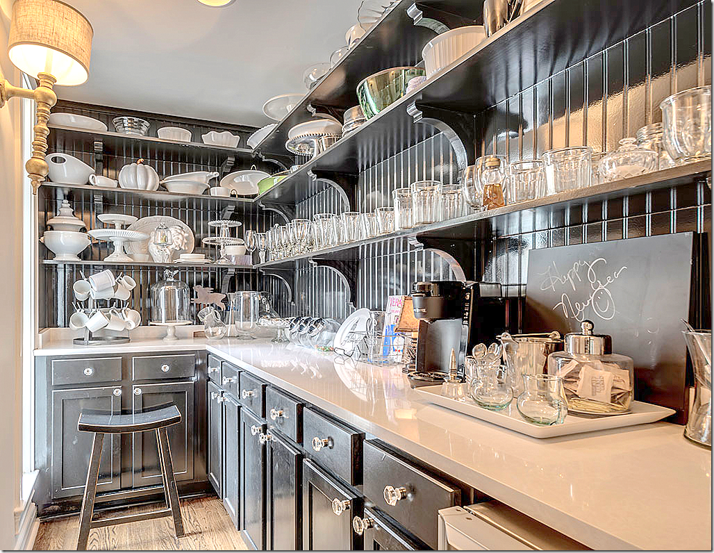
The butler’s pantry/coffee bar was installed in what was once a half bath! Love this space painted in black with white countertops and open shelving!!!
The wet bar has new hardware and countertops. Love the wood ceiling!
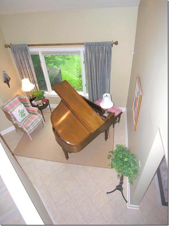
BEFORE: Music room with tile floor.
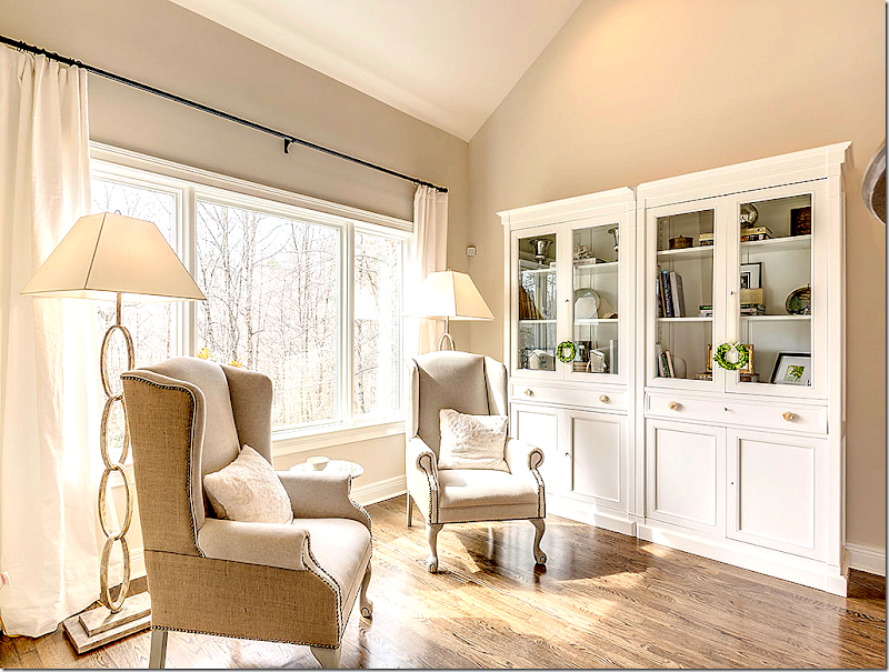
Today, with hardwoods, the room looks so different – configured as a library/reading room with two comfy wing chairs and chic brass standing lamps.
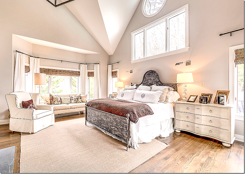
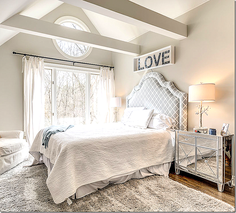
The master bedroom has high ceilings and is painted Benjamin Moore’s London Fog, one of Stacy’s favorite colors. The bed is distressed metal.
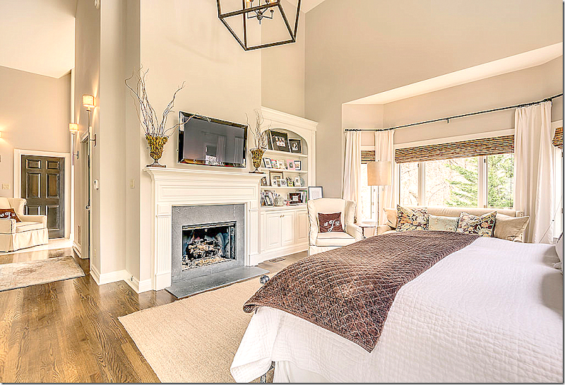
And looking the other direction – at the fireplace.
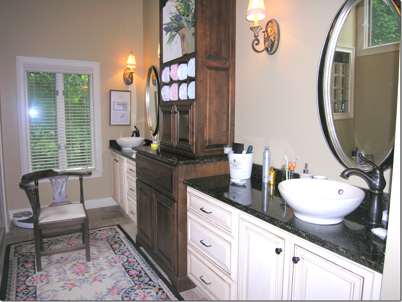
BEFORE: dark countertops and bowl sinks (I really don’t like to use these!) are two elements that Stacy changed.
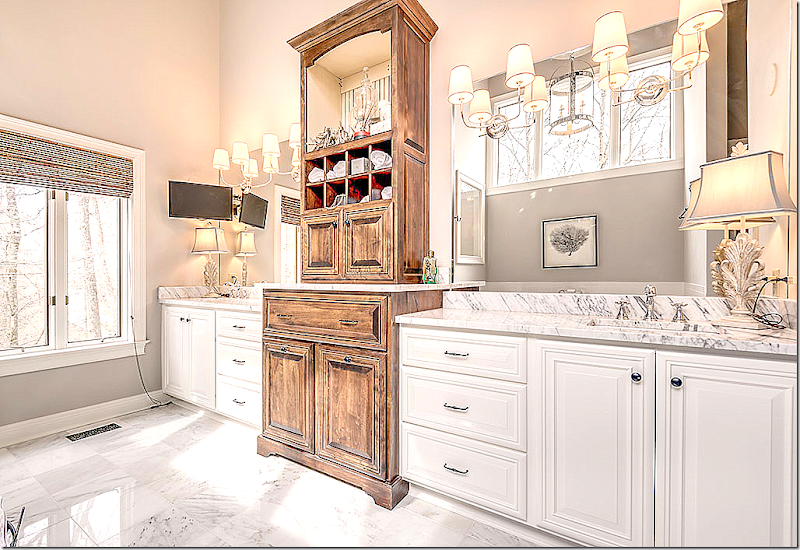
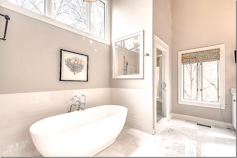
New marble countertops with inset sinks, new mirrors, sconces, and marble floors updated the bathroom. The dark cabinet was distressed.
New bath and subway tile. The window of glass blocks was replaced with plate glass.
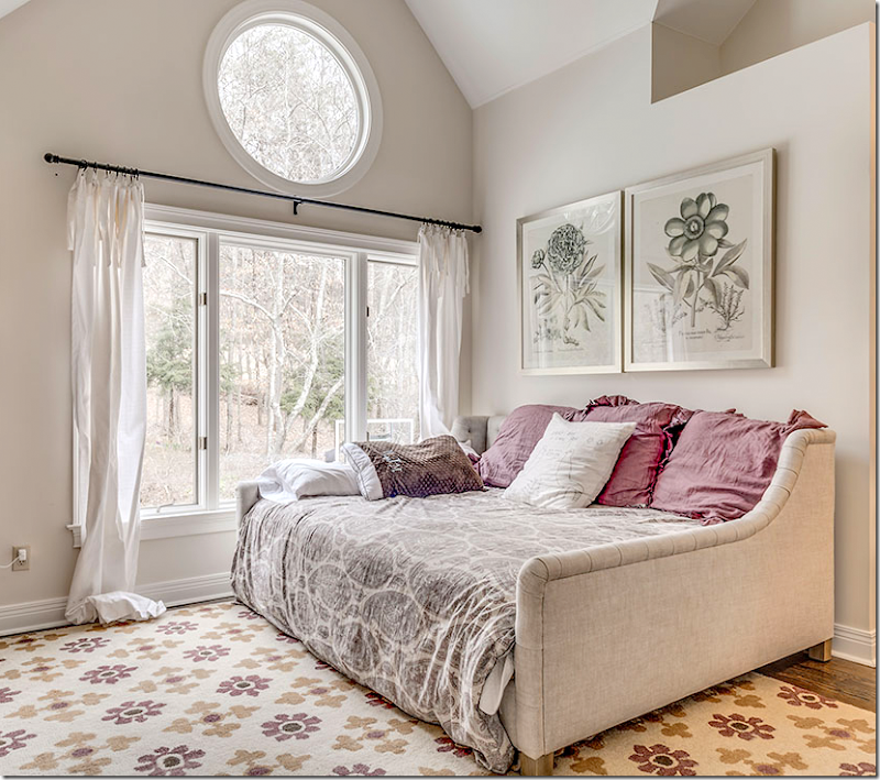
Stacy has three teenage daughters who each have their own style of decorating.
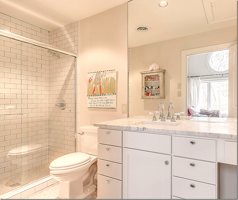
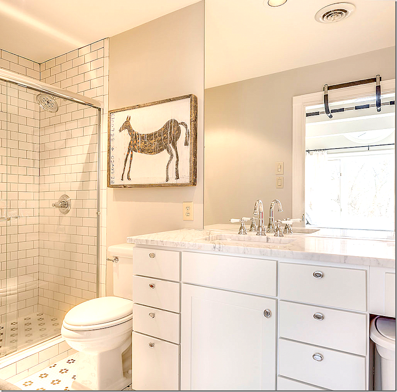
Updated baths with glass showers and white subway tiles with gray group. New marble countertops make the baths look so fresh.
Cute room in grays.
Another bathroom with marble and tiled floors.
Darling bunkroom! Love this!!
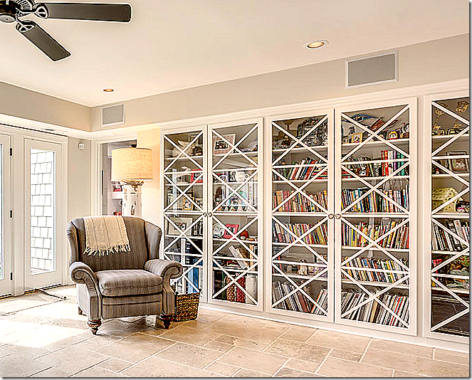
The daughters’ library - with updated doors and stone floors.
I love this house – the way Stacy took a dated, soft contemporary with soaring ceilings and high porthole windows – and by adding warm hardwoods, using creamy paint, designing custom iron railings and installing light fixtures – she turned her house into a cozy, welcoming home! Amazing!!!!
Stacy has a blog with lots more pictures of her work. Go HERE to read it.
For many more pictures of renovations – go HERE.
To contact Stacy Jacobi – go HERE!
And finally, a huge thank you to Stacy!









There are lovely things about the rooms yet the house looks very "cold" to me. Maybe just too styled for the photoshoot but it doesn't look like a "home" ..
ReplyDeleteThe great thing about living here in Upstate NY is the amount of fabulous character homes everywhere. People come rescue a dilapidated old house and the result is a warm inviting home.
And there are SO many historic homes here to choose from .. (ps .... "flipping houses" and the people who do it here in NY/Ct are not admired that much. they are taking affordable homes and making them too expensive for most of the actual residents of the area )
There are any number of things about NY/Ct that people across the country don't admire. There is an element in this country that abhors profit unless of course it finds its way into their pockets. If someone takes a dated or even a dilapidated house and turns it into something lovely with added value, why should that be deemed a negative or do people in your area prefer to live in squalor?
DeleteI think the remodel turned out gorgeous. We can take away many ideas for our own houses.
ReplyDeleteI agree with NotesFromAbroad...very much staged. Not that exciting. NOT AT ALL COZY. Messy details like the burlap to look like a skirted table; curtains that do not fit, they look like instant curtains. Wall lamps next to front door sit way too high for the fixture type. It sure looks better then the before, but the after is no quality. It looks very much like a 'flipping project'. Does not look like a professional job. I have to grand her...she did well on the sale price.
ReplyDeleteBig surprise, someone posting a negative comment anonymously.
DeleteIt was my personal home for almost a year before we moved to open up a chick fil a sold it in a day
DeleteDrapes aren't custom but restoration hardware and pottery barn floor lamps from Currey (;
OMW! I would never dream you could make modern look so lovely!
ReplyDeleteI LOVE the kitchen transformation! The contrast of the marble against the stone looks amazing, and removing the pantry and opening the kitchen to the dining room makes so much sense.
ReplyDeleteAlso, I can't believe the amount they made on this flip. Wow. Seriously impressive.
Before we can be too terribly impressed with the 'amount they made on this flip', we have to know the 'amount spent on the remodel - to say nothing of time spent overseeing it'. Still, a one day market sale says she did something right, and is quite impressive!
DeleteShe made great choices for a house flip at this price point with the staircase railing, wood floors and marble. I think the huge butler's pantry would sell me if I were looking at this house, too.
ReplyDeleteI love how spacious and light the entire house feels. The kitchen and pantry are just a dream. It makes me want to take a sledgehammer to my own kitchen and just redo the whole space. :)
ReplyDeleteJoni that staircase and railing is amazing. Great transformation from the previous look!
ReplyDeleteStacy really knows what she is doing to flip a house!
xoxo
Karena
The Arts by Karena
I absolutely love the way they rescued the kitchen! Getting rid of the pantry really makes a difference. The stair railing is fabulous--but I my building inspector would never allow that railing, they were there with a tape measure, making sure a child couldn't put their head through the railing. I'd check before doing that in your area.
ReplyDeleteMs. Jacobi did a fabulous job renovating this home. Really loved this post and seeing the transformation.
ReplyDeleteSpectacular renovation.
ReplyDeleteI am really concerned about the railing-it is gorgeous, but how can it possibly pass code? Is there glass over the iron? A child could easily fall through that railing. I see now that Simone made the same comment
Not liking a few things that Joni usually would point out as "don'ts" like the skimpy drapes (some ridiculously long), the blinds hung too low, the sloppy burlap tablecloth, the cords on the lamps in the bathroom, just little things throughout that say "cheap" or "quick fix." But my biggest question - is that railing to code? The openings look plenty wide enough for a child to slip through. I see that another person commented on that. Also wondering how much the renovation cost (or is that too personal?) I always love reading this blog and the comments.
ReplyDeleteSorry about cords drapes are linen from restoration hardware and pottery barn in kids bedrooms
DeleteThis comment has been removed by the author.
DeleteDrapes should be 2x - 3x the width of the window, ask Joni! But don't be sorry, looks like you're doing fine and having fun. Could you also give us a ballpark as to the cost of the renovation? I'm not the only one curious, since Joni published the buy & sell prices. Without the cost of the renovation, those numbers are meaningless. Also, the railing - any code issues there? Thank you!
DeleteRenovation cost was 300k
DeleteAnother super post Joni! So many take-aways for those of us who can't afford a new home or a decorator. While I would agree with some of the criticisms above, the transformation is amazing. That Ms. Jacobi would have the vision and determination to transform such an awkwardly proportationed, dated, soft contemporary and make some coin on the flip--more power to her! Remember, this is a flip, not a house that has been someone's home for several years, decorated with layers over time, etc. The idea is to do just enough so that potential buyers say wow and are able to see further potential as to what they can do with the home to further improve. Many people would've taken one look at the "before" foyer and walked back out. Few people have the talent or guts to take a risk on a house like this and put together such a stylish transformation. Thanks to Ms. Jacobi and you, Joni for sharing! Debbie
ReplyDeleteThe railing most definitely does not pass code and the 4" sphere rule.
ReplyDeleteBi-level islands remind me of the 70's - mullet haircuts and muscle cars with the back ends jacked up. Not so pretty in today's kitchen design.
ReplyDeleteIf one is going to talk about the price the house was obtained for and the amount it sold for, then wouldn't it make sense to disclose the amount spent doing the reno? There were a lot of large ticket items here and I for one as a chronic renovator would find that information very useful.
ReplyDeleteWow, I think Stacy did a knockout job here. This is a flip house, so it was done in a way (neutral) that anyone could walk in and envision themselves and their things in this house. I've been through a couple of major renovations - I have to hand it to her, having the stamina to be doing all this and moving all the time. I wonder how this affects the kids? I know my two kids (grown now, so the "stories" come out, haha!) now recall our renovations - all total maybe 20 months of upheaval - as being a completely upsetting and difficult time for them. I never realized it, and of course they love to be overly dramatic now. I will say, neither one of them have any interest whatsoever in house renovations of any kind.
ReplyDeleteYes it took me july to nov to finish the reno we didn't move in until a few weeks before it was complete we actually lived in this house for almost a year before we took a chick fil a store in oklahoma. My oldest daughter Lauren wrote her essay application for Notre Dame about moving from house to house she is in marketing and writes a clothing design blog . My other two daughters are very good at walking into a house and letting me know exactly what it needs to look better! They will probably all need therapy regardless of the moves since I am their Mother!! Thanks for the kinds words. Stacy
DeleteHope your daughter gets in ND, Stacy. It's a great place. I have had several family members attend and they all had a fabulous experience.
Deletespectacular...
ReplyDeleteAgain, I loved everything. Thanks Joni.
ReplyDeleteJoni, would love to hear more about the risk of losing a half bath and a kitchen pantry. I know there's a new butler's pantry - but I would miss the storage space.
ReplyDeleteWe moved the half bath to a space down the hall that was unused space and used butlers pantry as food storage as well
ReplyDeleteI see one person call it spectacular. They must live in a pig stye. This is a perfect 'generic blah' home. But it is what all realtors tell you to do. If I were spending a million I would want better quality and better upgrades. The renovator did really well. There is always a mug with too much money that will buy mediocrity.
ReplyDeleteThis was going to be my long term house until we received job offer so I originally did this for our family
DeleteMaterial list was Calcutta gold marble
Unfinished white oak flooring
Marble bathrooms
Dacor appliances
Egg soaking tub and rohl farm Sink and faucet
Limestone counters in butlers pantry custom cypress front doors all high end light from low country originals
So by today's standards considered high end finishes 😊
Where were the thin black curtain rods from please.
DeleteWhat a beautiful renovation! Do you know the stain color on the floors?
ReplyDeleteStain color is Jacobean
DeletePeople can just be so snide. Love the house and the colors used. Love to see what Staci does in Oklahoma. Thanks Joni!
ReplyDeleteGREAT updates!
ReplyDeleteIt looks so light, clean, bright and spacious. I think it is neutral, lovely and yes, there are some takeaways for those of us who don't have that type of budget! Personally, I love that gorgeous railing. Definitely not safe for small children, but not everyone has to worry about that. Also, I think it is hilarious that someone would complain about lamp cords. Where are the cords supposed to go? Am I missing something? I love the bookcases! Reminds me of some in Suzanne Kasler's book.
ReplyDeleteI find the picture of the bed under which is the sentence " Stacie's Daughters . . ." to be really surprising. The curtains are dragging on the floor, the sheets on the bed are showing and the pillows look like they came from the Goodwill, a long time ago!
ReplyDeleteYes pottery barn drapes came in too long during photo shoot and rachel is not best bed maker (;
DeletePillows are from restoration hardware and www.sugarboo.com
A high end co out of atlanta has great things
I took a look at this post a few days ago but did not have time to comment. Upon returning to the post today to comment, I was very surprised by some of the other comments. I think the transformation of this house is amazing and must have been a tremendous undertaking since it is such a large home and needed to be taken out of the 80's. I think that everything that was chosen was very tasteful... the floors, the counters, the light fixtures, the paint colors, the stone, the front doors, the stair railing, the kitchen.......ALL such great improvements.
ReplyDeleteIf you have EVER done renovations of any kind, you know how it seems so easy, but the actual process is NEVER as easy as it seems. Congratulations to Staci on a job very well done! As for me, I gleaned several ideas from this house. I love the lamps in the kitchen. I am looking at new light fixtures for my home so it was very fun for me to see the wonderful choices in this home. I have spied the quilt at the end of the master bed for sometime in a catalog....it was nice to see it in a real room.
I would love to see the exterior renovation of this home. Is that possible? Joni, thanks so much for sharing this post with us. Staci, thanks so much for sharing your talent and ideas with us.
I think the renovations are gorgeous, and I would be thrilled if I had the opportunity to live in such a grand, but cozy, home. Well done! Thanks for letting us take a tour.
ReplyDeletegreat post
ReplyDeletebeautiful pics
I think Staci did a great job ! I wish people would not be so quick to judge and say mean things. I wish those same people would open up their own homes... I sent S. a private e-mail and asked her a question. She got right back to me with all the info that I needed. I think that says a lot for her as I am sure she is very busy. Thanks for a great post Joni and thanks for sharing your lovely home Staci. Vicky Darnell
ReplyDeleteI want one! Just exquisite!
ReplyDeleteThank you for sharing
ReplyDeleteI have gained a lot of new
knowledge after reading your topics
I hope others can benefit as
Greeting Vimax Vimax Asli
http://store.alexanderhuang.net
Even if the style of decor isn't something that you care for, there is no reason at all to be so rude to what Staci has accomplished. It seems sour grapes run rampant if someone has something of value. I feel she's done a phenomenal job on this house and kudos to her in this undertaking. Well done Staci.
ReplyDeleteLove this renovation. The colors are great - a very comfortable home. I would love to know where the hardware in wet bar area are from?
ReplyDeleteWow! these are wonderful tips. Thanks for sharing them with us. Please visit http://goo.gl/e0rnto
ReplyDeleteWow! Stacey did a fabulous job - and looks like she spent a ton on the renovations. Taking a dated house and making it updated and gorgeous -she is very talented. Thanks, Joni , for showcasing it!
ReplyDelete-Linda, NY.
Beautiful transformation. Love every detail, especially the new iron railing. Well done!
ReplyDeleteThat stairway railing made all the difference in the world and is so beautiful and modern.
ReplyDeleteRalph Lauren Outlet
ReplyDeleteKate Spade Outlet
MCM Backpack Outlet,
MCM Backpack
UGG Boot Clearance
Oakley Sunglasses Outlet
North Face Outlet Online
Marc by Marc Jacobs
Great blog.......Renovation (also called remodeling) is the process of improving a broken, damaged, or outdated structure. Renovations are typically either commercial
ReplyDeleteor residential.Non Explosive Demolition Agent
You have combined creative design with originality.Whole renovation plan is awesome.Well done.In case you may need them, here are some more bathroom renovation ideas which you can exercise to get even better results.
ReplyDeleteTruly, a great renovation! What a wonderful home you have. Great photos too! I love your kitchen. Just awesome! The whole design is fantastic!
ReplyDeleteGreat home renovation blog! Thanks for sharing...
ReplyDeleteSydney Tiles
nice interior of all the houses. awesome information of all marble and granite is use of best quality
ReplyDeletemarble exporters in India
granite exporters
marble manufacture in India
granite stone
marble handicrafts
indian sandstone exporters
black galaxy granite
Semi Precious Stone
Stone Cobbles
wall cladding mosaics