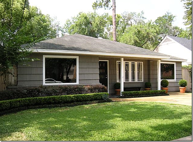
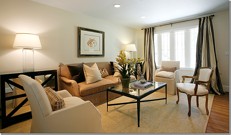
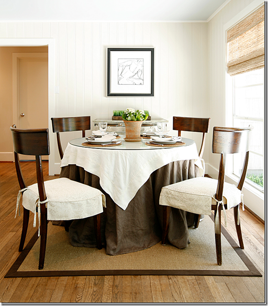
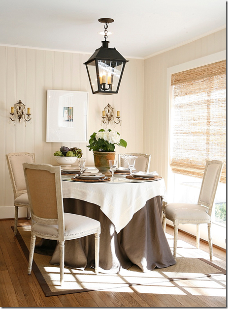
Six years ago I wrote a story about a house in West University – it was small, but impeccably decorated which is why it caught my eye. It was highly edited, clean lined and sophisticated, with furniture and accessories that were top quality. What was most inspiring was the house really had no architectural features - a typical 1930s original bungalow that couldn’t even be called a charming cottage - yet the interior designer made you overlook that fact and think you were in a larger, custom house.The bungalow was beautifully designed by Ashley Goforth who runs her own design firm. Once the bungalow sold, the new owners loved what Ashley had done with the house so much, that they hired her to design it again, this time for the new owners. She even used some of the same furniture which purchased from the previous owners. What a compliment to Ashley! I can’t think of another time where the former and present owners both used the same designer. The story of that bungalow is HERE.
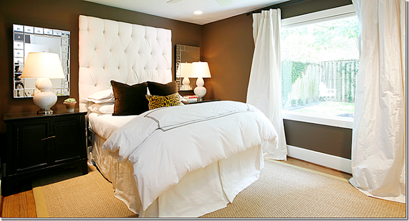
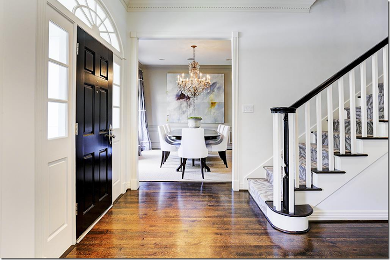
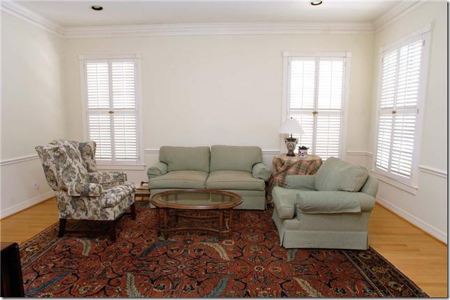
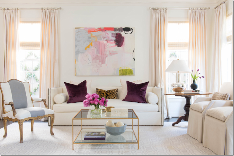
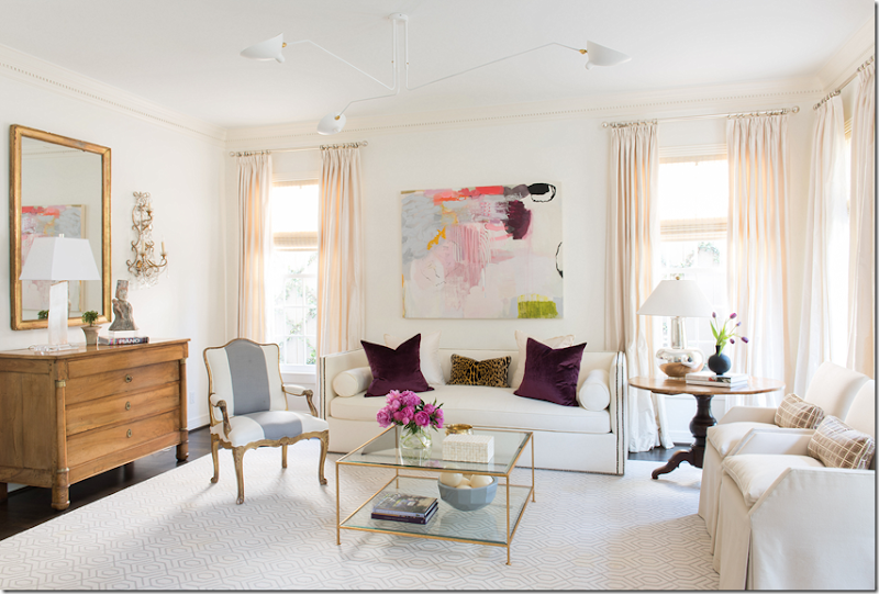
BEFORE: The bungalow: The original living room – Ashley used light fabrics and silk curtains mixed with contemporary tables.BEFORE: Two antique chairs add a contrast to the contemporary side chairs.AFTER: The new owners kept the silk curtains and furniture, but added gilt antique chairs.AFTER: The biggest change is in the dark grey fabrics on the sofa and pillows. This one change made the room seem fresh and bit more modern.BEFORE: A skirted table with slipped chairs fills the dining area.AFTER: A new lantern, sconces, French chairs, and a Swedish console updated the dining room for the new owners.BEFORE: An oversized tufted headboard becomes the focal point, along with silk curtains and dark chocolate walls.AFTER: The same room, with new mirrored nightstands and round accent mirrors, along with a print pillow made the room new for the current owners.Over the years, I’ve shown the work of Ashley Goforth a few times – I really love her aesthetic. It’s fresh and modern yet she uses fine antiques to create a look that appeals to the younger set, as well as the more seasoned (hmph!) crowd.While perusing the HAR web site, I came upon a house for sale in West University that stopped me in my tracts. It’s so rare that you find a house that is professionally decorated and in a way that would be put in a magazine – that when you do, it seems so dramatic! I kept looking at this house and was dying to know – who designed it? A little bit of research lead me to Ashley Goforth (of course) but even more fun, was that the owners of this house were the original owners of the bungalow that I had showed so many years ago!!! Wow!!Ashley was so sweet to send me the professional photographs of the house for sale, and I found the BEFORE pictures so you can really appreciate the work that Ashley did – enjoy!!!!BEFORE: The red brick house is typical for the newer houses in West University built in the 1990s. Pretty.AFTER: Whoa! The change is amazing. First Ashley painted the red brick – white, which is a very on trend thing to do. This one change is immense. Next, landscape designer Gregory Henry HERE pulled out the accent trees and shrubs and installed clipped box. He also put in a brick sidewalk. New wood gates add more interest, along with new oversized New Orleans styled lanterns.AFTER: A glimpse into the main hall, with the patterned zebra print runner on the stairs.BEFORE: The living room is rather plain with shutters and orange colored hardwoods. A blank slate.AFTER: First Ashley stained the hardwoods a deep, dark brown. Then, she painted the walls white. Here, she added silk curtains with textured shades. Modern artwork adds pops of color which are repeated in the pillows.
Much of the beautiful art work came from Kathy Dimmitt Contemporary Art - to see more, go HERE.
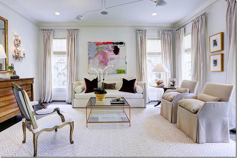
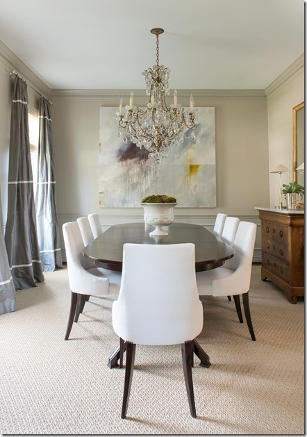
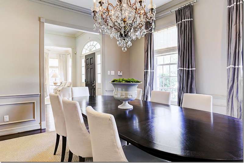
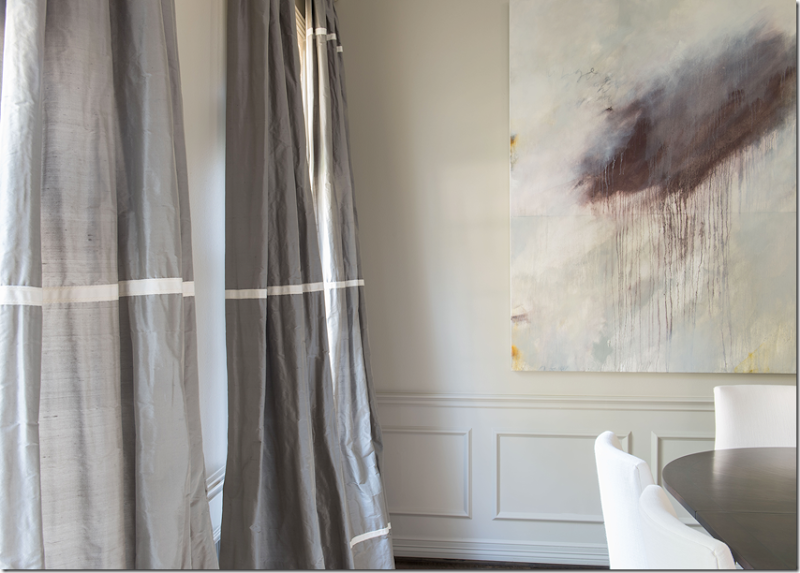
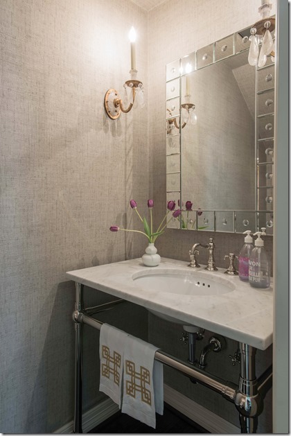
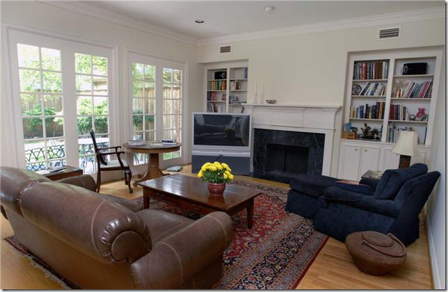
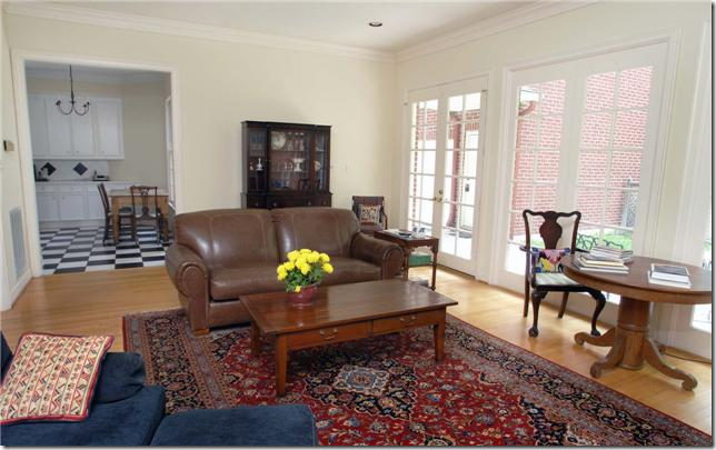
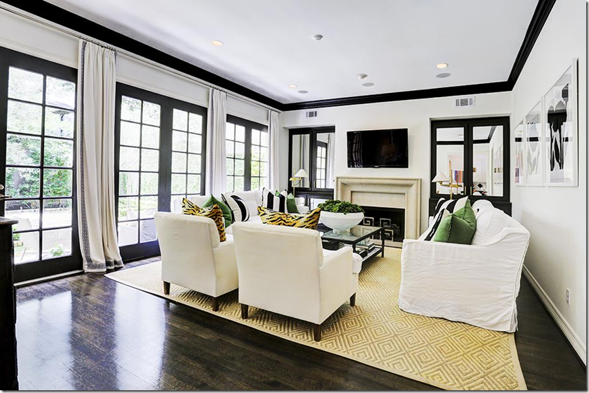
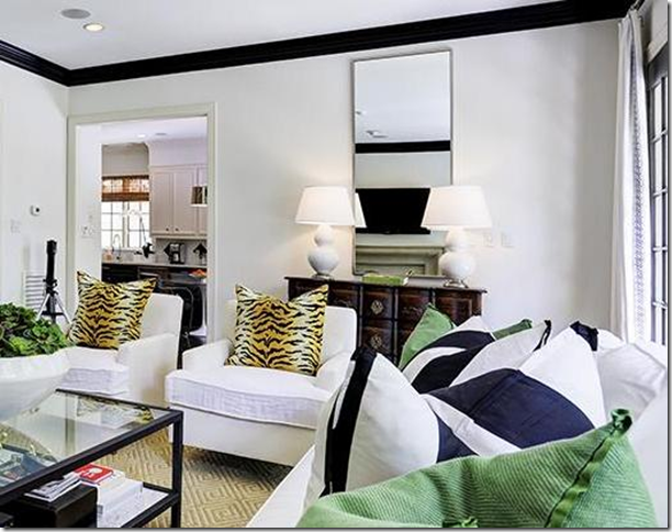
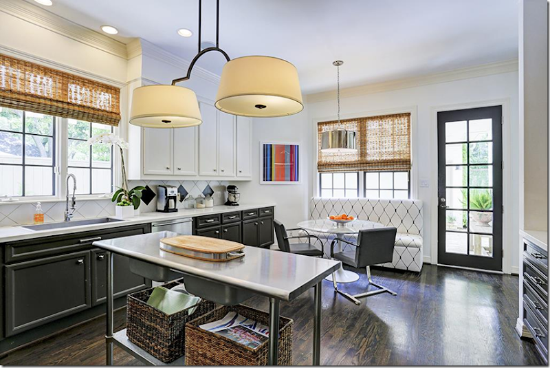
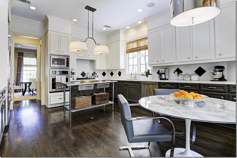
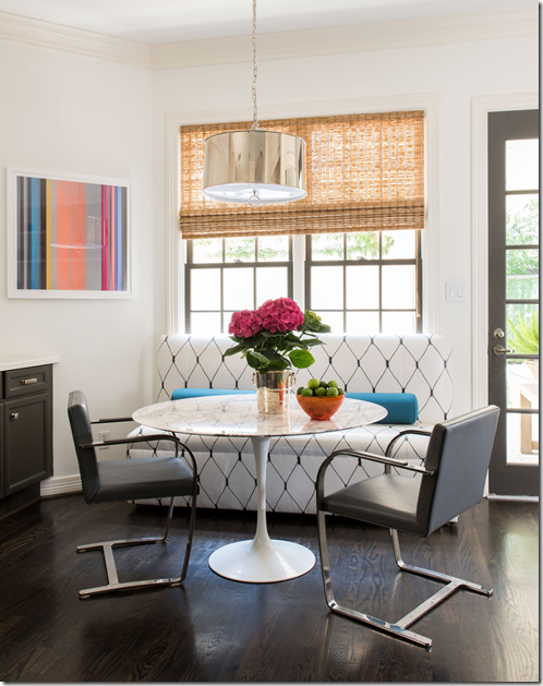
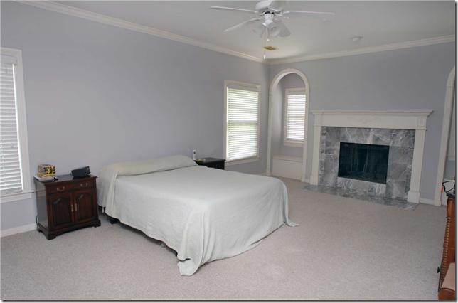
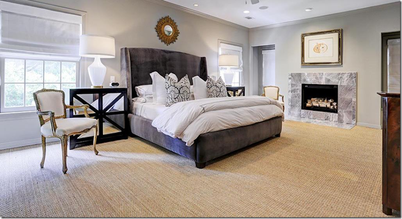
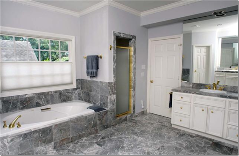
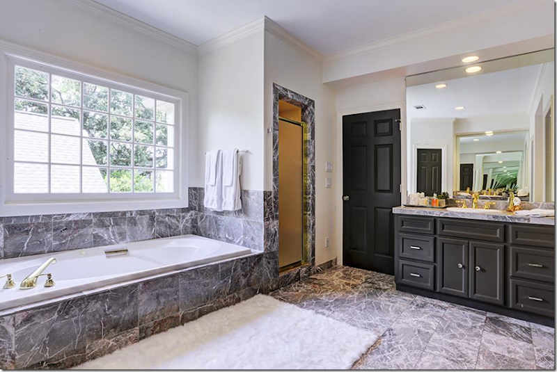
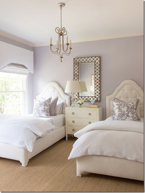
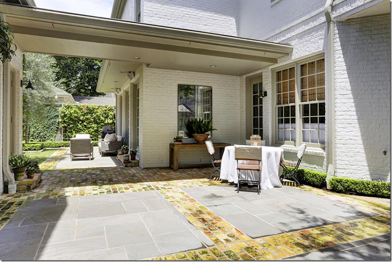
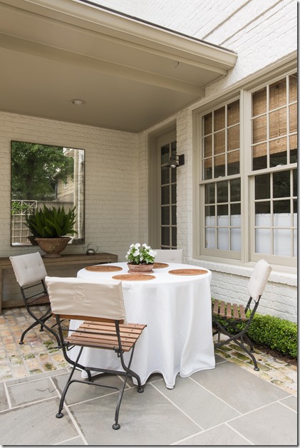
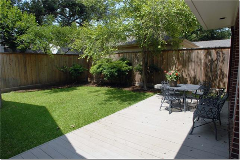
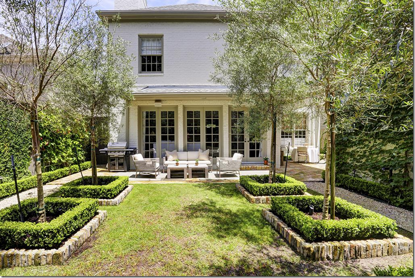
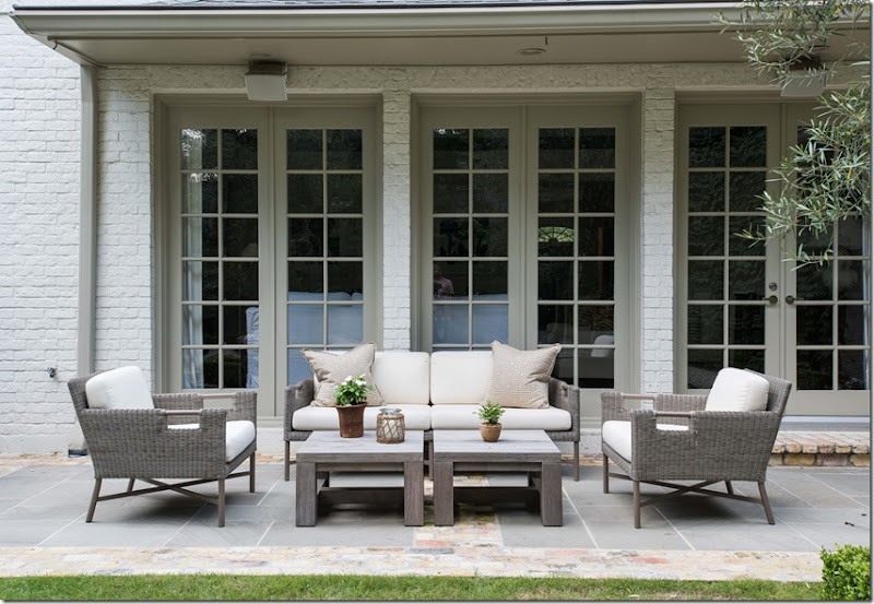
The rug is textured with a pattern. The light fixture is a modern Serge Mouille. Love the gilt French chair with the stripe upholstery. And on the left is Ashley’s signature antique – a chest.From the real estate photographs – you can see the pattern in the rug a bit easier and to the right are two taupe velvet chairs.Looking out towards the front hall.A close up of the antique chest with the crystal lamp and sconces. I love how Ashley mixes the old with the new. She has a real talent for vignettes and she always includes one in each room.BEFORE: Another blank slate.AFTER: Ashley mixed a contemporary table and chairs and art and with an antique chest and chandelier.I love how the white chairs mix with the white trim in the curtains.View into the foyer.Close up view of the white trim on the silk curtains.AFTER: Unfortunately no before pictures, but here is the after Library. Ashley used a pattern rug here and put a glossy stain on the paneling. Simply elegant.AFTER: Ashley added a console sink, with contemporary mirror and crystal sconces.Before: plain mantel and boring shelves.Before: the view towards the kitchen.AFTER: A new mantel was installed along with mirrored door cabinets that replaced the boring shelves. Genius! Ashley painted the room white and the trim and French door were painted black.Along the French doors she added white curtains with a black and white trim.I love the mix of pillows and colors here!!!Great mix of pillows - black and white stripe, silk velvet tiger, and the very trendy green. They look so great together – as does the series of black and white prints.A close up of the andirons – love!!! The brass is repeated in the cabinets and in the floor lamps.Close up of black chest and white lamps vignette against the back wall.BEFORE: The kitchen was a bit dated – just 15 years old and with new appliances, but it still needed a small facelift.BEFORE: The view towards the breakfast area.AFTER: Ashley first removed the tile floor and extended the newly dark hardwoods into the kitchen. At that time, the island was removed and replaced with an industrial style movable one. She left the backsplash but painted the bottom cabinets a dark grey and added new hardware.A new contemporary light fixture was installed over the island, along with textured shades. In the breakfast area another new light fixture was installed along with a banquette. The French door was painted the same black as the adjoining family room and kitchen.To further update the kitchen, the upper cabinets along one side were removed and a built in refrigerator was added, along with a wine cooler and new sink.A marble topped Saarinen table.The new breakfast room – with a pop of turquoise color.BEFORE: Like most West University houses, the bedrooms are all upstairs. Here the master has a fireplace which is not usual, and how romantic is that!!! Again, this room is a blank slate.AFTER: Ashley installed wall to wall seagrass. An upholstered, tufted velvet bed was used, along with mirrored end tables. Fabric shades, white lamps, and touches of gilt were added.I love the wood chest – again, it’s something Ashley does, adding the classic along with the contemporary.At the left, a large contemporary painting adds pops of color.BEFORE: The master bath had gray marble, but needed some updating.AFTER: With just a bit of white paint and dark paint on the cabinets – the room looks much brighter. Dark paint on the closet door is another effective tool. Ashley used an extra large mat/rug to break up the sea of marble.Another view shows how just changing surface elements makes a room look totally renovated.This daughter’s bedroom is darling in pink with an antique canopy. Love.And this room is darling in lilac.BEFORE: Kids bathroom needed just a few surface tweaks.AFTER: Here, Ashley made a just few surface changes with new white paint to update the bathroom. By changing the blinds for the shutters the room looks much nicer. The large mirror is replaced with a small one and the old shower door is replaced with a white linen curtain. New hardware completes the look. With these few changes, the room looks updated for the 2015s instead of the 1990s.The back yard was updated with new slate pavers set into bricks.Here Ashley set up a vignette by the back door – which helps extends the indoors into the outdoors. Mirror placed on the newly painted brick wall also helps extend the space.BEFORE: The backyard was just grass and red brick.BEFORE: A wood deck led from the house to the backyard.TODAY: The backyard is fabulous, thanks to Gregory Henry. In a European style, a series of six trees was planted into square beds lined with box and brick. Vines were planted on the garage brick wall and fence. And paths of gravel were added, another European touch.The wood deck was replaced with slate pavers set into brick.Another view of the back yard – now an interesting courtyard filled with a geometric pattern. Just lovely.BEFORE: I hope you have enjoyed watching how Ashley Goforth transformed a pretty, but outdated house -Into a sophisticated and elegant showstopper – using paint, stain, mirrors, and beautiful furniture, accessories and art!!!To see more of Ashley Goforth’s portfolio, go HERE.






















Beautiful! Congrats Ashley and the new owners!
ReplyDeleteStunning, stunning, stunning is all I can say. When can I move in?
ReplyDeleteStunning, stunning, stunning is all I can say. When can I move in?
ReplyDeleteJoni,
ReplyDeleteThank you for ALL your wonderful post! This is one is truly fabulous. I ALWAYS look forward to your blog, Cote de Texas is one of my "happy places " :)
I love the transformations...I first saw her little apartment in Country Living when she worked at Shabby Slips. She made that place look incredible!!
ReplyDeleteme too. i would always see her at shabby slips - and then she was in country living. yep.
Deleteme too. i would always see her at shabby slips - and then she was in country living. yep.
DeleteHi! Great post ~ one issue, however. The link to the post you wrote 6 years ago about the bungalow says it's no longer available when I click on it. Can you find the former post on the bungalow? Thanks!!
ReplyDeleteill fix it asap.
Deleteill fix it asap.
DeleteJoni, That bungalow story was one of my all time favorite Cote de Texas ones along with the small Highland Park/Dallas reno (for a divorced, I believe accountant.) Love the small but elegant houses that get reno'd and have top quality designers. Thank you for all the time you put into your blog!!!
ReplyDelete-linda, ny
She is an incredible designer Joni! Love before and afters always. I will have a small package off to you this week, now that things have calmed down a bit.
ReplyDeletexoxo
Karena
The Arts by Karena
Artist Nicoletta Belletti
These are some of my favorite types of posts! Love a before and after. Thanks for sharing.
ReplyDeleteJoni, Love this post You said in an earlier post you didn't care for some of the modern light fixtures. But look at this house! Here is modern done right! Lovely house! I'm in Houston and recently remodeled at 1938 brick Georgian. Ashley is my next call today! Thanks.
ReplyDeleteThe before shot of the West University house reminds me (at first glance) of the house from the movie Terms of Endearment. Great post!!!!
ReplyDeletethe artwork from above the sofa in the first living room photo made it all the way to the bedroom over the fireplace in the white brick home.
ReplyDeleteGreat research Joni! I love Ashley's style. A perfect mix of classic, antique, and modern.
ReplyDeleteThank you for all your work on another outstanding post!
Sally
Love her style. Thanks for sharing!
ReplyDeleteI like the "before and after" posts!
ReplyDeleteMay I ask the following: I am in the process of purchasing furniture for our first house. Most of our current one comes from Ikea, so we'd like to jazz it up a bit with some more funky and interesting pieces. But I struggle because I never really know where to start from and I am worried that the end result will end up not matching! Where is the starting point of interior design exactly? should you choose a specific piece you like and work from there? should you work from a painting you will have hanging on the wall and its colours? or should we just pick pieces we like and hope they will all work together in the end? it's a bit daunting without much of an education on interior design! Thanks! :)
I echo the other comments--I just love seeing before and afters like this!! always a favorite. Ashley is soo talented! It's inspiring. Thanks so much for sharing Joni-- this was awesome.
ReplyDeleteWow! I'm in absolute awe of the transformation in every room! Her vision is amazing! Thanks for sharing!
ReplyDeleteJoni - I always love reading your posts. I love Ashley Goforth's work - gorgeous. I have to ask you, though, how do you feel about the West University living room, where the shades are hung inside the window, rather than in line with the top of the curtains?
ReplyDeleteWow! Love her work, every bit of it! Love all the before and afters! Thanks for sharing. I could move right in!!
ReplyDeleteThis comment has been removed by the author.
ReplyDeleteI love this post and got inspiration for my garden at home from the Gregory Henry design. Thanks so much!
ReplyDeleteAshley is so talented. This is a good example to show regarding painting interior doors dark. Her style is elegant but approachable. Nice!
ReplyDeleteAnd thanks for your sweet comment on my blog. My two best friends from SF just moved to Austin...and I think the direct flights are into Houston--so I hope we can have lunch sometime soon!
Bloodless decorating.
ReplyDeleteLove the painted brick and the new landscape looks outstanding!!
ReplyDeleteBlessings,
Linda
Just so imaginative and incredibly well done!!! BRAVO!! franki
ReplyDeleteThe painted bricks are so nice! You are so imaginative. This is my first time visit your blog and I love the posts you wrote. Well done! Thanks for sharing.
ReplyDeleteIt always makes me sad when the fine craftsmanship of Flemish bond brick work is covered up with paint. Might as well have put aluminum siding on it, for it loses all texture and dimension. The interior is quite nice.
ReplyDeleteDear Joni, what Alison did it’s really an impressive work and the story behind is brilliant. I fell in love with the kitchen from West University, the floor and the breakfast area are simply gorgeous.
ReplyDeleteYou highlighted a lot the importance of a carpet in a room and I’m 100% on your side :). That’s why, let me share with you our handmade world: http://feltballrug.com/ .Over here you can find even our social story of these unique rugs: http://feltballrug.com/meet-the-team/ I hope you will enjoy the video and our work!
Wonderful post Joni!
ReplyDeletethose oak trees in backyard are way too close together. I did the same thing and had to take half of them out --- beautiful home
ReplyDeleteJoni-
ReplyDeleteWho is the manufacturer of the tuxedo sofa that Ashley used?
Thank you in advance!
I love the exterior paint color and trim colors. Do you know which colors were used or how I might find out? Were the windows replaced and if so, do you know what manufacturer and color? I would be happy to pay for this information. Thank you for this excellent post.
ReplyDeleteHi! This is so beautiful house. Can I know the wall pink paint color for girl? Thanks
ReplyDeleteI love the lilac that you used. What was the brand, and color exactly? I want to use it in my bedroom.
ReplyDeleteAlso wondering what color the lilac is in the little girls bedroom with the twin beds. Its perfect!
ReplyDeleteRS Quality Living, provide complete home improvement solutions, e.g. Sunrooms, Pergolas Sydney, Sydney Patios, Awnings, and Patios etc. Sydney Patios
ReplyDeleteAct Now. Call 02–9833–7877RS Quality Living, provide complete home improvement solutions, e.g. Sunrooms, Pergolas Sydney, Sydney Patios, Awnings, and Patios etc. Sydney Patios
Act Now. Call 02–9833–7877
Do you know the name of the lavender paint color?
ReplyDelete