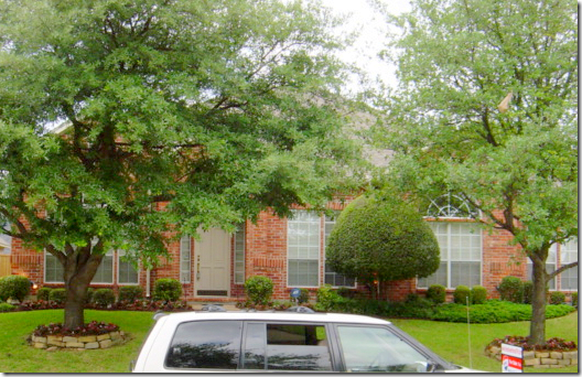
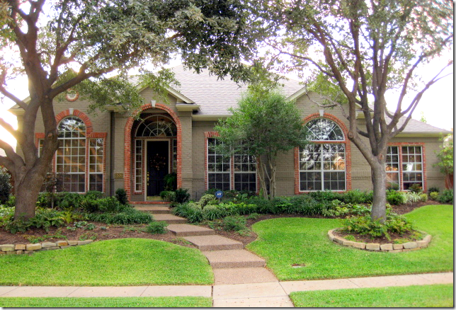
Today, I have a few houses to share from readers! I love when you send me pictures of your homes and encourage anyone who wants to show their home to email me!!Today, one of the houses shown is new to Cote de Texas readers, while the second is a house I first showed many years ago. Since then, the owner totally redecorated it, and thought you would like to see her changes.First up, The Red House.Some years ago I showed a house owned by interior designer Cheryl Ketner in Texas. She and her husband, builder Kerry Ketner (www.ketnerservices@tx.rr.com) had bought a house which they completely updated and decorated all in the shades of red. Many readers loved her bright and vibrant house, and they especially liked all their renovations.A few days ago, Cheryl contacted me, telling me that she had tired of all the red and wanted a change and thought you would like to see how she had transformed her house yet again.Before: The house is located in Plano, Texas – right outside of Dallas. It was a builder’s special which the new owners Cheryl and her builder husband Kerry updated to make it more custom.After: The brick was painted taupe, but Cheryl left the original brick lining the windows. The trees were thinned out, and the beds were made larger.
BEFORE: Here is a picture of the house when they bought it. There is a large entry hall that overlooks the living/dining rooms through arched columns.
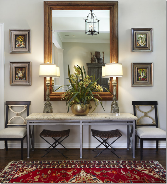
Entry Hall Before: The walls were painted yellow, with touches of red and black. The hardwoods were stained darker.
Today: The walls are now a soothing green/blue/gray Benjamin Moore Healing Aloe throughout. Cheryl kept the red rugs for a pop of color, but otherwise everything else was lightened – like the chairs and the lampshades.
Although the house is now lighter and brighter, it isn’t cold – rather, Healing Aloe has a very warm tone that keeps the interiors from feeling sterile and icy.
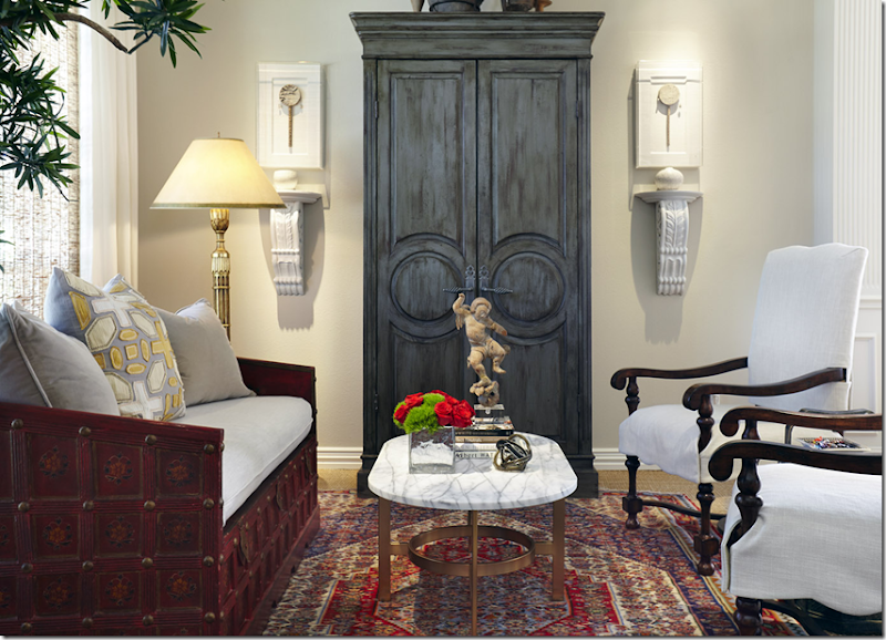
Before: the living room is red with the yellow walls.
AFTER: New white slips cover the chairs and sofa. The red coffee table was replaced with a new white marble topped one, and the sconces are now painted white. The red and yellow patterned curtains are a soothing white – bought at Ikea for $39 a panel! The red rug is layered over wall to wall seagrass.
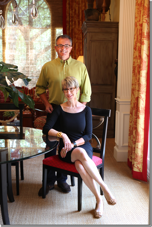
Before Dining Room: Here, the Ketners sit in the dining room with their red fabric chairs.
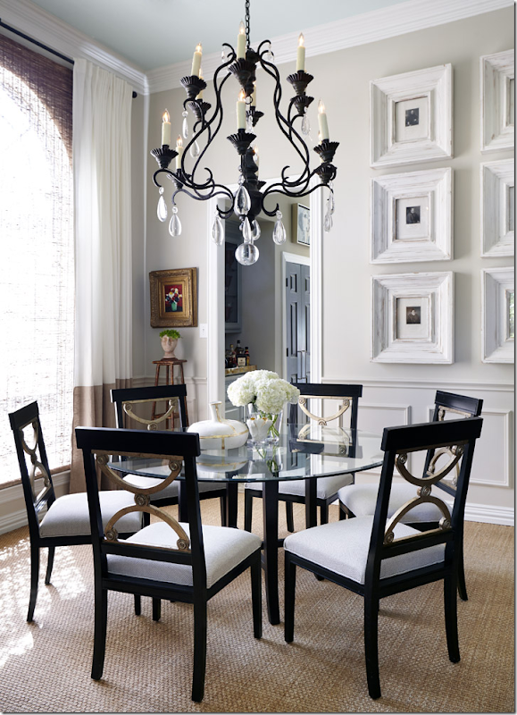
AFTER: The dining room with the new white fabric chairs. Here you can see the Ikea panels with the contrasting taupe hem that were added to the curtains.
BEFORE: The family room had rather plain looking built-ins and wall to wall carpet.
AFTER: A sea of red and gold, the mantel and bookcases were painted and updated. Wood floors were added.
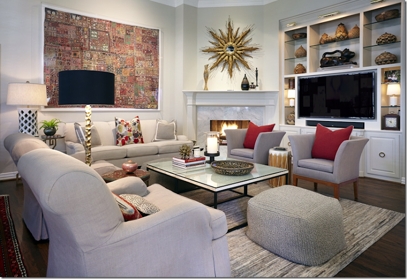
AFTER: And today, the furniture now is covered in tight, tailored light slipcovers (perfect for dogs!) There is a new gray rug and stool, and white/black coffee table. The other big change is the fireplace with white carrara marble and white bookshelves with new lamps. The sunburst mirror was moved from the master bathroom. Wonderful!
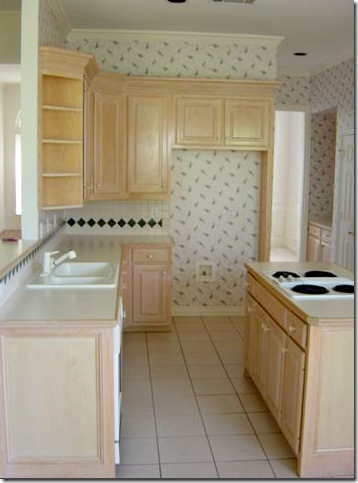
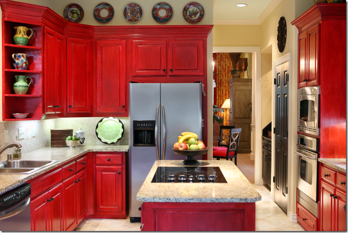
BEFORE: The kitchen had light cabinets and wallpaper.
AFTER: The cabinets were painted red with new granite, stainless appliances and floors.
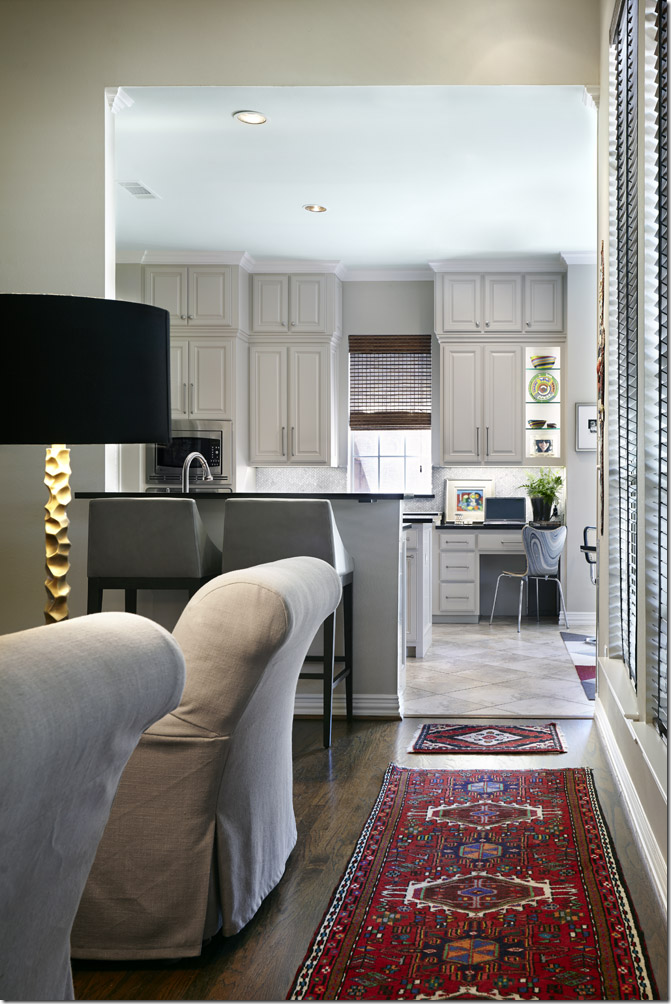
Today: The cabinets and walls are now Sherwin Williams Accessible Beige and reach to the ceiling, new hardware, along with black quartz countertops and carrara backsplash. The change is total.
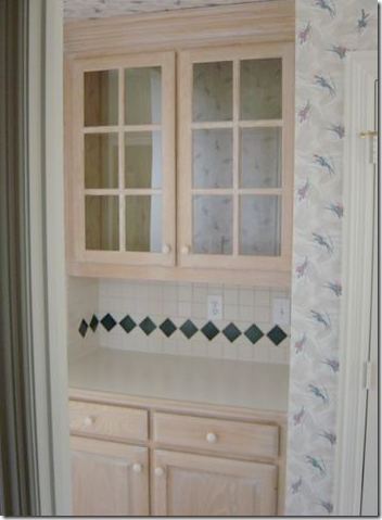
BEFORE: The butler’s pantry was the pink-beige stain with the 90s style backsplash.
AFTER: The butlers pantry was painted black with red undertones and seeded glass.
Today, the butler’s pantry is painted gray to match the kitchen. There is now regular glass, carrara marble and mirror backsplash. It’s more sophisticated now.
AFTER: A new Crate and Barrel breakfast room with knockoff Breuer chairs, along with a contemporary FLOR rug.
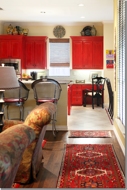
BEFORE: The view into the kitchen. What a difference the Ketner’s have made!!
BEFORE: The red version.
AFTER: And now, with the gray kitchen. At the desk, you can see where a section of cabinet was removed to make a display shelf.
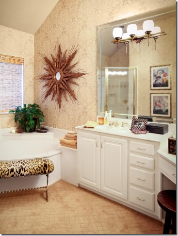
BEFORE: The master bathroom. Here there is a sloped ceiling.
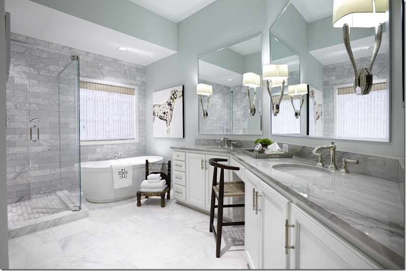
AFTER: The bathroom got a major overhaul. The ceiling was leveled out with a furr down added. A wall of carrara subway tiles were added, along with a new quartz countertop and mirrors.
BEFORE: The guest room with the yellow walls and bright brown bedding.
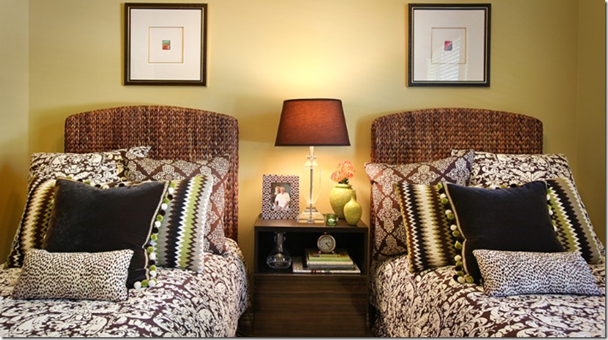
AFTER: The walls are now light with white bedding and leopard quilts. I love the ikat pillows and the new bedding.
In general, the changes in the house were structurally minimal except for the bathroom and the addition of new, extra cabinets in the kitchen. All the other changes were mostly cosmetic – new paint and new fabrics. The biggest change was editing, taking away a large amount of extra, unnecessary accessories which helps make the house look more serene and less cluttered. The new paint, BM Healing Aloe is the most effective change. It’s said over and over again, but a fresh coat of paint in a new color can be the most dramatic decorating change you can make. And notice, by keeping the red rugs, it helps to keep the house warm and cozy and gives a pop of color. And finally, another change, a really minor, very inexpensive change – new lamp shades – is something that anyone can do and almost anyone can afford, and the effect can be very pleasing!!
House #2
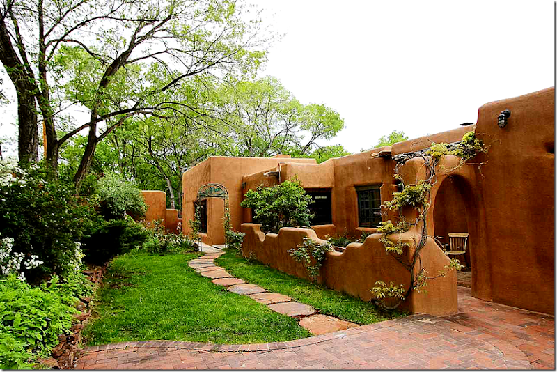
Next up is a reader’s house in Santa Fe, New Mexico. It isn’t often I get a chance to show a house from New Mexico, and adobe houses are completely alien to me in Houston! So, this house is a real treat. The native architecture of New Mexico, and I suppose Arizona, are so aesthetically connected to its environment – the brown adobe walls seem to disappear into the earth.
This particular house has an interesting history. It was built in 1970 by the daughter of the popular primitive artist Streeter Blair. The house, decorated in a whimsical style, was featured in the book “Mud, Space and Spirit.” Later, CdT reader Elizabeth and her artist/musician boyfriend Grant Hayunga bought the adobe house and remodeled it, keeping its original integrity, yet making it a bit more luxurious.
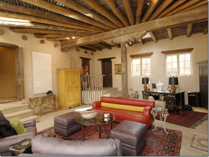
The house is adobe brick with interior Venetian plaster walls. The floors are terra cotta and reclaimed wood, while many doors are antique. There are many fireplaces, and rough hewn vigas, or wooden beams, as would be expected. The house, with views of Cerro Gordo and the Sangre de Cristo foothills, sits on half an acre and is completely surrounded by an adobe wall.
The adobe wall that surrounds the house.
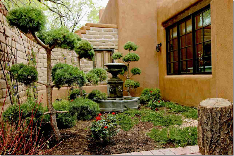
Behind a half wall lies a courtyard.
I was lucky to find the original pictures of what the house looked like when the present owners bought it:
BEFORE: The main living room. With the original flag floors, painted walls, and stain glass.
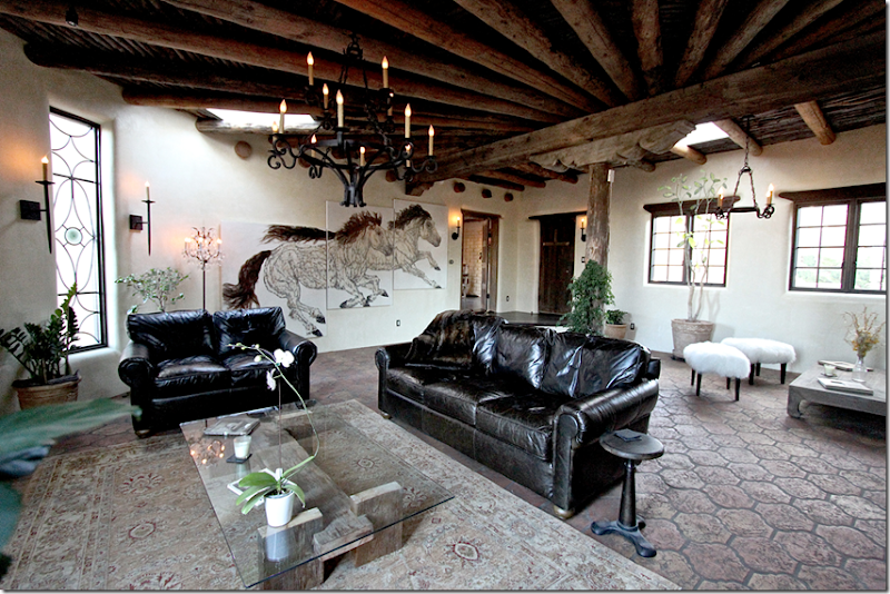
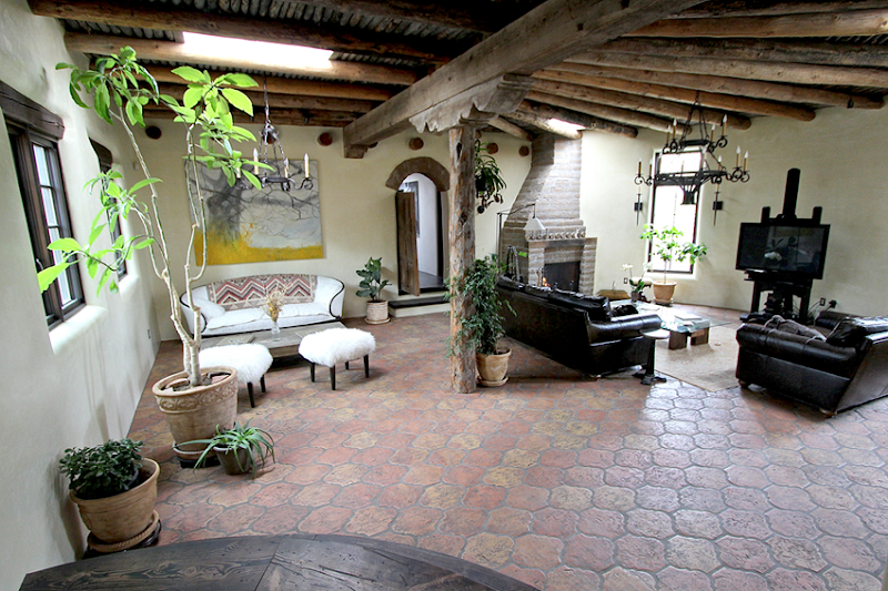
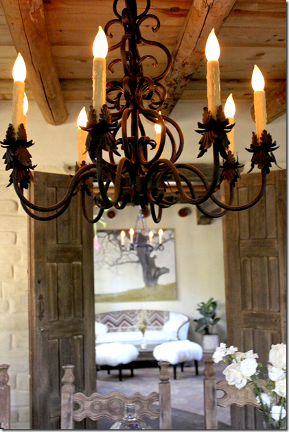
AFTER: Today, the flags have been replaced with terra cotta tiles, the walls are Venetian plaster. Instead of contemporary strings of lights – there are now iron chandeliers. I love the flatscreen easel! I love those. Here are a selection from Restoration Hardware.
BEFORE: Looking towards the front door. The new owners removed the wood raining and stone stairs that lead to the corner door and replaced it with wood stairs. The door at the near left was removed below:
AFTER: Looking towards the front door, you can see the rough hewn rafters. At the left, you can see how the owners modified the stained glass window and made it more subdued and less colorful.
Looking from the front door to the living room.
BEFORE: The dining room with orange brick walls.
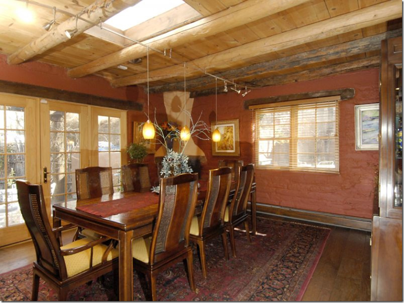
AFTER: Through antique doors, the dining room is seen from the living room.
AFTER: Such a difference! The brick walls were painted a fresh white and the wood floors and molding around the windows were stained black-brown. Instead of traditional furniture, there is now antique styled chairs and tables. Again, the contemporary lighting was removed for an iron chandelier.
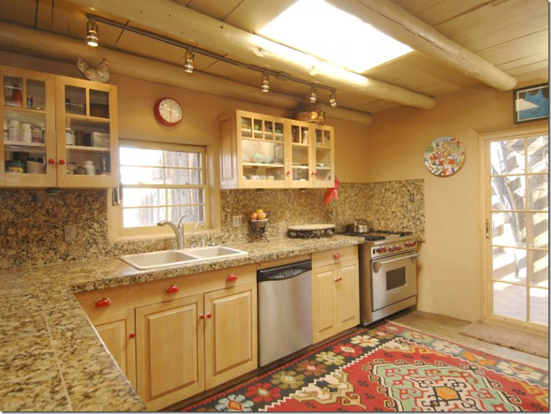
BEFORE: The kitchen before had dated granite countertops and light stained cabinetry. It got a major overhaul.
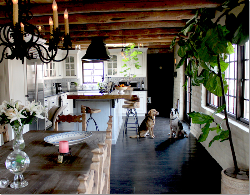
AFTER: The dining room – leads into the new kitchen.
A center island was added, along with all new cabinets.
Before: The master bedroom with orange walls.
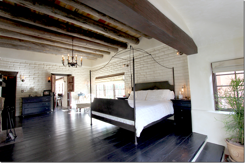
AFTER: The master bedroom with the new dark stained floors and white walls.
The fireplace with a new free-form stone mantel. I love the sconces on each side of the bed.
BEFORE: The master bathroom.
AFTER: The master bathroom with a free standing tub and corner fireplace! How romantic!!
The shower is behind the sink wall.
The shower with natural looking stone floor.
The half acre is filled with courtyards. Here, in this courtyard off the master bathroom is a fountain.
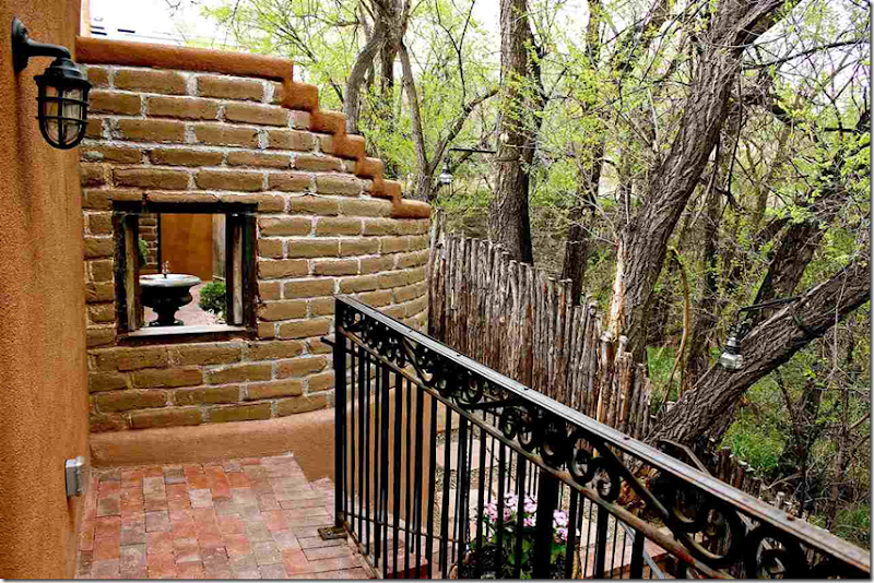
This second story balcony overlooks a window that opens to the fountain’s courtyard.
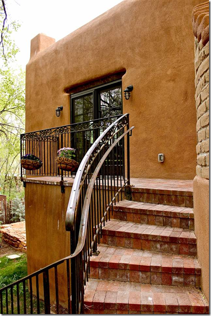
The balcony and winding outside stairs.
A view of part of the house and garage during winter. It looks so different with snow!
Here is the same view of the same courtyard during the summer. There is a fireplace at the right side of the terrace.
And the view from the same terrace, looking out.
This house in Santa Fe is currently for sale. If you are interested in this beautiful property, go HERE.
AND
The 2015 Paper City Design Awards were announced this month HERE and Ginger Barber won First Place for BOTH Residential Design over 3500 sq ft AND Residential Design under 3500 sq ft.
A huge congratulations to Ginger and her team!!!
I was honored to show both of these winning houses.
I was so excited for Ginger to win both of the top awards!!! Very well deserved!!!
AND finally,
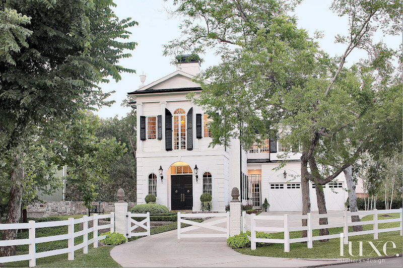
You may remember over the years my featuring the houses of Michael Siller. Most recently, he and his partner Larry Hokanson built a Federal style house in Houston that is pure sophistication and a luxurious dream. The CdT story of the Federal house is HERE.



















Joni: Always fun to see readers homes! Overall loved all the changes made but one thing that stuck out as "off" to me was the kitchen in the adobe house. The cabinets don't fit in with the style of the homes or the other furnishings. Too bad as they appear to be new. Maybe painting them a darker color to blend in and removing the glass would help?
ReplyDeleteThanks to you and the readers as it takes guts to put your home out there for all too critique and in general, the transformations were amazing!
Debbie
Joni you know how much I love to see before and afters!
ReplyDeleteGreat choices made by the homeowners for their redo's!!
xoxo
Karena
The Arts by Karena
Parish-Hadley Tree of Life
I'm amazed at some of these transformations. I've transformed some rooms in my house twice now...that's what happens when you live in the same house for 17 years! Tempted to send in pictures, but I'll have to dig deep for the older ones :)
ReplyDeleteplease do!!!
DeleteWell re-done!! franki
ReplyDelete3.5 million to live on a four lane highway????????? Michael Siller needs a reality check!
ReplyDeleteAre you from Houston? It's not a highway - more like a grand boulevard. It weaves from downtown to the very west of Houston - mostly through a pine forest, the woodiest part of Houston. His house is right next to Memorial Park, the prettiest in Houston. BUT, I will give you this. The traffic awful at 5pm. and it is a very busy street even though his property is back off the street, unlike his last townhouse which was at the light on kirby at shepherd. I do wonder if that is why they are moving. The house will sell quickly, I think. There are many pricey homes right around there. I could be wrong, which is why I am not in real estate.
DeleteSo much fun to see the transformations...I love Cheryl's home when it was red, but love the new white design even more!
ReplyDeleteAll I can say is WOW!!!! Beautiful transformations. I love all the fire places in the adobe home. Fresh neutral palettes. Ahhhhh......
ReplyDeleteYou have combined creative design with originality.Whole renovation plan is awesome.Well done.In case you may need them, here are some wonderful small bathroom ideas which you can exercise to get even better results.
ReplyDeleteThe adobe house is lovely, nice to see someone stick with the vernacular architecturally and in terms of their design choices without turning it into a Disney theme park (in this case of "New Mexico"). Classic choices, lovely updates, and a very unique property. Love it.
ReplyDeleteHOW fun! It's amazing how making things more neutral freshens the interiors and the rugs as accents pop!
ReplyDeleteWow! Great to see the huge difference a few changes made in House #1! Too many homes around here look like the very first set of before pics; ugh nothing done to them for 20-30 years. Great to see a few tweaks can update them. Love the pulls used in the kitchen and bar areas. Wonder where they are from? The Santa Fe home is a great update too.
ReplyDeleteThis comment has been removed by the author.
ReplyDeleteA very good and informative article indeed. It helps me a lot to enhance my knowledge, I really like the way the writer presented his views.
ReplyDelete"quartz countertops houston
"
شركات عزل الاسطح بالمدينة المنورة
ReplyDeleteالعزل عملية تتم من خلالها حماية المباني من العوامل الخارجية الناتجة عن الطقس الصيفي والطقس الشتوي كلاهما له تأثير على المباني لتفاعل ارتفاع الحرارة والمياة مع مواد البناء فتسبب الرطوبة والتصدع أو الشقوق بالجدران، شركة عزل اسطح بالمدينة المنورة للعزل المائي والعزل الحراري وارخص اسعار عزل اسطح عزل مائي وعزل حراري بافضل مواد العزل بمواصفات عالمية.