Looking for something to do this weekend and the next?
The Bellaire Fall New Home Showcase is is being held this October 17 & 18, and the next weekend October 24 & 25, from 11:00 AM -6:00 PM.
This showcase is known for having some of the more beautiful houses in the area, featuring all the latest bells and whistles. These specially selected houses are built by the more respected and popular companies in Bellaire & Houston.
Here are a few pictures from this year’s show to grab your attention:
RJ Homes:
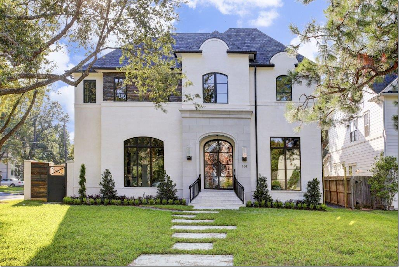
This white stucco by RG Homes is located at 101 Calvi Court.
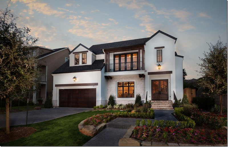
And this white stucco by the
Frankel Building Group is located at 4514 Braeburn Drive.
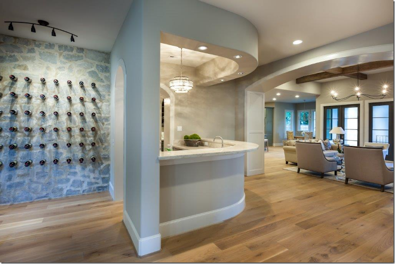
Inside, it has a stone accent wall and a large bar that opens to the living room.
The dining room, at the front of the house, is on the other side of the stone accent wall.
Upstairs is a darling bunk room.
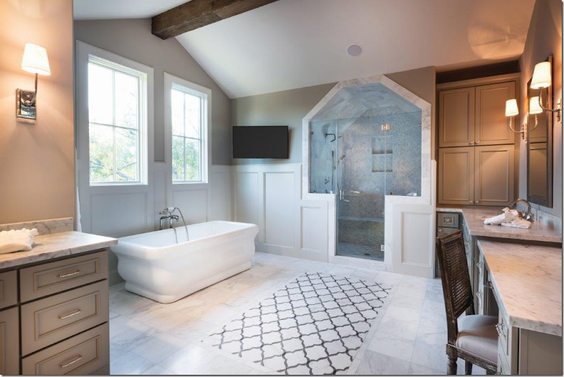
The master bath is a mix of marble.
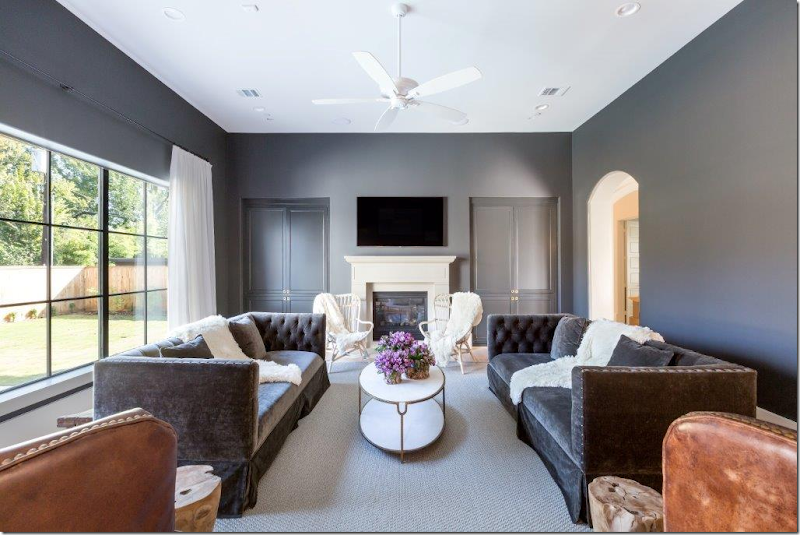
Next, the entry from Cason Graye Homes is at 5120 Grand Lake. Love the two gray velvet sofas mixed with antique leather chairs.
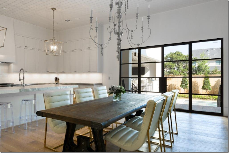
The floor is on trend cerused. Love the planked ceiling.
And the metal windows, also very on trend.
Tufted bed in the master with gray walls.
Look at the mother of pearl-like tile in the bath! Also, notice it features the latest combination shower/tub wet room.
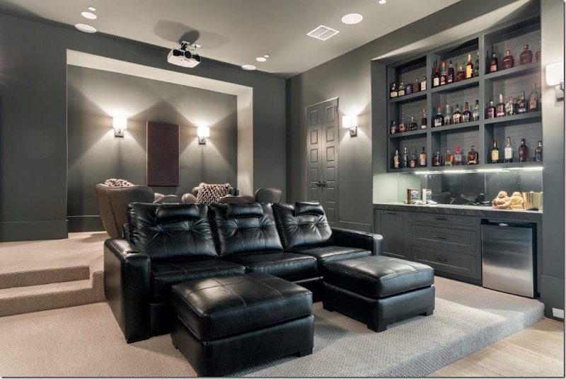
And the media room. Every house in Bellaire has a media room for sure!
Be sure to visit the tour this weekend and next. If you are building or thinking of buying, it’s a great place to see the latest looks
and options. And be sure to vote for your favorites!
For more information on the show:
To look at past Bellaire showcase houses, go HERE.
The 2015 addresses:
Blum Custom Builders - 5219 Pine Street
Cason Graye Homes - 5120 Grand Lake
Frankel Building Group - 4514 Braeburn
Lovett Homes - 5401 Alder Circle
RG Homes - 101 Calvi Court
Tommy Cashiola Construction - 420 Mulberry Lane
The 2015 Bellaire Fall New Home Showcase
Subscribe to:
Post Comments
(
Atom
)







I like the bunk room. I think it's a great idea for a vacation cabin.
ReplyDeleteWonderful photos! I love the Frankel Building Group photo. It's really a great idea for a vacation cabin.Stunning!
ReplyDeleteToo stark too gray they all look the same
ReplyDeleteAnyone have a source for the tufted bed??? Love it!!!!!
ReplyDeletehow many different window sizes and shapes can you get in one narrow elevation? See example one for a clue.
ReplyDeleteThat bunk room is absolutely adorable! I think I would hang out there with my kids for a pajama day and watch movies from the top bunk! Thanks for sharing - gorgeous!
ReplyDeleteLooks like fun! Thanks for the heads up Joni. Should be a good diversion this weekend since the Astros are out of it.
ReplyDeleteJoni, what a treat to see these homes, I wish I could be there.
ReplyDeleteThe exterior of the first is dreamy!!
xoxo
Karena
The Arts by Karena
Palm Beach Chic
I wish I could go....if only I lived just a little closer!!!
ReplyDelete~Des
I have a dear friend who bought a great mid century home in Bellaire two years ago. Love that area!
ReplyDeleteThat bunk room is fantastic. The wall colors in the beautiful shades of gray. Such lovely rooms!
ReplyDeleteJoni, My husband had a meeting in Dallas, so last minuet my son and I flew to Dallas, spent two days doing and seeing as much as we could. "Unlimited miles" took on a whole new meaning with he and I as the renters. We decided if only we could have added two more days we would have gone to Houston! So many great shops and people! And now with the Bellaire Fall New Home Showcase, I'm dying to go back.... sigh. Why is Cali so far away. xx Rié
ReplyDeleteHave always been intrigued by the advice of many American stylists and interior designers to put curtain poles way over the top of the windows presumably to make the windows seem taller as in the photo with the two grey sofas. I ve never noticed a UK designer giving this advice so had a look at a few images and realised that on the whole our windows start nearer the ceiling. Would a word to the architects by the designers result in a window placement that would suit everyone much better?!
ReplyDeleteHi Joni, I wanted to take some time out to thank you...about 10 years ago I had emailed you. I had back surgery and re-herniated my back a month after surgery. It took 5 months on a sofa and a year of physical therapy to get back to normal. But you had encouraged me to follow my passion to have my own business as a designer...I had worked for an interior designer through out the years, but that time on the sofa and your encouragement I now have on going clients and I'm loving it..I would of emailed you, but your email at the top didn't work. Thank you again!
ReplyDeleteI think the slipcovered dining chairs in House #1 are from Ikea - good high/low mix if so!
ReplyDeleteI am so relieved you didn't show the Tommy Cashiola home, although I shouldn't be surprised knowing your aesthetic. While it was the largest home on the largest lot, a whole acre in the middle of the city, it was a clear indication of the phrase "money doesn't buy taste". It was obnoxious. While the backyard will most likely be amazing upon completion the interior finishes were subpar to all of the other homes. That mustard yellow exterior and all of the other warm reds and oranges were quite awful. Every other home featured inset cabinetry and quality hardware and lighting throughout but this home seemed subpar to me and those I attended with. The Cason Graye home was stunning and Frankel builds a good looking and quality product from what I have seen in town and at there new development in the Woodlands. RG homes was beautiful downstairs with some interesting finish choices upstairs. I really liked how all of the homes with the exception of 420 Mulberry featured painted paneling both dark and light, that is a trend I look forward to seeing more of. Oh and that Lovett home had a great interior with the exception of the glass elevator enclosure. GROSS!
ReplyDeleteThe bunk room is my favorite. What kid wouldn't love that!
ReplyDeleteLooks like fun! Thanks for sharing.
ReplyDeleteI think the house is great from the outside but inside it is icy cold.
ReplyDeleteI loved looking at this variety of inspirational decor. The way that some of these designs are showcased really makes them stand out and make a bold statement. I love the modern look but some classic touches really help to keep things from looking too cold and add some texture.
ReplyDeleteHayden Farley @ Malibu Real Estate Agents
شركة تنظيف بجدة
ReplyDeleteشركة نقل عفش بجدة
شركة نقل اثاث بجدة
شركة مكافحة حشرات بحائل والقصيم وبريدة
شركة مكافحة حشرات بالقصيم
شركة مكافحة حشرات ببريدة
شركة مكافحة النمل الابيض بالقصيم
شركة مكافحة النمل الابيض ببريدة
شركة مكافحة النمل الابيض بحائل
شركة مكافحة حشرات بأبها وخميس مشيط والدرب
شركة مكافحة حشرات بخميس مشيط
شركة مكافحة حشرات بالدرب
شركة مكافحة النمل الابيض بأبها
What gorgeous homes! I have noticed that the older I get, the more I want to buy a home for its style and grace as opposed to how close it is to where I work. Buyers agents have always been a big thing for me in the past because they can help someone buy a home that is perfect for them.
ReplyDeleteJulia Stewart @ Daytona Buyers Agent
There are beautiful stucco homes, and the interiors are stunning. I never would have considered a darker gray color for interior walls, but seeing it here, I will now. The interiors are so elegant and bright with the white ceilings and white accents. I wonder where they found clear stools for the kitchen?
ReplyDeleteMargaret @ Boston North Shore Real Estate