I wasn’t really a Laura Ashley kind of girl. With a head of unruly curls and a Semitic face, the English Rose look didn’t fare well on me. But, in the 1990s, when the United States was flooded with Laura Ashley boutiques in every mall and Princess Diana was “all that” my friends were having babies and many had nurseries decorated with their beautiful pink and lilac chintz, mixed with their famous Sprigs and striped fabrics.
My own guest room for a time was decorated with Laura Ashley’s Sprig and Stripe fabrics and my baby wore some of the cutest little dresses I would buy there, on sale, off season.
But all those Laura Ashley boutiques closed in bankruptcy and that was the end of that trend although the company did eventually make a comeback.
After Laura Ashley, if you wanted the pastel hued English decor, you had to go to the decorative center and order very expensive, overpriced cotton from companies like Jane Churchill or Colefax, which - had they been a company in the states - their prices would have been more like Waverly. Remember Waverly?
Cabbages & Roses
And then came the romantic and affordable Cabbages and Roses and the fun Cath Kidston and the even more romantic, if possible, Kate Forman Designs.
While Cabbages & Roses and Cath Kidston have a higher profile thanks to the Internet, the third English company, Kate Forman, is not as well known even though they have been producing the prettiest fabrics since 2004. They have the most gorgeous web site, and I love to visit and just drool over Kate’s photographs, many of which are taken at her own country home.
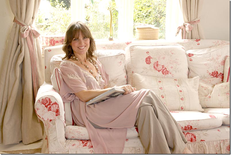
Kate Forman at home in 2005.
Kate grew up in a house she describes as “shabby chic.” Her mother, Pixie Weir, designed costumes for film and the family home was filled with mannequins and fabrics, which is, Kate thinks, the genesis of her love of textiles. After studying fashion at art school, she joined a friend to share an antique shop on London’s Lillie Road. Besides selling antiques, she did a bit of interior design using vintage fabrics she sourced at auctions in London and France.
She had a special love for these fabrics that were faded and pale but she couldn’t find enough yardage for her clients who wanted the English Country Manor decor. Kate took her collection of remnants, recolored to suit today’s interiors, and then found a textile printer on the Internet who created her first line. Market research consisted of groups of friends who offered opinions on colorways and prices. Her company Kate Forman Designs launched in 2004. She still uses the same textile printer and keeps her crew low at just six people.
Kate moved her family to Hampshire to an 200 year old house that friends had once lived in and were renting out. Her shop is five minutes away in a block of renovated stables. Kate’s husband Jake serves as the financial director.
Christophe Gollut
Kate Forman was influenced by the Swiss designer, Christophe Gollut. She especially loved his use of colour and sense of style which she found “utterly beautiful.” Me too.
Just look at this living room by Gollut. So gorgeous, so English! It’s no surprise he influenced Kate’s designs.
And here, from Kate Forman Designs beautiful web site – many of the photographs are prettier than a magazine. I mean, look at this! Gorgeous!!!
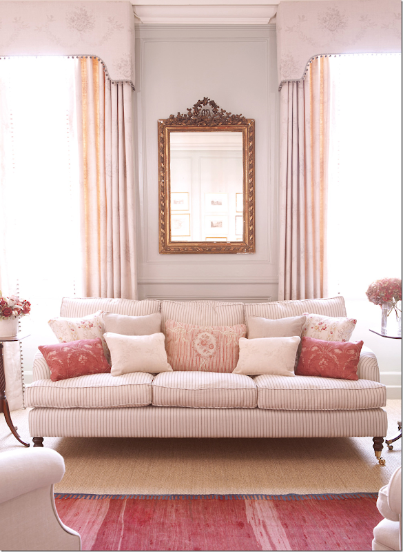
And my favorite! A stripe on the sofa with a mix of patterns for the pillows. Notice the tiny bobble trim on the valance. LOVE!!!!!
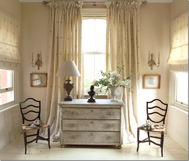
An hall with an antique chest and curtains.
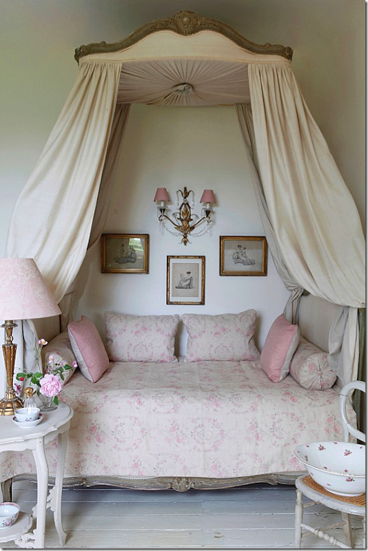
A beautiful bedroom with an antique bed, in her pink fabrics.
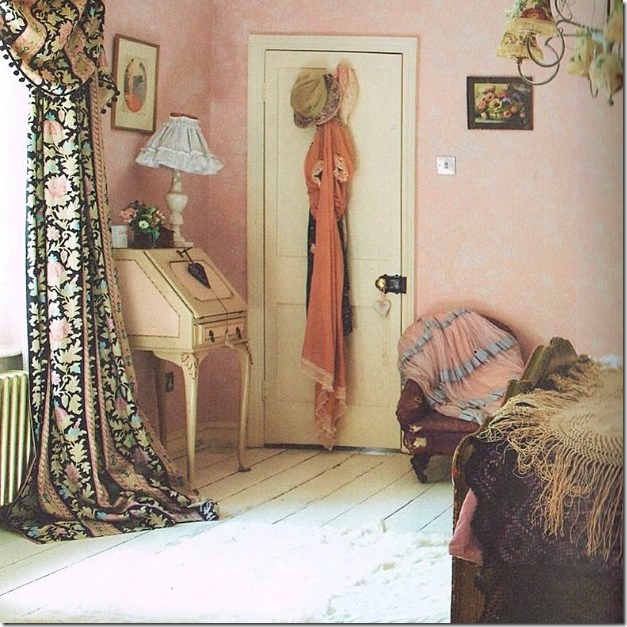
Another bedroom finished in the pink fabrics.
Swedish blues in Check and Cameo Ribbons fabrics.
Kate Forman has a line of beautiful velvets – here in red, with a touch of pink.
Just beautiful walls and mantel!
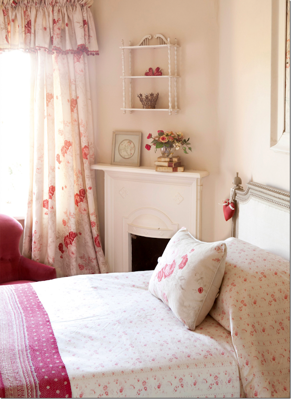
A bedroom, with her pink Delilah curtains.
A subtle stripe in charcoal for the curtains.
Beautiful – Sophia in gray. This is a very popular fabric and wallpaper.
Here is the Sophia wallpaper in gray and Bella in pink on the bed.
Here, is Josephine in yellow. Kate’s favorite fabric is Josephine in the yellow and in the red colorway.
Brighter, in yellows.
Pearl Lowe’s new book featured curtains made of Kate’s Guinevere.
The newest line – Boho: Elodie in pink. Today, Kate is favoring brighter fabrics.
And the headboard in an ikat – Jag, in pink.
Red Agnes curtains. Candy Stripe in red on the bed.
Kate Forman at her Decortex Booth. I love the caftan made with her new ikat fabric!!
The Hampshire country house. The back side facing the street is stone, while this side is stucco. Built around 1750, the house was extended in 1800 with a new wing and the addition of the Gothik porch with its extravagant frieze.
And, a romantic shot at night.
In 2006, with two of her children – the frieze is painted blue, later it is white.
Kate at the front door. A close up of the frieze around the front door and window.
2006. Inside, the living room is to the right of the front door, with windows on three sides of the room. Above this – is the master bedroom. To the left of the front door is the second drawing room, which leads to the kitchen in the extension.
The back of the house shows the garden outside the kitchen. The mud room on the left is so charming!! You can see the stone facade that faces the street on the left.
The furniture is in Kate’s fabrics, of course.
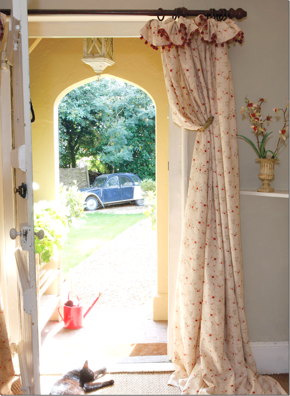
Here, the front entry with portieres, and her bobble trim at the top. Kate uses her house for some of the catalogues. Twice a year she updates a room or two with new wallpaper or fabrics and then photographs it for the web site. Must be nice!
Here, in 2011, the front hall, with the living room to the left.
The first photoshoot, from 2006, shows the drawing room on the left of the front door in reds and creams. Everything is so English! This living room to the left of the foyer leads to the kitchen, through the door shown.When Kate first rented the house, there was brown carpet everywhere, beige walls and yellow trim, with black beams. She redid the floors and painted everything – including the beams, making it bright and light.
There are several sofas and lots of antiques, along with furniture from Kate Forman’s line which is now discontinued. Lots of roses and little accessories.
And the view of the fireplace. The original paneled door leads back to the entry.
Kate, with two of her four children, sits on the floral slipcovered sofa – looking like a magazine cover for Englishness!
Years later, the same room looked like this, with Kate’s velvet on the sofa and a slipcover stripe on the other one.
The paint is now Farrow and Ball’s Smoked Trout.
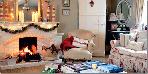
Across from the sofa is the white brick fireplace.
Still later, the velvet sofa and ottoman were photographed for the catalogue.
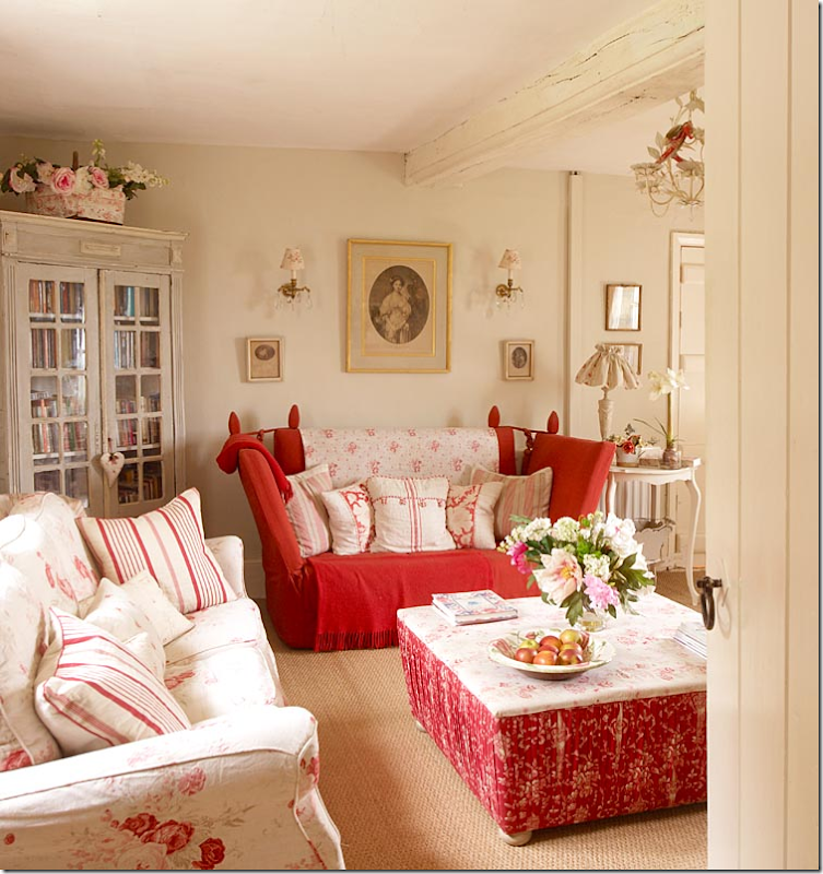
To the right of the foyer is the second drawing room, as it was in the early 2005. Chintz and stripes mixed with very faded chintz. So pretty! I still like this room as it was.
Across the room is another Knole sofa next to an antique chair. This room has three sides of windows with a northern exposure, The master bedroom is upstairs over this room, with the same three window walls.
The same room in 2011, warmed up with a velvet sofa and red curtains and an area rug.
Across from the sofa is the fireplace photographed during Christmas.
This drawing room was used many times for the web site. Here, a pink sofa was placed in front of the red curtains.
And a different sofa for this photograph.
This tufted pink sofa against the back window with new curtains looks so pretty!
Here, the same sofa is now in a plain linen, with different curtains and velvet pillows.
And yet another photoshoot with different fabrics and the original curtains. This is a pretty version of the drawing room.
Last – a huge change when the walls were painted indigo to showcase Kate Forman’s newest fabrics! Such a difference from the original look of 2006!!! Much more casual, but the antique French trumeau remains.Kate blogged that for now she is liking brighter, stronger colors and this living room reflects this change.
Against the fireplace, a new blue Ikat fabric on the chair that before was covered in Guinevere.
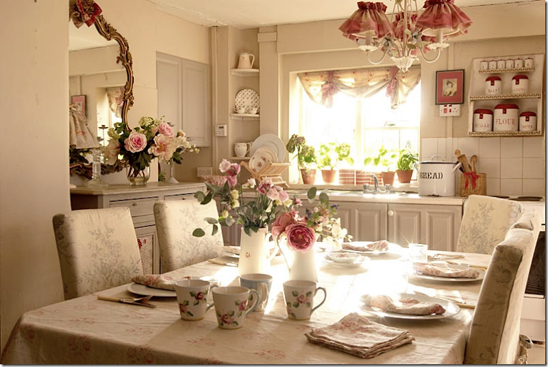
From the early 90s, the kitchen was very romantic with the original Roses fabric in gray on the chairs. Kate later removed a wall to make more room for the dining area.
So sweet – were we all THIS sweet in the 2005s????
Originally, the floor had a cork floor which Kate painted gray and white.
Later the kitchen was remodeled and new white stone floor was added.
An even later view for the catalogue.
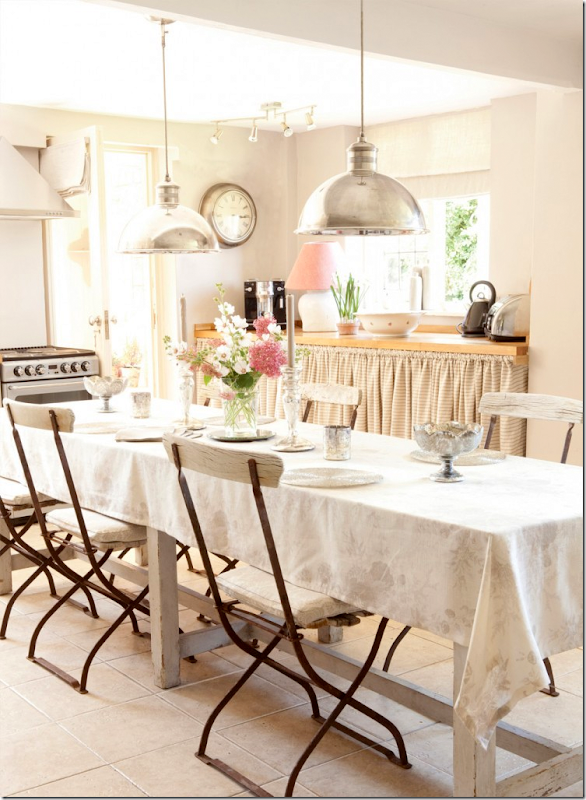
Recently, new updated polished nickle pendants were added, along with a French door that leads to the garden. New butcher block countertops.
For a completely different look, the kitchen was done in stone washed linen – in Mauve. Quite a long way from the sweetness of 2006!!!!
From 2006, the charming mud room that leads to the garden.
Today, the mud room looks like this, though I must admit I miss the cute way it look in 2006! This photograph highlights how different interior styling for magazines is today.
Upstairs are four bedrooms. This bedroom in 2011 has a small wooden mantel on the fireplace, along with an iron bed.
This bedroom was photographed for the web site with a French headboard.
And this gorgeous photograph in the same bedroom – the crystal chandelier was borrowed from the master bedroom.
Here, the small room was painted blue, and an antique chair of Kate’s was newly covered in Roses, her most popular fabric.
One more decor for this tiny bedroom! This time it was done in Kitty wallpaper.
The bathroom as it was in 2006. This family bath was later enlarged – from two rooms into one. Today, the check fabric is different, but I prefer this original one. I wonder why it was changed? Big buffalo checks are really in now. Puzzling.
Here is the check today – you can see it isn’t as bold or crisp as it was before.
And later, the family bath, enlarged, looked like this.
And across from the bath, was this vanity.
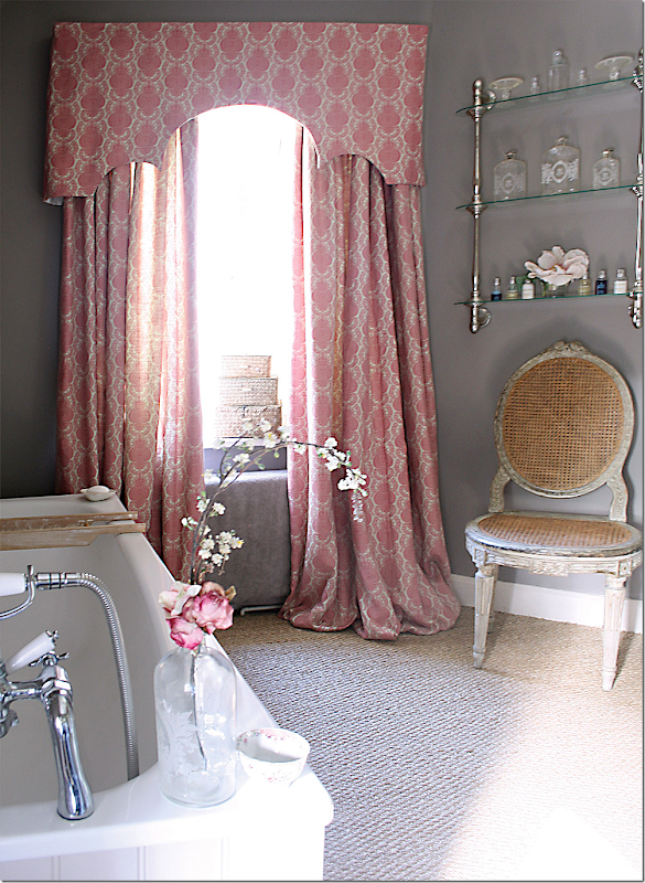
For the catalogue, new curtains in this bathroom – Margot in pink.
Upstairs, a long hall leads to the master bedroom, the room that sits above the drawing room, with three walls of windows. It was photographed here in 2006.
Here, the beautiful Kate sits in her master bedroom looking at fabrics.
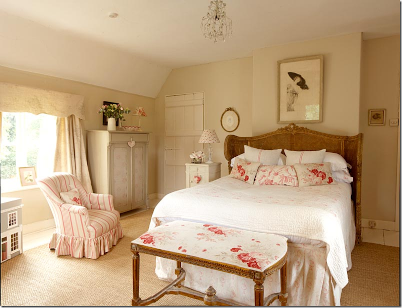
Originally, in 2006, her bedroom looked like this – in creams and roses, matching the rooms downstairs. A fireplace is hidden behind the bed, probably to make room for the headboard since all the other walls are windows! A small crystal chandelier will be replaced later with a larger one. The cane antique bed is French – one of the first French antiques Kate bought – 30 years ago - and something she says she will never part with. Don’t blame her!
Later the room was wallpapered in the most popular paper, Gray Sophia. You can see the paneled door to the side of the bed is now gone. And the new chandelier is now hanging.
In 2011, the room looked like this.
For the web site, new curtains.
And later, the walls were painted for the catalogue. This version of the master bedroom is so pretty! Love it!
This tiny room was carved out of a space on the landing. When Kate first rented the house, it was just a three bedroom.
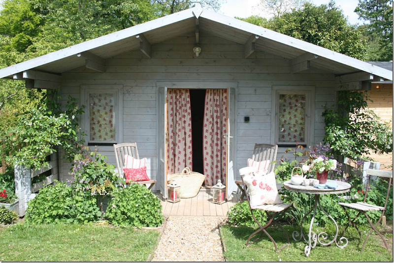
The summer house decorated with new fabrics.
And Kate made a scalloped umbrella for the sun – out of one of her fabrics.
The outside, decorated with piles of blue fabric.
Interestingly, the house was offered for rent earlier this year with a newly painted dark blue frieze. It will be exciting to see where the family has moved. I wonder if the other photographs from the web site were shot at their new house? Many of those photographs show a limed wood floor, higher ceilings, and architectural elements, totally different than the Hampshire house with its low ceilings and casual charm.
Kate Forman Designs is a short hop from her house in Hampshire. Location: Long Barn North, Sutton Manor Farm, Bishops Sutton, Alresford, SO24 0AA
To order fabrics or accessories – go to the Kate Forman web site - HERE.
























This comment has been removed by a blog administrator.
ReplyDeleteSuch a gorgeous post! Thank you so much for sharing. I am in LOVE with so much I can't even begin to list them.
ReplyDeleteBeautiful article to show the evolution of a home and a company. Lovely is the word that comes to mind! Thank you for your extensive research, always a pleasure to read one of your beautifully written articles.
ReplyDeleteKathysue
PS forgot to thank you for your visit and suggestion on my blog post today. You are the BEST!!
ReplyDeleteYes...we were. A more gentle time. *sigh* franki
ReplyDeleteI was a Laura Ashely girl back in the 80's. If I could have afforded it, I would have done up my Cotswold on the Bayou cottage (which you featured in your blog in 2011 (http://cotedetexas.blogspot.com/2011_04_12_archive.html). Can't you see this Houston Heights cottage in nothing but Laura Ashely? Its lovely to be reminded of what a strong, unique, encompassing sensibility Laura Ashley expressed. Its also lovely to see what Kate Foreman is doing today, although I don't think the current incarnation has quite the personal, dare I say obsessive vision that Laura Ashley embodied. Don't you think Kate Foreman paved the way for Rachel Ashwell, whose shabby chic morphed into the shabby slip phenomenon of covering absolutely EVERYTHING in white cotton duck and white linen? That is the course in which my personal sensibility evolved, INFLUENCED IN NO SMALL MEASURE by your blog. Interior design is probably considered a superficial, even silly interest by many if not most, but once again your post has me waxing philosophical about the subject.
ReplyDeleteThanks for all your thoughtfulness and your amazing research. And thanks for the memories!
Best
Melanie Millar
Hi Melanie! I couldn't afford the true Laura Ashley fabric by the yard, and for my guest room had to buy the already made up bedding- which was a polyester blend. yuck. I wanted the real thing!!! A few years later I did use the Sprigs wallpaper in my daughters room. But - it was all very expensive back then!! Glad to hear from you!!!
DeleteI had that pink LA ticking stipe in my teen bedroom. Loved it. This post is quite timely as I am getting ready to update the fabric in my sunroom. Thanks!
ReplyDeleteJoni!
ReplyDeleteThis has to be one of the most visual posts you've ever done! So PRETTY !
Laura Ashley and her husband Bernard made a fortune selling the English look, and one can see why after
reading you post on Kate Forman! Fabulous!
Dean
What a wonderful, wonderful post. Thank you so much.
ReplyDeleteGentle hugs,
Tessa
I've always been a romantic Anglophile, so I was ripe for the picking when Laura Ashley came along, and in my first house in 1979 I made the living room curtains out of a Laura Ashley small print fabric in mauve. I loved her catalogues and her clothes. But I am the mother of sons and a blowsy pastel floral style just didn't fit the family dynamic. (In the late 80's, I tried those peachy pink tones shown above in 2005, but abandoned them for neutrals by the mid-90's mixed with a heavier velvety tapestry floral, not the cottony prints.) Still, I always thought this delicate look was so pretty (not to mention feminine), and I did manage a blue and white master bedroom with soft prints mixed in. Love Kate Forman's style and I would love nothing more than having an English cottage like this one with a wonderful garden. However, the look is out of place in my woodsy mountain cabin, though my latent tendencies nevertheless sneak in. I have managed a pair of throw pillows (English toss cushions) in a rose cotton print in the muted blues and greens of my color scheme. But if I ever have an English cottage . . .
ReplyDeleteThis is a great post! I love the evolution of the home. Thanks for sharing.
ReplyDeleteWhere can you order her products in the US?
ReplyDeleteI dont think you can! you can order cuttings on her web site - then just order online. it sounds like even in europe, your only bet is the small shop in hampshire. she used to have a shop in notting hill, but no longer. she is just strictly on line.
DeleteI lived in England from 1987-1990 (thank you, USAF!) and had, within "American-style" commuting range, four Laura Ashley shoppes. My favourite was the one in Cambridge...two floors of clothing and decor within spitting distance of Kings College. So I took full advantage of the price point (being local) and decorated in Laura Ashley, dressed in Laura Ashley, adored the whole English county look. I had, at one time, every catalog...too many house-moves since then. But I still have her books as well as 8 yards of one of the best upholstery fabrics they ever did, and ottoman dobby weave, which is on my Mom's French fauteuils, and 5 yards of a serene blue linen. Fortunately, when I eventually landed in Ohio, there were two Laura Ashley shoppes: one local, one a little further afield. When the Laura Ashley shoppes closed, around 2001, I mourned the loss even as I took advantage of the sales. BTW, her upholstery fabric is still going strong, still fresh looking, even after 15 years.
ReplyDeleteAll this to say, I adore the English Country look. For me, careful mixing and updating of the peripherals keep the foundations, like sofas and chairs, from looking drab or dated. That which passes for Laura Ashley USA today (the American branch was spun-off from the original LA) doesn't begin to match the quality of the original. But, then, I miss Waverly, too (remember that red rose print that Charlotte Moss did for them? Still like that). While it can be fussy, it is also timeless and comfortable. Thanks or the memories! How I wish I could have saved the company...for myself! Laura.
Elisabeth's nursery was done in Waverly - I LOVED it! It was a beautiful cotton rose chintz. Then they started selling it in Hobby Lobby.
Delete....then they started selling it in Hobby Lobby...and? Not sure what this means.
DeleteWhat a gorgeous post, her fabric are magnificent...
ReplyDeleteLaura Ashley was one of my first design inspirations. I saw a home designed in her fabrics using blue in different hues on white, white on blue, large print, small print etc. and I fell in love. My sister had given me two Meissen blue and white dishes and my husband's grandmother gave us a set of dinnerware in blue onion. It was of lesser quality than the Meissen, but pretty none the less. It set the theme for my kitchen, dining, living room and bedroom. I collected blue glass and blue and white porcelain every chance I could find something affordable. My daughter's room was softer with the cabbage roses of rose and green. Then came the french look - Diane Burn - for me her rooms were to die for and over time I changed my entire look to romantic creams, whites, taupes, monochromatic with some faded roses, religious themes, cherubs, statues etc - then came Pam Pierce and Jane Moore and your great look and blog Joni - I love seeing the art of creative decor and no one shows it better than you, Joni. Thank you for all your posts, research and expertise.
ReplyDeleteYes! Diane Burn for sure. My personal inspiration was Carol Glasser. I loved her house to death and her new house was gorgeous! Looking forward to see her Santa Barbara house!!!!!
DeleteLaura Ashley was one of my first design inspirations. I saw a home designed in her fabrics using blue in different hues on white, white on blue, large print, small print etc. and I fell in love. My sister had given me two Meissen blue and white dishes and my husband's grandmother gave us a set of dinnerware in blue onion. It was of lesser quality than the Meissen, but pretty none the less. It set the theme for my kitchen, dining, living room and bedroom. I collected blue glass and blue and white porcelain every chance I could find something affordable. My daughter's room was softer with the cabbage roses of rose and green. Then came the french look - Diane Burn - for me her rooms were to die for and over time I changed my entire look to romantic creams, whites, taupes, monochromatic with some faded roses, religious themes, cherubs, statues etc - then came Pam Pierce and Jane Moore and your great look and blog Joni - I love seeing the art of creative decor and no one shows it better than you, Joni. Thank you for all your posts, research and expertise.
ReplyDeleteNICE post. Keep posting such quite excellent info on your blog. SEO Company in Lahore
ReplyDeleteI so like your sens of style. There are a lot of patterns and colors that amazed me. You post is great inspiration for me.
ReplyDeleteI was definitely a Laura Ashley girl! I decorated a guest room and bath in my first home in 1986 with Laura Ashley fabrics and wallpaper and balloon shade. My daughter and I had matching dresses and rompers. I adored spending time in their beautiful stores plotting and planning my next Laura Ashley project. In 1994 my retired in-laws (at the time) bought a home in Keswick Golf Club in VA from Bernard Ashley,BA, as he was know to friends. It was quite a change from their most recent home in Boca Raton! Boca in the 80's was such a dreadful time in interior design. The new Virginia home was completely decorated in Laura Ashley fabrics, furniture and wallpapers and of course English antiques. The drapery was over the top as you can imagine. I remember that all the transoms in the house had English landscape scenes painted by some famous English painter in lieu of glass. Lots of yellow and trims and penny tile and towel warmers! It was the first time I had ever seen limestone floors in a home. I do remember not caring much for a rather dull monotone scenic wallpaper in the dining room which today I would absolutely adore! Obviously a young me did not know that grisaille wallpaper was the coolest thing ever! Bernard had built the home for himself to stay at when he was at the Keswick Club which was owned by Laura Ashley Corporation along with The Inn at Perry Cabin. Keswick Hall was amazing when it was owned by the Ashley group. Walking into Keswick Hall felt like you were a guest at a grand English Country House. Once BA sold the clubs to Orient it was a poor sad cheap imitation. My ex-mother in law passed away a little over a week ago and I have been flooded with memories that included time spent in her "Laura Ashley" home. Joni, thanks for such a wonderful post.
ReplyDeleteWhat terrific eye candy. I was mad for Laura Ashley in the 80s (and have photos of me in alarming floral sailor dresses to prove it) and still have a fondness for the english rose look. I was not familiar with Kate Forman so this is truly a delight!
ReplyDeleteah, what a glorious flashback to the romantic interiors of Laura Ashley and I too love Cabbages and Roses and Kate Forman.
ReplyDeleteThat look never gets old, in my opinion.
I worked for the Laura Ashley shop here in Seattle for years, but left right before the American shops closed down. It was a bad marketing decision on Nick Ashley's part, to sell the N. American division to an Indonesian company. Suddenly the beautiful cotton and wool dresses were made in Asia instead of Europe and the high quality English and Italian made fabrics were dumped for cheap synthetic fibers from a newly emerging Chinese market. Sweaters were no longer made in Scotland or Italy, but in china instead, etc.
But I still have my quality-made dresses and sweaters, nightgowns and so on. Although fitting back into them is as long gone as the shops are! lol
I still have all the home furnishing catalogs and most of the clothing catalogs too, from the 80's and 90's, including all the wedding dress issues.
I longed for vintage Laura Ashley style fabrics but couldn't find what I liked online (or if I did find something I loved, by the time I could afford enough yardage, it was discontinued) so I began designing my own fabrics. Now I can sew slipcovers, curtains, pillows and table linens in my own romantic floral designs, using my favorite shade of blue! (thank you print-on-demand and Spoonflower!!)
I miss the prettiness and comfort that used to dominate interiors and I hope to help bring that look back with my own designs (at least for my own Swedish-inspired cottage).
This was such a fun read and every photo was drool-worthy!
LilyOake
I was surprised that you didn't mention Rachel Ashwell in your introduction. She certainly made an impact in this country.
ReplyDeleteWow! wonderful post and great advice. This is lovely home and decoration. I think, It's so much peace and comfortable. Thanks for sharing valuable information.
ReplyDeleteUp to 85% off! Eades Discount Wallpaper and Fabric is your first top quality home decor, commercial wallcovering, fabric for hospital, hotel, office shop! Add the items to your cart! Shop with us 24/7 for all your discount needs!
Lovely post. I, too, adored Laura Ashley and did the bedroom of my third child in all Laura Ashley--top to bottom! She was my first girl and had a corona above her bed and, to me, it was perfection. Have never heard of Kate Forman so your post was a wonderful introduction. Thank you.
ReplyDeleteMebel Jepara
ReplyDeletePengrajin Garden Jepara
Mebel Garden Jepara
Mebel Jati Jepara Murah
Pengrajin Meja Payung Set Jati Jepara
Pengrajin Mebel Kursi Bar Jati Jepara
Mebel Minimalis
Mebel Antik Jepara
Mebel Ukir Jepara
Mebel Kursi
Gazebo Jepara
Pengrajin Gazebo Jepara Murah
Dipan Set
Tempat Tidur Set Jepara Mewah Desain Eropa
Jual Sofa Set Furniture Jepara
Furniture Modern Mebel Jepara
Kursi Minimalis Jepara Kayu Jati Perhutani
After that I feel I should make a cup of tea and contemplate some pink! Love pink and used it once upon a time! I hope it has a come back!
ReplyDeleteJestem zachwycona przepiękną prezentacją romantycznych pokoi - jest to mój ulubiony styl , a wspaniały pokaz zainspirował mnie tak,że mam ochotę zaraz malować - pozdrawiam serdecznie
ReplyDeleteJestem zachwycona przepiękną prezentacją romantycznych pokoi - jest to mój ulubiony styl , a wspaniały pokaz zainspirował mnie tak,że mam ochotę zaraz malować - pozdrawiam serdecznie
ReplyDeleteOh Joni how have I never heard of Kate Forman??? What a delight. I had to pin several images.
ReplyDeleteWOW... This is really a very nice and very good decorative ideas you have shared through this blog. I really like each and every picture you have shared here. Thank you so much for sharing this very amazing blog. oriental rugs for sale
ReplyDeleteLaura Ashley is alive and well in Japan. I buy housewares and linens there. Now that I'm a mother I was hoping they would carry those sweet dresses I wore as a girl in the 80's... but no. That being said they do have some lovely clothes but their scarves are my favorite.
ReplyDeleteHi Dear,
ReplyDeletei Like Your Blog Very Much..I see Daily Your Blog ,is A Very Usefull For me.
You Can see also See at Quality porcelain tiles, Italian quality porcelain tiles, Quality pottery italian
CERAMISSIMA is selling online tiles of Italian quality porcelain tiles & pottery. Buy tiles online for floor, wall, Outdoor tiles, Tiles for homes with Affordable price.
Visit Now - https://www.ceramissima.it/
Hi Dear,
ReplyDeletei Like Your Blog Very Much..I see Daily Your Blog ,is A Very Usefull For me.
You Can see also See at Quality porcelain tiles, Italian quality porcelain tiles, Quality pottery italian
CERAMISSIMA is selling online tiles of Italian quality porcelain tiles & pottery. Buy tiles online for floor, wall, Outdoor tiles, Tiles for homes with Affordable price.
Visit Now - https://www.ceramissima.it/
I like what you guys tend to be up too. This type of clever work and exposure! Keep up the wonderful works guys I've incorporated you guys to my blogroll. Kids curtains
ReplyDelete