A House For The Hip & Chic
I tuned into HGTV the other day and saw an episode that has probably been repeated a zillion times, but it was my first viewing. It was on House Hunters – Renovation, that mashup between their older and very popular show House Hunters and then, later, we get to see the homeowners as they renovate their newly purchased house. Heaven!!!
I have loved House Hunters for years and this new version with the 30 minute look at the remodeling process just makes the show that much better. Although some of the renos they show would be better left on the cutting room floor – some are fabulous, as this one I just saw was.
This episode’s homeowners are young, ultra hip millenniums who are living in Los Angeles with their baby. They want to buy a house in Beachwood Canyon where they now rent.
OK, OK. You watch these shows and you think these homeowners are going to be just another slacker couple, but then with just a few clicks on the internet, it turns out that the husband actually just won an EMMY for God’s sakes and the wife has tons of really cool music on You Tube, etc. Hmmm.
No wonder they look so hip and chic – and no wonder their house turned out so great. Helping them was their realtor/brother-in-law, who then turned into their renovation specialist with his own construction business. What a brother-in-law – everything you could possibly need all tied up in one neat package!! My own brother-in-law is handy with the BBQ grill. (He’s the best BBQer!)
As the show reveals, the husband Steve, wants a Spanish style house and his wife Sam wants a Craftsman. In the end, they got neither, but instead picked a house that is loaded with charm and architectural features.

Before: The house is 1 1/2 stories with the main living areas on the top floor. It’s right under the Hollywood Sign in the trendy Hollywood Hills area near the Griffith Observatory. The back yard is a private canyon and is truly beautiful!
It’s not large – with three bedrooms and 2 baths – there is 1400 sq. ft. But, the views and terrace increase the indoor/outdoor living space. The light taupe house blends in with the background – making it look organic, as if it sprung up in the shady canyon just as a mushroom would.

BEFORE: Inside the front door is a door to the kitchen which also opens to the living room.
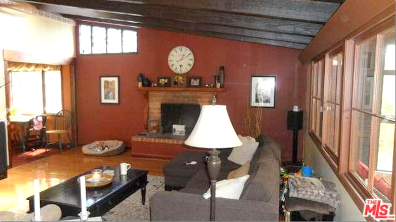
BEFORE: There are dark beams with dark wood planks between them. There is also a large fireplace. Instead of being light and bright, the red walls makes the house look so dark.

BEFORE: Without the furniture, you can see the large living room. There are two conservatories off this room – one which the new owners want to remove. Also, the owners want to take out the living room windows and put in French doors.

Here is the conservatory off the living room that will be removed.

And connected to the first conservatory is the larger, second one that will become the baby’s playroom.
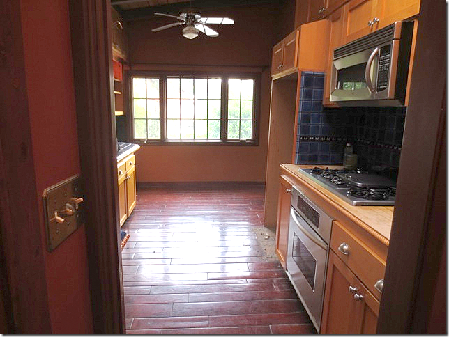
BEFORE: Off the foyer is the kitchen – that opens to the living room. It’s been updated and is very Spanish styled, but the new owners don’t like it.

BEFORE: The kitchen has blue and yellow tiles.

The designer’s plan for the kitchen: All new cabinets with white countertops. The door to the foyer will be closed off. The ceiling and floors will be painted white.

The homeowner isn’t sure she likes the new kitchen design – she is worried it won’t be bright enough with the dark cabinets, so the designer gives her other ideas to think about. In the end, she goes with the designer’s original design. Smart choice, as you will see.

BEFORE: Demo starts and the wall between the kitchen and living room is partially removed to open it up. In the kitchen – all the cabinets are now removed.

Extra large subway tile is chosen for the backsplash. The door to the foyer is now closed up.

AFTER: The new French doors are installed in the living room and the conservatory is removed. The ceiling planks are painted white, as are the walls. The new mantel is being made for the fireplace.

BEFORE: At the front door, a floor of yellow tiles is laid to create an interesting foyer.
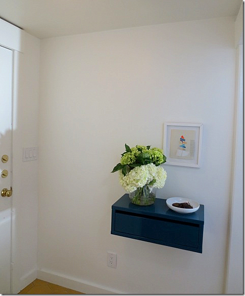
AFTER: At the front door – where the opening to the kitchen once was, there is now a wall with a built-in shelf for keys.

AFTER: The living room, which is filled with mid century modern furniture, and the view to the foyer with the yellow tiled floor.
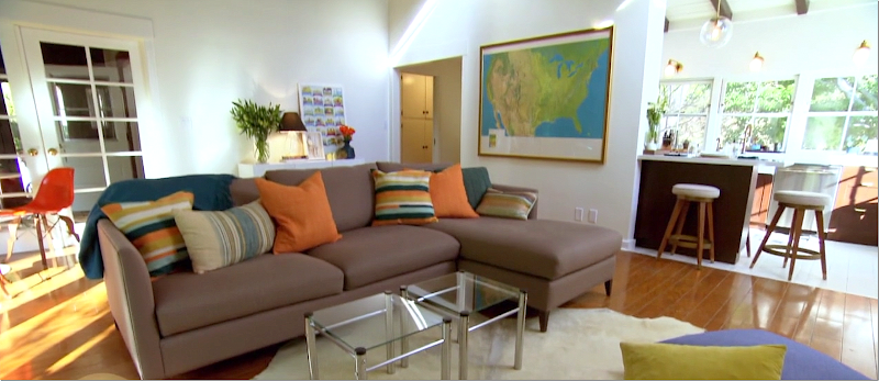
After: The living room with the kitchen to the right.

And the view towards the new French doors. The first conservatory is now gone and the second one is reached through the two closed French doors in the corner.

Before & After – The mantel was painted a gray and a new piece of wood was added.
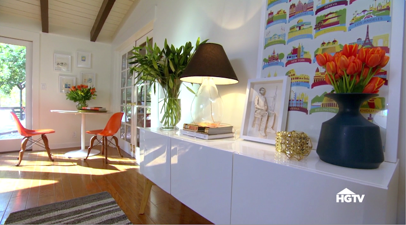
The back of the living room. Love this console. In the corner is a small dining table and chairs.
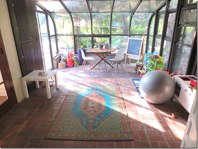
After: The second conservatory with the brick floor is set up as a playroom for their son.

The kitchen is a stunner. Where the wall was removed, there is now an eating bar.

The back wall is extra large subway tile that reaches up to the ceiling. The three windows remain, now painted white. The countertops are white quartz.
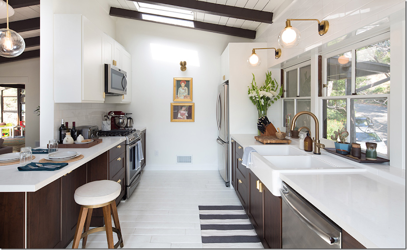
Above the counters are three bronze lights with glass globes. Beautiful! The doorway to the foyer now closed off is decorated with two gold framed paintings.

Before & After. Love the gold handles! The sink is from Ikea – I wonder if the cabinets are too?

Before & After

Before & After: Love how they built a cabinet around the refrigerator which makes it look built-in. Notice the wood floor was painted white.
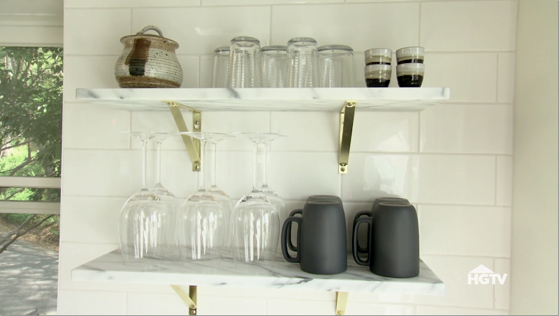
Marble shelves replace upper cabinets.

Love, love love!!!! This look is really in now. Black and white with subway tiles and gold/brass hardware/lighting and light wood accents.
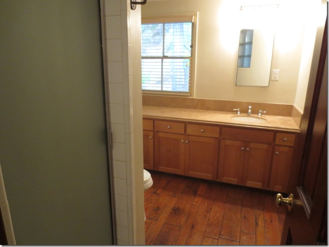
Before: The family bathroom was completely gutted so that a bathtub could be added for the baby.

After: Trendy black & white concrete tiles were laid in the bathroom. The new apron front tub is at the left.
I love the concrete tile look in black & white, again – this is look is so trendy now.
Remember: Black and white, subway, marble, gold/brass, and light wood accents!!!

Another view. The toilet is hidden from view by a pony wall of subway tile.

Before: The baby’s room is small, but nice with hardwood floors and built ins.
 After: The changing table fits in between the cabinets. Cute blue and white rug.
Before: The master bedroom is large with a beamed vaulted ceiling.

After: Simple white bedding and a Moroccan rug.

Out back, stairs lead down to the private canyon.
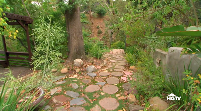
BEFORE: Off the back deck, the stones were moved to make a greenspace for the baby.

AFTER: There is a nice level yard now, closed off with a picket fence for safety.
>
I’ll show the designer soon! She has done some great work in L.A.I loved what they did with the house – the kitchen and bathroom, painting the walls and ceiling, putting in the French doors, taking out the old fashioned conservatory – the total cost of the reno was around $70,000.
This look with the graphic black and white – black walls, concrete tiles, brass metals – it has really taken off and is becoming the look now. Was it a coincidence that One King’s Lane did an entire story on this look in bathrooms today? They showed how this graphic look, with high contrast.One Kings Lane showed some graphic bathrooms today that have the same look:

This bathroom from Instagram has the graphic concrete tiles that are so hot right now. Even the stools are the same as the hip HGTV couple. Like the look? mix black, wood, marble and subway to get it.

More black and white floor tiles with black bathtub and subway tile with wood accents.

Love this one! The gold brass, the black and white tile, wood accents. These are the primary elements to have in order to get this look.

OK OK OK ! I am dying to redo my bathrooms now!!!

Blue instead of black for a change. Nice!!!
For the kitchen – follow the same formula.

Love the graphic look? I hope you are getting ideas on how to update YOUR house or your children’s house!!!!
To see more of these great looking bathrooms and to shop the rooms, go HERE!!!!
After: The changing table fits in between the cabinets. Cute blue and white rug.


I was born and raised in the Los Angeles area. I don't think of the redo as hip and chic but rather cookie cuter style for the area.
ReplyDeleteJust curious, what is considered hip and chic in that area today?
Deleteshe probably means that so many of the younger set in la like this look. the concrete tile tho - that is relatively new in the past few years. and the brass/gold is new in the past few years.
DeleteI am so glad they didn't double the size of the house or something. It looks bright and friendly. I love the three brass lights in the kitchen; I am looking for appropriate sconces for my renovation to provide task lighting in the kitchen because with 14-foot ceilings, halogen spots won't be much use. Your blog is an incredible resource for me!
ReplyDeleteI wouldn't want to carry groceries (or a tired kid) up those front steps. When I saw that back yard, I thought again, yikes! You don't want to have to chase a ball down that slope! But the way they made a level yard is really lovely.
Conservatories, or what the French call verandas, are very popular, especially in the north, for play rooms because it's so often rainy that the kids can't go out. Where I am in the south they are far less popular because it gets hot here and they create a steam room.
Joni, would love your opinion on tile & bathroom remodelling. LOVE these wonderful trendy tiles, and I am considering a similar look for a bathroom remodel. But am I going to be facing another remodel in 10 years? Not just a change of fixtures but a complete jackhammer job because the tiles will soon look dated...? Or does this trend have some longevity...?
ReplyDeleteI love the cement tiles, but I think it is a look that has more longevity in areas where a mediterranian look makes sense (California). When I work with my clients, I generally steer them to more neutral tile, because it's likely that they will only remodel once. If you have the means to change the tile out in five years I say go for the more trendy tile!
DeleteI love the house; the transformation from old, dated and dingy to bright and hip is amazing. I am finding myself drawn to the new play with black and white. Love the brass handles with the black cabinets. There is one element of the design plan that really bothers me; the eating bar in the kitchen. The horizontal line across that beautiful opening they created looks odd to me. I think it would be so much prettier if the eating area had been placed between the fireplace and kitchen opening, or move the sofa forward and build a narrow banquet along the wall (where the buffet is) paired with a narrow table and flanked with a bench that would tuck under. They have a small table and two chairs in front of the French doors going to conservatory/play room; maybe larger table there? Of course there is no way in photos to know if there is enough space to relocate dining space. It's just my personal opinion - which isn't worth much. Uncertain why that horizontal line created by the eating bar bothers me? Beautiful renovation, amazing transformation. As you said "young and hip".
ReplyDeleteok, yes. i don't like to eat on barstools. and the husband wanted to keep the atrium and make that a dining room. i guess they could add a bigger table behind the sofa? i love the kitchen though. i love the black brown and white and brass that is so in right now. i do agree tho - i would have added a small table somewhere.
DeleteThanks for this. I am in the process of planning our master bath reno and have chosen larger-size subway tiles for the shower, with banded trim in small black, gray and white. I was thinking of painting the very dated sink cabinet black (it's now that pinkish-white stain that was hot in the late 80s/early 90s). Now I KNOW I will paint it black!! Love the HGTV reno too. Everything looked beautiful except the fireplace. They improved it, but not enough. It's really odd looking. Great post though!! Thanks again.
ReplyDeletei love the black. I hope it works out for you! agree about the fireplace? might have been the photo.
DeleteI don't think any of these rooms look super trendy when mixed with classic subway tiles. I love the blue tile in the last photo! Agree that the kitchen is a stunner. I was in that neighborhood last month when we took a short cut hike up to the Hollywood sign. I wondered what those houses looked like inside. What a treat it is to see one of them!
ReplyDeleteAs beautiful as that kitchen is, please note that in their effort to lighten and open things up, they eliminated about half of the cupboard space in the original kitchen. Now, although it is a great looking kitchen, I question how functional it is with so little cabinet space. This is often the problem I find with these types of remodels. Things look great, but how do they work as a living space? It's definitely form over function every time.
ReplyDeleteMeh! Sorry....
ReplyDelete1. I am SO over the mid-century look.
2. Never understood the trend for open shelving in kitchens. Do people have maids that come in daily and clean the dust off of the items on the shelf??
3. Where is storage space in the kitchen? Kitchen looks nice but NOT very functional at all.
4. Brick floors in kid's playroom....Yep, that's a great idea! (said facetiously...)
They did do great job of letting more light into the house.
Thanks again Joni for the post. Your posts, in addition to being fab to look at, are always so informative design-wise.
Gina from The Midwest
well, the brick was there! ok - hip and chic and young = mid century design. it just does. and while it's not ME I do appreciate this look. I just loved the kitchen. loved the look of it.
DeleteI agree. And I thought you said it was only 1400 sf? Not a bad sized kitchen for 1400 sf. We have 1500 sf and our kitchen is 10'x8' wall to wall (about 6x6 floor space), and one wall has a big giant window (which we can't change due to HOA rules). So I have no storage either... I always wonder about the dust factor on open shelving also, though I love the look. But I DO have a 3' pot rack (bar?) hanging over the sink because there was just no other place to put them. I had them in the lower corner cabinet on the lazy susan, but the top rack of the lazy susan kept giving way to the weight of the pots and falling to the bottom. So I had to find a place to put them. The pots I don't use very often, I do have to rinse/wash before using them, but I don't mind since it isn't often and only takes a minute. I dream of a bigger kitchen some day!
DeleteJackie - I have open shelves in my kitchen and NEVER have a problem with dust. If you keep the items you use most in open shelves, they constantly get used and washed so it isn't an issue. And if you see a little dust, rinse it in your sink before you use it.
DeleteAnonymous - good to hear. I love the look. Maybe in my next kitchen. And maybe I need less stuff. :-) With just two of us, we don't use that many items regularly...
DeleteSuch good inspiration! And nice save on the brother-in-law, btw! ;)
ReplyDelete"This look is really in now." "Trendy." I think these words say it all. While I approve of the architectural changes made (close off the kitchen from the entry and open it up to the living, French doors, etc.), it has lost the warmth of the original. True mid-century modern houses had a more organic look with natural tone woods. (Thanks to Frank Lloyd Wright.) Personally, I'm tired of the all white look, whether contemporary or shabby chic.) I feel the connection between the natural beauty of the canyon and the house is lost. It looks like generic decorating of the times to me. I do love a black and white bathroom, though.
ReplyDeleteYes, love the concrete tile in the first bath!
ReplyDeleteFirst, thanks for all the posts this week. What a treat. Your every post is interesting, thought-provoking, fun and beautiful. I'm a fan! I think they did a good job on the house and especially the kitchen. Guys, you don't need all those kitchen cabinets. Pare things down to the beautiful and the useful and get rid of your upper cabinets. It will open up your kitchen and you will love it. I took my upper cabinets down last summer and it looks great. I added just three stainless open shelves next to the fridge and no, you don't have to dust every day or even every week. I use those shelves for things I use very frequently so they never get dusty. And you can get at things so easily. This trend will become a classic look, I'm pretty sure.
ReplyDeleteI do wonder about the dust. Well, I'm trying to maybe blog a little more instead of waiting. we'll see!!! It seemed like a quick, fun one.
DeleteI don't care for mid century modern design at all but your post was interesting and I enjoyed seeing the bathrooms. Thank you!
ReplyDeleteI positively love the kitchen. As for trendiness, it won’t require a total gut job in 10 or so years and there is no such thing as a timeless kitchen, period. Small changes could refresh it starts to seem wrong. I too just removed my upper cabinets and I couldn’t be happier. With the money I saved by not having to purchase uppers, I’ve been able to totally customize the lowers with pull out shelves, deep drawers for pots, pans, even plates and glasses, and I so love looking down into the lower drawers rather than rooting around in the uppers looking for where the hubby put the cobalt blue stemware. And I have room on my walls for a fabulous light fixture and some French antique rooster prints. My knives are within reach on a magnetic strip and a row of hooks holds the cookware I use most often (which encourages me to keep it sparkling clean). It is highly functional! I read a line recently: “Nothing dates a kitchen more than wall hung cabinets.” I see nothing wrong with a total rethinking of how we approach kitchen design and to me, function over number of cabinets is just plain smart.
ReplyDeleteI wish I could remove mine too. I want to bomb my entire house.
DeleteNo way, Joni. Your house is beautiful and filled with lovely, meaningful objects. There is no one way to do things, I'm sure you learned long ago. I want to weigh in about the concrete tiles. A year and a half ago I was looking for them, having seen them in the shelter mags, and wanted them for a downstairs bathroom. I couldn't find them at all. Glad I didn't. For me, they are a bit loud and dizzying now. What I favour now, and have used in three bathrooms, is stone mosaic tiles of the sort sold by Ann Sacks. More subtle, just gorgeous. They are expensive, but since the square footage is small, it is well worth it.
DeleteHola, Joni!
ReplyDeleteYou are so good to take up for HGTV. I want them kicked to the curb for ruining the home design space on TV. Granted that the housing market tanked and took a toll on great shows like Sarah's House. There were such great designers showcased--that Ken fellow. All gone.
And tell me that by this point, HGTV couldn't have come up with some great, inspiring, and wonderful shows. They could give you your own show--I'd LOVE that. Seriously, what is wrong with them? They could make MORE money with better shows. And this particular episode, it's a C+. And only that good because Joni likes it.
Now it's "All House Hunters All The Time". Unless it's "All House Hunter Renovation All the Time".
Have you noticed that every HGTV show is paid for by either the Canadian government or the state of North Carolina? Watch those "Special Thanks" messages at the end.
No. No more House Hunters ad nauseum. I'm watching RuPaul. If those big, hairy men can look so beautiful, then so can any woman who wants to. On your worst day, you can be gorgeous. When does RuPaul get a design show?
But I applaud you always and thank you for your postings. But HGTV is a hissing and a byword. It's dead to me now. Except for Chip & Joanna. I think they snap HGTV's shorts.
Your friend,
Ms. #FurlowFurever
Not that anyone cares what I think, but that is one of the worst renovations I've seen. I don't think there is anything I like about the re-done rooms.
ReplyDeleteReally? I LOVED the kitchen!!!! which is why I showed it! don't tell me this, it makes me think I've lost my eye!!!!!
DeleteOh don't go by me, I'm not a designer, I own an old over 100 year old farmhouse in Prince Edward Island, Canada. I really do enjoy your blog!
DeleteI see why you like the renovation Joni. I think the home owners made some nice improvements and thank god they didn't level the house and build a cheap mediterranean or nasty contemporary mish mosh house. The house feels much lighter, and the bathrooms are interesting with some classic choices. The kitchen cabinets look cheap to me - I would have done wood painted black or white. Love the beams and subway tile. I completely support the lack of upper cabinets, which by the way has been done in Europe and Italy for centuries .. nothing new there! It's a good excuse to purge unused kitchen items.
Deletewhoops .. typo ... i meant France and Italy (not Europe and Italy)
DeleteJoni, seriously HGTV should give you a show, I totally agree with anon posted March 17! Kris in Seattle
DeleteNorth Carolina? I haven't noticed that! I can't watch it alot becuase I'm too addicted to the NEWS! haha. BUT I do love Fixer Upper and the other day I just happened to see this episode. I do love a reno. I like the ones from Paris that they show. We watch Property Brothers, but omg, they get on my nerves soooo much trying to be funny. I like the Flip show with Tarek and his pretty wife. But that's it I guess. I used to love HGTV before it all changed. What a shame. And really, what is with all the Canadian shows? Their houses are so different than ours.
ReplyDeleteThis comment has been removed by the author.
ReplyDeleteI don't know if I am ahead or behind! I've had a house full of black, white, taupe and some wood (lots of contrast) for the last 10 years or so--certainly wasn't trendy, and didn't match anyone's style but my own. Before that I had lots of white... Then after I started looking at decorating blogs a few years ago, the black started to seem heavy to me. So I have been trying to slowly lighten things up. Also our current house is dark (larger windows face north and we have lots of trees). So we just recently were able to re-do the master bathroom, and chose lots of white and gray, quartz, Carrera... and I love it. It looks so fresh and pretty, light and clean. Then I see all this black and white and wonder if I should have stuck with my previous style and just updated some of the materials, rather than go so light in the bathroom and then feeling like I need to lighten everything else up too? Is my bathroom going to look dated soon after it is finished? Too late now! As others have mentioned, though, I also wonder about the concrete tiles. I would worry about those getting old too soon. But maybe not since they seem like a fairly new trend?
ReplyDeleteUpper cabinets, yes or no? I think that depends upon the kitchen. In this remodel, the upper cabinets seemed very oppressive. In addition, not sure how they would get to anything stored in them without a ladder. I am an American with lots of stuff, but realistically most of what I use every day can be stored in just a few lower cabinets especially after I added the pull out drawers. Huge difference being able to to use the full 24" depth of a bottom cabinet!
ReplyDeleteI also discovered that I no longer needed an ice cream maker, more than one blender or a half dozen spring form pans for cheesecake. Hubby wanted a big mixer to make bread, but since I am the one who makes the bread, I told him I would rather make it by hand. Just need a big bowl and a big spoon for that!
I am trying to create a French lifestyle (NOT the King of France's lifestyle but a normal person's life style.) For that I think fewer, good quality things are more appropriate than a lot of "stuff".
Smiles from Charlotte