Here is a Houston house – before and after and then, after again. It’s a study in designing in a way for the younger set and the more traditional set and it shows us where interior design was 15 years ago and where it is going today. Get ready for a fun ride. Enjoy!!!
2005:
Our first view of the custom designed house is a beautiful, Federal styled, reddish brick house with sage green trim. Lots of curb appeal for sure, not much to change. Right?
It’s large, 6 bedrooms, 6 1/2 baths, around 6,000 sq. ft. located in the woodsy Memorial village Hunter’s Creek. It was built in 1996 and by 2005, it was on the market – looking for new owners.
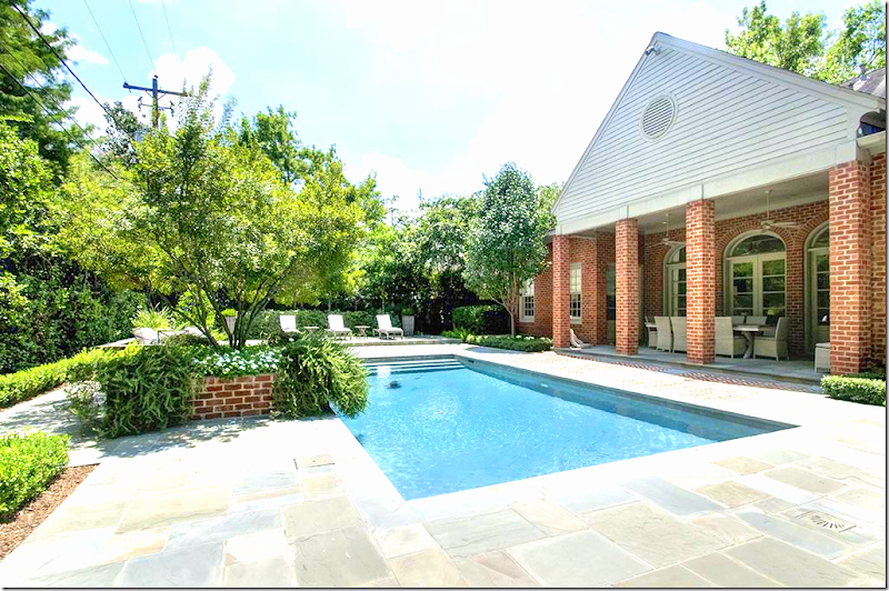
2005: The back yard has a large rectangle swimming pool with herringbone pattern brick. Typical Houston wood fence.
2014:
In 2014, the house was back on the market - it had been completely renovated and expanded. Here, the exterior now has a more sophisticated taupe trim. There is new landscaping, edited, along with a curved driveway. The price tag in the few years was raised 1,200.00 more. Of course, that increase had been added back into the house and yard.
2014: The view straight on shows the new landscaping and taupe trim.
2014: The backyard was extensively updated – with stone pavers and brick. A large raised sundeck was added to the back of the yard. New landscaping hides the Houston fence – the back now has a spa-like look.
2014: The view of the raised sundeck that overlooks the pool and the two conversation areas – one of each side of the new brick planter/fountain.
2014: One of the new conversation areas added to the back yard. You can see the new wood fence that was installed.
2014: Looking the other direction, at the back of the house. At the right of the pool is a new planter. Notice at the right of the house – the barn door that leads to the garage.
2014: The barn doors open to the garage – you can see to the driveway. I’ll guess this door was added on during the remodeling.
2014: Another view of the back of the house.
2014: Off the family room is the outdoor dining room, sheltered under the porch.
2014: Hidden off to the side of the house is the firepit.
2016:
And today, 2016, the house has been listed again, after another extensive remodeling.
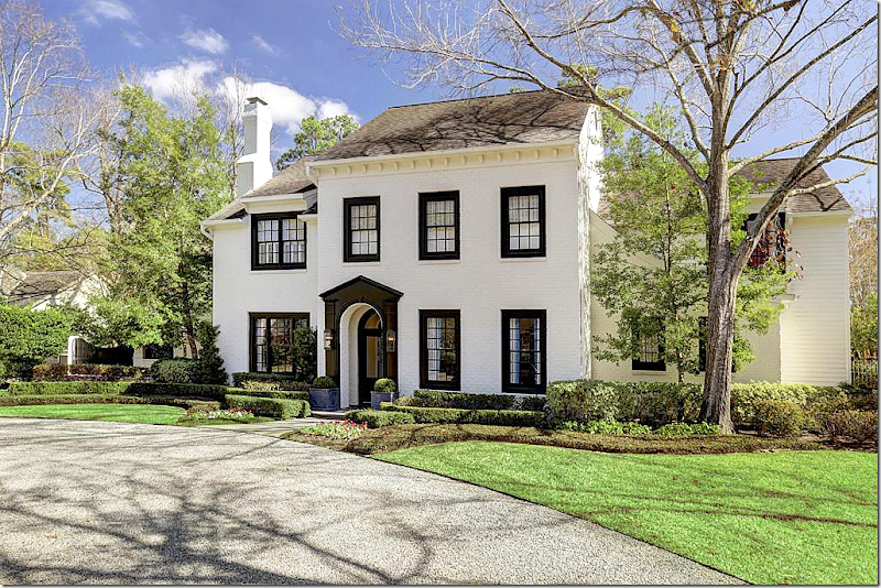
The facade gives a hint to the changes: all the reddish brick is now a modern stark white with a dramatic contrast in black trim. It looks like the landscaping remains the same.
A straight on view of the house with the beautiful front door and exaggerated trim.
And a view of the driveway with the wood gate.
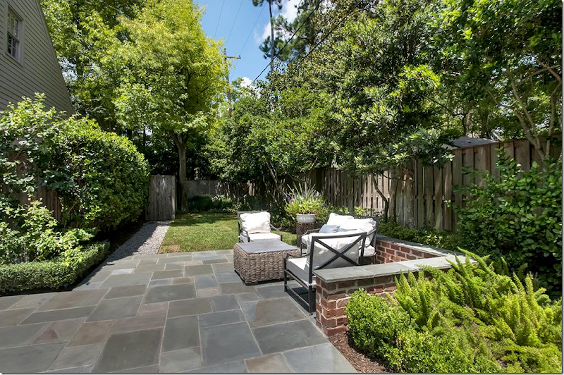
2016: The backyard was changed again, to match the more modern interior and exterior. The brick pavers were bleached to create a more unified look. The brick planter/fountain is now white – with its plants edited - again, a more contemporary look.
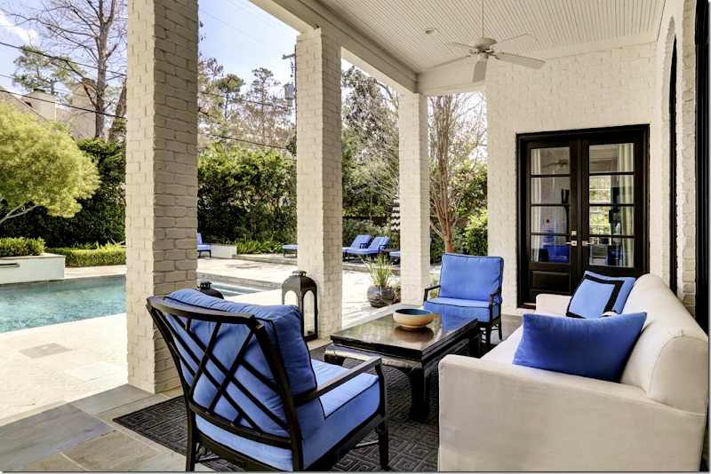
All the brick planters are now white, matching the house. The barn door is black, to match the trim. The furniture cushions are bright orchid blue.
2016: Off the side of the garage is the new outdoor eating area.
The back of the house, notice the vent is ringed in the bright blue. The umbrellas are white and black stripes which contrast with the blue cushions.
2016: Black, white, and blue – to blend in with the new modern interiors. Indoor outdoor rug was added. Since the outdoor eating area is now moved to the side of the garage, this area becomes a seating area.
2016: The view towards the pool.Ready to go inside?
2005:
2005: There aren’t a lot of pictures of the house from this sale, but here is the living room. The house had heart pine floors. The living room had faux stone walls, which was on-trend back then. The decor looks a little bland, not too exciting.
2005: Across from the living room is the dining room, wallpapered. The pine floors are stained a dark brown. There is a fireplace with a black mantel, silk curtains. Pretty room!
2014:
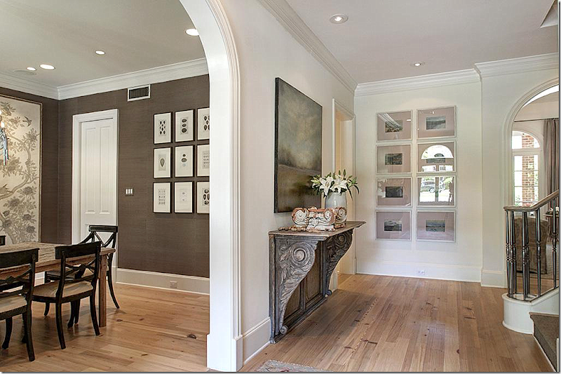
2014: The new owners totally remodeled the house. Here is the entry hall with the study, formerly the living room, to the right, now painted a muddy green-gray. Ahead is the family room, which overlooks the pool. To the left is the dining room. Arches lead to all the rooms. The square footage was increased by around 1,000 ft. from 5000 to 6000.
2014: The floors were stained – from dark to now a light look. At the left is the dining room.
2014: The study with the newly painted walls and newly installed bookcases. The gray envelopes the room, all the trim, including the ceiling. Beautiful area rug, antique desk and chairs with two yellow chairs. Silk curtains with an antique mirror.
The owner was obviously a Texas hunter, several trophies were displayed in his office. I love this room – love the decor! It’s sophisticated, traditional with a twist of the modern.
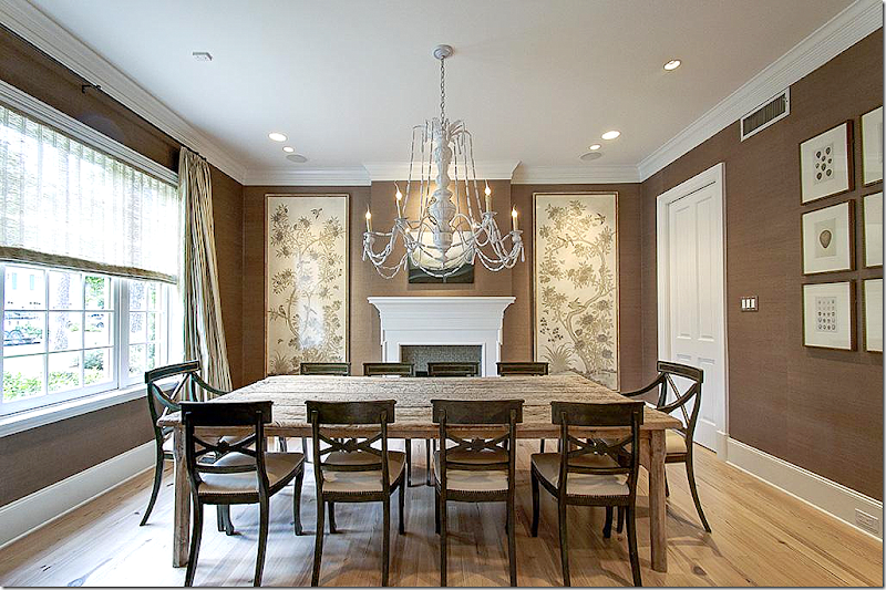
2014: The dining room has a totally new mantel in white wood. The walls are lined in a chocolate brown grasscloth. At the window is a shade with silk curtains. The antique wood table is bleached like the floors and a set of antique chairs surrounds it, while a white chandelier hangs. Framed wallpaper remnants flank the fireplace.
2016:
2016: Today, the house has been completely redecorated – with a younger, more contemporary look – for the 2020s. The floors were stained a white, while the walls are painted a bright white.
The doors leading to the study are glossy black and a skin runner is on the stairs. The railing was also painted black. Past the arched mirror is the master bedroom suite.
2016: The study sets the tone of the new decor: The built ins are now painted glossy white with trendy gold hardware. The back of the shelves is black. A green antique desk is paired with a blue velvet wingchair and two modern chairs (you can get these chairs at Huff-Harrington HERE.)
Behind the desk is a large piece of art featuring Marilyn Monroe. Green curtains with blue trim. Notice the blue and green are picked up in the accessories in the shelves.
2016: Across from the study is the dining room – now a lacquered Yves Klein blue. Wow! What a huge transformation. But, if you look – it was done with paint only which was put on top of the grasscloth. The white mantel was painted blue, and a crystal chandelier was added. A round black table is flanked by white leather chairs.
Two mirrors and lamps on Oriental demilunes flank the fireplace. Simple white curtains hang at the window. The area rug is a contemporary Greek key design in blue and black.
Another view. The tiles on the fireplace were either replaced in black or painted. The art work above the mantel brings in the green, from the study.
Notice how antiques were mixed in with all the contemporary pieces – like the blue and white vase, the Oriental demilunes, the crystal chandelier, the green desk and wing chair – I love this and it makes an interesting mix!
2005:
2005: The original family room with the wall of arched French doors that open to the pool. There is a stone mantel.
2005: The original kitchen. The door leads to the pool. The breakfast room was extended with the next owner and a new, large den was added to the left of the breakfast room.
2014:
2014: The remodeled family room with the bleached pine floors and new shelves instead of closed cabinets that flank the fireplace, which has a new mantel. The old stone was replaced for this more sophisticated version.
Above, the ceiling and beams are painted white. Notice the matching lanterns. Slipcovered furniture in solid linen and printed fabrics. Such a beautiful room!
2014: The kitchen was completed renovated. Wood floors were added in here. New cabinets, new island, new appliances and blue stone countertops.
The look here is the limed, bleached wood, which is very on trend even now. There is no crown molding which is modern and the open shelving is also a more contemporary look. Love how the freezer and refrigerator flank the stove.
2014: The view into the family room – with the pantries that flank the doorway. All the doors and island have planked wood faces.
2014: Antique table, wicker chairs, antique light fixture. Again – I love the decor; it’s sophisticated but warm and cozy. Perfect for a young family who likes antiques mixed with soft upholstery.
2014: At the end of the kitchen is the wet bar, which opens to the dining room and the foyer. White tile and cabinets mix with wood mirror.
2016:
2016: And today – behind the dining room is the wet bar, now painted glossy black with open shelves and mirrored backs.
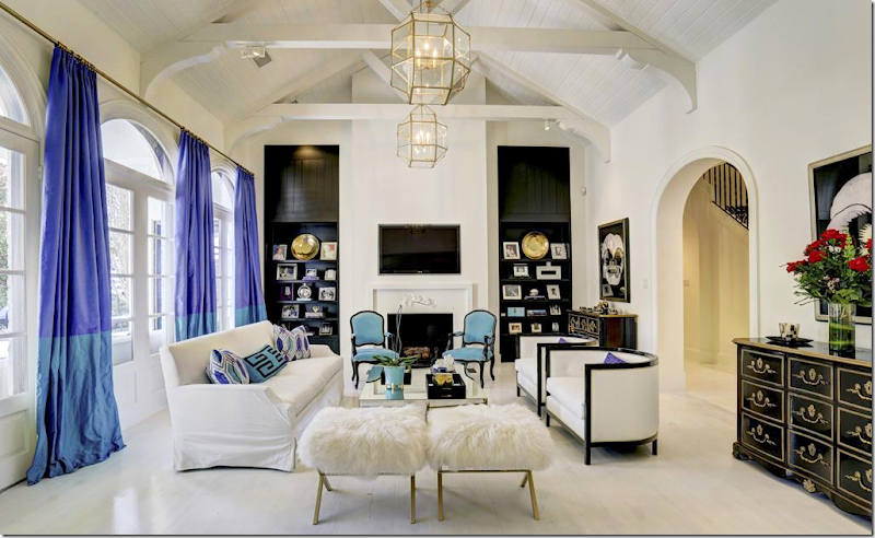
2016: The family room with white floors and walls and ceiling. The wood cabinets and shelves were painted a glossy black. The lanterns remained. Here, the decor of blue, black, and white continues with the new addition of turquoise and lilac.
Love the black chest. Again – it is amazing how the white washed floors and black trim can make such a HUGE difference in the look of the house! It’s a lesson for sure – the power of paint.
2016: Looking towards the kitchen. The room looks really pretty from this view! Black sconces were added between the two rooms.
2016: The kitchen – the backsplash was replaced with very on trend tiles. The shelves were painted lilac to match the barstools. Otherwise, it remains the same. You can see where the new den was added in 2014, off the breakfast room.
2016: A view of the kitchen with the newly installed tiled backsplash and white painted cabinets which completely changes the look of the kitchen.
2016: The view back into the family room.
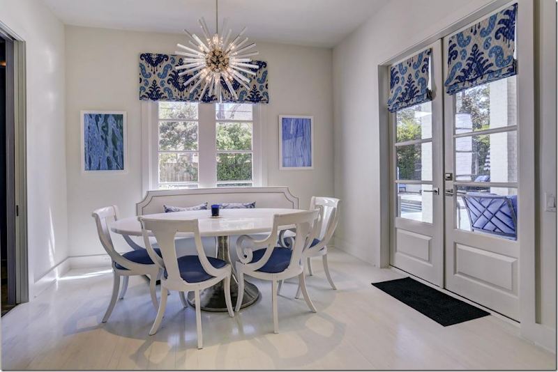
2017: The breakfast room has a leather banquette, marble topped table, and that beautiful crystal sputnik!! That is my favorite Sputnik fixture – it’s a beauty, based on an original design of Murano crystal. To order, click the photos below:
Small Size – click on photo for more information.
Large Size – click on photo for more information.
Next are pictures of the den which was added on after the house was purchased in 2005:
2014: Off the newly widened breakfast room is the added on den. A large room, there are cabinets along one side of the room. Furnished in the warm taupe like the rest of the house, it is a mix of new and old.
2014: At the back corner, a new walk-in wet bar was added. Beautiful striped rug.
2014: The new wet bar, with weathered wood paneling! Love this – with all the open shelves.
2016:
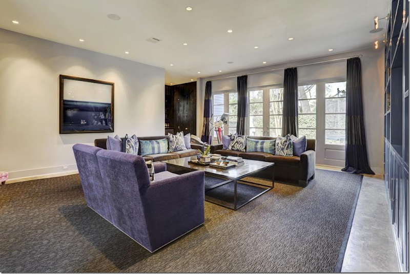
2016: And – off the breakfast room – seen through the opening - is the large, added on family room, done in the blues and lilacs found in the kitchen and family room. Velvet sofas and chairs with Ikat pillows. To the right is the new wet bar.
2016: view from the other side, showing the windows with curtains. Large contemporary area rug. The bar is in the corner. Again, the only physical change in this room was the paint on the cabinets is now a glossy lilac shade.
2016: The bar is now a distressed glossy black and again paint makes it look completely and totally different.
2016: The powder room, updated with a graphic black and white wallpaper.
2005:
2005: The master bedroom is located off to the right of the entry hall. There is a door that leads to the covered porch off the swimming pool. Originally, the carpeted room was sweet, with a canopy bed and fabric valances.
2014:
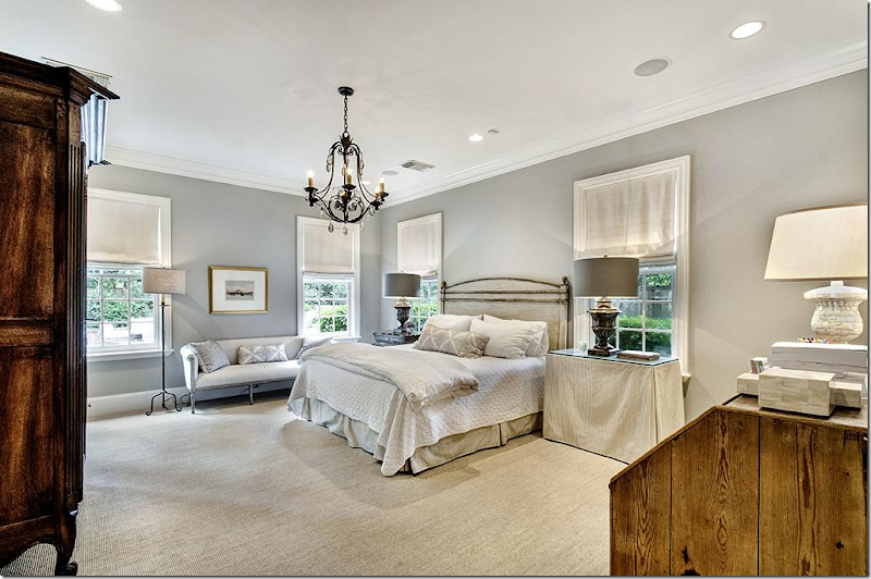
2014: The bedroom was painted gray with seagrass. The furniture is a mix of French antiques with skirted tables. White fabric shades cover the windows and there is a new black iron chandelier. Love the painted French settee.
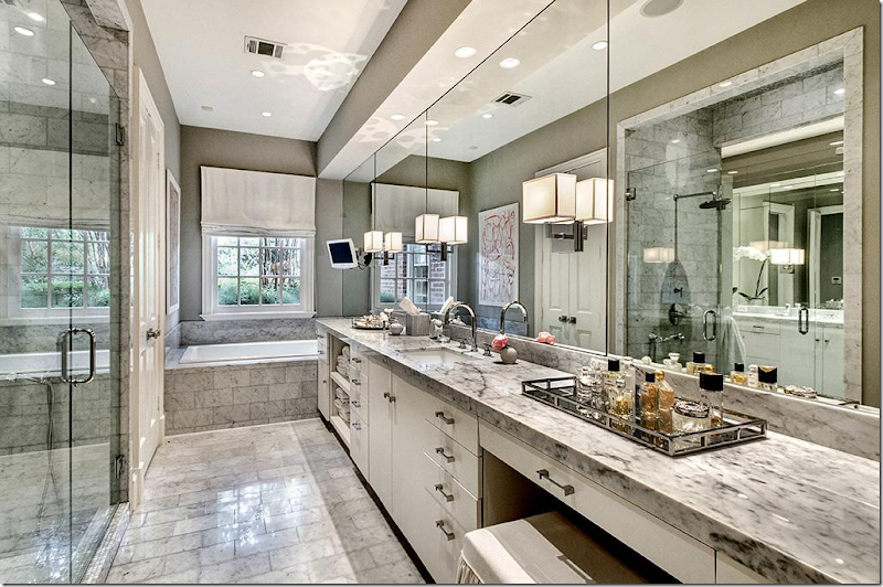
2014: Gray marble in the lady’s master bathroom reflects the look of the gray and taupe decor found throughout the house. This bathroom was updated after it was bought in 2005.
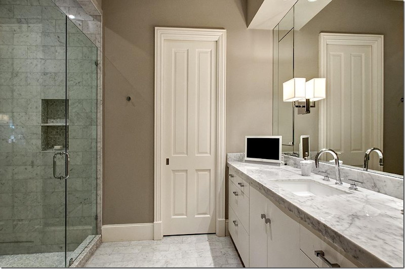
2014: His master bathroom.
2016:
2016: WOW! Total glam! Black walls, blue and white accents. The carpet is stunning.
2016: Another view – shows the black and white striped chairs with blue pillows. Mirrored end tables. White upholstered bed. Love the gilt sunburst accent.
2016: The new lady’s master bath now has white walls, the only change.
2016: The man’s master bath again, with new white walls.
2014:
2014: There are two staircases. The main one, here, was carpeted in a faux seagrass. An antique post office cubby is charming! Love that!! It’s a great idea for large families with bedrooms upstairs.
2005:
2005: Upstairs are several guest room including another family room and computer room. Here is Guest Room #1 in 1990s toile.
2005: Guest Room #2. Nice, but plain.
2014:
2014: Guest room #1 in navy and white with a faux type seagrass carpet. The shutters remain from the original owner.
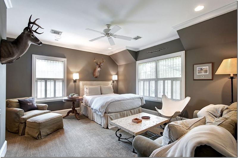
2014: Guest room #2 in dark taupe/gray and white with hunting trophies and the original built ins now painted a bright white.
2014: Guest Room #3 in dark taupe/gray with slipcovered sofa and chairs. This family must have had all boys?
2014: Guest Room #4 – with vaulted ceilings in a warm persimmon with black beds. It’s not easy decorating five bedrooms that blend yet, still stand out. By changing wall colors, they have found a way to distinguish the rooms from each other.
2016:
2016: Guest Room #1 – now has cobalt blue walls with black and white accents, just like the downstairs decor. Interesting that the original shutters still remain in place, the carpet remains from the 2014 decor.
2016: Guest Room #2 now in navy and red stripes, with the original built ins.
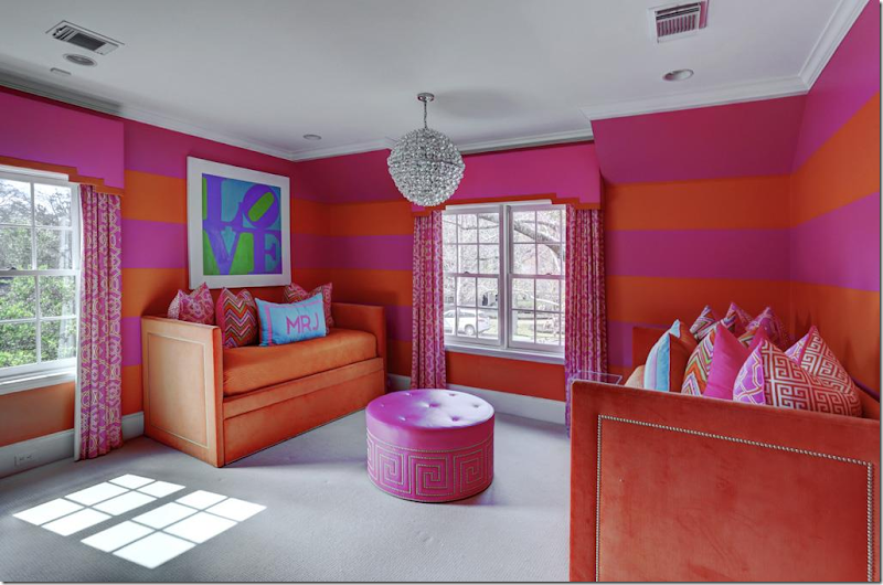
2016: Guest Room #3 is totally different in bright orange and pink – perfect for a little girl, with new curtains with cornice boards, and new gray carpet. These twin beds are made like sofas, perfect for sleepovers!! Cute Sputnik.
2005:
2005: The upstairs playroom with computer room. This room is off the back, second set of stairs and can act as a separate apartment.
2014:
2014: The playroom with the persimmon walls – turned into a media room. The “computer” room is now a kitchen/dining area.
2016:
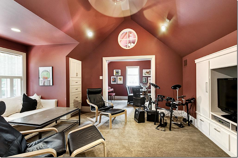
2016: The playroom – is now more younger kid friendly in lime green and blue, continuing the decor them from downstairs.
I really enjoyed looking at this house change dramatically in just over a decade. It reflects where interior design has been and where it is going. From sedate traditional decor to light woods with taupe and gray schemes to ultra glamorous in bright colors, with black accents and cooler tones.
To go from this:
in 2005 to this:
In 2014, to this – a few short years later:
The bright modern, glamorous look of 2016.
I’m curious – which is your favorite decor: 2005, 2014, or 2016? I’m going with 2014, but I’m crazy over the 2016 master bedroom and the dining room!!
To see more of this house, go HERE. It’s for sale!!
NEXT, a Houston broker, Facebook friend alerted me to a new listing of his – a chic townhouse in the Galleria area.
Here’s a look at this beauty:
Next to Uptown Park, with pedestrian access to it via a private gate, this small private community is located on Rue De La Paix Way.
Private gardens and a protected reserve which backs up to the townhouse.
The townhouse has a metal roof and brick and stucco facade. An elevator gives easy access to the three levels, especially useful for transporting luggage and packages.
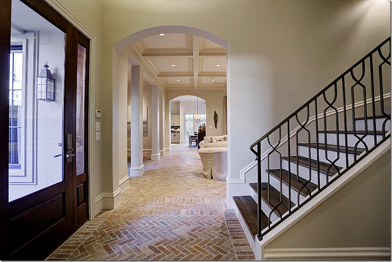
Inside, the front door opens to the three level staircase with metal rails and hardwood risers. The main floor is a beautiful herringbone brick, which I LOVE!!!
To the left of the foyer, the public rooms open to the center hall, which ends at the kitchen.
The living room is off to the right with the dining room on the left through columns.
Coffered ceiling, with lighted shelves and stone mantel.
The view towards the front door and the dining room, across from the living room.
Antiques mix with French chairs and double chandeliers.
The view from the dining room into the living room and the kitchen.
The breakfast room is at the end of the hall and off the kitchen. I love how open the house is. And I love how the kitchen and living room are on the ground floor instead of the second floor like it is in so many Houston townhouses today.
The kitchen with limed wood cabinets and black countertops. Very sophisticated and pretty.
Off the breakfast room is a patio with an outdoor grill – a must in Houston!
Antique trumeau with sink on a stand, the must-have look in powder rooms.
Upstairs, the light look with limed wood floors continues, as does the beamed ceiling. Off the master room is the study.
The study is next to the three story staircase. Looks very cozy with the fireplace and big screen!
The master bedroom is right through these double doors. Lots of shelves make this room the perfect library. Instead of a recliner – think about a comfy chair and ottoman, with down filled cushions, slipcovered. Indestructible!!!!
The master bedroom with a small seating area.
Master bathroom with standing tub. Love the bench!
The 2nd bedroom on the same floor is used as an office. It has a charming Juliet balcony.
At the top of the stairs is the media room with its own drink refrigerator. Huge leather sectional – great for a media room!
Another view of the media room, perfect for families with teens and college kids.
Off the media room is the third floor outdoors room with a fireplace! Incredible!!!!! Love this!
Guest Room #3 with wood floors.
Guest bath – notice the tile backsplash and sconces.
The guest room #4 – my favorite bedroom, of course! So cute!!!
For more information on this house for sale, go HERE.
































Definitely 2014 for me with less trophies in the bedrooms though. I could move into this version, but would walk in and out of the modern version. Feels cold to me. I want rustic and comfy. Love the second home.
ReplyDeleteYes, I agree. One wonders how many sawn-off heads one needs to make that 'we hunt' statement!
DeleteTo some people it's a status symbol to have as many severed heads as possible on their walls and they want one from as many species as possible.
DeleteIt shows their hunting ability, (even though lots of these "hunts" are set up for the kill) masculinity, (yes, it takes a big man to murder a helpless creature...NOT), social status,(these phony contrived "hunts" cost big bucks) and a few other primitive human emotions.
I get that people don't want their guns taken away but can't you just save them until the burglar comes in your house, and spare the lives of animals who have no reason to be killed?
Sheila
Dear Joni- Can you please ask the home owner of the first house for the names of the paint colors that were used????
ReplyDeleteThanks for the best design blog site on the web!
Thank you!!!!!
you are such a great story teller! Agree with the comment above. 2014 incarnation would be my choice. I guess I am showing my age. I am absolutely dying to know who the 2014 and 2016 designers were. I am sure I will have to keep guessing. If you wanted us to know you would tell us. Thanks for another great story!
ReplyDeleteI like the 2014 the best for sure. There are things I love about the 2016 modern look but the 2014 is more inviting relaxed and comfortable and still very current.
ReplyDeleteWow! I think both 2014 and 2016 are very tasteful. My personal preference would be 2014 though, so soothing and relaxing for me. However, I am really into Windsor Smith black, white, and grays lately, but in this particular case I did not like the painted brick with the black contrast. I just purchased a home and was considering making similar changes... Really though both are very well done imho as a lay person,non-designer. The town house is darling. My best friend's mother must live in the same enclave because hers if similar and I love it. Thank you for the eye candy!
ReplyDeleteI always love it when you feature Houston homes. Our last home in Houston was in Hunter's Creek. What a lovely area. What an amazing change in the first home you featured.
ReplyDeleteSam
The exterior would have been gracious if only the window sash (the operable part of the window) had been painted dark. The dark brick mould surrounding the windows is far too heavy. The dark entrance surround is hideous in the dark paint; the detail is completely lost.
ReplyDeleteLong time lurker here, very rarely do I post a comment, but this post inspired me to do so! Much prefer the "2014" after to the "2016" after. The upstairs guest rooms in 2016 to me were the only redeeming quality. Just cannot believe the unnecessary transformation. The 2014 was still clean, classic, and trendy enough to keep around for a very long time! The 2016 actually looks so glossed over it borderlines on a (dare I say it?) cheap look. I know that is harsh, but much of the 2016 changes were not for the better, IMHO!
ReplyDeleteI love 2014. Such beautiful livable spaces.
ReplyDelete2016-Yuk! So garish and cheap looking in my opinion.
ReplyDeleteI'm with you on the first house. 2014 is my fave although I don't care for all the hunting trophies. I like some elements of the 2016 house. It's a bit too trendy and doesn't have that timeless look. But, who knows, it might be completely revamped in another 2 years.
ReplyDeleteThe 2014 renovation is tasteful and beautiful. The 2016 exterior paint job is just shockingly horrible. I'm sorry - I am so over every house in Houston painting the brick white. It would have been more attractive if they hadn't gone so dark with the trim. In my opinion, they have ruined this house. So sad :-(
ReplyDeleteI completely agree with Carole. It hurt my heart to see the 2016 "updates", both inside and out. The 2014 updates were just perfect. Now, the house feels cheap and "Beetlejuice-like."
DeleteTotally agree. This was a gorgeous home, ruined by paint and excess! And what about the waste of building materials from 2014 to 2016 and the environmental impact?
DeleteThis house is crying "take me back to 2014 PLEASE"!!!!! I do agree the dead animals would have to go.
ReplyDeleteAt first I was a 2014 all the way...safe...however...that 2016 is "exciting"...dare I say...it gives me a thrill...those colors just resonate with me. Decisions (I don't have to make...) :) Great post (as usual!) franki
ReplyDeleteI don't know, in some ways the 2014 looks "Restoration Hardware" dated, and the 2016 sort of new and fresh. And, I HATE color, but...
ReplyDeleteYUCK! 2016 is just tooooo plastic and trying so hard to make a statement..my biggest complaint is It just doesnt feel like it fits with the bones of the house. I love some modern touches, but even with the white exterior...the style chosen for the 2016 was a disconnect :( sad.
ReplyDeleteI preferred the Houston French townhouse WAY better than any version of the Hunter house. Hunter house lacked warmth and comfort IMO. Guess I am old fashioned. ��
ReplyDeleteInteresting how powerful color is.
Side note I wouldn't paint floors white, too worried about scuff marks. Kris in Seattle
I'm with you. I am surprised by the lack of area rugs on the brick floors. Brick/tile/stone floors (as well as parquet) are typical in Europe, but you would have oriental carpets to absorb sound and give some softness underfoot.
DeleteThe 2016 Hunter house takes me right back to the 1980s, with the jewel tones, brass/gold accents, black and white. I think that in two years, we will say it looks dated. I like the 2014 version better but, like the others, without the dead animals on the walls.
Hi Joni, yes the 2014 is much more pleasing (without the trophies please)
ReplyDeleteTheir art collection was displayed beautifully!
xoxo
Karena
The Arts by Karena
It's not perfect, but definitely 2014 for me, without the animal trophies. Though I'm a blue person and I love some of those colors in the 2016 version, it's too glossy and glam and high contrast for me. I like the more natural woods and earthy colors of 2014. Those pickled white floors will also show every speck. Painting weathered barn wood a glossy black is particularly disgusting, though I hate to sound so harsh. (And what's done is done. I don't know how you could strip rough grained wood like that.) The 2014 looks more relaxed and comfortable, though a tad too RH. The 2016 master bedroom is way too jazzy and looks like a furniture market showroom. I don't think I could relax in that room, but the curtains are pretty. As for the exterior, I do love brick painted white, but the harsh black trim is too much. I would much rather see the trim a softer gray or greenish-gray like one of those subtle Farrow and Ball colors.
ReplyDelete2014: soothing, comforting, classy. 2016: I'll try to be kind. I love the painted (white) brick. The contrast, as Carolyn commented, is overwhelming and stark. It would be fine as a free-standing restaurant. The interior: how does anyone get any rest? how does anyone sleep? The jolts of saturated color resemble a shopping arcade in a third world country. Give me the cozy guest room, with the comfy twin beds in white linens. Linda Klinger
ReplyDelete2016 looks naked...Hollywood wannabees anyone? Flat out hurts my eyes. Like the furniture market showroom comment.
ReplyDelete2014 for me without animal parts. Looks like real people might live there.
Love white with black trim. This white is not it. The house looks like it was plonked down with no attempt to make it part of its setting. Guess I've said enough
Dear dear Joni, I think you knew what reaction you would provoke on this post and you have not been disappointed! Not wishing to offend any homeowner or designer, I will just say that your friend's townhouse is stunning and I would feel comfortable, relaxed and at home there and I will congratulate them on their, inevitable, quick sale :-)
ReplyDeleteFirst house, new decorating rather trite and harsh...especially the black exterior trim. But of course I liked the 2014 renovation.
ReplyDeleteThe 2005 house looked very 1995, I don't think it was professionally decorated... the 2016 house would have been nice had they kept some wood tones in the house to give it some warmth and naturalism. They should have kept the floors wood toned, it would have balanced out the starkness of black and white. The 2014 decor was very safe and typical, but I think more buyer friendly, except at this price point, I am sure the buyer is going to customize the place to suit their personal taste to some degree anyway.
ReplyDeleteThe 2005 house looked very 1995, I don't think it was professionally decorated... the 2016 house would have been nice had they kept some wood tones in the house to give it some warmth and naturalism. They should have kept the floors wood toned, it would have balanced out the starkness of black and white. The 2014 decor was very safe and typical, but I think more buyer friendly, except at this price point, I am sure the buyer is going to customize the place to suit their personal taste to some degree anyway.
ReplyDeleteThat's fascinating! I am moving from a 1920s house to one built in the early 2000s and this piece gives me lots of ideas for updating! Thank you for your thoughtful post!
ReplyDeleteBLack and white with blue is my own personal color scheme for my own home so for me the 2016 home is spot on. Love it!! Fresh, crisp, young and current!
ReplyDeleteBeautiful home but don't care for most of the 2016 updates. Joni, I know you love the master bedroom but that carpet would be hard to look at and relax at the end of a day. 2016 feels more like hotel decor. Lots of flash and impresses at first but then after a few days gets on your nerves. I love painted brick but they ruined this house with the glossy black trim...too harsh. If they wanted the slick shiny glam bold look, they should have bought a contemporary house. I feel the decor choices don't marry well with the house. In a few years it will look very dated and silly.
ReplyDeleteHi Joni! I loved the 2014 house and being the wife and mother of men who hunt I thought the "trophies" added some character and masculinity. I see a lot of homes today that have become so contrived or sterile.
ReplyDeleteThank you for your beauty and thoughtful generosity in all you do.
Have a great day!
Judith Presgrove
My dad hunted, too, fifty years ago. I'm for gun rights but killing innocent creatures and then displaying their severed heads just doesn't seem masculine to me. It feels barbaric at this point in time. If you need a meal it's one thing; but how often is that these days?
DeleteBut to sever the head and mount it on the wall to show your "masculinity"? Ugh. Just ugh.
Sheila
she types after she sets her cheeseburger down... I hate these holier than thou comments. Unless you're vegan, keep it to yourself folks. - Tanya from Texas
DeleteTo Tanya from Texas,
DeleteI don't eat cheeseburgers, bless your heart. I have a family member who died from mad cow disease. It's not really holier-than-thou to feel sad when you think of beautiful animals being killed for no reason other than the "fun" of it and then mounting their heads. It feels to me like a mindset from an era that has passed.
If you personally choose to kill animals there's no one stopping you.
Sheila
Same is true for passing moral judgement on people you don't know.. On a blog.. Anonymously.. I guess with perfection comes privileges Sheila. I wish I were as good a person as you.
DeleteDear ANONYMOUS,
DeleteI am not "anonymously"; I am Sheila.
I am not perfect. I get really sad when I see beautiful creatures who have been slaughtered for no reason other than the gratification of the hunter. There's just no reason for it.
It's an opinion, just like anyone else's here.
The ugly truth is that species of animals are being killed off the face of the earth and there will be no getting them back. Telling you this, though, is like farting in the wind.
Sheila in Port Townsend
2014 was a very nice, pretty, comfortable and inviting home. I would not change the exterior or interior. This was a very fun post and I loved looking at the three stages. Thanks for sharing. Love the townhouse.
ReplyDelete2014 is my vote as well. I prefer the exterior and interior for that renovation too. I'm a fan of more muted flat paint than shiny shiny!
ReplyDeleteHi Joni,
ReplyDeleteWhat an interesting article. Styles, design are such personal choices and they truly reflect a combination of our lifestyles and "desires."
The 2014 will probably attract a wider audience but 2016 also has some catchy design elements.
One question though, can anyone point to a source for those kitchen island high chairs with the brass legs?
Thank you!
KIm
Great post. 2014 is more appealing as a pretty, livable home. If it were mine I would freshen it by replacing most of the country pine furniture with painted country pieces. I would bring in modern sculpture. 2016 is glitz and could be improved by layering in more pieces of furniture, art and objets d'art from earlier periods. As to the townhome, it is very appealing but would look much better if it had plants - big ones - and flowers like groupings of orchids. About white floors, I took a deep breath and painted mine white this summer. it has transformed everything, but has me busy with the Magic Eraser every day! Thanks again Joni.
ReplyDelete"Floor maintenance" my first thought. If you don't have kids or pets, maybe... but then why on earth would you want 6,000 square feet?
DeleteAnother great post Joni - thanks!
ReplyDeleteThe "2014" version is so perfect.
The "2016" version is flat-out FUGLY. Those room colors and decor - UGH!!! I don't think I could eat a morsel of food in that glaringly bright blue dining room. My eyeballs would totally glaze over.
The townhouse: I. WANT. IT.
Gina from The Midwest
Fugly...good one!
DeleteSheila
2014 interior with '16 exterior. It's too cold for me now and feel that it's too trendy where as 2014 is classic and timeless. I would love 2014 with at few touches of contemporary to "update" it, though it really was perfect.
ReplyDeleteOh! And, these are my favorite posts you do!! And, the dear reader... So much fun, eye candy all of it.
DeleteThe 2014 version is nice, but WOW!!!
ReplyDeletethe 2016 version is stunning!! The master
bedroom is just beautiful! Everything just
flows together to create a very glamorous
Room
The whole 2016 version is really fresh
And exciting! Love it!!
Is this a tongue-in-cheek comment?
DeleteYou can't be serious.
Sheila in Port Townsend
2014-minus a few trophy heads and adding a girls room. 2016- a travesty to a beautiful home. They took a classic no-maintenance brick home and made it white and ugly.
ReplyDeleteTravesty is just the perfectly used word here.
DeleteSheila in Port Townsend
This comment has been removed by the author.
ReplyDeleteWonderful post, Joni! A question... you say they beached the outdoor brick on the patio, but it looks more like they painted it a cream color. I would like to achieve this look and would like to know what you mean by "bleaching" the brick or how this is accomplished. Thank you for writing my favorite blog.
ReplyDeleteNot to conctradict Joni. it has to have been covered with "grout"; a thin layer. It is not possible to "bleach" brick. Astonishing.....actually!
DeleteMy vote is for the 2014 version, but I'm probably biased since I lived in it for 9 years.
ReplyDeleteMy sympathies. It would break my heart to have my beautiful home become unrecognizable, inside and out!
DeleteMe too! Holy garish excess! Yikes. I'd be crying if someone did that to my house..
DeleteI was looking through the comments and was about to add a comment that said DEFINITELY the 2014 version - then noticed your vote! Your changes to the home were stunning - simply bringing the home to its time with subtle, warm, elegant renovations and additions. It is a lovely brick home and the taupe trim was perfection (as the intention of the architecture was to have solid stone embellishments (door and window surrounds). The white, but even worse, black trim is awful. Garish and inappropriate to the architecture. The (2016) interior made my eyes hurt. But I would live in the 2014 in a heartbeat.
DeleteWow, such changes to an already beautiful home. I wonder why? Did it have an obsolete floor plan? Did it have trouble selling? Since I am a realtor, I have to say the 2016 version has severely limited its buyer pool. With those super trendy colors and lack of traditional charm, it may be a hard sell to anyone but a Kardashian wannabe. Fortunately, the changes are mostly cosmetic, but whoa.
ReplyDeleteYeah, whoa.
DeleteThere's a 25 year old somewhere who's going to just love it.
Sheila
I love the 2014 the most, for sure. It is updated enough, and I thought, timeless enough to still look good for some years to come. And it fit the house, whereas I feel like the 2016 is just too modern and doesn't match the style of the structure. The only thing I like about the 2016 remodel is the outside! I do love the brick painted white:)
ReplyDeleteGreat post Joni!
Sheila
www.maisondecinq.blogspot.com
Agree with you, Sheila Irwin, about everything except exterior. It just doesn't work for me on this house.
DeleteSheila in Port Townsend
I love the brick painted. I hated everything else. Oh.......it hurt to see it!
DeleteHi all, The 2014 version was my family's house. I agree with most of the comments about both houses. The 2016 version is a dramatic change....some of the updates are not my taste and some of the updates I think are nice. The powder room is beautiful! I'm laughing about all the comments about too many trophy heads ect. I have to say I agree, but I have 3 boys and a husband who hunt and they love to show off their trophies, especially the boys. I love my designer Don Connelly because he believes that a house can be "decorated", but it should be comfortable and reflect the personality of the family. Don encouraged my husband who coached our boys' baseball teams for many years to display the team photos in his office because it has been such an important part of his life. The floors in the 2014 photos are deceiving and look darker than they really were. They were much lighter and made the house look fresher. That was a great house for our family and we really loved it! We love our new house too.....and yes the trophies are hanging all over the place....but Don told the guys that he will not allow one more. They will all have their own places to hang them way too soon!! Thanks for this fun post!! Susie Green
ReplyDeleteI very much liked the trophies.. My husband, father, brothers hunt as well.
DeleteSusie - Thank you so much for commenting !! The original owner also left a comment. I didn't know that Don Connelly had done the 2014 renovation. I love his work. I'm dying to see your new house!!! Thanks for beingu understading. A lot of people really let us know what they liked and didn't like!!! In detail!!!! At least it seemed be evenly divided. I just wish people would use a little more discretion when commenting. P.S. I like the trophies!!!! My husband's younger brother is a big hunter and so is my nephew.
DeleteYikes. I think the owner of the 2014 house needs a new head on his/her wall. Hey...how about the owner of the 2016 house!
ReplyDeleteWhat a shame. They ruined the home. It looks like a Kardashian must own it. It is certainly going to be out of style in about 6 months.
Exactly.
DeleteSheila
I agree.
DeleteThe 2016 exterior is not good. I've seen black and white houses that I love; it just doesn't work for me on this particular house.
ReplyDeleteSheila
Why, oh, why do people insist on putting such small t.v.s in what is supposed to be the "media room"?
ReplyDeleteThe key words are "media room" for heaven's sake.
I've seen actual theater rooms with like 52" t.vs for the screen. Might sound big on paper; it's not. Get a decent size t.v. people. You'll never regret buying a larger screen; you will regret buying a smaller screen.
Sheila
joni! this houston home's evolution is fascinating, isn't it???? i am in awe of how much there is to learn watching each remodel unfold and the different emotions each design evokes. 2014's is simply breathtaking, but 2016 makes total sense to me as well. that cobalt dining room. are you kidding? i can just imagine the colorful upbeat conversations over dinner in there. the townhouse is breathtaking, and i'm loving the blush linen comfy chairs in the study and the ethereal open feel of the whole place. thanks for sharing these stunning examples. peace to you right where you are.
ReplyDeleteLove love love 2014! Could have moved in in a heartbeat!
ReplyDeleteThe townhouse was stunning...loved everything about it spoke to me much more than the Hunter house. Amazing job....just love your posts!!!! Keep them coming!!!!
ReplyDeleteThe townhouse was stunning...loved everything about it spoke to me much more than the Hunter house. Amazing job....just love your posts!!!! Keep them coming!!!!
ReplyDeletehello i have seen your post in that i have seen most beautiful pictures of home with good design like interior design and your have maintain well your blogs which is pretty impressive interior designers manhattan beach
ReplyDeleteThanks..
I think it is interesting that there is such a complete "turn around" or revision of style between 2014 and 2016. I understand it is time for the next trend; however the 2016 feels jarring, almost just for the sake of being jarring. Do you feel this trend will speak to the majority? I'm a little bored with 2014; linen and seagrass (although my feet are sitting upon seagrass as I type). It would be nice to see a combination; the 2014 2.0 version with a few modern touches (Sally Wheat modern), rather than completely off in the sleek direction accented with contrast of dark blue and black. I think my largest rejection is the white floor paint - brrrr, cold. I love the color combination of blue and lavender, the family room drapes with the wide border are beautiful. The style reminds me of Mary McDonald; bold, and unexpected accented with glam. Pretty, not practical, not livable - for me. Given the choices; 2014.
ReplyDeleteSeeing the 2016 version really has me starting to think about my own decorating choices. We are building a new home and I just can't see myself living in that environment. It seems cold, stark and uninviting. I mean really, white floors?!?! But on the other hand I don't want to build something that is already dated from the get go. My gut feeling is to just stay true to myself and decorate with what I love since I will be the one living in it but these photos give me something to really think about. Are young people today really that into what I consider completely impractical decorating styles? Now keep in mind I raised 3 kids and several cats and now have grandchildren....
ReplyDeleteThis comment has been removed by the author.
ReplyDeleteI really like the 2014 version, much of it still in style now. A house should not always have to be "on trend", otherwise we would all be redecorating every other year. The 2016 version looks like a Beetlejuice house. Very taste specific. I do like the new exterior paint though. Great write-up as always Joni!
ReplyDeleteSomeone else beat me to my original thought: if the 2005 owners saw the 2016 version, they would think they were in Beetlejuice.
ReplyDeleteI can find things to appreciate about all three looks, with 2014 probably being closest to what I would want to live with myself. The 2016 has a lot of "wow" but I feel like it's being forced on the wrong style of house. A designer friend of mine would call it "pouring gravy on cake". I love gravy, and I love cake, but I don't love them together.
You must be Southern. Those expressions are such treasures.....They need to be written.....catalogued!
DeleteSuch a perfect description! Can you please write a book and explain those classic Southern expressions?!????
PS I forgot to say; my beloved Granny was from Birmingham...Alabama. I grew up in Pasadena...California.....but that Southern influence has never left me!
DeleteI am! And we do have a way of turning a phrase!
DeleteInteresting post. While I have no problem with the natural brick exterior, I can understand painting it white and the black trim is stunning. The back of the house looks better white I think. I don't know, I just can't get into the 2016 interior. The kitchen and the powder room are good. I'm not digging the glossy black on either side of the fireplace and the bar area, and that burned out looking blackened bar area is really bad. The white floors are pretty but not practical at all for most people. 2014 would most certainly appeal to more people (myself included). In my opinion, fine..paint the exterior, perk up the kitchen and powder room, paint the dining room, hang some bold curtains, add color...but they should of left the rest alone! Thanks for the post!
ReplyDeleteWell Joni I must have slid into "unhip" mode. Most of the rooms from 2016 revision just did not appeal to me. But as someone who does real estate staging I do have to say that this home is now very buyer specific which is not necessarily a good thing. So my vote is going back in time to 2014. :) Thanks for sharing this post. It was fun.
ReplyDeleteI agree, Laura. I cannot BELIEVE they painted that entire formal dining room bright blue. What were they thinking?! Not a good thing IMO, but it's a very detailed post, and it just goes to show how quickly things can change. Two years and already back on the market! I'm sure none of those cosmetic changes will pay off.
DeleteI liked the warmth of the natural brick exterior. I cannot get past the white with black trim, esp. on the front door. While I have a lot of the 2014 look, I am getting kind of tired of it. But that 2016 look in the Houston house is too garish for me, esp. the dining room and the master bedroom. I have to say I did not like the den at all--not one thing. And the bar, repainted in glossy black is just plain hideous. I guess what appeals to me most is a classic, timeless decor with some punches of a current bright color and a few contemporary pieces, like the Sputnik light fixture, some trendy chairs or side tables and art/mirrors.
ReplyDeleteCan't get over the idea of painting perfectly timeless brick white with garish stark black trim. What were they thinking?
ReplyDelete