Recently I saw a design blogger’s instagram filled with photo after photo of her picturesque farmhouse style house in Oklahoma. I thought “wow, this is really pretty!” You might already know the blogger as she is popular on both the web and on instagram.
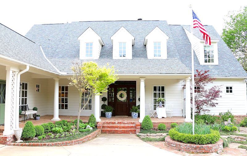
Her name is Emily and she lives in a two story white house that looks like it stepped right out of the pages of an American storybook.
Emily is the only bit of estrogen in her large family of four young sons and husband. Still, she has managed to decorate her house in a very feminine way, which is a testament to her strength and design conviction. With so many males in the house, you would think her family room would have at least one leather recliner! But, I can assure you, it doesn’t.
Emily has been blogging for five years and over that time, she has posted many Before & After photographs of her house. Typical of those of us who love to decorate, she does like to change it up now and again. And, most important, she has a long term plan for her house. She has lived with some things while she remodeled one room, knowing that next year, she will tackle another area. I think you will enjoy seeing how her house has changed over the years while she has made the house she bought in her own vision.
BEFORE: Emily bought her house in 2006. The house wasn’t for sale when she first spotted it. Instead, she fell so in love with it that she rang the doorbell and told the owners if they ever wanted to sell, to please call her. And yes. They did!
AFTER: And today, the changes to the front facade are subtle, but very important. The black shutters were removed, making this an all-white clapboard house, which is so the rage today. Emily decorates her large porch for the seasons. Here, in spring, it’s all blue and white and flowers mixed with topiary.
While searching for a romantic name for her new house, Emily counted up the multitude of gables on the house and cabana and viola – she christened her house Eleven Gables. Of course, that became the name of her blog too when she started writing it in 2011.
The house at dusk during Christmas.
Beautiful!!!
And here is the Winter White Christmas facade. So romantic!!
And the Fall look.
To the left is the charming side door, painted green.
BEFORE: Not all the windows matched when Emily bought her house. Most windows had classic wood framed divided lights, but a few did not – like this window. In order to have a cohesive look, Emily replaced all the windows that didn’t have the divided lights.
AFTER: The new paned window. Notice the green door and the topiary. These elements are seen throughout the house from the front facade to the back facade.
A view of the brick paved porch, the side door and the carriage style garage doors.
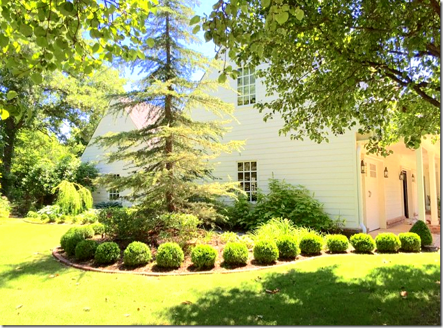
There’s a three car garage that is broken up with lanterns and clapboard siding. Notice how charming the garage doors are, with windows and door handles that give the bays a carriage house look. Above are three gables that add even more charm.
BEFORE & AFTER:
Originally the garage doors were plain vanilla – as seen on the left. After living with them for several years, Emily replaced them with these beautiful carriage style doors with door handles and windows. This type of garage door makes a HUGE difference, especially with front loading garages. LOVE!!
At the very front of the yard and at the far end of the garage, is this beautiful bed of clipped box balls.
The same view – at Christmas. Wow. That is a REAL Christmas Tree in Emily’s yard!!!
At the right side of the front porch, by the flagpole, the yard leads down to the side of the house where there is a large pond.
At the right side of the house is what might be the best feature of all, the pond with a fountain and gazebo. To the far right of the house is the backyard which is open to the pond.
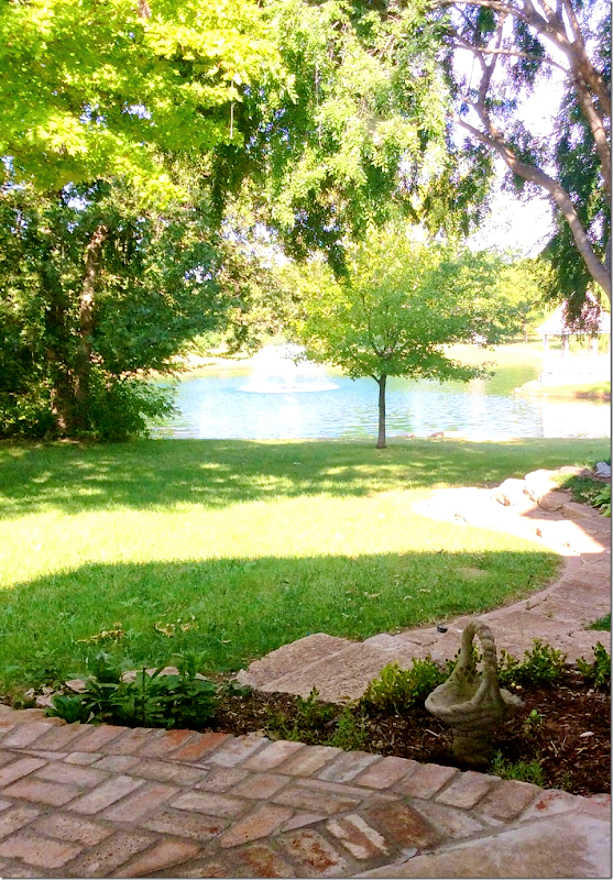
The view from Emily’s backyard of the pond and gazebo.
A dawn view of the gazebo decorated for Fall. Beautiful! The pond is stocked with fish which Emily’s four boys love.
A closer view of the side of the house with the bay window and back porch right off the banks of the pond.
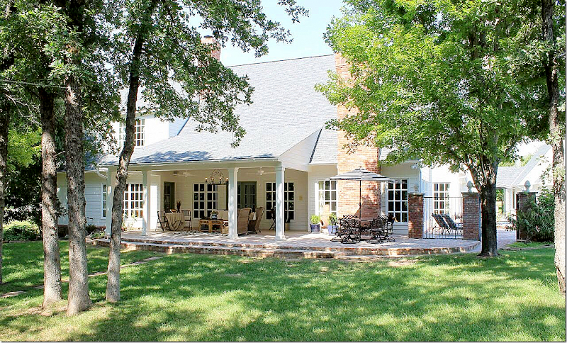
AFTER: The back of the house with its covered porch. Two stone dogs on brick steps mark the entrance to the yard from the pond.
BEFORE: Here’s one of Emily’s FOUR darling sons! She is so lucky!!!! You can see here that the posts did not have the dogs on top. She added them and they really add so much. Sometimes it’s the smaller things that make the biggest difference.
Looking the other direction, from the back yard to the pond. Emily sets a beautiful Thanksgiving table for outside diners.
A closer look at the large covered porch that leads off the living room. The view from the front door is on a direct site line to the back yard. The family room is to the far right where the brick fireplace is. Past the house is a brick and iron fence where the swimming pool is located.
BEFORE: The covered porch before it was extended. The ceiling was replaced and the porch is now much larger. The porch was also extended to where the flowerbed in front of the chimney was. This area became the outside dining area.
AFTER: The enlarged covered porch, including the dining area outside the family room. To the very right is the brick and iron fence where the swimming pool is – which is another great idea. The pool is off to the right side of the house – rather than in the main back yard where it would take away from the beautiful wooded view of the pond.
BEFORE: A few years ago, Emily completed a total renovation of her kitchen. Right afterwards, a hail storm damaged the house and windows. At that time, Emily and her husband decided to enlarge the back porch when they replaced the damaged family room windows. Here, the siding has been removed and you can see how small the porch once was.
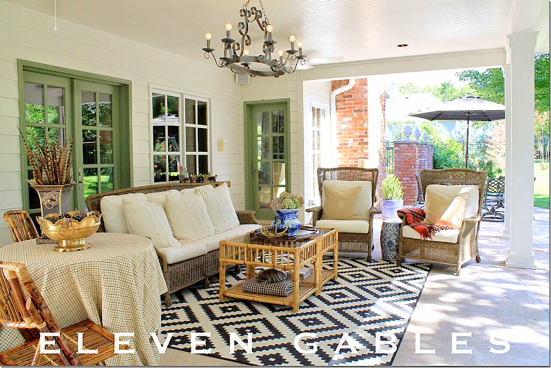
AFTER: The new beautiful covered porch and dining area with brick steps, columns, and light fixture. As you can imagine, she has quite a lot of family functions here.
The columns were purposely spaced with a wide opening in the center so that when there is a back yard wedding, the porch can hold the guests, or the wedding party, and the columns won’t block the view or the access. Yes. She is already planning a back yard wedding. I would too!!
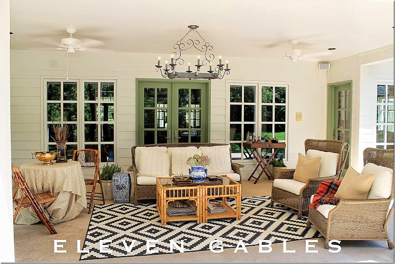
The porch is decorated with rattan and blue and white, with green accent doors.
So cute!!! Makes me what to get outside and fix up my tiny porch!!! You too?
The view from the porch to the boy’s treehouse.
Off the porch is a brick path that leads to a dining spot in the back part of the yard.
The path leads from the porch to a round patio where a chandelier hangs over the outdoor table & chair set that Emily grew up with!
The pond, from the new porch steps.
Continuing on to the far right side of the house where the brick and iron fence is.
Right past the gates is the side of the house with the family room and kitchen.
The French doors that lead the swimming pool and cabana. Topiaries, lanterns, and painted green doors are three decorative items that are found throughout the house. Choosing special decor elements like these provide a continuity throughout.
The swimming pool. At the side, the water cascades down like a fountain. At the back on the left, is the chicken coop!! Notice on top of each brick column is a finial.
The darling chicken coop! Designer chickens have to have cute houses too!!
The new kitchen window is a casement which opens to the pool for ease of serving drinks and meals to the boys. So pretty!!!
Inside the gate that leads to the swimming pool. Ducks come from the pond to the pool. Too cute!
The set up by the pool is in black and white and turquoise.
Chickens flew the coop!
Let’s go inside!!!
Emily and her husband lived in the house for a few years before they started making changes. Slowly, they have redecorated or renovated the house to make it their own. Because they couldn’t do it all at the same time, they picked their priorities. A big one was the paint.
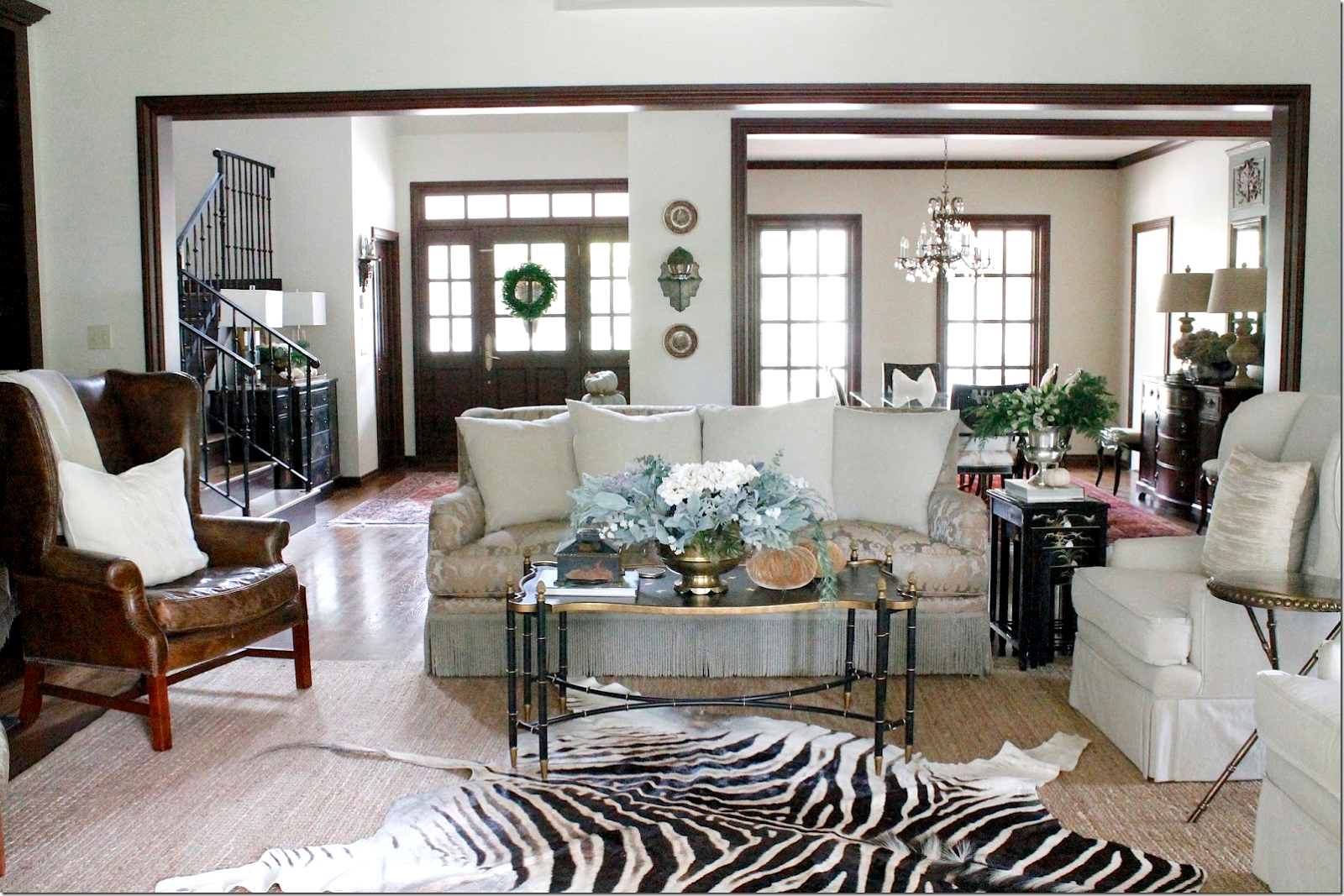
The front rooms were dark. The dining room was red, the entry and living room were gold. These front rooms changed dramatically when they were painted a light creamy white. Painting the walls is a quick inexpensive fix. But painting trim isn’t. When you paint your woodwork, the cost soars.
So, Emily chose to paint just the walls, leaving the trim dark for awhile. Recently, she called the painters back to paint the wood trim white. Priorities. Pick and choose what is most important and what will buy you the most bang for the buck.
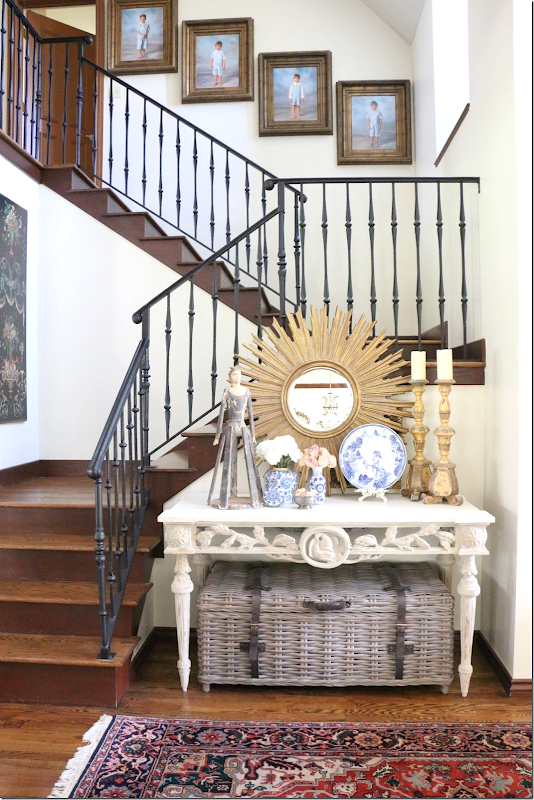
AFTER: There isn’t a photo of the dark walls, but here is the entry with the beautiful staircase. The gilt antiques on the console set the tone for the decor inside.
BEFORE: The living room with its former needlepoint rug and sofa.
BEFORE: The rug was changed for a lighter one.
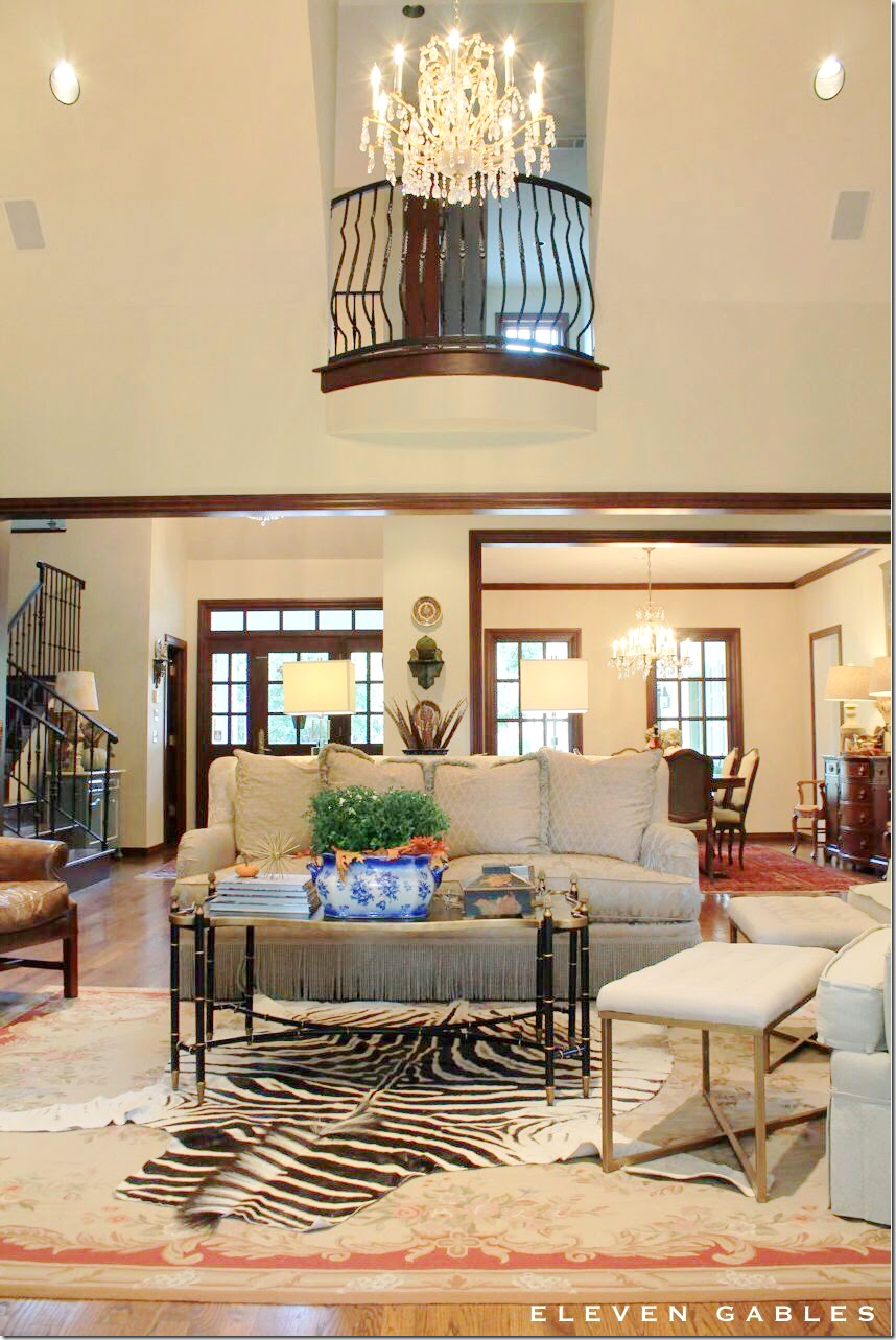
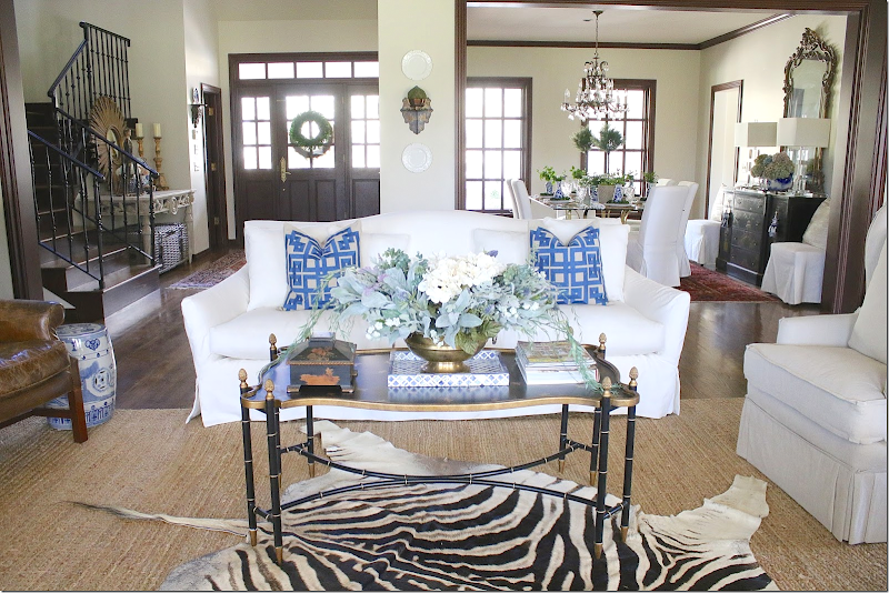
AFTER: Today, there is a white slipped sofa that has a beautiful curved back.
An antique bench sits in front of the windows.
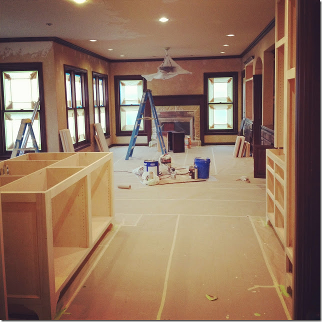
The fireplace with the dark trim.
Today: The dark marble is being replaced for a lighter piece!
AND: Yes! All the dark trim is now white! The room is going to look so different with the white trim. Well worth the wait. Pick your priorities.
After: The dark French doors are now white. I can’t wait to see it all finished. Be sure to check back to see it!!!
Before: The dining room was red with cherry wood trim. It was quickly painted white.
Before: A view of the dining room with a wood table and trumeau.
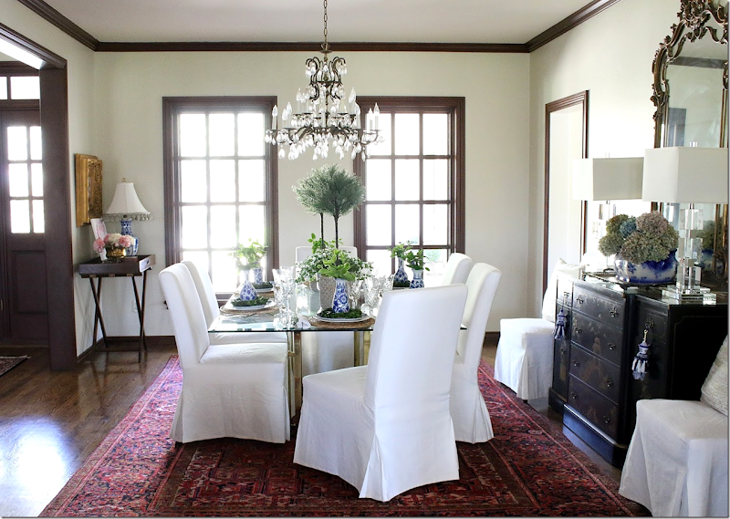
AFTER: The dining room today – set for Easter. Today there is a glass table and white slipped chairs. An antique mirror replaces the green trumeau.
Close up of the chinoiserie chest and antique mirror.
So pretty. I love the black chinoiserie chest and the white chairs with glass table.
The Kitchen and Family Room –
BEFORE:
After living with this dark kitchen for several years, Emily designed a new one that would be more functional for her large family. Most important, the island wasn’t functional. You couldn’t sit there and the glass cabinets at the floor were a hazard for her young boys. Plus there wasn’t enough room between the island and the cabinets. The built in desk was wasted space. And Emily wanted a light, bright space that was highly organized.
Wasted space. Plus the brick floor wasn’t level with the wood floor.
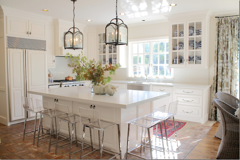
The entire room was taken down to the studs. The floor was leveled. Extra square footage was gained from the outside wall being pushed out. New appliances. New cabinets. New island with Caesarstone London Gray.
Beautiful!!!!
BEFORE: The family room and breakfast room connect to the kitchen. A few weeks after the kitchen was completed, a horrendous hail storm ruined the windows in this room – and these all had to be replaced, which was a positive, in the end. The new windows match the rest of the windows that were already in place.
BEFORE & AFTER: The windows in the family room are replaced after the hail storm. Now, all windows in the house match – wood framed, divided lights.
BEFORE: The decor before the room was redecorated. The floral couch had been with Emily for years and years.
BEFORE: Here you can see the beautiful new wood windows.
BEORE: The view from the new kitchen.
BEFORE: Looking to the beautiful new kitchen, with the old breakfast room set and chandelier.
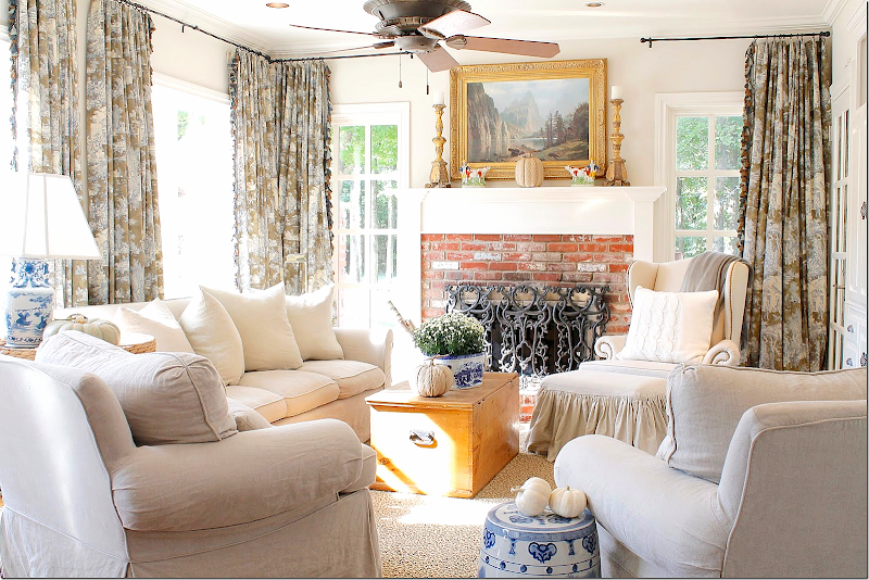
AFTER: Emily had all her furniture slipcovered. And the room looks completely new!!! What a difference it makes!!!! Fabulous!!!! She used linen slips and mixed it with blue and white lamps and garden seats. Just beautiful!!!
The toile curtains look great with the slips. Mixed with the plain linen, they are perfect.
LOVE!!!
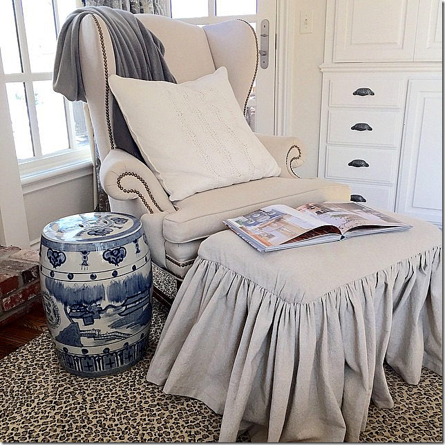
And here, the ottoman gets a softly pleated slip. The rug adds great pattern to the room! LOVE!!!!
Here is the new table and wicker chairs, with a crystal chandelier. The two rooms flow so perfectly now!
Here Emily changed up her mantel a bit.
The new table and chairs overlooks the new windows and side yard with the pool.
Another view.
The kitchen with the Lucite barstools that keep the island from looking cluttered.
Twin lanterns. The new casement window is beautiful.
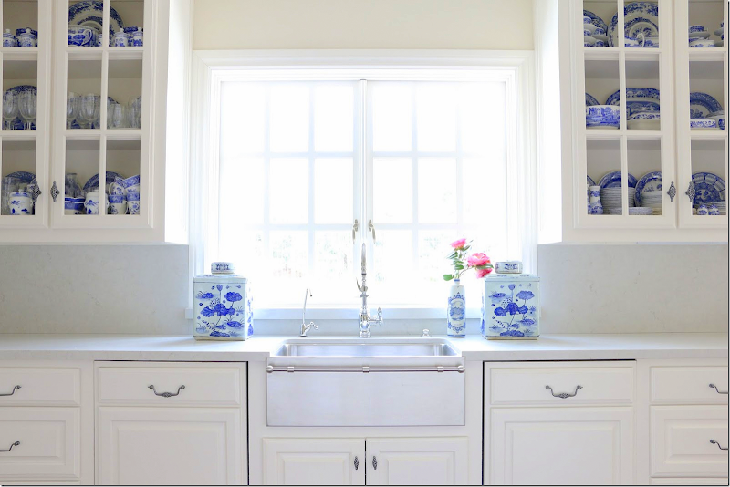
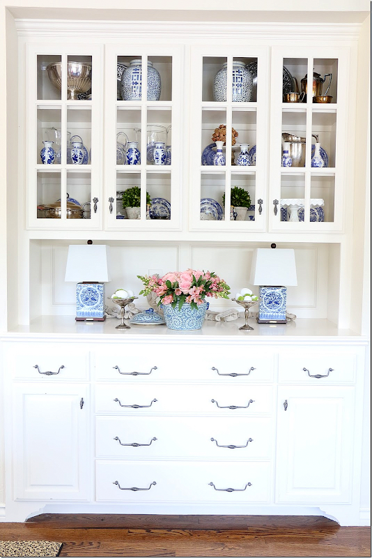
The shelves are accessorized with blue and white. The sink is stainless – with a towel rack across the front – love it!
View towards the stove.
Another view.
Where the desk once was, there is now more storage space.
The appliance garage – hidden behind a cabinet door – keeps the kitchen clutter free.
Lighted door keeps the back hall from being too dark.
One of the back rooms was turned into a mud room for the boys and their school and sports gear.
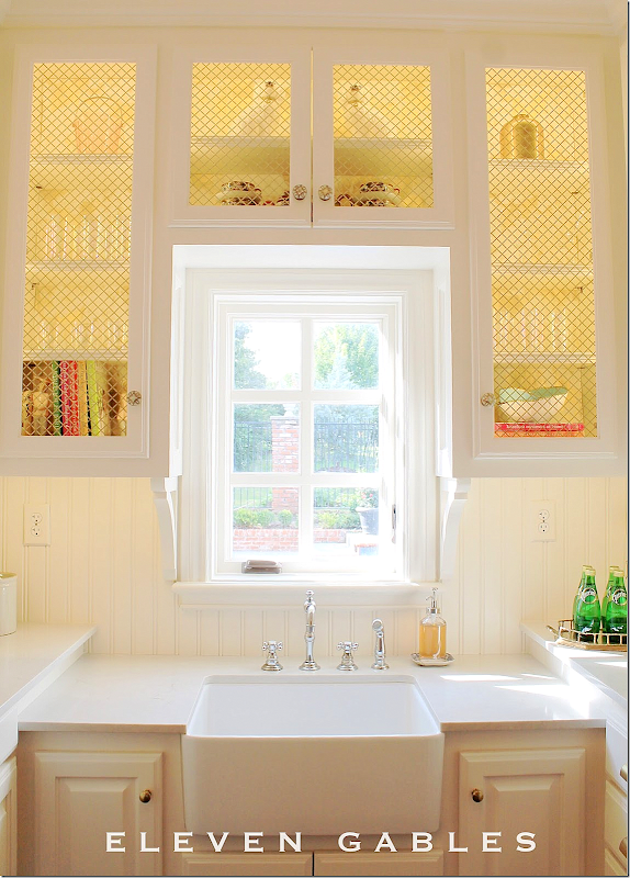
AFTER: And where there once was a door to the outside, a window now replaces it and this room becomes the butlers pantry/laundry.
Fabulous farm sink, new window, grills on the cabinets. Just darling!!!!!!
This French door was added to let in more light to the pantry and the hall.
Everything is organized in baskets and bins. So organized! I am totally jealous of this room!!!
Every little item has its special place!!! Love the shopping list – the boys can write down what Mom needs to replace.
And across from the shelves is the washer/dryer. This room is also used for gift wrapping.
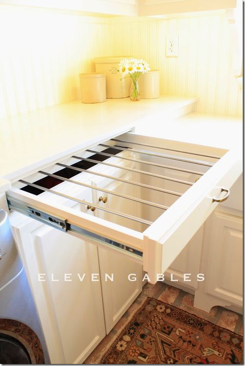
There is even a drying rack in one drawer.
I hope you have enjoyed seeing Emily and her family’s house as much as I did! The master bedroom and bathroom are being updated now - check her instagram in a few months to see all the updates!
To see more of Emily’s house and her kitchen renovation, go to her blog HERE and sign up for Emily’s Instagram HERE!
** Do you have a house you have renovated or decorated that you want share? Email me at cotedetexas@aol.com **
Interested in backyard glamping? Shop HERE.
Summer in Provence - Shop HERE.
Finally, just as I published this story, a tornado hit Oklahoma. Sending prayers to all those families that were helplessly caught in the path of the storm.





























It's lovely. So cohesive. Bright, cheerful. Simultaneously spacious and cozy.
ReplyDeleteI have a similar kitchen setup, with the sink in front of windows that open outward. I don't dare open them because then I can't reach to pull them shut--I have to do it from outside. I would think it's even harder here with the towel bar (though I LOVE the idea of a towel bar attached to the sink). And I hunted forever for a faucet with a detachable hose (not common in France, at least when we did our house--husband was amazed by the concept) that was also low enough not to stick up in front of the window. They don't have problems with that? It really is a good idea to have a view toward the pool from the kitchen.
Interesting how dark colors seem to be so "in" and she got rid of them for all white. I must say I'm with her. I so prefer the brightness. And white slipcovers rule! They are the only way to keep white furniture white and not to freak out every time somebody goes near it.
Thank you so much! Yes, the window is sometimes difficult to close, but the door is nearby and my boys are quick to help! :) The sink and faucet are some of my favorite features of the kitchen. I searched and searched for a faucet that had the sprayer attached, that was also gorgeous. I loathe having one more hole in my countertop that could potentially leak... that is why I went with this particular faucet by Waterstone. I have linked to it on my blog. As far as sticking up in front of the window, it isn't a problem at all. The window is six feet wide by five feet tall. That may have something to do with it.
DeleteThe white is totally against my husband's wishes. He didn't even want a white kitchen! But he agrees with me that it is much lighter and a happier place to be. My boys do sit on our furniture... hence the slips. They sure are easier to clean than upholstery. Thank you for your comments... I am going to go check out your blog now! xox, Emily
I always drool over Emily's home. I have been following her for years and she is so sweet, too!
ReplyDeleteOh Kim! YOU are sweet! Thank you!!
DeleteJoni, I am a big fan of Emily's blog and her beautiful home. They have done an amazing job updating the house.
ReplyDeleteSherry, You are so kind! Thank you so much!! xox
DeleteI'm laughing at myself for finding all my jealousy of this beautiful home to be inspired by the laundry room. This one puts the average laundry room to shame.
ReplyDeleteWell, Sherry, you should see it today! It's piled high with loads and loads of boy laundry waiting to be sorted and folded. Still jealous? ;) xox
DeleteAdmin, if not okay please remove!
ReplyDeleteOur facebook group “selfless” is spending this month spreading awareness on prostate cancer & research with a custom t-shirt design. Purchase proceeds will go to cancer.org, as listed on the shirt and shirt design.
www.teespring.com/prostate-cancer-research
Thanks
Emily has such an amazing home! I never tire of seeing what she is up to......
ReplyDeleteThanks for sharing!
~Des
Thank you so much, Des!
DeleteI have been following Emily for years and am always inspired by her beautiful style! I loved how you gave a complete tour of your home in this post. You showed angles of her house that I don't think I have seen before on her blog. Just lovely. Truly a stunning home!
ReplyDeleteShelley
This tour puts my tours to shame, Shelley! Thank you for the sweet sentiments! xox
DeleteWow! Thank you so much for this look into such a wonderful home and a remarkable talent! I am definitely skipping over to Emily's blog right now!
ReplyDeleteThank you so much!!! xox
DeleteThis is an incredible transformation all the way around. The house changes, the furnishing updates...I'm jealous!!! What a beautifully written post as well. I know this may sound personal to the owners, but if Emily would choose to share what the building updates have costs I would be interested to know. I fully know what a kitchen alone can cost, which is why I'm curious. Thanks so much for sharing this. I guess I'll be adding another blog to my weekly roll!
ReplyDeleteThank you so much!!! Costs are what keeps us doing "one room at a time." :) Email me at elevengables@gmail.com and we can chat further! xox
DeleteThis IS a gal after my own heart!! Long range...that's what is happening (on purpose) our log cabin...now, hopefully, more cottage!! LUV her "get it done attitude!! franki
ReplyDeleteAwe! Thank you!!
DeleteSo glad that you featured her Joni! Her house is so pretty, and she has really done a lovely job. She and I are friends on IG and have admired each other's kitchens - but you showed so much I haven't seen on IG - and bigger photos! Love that! The yard, the pond, the kitchen - it all works so well together. I want to move in:))
ReplyDeleteSheila
www.maisondecinq.blogspot.com
Thank you so much, Sheila!! xox
DeleteWell, Joni! You about made me cry this morning! Such a lovely and detailed post! You have a gift for writing AND decor! I have enjoyed your blog since I first heard of blogs. It is actually my most favorite blog of all time. I tell all of my clients that if they want to see more of my taste in style, go to your blog. The zebra rug... inspired by you. The large ledge over the sink in the kitchen... you again. The slips... all you. Thank you for sharing your gifts with others. You are blessed with such talent! Now, get over here and sip some champagne on this porch with me! Let's invite Brooke and Helen too! Thank you, again, from the bottom of my heart! xox, Emily
ReplyDeleteby the way, the only reason I started a "blog" was so that I could comment on your blog... way back when. :)
DeleteEmily's house is absolutely beautiful! She is such a lovely person too!
ReplyDeleteOh Joan! Thank you so much!! xox
DeleteWhat a beautiful house. I am in the middle of a home addition right now and needed a little inspiration. Thank you for this amazing post❗️
ReplyDeletexo, Lissy
Thank you so much!! xox
DeleteWhat an amazing house, inside and love,love,love the exterior outside as well-So hard to believe that she has 4 little boys in that gorgeous house, but it has a comfy family vibe that I love with those comfy looking couches and chairs.Wonderful job Emily!
ReplyDeleteThank you so much!! xox
DeleteGorgeous, inspiring home!! Any idea where the wicker chairs around the breakfast table came from?!
ReplyDeletehttp://11gables.blogspot.com/2016/03/eleven-gables-home-spring-home-tour_25.html I've linked to them here! Thank you so much!! xox
DeleteMust say that Emily's home is absolutely one of my very favorites...It is classic, casual, with the perfect modern touches too. Her home is as beautiful as she is inside and out!
ReplyDeleteWhat a fabulous post! Joni thanks so much for sharing. I love every single detail especially how Emily transformed the interiors from one style to another. The kitchen and laundry room are so fabulous! This post has inspired me to work harder in my own home.
ReplyDeleteour kitchens look rather alike so I like her very much now! Thanks for introducing her. Though where she has blue and white and personal momentos I have blue and white and liquor bottles. Love how much she's brightened this beautiful home over the years! A house is never complete.
ReplyDeletesimply gorgeous !!!!!!! stunning inside & out !!!!!!!!!!! LOVE !!!!!!!!!!!!!
ReplyDeleteI love how classic she stays, still feeling fresh and not dated!! Just beautiful!
ReplyDeleteAn absolutely stunning home very worthy of a blog crush!!! ;)
ReplyDeleteGreat post! This home is amazing both inside and out. The owners have beautiful taste and have turned this home into a beautiful and yet very comfortable home in which to raise a family. I particularly love their gardens.
ReplyDeleteWhat a beautiful transformation to this home full of charm and character. I love the attention to detail both inside and out and the kitchen, dining, family room is a perfect place to "live"! Happy weekend, Joni!
ReplyDeleteAdmin, if not okay please remove!
ReplyDeleteOur facebook group “selfless” is spending this month spreading awareness on prostate cancer & research with a custom t-shirt design. Purchase proceeds will go to cancer.org, as listed on the shirt and shirt design.
www.teespring.com/prostate-cancer-research
Thanks
Admin, if not okay please remove!
ReplyDeleteOur facebook group “selfless” is spending this month spreading awareness on prostate cancer & research with a custom t-shirt design. Purchase proceeds will go to cancer.org, as listed on the shirt and shirt design.
www.teespring.com/prostate-cancer-research
Thanks
Stunning! American houses are so beautiful. Almost all the houses look the same in Sweden - small and red ones ;P
ReplyDelete