I found three really great Before & Afters!!!
Enjoy!!!!

BEFORE: This house in West University was built in 1936. It’s a rare, original, two story in this small town. Originally painted white, I found this old picture – before the house was renovated in 2010. No shutters. Old front door. No landscaping. No lantern. But, you can see the house has charm just waiting to come out!

BEFORE: This photograph shows the house as it was when first renovated with its green painted brick.
The house was sold in 2010 and again in 2013 so there are two sets of Before pictures. When it was first sold in 2010 – the owners had completed renovated it.

2010: The back side with the new terrace. There is mondo grass growing between the new flags.

BEFORE: The house is on a large corner lot with a charming overhead connection to the detached garage.
The mondo grass was removed and instead the stones are now divided by gravel.
BEFORE: An overhead view of the terrace.

BEFORE: The side street with the old fence and old painted garage.

AFTER: And today. The house was bought by a young, professional, newly married couple who recently had a baby. The exterior was freshly painted a soft taupe. There is a new front door – painted purple, along with new landscaping – featuring triple level box and greenery. The vines around the windows were removed as were the crepe myrtles. It all looks much more edited and neater – thus a bit more updated. So pretty!!

AFTER: A view of the new fence on the side street.

AFTER: The view of the garage and back terrace.

AFTER: View of the new side fence and the newly painted garage & door. Lots of room for even more landscaping or a pool.

BEFORE: The entry with the arched openings to the living room on the right and the dining room/kitchen on the left. Lovely staircase with updated iron railings. The floors were stained a light brown tone.

AFTER: The floors are now stained a very dark brown. The entire house was painted in trendy Farrow & Ball paint. And, on the stairs is the uber popular Starke Antelope runner. Yes, this is a cute one!!!

BEFORE: With the cream walls, light brown floors, and brown furniture – the decor is a bit drab. But you can see how lovely the room is – large enough for three seating areas!

BEFORE: Notice there is a faux fireplace. The new owners removed this, surprisingly. I think it’s a nice feature – and it would look good with either a candelabra in it or a cord of aspen logs.

BEFORE: Across the hall is the dining room with a view into the newly renovated kitchen.

AFTER: The new owners used blues and greens – in velvets and silks. There is a custom cut seagrass with a Moroccan rug styled on top, along with a bricklayers cocktail table. The silk curtains are gorgeous. Instead of the fireplace there is now a large white bookcase.

The bookcase is very nice with accented brass lights – and it certainly is much more functional than the faux fireplace. Also, the curtains with the shade underneath are perfectly done – raised to the ceiling to avoid the dead spot!!! Oh – now you can see there is a Lucite console table behind the sofa.
What a huge difference in how this room looks today – so fresh, so bright, so fashionable. Just perfect for a young couple.

AFTER: The opposite view. Brunschwig & Fils Les Touches pillow in green & white.

AND – I wish this photo was larger, but you can see flanking the front window, there are two wing chairs in the chic Martyn Lawrence Bullard fabric, sitting next to an on-trend bar cart.

AFTER: Wow! Love!!! The difference in the dining room today compared to before is really stunning. The same light blue silk curtains and dark brown shades were used again in here – to create continuity in these two rooms. The round table is the right choice in a square room. But – the Farrow & Ball Silvergate wallpaper is so beautiful. And notice, they added a wainscot which creates a nice break from too much pattern on the walls.

AFTER: Another view. Crystal chandelier is a nice touch over the light wood table.

BEFORE: Unfortunately, there are no pictures of the original kitchen, but you can see here, the remodeled kitchen with light granite countertops.

BEFORE: There is a small breakfast room – through the arch is the living room.

AFTER: With a few changes – the kitchen gets a totally new look. New gray paint on the cabinets, along with a backsplash of subway tiles and new carrara marble countertops – makes the change, huge. Love the checked shades – not sure about the orange light in the alcove?? But it is dramatic. The tile floor remained as did all the stainless appliances.

The view of the breakfast room with the banquette and Tulip table (probably from Ikea?) and two French chairs in the hot Pyne Hollycock fabric from F. Schumacher.

AFTER: And another view of the banquette and into the living room.

BEFORE: The powder room with toile wallpaper.

AFTER: The only change is the wallpaper – but again, this small change makes a huge difference, turning a small room into a contemporary statement.

BEFORE: The master bedroom is rather plain, small – with two windows.

AFTER: New dark gray paint, dark floor stain, and white curtains with dark shades really changes the room. It’s now warm and contemporary – two adjectives that don’t usually go together. More F. Schumacher fabric on the shams. It looks like the husband was allowed to keep the ceiling fan. Ha!!!! Original glass door knobs are such a nice touch. Taking back what I said about the shades downstairs – here the dead spot was allowed to show. Not sure why?

BEFORE: The master bathroom was remodeled with granite countertops and light fixtures.

AFTER: The bathroom was updated with just a few changes – like white paint on the cabinets, which makes it look like a huge change. New contemporary hardware and light fixtures – not expensive, but a big update. AND – it looks like the mellow gilt mirrors were painted to look more gold. Could be the lighting, but it looks like they were repainted.
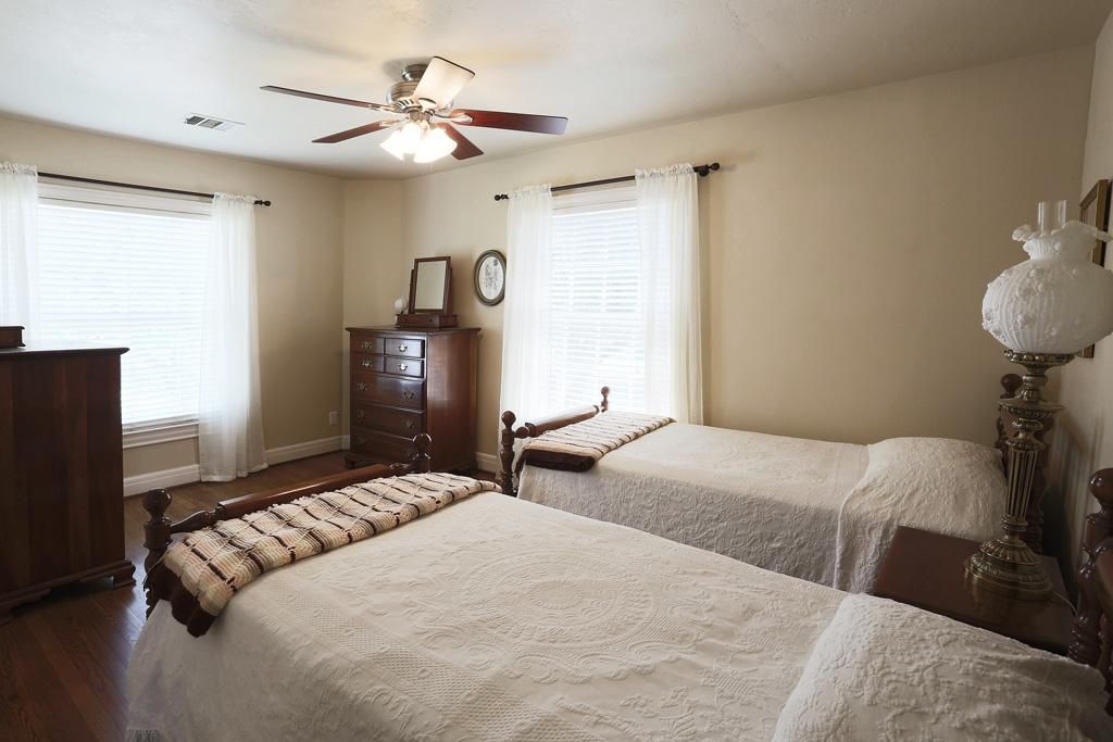
BEFORE: The second bedroom – again, nice, but plain.

AFTER: Awwwww – sooooo cute!!!!! Well, the couple obviously had a little girl! DARLING!! More Farrow & Ball wallpaper in lilac. Farrow & Ball can be rather expensive – so just doing an accent wall is a way to save money. F. Schumacher Imperial Trellis fabric works against the lilac silk. Darling. Love the light fixture.
Question? Since when did Schumacher take away the Kelly Wearstler designer label on Imperial Trellis??? Contract dispute since she is now with Lee Jofa? Still – Kelly IS Imperial Trellis, but not according to Schumacher. Very strange.

Before: The original green tiled bathroom was updated with a new cabinet and granite counter, with new wallpaper.

AFTER: The tile was left but the cabinet was painted white and new Farrow & Ball Aranami wallpaper was installed, along with a cute shade and mirror. Nice way to update an original bathroom and make it contemporary!!!

BEFORE: And, the third bedroom before, set up as an office.

AFTER: And, the office/library today – with a textured wallpaper, purple trim, and cowhide rug. Perfect!!!
Since this house is SOOO cute, it was barely on the market for a few weeks, and it’s already Contract Pending. See more HERE.
House #2

I love this area – it’s in River Oaks and two blocks of houses face each other over a park – instead of a street. The garages are back loading in the alleyway. Guests that visit have to park their car on the street and walk along the sidewalk down to the house. Not exactly easy, but the location on the park makes these rare lots highly prized.

I have written about this house before, the yellow stucco on the right, years ago HERE when it was first built by a friend’s brother David Gunn. The architect was Stephanie Adolph Eugster and it was built in 2008 after the existing house was torn down.

At the time, it was a very unique house, made to look like a country French mas. Instead of granite counters, Gunn used old cement tiles, he sourced antique doors and beams, the mantel was antique, and he found architectural elements at places like M. Naeve and Chateau Domingue. Today, all this is more commonplace, but back then, it was all very special. Today, the house is still quite wonderful and very pretty.

Even the floor plan was unique – very much so. Most rooms look out to a side courtyard. The dining room is off the kitchen. The family room is up on the third floor.

The second floor as it was. Today, the master bathroom and closet was extended into the adjoining bedroom – making it a larger suite.

BEFORE: A few years after it was built, the house sold and then it became a rental before it was sold again. Recently, it was put up for sale again and surprisingly it had been changed quite a bit.
Above – is how it looked in 2012. With its charming French facade, the front door is Dutch. Upstairs, is a Juliet balcony. The landscaping was kept casual intentionally.

Before: Builder David Gunn added the authentic French shutters with the iron s-hooks.

AFTER: Today, the house has been totally landscaped. There is a new slate walkway and professional beds. The wall to the left has been extended making the courtyard more private. With its new height – the top of the fence was tiled to mimic the house.
While the new landscaping and fence is quite attractive, before it was more casual – more like a true French country house.

And a view from further back. A new, low box hedge separates the house from the park, creating a front courtyard.

BEFORE: The courtyard was gravel. Plans called for a fountain that was never installed. These owners didn’t really decorate the area nicely – it could have been much more charming. But this has all been changed.

Today: the gravel courtyard is now gone, replaced with a slate terrace and a small swimming pool. The change is huge. Gone is the authentic looking French landscaping – instead, there is now a very pretty patio.

The view towards the front gate. I love the tiny window with the tiny shutter – at the entry hall.

Notice the new side fence. The landscaping was designed by Thompson Hanson. I assume most will love it, while some will prefer it before. That is a personal choice – but I can only assume the family loves the swimming pool!!

AFTER: On the opposite side of the house, Thompson Hanson added even more landscaping.

BEFORE: The entry hall with the Dutch door opens to the antique doors at the coat closet.

BEFORE: The powder room – with its hanging antique sink and old cement tile floors. Hanging on the wall is a French lantern.

BEFORE: Attaching the concrete sink proved to be a real engineering feat for Gunn, it weighed over 200 pounds.

TODAY: There is the new slate porch with a new, larger lantern. To the left – there are now three windows in the enlarged stucco fence.

AFTER: The tiles in the powder room were changed out, as was the charming black seat toilet and stone sink. In the foyer, the lantern is now gone, replaced with a new sconce and chandelier.

Instead of the stone sink, there is this beautiful antique console and mirror – all from Chateau Domingue. It looks like the new owners kept the antique door and knob.

BEFORE: The mantel is an antique and is just beautiful, as is the chandelier.
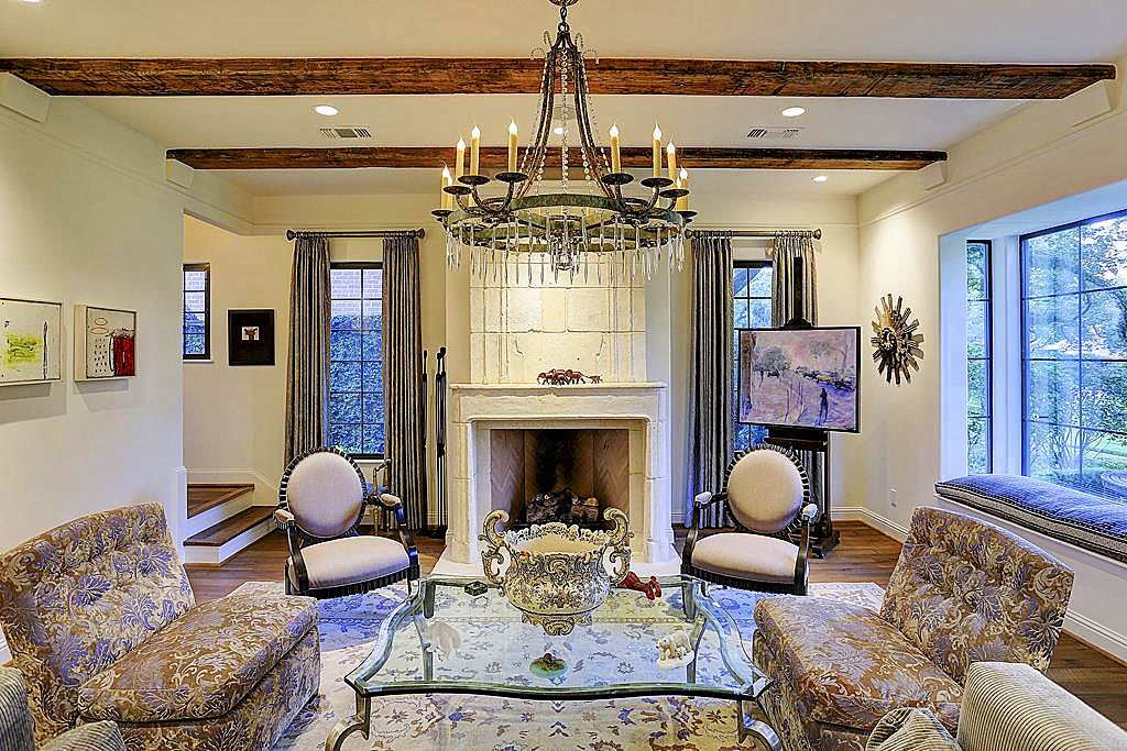
AFTER: The living room remains the same – but it is now professionally decorated. Love the new chandelier.

AFTER: Another view of the living room.

AFTER: You can see the entry hall, with its antique doors at the coat closet – and the beautiful view out front of the park.

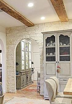
AFTER: This view shows the arch doorway at the right, leading into the kitchen and dining room.

BEFORE: The kitchen is a French version of mixed cabinetry with original Saltillo floors. There is the gray armoire and the stucco hood over the range. There is open shelving. This type of kitchen was much more unique at the time – most were still finished out with all matching cabinetry. Through the arch on the left is the second set of stairs – next to the garage which is behind the kitchen.

BEFORE: A French lantern sits above the island. Beyond the window is a small office. And under the stairs is the pantry.

BEFORE: Another view of the kitchen. Notice the stone wall behind the range. You can see through the window into the study.

TODAY: The kitchen is more colorfully decorated today. Under the sink, the linen skirt was removed and replaced with a grill – along with new cabinetry and appliances at the island. And the pantry under the stairs now has an antique door.

AFTER: The windows overlooking the pool now have shades to block the morning sun. Notice in the hallway through the stone arch, the owners removed the built-ins and put in an antique chest.

AFTER: The kitchen is really so beautiful. David Gunn did a great job outfitting it although there is now new cabinetry and new countertops and new appliances and sink and new hardware & faucets. Whew. But, the kitchen still looks beautiful, no? Love it!! Through the arched door is the dining room.

BEFORE: Here is the pantry under the stairs – without a door. I must say – the door is a huge improvement, below:

AFTER: See? A closer view of the antique door newly added to the pantry. The butcher block on the island countertop has not been changed – that remained.

BEFORE: Behind the kitchen – is the office. This is now all gone, see below:

AFTER: The office is now gone. Instead, there is an elevator. The door is an antique one, in keeping with the rest of the house. It opens onto the kitchen, shown here, and the garage – which is great for loading suitcases. The elevator leads up to the master closet. I have a feeling the new owners are frequent travelers.

BEFORE: The dining room that overlooks the courtyard.

AFTER: Today, the dining room is decorated more contemporarily. The French doors open to the newly installed courtyard. So beautiful!!!

BEFORE: Off the kitchen and dining room, the back staircase with the built ins – it was once more of a mud room for the children. Today, the built-ins are now gone. The door to the right of the built ins leads to a small office.
AFTER: There’s no picture of the same room – but this shows that the new owner removed all the built-ins and made the space more of a decorated room.

BEFORE: Off the mudroom, is the small office.

AFTER: Today, the small room is used for watching TV. The floor was replaced with old hardwood planks.

BEFORE: The master bedroom. Upstairs there has been more renovation. This master bathroom was extended into the next bedroom, creating a larger suite.

BEFORE: The master bathroom with beautiful marble. This room was extended into the closet and the bedroom next door and is three times this size now.

AFTER: The beautiful master bedroom today. It overlooks the front of the house and the park. The French door opens to the Juliet balcony. Beams were added, along with a 100+ years old hardwood floors.

AFTER: The master bathroom was extended into its closet and the next door bedroom. The antique door opens to the elevator. Cement tile floors were laid, and a new tub and shower were added.

AFTER: Where the closet once was, there is now a built in vanity and another sink.

AFTER: another larger view.

AFTER: The new closet with hardwood floors and a chandelier. Included are beverage drawers.

BEFORE: The hall outside the master bedroom. At the left is the door to the small bedroom that is now part of the master bedroom suite.

AFTER: The same hall outside the master bedroom is now enlarged. Love this space!
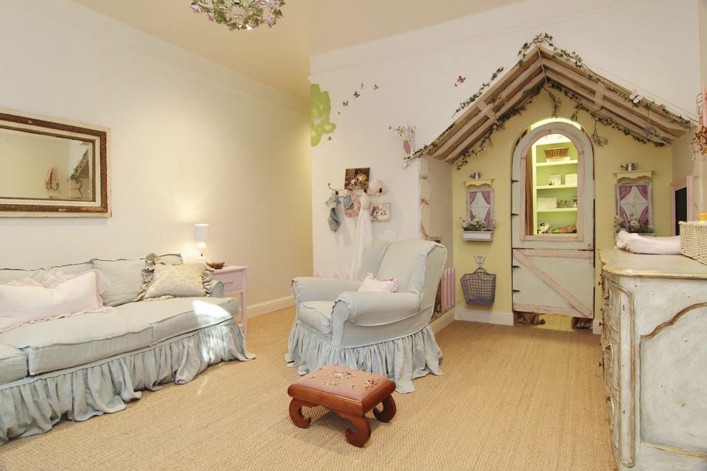
Before: The small bedroom with a playhouse that was incorporated into the master bedroom suite.

Before: A bedroom.
AFTER: The guest room with new carpet and curtains. Very pretty.

BEFORE: The bathroom – with cement tiles and Saltillo floors handpicked by David Gunn. Unfortunately, it’s all gone now.

AFTER: New vanity with sink. New walls of subway tiles and floors of tile. Very pretty.

AFTER: The second guest room is also very pretty and similar in style to the first one.

BEFORE: The guest room with more cement tiles picked by Gunn, now also all gone.

After: the same bathtub, but everything else is new. Very pretty.

BEFORE: The family room upstairs with a bath.

AFTER: Today, it’s a work out room with new built-ins.

The house is for sale for $2,995,000. HERE.
Finally, a real treat, a house decorated by Ginger Barber. This large West University house was relatively new, but without much charm when the owner hired Barber to “Gingerize” it. This is a great opportunity to see a Before & After and use tips to upgrade a spec builder’s design choices in your own home.

BEFORE: New construction – the 5 bedroom house was built in 2006 and was sold in 2011. The stucco house is very large at over 5,000 sq. ft.

AFTER: Ginger Barber’s changes start outside at the facade. New white paint on the stucco with gray paint on the front door gives a hint to the decor inside. Large wooden planters with box continues the theme.

BEFORE: Brown wood floors stained very red, yellow walls, and black iron stair railings are builder grade standards from its spec house origins. Beautiful double front door. The study is at the left and the living room and dining room are at the right of the front door. Unfortunately – there is no After view of stairhall.

BEFORE: The living room with the yellow walls – the decor is very plain. You can see immediately the problem – yellow walls with red floors. It’s a bad color scheme.

BEFORE: Across the main hall is the study, again, very plain decor with yellow walls.

Before: The dining room is connected to the living room. The iron light fixture looks dated now. We’ve gone through two new styles since this Tuscan verson – the Italian Candelabra style and now the Sputnik style in light fixtures.

AFTER: The floors were restained a dark, warm brown – taking away the red tone that was there before. The walls are now a soft gray-white, with the same color on the walls and the molding and ceilings – making it all a seamless shade.

The large rooms are made cozy with the custom cut seagrass. Touches of blue in the velvet are repeated throughout. Linen slipcovers make it casual rather than fancy. The pillows are Les Indiennes fabric. The lamps are Ginger trademarks – made out of antique columns.

AFTER: You can really see how much the paint job updates the house in this photo. All one color is great for this type of casual decor. The large painted cabinet has just a hint of blue. Love the shutters at the doorway. And, the Italian chandelier is updated from the iron Tuscany version that was there before.

AFTER: The study has a fabulous desk with wicker chairs and Ginger lamps. Again, the painted cabinet has just a hint of blue. Love the zebra rug.

BEFORE: The family room with the reddish floor and yellow walls and dated ceiling fan.

AFTER: Fresh white paint and seagrass lightens up the room so much. A muted linen covers the two chairs. A new updated ceiling fan – matching the white paint, it almost disappears!!!

BEFORE: The kitchen has tiled floor with dark grout that looks a bit dated. The black granite is classic, but the backsplash with the black accent seems out of style now.

BEFORE: Anxious to see how Ginger updates this area.

AFTER: The tiled floor with the dark grout was removed and replaced with larger limestone and quieter grout lines. This makes a big difference in the kitchen. While the granite seems to go with the decor, Ginger did get tweak the backsplash. If you look carefully – she just had the black accents removed – replaced with matching accents. Great idea to do this, rather than replace the entire backsplash at a greater cost. The textured shades and baskets update the kitchen even more.

AFTER: In the breakfast room, antique table and wicker chairs, along with an updated lantern make the big changes here.

BEFORE: Upstairs, the playroom has the yellow walls and red floors. Boy – those floors are REALLY red!!! You can see it more up here.

AFTER: The floor was restained and window shades and seagrass were added, along with new wall paint. And, the ceiling fan – the lighted version was replaced for one that seems to disappear a bit. Houston is just so hot – we have to have these here!!

Before: The rooms are so large, it’s hard to furnish rooms like this, especially when you don’t put much furniture in the room. Big rooms require furniture to be warm and cozy.

BEFORE: The bathroom has an issue with the tiled floor. This bold floor is not something that goes with a Ginger Barber interior. And the columns? I wonder how she will handle it?

AFTER: With wall to wall seagrass and linen curtains, the room looks more cozy. Adding the ottoman, chairs, desk and the armoire – it is more furnished and looks much smaller too, no? Amazing.
Remember: when you have an oversized room – be sure to use enough furniture. Even if you have to go to Ikea and buy two love seats!!! Add the furniture to make the rooms less empty looking!!!

After: White paint updates the bathroom – the tiled floor? I think a simple, inexpensive fix was used with the seagrass rug hiding the tile. Great idea! Rather than a huge expense – this was a good option. And the columns? Simply remove them. Gone.

Before: Yellow walls, pink toned carpet, and hum-drum shades.

After: In all the bedrooms, Ginger used wall to wall seagrass and similar linen bedding and curtains. White paint and new simple ceiling fans. One or two rustic tables and done.

AFTER: The back terrace with the outdoor kitchen. More information and pictures of this house are HERE. On the market for just 19 days, it won’t last long!

If you noticed, Ginger used some of her favorite horse photographs in the house. She is very active in Habitat for Horses, a sanctuary for abused and abandoned horses. Ginger has worked on their annual fundraising event – and this year will be the fifth one! The event will be held at Goode Co’s Armadillo Palace on November 9th. And wow, Shake Russell & his Band will be playing. OK. Mr. Slippersocksman will be wanting to go to this for sure. For more information or to make a very much appreciated donation, go HERE.
AND…

A word about seagrass. I’ll always press for this option. Seagrass is so pet friendly and traffic friendly. It wears extremely well. Stains are easily removed with water and Natures Miracle. It’s an amazing product. Seagrass – not sisal. Seagrass. Sisal stains terribly, but not seagrass. And seagrass is inexpensive – either wall to wall or as an area rug. When time comes for new rugs – you won’t be out a fortune to replace it. Don’t want the quiet look of it? Think about layering antique area rugs over it, or a zebra or cowskin rug. You can choose a more contemporary rug to place over seagrass for a trendier look. It’s a great product and one that I highly recommend.
I use Anthony Perez for my seagrass. To reach him – call 713-861-3000. AND speaking of Anthony – in a weird, cosmic way after writing about seagrass – I got an email from him today, telling me about his newest endeavor:

Anthony informed me that he has opened a Pop-Up Shop where he is selling his beautiful collection of area rugs from now until the end of November. The shop is in the Rice Village at 6115 Kirby Drive – between Times and Rice Blvds.

He has a great collection of Oushaks, Sultanabads, and Tibetans – all at highly discounted prices. Call Anthony at 713-861-3000 for more info on times and dates.
AND FINALLY:

Designer Mark Sikes is hot, hot, hot. With his new book, his clothing line, and his new furniture line – Mark is EVERYWHERE!!! Including One Kings Lane. They have a large pictorial of his house along with a sale.
Don’t miss it. If you love him, go HERE and HERE.

His book is the #1 Best Seller on Amazon. If you are the only person in America who has not read it, click the photo to order it.

His clothing line is now available for preorders for Spring - HERE.
Congratulations Mark on all your success!!! Much deserved!!!!
First house: my favorite of the three. Love the taupe exterior and purple door. Love the billowing silk curtains. The new living room layout is much cozier. The dining room, though is my favorite: the subtle wallpaper, the plain chairs, the continuation of the blue curtains. I preferred the kitchen in white. The "before" bathroom tried to play down the green tiles, but it didn't work; the "after" gets it right.
ReplyDeleteSecond: stucco walls often have tiles on top in France (ours do). The squares in the wall are a little odd, but frequent in France, and they are cleverly the same dimensions as the squares in the large window. The shutters appear to be working but are they used? They would be just the thing for Houston heat. The original landscaping is typical of southern France, where summers are very hot and dry. Not sure how much water the "after" drinks up. I don't like the stone wall in the kitchen--looks fake. And the ceilings are too low for canopy beds and low-hanging chandeliers.
Third: I just heard a piece on McMansions, and this one fits the bill: more than one style of windows (it has four), bumped-up roof, inexplicable columns. The second house might be a recent build, but it's a real mansion, with no Mc. The third's "after" interior, however is a big improvement. It's lighter in both luminescence and weight. The "before" felt dark and oppressive.
I love your before and afters!
read - McMansion Hell on Tumblr - it's my favorite. it's fabulous!!!! http://www.mcmansionhell.com/
DeleteYour before and after posts are the best. The first house is just so "satisfying" an example of a before and after. Would actually love to see more of the house next door to 3132 Jarrard St.
ReplyDeleteBeautiful before and afters, Joni. No matter how these houses look, they are the personal style extension of the owners. I particularly love the first house, these home owners and their designer have played up the strengths of each room, and made this house fit them, and their lifestyle. No one does "before and afters" better than you my friend. Thank you for the inspiration!
ReplyDeletethank y'all so much!!!
DeleteIn 80% of the photos I prefer the before to the after. I must be an old person. I find this trend of whiting or graying out all color and choosing cool tones over warm tones in almost every case so depressing. But I know it will pass soon.
ReplyDeleteMe too--but I am seventy now!
DeleteAlways love your "befores/afters". Just curious why you made no mention of "dreaded dead space" Ginger Barber left on windows and the curtains with 3 individual Roman shades on study windows and shades on playroom windows . . . ??
ReplyDeleteI wondered the same thing!
Deletewell - because she is Ginger! And so much more talented than me and I don't feel it's my place to critique her. And, some designers like to do shades that way. I don't. It's personal i guess????? Back to Ginger, I love her taste and always have and always will. Plus, I really admire her as a person - all the charity work she does for the horses. It's not lip service - she actually goes out there and mucks the stables in the heat of summer.
DeleteThe first house looked 100% better after the new owners were done with it. The new front door is much more appropriate. The only things they should have kept were the fireplace (a cord is 128 square feet of wood, so I don't think anybody puts a cord in their fireplace), and the lovely toile paper in the powder room. The French house shouldn't have those phoney baloney beams. They look fake and forced. The third McMansion is a disaster. It's all so banal and insipid. White, white, white everywhere. Boring! But it's great seeing before and afters. The first one is the only success story, however.
ReplyDeleteThe first house just goes to show how important sizing shutters is. The house looks awful in my opinion with those out of scale narrow shutters. Don't even bother installing shutters if they aren't appropriately sized! Even if they are not functional, they HAVE to look like if they WERE closed, they would at least meet. Large picture windows (like those) should NEVER have shutters. I understand the developer/owner wanted to soften the look of the house but this is NOT the way to do it.
ReplyDeleteThe less said about that last house the better.
Some truly awful architecture -but some very pretty decorating!
Hi! I really enjoyed seeing all the before and after photos. None of these are my style but it was fun pretending they could be. Very interesting to see what the high dollar market in that part of the country is like.
ReplyDeleteAbsolutely LOVE that purple door.
ReplyDeleteJoni, would love your opinion--should the back of the first house have shutters as well? Seems so unfinished to just have the covered walkway. Truly would love to hear your perspective on this.
I thought the entire yard needed landscaping. It was probably a financial reason why they didn't. It's large. I suspect the new owners will put in a pool. But yeah - it needed shutters and beds and a terrace, etc.
DeleteI love, love, love this post! Such fabulous updates and inspiring for anyone making changes in their own home. Thanks so much for sharing all three of these homes with us.
ReplyDeleteJoni, thank you for posting such a great column. I can provide a little insight on the Jarrard St house - the 2010 owner was a bachelor who purchased the home from a flipper/developer couple that went on to do a beautiful job of renovating the old home on the corner of Belmont/Wroxton (approx 2992 Wroxton). I dated said bachelor for about a year, and our first date was the day he closed on the property. We ended the evening unlocking the front door to check out his new purchase and eat Blue Bell in the back yard! I spent many hours in this home - it had such beautiful light and I was always amazed at how functional the floor plan was given the home's age. I was DYING to decorate it, but the owner was a busy professional with little interest in decorating and the furniture in the home was all inherited from his family - it was incredibly heavy, all brown, and he was very sentimental about it. Decorating differences (among many others) led to our breakup, but I have loved driving by since it was purchased to watch the new owners bring out its pretty potential. My jaw was on the floor after seeing the new listing photos - what a great lesson in the value of investing in decorating!
ReplyDeletewow!!!!! thanks!!!!! sorry this is late - I've been working on the new story and haven't checked up on the comments. my bad! but wow - it does def. look like a man did this. Love this story. Thanks! hope you married?????
DeleteVery happily married to a wonderful man who lets me decorate!
DeleteLoved the afters on all three homes - outstanding changes!
ReplyDeleteJoni: what a terrific post! Always love and learn so much from these before and afters. Have to agree with previous comment about the shutters on the first home needing to be removed but otherwise, fab job. Like the "after" on the second home the least overall, especially the more public spaces. The architecture of the 3rd home is so Texas McMansiony but wow, Ms. Barber did a fabulous job with the reno inside and out. She did a great job playing down all the crazy windows and bump outs with the exterior paint and just an amazing job with the interior. Although prefer "warm" colors versus the grays/blues that are so in right now, those reddish floors were ugly even in their day. The new floors, seagrass and paint, elimination of columns and arches are a vast improvement! Thx for the info on seagrass too! I'm very tempted. I have some sisal rugs that I love but you are right--they stain very easily and forget it if you have dogs!
ReplyDeletethrow out the sisal!!! get seagrass. it will change your life!!! you can layer rugs over it. it's just a wonderful rug.
DeleteJoni! Oh my goodness! I have read your blog for close to five years now and what a wonderful shock to see my house featured! As the proud owner of the first house featured, this has been a wonderful experience. I have enjoyed mixing high and low, new and old,traditional and contemporary to create a space that does feel uniquely us. Couple of answers to your questions.... I think the lighting and colors on HAR pics sometimes is a bit distorted. The under cabinet LED lights really do read orange in that picture--but they are not! The nursery is actually a pale blue for our sweet baby boy Henry. My husband's office is actually a dark navy, Benjamin Moore, Hale Navy to be exact--the only room we did not use Farrow and Ball in. Finally, the DREADED upstairs dead space in the master. Covering those windows gave me nightmares. The original plan was to have one large shade covering both of the windows and the millwork division between them. However, when measuring with my installer we changed our mind. It's hard to tell in the picture but the millwork between the windows is actually raised up a couple of inches from the window...so strange, I know! We decided one shade would lay unevenly over the windows and ultimately, that would bother me much more than dead space! Thank you again for the feature---our new house at 3214 Tangley is an even bigger project and we start gutting the kitchen next week! XOXO, Jenny
ReplyDeletehi!!! so glad you aren't mad! A body?!?!?!? hahah. ooops!! I knew it was you - so I tried to hint at your life without giving it away. Thanks so much for all these comments. When you get settled - send us the new pics! Did you decorate the house yourself? If so - you did a GREAT job!!!!!!!!!
DeleteSo much fun to see these houses and your take on them.
ReplyDeleteHouse #1 is so cute. What is the name of the textured wallpaper in the office?
ReplyDeleteF Schumacher - Bamboo grasscloth.
DeleteI always love seeing your before and after houses! The first house is so charming-love how every room has just come alive. Hope you're having a great week, Joni!
ReplyDeleteI am!! kind of!!! Ben's sick again, but what's new?
DeleteI always love your before and afters Joni. I always marvel at how many lovely homes Houston has. I need to get that Mark Sikes book for myself. I have purchased it for friends!
ReplyDeleteCan I use seagrass in south Florida humidity? Will it attract insects? Will it grow mold in the humidity? LOVED this post. Can't wait to go back and study the pictures more. Thank you for this labor of love.
ReplyDeleteWhat a creativity! Superb modification Joni. I loved your before/after article, everything is perfect and looks beautiful specially kitchen, home entrance and panel doors.
ReplyDeleteWell done and Keep going Joni :)