31,Jul2016
Today, I have some interesting Befores & Afters in Houston. I love looking at houses for sale and then seeing if they were renovated. I think you can learn so much about the evolution of interior design by studying the befores & afters and hopefully, avoid making some decorating errors along the way.
This first Before & After is a townhouse in West University, the small town inside Houston’s city limits, where I live. This townhouse is currently for sale and it’s a testament to unique interior design, as you will see!
Just a note – rather than show each house all at once – I will show show each room, Then & Now so you don’t have to scroll back and forth.
Enjoy!!!

BEFORE: We have three versions of this Georgian styled house, the first is from 2011 and represents design from the early 2000s. Gated townhouse developments are rare in West University since the majority of housing here is single houses.

The next version is from 2013, when the house was redecorated mostly using paint.

And finally, today, 2016, when the house was completely renovated, not just redecorated.

2016: Today, you can see the current owner has decorated the front porch, which extends their living space.

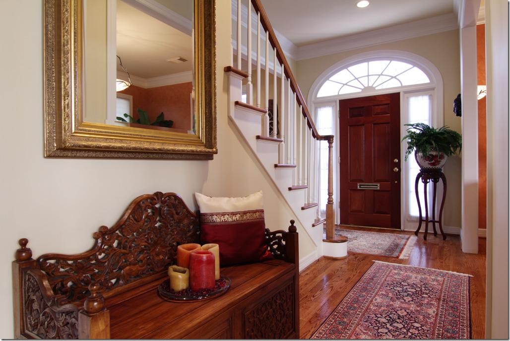
2011: Then, the house was a combination of the warm, Tuscany inspired colors which were so trendy in the early 1990s. This house was built in 1993 and this decor reflects what was so trendy back then.

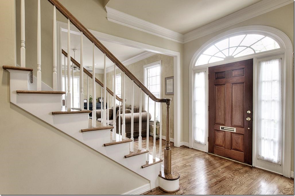
2013: The house was redecorated with a new coat of light ivory paint and the hardwoods were restained, which brought it up to today.

2016: And today, the townhouse has a totally unique design, thanks to the current homeowner. The changes are obvious at the foyer and carry through to the upstairs. The moldings are now painted a dark gray while the walls are contrasting white. The wood balusters were replaced with iron ones. And there is a new front door. The floors were either replaced or stained a very dark brown.

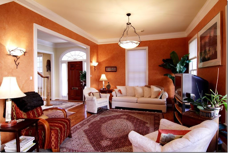
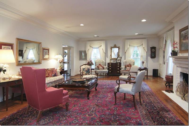
2011: With its heavily fauxed Tuscany yellow walls, the living room was filled with leather furniture. The mantel has a red marble hearth.

2013: The walls were kept the same here. Rugs in both 2011 and 2013 are typical of the look more from the 1990s.

2016: With the new white walls and dark trim, the aesthetic is totally different. The house no longer has the typical “West University Builder Look.” The traditional bookcases are long gone, replaced with a brick accent wall. These are probably very thin bricks, applied like tiles. The fireplace was also completely replaced incluidng the marble hearth and the mantel.

2016: Looking the other way, towards the foyer. The furniture is a mix of new and antique with antique chairs. The ceiling fan was replaced with an iron chandelier.

2011: The Tuscany color carries over to the family room across the foyer.

2011: A look into the breakfast room and kitchen.

2011: Another view of the warm Tuscany styled family room.

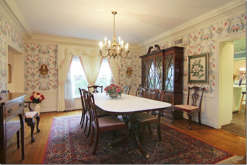
2013: These owners chose to use the room as a formal dining room. With the walls now painted ivory – it looks completely different in here.

2016: Today – you can really see the either the new hardwoods or the restained ones. They look completely different – and so beautiful!!! And they add so much to the decor. Against one wall they added more brick which completely takes all the “Georgian detail” away. Instead of a lot of small art work – they used a few large pieces which make a big statement.

2011: These owners chose not to have a dining room and have only a breakfast room. The kitchen cabinets continue into the breakfast room along the back wall.

2011: Since they don’t have a dining room, their breakfast room is more dressy. The kitchen seems rather small.

2011: Modern pendant lights, typical of the early 2000s.

2013: Their breakfast room is off the formal dining room. They added a chair in the space in between the dining room and the breakfast room.

2013: They kept the modern pendant lights and made no real changes except for the paint and the floor stain.

2013: They added a bigger refrigerator - it fills out the space better.

2016: And today – they chose to use this space as a combination family room and dining room.

2016: Instead of a breakfast room, they use the new bar at the expanded island!

2016: They made a good use of the space, with a smaller dining room and no breakfast table.

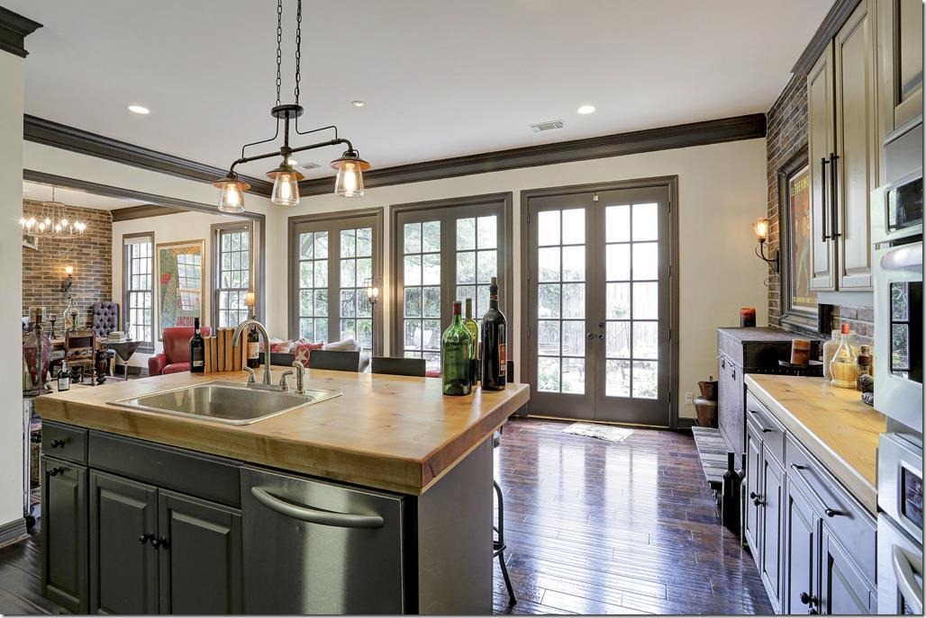
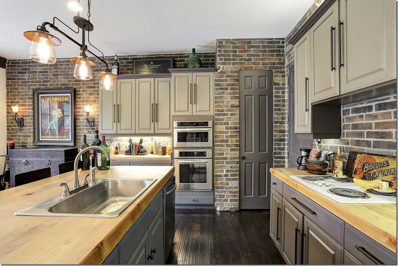
2016: The changes here are amazing! At first look, it seems like a new kitchen. But it’s not. They only changed the cabinet doors with new oversized hardware. Beautiful!!! To enlarge the island, they put on a new wood countertop which allows for bar space. New stainless appliances. Along the back wall, they removed the cabinets there – and added the brick tile along both back kitchen walls. What a statement!!!

2016: New light fixture adds more atmosphere. All the cabinets were painted the same dark gray as the molding.

2016: A close up view of the wood countertops and the new, smaller sink!

2016: Powder room. I’m going to guess that the sink was there, but they added the brick tile and the dark painted wall – which totally updated the room.

2016: Upstairs, the new metal railing and the large art work and sconces continue the atmosphere upstairs. Notice the risers – now tiled with the brick.

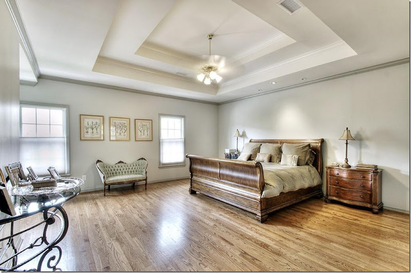
2011: We have the orange wood floors, with the DIY valances (remember those?) at the windows, along with the sponge wall treatment. The house was built in 1993 and the wall treatment and floor stain are from that time period, as is the tray ceiling which were so popular in the 90s and early 2000s.

2013: With the new ivory paint – the floors were restained and are less orange looking.

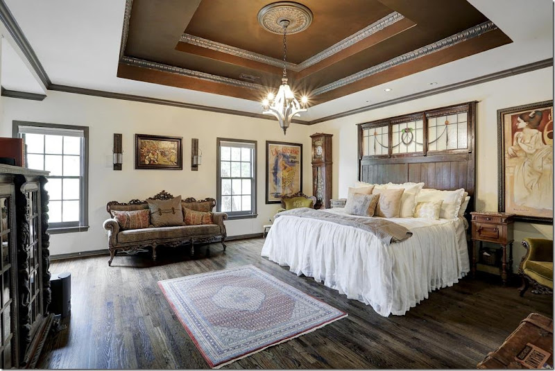
2016: Today. The new owners chose to paint the tray ceiling the dark gray and add molding. The dark paint tends to take the stairstep look away. The feminine, white linen bedspread keeps the room from looking too dark and heavy.

The bookcase is a perfect choice here.

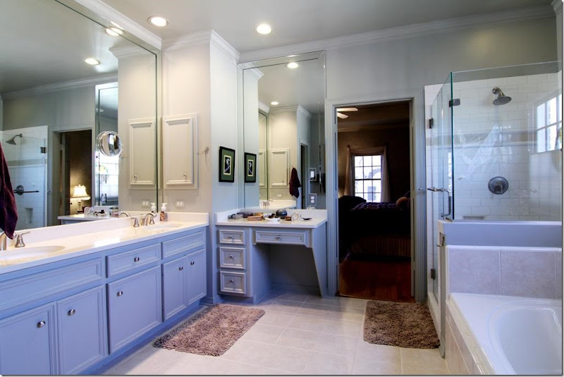
2011: This was updated for the first owners. You can tell by the frameless shower, the subway tile, and the hardware. West U spec houses from 1993 didn’t have bathrooms like this.

2013: Since it was redone, nothing new was needed.

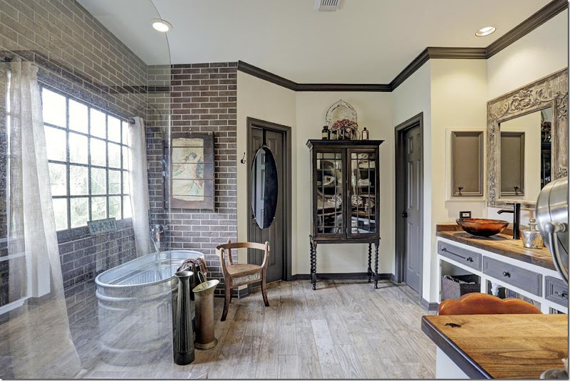
2016: Of course you knew the newly redone bathroom wouldn’t stay! Everything is now gone and replaced with dark brown subway tile and a freestanding bath tub. The shower is beautiful! The vanity remains – with a new wood countertop. The large mirror walls are now gone.

2016: New tile floors that look like wood. Doors are removed from the counters.

2016: The bath tub looks like a metal tub used on farms. Is it? I love the floor! This bathroom reminds me of the Pearl Hotel in San Antonio for some reason.

2013: Typical West U. bedroom with carpet and ceiling fan.

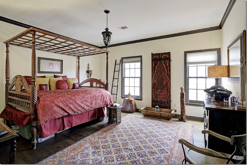
2016: New wood floors, dark gray molding, and light fixture updates the guest room.

2013: Typical bathroom with counter over the toilet and tiled bath.

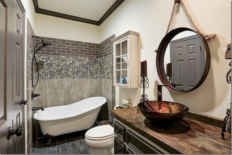
2016: Redone with new freestanding bath and tiled wall. Not a fan of these sinks – they are so hard to use, in my opinion. But notice how with a new countertop – you get a totally different look!

2013: Another bland guest room.

2016: With wood floors and dark molding - the room looks completely different!

2011: Back then. A hot tub, which sort of says it all.

2013: Cleaned up a bit.

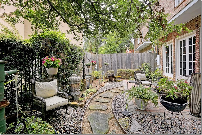
2016: Today, by adding gravel and a stone path – it looks totally different. Another farm tub becomes a fountain.

2016: And looking the other direction.
The listing is HERE. At $775,000. this house wasn’t on the market long – it’s now sale pending. Not surprised. A totally unique renovation, using mostly paint and brick tile, along with dark hardwoods, they totally changed the typical Georgian townhouse into something very special!

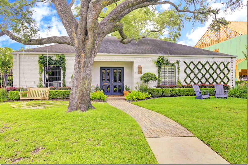
On to Briar Grove where both my nephews live. The neighborhood is a mix of original 60s houses like this and new two stories macmansions that are quickly replacing the ranchburgers. The neighborhood is in demand and its houses don’t remain on the market for too long.First up is this original ranch from 2005.

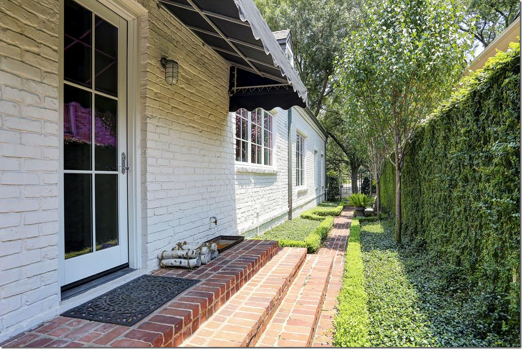
2016: So pretty and so different. But really – not much has changed. It just looks so updated with the shutters gone and the door painted a vivid blue. It’s the simple X ivy grid on the white brick that looks so stunning. You just know that the inside is going to look great. THIS is curb appeal!

2005: The house had been totally renovated in the mid 80s. And the owners didn’t change a thing since then. Tile floors were an upgrade.

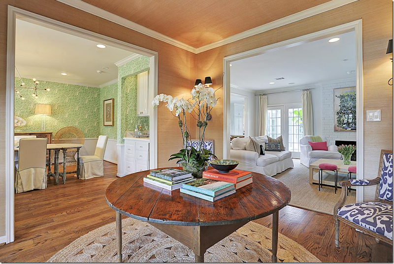
2016: I love this!! A large foyer allows a trendy round straw rug – love!!!! – and an antique center table. Seagrass wallpaper sets it apart. Sconces. I love how you can see into all the rooms from here. Very pretty!!!

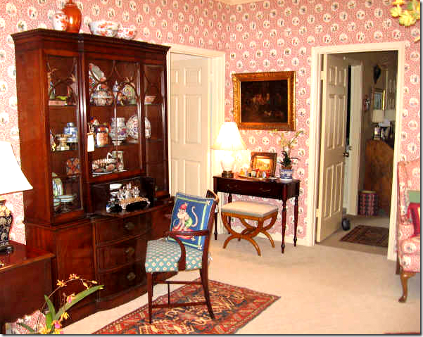
2005: The living room with English antiques and wallpaper and carpeting.

2016: Now, with wood floors, the room is a library. Pretty pillows.
I love to get pillows like these from Etsy. HERE

2005: The dining room with the new tiled floor, English antiques and striped paper.

The dining room – is bright in green with a bleached wood table and new hardwoods.

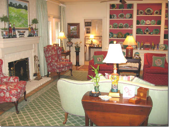
2005: The family room in greens and reds. Very English.

2005: Beautiful collection of Majolica.

2016: Today the same room is so bright and white with touches of hot pink and lime green. The shutters between the kitchen and this room were removed to make it larger and sleeker.

The wood mantel was removed to streamline the brick wall.

A view towards the shelves.

2005: The kitchen.

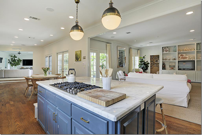
2016: The kitchen was remolded with marble countertops and stainless appliances.

The countertop is new – enlarged and lowered to create a bar. New farm sink. I love the navy blue island. The house is colorful and pretty!

2016: The view into den and the new playroom.

2016: The breakfast was enlarged and connected to the garage, which became a playroom. For those with a garage not connected to the house, this is a good idea of how to enlarge a ranchburger.

2016: The former garage is now the perfect space for the kids!!! That sign is so cute. Order the letters HERE.

2005: Master. And the ubiquitous rice bed! Everyone had one and that matching bench!!! OH – and flame stitch on the chair in the corner! Flame stitch is now back in style.
It’s really funny how trendy looks are. This is so typical of mid to late 80s decor. It’s sad to think that one day soon we will be laughing over today’s decor!!

It looks like they took the rug up. The room needs one to finish it – the desk is fab and I love the headboard.

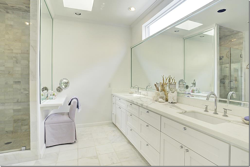
2016: The bathroom is new. It’s huge.

Great shower.

And bathtub. Trend alert: stand alone tubs. Every new bathroom has one.

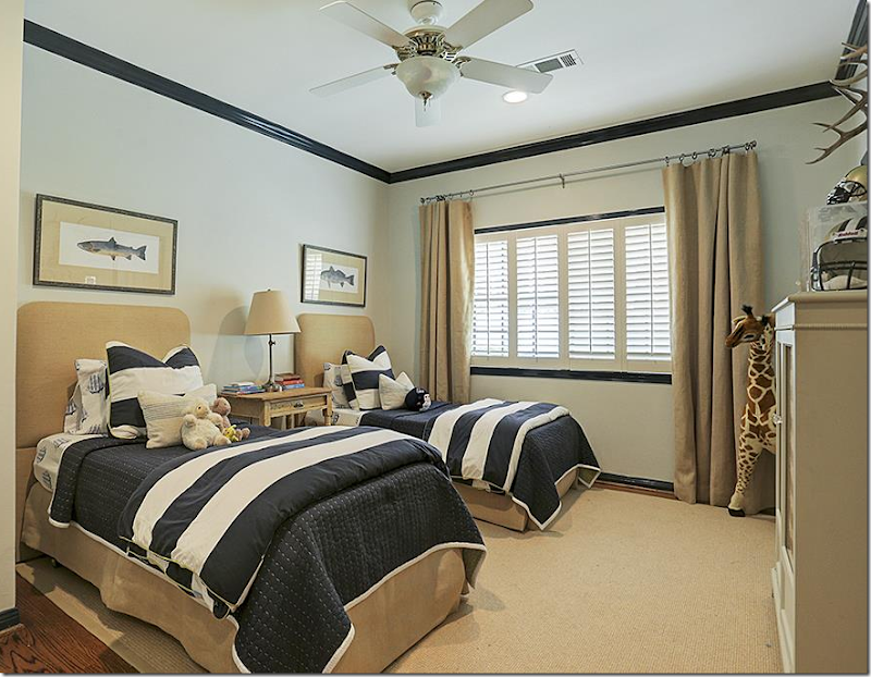
2016: The boys rooms. Stripes and khaki are trendy for boys now.

2016: The girls rooms.

2016: Renovated guest bath.

2005: The renovated back yard – they probably put in the brick terrace and the French doors in the master bedroom, which is a typical update in Briar Grove ranches.

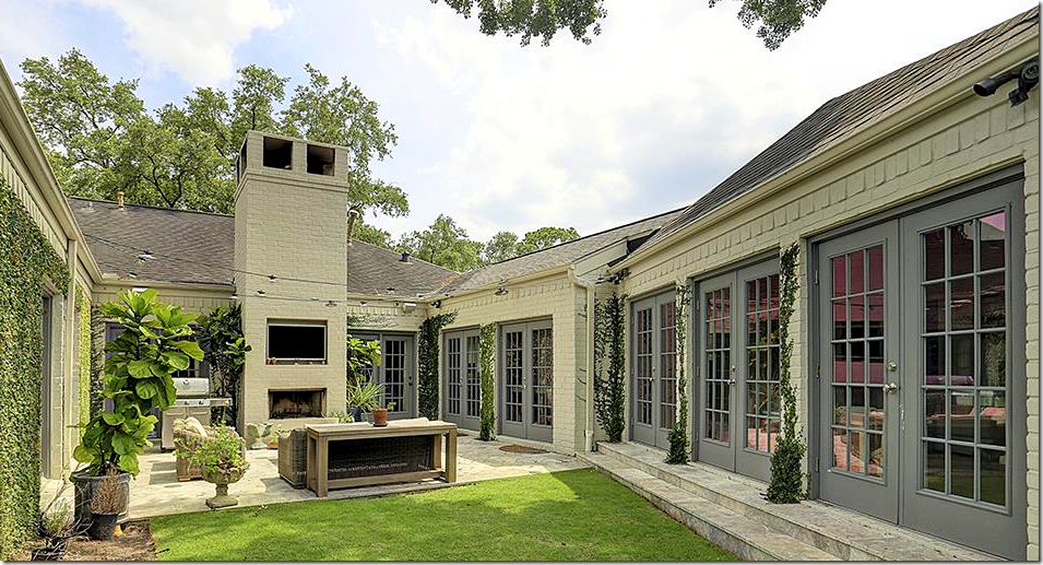
2016: The new terrace – with beautiful stone floor. The fireplace was added to the terrace side, along with a TV! Love the lights hanging over the space – they act like a sort of ceiling. So nice!

2016: A larger view shows the garage – now the playroom – and the hallway that connects the house to that room.
The listing for this house is HERE. At $1,175.00 – the house is now contract pending – of course!!! It’s way too cute to stay for sale for long. The house sold in 2005 for $499,900. So you can see it was great investment – even though they did put in a lot of costly renovations.

Our last house is located in Tanglewood, a very exclusive neighborhood that started out as a far-away suburb – but today, is right in the heart of Houston. The house was built in 1974 and I don’t think it was redecorated during the entire time until it was sold in 2012. The house was actually a parsonage – a very nice parsonage!

When the house sold in 2012, it was taken down to the studs and totally renovated by Courtnay Elias of Creative Tonic HERE. OK. I’m in LOVE with Courtnay!! She’s creating incredibly pretty interiors and I love that adjective – “pretty.” I’m very partial to feminine, pretty designs and Courtnay Elias is cornering that look – but adding an edge to the pretty. She is sooooo talented!!!

Courtnay updated the house by, first, painting it white. This single change takes a house from blah and old to chic and trendy. The front porch was updated by ridding it of outdated iron columns, replacing them with sleek black ones. There’s a new double door, a new New Orleans styled lantern and – new landscaping, with large pavers atop moss, along with a streamlined look to the plantings.
Another major update was new shutters. Get rid of standard shutters that are never the correct size and install these French inspired beauties. It’s a great update.Walking up to this door – you know that something special is waiting for you.

Before: The decor is stuck in the 70s and 80s. What’s important is looking at what was here and how Courtnay changed it. Brick floors: these floors can be fabulous. They can add texture and a certain warmth and casualness. But, if you are looking for a trendy, sleek, chic feel – these brick floors, along with the paneled walls, have to go. The stairs are very Georgian – again, they don’t fit the wanted aesthetic. They need to be updated. So does the bar, with the paneled doors that were probably NEVER closed once in 30 years! Add in outdated molding that needed to be beefed up – and let’s see how this was entry hall – which is an important part of the house’s layout – was changed by Creative Tonic.

And here it is – looking from the opposite direction. Beautiful, dark hardwoods, simple, wide moldings, iron railings, bright white walls, along with the addition of a series of modern sconce and updated can lights. Notice the new bar to the right. It is now a focal point of the large entry hall – the entrance to it has been enlarged and the doors were removed. I love the brass foot rail. And notice the carpet – it’s fabulous! Antilocarpa by Starke!!! At the rear of the hall is the study, that before, was more closed off.

I got a few extra photos off of Creative Tonic’s Facebook – and here is the settee in the entry – with a lilac fabric.

The bar is totally new – with antique mirror on the back. Beautiful stone countertop with gold hardware. Very beautiful.

2012: The living room at the front of the house. Before this room was isolated behind closed doors. The doorway to the front hall is now enlarged. The dining room leads off on the right. Today – the area to the dining room is open and enlarged.

2012: The view to the right.

Today: The living room looks completely different. So bright and chic! The shelves flanking the fireplace were removed and a new stone mantel was installed. Green trim on the curtains pick up the green leather chairs. Love these!!! Today the newly designed room is no longer isolated – it’s open to the foyer and dining room and this is now more of a family room with the flatscreen.

2012: The dining room – you can see the foyer and the kitchen.

2012: Another view. The dining room was enclosed behind walls and doors – no longer!

2016: Today – the dining room is completely open to the foyer and the kitchen and the living room. The wall between the kitchen and dining room was removed. I wish there was a view off the foyer into the dining room so you can see how open the house is now.

2016: Close up of the dining room fixture.

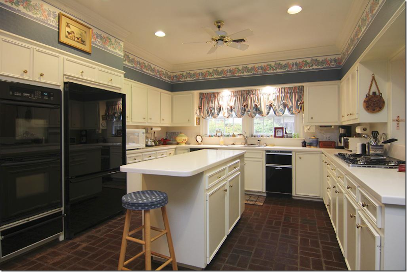
2012: The kitchen with the brick floors – closed off to the dining room and the breakfast room to the right.

2012: This is such a typical Houston kitchen from the 80s. My girlfriend’s kitchen looked exactly like this!! Exactly.

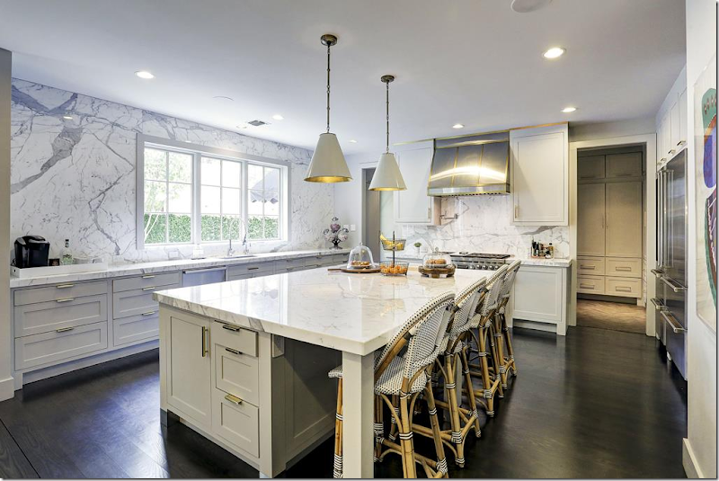
2016: Today – the enlarged and widened kitchen has gorgeous white marble slabs on the island and the backsplash. No upper cabinets – enlarged windows. Totally new kitchen. Gorgeous! The mud room is through the door.

2016: From Creative Tonic’s Facebook. That marble backsplash is stunning!!!

2016: Large island with one slab of marble.

2016: Large range, refrigerator – with wine cooler. Through the door is the entry hall and past that is the master bedroom.

2016: The breakfast room was turned into this mudroom.

2016: And – the laundry room with its shiplap walls and tiles.

2016: The mud room leads out to the side walkway.

2016: The room at the end of the entry hall – is the library with its lacquered gray walls.

2016: From Facebook – a closeup look of the beautiful molding on the library walls.

2016: The totally new powder room with a marble sink and gilt mirror. The walls are lilac grasscloth.

2012: Off the entry hall, past the library and bar is the master suite.

2016: Today, the room looks completely different in white with a patterned carpet. The wall behind the bed is wallpapered. Courtnay installed a wall of built-ins.

And from Facebook, a closeup of the bed. The photos from Creative Tonic are so much prettier than HAR. Photographer is the talented Julie Soefer HERE. You can really see the wallpaper here. So pretty.

2012: The master bathroom.

2016: Today, the master is totally renovated with white marble and contemporary crystal sconces.

2016: The shower.

2016: Her closet. OK, lots of Hermes boxes. You just can’t throw out those orange boxes.

2016: Overlooking the entry hall – is the study.

2016: Today, with hardwoods and Starke rug. Two flatscreens. Love that sofa with the ottomans. Would have been great to watch the conventions in!!!

2016: The back of the study with built in desks.

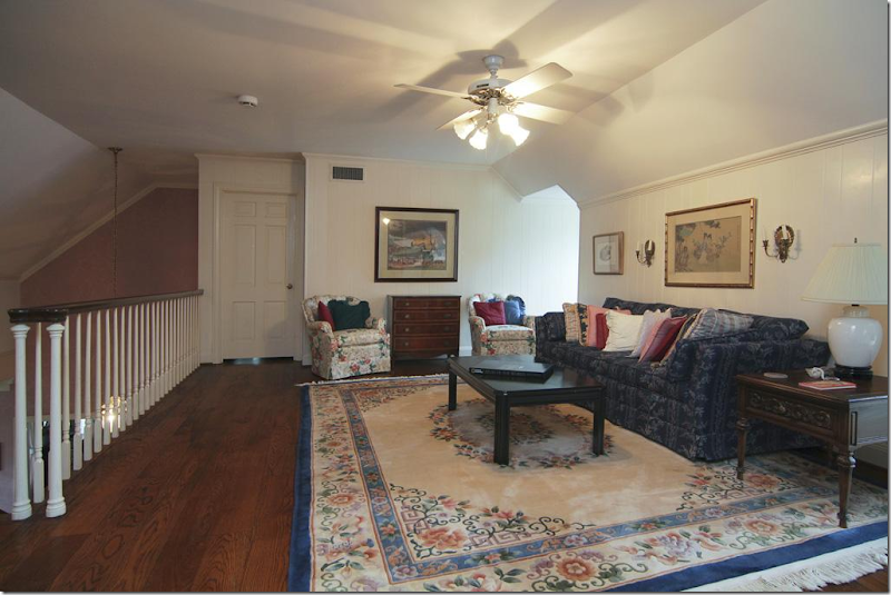
2016: Upstairs are the kids bedrooms, with the dormer windows and slanted ceilings. The owner has three young sons, so Courtnay furnished them similarly – with sofas, wood floors, and rugs.

2016: The upstairs baths are similar to the master, in white marble tiles.

2016: This bedroom has wood floors and orange rug. Love the sofa in the boys room – great idea. Keeps them from laying in bed all day.

2016: And this one! With the wallpaper and patterned shades.

A huge thank you to Courtnay Elias & Creative Tonic for letting me borrow a few of her Instagram pics! Love what she did to this house!!
The listing to this fabulous house is HERE – it is available!
AND finally…

Read about this darling NYC apartment’s renovation HERE.


