AMAZING BEFORES & AFTERS!!!
Today, I have some interesting Befores & Afters in Houston. I love looking at houses for sale and then seeing if they were renovated. I think you can learn so much about the evolution of interior design by studying the befores & afters and hopefully, avoid making some decorating errors along the way.
This first Before & After is a townhouse in West University, the small town inside Houston’s city limits, where I live. This townhouse is currently for sale and it’s a testament to unique interior design, as you will see!
Just a note – rather than show each house all at once – I will show show each room, Then & Now so you don’t have to scroll back and forth.
Enjoy!!!

BEFORE: We have three versions of this Georgian styled house, the first is from 2011 and represents design from the early 2000s. Gated townhouse developments are rare in West University since the majority of housing here is single houses.

The next version is from 2013, when the house was redecorated mostly using paint.

And finally, today, 2016, when the house was completely renovated, not just redecorated.

2016: Today, you can see the current owner has decorated the front porch, which extends their living space.
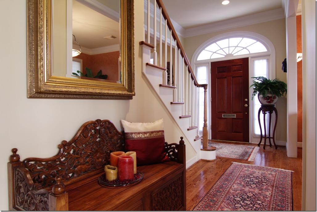
2011: Then, the house was a combination of the warm, Tuscany inspired colors which were so trendy in the early 1990s. This house was built in 1993 and this decor reflects what was so trendy back then.
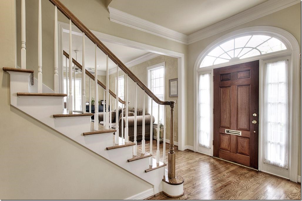
2013: The house was redecorated with a new coat of light ivory paint and the hardwoods were restained, which brought it up to today.

2016: And today, the townhouse has a totally unique design, thanks to the current homeowner. The changes are obvious at the foyer and carry through to the upstairs. The moldings are now painted a dark gray while the walls are contrasting white. The wood balusters were replaced with iron ones. And there is a new front door. The floors were either replaced or stained a very dark brown.

2011: With its heavily fauxed Tuscany yellow walls, the living room was filled with leather furniture. The mantel has a red marble hearth.

2013: The walls were kept the same here. Rugs in both 2011 and 2013 are typical of the look more from the 1990s.

2016: With the new white walls and dark trim, the aesthetic is totally different. The house no longer has the typical “West University Builder Look.” The traditional bookcases are long gone, replaced with a brick accent wall. These are probably very thin bricks, applied like tiles. The fireplace was also completely replaced incluidng the marble hearth and the mantel.

2016: Looking the other way, towards the foyer. The furniture is a mix of new and antique with antique chairs. The ceiling fan was replaced with an iron chandelier.
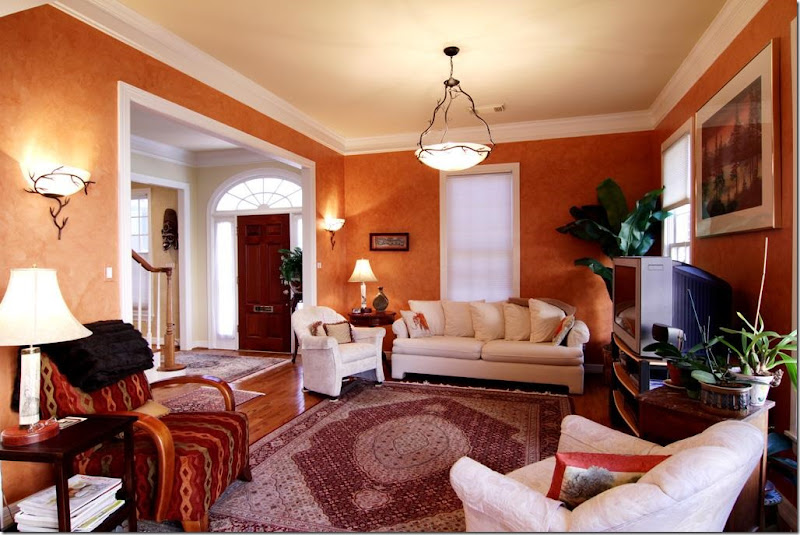
2011: The Tuscany color carries over to the family room across the foyer.

2011: A look into the breakfast room and kitchen.

2011: Another view of the warm Tuscany styled family room.

2013: These owners chose to use the room as a formal dining room. With the walls now painted ivory – it looks completely different in here.

2016: Today – you can really see the either the new hardwoods or the restained ones. They look completely different – and so beautiful!!! And they add so much to the decor. Against one wall they added more brick which completely takes all the “Georgian detail” away. Instead of a lot of small art work – they used a few large pieces which make a big statement.

2011: These owners chose not to have a dining room and have only a breakfast room. The kitchen cabinets continue into the breakfast room along the back wall.

2011: Since they don’t have a dining room, their breakfast room is more dressy. The kitchen seems rather small.

2011: Modern pendant lights, typical of the early 2000s.

2013: Their breakfast room is off the formal dining room. They added a chair in the space in between the dining room and the breakfast room.

2013: They kept the modern pendant lights and made no real changes except for the paint and the floor stain.

2013: They added a bigger refrigerator - it fills out the space better.

2016: And today – they chose to use this space as a combination family room and dining room.

2016: Instead of a breakfast room, they use the new bar at the expanded island!

2016: They made a good use of the space, with a smaller dining room and no breakfast table.

2016: The changes here are amazing! At first look, it seems like a new kitchen. But it’s not. They only changed the cabinet doors with new oversized hardware. Beautiful!!! To enlarge the island, they put on a new wood countertop which allows for bar space. New stainless appliances. Along the back wall, they removed the cabinets there – and added the brick tile along both back kitchen walls. What a statement!!!
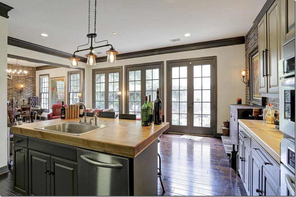
2016: New light fixture adds more atmosphere. All the cabinets were painted the same dark gray as the molding.
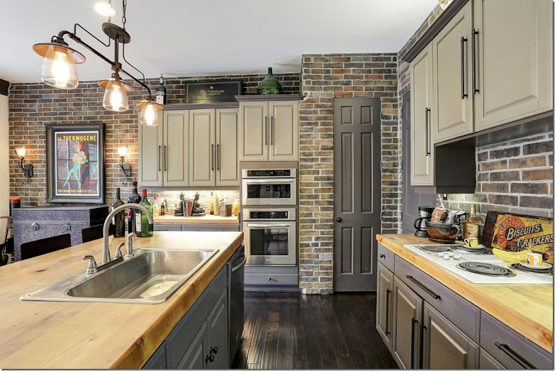
2016: A close up view of the wood countertops and the new, smaller sink!

2016: Powder room. I’m going to guess that the sink was there, but they added the brick tile and the dark painted wall – which totally updated the room.

2016: Upstairs, the new metal railing and the large art work and sconces continue the atmosphere upstairs. Notice the risers – now tiled with the brick.

2011: We have the orange wood floors, with the DIY valances (remember those?) at the windows, along with the sponge wall treatment. The house was built in 1993 and the wall treatment and floor stain are from that time period, as is the tray ceiling which were so popular in the 90s and early 2000s.
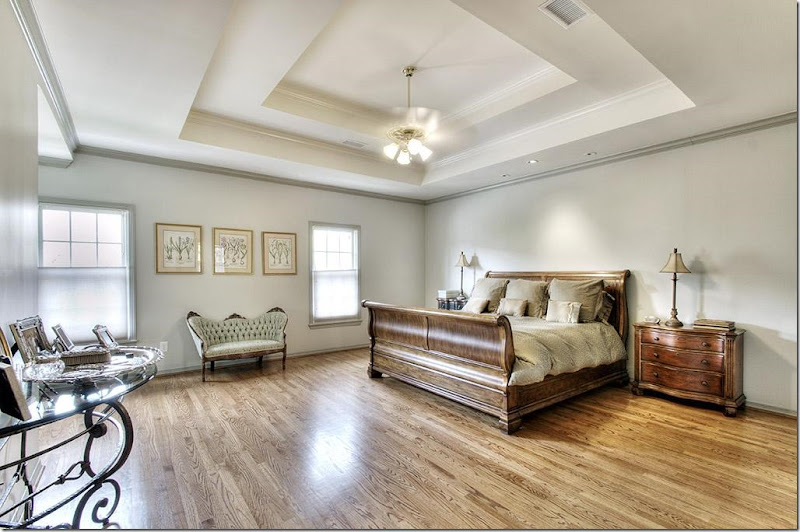
2013: With the new ivory paint – the floors were restained and are less orange looking.
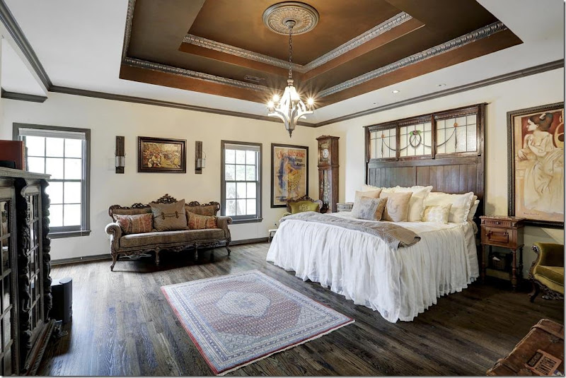
2016: Today. The new owners chose to paint the tray ceiling the dark gray and add molding. The dark paint tends to take the stairstep look away. The feminine, white linen bedspread keeps the room from looking too dark and heavy.

The bookcase is a perfect choice here.
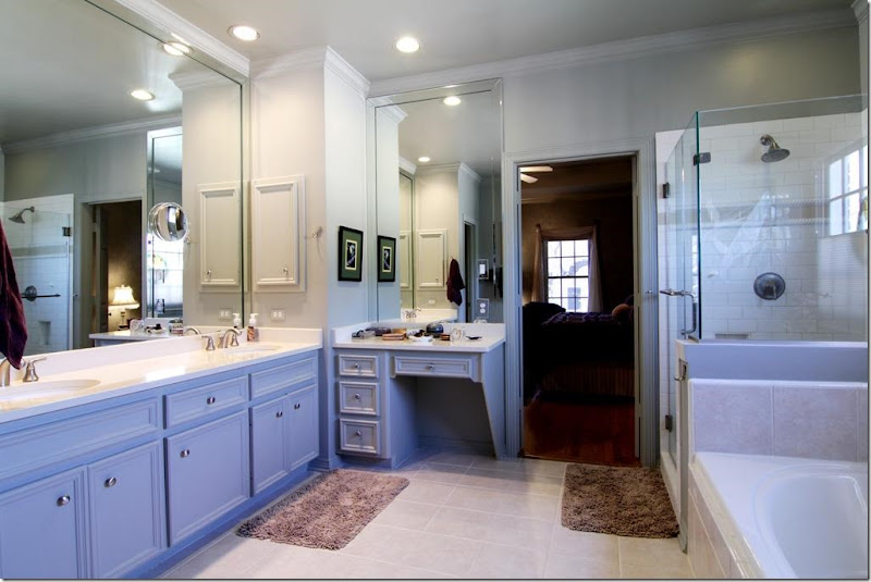
2011: This was updated for the first owners. You can tell by the frameless shower, the subway tile, and the hardware. West U spec houses from 1993 didn’t have bathrooms like this.

2013: Since it was redone, nothing new was needed.

2016: Of course you knew the newly redone bathroom wouldn’t stay! Everything is now gone and replaced with dark brown subway tile and a freestanding bath tub. The shower is beautiful! The vanity remains – with a new wood countertop. The large mirror walls are now gone.

2016: New tile floors that look like wood. Doors are removed from the counters.
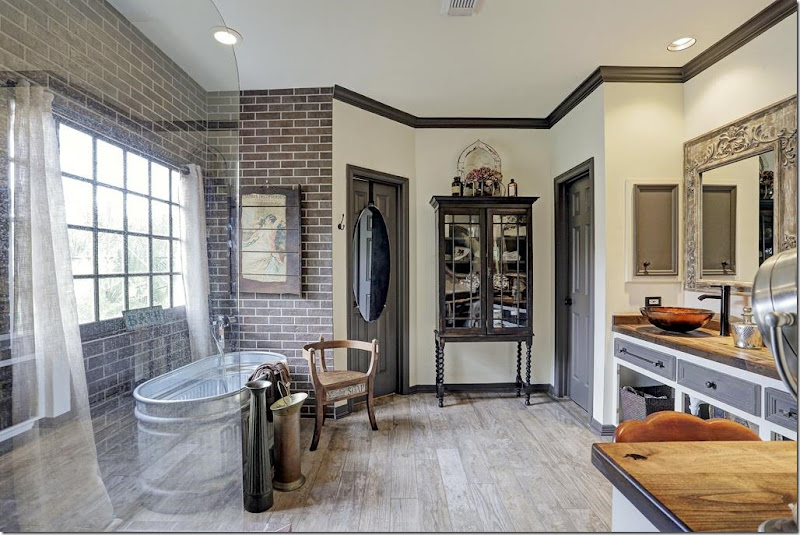
2016: The bath tub looks like a metal tub used on farms. Is it? I love the floor! This bathroom reminds me of the Pearl Hotel in San Antonio for some reason.

2013: Typical West U. bedroom with carpet and ceiling fan.
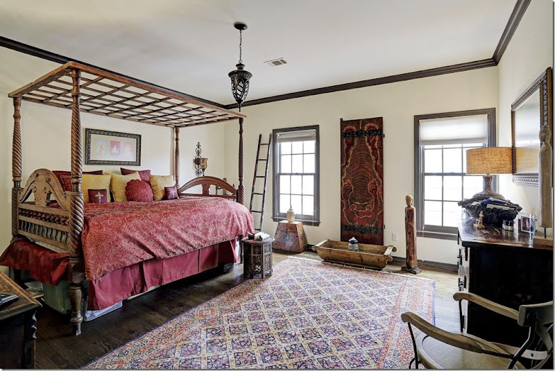
2016: New wood floors, dark gray molding, and light fixture updates the guest room.

2013: Typical bathroom with counter over the toilet and tiled bath.
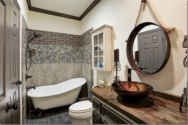
2016: Redone with new freestanding bath and tiled wall. Not a fan of these sinks – they are so hard to use, in my opinion. But notice how with a new countertop – you get a totally different look!

2013: Another bland guest room.

2016: With wood floors and dark molding - the room looks completely different!

2011: Back then. A hot tub, which sort of says it all.

2013: Cleaned up a bit.

2016: Today, by adding gravel and a stone path – it looks totally different. Another farm tub becomes a fountain.
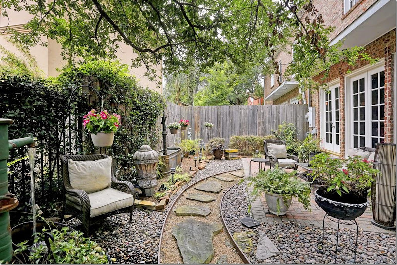
2016: And looking the other direction.
The listing is HERE. At $775,000. this house wasn’t on the market long – it’s now sale pending. Not surprised. A totally unique renovation, using mostly paint and brick tile, along with dark hardwoods, they totally changed the typical Georgian townhouse into something very special!

On to Briar Grove where both my nephews live. The neighborhood is a mix of original 60s houses like this and new two stories macmansions that are quickly replacing the ranchburgers. The neighborhood is in demand and its houses don’t remain on the market for too long.First up is this original ranch from 2005.
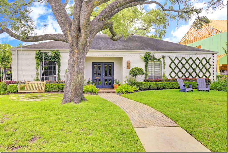
2016: So pretty and so different. But really – not much has changed. It just looks so updated with the shutters gone and the door painted a vivid blue. It’s the simple X ivy grid on the white brick that looks so stunning. You just know that the inside is going to look great. THIS is curb appeal!

2005: The house had been totally renovated in the mid 80s. And the owners didn’t change a thing since then. Tile floors were an upgrade.
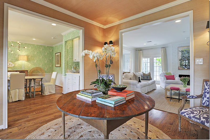
2016: I love this!! A large foyer allows a trendy round straw rug – love!!!! – and an antique center table. Seagrass wallpaper sets it apart. Sconces. I love how you can see into all the rooms from here. Very pretty!!!
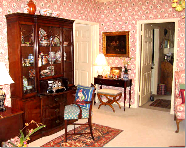
2005: The living room with English antiques and wallpaper and carpeting.

2016: Now, with wood floors, the room is a library. Pretty pillows.
I love to get pillows like these from Etsy. HERE

2005: The dining room with the new tiled floor, English antiques and striped paper.

The dining room – is bright in green with a bleached wood table and new hardwoods.

2005: The family room in greens and reds. Very English.
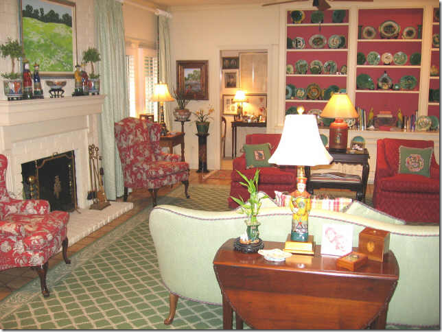
2005: Beautiful collection of Majolica.

2016: Today the same room is so bright and white with touches of hot pink and lime green. The shutters between the kitchen and this room were removed to make it larger and sleeker.

The wood mantel was removed to streamline the brick wall.

A view towards the shelves.

2005: The kitchen.

2016: The kitchen was remolded with marble countertops and stainless appliances.

The countertop is new – enlarged and lowered to create a bar. New farm sink. I love the navy blue island. The house is colorful and pretty!
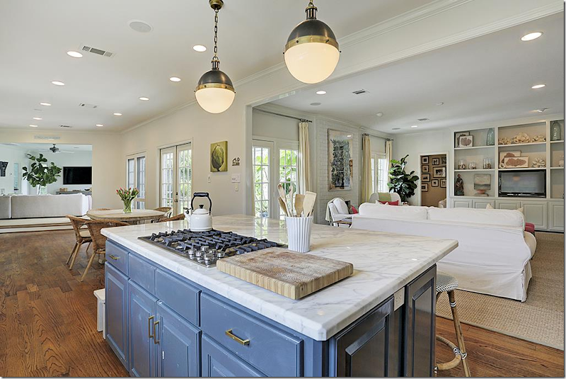
2016: The view into den and the new playroom.

2016: The breakfast was enlarged and connected to the garage, which became a playroom. For those with a garage not connected to the house, this is a good idea of how to enlarge a ranchburger.

2016: The former garage is now the perfect space for the kids!!! That sign is so cute. Order the letters HERE.

2005: Master. And the ubiquitous rice bed! Everyone had one and that matching bench!!! OH – and flame stitch on the chair in the corner! Flame stitch is now back in style.
It’s really funny how trendy looks are. This is so typical of mid to late 80s decor. It’s sad to think that one day soon we will be laughing over today’s decor!!

It looks like they took the rug up. The room needs one to finish it – the desk is fab and I love the headboard.
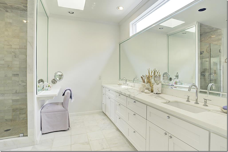
2016: The bathroom is new. It’s huge.

Great shower.

And bathtub. Trend alert: stand alone tubs. Every new bathroom has one.
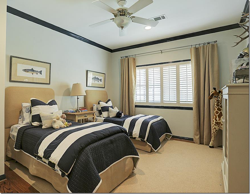
2016: The boys rooms. Stripes and khaki are trendy for boys now.

2016: The girls rooms.

2016: Renovated guest bath.

2005: The renovated back yard – they probably put in the brick terrace and the French doors in the master bedroom, which is a typical update in Briar Grove ranches.

2016: The new terrace – with beautiful stone floor. The fireplace was added to the terrace side, along with a TV! Love the lights hanging over the space – they act like a sort of ceiling. So nice!
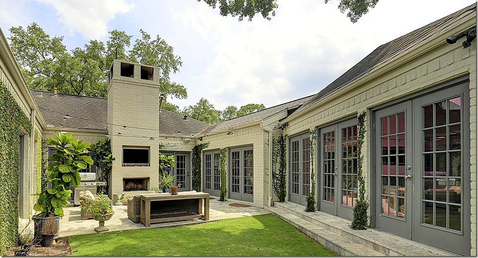
2016: A larger view shows the garage – now the playroom – and the hallway that connects the house to that room.
The listing for this house is HERE. At $1,175.00 – the house is now contract pending – of course!!! It’s way too cute to stay for sale for long. The house sold in 2005 for $499,900. So you can see it was great investment – even though they did put in a lot of costly renovations.

Our last house is located in Tanglewood, a very exclusive neighborhood that started out as a far-away suburb – but today, is right in the heart of Houston. The house was built in 1974 and I don’t think it was redecorated during the entire time until it was sold in 2012. The house was actually a parsonage – a very nice parsonage!

When the house sold in 2012, it was taken down to the studs and totally renovated by Courtnay Elias of Creative Tonic HERE. OK. I’m in LOVE with Courtnay!! She’s creating incredibly pretty interiors and I love that adjective – “pretty.” I’m very partial to feminine, pretty designs and Courtnay Elias is cornering that look – but adding an edge to the pretty. She is sooooo talented!!!

Courtnay updated the house by, first, painting it white. This single change takes a house from blah and old to chic and trendy. The front porch was updated by ridding it of outdated iron columns, replacing them with sleek black ones. There’s a new double door, a new New Orleans styled lantern and – new landscaping, with large pavers atop moss, along with a streamlined look to the plantings.
Another major update was new shutters. Get rid of standard shutters that are never the correct size and install these French inspired beauties. It’s a great update.Walking up to this door – you know that something special is waiting for you.

Before: The decor is stuck in the 70s and 80s. What’s important is looking at what was here and how Courtnay changed it. Brick floors: these floors can be fabulous. They can add texture and a certain warmth and casualness. But, if you are looking for a trendy, sleek, chic feel – these brick floors, along with the paneled walls, have to go. The stairs are very Georgian – again, they don’t fit the wanted aesthetic. They need to be updated. So does the bar, with the paneled doors that were probably NEVER closed once in 30 years! Add in outdated molding that needed to be beefed up – and let’s see how this was entry hall – which is an important part of the house’s layout – was changed by Creative Tonic.

And here it is – looking from the opposite direction. Beautiful, dark hardwoods, simple, wide moldings, iron railings, bright white walls, along with the addition of a series of modern sconce and updated can lights. Notice the new bar to the right. It is now a focal point of the large entry hall – the entrance to it has been enlarged and the doors were removed. I love the brass foot rail. And notice the carpet – it’s fabulous! Antilocarpa by Starke!!! At the rear of the hall is the study, that before, was more closed off.

I got a few extra photos off of Creative Tonic’s Facebook – and here is the settee in the entry – with a lilac fabric.

The bar is totally new – with antique mirror on the back. Beautiful stone countertop with gold hardware. Very beautiful.
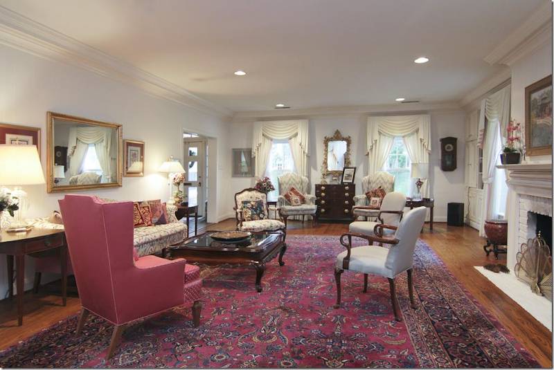
2012: The living room at the front of the house. Before this room was isolated behind closed doors. The doorway to the front hall is now enlarged. The dining room leads off on the right. Today – the area to the dining room is open and enlarged.

2012: The view to the right.

Today: The living room looks completely different. So bright and chic! The shelves flanking the fireplace were removed and a new stone mantel was installed. Green trim on the curtains pick up the green leather chairs. Love these!!! Today the newly designed room is no longer isolated – it’s open to the foyer and dining room and this is now more of a family room with the flatscreen.

2012: The dining room – you can see the foyer and the kitchen.
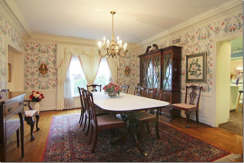
2012: Another view. The dining room was enclosed behind walls and doors – no longer!

2016: Today – the dining room is completely open to the foyer and the kitchen and the living room. The wall between the kitchen and dining room was removed. I wish there was a view off the foyer into the dining room so you can see how open the house is now.

2016: Close up of the dining room fixture.

2012: The kitchen with the brick floors – closed off to the dining room and the breakfast room to the right.
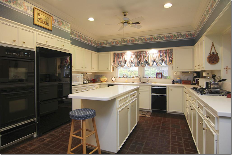
2012: This is such a typical Houston kitchen from the 80s. My girlfriend’s kitchen looked exactly like this!! Exactly.
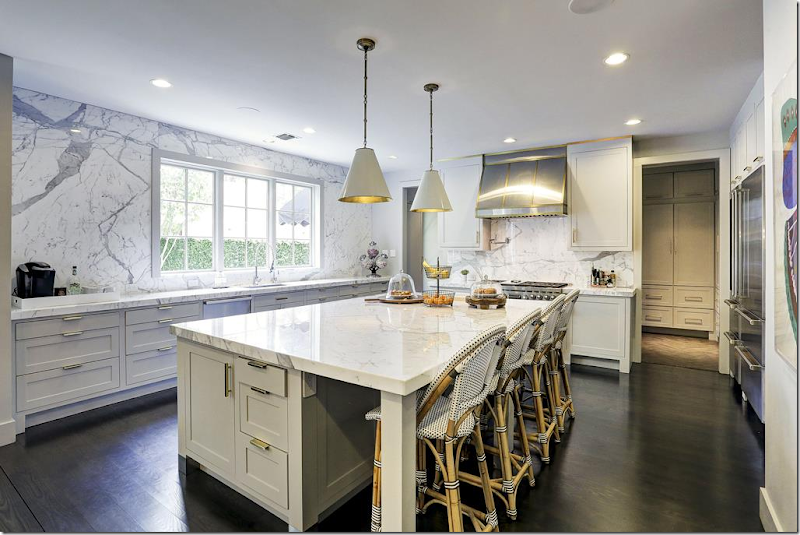
2016: Today – the enlarged and widened kitchen has gorgeous white marble slabs on the island and the backsplash. No upper cabinets – enlarged windows. Totally new kitchen. Gorgeous! The mud room is through the door.

2016: From Creative Tonic’s Facebook. That marble backsplash is stunning!!!

2016: Large island with one slab of marble.

2016: Large range, refrigerator – with wine cooler. Through the door is the entry hall and past that is the master bedroom.

2016: The breakfast room was turned into this mudroom.

2016: And – the laundry room with its shiplap walls and tiles.
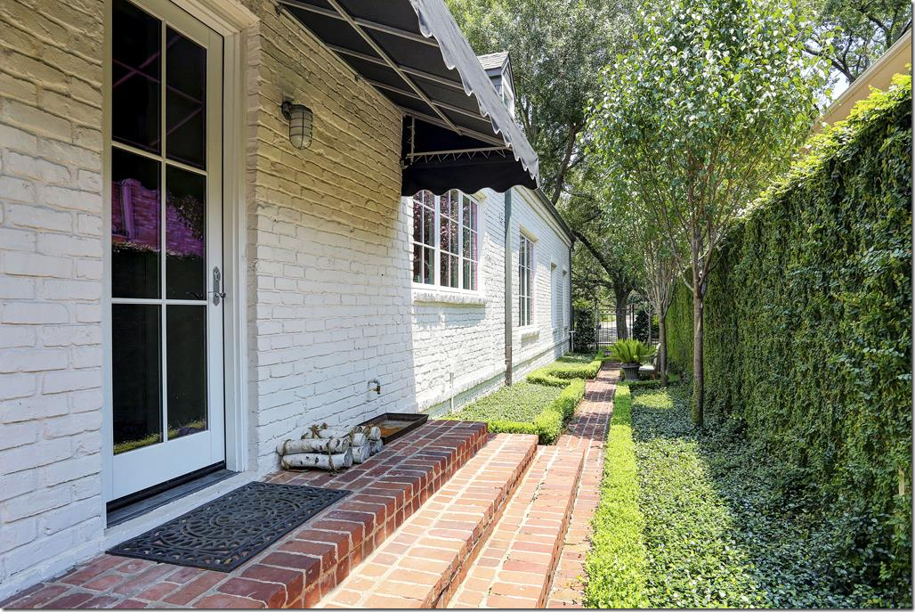
2016: The mud room leads out to the side walkway.

2016: The room at the end of the entry hall – is the library with its lacquered gray walls.

2016: From Facebook – a closeup look of the beautiful molding on the library walls.

2016: The totally new powder room with a marble sink and gilt mirror. The walls are lilac grasscloth.

2012: Off the entry hall, past the library and bar is the master suite.

2016: Today, the room looks completely different in white with a patterned carpet. The wall behind the bed is wallpapered. Courtnay installed a wall of built-ins.

And from Facebook, a closeup of the bed. The photos from Creative Tonic are so much prettier than HAR. Photographer is the talented Julie Soefer HERE. You can really see the wallpaper here. So pretty.

2012: The master bathroom.

2016: Today, the master is totally renovated with white marble and contemporary crystal sconces.

2016: The shower.

2016: Her closet. OK, lots of Hermes boxes. You just can’t throw out those orange boxes.
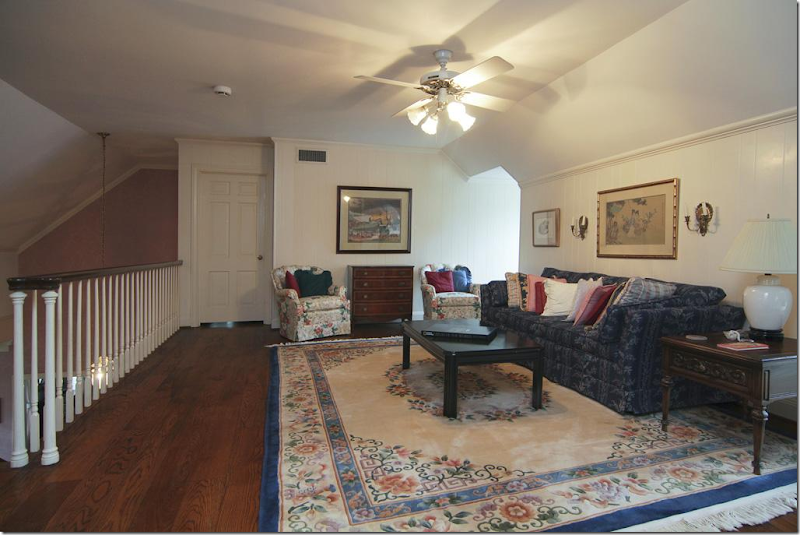
2016: Overlooking the entry hall – is the study.

2016: Today, with hardwoods and Starke rug. Two flatscreens. Love that sofa with the ottomans. Would have been great to watch the conventions in!!!

2016: The back of the study with built in desks.

2016: Upstairs are the kids bedrooms, with the dormer windows and slanted ceilings. The owner has three young sons, so Courtnay furnished them similarly – with sofas, wood floors, and rugs.

2016: The upstairs baths are similar to the master, in white marble tiles.

2016: This bedroom has wood floors and orange rug. Love the sofa in the boys room – great idea. Keeps them from laying in bed all day.

2016: And this one! With the wallpaper and patterned shades.

A huge thank you to Courtnay Elias & Creative Tonic for letting me borrow a few of her Instagram pics! Love what she did to this house!!
The listing to this fabulous house is HERE – it is available!
AND finally…

Read about this darling NYC apartment’s renovation HERE.


I like the first one best, though not in its Tuscan iteration. I wonder how well the brick look will age. I remember when brick walls and the whole industrial warehouse look was so hot in the '70s. It never really went away, so maybe it's a trend with legs.
ReplyDeleteThose original builder-grade bedrooms make me wince.
The change of the parsonage exterior from red to white is amazing. It's still traditional and appropriate to the era of the building, yet fresh. Well done!
I LOVE LOVE LOVE Courtnay. She won the Paper City design award this year too. She's beyond fabulous.
DeleteHouston always has a "look"! One thing for sure - you all don't like color. Must be the weather. These houses will be badly dated in five years - not even giving ten. Wondered to myself about the first house - where do they keep the cows? Joni, thanks always for pointing out to me how stodgy and behind the times I am! Great post!:)
ReplyDeleteGod sorry! but, Beth, me too! I want to bomb my house. It's sooooooo - been there, done that.
DeleteI guess I'm old and stodgy too Beth ... I liked the updates in the ranch but the other homes left my feeling bored, cold and uninspired. When are we going to ditch the dull restoration hardware/ industrial/ transitional nonsense forced on us by untalented and unoriginal "designers" and reclaim classical and timeless design? I'm not saying that we all have to emulate the likes of Charles Faudree or do Louis Louis Louis ALL the time, but why would you fill your house with trendy furniture and color palettes that will need to be replaced in 5 years? And why would you let a silly interior designer chose an interior that is in conflict with the interior and exterior architecture/ feel of your home? Don't you think it would be more prudent, responsible and savvy to carefully select well made quality pieces and mix in some contemporary art/ accents/ pillows to satisfy your "trend" appetite? Please Joni .. save us from HGTV and Joanna Gaines .. I can't take it any more ...
DeleteThank you Beth, if someone didn't say it my head would explode. Whatever happened to the idea that a room should look like it evolved over time? Plus I am partial to the notion that the decor should exist in some sort context. Not that we have to be slavishly true to the architecture or area. But are we in a penthouse, in the mountains? on the beach? in Tuscany? on a farm? Where are the cows?- indeed. Of course that first house- the dignified Georgian gone Tuscan Villa to Calamity Jane, was pretty even all dude ranched out, and I loved the decorator's use of scale especially with regards to the art work. She obviously has great talent, but the look was so contrived, ultra trendy and totally out of context. Of course, we all want to burn our houses to the ground, especially everyone who thought the brown floor color was fine. My new house design is dated before I started to paint.
DeleteI didn't much care for the after of the first house but loved the brightness and colors of the 2nd and 3rd. By the way, the link to your Etsy pillow source doesn't work. I'm looking for some new pillows so I would love if you could fix it! Thx!
ReplyDeletefixed it.
DeleteSo interesting how we are all different. I like the first house but not the 2nd and 3rd!
DeleteYour link to those Etsy pillows does not work. Can you post the link? Thanks!
ReplyDeleteok. sorry, hold on.
Deleteok fixed it. I used them - she will make custom sizes. so cheap too.
DeleteI liked the 2013 version of the first house. The other two were great in the 2016 style.
ReplyDeleteI liked the NYC apt the best, then second the ranch single level. We did a similar to the studs Reno to our rambler spent $400k and we acted as general contractor. I think they spent close $600k on their remodel since they did a big redo of the outside patio area. So they probably just broke even. Moral is be careful how much you spend updating your house relative to location, and how long you plan to stay.
ReplyDeleteAlso I think open concept and lots of white will as a trend play out soon, it's cold, and lacks privacy when you want it also if your dining area is open to kitchen, not enticing to have dinner guests, I'd be a wreck cleaning the kitchen while cooking so you don't look at kitchen messes while dining
open kitchens are just "in." personally, I hate mine when I have family dinners. but - other people love it.
DeleteHi Joni, An interesting post. An "Open" floor plan does make a house look bigger. However, decorating one requires a lot of thought and planning. Much more thought and planning than most people can afford. The first townhouse seemed too confusing and chopped up. Also, the more horizontal space you have to view, the more vertical space you need or the ceilings seem lower than they really are.
DeleteSo much depends on how you live. An "open" floor plan can be really noisy when you have lots of kids.
Most homes since the 1950's have been designed with "family dining" in mind. Even if there is a formal dining room, it is always right next to the kitchen, so forget true formal dining. You need a least a cook and a few servers plus a kitchen that is very far away from the dining area to eliminate food prep noises. (Think of older homes where the kitchen is in the basement or in another building out back.) Who has that kind of money these days?
We stopped stressing about guests seeing our kitchen prep for parties. Everything is informal now. Formal occasions take place at a nice restaurant.
Sigh... Charlotte Des Fleurs
Well, these were interesting, though none of them made my heart sing. The first one was definitely the most eclectic, but not sure how the new owners will carry off the look as the furnishings were definitely part of the total package. And they are obviously not readers since they got rid of the bookcases in the living room. Open shelves over the brick would have been interesting and allowed for display as well as books for us bibliophiles, though I think they may have overdone the brick a bit. I think it's interesting to see the older versions with their traditional antique/reproduction 18th century furniture, and how those rooms look so formal, stale, and outdated. How do the English, like you've recently featured, with their wonderful Georgian furnishings make them look so warm and livable? I'm not a fan of lacquered finishes, but, other than that, I think the kitchens and baths are wonderful improvements. However, in the first house, I don't understand removing the cabinet doors and showing all those baskets in the master bath. Bathroom stuff is not something you want to be able to view, or white plastic pipes, either, for that matter.
ReplyDeleteThe English? I know! their old houses are much prettier - which makes their old furnishings look good. It's about the architecture, not the furnishings. Here - it's the opposite.
DeleteI agree totally, and started to say something to that effect. You wouldn't rip out a Georgian staircase or moldings if they were the real thing. Very few houses in the US have such integrity, historical significance (or even correctness) or are so well designed that the bones look fabulous even unadorned. Especially in the builder burbs.
DeleteI agree with anonymous. The first house redo didn't appeal to me. Some of the furniture seemed huge. Loved the other two, especially the ranch.
ReplyDeleteOne more comment, I personally disagree with converting a connected garage into a playroom, resale value it's better to keep a connected garage, especially a rambler! The hottest selling homes right now are single level homes and a connected garage is a major convenience especially for us baby boomers, empty nesters and senior, disabled folks. Here in Seattle ramblers are gone in a day.
ReplyDeletethey built a carport, I think. I looked on google map to see. ok - that neighborhood - the homes are kind of small compared to what is built today. My two nephews are going through that in Briargrove, There's just not enough storage for all the toys and kids gear. The garage solved all that - and the kids can watch tv there. One of my nephews just tore down their ranch and are building a bigger two story on their lot. It's the land that holds all the value - not the small, old houses.
DeleteSomething for everyone I suppose? the first townhouse was just a trainwreck and remains one. Those fake shutters on the outside just shout out about the horrors inside. Maybe I'm too mean.
ReplyDeleteI love the 2nd ranch house and the new decoration - timeless.
Lots to like in the old parsonage too!
Haha! you are mean! I love that she took a normal georgian nothing spec house and turned it into something. everyone here has a house like the first one.
DeleteAs always I so enjoyed your post, and as a fellow blogger I especially appreciate the effort that goes into such a lengthy, detailed and researched post. You really amaze me! I also look to you for great examples of what's in and what's passé. I value your opinions and design expertise. Thank you!
ReplyDeleteTHANKS! that is so sweet of you!!!
DeleteThank you Joni, this was sooo interesting. A 3 cups of coffee study! Now, were do I start? First, these are only my opinions, worthless as the pixels used to write it with, but here it goes...
ReplyDeleteI had to nix number one and number three. First one, if you like this industrial style and plan on living there for awhile, and don't mind redoing it in about 3 years, it's great. Otherwise, too many fake 1/4" brick covered walls, too much color in form of brick, busy wood floor and colored moldings. Sitting area to twiddle thumbs in between kitchen and dining area. No tv, bookselves or anything to while away relaxing hours. Maybe they have another den someplace. All in all, it would be great as a stereotypical guys place. Second one was an improvement. Left neutral enough to re-sell easily. Nice updates in bath and kitchen, floor and flow. Good work. Third one...knowing that a designer has to do what the customer wants...I already starting cringing in the first photos, when I saw the brick floor was removed in the entry way. What a gorgeus feature that can easily be updated around without ripping it out. I am all for new, light and bright, heck, my whole house is painted white inside and every room. But this parsonage, had such great features and would have looked so warm and welcoming, AND more modern, if only it was updated a bit, new paint and some new furniture. Not made to look like you could order it from Overstock. (no offense, I order from there too). But when every piece becomes too trendy, it quickly looks overstock'ish. And, don't get me started on dark wood floors. I lived in a multi- million dollar Nantucket style house for 2 years, (as a kind of caretaker...lucky me!) build in 2005, on the water, and built in the style of "Something's Got To Give", with dark wood floors. I believe dark floors like that are dated, and, anyone that has ever lived with dark wood, would never-ever, ever-never do it again! You can see a hair or dust ball at 20 ft accross the room. It will drive anyone crazy. That house was just sold, and the first thing the new owners are doing now is re-sanding and re-staining 5,000 sq ft of dark floor to a light floor. That bar in the entry way? Strange and over- done, unless this is a hotel or BB. Bathrooms were nicely done, master bedroom nice, and mudrooms too. Again, only my 2 cents worth and really means nothing and we all have different taste, thank goodness. Important is that the people that live there love it, and there is lots to love too. Thanks again Joni for a great post!
It's quite possible....that my middle name is makeover! I can't look away from a good makeover. These are fantastic!
ReplyDeletehttp://www.queenieslittlekingdom.com/2016/08/01/i-can-do-anything/
Ha! Christa nailed it! Joni - it was fun to look at but nothing I would do - except the exterior from red to white - THAT was gorgeous and timeless!
ReplyDeleteI suppose it is only a matter of time before most of our fellow consumer citizens will require two flat screens in one room. This is particularly repugnant here in a so-called "study" that has virtually no books in it.
ReplyDeleteFabulous post. Thank you for sharing such a wealth of ideas.
ReplyDeleteYou always show the best before and afters! Thanks for sharing!
ReplyDeleteSara
Posts like these, where you show the evolution of taste, style, and design are my absolute favorites! More, please! All the floral wallpaper and faux cherry furniture looks so awful now...but perhaps, equally bad, is the 2016 bathtub in the townhouse. Sorry to say but it looks like a garbage can. It does not look comfortable at all. I love the parsonage exterior. And I love the courtyard on the rambler. White plus colors is my favorite look.
ReplyDeletePerhaps this is not your thing, Joni, but if I could make one request, it would be to feature this kind of information about houses for us people out in the real world. You know, those of us in houses that cost $300,000 and have hand me downs and Craigslist finds. The least expensive home here is three-quarters of a million! I don't have Hermes boxes in my (Ikea) closet; I have Marshall's and TJ Maxx bags.
Ditto on the Marshall's and TJMaxx bags. Have found many treasures there too!
DeleteI try! I look all the time!!!! But honestly, most of the houses that are cheaper for sale aren't designed well. But send me your houses!!!
DeleteJoni: another fun, fun post and so much to learn! Agree with comments about not being able to afford these types of homes but then, it's not as much fun to look at homes furnished from TJ Maxx and Target. We all like to dream a little! And, regardless of you budget, I think there are great take-aways from all your posts. What i learned here: the power of paint. what about painting trim dark in my dining room? Liked the brick at first as a feature wall but got tired of it quickly. What about a feature wall in only one room with brick, paint or wallpaper. Love the courtyard idea in ranch burger and the updates here could lend themselves to a less expensive ranch burger! What an improvement better fitting shutters make on exterior. If only all the ranch-burgers in my Houston neighborhood would just replace the dated, louvered shutters… Again, the power of paint on taking the red brick in 3rd home to creamy white! Get a large piece of artwork even if you can only afford something from West Elm--what drama and style versus lots of little things. I could go on, so many lessons here that apply no matter what you paid for your house! Thanks a bunch Joni!
ReplyDeleteI have a love / hate relationship with Target, TJ Maxx and its sister company, Home Goods. All three stores are filled with cheap things from China that may only last a few years and certainly won't become family heirlooms. HOWEVER, there are occasional treasures. So, worth checking out. I like their embroidered, all cotton kitchen towels and some of the ceramic figurines. I bought some rabbit figurines for a just a few dollars each and made them into lamps for my granddaughter. The lamps look exactly like ones I found on-line for $120 and up.
DeleteBetsy Speert, long time interior designer who has been published in many well known shelter magazines, is a master of using thrift store and Home Goods items in her very upscale interiors. She has a fun blog: http://betsyspeert.blogspot.com/ Always a good source of ideas for those of you who like traditional, colorful interiors.
Smiles from Charlotte Des Fleurs
About the first house: The current décor reminds me of the Haunted Mansion in Disney World.
ReplyDeleteI have always admired eclectic décor and a mix of antiques and modern, a look that says, "I've acquired things through the years and through travels". I absolutely detest a look that shows a decorator came in and did the whole house without input from the owners. It is completely nouveau riche. The art is all fake. My mother taught us that it is better to frame a piece of your kids' art or a poster than to have a copy of the Mona Lisa on your walls. And the brick...! One was would have been nice, but that obviously fake brick all over?!!! And on the stair risers?! They even ruined the nice yard. To me this décor shouts, "I have just acquired too much money and it is burning a hole in my pocket, Decorator... spend it for me!"
I could not agree with you more.
DeleteHi Joni,
ReplyDeleteI enjoyed this post a lot, the first house has some things that I will not choose.But I appreciate all the information and hard work you put on to this posts. I see some very interesting ideas.
About the open floor plan, well we leave in one and I think that we are struggling with the arrangement, and the kitchen noise and kids around. What I do like is that I can see my kids at all times since they are still little is important to me, but I am finding that there's less separation and walls between rooms and that translate to me to less space to put tables, sofas or even art work. Now, I even miss our old eat in kitchen I grew up with. Family meals had no distractions you were right there in the kitchen, helping and eating!
Thanks again for your posts!!
I adore the after of the last home. It's amazing the power of white paint on the outside, and the kitchen is gorgeous, but I think my favorite space is the library. Love the gray walls! Happy Wednesday ~
ReplyDeleteWhat a change from the two posts on Ben Pentreath and Rollitt and the English Eclectic style.
ReplyDeleteI think I like, overall, the second renovation the best. It comes off as the most liveable and the most likely to age well. Plus, everything just meshed with the ranch layout. Nothing looks forced or too contrived.
The townhouse reno was just sooooo specific to that certain aesthetic (not sure even How to categorize it - Texas industrial chic????). Way, way too much faux brick. That is going to trend out in about 5 years or less. AND i agree with another cmomenter that the new owners are going to have a hard time making that interior work for them. It was so specific to the previous owner's furniture and artwork. Could they really have sold it to someone with the exact same taste? Seems unlikely to me. Maybe Joni will be featuring this townhouse again in a couple more years with a completely new interior yet again.
I love the exterior changes to the final house, the Parsonage. It is a master class on how to subtly update an otherwise charming brick house. Bravo! But then we hit the interior. Don't get me wrong, it is superbly done, but it irks me to no end because that interior should be in a more contemporary house, not this one! Aaagh! Just like what was done with the iconic Los Feliz house you featured a few months back. This house clearly needs an interior with a bit more traditional bent. If this interior was wrapped inside a brand new, sleek hi rise, let's say, I would absolutely love it to death.
My favorite is that kitchen with the dining room wall removed! Thank you, Joni.
ReplyDeleteI so enjoy reading your blog. Some of my favorite post are your comparisons of a single home through time, and transitioning various owners. What is interesting to me, is how different people dress the same home, influenced by trends, and personal taste. My absolute favorite is the Georgian Townhome transformation. What unique style these owner's have! It feels like a warehouse loft to me, NY or maybe NOLA. I adore it. I've looked over this post many times in the past few days, each day spying something new. True "eye candy". Thank you!
ReplyDeleteThe apartment in New York was perfect. The houses you showed both before and after pics are chasing fashion- no style, no taste- just disposable fashion waiting for the next season- out with the old in with the new. Of course things must be updated - avocado green - chintz toppers- these come and go- and those of us who like to shop need to edit and pare things down- but the creativity of a designer is no match for taste and style.
ReplyDeleteOMG...it is like a complete design history lesson! thank you so much for taking the time to put this all together...it was so fun to read. Love all the transformations but those green leather chairs...yummy!
ReplyDeleteSorry, I did not enjoy it. What distiquished any of those rooms? Can't even splash a color on a dining room wall, the one place everyone is in agreement about stretching. Can't tell one decorating style from the next when the self-imposed limitation is greige/grey/white/sand/beige. Notice how Architectural Digest doesn't heavily feature the monochrome look, only the lower end Shabby Chic style magazines do. And I read COLOR was making a comeback. How is it we're so afraid to use it. Not everyone wants to live in a washed out clinic under the guise of 'calmness'. COLOR ADDS LIFE!
ReplyDeleteThanks for sharing this information via blog.We are globally furniture supplier.We are office
ReplyDeletefurniture suppliers USA.We are also Office,Home, Restaurant and Canteen furniture suppliers Dubai.We are online furniture stores
USA, UAE and Southern China.